
Shared posts
04 Sep 16:40
Leçon d'animation par Terry Gilliam
by noreply@blogger.com (julien josset)
Ça met de bonne humeur :-)


04 Sep 16:30
Index Ring by HOKO
by Yanda


Today, the role of an index finger’s tip has superseded that of the opposable thumb.
The global gesture of swiping and clicking is one that unifies us in acknowledgement of technological advancement. To protect one’s fingertip is not an act of paranoia, but a calculated anticipation of society’s shifting perspective upon our evolving anatomy.
INDEX RING is a form of fingertip protection that should be removed only when using digital interfaces that require the fingertip’s participation. Should the wearer wish to press a lift button or switch on the lights in the bedroom, we recommend the middle finger or the outdated thumb.


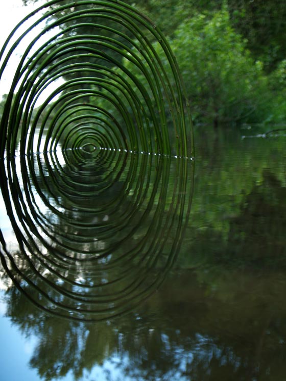
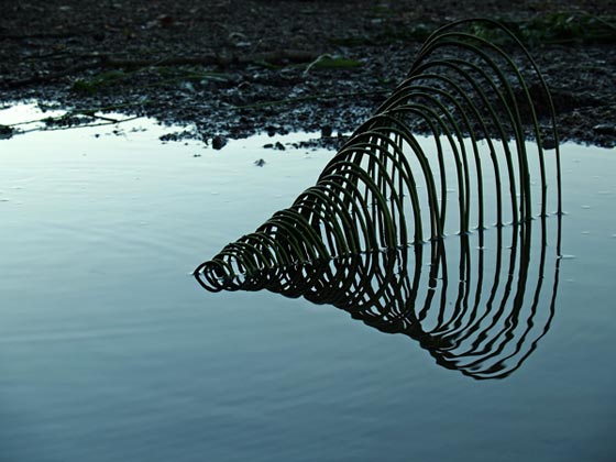
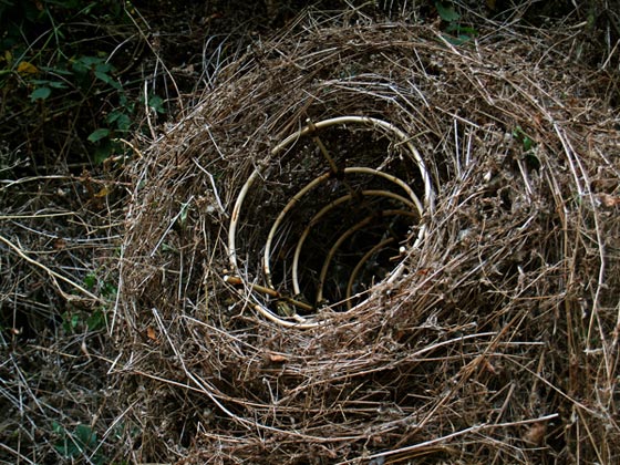
04 Sep 16:04

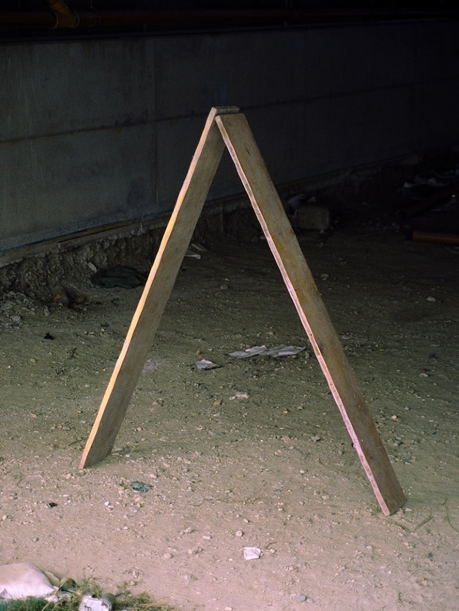
Les idées sauvages de Ludovic Fesson
by Antoine
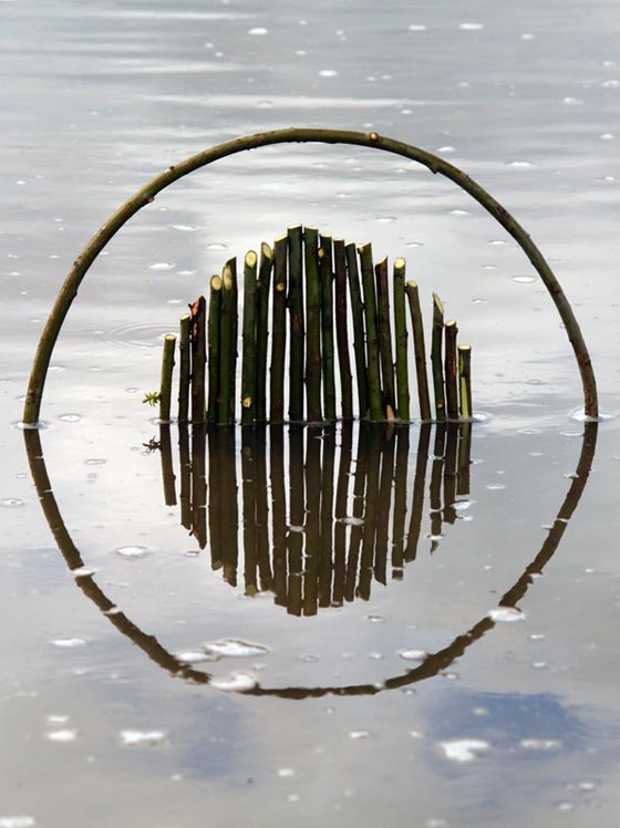
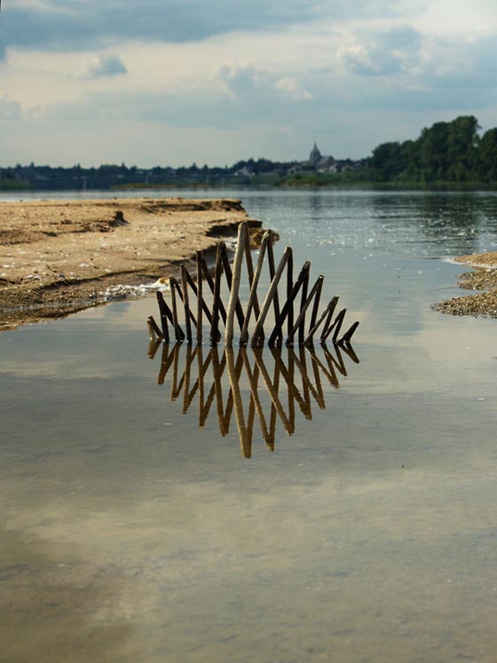
Ludovic Fesson est un artiste et photographe français qui travaille avec des éléments naturels pour créer un art environnemental qui comprend de simples lignes, des courbes, des formes géométriques placées directement sur terre ou dans l’eau. On ne trouve pas énormément de « land artists » sur le net, aussi j’ai été tout de suite intéressé par ce portfolio sur Behance. Le travail de Ludovic Fesson est quelque peu intriguant notamment en raison de sa passion pour la photo, en effet il me semble évident qu’il compose ses différentes installations en pensant à la photo finale, avec cet oeil du photographe… Le style est parfois un peu brut et généralement simple, pourtant les compositions sont très soigneusement réalisées et préparées, ce qui doit être assez complexe. Tous ces matériaux naturels sont parfaits pour se connecter à ses racines… Enfin Ludovic Fesson choisi des endroits assez ordinaires de la campagne française pour placer ses œuvres (qui ne sont pas ordinaires), ce qui souligne le côté accessible et universel d’un art sans prétention.
04 Sep 16:00
Man on Earth
by Hannah Edwards
Time has stopped, there is no breeze, no distracting sound or noise, only footsteps are echoing from the surrounding walls. Rupert Venderwell’s photographs seem like carefully created, staged images or thoroughly choreographed scenes. With an incredible intuition for the moment, Vandervell’s pictures are snap shots of random passer byes. With his series ‘Man on Earth’ he aims at highlighting the dramatic contrast between the urban background and the small but important presence of human life, with its unique visual characteristics. The pictures are less about the environment they are taken in and more about the
‘human factor’ moving through it.
‘I wanted to portray a feeling of isolation and, though remaining distant from the subject, I wanted to intrude just a little on this solitude. In our crowded world, moments like these are becoming harder to imagine.’


All images © Rupert Venderwell
04 Sep 16:00
Rainbow Pencils
by feeldesain
Rainbow Pencils Made of Recycled Paper
Tokyo-based designer Duncan Shotton, known for his whimsical functional objects like the magnetic cloud keyholder and his Lochness monster pins, just launched a Kickstarter Project for a new kind of pencil that makes rainbows when you sharpen it. Each pencil has a 6-layer rainbow core of recycled paper (not wood) and either a white or black exterior. Shotton says the pencils will ship before Christmas.


[ via ]
Don’t forget to follow Feeldesain on Twitter + Facebook + Pinterest to get all the latest updates.
03 Sep 14:59

My Dear friends, today it’s my pleasure to introduce you some outstanding russian interiors as well as all over the world collection. Enjoy! From Russia with love, A. Keep on reading


Posted by Anna Neklesa
Facebook ※ Twitter ※ Instagram

Living Spaces: Inspiration Set 31
by designcollector@gmail.com
My Dear friends, today it’s my pleasure to introduce you some outstanding russian interiors as well as all over the world collection. Enjoy! From Russia with love, A. Keep on reading
Posted by Anna Neklesa
Facebook ※ Twitter ※ Instagram
Jeff likes this
03 Sep 14:59
Mark Braun
by Caroline Kurze
‘You have to discover the very own character of each material and implement this character in a way that it’s both surprising and harmonious.’, explains Berlin-based designer Mark Braun. His works exude an modest elegance and a a strong personal signature.
He discovered the joy of shaping and characterizing material and surroundings during his carpentry training and later on followed the urge of going to the Designschool. In 2006 Mark Braun had finished his studies and founded his own design studio in 2007.
He was influenced by the work of his grandparents – both architects – as well as minimalistic Scandinavian design. He states: ‘the shapes of the objects around us is something that reflects a character of its own’. Mark Braun sees himself as a kind of ‘New Interpreteur’, as someone who does not reinvent existing objects, but puts them in a contemporary context and design.


Production errors may occur bothersome from some point of view, Mark Braun sees it more as liveliness or symbolism – they communicate authenticity and uniqueness. Thus, each material challenges with what you have to become familiar, you have to play with them, to experiment and find out how it can be processed in the best possible way.
‘I don’t really browse the internet for what’s hot and what’s not. You get a pretty good impression of that at trade fairs and by just keeping your eyes open’ he explains. ‘Of course it’s important to know what’s going on, but if everyone starts using a certain material, I’m not really the person to jump the bandwagon immediately, you can’t if you want your work to stay kind of exciting and exquisit’.
His latest project is a bottle for brandy, which he designed in collaboration with the Edelobstbrennerei Stählemühle . with its classic and timeless design, this bottle is an object that may be reused as a design object after consumption of the product.
His collection ‘Les Trios’ modeled on ancient amphorae for the French Gallery Grandville Paris, is contemporary and modern. The color of the vase is reminiscent of goods that were mainly transported and stored in amphorae: oil, honey and wine. Mark Braun succeeds reinterpreting an object used thousands of years ago. Many designers look for disfunctional everyday problems and try to find a new solution. His aspiration lies in reinterpreting already existing object,s giving them a new feel and design and although solving the question of design is always linked to its functionality. ‘I would like to design things that are new and are yet familiar’.
Whilst explaining his premise to us, he carefully sets up his latest work, a sidetable called ‘Lift’, he smiles and says that it’s a nice experience to realize your signature.
Mark Braun’s design is reduced and at the same time very attractive. The manuscript of the ‘Antifollowers’ as he calls himself is pure, timeless and high quality.
Text by Hannah Edwards | Photography by Caroline Kurze
03 Sep 14:53
Paintings Depict Environmental Low And High Brow Decadence
by Stacy Dacheux


 How does our plastic/synthetic “throw away” culture affect not only our values, but also our environment? Walmart retail may seem cost effective and conservative, but in a glutton abundance, it’s possibly just as decadent as the upper echelons of collecting from the Renaissance or Baroque times. By placing disposal items such as Coors beer, shelves or detergent, and bargain bin t-shirts under a canopy of classically rich “painted” ceilings in her work, Jean Lowe cleverly examines these ironies and more.
Regarding this fiscal clashing, David Pagel suggests, “This compromise between high art and low culture suggests that splitting the difference between extremes creates a mutation both queasy and questionable.”
This is what makes each piece striking– Lowe is not just easily questioning consumerism’s role in art, but instead asking us to consider where art lives and who it lives for. It’s not just about “what” but “how” such blending or bleeding confuses, masks, or tempers our own sense of place and thought.


The post Paintings Depict Environmental Low And High Brow Decadence appeared first on Beautiful/Decay Artist & Design.
03 Sep 14:44

Graphic Design: Ideas man Josh King has a weird and wonderful way of looking at the world
by Liv Siddall

You may have missed it but a few months ago when Manchester United boss Alex Ferguson announced his retirement, a piece of his chewing gum went on eBay claiming to be his “last gum.” Word spread, and within two days the bidding war on the gum had reached nearly £200,000. The gum wasn’t Fergie’s, and eBay took it down before the deal was done, but the clever person behind that genius idea was Josh King.
03 Sep 10:05


http://www.anambitiousprojectcollapsing.com/2013/08/blog-post_31.html
by aapc
"Casa Jean Mermoz" via the José Vial Armstrong archives @ Escuela de Arquitectura y Diseño PUVC
previously here
Andreidignart likes this

03 Sep 09:53
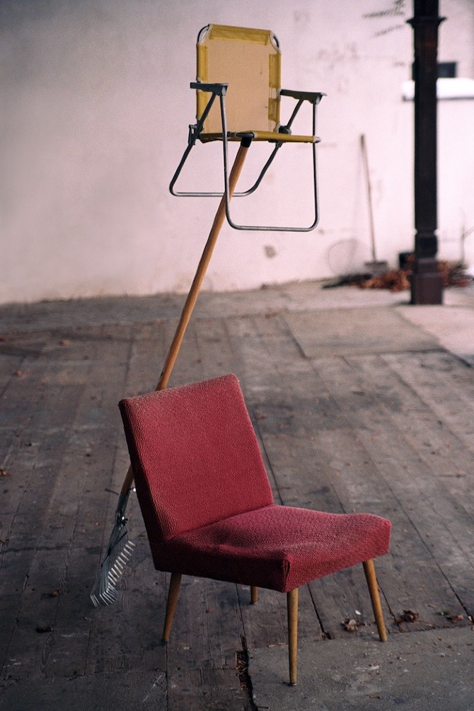
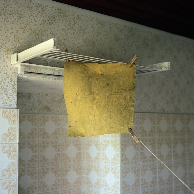
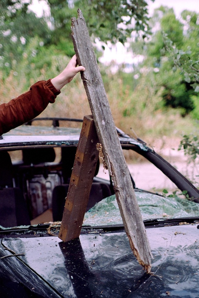
 Actualities by Thomas Albdorf
Extraordinary works of Vienna based photographer Thomas Albdorf have their unique quality. Very pictorial still lifes - arranged spontaneously or staged carefully, always play with the background. Every day objects create intriguing compositions and are caught with great subtlety and feeling.
'The series “Actualities” was a redefinition of my sculptural approach. All the arrangements, mainly consisting of objects that are easily overlooked in an everyday context, are either constructed very spontaneously with on-site found objects or define themselves as photographic sculptures solely through the act of photography, whereas this very action conducted with my camera functions as a sculptural intervention. The goal is not to construct a stunning and complex sculpture, rather than revealing given qualities within the materials I use to enable a different reading of these often hardly perceived things.'
Words: Thomas Albdorf, Thisispaper
Photography: Thomas Albdorf
Actualities by Thomas Albdorf
Extraordinary works of Vienna based photographer Thomas Albdorf have their unique quality. Very pictorial still lifes - arranged spontaneously or staged carefully, always play with the background. Every day objects create intriguing compositions and are caught with great subtlety and feeling.
'The series “Actualities” was a redefinition of my sculptural approach. All the arrangements, mainly consisting of objects that are easily overlooked in an everyday context, are either constructed very spontaneously with on-site found objects or define themselves as photographic sculptures solely through the act of photography, whereas this very action conducted with my camera functions as a sculptural intervention. The goal is not to construct a stunning and complex sculpture, rather than revealing given qualities within the materials I use to enable a different reading of these often hardly perceived things.'
Words: Thomas Albdorf, Thisispaper
Photography: Thomas Albdorf


Thomas Albdorf: Actualities
by Thisispaper Magazine
Actualities by Thomas Albdorf
Extraordinary works of Vienna based photographer Thomas Albdorf have their unique quality. Very pictorial still lifes - arranged spontaneously or staged carefully, always play with the background. Every day objects create intriguing compositions and are caught with great subtlety and feeling.
'The series “Actualities” was a redefinition of my sculptural approach. All the arrangements, mainly consisting of objects that are easily overlooked in an everyday context, are either constructed very spontaneously with on-site found objects or define themselves as photographic sculptures solely through the act of photography, whereas this very action conducted with my camera functions as a sculptural intervention. The goal is not to construct a stunning and complex sculpture, rather than revealing given qualities within the materials I use to enable a different reading of these often hardly perceived things.'
Words: Thomas Albdorf, Thisispaper
Photography: Thomas Albdorf
03 Sep 09:50
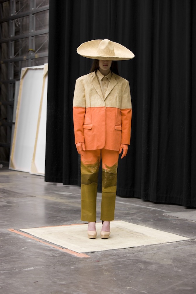
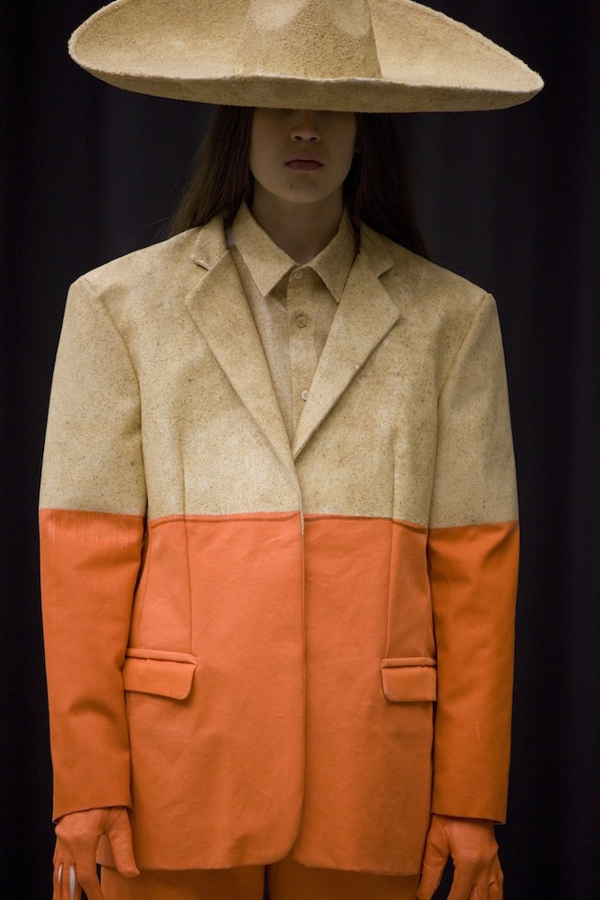
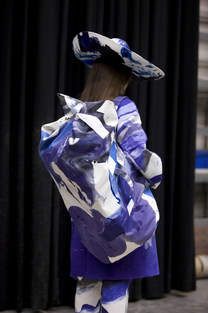
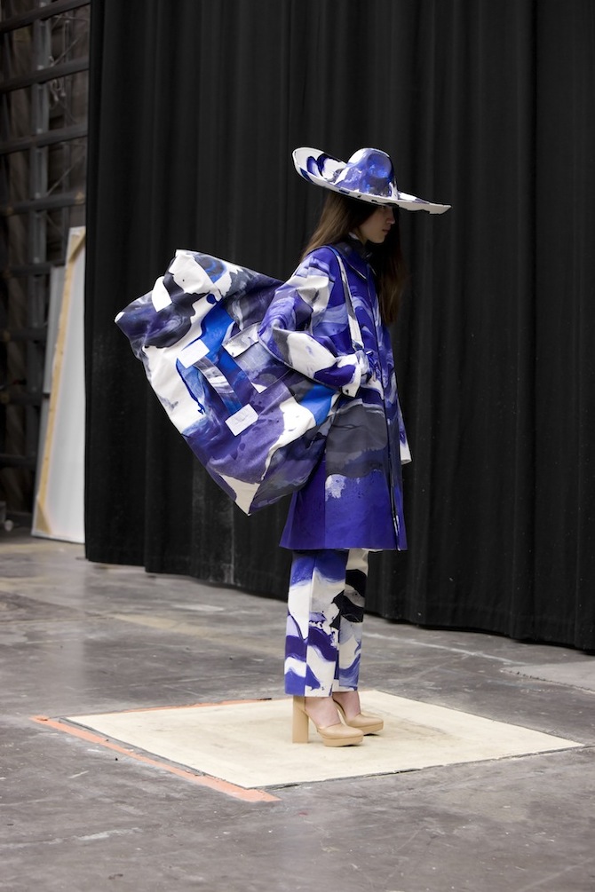
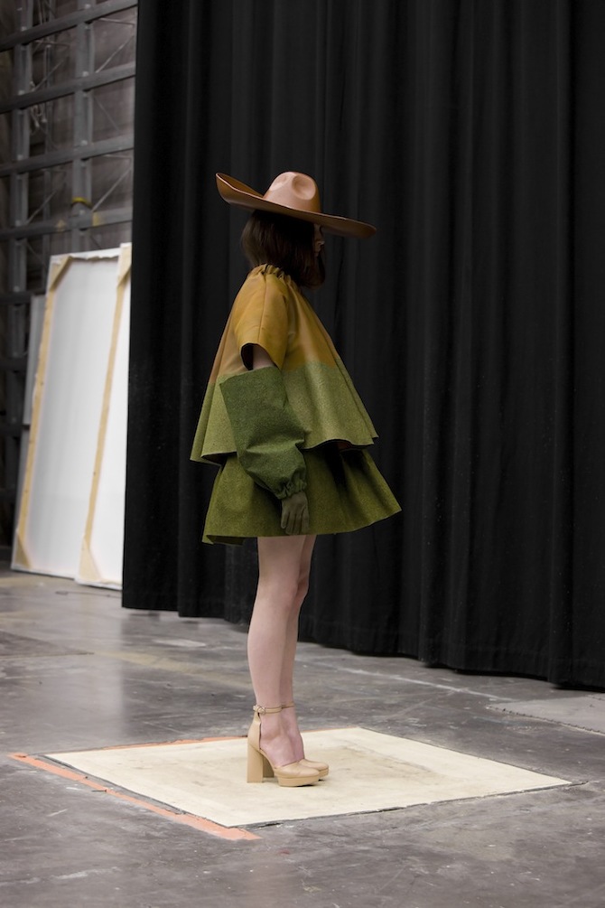
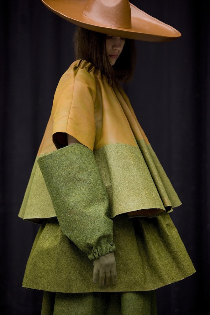
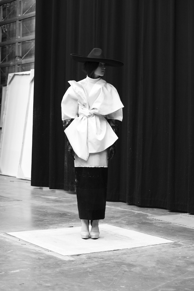
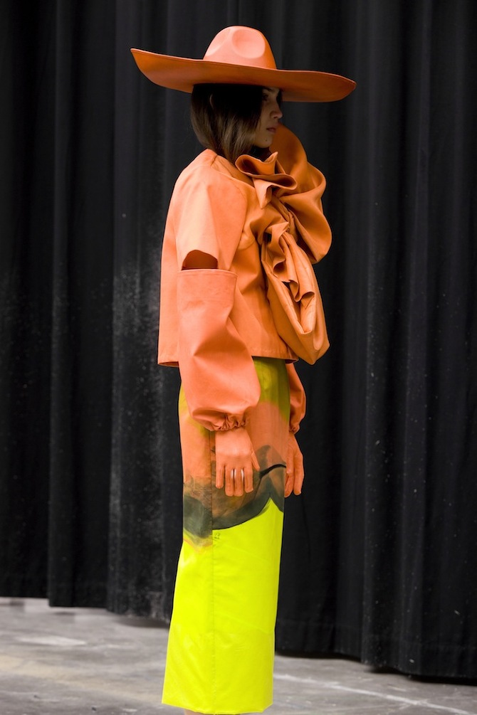
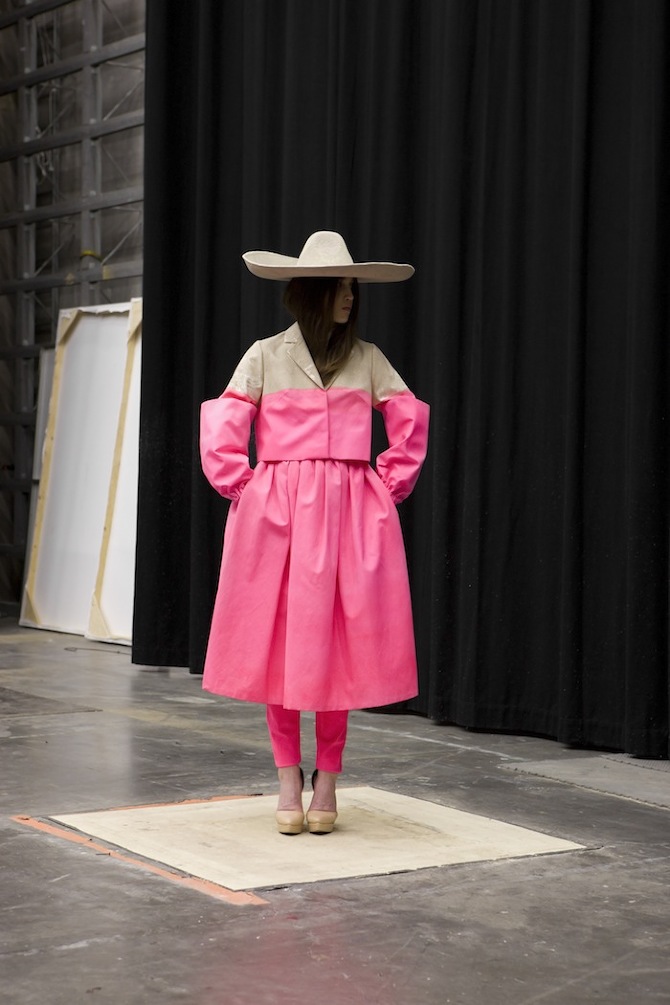 Garment in Landscape by Satu Maraanen
Satu Maaranen's collection Garment in Landscape came back to our minds with this beautiful photoshoot. You can remember her collection from one of our stories. Satu, a designer from Helsinki, creates an avantgarde and innovative garments, which blend with the surroundings, mimic the landscapes, plays with the background. Inspired by landart, camouflage and 60's Finnish printdesign, she created an amazing, visually and conceptually stunning collection.
'The inspiration for Maaranen silhuettes and cuts come from old Haute Couture, but the looks are a combination of Haute Couture and Ready-to-Wear. The athmosphere of the collection is experimental and young. She has undertaken specific work with innovative materials. She has covered silk, cotton and viscose with grass, sawdust and sand. Her expressionistic prints are handprinted with an open silkscreen and some didgitalprints of the grass-, sand- and sawdustcoated fabrics. Thus she joins an innovative tradition of designers from her country who are celebrated for their use of natural materials: Aalto, Sarpaneva, Nurmesniemi, have all worked for the legendary fabrics company Marimekko. Satu Maaranen wishes to instigate a new reflection on Haute Couture (all of her materials and prints are handmade) by leading it into another poetic dimension.'
Words: Satu Maraanen, Thisispaper
Photography: Chris Vidal Tenomaa
Garment in Landscape by Satu Maraanen
Satu Maaranen's collection Garment in Landscape came back to our minds with this beautiful photoshoot. You can remember her collection from one of our stories. Satu, a designer from Helsinki, creates an avantgarde and innovative garments, which blend with the surroundings, mimic the landscapes, plays with the background. Inspired by landart, camouflage and 60's Finnish printdesign, she created an amazing, visually and conceptually stunning collection.
'The inspiration for Maaranen silhuettes and cuts come from old Haute Couture, but the looks are a combination of Haute Couture and Ready-to-Wear. The athmosphere of the collection is experimental and young. She has undertaken specific work with innovative materials. She has covered silk, cotton and viscose with grass, sawdust and sand. Her expressionistic prints are handprinted with an open silkscreen and some didgitalprints of the grass-, sand- and sawdustcoated fabrics. Thus she joins an innovative tradition of designers from her country who are celebrated for their use of natural materials: Aalto, Sarpaneva, Nurmesniemi, have all worked for the legendary fabrics company Marimekko. Satu Maaranen wishes to instigate a new reflection on Haute Couture (all of her materials and prints are handmade) by leading it into another poetic dimension.'
Words: Satu Maraanen, Thisispaper
Photography: Chris Vidal Tenomaa
Satu Maaranen: Garment in Landscape
by Thisispaper Magazine
Garment in Landscape by Satu Maraanen
Satu Maaranen's collection Garment in Landscape came back to our minds with this beautiful photoshoot. You can remember her collection from one of our stories. Satu, a designer from Helsinki, creates an avantgarde and innovative garments, which blend with the surroundings, mimic the landscapes, plays with the background. Inspired by landart, camouflage and 60's Finnish printdesign, she created an amazing, visually and conceptually stunning collection.
'The inspiration for Maaranen silhuettes and cuts come from old Haute Couture, but the looks are a combination of Haute Couture and Ready-to-Wear. The athmosphere of the collection is experimental and young. She has undertaken specific work with innovative materials. She has covered silk, cotton and viscose with grass, sawdust and sand. Her expressionistic prints are handprinted with an open silkscreen and some didgitalprints of the grass-, sand- and sawdustcoated fabrics. Thus she joins an innovative tradition of designers from her country who are celebrated for their use of natural materials: Aalto, Sarpaneva, Nurmesniemi, have all worked for the legendary fabrics company Marimekko. Satu Maaranen wishes to instigate a new reflection on Haute Couture (all of her materials and prints are handmade) by leading it into another poetic dimension.'
Words: Satu Maraanen, Thisispaper
Photography: Chris Vidal Tenomaa
Jeff likes this
03 Sep 09:01


Ann Cathrin November Høibo. Untitled, 2011, Print on cotton
Jeffwaaaaaaaaaaaant
Ann Cathrin November Høibo. Untitled, 2011, Print on cotton


23 Aug 03:23

Fire & Ice: A Walk Inside an Ice Cave Next to the Mutnovsky Volcano in Northern Russia
by Christopher Jobson

This amazing shot was captured last year by photographer Denis Budkov in an ice cave near the Mutnovsky volcano in an area of northern Russia. Known for an abundance of precipitation the area is often covered in several meters of snow and ice that cover mountain streams like this creating vast caves that look like something out of a science fiction movie. This particular cave was nearly 300m (980 ft.) long and several photographers in Budkov’s group also snapped a few amazing shots. The photographer also captured this jaw-dropping photo of some tourists in front of a volcanic explosion earlier this year. The power of depth of field, right? (via Russia Travel Blog)

22 Aug 13:42
A camera homage to (the style of) Braun & Dieter Rams
by Bobby Solomon


I’ve been seeing this camera concept by Kim Seongjin floating around the web lately, a beautiful homage to the design of Braun and Dieter Rams. The body is design is clean and simple with no unnecessary elements, beautiful curves and a minimum of colors. But does it follow the very principles that Rams idnetified to encourage good design?
Looking over Dieter Rams’ 10 principles of good design, number four in particular sticks out to me in relation to this project – “Good design makes a product understandable.”
It clarifies the product’s structure. Better still, it can make the product talk. At best, it is self-explanatory.

When I look at the back of this camera concept, I’m left scratching my head a little. I’d guess that the red dial is the power, but what is the white dial for? Is it a menu? Does it allow you to scroll through photos? I think this homage could have been stronger had iconography or labels been included to provide clearer feedback. Would it have been as clean looking? Perhaps not, but the usability would have increased, and that’s an important consideration to make.
Even Rams himself used labels.
Roslyn Cook, Lou Ros likes this
22 Aug 08:20
Video: Nike Possibilities Campaign
by Staff
Celebrating the 25th anniversary of their iconic "Just Do It" campaign, Nike have gone all out of their latest "Possibilities" campaign. Starring sporting legends LeBron James, Serena Williams, Gerard Pique, and Andre Ward, the one-and-a-half minute spot is directed by narrated by Nicolai Fuglsig (best known for his work on the Sony Bravia bouncy ball commercial) and is narrated by actor Bradley Cooper, who tells viewers to push their physical limits by challenging everyone they can. "If you can run a mile, run a race, run a marathon, outrun a movie star…" Watch above and leave your thoughts below!
22 Aug 08:17
Stack
by swissmiss

Mugi Yamamoto‘s designed an inkjet printer that eliminates the paper tray and related components by having the printer sit directly on top of the paper. Brilliant!


