Disco Volante. I was wracking my brains to remember where I’d come across the name before, but luckily Madame Mohr, the design studio behind this Austrian pizzeria, put me out of my misery. It was of course the name of Emilio Largo’s boat in the James Bond story Thunderball, and a futuristic Alfa Romeo car from the 1950s. As it turns out, Fleming’s novel isn’t relevant. From the Italian for “flying saucer”, Disco Volante could have several meanings here in Vienna: there’s the round shape of the pizza, the rotating wood fired oven and the giant disco glitterball that houses the oven itself. There are no evil megalomaniacs involved in the project as far as we know, but then again they do normally operate in secret.
Madame Mohr’s Lukas Galehr subtly incorporated the red and green of the Italian flag into his mainly white and black interior. During renovation, the former grocery store revealed itself to have another metre of ceiling height beyond the false one that was removed, and as a result the dining area is a spacious, canteen-like one – utilitarian and austere. Of course there is no getting around what is the centrepiece of the restaurant; wood fired ovens are the heart of Italian pizzerias, but you won’t see a less traditional example than this huge discoball. Once the dough is inside, the internal mechanism turns at one revolution per minute, ensuring the pizza is cooked evenly, and in some style. Hot stuff baby…
À ne pas louper en cette rentrée pluvieuse :
Demain débute une exposition à la Bibliothèque Nationale Mitterrand sur le graphisme contemporain.
L’expo présente un choix de travaux de graphistes réalisés dans les années 2000, en France, pour un lieu, une collection, ou une manifestation à caractère patrimonial.
La plupart des colas (comme Coca-Cola ou Pepsi-Cola) contiennent de l'acide phosphorique (E338) pour réguler le pH. Ce composé chimique est également utilisé dans l'industrie pour dérouiller ou protéger de l'oxydation les pièces mécaniques.
Exposition — Galerie Emmanuel Perrotin – Saint Claude — 12 septembre → 9 novembre 2013
La Galerie Perrotin présente l’exposition Dear de Sun Yuan & Peng Yu. Leurs œuvres aux allures provocatrices prennent comme sujet les questions complexes de notre époque contemporaine. S’ils figurent parmi les artistes les plus controversés en Chine, leurs installations donnent une vision de la condition humaine au sein du monde moderne.
Sweet new cover Pedal magazine: a free portuguese independent publication about bikes.
Design Director: Bráulio Amado
Design Director: Luis Gregorio
Editors: Filipe Gil & João Pinheiro
The pen, ink and gouache works of Minneapolis-based artist Nick Howard are a visually startling exercise in repetition, form and mass-psychology. By carefully rendering similar figures gathered together in masses, each drawing creates formations and shapes that echo the power of a collected focus, or the terror of mob mentality. Using a style that is precise yet simple, individual figures blend into one another despite their unique features, masks, several mouths and monochrome capes. Enhancing the eerie and silent quality of the works is the monuments that occasionally appear, built by the nameless and faceless, or simply serving as a symbolic, yet arbitrary, gathering point.
Says Howard in a statement of his work, “I am fascinated with people, relationships and mass psychology. In particular, I am interested in how the mind works and how the feelings, thoughts, ideas, and perceptions we have create our world both personally and collectively. I find inspiration for my work by both looking outwards and inwards.”
This simultaneous outward and inward focus is particularly fascinating, as it illuminates the allure of the collective – whereas one figure alone might not illicit an emotional or aesthetic response, hundreds or thousands of them, carefully drawn and carefully placed, create a sum that is greater than its parts. Similarly, the drawings tap into the simultaneous feeling of empowerment within a large group, as well as the loss of individual and personal control.
Toilet Paper is perhaps the most bizarre, shocking, and borderline-subversive publication I’ve ever picked up… And I love it. A bi-annual magazine, it’s the child of (super-talented) artist Maurizio Cattelan and photographer Pierpaolo Ferrari. I highly recommend any self-respecting creative to pick one up, as my words can hardly do their work justice. It’s simply an experience you have to hold in your hands and observe with your own eyes. But that doesn’t mean I’m not stubborn enough to try (heh).
There’s no mistaking an issue of Toilet Paper for anything else on the shelf. One glance at their iconically brash covers and the brand will be forever be burnt into your brain. Their work has gone on to adorn everything from clothing to kitchenware (more on that later).
My first encounter with the mag was in NYC’s Strand Bookstore, when a friend pointed it out. I probably spent the next 20 minutes totally absorbed into each page and every piece of photography. For you see, Toilet Paper is strictly photography; page after page of beautiful full-page spreads. It’s simple in conception and execution, yet manages to somehow strike a balance between “completely fucked up” and tasteful.
Cattelan and Ferrari aren’t shy to push boundaries. “Every issue starts with a theme… Like love or greed,” says Cattelan. From there they explore a variety of outlets, eventually landing on a series of well-crafted and thought-out content. Cattelan elaborates, “we keep homing in on what a Toilet Paper image is. Like distilling a perfume. It’s not about one particular style or time frame; what makes them Toilet Paper is a special twist. An uncanny ambiguity.”
That’s the charm about the magazine, every picture has some sort of slant, places your brain would have never conceived of ever going before. It’s because of this that I stress Toilet Paper as an invaluable asset for any creative’s bookshelf. Browsing the pages is like exercise for your thoughts; you’ll begin to consider new ways of approach.
Whenever viewing Cattelan’s impressive body of work, I get the sense that he’s one step ahead, that he knows something that I don’t… I say this because Toilet Paper has been extremely successful from a pop culture standing. Their aesthetic is one that I come across often nowadays; Ferrari and Cattelan’s publication must’ve helped propel it (remember? Always a step ahead). It’s fresh, it’s edgy, it doesn’t take itself too seriously, and it wreaks of contemporary. Don’t agree? Then consider their collaborations with Paris based fashion label Kenzo, MSGM, or the various album covers they’ve designed.
Which brings me to their most recent project: kitchenware with Italian design firm Seletti. The collection looks fantastic, evoking times of yonder and bearing some of Toilet Paper’s most famous shots. Each piece won’t break the bank either, with prices ranging from $15-$25. Currently for sale in select Parisian shops, they set will be ready for worldwide distribution by late September. So keep your eyes open, which won’t be tough considering Toilet Paper’s off-beat images are hard to miss.
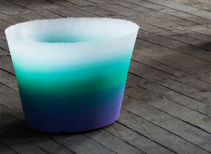
a gradient brings to life the smooth surface giving it a surprising lightness. this unusual quality pushes the rotational moulding technology to the limits of its unexplored aesthetic potential.
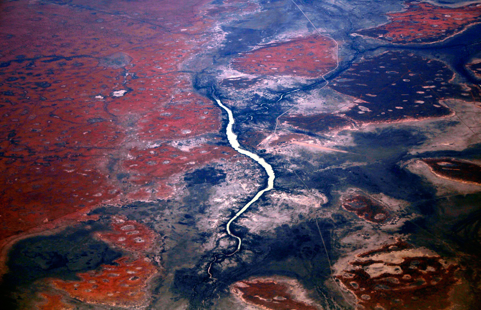
Over half of Australia lies above the Tropic of Capricorn, but it is home to only five percent of the population. It is a frontier land with little infrastructure, populated by cattle barons, crocodile hunters and aboriginal tribes. Geologists say the Northern Territory, which is the size of South Africa, has abundant diamond, gold and uranium reserves. However, a fifth of the Northern Territory is owned or controlled by aboriginal groups and many Aborigines have joined environmentalists to discourage mining. -Reuters ( 11 photos total)
A river flows among sand dunes in the Tanami Desert, located in Australia's Northern Territory on July 15. (David Gray/Reuters)