Flackon
Shared posts
04 Jul 22:40
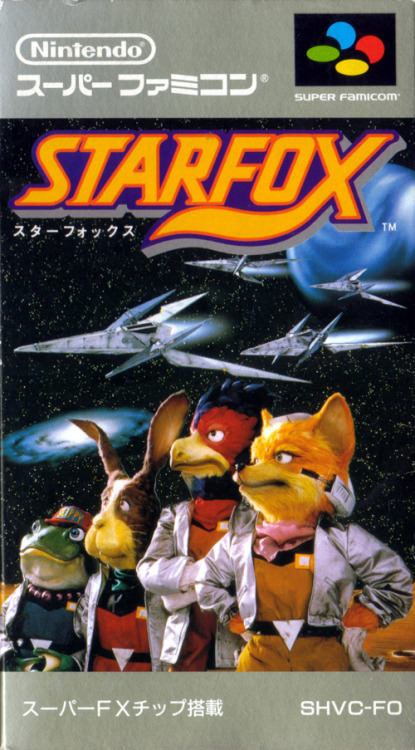
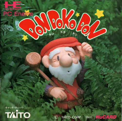
Crafty Game Boxes I’ve always been charmed by the use of...
Crafty Game Boxes
I’ve always been charmed by the use of clay, puppets, and dioramas in video game box art and advertisements. Unfortunately, it was never very common (mostly a Japanese phenomenon), and these days it seems even more rare. At least we’ll always be able to look at them on Tumblr!
1. Star Fox (Super Famicom, 1993). (Source)
2. Don Doko Don (PC Engine, 1989). (Source)
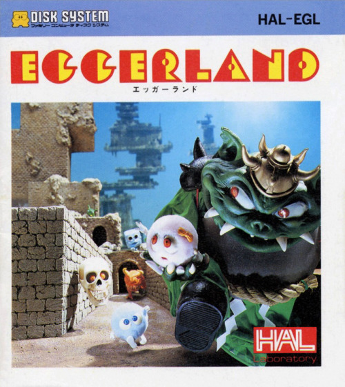
3. Eggerland (Famicom Disk System, 1986). (Source)
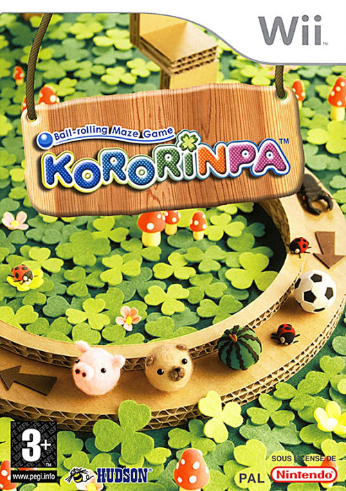
4. Kororinpa (Wii, 2006). (Source)
5. Famicom Wars DS (DS, 2005). (Source)
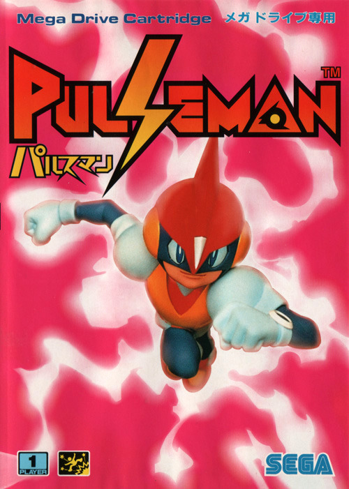
6. Pulseman (Mega Drive, 1994). (Source)
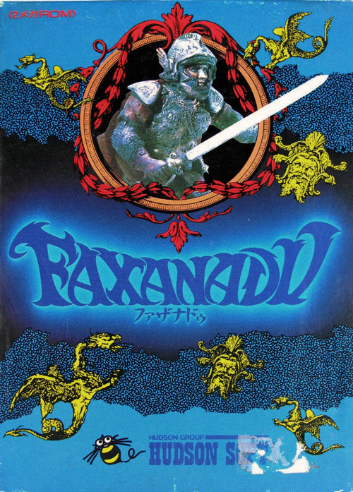
7. Faxanadu (Famicom, 1987). (Source)
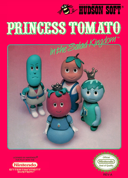
8. Princess Tomato in the Salad Kingdom (NES, 1991). (Source)
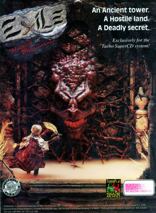
9. Exile: Wicked Phenomenon (TurboGrafx CD, 1993). (Source)
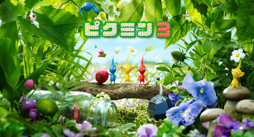
10. Pikmin 3 (Wii U, 2013). (Source)
26 Jun 00:51
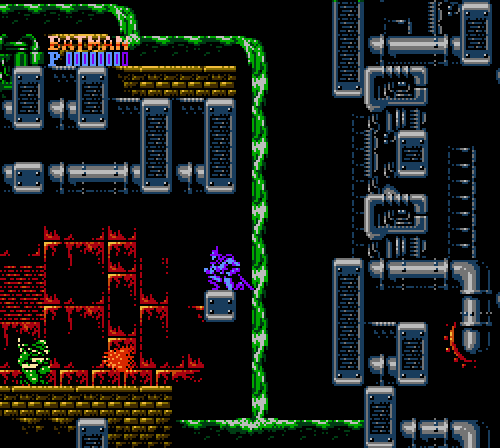
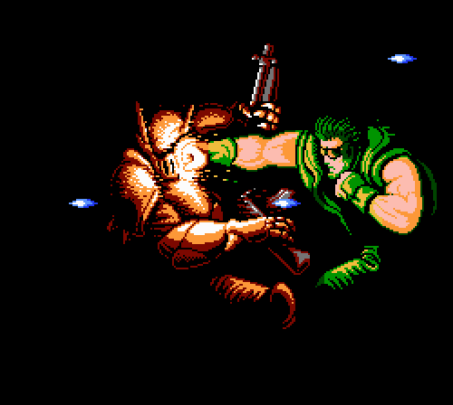
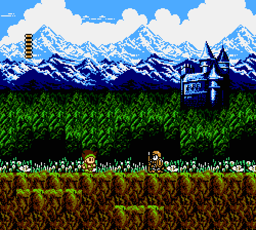
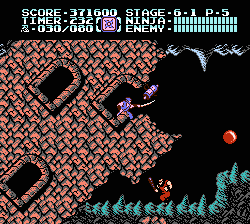
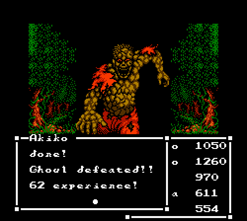
Abobobo’s Top 10 Best Famicom/NES Graphics1. Batman...
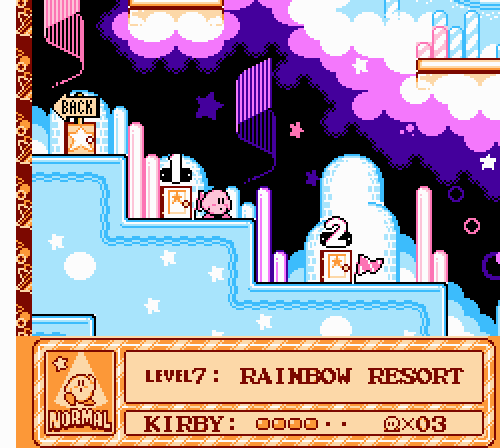
Abobobo’s Top 10 Best Famicom/NES Graphics
1. Batman (Sunsoft, 1989)
2. Shatterhand (Natsume, 1991)
3. Little Samson (Taito, 1992)
4. Ninja Gaiden II: The Dark Sword of Chaos (Tecmo, 1990)
5. Kirby’s Adventure (HAL Laboratory, 1993)
6. Castlevania III: Dracula’s Curse (Konami, 1989)
7. Gimmick! (Sunsoft, 1992)
8. Metal Storm (Irem, 1992)
9. Sweet Home (Capcom, 1989)
10. Crisis Force (Konami, 1991)
These games were picked for their visual beauty, style, and technical prowess. Effects, animation, cutscenes, pixel artistry, and overall atmosphere were all taken into account. Of course, there are a lot of great-looking titles for the NES, and the ones that didn’t make the cut include Super Mario Bros. 3, Megaman 5/6, Solstice, and Summer Carnival ‘92: Recca. Like any “best of” list, this one is personal and subjective.
For reference, the Famicom was released in 1983 and the NES was released in 1985.
See also: The Games That Pushed The Limits Of The NES (Racketboy)
Image sources: Batman, Shatterhand, Little Samson, Ninja Gaiden II: The Dark Sword of Chaos, Kirby’s Adventure, Castlevania III: Dracula’s Curse, Gimmick!, Metal Storm, Sweet Home, Crisis Force
Flackon and -1 others like this
26 Jun 00:34
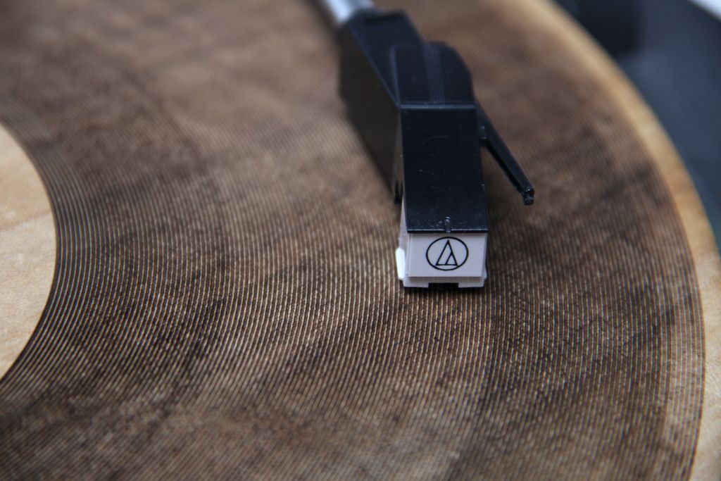
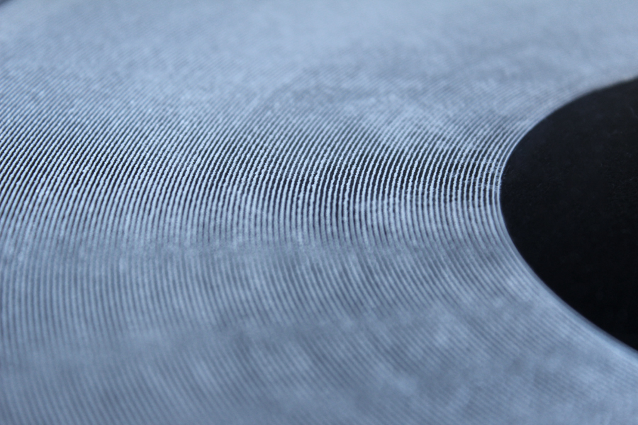
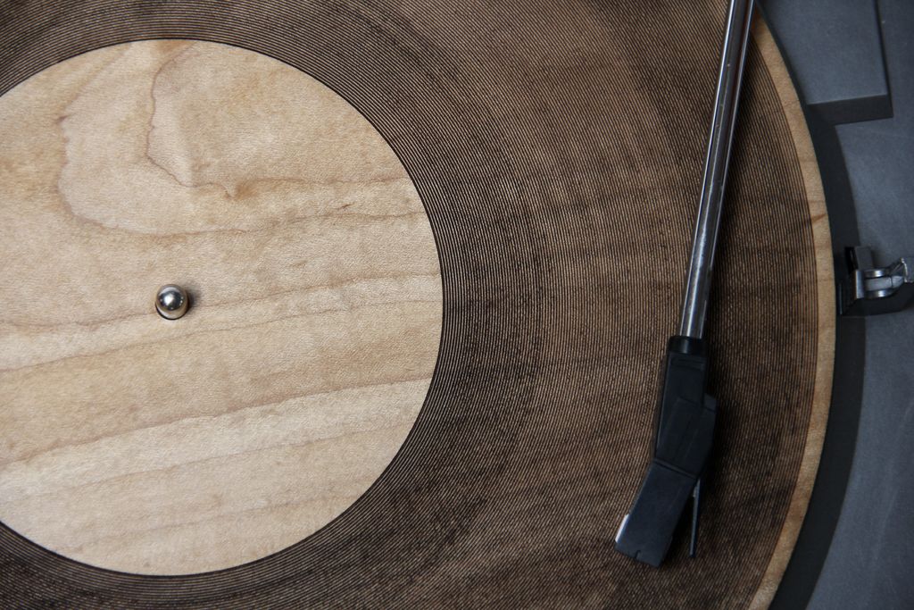 [Image: "Laser Cut Record" by Amanda Ghassaei].
An incredible example of what can be done with laser-cutting, Amanda Ghassaei's project "Laser Cut Record" features music inscribed directly into cut discs of maple wood, acrylic, and paper, resulting in lo-fi but playable records.
For what they are, the otherwise scratchy and off-kilter audio quality is actually quite amazing, and the sounds themselves are made all the more haunting and strange by the crackling noise and resonance of the material that hosts them.
 [Image: "Laser Cut Record" by Amanda Ghassaei].
Some technical details are available at Ghassaei's Instructables page, and you can see the laser-cutting itself at work in the following video.
I'm reminded of a short letter called "Acoustic Recordings from Antiquity," written to the Proceedings of the IEEE in August 1969 by a man named Richard G. Woodbridge III. The somewhat eccentric Mr. Woodbridge explains that he has been researching accidental recording of sounds found, after careful analysis, on the surfaces of physical objects rescued from antiquity—in particular, pieces of pottery originally shaped on potters' wheels (seen here as a kind of primordial record platter).
Woodbridge even claims some sounds have been "recorded" as re-playable waves in the slowly drying shapes of oil paintings.
To listen to these lost recordings, the letter suggests, you simply hold a record cartridge near the work of pottery in question, such that the needle of the phonograph can "be positioned against a revolving pot mounted on a phono turntable (adjustable speed) 'stroked' along a paint stroke, etc." When this was done properly, he claimed, a "low-frequency chatter sound could be heard in the earphones."
That is, the voices of people present in the room during the making of the pot could be re-played from the surface of the pot itself.
 [Image: "Laser Cut Record" by Amanda Ghassaei].
Woodbridge suggests that this might have alternative applications: "This is of particular interest as it introduces the possibility of actually recalling and hearing the voices and words of eminent personages as recorded in the paint of their portraits or of famous artists in their pictures." So an experiment was orchestrated:
 [Image: Like the rings of Saturn, from "Laser Cut Record" by Amanda Ghassaei; in fact, perhaps the rings of Saturn are an unread recording...].
But why stop at sounds?
Perhaps in two years' time, we'll watch as Amanda Ghassaei cuts DVDs—"the data on a DVD is encoded in the form of small pits and bumps in the track of the disc"—with a combined and simultaneous laser-cutter/3D printer ensemble, coating inscribed "small pits and bumps" with reflective metals.
Suddenly, wood, rock, metal, even exposed geology in situ can host visual content. Indeed, perhaps it already does, but we haven't invented—or we simply haven't applied—the right technologies for decoding it. In other words, we have DVD players; we just haven't, learning from Richard G. Woodbridge III, used them to "read" other materials.
In August 2015, you and some friends hike up to a rock wall in the middle of Utah, and there are DVDs printed all over the surface of the hillside, full-length albums laser-burned into White Rim sandstone, and audio-visual pilgrims carrying deconstructed laser-lens systems, scanning for hidden film fests and warbling soundtracks, swarm every surface all around them.
It's the rise of geomedia.
Geomedia
by noreply@blogger.com (Geoff Manaugh)
[Image: "Laser Cut Record" by Amanda Ghassaei].An incredible example of what can be done with laser-cutting, Amanda Ghassaei's project "Laser Cut Record" features music inscribed directly into cut discs of maple wood, acrylic, and paper, resulting in lo-fi but playable records.
For what they are, the otherwise scratchy and off-kilter audio quality is actually quite amazing, and the sounds themselves are made all the more haunting and strange by the crackling noise and resonance of the material that hosts them.
[Image: "Laser Cut Record" by Amanda Ghassaei].Some technical details are available at Ghassaei's Instructables page, and you can see the laser-cutting itself at work in the following video.
I'm reminded of a short letter called "Acoustic Recordings from Antiquity," written to the Proceedings of the IEEE in August 1969 by a man named Richard G. Woodbridge III. The somewhat eccentric Mr. Woodbridge explains that he has been researching accidental recording of sounds found, after careful analysis, on the surfaces of physical objects rescued from antiquity—in particular, pieces of pottery originally shaped on potters' wheels (seen here as a kind of primordial record platter).
Woodbridge even claims some sounds have been "recorded" as re-playable waves in the slowly drying shapes of oil paintings.
To listen to these lost recordings, the letter suggests, you simply hold a record cartridge near the work of pottery in question, such that the needle of the phonograph can "be positioned against a revolving pot mounted on a phono turntable (adjustable speed) 'stroked' along a paint stroke, etc." When this was done properly, he claimed, a "low-frequency chatter sound could be heard in the earphones."
That is, the voices of people present in the room during the making of the pot could be re-played from the surface of the pot itself.
[Image: "Laser Cut Record" by Amanda Ghassaei].Woodbridge suggests that this might have alternative applications: "This is of particular interest as it introduces the possibility of actually recalling and hearing the voices and words of eminent personages as recorded in the paint of their portraits or of famous artists in their pictures." So an experiment was orchestrated:
With an artist’s brush, paint strokes were applied to the surface of the canvas using “oil” paints involving a variety of plasticities, thicknesses, layers, etc., while martial music was played on the nearby phonograph. Visual examination at low magnification showed that certain strokes had the expected transverse striated appearance. When such strokes, after drying, were gently stroked by the “needle” (small, wooden, spade-like) of the crystal cartridge, at as close to the original stroke speed as possible, short snatches of the original music could be identified.Through this technique, the overlooked—overlistened?—acoustic qualities of various objects, beyond high-brow pottery and oil paintings, can thus be revealed:
Many situations leading to the possibility of adventitious acoustic recording in past times have been given consideration. These, for example, might consist of scratches, markings, engravings, grooves, chasings, smears, etc., on or in “plastic” materials encompassing metal, wax, wood, bone, mud, paint, crystal, and many others. Artifacts could include objects of personal adornment, sword blades, arrow shafts, pots, engraving plates, paintings, and various items of calligraphic interest.Woodbridge calls the pursuit and revelation of these sounds "acoustic archaeology."
[Image: Like the rings of Saturn, from "Laser Cut Record" by Amanda Ghassaei; in fact, perhaps the rings of Saturn are an unread recording...].But why stop at sounds?
Perhaps in two years' time, we'll watch as Amanda Ghassaei cuts DVDs—"the data on a DVD is encoded in the form of small pits and bumps in the track of the disc"—with a combined and simultaneous laser-cutter/3D printer ensemble, coating inscribed "small pits and bumps" with reflective metals.
Suddenly, wood, rock, metal, even exposed geology in situ can host visual content. Indeed, perhaps it already does, but we haven't invented—or we simply haven't applied—the right technologies for decoding it. In other words, we have DVD players; we just haven't, learning from Richard G. Woodbridge III, used them to "read" other materials.
In August 2015, you and some friends hike up to a rock wall in the middle of Utah, and there are DVDs printed all over the surface of the hillside, full-length albums laser-burned into White Rim sandstone, and audio-visual pilgrims carrying deconstructed laser-lens systems, scanning for hidden film fests and warbling soundtracks, swarm every surface all around them.
It's the rise of geomedia.
03 Jun 23:34


My Famicase Exhibition 2013 entries Meteor, our favorite video...
by ericisawesome
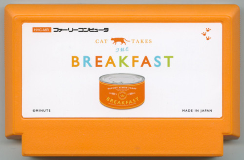
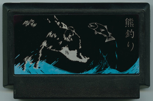
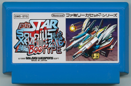
My Famicase Exhibition 2013 entries
Meteor, our favorite video game shop in Tokyo, began hosting its annual Famicase gallery last week, displaying nearly 90 Famicom cartridges for fake games dreamt up by artists. It looks like more Western artists than usual participated this year, and judging by the messages we received, a lot of our readers heard about the show from our posts and participated! Congratulations! You might remember that we had our own piece featured by Famicase not too long ago.
I’ve picked out my favorites from 2013’s submissions for the images above. Yuko Yano’s Cat Takes The Breakfast sounds like a game idea JC and I kicked around back in the day — the goal in Yano’s imaginary game is to wake up your master to serve you breakfast. ExedStarSoldius曼蛇Xevi ForceZone 頭脳BeeType is also neat, mashing together of a dozen shmups.
BUY Famicom stuff, upcoming games
03 Jun 01:30
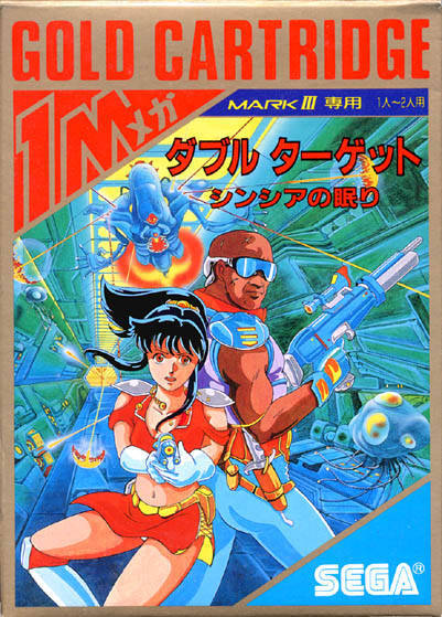
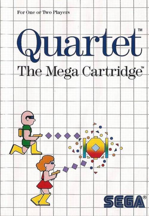
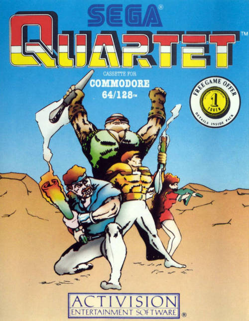
boxvsbox: Double Target: Cynthia no Nemuri VS. Quartet VS....
Double Target: Cynthia no Nemuri VS. Quartet VS. Quartet, 1987
This game was originally called Quartet in Japan as well, but was renamed because the Master System port was only two players.
02 Jun 18:58


Ubuntu Button Tweaked to Meet ‘Cultural & Aesthetic’ Expectations
by Joey-Elijah Sneddon
The Ubuntu button in 13.04 has received a last minute change: the background swirl now spins in a clockwise direction.
Trivial, right? In fact, if had it arrived sooner, then our recent post on ’7 subtle changes in Unity 7 you probably won’t notice…‘ would have been 8!
Left: Old direction; Right: New Direction
Why The Change?
But why has the background direction been altered? And why now?
We don’t need to go too far back in history to answer the latter question, just to yesterday when a bug report was filed by Matthieu James, Ubuntu’s icon maker.
In the issue he cites a mail forwarded to him by Mark Shuttleworth in which a user argues that the button background swirl should spin clockwise, as there are cultural and historical dispositions favouring this procession.
Still following? Good.
Now, there is certainly no denying that, for most cultures, the clockwise/right-leaning movement is seen as being ‘good’, ‘positive’, and, in some cases, ‘holy’.
Whether it makes sense to us today is moot; the fact is that the vast majority of us are socialised to believe that clockwise = moving forward and moving forward = good. It sits within in us at a subconscious level, handed down to us from ancient times when the movement of the sun in the sky ( ‘east’ to ‘west’) was revered as important, life-giving and divine.
‘Sunwise’ became shorthand for ‘the right way’. Shorthand that remained core through subsequent cultures and civilisations; a crutch that influenced architecture, mathematics, science, mechanics.
The procession of clockwise over anti-clockwise is a movement we’re just darn well used to. Even some of our words, like ‘sinister’ are hold overs from this, being derived from the latin for anti-clockwise ‘sinistro‘!
‘iron age thinking’
Back to the present. The BFB icon in 13.04 has now been changed (albeit committed to Unity but not yet landed) to conform to this cultural/historical expectation.
This hasn’t pleased everyone, especially Steve Riley who writes:
“The notion that left = bad and right = good is steeped in ancient (and wrong) beliefs about what nature prefers. It’s the 21st century now. Do people really make technology decisions based on iron age fairy tales?”
He wasn’t alone in feeling a little peeved. The Ubuntu Documentation team, who have already taken screenshots of Ubuntu 13.04, also felt a bit put out. And Kevin Godby raised the point of whether this change means other anti-clockwise-leaning icons will also be hanged, like the new Software Updater icon.
Ultimately it’s a change that is both trivial and, to those who don’t care about such inferences, an irrelevant one at that.
But for designers, who speak a language that’s heavily based on symbolism, the change of direction will be seen a touch of finesse aimed at reassuring the subconscious eye with a familiar shapes, patterns and flows.
And that, cultural reasonings aside, is the most important thing: making sure it looks good.
Ubuntu Button Tweaked to Meet ‘Cultural & Aesthetic’ Expectations OMG! Ubuntu! - Everything Ubuntu. Daily.
01 Jun 23:29

The full comment can be found HERE.
What do you think?


Ubuntu Bug #1 Marked As Fixed By Mark Shuttleworth
by noreply@blogger.com (Andrew)

After almost 9 years and 1833 comments, the famous Ubuntu bug #1, "Microsoft has a majority market share", has been marked as fixed today by Mark Shuttleworth.
Ubuntu bug #1 states that "Microsoft has a majority market share in the new desktop PC marketplace" but since it was reported, phones and tablets have become a lot more important and while Microsoft may still be winning on the desktop, in the consumer compute market it's now 3rd, behind Android and Apple.
Mark Shuttleworth notes in the comment that marks the bug as "fix released":
"[...] Android may not be my or your first choice of Linux, but it is without doubt an open source platform that offers both practical and economic benefits to users and industry. So we have both competition, and good representation for open source, in personal computing.
Even though we have only played a small part in that shift, I think it's important for us to recognize that the shift has taken place. So from Ubuntu's perspective, this bug is now closed.
[...] Along those lines, it's good to reflect on how much has changed since 2004, and how fast it's changed. For Ubuntu, our goal remains to deliver fantastic experiences: for developers, for people building out production infrastructure, and for end-users on a range of devices. We are doing all of that in an environment that changes completely every decade. So we have to be willing to make big changes ourselves - in our processes, our practices, our tools, and our relationships. Change this bug status is but a tiny example."
The full comment can be found HERE.
What do you think?
Bokor Karoly and -1 others like this
01 Jun 22:25
"Let me tell you a little story about innovation and creativity. Years ago, I worked on a wiki-based..."
“
- Dave Freeman, a game designer, friend, and former coworker (via adiscourseongaming)
Let me tell you a little story about innovation and creativity. Years ago, I worked on a wiki-based project to find the first instance of ideas/techniques in video games (like the first game to use cameras as weapons, or the first game to have stealth as a play element). It excited me to dig to give credit to those who laid the foundations of ideas that we now take for granted. I couldn’t wait to show the world how creative and innovative these unknown game designers/developers were.
I went into it with much passion and excitement, but unexpectedly, it turned out that there were almost no “firsts”. Every time someone put up a game that was the first to do/contain something, there was another earlier game put up to replace it with a SLIGHTLY less sophisticated, or SLIGHTLY different version of the same thing. The gradient was so smooth and constant that eventually, the element we were focusing on lost meaning. It became an unremarkable point to address at all. We ended up constantly overwriting people’s work with smaller, less passionate articles, containing a bunch of crappy games that only technically were the first to do something in the crudest manner. Sometimes only aesthetically.
After a lot of time sunk into this project, I came to the conclusion that I was mistaken about innovation/creativity. It would have been a better project to track the path of ideas/techniques than to try to find the first instance of an idea/technique. I held innovation so highly for years before that, but after this project, I saw just how small it was. How it was but a tiny extension of the thoughts of millions before it. A tiny mutation of a microscopic speck that laid on top of a mountain. It was a valuable experience that helped me very much creatively.
”- Dave Freeman, a game designer, friend, and former coworker (via adiscourseongaming)
Flackon likes this
31 May 21:20

This Compact Camera Captures Glorious 8K Ultra HD Footage
by Andrew Liszewski

The shrinkification of technology is as inevitable as death and taxes, but we still can't help but be excited to see that Japan's NHK, working with a company called Astrodesign, has managed to shrink an 8K-capable camera into this relatively compact package. Compared to the HD-capable smartphone in your pocket it's monstrous, but when put next to existing Ultra HD cinema cameras believe it or not this is tiny.
The secret to the 8K camera's trim figure is a 33-megapixel sensor that's just under an inch in size, so all of its components are able to squeeze into a housing that's about four inches square. Its compact form factor also allows smaller, lighter lenses to be used, which will eventually help bring the cost of 8K production down so the next-gen format has a better opportunity to catch on.
Of course, given 4K technology like cameras and TVs is only just being rolled out, 8K seems like a pipe dream for now. But with the introduction of HD many years ago, consumers discovered that increased resolutions could vastly improve their viewing experience, and eventually we'll even be complaining that 8K looks like crap. [DigInfo TV]
02 May 12:12
Brand Re-Versioning: Trading Logos with the Competition
by Urbanist
[ By WebUrbanist in Design & Graphics & Branding. ] 


[ By WebUrbanist in Design & Graphics & Branding. ]
[ WebUrbanist | Archives | Galleries | Privacy | TOS ]


![]()
Our brains recognize brands before we even get to the text … but what happens when that second of the process process yields the reverse of what we expect?
![]()
In this series of experimental logo swaps by Graham Smith, our expectations are subverted right at the point of recognition – Coke replaces Pepsi, UPS becomes FedEx and so forth in realms ranging from fast food to digital technology.
![]()
The result is a kind of temporary cognitive dissonance, and poignant reminder of just how much we rely on visual cues – from shape and layout to color and typography – to interpret input and apprehend iconic designs.
![]()
Some of the trades work relatively seamlessly – a surprise number actually work visually – you could almost believer that Twitter, Facebook and Google could simply have gone a different direction with their designs.
![]()
But given our own familiarity biases when viewing them, it is hard to say in some cases, too. Either way, it is clear that our experience and associations play a major part in the power of branding.
[ By WebUrbanist in Design & Graphics & Branding. ]
[ WebUrbanist | Archives | Galleries | Privacy | TOS ]
    
|
02 May 12:09
In The Fold: 10 Futuristic Folding + Flexible Computer Ideas
by Delana
[ By Delana in Conceptual & Futuristic & Technology. ] Next Page:
[ By Delana in Conceptual & Futuristic & Technology. ]
[ WebUrbanist | Archives | Galleries | Privacy | TOS ]


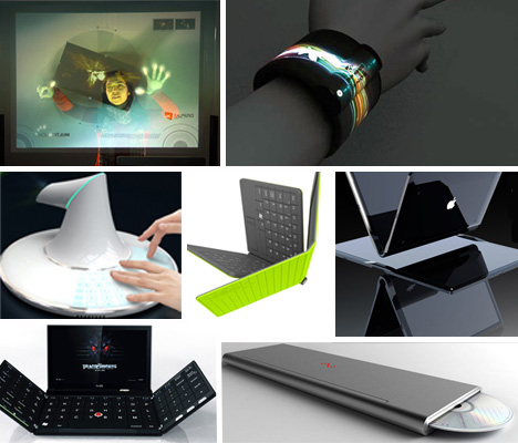
The concept of computers has changed dramatically over the past 50 years. They have gone from room-sized monstrosities to desktop beasts to laptop machines to tiny powerhouses that we can carry in our pockets. But it would be a mistake to think that computers are done evolving. The materials we use to build computers are constantly changing, and their form factors will undoubtedly change rapidly as well. These concepts show just what might be possible in the very near future of computer design.
Napkin PC Concept
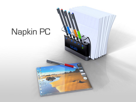
Operating on the idea that most great ideas start as napkin sketches, designer Avery Holleman decided to design a computer system that looks just like a group of napkins. A stack of napkin-like screens and a set of “pens” are kept in a handy holder, allowing collaborators to simply grab one of each and sketch out an idea.
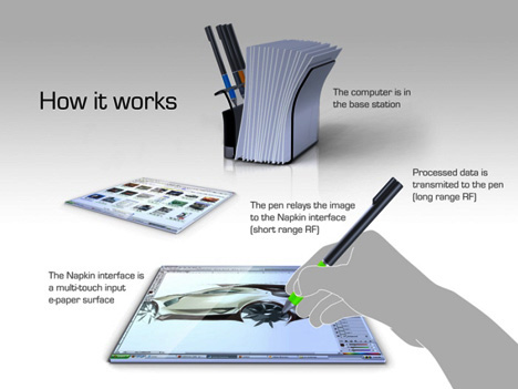
The holder is actually a base station and computer, allowing all of the processing to be done in the case so that the “napkins” themselves can remain small and easy to handle. A couple of napkins can roll up and be secured with a kind of napkin ring that holds two pens, letting the system go with you to impromptu meetings or anywhere great ideas might strike.
Feno Foldable Notebook
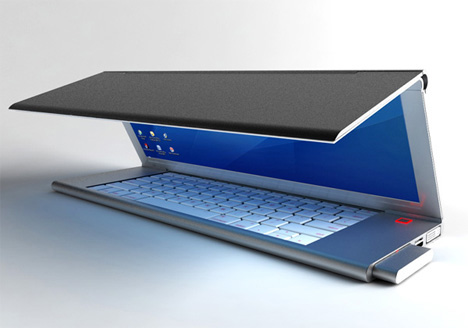
Designer Niels Van Hoof had a compelling vision for the modern laptop: why not eliminate wasted space and make the screen itself fold up to make the entire machine smaller? The screen would use OLED technology to let it fold in half without damaging the display.
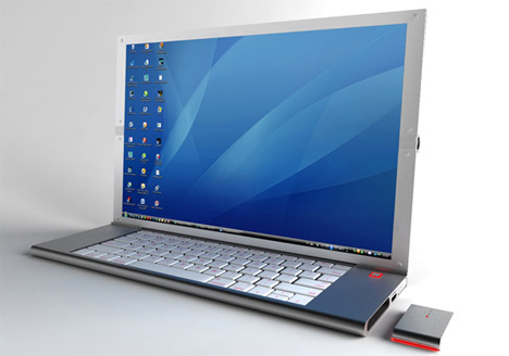
The keyboard could then shrink significantly, allowing just enough room for the keys and eliminating the vast amounts of space under the keyboard that is usually dedicated to the trackpad. A pop-out mouse takes care of that, letting you navigate naturally and then store the mouse inside the laptop’s body when you’re done.
Next Page:
In The Fold 10 Futuristic Folding Flexible Computer Ideas
[ By Delana in Conceptual & Futuristic & Technology. ]
[ WebUrbanist | Archives | Galleries | Privacy | TOS ]
|
|
Flackon likes this
02 May 12:07
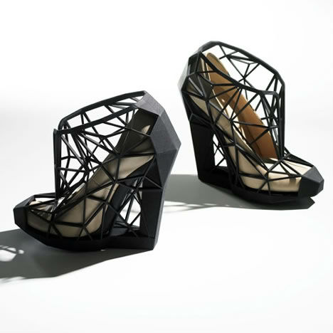
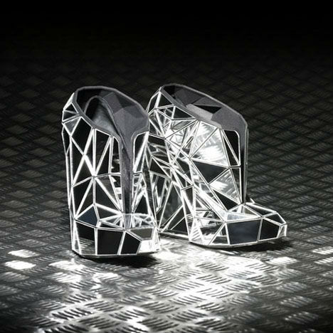
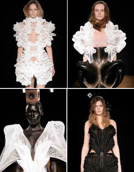
High Tech to High Fashion: Upscale 3D-Printed Designs
by Steph
[ By Steph in Design & Products & Packaging. ] Next Page:
[ By Steph in Design & Products & Packaging. ]
[ WebUrbanist | Archives | Galleries | Privacy | TOS ]


Pioneers in 3D-printed fashion are showing off the capabilities of rapid-prototyping technology with dresses, hats, shoes, swimwear and jewelry. Machines layer buildable materials like nylon or steel according to computer-generated blueprints, eliminating the need for fabric and conventional soles and fasteners. The results are delicate and architectural, but surprisingly strong. Designs are custom-printed to the wearer’s exact dimensions for a perfect fit.
N12 Bikini by Continuum Fashion

While 3D-printed fashions have been showing up on runways for a few years now, the N12 bikini was among the first to actually be available for purchase. Every single piece of this bikini is 3D-printed including closures, and snap together without any sewing. Order through the Continuum Fashion shop.
Exoskeleton 3D Printed Shoes by Janina Alleyne
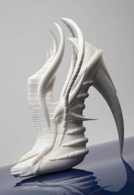
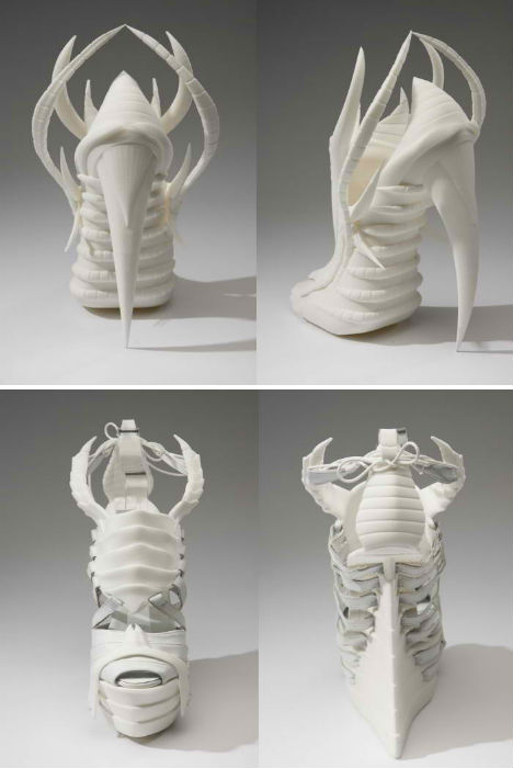
The Exoskeleton collection by Janina Alleyne is a futuristic, vaguely alien-looking series of footwear inspired by the structure and silhouettes of marine invertebrates and insects. With 3D printing, shoes and garments can be printed to the exact size of the wearer, making uncomfortable-looking designs fit like a glove.
Parasol Hat by Heidi Lee

Artist and milliner Heidi Lee created this parasol-inspired cocktail hat, modeled by Andrej Pejic for WILD Magazine’s Woman issue.
Invisible Shoe by Andreia Chaves
Created in collaboration with rapid prototyping studio Freedom of Creation, fashion designer Andreia Chaves’ Invisible Shoe features a 3D-printed base that is then covered in a mirrored shell. This produces an optical illusion effect, making the wearer’s feet seem to blend in with their surroundings.
Jointed Jewels by Alissia Melka-Teichroew
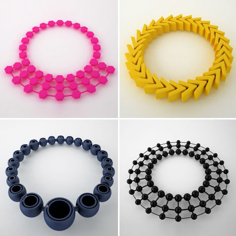

A ‘selective laser sintering process’ enables jeweler Alissia Melka-Teichroew to create a range of unusual jewelry from plastic powder, which is fused into solid form using a computer-controlled laser.
Seed of Life Corset by ThreeForm
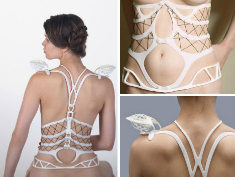
This piece of wearable sculpture features a segmented design with movable joints and hinges, and it’s made to fit your body perfectly. The Seed of Life Corset from ThreeForm is available at Shapeways for $2,500.
Escapism Dresses by Daniel Widrig, Iris van Herpen and .MGX by Materialise
This incredibly complex series of dresses from Dutch fashion designer Iris van Herpen was produced in collaboration with London architect Daniel Widrig and digital manufacturers .MGX by Materialise. The digitally-printed dresses are lightweight and flexible, amazingly detailed and yet easy to produce.
Biomimicry Shoe by Marieka Ratsma and Kostika Spaho

Look closely at the heel of the biomimicry shoe by Dutch fashioned designer Marieka Ratsma and American architect Kostika Spaho. It’s modeled on a bird skull. The hollow structure of the skull creates a high platform sole that is nevertheless lightweight, using less material than a solid structure.
Next Page:
High Tech To High Fashion Upscale 3d Printed Designs
[ By Steph in Design & Products & Packaging. ]
[ WebUrbanist | Archives | Galleries | Privacy | TOS ]
|
|
26 Apr 21:14
'Endless Summer' From Bethesda Outed by Australian Classification Board
by noreply@blogger.com (Endless)

06 Apr 00:13

Sonic Beyond: The Battle for Earth - Demo Preview
by Topher Florence

Last week, I was selected as one of a few members of the gaming press to get a VIP pass to a short preview build of Sonic Team's newest Action RPG offering Sonic Beyond: The Battle for Earth.
After the requisite logos and disclaimers, a short Anime sequence began, featuring Sonic and his many (many) friends in different locales around the globe smashing up robots to the strains of a blazing hot electro remix of the Crush 40 tune "Open Your Heart". I wasn't 100% sure whether the multitude of members in Sonic's Technicolor Army were actual characters from his long-running game series or custom characters from SB:TBFE, but one thing was for sure, these furballs meant business! Definitely a treat and probably second only to the exciting Sonic Unleashed intro for sheer wow factor (The animation was done by Manglobe, the guys behind Samurai Champloo).
After navigating the rather slick menu system, I dove right in to character creation. High-level creation begins by choosing the kind of critter that you want to use to fight Dr. Eggman's army. You can pick from a wide variety of Mammals, Birds, Lizards, and Insects (Sonic Team promises that Fish, Amphibians, and Hero Robots are coming soon). Once you decide what animal best suits your fancy, you have a nice selection of ages and builds to pick from, followed by a surprisingly large number of haircuts (furcuts?), and dozens of colors and patterns for skin and eyes. I decided to resurrect my old fan character Lady SummerSpines, a golden hedgehog with a heart to match (a few of you may remember her from the old forum RPG on the now defunct Daily Mobian website). After you've finalized your base creature, you have the option to pick two character classes from a pool of Mechanic, Mystic, Speedster, Sharpshooter, and Warrior. I decided to stick with the classic Speedster/Warrior in the vein of Sonic. The clothing options were quite robust, at or above the level of a Tony Hawk game. There are dozens upon dozens of accessories to personalize your characters. I decided to deck Lady SummerSpines out in an 80s ensemble with hot pink kicks, leg warmers, a headband, and a cute half shirt. Lastly, I named her and gave her an appropriately chirpy voice. All in all, I think you could make almost any kind of platformer mascot that you could conjure up, from Felix the Cat to Fritz the Cat.
Once the game began proper, a short cutscene showed me starting my first day at Sonic's Super Fast Delivery Service, working for a rather harried Amy Rose, who served as a secretary and recruiter. Unfortunately, there were a lot of low-res textures and framerate issues at this point which was a little distracting. Amy walked me through a short tutorial in the form of a VR simulator that Tails had built (hooked up to a Dreamcast!) which showed me the basics of combat and platforming. I struggled with the mouse and keyboard controls for a bit before giving in and switching over to my trusty 360 gamepad (which the game was nice enough to auto-config).
The game essentially controls like a cross between the classic Psygnosis racer Rollcage and Crash Bandicoot. The feel is is much tighter than previous Sonic titles and the engine actually seems to generally handle loops and curves with actual physics instead of scripted events. There were still a few too many dash pads and rails for my taste, but I actually managed to get through the whole tutorial (which had a rather complex architecture) without any camera problems. Combat was pretty intuitive as well. I had the option to jump on the heads of badniks in the traditional manner, but with contextual controls I was also able to perform special moves like zooming around them to make a whirlwind, jumping between them with some neat acrobatic moves, or even disarming them and blasting them with their own weapons. Once I completed the tutorial, an 8-bit chiptune version of the classic "act complete" music played and I was whisked back into the real world.
Amy was impressed with my skills and gave me a special package that had to be delivered to a new Sonic Museum that was opening across town in seven minutes. She equipped me with a special watch that gave me a countdown and a radar screen to tell me my destination and I was shoved out the door.
After a (too long) loading screen, I found Lady SummerSpines on a rooftop at night in the center of a bustling urban center. A JUSTICE-style bloghouse track pulsed in the background and a disembodied voice counted me down. I was off! From the start, the impressive draw distance actually let me see a few miles out beyond the edge of the city to the waterfall where my quest log told me the museum was located. The city itself was a gorgeous affair, sort of a "clean" Brazilian favela meets Hill Valley 2015 with a flat shaded pastel look that really seemed like a living painting. The running was dynamic and well executed and there were very few limits to what I could run or jump on. You could tell where the stage was trying to funnel me in the right direction, but going backwards or any direction I wanted was actually accomplished pretty easily and without camera headaches. I went down to the street level just to see what would happen and (despite a little pop-in) there was actual traffic and clusters of people and furries going about their business in the city. It was pretty natural to bounce off of street signs and telephone wires like a pinball and go right into a grind or a wallrun. You can even blow up the skirts of pedestrians if you're going fast enough. The buildings unfortunately, were mostly non-enterable facades, though in running about, I did blast through an outdoor mall and some rooftop greenhouse gardens.
Every minute or so I would run into a squad of G.U.N. police bots which were fairly easily dispatched. I had the option to stick to standard Sonic moves but there were a lot of nifty ways to take out the little buggers. For instance, if you time it just right, you can hop onto the back of a mini tankbot and ride it like a skateboard into a wall or crash the flying drones into a flagpole or even use the whirlwind attack on a fire hydrant to blast an enemy with water. There is also auto-taunting when your character finishes a particularly complex combo attack; Lady SummerSpines did a few cute ballet flourishes and stuck out her tongue at the metal husks of the bad guys she defeated. I can easily see the potential of this engine for creating lots of procedurally generated versions of the faux-cinematic sequences from the Sonic Adventure series.
With a few minutes to spare, I was zooming out of the city limits and into the countryside. The music track made a nice seamless change into a kind of funky ukulele beat. Flowers swayed nicely in my breeze and just the sound of the grass crushing underfoot was really nice. I went over a ridge and saw a small crowd waiting in front of building with a statue of Sonic. I sped down to them and the Mission Complete screen appeared. Apparently my performance was good enough for an "S" rank!
The crowd separated in half and the man (well, hedgehog) himself walked up to me. I handed him the parcel and he gave me a fist bump. He told me what a good job I did and opened the package. Inside was a bottle of mustard. He reached behind himself, pulled out a chili-dog from some sort of crevice, and squirted the condiment on top. "Hard to work on an empty stomach" he said, winking at me. Lady SummerSpines did a cartoony faint and Sonic went up to a small stage. He made a short inspirational speech and went to cut the ribbon. Suddenly, an anchor fell from the sky and exploded the Museum into shards. It was Dr. Robotnik in a city sized airship. He mocked Sonic over a P.A. System and said he was claiming this land for himself. Sonic was furious. He looked over to me and asked if I was ready for my next job. Lady SummerSpines nodded and the two ran up the anchor together and the game freeze framed into a makeshift comic book splash page. The demo ended.
Overall, Sonic Beyond seems like a very impressive effort. The Sega Rep who was showing me the ropes assured me that Sonic Team had listened to fan complaints from other games and despite the change in genre, this game would stay true to Sonic's 16-bit roots. If they can work out some of the niggling technical hiccups and polish up the gameplay, we could be looking at a serious Game Of The Year contender.
I rate this demo a solid 7.5.
05 Apr 23:21

The Top 7.5 Games of the 00's
by Topher Florence
FlackonOh man, my Reder feeds have been imported and now a lot of old stuff like this is resurfacing.

The gaming world went through a lot of changes this decade, the Dreamcast died, 9/11, there was a Commander Keen game on Game Boy Color, several new Pokémon were created, and now we live in a high-tech wonderland of motion controls and high definition Dr. Mario. Perhaps the biggest change was the sheer torrent of cool games that started to come out.
Unlike previous decades, games became easier to make, as expensive as Hollywood movies, and finally became the art form that they were destined to be. It rates our highest average gaming decade score at 7.5 which just edged out the 80s with a 7.3 (adjusted for the new system).
Now as we put a bow on the Naughties and blast forward into the 10's let's put our cards on the table and get down to brass tacks. No more fucking around. It's time once and for all to name the OFFICIAL best six electronic TV games from the past decade plus one game so good it's a game and a half.
7. Sinistra (Xbox, Playstation 2, PC)
Taking full advantage of the anger against the Bush administration, Sinistra became one of the greatest political thrillers of the decade and fomented the movement which eventually helped to elect Dennis Kucinich president. With it's meta-memory dialogue system now a videogame staple and the game itself made into an HBO miniseries it's easy to forget that Namco was targeted by the FBI after the game's release. Fortunately, fans took it upon themselves to create new updates and patches to the PC version after the game was initially banned, creating a thriving sub-community that still exists to this day, even after the re-release. Sinistra is more than an important game, it's was quite literally a "game changer".
6. Peabo Penguin's Radical Snowboard Adventure (Wonderswan)
Whether he's catching some air or working on his tan, Peabo Penguin is one "cool" customer. 2004 was the year that the world fell in love in Peabo and his Antarctic Amigos. And from the playground to the office, it seemed like everyone was talking about new ways to collect sweet, sweet Peabo Points. From the original soundtrack by Morrissey to the stylish snowboards (also designed by Morrissey), Peabo was a smash hit and changed the way that we think about optical illusions in gaming. It garnered our highest score ever of 8.8, so you know we're always down for a little Wintery Action.
5. Smallville: Total Justice (Wii)
Best superhero game of the decade or best superhero game of all time? Playing as Smallville's version of the Justice League (Clark Kent, Green Arrow, Impulse, Aquaman, and Cyborg) you travel from city to city shutting down Lex Luthor's evil 33.1 facilities. Presented in a lavish 2d style, the game is as if one of the classic beat 'em ups of the 90s rocketed into the 21st century. Featuring a surprising amount of swearing and frank language about sex, the rated M game left it's WB roots behind...to horrible sales. The strange brew made the game into a cult hipster hit, though and became a staple at college parties. The game even spawned the "I'VE GOT YOU NOW COCKSUCKER!" internet meme and is even occasionally still referenced on the show itself. It may the last 2D game ever made, but at least they went out with a bang.
4. Yu-Gi-Oh! 7 Trials to Glory: World Championship Tournament 2005 (Game Boy Advance)
Sometimes you have to step back and just say to yourself that a game is more than a never ending conveyor belt of pride and struggle. Sometimes there is a singular artistic creation that makes you believe that the universe isn't random but there has to be some force, some energy out there that has to be engineering what you are experiencing into existence. To call Yu-Gi-Oh! 7 Trials to Glory: World Championship Tournament 2005 a mere digital card game would be to call the luxuriant imagery of Fellini's 8½ a funny cat video. A subtle and bittersweet ode to a lost time, Yu-Gi-Oh! 7 Trials to Glory: World Championship Tournament 2005 is a positively transformative and unforgettable experience that would melt the heart of even the coldest of men. Yu-Gi-Oh! 7 Trials to Glory: World Championship Tournament 2005 swept the Spike VGAs and has spawned a generation of imitators. This is it, the once in a lifetime experience, the Halley's Comet moment in which you will be able to tell your grandchildren that I Was There for Yu-Gi-Oh! 7 Trials to Glory: World Championship Tournament 2005.
3. Yu Suzuki's Fuck It (Dreamcast, Dreamcast 2)
Probably the purest expression of frustration in video game form, Fuck It is a minimalist single player kart racer in which you play Girl, who bares a suspicious resemblance to Jetta Maxx from Eternal Champions. Your goal in the game is to get the end of what seems to be a never ending stream of graphics, Japanese dialogue, and code from what appears to be the remains of Shenmue Online. The game is randomly generated, easy to die in, and would literally take a month to complete from beginning to end. Did we mention that there are no saves? Fuck It was an online exclusive, likely due to it's name and the obscene gesture on the cover. Recent developments have allowed the game to be taken apart and you can watch the ending online...you just might want to have a barf bag at the ready.
2. French Fry Twins (XBLA, PSN)
Six years in the making, French Fry Twins was an RPG Tour de Force and a bright star of the burgeoning Caribbean game design scene. A traditional turn based roguelike based on the vintage Atari game Pressure Cooker, FFT might have just been a mild success. However, it's addictive gameplay combined with the over the top personality of it's rockstar designer Madeline Cameron rocketed it to the top of the charts. Cameron, who is somewhere between Pee-Wee Herman and Andre 3000, is known for her salty language and saltier accessories, all made of real french fries, just like her game's graphics. And, of course, pouring ketchup on Shigeru Miyamoto and taking a bite out of his hair at E3 2008 garnered her a police record, over 6 million YouTube hits, and international headlines. What's next for "Mad Madeline"? She recently bought a controlling ownership in the Miami Dolphins and said that she has "some exciting ideas for the uniforms". Yikes!
1.5 Battletoads vs. Awesome Possum (Nintendo 64)
Despite coming out in 2000, this fighter easily takes the top spot for game of the decade. Total joy in a 256-megabit cartridge, BVAP almost wasn't made. Before the collapse of Tengen, it's CEO Rajni Oscar Tengen became depressed and after much reflection decided to go to Europe to "find himself". While half-drunk one night in a Nottinghamshire pub, he met Rare's Chris Stamper who challenged him to a series of increasingly wild and dangerous wagers. Eventually, several 100 pounds poorer, Rajni decided to bet the IP to Awesome Possum, preying on Chris's pure and untainted love of talking animals. Rajni lost the bet (and his right pinky) and the property went to Rare.
A few years later, while watching his brother and Rare co-founder Tim Stamper become addicted to Marvel vs. Capcom, Chris decided to take the opportunity to put his own spin on the concept of a clash between two worlds, this time the radical Battletoads universe against the cornucopia of critters from Awesome Possum. From this humble idea sprang the game of year and a game that is still an unparalleled fighting game experience.
Thanks to the pub owner who wouldn't cut Rajni off for helping spark the next level of interactive entertainment.
29 Mar 11:24
Dignity: The work of Bence Bakonyi
by Cole Rise


With such stark contrast between the subtleties of the salt and the void created by cloth, at first blush, you’d think these were illustrations or oil paintings. Meet Shanghai artist / photographer Bence Bakonyi. There’s something so clever in how he twists your sense of medium & scale. Find more of his work on Behance.
Permalink |
Comment On This Post (2) |
Tweet This Post | Add to
del.icio.us | Stumbleupon
Post tags:
27 Mar 15:25

Amazing Fractal Patterns Found in Nature
by sprouticus
Put simply, a fractal is a never-ending pattern. Put not-so-simply, a fractal pattern is a "geometric pattern that is repeated at ever smaller scales to produce irregular shapes and surfaces that cannot be represented by classical geometry." From rivers to trees to mountains, nature is full of fractals, making these amazing patterns both complex and familiar at the same time.
With tools like Google Earth at our fingertips, people like Paul Bourke, a Research Associate Professor at the University of Western Australia, have put cool websites together like this one, featuring some of the most stunning aerial shots of Earth's landscapes that you'll find on the internet. With the help of other geographical enthusiasts, Bourke has a pretty extensive collection of fractals from all over the world. We selected some of our colorful favorites to share with you guys.
Algeria


Angola


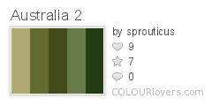
Australia


Canada


Egypt


India


Malaysia


Spain


United States of America


Pretty amazing, huh? If you're interested in learning more about fractals, check out some of these other interesting links:
Fractal Foundation
Fractal Geometry
Fractals Unleashed
Earth’s Most Stunning Natural Fractal Patterns
Flackon and -1 others like this
23 Mar 12:46
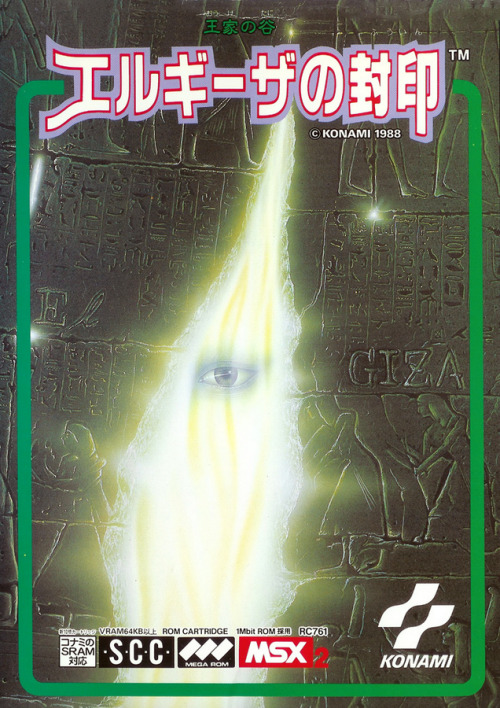
obscurevideogames: vgjunk: Ouke no Tani: El Giza no Fuuin /...
Ouke no Tani: El Giza no Fuuin / King’s Valley II: The Seal of El Giza, MSX 2.
Some of the music from this game was remixed by Michiru Yamane and used in Castlevania: Portrait of Ruin.(Konami - 1988)
from Wikipedia: “The game consists of six pyramids each with its own wall engravings and color pattern; every pyramid contains 10 levels. The idea of the game is to collect crystals called soul stones in each level by solving the different puzzles and evading or killing the enemies using the many tools and weapons available to unlock the exit door that will take you to the next level.”
23 Mar 12:43

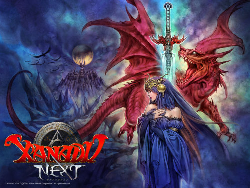
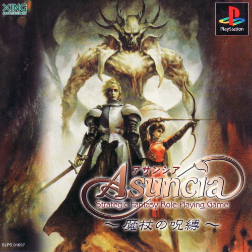
An ad showing the cover of Xanadu Next (2005) by Falcom, along...
An ad showing the cover of Xanadu Next (2005) by Falcom, along with a wallpaper of the source art. This game was a spin-off of the 1985 action-RPG Dragon Slayer II: Xanadu. It was later ported to N-Gage as a multiplayer game.

23 Mar 12:42
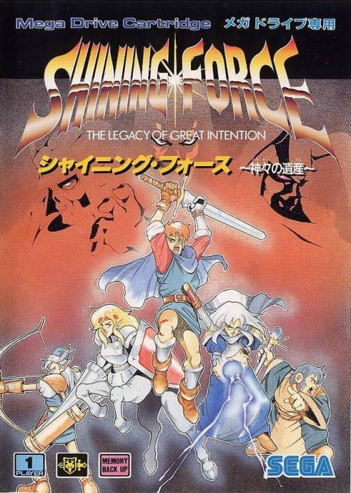
Shining Force: Kamigami no Isan (JP)
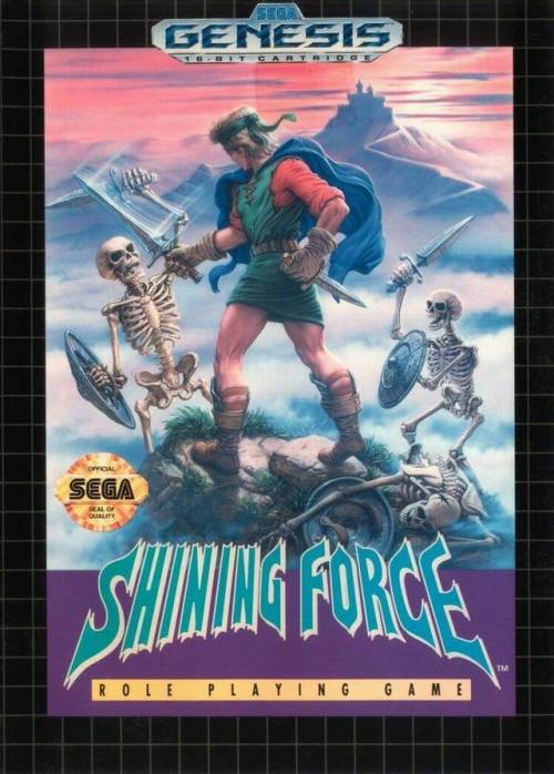
Shining Force (NA)
boxvsbox: Shining Force: Kamigami no Isan VS. Shining Force,...
Shining Force: Kamigami no Isan (JP)
Shining Force (NA)
Shining Force: Kamigami no Isan VS. Shining Force, 1992/93
23 Mar 12:36
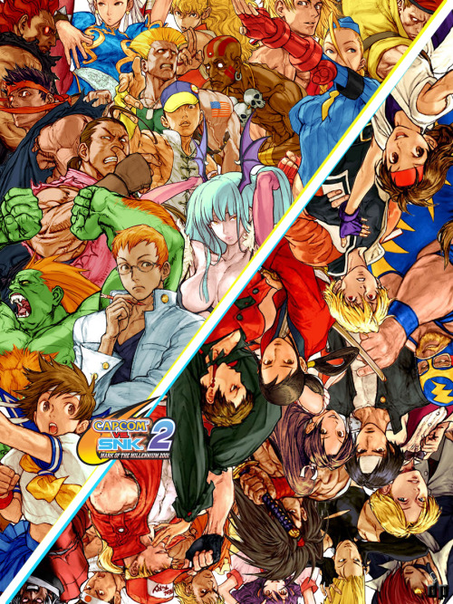
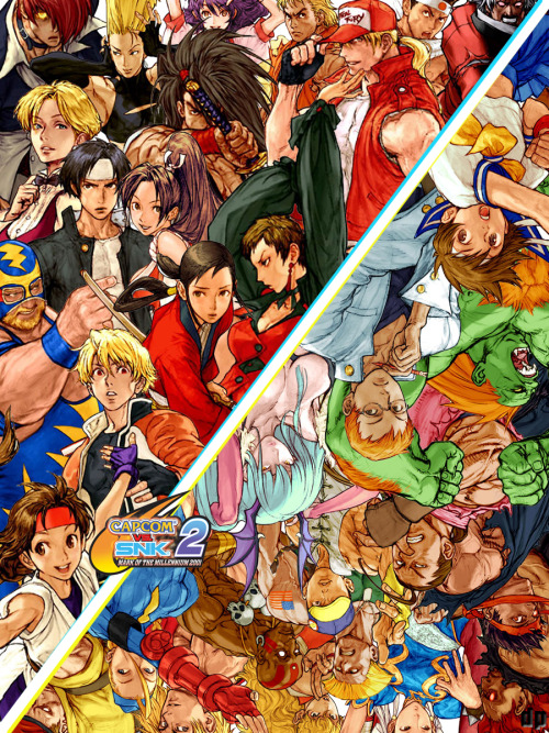
deliberatelypurposefully: THIS IS TRUE LOVE WE’RE MAKIN’ Capcom...
THIS IS TRUE LOVE WE’RE MAKIN’
Capcom vs SNK 2 is coming back! Target release window is towards the end of April (next month!) on PSN. In the mean time do yourself a favor and LISTEN
No more posts. Check out what's trending.