Shared posts
PET DOG TOYS HAPPY TAILS
Deerz
Contributed by Maria Sinutina of St. Petersburg-based Eskimo.
Our rebranding for the online store Deerz. The main range of goods are sweaters and pullovers with Scandinavian patterns. Our task was to create a monochrome logotype with a unique symbol and typography, able to adapt for a wide variety of goods. The project also included the creation of the cloth tags and buttons, etc.
Work began with a search for the graphic style of the logo. Detailed versions didn’t initially meet the task at hand. So the search concentrated on more simple and significant forms. As a result, the symbol is a deer head made of three pairs of stitches. An additional element (a deer hoof) has the same graphic as the main symbol and can be used in different situations.
The packaging is made of micro-corrugated cardboard with a die-cut hoof, through which you can see the goods. The inner part is without glue due to the dovetail partition, and looks like the deer is hugging the sweater. To extract the inner part you just need to pull the “deer” by the tail.
Printing by F61 Work Room.
Paper stock
Labels: Murillo 260gsm paper Brown, Medium Grey and Olive green.
The package box: micro corrugated cardboard.
Inner part: uncoated cardboard.
Credits
Eskimo design studio
Art director: Pavel Emelyanov
Manager: Denis Gluschenko
Photographer: Anatoly Vasiliev
Photo set: Pavel Emelyanov, Maria Sinutina
Deer photo by Ray Hennessy.
—
Eskimo elsewhere on Identity Designed: Monster Milk.
View more identity work on the Eskimo website.
The Chain Reaction Project
The Chain Reaction Project (TCRP) is a non-profit organisation launched in 2009, when four women committed to help change lives in some of the world’s least-developed nations.
“TCRP’s mission is to find a cause, and have an effect and from there, grow their initiative by inspiring others to be catalysts for change as well.”
The brand identity was created in 2012 by Singapore-based Bravo Company, a design studio founded by Edwin Tan and Janice Teo.
It’s an excellent example of how a simple-looking symbol can form part of a much stronger visual identity, and why there’s a lot more value in logos when viewed as part of the bigger picture.
The symbol is based on the Chinese character Rén, meaning “people.”
Bravo created a series of icons with the symbol for their client’s various causes.
The namecard creates its own chain reaction. You can pass it on to three other people.
Bravo Company are on Twitter.
And here’s The Chain Reaction Project website.
Belgian Beer chocolates
The post Belgian Beer chocolates appeared first on Belgian Beer Specialist.
The second mouse gets the cheese?
The previously mentioned johnson banks’ Mouse logo from 2008.
And Noisy Mouse Marketing‘s logo, by ASBO Graphics, 2012.
It’s been taken off the website.
But not before cards were printed and promotion done.
I feel for the client when this happens.
Via thought for the week.
Graphex 2013: logos
I’m judging a couple of categories in this year’s Graphex Awards, the categories for logos and brand identities. The logos are more difficult to vote on because entries tend to be submitted in isolation without any context, but here are a few that stand out.
Sounds Like Architecture
“In 2010, the Royal Architectural Institute of Canada held its national conference in Saskatoon in association with the Saskatchewan Association of Architects. As it was to coincide with the Sasktel Saskatchewan International Jazz Festival, the committee agreed that a corresponding theme could bring a new spirit to the event.”
Designed by Christian Jensen for The Royal Architectural Institute of Canada.
All Canadian Grain
“The design combines kernels of grain in a variety of colours representing the different products offered by All Canadian Grain Inc. Together the kernels form a maple leaf. The colour red was chosen to symbolize Canada. Gold was chosen represent Saskatchewan.”
Designed by Bravo Tango Advertising for All Canadian Grain.
Burnaby Velodrome Club
“Burnaby Velodrome Club is one of only two indoor velodromes in Canada. The stylized b icon is inspired by coloured hardwood strips on the surface of the track.”
Designed by Jonathan Wood for Burnaby Velodrome Club.
Royal Canadian Mint
“Created using circles of different sizes which represent the different denominations that the Royal Canadian Mint strikes. Those circles were used to make up the maple leaf, a strong symbol of this Canadian institution.”
Designed by Cossette for the Royal Canadian Mint.
The Graphex Awards reception will take place in Edmonton, Alberta in May 2014. Read more about Canada’s biennial national design awards over on the Graphex website.
Freaky and Delicious Cake Concepts for Halloween
Blank Slate: A Comprehensive Library of Photographic Templates
I’ve talked before about how showing identity work using Photoshop mockups can really bring an idea to life. So it was interesting to get Blank Slate in the post, courtesy of publisher Gestalten.
You know the idea…
The book is a hardback reference catalogue that might make it a little easier to find the exact “blank slate” you’re looking for. More than 1,000 images are labelled with codes that correspond to the TIFF files on the included DVD.
All images are available on white and on black backgrounds, except for the few in the sadly lacking “environment” section — it’s a shame there isn’t a wider variety here.
I’ve built a decent library of these images, but this is a nice alternative to signing up to a stock photography website, and I’m sure I’ll make use of it at some point soon.
You can get a copy of Blank Slate direct from Gestalten, or here:
on Amazon.com
on Amazon.co.uk
From the archives: Where to find contextual image templates for client presentations.
Aro 27 Bike Café
Contributed by Marina Chevrand of São Paulo-based Serifaria.
At the end of 2012 we were approached by a couple of entrepreneurs who asked us to develop the face of the business they were about to create — a bike café called Aro 27. We developed the logo, menu, icon set, and signage for the new café.
It’s the first place in Brasil with this concept. You can have lunch, buy a bicycle and accessories, chill out at the reading area or terrace, and also park your bicycle and have a shower before going to work.
Before decorating (above) and after (below)
Art direction: Marina Chevrand / Serifaria.
—
View more identity design on the Serifaria website. Follow Serifaria on Twitter.
Book giveaway
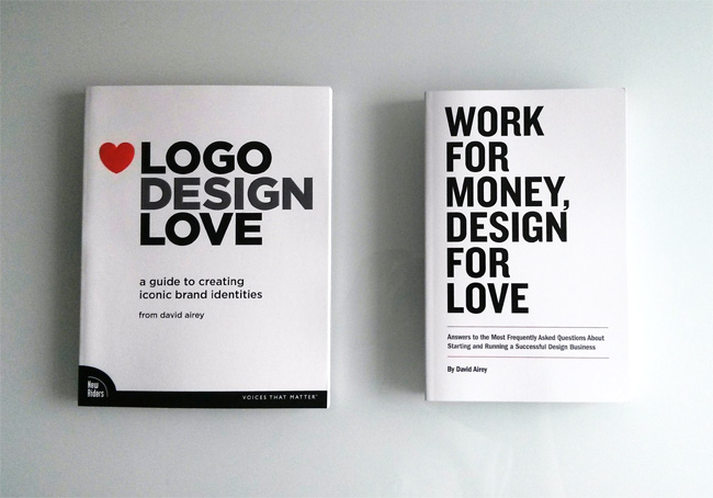
My publisher sent me seven copies of each of my books as well as twenty codes for each title (the codes are for downloading digital copies from the Peachpit website).
I’m giving them to people who subscribe to the mailing list, and I’ll draw names from all subscribers next Wednesday (28th).
I’ll sign and mail copies of both books for seven subscribers. And give codes to download digital copies of both to twenty others.
If that interests you, sign up here.
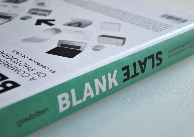
Available to buy here on Amazon.
Thanks so much for all the positive vibes.
—
Update: Wednesday August 28th
All winners have been sent emails.
Receiving the signed copies are:
Chad (cwahlgren)
Jakub (facebooker34)
Josephine (jb4jncr)
Jennifer (pilkintondesign)
Yamini (yami.mthr)
Murray (hutcherson)
Kevin (kevinyeedesign)
Receiving the codes for digital copies are:
Esther (esthermartinezcalvo)
Michelle (m.marechal)
Megan (brohawnm)
Marius (optore-studio)
Sarah (sarah.j.stephens)
Emily (divinemrsem)
Kim (kimsipad)
Sandy (sandy.paton.87)
Kasia (jakatiana)
Leon (baoan0703)
Martin (m.visualprojects)
Casota (skidu.cb)
Ekaterina (katyant.design)
Niall (branddesigns)
Marni (mm)
Su Tong (virtualoffice75)
Nancy (nvdesigns57)
Diego (wolfdiego)
Mary Jo (mjenigma)
Zeynep (zeyneepa)
Apologies to those who weren’t drawn, and thanks again, everyone.
—
O|O Brewing
O|O Brewing is a recently founded micro-brewery built upon a foundation of many years of home brewing. Founded by two beer connoisseurs — O|O aims for quality rather than quantity, brewing high-end beers serving as a suitable alternative to the traditional choice of wine in fine dining contexts.
We designed O|O’s identity and packaging. The logotype was inspired by brewmaster Olle Andersson’s peculiar glasses, his characteristic appearance having become somewhat synonymous with the brand.
With many friends of the brewery being involved in creative disciplines — we designed the labels leaving a defined space serving as a canvas for artist collaborations. With each beer being produced in limited quantities, the labels will serve as a micro-gallery growing over time.
— Lundgren+Lindqvist
The Waen Brewery
Packaging and identity for this “Hellish Good Beer” from Wales was created to stand out amongst the sea of traditional ales on the market.
(via The Dieline)
Great Divide Yeti
This line of imperial stouts are big, bold beasts.
Signs Of Design
OCPD Design Poster by Tes-Ted
This poster is a tribute to all designers obsessed with details.