
Last week I started playing in CSS for my new personal site. I decided to skip the Photoshop/Fireworks/Illustrator part and go from sketches to HTML/CSS. This process helps me to improve my coding skills, especially for rapid prototyping. The first experiment I decided to create was a simple page with just text and texts rotated 45 degrees, heavily inspired in the Swiss Graphic Design Style.
For this post I want to show you a little bit of the creative process behind this experiment. The whole design uses only regular fonts, if you use a MAC you will see the text in Helvetica, while other platforms might render in Arial or Roboto (android).
Also feel free to give feedback or suggestions on how to improve the code.
Step 1
To start, let me show you the basic HTML file. You can see the structure of the document. It might look that there's too many nested DIVs but I did that because I will use that to extend the content of the site in the future. Right now, let's focus on the rotated text.
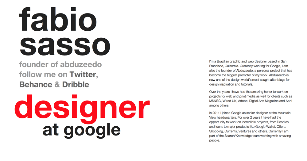
Portfolio
fabio
sasso
designer
at google
I’m a Brazilian graphic and web designer based in San Francisco, California. Currently working for Google, I am also the founder of Abduzeedo, a personal project that has become the biggest promoter of my work. Abduzeedo is now one of the design world’s most sought after blogs for design inspiration and tutorials.
Over the years I have had the amazing honor to work on projects for web and print media as well for clients such as MSNBC, Wired UK, Adobe, Digital Arts Magazine and Abril among others.
In 2011 I joined Google as senior designer at the Mountain View headquarters. For over 2 years I have had the opportunity to work on incredible projects, from Doodles and icons to major products like Google Wallet, Offers, Shopping, Currents, Ventures and others. Currently I am part of the Search/Knowledge team working with amazing people.
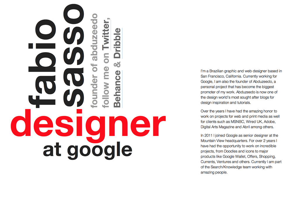
Step 2
Now let's focus on the part of the text that rotates. I used H1 and H2 for the text and put them inside a DIV with a class called "roatedtext"
fabio
sasso
designer
at google
Step 3
First thing to do is to adjust the font sizes using CSS
h1{
font-size: 150px;
line-height: 75%;
margin: 0;
font-weight: bold;
}
.rotatedtext h2{
font-size: 36px;
clear: both;
margin: 0;
padding: 0;
line-height: 130%;
}
Step 4
To rotate the text we will use CSS transformation (transform:rotate(deg)). The first thing to do is to rotate one block 90 degrees. Use transform:rotate(-90deg);. Use negative to change the direction you rotate.
.name{
-webkit-transform:rotate(-90deg);
position: absolute;
left: 90px;
top: 30px;
}
Step 5
Now just rotate the container DIV with the texts. Use 45 degrees to create the perfect Swiss style text.
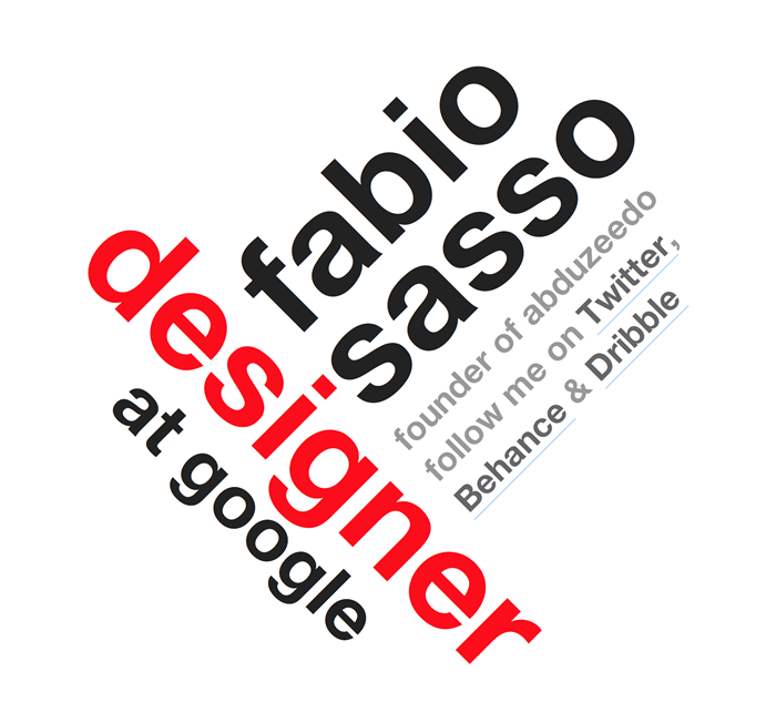
.name{
-webkit-transform:rotate(-90deg);
position: absolute;
left: 90px;
top: 30px;
}
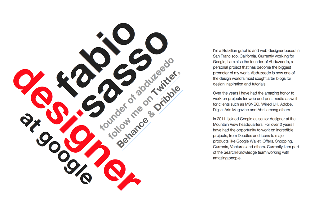
Conclusion
Here's the final CSS I had when I finished this experiment.
DEMO
Tags:
css web design html inspiration tutorial code


