Submitted by: Unknown
qqilihq
Shared posts
26 May 11:54


Conan O’Brien Rages After Seeing New Man of Steel Trailer [Video]
by Geeks are Sexy
It seems that Conan O’Brien has a problem with the fact that Superman has a beard in the latest Man of Steel trailer. Here is his hilarious video response (above,) to which I reply:
[Team Coco | Via The Mary Sue]
26 May 11:47
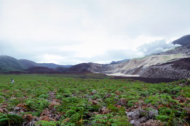
Capturing the beauty and wonder of the Galapagos on Google Maps
by Emily Wood
The Galapagos Islands are some of the most biologically unique ecosystems in the world. Explorers and scientists alike have long studied and marveled at these islands—made famous by Charles Darwin. The Ecuadorean Government, local conservation groups and scientists are working to protect the Galapagos from threats posed by invasive species, climate change and other human impacts.
It’s critical that we share images with the world of this place in order to continue to study and preserve the islands’ unique biodiversity. Today we’re honored to announce, in partnership with Charles Darwin Foundation (CDF) and the Galapagos National Parks Directorate (GNPD), that we’ve collected panoramic imagery of the islands with the Street View Trekker. These stunning images will be available on Google Maps later this year so people around the world can experience this remote archipelago.
Images, like the one you see above, are also an important visual record that the CDF and GNPD will use to study and protect the islands by showing the world how these delicate environments have changed over time.
Our 10-day adventure in the Galapagos was full of hiking, boating and diving around the islands (in hot and humid conditions) to capture 360-degree images of the unique wildlife and geological features of the islands with the Trekker. We captured imagery from 10 locations that were hand-selected by CDF and GNPD. We walked past giant tortoises and blue-footed boobies, navigated through steep trails and lava fields, and picked our way down the crater of an active volcano called Sierra Negra.

A Galapagos giant tortoise crawls along the path near Googler Karin Tuxen-Bettman while she collects imagery with the Street View Trekker in Galapaguera, a tortoise breeding center, which is managed by the Galapagos National Park Service.
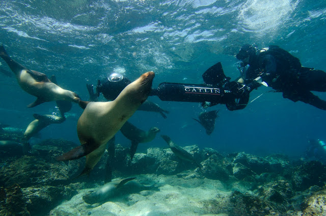
Life underwater in the Galapagos is just as diverse as life on land. We knew our map of the islands wouldn’t be comprehensive without exploring the ocean that surrounds them. So for the second time we teamed up with the folks at the Catlin Seaview Survey to collect underwater panoramic imagery of areas being studied by CDF and GNPD. This imagery will be used by Catlin Seaview Survey to create a visual and scientific baseline record of the marine environment surrounding the islands, allowing for any future changes to be measured and evaluated by scientists around the world.
We truly believe that in order to protect these Galapagos Islands, we must understand them. As they say, “a picture is worth a thousand words.” We hope this Street View imagery not only advances the important scientific research, but also inspires you to learn more about this special place. Stay tuned for updates on this collection—the first time we’ve captured imagery from both land and sea! We can’t wait to share this amazing imagery with you later this year.
Posted by Raleigh Seamster, Project Lead, Google Maps
It’s critical that we share images with the world of this place in order to continue to study and preserve the islands’ unique biodiversity. Today we’re honored to announce, in partnership with Charles Darwin Foundation (CDF) and the Galapagos National Parks Directorate (GNPD), that we’ve collected panoramic imagery of the islands with the Street View Trekker. These stunning images will be available on Google Maps later this year so people around the world can experience this remote archipelago.

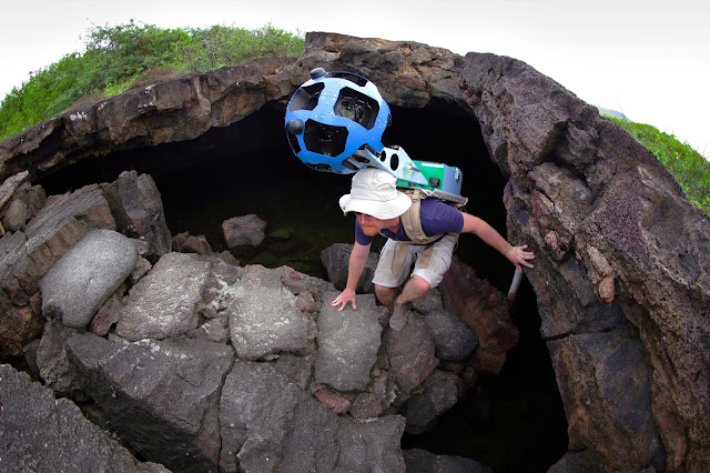
Daniel Orellana of Charles Darwin Foundation crossing a field of ferns to reach Minas de Azufre (naturally-occurring sulfur mines) on the top of Sierra Negra, an active volcano on Isabela Island. The Google Maps team traveled for more than three hours, hiking and on horseback, to reach this remote location.
Images, like the one you see above, are also an important visual record that the CDF and GNPD will use to study and protect the islands by showing the world how these delicate environments have changed over time.

Daniel Orellana of the Charles Darwin Foundation climbs out of a lava tunnel where he was collecting imagery. The dramatic lava landscapes found on Isabela island tell the story of the formation of the Galapagos Islands.
Our 10-day adventure in the Galapagos was full of hiking, boating and diving around the islands (in hot and humid conditions) to capture 360-degree images of the unique wildlife and geological features of the islands with the Trekker. We captured imagery from 10 locations that were hand-selected by CDF and GNPD. We walked past giant tortoises and blue-footed boobies, navigated through steep trails and lava fields, and picked our way down the crater of an active volcano called Sierra Negra.

A Galapagos giant tortoise crawls along the path near Googler Karin Tuxen-Bettman while she collects imagery with the Street View Trekker in Galapaguera, a tortoise breeding center, which is managed by the Galapagos National Park Service.
Life underwater in the Galapagos is just as diverse as life on land. We knew our map of the islands wouldn’t be comprehensive without exploring the ocean that surrounds them. So for the second time we teamed up with the folks at the Catlin Seaview Survey to collect underwater panoramic imagery of areas being studied by CDF and GNPD. This imagery will be used by Catlin Seaview Survey to create a visual and scientific baseline record of the marine environment surrounding the islands, allowing for any future changes to be measured and evaluated by scientists around the world.

Christophe Bailhache navigates the SVII camera through a large group of Sea Lions at Champion Island in Galapagos. Image courtesy of the Catlin Seaview Survey.
Posted by Raleigh Seamster, Project Lead, Google Maps
Cristiano Casagrande, Strasharo and 5 others like this
26 May 11:46


Concept design for a bike-light that projects a grid on the ground, highlighting bumps/holes
by Cory Doctorow
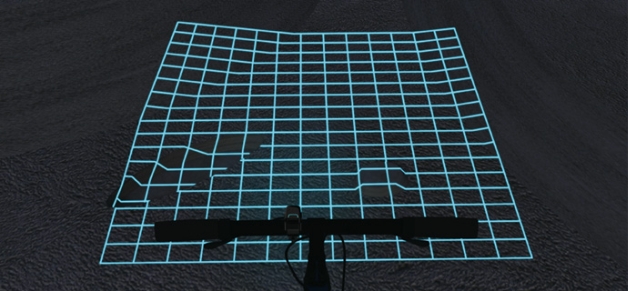
A team from the University of Sichuan won the Red Dot Design award for a concept design called "Lumigrid" -- a bike-light that projects a grid on the ground ahead of the rider, making terrain irregularities easy to spot:
Lumigrids can project a grid onto the ground. On a flat road surface, the grid will consist of standard squares. On a rough road surface, the grids will deform accordingly. By observing the motion and deformation of the grids, the rider can intuitively understand the landforms ahead. In addition, the luminous grids can make it easier for nearby pedestrians and vehicles to notice the bicycle, reducing the likelihood of collision.
Lumigrids can be fixed onto the bicycle’s handlebars. Its power is supplied by either an internal battery or by the rotation of the bicycle’s wheels. It has only one button so that the rider can easily use it while riding. The first press will turn on the power, the second press will change the mode of projection, and holding the button down for two seconds will turn the power off. Lumigrids has three modes with different grid sizes that can be used to adapt to different situations: normal mode (140x180mm), high-speed mode (140x260mm), and team mode (300x200mm)."
    
|
Superboggly, Bwescott.bw and 4 others like this
24 May 18:31
Adobe Typekit improves the Rosario typeface family
by Dave Crossland
Since 2010, Google Fonts been collaborating with the Adobe Typekit team to create better web font technology. And now that many fonts first published by Google Fonts are also available in Adobe Edge Web Fonts, we’re extending that collaboration beyond just software to fonts themselves.
Together with Adobe, we want to improve the quality of open source fonts available to everyone publishing on the web. As a first step, the Typekit team has optimized Rosario, a humanist sans serif based on the classic proportions of Garamond’s type.
To start the process, Typekit reached out to the foundry, Omnibus Type, to request up to date copies of the font source files. Here are some examples of the possible optimizations that the Adobe team might make to a web font:
- Convert and/or clean up outlines, for design fidelity and file size efficiency
- Re-componentize source fonts, for file size efficiency
- Remove/reassign glyphs with incorrect Unicode code points, for semantic value
- Add common missing glyphs (non-breaking space, soft hyphen)
- Set vertical metrics values according to best practices
- Set underline and strike-through values, for design consistency
- Contribute PostScript hints and (if a typeface was designed for small sizes like paragraph text) TrueType instructions (also called hinting), which consist of instructions to the rasterizer embedded in the font file itself
After making some of these improvements, Typekit sent their version back to the foundry to review and release on the Omnibus Type homepage. The updated Rosario family is now available in Typekit, Adobe Edge Web Fonts and Google Fonts.
Together with the Typekit team, we’re looking forward to more quality improvements in the future!
Posted by Dave Crossland, Font Consultant
24 May 12:27
thegrugq: The cloud is a slum. You rent a room for your stuff, but you have to share it with 4 other families. And the hallways are full of criminals.
thegrugq: The cloud is a slum. You rent a room for your stuff, but you have to share it with 4 other families. And the hallways are full of criminals.
23 May 11:28
 "ComputerBild" kooperiert künftig mit Viacom: Die Gaming-Show "Game One" ist ab sofort auch auf dem Online-Portal von "ComputerBild" zu sehen. Darüber hinaus wird die Kooperation auch weitere News und Videos umfassen.
"Game One" gibt's nun auch bei computerbild.de
by krei@dwdl.de (Alexander Krei)
qqilihqwtf lol!
"ComputerBild" kooperiert künftig mit Viacom: Die Gaming-Show "Game One" ist ab sofort auch auf dem Online-Portal von "ComputerBild" zu sehen. Darüber hinaus wird die Kooperation auch weitere News und Videos umfassen.

23 May 11:27
 Nur 42 Stunden nach der Ausstrahlung im amerikanischen Fernsehen wird AXN ab Mitte August die fünfte und zugleich letzte Staffel von "Breaking Bad" zeigen. Zunächst gibt es aber nur die englischsprachige Originalversion zu sehen.
"Breaking Bad": AXN zeigt letzte Staffel ab August
by krei@dwdl.de (Alexander Krei)
qqilihqfyi
Nur 42 Stunden nach der Ausstrahlung im amerikanischen Fernsehen wird AXN ab Mitte August die fünfte und zugleich letzte Staffel von "Breaking Bad" zeigen. Zunächst gibt es aber nur die englischsprachige Originalversion zu sehen.

23 May 10:51
Potato Famine culprit identified from 166-year-old dried leaves
by livius drusus
 An international team of researchers at the Max Planck Institute for Developmental Biology have identified the strain of Phytophthora infestans that caused the Irish Potato Famine of 1845-1852. In the thick of blight, botanists classified it as a mildew-causing fungus of the Botryotinia genus. In the 20th century it was reclassified as Phytophthora but was thought to be a strain called US-1 which is still widespread today. By analyzing dried specimens collected between 1845 and 1896 that have been kept in herbaria at Kew Royal Botanical Gardens in England and the Botanische Staatssammlung Munchen in Germany, researchers were able to find trace amounts of Phytophthora infestans DNA, map its genome and identify a previously unknown strain they’ve named HERB-1. (Full pdf study here.)
“Both herbaria placed a great deal of confidence in our abilities and were very generous in providing the dried plants,” said Marco Thines from the Senckenberg Museum and Goethe University in Frankfurt, one of the co-authors of this study. “The degree of DNA preservation in the herbarium samples really surprised us,” adds Johannes Krause from the University of Tübingen, another co-author. Because of the remarkable DNA quality and quantity in the herbarium samples, the research team could evaluate the entire genome of Phytophthora infestans and its host, the potato, within just a few weeks.
They found that HERB-1 is related to US-1 more than it is to any other modern strain, but it is unique. Phytophthora infestans originated in Toluca Valley, Mexico, among the potatoes that grow wild there. It was already endemic when Europeans arrived in America and brought the potato back, and yet, hundreds of years would pass before any Phytophthora strain made its way across the ocean. Scientists believe the US-1 and HERB-1 strains diverged in the Americas in the early 1800s. The newly individual HERB-1 hitched a ride on a trading ship and landed in Europe in Antwerp, Belgium, in the summer of 1845 before rapidly spreading to the Low Countries and other countries in Western Europe. Then it made the sea voyage to England and, most disastrously, Ireland.
 Ireland was hit the hardest because more than a third of its population was dependent on potatoes as the sole source of nourishment. Irish Catholics were prohibited by law from owning land. Instead, the became tenant farmers who paid rent and worked the property of absentee English or Anglo-Irish landlords producing crops and cattle for export. This was a hand to mouth existence. Potatoes had the most bang for your caloric buck and could grow in the marginal land which was all the tenant farmers had left once the export crops and cattle pastures got the choicest bits.
By the early 1800s, the potato was the sole staple of the Irish farmer. Not only was it their only food, but almost all of the potatoes grown in Ireland were one breed: the Irish Lumper. The profound dependence on the potato coupled with a lack of genetic variety geometrically expanded the impact of the late blight when it arrived. HERB-1, used to the challenges of tough wild varieties, just slaughtered the cultivated potato crop. Author and scientist E.C. Large wrote in his seminal work The Advance of the Fungi that the blight “spread faster than the cholera amongst men.” Over the seven years of the Famine, HERB-1 destroyed crops so thoroughly that the Irish Lumper breed was almost driven to extinction. (It’s back now as an heirloom potato.)
The population of Ireland was more than decimated. In 1845 the population was more than eight million. By 1852, there were only five million people left in Ireland. One million of them died from starvation and the diseases that ravage the hungry. Two million emigrated to the United States, Canada, Australia, New Zealand and other countries. Ireland’s population today at just 4.5 million has yet to recover from the devastation of The Great Hunger.
 HERB-1 may have been defeated by human-directed evolution, namely the breeding of new blight-resistant potato strains in the early 20th century. US-1 is probably the strain that replaced HERB-1. Now that the genome of HERB-1 has been decoded, researchers can see if it really was driven to extinction or if it still exists in secluded pockets somewhere around the world that the genetically resistant potato varieties haven’t reached yet.
This is the first time the genome of a plant pathogen has been decoded from dried samples. It brings new life to musty old specimen collections that aren’t exactly exciting to most museum visitors and have been relegated to storage. Scientists studying the evolution of pathogens, how they develop in concert with human breeding of crops will find a rich new vein to mine in the back rooms of Victorian museums.

22 May 18:03
Buddies Diekmann & Rösler: BILD Dir Deine Meinung!
by Der Namenlose

Das beste Beispiel für journalistische Distanz.
22 May 11:49
The User is Drunk
by Dirk Metzmacher
qqilihqbissel shishi - aber witzig
Mein alter Sandkasten-Kumpel Tim (jetzt Webdesigner, da war sicher etwas im Sand bei uns) hat mich auf dieses Video hingewiesen: The User is Drunk. Ein genialer Ansatz!
22 May 11:45
bukowskigutentag 4/13: Huch, fertig!
by mbukowski
qqilihqFand ich witzig.
Wir hatten es hier und hier angekündigt, und jetzt steht das Roman-Manuskript mit dem Arbeitstitel »Der Sandfloh«.
Schon wieder ein Buch also, fragen Sie sich? Muss das immer sein mit diesen Büchern? Wer soll denn das alles lesen? Na ja, ich zum Beispiel, am 16. Mai bei Read on, my dear in der Z-Bar. Jan-Uwe Fitz und Frederic Valin laden ein und lassen freundlicherweise auch mich mal kurz auf die Bühne.
Das heißt: Sie müssen dort nicht lesen, aber zuhören. Um ein wenig Neugier zu wecken hier schon mal vorab ein paar packende Passagen aus dem Text:
»Es war an einem der ersten warmen Frühlingstage …«
»Vor ein paar Monaten erst, erinnerte er sich, hatte er sie auf einer Party …«
»Guten Tag.« – »Guten Tag.«
»… bestellte er an Ort und Stelle für jeden ein Bier.«
Sie sehen, da ist Zug drinne! Und wie man schon anhand der kurzen Auszüge merkt, geht »Der Sandfloh« auch stilistisch ganz eigene und bisher noch nie beschrittene Wege. Hören Sie selbst: am Donnerstag, 16. Mai um 20 Uhr 30 bei Read on, my dear in der Z-Bar.
P.S.: Autoren, die diesen Beitrag geschrieben haben, haben auch diese Beiträge geschrieben.
22 May 11:00
That moment when you find out all developers know the root password

by Matt
Strasharo and -1 others like this

22 May 06:14
Navy dolphins find rare early torpedo
by livius drusus
qqilihqBeste Überschrift
 Yes, the United States Navy has teams of bottlenose dolphins trained to detect mines, other undersea objects and enemy divers. During training in the Pacific off the coast of San Diego, California, last month, a dolphin named Ten alerted his handlers to the presence of a suspicious object in an area where the trainers hadn’t planted anything. A week later a second dolphin, Spetz, alerted in the same area. He was sent back with a marker to pinpoint the precise location so the object could be retrieved. When the Navy divers recovered it, they found it was a Howell torpedo broken into two pieces.
To train the dolphins, Navy specialists sink objects of various shapes in rocky and sandy undersea areas where visibility is poor. The shapes mimic those of the mines used by U.S. adversaries. [...]
The dolphins have found unexpected things in the past, including a mine-shaped lobster trap during a mission off Canada with the Canadian navy. But a torpedo that was more than a century old and that the divers and trainers needed to consult explosives experts — and Google — to identify?
“We’ve never found anything like this,” said [head of the marine mammal program Mike] Rothe, his voice full of admiration for the marine mammals. “Never.”
The Howell torpedo was the first torpedo to be produced in any quantity by the US Navy. It was invented in 1870 by Navy Lieutenant Commander John A. Howell, head of the Department of Astronomy and Navigation at the U.S. Naval Academy, but development took almost two decades. In 1889, the Navy ordered 50 Howell torpedoes from the Hotchkiss Ordnance Co. of Providence, Rhode Island. Powered by a flywheel that was spun at high speed before launch, the 11-foot-long Howell required no fuel, left no visible wake for the enemy to detect and could be surface-launched from battleships or launched underwater by torpedo tubes. It had a range of 400 yards and could reach a speed of 25 knots. Its flywheel acted as a stabilizing gyroscope to keep it on target.
 It had some marked disadvantages however. It was unwieldy, hard to load and hard to charge. The flywheel had to be spun by massive winches to get it going and once it was finally in the water, the flywheel was so loud it obviated the stealth advantage of wakelessness. In 1892, American manufacturer E. W. Bliss Company secured the rights to producing Whitehead torpedoes. Invented by English inventor Robert Whitehead in 1866, over the next few decades Whitehead torpedoes became established in the Navies of Austria, Britain, France, Germany, Italy, Russia and China. They were more expensive, but they were self-propelled with three-cylinder engines.
For a while, the Navy tested both Howells and Whiteheads side by side (see this 1894 New York Times article about just such a test in Newport, Rhode Island), but by the late 1890s, the Whitehead was the undoubted victor. The Howells never made it past that initial 50 unit order.
Before the kickass trained dolphins did their thing, there was only one known surviving Howell torpedo on display at the Naval Undersea Museum in Keyport, Washington. The discovery of a second one, by dolphin no less, is thus nothing short of epic.
The newly recovered Howell is stamped “USN No. 24″ which puts it right in the middle of the production run. Explosive experts have examined it and found that its century plus in the Pacific has rendered it inert. It’s at a Navy base right now being cleaned and prepared for shipment to the Naval History and Heritage Command in the Washington Navy Yard.
21 May 19:21

Marian

FF Tisa Sans

Euclid


The Harriet Series

OurType Stencils

JAF Bernini Sans

Thema

Rollerscript

Trivia

Fort

Die besten Fonts 2012
by Christoph
qqilihqEndlich wieder sharing!
The best fonts of 2012
Jedes Jahr dasselbe: Eine Unmenge neuer Schriften, und keiner behält den Überblick! Na ja, fast keiner. Viel Spaß mit meiner kleinen Auswahl, wie immer garantiert unsortiert, subjektiv und unabhängig, und jetzt erstmalig bilingual und Retina-ready!
It’s the same every year: So many new fonts, and no one keeps track of them. Okay, nearly no one. Enjoy my little selection, unsorted, subjective and independent as always, bilingual (sort of) and Retina-ready for the first time!
Marian
Paul Barnes [Commercialtype]
Skelett der Schriftgeschichte
Eine Schrift so auf ihr Skelett zu reduzieren, daß nicht nur ihren Linien, sondern auch ihrem Charakter treu geblieben wird, ist eine sehr schwierige Sache. Eine Schrift war Paul Barnes allerdings zu wenig, und so hat er sich gleich die halbe Schriftgeschichte vorgenommen und Skelette der Typen von Austin, Baskerville, Bodoni, Fournier, Fleischmann, Garamont, Granjon & Kiš erstellt, selbstverständlich inklusive aller histrorischen Ligaturen, Alternativzeichen und co. Und wem das nicht reicht, der bekommt noch eine Textur von Hendrik van den Keere als Hairline dazu!
The skeleton of the history of type
Reducing a typeface to its skeleton, in a way that keeps both its shapes and its character, is a darn hard task. Yet one single typeface wasn’t enough for Paul Barnes who did so for half of the history of type, creating skeletons of the typefaces of Austin, Baskerville, Bodoni, Fournier, Fleischmann, Garamont, Granjon & Kiš. Of course none of the historic ligatures, alternates and swashes are missing, and if that still wasn’t amazing enough, he added a hairline blackletter typeface by Hendrik van den Keere too!
FF Tisa Sans
Mitja Miklavčič [FontFont]
Nadellose Eibe
Mitja Miklavčič hat mit seiner FF Tisa (Slovenisch für »Eibe«) eine der interessantesten Serifenschriften der letzten Jahre gestaltet, und die passende Serifenlose wurde mit Spannung erwartet. Mitja ließ sich jedoch nicht aus der Ruhe bringen und nahm sich genug Zeit, um eine eigenständige Partnerin zu entwickeln. Die Betonung liegt auf eigenständig, denn anders als viele Sans-Pendants weiß Tisa Sans durch ihre freundliche, rundliche Formensprache auch (und gerade) alleine zu betören, so auch in den Überschriften auf dieser Website.
Leafless yew
With FF Tisa (Slovenian for “yew”), Mitja Miklavčič created one of last years’ most stunning serif typefaces, which was crying out for a sans serif counterpart from the beginning. Yet Mitja kept calm and took the time that it needed to create an adequate partner. And the result is not just adequate but independent, for unlike most sans serif equivalents, FF Tisa Sans’ friendly shapes know how to charm on its own, like in the headlines of this website.
Euclid
Emmanuel Rey [Swiss Typefaces]
Geometrie jetzt
Euclid ist kein bloßes Revival einer geometrischen Sans aus dem 20. Jahrhundert, sondern eine echtes Kind des noch jungen Jahrtausends. So ließ sich Emmanuel Rey für den üppig ausgestatteten OpenType-Font (neben unzähligen Ligaturen und Alternativzeichen finden sich auch Mediävalziffern und Unicase-Zeichen!) nicht nur eindimensional inspirieren; Einflüsse kommen aus historischen Inschriften genauso wie aus zeitgenössischen Graffiti-Tags.
Und im nächsten Jahr folgen neue Fettegrade, exklusiv hier vorab zu besichtigen!
Today’s geometry
Euclid isn’t a revival of a 20th century geometric sans but a true typeface of today. Emmanuel Rey’s inspirations come from a variety of different sources, such as ancient inscriptions and contemporary graffiti tags. The Bold with all its OpenType madness (countless ligatures, alternates, old style figures, unicase et al) is currently the only available style, but more weights are on the way (see exclusive preview here!).
The Harriet Series
Jackson Cavanaugh [Okay Type]
Server-crashing serifs
Als Jackson Cavanaugh Anfang des Jahres seine neue Schriftfamilie mit einer eigenen Microsite veröffentlichte, dauerte es nicht lange und der Server ging ob des großen Andrangs in die Knie! Und warum das so war, wird nach einem Klick schnell klar: Nicht nur die Microsite, sondern vor allem die darauf perfekt in Szene gesetzte Schrift weiß auf Anhieb zu begeistern: Einflüsse von Baskerville über die Scotch Roman bis hin zu den »modernen« anglo-amerikanischen Spitzfeder-Schriften des frühen 20. Jahrhunderts sind zu spüren, ohne jedoch den eigenen Charakter aus den Augen zu verlieren. Ein breites Spektrum an Strichstärken steht zur Verfügung, sowohl für den Display-Einsatz als auch mit reduziertem Kontrast für den Mengentext.
Server-crashing serifs
When Jackson Cavanaugh released his new typeface in early 2012 with its own microsite, it didn’t take long for the huge traffic to crash his server. And if you have a look at it yourself, you soon understand why: Not only is the microsite amazing but also (and especially) the typeface. Influences reach from Baskerville to Scotch Roman to the “modern” typefaces of the early 20th century, without losing its very own character. Choose from a wide range of styles for both display and body text.
OurType Stencils
Fred Smeijers, Maurice Göldner, Pierre Pané-Farré & Thomas Thiemich [OurType]
Not your usual stencil
Wer bei Schablonenschriften nur an die blockigen Lettern auf Holzkisten, Containern oder Pappkartons dachte, wurde spätestens 2010 von Paul Barnes eines Besseren belehrt. Nun nahm sich Fred Smeijers endlich einem seiner liebsten Themen an und hat zusammen mit den OurType-Designern Maurice Göldner, Pierre Pané-Farré & Thomas Thiemich eine ganze Serie unterschiedlichster Schablonenschriften veröffentlicht, eine aufregender als die andere.
Not your usual stencil
If “stencil” used to make you think of blocky letters on containers, cardboard or wooden boxes, then Paul Barnes already taught you better in 2010 with Dala Floda. Two years later it’s Fred Smeijers who’s on one of his favourite subjects and (together with OurType designers Maurice Göldner, Pierre Pané-Farré & Thomas Thiemich) releases a whole series of extraordinary stencil fonts, one finer than the other.
JAF Bernini Sans
Tim Ahrens [Just Another Foundry]
Aufregend unaufgeregt
Es gibt introvertierte und extravertierte Schriften. Letztere sind diejenigen, die man entweder sofort liebt oder eben haßt, weil sie mit ihren Besonderheiten nicht hinter dem Berg halten. Die introvertierten Schriften sind jene, die gerne auf den ersten Blick übersehen werden, weil sie so unscheinbar wirken, aber je näher man sich mit ihnen beschäftigt, desto faszinierender werden sie. So wie Bernini Sans von Tim Ahrens, bestehend aus der eher maskulinen Bernino Sans (oberer Teil des Schriftmusters) und der feminineren Bernina Sans (unterer Teil) . Im Interview/Portrait auf myfonts.de kommt man langsam, aber sicher zur Erkenntnis, daß Tim das spannende Feld der »pseudo-dynamischen« Serifenlosen à la Frutiger trefflich analysiert und um eine Schriftfamilie ergänzt hat, die schlicht und einfach als ultimativ bezeichnet werden muß.
Thrillingly unexcited
There are introvert and extrovert typefaces. The latter ones are the ones that you immediately fall in love with or hate because their characteristics are visible at first glance. The introvert typefaces are often overlooked, but the closer you look the more fascinating they become. Such as Tim Ahrens’ Berninis, consisting of the more masculine Bernino Sans (upper part of the specimen) and the feminine Bernina Sans (lower part). In myfonts.de’s interview with Tim (in German) you soon notice that he perfectly analysed the Frutigeresque “pseudo-dynamic” sans serif genre to add a typeface that’s simply ultimate.
Thema
Nikola Djurek [Typonine]
Lückenlose Eleganz
Bereits 2008 veröffentlichte Nikola Djurek Typonine Stencil, deren Kombination aus elegantem holländischem Duktus zusammen mit dem für das Genre ungewöhnlichen Schabloneneffekt für Aufsehen sorgte. Und es konnte im Grunde nur eine Frage der Zeit sein, wann er buchstäblich die Lücken schließen und die eleganten Formen ohne die Stege veröffentlichen würde. Das Warten hat nun erstens ein Ende und sich zweitens gelohnt, denn eine derart schnörkellose, anmutige Breitfederschrift hat man bisher selten gesehen!
Gapless elegance
In 2008 Nikola Djurek released Typonine Stencil, whose combination of an elegant Dutch flow and an unusual stencil effect caused a stir. So it was just a question of time for him to literally close the gaps and release the exquisite shapes in an undisturbed way. And it’s been worth the wait, for it’s hard to find a comparable sophisticated broad nib!
Rollerscript
Nick Cooke [G-Type]
Digitaler Tintenroller
Wer mich kennt, weiß, daß ich eine Schwäche für gut gemachte Handschriftenfonts habe, und wer die typografische Realität kennt, weiß, daß es immer noch viel zu wenige gibt. Nick Cooke hat dem Genre mit Olicana bereits einen eleganten Beitrag hinzugefügt und legt jetzt mit Rollerscript lässig nach. Wie der Name schon sagt, basiert die Schrift auf dem schwungvoll geschriebenen Rollerball Pen (»Tintenroller«), und neben ihrem dynamischen Duktus ist es vor allem die smarte OpenType-Technik, die sowohl in der Smooth- als auch in der Rough-Variante durch automatisch integrierte Alternativzeichen und Ligaturen für ein natürliches und lebendiges Schriftbild sorgt.
Digital rollerball pen
If you know me, you know that I have a soft spot for sophisticated handwritten fonts. And if you know the reality, you know that there are still not enough of them. A few years ago, Nick Cooke added the elegant Olicana to the genre, and now he comes up with something casual. As the name implies, it is based on the rollerball pen, and apart from the dynamic flow it’s the smart OpenType technology that cares for a natural and lively hand, both in the Rough and Smooth styles.
Trivia
František Štorm [Štormtype]
Kleines Einmaleins im großen Stil
Neben der Schriftgestaltung scheint František Štorms große Stärke im Understatement zu liegen, denn er verleiht dieser gigantischen Schriftsippe das Prädikat »trivial« und möchte eigentlich nur die drei Ausprägungen einer Schrift verdeutlichen: Sans, Serif und Slab. Das Ergebnis ist jedoch eine (im wahrsten Sinne) Superfamilie, die ihresgleichen sucht: Hier trifft klassizistische Antiqua nicht nur auf Serifenlose und Serifenbetonte, sondern gleich auch noch auf Amerikanische Grotesk. Dazu gibt es noch eine kontrastärmere Variante für den Mengensatz und neben unzähligen OpenType-Features auch Kyrillisch und Griechisch in allen 94 (!) Schriftschnitten. Ganz trivial eben.
A trivial superfamily
František Štorm seems to be not just a great typeface designer, but also a master of understatement by coming up with a name for his gigantic type family like that. Actually, he simply likes to clearly distinguish the three basic latin type categories sans, serif and slab. Therefore he created a superfamily consisting of a Didone with matching sans and slab variants and above all that a four-width Grotesk. Not to forget the low-contrast version of the Didone for body copy, and besides countless OpenType features Cyrillic and Greek support for all of the 94 (!) styles. Trivial!
Fort
Jeremy Mickel [Village/MCKL]
Freundliche Neutralität
Wer wie Jeremy Mickel gleichzeitig Grafikdesigner und Schriftgestalter ist, hat den Vorteil, sich seine passende Schrift einfach selbst gestalten zu können. Im Falle von Fort könnte das Problem gewesen sein, daß Gotham zu rund war und DIN zu streng. Ergebnis: Eine zeitgemäße Grotesk mit leicht gespannten Rundungen; neutral genug, um sich zurückzunehmen wo es nötig ist, gleichzeitig aber mit der gewissen Wärme und Freundlichkeit ausgestattet, um nicht zu unpersönlich rüberzukommen.
Friendly neutrality
Jeremy Mickel’s background as a graphic designer can be quite advantageous as a typeface designer: If existing fonts aren’t quite right, he can draw one himself. In the case of Fort, Gotham might have been too round and DIN too strict. The result is a contemporary sans serif with slightly squared shoulders; neutral enough to stay discreet where necessary, yet warm and friendly to avoid being impersonal.
Honorable Mentions
 Wayfinding Sans
 Heron (Superfamily)
 Dapifer
 Macula
 Edward
 Dulcinea
 Colfax
 Blu
Blu FF Scuba
 Serge
Serge Greta Sans
 Karloff
 Adelle Sans
 Shift
Shift Atlas Grotesk
 FF Videtur
 Marat Sans
 Vinter
 Agmena
 Pitch
Pitch Henriette
 Signalist
 Gira Sans
 Hipster Script
 Trim
Trim Idlewild
 Eskapade (Superfamily)
 Brix Slab
 Solido
 Lust
Lust Kohinoor
 Fakt (Superfamily)
 Ashbury
 Ciutadella
 Flenja
 Tablet Gothic
 Telefon
Andere Best-of-Listen
Ein großes Dankeschön
… wie immer allen Designern und Foundrys für die freundliche Unterstützung!
Many thanks to all designers and foundries for the support!
No more posts. Check out what's trending.