Rachelcurioso
Shared posts
The Real Reason Nintendo Will Never Make A Pokemon MMO

We want it. We have to have it. Our desire for it burns like the heat of a thousand suns, but what would happen if Nintendo did make a Pokemon MMO? Gaming humor site Dorkly may be on to something here. I doubt even Valve's Gabe Newell could save us.

For more sick and twisted video game comedy, follow the link to Dorkly.com.
Nintendo President's Animal Crossing House Is Decorated With His Face
What would you find in Reggie Fils-Aime's bedroom? Well, we can't tell you what's in his real-life bedroom. His Animal Crossing bedroom, however, has bedsheets with his own face on them. Really!
Not only that, but in this video tour, Reggie rolls around in those sheets. It's pretty fantastic, if not a tad ridiculous. Like he always told us, though: his body is ready.

http://fuckyeahdementia.com/post/52719969970
Penalties

Guess which ones are real penalties! Here are more sports cartoons.
#its my time to shine shine


#its my time to shine shine
Can Architecture Make Us More Creative? Part II: Work Environments
Jane Jacobs revered the West Village. It was a bustling neighborhood enlivened by its social, spatial, and functional diversity. It had different building types and functions, which meant that people were always in places for different purposes; it had short blocks, which have the greatest variety of foot traffic. It had plenty of old buildings with low rent which “permit individualized and creative uses;” and, most importantly, it had all different kinds of people. As a result, West Villagers could establish casual and informal relationships with people that they might not have had the opportunity to otherwise.
Without these necessary characteristics, Jacobs felt “there is no public acquaintanceship, no foundation of public trust, no cross-connections with the necessary people – and no practice or ease in applying the most ordinary techniques of city public life at lowly levels.”
By simply changing a few words, it’s not hard to imagine Jacobs’ writing describing offices instead of cities. Buildings are different internal spaces, like individual offices or gathering spaces; desks are homes; sidewalks are hallways or circulation space; etc.
If the office is a small microcosmic city, then suburbia is the cubicle-strewn office, and Google might be the West Village. And ‘people analytics,’ the statistical and spatial analysis of interpersonal interaction, is the office’s urban planning.
To find out what creative work environments can learn from the composition of cities, keep reading after the break…

Google isn’t just a search engine. While it began as one good idea, it grew into a platform for new ideas, a dynamic system of web-based innovation driven by the creativity of its employees.
According to Susan Wojcicki, the Senior Vice President of Advertising at Google, “nurturing a culture that allows for innovation [has been] the key” to Google’s continued success. It is not good enough to have one good idea; a constant flow of new ideas is critical to development.
That’s why Google pays so much attention to the places in which its employees work. By facilitating the interactions between them, the office space is the medium through which ideas come about. If the company itself is a functional platform for innovation, its offices, then, are the physical platform. For it is there, in the office, that the accidental collision of ideas can lead to the significant creation of products (this is what led to Google Translate, the Google Art Project, etc.).

Although the Google office is famous for ping-pong tables and beanbag chairs, its quirkiness and informality are not a gimmick.
If we remember Building 20, researchers cherished the ability to have ownership of their space. If they wanted to change the layout, knock down a wall, or even change the artwork, they just did it. They didn’t have to ask anyone.
In a similar spirit, Google allows its employees to design their own desks or work stations. “Some have standing desks, a few even have attached treadmills so they can walk while working. Employees express themselves by scribbling on walls. The result looks a little chaotic, like some kind of high-tech refugee camp, but Google says that’s how the engineers like it,” explains James Stewart of the New York Times.
Christopher Alexander, in an unpublished, collaborative work with his students titled “Office Patterns,” promotes this concept wholeheartedly:
“At each level of scale, it is those actually using the space who understand best how it can be made/altered to have the character of being conducive to the work, and this group should be given sole control over that space both in the physical definition of the territory and by giving the group power over placement of furniture, purchase of needed items, decorations, etc. Thus an individual has control over his/her workspace; the workgroup has control over the group working area but not over the individual workspaces; the department has control over its space but not over the workgroup spaces, and so on.
Therefore, we suggest using materials and structural systems which invite change and allow changes to accumulate, gradually fine-tuning some areas very closely to the real human needs that exist there.”
Tinkering is so successful because the user usually knows best. The individual knows what desk will be best for him/her, what writing they want on the wall, what chair is most comfortable; the project manager knows what arrangement will be most productive; etc. Allowing for this type of local autonomy promotes interaction with the space and ownership of the office.
This informality, which is ultimately what shocks people about Google’s work environments, is a cornerstone of its design philosophy. Employees should feel free to work independently however they want, but also to interact with one another, about a passing question or a business related problem, without the concern of appearing not to work. For Google, distraction is great, especially when it crosses thresholds.

Google knows that knowledge can only really spill over if there is a surface – like a chalkboard – on which it can land. If two people run into each other in a hallway and spark a conversation that requires technical discussion, or idea generation, or any topic that might benefit from being written down, it is best if they can write it down then and there. Since hallways are not conducive to stopping to write, Google offices are strewn with “every conceivable gathering space, from large open spaces to tiny nooks with whimsical furniture.” Conversations never take place too far from a space to gather.
Their new east coast headquarters in Chelsea poses a potent example of a space intentionally designed to fit this philosophy of creativity. Craig Nevill-Manning, the engineering director in Manhattan and impetus for the new building, explains that the design of the office is consistent with a culture of creative interaction. “Google’s success depends on innovation and collaboration. Everything we did was geared toward making it easy to talk. Being on one floor here removed psychological barriers to interacting, and we’ve tried to preserve that.”

As with constructing a new neighborhood, Google didn’t go about this blindly. They referred to the office equivalent of urban planning: “people analytics.” The field, which is essentially the statistical assessment of interactions between people within the office, informs the organization of an office. Often, the studies look at who is interacting with whom, where those interactions are taking place, and how the organization of space influences them. With this information, businesses can make informed changes to the arrangement of their offices.
How effective is this? Ben Waber, who literally wrote the book on “People Analytics,” strongly believes that “physical space is the biggest lever to encourage collaboration. And the data are clear that the biggest driver of performance in complex industries like software is serendipitous interaction.” That is, generative interactions that happen by accident, but lead to tangible creation. To achieve this, people analytics firms employ strategies such as promoting redundant pathways, where employees interact in both directions.

This tendency of people analytics points to the most important aspect of the office-city comparison: the sidewalk. In Jacob’s model, the sidewalk is the facilitator. It is where people interact, where relationships begin and develop. Basically, it is the locus for all things both communal and informal. To apply this to offices would imply that hallways, or more broadly, the spaces in-between, are the most significant space of the office.
Interstitial space, then, is not simply a placeholder that allows people to move from one functional space to another. It isn’t just there because it needs to be. In fact it is quite the opposite. As the space in which people move without immediate purpose, other than to get where they’re going, it is the heart of informal interaction. It is where people run into one another, where conversations begin, where ideas collide. It is this space that offers the most potential for generating creativity within an office.
It is for this reason that Steve Jobs, when he was CEO of Pixar, put all of the bathrooms in the common space at the center of the office. This forced the employees to walk from their office to the commons and back more often, thereby maximizing their time spent in the hallways, and consequently, their time spent interacting with their colleagues. Other offices attempt to enliven hallways with comfortable nooks and chalkboards to give the expected informal interactions a landing pad.
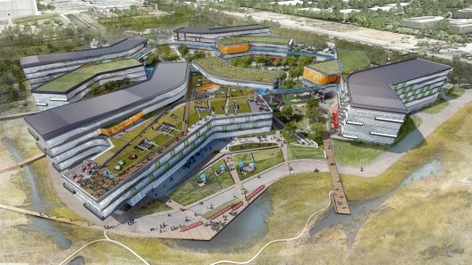
It is interesting to note that those companies dedicated to creativity and collaboration are not designing skyscrapers. They design horizontal, neighborhood-like, campuses that promote movement and interaction, as opposed to isolation and hierarchy. Take Gehry’s design for the new Facebook campus, for example. Even at a glance, the philosophy of informal interaction is apparent. In a vertical office, by contrast, people, departments, levels are literally divided by floor plates. If you work on the 23rd floor, odds are you probably won’t run into someone on the 26th. Even if you’re going to the 27th floor, thanks the elevator, you won’t have to pass the floors before it to get there. Although this allows efficient movement, it dramatically decreases the potential amount of informal interaction between employees.

When those groups are divided instead on a horizontal plane, however, in something like Jacobs’ West Village, they share interstitial space. Their circulation paths intersect, their meanderings collide. Ultimately, this will slow people down. It will take them longer to get from one place to another. But time spent in the in betweens, be it going to the bathroom in Pixar’s common space, or walking across Facebook’s campus for a meeting, means more potential for serendipitous interaction – inefficiency, sure, but functional inefficiency.
If you missed Part I, find it here, and stay tuned for Part III on education environments.
Can Architecture Make Us More Creative? Part II: Work Environments originally appeared on ArchDaily, the most visited architecture website on 10 May 2013.
send to Twitter | Share on Facebook | What do you think about this?
Video: ‘The Competition’ Trailer
Click here to view the embedded video.
Madrid-based architect Angel Borrego Cubero of Office for Strategic Spaces (OSS) has directed and produced the first documentary focused on the tense process that often characterizes an architectural competition. Appropriately titled The Competition, the film captures a fascinating account on how five world renowned architects – Jean Nouvel, Frank Gehry, Dominique Perrault, Zaha Hadid and Norman Foster – “toil, struggle and strategize to beat the competition.” The premise is based on a nearly forgotten, 2008 competition for a new National Museum of Art of Andorra, a small Pyrenees country nestled between Spain and France, which has yet to be realized.
The Competition is expected to debut in late 2013. Updates will be available on OSS’s website and facebook.
Video Credits:
Production by: Office for Strategic Spaces (OSS)
Director and Producer: Angel Borrego Cubero
Technical Director and Editor: Simon Lund
Assistants to Edition: Gaël Urzáiz, Cristina Hortigüela
Funding and Collaborations: Fundación Arte y Derecho, Govern d’Andorra, Lord Culture, Universidad Politécnica de Madrid, Ateliers Jean Nouvel, Dominique Perrault Architecture, Zaha Hadid Architects, Gehry Partners
Video: 'The Competition' Trailer originally appeared on ArchDaily, the most visited architecture website on 26 Apr 2013.
send to Twitter | Share on Facebook | What do you think about this?
The 10 Most Inspirational TED Talks for Architects
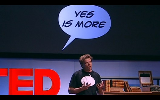
Inspiration is a funny thing: when you need it is nowhere to be seen, and just when you’re not expecting it, it can blindside you in the least convenient of places. Here’s ten inspirational TED talks for architects (in no particular order) from people with broad and unique views on architecture. Some might enlighten, educate or even enrage you – at the very least they should get those creative juices flowing a little better.
Take-in these ten TED talks after the break…
1. Thomas Heatherwick: Building the Seed Cathedral
Click here to view the embedded video.
There’s usually an obvious answer to most problems, and then there’s Thomas Heatherwick’s solution. Heatherwick is an architect who refuses to take the conventional path, instead dreaming up new ways to do things. Here he demonstrates his prowess: showing a folding bridge that curls up and ‘kisses itself’, taking seeds out of small paper packets and constructing a light-filled cathedral for them, or turning apartment buildings upside down and creating a rain-forest between them.
2. Bjarke Ingels: 3 Warp-Speed Architecture Tales
Click here to view the embedded video.
With buildings, it is usually the finished product which grabs the most attention, however, for Bjarke Ingels the story behind the design is more interesting and useful than whatever the final product happens to be. In this vein, he races through his ’3 warp-speed architectural tales’ detailing how his design process mirrors Darwin’s theories, adapting and improvising, cross-breeding and creating mutant off-spring – like a ‘Cambodian-style ruin’ next to his apartment in Copenhagen. Ingels argues that instead of architects creating buildings that revolt against traditions, they can adapt and use their designs to embrace them.
3. Joshua Prince-Ramus: Seattle’s Library and Other Projects
Click here to view the embedded video.
How does a graph become a building? Hyper-rationality, that’s how. In the eyes of REX and OMA New York founder Joshua Prince-Ramus, Hyper-rationality means taking cold, hard, rational thinking and taking it to extreme, almost absurd levels, a process which they used in Seattle’s Central Library, Museum Plaza in Louisville and the Charles Wyly Theater in Dallas.
4. Cameron Sinclair: A Call For Open-Source Architecture
Click here to view the embedded video.
Architecture can tend to be a hierarchy where lead designers develop ideas which gradually trickle down through the ranks. Cameron Sinclair has a different idea. Sinclair is co-founder and CEO (Chief Eternal Optimist) of Architecture for Humanity, a non-profit organization which wants to tap the world’s supply of socially responsible designers to aid in humanitarian situations. Starting with only a laptop and $700, Sinclair is now working towards creating a globally accessible network of collaborative, open-source design, where thousands of people from thousands of specialities can all contribute, creating fast and free innovation to help the lives of those who really need it.
5. Magnus Larsson: Turning Sand-Dunes Into Architecture
Click here to view the embedded video.
Desertification is gobbling up agricultural land in Africa at a rate of 600m a year, and while it might not seem like the most sane or practical idea to build a 6,000 km long wall stretching across the continent, Larsson thinks he can do it with nothing more than bacteria and sand. His vision is to create a wall which would be supplied, designed and built mostly by nature itself, creating green spaces and providing a place for people to live.
6. Julian Treasure: Why Architects Need To Use Their Ears
Click here to view the embedded video.
Julian Treasure wants to know: ‘Do architects have ears?’ Most of us communicate primarily through sound, which is hugely dependent on our environment, yet architects tend to exclusively fetishize the visible, almost entirely neglecting the other senses. Treasure explains why architects need to find a pair of ears and use them – in some cases it could be a matter of life and death.
7. Liz Diller: A Giant Bubble For Debate
Click here to view the embedded video.
The National Mall is possibly the most significant public space in the U.S. The famous stretch has long played host to huge demonstrations of public discourse and dissent. Despite this, the space is hemmed in on either side by a string of stony cold buildings, none so hulking and introverted than the Hirshhorn. A concrete doughnut, it has been unflatteringly described as corporate, arrogant, and ‘neo-penitentiary modern’. Diller Scofidio + Renfro plan on transforming this introverted hulk into a bright open public forum to reflect the spirit of the mall. How do they intend on doing this? An air-bubble. Liz Diller of DS+R explains…
8. Frank Gehry as a Young Rebel
Click here to view the embedded video.
For many, when they think of Frank Gehry, they think of the typical Starchitect. When this talk was recorded back in 1990, the Walt Disney Concert Hall was just a series of haphazard models and the Guggenheim Bilbao was just a twinkle in his eye. Modest, witty and surprisingly honest, Gehry wants to prove that he does straight-stuff, logical and relating to what’s going on. A man who views architecture as a pure form of sculpture, he tells surreal stories about smutty-comic books, accidentally winning a competition via a drunk napkin-sketch of a fish, and dressing up as a postmodernist skyscraper.
9. Daniel Libeskind: 17 Words of Architectural Inspiration
Click here to view the embedded video.
It is fair to say that Daniel Libeskind is one of the most prolific and controversial architects currently practicing. His firm wins some of the globe’s biggest commissions; his style is loved by some and frequently lambasted by critics. Here Libeskind lets us into his unusual world, excitedly racing thorough seventeen words which form the basis of his mantra on architecture. He explains why he has shunned ‘the well mannered box’, instead playing fast and loose with the established rules of architecture, to create something which he sees as emotive, human and heartfelt.
10. David Byrne: How Architecture Helped Music Evolve
Click here to view the embedded video.
And finally, for a bit of a reprieve from architects talking about architecture, we have a musician talking about architecture. If anyone was ever in doubt about the transformative power of architecture upon all things great and small, here is Talking Head’s front man, David Byrne describing the intermeshed history of architecture and music.
He travels all the way from Gothic Cathedrals and Wagner-designed music theaters, to 20th century grunge clubs and discotheques, and finally the advent of gargantuan in-car speakers and the mighty mp3 player. Byrne describes how architecture has continually shaped and tweaked the evolution of music.
If there’s any fantastic talks for architects which you think this piece has missed, please share them in the comments below!
The 10 Most Inspirational TED Talks for Architects originally appeared on ArchDaily, the most visited architecture website on 26 Apr 2013.
send to Twitter | Share on Facebook | What do you think about this?
Why people hate Electronic Arts
RachelcuriosoJá detestava a EA sabendo só 10% dos podres. Agora, não compro mais nada!
It wasn't much of a surprise when Electronic Arts was recently voted the Worst Company in America by readers of Consumerist for the second year in a row. Though the game publisher's sins are arguably less substantial than those of their competition, nerds have soundly declared that borked SimCity servers are officially worse than the predatory housing loan tactics responsible for the current financial crisis.
Regardless of whether you agree with EA's win, it's obvious that gamers really dislike this software giant. Let's take a look at the reasons why.

Eyescream

I scream. You scream. We all scream for ....eyescream? A self service shop in Barcelona selling little monster bowls of Taiwanese shaved ice cream. From product design to branding, graphics and packaging all the way to interior design Estudio m Barcelona has taken what is normally an amorphous mass of sweet goop and introduced a fun taste and visual feast to the passing customers. How cool (pun intended) are those ice cream monsters with their sugar eyes?


the "befores"
DLC Filosofal: O que aprender com a nova Lara Croft?

Here's A Ton Of New Concept Art For Destiny, Bungie's Next Big Game
Rachelcuriosoe de pensar que em 1998 eu olhava o concept de FF8 e pensava "não da pra ficar mais realista que isso"

During Bungie's GDC panel earlier today, which was all about world-building, was this bucketload full of concept art, most of it unseen until today.
Update - Here's some video from the event as well, an animation showing off how characters went from the drawing board to the game.
The images you'll see cover all aspects of the game's pre-production, from designing worlds to characters to enemies to individual locations.
Some of it has been cut, some of it will look different when the game is actually released. But all of it looks absolutely fantastic.
To see the images at full-size, click the "expand" icon in the bottom-right of each one.


Change of Schedule

More productivity.
