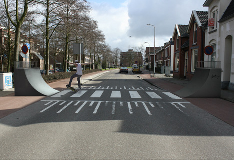
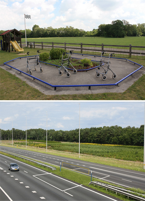
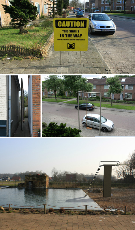
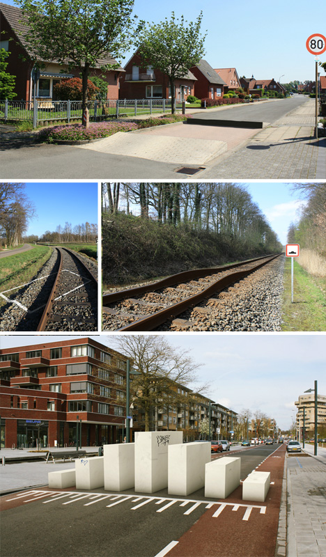
It would be entirely right and wrong at the same time to call this body of work realistic. On the one hand, the results look like pictures (which form the basis of these manipulations) – on the other hand, while not impossible, the reality they present is dramatically improbable.
This series by Robert Rickhoff is titled Out of Place and features all kinds of ordinary spaces and situations, from swing sets, crosswalks and roundabouts to railroad tracks, swimming pools and public bathrooms.
Yet in (almost) each case, there is something not quite right … or drastically wrong. It takes a little while to notice in each case, though, until you get the hang of it and start looking for the odd-man-out element right away.
Still, it is fun to imagine what would happen to people taking a speed-bump ramp, or encountering a raised crosswalk – certainly a surreal experience in reality, and at least something to trigger the urban imagination in photographic form.
A very wise man, Homer Simpson, once described alcohol as “the cause of, and solution to, all of life’s problems.” While this may not necessarily be true for all problems, fifty years ago it seemed that beer was going to play a part in solving a housing shortage on the Caribbean island of Curaçao, thanks to a bizzare, yet socially conscious, piece of design.
Check it out after the break…
Upon visiting Curaçao during a world tour of his factories in 1960, brewing magnate Alfred Heineken was struck by two things: the beaches were littered with beer bottles – many bearing his name – and there was a shortage of affordable building materials, which meant the lower-classes were consigned to poor quality housing.
In a stroke of either genius or madness, Heineken realized that both problems would be solved if people could build their houses with his beer bottles. Intent on realizing his vision, he enlisted Dutch architect N. John Habraken to design a glass brick that he could also sell beer in.
While Habraken’s first few attempts were dismissed for either being too costly and difficult to produce or not pretty enough to sell beer in, he eventually settled on the design known as the Heineken WOBO (World Bottle) - a piece of emerald green glassware tailor made to serve as both a beer bottle and a building material.
In 1963, the brewery produced a test run of 100,000 bottles. The design was, of course, first and foremost a functioning beer bottle, but when emptied and laid on its side, it became a self-aligning, interlocking, glass brick. Habraken’s design allowed the neck of one bottle to be fitted into the base of the next, while the sides were lined with rows of small bumps that made it easier for both people and mortar to grip them. With this design, a basic 10 by10 foot hut could be built using one-thousand bricks. To overcome the problem of creating corners and openings without having to modify the bottles, they were designed in two sizes: a 500mm version and a 350mm ‘half-brick’.
The WOBO was not without its problems; while normal glass bottles can take up to 50kg standing on end, these ones were laid horizontally, which required thicker glass. In addition, their square physique made them prone to chipping in transit and during construction, and there was no way to join two bottles if they happened to meet end to end.
Despite its shortcomings, the concept was revolutionary; as author and architecture critic Martin Pawley describes, it was “the first mass production container ever designed from the outset for secondary use as a building component”. Heineken was so insistant that they be used as bricks that he planned on printing building instructions on the side each bottle. Habraken even suggested shipping the bottles on special plastic pallets which could be reused as roofing.
However, despite Heineken’s optimism, the brewery’s marketing department was less than impressed. Worried the company would be held liable if a house were to collapse, not to mention and the consequences of relating their premium brand with poverty, the company consistently rejected plans to fully adopt the design.
The idea unfortunately fell from the spotlight and, despite a brief resurgence of interest in the 1970′s, only two of structures were ever built: a small glass hut and a shed – both of which were retrofitted with WOBO walls located on the Heineken estate in Noordwijk near Amsterdam. The bottles themselves are few and far-between today, and instead of being the mass affordable building material they were intended to be, they have become rare collectors items.
What does it take to design a bestseller for the MoMA Store? Industrial designer Lawrence Chu knocked one out of the park with his Tuck storage box, designed for Umbra back in '09 and subsequently picked up by MoMA scouts. The scale of the photos might be deceptive; the bamboo box is roughly 5" x 5" x 5" and rings up at $35, making it a popular gift.
Where is Chu now? After departing Umbra to set up his own shop, Chu—a Hong-Kong-born native Chinese speaker educated in Canada—jumped on an opportunity. He's now helping American home appliance company Bissell expand far beyond their Grand Rapids, Michigan home base, by setting up their China-based industrial design branch in Shenzhen.
Specifically, Minuum improves on the concept of a linear arrangement of letters: screen-based UI and predictive text allows for a QWERTY layout to be transposed into a single line of letters. (It's worth noting that index typewriters were initially developed as a less expensive, more portable alternative to keyboard-based typewriters, though they were reportedly slower than handwriting in most instances.)
Minuum is a tiny, one-dimensional keyboard that frees up screen space while allowing fast, accurate typing. Current technology assumes that sticking a full typewriter into a touchscreen device is the best way to enter text, giving us keyboards that are error-prone and cover up half the usable screen space (or more) on most smartphones and tablets.
Minuum, on the other hand, eliminates the visual clutter of archaic mobile keyboards by adapting the keyboard to a single dimension. What enables this minimalism is our specialized auto-correction algorithm that allows highly imprecise typing. This algorithm interprets in real time the difference between what you type and what you mean, getting it right even if you miss every single letter.
The video is, as they say, a must-see:
Yes, the last bit is cool, but nota bene: it's currently an alpha-stage prototype, and Will Walmsley & co. are currently seeking funding on IndieGoGo. Suffice it to say that we'll be keeping an eye on this one... if all of the hypothetical wearable implementations become a reality, we could see the emergence of a new set of curious rituals.
Spatii es una empresa que se encarga de entregar soluciones completas de alta gama al mercado residencial, comercial e inmobiliario en Puertas de Closet, Divisiones de Ambiente y Sistemas de Organización Modular.
En esta oportunidad Spatii nos presenta sus soluciones para proyectos de cocina, el cual los desarrolla en forma completa e integral utilizando tres líneas de productos especialmente diseñadas para este espacio: Puertas Lacerta para muebles despensas, Puertas Géminis para muebles murales, Cajones y accesorios Grass para muebles base.
En forma paralela Spatii en asociación con Rojo y Negro y Kitchen Center desarrolla proyectos completos de cocina con los mejores materiales, terminaciones y artefactos de su categoría.
PUERTA LACERTA
Sistema de corredera de apertura tipo coplanar donde las puertas se desplazan en un mismo plano y cerradas simula un muro parejo que se adapta a diferentes contextos otorgando disponibilidad y fácil acceso al interior.
Cada puerta soporta una capacidad de carga de 50 kg por hoja, permitiendo un ancho de puerta entre 0.8 y 1.5 m. Está diseñada para aplicaciones en madera o aluminio / vidrio y considera tirador embutido.
Es una solución corredera diseñada para la aplicación en muebles de cocina murales. Se utilizan puertas entre 0.8 y 1.1 m de ancho, en espesores que van entre los 18 y 30mm ya sean puertas de madera sólida o con bastidor de aluminio con sustratos en 4 o 6 mm de espesor como lamitech, 3-form, lacados y vidrio.
Permite una carga máxima de 20 kg por puerta e incorpora tirador embutido para facilitar su apertura de forma coplanar.
Puerta Géminis con marco de aluminio (abierta)
Puerta Géminis en madera sólida (abierta)
Detalles
FRENTES DE CAJÓN Y SISTEMA CORREDERA
Spatii tiene la representación en Chile de G*GRASS, marca austriaca líderes en sistemas de correr para muebles de cocina. Sus productos de alta gama cumplen con las competencias de tecnología y calidad certificando su eficiencia a largo plazo.
Spatii implementó como solución para muebles de cocina bajos esta línea de cajones que entregan la mezcla perfecta. Se complementan herrajes G*GRASS con frentes en madera sólida o con marco de aluminio utilizando cristales templados, laminados, chapas, lamitech, y 3-form en variados colores y diseños.
Los herrajes G*GRASS ofrecen variadas alternativas y combinaciones en sus productos: cajones con sistema con Soft Close (cierre suave) o con apertura tipo Push (no requiere tirador). Laterales tipo cajón, cesta y cesta/ acrílico, además de variados accesorios para su interior. Cada combinación dependerá exclusivamente de su función y uso.
Cajón Spatii con sistema soft close y frente de aluminio / vidrio
Cajón con sistema Push y frente de aluminio /vidrio
If you were hoping to pick up a cat-skin rug for your mancave through the Kiwi auction site Trade Me, it seems you're out of luck. The last one has just been sold to the highest bidder for NZ$955 (~USD$800). More »
Swiss artist Felice Varini creates large scale anamorphic illusion paintings in which geometric shapes and patterns are visible from only one vantage point. He began creating the works in 1979, starting with small paintings and relatively simple shapes. More recent works have covered entire rooms, buildings, and even a small town in the Swiss alps. To create the paintings, Varini first projects his designs over the space he wishes to paint. He then traces the projected image and begins painting. The finished painting can be viewed from the spot where he originally placed the projector.
News: concrete made with unprocessed sea sand has been found in at least 15 buildings under construction in Shenzhen – including what will be China's tallest building when completed – putting them at risk of collapse. (more...)
We vaccinate children against a handful of illnesses at an early age, but now evidence shows that these vaccines seem to wear off after a number of years. If you want to avoid something awful like whooping cough, you should speak with your doctor about getting vaccinated again. More »
Now that Google Reader is slowly making its way down that old dusty trail, alternative services have started cropping up begging for your traffic and your feed-reading clicks. We'll all miss Google Reader, but when we asked you last week what your best alternatives to the service were, you responded with more nominees than we could possibly feature. We highlighted the top five in the five best Google Reader alternatives, and then put them to an all-out vote to determine the Lifehacker community favorite. Now we're back to highlight the winner. More »
Perhaps the advocates of human enhancement have it all wrong. Maybe we'd all be happier and considerably more content if we were stupider. The answer to our woes, it would seem, might come in the form of a pill that permanently lowers our IQ.
Igor Morski is a Polish illustrator & graphic artist with quite a style. I love surreal style artwork and nn this post you will see some pieces from his Nature collection and also his portrait collection. His work is very detailed and very intriguing like most of surreal work, but his art looks so real it's almost like a magical photograph.
Google has announced the release of Google Keep, a note-taking web and Android app that quickly captures what’s on your mind, stores it in the cloud (specifically Google Drive), and then syncs the information to all your devices. It can keep “track of your thoughts” with notes (audio ones too), lists (which can be color-coded) and photos. It is available to download for Android 4.0, Ice Cream Sandwich and higher devices at Google Play and can be accessed online at the Google Keep site.
Save what’s on your mind and remember anything you need wherever you are. With Google Keep, stay on top of your world by quickly accessing and organizing the information you want. Enter a note with your voice, add a photo, or just type a list. All your notes are instantly saved across your devices.
It was impossible to walk into OXO's booth at the 2013 International Home + Housewares Show without a swift recollection of a certain recent incident that might henceforth be known as a 'dustpan dustup.' The New York-based company hasn't missed a beat since they took the high road with their response, and their stalwart team of designers and engineers has remained focused on innovation and iteration in product development, exemplified by the new wares on display at McCormick Place.
The latest generation of salad spinners, for example, have flat tops for easier storage; the smaller model was introduced for the Japanese market
We had the chance to talk to a couple of their Category Managers, who kindly demoed the new Cookie Press, for which they 3D-printed numerous prototype disks before arriving at the final dozen, and the Mouthwash Dispenser, which will be available soon.
Regarding their stance on intellectual property, our Twitter followers might have noticed that OXO recently hosted an IP Primer at their NYC HQ; the full presentation is available online as a PDF here.
They should fix their freaking bugs first, I can't seem to unfollow boards, I still see pins from people I am not even following anymore.
Pinterest will be rolling out a newly revamped design to all of its users starting today. The new design was well received by a small sample group that had tested it back in January. The new design will help improve user experience by making things more “simpler and cleaner”. Now users will be able to browse through pins, plan their fantasy weddings, design their fantasy homes, and crave their fantasy meals much more quickly and easily.
One of the changes include increasing the size of pins. This will help users see “more of what you love”. Pinterest has also made it so that when you’re browsing through pins, and find yourself buried deep into your search, you can hit the “back” button on your browser and it will land you all the way back to where you were before you started browsing. Sometimes you get lost in what your doing, and Pinterest understands.
Another major change is the amount of information you see when you click on a pin. Not only will you see a larger, more close-up shot of a pin, you will also see pins on the same board as the original image, as well as more pins from the website the original pin came from. You will also be able to see what other pins the user has pinned on their boards, a feature that will make its way to mobile devices soon. This will allow you to spend more times discovering the things you like.
Overall, the user experience for Pinterest will see a great, new change after this. The site has also stated that they have “rebuilt their foundation”, so Pinterest should be much more stable and reliable. Pinterest encourages users who have any feedback to leave a message on their blog post. You should be updated to the new design shortly, and once you do, you can resume craving that ridiculously delicious-looking cupcake while that motivational workout pin makes you feel guilty.
While adults might be able to save themselves from a sad, sedentary fate -- by switching to standing desks, by buying cushy ergonomic chairs, by getting up and walking around every once in a while -- there's a large segment of the population that has even less control than the rest of us over daily sitting habits: kids. And that's largely because we force our mini-humans to sit, day in and day out, at school.
So the industrial designer Simon Dennehy has set his sights on creating an ergonomic chair that is targeted to the classroom setting. The device, nicknamed "Ray," is a stripped-down seat -- essentially, a wheeled stool with a back brace. And it makes sitting a little healthier for the sitter, Dennehy claims, by ensuring that core muscles stay engaged ... even while the owners of those muscles are made to sit, relatively motionless, during class.
Perch
The chair works by making sitting a slightly more active experience. ("Ray" gets its name from the cartilaginous fish, whose wings are mimicked by the chair's flat, flexible seat.) It encourages kids to "self support," Fast Company notes, by engaging kids' feet and core muscles constantly throughout the day. Ray's seat is the key to all that: Since it's flexible, much like the surface of a balance ball, it forces the sitter to keep shifting his or her position even while sitting. This not only allows for constant mini-movements; it also, Dennehy claims, neutralizes the spine by tilting the pelvis downward. And that in turn avoids the "right angle" sitting position that medical experts blame for so much of sitting's health dangers.
The chair is part of a more comprehensive ergonomic technology that includes a desk that resembles a drafting table: It tilts up and down, rather than at a sharp 90-degree angle. That's meant to mitigate, Dennehy says, the hunching -- and thus the spinal misalignment -- that can come with traditional work surfaces.
Perch
Ray, in its simple, plastic, IKEA-esque glory, is currently gaining traction where you'd expect it to: Scandinavia. And also Germany. And also the U.K., where Dennehy's company, Perch, is currently offering a mid-range version of the chair that's cheaper than the original. So could Ray make its way into U.S. classrooms? It's hard to see already cash-strapped administrators making the investment -- though with the new emphasis on making schools healthier places for kids, the idea of ergonomic classrooms could gain more traction now than it might have a few years ago. And what's especially clever about Ray, Fast Company points out, is that it doesn't require the hydraulics usually involved in other dynamic seating systems -- which means that making cheaper versions of Ray is easier than it might be for other chairs.
Plus, the more we discover about the health effects of industrialized sitting, the more urgent it becomes to develop newer, better ways to take a seat. That's particularly true for children, whose bodies are still growing, and whose habits are still forming. Kids tend to get stuck with the same uncomfortable, plastic chairs that schools have been using for decades. And that is both unfortunate and fixable. "We could have designed an office chair with all the bells and whistles," Dennehy notes. "But when you strip a chair down to its basic parts, as you do with school furniture, functionality and ergonomics become essential. We think it's important to target that market."
Speaking of copper and zinc, those two metals can be combined to create brass. And the copper is kind enough to pass on its antimicrobial properties to the resultant alloy, effectively rendering it a passive disinfectant. That's why some hospitals have begun using copper-based alloys in their lightswitch covers and IV poles, things people touch all the time, in a bid to reduce the spread of viruses.
Brooklyn-based Karl Zahn is the latest designer to create a pen for Acme Studios, and he's chosen to go with an all-brass construction for their new Hatch pen. Healthcare professionals all have to use pens, and they might as well use one that actually kills germs.
As for us civilians, well, let's say you're at the Post Office sending a package, and you brought your own Bic because you don't like touching the germy one chained to the counter. That's always when some grizzled, coughing drifter next to you asks "Hey can I borrow your pen for a sec?" Option #1 is to be a jerk and say no; option #2 is to say "Sure—keep it" and walk away; and now you've got option #3, snag a Hatch. While it's true that brass can take one to two hours to kill bacteria, I'd lend the drifter my pen, then pull my pocket open and instruct him to place it back inside afterwards without touching me.
Seriously though, Zahn has made an interesting design choice that I dig: You can find other brass pens on the market, but as the Wall Street Journal reports, those pens are heavily coated with lacquer to stay shiny. Zahn spec'd out a thinner coat with a purposefully shorter lifespan. The Hatch's finish will therefore wear over time, sacrificing its shininess to let the exposed brass do its work. I like things designed to wear, and function over appearance gets my vote every time.
[Editor's Note: We saw Zahn's work as recently as the Housewares Show at the beginning of the month—he recently designed a utensil set for Teroforma—and he was one of a couple designers who exhibited at both our OPEN exhibition and 12×12 at New York Design Week last year.]
This diagrammatic analysis of the open and closed systems of patterns in the geometries of 20th-century architectures demonstrates the importance of the various roles of patterns for innovation in this field. Tomado de: AD Patterns of Architecture. Architectural Design 73, November/December 2009. Editor Invitado: Mark García.
(Nótese la proporción de las décadas del 50 y 60 con respecto al resto del siglo) Seleccionado por el arq. Martín Lisnovsky
The impending death of Google Reader has sparked much wailing and gnashing of teeth, petition-signing, alternative-seeking, and rending of garments. But what about the people who made RSS? Dave Winer, one of the fathers of the both RSS and the blog, couldn't give less of a shit. More »
In 1896, chemist Arthur Eichengrün brought forth a miracle—a pure acetylsalicylic acid with medical applications. This was a few years before Lizzie Magie invented the board game Monopoly, and if only the two knew each other, they might have had a lot to talk about. Just as Parker Brothers stole Monopoly from Magie and whitewashed her from history, so to did Bayer make Eichengrün an unperson and cash in on his invention: the aspirin.


 ..
.. 
 ..
..


 The
The  The latest generation of


![[optional image description]](http://cdn.theatlantic.com/static/mt/assets/science/ray_room.jpg) Perch
Perch ![[optional image description]](http://cdn.theatlantic.com/static/mt/assets/science/assets_c/2013/03/ray_erg-thumb-570x590-116228.jpg) Perch
Perch ![[optional image description]](http://cdn.theatlantic.com/static/mt/assets/science/assets_c/2013/03/raytable-thumb-570x327-116220.jpg) Perch
Perch