

 It goes without saying that most rich folks have a bit of money to throw around on their hobbies—that $1.9 million teddy bear collection isn't going to amass itself. But sometimes friendships can get in the way of a good thing: billionaire Henry Kravis and multi-millionaire Donald Bryant jointly purchased three Jasper Johns paintings, called "Tantric Detail I-III," five years ago. But Kravis has now sued Bryant for trying to back out of their arrangement—all because Bryant allegedly doesn't want the paintings to go to MoMA after they both die. [ more › ]


Macmillan, one of the "Big Six" publishers, will start selling ebooks to libraries in the next few months. In a statement, the company detailed a pilot program that would distribute 1,200 backlisted titles from the Minotaur crime fiction imprint, the first time it's offered a library program. Like most other big publishers, though, the ebooks will come with restrictions: only one user at a time can check them out, and each copy will only last for 52 checkouts or two years, whichever comes first. As tight as that leash seems compared to physical books, it's still better than Penguin's one-year limit or the 26-checkout cap imposed by HarperCollins back in 2011. Library Journal reports that each title will sell for $25 a copy, not terribly...

Well, that didn't last long. Gmail's handy new Quote Selected Text has received a serious demotion, getting knocked back down to Labs, due to negative user feedback. According to its creators, the addition was causing too much accidental quotation -- and no one wants that, right? If you find yourself missing the feature, you can still enable it with a little help from Labs. No word on plans to move the feature back up to the bigs.
Filed under: Google
Source: Google+
Ramsey Nasser hat eine Programmiersprache namens قلب (‘Alb) in arabischer Kaligraphie programmiert, dazu musste er sämtliche Tools (Terminal, Texteditor) neu aufsetzen. Animal NY hat ein kleines Interview mit dem Mann, rumspielen kann man damit hier. Finde ich extrem spannend, auch wenn sich das alles erst im experimentellen Entwicklungsstadium befindet.
“قلب, as far as I know, is the first programming language that’s also a conceptual art piece,” says Ramsey Nasser, computer scientist and a fellow at New York’s Eyebeam Art+Technology Center. He can’t read the Russian hacker forums or the Chinese Twitter accounts buzzing about قلب (“alb”, “heart”), but he shows us how his terminal can understand Arabic calligraphy. It’s novel. It’s crucial. It’s incredibly exciting.
[…] programming seems to hate Arabic-speakers. Tools fall apart reading Arabic. Interfaces break. Terminals crash. Text readers don’t know what to do with it. “Practically speaking, it’s more sensible to just learn English in order to learn code. That shocked me,” says Nasser. “I believe that code and computation should be something anyone can access.”
And so, Nasser set out to create a non-Latin Lisp in Arabic calligraphy from scratch. The challenge was immense. Every tool had to be custom made. Relatives were recruited for linguistic assistance. And viola…
ARABIC PROGRAMMING LANGUAGE AT EYEBEAM: قلب OPENS THE WORLD
If I got a message from Facebook or Instagram telling me I had to upload a picture of my drivers license to regain access I think I'd be sure it was some sort of phishing scam. And if anyone actually complied I'd think they were web rubes, like folks who think the dude in Nigeria really needs them to dicreetly move his 5 million dollars from America to Luxembourg. But the joke would be on me because Facebook and Instagram are really doing this.
![Alb programming language [via Animal New York]](http://cdn3.sbnation.com/entry_photo_images/7578845/Screen_shot_2013-01-25_at_10.09.59_AM_large.png)
In the Arab world, aspiring programmers are faced with a unique kind of challenge: nearly every computer language, platform, and standard in history has been built around a Latin character set — a set of symbols that, in many cases, is utterly mysterious to them. It's with that in mind that computer scientist Ramsey Nasser has built قلب (pronounced "Alb," lit. "heart"), a fully-functional programming language based on Arabic script.
Historically, computers have never been very friendly in this situation. When faced with Arabic, terminals and text editors either crash or have no idea what to do. Nasser, a resident of the Eyebeam technology lab who teaches programming to students around the world, says it usually makes more sense...


If you like the no-fuss functionality of restaurant equipment, you'll probably love this stainless steel wall-mounted dish rack from French design company Tsé & Tsé. It's advertised as a dish drainer (all the shelves have holes in them) to be hung over the sink, but I honestly think it'd work better as a dishware cabinet in a small kitchen, don't you? You could even get a couple and hang them side by side for a wall of open cabinetry. More

 |
 |

Rev. Blanchard and Dominique James
A Kentucky Baptist minister protested on behalf of same-sex marriage by refusing to leave the county clerk’s office until he and his partner received a marriage license. Rev. Maurice “Bojangles” Blanchard and Dominique James walked in — already knowing they would be refused — and were later arrested when the office closed. Blanchard said the sit-in showed they would not be “silent accomplices to our own discrimination.”
In an interview with the Louisville Courier-Journal, Blanchard pointed out that religious leaders stand behind his right to marriage:
We’re here today to give nonviolence witness and let folks know that even people of faith, most definitely people of faith are going to stand up to and say this is wrong [...] We anticipate being denied and upon that denial we are going to sit down and not be moved and not leave as a sign of a method of nonviolent resistance. Because we feel if we do not resist we’re silent accomplices to our own discrimination.
Watch the interview and their arrest:

|
|
WHAT is the best way to display information? The data geeks at The Economist struggle with this question every day. On January 17th we produced a daily chart about Kickstarter, the largest crowdfunding site. It showed projects by three measures—money pledged, average pledge and success rate—using traditional bar charts.
 Enlarge
 However a draft version was more ambitious, showing the interrelationships among the three categories using a technique called "parallel coordinates" (see the thumbnail chart on the top right). The vertical columns rank the projects; the lines show how ranks change across the categories. Steep vertical lines signal something interesting. Yet we felt critics might grumble that the comparisons were not related: money in dollars, success rate in percentage. Hence, straightforward bar charts ruled the hour.
 Enlarge
 How could we have adapted the technique to the data a bit better? We decided to experiment. First, we removed the second category, "average pledge," since it simply refined our understanding of "money pledged". The stacked columns were replaced with projects measured in plain numbers. We smoothed out the lines and put in bold the most striking findings: dance projects attracted far less money but had the best success rates, while games hauled in the most yet had among the worst rates (second chart).
 Enlarge
 But this wasn't ideal either. What we gained with simplicity we lost in detail, and the proportionality in the ranking was stripped out. So we returned to the workbench. The beauty of the data was both the rank and the change in rank—not one or the other. We decided to reinsert two of the original columns, and used tinted, proportionally-filled lines to show changes (third chart). Now the data in each column remained dominant while the rise or fall in rank was shown with the changing volume of the line.
This made the original worry about the different units a non-issue, since the chart showed the relationship between the projects, not simply the metrics in isolation—as did the original bar charts, forcing viewers to make these connections themselves. Yet the final experimental chart is more complicated: data-vis giveth, data-vis taketh away.
Which do you think works best? Let us know in the comments below.
Update: Download the data that we used for the charts here. Share
any infographics you create via a link in the comments field.
 Chrome/Firefox: Hola Unblocker is a browser extension that removes region locks and allows you to watch BBC iPlayer, Netflix, Hula, Pandora, and more regardless of where you live. It doesn't require any set up and works right out of the box. More »
 Pretty trippy, right? Given that Antarctica rests on every line of longitude, you might be tempted to think the continent observes every single time zone, but this is not the case. In fact, as the maps featured here illustrate, even regions that lie along the same meridian don't necessarily observe the same time zones, due in large part to the range of territorial claims on the continent. Some places — labeled in red — have no time zone, and just observe Coordinated Universal Time, by default. More »
Russian Sledgesaw;dr
One of the problems with the move to digital humanities and big data is a kind of “gadget logic” taken from the advertising rhetoric of consumer electronics. Lots of the reportage around digital humanities work on the big data side of the field focuses on what computer could do that people couldn’t. By that I mean there is a “look! now you can ______” rhetoric that to my ears sounds exactly like an ad for a new consumer electronics product. “Look, now you can update your friends on what you’re doing in real time” is not all that far from “look, now you can manipulate data in this new exciting way.”
The point, as a friend put it to me recently, is not whether you can do this or that kind of analysis, but whether you do carry it out and whether it tells us anything we don’t know.
Take this piece from The Awl for instance. It’s all very cool, except for the following problems:
1. The two main examples are feats of good research, but at least as summarized, they generate no substantial new knowledge OR don’t transform ongoing debates scholars are having — which is what I look for when reading new material (though I suspect that a reading of the Lim book would suggest deeper knowledge than the article represents–I did have a look at the article). I realize the actual work may be more sophisticated than the article, but since the article is claiming that there’s a revolution in knowledge, I’d say it’s got a burden of proof to demonstrate that claim. We knew that press use of sources was biased toward men (and as a comment points out, they are also biased toward official sources put forward by PR departments and agencies, which likely means more men). We also knew that presidential rhetoric got less flowery and pedagogical over the course of the 20th century.
2. The method discussion in the journalism article does not even approach giving us something that would look like reproducible science. If it’s going to claim to be scientific, then this is a major failure. If, on the other hand, we’re doing some kind of interpretive humanities work, that’s fine, but then they can’t claim the mantle of science. They use words like “data mining” and “machine learning” and “automatic coding” but good luck trying to figure out what judgments were encoded into their software and whether you might want to make different ones if you were to do the study yourself.
I agree with the authors that
Our approach — apart from freeing scholars from more mundane tasks – allows researchers to turn their attention to higher level properties of global news content, and to begin to explore the features of what has become a vast, multi-dimensional communications system.*
But that begs two questions: will that attention to higher-level properties of a phenomenon yield greater or more profound insight? Only if scholars know how to ask better questions, which implies a greater sophistication with both theory and synthetic thought–two areas where current AI is woefully lacking. There is also the question of the degree to which scholars should be free of direct engagement with the data. Another group of people in the digital humanities seems to argue that you can’t be a real scholar anymore if you can’t code. As I suggested yesterday, that’s a silly proposition, but people should of course know how stuff works, which would include their data.
Synthetic, abstract, large-scale work requires a good thinker needs to move between scales–something Elvin Lim appears to do more effectively in the article’s representation of The Anti-Intellectual Presidency. The description makes it look more like real scholarship to me because Lim utilizes digital methods when they suit the specific question he’s asking, and utilizes other approaches when called for, and approaches the topic from multiple registers. If you’re hearing echoes of what I said yesterday about writing tools, you’d be right.
Good work comes from good questions, and not shiny new tools. In the hands of a skills craftsperson, a new tool and yield beautiful and unexpected results, and that’s ultimately what we want. But we can also sometimes get those from old tools.
See also: musicians and instruments, surgeons and their instruments, drivers and cars, cooks and kitchens.
We also need to question the value of speed as a universal good. For some things, like getting out an op-ed, speed is good. But for certain kinds of scholarship, slowness is better–the time with a topic helps you to understand it better and say smarter things. If everyone can write books and articles twice as fast as they used to–or faster–nobody will be able to read them and keep up, except for machines.
Oh, wait. That already happened.
As one of my teachers told me, the hardest thing to do after jumping through all the institutional hoops is to remember why you got into academia in the first place. But that’s also the most important thing. Much as I love talk of and experimentation with new tools and processes, I worry that some of the DH discussions slide over into old fashioned commodity fetishism, and loses track of the purpose of the work in the first place. As my friend said, it’s not whether you can that matters in scholarship. It’s what you do.
—
*I disagree with the authors’ assertion that the modern media system is more complex and multilayered than earlier systems. Have a look at Richard Menke’s Critical Inquiry essay on the Garfield assassination (which I just taught last week). Sure, it’s different, but from a perspective of cultural analysis there is every bit as much complexity (perhaps more since less it automated and systematized) though people walking around and writing on giant bulletin boards isn’t really well enough archived to be data mined.
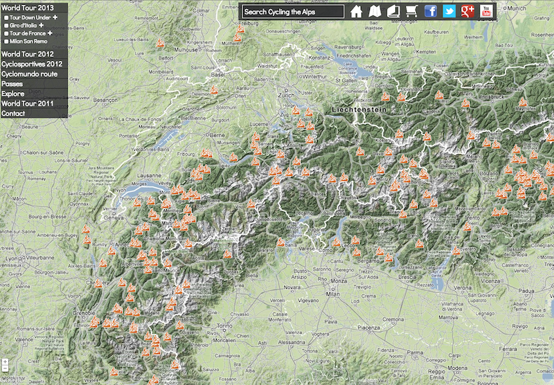 Click on a route, and you’re presented with a number of options: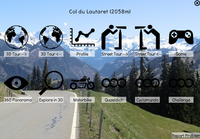
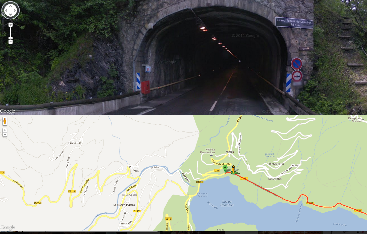 The 3D Tour mode uses the Earth API to show you the route, as does Explore in 3D. In the Android app, it launches Google Earth with an intent that includes the KML tour:
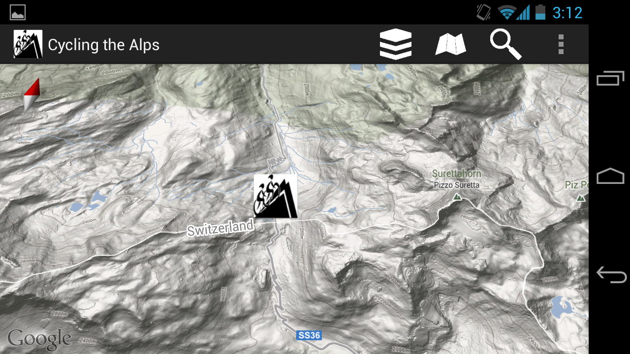
 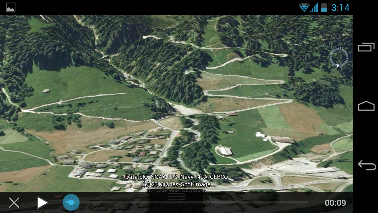 The app also uses the new Google Maps Android API V2, giving it easy access to the most modern Google Maps, including the street maps, satellite imagery, and terrain:
  There’s so much more to mention, and we can’t cover it all, but we can mention one last feature: the Profile view which uses the Elevation Service of the Maps API to show an elevation profile of the route:
 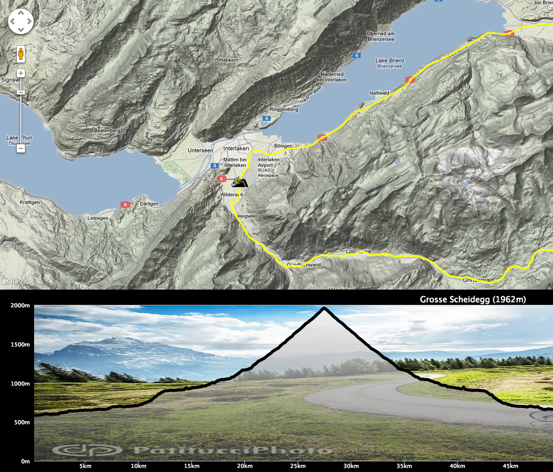 In short, Cycling the Alps is a great way to see many of the possible uses of the Google Maps API in all its different forms.
Scott Kirsner's recent Innovation Economy column about start-ups offering apps to the (wary, profit-margin-conscious) restaurant industry is rife with fun anecdotes, but this quote from a venture capitalist was our favorite: "What is a restaurant but a few guys cooking, some people carrying plates, and 50 people sitting there with smartphones, waiting for their food and doing nothing?”
That's the assessment of Christopher Mirabile, a managing director of LaunchPad Venture Group in Boston, "which has backed several restaurant-oriented start-ups." He paints (Instagrams?) a lovely picture ... of a horrible first date at a buffet, maybe. Clearly he won't be peddling his wares to phone-unfriendly JM Curley.
Restaurants Are A Tough Sell for Start-Ups [Globe]
JM Curley Bans Douchebags from Bar
Watch an iPhone 5 Spoof for Food-Photo Addicts
Read more posts by Kara Baskin
Long-time crossword puzzle builder John Graham (aka Araucaria) is dying of esophageal cancer and used a crossword puzzle in the Guardian to reveal the news.
Above cryptic crossword No 25,842 sat a set of special instructions: "Araucaria," it said, "has 18 down of the 19, which is being treated with 13 15".
Those who solved the puzzle found the answer to 18 was cancer, to 19 oesophagus, and to 13 15 palliative care. The solutions to some of the other clues were: Macmillan, nurse, stent, endoscopy, and sunset.
Speaking from his home in Cambridgeshire, Araucaria said this particular puzzle had not taken him very long, adding that a crossword had seemed the most fitting way to make the announcement.
"It seemed the natural thing to do somehow," he said. "It just seemed right."
(via @daveg)
Tags: cancer crossword puzzles games John Graham


Read more of this story at Slashdot.

Russian Sledgesparticularly if there's no lower limit to numbers like, the number of dudes who fit this criteria who've worked at company x, shit could be really identifiable.

“Islamic men interested in men who live in Tehran, Iran“… “Places where they’ve worked.”
Four Roses first introduced a limited edition small batch bourbon a good 4 or so years ago. At that time the distillery called this product “Mariage” (one “r”) because it started as a marriage of 2 different bourbons from the distillery’s ten bourbon recipes.
In speaking with Four Roses Master Distiller, Jim Rutledge, in early 2011 (videos here), he informed me that the term “Mariage” was often mispronounced by the buying public. Consumers were confusing the term with a the wine term, meritage. In addition, the name was limiting for the distillery due to the common meaning of marrying just two components. Jim was interested in creating a small batch blend that didn’t constrain him to only two whiskeys.
For the 2010 release, Four Roses chose to stick with simplicity, calling the bourbon the “Limited Edition Small Batch”. The name has stuck since. The 2012 edition is a blend of a 17 & 11 year old OBSV, 12 year old OBSK, and a 12 year old OESK.
For clarification, the “B” in the designation refers to the distillery’s higher rye (35%) bourbon while “E” is the lower rye (20%) version. Even at 20%, that’s a great deal more rye content than the average bourbon whiskey on the market. Venturing a guess, I’d say average is closer to the low teens in terms of percentages. In addition, the “V” in the recipe refers to the distillery’s fruitier, creamier yeast strain. “K” refers to a spicier strain of yeast. These four whiskeys were “mingled” (as Jim refers to it) together to create a harmonious blend. The results are something truly epic.
Four Roses Limited Edition Small Batch Bourbon (2012), 55.7% abv (111.4Proof), $70/bottle
Color: Medium Amber/Copper/Burnt Orange
Nose: Cinnamon, allspice, candied orange, brandied cherries, maple fudge, and heaps of vanilla. So full of bright wood spice tamed by sweet, soft fruit.
Palate: Vanilla cream, maple, and toffee on the palate with prickles of cinnamon and chili heat. Bitter orange, grapefruit, and cherry add a layer of fruitiness. Well structured, and layered flavors unfold with each sip.
Finish: Wood and spices bring on warmth while the fruit and vanilla notes linger long.
Overall: Four Roses has managed to create one of the great bourbons of all time with the 2012 Limited Edition Small Batch. I can’t think of a more complex and satisfying pour of whiskey for 2012 than this one. It’s amazing that in a time when the Pappy and the Antique Collection products seem to gain all of the press, a whiskey of this stature can still be found on shelves. What I enjoy so much about Four Roses is that it tastes like………Four Roses. There’s nothing else quite like it. The wood never dominates and these whiskeys amaze you with both their finesse and their power. At 55.1% alcohol, I had little trouble sipping this neat. A splash of water tones down the heat, ramps up the fruit, and makes for a completely different (yet not less satisfying) sip. Well done Four Roses – my shoe-in American Whiskey of the Year.
Sour Mash Manifesto Rating: 9.8 (Epic)
 It's been a long, long time since pre-Russell Davies Doctor Who was shown in America, but that's set to change this Sunday, at 9 p.m. EST. BBC America will air the four-part serial "The Aztecs," starring William Hartnell as the First Doctor, in its entirety. It's part of a series titled "The Doctors Revisited," which will help celebrate Doctor Who's 50th anniversary in America by airing a Who serial each month, one per Doctor, in numerical order. Given how well the new-Who series do on BBC America, these classic episodes could be quite the hit... or at least help bring some newer fans into the vast if lower-production-valued world of classic Doctor Who. Thanks to everyone who sent in the tip. More »
Russian Sledges#fyb
Yes, Pulitzer Prize-winning author Michael Cunningham's literary oeuvre is impressive (his tomes include "The Hours" and "By Nightfall"), but it's really his bookshelf-lined NYC bathroom we're interested in.
Photos by Joshua Simpson via FSG Work in Progress.

Above: Cunningham's custom bathtub is surrounded by books and stacks of magazines.

Above: Avian decor mingles with the volumes.

Above: Reading within reach; books everywhere (even next to the bathroom sink).

Above: Michael Cunningham at home in his sun-flooded NYC loft. "His aesthetic sensibility also extends to his personal style," writer Elliott Holt says at The Migrant Book Club. "He tends to wear jeans, t-shirts, and boots. But not just any boots. He once told me that he buys them from Carol Christian Poell, an Austrian designer in Milan, who buries the boots in his backyard for a few weeks to give them an authentic weathered appearance."

Above: Cunningham created a tower of books, spines to the wall, using the Sapien Bookcase, designed by Milan-based Bruno Rainaldi and available at Design Within Reach. Note the appealing visuals created by the different shades of aged and new paper.

Above: Prized volumes on a horn stool.

