


Marry, Fuck, Kill w/ the cast of The Hobbit
Oh jeez guys, I love you soo soo much
Gay-I mean, GUYS, come on….!
Hilarious.
Russian SledgesFIGHT FIGHT FIGHT
A bit earlier we flagged this sort of weird story where Georgia (the US state of Georgia in case John McCain gets any bright ideas) is making a claim on a tiny sliver of Tennessee. And as usually happens, when we dip into a new story at least one reader writes in who understands the issue in great detail. In this case it's TPM Reader JM ...
Some background might be helpful for this Georgia goes to war with Tennessee thing. As a Georgia resident and someone who has been involved behind the scenes with this resolution's crafting and advancement, what looks far-fetched at a glance is actually surprisingly substantive when examined. I've tacked on the official white paper that details this in much better depth but - speaking as someone who was very skeptical at first - I honestly can suggest there is a concrete legal argument buried in there.
The long story short is that the original border was drawn wrongly. Both sides agreed the border would be the 35th parallel, and both sides conceded through the 1900s the original survey was flawed, drawn a few hundred yards too south. Georgia has worked diligently to remedy this since the border was first drawn inaccurately, but Tennessee has refused to take action (Tennessee, however, did take action against Mississippi regarding the same 35th parallel dispute and won ... otherwise the Memphis airport would actually be in Mississippi).One of the biggest advocates of the bill is State Sen. Jason Carter, the grandson of President Carter, and it's largely because his grandfather really kicked this off back in the 1970s when he convened a commission to review the dispute.
Take a look at the white paper which lays out the legal justification and a litany of precedent for why this isn't as crazy as it seems.
I was intrigued so I asked for some more detail and JM obliged ...
There never has been any impetus for Tennessee to treat this seriously because there hasn't been any concerted legal strategy behind it. It's been, for the most part, the Georgia state government puts together a commission or passes a resolution that says "let's redraw this border" and nothing comes of it because it's doesn't force Tennessee's hand. So our northern neighbors just shrug (or, as they did a few years back at the height of a severe drought, sent some pallets of bottled water to the Georgia General Assembly).With this resolution, there's a two-fold strategy:
1. There's a clear compromise on the table. Tennessee gets to keep all the people who live in the disputed area, thus preserving that tax base and preventing any sort of mishaps on a whole host of other levels. Georgia, in turn, gets access to the Nickajack Lake, which is part of the Tennessee River system. Other attempts were either symbolic or not done in the spirit of protecting the residency of those folks in the disputed area.
2. There's a stick tacked on to this carrot. An amendment that was added on the Senate floor authorizes Georgia's attorney general to pursue legal action against Tennessee if the latter doesn't respond by the end of Georgia's legislative session in 2014 (which will close in spring since Georgia only has its sessions from January through March/April). This, from my understanding, is the real game-changer since it's all been symbolic bluster for the most part up until now.
Judging by the Tennessee response today, it seems the latter has at least gotten their attention.Now, regarding water rights, there are a couple of interesting arguments. Tennessee's main argument is that Georgia is not riparian to the Tennessee River (given the existing boundary) and, therefore, can't access the water. Georgia's argument is a bit more multi-faceted. For starters, if you examine the historical arguments and review the judicial precedents, thus conceding the 35th parallel should be properly sited, Georgia becomes riparian to the river through access at Nickajack. That's the most basic approach.
Additionally, the Tennessee River's headwaters are located in Georgia, churning out 1.6 billion gallons of day from Georgia for Tennessee. However, there are two other interesting elements to that discussion:
1. The Tennessee River is managed by the Tennessee Valley Authority, meaning the entire river system has been federalized. As such, the TVA would be bound by an 1802 agreement known as the Cession Agreement granting Georgia's original riparian status (to say nothing of the fact that the TVA serves parts of North Georgia and owns three hydroelectric plants in the state).2. Tennessee used to permit transfers of water from Nickajack to Georgia prior to 2000 which is when the issue started to smoke again. At that point, Tennessee passed state legislation restricting the sale of water to Georgia. In a sense, then, Tennessee was conceding Georgia could have access to system up until it became politically beneficial for them not to. Additionally, where a river forms a border between two states, it is governed by federal common law and neither state can impose inconsistent state law regulations on the other side.
The Tennessee River has one billion gallons of water that is considered to be "excess capacity" and that amount, the TVA determined, could be extracted without impacting the downstream reservoir levels. Georgia simply wants a fraction of that.
It's a weird story, to be sure, but one that even grew on me.
 |
 |
Russian Sledges#myfriendsbreastsinthenews
Scouting NY:
★I can imagine that Kubrick conspiracy theorists would argue that this is all intentional, adding to the movie’s dream-like feel. That by trapping Bill in the same three recurring New York streets, it’s like he’s in a nightmare he can’t escape. I could buy that to a certain extent.
But a more practical way to look at it is that Kubrick was simply doing what every filmmaker does when shooting on a set. Film sets are limited in size, and you do everything in your power to give them scope, the sense of an outside world. Also, film sets cost money, and rather than tearing down and rebuilding, you try to use them in as many different ways as possible.
Russian Sledgesannie clark/nadia sirota autoshare
Hailed by NPR’s Fred Child as “one of the groups that has really helped to shape the future of classical music,” yMusic is a group of six New York City instrumentalists flourishing in the overlap between the pop and classical worlds. Their virtuosic execution and unique configuration (string trio, flute, clarinet, and trumpet) has attracted the attention of high profile collaborators—from Dirty Projectors to My Brightest Diamond—and more recently inspired an expanding repertoire of original works by some of today’s foremost composers.
This Fall, yMusic released Balance Problems, the much-anticipated follow-up to 2011’s Beautiful Mechanical(Time Out New York’s #1 Classical Record of the Year). The record features stunning new compositions from Nico Muhly, Sufjan Stevens, Andrew Norman, Mark Dancigers, Jeremy Turner, Marcos Balter, and Timo Andres, all realized through the ensemble’s striking performances.
In addition to performing its own repertoire, yMusic serves as a ready-made collaborative unit for bands and songwriters. In the 2013-14 season, yMusic recorded “Mutilation Rag” for Beck‘s Song Reader compilation and performed three concerts at Lincoln Center, two in the Atrium, collaborating with Blake Mills and premiering works by Gabriel Kahane, Mark Dancigers and Dawn of Midi’s Qasim Naqvi, and one in collaboration with José González as part of the Lincoln Center Out of Doors Festival.
Since their inception in 2008, yMusic has striven to bring a classical chamber music aesthetic to venues outside the traditional concert hall. Its members have individually toured and recorded with artists such as Bon Iver, Paul Simon, Bjork, The National, Meredith Monk, Antony & the Johnsons, David Byrne, The New York Philharmonic and Sufjan Stevens.

Illustration by Courtney La Forest
To the Douchebag Hipster Cyclist,
We all watched you veer onto Comm. Ave over by BU and shove that too-slow pedestrian in the crosswalk … who just so happened to be an old lady with a cane.
What the FUCK is wrong with you.
And when she cried out, did you stop to see if she was okay? No. You, to the complete shock of pedestrians and drivers who just watched you SHOVE AN OLD LADY WITH A CANE, kept furiously peddling and yelled over your shoulder, “Right of way!”
Technically you did have the right of way.
But those of us driving watched you blow through all the red lights at Kenmore so you’re more or less a dick who is so full of self-importance (and shit) you can justify running over the elderly. First time in my life I ever wished someone would door a cyclist.
I’d end it on that, but thank you to the cyclist in Porter and Davis who restored my faith. You waved and let me back up my ginormous company vehicle instead of darting by, and at the Davis lights you followed the laws while the cyclist right next to you blew through the reds.
You sir, are AWESOME and a shining example of how it’s possible for all of us to coexist.
Sincerely,
Comrade in Commuting
SEND YOUR ANONYMOUS GRIPES AND GROUSES TO EDITORIAL@DIGPUBLISHING.COM. CRYBABY.


At first glance, you may think these photos were taken in Provence, France at their world famous lavender fields. You may be surprised to find out that they're actually photographs of a large lavender field in Somerset, England, a place where, if you're lucky (or skilled), you can capture a once-in-a-lifetime shot.
The Somerset Lavender Farm is home to more than 50,000 lavender plants, rows of vibrant bushes spread amongst a 5-acre field. If you come at just the right time (usually June or July), you may be able to capture a photo that looks very similar to an Impressionist painting.
Photographer Antony Spencer, who shot the photo immediately above and below told The Daily Mail, "You have a window of just ten days each year when the lavender is at its best before it's harvested so it's a matter of getting up early and getting down to the field before sunrise. The light was absolutely phenomenal and made the lavender look beautiful. As a landscape photographer you only get those kind of moments once a year."
Especially love the photos of the lavender fields set against dramatic skies.
Top photo credit: Antony Spencer


Photo credit: Sandra Kreuzinger

Photo credit: Sandra Kreuzinger

Photo credit: Daugirdas Racys

Photo credit: Graham McPherson

Photo credit: Graham McPherson

Photo credit: Sandra Kreuzinger

Photo credit: Sandra Kreuzinger
Russian Sledgescan take a surprisingly large amount of text
has a "random" button / is easier than pulling a random sample of values from a column in access
Russian Sledgescf. http://explodingdog.tumblr.com/post/7928686091/we-will-all-cool-off-when-the-cocktail-truck-gets

From the Neiman-Marcus gift catalog, a trailer that converts into an elaborate, beautiful bar, and comes with a year's supply of Bulleit bourbon and rye. There are two for sale at $150K each, with 10 percent going to an HIV/AIDS charity.
A chorus of cheers rings out the minute you pull up. Tailgating will never be the same now that your Bulleit Frontier Whiskey Woody-Tailgate Trailer is on the scene. Designed by interior designer Brad Ford, it's impressive on the outside, but what's on the inside truly astounds: sleek leather furnishings and details from Moore & Giles, rich wood finishings (handcrafted from reclaimed Bulleit Bourbon casks), elegant glassware, and a top-notch entertainment system, including a flat-screen TV, Blu-ray Disc™ player, and a state-of-the-art sound system, plus a one-year supply of Bulleit Bourbon and Bulleit Rye*. You park, open the hatch, and slide out the bar—cocktails anyone?
Bulleit is delicious bourbon, but I recently bought a bottle of Elmer T Lee Single Barrel and holy cats, is that stuff astounding.
Russian SledgesI don't know
 46. Nick and the Glimmung
45. Galactic Pot-Healer
44. The Zap Gun
43. Mary and the Giant
42. A Maze of Death
41. The Game-Players of Titan
40. The Broken Bubble
39. Dr. Bloodmoney, or How We Got Along After the Bomb
38. The Ganymede Takeover
37. Voices from the Street
36. Deus Irae
35. Confessions of a Crap Artist
34. Vulcan's Hammer
33. The Crack in Space
32. Counter-Clock World
31. Martian Time-Slip
30. Radio Free Albemuth
29. The Simulacra
28. The Penultimate Truth
27. The Transmigration of Timothy Archer
26. Ubik
25. Time Out of Joint
24. Eye in the Sky
23. VALIS
22. The Man in the High Castle
21. The Cosmic Puppets
20. Gather Yourselves Together
19. Lies, Inc. (an expanded, republished version of "The Unteleported Man")
18. Solar Lottery
17. The World Jones Made
16. Clans of the Alphane Moon
15. Dr. Futurity
14. The Three Stigmata of Palmer Eldritch
13. A Scanner Darkly
12. We Can Build You
11. The Divine Invasion
10. Puttering About in a Small Land
9. The Unteleported Man
8. In Milton Lumky Territory
7. The Man Who Japed
6. Our Friends from Frolix 8
5. Now Wait for Last Year
4. Do Androids Dream of Electric Sheep?
3. Humpty Dumpty in Oakland
2. The Man Whose Teeth Were All Exactly Alike
1. Flow My Tears, The Policeman Said
Ted Pillow means no harm. His writing can be found at Fanny Pack Spectacular! He tweets @TedPillow.
---
See more posts by Ted Pillow

Photographed and Reviewed by Carolina de Bartolo
How many type reference books do you need in your library? If you love looking at letters like I do, I’d say the more the merrier. Stock up! Sure, I’ve heard about that whole digital revolution thing, but when it comes to looking at great type, the higher the resolution the greater the eye-candy effect. And even the latest retina screen is nowhere near the resolution of good ol’ ink on paper.

Cover of The Anatomy of Type: A Graphic Guide to 100 Typefaces by Stephen Coles, with a foreword by Erik Spiekermann, published in 2012 by Harper Design.
A (superfluous) dust jacket of exactly the same design has been removed and discarded. Sorry!

From The Anatomy of Type, the requisite typographic anatomy diagrams.
No surprise considering the aforementioned title.

From The Anatomy of Type, convenient reference for how to use the book.
In addition to the typeface information and samples, each spread includes a nifty cross-reference for related faces in the lower right corner. Facing page here is a basic glossary of terms. And we’re just getting started.

From The Anatomy of Type, type classifications.
While this extensive system of classifying type certainly has its merits, I’m afraid beginners will find it a bit rarified and intimidating. Delineating groups of subclassifications would probably benefit the newbies.

From The Anatomy of Type, sample spread for FF Meta Serif.
A carefully chosen word is set in a triple-digit point size and straddles each spread to give you a macro view of the type’s features.

From The Anatomy of Type, Calibre spread, detail.
The oversized sample letterforms allow every characteristic of each typeface to be beautifully noted with an abundance of playful swooping arrows.

From The Anatomy of Type, Lexicon spread, detail.
Each page begins with precise design details such as the designer, foundry, year of design, etc. You’ll want to memorize this stuff, right?

From The Anatomy of Type, Ed Interlock spread, from the “Display” chapter.
Color variations from page to page make leafing through the book a very pleasant experience.

Cover of FontBook, published by FontShop International.
The FontBook app has understandably replaced this massive volume, which is sadly no longer in print.

From FontBook, the bookplate on black endsheets.
The warning reads: “Steal this book and be cursed with papercuts and Postscript errors.” A humorous little touch.

From FontBook, chapter 5 opening spread.
Note the 3 ribbon bookmarks. You’ll need them if you are lucky enough to have this invaluable reference.

From FontBook, detail of the Tarzana Narrow entry.
Each typeface is shown with a full character set in the parent weight. Below that, pangrams are set in all the different weights of the face. To the left of the pangrams, related typefaces are cross-referenced under an eye icon. This much info packed into a tiny space is truly a remarkable achievement of design.

From FontBook, sample spread.
Information about the type designer and date of design is beside the name of the typeface in the black bar.

From FontBook, edge detail.
The yellow chapter openers and black bars within each chapter allow you to easily see and flip to the various sections of the book. Laying open at approximately the center of the book here, you can see why this book is lovingly referred to as the “FontBrick.”

From FontBook, sample spread, Pi & Symbols chapter.
Flip to these pages for an abundance of analphabetic inspiration and ideas. If I was un- or even under-employed, I could peruse the thousands of forms of arrows in this section all the livelong day.

Cover of Letter Fountain: The Anatomy of Type (The Ultimate Typeface Reference Guide), by Joep Pohlen, published by Taschen.
The fourth edition of this compendium is a 2010 red dot design award and TDC winner. At 640 pages, there is not much left out of this baby.

From Letter Fountain, comparison of the letter O in four sans serif typefaces.
Diagrams like this help us know the angle of stress in Linotype Helvetica Neue Italic is 12º. And, by comparison, what is it in Linotyope Futura Oblique, you ask? A whopping 39º. Boo on you, Futura Oblique.

From Letter Fountain, page detail.
The impressive breadth of content ranges from the prehistoric origins of writing to this “Choosing a Typeface” section. An extensive historical timeline of typographic events from Gutenberg to the present includes contemporaneous developments in painting. Study this and you are sure to be amongst the most popular typophiles at any party.

From Letter Fountain, spread for Chaparral Pro.
With so much information, this could have been an ordinary monotonous textbook, but the drama of a full bleed black gives the page sequence an occasional pop. In book design as in writing, above all, do not bore the reader.

From Letter Fountain, reproduction of a lovely 1886 type specimen of “No.” characters from J.G. Schelter & Giesecke.
The sizable appendices are printed on a laid brown-paperbag-colored stock which sets these sections apart rather distinctly.

From Letter Fountain, keyboard layout detail.
All the dingbat fonts referenced in the book include these handy keyboard layout references.

Cover of Type Navigator (The Independent Foundries Handbook), by Jan Middendorp and TwoPoints.net, published by Gestalten.
At 9-by-12 inches, this is the largest format of the four books reviewed here. A standard textbook binding makes it a solid, sturdy edition.

From Type Navigator, chapter opener.
Organized by foundry, each chapter begins with a quote from the foundry’s type designer/s in response to the question: “Why?”. Those big red and blue squares have me asking “why?” as well. More on that later…

From Type Navigator, spread showing display type samples in blue and text type samples in red.
While I admire many Gestalten publications, I found the “red, white and blue” color scheme in this book somewhat disappointing. Red and black alone would have been a simpler and more elegant book design.

From Type Navigator, text type sample spread.
Each of the text type pages shows the featured face in all its weights at display sizes as well as in short paragraphs set at 12/14, 9/12 and 7/10. (Note how much nicer the book looks when you just see the black and red.)

From Type Navigator, detail of text type specimen for Sang Bleu All text block samples are shown in three sizes and three or four weights.
Highlighting a diverse group of underused but excellent faces, the book functions as a full-scale and much needed “Cure for the Common Font.”

From Type Navigator, type in use sample.
This swirly handlettering was created for a magazine layout and is based on the typeface Mommie by Hubert Jocham. Including the type in use images seems like it might have been an after-thought, but their intermittent appearance provides a bit of visual relief from the somewhat uninspired book design.

From Type Navigator, inside back cover, CD insert.
Yes, you’re seeing that right, a book published in 2011 includes a CD (!) of free fonts. Whether you are laughing or crying right now, fear not, the fonts on the CD are mostly garbage…as free fonts on a compact disc would tend to be. Clearly a lame marketing ploy aimed at the typographically challenged.

(Click to enlarge)
Compare and contrast these four type reference books, and find the one/s that are right for you.
The Anatomy of Type is published by Harper Design in the US and by Thames & Hudson in the UK. It is available at Amazon.com (US | UK).
FontBook is published by FontShop and the print version is available used at Amazon.com (US | UK).
Letter Fountain is published by Taschen and is available at Amazon.com (US | UK).
Type Navigator is published by Gestalten and is available at Amazon.com (US | UK).
Carolina de Bartolo teaches typography and design history in San Francisco. She is the designer, author and publisher of the popular typography textbook, Explorations in Typography: Mastering the Art of Fine Typesetting, which is now available as an interactive digital book inside the book’s companion app.
Possibly related posts:
BOSTON — With correction costs spiraling upwards, Massachusetts should impose a moratorium on state and county prison expansion, revisit its “tough-on-crime” sentencing laws and expand programs aimed at preventing recidivism, according to a report released Monday by MassINC and a new coalition helmed by prominent former criminal defense, prosecutorial and public safety officials.
The report found the percentage of the state’s population in prison or jail has tripled since the early 1980s and state spending on corrections policies will top $2 billion over the next decade, up from more than $1 billion currently, without major changes in public policy.
According to the report, which also found the state’s parole rate has plunged, six of every 10 inmates leaving state and county prisons commit new crimes within six years of release.
The report revisits many of the claims long made by proponents of sentencing reforms, who have argued that Massachusetts should follow the leads of other states that have taken steps to curb the growth of correction budgets by focusing on reentry programs and eliminating mandatory minimum sentencing policies, especially for drug offenders.
“Massachusetts has taken some tentative steps toward reform, but it remains wedded to policies heavily weighted toward incarceration,” MassINC wrote in a press release announcing the report’s findings and introducing the coalition.
“This report documents the problems and the potential solutions to what has become a point of reckoning in criminal justice policy in Massachusetts,” Wayne Budd, former U.S. attorney and co-chair of the newly formed Criminal Justice Coalition, said in a statement. “It is time we joined other states that are investing in what works, rather than spending money on what doesn’t.”
The coalition is also chaired by Kevin Burke, former state public safety secretary, and Max Stern, president of the Massachusetts Association of Criminal Defense Lawyers.
On the heels of passing a new law toughening sentencing on repeat violent offenders last summer, criminal justice policy was identified by Gov. Deval Patrick and legislative leaders is a priority issue to revisit in 2013 but there’s been no tangible momentum behind the issue so far this year on Beacon Hill.


What would you do if you had your very own action figure? Lately, Star Trek: The Next Generation actress Gates McFadden has been photographing her Beverly Crusher doll in all sorts of strange situations, creating a bizarre shrunken Dr. Crusher spinoff.
Russian Sledgesit's awfully unfair to sisko that he's got to be eliminated in the first round

hulu:
We know we’re going to lose friends over this list. We’ve lost some already.
We’re big Star Trek fans here at Hulu, so much so that we’ve made every episode from every show free through the end of the month. So when we started talking about our favorite characters, the discussion naturally got pretty heated. We started making lists and then realized that we weren’t going to settle this without resorting to breaking out our bat’leths. (And yes, some of us have bat’leths. Don’t judge.)
Here’s where you come in. We need your help to settle once and for all the most important question you will be asked all day: Who is the greatest Star Trek character of all time? Starting tomorrow, and running every day through March 31st, check Hulu’s Tumblr for your opportunity to vote for your favorite Star Trek characters.
We know some of your favorites didn’t make this list. We love Beverly, Deanna, Sulu, Bones, Kira, and Odo just as much as you do. And yes, Khan is totally badass, but he was only in 1 episode of the original series, so he didn’t make it. Tell us how wrong we are to exclude them. But more importantly, vote.
And for those of you wondering where Enterprise’s Captain Archer is, well, let’s just say he traded his jumpsuit for a red shirt.
For a printer friendly bracket, please click here.
Boston Public Library posted a photo:

File name: 10_03_003741a
Binder label: Medical
Title: Prof. Horsford's Acid Phosphate (front)
Created/Published: N. Y. : Schumacher & Ettlinger
Copyright date: 1884
Physical description: 1 print : chromolithograph ; 12 x 8 cm.
Genre: Advertising cards
Subject: Boys; Patent medicines
Notes: Title from item. Retailer: W. G. Shillaber, No. 124 State Street, Boston
Statement of responsibility: Rumford Chemical Works
Collection: 19th Century American Trade Cards
Location: Boston Public Library, Print Department
Rights: No known restrictions.
Russian Sledgesthat's damien hirst's bejeweled skull! http://upload.wikimedia.org/wikipedia/en/thumb/6/6d/Hirst-Love-Of-God.jpg/220px-Hirst-Love-Of-God.jpg
КОММЕНТАРИЙ ПРЕДСТАВИТЕЛЯ ВЕРХОВНОГО ГЛАВНОКОМАНДОВАНИЯ
КОРЕЙСКОЙ НАРОДНОЙ АРМИИ
Официально
Армия и народ КНДР остаются непреклонными в своей твердой решимости сорвать враждебные действия США и их союзников и защитить суверенитет страны путем всеобщего противостояния.
Тем не менее, США, не понимая, с кем они имеют дело, по-прежнему не оставляют свои неразумные попытки проверить реакцию КНДР и сломать ее решительные решения за счет свирепых враждебных актов, включая ядерный шантаж.

Не довольствуясь повышением до опасной грани интенсивности военных учений «Ки Ризолв» и «Фоул Игл», США перешли к неприкрытому ядерному шантажу против КНДР, перебросив на эти учения разрушительные ударные средства с ядерными боеголовками на борту.
В этой связи представитель Верховного Главнокомандования Корейской Народной Армии дал следующий комментарий в интервью с корреспондентом ЦТАК.
Как уже заявило Верховного Главнокомандование, нынешние совместные военные учения, без сомнения, являются опасными ядерными военными приготовлениями, которые проводятся на одной плоскости с самыми свирепыми враждебными акциями по лишению КНДР национального суверенитета и ущемлению ее высших интересов.
Они также являются ярким проявлением самых откровенных нарушений Соглашения о перемирии и всех межкорейских договоренностей.
Именно по этим причинам КНДР объявила о суровом решении аннулировать Соглашение о перемирии и прекратить действие межкорейских Декларации о ненападении и Совместного заявления о безъядерном статусе Корейского полуострова.
Поскольку теперь уже нельзя надеяться на обязывающую силу всех соглашений и деклараций, в этом заявлении отражены незыблемая воля и непреклонная решимость нашей армии и народа – освободить себя от каких-либо обязательств и сорвать нашим ядерным оружием ядерные военные приготовления США и смести их союзников.
Сейчас США, пытаясь проверить нашу реакцию и сломать наше решительное решение, ввозят в Южную Корею и прибрежные воды ядерные ударные средства, в том числе стратегический бомбардировщик «В-52» и атомные подлодки.
Эскадрилья стратегических бомбардировщиков с ядерными боеголовками на борту и атомные подлодки, наряду с межконтинентальными баллистическими ракетами, служат для США «тремя ядерным китами», которыми они размахивают для шантажа.
Примечательно то, что США афишируют нынешнюю дислокацию стратегического бомбардировщика «В-52» и атомной подлодки в Южной Корее как жесткое предупреждение в адрес КНДР и открыто заявляют, что такие угрозы и шантаж будут продолжаться и в дальнейшем.
Но США не смогут испугать армию и народ КНДР подобными предупреждениями и угрозами.
США не следует забывать, что их военная база Андерсен на Гуаме, с которой запускают бомбардировщики B-52, а также военно-морские базы на Окинаве находятся в зоне поражения наших высокоточных систем вооружения.
Раз США начали неприкрытые ядерные угрозы и шантаж, мы вынуждены перейти на адекватные военные контрмеры.
Наше заявление о противодействии ядерным угрозам противников более мощными ядерными атаками отнюдь не являются пустыми разговорами.
Мир увидит, как встретят свою трагическую гибель провокаторы, затонув в море огня правосудия, который разожгут армия и народ КНДР для защиты своего суверенитета.
Three boys falsely accused of murder, and what the twenty-year saga says about all of us.
Nathaniel Rich | New York Review of Books | Apr 2013 [Full Story]
Cary Grant is perhaps my number one old Hollywood history crush. Can we just take a moment to appreciate how absolutely adorable he is?
Russian Sledgesffcfe

Many works of amazing literary art have been printed on typewriters in times past, but this re-purposing takes an old machine beyond words and into the realm of colorful painting.
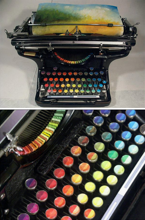
Tyree Callahan has recycled (or upcycled, perhaps) a classic 1937 Underwood typewriter by replacing letters with sponges soaked across the spectrum with bright yellows, reds, blues and combinations thereof.

Based in the Seattle area of Washington, the artist writes of his environs: “I’m constantly amazed at the play of light through our moist air and over the varied landscape of the Pacific Northwest. I especially enjoy early morning light–that short interval of time just before the last of the fog burns off–and evening light, especially on humid evenings, when the atmosphere itself is aglow with evening’s hues. We live in an environment that can produce both vivid and somber landscapes, often both within an hour’s time.”
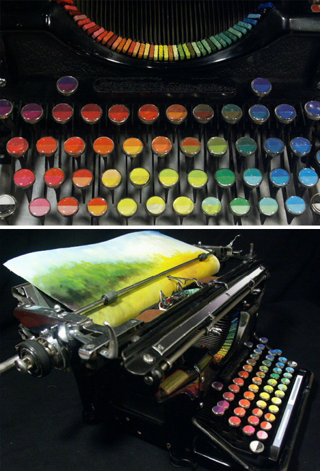
There is something so satisfying about the click-clack sounds of a traditional typewriter, translating the mechanical motions of your fingers into physical results on the page in front of you – but imagine making those impressions in vivid colors instead of black on white. Sounds relaxing, hopefully literally.


|
|

Since white smoke rose above the Sistine Chapel in mid-March, the world has speculated on the policies of the new papacy. Would Pope Francis continue the theological conservatism of Pope Benedict XVI, or would he be every single Say Yes To The Dress bride ever—drawn to a modern (liturgical) cut, but restrained by elder family members who demand a more traditional number?
Last night, the official Vatican’s Communications Twitter seemingly srtuck a blow for both traditionalism and mild befuddlement when it tweeted a link to an article titled, “Holy switcheroo! Batman has grown bitter, more vengeful with the years.” Posted on the Vatican Communications website, the article comments on the darkening tone of the comic-book franchise, ever since Batman’s ka-pow fisticuffs heyday in the 1980s. While ostensibly related to the social values that concern the Church, the article seemed so out of place among tweets about Pope ...
Read moreGoogle is taking a lot of heat for its decision to scrap the popular Reader RSS feed aggregator, leading many to question why it would pull the plug on such a popular service. It turns out that the answer might have a lot to do with the hidden costs of safeguarding privacy. According to a report from All Things D, an unnamed source says that the closure is at least partly because of Google’s reluctance to build out the staff and infrastructure needed to deal with legal and privacy issues related to the product.
"Unless it's going to get to 100 million users it's not worth doing."
The source says that Google is trying to position the company so that it stops getting stuck in expensive privacy lawsuits, like the $7 million Wi-Fi data-slurping case in the US. When the company announced it would be shuttering Reader, the service reportedly didn’t even have a project manager or full-time engineer assigned to it, and it’s said that Google didn’t want to spend the money to build the service out into a tentpole app. And while many longtime users of the service have questioned why Google doesn’t simply Reader off to a third party, its deep integration with other Google Apps means it’s easier for the company to just shutter it. So how many users would have made it worthwhile for Google to keep Reader around? Former Reader product manager Nick Baum tells ATD, "my sense is, if it’s a consumer product at Google that’s not making money, unless it’s going to get to 100 million users it’s not worth doing."
 Lokvarka Cave near Lokve, Croatia
deichgnu
Lokvarka Cave near Lokve, Croatia
deichgnu
With more than seven million people squeezed in to around 1,100sq km of land space—and property prices regularly ranking among the highest in the world—Hong Kong realizes it needs to get inventive if the city wants to attract more big IT business. The answer: cavernous underground data centers that remain naturally cool.
Plans are already in motion to start digging deep according to Cordells property law firm partner Hilary Cordells, reports The Register.
"Rock cavern development can be done, and datacentre use is a particularly good one," she said at the Datacentre Space Asia Conference this week. "It's on the government's radar screen and it's taking active steps but it's not easy and some sites will be more suitable than others."
Read 6 remaining paragraphs | Comments

‟ There are only two actions I cannot tolerate. The first is denim. The other is murder. If denim is not wrong, nothing is wrong. ” — Sebastian Horsley
Photo : Gabriella Meros

