It’s official! Google just announced the Nexus 6, Nexus 9, and the Nexus Player.
RELATED:
Via: Google
Google Announces the Nexus 6, Nexus 9, and Nexus Player is a post from: Droid Life
Christopher EvansI know it's massive, but I do really want one.
It’s official! Google just announced the Nexus 6, Nexus 9, and the Nexus Player.
RELATED:
Google Announces the Nexus 6, Nexus 9, and Nexus Player is a post from: Droid Life
Christopher EvansThis video is brilliant.
Best. Android. Reveal. Video. Ever.
Android 5.0 is Lollipop.
And for the GIF lovers, a special treat below.

And Here is the Android 5.0 “Lollipop” Unveiling, Including a Twerking Lion is a post from: Droid Life
Christopher EvansThis kind of thing pains me. A massively mediocre phone which has the added bonus of plugging into a super average screen. Bet Stu buys one!
After launching on AT&T earlier this year, it appears that the ASUS PadFone X has decided to bring its little sibling onto big blue as well.
The ASUS PadFone X mini will launch on AT&T GoPhone, the carrier’s prepaid service, on October 24 for $199.99 without a contract. In exchange for your hard-earned dollar dollar bills, you’ll get two devices with the following features:
Phone
Tablet
While neither the PadFone X mini nor the PadFone X mini tablet will blow your hair back with their specs, getting both devices for $200 without a commitment seems like a pretty nice deal. Are you thinking about picking up the ASUS PadFone X mini when it arrives later this month?
Christopher EvansMassive lols at the video. "Air umbrella A is available for female"

The teasing begins!
Lemon Meringue Pie? Lava Cake? Lady Finger? Lemon Drop? Even Licorice makes several appearances. Who didn’t show up? Lollipop, of course.
Google Just Teased the Name of Android L…Which is Android 5.0 is a post from: Droid Life
Christopher EvansLooks nice.
Over the last few weeks, multiple press outlets – including us – told you that the new Nexus from Google, a device that will be called the Nexus 6, looks like a blown up version of the Moto X (2nd gen). We told you that for a reason, because that’s exactly what it looks like. If you needed additional proof, here is a render that surfaced via @evleaks this morning.
The device, as is obvious, looks exactly like the new Moto X, but has seen a button shift slightly down the side to make for easy touching on the larger body. We are also seeing a really clean look at what should be Android L (Lollipop), along with a revamp of all sorts of icons that match up to Google’s current icon trend send with Play Newsstand and the new Play Store 5.0.
What do you think?
Nexus 6 Makes New Appearance is a post from: Droid Life
Christopher EvansI like this tag line. Very androidy.
 Google may be tipping its hand with new Android advertisement spots, which were spotted and posted to YouTube by Droid Life. The ads feature an eclectic assortment of Andy the Android characters, wearing various costumes and rendered in various sizes. The Android mascot’s variety is also the main message Google is trying to promote with these ads, which tout the slogan “Be… Read More
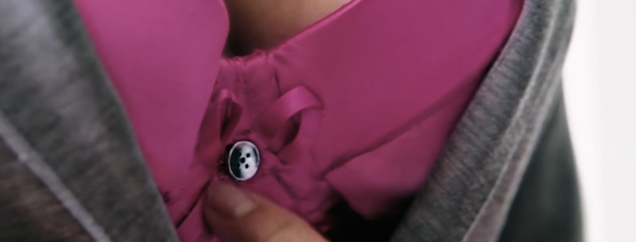
It's an obvious stunt. Nestle Fitness outfitted a woman with a bra camera to show just how many people sneak a glance throughout the day. Spoiler! It's a lot of random eyeballs. Why did they do this? Nestle Fitness says: to remind women around the world to check their breasts regularly to help prevent breast cancer.

Christopher EvansLove this!

Christopher EvansAnd the award for ugliest phone goes to...
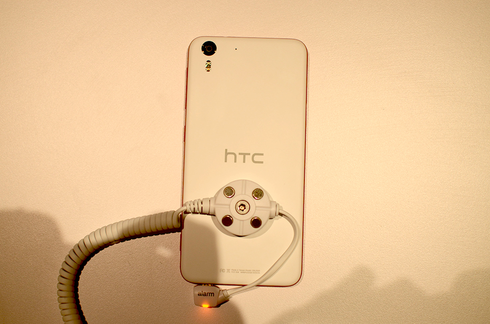
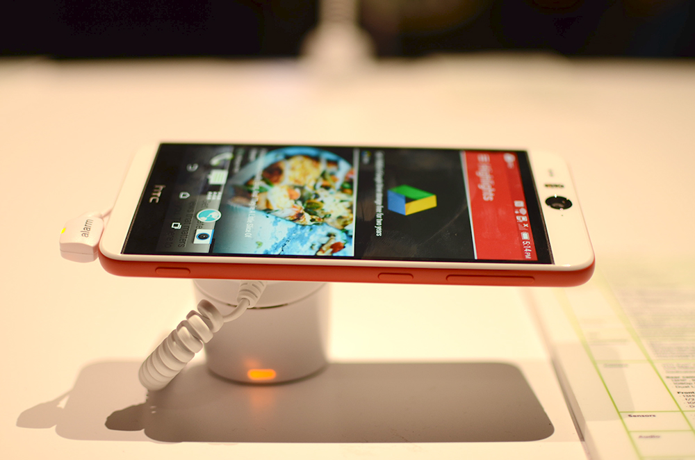
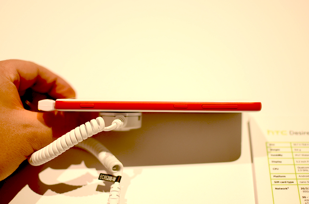
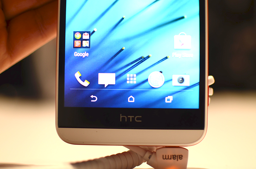
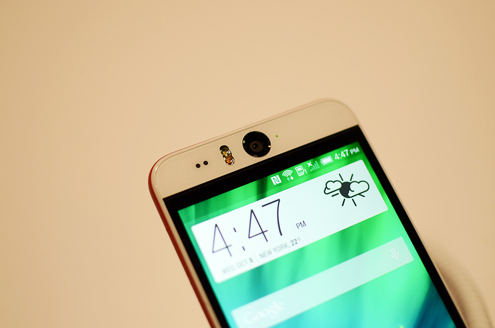
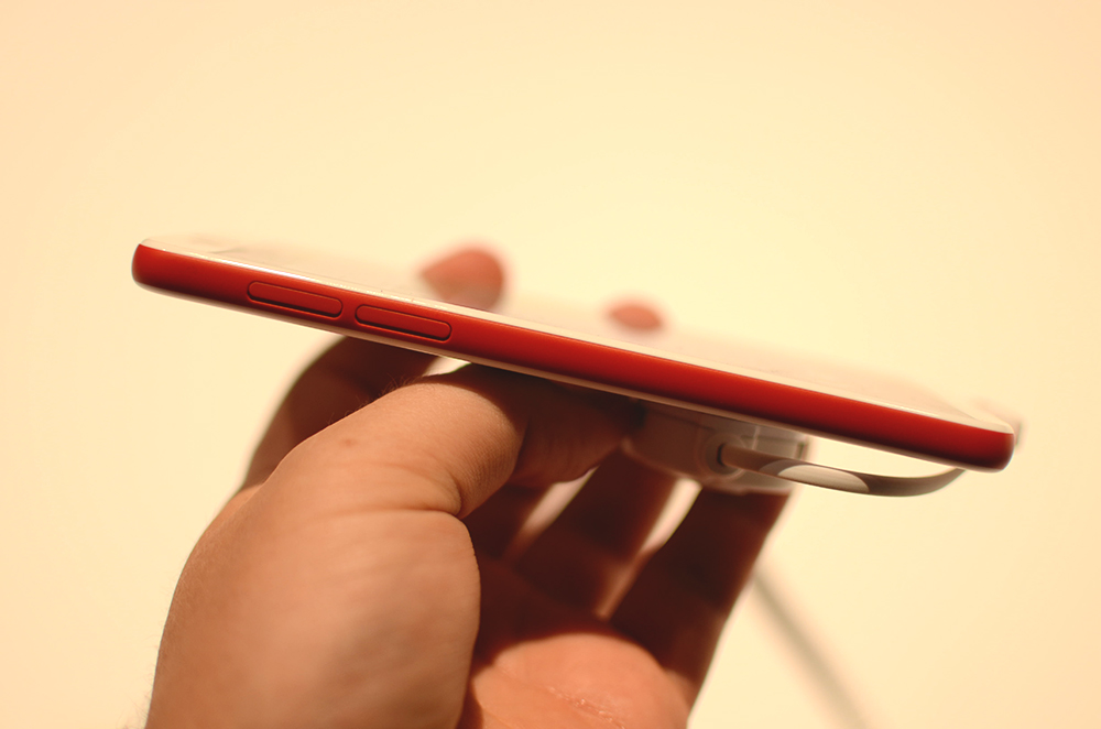
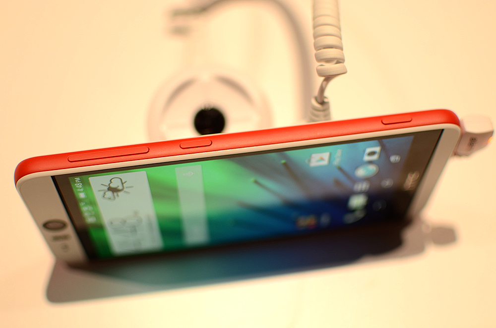
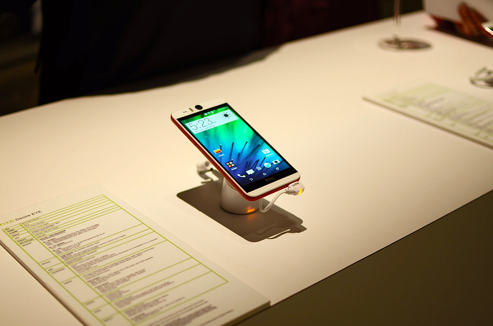
HTC made it official today with the announcement of the HTC Desire Eye. This device is packing a 5.2″ FHD display, Snapdragon 801, 2GB RAM, and comes with Android 4.4.4 right out the box.
Of course, the defining feature of the Eye is its dual 13MP cameras. That’s right, both the front facing camera and back shooter are sporting the higher resolution. They’ve created what I overheard one rep say, “the ultimate selfie-taker.” I spent a good ten minutes playing with the camera, including the Split Capture feature, which is a part of the new EYE Experience for HTC’s cameras. The front facing 13MP camera is definitely heads above any other Android device that I’ve handled.
The Desire Eye is also rated IPX7 on the waterproof scale, features BoomSound speakers, 2,400mAh battery, and a microSD slot for cards up to 128GB in size.
Check out the quick hands-on gallery and video below!


HTC Desire Eye Hands-on is a post from: Droid Life
One of Apple's favourite sticks to poke Android with has always been the sluggish upgrade rate of new versions of Google's OS. While Apple's still got the 'droid handily beat in that respect, it looks like Apple might have a growing problem on its hands with iOS 8 adoption.
Georgia Tech researchers have come up with an app that turns Google Glass into a real-time closed-captioning display for the hearing-impaired, using the voice recognition in the user's Glass-paired smartphone. Now this is a face-computer use we can get behind.
Christopher EvansThis is pretty smart.
It's a tough pill to swallow, but smartphones aren't getting any smaller. And since those larger displays are unfortunately putting more of a strain on battery life, Microsoft Research is proposing a clever trick that promises to extend your phone's usable hours by detecting and dimming parts of the display already obscured by the user's fingers.

For five straight years, I spent an inordinate amount of time staring at the screen of an iPhone. I'm not alone in that, but I am usually quick to buy new models and even quicker to download new operating system updates. Perhaps I'm a little too quick, because earlier this year, my enthusiasm got the best of me.

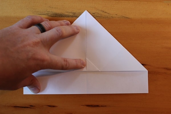
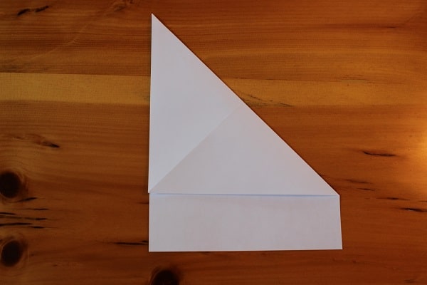
There are many skills fathers should pass on to their children: how to ride a bike, how to skip a stone, and of course, how to make a paper airplane. When it’s time to show your kids how to fold a humble piece of paper into a soaring jet, don’t stumble around and hastily construct one from the poor memory of your youth — one that takes a disappointing nosedive as soon as it leaves your fingertips. Instead, teach them the art of making a plane that can truly go the distance.
The three designs below are tried and true (you wouldn’t believe some of the science behind paper airplanes) and are perfect beginner, moderate, and expert level models to play with. They go in order from easiest to hardest, so there’s something for every age level — including adult; don’t act like you’re not going to try these out in the break room.
This paper airplane is a warm-up of sorts. It’s simple, requires few folds, and flies well. It’s just not going to win you any contests or style points. If it’s your kid’s first time making a real paper airplane, this is a good place to start.

First you fold the paper in half lengthwise, and then unfold. This initial crease is simply a guideline for the next folds.
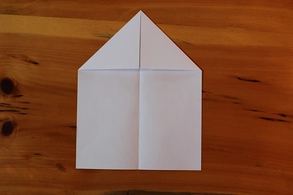
Fold the top two corners down so they meet the center crease. This is the classic way to start a paper airplane, and probably what you first learned as a kid.
Flip the plane over, and fold the corners in again to the center crease. You want the diagonal line coming off the top of the plane (on the left side) to be lined up with the middle (like on the right side).
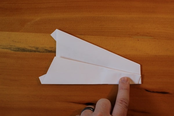
After both folds are completed.
Fold the top point down so that the tip meets the bottom of where the previous folds come together.
Fold the entire plane in half, in on itself. This creates the snub nose, which gives the Bulldog Dart its name.
Fold the wings down so that you’re making a straight line across from the top of the snub nose. Repeat on the other side.
The finished Bulldog Dart. This flies better when thrown at lower speeds. Your tendency is to launch it, but the heavy nose will just fly it into the ground. Give it a softer throw and you’ll have better luck.
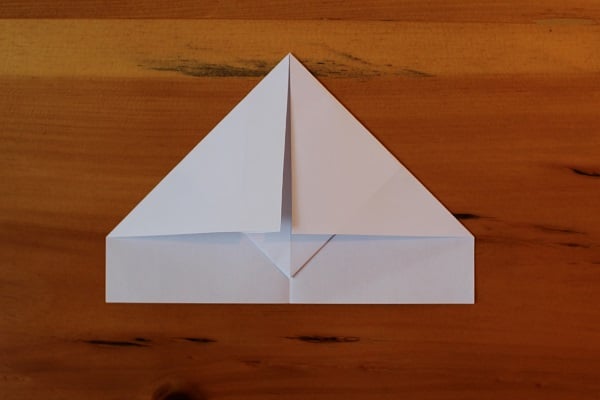
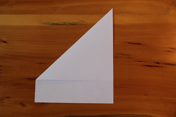
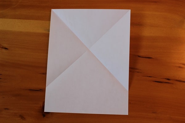
This is a slightly more advanced paper airplane. There are a few more folds, and it flies a bit better than the above Bulldog Dart. This is the perfect middle ground between simple and complex recreational paper aircraft.
Start the same way you did with the Bulldog. Fold in half lengthwise and then unfold. Again, this center crease is just a guide for future folds.
Fold the top corners in so they meet at the center crease.
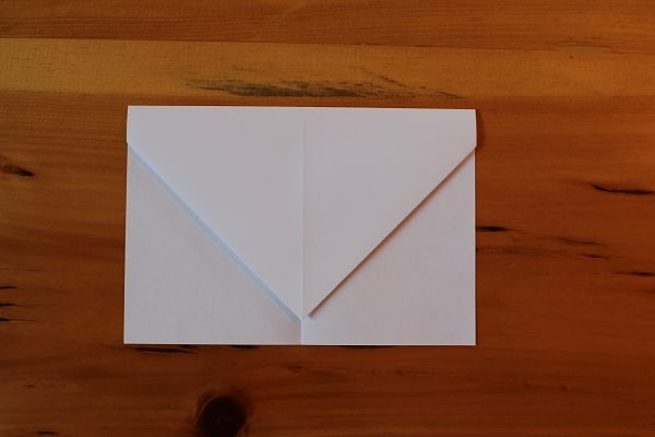
Fold the entire top down so that it resembles an envelope. Make sure you leave a half inch or so at the bottom — you don’t want the top point to evenly meet the bottom edge.
Fold the top corners in so they meet at the middle. There should be a small triangle tail hanging out beneath these folds.
Fold that small triangle up to hold those previous folds in place.

Fold in half, but make you sure you fold it outwards on itself, not inwards. You want the previous triangular fold to be visible on the bottom edge.
Fold the wing down so its edge meets the bottom edge of the airplane. Repeat on the other side.
The finished Harrier. It has cool pointed wings and has great stability because of the triangle on the bottom.
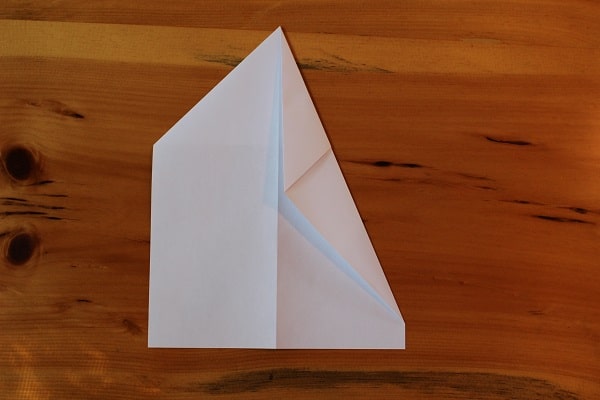
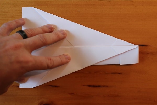
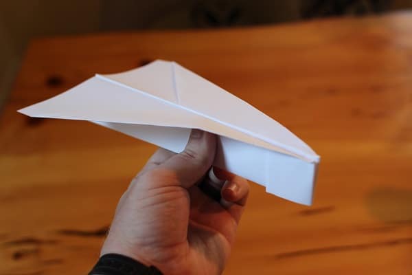
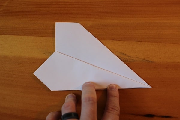
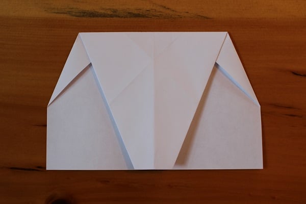
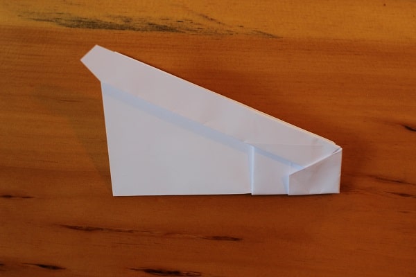
While there are far more advanced paper airplanes, this one, in my opinion, is the perfect balance of complexity and accessibility for the Average Paper Airplane Joe. It has far more folds than the previous two models, and also flies the best and farthest. Pay attention with this one, folks, and the payoff is well worth it.
This one starts a little differently than your average paper airplane. First, fold the top left corner all the way down so it meets the right edge of the paper. You’ll then unfold, as this will be a guiding crease.
Repeat the same thing with the top right corner and unfold.
You should end up with an unfolded sheet of paper with two creases forming an X.
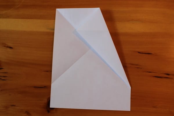
Now, fold the top right corner down so that its edge meets the crease that goes from top left to bottom right.

Do the same with the left corner. The top left point should exactly meet the diagonal right edge of the airplane.
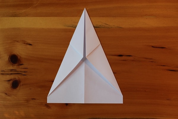
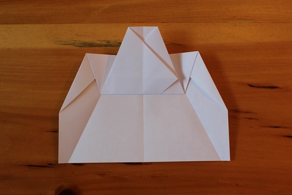
Fold the plane in half in on itself, then unfold. You’ll use that middle crease as a guide.
After you’ve unfolded the previous step, fold the top down so that its edge meets the bottom edge.

Fold the top corners down so that their points meet at the middle crease.

Unfold — as with many steps in making this airplane, these creases are a guide.
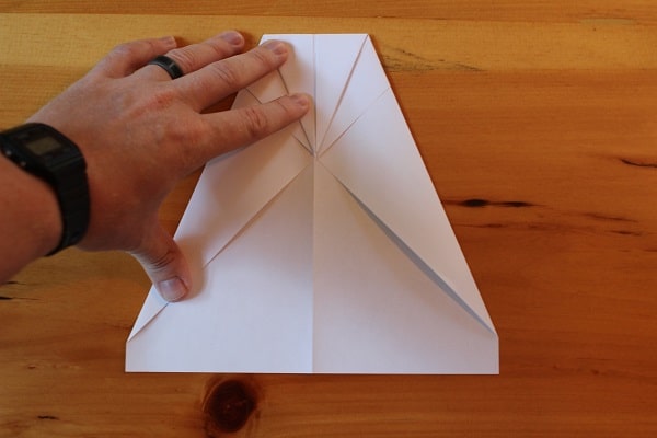
Now take what was the top edge that you previously folded down (3 images back) and fold it back up at the point where its edge meets the creases from the previous step.
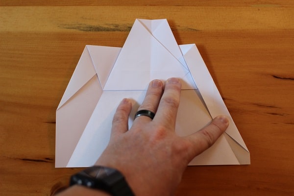
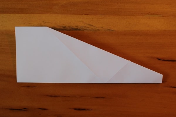
Fold the corners in yet again so that their edge meets both the edge of the top flap and the crease from two steps ago.
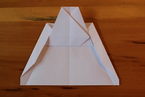
Both corners folded in, meeting both the top flap and the previously-made creases. These are ultimately the wings.
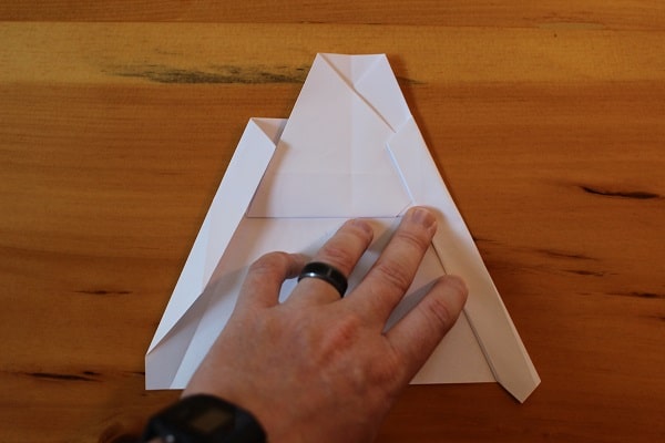
Fold the wings in once more, this time simply folding along the crease that you already made. After this step your plane should have straight lines down from the top to the bottom.
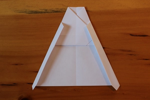
Both wings folded in again; straight edges from top to bottom.
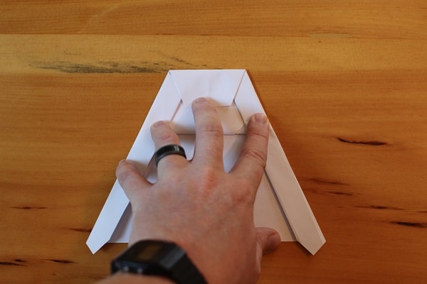
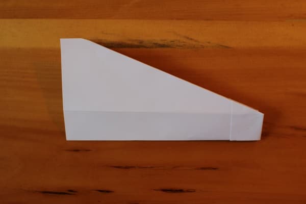
Fold the top down from where it meets the top of the wing flaps you created in the previous step.
Fold the whole thing in half outward. You want all the paper flaps on the outside of the craft. At this point, folding can become a little tricky because of the thickness of the paper, so take extra care in making good, clean folds.
Fold the wings down so that their edge meets the bottom edge of the plane. This creates a small snub nose. Again, this can be a tough fold, so be precise and take your time if you have to.
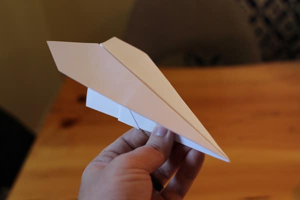
The finished Hammer. This bad boy flies like a dream.
The Nexus 6, constructed by Motorola and Google, has just received the leak treatment from Android Police. Rumors and leaks regarding the Nexus 6 have been in abundance, but this is by far the largest leak we’ve seen yet. Starting with the physicals of the device, the above render reveals that the rumored 5.9-inch display is real and looks just as massive as expected. Also on the front, we can see two black front-facing speakers and a front-facing camera. On the right side, you can just barely see the outlines of a power button and volume rocker.
Continuing on the hardware, the phone is essentially an upsized Moto X in terms of design. The sides will contain the same aluminum trim and the back will be identical to the standard Moto X. The same 13-megapixel camera with OIS and ring flash will be present and the front camera will be 2 megapixels. The 5.9-inch display carries a QHD resolution and a PPI of 496. To keep it going, the Nexus 6 packs in a 3200+ mAh battery, and knowing Motorola, will probably offer great battery life. It should also be noted that the phone will be capable of using Motorola’s Turbo Charger.
Looking at the software, we can see Android L (5.0) with redesigned icons that use Material Design. A new folder holds the Google Drive suite of apps, suggesting that the family will be pushed more with the next release of Android. Curiously, there appears to be a messaging icon next to the dialer. If you’ll remember, the Nexus 5 ditched the dedicated messaging app and used Hangouts as the default messaging app for the phone. Unless this is a rebrand of Hangouts, we could see the messaging app making a return. Unless, of course, it was simply a mix-up in the concept photo.
While the Nexus 6 has the potential for greatness, we’re forced to wonder about the size. The large 5.9-inch display and gargantuan form factor are sure to be off-putting to some. Additionally, there haven’t been any leaks of a smaller Nexus 6 device to accompany it, so this could be the only Nexus phone arriving this year. We’ll have to wait and see what Google does, but this could signal a change in the Nexus line. And possibly one that won’t be found popular.
What are your thoughts on the leak?
Christopher EvansExtra lol at the tooltip.
![More actual results: 'Hello. My name is Inigo Montoya. You [are the best. The best thing ever]', 'Revenge is a dish best served [by a group of people in my room]', and 'They may take our lives, but they'll never take our [money].'](http://imgs.xkcd.com/comics/ios_keyboard.png "More actual results: 'Hello. My name is Inigo Montoya. You [are the best. The best thing ever]', 'Revenge is a dish best served [by a group of people in my room]', and 'They may take our lives, but they'll never take our [money].'")
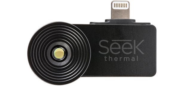
Through apps and accessories our smartphones can be almost any digital tool we could ever need, including a thermal camera as FLIR showed us earlier this year. Not surprisingly, competing products to the FLIR ONE have started to appear, including the Seek thermal camera which promises a considerably smaller form factor and a cheaper price tag, without sacrificing too much in terms of its capabilities.
By Hoi Lam, Developer Advocate, Android Wear

The best cooking companion since the apron?
Android Wear is designed for serving up useful information at just the right time and in the right place. A neat example of this is Allthecooks Recipes. It gives you the right recipe, right when you need it.

This app is a great illustration of the four creative visions for Android Wear:
Allthecooks also shows what developers can do by combining both the power of the mobile device and the convenience of Android Wear.
One particularly well-designed aspect of Allthecooks is their approach to the multi-device experience. Allthecooks lets the user search and browse the different recipes on their Android phone or tablet. When the user is ready, there is a clearly labelled blue action link to send the recipe to the watch.
The integration is natural. Using the on-screen keyboard and the larger screen real estate, Allthecooks is using the best screen to browse through the recipes. On the wearables side, the recipe is synchronised by using the DataApi and is launched automatically, fulfilling one of the key creative visions for Android Wear.
The end result? The mobile / Wear integration is seamless.
Once the recipe has been sent to the Android Wear device, Allthecooks splits the steps into easily glanceable pages. At the end of that list of steps, it allows the user to jump back to the beginning with a clearly marked button.


This means if you would like to browse through the steps before starting to cook, you can effortlessly get to the beginning again without swiping through all the pages. This is a great example of two other points in the vision: glanceable and zero or low interaction.
One of the key ingredients of great cooking is timing, and Allthecooks is always on hand to do all the inputs for you when you are ready to start the clock. A simple tap on the blue “1” and Allthecooks will automatically set the timer to one hour. It is a gentle suggestion that Allthecooks can set the timer for you if you want.


Alternatively, if you want to use your egg timer, why not? It is a small detail but it really demonstrates the last and final element of Android Wear’s vision of suggest and demand. It is an ever ready assistant when the user wants it. At the same time, it is respectful and does not force the user to go down a route that the user does not want.
Great design is about being user-centric and paying attention to details. Allthecooks could have just shrunk their mobile app for wear. Instead the Allthecooks team put a lot of thoughts into the design and leveraged all four points of the Android Wear creative vision. The end result is that the user can get the best experience out of both their Android mobile device and their Android Wear device. So developers, what will you be cooking next on Android Wear?
For more inspiring Android Wear user experiences, check out the Android Wear collection on Google Play!


Apple has posted an 'official' workaround to the iOS 8 screwing-over-your-cell-connection update, and it's similar to all the versions that've been floating around today : backup your phone, then restore to the earlier version of iOS 8, using iTunes. And no, they still haven't said sorry. [Apple]
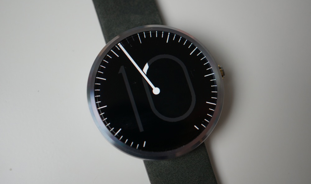
Creation of watch faces for Android Wear is booming right now, even though Google has yet to release an official API for their development. Regardless, much like in Jurassic Park, developers will find a way. And for that, we would like to thank them.
We have compiled a showcase for a few of our favorite watch faces that are currently available for the Moto 360. While this list is somewhat short considering the hundreds of different choices out there, we hope this post can serve as reference for anyone who would like to go beyond the stock faces that Motorola and Google provide out of the box.
There are three main applications we use to peruse the options made available from developers/designers who put their work out for the public to download. These applications are Facer, Android Wear Faces Creator, and WearFaces. Each app curates a select few watch faces, then lets you go about and discover other options on your own. In addition, a couple of them even allow you to import your own images to create your very own watch faces.
In Facer, for example, a few choices are made available only through IAP, so if spending money is not something you are looking to do, your options will remain somewhat limited in a couple of the applications. However, most of the apps shown below are free to use, so have some fun.
As a note, to send watch faces to your smartwatch through Facer and WearFaces, you will need the aforementioned apps installed, the watch face’s zip file (given through the applications), a file manager such as ES File Explorer, and then to simply follow the instructions inside of the application. All it requires is a quick unzip of the files into the app’s main directory through the file manager, then a sync from the app to the watch. It might sound complicated, but once you do it a couple of times, you will be a pro.
Take a look below at a few of the options we have installed below. If you like what you see, feel free to download the apps via the links to Google Play that are provided.
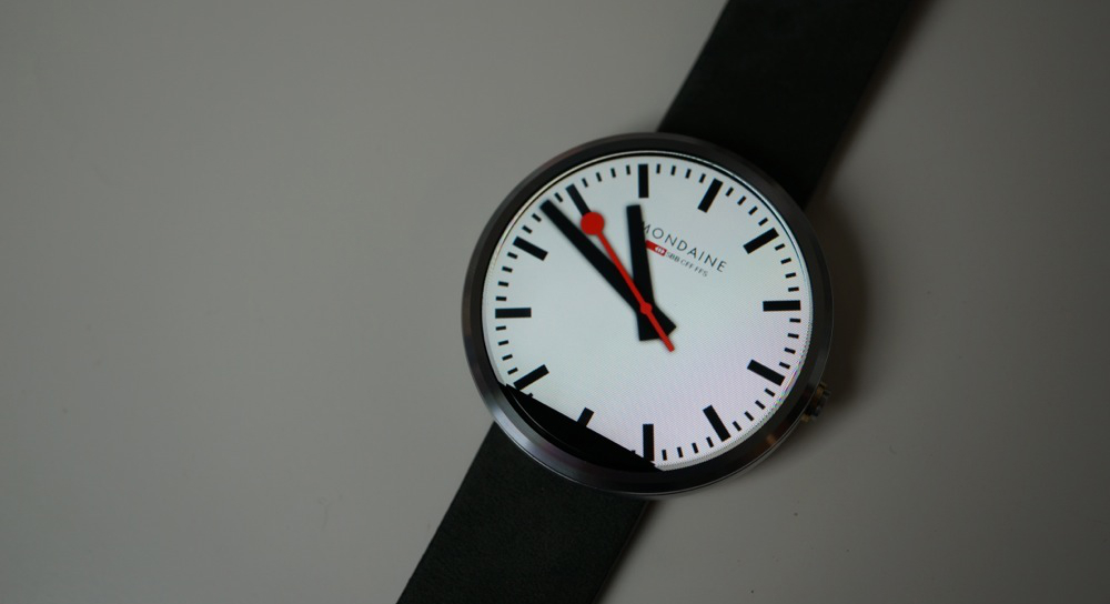
Mondaine Face
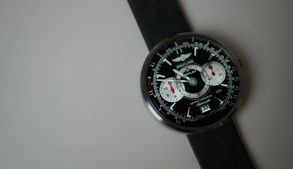
Breitling (zip file)
modotech
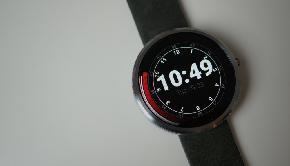
Radiance
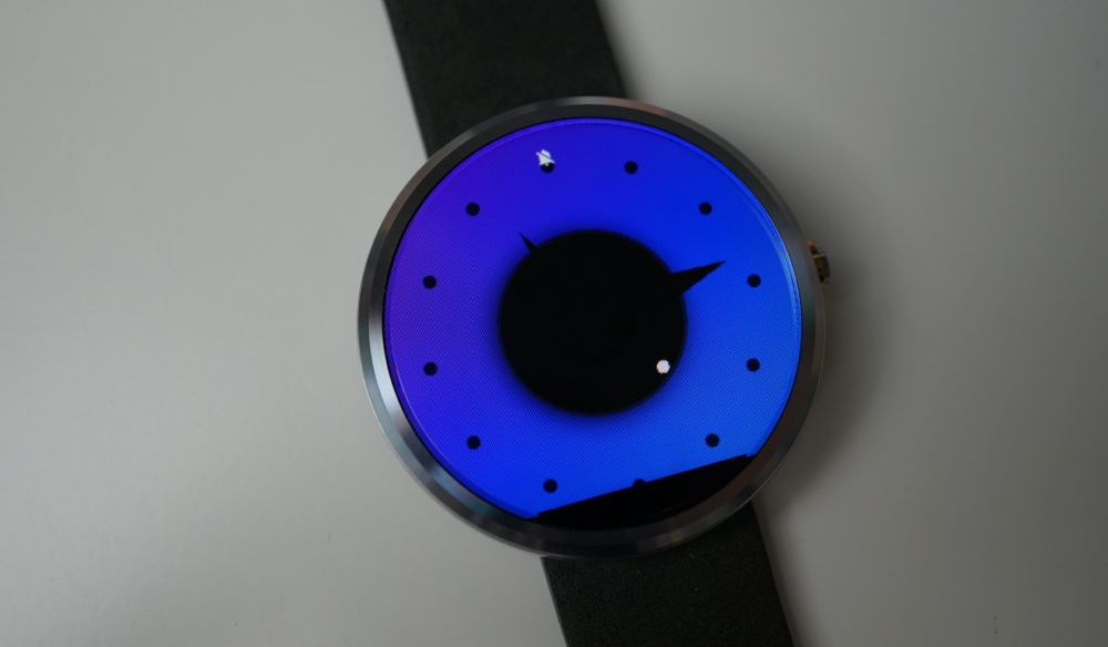
Move
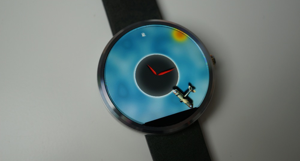
Form
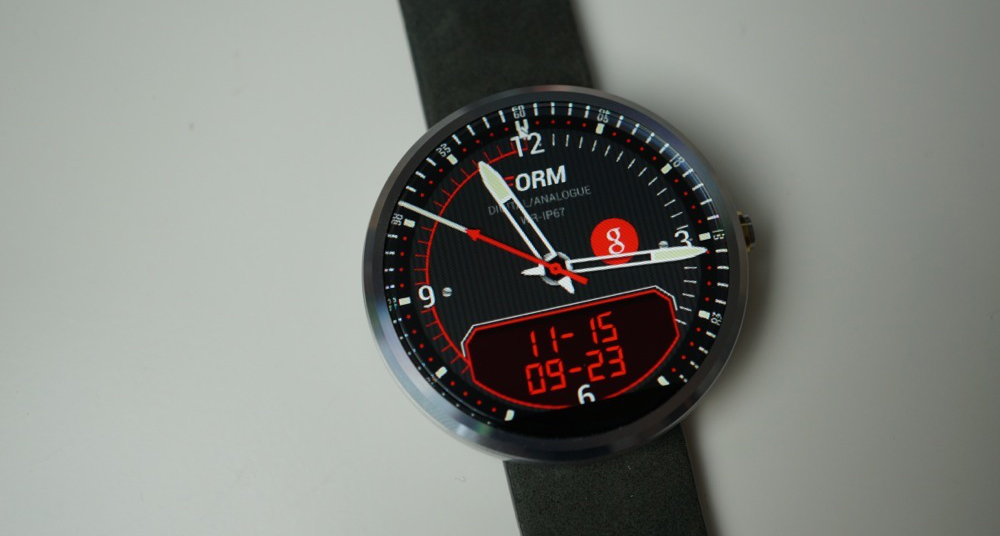
Titanium
Chromium
If you have your own fancy watch face that we did not feature here, feel free to leave links/pictures in the comments below.
Top Custom Watch Faces for Android Wear is a post from: Droid Life
Christopher EvansiPhone 6 review from an Android site. I actually think it seems pretty fair and unbiased.
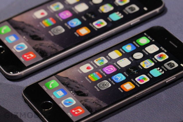
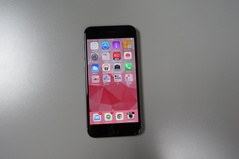
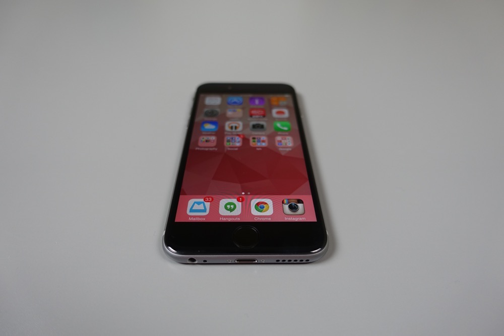
For years, we have debated whether or not we should do an iPhone review of some sort. And for years, we always decided against it for one reason or another. But this year, with iOS 8 reinventing all of our favorite Android features, along with a reinvention of the big phone (“bigger than bigger,” people) through the iPhone 6 and 6 Plus, we thought that it was finally time. So yes, we have an iPhone 6 and we are going to review it.
Before we dive into all things iPhone 6, I want to make one thing clear – we are not going to bombard you with iPhone 6 stories unless you ask for them. We are an Android site after all, so the last thing we want to do is annoy you with stories about Android’s biggest competitor. In the end, we really just want to take some extra time with the competition to really get to know the competition. That’s it.
To begin our coverage, I wanted to put together my initial thoughts on the device after having it in hand throughout the weekend as my daily device. This shiny little toy showed up Friday and has been by my side ever since.
You will hear more in the video below, but basically, you have a phone with a great camera, beautiful display, amazing battery life, and solid performance, that is hampered by the incredibly inefficient ways that iOS forces you to work. From attempting to manage notifications to the odd way that it decides how loud volumes are to the lack of Android’s back button, I can tell you that I appreciate Android more and more every day. While I have few major complaints about the phone thus far (because Apple really has made iOS closer to Android than ever), it has just become more apparent as time goes on that Android is a far superior and advanced mobile operating system – at least in the ways that I need to use it.
So, here we go. Below are my first impressions of the iPhone 6. I tried to keep it short, but there is so much to say.


iPhone 6 First Impressions – Yes, Really. is a post from: Droid Life
Christopher EvansLol.
Lulz.
Apps should not be allowed to say they’re updated for iOS 8 if they don’t support the new display sizes.
— John Gruber (@gruber) September 19, 2014
Yeah, developers need to seriously update their apps for the 6 Plus.
— Mark Gurman (@markgurman) September 19, 2014
I just downloaded a lot of apps on the iPhone 6 and it looks like they're ALL magnified. Updates needed!
— saschasegan (@saschasegan) September 19, 2014
6 plus users are getting just the tiniest, tiniest taste of android hardware spec fragmentation hell right now
— Chris Ziegler (@zpower) September 19, 2014
OK, after 30 minutes of using the iPhone 6+ its clear app dev need to work on scaling. As do we…
— Benjamin Dyer (@benjamindyer) September 19, 2014
Blown up iPhone 5 apps look terrible on the 6. I can’t imagine how bad they look on a 6+.
— Graham Wetzler (@grahamwetzler) September 19, 2014
Talk about fragmentation. iOS on iPhone 6 plus. No two apps look and behave the same. Tonnes of "non scaling" apps. Not a good start.
— Varun Singh (@phiero) September 19, 2014
@escoz Sounds good! Hopefully the small update brings support for iPhone 6 screen. The scaling Apple is doing currently looks terrible.
— Kevin Dietrich (@_kevdi) September 19, 2014
Most apps do not look good on iPhone 6 plus while scaling. This means that we have to create custom interface to fit the screen best.
— Denys Zhadanov (@DenZhadanov) September 19, 2014
I'm already tired of scaling on #iPhone 6.
— Wes Hargrove (@whargrove) September 19, 2014
Yup, companies working on it now RT @WilliamBerlin: The iPhone 6 will be better when they format the apps to the screen.
— Paul Briggs (@PastorTroy_) September 19, 2014
Most of the apps I have installed look like garbage on the iPhone 6 plus. It's like scaling up and iPhone app to run on an IPad.
— Josh Highland (@JoshHighland) September 19, 2014
Pretty much none of my apps have been updated for the new iPhone 6 screen size. #fail
— Jacob Evans (@evansio) September 19, 2014
They need to fix some of these apps because they look hideous on the iPhone 6 Plus
— Charie Traplin (@King_Eazzy) September 19, 2014
Even after an hour of use I'm annoyed with apps that haven't been updated for the iPhone 6 screen size. Hurry devs!
— Rob Wright (@isrob) September 19, 2014
There are only a few apps that are optimized for iPhone 6. Okay developers! Get on it!
— Anthony C Waldron (@AnthonyCWaldron) September 19, 2014
And I quit.
Welcome, iPhone Users and iOS Developers, to Fragmentation. is a post from: Droid Life
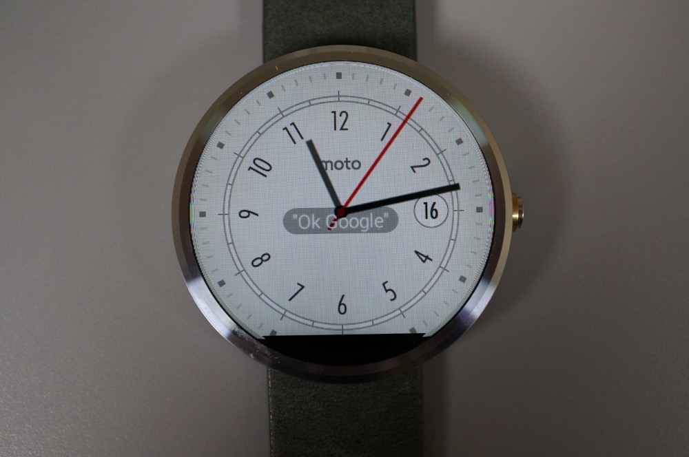
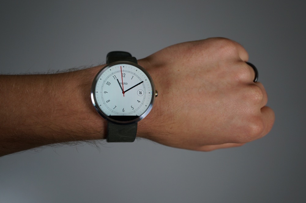
Christopher EvansI can't get over the fact the screen isn't a full circle. Upsets me to look at it.
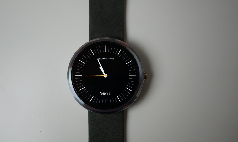
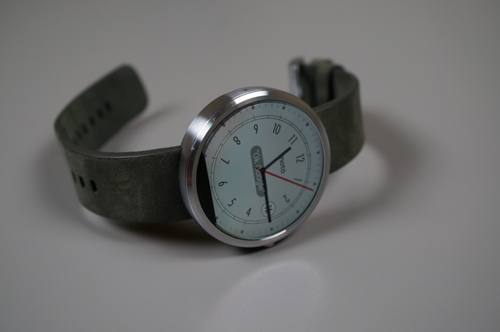
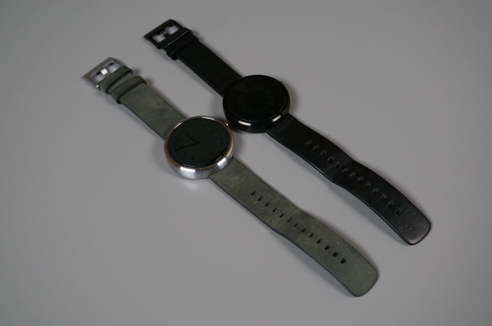
Motorola’s Android Wear watch, the Moto 360, is without a doubt the most anticipated wearable of 2014. There is good reason for that, of course. Thanks to its classic, round design, stainless steel body, and leather accessories, there aren’t any other smartwatches that can come close to the overall package promised.
Motorola took their sweet time getting it ready for retail after initially unveiling it in March, but the device is now available for purchase. Early reviews showed concern over battery life, limited quantities have been available for purchase, and Apple just got done unveiling their own watch, so we can imagine that you want our thoughts. Trust me when I say that there are plenty to share.
This is our Moto 360 review.
The Moto 360 is without a doubt the most beautiful smartwatch on the planet. Actually, there isn’t even a close second in my opinion, and that’s with both the newly unveiled Apple Watch and LG G Watch R included in the conversation. Motorola tried to create a classic-looking timepiece that you would be proud to wear on your wrist as a watch, but that also manages to perform tasks as a smart device. They have succeeded and then some.
The round display, along with premium build quality and materials combine to make a device that most probably wouldn’t believe is a smartwatch unless you told them. Smartwatches haven’t ever looked this good. Pebble tried and failed to create a normal-looking watch with the Steel. Samsung has made…things. Others too. This is the first – and so far from what I have seen, only – smartwatch I would consider wearing on a daily basis.
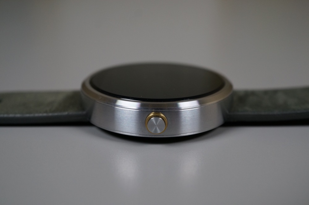
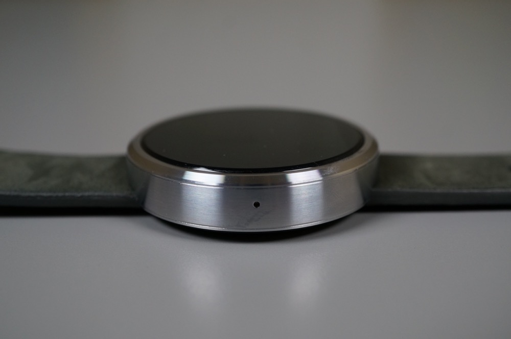
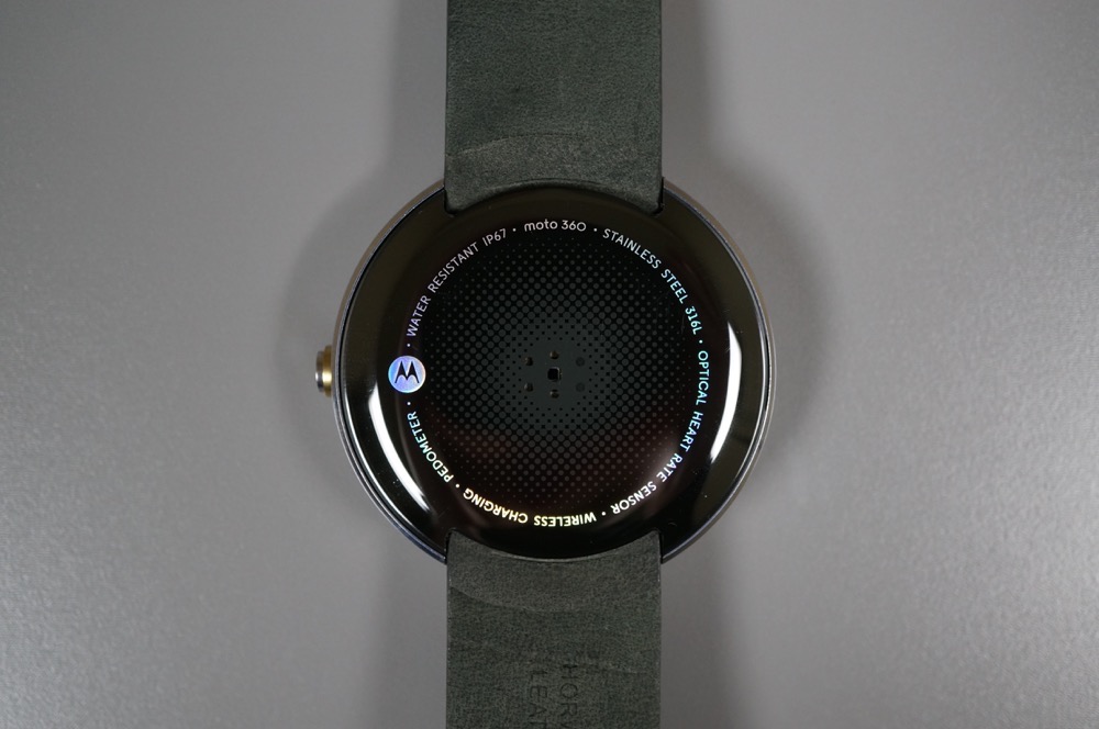
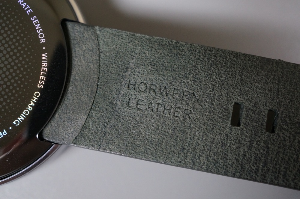
Motorola is using stainless steel in the watch’s case and clasp, along with leather watch bands made by Horween, a company based out of Chicago that also makes NFL footballs. The face is glass, but protected by Corning Gorilla Glass and shouldn’t scratch. There is a bit of plastic on the under side, yet you wouldn’t notice, especially since that’s the portion of the device that sits on your wrist.
Speaking of the watch on your wrist – it’s actually a really nice size. There were worries early on that the device would be far too big for most, but on my slim wrists, I do not feel like this watch is too big. It’s not small by any means, but it’s also not huge. Motorola worked really hard to create a watch that sits perfectly on a human’s wrist, along with one that also uses proper materials to conform to it without showcasing gaps. When wearing the 360, it feels like you are wearing a premium watch, not a heavy or clunky smartwatch.
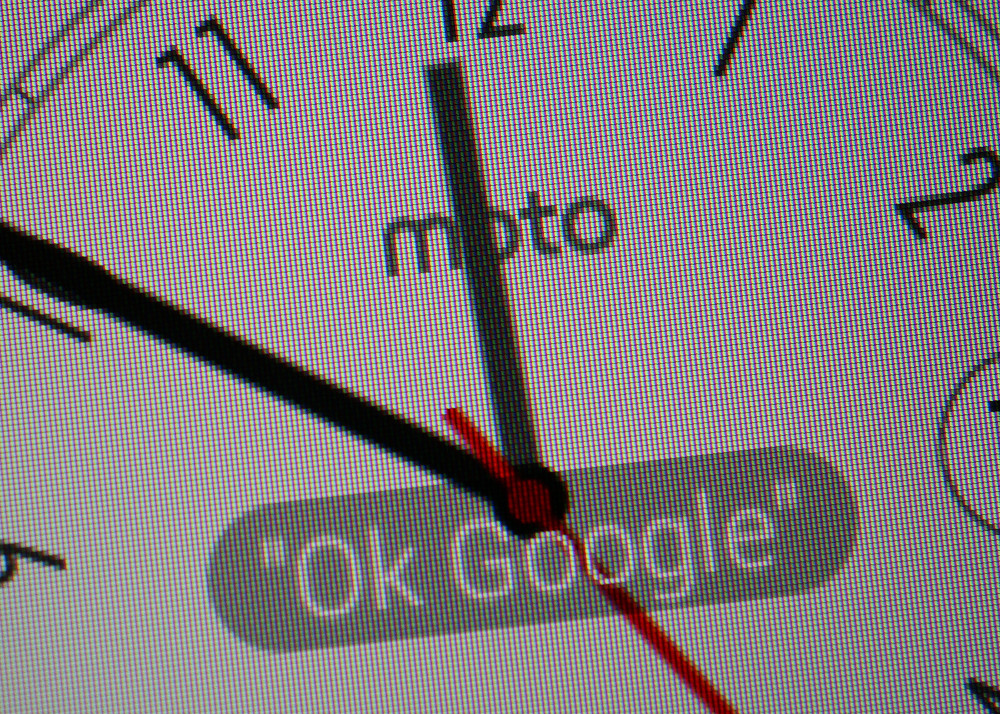
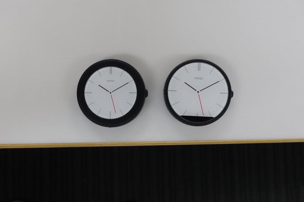
If there is one blemish on the 360’s design, you could argue that it’s the black area (known as the dreaded “black bar”) located at the bottom of the round display that sort of makes it not fully round when lit up. As we have mentioned on a number of occasions, this area houses the ambient light sensor, and was needed in order for the device to have such little bezel. If Motorola decided to make the display fully round without this area, the device would have had a sizable bezel around the entire display (like this), something I’m glad they chose not to do. We have heard people claim that they can’t “unsee” it, but I can tell you that in the almost-two-weeks I have spent with the watch on my wrist, not once has it bothered me.
When you hear Motorola talk about the 360, you can’t help but sense the amount of time and careful thought that was put into its exterior and interior to get it right. I think it’s safe to say that they did.
Motorola chose to put a 1.56-inch round LCD display in the Moto 360 that is protected by Gorilla Glass, a bold move that really took engineering expertise in order to achieve. Thanks to that previously mentioned “black bar,” the display runs edge-to-edge without bezel, with a slight chamfer to blend it into the stainless steel body. Depending on how you look at the 360, the display almost appears as if it floats. It’s very cool. The round display is indeed the star of this show.
The display resolution is somewhat low at 320×290 (205ppi), but no different than other watches of today. Pixels can be seen in text here or there, plus there is this rainbow-like effect towards the chamfer when you have a white screen up that is not exactly pretty or a “feature.” Colors are bright and clear, and the display overall gets the job done. This is a round 320×290, first-of-its-kind type of display we are talking about here. You aren’t supposed to be analyzing pixels in photos or looking for precise lines and image detail – it’s a 1.56-inch display on a watch.
In sunlight, I found the Moto 360 to perform quite well, as long as you have a white watch face showing. You may recall our frustration with the G Watch, in that it was completely unusable when outdoors. That is not the case with the 360.
I would call it a good first effort, but will hope that future round smartwatch displays can improve, assuming they won’t destroy battery life.
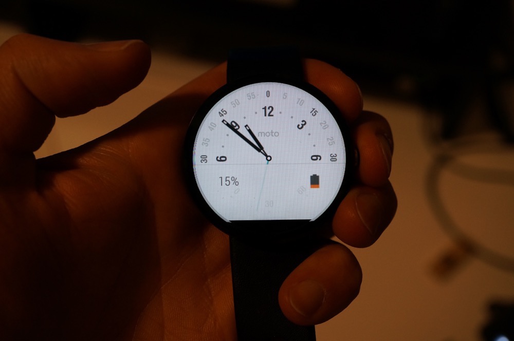
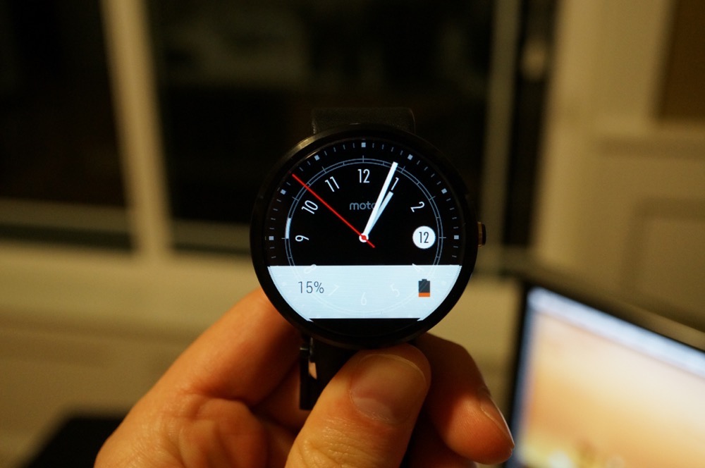
What about battery life, though? I shared some thoughts on battery life a week ago, and those thoughts have not changed. The Moto 360 has two display modes – Ambient Screen on or off. If you keep Ambient Screen on, your device will stay awake, dimly lit, all day long, so that you can quickly glance at it from any angle to check the time, just like a normal watch. The battery (320mAh) and processor (an ancient TI OMAP 3) together are not good enough for the device to last for more than 10-12 hours with this mode on. I would advise you leave it off. If you leave Ambient Screen off, your watch will last you all day, from the moment you wake up and take it off the charger until you take it off at night and go to bed. With Ambient Screen off, not once has the Moto 360 died on me in a day and left me stranded with a dead device on my wrist. On most days, I take the watch off, check the battery percentage remaining and typically see at least 15%.
So here is the deal. As with any smartwatch, you need to learn how to optimize it. A smartwatch isn’t supposed to replace your smartphone. It’s supposed to be an extension of it, to help you quickly view information before deciding if it needs more attention (which would mean pulling your phone out). A smartwatch is there for quick voice replies to texts or messages, seeing calendar appointments or new emails as they roll in, navigation here or there, and some fitness tracking. It is supposed to help you efficiently manage your time with your phone, to help you decide if items need action now or later. If you approach your smartwatch in that manner, you will get all-day battery.

Other Android Wear watches currently have better battery life than the Moto 360, there is no denying that. But in the end, they aren’t seeing 2-3 day battery life either. While the 360 may see 20-25 hours of use and need charging at night, others need nightly charges as well if you want to see them last throughout the next day. So in the end, all Android Wear watches need nightly charges.
Is battery life on the Moto 360 bad? No. Is it great? No. It really is somewhere in the middle, but again, it will last you a full day without worry.
The Moto 360 is powered by a TI OMAP 3 processor, which is the same processor used in 2010’s DROID 2 and Motorola’s previous smartwatch, the MOTOACTV. It’s old, slow, and power hungry. We still aren’t sure why Motorola decided to use this tired old processor to power their beautiful smartwatch when everyone else in the game is using a modern day Qualcomm Snapdragon 400, but I can’t help but mention how disappointing that fact is. The Moto 360 doesn’t need to do much, yet you will often find stuttering in the UI when swiping or scrolling between cards and activating voice actions. It doesn’t lag all of the time, but the lag is real. The “jank,” as Tim would put it, is real.
If you were rating performance on the 360, you could probably put it somewhere in the middle, bordering on semi-bad. That’s not to say that the 360 is ever unusable, because again, it doesn’t need to do much other than show cards, allow you to swipe between them, and be prepared for voice actions. The 360 just isn’t as fluid as one would like from a smart device in 2014. I guess chipsets from 2010 aren’t ready to leave 2010 behind.
The Moto 360 runs Android Wear, Google’s platform for wearable devices. At this stage in the game, Android Wear is still very young and needs time to grow. The idea behind Android Wear is this – your watch can provide you with important information just when you need it. The information isn’t supposed to include great detail, it’s supposed to be glance-able. It can take voice actions and give you feedback or complete actions through them, track fitness goals, and will eventually include added functionality when your favorite app developers build out compatibility. This is one of those software platforms that should get better over time, assuming developers can figure out the best ways to take advantage of a screen on your wrist.
Google claims there are over 1,000 apps that have already added in Android Wear compatibility. You can see many of them here. Apps like Runkeeper show current fitness activities on your watch, you can request car rides through services like Lyft, send messages through Whatsapp, get notifications from Trello, automate ideas with IFTTT, get boarding passes from Delta and American Airlines on your wrist, manage your golf round, and even remotely snap photos.
This is a new area for the tech world, one we still don’t full have a grasp on, if you ask me. But as we start to decide how we want to use our smartwatches, Android Wear should follow along and become incredibly powerful. At least I hope that’s how it works.
If you want to see Android Wear in action, be sure to check out our LG G Watch review.
I can’t thank Motorola enough for making the Moto 360 Qi compatible. Previous smartwatch attempts from others typically use awkward attachments or charging PINs with docks in order to re-charge, but Motorola went super simple. All you need to do is set your device into the Qi wireless charging cradle that is included with purchase to charge it. That’s it. There are no cords, no ports, and no attachments that you will lose. All you have to do is drop the device into the cradle and it will charge, fully within an hour. Oh, and since it’s Qi compatible, you can set the watch on almost any other Qi wireless charger that you may already own. It is glorious.
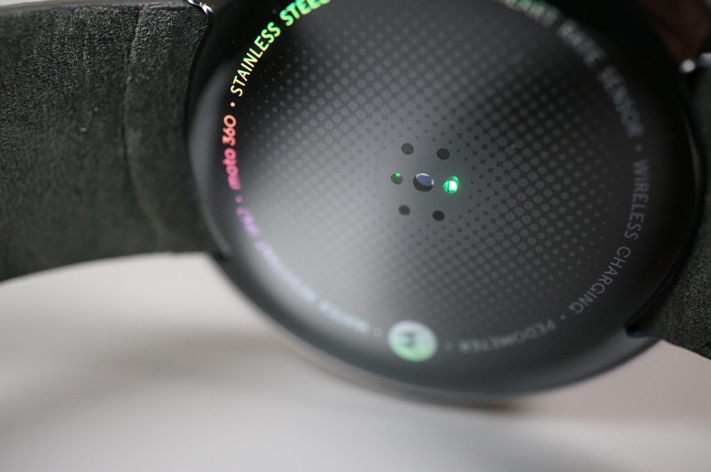
Motorola included an optical heart rate monitor in the Moto 360. It attempts to take check your heart rate, probably better than other watches. I still couldn’t tell you how accurate it is. For example, I ran 6 miles on Sunday, yet the 360 clocked my heart rate at around 60bpm when I was finished, then 120, then 60, then who knows. The Moto 360 wants to help you stay active throughout a day by telling the percentage you are active in a day, which it should be given credit for. At this time, though, I’m not sure you should rely on it. Expect it to get better over time as Motorola issues updates to it.
The Moto 360 is $249.99 and available at Motorola’s store, Best Buy stores and online, and Google Play. So far – at least at the time of this review – the device is hard to come by. It sold out immediately when the first batch went up for sale and has stopped off at Best Buy and Google Play sparingly over the last couple of weeks. Motorola is going to re-stock today in limited quantities, but we have yet to hear when they expect to stabilize inventory and make the watch easily accessible.
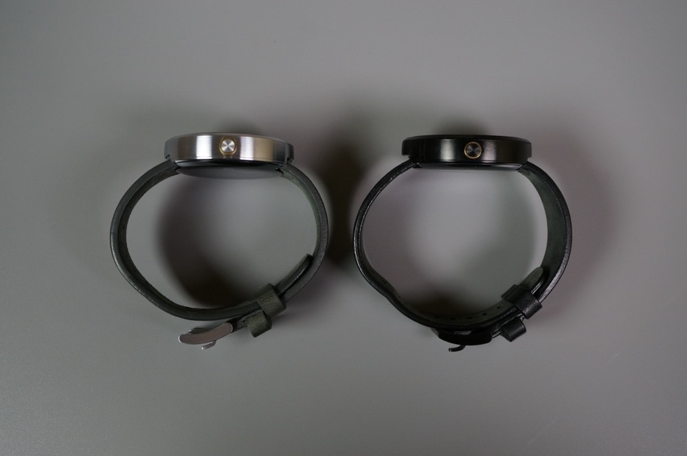
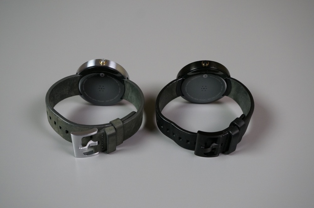
At $250, I would call the Moto 360 priced about right. Motorola is pricing the device slightly above the LG G Watch and Samsung Gear Live, but you could see their reasoning when you think about the premium materials (stainless steel and leather) being used.

The Moto 360 comes in two colors – black with a black leather watch band or silver with a grey suede leather watch band. Color preferences are obviously a personal thing, but if you ask me, the silver with grey suede leather is the best of the two. The silver stainless steel in the device casing and clasp offers a subtle contrast to the grey leather that really allows the device to have some personality and act as a fashion item. The black version is just that – all black. It’s not ugly, it’s just the more un-assuming model. I would also add that the grey suede leather band on the silver model is a much thicker cut of leather that will likely last longer than the flimsy black leather band included with the black model.
In the coming months, Motorola will release new leather band options, along with stainless steel bands. The stainless steel bands will run $79.99; the leather bands will run $29.99. The metal bands will be available in either black or silver, whereas the leather options should grow over time.
The Moto 360, like all Android Wear devices, works with Android phones running 4.3 or higher. Approximately one third of all Android devices run Android 4.3, including almost every device released within the last year. If you have a modern smartphone, you should be covered.
Unboxing
Software Tour
I have worn a lot of smartwatches over the last couple of years, none of them get this kind of positive attention. I was at a wedding reception this last weekend and at least three people said, “That’s a really cool watch.” Never once did that happen with the G Watch or Pebble or Galaxy Gear or Qualcomm Toq or Sony’s Smartwatch 2. Most people see those glowing, wrinkle their forward with confusion, and then move on. With the Moto 360, they actually find themselves interested. They want to know what that beautiful device is on my wrist. Motorola tried to create a classic timepiece with style and class, and they have done that. As a watch alone, the Moto 360 wins.
On a smartwatch front, the Moto 360 is still in its infancy, like all smartwatches powered by Google’s Android Wear. For now, it handles notifications well, showing them better than any other smartwatch, thanks to its round display. More apps will build in functionality and the platform will evolve. Battery life could be better, but it will get you through a day. Performance could be better too, but it’s not bad enough that it will frustrate you. Overall, this is a smartwatch that should only get smarter and more efficient.
The Moto 360 is the smartwatch to buy if you have decided that you need a smartwatch in your life at this moment.
Moto 360 Review is a post from: Droid Life
Christopher EvansThis turbo charger sounds awesome. 8 hours battery life from 15 mins of charging. Combine it with contactless wireless charging and you'd be a long way towards solving all charging issues.
Motorola announced this morning that the new Moto X – both the AT&T and “Pure Edition” models – will be available on pre-order starting Tuesday, September 16, along with the new Moto Hint and Turbo Charger. Moto will also re-stock the Moto 360, though it will again be available in limited quantities. Shipping dates will vary depending on the product you order will be provided at checkout, according to Motorola.
The new Moto X runs $99 on-contract or $499 at full retail, which Motorola is hoping attracts buyers as a price around $100 less than other flagships. The AT&T model is a carrier-tied phone, not unlike any other carrier-tied phone. The “Pure Edition” on the other hand, is the unlocked GSM model without carrier ties, that also comes with an unlockable bootloader.
The Moto hint, Motorola’s discreet Bluetooth ear piece, is $149. The Turbo Charger, which can charge a new Moto X to 8 hours worth of juice in just 15 minutes time, carries a price of $34.99.
All devices will be available at 12PM Eastern, 9AM Pacific.
No details were given on the Verizon model or Moto Maker access (edit: Moto’s site says “build” a new Moto X on Tuesday, so Moto Maker should be a part of it), but we are assuming that Moto Maker will be a part of the deal on Tuesday. We were told back in August by sources that the Verizon Moto X would launch on September 25.
Here are some specifics from Motorola’s announcement:
Moto X for AT&T – Order the AT&T version of the new Moto X starting on Tuesday.
Moto X – Pure Edition – The off-contract Moto X is available SIM unlocked and with an unlockable bootloader for $499.99 USD.
Moto Hint – Our discreet wireless earbud gives you complete control of your phone and allows you to access everything you need by just using your voice. It will be available for $149.99 USD.
Motorola Turbo Charger – Our fastest charger ever takes just 15 minutes on the latest Moto phones to get up to 8 more hours of battery life. It will be available for $34.99 USD. Learn more.
Ready to order?
New Moto X on AT&T and “Pure Edition” Pre-Orders Start Tuesday – Moto Hint, Turbo Charger Too is a post from: Droid Life
Christopher EvansInteresting read and not *too* biased.
This week Apple released their long awaited smartwatch, the simply-named Apple Watch, to great fanfare from the Apple faithful. Journalists and Apple employees alike gave the watch a standing ovation — or perhaps that was just for Tim Cook’s use of “One more thing….” — and then they were treated to an overview of the watch, which will be released sometime early next year.
Despite the fact that the Apple Watch requires an iPhone and therefore likely precludes most of you from owning it, we wanted to do a quick overview of some of the features and choices that Apple has made versus the Moto 360. It’s important to remember that the Apple Watch software shown at the even was far from final and that Android Wear will be in a much different place about 6 months from now when the Apple Watch is likely to launch.
Obviously there are many Android Wear options out there and more coming before the Apple Watch launches, but we are going to use the Moto 360 as the comparison point since it is has been one of the most anticipated Wear devices.
Shockingly, we weren’t extended an invitation to Apple’s event, so we have to take hands on impressions of the device from those that were there.
Most indicated that the watch and its bands feel well-constructed and expensive, and at least the aluminum version is reportedly remarkably light. The Apple Watch comes in two sizes, 42mm and 38mm, compared to 46mm for the Moto 360. There are no other official specs related to the size or weight of the Apple Watch, but it appears thicker than the Moto 360 in pictures.
The body of the watch is fairly standard: a rectangular screen with a thick body constructed of stainless steel, anodized aluminum or 18-karat gold, depending on which model you choose. While the basic design isn’t a huge departure from what we’ve seen in other smartwatches, the majority of journalists seemed to agree that the fit and finish is superior. With that said, I think the Moto 360 and its circular face remain the more striking design.
The single unusual hardware element found on the Apple Watch is the “Digital Crown” located on the side of the watch. This functions as a rotating dial and home button and is the primary means for navigating the device other than touch.
Apple made a big point of the Watch’s Digital Crown and how much more logical it is versus a watch relying on pure touch. As no one has true hands on time with the Crown, save for Apple employees, it is impossible to say how well this will work. For Apple to stick with something this skeuomorphic after steering the entirety of their OS away from it, they must think it’s a winner. This is the aspect of the watch I’m most curious to see in practice as it could be make or break for the ease of use.

image credit: FastCompany
I think that this and a few other aspects of the watch may point to a fundamental misunderstanding of how people will want to use a smartwatch. Apple shows you navigating through dozens of apps or hundreds of photos by zooming in and out with the crown and then panning around the screen with touch. This all seems like far more than I want to be dealing with on my watch. If you’ve moved past the 10-15 second mark in any activity with your watch, I feel like you should have just pulled out your smartphone instead.
Android Wear takes a very different approach here and is instead designed to surface what you need without having to ask for it. There are apps that allow you to pull them up, but for the most common uses you are simply given the information you want and you can deal with it quickly and move on. This makes considerably more sense for a device on your wrist and with the screen size that is able to rationally fit on your wrist.
This is one area that I have to say Apple knocked out of the park. The Apple Watch allows you to easily slide new bands in and out without any special tools. Prior to seeing their announcement, I had already written my Moto 360 early impressions post and said that I wish it had an easier mechanism for swapping bands to deal with different use cases. I really enjoy the Horween leather band on the Moto 360, but I can’t easily change bands and I’m not inclined to wear the watch while working out due to that nice leather band.
The Apple Watch will offer leather, polymer and metal bands with either a magnetic closure or a more standard buckle closure.
Reports are that users should expect about a day out of the Apple Watch, so it’s likely a dead heat with the Moto 360 in this regard. And like the standard setting for the Moto 360, the Apple Watch powers the screen down most of the time, only lighting up when you turn your wrist to look at it or interact directly with the watch.
Apple went with a MagSafe-like wireless charging method for the Apple Watch. It simply attaches magnetically to the back of the watch to charge. It appears more portable than the Moto 360 dock, but a less useful implementation. Given that the Moto 360 uses the Qi standard, it is also offers less flexibility than the 360 in terms of third-party charging solutions.

Both platforms have apps coming from hundreds of developers so I’m not going to try to cover that, but I do want to touch on the Apple apps as they are interesting to say the least.
As you would expect there are messaging, mail, maps and phone apps. They all look pretty well done, although the maps app looks like it could be better tailored to the small screen experience. There is also a Friends app that is accessed by the hardware button located below the digital crown and takes you to your most frequent contacts.
Then Apple got a little crazy with things, and I’d love to hear your reactions to these apps in comments.
The first is Sketch, and the best description I’ve come up for it is “Draw Something: Watch Edition”. You draw on the screen with your finger and send that directly to your friend.
Walkie-Talkie, as you might guess, is just a quick way to chat using the microphone and speaker on the Watch without resorting to an actual phone call.
Tap literally allows you to tap your watchface and have it vibrate that pattern on the other watch.
And finally Heartbeat records your heart rate using the sensor and then sends that to your loved one.
Honestly I don’t think these are all terrible ideas for apps, but the amount of attention given to them again shows me that Apple is perhaps not entirely sure that they should be doing with their watch. I’ll just go ahead and compare these to Google Now on Android Wear, which surfaces relevant information for you from around the web based on your interests and location. The central concept of Android Wear (and Google Glass before it) is to deliver information to you, but ultimately try to keep the technology out of your way rather than burying you in it, Apple appears to have gone the opposite way with their watch.
No surprise that Apple is setting the high water mark for price on a smartwatch. The base model will start at $349, so $100 beyond the Moto 360 asking price. They have not indicated what the “Sport” or “Edition” models will cost, but suffice to say they will be significantly pricier than any Motorola option.
As Android Wear is dependent on Android and the Apple Watch requires an iPhone, I don’t expect this to really be a decision for any of you. But as we have learned over the past several years, there is substantial “borrowing” of ideas that goes on with both sides, so it is worth paying attention to what Apple thinks a smartwatch should be.
Is there anything here that you would like to see an Android Wear spin on either from a hardware or software perspective?

