I found a treasure trove of illustration and design this morning over on Telegramme’s site. Go check em out.
![]()


![]()
![]()


I found a treasure trove of illustration and design this morning over on Telegramme’s site. Go check em out.
![]()
![]()
![]()
Avec son superbe projet Before They Pass Away, le photographe Jimmy Nelson a décidé de suivre les tribus dans la planête dont l’existence est menacée. Une initiative qui amène l’artiste anglais à se déplacer aux 4 coins du monde et découvrir des visages d’une beauté incroyable. A découvrir dans la suite.


a la cocina !!!!!!!!!!
Après la magnifique série de photographies “Rurubu – Danse et Calligraphie” du photographe Haley Friesen, c’est au tour de l’artiste et designer Aerosyn-Lex Mestrovic de mêler les énergies du mouvement, issues de la danse contemporaine et de la calligraphie. “Scriptura Vitae” est une performance réalisée avec la collaboration de l’actrice japonaise Miho Nikaido et du danseur Maki Shinagawa.


Born in Tokyo, Dusseldorf-based artist Ramon Todo creates beautiful textural juxtapositions using layers of glass in unexpected places. Starting with various stones, volcanic rock, fragments of the Berlin wall, and even books, the artist inserts perfectly cut glass fragments that seem to slice through the object resulting in segments of translucence where you would least expect it. You can see more of his work over on Art Front Gallery, and here. (via My Amp Goes to 11)
In the spring of 2012, Stefania Malmsten became the new Creative Director of Swedish fashion & culture magazine Rodeo. Stefania was living in New York at the time, working with Swedish and American clients from the collaborative workspace Studiomates in Dumbo, Brooklyn. She had decided to move back to Sweden where she had started her career with designing iconic magazines like Pop and Bibel.
Stefania is known for the attention to typography in her design work:
“I’m very passionate about photography and I’m very passionate about typography. I never wanted to choose between being a graphic designer and an art director and that’s why I love working with magazines and titles for film. Working with Göran on this project has been very luxurious, creating almost like a main character for the magazine.”

For the redesign of Rodeo Magazine Stefania chose Lyon and Benton Sans, two stylish yet traditional text faces. In contrast, she needed something more expressive for headlines, drop caps and graphic elements.
“I created a strict 12 column grid and nice legible styles for the main typography but I felt I needed something to interfere with this. Rodeo wanted to keep it’s big format (245 x 330 mm) and there was something about these big pages… I got this idea of a line that went through the whole magazine, like someone had been writing with a thin pen over the grid system.”
To explain her ideas, she made a mood board which became the creative brief for the typeface. The plan was to create a monoline script, but definitely not a traditional one.


When the project started Göran Söderström was on parental leave and had limited time to work with the project, but this was a rare opportunity he couldn’t pass up. Göran explains:
“I’ve always admired designers and art directors who have the courage and vision to not settle for existing type and instead work towards something new. This is quite uncommon in Sweden, but suddenly it happened.”
Göran jumped at the chance to work with Stefania, whose work he holds in high regard. In the beginning he received photo updates with inspiration Stefania had found on the streets of New York.

After some time Göran responded with some sketches he thought could work. Stefania, who was still in New York, replied with more sketches and comments — the collaboration was in motion.


This project needed a font editor where the letters could be drawn with open contours (rather than closed shapes) and with a possibility to test different line thickness live while editing. The new font editor Glyphs had a function that could work but it was not behaving quite like Göran wanted. Amazingly, Georg Seifert (the inventor of Glyphs) added the missing functionality in a matter of days and suddenly the whole project became more concrete. Now letters could be drawn with just a single stroke and exported with varying stroke weight.


Every idea was tested, but somewhere the line had to be drawn; was it supposed to be a typeface or a set of illustrations? Naming this typeface was also bit tricky, but in the end it was named after what it was – lines.

Line comes in 5 super thin styles. With the formula 100, 65, 40, 25, 20 it’s easy to create compositions with same stroke weight across different point sizes. This was also a feature from Rodeo. Stefania was working with three styles in three different sizes, looking as if they were coming from the same pen.

We deliberately avoided making an OpenType showcase out of this font. There’s an exquisite joy in unpacking a new font, similar to that of a Lego set. Rather than large, extravagant glyphs, the final typeface consists of a basic character set with some alternate letters, plus a large number of modular embellishments which attach to letters in different ways. The embellishments (or krussiduller in Swedish) are perfect for starting or finishing words, and some are flexible enough to do both. And just like the possibilities with Legos, this brings huge variation to the typeface.


Letters from Sweden has a new website in the works and Line will be available from our new webshop very soon. Until then you can send us an email if you’re interested in licensing Line for desktop, web or apps.
Follow us on Twitter, Facebook or signup for our Newsletter to stay updated.

Stefania Malmsten is an art director and a graphic designer with clients mainly in the fields of art, fashion and film. She was one of the founders of Pop and Bibel magazines in Sweden and is a former art director at Vogue Hommes International in Paris. Stefania Malmsten received The Berling Prize, Swedens most prestigious graphic design-prize, for 2006. On the fourth of July 2013 Stefania founded the new design studio Malmsten Hellberg together with designer Ulrika Hellberg. Stefania is currently the Creative Director at Rodeo Magazine in Sweden.
Göran Söderström is the founder of Letters from Sweden and has been designing type since 2006. He is self taught and has previously published his work through Psy/Ops, Fountain and FontFont. At FamiljenPangea Göran has designed custom typefaces for ATG, ICA, LO, SEB, WyWallet and others. His commercial typefaces are used pretty much all over the world by companies like Red Bull, Pitchfork, The New Republic, SVT and Expressen. One of Göran’s typefaces has been carved in stone.
Text, photos and illustrations: Copyright © 2013 Stefania Malmsten & Göran Söderström. All rights reserved. No portion of this article may be reproduced without the authors written approval.

Sponsored by H&FJ.
and
Drawing Line
 Unveiled Obscurity, 2013. Mixed media assemblage. 32″ x 46″ x 12″.
 Unveiled Obscurity, detail.
 Neo-Hellenism, 2013. Mixed media assemblage. 37″ x 35″ x 11″.
 Neo-Hellenism, detail.
 Intelligent Redesign, 2013. Mixed media assemblage. 40″ x 50″ x 12″.
 Intelligent Redesign, detail.
 Expulsion, 2013. Mixed media assemblage. 24″ x 32″ x 9″.
 Expulsion, detail.
 Der Ubermensch of the Post-Post World Calamity Variety, 2013. Mixed media assemblage. 54″ x 48″ x 16″.
This week Kansas-based artist Kris Kuksi (previously) opened his fourth solo show, Revival, at Joshua Liner Gallery. Kuksi continues his use of ornate assemblage to create wildly complex sculptures that comment on history, life, death, and spiritual conflict. In the words of director Guillermo del Toro:
“A postindustrial Rococo master, Kris Kuksi obsessively arranges characters and architecture with an exquisite sense of drama. Instead of stones and shells he uses screaming plastic soldiers, miniature engine blocks, towering spires and assorted debris to form his landscapes. The political, spiritual, and material conflict within these shrines is enacted under the calm gaze of remote deities and august statuary. Kuksi manages to evoke, at once, a sanctum and a mausoleum for our suffocated spirit.
Revival will be on view through January 18, 2014 and you can see many more pieces from the exhibition in this gallery.
Après AFP Pictures of the Year 2013, voici le récapitulatif de l’agence Reuters qui récupère et diffuse des milliers de photos chaque année. Des images terrifiantes, touchantes, émouvantes, dont les plus marquantes sont réunies dans une sélection de 93 clichés, à retrouver en intégralité dans la suite de l’article.
RAFAEL MARCHANTE, Portugal

JIM URQUHART, United States

DARRIN ZAMMIT LUPI, Malta

CARLOS BARRIA, China

JORGE CABRERA, Honduras

JOHN KOLESIDIS, Greece

LUCAS JACKSON, United States

MUZAFFAR SALMAN, Syria

SAJID HOSSAIN, Bangladesh

CHEN ZHONGQIU, China

MARKO DJURICA, Serbia

DAMIR SAGOLJ, Myanmar

SIPHIWE SIBEKO, South Africa

DAVID MCNEW, United States

LUCY NICHOLSON, United States

JORGE DAN LOPEZ, Guatemala

IVAN ALVARADO, Chile

STEVE NESIUS, United States

ZOHRA BENSEMRA, Pakistan

ANGEL EDUARDO ALANIS, Mexico

CATHAL MCNAUGHTON, Northern Ireland

KEVIN LAMARQUE, Northern Ireland

NOOR KHAMIS, Kenya

PETER ANDREWS, United States

RONI BINTANG, Indonesia
PETER THOMAS, Germany

CATHAL MCNAUGHTON, Northern Ireland

MOHAMED AL HWAITY, Saudi Arabia

CHEN HAO, North Korea

DANISH SIDDIQUI, India

KAI PFAFFENBACH, Brazil

SUSANA VERA, Spain

ADREES LATIF, United States

TOBY MELVILLE, England

YORGOS KARAHALIS, Greece

MARKO DJURICA, Serbia

JORGE CABRERA, Honduras

LUCAS JACKSON, United States

MIKE BLAKE, United States

ALESSANDRO BIANCHI, Italy

EDGAR SU, Singapore

BRENDAN MCDERMID, United States

YVES HERMAN, Belgium

A A GDE AGUNG, Indonesia

CHRISTOPHER VANEGAS, Mexico

JOE PENNEY, Mali

LUCAS JACKSON, United States

NACHO DOCE, Brazil

BRIAN BLANCO, United States

OSMAN ORSAL, Turke

WANG XIAO, China

OSCAR CORRAL, Spain

KEVIN LAMARQUE, United States

ERIK DE CASTRO, Philippines

YVES HERMAN, Belgium

JIM URQUHART, United States

DARRIN ZAMMIT LUPI, Malta

UMIT BEKTAS, Turkey

MOHAMED ABD EL GHANY, Egypt

GIANNI MANIA, Italy

STEFANO RELLANDINI, Italy

LISI NIESNER, Germany

WANG YIXUAN, BEIJING TIMES, China

SHANNON STAPLETON, United States

JIM URQUHART, United States

GORAN TOMASEVIC, Kenya

ALEXANDER DEMIANCHUK, Russia

LARRY DOWNING, United States

ALEXANDER DEMIANCHUK, Russia

DAMIR SAGOLJ, Japan

WU FANG, China

BASSAM KHABIEH, Syria

CARLOS BARRIA, Mongolia

JOHN GRESS, United States

DAMIR SAGOLJ, Pakistan

JACKY NAEGELEN, Chile

MIKE BLAKE, United States

FEISAL OMAR, Somalia

NIR ELIAS, Israel

GORAN TOMASEVIC, Syria

DANISH SIDDIQUI, India

YANG TAO, China

DAN LAMPARIELLO, United States

JIM YOUNG, United States

NACHO DOCE, Brazil

MOHSIN RAZA, Pakistan

TYRONE SIU, Hong Kong

LUCAS JACKSON, United States

RICARDO MORAES, Brazil

HAMID KHATIB, Syria

IVAN ALVARADO, Chile

MOHAMMED SALEM, Gaza

ERIC GAILLARD, Mali


Self-taught artist Glen Weisgerber is a master pinstriper who has been in business since the early 1970s painting all matter of truck lettering, race cars, logo designs, guitars and bike customizations. This summer Airbrush Action Magazine filmed Weisgerber doing a number of different hand lettering tutorials including single stroke lettering, and chrome lettering. It’s almost a miracle to see each letterform leave his paintbrush so fully formed and perfect. If I was asked to make a list of 100 guesses of what this man was about to demonstrate based on his looks alone, I don’t think pinstriping would have crossed my mind.
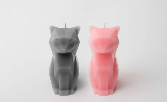
Pyro Pet, c’est le nom de ce joli projet Kickstarter de bougies en forme de chat. Appelée Kirsa, cette bougie disponible en deux couleurs, propose une armature en forme de squelette. Une création très réussie à découvrir en images dans la suite, avant et après la fonte de la cire.