Shared posts


07 Oct 22:59
Vandroid - Graphic novel trailer by Golden wolf
Vandroid - Graphic novel trailer by Golden wolf
Juan Pablo Astorga likes this

28 Nov 18:54
 David Palumbo
I'm a big believer in the value of personal projects. Though not every experiment or personal series which I've explored has lead to a lightbulb moment, every lightbulb moment I've experienced owed a great debt to the time which I had invested in personal projects. I know for certain that I would not be the painter that I am without having set aside time for experimental work.
My most recent series that I'm particularly excited about is the Re-Cover Project. Basically, I have been finding old hardcover copies of some of my favorite books and creating new cover images for them directly on the book itself.
The series started in an almost accidental way. Some years back, a fellow artist (hey Bill!) was generous enough to send me a couple drawings of apes which I really liked but he refused to take any payment for them. The best I could get in the way of reciprocating was he said, if I really felt like sending him something in return, I could send some books to read. For the next two or three years I tried my best to collect a good group of books but really didn't know what he had already read or what his taste might be, so the books went unsent. Finally, earlier this year, I knew we'd be seeing each other at SFAL and wanted to finally bring something after all of this time. Looking back through the box, one of the books I'd set aside was a 1963 first American edition of Planet of the Apes. Tying this to the ape drawings I'd been given, I thought it might be fun to paint an ape onto the book as a new cover.

It was one of those moments where I wasn't sure if this idea was good or terrible, but figured it might be a fun experiment so I ditched the dust jacket, gessoed up the front board, and jumped right in.
Like any experiment which turns itself into a series, I really enjoyed myself on that first one. I had the end papers of N.C. Wyeth's treasure island in my mind as I worked and so ended up limiting myself to a similar palette of black and white with one "spot color". The thing that I really enjoy about this limitation is how much it focuses my attention on design.
I began thinking up other books which might be fun to re-imagine. I started reading books I'd always meant to read but had never found the time for, which meant I started making more time to read in general.

One of the wonderful things in a personal series is exploring processes or visual solutions which you would not turn to on a job. It seems that is the sacrifice needed when appeasing the angry volcano gods called deadlines and client expectations. Without those pressures, however, I've had fun pushing graphic ideas into places I normally might shy from. It's too early to tell how this might filter in to my illustration work, but I'm certain that it is already having some effect.

Another thing about this series which has been really enjoyable for me is the conversations which it sparks with people when they see them. People who know the stories will talk about the choice of cover image while people unfamiliar with the stories might be interested to finally pick it up. Of course, that is besides the number of recommendations which I've been given for books I've yet to read (and so they are added to the ever growing list...)

The books are all vintage copies when I can manage it. Some have been too rare for me to be able to use an actual first edition, but finding re-printings and book club editions from decades ago are just as good to me.

I think of each cover as a puzzle in a way, which is why these are shown mostly head on and without titles. If you are curious to know what each book is, I'm listing the spoiler sheet at the end ;)


Books shown, from the top:
The Man in the High Castle by Philip K Dick (1962 book club edition)
Planet of the Apes by Pierre Boulle (1963 1st American edition)
The Right Stuff by Tom Wolfe (1979 1st edition, 2nd printing)
The Stars My Destination by Alfred Bester (2003, SFBC 50th Anniversary edition)
The Shadow of the Torturer by Gene Wolfe (1980 book club edition)
The Call of the Wild by Jack London (1931 reprint)
Casino Royale by Ian Flemming (1953 1st [?] edition)
The Hobbit by J.R.R. Tolkein (recent printing)
The Time Machine by H.G. Wells (1927 reprint)
The Great Escape by Paul Brickhill (1950 1st [?] edition)
The Shining by Stephen King (1977 1st edition)
Neuromancer by William Gibson (2004, 20th anniversary edition)
The Re-Cover Project
by D Palumbo
I'm a big believer in the value of personal projects. Though not every experiment or personal series which I've explored has lead to a lightbulb moment, every lightbulb moment I've experienced owed a great debt to the time which I had invested in personal projects. I know for certain that I would not be the painter that I am without having set aside time for experimental work.
My most recent series that I'm particularly excited about is the Re-Cover Project. Basically, I have been finding old hardcover copies of some of my favorite books and creating new cover images for them directly on the book itself.
The series started in an almost accidental way. Some years back, a fellow artist (hey Bill!) was generous enough to send me a couple drawings of apes which I really liked but he refused to take any payment for them. The best I could get in the way of reciprocating was he said, if I really felt like sending him something in return, I could send some books to read. For the next two or three years I tried my best to collect a good group of books but really didn't know what he had already read or what his taste might be, so the books went unsent. Finally, earlier this year, I knew we'd be seeing each other at SFAL and wanted to finally bring something after all of this time. Looking back through the box, one of the books I'd set aside was a 1963 first American edition of Planet of the Apes. Tying this to the ape drawings I'd been given, I thought it might be fun to paint an ape onto the book as a new cover.
It was one of those moments where I wasn't sure if this idea was good or terrible, but figured it might be a fun experiment so I ditched the dust jacket, gessoed up the front board, and jumped right in.
Like any experiment which turns itself into a series, I really enjoyed myself on that first one. I had the end papers of N.C. Wyeth's treasure island in my mind as I worked and so ended up limiting myself to a similar palette of black and white with one "spot color". The thing that I really enjoy about this limitation is how much it focuses my attention on design.
I began thinking up other books which might be fun to re-imagine. I started reading books I'd always meant to read but had never found the time for, which meant I started making more time to read in general.
One of the wonderful things in a personal series is exploring processes or visual solutions which you would not turn to on a job. It seems that is the sacrifice needed when appeasing the angry volcano gods called deadlines and client expectations. Without those pressures, however, I've had fun pushing graphic ideas into places I normally might shy from. It's too early to tell how this might filter in to my illustration work, but I'm certain that it is already having some effect.
Another thing about this series which has been really enjoyable for me is the conversations which it sparks with people when they see them. People who know the stories will talk about the choice of cover image while people unfamiliar with the stories might be interested to finally pick it up. Of course, that is besides the number of recommendations which I've been given for books I've yet to read (and so they are added to the ever growing list...)
The books are all vintage copies when I can manage it. Some have been too rare for me to be able to use an actual first edition, but finding re-printings and book club editions from decades ago are just as good to me.
I think of each cover as a puzzle in a way, which is why these are shown mostly head on and without titles. If you are curious to know what each book is, I'm listing the spoiler sheet at the end ;)
Books shown, from the top:
The Man in the High Castle by Philip K Dick (1962 book club edition)
Planet of the Apes by Pierre Boulle (1963 1st American edition)
The Right Stuff by Tom Wolfe (1979 1st edition, 2nd printing)
The Stars My Destination by Alfred Bester (2003, SFBC 50th Anniversary edition)
The Shadow of the Torturer by Gene Wolfe (1980 book club edition)
The Call of the Wild by Jack London (1931 reprint)
Casino Royale by Ian Flemming (1953 1st [?] edition)
The Hobbit by J.R.R. Tolkein (recent printing)
The Time Machine by H.G. Wells (1927 reprint)
The Great Escape by Paul Brickhill (1950 1st [?] edition)
The Shining by Stephen King (1977 1st edition)
Neuromancer by William Gibson (2004, 20th anniversary edition)
Juan Pablo Astorga, Monicacentelles likes this
28 Nov 18:53
If you’re a figurative sculptor, expression is everything. And everything is in the eyes. Its where we look first. Even when they’re ambushed by the face, the eyes don’t lie. The trick is to create something in the eyes that either confirms the expression of betrays the expression. Or reveals the expression in flux. As Houdon once said (and I’m liberally paraphrasing) an expression evolves. The eyes seem to get it first and the rest of the face stumbles into place. Chances are the viewer will interpret what you’ve created differently from what you intended. But that’s okay. If they invest a little of their emotional or physiological history into your piece, it almost can’t get better than that. Up front, I want to say, I’m still figuring it out. It’s a crap shoot anytime you pick up clay. But each pieces leads to opening the window of understanding just a little more. And ain’t that the point of creating art, the miracle of revelation.
Anne Phibian: A half life-size bust of an alien beauty. There’s a wariness in her expression. She’s deciding. I used washes of iridescent paint to create the iris with several coats of high gloss. I painted the highlight first in a light gray and the white dot of reflected light to soften it.


A Little Mischief: I think there a lot of ways to read his expression, but none of them of a pure intent. Ordinarily, I’d have would have put the squint in his recessive eye (right) eye, making the lead eye (left) the evaluator. By compressing the expression in his left eye it sharpens his expression. It reveals a conspiracy only he is privy to.

Lucifer’s Lawyer/Devil’s Advocate: As I sculpted this piece I repeated the same phrase over and over, watching myself in a mirror. My expression changed with how I interpreted the phrase. At some point, as I understood more fully what I wanted to say, things started to lock in. With luck, the viewer will fill in the blank in their own head. My guess is, we’ll all be using a very similar vowel.

Afternoon Delight: This character first appeared on a Call for Entries poster for Spectrum Nine. I “appropriated” the concept from a drawing by Heinrich Kley. All her concentration is in getting the last sweet drops of nectar.

Belle et la Bete: It’s a love story. He carries his sadness in his right eye while keeping watch on her with his left. Sometimes, letting the eyes track a little off center helps reveal a complicated expression.

Ode to Joy/Cyrano-My White Plume: He had to have smiled. One listening to his Rage Over a Lost Penny and you know old Ludwig had a sense of humor. This is Cyrano from the end of the play. He’s dying and has come to see his beloved Roxanne one last time. I just like the juxtaposition of their expressions, both captured in their eyes.

ONE: This was an odd piece for me. I wanted to try and create a character that revealed an inner peace and quiet strength. I tied a bunch of open eye treatments and nothing worked. In filling in the carved out iris, I swiped some clay across his eyeball and got a kind of closed lid. And that’s what worked for me. Thank you clay, my old reliable collaborator.

Something to Consider/Two Humans Walk Into a Bar: These pierces were done back to back. I started with Something to Consider. I smiled all the way through it. Working on him just made me feel good. With his eyebrows raised but his eyes half open, it felt like he was considering something he’d heard in conversation. Two Humans was me in the bar with my alien buddy waiting for the bunch line.


My Monster isn’t taking any chances. His interaction with humans hasn’t been all that good. So best keep your distance.

Vampira 13: Its all in her eyes. All of it.

Catherine with a C: This is a portrait bust I did of my mom some years ago. She was having a difficult time of it. Relationships she thought she could count on were fracturing. She came to the studio for a photo session. We spent of few moments joking around and then we got to talking about what was going on in her life and a profound sadness overcame her. This image is an assemblage of several photographs.

He Who Laughs Last: This is the third and final version of this piece. It took some twenty years for me to figure out what I was trying to tell myself and with his version, I got it. Unlike A Little Mischief, his lead eye is fully open and evaluating. Don’t let the makeup fool you.

For those of you who are interested in learning how to sculpt maquettes, I’ll be doing a workshop at TLC Workshops in May of 2015.
For more information, visit:
http://www.tlcworkshops.com/p/expressive-sculpture-and-maquettes-with.html
Hope to see you there!
The Eyes Have It
by Dan
-By Tim Bruckner
If you’re a figurative sculptor, expression is everything. And everything is in the eyes. Its where we look first. Even when they’re ambushed by the face, the eyes don’t lie. The trick is to create something in the eyes that either confirms the expression of betrays the expression. Or reveals the expression in flux. As Houdon once said (and I’m liberally paraphrasing) an expression evolves. The eyes seem to get it first and the rest of the face stumbles into place. Chances are the viewer will interpret what you’ve created differently from what you intended. But that’s okay. If they invest a little of their emotional or physiological history into your piece, it almost can’t get better than that. Up front, I want to say, I’m still figuring it out. It’s a crap shoot anytime you pick up clay. But each pieces leads to opening the window of understanding just a little more. And ain’t that the point of creating art, the miracle of revelation.
Anne Phibian: A half life-size bust of an alien beauty. There’s a wariness in her expression. She’s deciding. I used washes of iridescent paint to create the iris with several coats of high gloss. I painted the highlight first in a light gray and the white dot of reflected light to soften it.
A Little Mischief: I think there a lot of ways to read his expression, but none of them of a pure intent. Ordinarily, I’d have would have put the squint in his recessive eye (right) eye, making the lead eye (left) the evaluator. By compressing the expression in his left eye it sharpens his expression. It reveals a conspiracy only he is privy to.
Afternoon Delight: This character first appeared on a Call for Entries poster for Spectrum Nine. I “appropriated” the concept from a drawing by Heinrich Kley. All her concentration is in getting the last sweet drops of nectar.
Belle et la Bete: It’s a love story. He carries his sadness in his right eye while keeping watch on her with his left. Sometimes, letting the eyes track a little off center helps reveal a complicated expression.
Ode to Joy/Cyrano-My White Plume: He had to have smiled. One listening to his Rage Over a Lost Penny and you know old Ludwig had a sense of humor. This is Cyrano from the end of the play. He’s dying and has come to see his beloved Roxanne one last time. I just like the juxtaposition of their expressions, both captured in their eyes.
ONE: This was an odd piece for me. I wanted to try and create a character that revealed an inner peace and quiet strength. I tied a bunch of open eye treatments and nothing worked. In filling in the carved out iris, I swiped some clay across his eyeball and got a kind of closed lid. And that’s what worked for me. Thank you clay, my old reliable collaborator.
Something to Consider/Two Humans Walk Into a Bar: These pierces were done back to back. I started with Something to Consider. I smiled all the way through it. Working on him just made me feel good. With his eyebrows raised but his eyes half open, it felt like he was considering something he’d heard in conversation. Two Humans was me in the bar with my alien buddy waiting for the bunch line.
My Monster isn’t taking any chances. His interaction with humans hasn’t been all that good. So best keep your distance.
Vampira 13: Its all in her eyes. All of it.
Catherine with a C: This is a portrait bust I did of my mom some years ago. She was having a difficult time of it. Relationships she thought she could count on were fracturing. She came to the studio for a photo session. We spent of few moments joking around and then we got to talking about what was going on in her life and a profound sadness overcame her. This image is an assemblage of several photographs.
He Who Laughs Last: This is the third and final version of this piece. It took some twenty years for me to figure out what I was trying to tell myself and with his version, I got it. Unlike A Little Mischief, his lead eye is fully open and evaluating. Don’t let the makeup fool you.
For those of you who are interested in learning how to sculpt maquettes, I’ll be doing a workshop at TLC Workshops in May of 2015.
For more information, visit:
http://www.tlcworkshops.com/p/expressive-sculpture-and-maquettes-with.html
Hope to see you there!
Juan Pablo Astorga, ZZDas likes this
19 Nov 18:31
Dezeen » Blog Archive » Cord-Chair by Nendo
by renard

Juan Pablo Astorga, Sofía Henao likes this


16 Nov 04:36
zolaida: amiammorette: Eyes, nose, mouth, head, hands, ears...


Juan Pablo Astorga likes this

14 Nov 18:54
Nuthin' But Mech: 404REDIRECT
by researchinstitute

Juan Pablo Astorga, Nuno Cruz likes this


03 Nov 21:45


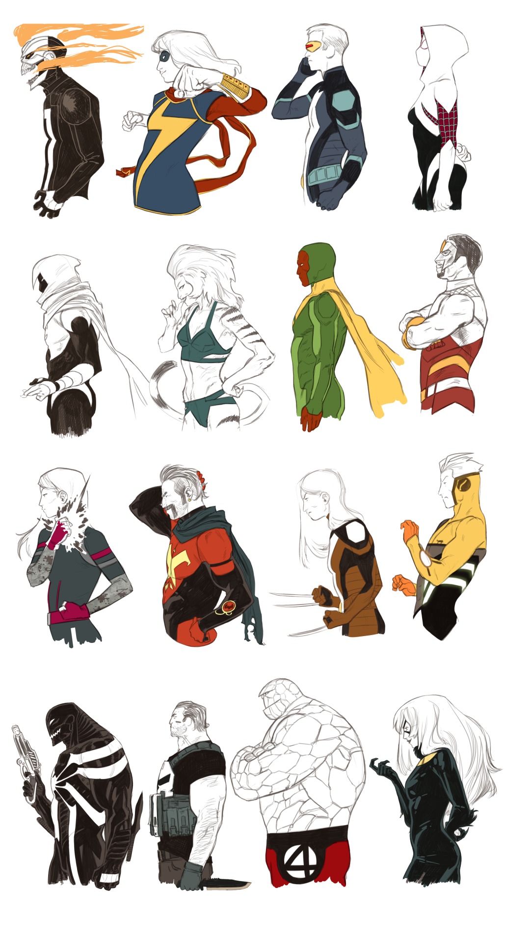
68 Marvel NOW! Portraits by Kris Anka
by Free Reyes
Marvel artist Kris Anka best known for his work on All-New X-Factor, Uncanny X-Force, Uncanny X-Men, and New Mutants has created 68 character portraits in the style of Marvel NOW! If you have been following all the new character redesigns in Marvel NOW! over the last couple years these should be a great overview.
H/T: Geek Art


Juan Pablo Astorga likes this
03 Nov 19:57
Thoughts Of A Twisted Mind
by hugotorres

Juan Pablo Astorga, Sofía Henao and one other like this

03 Nov 19:57
tumblr_m9r2chXIJF1ql5diio1_500.png (500×750)
by matth1eu

Juan Pablo Astorga, Sofía Henao likes this
03 Nov 19:55
O8WEIW6mAlt32xvgJNHgtGBro1_1280.jpg (JPEG Image, 1280x853 pixels) - Scaled (89%)
by sphansavanh

Elativokram, Juan Pablo Astorga and one other like this
03 Nov 17:47
arrangement_in_skintones_6.jpg (520×675)
by thefriendlyoffice

Juan Pablo Astorga likes this


03 Nov 17:46
arrangement_in_skintones_7.jpg (520×520)
by thefriendlyoffice

Juan Pablo Astorga likes this

