jCorner is a lightweight, easy jQuery plugin to create a clickable & flat long shadow styled folded paper corner effect to an Html element.
jCorner is a lightweight, easy jQuery plugin to create a clickable & flat long shadow styled folded paper corner effect to an Html element.
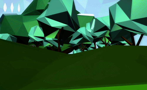
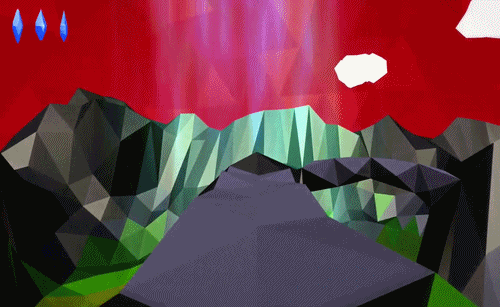
The Pirate Cinema* is a cinematic collage based on Peer-To-Peer network activity. I have been working on it for much of the last year with Nicolas Maigret who developed the concept. Surprisingly, quite a few people in the press were interested in the project including: Wired, C|Net, the Verge, CAnet, We-Make-Money-Not-Art, Geek.com, Cheezburger.com, FastCo, Gizmodo.de, der Standard, TorrentFreak and BoingBoing.
For detailed info, check out the official site.
* Not to be confused with the similarly named novel or underground film-screening movement.


Preamble Being an amateur web designer for almost ten years in the running, I realized that there are several pieces of code that I have up…

The New York Times recently examined the body language of the US presidential candidates Barack Obama and Mitt Romney. For the motion capture and gesture recognition they partnered with experts in movement analysis from the the NYU Movement Lab. The signature gestures of each candidate are shown with an interactive video and accompanying visualization.

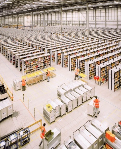
Ben Roberts, from the series Amazon Unpacked, 2011. In their bright orange vests, 'pickers' deliver goods between various areas of the warehouse
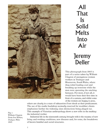
There's an exhibition called All That is Solid Melts into Air right now at the Manchester Art Gallery. It's been curated by Jeremy Deller. So of course i took the train to see it.
In a show which title refers to a passage in Marx and Engels' Communist Manifesto, Deller takes a personal look at the impact of the Industrial Revolution on British popular culture, and its persisting influence on our lives today.
This is not an exhibition of Deller's work (apart from his film about glam rock wrestler Adrian Street.) Neither is it a historical treatment of the industrial era. Instead, Deller brings side by side historical artefacts and contemporary works to explore several threads that expose the impact of the Industrial Revolution on British cultural life.
I was particularly interested in the connections drawn between the digital revolution and the Industrial Revolution, in particular working conditions. They were notoriously harsh in the 19th century: low wages, long hours, child labour, etc.
A document entitled Rules to be Observed in this Factory, Church Street Mills, Preston (c. 1830) informed workers that to give their notice they must do so on Saturday only, in writing and one month in advance. Whereas the "Masters have full power to discharge any person employed therein without any previous notice whatsoever." The same documents states that workers are to be at the factory from 6 in the morning to 7.30 at night, with half an hour allowed for breakfast and one hour for dinner.
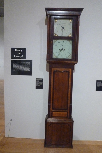
But accounts from the time deplored the fact that managers did as they liked, with clocks brought forward in the morning and back at night. Some clocks were even made to measure productivity as time. One of the artefacts in the gallery is a two-faced clock that was connected to a watermill at a silk factory and would show 'lost' time if the wheel did not turn quickly enough. The time would then have to be made up at the end of the working day. The struggle to shorten working days was hard fought by successive generations.
Nowadays however, the growing use of 'zero hours contracts' in the low wage sectors of the service and digital economy is shaping a new form of day labourer, imposing another time discipline where the worker is informed often at short notice if their labour is required. A tapestry (by Ed Hall, maker of remarkable protest banners), hanging near the clock, is adorned with the words, 'Hello, Today you have day off', a message texted to a worker on a 'zero hour' contract on the morning his shift was due to start. No work, no pay.
Also next to the clock are photos from Ben Roberts' series that documents the inside one of Amazon's nine UK 'fulfilment centres' where employees spend 10½ hours a day picking items off the shelves.
Visitors have no problem joining the dots by themselves....
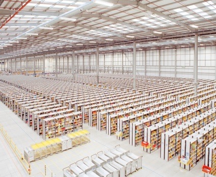
Ben Roberts, from the series Amazon Unpacked, 2011. The interior of Amazon's giant fulfilment centre is the size of nine football pitches
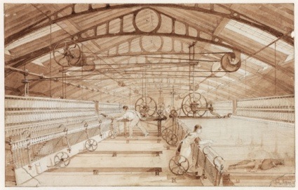
Swainson Birley Cotton Mill near Preston, Lancashire, 1834.. ©Science Museum/SSPL
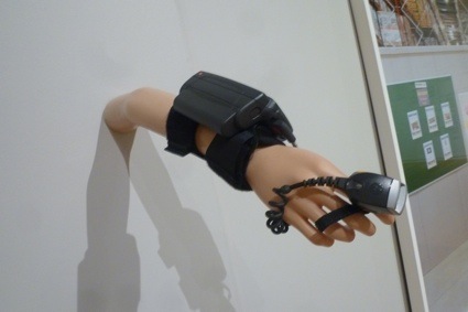
The last object on that wall is a Motorola WT4000, a computing device worn on the wrist by people working in a warehouse. Retail giants rely on this kind of device to monitor the speed of orders and the efficiency of its staff in fulfilling them. It can also send warnings if the worker is falling behind schedule.
Motorola WT4000
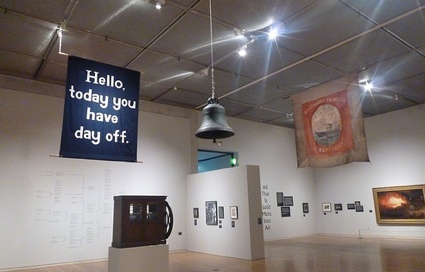
But as can be expected with Jeremy Deller, there's a great deal of music in this show. Here he is posing next to a jukebox visitors are welcome to activate. Pressing buttons triggers archive recordings from factory machinery, folk songs or quarrymen singing at work.
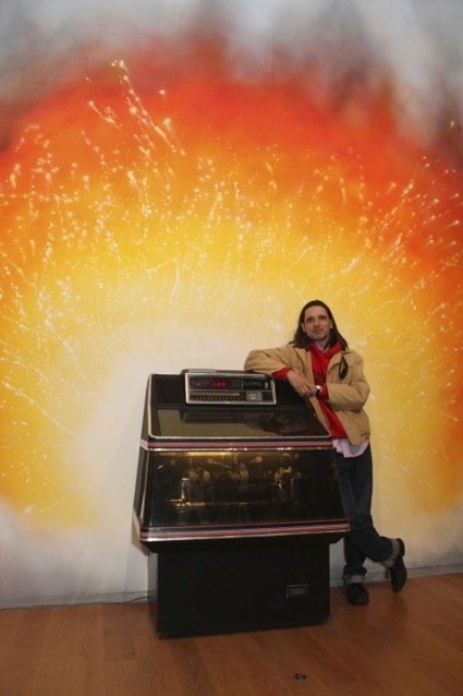
Jeremy Deller with Jukebox, 2013 and mural backdrop by Stuart Sam Hughes. Courtesy Alan Seabright / Manchester City Galleries
All That is Solid Melts into Air also looks at heavy metal and rock bands such as Judas Priest, Black Sabbath, Happy Mondays and Slade and at how they are the products of the industrial towns their members came from. Many came from working class backgrounds and their music echoed the loud and traumatic rhythm of the factories.
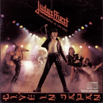
Judas Priest, Unleashed in the East (album cover), 1979
The only Deller work in the show is a film about Adrian Street. Street was born into a Welsh mining family but he refused to follow in his father's footsteps and spend his life working in the coal mines. He left home as a teenager and became a flamboyant wrestler and for a brief time also a glam rock singer.
The photo showing Street posing next to his father in the Welsh coal mine he had fled from embodies a country attempting to get to grip with its new role: services and entertainment.
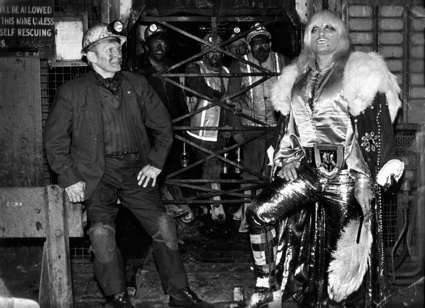
Adrian Street and his father, 1973 (photo: Dennis Hutchinson) © Dennis Hutchinson 2012
Jeremy Deller, So many ways to hurt you, the life and times of Adrian Street (excerpt)
More images from the exhibition:
Iron Workers, Tredegar, Wales, 1865, W Clayton. Manchester Art Gallery. Photographs courtesy Manchester Art Gallery
Iron Workers, Tredegar, Wales, 1865, W Clayton. Photographs courtesy Manchester Art Gallery
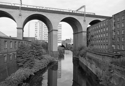
Stockport Viaduct 1986. ©John Davies
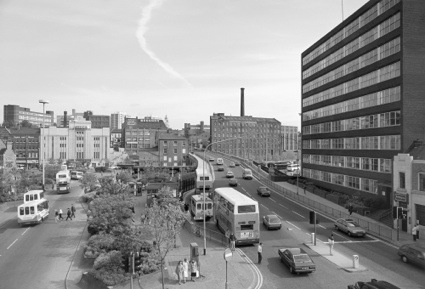
Mersey Square, Stockport 1986. ©John Davies
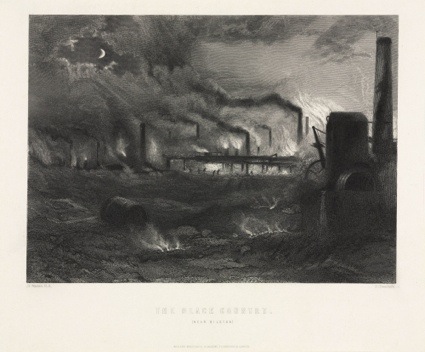
G. Greatbach, 'The Black Country' near Bilston 1869 Engraving. ©Science Museum / SSPL
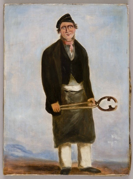
Chapman, W.J., Francis Crawshay Workers Portraits. Courtesy National Museum Wales, Cardiff
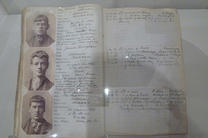
Portraits of Scuttlers, members of youth gangs characterized by their carefully coiffed hair and colourful scarves (and as such precursors of the Teddy Boys)
All That is Solid Melts into Air: Jeremy Deller is an exhibition curated by an artist so don't expect academic interpretations and rigorous narratives. It is an eclectic and thought-provoking show that confronts with each other elements from our past and present, draws parallels, and triggers all kinds of associations.
If you're curious about the show but can't make it to Manchester, you'll find more information in the film that Deller shot together with BBC. And, obviously, in the exhibition catalogue:
All that is Solid Melts into Air Curated by Jeremy Deller is at the Manchester Art Gallery, until 19 January 2014. The exhibition will tour to other cities known for their strong industrial heritage: Nottingham, Coventry and Newcastle.
Related stories: Ed Hall, the art of protest banners and Audio CD review - Jeremy Deller: Social Surrealism.
HTML5 video is awesome and makes consuming video on multiple devices so easy.
However, it also has its own problems: the videos run on the native video player in mobile devices which makes interacting with the rest impossible (or displaying multiple videos at the same time) and different versions are required for browser compatibility.

Frame Player is an original method to display video; it uses JSON data (of data URIs) and the video is mimicked by showing the images frame-by-frame.
It is compatible with all browsers, can be customized however preferred and PHP + Nodejs converters are available.
Considering there will be no streaming, it is a good idea to prefer to player on short videos.Advertisements:
ioDeck, a self-hosted and awesome PHP form generator.
Professional XHTML Admin Template ($15 Discount With The Code: WRD.)
SSLmatic – Cheap SSL Certificates (from $19.99/year)

[Editor’s note: Are you having trouble understanding artists through their art? Understand them through their STUFF instead. In this edition of STUFF we bring you 10 of artist Analia Saban's favorite books. Saban works in a variety of media. She is represented by Thomas Solomon Gallery in Los Angeles as well as Tonya Bonakdar Gallery in New York. She currently has exhibitions open at the Palais De Tokyo and the Gemeentmuseum De Haag.]

Because of my career as an artist, I guess it is proper to add a good art book 

Dissection: Photographs of a Rite of Passage in American Medicine 1880-1930

Embryos in Wax: Models from the Ziegler Studio

Anatomie

Stiff: The Curious Lives of Human Cadavers

GASTROENTEROLOGIA PRACTICA

I visit all medical exhibitions around the world. This summer I visited the Museum of Wax Moulages in Zurich, which is about skin diseases. This is a catalog from one of the best medical collections: The Museum Dr. Guislan in Ghent. I flew to London to get this book, as it was ₤ 2 off!

Medicine Man: The Forgotten Museum of Henry Wellcome (None)

There is a lot of controversy around Bodies

A Visionary! or WTF?? That’s the best part of Steiner
Previous STUFF columns can be found here.
Web-based note taking and writing apps are a dime a dozen these days. There is no dearth of choices irrespective of whether you want a quick & simple note-taking tool or a feature-packed writing app with more functionality that you can shake a stick at. Then there are bells & whistles like mobile access, synchronization with cloud services and more.
Wri.pe is a fairly new app that tries to do a lot of those things in the attempt to become your go-to service for all writing and note-taking needs. It is a simple, web-based, mobile-device ready note taking tool with a page-full of features to boast of. I took it for a drive to see if it replaced any of my staples. Here’s what I thought.
One look at the wri.pe homepage and you can tell that this is one feature-packed app. There are a ton of things the app does already, with a few more features listed as coming up in future updates. Log in with your Facebook or GitHub ID, and you can straightaway jump into writing your notes. The interface is modern and bold with a list of your documents front and center, ways to access them on the left and helpful tips off to the right.

The notes list
The editing interface is super-minimal with a big huge text area and a preview pane on the right. The preview updates in real time as you start writing your note and recognizes markdown as well as html syntax on-the-fly. The Help tab provides some helpful tips for editing your note and the Settings tab lets you choose fonts and turn autosave on or off.

The minimal note view
Pretty much every part of the app is accessible using keyboard shortcuts which are conveniently available in the right panel. You can close the widget once you get used to the shortcuts. Within the notes themselves, you get pretty good Markdown support, live previews, the ability to turn on per-minute autosave for each note, and more. What surprised me most though, was that fact that the app recognizes and parses HTML within a note, including CSS definitions in the head or even inline.
One killer feature is a Calendar view that shows all your notes in a calendar view. The app recognizes dates in your notes and automatically places them on the calendar accordingly. Of course, this does not matter if you don’t bother mentioning a date inside the document. Besides, if you have two different dates — let’s say one for when a note was created and one for when it was last updated — the note appears on both days in the calendar.

The notes calendar is an interesting feature that may appeal to some
There’s the usual set of features you should expect by default in an app like this – full text search, the ability to archive notes so they don’t end up cluttering your Notes list once their purpose is served, etc. If you are particular about your ability to back up and take your content with you, they have daily backups to your Dropbox account once you have authorized the app to do so. The calendar feature also goes a step further with iCal support, meaning you can integrate it with your calendar app of choice.

Dropbox backups can be turned on or off
There are also some very nice touches that add to the experience. Character, word and line counts are always available in the bottom-right corner when editing an app. You can manually resize the preview pane according to your preferences. Most importantly, the website works perfectly on mobile devices. Simply log in and start editing your notes, no matter what device or screen size you are working with.
The app does a lot, but unfortunately not everything is as rosy as it seems. My biggest concern by far was the performance. Editing just doesn’t feel snappy enough. It is probably the live preview, but the fact that the app freezes for a few microseconds every time I write something makes it virtually unusable if you are keen on a distraction-free, snappy writing experience.
Apart from that, there are some glaring omissions — like the lack of offline support, collaboration and no way to organize your notes whatsoever. You get two buckets — Notes and Archive — with no folder or tags to categorize your notes. This can get frustrating very quickly as you add more and more notes.
There are also a number of minor niggles. Standard formatting shortcuts like Ctrl+B for bold, etc. don’t work. Clicking the Bold icon in the formatting toolbar doesn’t make the selection bold, rather adds a word “bold” with the formatting so you can go edit the text.
Although the app makes a very promising start, the lack of certain features, those niggling issues and most of all the laggy performance are a huge let-down. The developers promise that a number of features are coming soon though, and going by the periodic updates it is clear that the app is being actively developed.
Wri.pe does what it does pretty well, and might work for you if the missing features don’t matter as much. For me, the search continues.
    
|
Tridiv is a web-based editor for creating 3D shapes in CSS. It provides a traditional four-pane interface that gives a view from each plane, as well as a preview pane showing the final object. It’s possible to create extremely sophisticated objects and animations with Tridiv.
Garnier suggests that a good use-case for Tridiv is in creating logo animations similar to the one he uses on the landing page: “No JavaScript is needed, and it runs pretty smoothly on iOS devices, which is a scenario in which JavaScript will fail most of the time. So I think it can be really be useful for logos and simple UI elements, where using JavaScript is probably not worth it.”

Requirements: -
Demo: http://tridiv.com/
License: License Free
Inspirée d'une idée de Cory Doctorow qui dans son livre Little Brother imaginait un logiciel capable d'embrouiller ceux qui nous traquent sur le net, voici une extension pour Chrome qui devrait vous plaire.
Cela s'appelle Paranoid Browsing et c'est développé par Ben West. Cette extension ouvrira de manière totalement aléatoire dans un onglet, des pages appartenant à des sites web définis dans une liste afin de semer la zizanie dans votre historique de navigation. Les sociétés qui traquent vos habitudes de navigations auront alors des données totalement erronées sur votre compte. À défaut d'être invisible à leurs yeux, vous serez imprévisible.

La liste de sites n'est pas assez exhaustive et diversifiée pour être vraiment "perturbante" mais je fais confiance à votre imagination pour en ajouter tout plein ! Par contre, faut aimer se faire ouvrir des onglets à tire-larigot. D'ailleurs, Guillaume, un lecteur de Korben m'a donné cette url http://www.randomwebsite.com/cgi-bin/random.pl à ajouter pour obtenir un site aléatoirement.
Pour installer Paranoid Browsing, rendez-vous sur Github. Télécharger le zip de l'ensemble des fichiers, décompressez-le puis dans le menu des extensions Chrome, cochez la case "Développeur" puis cliquez sur le bouton "Charger l'extension non empaquetée" pour sélectionner le répertoire où vous avez décompressé les fichiers.

Pas con comme idée !
As a designer I am always looking for new fonts to use in my designs. Adding new fonts to my library helps inspire you, giving a fresh feel to the designs. Unfortunately it can be really hard to locate quality free fonts amidst the thousands of mediocre ones.
There are tons of font sites that offers free fonts. The problem is, most of them suck. Today we’ve put together a list of website that contains a collection of quality fonts from award winning font designers.
If you would like to receive our daily updates and keep up to date with the latest and greatest articles and resources from the design/developer community, you can subscribe to our Full RSS Feed, follow us on Twitter and Facebook.


If you would like to receive our daily updates and keep up to date with the latest and greatest articles and resources from the design/developer community, you can subscribe to our Full RSS Feed, follow us on Twitter and Facebook.
 Free Font For Quick Mock-ups And Wireframing: BLOKK
 Retina Ready Web Icon Font: MFG Labs Iconset
 Growing Collection of Free, Flat, One Color Icons For Interfaces: Icons DB
 Collection of Free Avatars For Interface Design And Demos: uiFaces
 300 Metro-Style Free Vector Icons: Metrize
 Time Saving Free CSS Tools For Web Designers: CSSmatic
Imitation Chapter 3-1
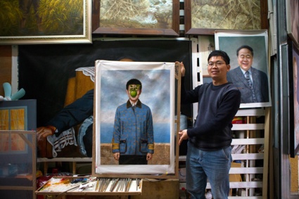
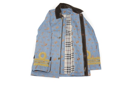
Imitation, Imitation is another project exhibited at the RCA graduation show, this time in the Design Products department (Platform 13.)
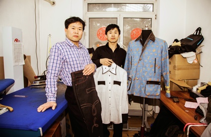
Zhenhan Hao explored China's copy culture in an attempt to go beyond the 'illegal', 'vile' and 'evil' epithets that are usually associated with the practice. In the artist/designer's own words:
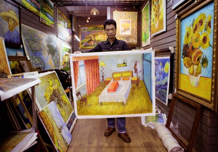
Hao asked artisan imitators to use their own imagination and customize the goods that would otherwise have been mere replicas of 'Western' artworks and fashion items. He commissioned a suit, a series of ceramic vases as well as oil paintings. He would suggest that the workers stick to what they are used to (imitating famous fashion brands or Impressionist painters) while adding something personal. A cobbler created footwear that mix the design of traditional Church's shoes with the bold colour of trainers. And tailors designed a suit by mixing western aesthetics (in particular the famous Barbour jacket) with traditional Chinese patterns and symbols:

A painter specialized in replicating Van Gogh oils pictured his own bedroom in the style of the Dutch post-Impressionist:
Imitation Chapter 5-1
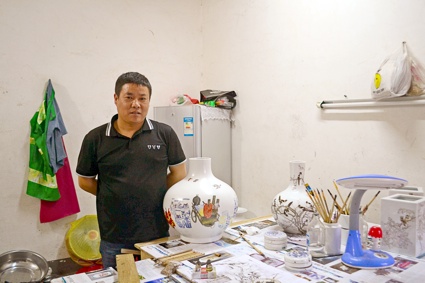
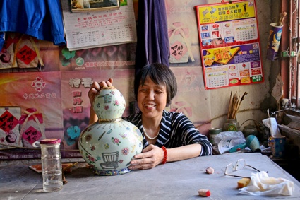
The vases add another layer to the project as Hao asked the ceramists to 'document' their craft and its context by painting their tools and workshops on the surface of the vase:
Imitation Chapter 4-1

Imitation Chapter 4-1
Imitation Chapter 4-1

Imitation Chapter 4-1
The artist did some kind of reverse experiment in London where he introduced Chinese imitation culture through a workshop with the absurd aim of mimic-drawing perfect circles.
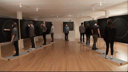
Imitation Chapter 6-1
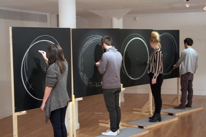
Imitation Chapter 6-1
I'll leave the conclusion to Zhenhan Hao:
As a Chinese national studying in London, I attempt to exploit the cultural differences and normative principles to uncover the complexity of imitation in the contemporary Chinese context. However, rather than delivering value judgments, or repeating the platitudes of political relativism, I am committed to revealing unknown matters and unfamiliar processes and keen to exploring an alternative ethic and aesthetic of imitation through my commission as a methodology as well as participatory interventions and practices.
Related story: Err (or the creativity of the factory worker), a conversation with Jeremy Hutchison.
This is our web design and development news series where we share our favorite design/development related articles, resources, tutorials and awesome freebies.
If you would like to receive our daily updates and keep up to date with the latest and greatest articles and resources from the design/developer community, you can subscribe to our Full RSS Feed, follow us on Twitter and Facebook.


If you would like to receive our daily updates and keep up to date with the latest and greatest articles and resources from the design/developer community, you can subscribe to our Full RSS Feed, follow us on Twitter and Facebook.
 Introduction to Frameworks and 10 Best Responsive CSS Frameworks for Web Design
 jQuery Responsive Parallax Slider Plugin: FractionSlider
 SuperBox – Re-Imagined Responsive Lightbox Gallery
 Responsive Layouts (Templates) For Email / Newsletters: Antwort
 Better Responsive Data Tables
 Free Google Styled Theme For Twitter Bootstrap: TODC Bootstrap
Rammellzee, Color Letter Racer Set, c.1988. And White Letter Racer Set, c.1991. Installation view 'Alternative Guide to the Universe', Hayward Gallery 2013 © Estate of Carmela Zagari Rammellzee. Photo: Linda Nylind
The Hayward Gallery in London has recently opened a fairly eccentric exhibition filled with the works of outlandish inventors, maverick engineers, self-taught architects, and other people whose imagination won't stop at the laws of physics nor at the rules set by society.
The Alternative Guide to the Universe is never dull nor predictable. And it is as much about artworks, models and speculation as it is about the stories and personalities of the individuals behind them..
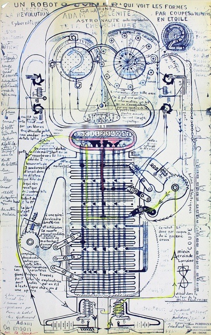
Jean Perdrizet, Untitled, Un robot ouvrier qui voit les formes par coupes de vecteurs en étoile (Worker robot who sees shapes in star-like vectoral planes), 1970
Take Jean Perdrizet for example. He was a civil engineer who lost his job because of mental health troubles. Around 1955 he became an "inventor", stretching the limits of physics, drawing and prototyping machines to communicate with ghosts or aliens. He also invented a language, the "sidereal esperanto" that enabled all humans to understand each other but also to communication with extra-terrestrials. His machines are lost, only the intricate drawing, plans and mathematical formulas remain.
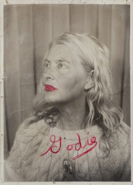
Lee Godie. Lee and Cameo on a chair...., early to mid 1970s © the artist. Courtesy Richard and Ellen Sandor Family Collection
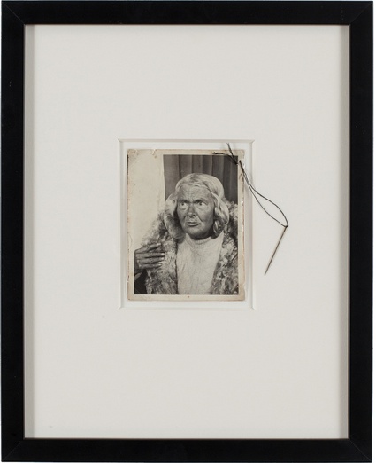
Lee Godie, Untitled
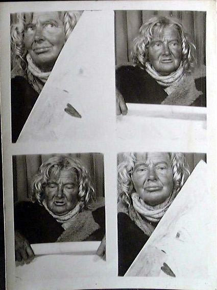
Lee Goodie, Four Photos (Photo booth Portrait)
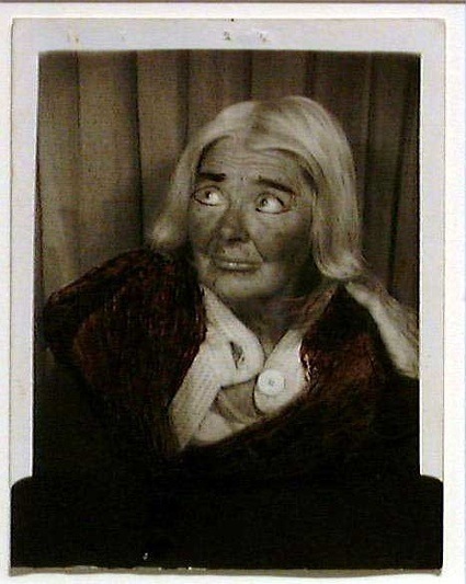
Lee Godie, Untitled Photograph (Photo booth Self-Portrait)
Lee Godie is the one who fascinated me the most. Godie was living on the streets of Chicago in the late 1960s. She called herself a French Impressionist and was selling her drawings and paintings on the steps of the Art Institute. So far, so almost normal. What makes Godie a star of the Hayward show are the theatrical self-portraits she was taking inside a photo-booth at the bus station. She'd bring along accessories, bits of fabric and other props to build different personae. She would then add bright colour to her lips or paint her eye brows in a Scouse fashion. Godie was thus doing theatrical self-portraits long before Cindy Sherman did. And long before celebs started invading twitter with 'selfies.'
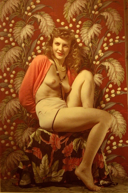
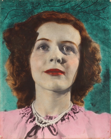
Eugene Von Bruenchenhein, Untitled, 1940s
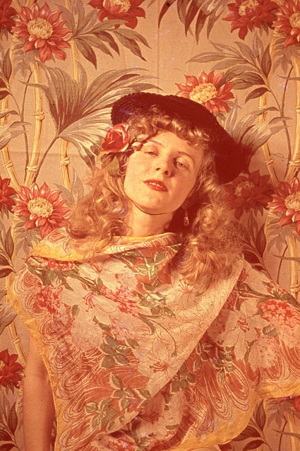
Eugene von Bruenchenhein, from Untitled, 1940s. Photograph: Hayward Gallery/© 2013 Lewis B Greenblatt
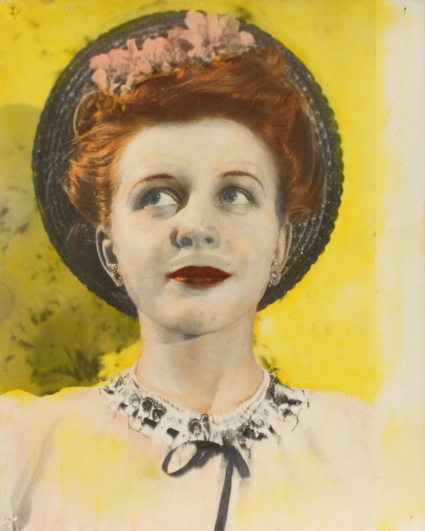
Eugene Von Bruenchenhein, Untitled (Bonnet), 1940s © 2013 Lewis B. Greenblatt, all rights reserved. Courtesy Lewis and Jean Greenblatt
Eugene Von Bruenchenhein, Untitled (Green Background), 1940s © 2013 Lewis B. Greenblatt, all rights reserved. Courtesy Lewis and Jean Greenblatt
The romantic in me is charmed by a self-taught photographer who sees his wife as his muse and takes thousands of photos of her dressed as a pin-up, wearing little more than cascades of pearls or donning christmas tree decorations on her head. Preferably against a rococo backdrop. From the early 1940s to the mid-1950s, Eugene Von Bruenchenhein documented the Marie's beauty but even when she is naked, the portraits have more tenderness than kinkiness.
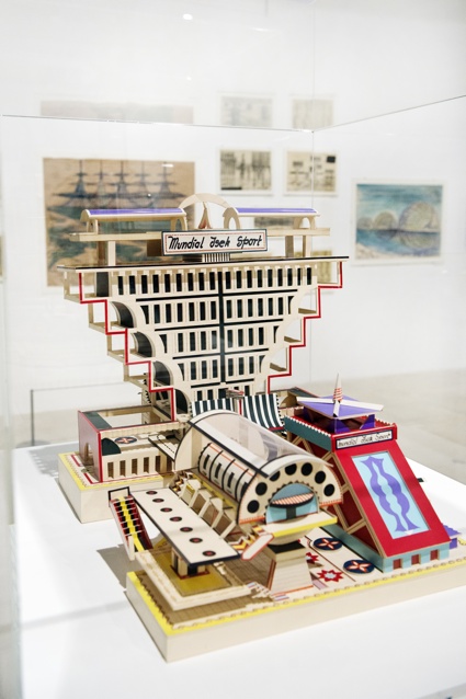
Bodys Isek Kingelez, Mundial Isek Sport, 1989. Installation view 'Alternative Guide to the Universe', Hayward Gallery 2013 © the artist. Photo: Linda Nylind
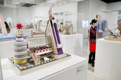
Installation view of works by BODYS ISEK KINGELEZ at 'Alternative Guide to the Universe' exhibition, Hayward Gallery 2013 ©the artist. Photo: Linda Nylind
Bodys Isek Kingelez uses cardboard, candy wrappers and other materials found in the streets of Kinshasa to make what he calls Extrêmes maquettes (Extreme Models) of extravagant buildings and utopian cities. They look neither purely African, nor European, even when they bear the name of a European city. I wouldn't say that they are futuristic either. In truth, these buildings can't be assigned to any architectural movement. They are in a league of their own.
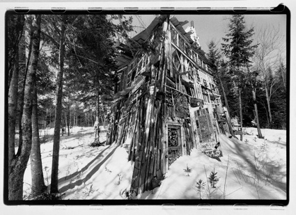
Richard Greaves, The House with Windows, 2005 © the artist. Courtesy Mario del Curto
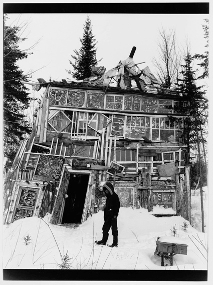
Richard Greaves, The House with Windows, 2005 © the artist. Courtesy Mario del Curto
Richard Greaves sculpts houses as much as he builds them. Like many of the artists in the exhibition, Greaves is self-taught. He never learnt to be an architect. Yet, his constructions successfully defy the laws of gravity. The cabins and shelters he erects in the middle of the forest in Canada are made from abandoned barns which he takes apart and rebuilds at his whim.
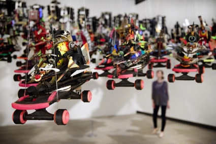
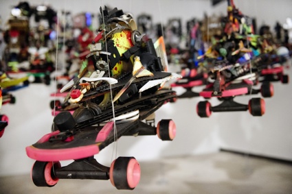
Rammellzee, Color Letter Racer Set, c.1988. And White Letter Racer Set, c.1991. Installation view 'Alternative Guide to the Universe', Hayward Gallery 2013 © Estate of Carmela Zagari Rammellzee. Photo: Linda Nylind
Rammellzee's graffiti and art work are based on his theory of Gothic Futurism. He imagined a world in which letters of the alphabet would arm and liberate themselves from the slavery and corruption of language. Made from found objects and customised skateboards, his Letter Racers are flying armoured vehicles poised for linguistic and galactic warfare. His style is stunning. Why had i never heard of him before?

Yulu Wu, Remote Controlled Cart with Clothing (detail), 2013. Installation view 'Alternative Guide to the Universe', Hayward Gallery 2013 © the artist. Photo: Linda Nylind
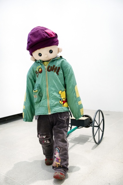
Yulu Wu, Remote Controlled Cart with Clothing (Yao Kong Chuan Yi Xiao La Che), 2013. Installation view 'Alternative Guide to the Universe', Hayward Gallery 2013 © the artist. Photo: Linda Nylind
I guess everybody knows about Wu Yulu's amazing, rural robots. Using rubbish that he finds near his farm, Wu Yulu creates robots that do the cleaning, wash dishes, light cigarettes, or take him to market. The Hayward is showing the small robot that climbs a wall and a child robot that chases people (as Ralph Rugoff, Director of the Gallery and Curator of the show, pertinently noted, it's not a coincidence if a man from the country of the one child policy decided to build himself a little boy.)
I'm going to stop here because unfinished, unpolished, unpublished posts are piling up and i need to move on but in an ideal life, i'll find the time to write about Karl Hans Janke, the man who discovered the 'radiation-free German Atom'; Philip Blackmarr and his theory of "quantum geometry"; or Emery Blagdon who built a 'Healing Machine' from wire, copper, aluminium foil, Christmas tree lights, ribbons, beads, leaves, butterfly wings, magnets and 'earth elements'. I cannot vouch for the scientific soundness of their theories but i'm glad an art gallery has given them a chance to expose them to the public.

Morton Bartlett, Untitled, c.1950s. © Morton Bartlett and Marion Harris. Courtesy The Museum of Everything
Morton Bartlett, Untitled, c. 1950. Photograph: Hayward Gallery/© The Bartlett Project, LLC
Installation view of works by MARCEL STORR at 'Alternative Guide to the Universe' exhibition, Hayward Gallery 2013. © Liliane and Bertrand Kempf. Photo: Linda Nylind
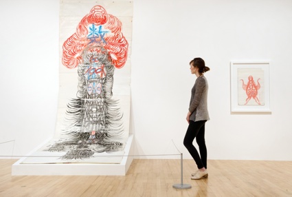
Installation view of works by GUO FENGYI at 'Alternative Guide to the Universe' exhibition, Hayward Gallery 2013. © the artist. Photo: Linda Nylind
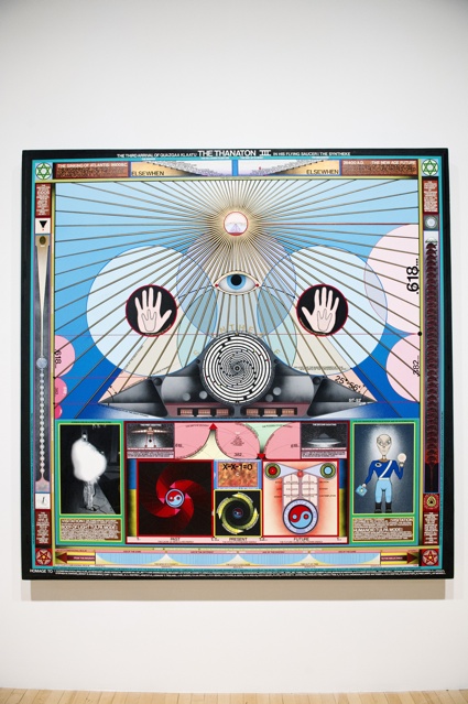
Paul Laffoley, Thanaton III, 1989. Installation view 'Alternative Guide to the Universe', Hayward Gallery 2013 © the artist. Photo: Linda Nylind
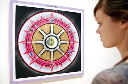
Paul Laffoley, The World Self, 1967. Installation view 'Alternative Guide to the Universe', Hayward Gallery 2013 © the artist. Photo: Linda Nylind
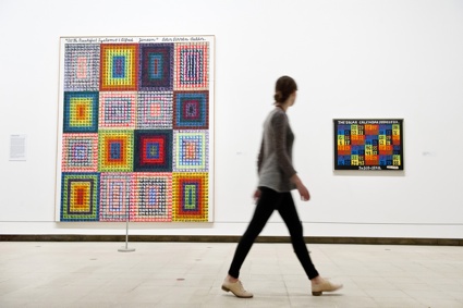
Installation view of works by ALFRED JENSEN at 'Alternative Guide to the Universe' exhibition, Hayward Gallery 2013 ©ARS, NY and DACS, London 2013. Photo: Linda Nylind
If you can't make it to London, i guess that the next best thing is to get your hands on the catalogue The Alternative Guide to the Universe: Mavericks, Outsiders, Visionaries. It's on amazon .co.uk
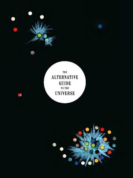
Alternative Guide to the Universe is at the Hayward Gallery in London until 26 August 2013.
Iam experimenting with touch.GL and Failed Memories. Here are the first results. What i really like, is the way how i can have direct acces to the composition, i mean i can use my own fingers to place the image errors. In the code i used many random parameters, so these compositions are all unique, there is no undo and option to create the same transformation again. This is why i think touch.gl is a good tool, because iam spending more and more time to work on the composition side.

wayne and joseph
“this memory was captured in 1976 when wayne and joseph decided to remain friends for the rest of their life. Unfortunately Joseph became unstabile and decided to stop all the relations with the external world. This transformation shows, how his memory changed after this crisis. “

the story of billy
+Art+Genealogies.jpg)
+Art+Genealogies+2.png)

CSS specificity is a topic that many new front end coders avoid for as long as possible. It sounds complicated, there are all of these rules, you might even have to do some math! How lame is that?
Ultimately, you can only avoid it for so long. Specificity is an essential concept that you need to grasp to be an effective developer. Today I’ll walk you through the concepts of specificity in a simple and easy to understand manner. It’s easier than you think!
Specificity is a funny word, right from the outset it communicates the idea that this is going to be complicated. Fortunately, its bark is bigger than its bite. There’s no reason that you can’t pick most of this stuff up in a few minutes or less.
To break the practical application of specificity down into something that anyone can wrap their mind around, let’s use a familiar metaphor.
When you were a kid, the world was a much cooler place. If given the opportunity to ask one and only one question to an all knowing entity, you would not have pondered the meaning of life or ventured forth a query about whether or not world peace is attainable, only one thing would matter. If Batman and Spiderman got into a fight, who would win?

ScrewAttack writes huge pieces dedicated to pitting heroes against each other.
There’s this innate curiosity in children to constantly compare things and ask which is better. As we grow older, shades of gray replace black and white and we lose this tendency (we nerds are of course an exception). To understand CSS specificity, you should revert to childhood. When given two similar selectors, always ask yourself, “Who would win in a fight?” The answer could prove critical to the way you code.
To see how this works, let’s pit a few selectors against each other and see what happens.
For our first battle, let’s pit two essentially identical selectors against each other. How do we know which selector would win?

Talk about class warfare. Puns aside, imagine that we had the following setup on our web page:
<!-- HTML -->
<div class="blue box"></div>
/*CSS*/
div {
  height: 200px;
  width: 200px;
}

/*The Battle*/
.blue {
  background-color: blue;
}

.box {
  background-color: red;
}
Here we have an equal matchup. Both classes are applied to the same div with no other complexities to muck up the example. Let’s let them battle it out and see who wins…

The box is red! That means the “.box” class won. But why? You probably already know the answer right? It came last. Switch the selectors around and we see the opposite outcome:

Here the square is blue because the “.blue” class came last, overriding the “.box” class.
That last battle wasn’t very interesting. The opponents were too equally matched and the outcome was obvious. We haven’t even really scraped the surface of specificity yet. Nevertheless, that was a necessary foundation that needed to be laid.
Now we’ll dive into a battle that’s a little more juicy: ID vs. Class.

Our setup here is pretty similar to last time, only instead of two classes, we’ll have one class and one ID:
<!-- HTML -->
<div class="box" id="box"></div>
/*CSS*/
div {
  height: 200px;
  width: 200px;
}

/*The Battle*/
#box {
  background-color: blue;
}

.box {
  background-color: red;
}
Given the rule that we learned last time, you might predict that the class would win in this scenario. Let’s see if that proves true.

An upset! Even though the class came after the ID, it still lost. This indicates that IDs are somehow stronger than classes in the battle of specificity.
Before we jump in to see how all of this works, let’s look at one final example. We’ll ramp up the complexity here so you can begin to appreciate how this knowledge can be applied in a real world situation.

Oh snap! I’ll bet this one even trips up some of the experienced readers. Many of us don’t even know the difference between the two, much less which one wins a specificity death match. Let’s get this party started.
<div>
   <h2>h20</h2>
</div>
h2:first-child {
  color: blue;
}

h2::first-line {
  color: red;
}
What’s it going to be? Will the h2 be red or blue? Let’s find out:

The pseudo element takes it! The pseudo class didn’t stand a chance. But why? What behind the scenes voodoo is taking place here? How can we be sure of the outcome before we even try it?
Trial and error is a great way to learn, but ultimately there are just too many different possible scenarios to run through to glean all of the information that we should know. What we need is a hard and fast way to decide which selectors the browser places more importance on and why.
It turns out, there are in fact simple rules that govern specificity. In fact, there’s even a handy point system:

A given CSS selector can have any number of the pieces of this puzzle. The trick to figuring out specificity is to add them up. The one with the highest score wins. It’s that simple.
Nobody likes math though, so to test the specificity of a selector, we can use the awesome specificity calculator on Keegan Street.

With this great tool, we can type in two selectors and a score for each will automatically be calculated. The first selector in the example contains one class, one pseudo-class and two elements (score: 0,0,2,2). The second selector beats it hands down with one ID, one class, one pseudo class and one element (score: 0,1,2,1).
The rule here, as you can see, is that the selector with the highest degree of specificity wins. In other words, more specific selectors trump less specific selectors.
Given our previous example of a class vs. an ID, we can see why the ID wins. Its specificity is far higher than that of the class, so it overrides the class.
Given the specificity calculator, we can figure out most scenarios, but there are a few curve balls that we need to keep in mind.
The last one here is the most interesting one, so let’s take a look at an example. Here’s some HTML and CSS to consider:
<!-- We'll use this to test the effects of important -->

<h2 class="header">Some Headline</h2>
h2 {
  color: blue;
}

.header {
  color: red;
}
Simple enough, right? Using our point system, the class scores higher than the element, so the headline will come out red. But what if we toss Superman into the scenario?
h2 {
  color: blue !important;
}

.header {
  color: red;
}
Now we’ve rigged the fight. In this case, the headline actually comes out blue! The !important rule says, “screw you specificity” and does what it wants.
Now that you understand specificity, you’ll be able to manipulate your CSS to do a lot of crazy things. Just remember that with great power comes great responsibility.
In CSS, the general rule is that less is more. The shorter your rules, the better. Never use .list ul > li > a when li a will work just fine. Shorter selectors are more efficient and easier to read. Sometimes you have to get fancy, but let that be the exception, not the rule.
Wait a dang second. The rules were supposed to explain the results that we received in our initial tests, weren’t they? So what about this one?
As far as I understand the rules, a pseudo class beats a pseudo element, so why does the pseudo element win here? Maybe we’re wrong about which is the pseudo element, let’s check our chart.

Nope. We were right about first-child being the pseudo class versus first-line, the pseudo element. Maybe we’re calculating it wrong? Let’s consult the calculator:

As far as the calculator is concerned, the headline should be blue because first-child beats first-line. But that’s not how it works in the browser. What gives? Maybe our calculator is broken, let’s try another one.

According to this one too, first-child should have a higher specificity value and should therefore win… but it doesn’t. I’ve tried using the single colon syntax, switching the order; nothing works. The pseudo element always wins, no matter what I throw at it.
body {color: blue;}
h2 {color: blue;}
div h2:first-child {color: blue;}
h2:first-child {color: blue;}
.someClass {color: blue}

/*Wins Every Time*/
h2::first-line {color: red;}
This is where it really gets nuts, even if I toss in an inline style element, which should beat almost anything, the dang thing still comes up red!
<!-- Even this doesn't work! -->
<h2 style="color: blue;">h20</h2>
Conceptually, this almost makes sense. Our pseudo class is targeting the entire h2 element while our pseudo element is targeting only the first line of that element, which seems more specific.
To be blatantly honest, I’m a little baffled here. For the most part, specificity is pretty straightforward, but I can’t seem to wrap my mind around this one. My instinct is that it’s perhaps some sort of inheritance issue, but I’m not sure. It might also be something similar to :not() which has special significance in regard to specificity (only the items in the parentheses count, by itself it’s a zero).
In response to our little puzzle, here are some helpful answers from readers!
Tim Pietrusky
“According to the spec only another element wrapping the content of the first line is more specific than the first-line pseudo-element.” – CodePen Demo
Thomas
“Think of first-line as an additional Element (like span) inside of the headline, wrapping only the first line, so its target is an element inside of the h2, like <h2><span>first line</span> second line</h2> The background-color of the h2 would only be used (inheritted) if no value would be declared for ::first-line”
There have already been a lot of great articles published on specificity, here are a few:
As we just saw, CSS specificity is super simple, except when it’s super complex… You can and should learn the basics so that you can avoid any unexpected results, but when it comes down to it, some good old fashion trial and error might be necessary if you come across a sticky situation.
What do you think? Do you understand specificity as much as you should? Can you explain the puzzling scenario that we ran into above?

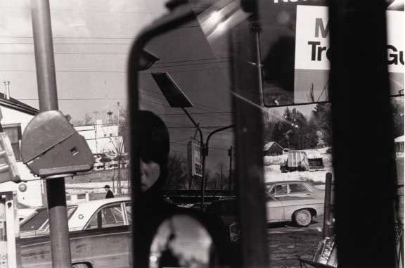
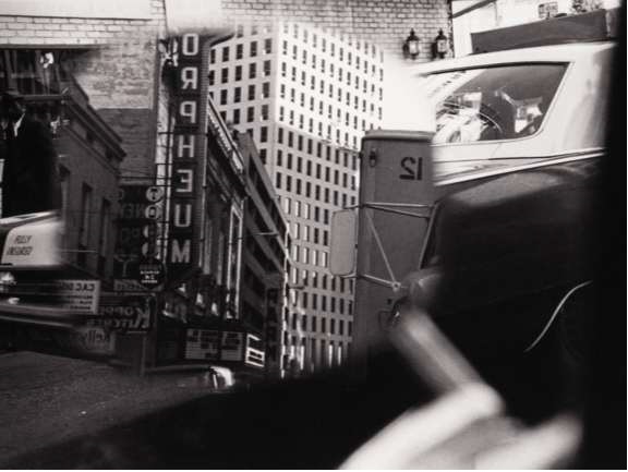
New York City, 1963. Lee Friedlander (Fig. 2)
Photography and the Aesthetics of Abstract Painting
By Robin Marriner, Senior Lecturer Critical Studies, Bath School of Art & Design, Bath Spa University, UK
It is not difficult to imagine if one was unfamiliar with photographic culture and had encountered individual random examples of Lee Friedlander’s work becoming perplexed on being told that Friedlander was one of the most important photographers of the past fifty or so years. On a first encounter many of his images seem to have a level of casualness, perhaps even carelessness that one would not recognize as differentiating them from much other vernacular photography let alone destine them to the consecration and acclaim they have received on numerous occasions from the Museum of Modern Art. (e.g MOMA 1967, 1978, 2005, and literature doesn’t enlighten one as to the why). (Fig 2, 3, 4)
New York City, 1963. Lee Friedlander (Fig. 2)
Hillcrest, New York, 1970. Lee Friedlander (Fig. 4)
In her seminal paper on Friedlander, “Guarded Strategies”, Martha Rosler picks up on this ostensible casualness and proposes two sets of oppositions in terms of which Friedlander’s work can be illuminatingly positioned: formal v transparent, transcendental v literal. She argues that for all their prima facie ‘casualness’/‘carelessness’ and the ‘ordinariness’ of what the individual images present which seems to align them with the transparent and literal, with the vernacular and documentary, across the body of the work there are recurring features which draw attention to it as imaged and as images, i.e. subvert its transparency and tilt its categorization towards the formal and transcendent and art. As she comments “Most of the issues of painterly ‘’design” within a rectangular format turn up in his photos”. Given this insight, surprisingly she then goes on to name and herself explore only two of these incidences: “echoes of analytic Cubism’ and “the look of collage- the (apparent) joining of disparate elements and image fragments “.
New Orleans, Louisiana, 1969. Lee Friedlander

Los Angeles, California, 1965. Lee Friedlander

Nashville, Tennessee, 1971. Lee Friedlander (Fig. 3)
This paper pursues what I understand as mooted by Rosler but unexplored. I want to suggest that at a time when judgments about quality of the visual were premised on notions of the ‘essence’ and ‘specificity’ of media, the time of Late Modernism as forcefully articulated by Clement Greenberg and Michael Fried (Greenberg 61 ,82 , Fried 66 ,etc), the recurrent strategies through which Lee Friedlander’s works can be read to assert their facticity as photographs, their presence as two-dimensional surfaces simultaneously with their presence as illusionistic images, i.e. their place as belonging within the Museum of Modern Art, are aesthetic strategies which had already had a currency as signifiers of surface and flatness in American Abstract painting of the 1950s and 1960s.
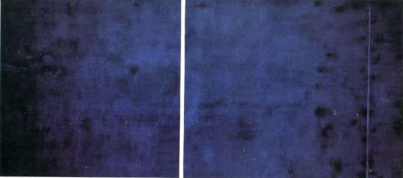
Cathedra, 1951. Newman Barnett
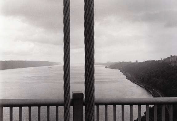
George Washington Bridge, New Jersey, 1973. Lee Friedlander

Santa Fe, New Mexico, 1969. Lee Friedlander
One of the recurring features across Friedlander’s work is a particular use of the frame in which foreground verticals traverse the images and extend beyond its top and bottom limits. In relation to one model of imaging, that which aspires to transparency and to pictorial composition which seeks clarity of subject matter as a primary quality of good photography these photographs seem to embody a shortfall. The various telegraph poles, lamp posts, street signs, steel hausers etc, seem to get between the viewer/us and the scene beyond which one assumes is the focus of attention/interest, – and perhaps account for the ‘coolness’ or detachment that is often attributed to Friedlander’s images – ; read on this model the street furniture act as a ‘barrier’ to one’s sight, literally set us at a distance from the ‘scene’. From a different perspective, that which is concerned less with transparency but with what in the fifties, sixties and seventies might well have been expressed as concerned with ‘photography as such’ the vertical obtrusions take on a different signification.
The vertical stripes within Barnett Newman’s paintings from the nineteen fifties are read within formalist criticism as significant because of what they do to our experience and concept of a painting. Greenberg (et al) have argued that the vertical stripes up against the picture plain positioned against an ambiguous ‘optical’ space, re-iterate the edge of the support (canvas), and in so doing give us an experience of the edges as part of the painting (as if further verticals (stripes) on the surface) rather than containers of it. The effect of the edge becoming part of the painting is to underscore our experience of the painting as surface, as flat (even if there is an optical space with it.) and by so doing declare its facticity, the truth of what it is. Within this frame, if we are prepared to accept as many did, Greenberg’s claims as to the effects of the stripes, the verticals within Friedlander’s photographs appear less as obtrusions to the scenes depicted than signifiers of the photograph itself, a means to declare its flatness and facticity.
New York City, 1963. Lee Friedlander

New York City, 1975. Lee Friedlander

Number One, 1949. Jackson Pollock
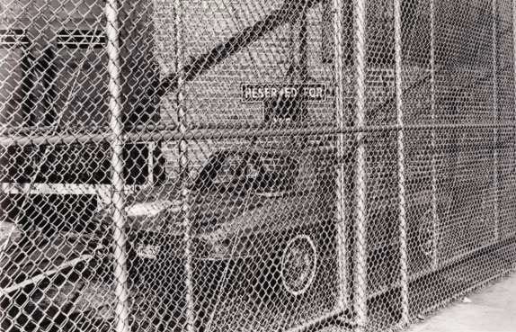
Another frequently recurring feature in Friedlander’s photographs is the manner in which he uses frontality and the frame to generate a conspicuous degree of patternation across the image – for example the use of mesh fencing or foliage in the foreground of the image. Again here as with the verticals referenced above, on a model of transparency, the fences and foliage appear as obstructions to a clear view of the scene, but read within the dominant critical frame of painting at the same moment, the same features take on a signification that locates the photographs, perhaps even confirms the photographs as art.
Amongst the many claims that are made of Pollock in his ‘drip-paintings’, for example, that he undermined the distinction between drawing and painting, that he frees painting from its concern with illusionistic representational space, etc, the one that is perhaps of most weight and significance is that he has through these paintings changed the nature of pictorial composition of western art. Through working the paintings from all sides (on the floor) and ‘cropping’ or stretching the canvases after Pollock, it is claimed, has generated images which have an equal intensity of pictorial incident across their whole surface: what has been designated as ‘overall-composition”. Instead of pictorial composition involving the reconciliation of shapes within the space bounded by the edges and to that degree subordinated to them as something which contained but was not part of the painting, – for example way that the intensity of incident in the centre of Cubism’s shallow-box like picture plane has to be thinned out to reconcile that picture plane to the edges – Pollock’s drip paintings in their evenness of pictorial incident look as if they could go on laterally and vertically indefinitely, their edges being an arbitrary cut on their surface rather than enclosures for the work. The overall composition of Pollock is heralded (as Lieder says) as ‘the exquisite triumph of the two dimensional manner’ in painting, here it is enough to note that an overall distribution of pictorial incident underscores two dimensionality, and such draws attention to the surface as surface, as stuff and opaque not transparent.
It is not that there cannot be found within photography itself precedents for the ‘look’ of that to which I am pointing, for example what can be read as the underscoring of surfaces in Frank (Fig 23 Barbershop) and (Fig 24 Venice), the framing and frontality in Evans, (Store front, Fig 25 and Gas Station, Fig 26 F) and Frank (Trolley Fig 27) but rather that what gives those features the signification that they are now read to have, and Friedlander’s work too is the meaning given to them in the paintings: i.e. signifiers of facticity.

Barbershop through screen door. McClellanville, South Carolina, 1955-56. Robert Frank

Backyard. Venice, California, 1955-56. Robert Frank

Painting, 1951. Clyfford Still
According to Greenberg, despite the jagged edged forms and uneven ‘autumnal’ palette that set up the degrees of depth and space, what redeems a typical Clyfford Still painting is the way in which they avoid enclosed or bounded figures by running shapes off the edges. The running of figures off or over the edge, something which 19C painters like Degas learnt from the framing/cropping of photography is here being posited as another strategy through which pictorial depth can be reconciled to the actuality of painting as flat. The cropping of the faces and heads in the New York (Fig 2) and Nashville (Fig 3) Friedlander images shown very early in this presentation might be read in this way, as I think can the images in which rather than cutting things off, phenomena are allowed to intrude from beyond the edge into the picture, e.g. branches, foliage and traffic lights and signs, with the same perceptual effects i.e. undercutting the illusion of depth within the image as one’s eye is led to and across its edge. (Fig 30, Fig 31, Fig 32, Friedlander)

Brink, 1959. Adolf Gottlieb (Fig. 32)

Blue and Gray, 1962. Mark Rothko (Fig. 37)

Akron, Ohio, 1980. Lee Friedlander (Fig. 35)
Sceaux, France, 1973. Lee Friedlander (Fig. 36)
In his 1955-58 essay “American-type painting” Greenberg has this to say of Adolf Gottlieb: (Greenberg 1961, 216) “ he has made himself one of the surest craftsmen in contemporary painting: one who can, for instance, place a flat and irregular silhouette, that most difficult of all shapes to adjust in isolation to the rectangle, with a force and rightness no other living painter seems capable of.” Perhaps one might say of Friedlander as a photographer, that he too, not without a lightness of touch/sense of humour has achieved a similar feat for not dissimilar ends. ((Fig 35, Fig 36 Friedlander).
Not just Gottlieb but Rothko (Fig 37) places elements of his paintings perceptually up against the picture plane and whilst using more ‘regular shapes’ he too gives those elements ‘soft’ or fuzzy edges. The combined effect of the placement in the foreground and the ‘softness’ of its edges is both to underscore the work’s surface and also render the space/depth within the work ambiguous, a description that seems to be equally apposite to Friedlander’s photographic equivalent to the painterly strategies.
What I have been trying to argue is not intended as a criticism of Friedlander’s work nor as a challenge to his status within the world of (art) photography. If anything it is a challenge to the ideas that held such sway through the fifties sixties and seventies that each art form has an essential nature, and that quality is dependent on an en engagement with those properties unique to the art form. What I have tried to show rather perhaps suggests something of why he is held in such high regard in a way that the writings issuing from MOMA during that period for me fail to do with the under-developed concept of ‘camera vision’ (New Documents. 1967) or such vagueness as “What unites the photographers included in the exhibition is their common “pursuit of beauty: that formal integrity that pays homage to the dream of meaningful life.” Both approaches are, in fact, part of a single if complex tradition.”” (Mirrors and Windows 1978). What I am suggesting is that through photographic means Friedlander has managed to address issues that were (and to a degree still are) central to art culture. At least armed with art culture knowledge the works can be so read. Whatever we may think about the quality of the work as representations of the social scene, it seems to me that it is the significations it yields in relation to the knowledge and aesthetic concerns of art culture that its standing within MOMA is to be sought. It therefore perhaps should come as no surprise that one can see the same preoccupations, albeit writ (literally) large – the frontality, the framing, the acknowledgement of flatness through the re-iteration of the edge, both vertical and horizontal constituting a grid, or an equal distribution of pictorial incident across the whole surface, in conjunction with a massive scaling up of image to the size of many post World War II paintings- in the works of the photographer who more than any other thus far has secured the status of artist, namely Andreas Gursky.
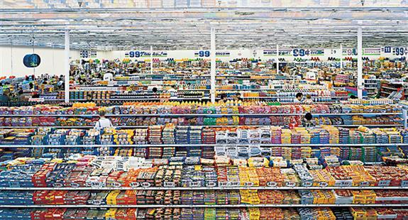
99 Cent Store, 1999. Andreas Gursky (Fig. 38)
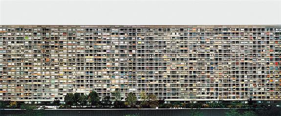
Montparnasse, Paris, 1993. Andreas Gursky (Fig. 39)
Notes
Rosler, M. 1975 “Guarder Strategies”, Artforum. April: 46-54
Greenberg, C. [1955, 1958] 1961. “ “American Type” Paining ” in Greenberg, C. Art and Culture. Boston: Beacon Press.
Greenberg, C. [1965] 1982. “Modernist Painting” in Frascina, F & Harrison, C (eds). Modern Art and Modernism: a critical anthology. London: Harper & Row.
“The essence of Modernism lies, as I see it, in the use of the characteristic methods of a discipline to criticise the discipline itself- not in order to subvert it but to entrench it more firmly in its area of competence of each art, it turned out had to effect this demonstration on its own account. What had to be exhibited and made explicit was that which was unique and irreducible not only in art in general, but also in each particular art…
‘It quickly emerged that the unique and proper area of competence of each art coincided with all that was unique to the nature of its medium. The task of self-criticism became to eliminate from the effects of each art any and every effect that might conceivably be borrowed from or by the medium of any other art. Thereby each art would be rendered ‘pure’, and in its ‘purity’ find the guarantee of its standards of quality as well as of its independence. ‘Purity’ meant self-definition, and the enterprise of self-criticism in the arts became one of self-definition with a vengeance. (p5/6)
Fried, M 1966. “Shape as Form: Frank Stella’s New Paintings, Artforum, (Nov): 17-32
Fried 1966 Footnote 8: ‘And in fact – despite the proliferation of work that is neither painting nor sculpture, and despite the pervasiveness of the facile notion (hawked recently by Susan Sontag) that the arts in our time are at last heading towards synthesis – what modernism has come increasingly to mean is that, more than ever, value or quality can be predicated of work that lies only within not between the individual arts.
Greenberg , C 1961 , see note ii.
Leider P 1970, ‘Literalism and Abstraction, Frank Stella’s Retrospective at the Modern’, Artforum, (April): 44-51.


ASX CHANNEL: LEE FRIEDLANDER
(All rights reserved. Text @ Robin Marriner, Images @ Lee Friedlander)
The post LEE FRIEDLANDER: “Photography and the Aesthetics of Abstract Painting” (2012) appeared first on Since 2008, AMERICAN SUBURB X | Art, Photography and Culture that matters..
If I find an app that works well, does something I really need it to do and has a reasonable price tag but lacks keyboard shortcuts, I am left disappointed. To me, keyboard shortcuts are specially essential in apps that one might use frequently. Though there is a difference between using shortcuts for simple and complex apps: it’s easier to learn them all when the app is simple and performs few functions, but can be challenging when it comes to feature-filled apps. KillerKeys VR for OS X is a free learning tool for app shortcuts that adds an on-screen keyboard to your desktop that shows available shortcuts and what they do. The keys are color-coded and change if you’re holding down a modifier key such as Command or Control. The app can show on-screen shortcuts for OS X Mountain Lion, OS X Lion, Chrome, Firefox, Safari, and iTunes. You can buy shortcut indicators for more apps like Adobe Photoshop, Lightroom, Final CutPro 7, etc. The price for the shortcuts of an app varies between $0.99 and $4.99.
Open the app and wait for the first keyboard to appear. It offers a compact view and an expanded one; the latter also shows the navigation keys and the numeric keypad. The keyboard supports both QWERTY and AZERTY layouts, and its opacity can be customized. You can set a keyboard shortcut to hide/unhide the keyboard, and also pin it on top of all windows.

KillerKeys VR is not context sensitive; it won’t change which shortcuts are being displayed if you switch to a different app. To change the shortcuts that you see, click the menu at the top-left and select a different app; the keys will change to reflect the shortcuts for the selected app. You will notice that if you press and hold different modifier keys – be it just one or in a combination – the keyboard will change to reflect any and all shortcuts that are available with that combination.
The QWERTY and AZERTY buttons at the top allow you to change the layout of the keyboard. The slider right next to it lets you manage the opacity of the keyboard. The keyboard button itself lets you record a shortcut for calling the app, and the two squares allow you to toggle its pinned state. To view the expanded version of the keyboard, click the arrow at the far-right.

The app is pretty good but given that it’s a learning tool that will soon be discarded once a user has learnt the shortcuts, its price tags for each app’s shortcut are bit high. It might be a good idea to give users a package or allow them to buy a certain number of shortcuts for a fixed price.
Download KillerKeys VR For Mac
Read KillerKeys VR Teaches Hotkeys For Mac Apps Using A Virtual Keyboard by Fatima Wahab on AddictiveTips - Tech tips to make you smarter
The following is a guest post by Parker Bennett where he explores some different ways to approach the behavior of fluid and responsive images.
Sometimes you want an image to resize responsively but restrict its height — cropping it then as it widens. Here, we explore three options with various trade-offs.
background-position: center bottom.Here, in place of an <img>, we create a div with a background-image and use CSS3's dandy new background-size: cover to have it size proportionally. As a bonus, we can easily crop from the top, center, or bottom using background-position.
One potential issue is we need to specify a height for the div to show up. This gives it a fixed height that doesn't scale proportionally (at least not without CSS media queries). When it gets narrow enough, the sides start cropping (this might be preferable, it depends).
Also, a quick check with caniuse.com shows this will fail conspicuously in IE8 (showing the image full size), but thanks to Louis-Rémi Babé, there's a background-size polyfill workaround (though it does require a relative or fixed position, and a z-index). IE8 also needs a polyfill for CSS media queries. There are a couple options.
.bg-image {
  /* image specified in separate class below */
  height: 240px;
  width: 100%;
}

.bg-image-wedding {
  background-image: url(img/photo-wedding_1200x800.jpg);

  /* lt ie8 */
  -ms-background-position-x: center;
  -ms-background-position-y: bottom;
  background-position: center bottom;

  /* scale bg image proportionately */
  background-size: cover;

  /* ie8 workaround - http://louisremi.github.io/background-size-polyfill/ */
  -ms-behavior: url(/backgroundsize.min.htc);
  /* prevent scaling past src width (or not) */
  /* max-width: 1200px; */
}

/* example media queries */
@media only screen and (min-width : 768px) {
  .bg-image { height: 320px; }
}

@media only screen and (min-width : 1200px) {
  .bg-image { height: 400px; }
}background-position: center center.Something to note, background-size: cover will readily upscale larger than the src image's native size (or not, if you set a max-width).*
Still, there are some downsides to using a background-image. It's not as semantic or modular as an img, so it's less straightforward to maintain. You're seemingly stuck with a fixed height or cumbersome CSS media queries. Also, users can't save the image as easily (sometimes preferable).
Here, we use an img with max-width set to a percentage of the containing element so it scales responsively, then wrap it in a div with overflow: hidden and a specified height or max-height.

.crop-height {
  /* max-width: 1200px; /* img src width (if known) */
  max-height: 320px;
  overflow: hidden;
}

img.scale {
  /* corrects inline gap in enclosing div */
  display: block;
  max-width: 100%;
  /* just in case, to force correct aspect ratio */
  height: auto !important;
  width: auto\9; /* ie8+9 */
  /* lt ie8 */
  -ms-interpolation-mode: bicubic;
}
As you can see, the bottom of the image now gets cropped as it widens. But what if you want it to crop from the top? Surprisingly, you can — using CSS3's transform:rotate() we add a "flip" class to both img.scale and div.crop-height — flipping the img all the way around.
/* apply to both img.scale and div.crop-height */
.flip {
  -webkit-transform: rotate(180deg);
  -moz-transform:    rotate(180deg);
  -ms-transform:     rotate(180deg);
  -o-transform:      rotate(180deg);
  transform:         rotate(180deg);
  /* needed? not sure */
  zoom: 1;
}

img.flip {
  /* if native or declared width of img.scale
     is less than div.crop-height, this will
     flipped img left */
  float: right;
  /* add clearfix if needed */
}
Novel, but limited to top-cropping only. And, as you might expect, this doesn't work in IE8, either — perhaps failing less conspicuously (it will just crop from the bottom as before). The bad news is, I haven't found any polyfill options that work because they need a specified height and width.
What if we could have the advantages of specifying an img (e.g., using max-height so we get proportional vertical scaling below a certain height), but also the flexible cropping and IE8 polyfill support afforded a background-image? We can!
visibility: hidden, the background-image has background-position: center center.The trick is to make the responsively-sizing img invisible. With visibility: hidden it retains layout, so we see the background-image behind it. (Since it's the same image source it shouldn't have to download twice.) If you want user-friendly access, you could instead use opacity: 0. Now users can drag the image or right-click to save. (Opacity and background-size need some extra IE8 workaround bits.)
opacity: 0. A background-image you can drag or right-click to save. Works in IE8 (with help).Another thought is to use a more compressed proxy img, and use CSS media queries to serve a higher-resolution background-image as needed. This img could even be a proportionately smaller size (e.g., matching your max-height), or watermarked. Check out this CSS-Tricks post on media queries, and this helpful resolution mixin for Sass.

img is holding the space for the higher-res background-image..crop-height {
/* max-width: 1200px; /* img src width (if known) */
max-height: 320px;
overflow: hidden; }
.bg-image-wedding {
/* for small devices */
background-image: url(img/photo-wedding_1200x800.jpg);
/* lt ie8 */
-ms-background-position-x: center;
-ms-background-position-y: bottom;
background-position: center bottom;
/* scale bg image proportionately */
background-size: cover;
/* ie8 workaround - http://louisremi.github.io/background-size-polyfill/ */
-ms-behavior: url(/backgroundsize.min.htc);
*/ prevent scaling past src width (or not) */
/* max-width: 1200px; */ }
.invisible {
visibility: hidden; }
.transparent {
/* trigger hasLayout for IE filters below */
zoom: 1;
/* 0 opacity in filters still displays layout */
-ms-filter:"progid:DXImageTransform.Microsoft.Alpha(Opacity=0)";
filter: alpha(opacity=10);
opacity: 0; }
/* example media query for smaller non-retina devices */
@media
only screen and (max-device-width : 600px) and (-webkit-max-device-pixel-ratio: 1),
only screen and (max-device-width : 600px) and ( max-device-pixel-ratio: 1) {
.bg-image-wedding {
background-image: url(img/photo-wedding_600x400.jpg);
}
}
/* example media query for retina ipad and up */
@media
only screen and (min-device-width : 768px) and (-webkit-min-device-pixel-ratio: 1.5),
only screen and (min-device-width : 768px) and ( min-device-pixel-ratio: 1.5) {
.bg-image-wedding {
background-image: url(img/photo-wedding_1200x800@1.5x.jpg);
}
}Until the day where CSS3's object-fit is supported, which may be a while, this hybrid option seems like the best approach to me. Still, it's nice to have options. I hope you got something out of my way-too-thorough exploration. You can take a look at the source code for more, edit on CodePen, or download the example files here. If you have any questions, comments, or corrections, drop me a line: parker@parkerbennett.com.
* You can make an img upscale like a background-image if you want. You just need to "pre-enlarge" it, adding a proportionately larger width and height to the img element itself: <img width="2400px" height="1600px" src="img/photo-wedding_1200x800.jpg /> (edit on CodePen).
Crop Top is a post from CSS-Tricks

Diesel Black Gold has a very interesting 3D menu and some creative effects. Our pick this week.

A great and inspiring collection of hand-picked videos for web designers to learn and get inspired.

Popular UIs is a growing collection of popular web UIs reproduced in Photoshop for educational purposes.

Get free, hi-resolution photos for your website from Unsplash. The collection is updated every ten days.

Christopher Gammon takes you behind the scenes of the “National Geographic: Forest Giant” experiment that gives us a glimpse of the future of web layouts using CSS shaders.

Talented Ali Sisk made Forecast Font, a web-font for creating multi-layered, multi-colored weather icons.

A great excerpt from Stephen Hay’s new book “Responsive Design Workflow” where he writes about designing with major breakpoints in mind.

A great tutorial where Donovan Hutchinson shows you how to create and animate a Portal-inspired scene using only CSS.

An interesting set of responsive, IE-friendly CSS-only icons by Milana Cap.

A useful collection of links to blog posts, articles, videos and more for getting started with and learning AngularJS by Jeff Cunningham.

Learn more about Estelle Weyl’s technique for serving adaptive images in responsive web designs using media queries within SVG.

In her latest tutorial, Sara Soueidan will teach you how to create a beautiful horizontal portfolio layout with cool hover effects.

Oli Studholme dives into the topic of CSS normalisation, what its advantages are and how it’s different from CSS resetting.

An elegant and modern “Coming Soon” template by Nathan Brown for WeGraphics.

A beautiful “Hand with iPhone” mockup by Joe Mortell for your next project.

Peek behind the scenes of World Wide Maze, a game that uses great HTML5 features.

An interesting site where you can create and share your visual ideas.

Take a look at part 1 of the visual summary of the guidelines of Google’s visual assets.

A fantastic reference for unicode characters, all in one page with useful info on range, languages and more.

A great demo by Ross McMillan where text is blurred on scroll. Use Chrome or Firefox to see the effect (not mobile).

From the foundry that brought you epic fonts like Museo comes yet another beautifully crafted typeface: Tenso. Get the regular style for free.
Vous refaite la déco chez vous et vous avez besoin d’idées ?
Le collectif Platine Image a sûrement une solution pour vous ;-). Avec cette installation monumentale le hall d’accueil de leur studio c’est en effet transformé en une véritable oeuvre d’art interactive!
Cette création intègre plus de 800 pièces conçues à l’ordinateur puis imprimées pièce par pièce en 3D.
Cerise sur le gâteau: l’ensemble des effets lumineux est contrôlé grâce à plusieurs kinect qui captent les mouvement tout autour de la structure. Un projet audacieux qui ne manquera pas d’attirer les curieux… Et les clients ;-)

")
")
")

En savoir plus: [Link]
A collection of items from the Prosthetic Knowledge Tumblr archive and around the Web, returning to the theme of "Other Worlds" (previously explored in a post from August 2012), which takes a brief look at independent creative games that challenge conventions of the form and bridge the divide between art and gaming.
Animated GIF extract of Void One by Luis Hernandez.
After the original Other Worlds post was published, the theme became part of an art and gaming convergence festival called Vector, conceived by Skot Deeming. We managed to find many more examples, and below are a couple of pieces from that exhibition. There are also some brand new examples included--it is a creative field which is growing in prominence, as evidenced by the forthcoming establishment of the LA Game Space, which brings a Bauhaus-inspired approach to creative computing.
Void One

This game experience by Luis Hernandez takes the participant on a journey through different unrelated spaces: you could be roaming a familiar video game level or science-fiction landscape, or find yourself in a Kurt Schwitters’ Merzbau-esque room... or in another kind of place entirely.
Here is a video I put together, briefly touring the first few levels (apologies for the lack of sound):
Bad Trip


Alan Kwan's interactive game world is a trip into the artist’s subconscious. Scattered around the world are "memory cubes" which, when approached, display recordings of moments of the artist’s real life, recorded using a video camera mounted to his glasses. Watch the video below:
Bad Trip: Navigate My Mind from KwanAlan on Vimeo.
Kwan describes the work as follows:
Bad Trip is an immersive interactive system that enables people to navigate my mind using a game controller.
Since November 2011, every moments of my life has been logged by a video camera that mounts on my eyeglasses, producing an expanding database of digitalized visual memories. Using a custom virtual reality software, I design a virtual mindscape where people could navigate and experience my memories and dreams. The mindscape grows continually as fresh memories and dreams come in.
The artist is interviewed about the work at Gamescenes, which you can read here.
Memory of a Broken Dimension

Forthcoming independent game which smartly employs glitch aesthetics as part of its game world and narrative, by xra AKA Ezra Hanson-White:
If you would like to try out the game yourself, an early build can be found via a tweet from the developer here. The full version is forthcoming.
FRACT OSC

FRACT OSC, by Phosfiend Systems, is a first person puzzle platformer with a musical focus. As you complete the puzzle, you develop a virtual synth studio.
FRACT is a musical exploration game. Explore an abstract, broken-down world built on sound, rebuild its forgotten machinery and create your own sounds and music within the world. It draws inspiration from Myst, Tron, electronic music, and most importantly, synthesizers.
A quick look at some of the things we have planned for FRACT OSC - a first person adventure game inspired by synthesizers (no kidding!). We’re building some really interesting tools that combine exploration, puzzles and musical creation - and we’re really excited to share them with everyone!
Paradis Perdus (Lost Paradises)

High Definition low polygon game world to explore, only your path destroys the landscape:
Paradises Perdus is about not belonging. You are in a world that is beautiful and green, but the moment you enter it, you start infecting everything; the world starts decaying, until it eventually ceases to exist. You are the bad guy; you kill everything you touch. You can choose to exit the world, and then it will heal itself, but then you don’t get to enjoy it, of course.
More information, with links to download the alpha for PC, Mac, and Linux, can be found here.
EXO by Tabor Robak


Part first-person game, part demo-scene presentation, part "experience," all Sci-Fi, all worthy of 35 minutes of your time. EXO is available for free for PC and Mac. Here is a silent preview, embedded below:
If you don’t want to download the game, there is also a 35-minute video to guide you through the experience here.
You can get hold of this gorgeous piece of work here.
In Lookbook, Fashion Portraits 2007-2013 zijn op bijzondere wijze zeven lichtingen eindexamenkandidaten Fashion Design van ArtEZ door Louise te Poele vastgelegd. Het zijn glamoureuze staatsieportretten van een jonge generatie modeontwerpers. De foto’s zijn afwisselend rauw en decadent van karakter, dan weer ingetogen en nostalgisch, of juist kleurrijk en extravagant, afhankelijk van het thema van dat jaar. Te Poele weet aan de hand van die thema’s de veelheid aan karakters en types binnen een jaargang tot een coherente verhaallijn te brengen en de eigenheid van elke geportretteerde te verbeelden.
Te Poele was in 2003 zelf ook student op de afdeling Fashion van ArtEZ maar stapte na het eerste jaar over naar Fine Art. In 2007 is zij voor het eerst gevraagd om de eindexamenkandidaten van de Fashion afdeling te portretteren, inmiddels is het een jaarlijks terugkerend onderdeel van het programma geworden.
Louise te Poele’s werk viel al tijdens haar studietijd op door het uitgesproken karakter van haar foto’s. Door de nabewerking lijken haar foto’s op schilderijen, en ze fotografeert graag van dichtbij; dicht op de huid van haar onderwerp. Piet Gerbrandy schreef over haar serie Farmers, die ook in boekvorm verscheen: ‘Er is straalt zowel bewondering als compassie uit deze portretten: bewondering voor de vastbeslotenheid van de geportretteerden om het beste van het leven te maken, en compassie voor de nutteloosheid van die strijd. […]. Het wonderlijke van deze foto’s is dat de hand van de kunstenaar de werkelijkheid op zo’n manier manipuleert, dat er een authenticiteit [van de geportretterden] inzichtelijk wordt, die ons anders zou ontgaan.’
Een selectie van de werken uit dit boek is te zien van 5 juni – 22 september 2013 in het Museum voor Moderne Kunst Arnhem.
Titel: Lookbook, Fashion Portraits 2007-2013
Fotografie: Louise te Poele
Voorwoord: Matthijs Boelee
Ontwerp: Karin van de Kraats
Uitvoering: Gebonden
Formaat: 10,5 x 16 cm
Omvang: 148 pagina's
Illustraties: 100 in kleur
Taal: Engels
ISBN: 978-94-91444-12-8
Verkoopprijs: €17,90
Verwante boeken: Farmers