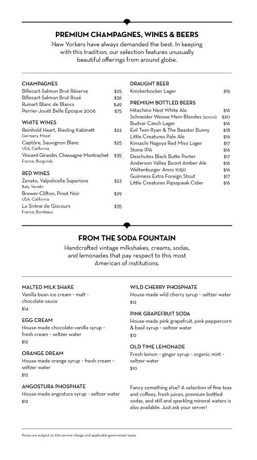
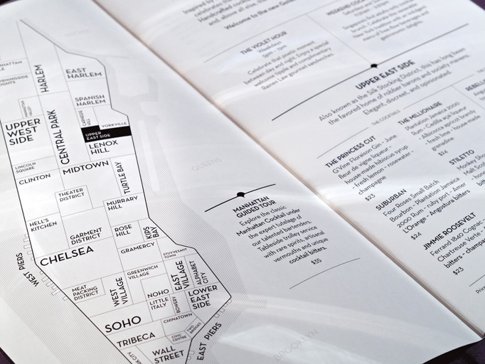
 [Image: David Maisel, from ToledoContemporánea].
 At the end of 2013, photographer
David Maisel was commissioned to photograph the city of Toledo, Spain, as part of a group exhibition called
ToledoContemporánea, timed for a wider celebration of the 400th birthday of the painter El Greco.
Maisel's photos offered a kind of aerial portraiture of the city, including its labyrinthine knots of rooftops. But the core of the project consists of disorientingly off-kilter, almost axonometric shots of the city's historic architecture.
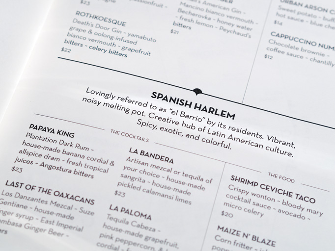
 [Image: David Maisel, from ToledoContemporánea].
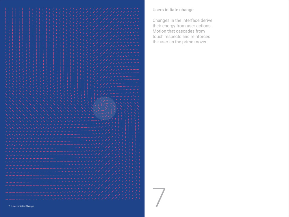
 On wider flights beyond the edge of the city, modern swirls of highways are seen coiling through the landscape, like snakes preparing for arrival; in a sense, their geometry mimics—or perhaps mocks—the bewildering whorls of tiny streets and passages seen in the city's core.
 [Image: David Maisel, from ToledoContemporánea].
 While he was in the country, however, Maisel took advantage of some extra time and access to a helicopter to explore the landscape between Toledo and Madrid, a short stretch of infrastructural connections, agricultural hinterlands, abandoned suburban developments, and arid hills.
The result was a new series of photos called
The Fall.
 [Image: David Maisel, from The Fall].
 As Maisel writes,
The Fall suggests a genre in which "the worlds of painting and photography have merged together," creating an ironically abstract form of landscape documentation.
This is most evident in the photos from an area called Vicalvaro on the outskirts of Madrid. As Maisel explains, this is "where construction was halted after the economic collapse of 2008. The
abandoned zones appear like the surreal aftermath of a bombed out city or an alien landing field."
 [Images: David Maisel, from The Fall].
 But, as seen in Maisel's photos, they could also just as easily be extreme close-ups of minimalist oil paintings, nearly microscopic zooms into the texture of another method of representation to reveal a different kind of landscape there, one created by pigments and dyes.
 [Image: David Maisel, from The Fall].
 This is an interrupted landscape, a geography elaborately and expensively prepared for something that has yet to arrive.
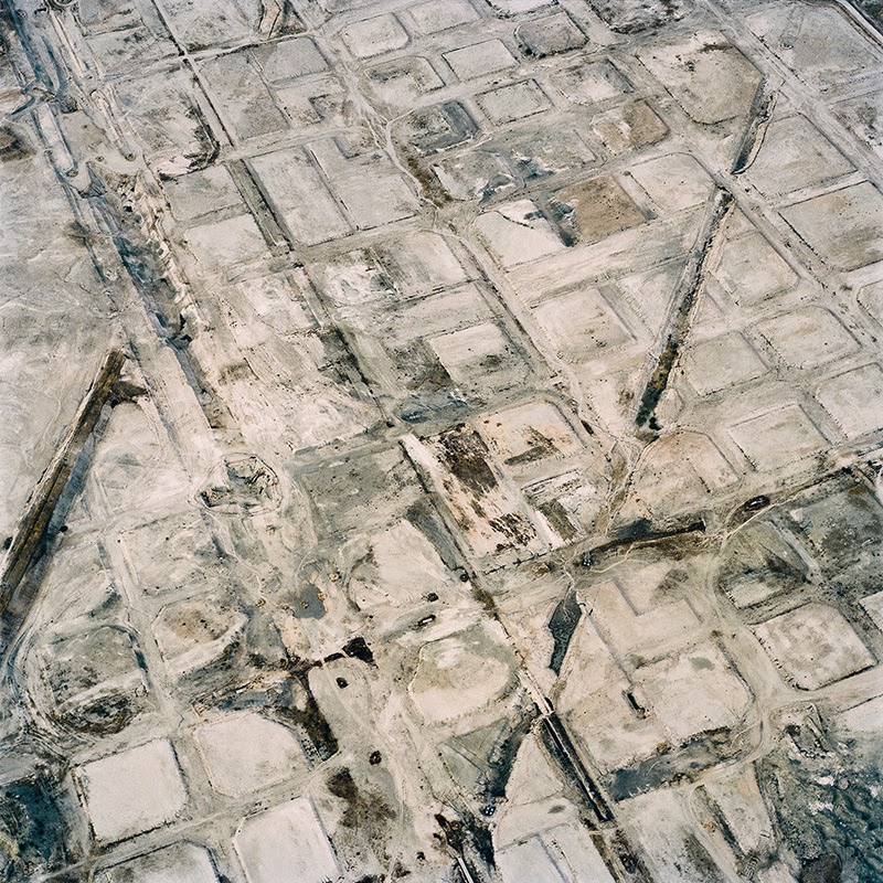
However, the dead abstractions of Vicalvaro were only one part of the "three different areas of the Spanish landscape" that Maisel says he set out to see.
 [Image: David Maisel, from The Fall].
 Another landscape type—true to form, considering Maisel's pre-existing focus on
landscapes of industrial use—are borax extraction sites.
These are "strange, ashen landscapes," he writes, seen "in a mining and agricultural region of La Mancha. The soil is laden with the mineral borax, which gives a surreal, ashen quality; the landscape shines, almost like a grey sea in a desert."
They're like windowpanes—or mercury lakes—reflecting the afternoon light.
 [Image: David Maisel, from The Fall].
 The surface of the earth becomes weirdly metallic in these shots, just a thin surface scraped away to reveal something seemingly utterly unnatural beneath, as if some divine force has begun etching the earth, scratching and engraving incomprehensible shapes into the planet.

 [Images: David Maisel, from The Fall].
 In many cases, amidst these grooved and metallized landscapes, gridded blooms of plant life have been introduced both to visually interrupt and physically contain the landscape.
Among other things, their roots help to secure disturbed dirt and soil from blowing away in heavy winds—but they also act to recuperate the terrain aesthetically, as if seeing these robotic fields the color of gunmetal was so philosophically unsettling for local residents that plants had to be brought in to make things seem earthly once again.
What we're seeing is thus not really arboriculture, but a kind of existential stagecraft, a rigorously constructed landscape whose ironic purpose is to shield us from the true artificiality of our surroundings.

 [Images: David Maisel, from The Fall].
 In fact, these bring us around nicely to the third landscape type Maisel says he was exploring with these photographs, joining the abandoned developments and borax sites that we've already seen, above.
This is Fuensalida, or a region of "croplands in the La Mancha region" that have been "gridded, crosshatched, and abstracted."

 [Images: David Maisel, from The Fall].
 Like the exquisite tree farms
documented by Dutch photographer Gerco de Ruijter, these rob viewers of any real sense of scale.
What are, in fact, trees appear instead to be small tufts of fabric pushing up through a needlepointing mesh. It could be a carpet interrupted mid-weave, or it could be some worn patch of clothing rubbed raw to reveal the underlying pattern for all to see.
 [Images: David Maisel, from The Fall].
 But it's just landscape: the earth reformatted again, made artifactual and strange, carefully touched up for human culture.
This is just a selection of images, however;
click through to Maisel's website to see the full series.
(All images by David Maisel, used with permission. If you like the look of Maisel's work, considering picking up a copy of The BLDGBLOG Book to read an interview with the photographer).

")


