Shared posts

08 Apr 01:01

The problem with slope charts

by Nick Desbarats

tl;dr: Slope charts and other common ways of showing “before and after” data are almost always misleading. Using a “merged arrow chart” eliminates the risk of misleading readers.

A video version of this post is available if you prefer to watch rather than read.


We often need to visualize how a set of values changed between a “before” period and an “after” period. For example, maybe our company has recently implemented a new sales strategy and we want to see which country’s sales team improved the most after the new strategy was implemented. Probably the most common ways to visualize this kind of data are side-by-side pie charts or clustered bar charts:

 
side-by-side pies.png
  
clustered bars.png
 

While these are probably the most common ways to visualize “before and after” data, they’re virtually never the most effective ways. Many posts that have been written on this topic, virtually all of which mention slope charts as a better alternative:


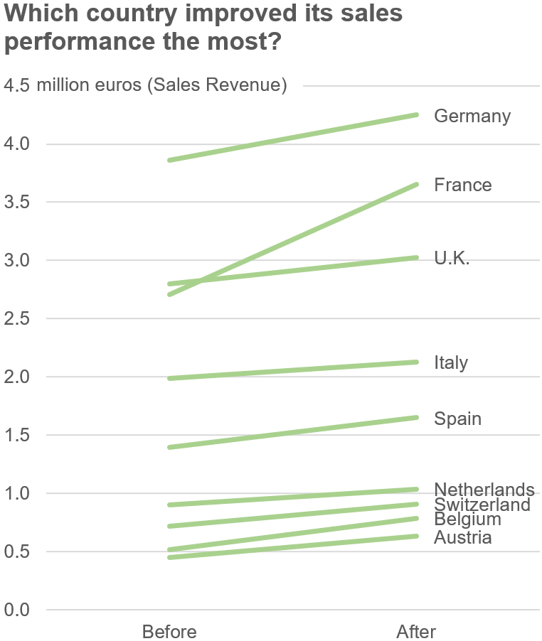
Those posts generally do a good job of explaining why slope charts and are more effective than side-by-side pies or clustered bars in “before and after” situations, but you can probably see the reasons for yourself. For example, in the slope chart above, it’s much clearer that France’s sales increased the most because we notice right away that its line has a steeper slope than the others.

Hold the proverbial phone, though. The title of that chart isn’t “Which country’s sales increased the most?”, it’s “Which country improved its sales performance the most?” If that’s the question that we’re trying to answer, it’s the relative change (i.e., the % change) that matters, not the absolute change (i.e., the change in euros). When we look at relative change, though, a quite different picture emerges:

 
country sales before after table.png
 

As it turns out, the French sales team isn’t the hero in this story, the Belgian sales team is. By a wide margin, in fact (52% improvement versus 35%). Indeed, the French team doesn’t even come in second (Austria also improved more). That sure isn’t what the slope chart seemed to say, though.

This isn’t a rare, straw-man problem because slope charts always make relative changes among small values look smaller than they really are. This is why I think that slope charts can be—and often are—misleading, and why I tend not to use them much anymore.

Another option for showing before-and-after scenarios is an arrow chart, which looks like this:

 
comet chart.png
 

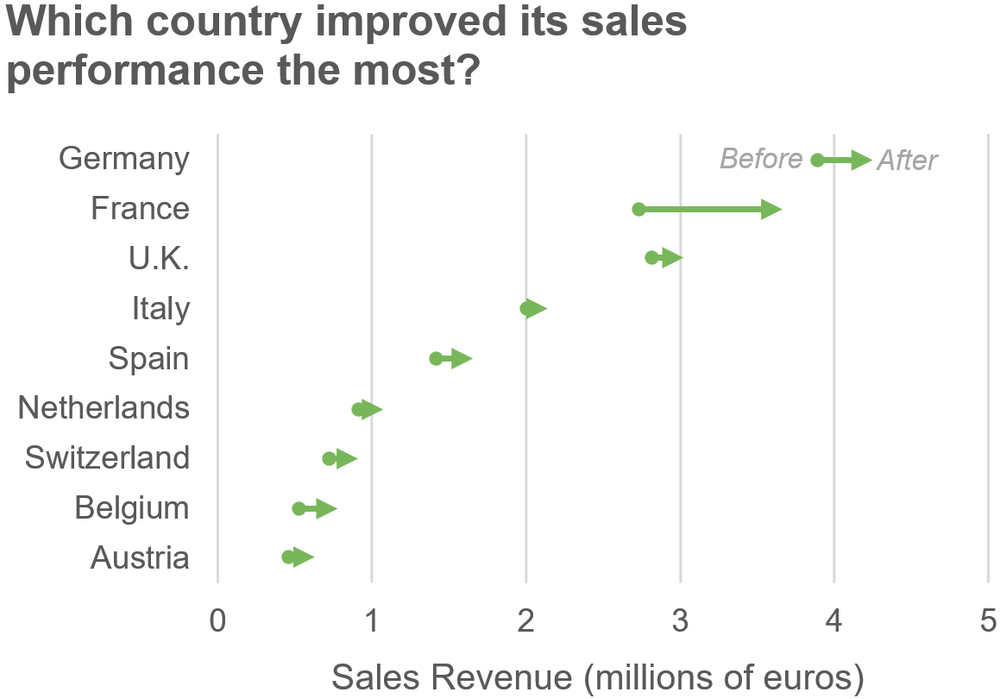
Unfortunately, though, these charts also suffer from the same perceptual problem as slope charts, i.e., France’s performance still looks like it improved far more than Belgium’s when, in reality, it improved less.

Is there a way to avoid misleading readers when visualizing before-and-after values, then? Well, the solution that I recommend in my Practical Charts course is what I call a “merged arrow chart”:

merged comet chart.png

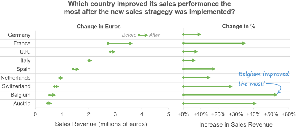
By showing relative changes (%) alongside absolute values (euros), readers get accurate answers to both “absolute” questions like “Which country had the highest sales after the change?” and “relative” questions such as “Which country improved their sales performance the most?” Yes, this is a busier chart but, if we don’t show the “relative change” values alongside the absolute values, the risk isn’t that readers will miss out on important insights, it’s that they’ll get completely wrong insights, which is obviously a much bigger problem.

Even when the relative changes among smaller values are less dramatic, it’s still necessary to show them alongside the absolute values. For example, in the chart below, the arrow chart on the left makes it look like Zuckerberg increased his wealth considerably more than other billionaires during the pandemic (ugh):

merged comets billionaires.png

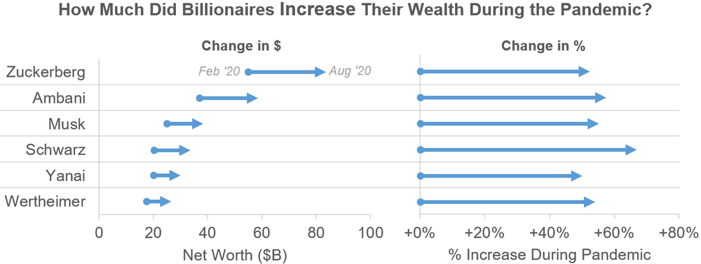
The “Change in %” chart on the right clarifies that, in reality, the relative increases in wealth were actually quite similar for all the billionaires in this list. Without the “Change in %” chart, many readers would conclude that Zuckerberg experienced a greater relative increase in wealth than the others even though, in fact, his wealth actually increased a bit less than most of the others, in relative terms.

If we don’t include the relative changes, at best, readers will wonder which values changed the least or most. At worst, it won’t even occur to readers to wonder that in the first place, and they’ll come away with a fundamentally incorrect understanding of the data. This is why, IMHO, showing relative changes on before-and-after charts isn’t just useful, it’s essential. Yes, technically, we only need to show relative changes when they’re relevant to the insights that the chart was designed to convey, but they’re almost always relevant in before-and-after situations. Even if the story that we want to tell is solely about absolute values, there’s still a high risk that readers will make incorrect relative inferences if we only show them a standard slope or arrow chart.

[Oct. 27, 2020 update: After this post was originally published, several people commented in this great Twitter thread that slope charts can be appropriate in situations when only the absolute change is relevant. This comment makes several implicit assumptions, though:

  1. Most audiences understand the difference between relative change and absolute change.

  2. Most audiences understand that the slopes of lines in slope charts only represent absolute change, not relative change.

I’ve seen even quite sophisticated audiences make mistake #2, though, and several data viz pros commented or DM’ed that they hadn’t really noticed this problem until reading this post. I think that these are far from safe assumptions, then (unfortunately).

If presented with the slope chart in my example and asked which country grew the most, I suspect that very few people would answer “Well, in absolute terms, France grew the most but, in relative terms, it’s unclear which country grew the most.” Most would just answer “France”. This is a problem because relative change is relevant more often than absolute change. The CEO ends up giving the “most improved” award to France when she should be giving it to Belgium.

Yes, sometimes relative change is truly irrelevant to a situation, and sometimes absolute change is truly irrelevant. The problem is that, with slope, arrow, and comet charts specifically, audiences tend to mash the two types of change together, perceiving absolute change as relative change. With other chart types, such as regular bar charts, this is less of an issue (though these have other important limitations in before-and-after situations).

Others commented that a best practice should be to ALWAYS show both relative and absolute values, but I wouldn’t go that far. The problem that I’m pointing out is specific to situations in which we’re comparing two sets of quantities, and doesn’t apply to, say, showing absolute and relative breakdowns of a total, or showing absolute and relative changes in rank (as opposed to changes in quantity).]

[Feb. 2 2021 update: Astute readers, including Dan Zvinca and James Thomson, pointed out that slope charts would be a better choice than arrow charts in situations when we want to feature changes in rank, as opposed to changes in quantity. I agree with them since, in those particular situations, relative changes in quantity are truly unimportant and slope charts make changes in rank more visually obvious. Thanks guys!]

Finally, I want to flag an important caveat that applies to all of the charts in this post, which is that insights that are based on comparing just two time periods should be taken with a boulder of salt, which I discuss in this post.

What do you think? Agree? Disagree? Let me know in the comments.

By the way…

If you’re interested in attending my Practical Charts or Practical Dashboards course, here’s a list of my upcoming open-registration workshops.

29 Oct 19:44

Let's stop fooling ourselves. What we call CI/CD is actually only CI.

by Ant(on) Weiss

Cover Photo by Yan from Pexels

// Detect dark theme var iframe = document.getElementById('tweet-1308108094157787136-107'); if (document.body.className.includes('dark-theme')) { iframe.src = "https://platform.twitter.com/embed/Tweet.html?id=1308108094157787136&theme=dark" }

Yes - this post started as a tweet. One that went semi-viral. It struck a real, naked, buzzing nerve. A nerve that most of us prefer not to touch.

Some of us pretend it's not a real pain, others are just too busy fixing production issues. Still others - and that would probably be the majority of the industry - are yet to discover how much of a distress it is when they meet with it face to face.

the gap between the elite and everybody else is only growing wider

But the truth is out there. Mere mortals can't have Continuous Delivery and even less so - Continuous Deployment. CD has become the privilege of that group that the folks at DORA quite non-accidentally call "elite performers". And the gap between the elite and everybody else is only growing wider.

Fooling Ourselves

Most organizations we work with say: "of course we have CI/CD pipelines!"
But when one digs deeper - there's usually some CI - and no CD in sight. Or, as @itaysk noted "it's not even CI, but continuous build..."

When asked what stops them from safely and regularly deploying every change into production environments - everybody seems to have their own reasons. Organizational, cultural, historical, technical, contractual.. Some go as far into denial as saying : "Oh, we don't need continuous delivery. In fact most companies out there don't really need it." But the underlying reason is of course the lack of confidence. Nobody wants to be the culprit for a system outage. According to a number of industry surveys the average cost of one hour of downtime is around 75000 USD. There's a lot at stake!
So instead we choose to move slower, to add controlled handoffs and build home-grown guardrails. To hire more Ops engineers and call them SRE to feel more secure. Rarely discussing the price of establishing and maintaining all of these over time.

But why can't we have CD?

Continuous Delivery is a sociotechnical practice. And as many Twitter commenters correctly noted - the barriers on the way to having it are two-fold. As with anything in DevOps it starts with culture and shared understanding that continuously delivering in small increments makes everything better. Engineers who've experienced true CD can't really fathom any other way of delivering software. As @giltayar puts it "CD ... is a total game changer. It changes how you perceive software development and delivering features... I did CD and EVERYTHING about how I developed changed. It was magical."

// Detect dark theme var iframe = document.getElementById('tweet-1308341183979151360-95'); if (document.body.className.includes('dark-theme')) { iframe.src = "https://platform.twitter.com/embed/Tweet.html?id=1308341183979151360&theme=dark" }

The Social Dilemma

But we humans are scared of change. The new mode of delivery challenges our perceptions: of ownership, of reliability, of hierarchy. If your SRE team is responsible for production site uptime - then what's their incentive for enabling the constant flow of change that continuously threatens the very thing they are responsible for? If you have folks whose job it is to control what gets released when - what will they do when this control is made obsolete? The existing organizational barriers make the blame game easier - thus providing us with a false sense of confidence. Because the tools we currently have can't promise true confidence - and this bring us to...

The Technical Dilemma

The socio-cultural obstacles are truly the hardest to remove. But as Archimedes used to say: "Give me a lever long enough and a fulcrum on which to place it, and I shall move the world." Technology, while meaningless on its own can become a great enabler for societal innovation.
Trouble is - the tools for continuous delivery/deployment are still lacking. And this is especially true for the new brave cloud/edge-native world we see rapidly unfolding before our eyes.

But Aren't CI Tools Enough?

This is where some readers might say: "Why are you saying there are no tools for CD? We already have Jenkins/CircleCI/Github Actions... Why can't we use those? and then there's Spinnaker, isn't there?"

That, of course, is a grave mistake. Yes - any CI server or even generic workflow automation tool can theoretically orchestrate your deployments - the mechanics of deployment are trivial. But deploying like this is the same thing as the proverbial "throwing changes over the wall" practice that brought on the DevOps revolution.
Because CI tools ignore the semantics of change. The only kind of feedback they provide is deterministic one - verifying a pre-defined functionality under pre-defined conditions. While the production environment has inherent uncertainty leading it to behave in often unpredictable manner. Therefore - in modern complex systems no change is verified until it reaches production. As they say - until the wheels hit the road.

And that is exactly why most orgs out there can't have CD. Because blindly pushing into production is scary, stressful and in the end falls on the shoulders of the undermanned SRE team.

And that is exactly why most orgs out there can't have CD. Because blindly pushing into production is scary, stressful and in the end falls on the shoulders of the undermanned SRE team.

Cloud Native CD is Possible

It's not all bad, of course. Some teams we talk to succeed to establish true cloud native CD by investing multiple man-months in home-grown solutions. This is costly, most orgs can't allow this, but those who do are very proud of their achievement - until the platform changes under their feet and they need to reinvent the home-grown solution.

Some very interesting OSS projects have emerged in the last couple of years in an attempt to tackle the problem. ArgoCD with Argo Rollouts, Flux and Flagger, Shipper and Keptn are all definitely worth looking at.

Still no one comprehensive, reliable, usable platform exists that can help us deploy to production continuously with confidence and without complex unsustainable in-house hackery.

That's why we at Canarian decided to step up to the challenge.

We're building a platform that will allow you to deploy continuously with confidence, full observability and automated recovery.

In the next post I'll describe the feature set that we see as the minimal viable proposition for such a platform and how we're building it.

Sounds interesting? Send us an email, sign up for our beta version on the site or just follow this blog.

We'll keep you continuously updated ;)

Keep delivering!

25 Oct 07:26

How do I work best?

The morning cuppa…

It’s incredibly obvious to say, but 2020 has not been a normal year for work. Next year probably won’t be either. So, what do we do about it? How do we stop simply reacting and instead meet the challenges we’re navigating and which are coming in a constructive way? My attempt to answer these questions have me going back to first principles and asking some basic questions of myself.

One of these questions is: “How do I work best?” As I think through this question, I’ve been reflecting back on my experiences and what’s worked well for me in the past and thinking about how they can be applied to the future.

Over the years, I’ve been in a wide variety of working environments. I’ve worked in big teams, small teams, and by myself. I’ve worked in private offices, group areas full of beanbags, my couch at home, and more coffee shops and airplane seats than I can count. For me, it’s not the physical environment that I find myself in that matters most, though it certainly helps. Instead, it’s finding the mental environment and space to focus on the problem at hand.

That means factoring out distractions, being comfortable enough, and concentrating on what I’m doing is what I strive for to be productive.

Sometimes, that means sitting down with a laptop in a café and focusing on writing and re-writing my thoughts as I work through a problem as the world goes by. Other times, it means settling into a beanbag with a code editor and terminal window and iterating through a test-driven loop. There are times that a long walk with a colleague to talk things out works best. And, sometimes it takes getting everybody into the same room — physical or virtual — and spending the time it takes to get everyone to a shared mindset so that a group can crack a problem that no single person can.

I don’t need quiet space to work, though it’s sometimes nice to be in a library-like environment. The background clatter of a café is sometimes a very soothing as well. Music always helps.

When I’m stuck, sometimes I just need to remind myself to put on a good beat and suddenly things start moving again.

When I settle into a good mental space to create within, I can easily handle multiple threads of conversation as long as they’re all related. Multiple threads of conversation about entirely unrelated topics will bounce me out of my zone. Surprisingly, I can thrive in complicated and chaotic communication environments as long as I can I find the connection between all the threads and focus on that to hang all the thoughts from.

I like understanding the entire scope of an issue from the holistic whole to the individual parts. My curiosity leads me to taking things apart and put them back together to understand them. I have a soft spot for building tools to build bigger things. And, when I find a point of friction that can be smoothed out in a way that will pay off over and over again, I am ecstatic.

If I’m working alone for a while, I like to bring the results of my work back in a form that is tangible in some way, whether that’s code that can be run, a document that describes something with supporting information, or a video that tells its story with a narrative feel. If I’m working in a group, I like to work in shared documents, code editors, or whiteboards combined with a free-wheeling discussion by voice to explore the problem space. Helping somebody else solve something is often as rewarding as solving it by myself. I don’t need the credit for every solution, but I love the satisfaction of being able to move forward.

As long as I’m a recognized part of a group that moves things forward, I’m happy.

I want to work with kind and smart people who have a sense of humor and are willing to consider all sides of a problem. People who have strong opinions and the arguments to back them up, but who can synthesize new input and change their opinion to apply a new understanding of the world. I enjoy learning continuously, I don’t mind it at all when I find out that I’m wrong, and I strive to consistently recast my view of the world, always with a mindset bent to growth.

I thrive being in an environment where risk-taking is appreciated, moving forward even as a consensus is developing is encouraged, and where failure is a learning opportunity met with kindness and introspection. Being critical of an idea even as I hold the person presenting that idea in the highest of regard is incredibly important to me.

When I fail to meet my standards, I appreciate being told and given the opportunity to try again.

I love the best parts of California startup culture and mindset, and I miss that living in Germany, yet I need to work in a global environment that understands that there is nuance to every action and decision. My passport is American, my family is in Europe, and my people are all over the place. I want to be in a team that finds working from an office in London or San Francisco is just as natural as from a café in Thessaloniki or a hotel lobby in Singapore.

This is how I work best. Give me a MacBook Pro, a good Internet connection, a set of problems that matter, and the smartest people around to work on them with in code, conversation, and in long-form writing. That’s how I want to work as we go into 2021 and meet all the challenges that are coming.

25 Oct 07:24

Tools

by Greg Wilson

A couple of days ago I tweeted:

What tools do you use daily to build software that aren’t on this list: text editor, version control, test runner, build manager, debugger, style checker, doc generator, package manager, issue tracker?

Answers included:

  • An IDE (which combines many of the tools listed above and below)
  • Pen and notebook
  • Stack Overflow and other Q&A sites for indirect collaboration
  • Search engine (see above)
  • Real-time collaboration tools (Slack, Zoom, …)
  • Asynchronous collaboration tools (a wiki, a mailing list, …)
  • Unix command-line tools (find, grep, home-grown scripts for scraping event logs)
  • Code reviewing system (usually not a separate tool, but built into whatever online software forge the team is using)
  • Continuous integration/continuous deployment
  • UI design/review tools like Figma or Abstract
  • A drawing tool
  • File sync/backup tools (rsync, Dropbox) that aren’t version control
  • Linter and memory checker
  • Code reformatter (often combined with the linter)
  • Compiler (oh yeah, people still used compiled languages…)
  • Coverage analyzer/profiler
  • Issue tracker (for threaded discussions as well as bugs)
  • Visual diff viewer
  • Model checker
  • Terminal multiplexer
  • Docker or other container/virtualization system (particularly for testing installations)
  • Package repository (because a package manager isn’t much use without one)
  • Mutation tester
  • Databases (indirectly: the IDE keeps one for symbols and cross-references in programs, for example)

It’s quite a list, and I’m willing to make a few bets:

  1. Most developers pick these up on their own rather than being taught explicitly how to use them.
  2. As a result, most developers don’t use most of these (where by “most” I mean Hanselman’s dark matter developers, not just the minority who blog and tweet and answer questions on forums and go to meetups).
  3. Proficiency with these tools doesn’t just correlate with productivity—it predicts it. In other words, if you teach people how to use these tools well, they will become more productive.

I further believe that:

  1. These tools aren’t in the curriculum because the act of building software isn’t considered part of computer science. Consider: to the best of my knowledge, no university in the English-speaking world offers a full semester course on debugging, and I’ve only ever seen one decent textbook on the subject (compared to literally hundreds on writing compilers).
  2. They also aren’t included in the curriculum because it’s hard to create meaningful pen-and-paper exam questions for them.
  3. It would be possible to examine proficiency meaningfully by having students record their desktop while solving problems and then submitting the video. I believe this could be done without violating students’ privacy, and that instructors could watch those videos at 5X or 10X and give meaningful feedback.

If you’re a graduate student in software engineering or computing education and looking for a research topic, I think this would be a good one—I’d be happy to chat any time if you want to brainstorm.

And following up on a suggestion from a friend, I guesstimated the genders of the people who responded to my original tweet from their profiles. This may not be accurate—studies have shown that women often use neutral or male identities online to avoid harassment—but the breakdown saddens me:

  • apparently male: 46
  • apparently female: 4
  • indeterminate or non-binary: 3

My estimate of the breakdown by race is undoubtedly no more accurate, but looks even more one-sided :-(

25 Oct 07:18

Smooth Criminal :: Matthew Panzarino about the iPad Air

by Volker Weber
So what you end up with is a device that shares the design philosophy of the iPad Pro and inherits some of its best features while simultaneously leaping ahead of it in raw compute power. This makes the Air one of the better overall values in any computing device from Apple in some time. In fact, it’s become obvious that this is my top choice to recommend as a casual, portable computer from Apple’s entire lineup including the MacBooks.

An dieser Stelle ist schon alles gesagt. Der neue iPad Air ist derzeit der interessanteste Apple-Computer.

Aber Obacht, billig wird das nicht. Wenn alles vorbei ist, hat man drei Teile gekauft:

  1. iPad Air 256 GB für knapp 798 Euro
  2. Magic Keyboard für 322 Euro
  3. Apple Pencil 2 für 125 Euro

Das Magic Keyboard ist brutal teuer, aber wenn man den iPad als Computer nutzen will, dann sollte man das kaufen. Es ist besser als die Alternativen. Den Stift brauchen nicht alle, aber wenn sie einen brauchen, dann diesen. 1250 Euro stehen da im Raum.

Wenn man keine Tastatur braucht, dann braucht man wahrscheinlich auch keinen iPad Air, sondern einfach das achte Modell des iPad. Das kostet dann mit 128 GB vergleichsweise günstige 467 Euro. Und das funktioniert auch mit einem Pencil, allerdings dem ersten Modell.

More >

25 Oct 07:18

Pikchr

Pikchr

Interesting new project from SQLite creator D. Richard Hipp. Pikchr is a new mini language for describing visual diagrams, designed to be embedded in Markdown documentation. It's already enabled for the SQLite forum. Implementation is a no-dependencies C library and output is SVG.

25 Oct 07:17

Pixelmator Pro 2.0

by admin

For the past 12 months, we’ve been working on a very special update to Pixelmator Pro. We’ll be able to tell you all about it very soon.

If you’d like to get any news about Pixelmator Pro 2.0 as soon as they’re available, sign up below.


Notify Me


25 Oct 07:17

Back in the Frame – New Paperback 17th December 2020!

by Lady Vélo

I’m absolutely thrilled to announce that my book, Back in the Frame, will be released in Paperback on 17th December 2020!

It includes a new Introduction called ‘This was not the plan’. I’m so pleased that I was able to add a very relevant chapter of my cycling story to Back in the Frame and hope that it resonates with others out there too.

There is more new material in the form of ‘The Perfect Ride’ – a Q&A about exactly that with a fellow cycling author. And if you hadn’t noticed, my book has a WHOLE NEW GORGEOUS COVER!

Pre-orders are live for Back in the Frame… and you can get it in time for Christmas too. Head to Amazon, Waterstones, WH Smith or Hive to place your order. I hope to be selling signed copies too, so watch this space.

Hugs, Jools x


The post Back in the Frame – New Paperback 17th December 2020! appeared first on Velo City Girl.

25 Oct 07:17

Diversity Equity and Inclusion workshops and courses that I’m excited about

by Tara Robertson
photo by Jacob Lund from Noun Project

Diversity, Equity and Inclusion (DEI) is a growing business. There are numerous DEI tech startups, DEI companies, DEI consultants and DEI certifications. I’ve been underwhelmed by the certifications offered by academic institutions as they are overly theoretical and don’t seem to equip learners with practical skills to do DEI work. Here are some trainings and workshops that are coming up that I’m excited about.

This Friday, October 23rd Paradigm’s Joelle Emerson, Dr. Evelyn Carter, and Courri Brady are offering a 1 hour free webinar on Creating Your 2021 Diversity, Equity, and Inclusion Strategy

Dereca Blackmon’s Inclusive Mindset for Committed Allies (free if you have LinkedIn Premium, unsure of the pricing if you don’t.) Dereca is the CEO of Inclusion Design Group and the former Assistant Vice Provost and Executive Director, Diversity and Inclusion Office at Stanford. She’s a dynamic speaker and I imagine this will be good. This 1 hour class is asynchronous, so you can do it at your own pace. 

Nicole Sanchez’s Building a More Inclusive Workplace: A 5-week series for measuring and improving DEI at your company (in partnership with O’Reilly. Nicole is the Founder and CEO of Vaya consulting and has been the VP of Social Impact at GitHub and a lecturer at UC Berkeley’s Haas School of Business. She is a thought leader and practitioner I admire. This class starts on November 3 and runs for 5 weeks, once a week. O’Reilly offers monthly or yearly subscriptions to their learning platform, so as an individual you would need to pay $49USD for for 2 months).

Dr. Dori Tunstall is offering Hiring for Decolonization, Diversity, and Inclusion in the Creative Industries Micro-Certification ($675 CAD or ~$515 USD) through OCAD U’s Continuing Studies department. Dori has been a leader at OCAD in effectively using cluster hires to shift increase the number of Black and Indigenous faculty and to start to shift the culture of the university. This class starts on November 18th and runs for 5 weeks, once a week synchronously with 3 optional synchronous sessions for students to share their work with each other.

What other trainings would you recommend?

The post Diversity Equity and Inclusion workshops and courses that I’m excited about appeared first on Tara Robertson Consulting.

25 Oct 07:17

The Shocking Truth about the North American Fixation on the SUV

by Sandy James Planner


Sports Utility Vehicles (SUVs) are the automotive darling of this century, growing in popularity as safe and secure for occupants, but are killing machines for other vulnerable road users. The SUV rides high above the road to give drivers good visibility.  I have been writing about how SUVs and trucks which make up 60 percent of all vehicle purchases have been responsible for a 46 percent increase in pedestrian deaths.

Statistics show that SUVs with the high front end grille are twice as likely to kill pedestrians because of the high engine profile, but this information has not been well publicized. In the United States a federal initiative to include pedestrian crash survival into the vehicle ranking system was halted by opposing automakers. Writer and city planner Angie Schmitt has just written the excellent book  “Right of Way” which details how road deaths in the United States have increased with rising sales of the SUV.

SUVs are also ‘Climate killers’. There has been little progress on reducing  road transport carbon emissions in Europe, comprising 27% of all emissions. While the automobile industry blames regulators for turning away from diesel (lower in carbon but more toxic)  regulators blame the lack of progress on SUVs “driven by carmakers’ aggressive marketing”.

Yet none of these factors have deterred the auto industry in marketing bigger, larger, more den-like SUVs with all kinds of driver assisted systems and even a 38 inch OLED screen.

The Verge’s Andrew Hawkins details his day driving the new 2021 Cadillac Escalade. It is the size of a small boat, nearly 18 feet or 5.5 meters long and nearly 6. 5 feet or nearly two meters high. It is bigger and longer than the model from the previous year and as Mr. Hawkins duly notes, is called by Cadillac ““the largest and longest Escalade ever.

But there’s more.

“Sitting in the driver’s seat, it’s easy to feel disconnected from the outside world — mostly because you can’t see a lot of it. The grille was like a sheer cliffside, obstructing my view several feet out in front of the wheels. An entire kindergarten class could be lined up in front of this vehicle and I wouldn’t see them.”

He used social media to send out images of his three year old son in front of the grill of this SUV to show how impossible it was to see a child in front of this vehicle. Mr. Hawkins also referenced this sobering study produced by WTHR News in Indianapolis last year  which shows how huge the “blind spot” in front of SUVs are. And the Escalade had the longest blind spot. In the horrifying video attached to this article news reporters had a group of crosslegged school children sit down in front of the SUV in a line, and kept adding school children until the driver could see them.

The Escalade had the largest front blind spot of 10 feet, two inches, with the driver sitting in a natural, relaxed position. It took 13 children seated in a line in front of the Escalade before the driver could see the tops of their heads.”

The SUV drivers had no idea that the blind spot in front of the SUVs they drove was so large. While some SUVs have front cameras in their vehicles, that is not in every vehicle, and as stated on WTHR News  some of the drivers never used it.  Meanwhile the National Highway Traffic Safety Administration pinpoints an 81 percent increase in pedestrian deaths in the last ten years to SUV drivers.

You would think the fact that these oversized vehicles are more fatal to pedestrians would be alarming enough that these vehicles would be scaled down. But instead of looking at shrinking these moving behemoths, the auto industry has installed more alarms, cameras, and driver comforts as if to mitigate the fatalities.

In 2018 58 children were killed by these SUVs and 3,000 injured in the United States in “frontovers”. This describes where drivers in slow moving SUVs in driveways and parking lots inadvertently rolled over children in the vehicle’s huge front blind spot.

There’s a direct dissonance between the fatalities and maiming caused by SUV’s and the auto maker  market response for bigger and bigger vehicles.

The “exterior designer”  for Cadillac cars stated “Our customers really enjoy and demand that space for their passengers and for themselves. So growing the vehicle felt very appropriate to accommodate our particular customers and to hopefully gain more.”

What is more important? Buying big vehicles or saving vulnerable road user lives?


Images: TheVerge,WTHRNews

21 Oct 01:26

Stack ’em up, zoom ’em down

by admin

Spoiler alert, this post is a mini rant! Don’t expect anything balanced, and because I didn’t get round to writing this last week it’s probably out of date.  
So last week I spotted this tweet from Vicki 

which was a reaction to this tweet from Lawrie 

about the new immersive scenes Zoom are adding to “allow the host to set a custom background theme for their meetings or create layouts where participant videos are embedded within a scene that everyone shares, like a classroom . . .” 

Why? Just why? If you are running a virtual classroom then you and your students are not all in the same room, so why pretend? Why create a false visual hierarchy?  What purpose does it serve except to extend and enhance a false sense of “normality” and control with students neatly staked in rows and the teacher at the “front”. Why try to re-create an old fashioned notion of a classroom and badge it as the “future now”.  

It does kind of remind me of when Second Life was all the rage and there was a trend for universities to build virtual campuses that replicated the physical campus including huge (mostly empty) offices for senior staff.  . .    

But back to Zoom. The newly enhanced creation “thingys” (my choice of technical term)  might be more useful.  They will apparently provide  “animated reactions to make nonverbal communication more noticeable and fun. These animations will also include an audio element (e.g. sound of clapping)”.   Sound of clapping might be nice, for a bit, particularly at online conferences – but I just wonder how long it will take for “noticeable and fun” to become ‘annoying and bland”?  

I just wish companies like Zoom would think out of box just now and not try to stuff us all back into them.  When we do all get back into rooms again, lets hope we don’t just go back to rows of desks . . . I’m now thinking even more about the need for asterisks not straight lines . . .

21 Oct 01:26

Obsidian is adding block references to its tool...

by Ton Zijlstra

Obsidian is adding block references to its tool in the latest build v0.9.5.. Thanks to Neil for pointing it out as a follow-up to a conversation we had last month on what block references are and how they’re useful. I’m on build v0.9.3 so will have to wait a bit, but Neil’s pointer also led me to read the release note of earlier intermediate releases, such as the version I am currently using.

That in turn made me discover new functionality I wasn’t aware of, but that does cater to something I encountered in my own use of Obsidian: if you search, you can grab the entire search results as a list of links to the notes that contain the search term, and have that as a note. That is very useful to me (would be even greater if I could populate a note with search results dynamically).

21 Oct 01:23

Five-Year Moziversary

by chuttenc

Wowee what a year that was. And I’m pretty sure the year to come will be even more so.

Me, in last year’s moziversary post

Oof. I hate being right for the wrong reasons. And that’s all I’ll say about COVID-19 and the rest of the 2020 dumpster fire.

In team news, Georg’s short break turned into the neverending kind as he left Mozilla late last year. We gained Michael Droettboom as our new fearless leader, and from my perspective he seems to be doing quite well at the managery things. Bea and Travis, our two newer team members, have really stepped into their roles well, providing much needed bench depth on Rust and Mobile. And Jan-Erik has taken over leadership of the SDK, freeing up Alessio to think about data collection for Web Extensions.

2020 is indeed being the Year of Glean on the Desktop with several projects already embedding the now-successful Glean SDK, including our very own mach (Firefox Build Tooling Commandline) and mozregression (Firefox Bug Regression Window Finding Tool). Oh, and Jan-Erik and I’ve spent ten months planning and executing on Project FOG (Firefox on Glean) (maybe you’ve heard of it), on track (more or less) to be able to recommend it for all new data collections by the end of the year.

My blogging frequency has cratered. Though I have a mitt full of ideas, I’ve spent no time developing them into proper posts beyond taking my turn at This Week in Glean. In the hopper I have “Naming Your Kid Based on how you Yell At Them”, “Tools Externalize Costs to their Users”, “Writing Code for two Wolves: Computers and Developers”, “Glean is Frictionless”, “Distributed Teams: Proposals are Inclusive”, and whatever of the twelve (Twelve?!) drafts I have saved up in wordpress that have any life in them.

Progress on my resolutions to blog more, continue improving, and put Glean on Firefox? Well, I think I’ve done the latter two. And I think those resolutions are equally valid for the next year, though I may tweak “put Glean on Firefox” to “support migrating Firefox Telemetry to Glean” which is more or less the same thing.

:chutten

21 Oct 01:22

Awkward

by swissmiss

“Social skills are like any other kind of ability in that they require practice.” Smith writes in the latest edition of her newsletter, Inside Your Head. “And by this point in the pandemic, starved of normal, everyday social interactions — running into an acquaintance on the street, sharing an elevator with a co-worker, or making small talk with a barista — most of us are pretty rusty.”

We’ve already gotten kind of awkward. But over the next few months, with even fewer chances to practice being social in person, we’re all about to get super awkward.

We’re All About to Get a Lot More Awkward

21 Oct 01:22

On Not Being Carefree

by peter@rukavina.net (Peter Rukavina)

Paul Capewell visits the National Gallery in London:

The system for limiting numbers and following a one way system is necessary to enable galleries like this one to reopen. Although they are large spaces, they can be tricky to navigate and – possibly even by design – allow the visitor to get lost in a reverie and wander the halls for hours. This sort of flaneuring is incompatible with the Covid world, and one way systems are now found everywhere from supermarkets to art galleries.

As an amateur psychogeographer, I appreciate any use of the word flaneuring.

And Paul’s reflections make me realize that it’s not restaurants and movies and coffee shops that I miss because of COVID, it’s being carefree.

21 Oct 01:22

The Best Dutch Oven

by Anna Perling, Kevin Purdy, and Ray Aguilera
A blue dutch oven and a green dutch oven with garlic and spices.

A Dutch oven is a kitchen workhorse—it’s the one pot that can turn out savory soups and stews, braise meats until they’re fall-apart tender, and also bake crusty bread. A good Dutch oven will last for years, and it doesn’t have to cost a fortune.

After spending hours searing, braising, steaming, and sautéing, we think the Lodge 6 Quart Enameled Cast Iron Dutch Oven cooks just as well as more expensive pots. With design details like roomy handles and a wide cooking area, it stands out from the other ovens we tested.

21 Oct 01:21

How two-factor authentication keeps you safer online

by Zopa Blogger

You have a password on our online accounts for the same reason you have a lock on your front door – so that only people with the right key can enter. But this first line of defence sometimes isn’t enough to keep hackers out online. In fact, 81% of security breaches are due to weak or stolen passwords

That’s where two-factor authentication (2FA) comes in. Put simply, 2FA adds an extra layer of security when you log in. Think of it like adding an extra bolt lock to your door to keep people out. This is achieved by requiring two different methods of ‘authentication’ that help to prove it’s really you logging in. 

In this blog we’ll take a look at the different types of authentication available and how they help to keep out hackers online.    

The different types of authentication 

There are three main types of authentication. To make your accounts more secure, it’s recommended that you should combine two of these factors when logging in. Let’s take a look at what they are and some examples of how they work in practice.   

  1. Something you know: This is the most common method of authentication. Think passwords, security questions and PINs. To make this method of authentication as strong as possible, you should never reuse a password across multiple accounts. If you do reuse a password and a hacker gets their hands on it, they would then be able to access multiple accounts rather than just one.   
  1. Something you have: This layer of protection adds something you own to part of the process for logging into an account or accessing a service. For example, linking your mobile phone number to an account so when you log in, after entering your password, you’re sent a unique verification code by SMS which you need to input before sign in is complete. Adding this means that if a hacker were to somehow learn your password, they still wouldn’t be able to log in to your account unless they also had access to your phone.  
  1. Something you are: This is where things get a little futuristic. Something you are refers to things like fingerprint or facial recognition technology, usually available through smart phones when logging into an app.  

Why twofactor authentication matters 

As online fraud becomes more prevalent, making sure your accounts are as protected as possible takes on even more importance.  

Reportedly, 61% of people use the same password across multiple accounts. This creates risk as, if there was a hack on one website which revealed your login details, it could lead to other accounts being compromised.  

Combining a password – the ‘something you know’ – with ‘something you have’ or ‘something you are’ adds another layer of defence. This approach is becoming standard across the financial services industry and so you might already use it with another of your banks.  

Staying secure online 

So, there it is, your whistle stop tour of the world of 2FA is complete. But it’s important to remember, this is just one of the ways to stay safe online. For tips and hints on how to protect yourself from hackers, here are a few other handy links.   

Protecting yourself from fraud 

Take five to stop fraud 

Don’t be fooled – Money mules 

The post How two-factor authentication keeps you safer online appeared first on Zopa Blog.

21 Oct 01:21

On me, and the Media Lab

by Ethan

(Please be sure to read the addendum at the end of this post.)

A week ago last Friday, I spoke to Joi Ito about the release of documents that accuse Media Lab co-founder Marvin Minsky of involvement in Jeffrey Epstein’s horrific crimes.* Joi told me that evening that the Media Lab’s ties to Epstein went much deeper, and included a business relationship between Joi and Epstein, investments in companies Joi’s VC fund was supporting, gifts and visits by Epstein to the Media Lab and by Joi to Epstein’s properties. As the scale of Joi’s involvement with Epstein became clear to me, I began to understand that I had to end my relationship with the MIT Media Lab. The following day, Saturday the 10th, I told Joi that I planned to move my work out of the MIT Media Lab by the end of this academic year, May 2020.

My logic was simple: the work my group does focuses on social justice and on the inclusion of marginalized individuals and points of view. It’s hard to do that work with a straight face in a place that violated its own values so clearly in working with Epstein and in disguising that relationship.

I waited until Thursday the 15th for Joi’s apology to share the information with my students, staff, and a few trusted friends. My hope was to work with my team, who now have great uncertainty about their academic and professional futures, before sharing that news widely. I also wrote notes of apology to the recipients of the Media Lab Disobedience Prize, three women who were recognized for their work on the #MeToo in STEM movement. It struck me as a terrible irony that their work on combatting sexual harassment and assault in science and tech might be damaged by their association with the Media Lab. The note I sent to those recipients made its way to the Boston Globe, which ran a story about it this evening. And so, my decision to leave the Media Lab has become public well before I had intended it to.

That’s okay. I feel good about my decision, and I’m hoping my decision can open a conversation about what it’s appropriate for people to do when they discover the institution they’ve been part of has made terrible errors. My guess is that the decision is different for everyone involved. I know that some friends are committed to staying within the lab and working to make it a better, fairer and more transparent place, and I will do my best to support them over the months I remain at the Lab. For me, the deep involvement of Epstein in the life of the Media Lab is something that makes my work impossible to carry forward there.**

To clarify a couple of things, since I haven’t actually been able to control the release of information here:

– I am not resigning because I had any involvement with Epstein. Joi asked me in 2014 if I wanted to meet Epstein, and I refused and urged him not to meet with him. We didn’t speak about Epstein again until last Friday.

– I don’t have another university that I’m moving to or another job offer. I just knew that I couldn’t continue the work under the Media Lab banner. I’ll be spending much of this year – and perhaps years to come – seeing if there’s another place to continue this work. Before I would commit to moving the work elsewhere at MIT, I would need to understand better whether the Institute knew about the relationship with Epstein and whether they approved of his gifts.

– I’m not leaving tomorrow. That wouldn’t be responsible – I have classes I am committed to teaching and students who are finishing their degrees. I plan to leave at the end of this academic year.

– My first priority is taking care of my students and staff, who shouldn’t have to suffer because Joi made a bad decision and I decided I couldn’t live with it. My second priority is to help anyone at the Media Lab who wants to turn this terrible situation into a chance to make the Lab a better place. That includes Joi, if he’s able to do the work necessary to transform the Media Lab into a place that’s more consistent with its stated values.

I’m aware of the privilege*** that it’s been to work at a place filled with as much creativity and brilliance as the Media Lab. But I’m also aware that privilege can be blinding, and can cause people to ignore situations that should be simple matters of right and wrong. Everyone at the Media Lab is going through a process of figuring out how they should react to the news of Epstein and his engagement with the Lab. I hope that everyone else gets to do it first with their students and teams before doing it in the press.

Addendum, August 21, 2019:

* A friend of Marvin Minsky’s objected to this sentence opening this post, noting that Marvin, who died in 2016, cannot respond to these accusations. While that is true, the accusations made by Virginia Giuffre are a matter of public record and have been widely reported. I mention these accusations both because they were what motivated me to speak with Joi about Epstein and, more importantly, because unanswered questions about Minsky are part of the horror of this situation for some of my colleagues at the Media Lab. To be clear, I have no knowledge of whether any of these charges are true – they happened long before my time at the Media Lab.

I changed the word “implicate” to “accuse” as a result and added “of involvement” before the phrase about Epstein’s crimes.

** My original version of this post had two additional sentences here, describing my dismay about the implications of the Epstein revelations for one of my students and her research. She is not ready to talk about that subject, and I’ve withdrawn those sentences at her request.

*** A friend pointed out that I was able to choose to step away from the Media Lab because of my privilege: I’ve got money in the bank, I’ve got a supportive partner, I am at a stage of my career where I can reasonably believe I’ll find another high prestige job, I’m a cis-gendered straight white dude. She wanted me to be clearer about the fact that not everyone is going to be able to make the same decision I did.

She’s right. There are people who are going to remain working at the Media Lab because they sincerely believe that we finally have the opportunity to fix some of the deep structural problems of the place – I respect them and I will work hard to support them. But there’s also people who are going to continue at the lab because it’s the best opportunity they have to develop their own careers and reach a point where they’ve got more flexibility to make decisions like the one I made. I respect them too – they are the people doing the work that makes institutions work, but they rarely have the power to make decisions that steer an institution towards its values.

So thank you for all the kind words about bravery. Truth is I’m privileged enough to afford to be brave. For those of you who love the Media Lab and want to see it sail through these rough waters, please take time to reach out to people who may not be able to be as visible in their next steps. Make sure they’re doing okay. Support them whether their decision is to leave or to stay. So many of my colleagues at the Media Lab right now are hurting, and they need your support and love too. Hope we can redirect some of that love folks are sharing with me to them too.

The post On me, and the Media Lab appeared first on ... My heart’s in Accra.

21 Oct 01:20

Next steps

by Ethan

Thrilled to be announcing a big next step: I will be joining the faculty of the University of Massachusetts at Amherst this coming year, and launching a new research center. My friends at UMass have created a unique position for me. I will be an associate professor of public policy, communication and information, with my tenure home in public policy, but teaching in all three departments. My first class at UMass will be in the spring of 2021, the Fixing Social Media class I’ve been teaching this semester at MIT.

In addition to teaching and advising students, I am launching a new research center at UMass Amherst, the Institute for Digital Public Infrastructure. DPI will be exploring the idea that the digital services we rely on – social networks, search, media hosting – might serve us better as citizens if they were public services and not for-profit corporations. Think of it as a project designed to see whether the platforms we rely on could be made more like Wikipedia and like public broadcasting, and less rooted in the surveillance economy. I’ve written about this idea here and here, and will be writing lots more in the next few months.

I am grateful to my friends at UMass Amherst who’ve been wonderfully creative in recruiting and welcoming me to their home during a difficult time for all of us. I just met many of my colleagues via a Zoom faculty meeting today, and I completed my interview process virtually – it helps that I have lived in western Massachusetts since 1989 and know the Pioneer Valley well. I am hugely looking forward to seeing my new colleagues in person, whenever such thing becomes feasible.

I am also grateful to MIT, the Media Lab and the program in Comparative Media Studies and Writing for giving me a great environment in which to work, teach and learn over the past nine years. The years at MIT have helped me discover who I want to be as a teacher and as a researcher, and I am grateful to everyone who’s been a student at Center for Civic Media, taken or taught a class with me, or supported our work. Civic alumni are now teaching at remarkable universities around the world, and leading great research focused on civic media and the relationship between technology and social change – I am glad to join their ranks as a Civic alum.

Lots more to tell as the new work begins. I’m grateful for the opportunity and excited for new challenges.

The post Next steps appeared first on Ethan Zuckerman.

21 Oct 01:20

To the future occupants of my office at the MIT Media Lab

by Ethan

To the occupant(s) of E15-351
Re: About the window.

Hi. My name is Ethan Zuckerman. From 2011-2020, I enjoyed working in this office. I led a research group at the Media Lab called the Center for Civic Media, and I taught here and in Comparative Media Studies and Writing. I resigned in the summer of 2019, but stayed at the lab to help my students graduate and find jobs and to wind down our grants. When COVID-19 hit in March 2020, I left campus and came back on August 14 to clean out my office and to leave you this note.


photo by Lorrie LeJeune

I’m leaving the note because the previous occupant left me a note of sorts. I was working here late one night. I looked up above my desk and saw a visegrip pliers attached to part of the HVAC system. I climbed up to investigate and found a brief note telling the MIT facilities department that the air conditioning had been disabled (using the vice grips, I presume) as part of a research project and that one should contact him with any questions.

That helped explain one of the peculiarities of the office. When I moved in, attached to the window was a contraption that swallowed the window handle and could be operated with red or green buttons attached to a small circuitboard. Press the green button and the window would open very, very slowly. Red would close it equally slowly. I wondered whether the mysterious researcher might be able to remove it and reattach the window handle. So I emailed him.

He was very happy to hear from the current resident of our office, and explained that it should be no problem to get the window up and running. I’d need to set up a dedicated Linux box and download some Python to control the climate logic, but it shouldn’t be that hard to debug. He was willing to help.

I wrote back and explained that I was looking for something much simpler. Since he was in Cambridge, I wanted him to come to our office, remove the apparatus and the vice grips and return the window to normal functioning. He wrote back, somewhat annoyed, and explained that the aircon in that office had never worked, and that his rersearch at the Media Lab had focused on regulating the temperature in our office. In his vision, building A/C systems would adjust to the personal preferences of the individual, adjusting windows and cooling systems to optimal settings to maximize everyone’s comfort. He seemed quite put out that I’d want to toss his work out the proverbial window and return to a simple hand crank.

So I read a few of his papers and contacted his advisor in the hopes that he’d have some advice on how to proceed. His advisor emailed me back and noted that the former student in question was “very passionate”. Thus advised, I emailed the researcher again and asked if he wouldn’t mind coming by my office and removing his system.

Ultimately he agreed to do so, but only between the hours of 2 and 5 in the morning, and he requested I leave him a key. I did so. The next day, I came to the office and found no visible changes: the vice grips were still attached to the plumbing, the pushbuttons still attached to the window. He left a note explaining that the system was disabled, but since he didn’t know where the window crank was, he left the very slow pushbutton system in place so I’d have a way to open and close the window.

After that, I tried going through official channels. When the very nice and very competent new facilities manager came on board a few years ago, she set up a meeting with me to discuss my office needs. I asked for a window crank. She tried to find me one, tried to order me one, and gave up after a few months. This is an Architecturally Significant I. M. Pei building, after all. It couldn’t be any old window crank to open our window.

I realized at this point that there was an appropriate Media Lab solution to this problem. I should borrow my next-door neighbor’s window knob, scan it, built it in a 3D modeling program and cut out a replica using one of our fine water jet metal cutters. I even scheduled time to work on the problem: the summer of 2020, where I would use my last few months at the Media Lab to do all the projects with the cool tools in the shop that I’d meant to do over the past nine years.

And then, Covid. No shop for me.

So here is your window knob. I cut it from a block of Vermont maple – some call it “rock maple” because of its hardness – that I had lying around my shop out here in western MA. It’s stained, but not varnished – it would probably benefit from a coat of polyurethane, if you had a moment. It’s somewhat misshapen because I made it in a hurry the night before moving out of the office. I like it. It looks a little like a homemade biscuit.

I’m installing the knob on my last day at the Media Lab, which means I’ll never get the chance to use it. But it was important for me to make it for you because I wanted to leave the Media Lab better than when I found it, if only in this one small way. And now, with some distance from the Lab, I understand that the researcher who previously worked here wanted the same thing: to make something broken work slightly better, in an unorthodox and creative way.

Sitting in this office, I’ve seen a lot of wonderful things. I watched two brilliant students organize two massive hackathons to improve the breast pump, challenging assumptions about who gets to invent the future and what problems are worth solving. Another student launched a remarkably successful movement against facial recognition technologies by demonstrating that they often embed significant racial biases. Five students and one staff member left this lab and became professors at terrific universities. (One teaches at MIT.)

And late one night, I saw a young woman walk past my door wearing a massive pair of delicate, filigreed copper angel wings. When I stopped her to inquire, she explained that the wings were attached to a Peltier junction, which rested between her shoulders. As she radiated heat, the Peltier junction cooled her off and generated electric power in the process. The copper wings served as a heat sink. It was one of the most beautiful projects I’ve ever seen. Only tonight, writing this note to you, did I realize that she’d solved the same problem our roommate was obsessed with, albeit more poetically.

The young woman left the Media Lab after two years here to pursue a startup. But she also left because a man in her lab began working on the same problem she was fascinated by. He ran his own lab here for a while, gained a lot of attention, then got thrown out for research fraud. I’ve lost track of her. There’s so many beautiful and brilliant people who pass through here – and so many frustrated and broken people too – that it gets hard to keep tabs on everyone.

So, this is just to say: sorry about the window. If you don’t like my solution, build your own. But please try to leave the Media Lab a little better than you found it, if only in a small way. And let me know if there’s anything I can do to help: ethanz@gmail.com

PS: About the geiger counter on the wall: that’s part of a project run by Safecast, an NGO Joi Ito helped found in the wake of the Fukushima nuclear disaster. We installed it here because I was the faculty member least likely to object to it. The pancake sensor is attached to the wall outside our window. The box under the whiteboard needs to be plugged into wifi and power. If it start beeping, either it’s malfunctioning and needs to be rebooted, or there’s a significant radiation leak on campus. When sleeping in this office, I found it helpful to cover the blue light on the box with a post-it note.

PPS: There’s amazing stuff stored in the subflooring. I recommend gently peeling off some carpet squares, removing some floating floor tiles and exploring. I left you a circuit board that Andy Lippman claims to have wired by hand. Watch out for mice.

The post To the future occupants of my office at the MIT Media Lab appeared first on Ethan Zuckerman.

21 Oct 01:19

America Will Sacrifice Anything for the College Experience

Ian Bogost, The Atlantic, Oct 20, 2020
Icon

I think this makes it clear why online learning (and skills programs generally) have always seemed like such a pale substitute for the real thing. "Quietly, higher education was always an excuse to justify the college lifestyle." The college experience, at least in the United States, as always about "access to opportunity, camaraderie, and even matrimony. Partying, drinking, sex, clubs, fraternities." Ian Bogost writes, "These rites of passage became an American birthright." But no, for most, they didn't. They - at best - entrenched the privilege of the privileged. The system won't change itself - not even in the middle of a pandemic. But at least now it is laid bare, the proverbial emperor with no ethics. "The pandemic has revealed that higher education was never about education." The internet might not overthrow U.S. colleges - but the people might.

Web: [Direct Link] [This Post]
21 Oct 01:19

Austin Mann’s iPhone 12 Pro Camera Review

by John Voorhees
Photo: [Austin Mann](http://austinmann.com/trek/iphone-12-pro-camera-review-glacier)

Photo: Austin Mann

Pro travel photographer Austin Mann has put the iPhone 12 Pro through its paces in Glacier National Park, Montana. You won’t want to miss the full selection of images shot by Mann who concentrated his testing on the low-light performance of the iPhone 12 Pro’s improved Wide lens, the addition of Night mode to the Ultra Wide lens, Smart HDR 3, and low-light portrait mode photos that take advantage of the Pro’s new LiDAR sensor for autofocus.

Mann also delves into the Camera app’s settings to reveal new controls provided to photographers. My favorite is the setting that allows the exposure settings to be preserved between shots. As Mann explains:

I’m absolutely thrilled about this new (and hardly talked about) feature. We now have true exposure adjustment that doesn’t revert back to auto mode every time a pictured is captured.

This adjustment remains even when you switch between .5x, 1x, and 2x lenses, or when switching modes. Even if you lock your iPhone and come back to it later, it still remembers your exposure settings. This is much more like working with a traditional manual camera and I love it.

Mann’s post includes other compelling additions to the Camera app’s settings as well as beautiful shots that do a fantastic job of demonstrating this year’s camera advances. What I’m most I’m most eager to see, though, what Mann thinks of the iPhone 12 Pro Max, which has what promises to be significantly better hardware than the iPhone 12 Pro.

→ Source: austinmann.com

21 Oct 01:16

Twitter Favorites: [MusicaAnne] @TeamUfYH "Language evolves, but I don't always like it!" is the motto of sociolinguists who are also secretly pedants

æn mjuzɪkə 🐙 @MusicaAnne
@TeamUfYH "Language evolves, but I don't always like it!" is the motto of sociolinguists who are also secretly pedants
21 Oct 01:16

Twitter Favorites: [sonjabl] Science fiction wasn’t about evading reality – it was a literary anthropology which made our own society into a for… https://t.co/SxnzlHPfud

Sonja Blignaut @sonjabl
Science fiction wasn’t about evading reality – it was a literary anthropology which made our own society into a for… twitter.com/i/web/status/1…
21 Oct 01:13

DJI’s new pocket camera brings stabilized 4K content to the masses

by Brad Bennett

Mobile camera, gimbal and drone company DJI, has a new pocket camera called the DJI Pocket 2 that can shoot 4K video with three-axis stabilization.

This new camera is the successor to the Osmo Pocket, even though the company has dropped the Osmo branding from the product.

The company says this new version has a larger image sensor and a wider angle lens, plus there’s even a new eight times zoom feature that allows for cool close-up shots.

To help all these new hardware functions, DJI has improved its focus system to make it easier for people to track the subject their filming without losing focus.

There is also a revamped audio system that the company is calling the DJI Matrix Stereo, which should help people gather clear audio, according to the company’s press release.

Another improvement to the new design is a removable base-plate. When you take the stand off, it opens up the possibility to attach the camera to other things. There’s no mention of other accessories in the press release, but it wouldn’t be surprising if there were helmet attachments and other accessories similar to GoPro.

The new camera has 140 minutes of battery life, which doesn’t seem incredible, but when you factor in how small the device is and the fact that it shoots 4K, it’s actually a pretty solid offering.

Camera specs

In terms of camera specs, it has a 20mm f/1.8 lens that can capture still photographs in either 16 or 64 megapixels, depending on if more light is needed. On the video side of things, it can do 4K at 60fps or 1080p with enhanced zoom capabilities. HDR is coming to the device at a later date but won’t be available at launch.

Included camera modes

  • Pro Mode: Control advanced camera settings such as ISO, shutter speed, EV, and focus mode.
  • ActiveTrack 3.0: Select a subject and let DJI Pocket 2 keep it in the frame automatically.
  • Slow Motion: Capture the fast-moving world in slow motion with a max speed and resolution of 8x at 1080p.
  • Timelapse, Hyperlapse, Motionlapse: Speed up the world around you with the varying effects of three different time-lapse operations. Hyperlapse automatically integrates Electronic Image Stabilization (EIS) for added smoothness. Users have the ability to save individual images separately, record in RAW format, and use ActiveTrack 3.0. 
  • Panoramas: 180° Pano: Captures four photos for sweeping landscape images. 3×3 Pano: Merges nine images for a wide and detailed view.
  • Livestreaming: Livestream directly to Facebook, YouTube, or RTMP.
  • Story Mode: Preset camera movements, colour profiles, and music make it easier to choose a template, record the moment, and share to social media instantly.

Pricing and availability

In Canada, people can purchase the DJI Pocket 2 for $349 CAD for the camera and a tripod mount and $499 CAD for the creator combo. This combo includes a Mini Control Stick, tripod mount (1/4”), Wide-Angle Lens, Wireless Microphone + Windscreen, Do-It-All Handle and Micro Tripod.

The device hits store shelves on November 1st.

The post DJI’s new pocket camera brings stabilized 4K content to the masses appeared first on MobileSyrup.

21 Oct 01:11

Microsoft’s WebView 2 brings Chromium Edge tech to web content in Windows apps

by Jonathan Lamont

Microsoft’s WebView 2 technology is entering general availability for developers building Win32 C and C++ apps.

The company detailed WebView 2 in a blog post, which you can check out here. In short, WebView 2 is based on Microsoft’s new Chromium-based Edge browser — the original WebView used Microsoft’s proprietary Edge browser engine. Ultimately, that change means components that use WebView 2 will benefit from Chromium Edge’s more modern technology, and hopefully will yield better performance and improved compatibility.

Developers can use WebView 2 within Win32 apps built with C and C++ to render and display web content, such as HTML, CSS and JavaScript. However, those who may want to use WebView 2 with things like .NET and WinUI 3 will have to wait a bit longer. WebView 2 will come to Microsoft’s .NET framework later this year. As for WinUI 3, it will gain WebView 2 once WinUI 3 comes out of preview in 2021.

For developers who build web content into native apps for Windows, WebView 2 and its improvements should prove helpful.

You can learn more about WebView 2 here.

Source: Microsoft Via: Engadget

The post Microsoft’s WebView 2 brings Chromium Edge tech to web content in Windows apps appeared first on MobileSyrup.

21 Oct 01:06

Twitter Favorites: [seanorr] New mask who this https://t.co/FGLauaAqB2

SEAN ORR @seanorr
New mask who this pic.twitter.com/FGLauaAqB2
20 Oct 06:17

Types Of Questions And Types Of Expertise

by Richard Millington

Here are two graphs from some data we scraped last month.

The first graph shows the average number of replies based upon the words used in the subject line.

Posts that have ‘what’ in the subject line get 3x more replies (on average) than any other type of ‘question word’.

This might lead some to conclude you should post more questions with the word ‘what’ and encourage members to do the same.

But take a look at the second graph.

This shows the word ‘how’ shows up almost 6x more frequently than ‘what’.

Two simple theories here.

The first is fairly obvious. Far more people want to know how to do something as opposed to learning what to do.

The second is more interesting. It’s clearly a lot easier to reply to ‘what…?’ questions than ‘how…?’ questions.

When you respond to a what…? question you’re usually giving an opinion. Opinions are fun to give and don’t require much effort or expertise.

But replying to a how…? question is harder. It requires genuine expertise to walk people through the steps of doing a task. It takes more time and effort. Fewer people possess both.

This is a classic example of where the tactics which drive the most engagement don’t drive the most value.

Sure you can post more what..? questions and probably get more responses. But you deliver more value to members by asking, responding to, (and nurturing experts to respond to) the how…? questions.

20 Oct 02:48

Recommended on Medium: At the beginning of the internet advertising revolution

We often think back to times that were simpler, washing machines would last decades, food was simple and cheap (didn’t have to analyze the ingredients list), and housing and real estate were somewhat affordable. Internet advertising was also once like that, it was incredibly simple.

In 1993 the first display ads on the internet started to appear on web pages. They were simple images that you could click on. If I were to write the HTML it would probably look like

<a href="http://www.adwebsite.com">
<img alt="The AD" src="./the_ad.jpeg" width="200" height="600">
</a>

It didn’t take long for me to write that and it’s really simple, it’s just an image with a hyperlink to another website. They appeared at the top of a web page, a banner ad, and they were scattered and embedded throughout articles of a website. News and media websites were in their infancy and sites like HotWired or Wired, as we know it today, had to find a business model and revenue.

It’s remarkably simple, but if you think about it, it’s quite a nightmare to maintain as a technical person. Content management systems really didn’t come about until later and most websites were just HTML files. So if an advertiser signed a contract to put ads on your site you’d have to manually edit ALL the HTML files and add the code above. When the contract finished you’d need to do it again and remove them.

The first internet display ads

What’s worse is that ads came in many different shapes and sizes. We could imagine the first internet advertising contracts had infinite leeway as to where the ads were to be placed. Once again it would be a nightmare to maintain as a technical person and that is exactly what happened as per the screenshot above of the very first ads.

Believe it or not, no one thought to host the ads in predefined spots on a webpage with standardized sizes as we have today. It wasn’t until 1995 that the first ad server was invented. It was just another web server to host the ad images on, but once again no one thought to host images on a seperate machine.

Hosting ads separately gave way to standardization, so no more manual editing, and most importantly it gave us the ability to measure how ads perform. Let’s dig a little deeper into that, how do we technically measure how ads perform? Why is this so revolutionary? First let’s refine our ad.

<a href="http://www.TheAdServer.com/ad_link_1">
<img alt="The AD" src="http://www.TheAdServer.com/ad_img_1.jpeg" width="200" height="600">
</a>

All we changed was the link and image so they both pointed to and loaded from the ad server. This allows us to count the number of ad image downloads from the ad server access logs, it also allows us to redirect users to wherever the advertiser wants whilst also logging it. Here is an example from an apache log file:

127.0.0.1 - Ad Server 1 [16/Oct/2020:09:24:36 -0700] "GET /ad_img_1.jpeg HTTP/1.0" 200 2326 "http://www.hotwire.com/article1.html" "Mozilla/4.08 [en] (Win98; I ;Nav)"
127.0.0.1 - Ad Server 1 [16/Oct/2020:09:25:10 -0700] "GET /ad_img_1.jpeg HTTP/1.0" 200 2326 "http://www.hotwire.com/article1.html" "Mozilla/4.08 [en] (Win98; I ;Nav)"
127.0.0.1 - Ad Server 1 [16/Oct/2020:09:27:55 -0700] "GET  /ad_link_1 HTTP/1.0" 200 2326 "http://www.hotwire.com/article1.html" "Mozilla/4.08 [en] (Win98; I ;Nav)"

This gives us two metrics, ad views, the number of times the ad image was downloaded and thus viewed, and the click-through rate, the number of redirects executed divided by the number of ad views. With this an organization paying for advertising can calculate the cost per view, what they paid for each ad view, and cost per click what they paid for each ad click. This in of itself was revolutionary for the ad industry.

If you think about it before internet ads existed there was only advertising in the traditional media i.e. news papers, television, radio, magazines etc. You paid for ads and that was it. To measure how effective the ad was or even to measure how big the audience is, was and is still difficult and imprecise. These metrics gave way to efforts in optimizing the effectiveness of ads and that summarizes what we’ve been doing for the last twenty years.

I’m trying to keep these posts bite sized so I’m going to leave it here. In future posts I’ll dive into how Google, Facebook etc tracks you across the internet to annoy you with ads, how internet ads have technically evolved, and how buying and selling people’s interests and data works at a technical level.

PS. Feedback and learning is a gift so please comment, like or if you want to talk more about ads, analytics, data and code DM me ( https://www.linkedin.com/in/simon-chong/ ).

20 Oct 02:48

Twitter Favorites: [wiobyrne] I wrote a thing about computational thinking. The steps that should come before we talk about coding and programmin… https://t.co/OxPdGuZelN

Ian O'Byrne @wiobyrne
I wrote a thing about computational thinking. The steps that should come before we talk about coding and programmin… twitter.com/i/web/status/1…