What useful, practical things might professional software developers learn from the Human cognition chapter in my evidence-based software engineering book (an updated beta was release this week)?
Last week I checked the human cognition chapter; what useful things did I learn (combined with everything I learned during all the other weeks spent working on this chapter)?
I had spent a lot of time of learning about cognition when writing my C book; for this chapter I was catching up on what had happened in the last 10 years, which included: building executable models has become more popular, sample size has gotten larger (mostly thanks to Mechanical Turk), more researchers are making their data available on the web, and a few new theories (but mostly refinements of existing ideas).
Software is created by people, and it always seemed obvious to me that human cognition was a major topic in software engineering. But most researchers in computing departments joined the field because of their interest in maths, computers or software. The lack of interested in the human element means that the topic is rarely a research topic. There is a psychology of programming interest group, but most of those involved don’t appear to have read any psychology text books (I went to a couple of their annual workshops, and while writing the C book I was active on their mailing list for a few years).
What might readers learn from the chapter?
Visual processing: the rationale given for many code layout recommendations is plain daft; people need to learn something about how the brain processes images.
Models of reading. Existing readability claims are a joke (or bad marketing, take your pick). Researchers have been using eye trackers, since the 1960s, to figure out what actually happens when people read text, and various models have been built. Market researchers have been using eye trackers for decades to work out where best to place products on shelves, to maximise sales. In the last 10 years software researchers have started using eye trackers to study how people read code; next they need to learn about some of the existing models of how people read text. This chapter contains some handy discussion and references.
Learning and forgetting: it takes time to become proficient; going on a course is the start of the learning process, not the end.
One practical take away for readers of this chapter is being able to give good reasons how other people’s proposals, that are claimed to be based on how the brain operates, won’t work as claimed because that is not how the brain works. Actually, most of the time it is not possible to figure out whether something will work as advertised (this is why user interface testing is such a prolonged, and expensive, process), but the speaker with the most convincing techno-babble often wins the argument
Readers might have a completely different learning experience from reading the human cognition chapter. What useful things did you learn from the human cognition chapter?
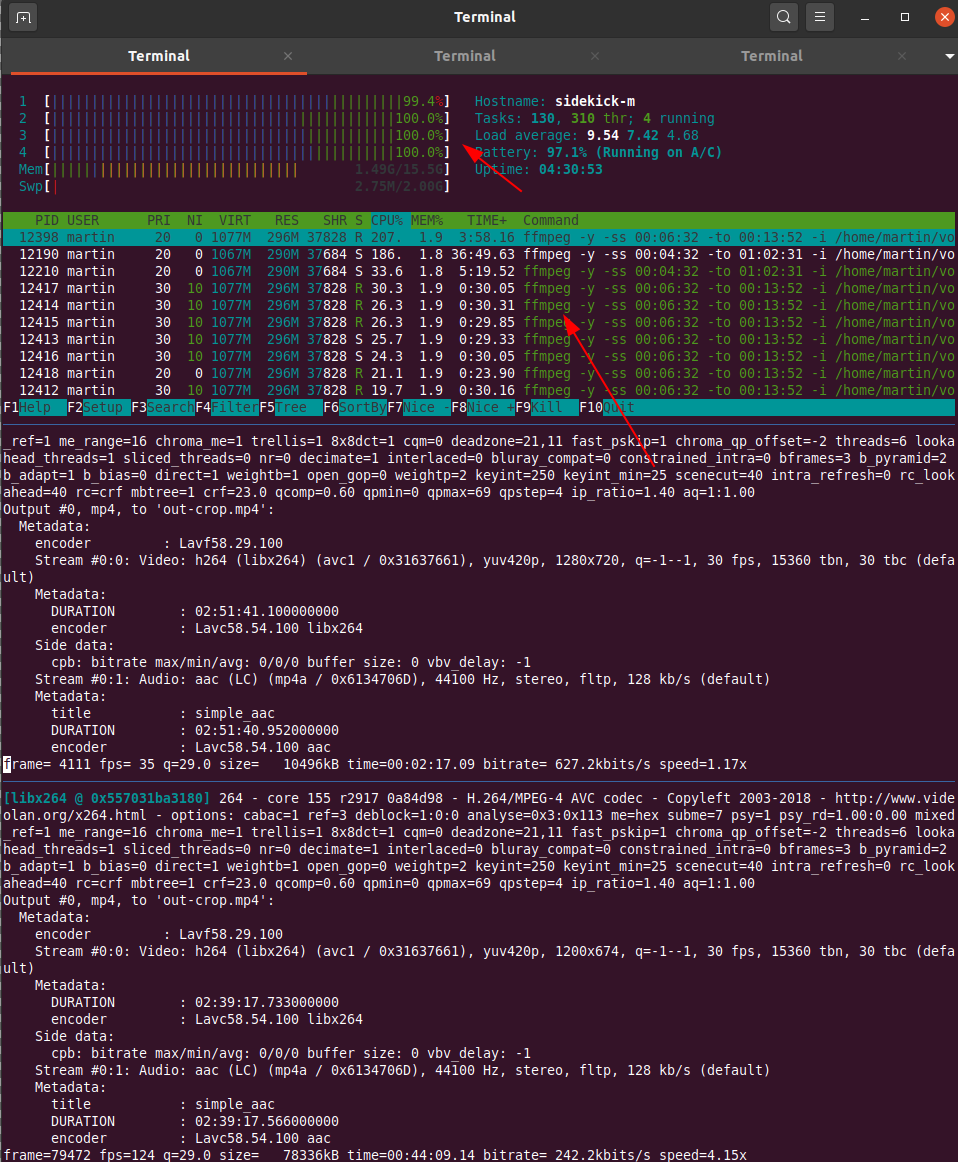
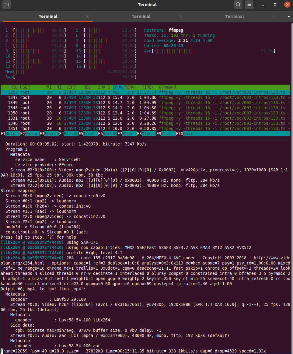
After the (virtual) Vintage Computing Festival Berlin is before the (virtual) festival and I’m in the process of cutting, upscaling, loudness normalizing and re-encoding the video stream dump into presentations for media.ccc.de. Ffmpeg is a great tool for this and with the right GPU hardware that the process probably flies. But I’m not a gamer and also don’t regularly modify and cut video streams so I don’t have that. As a result, going through all the steps to produce a final video of a presentation takes a Lenovo X250 2-core / 4 thread notebook around one hour for each hour of video material provided. Due to a lack of proper GPUs I thought I’d do the next best thing and just throw more and powerful CPUs at the problem that one can rent in the cloud. A 16 dedicated vCPU virtualized setup for 166 euros a month that can be rented on a per minute basis should do the trick. Or so I thought…
So I uploaded around 40 GB of stream dumps to the server in the cloud and my expectation was to see at least a factor of 10 speed improvement in the ffmpeg cut/upscale/loudness/re-encodig process. For one thing, that’s 8 times the number of processors compared to my X250 notebook. Also, those XEON based processors should be much more powerful then the power and heat optimized CPUs in my notebook.
What I got for the effort was rather disappointing however. Instead of the 10x speed improvement, which I thought was a rather conservative expectation, I got a meager factor of two! What takes 1 hour on my notebook took 30 minutes on the 16 core server. It seems that ffmpeg can’t distribute its workload across all 16 cores at once, there seems to be a limit somewhere. While on my notebook the 2 cores with their 4 threads ran at 100% on the same input data stream while the cloud server CPUs ran at a modest 30-60% load. So the comparison would probably look better if I ran several ffmpeg instances simultaneously that work on different presentation videos. But even at that low CPU load I would have still expected a significant speed increase as XEON CPUs should run circles around mobile i5 CPUs from back in 2015.
It leaves me a bit baffled. I am no ffmpeg expert, perhaps the small difference is because on the notebook ffmpeg can use some hardware for encoding or changing the stream that is not present on the XEON based cloud server. I am aware that ffmpeg can be compiled to support different kinds of hardware, so perhaps that would have helped in addition. But I just wanted to throw money at the problem, not get into the fine details of video encoding. Obviously the wrong approach.
So instead of using that mighty 16 vCPU cloud server I have opted for preparing the ffmpeg commands for each video and have 3 or 4 of them run simultaneously over night. But still, it strikes me as odd.
This is sweet. I can’t make much use of it as is, though, but I hope it inspires the next revision of the Zero or A series, because it would be perfect with 8GB of RAM, 32GB of eMMC storage and a couple of USB-C ports on the side.
The Frontiers in Education (FIE) 2020 conference starts Wednesday October 21 in Uppsala, Sweden — see program here. My student Bahare Naimipour will be presenting our paper “Engaging Pre-Service Teachers in Front-End Design: Developing Technology for a Social Studies Classroom” (see preprint here) by Bahare, me, and Tammy Shreiner. This work came long before the NSF work that we just got funded for (see blog post here), but it’s in the same line of research.
The paper is about two of our participatory design sessions with pre-service social studies teachers in Tammy’s class on data literacy. In both of these sessions, we asked teachers to program in JavaScript or Vega-Lite to build a visualization, and in the second one, we also introduce CODAP, a visualization tool explicitly designed for middle and high school students. The paper is less about the technology and more about what the teachers told us about what they thought about tools for visualization in their class.
Social studies teachers are such an interesting group to study. They’re not particularly interested in STEM, data, or computers. They want to teach social studies. Very few of our participants had ever seen any code. (One told us, “This looks a lot like setting up my MySpace page in middle school!”)They’re only interested if we can help them teach what they want to teach. It’s a hard audience to engage, in all the right ways.
I’m going to highlight just two lessons we learned here:
First: The results from the two participatory design sessions were remarkably different. Participatory design isn’t a “okay, we did that — check off the box” methodology. Each group of participants can be remarkably different. There’s no generalization here. Each session is useful, but I don’t know how many sessions we’d have to do to get anywhere near saturation. That’s okay — we learned design lessons from each session.
Second: There is no one answer to how teachers think about programming. I have heard from many people that teachers find programming hard (see this CACM Blog post about that discussion), and I’ve hypothesized that to be true in this blog (see this post). So, now I’ve been in the room as social studies teachers have their first programming experiences and interviewing them afterwards, and….it’s complicated.
Teachers tell us often in our sessions that programming is overwhelming, but several teachers also told us that CODAP (explicitly designed for their use, and not a programming tool) was overwhelming. The question is whether it’s worth the complexity — and for whom. We get contradictory responses from the teachers, which we report in this paper. One told us that she wanted a simpler tool for herself and JavaScript for her students: “I don’t mind keeping life simple for me, but I wanted to challenge my students and give them useful, new skills.” Another teacher told us the opposite: “I would like Java[script] because it would let me do more to the visualization. Vega-lite would be better for students because it seems far more simple.”
We couldn’t fit in all the great stories and insights from these two participatory design sessions. Like the teacher who wants JavaScript in her class because, “That’s similar to what they use in math and science, right? I don’t want history to be the ‘dumbed-down’ programming.” I found that surprising, and wondered what the teachers would think of a block-based language. Another teacher told us that she wants to use programming in her history class, “Because maybe that would make history ‘cool.’” One of the tensions I found most interesting in these sessions was between the desire to know the tools and be comfortable in front of the class, and the desire to push their students to learn more. Some teachers told us that they preferred CODAP to any programming tool because they would be embarrassed to get a syntax error in front of their kids, which they realized would always be possible when programming. Other teachers told us that they were more concerned with going beyond basic tools — (paraphrasing one comment we received), “My students will already know Excel and Google Sheets. I want them to do more in my class.”
Our work is ramping up now. We had another PD session with pre-service teachers in March, just before pandemic lockdown, which was our first one with our data visualization tool in the mix. We’ve just held our first workshop in August for in-service (practicing) teachers. We’ve got more workshops planned over the next year. You’ll likely be hearing more from these studies in future posts.
Virtual reality puts you in a digital world that can feel like a real world when it’s done right. Research from Benjamin Lee, et al. explored some of the possibilities in work they’re calling data visceralation.
As a proof of concept, shown in the video above, the researchers recreated popular works for virtual reality. Watch Olympic runners sprint past you or look up at the comparison of the world’s tallest buildings.
The goal is essentially to make the abstract shapes or data points feel more real. Looks promising.
By the way, this work is going to be presented at VIS 2020, which will be virtual and free to attend this year. If you’re interested in poking your head in, but don’t know where to start, Robert Kosara wrote an outsider’s guide to the conference to point you in the right direction.
Xiaomi already offers an industry-leading 55w fast wireless charging feature. However, the company is not stopping and is now testing out a prototype that supports 80W of fast wireless charging. Xiaomi’s newly developed charging technology is capable of charging batteries from 0-100 in just 19 minutes.
Continue reading →
This is definetely a word I’ll remember: data visceralisation.
The term is suggested for data visualization in virtual reality, so that people can better experience differences in data, understand them viscerally.
It is something that I think definitely is useful, not just in virtual reality but also in making data visualisation physical, which I called ‘tangible infographics’ in 2014. You switch the perspective to one or more other senses, thus changing the phenomenological experience, which can yield new insights.
In both, tangible infographics and data visceralisation, the quest is to let people feel the meaning of certain datasets, so they grasp that meaning in a different way than with the more rational parts of their mind. (Hans Rosling’s toilet paper rolls to convey global population developments come to mind too).
Benjamin Lee et al wrote a paper and released a video exploring a number of design probes. I’m not sure I find the video, uhm, a visceral experience, but the experiments are interesting.
They look at 6 experimental probes:
speed (olympic sprint)
distance (olympic long jump)
height (of buildings)
scale (planets in the solar system)
quantities (Hong Kong protest size)
abstract measures (US debt)
The authors point to something that is also true for the examples of 3d printed statistics I mentioned in my old blog post which are much less useful with ‘large numbers’ because the objects would become unwieldy or lose meaning. There is therefore a difference between the first three examples, which are all at human scale, and the other three which aim to convey something that is (much) bigger than us and our everyday sense of our surroundings. That carries additional hurdles to make them ‘visceral’.
The stampede of the affluent into grim-faced, highly competitive sports has been a tragicomedy of perverse incentives and social evolution in unequal times: a Darwinian parable of the mayhem that can ensue following the discovery of even a minor advantage. Like a peacock rendered nearly flightless by gaudy tail feathers, the overserved athlete is the product of a process that has become maladaptive, and is now harming the very blue-chip demographic it was supposed to help.
So many authorities want to use computational power to uncover how you feel. School superintendents have deputized “aggression detectors” to record and analyze voices of children. Human resources departments are using AI to search workers’ and job applicants’ expressions and gestures for “nervousness, mood, and behavior patterns.” Corporations are investing in profiling to “decode” customers, separating the wheat from the chaff, the wooed from the waste. Richard Yonck’s 2017 book Heart of the Machine predicts that the “ability of a car to read and learn preferences via emotional monitoring of the driver will be a game changer.”
Affective computing — the computer-science field’s term for such attempts to read, simulate, predict, and stimulate human emotion with software — was pioneered at the MIT Media Lab by Rosalind Picard in the 1990s and has since become wildly popular as a computational and psychological research program. Volumes like The Oxford Handbook of Affective Computing describe teams that are programming robots, chatbots, and animations to appear to express sadness, empathy, curiosity, and much more. “Automated face analysis” is translating countless images of human expressions into standardized code that elicits certain responses from machines. As affective computing is slowly adopted in health care, education, and policing, it will increasingly judge us and try to manipulate us.
Should we really aim to “fix” affective computing?
Troubling aspects of human-decoding software are already emerging. Over 1,000 experts recently signed a letter condemning “crime-predictive” facial analysis. Their concern is well-founded. Psychology researchers have demonstrated that faces and expressions do not necessarily map neatly onto particular traits and emotions, let alone to the broader mental states evoked in “aggression detection.” Since “instances of the same emotion category are neither reliably expressed through nor perceived from a common set of facial movements,” the researchers write, communicative capacities of the face are limited. The dangers of misinterpretation are clear and present in all these scenarios.
Bias is endemic in U.S. law enforcement. Affective computing may exacerbate it. For example, as researcher Lauren Rhue has found, “Black men’s facial expressions are scored with emotions associated with threatening behaviors more often than white men, even when they are smiling.” Sampling problems are also likely to be rife. If a database of aggression is developed from observation of a particular subset of the population, the resulting AI may be far better at finding “suspect behavior” in that subset rather than others. Those who were most exposed to surveillance systems in the past may then be far more likely to suffer computational judgments of their behavior as “threatening” or worse. The Robocops of the future are “machine learning” from data distorted by a discrimination-ridden past.
To many of the problems detailed above, affective computing’s enthusiasts have a simple response: Help us fix it. Some of these appeals are classic Tom Sawyering, where researchers ask critics to work for free to de-bias their systems. Others appear more sincere, properly compensating experts in the ethical, legal, and social implications of AI to help better design sociotechnical systems (rather than just clean up after technologists). As minoritized groups are invited to participate in developing more fair and transparent emotion analyzers, some of the worst abuses of crime-predicting and hiring software may be preempted.
But should we really aim to “fix” affective computing? What does such a mechanical metaphor entail? One of Picard’s former MIT colleagues, the late Marvin Minsky, complained in his book The Emotion Machine that we “know very little about how our brains manage” common experiences:
How does imagination work? What are the causes of consciousness? What are emotions, feelings, and thoughts? How do we manage to think at all? Contrast this with the progress we’ve seen toward answering questions about physical things. What are solids, liquids, and gases? What are colors, sounds, and temperatures? What are forces, stresses, and strains? What is the nature of energy? Today, almost all such mysteries have been explained in terms of very small numbers of simple laws. . . .
Emotions, by his logic, should be subject to scientific reduction as well. He proposes to decompose “feelings” or “emotions” into constituent parts, a step toward quantifying them like temperatures or speeds. A patent application from Affectiva, the firm co-founded by Picard, describes in some detail just how such quantification might work, by analyzing faces to capture emotional responses and generate “an engagement score.” If institutions buy into these sorts of assumptions, engineers will continue making such machines that try to actualize them, cajoling customers and patients, workers and students, with stimuli until they react with the desired response — what the machine has already decided certain emotions must look like.
From within an engineering frame, the scientific research behind affective computing is uncontestable, nonpolitical — something that must of necessity be left to AI experts. The role of critics is not to distrust the science but to help engineers reflect consensus social values in how they apply their findings about facial analysis, which, as another Affectiva patent filing notes, could “include product and service market analysis, biometric and other identification, law enforcement applications, social networking connectivity, and health-care processes, among many others.”
Treating persons as individuals, with complex and evolving emotional lives, is time-consuming. Attributing some “engagement score” to them is scalable
There is another and better framing available than the engineering one, though — a more political one, focused on longstanding controversies regarding the nature of emotions, the power of machines to characterize and classify us, and the purpose and nature of feelings and moods themselves. From this perspective, affective computing is not merely pragmatic people processing but a form of governance, a means by which subjects are classified for corporate chieftains and their minions alike. Treating persons as individuals, with complex and evolving emotional lives, is time-consuming and labor-intensive. Attributing some “engagement score” or classifier to them is scalable, thereby saving the human effort that would have once been devoted to more conversational explorations of emotional states.
This scale in turn fuels the profitability of affective-computing applications — the same software can be adapted to many situations and then applied to vast populations to draw actionable conclusions. We have seen the money to be made in conditioning persons to interact in standardized ways in platforms like Twitter and Facebook — including “hearts” and reaction buttons. Now imagine the business opportunities in standardizing emotional responses offline. All manner of miscommunications could seemingly be avoided. Once communication itself was constrained within tight bands of machine-readable emotional indicators, more messages and preferences would be instantly transmitted.
This is a dangerous project, though, because the meanings of, say, a sneer in a controlled experimental setting, a movie theater, a dinner date, and an armed robbery, are probably quite distinct. James A. Scott explored the dangers of “legibility” as a politico-economic project in his classic Seeing Like a State, which described bureaucratic overreach based on flawed presumptions about social reality. Scott theorizes disasters ranging from China’s Great Leap Forward to collectivization in Russia and compulsory villagization in Ethiopia and Tanzania as rooted in failed efforts by the state to “know” its subjects:
How did the state gradually get a handle on its subjects and their environment? Suddenly, processes as disparate as the creation of permanent last names, the standardization of weights and measures, the establishment of cadastral surveys and population registers, the invention of freehold tenure, the standardization of language and legal discourse, the design of cities, and the organization of transportation seemed comprehensible as attempts at legibility and simplification. In each case, officials took exceptionally complex, illegible, and local social practices, such as land tenure customs or naming customs, and created a standard grid whereby it could be centrally recorded and monitored.
Crises of misrepresentation — or forced representation — are also likely to arise in ambitious affective-computing projects. Not all classifications of a person as, say, “angry,” are based on accurate readings of emotional states. They could be projections, strategic readings or misreadings, or mere mistakes. But regardless of accuracy, they become social facts with weight and influence in various databases, which in turn inform decisionmakers.
Thus emotion metrics are not simply trying to provide a representation of what is but are also a method for producing subjects that are susceptible to the means of control that the metrics feed and administer. In other words, much of affective computing is less about capturing existing emotional states than positing them. It defines particular emotional displays as normative under particular circumstances and then develops systems (as the Affectiva patent filings mentioned above adumbrate) for rewarding, imposing, or even policing compliance with these norms. While affective computing’s long-term vision is now framed as a peaceable kingdom of pleasing computers and happy users, its inattention to power dynamics betokens a field easily repurposed to less emancipatory ends.
For example, if, having seen a series of widely publicized summary executions by police, most people begin to approach police officers with extreme deference, this behavior could be captured and normalized, resulting in software that calculates “obedience scores” for suspects. But this practice would not merely report on reality. Rather, it would help create new realities and could easily increase the risk of more violence against those who fail to properly perform obedience in the future. Like Noelle-Neumann’s classic “spiral of silence,” a “spiral of servility” is a distinctive danger of a world affectively computed by increasingly touchy, defensive, and intolerant authorities.
Affective computers may themselves become caught in such spirals, innovating displays of concern or respect for those subject to their interventions. One Medicare program now features talking avatars of cats and dogs, designed to soothe the elderly. Operated remotely in a manner reminiscent of the film Sleep Dealer, the avatars are meant to put a kawaii face on the ministrations of distant workers, while perhaps also sparing the workers some burdens of emotional labor while monitoring and responding to their clients. One can imagine retailers adding smiling, animated characters to self-checkout kiosks based on a customer’s internet browsing patterns. We may even welcome automated systems that simulate concern — mechanical havens in a heartless world.
Emotions are largely treated as autonomous and univocal rather than as prompts to articulacy or dialogic evaluation of one’s situation
But these comforts are no less manipulative for being personalized. As Daniel Harris argued in Cute, Quaint, Hungry, Romantic, cuteness has a curious duality: meant to evoke warmth and care, cute creatures are also abject, pathetic, helpless, innocuous. When a faceless corporation or state deploys such visual rhetoric, the foregrounded meaning is care and concern, but lurking in the background is another resonance of cuteness: infantilization, exacerbated by a sense that controllers of the system not only deem you too insignificant to deal with personally but can’t even be bothered with conjuring a human avatar to enable their distance.
These subtle and recursive dynamics of feeling — and the thin line between caring and patronizing gestures — do not seem to trouble most work in affective computing. The field’s model of mental activity is more behaviorist (seeking the best stimuli to provoke desired responses) than phenomenological (richly interpreting the meaning of situations). From this perspective, emotions are essentially pragmatic tools. Feelings are as functional as a like button or a traffic light: Joy and love affirm one’s present state; fear and sadness provoke a sense of unease, a need to flee or fight, criticize or complain. Emotions are largely treated as autonomous and univocal rather than as prompts to articulacy or dialogic evaluation of and reflection on one’s situation.
Researchers have described multiple affective-computing projects as ways of detecting — and even predicting — emotional responses, conceived in this limited fashion. For example, AI might find patterns of microexpressions (rapid and fleeting facial expressions) that often precede more obvious rage. Police departments could try to predict crime based on little more than a person’s demeanor. Customer-service systems want to use voice-parsing software to determine just how far they can delay a customer’s call before the neglect becomes grating. Some employers think that workers’ brain waves hold critical clues about their engagement and stress levels.
The shameful history of so-called lie detectors should inform future work to mechanically “decode” intent, stress levels, and sincerity
Such programs may provide valuable data to a corporation or government looking to maximize profits or to subdue a population. But are they really “computing affect,” rendering machine-readable something as ineffable and interior as emotion? Critics argue that the computation of affect is far harder than researchers make it out to be. They point to the many ways facial expressions (and other ostensible indicators of emotion, like heart rate or galvanic skin response) fail to accurately convey discrete states of minds. Are shifting eyes a sign of distraction or deep thought about the problem at hand? When is a smile a grimace? Or a wink, a twitch, in anthropologist Gilbert Ryle’s classic formulation? And why should we assume that turning involuntary or semi-voluntary expressions into forms of computerized interaction (or opportunities for computational classification) would serve our interests rather than those of the clients of affective computing’s leading firms? The shameful history of so-called lie detectors should inform future work to mechanically “decode” intent, stress levels, and sincerity.
Affective computing is just as much an engine as a camera, a way of arranging and rearranging social reality (rather than merely recording it). The more common it becomes, the more these sociotechnical systems will incentivize us to adjust our outward “emotional” states to get computers to behave the way we’d like. Of course, we do this in conversation with people all the time — strategic and instrumentalized communication will always be with us. But these systems will be more gameable because they will be far more limited in how they draw conclusions. And thanks to the magic of scale, they will also tend to be far more consequential than one-off conversations.
In all too many of its present implementations, affective computing requires us to accept certain functionalist ideas about emotions as true, which leads to depoliticized behaviorism and demotes our conscious processes of emotional experience or reflection. Just as precision manipulation of emotions through drugs would not guarantee “happiness” but only introduce a radically new psychic economy of appetites and aversions, desires and discontents, affective computing’s corporate deployments are less about service to than shaping of persons. Preserving the privacy and autonomy of our emotional lives should take priority over a misguided and manipulative quest for emotion machines.
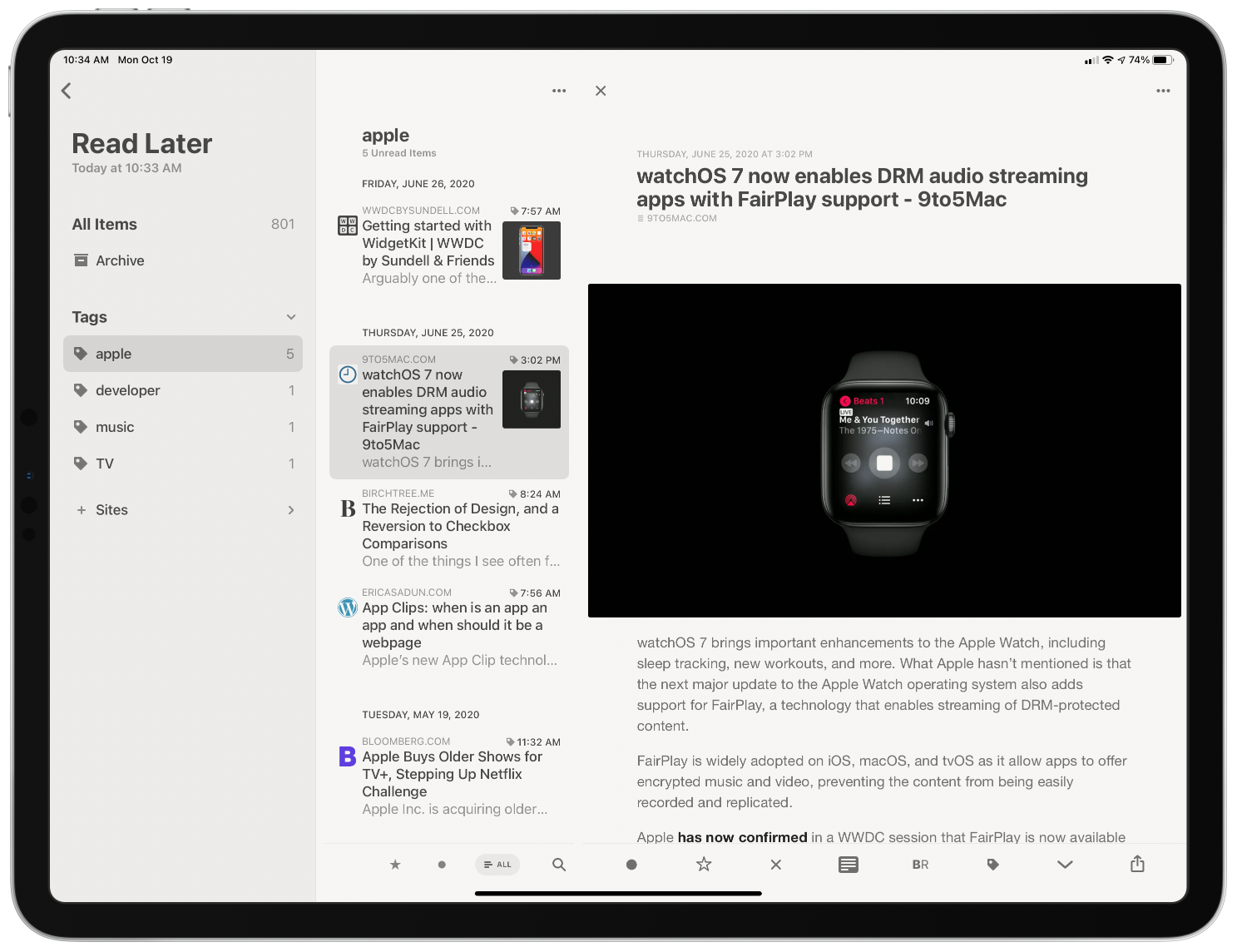
Last year we named RSS client Reeder 4 the Best App Update as part of the MacStories Selects awards for a good reason. Reeder has been one of the best-designed RSS apps available for a very long time. With the release of version 4, developer Silvio Rizzi rebuilt the app on a modern foundation from the ground up. Roughly one year later, version 5 is out as a brand new app that takes what Rizzi began last year and extends it further with a host of excellent new features and design refinements.
One of my favorite features debuted in version 4 of Reeder is its Read Later service. Read-it-later services are nothing new. However, having one built into an RSS client was an unexpected pleasure. Stories can be sent to Reeder’s Read Later service from the RSS feeds you subscribe to or from other apps by using Reeder’s share extension. The combination of items pulled from RSS and pushed from the web using the share extension is a powerful mix, making it possible for Reeder to become the main hub for your web reading.
Reeder’s Read Later service uses tagging to organize saved articles.
The biggest drawback of Reeder’s Read Later service in version 4 was the limited organization options. Items were organized by website only. With version 5, Rizzi added the ability to tag Read Later items too. By assigning multiple tags to a single item, users can organize links by topic, project, or other criteria. It’s a significant improvement that makes the app competitive with dedicated bookmark organizers like GoodLinks.
Links saved in Read Later continue to be accessible using Shortcuts. However, version 5 adds a new ‘Get Read Later Tags’ action for retrieving a list of the tags you use. The ‘Get Items from Read Later’ action has added a tag filter, too, so you can retrieve just those items associated with a particular tag. Coupled with browsing tags with Reeder, the new shortcut actions open up a wide variety of options for organizing and processing saved links.
Examples of Reeder widgets using different sources.
The iPhone and iPad versions of Reeder have added widget support too. The app’s Recent Articles widget comes in small, medium, and large sizes and can be configured to display articles from any source set up in the app, including the app’s built-in Read Later service and any RSS service. Folders and feeds associated with an RSS service and the tag associated with the Read Later service can serve as widget sources too. In a nice touch, there’s a search field in the widget configuration view to make it easier to find the source you want. Reeder’s widgets can also be displayed using four fonts: System, Rounded, Serif, and Compact.
The larger the widget you pick, the more articles it can display, but even with the large widget, you are limited to at most five articles, which is why the ability to pick a source is so important. That way, you can pick a site, folder, or tag you care about most to use with a widget or create a stack of the sources most important to you. One small thing I’d like to see added to the widgets is the ability to use the domain associated with articles stored in Read Later as a filter too.
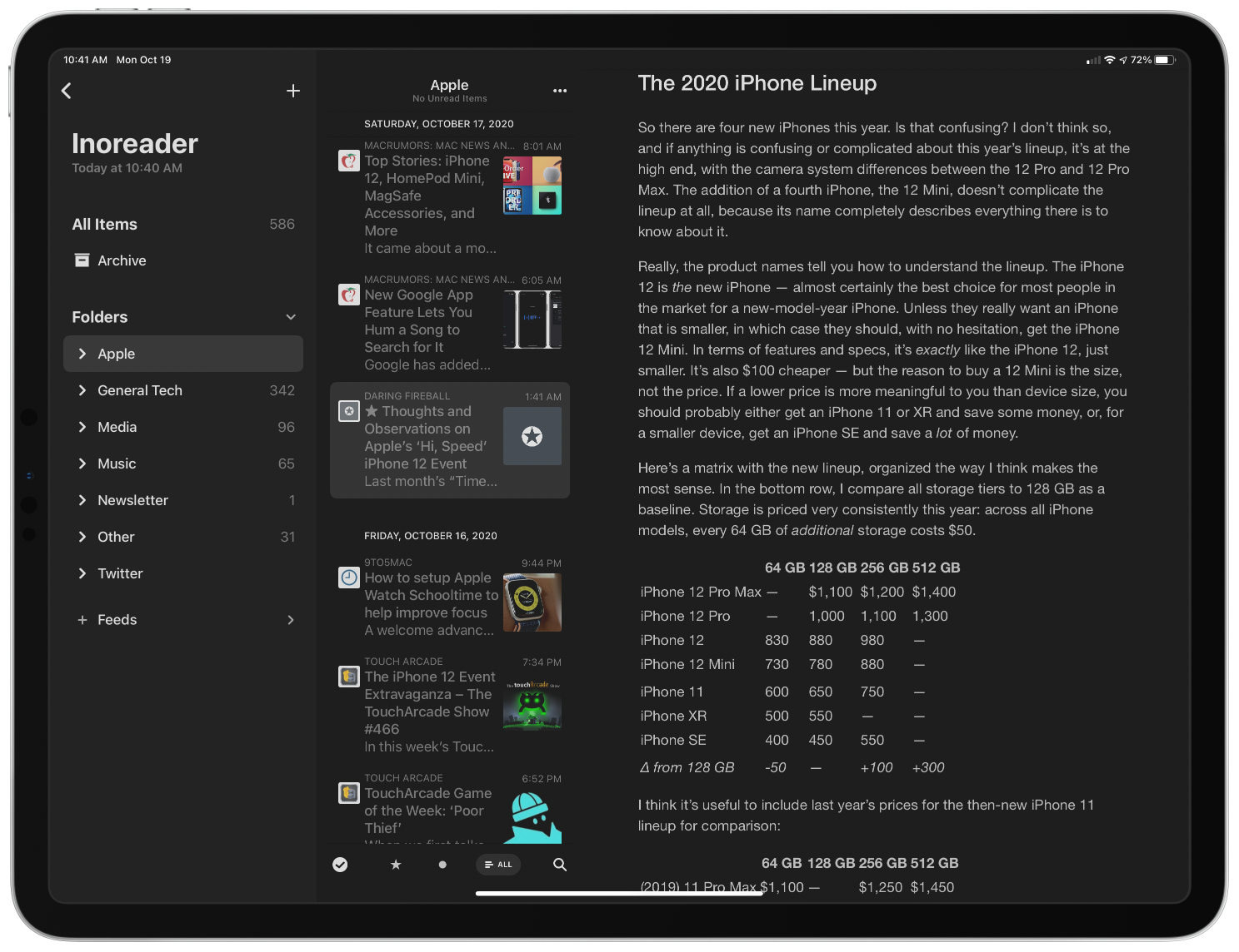
Browsing RSS feeds synced via iCloud.
Earlier versions of Reeder allowed users to sync feeds across multiple devices using a third-party sync service like Inoreader, Feedly, Feedbin, and several others. That’s still the case with version 5, and the variety of services available is one of the app’s greatest strengths, but now, you also have the option to sync feeds among devices with iCloud sync. The new option has the advantage of being free, but you lose the ability to keep different RSS apps in sync across multiple devices and any additional features some third-party services offer. However, if you use Reeder everywhere and don’t care about the extra features available with third-party services, Reeder’s iCloud sync is a fantastic option.
When you set up iCloud to sync your feeds, you have the option of syncing iCloud data only. This is an interesting option. If, for example, you have a Mac running at home and syncing your feeds in Reeder automatically over your local network, you could set your iOS devices to only sync iCloud data. That should make syncing faster and use less data because your iPhone won’t be downloading every feed, just the changes. As the app’s settings warn, though, if you turn this setting on for all your devices, none will be able to download new articles.
Reeder 5’s three-column layout makes browsing feeds an uncluttered pleasure.
Reeder adds some terrific design changes too. On the iPad, Reeder supports a three-column layout with collapsible sidebar sections. Before, no more than two columns were visible in Reeder when a story was selected. I greatly prefer this new layout. Articles can be browsed from the sidebar by all items, your archive, folders, or feeds. Instead of folders, the sidebar of Reeder’s Read Later service has an option to browse by tags. As someone with a lot of feeds, being able to collapse everything in the sidebar except what I care about is a much better, less cluttered browsing experience than before.
Another nice addition is the option to turn on marking items as read simply by scrolling past them. I scan lots of headlines of articles I don’t read, and with this feature, I no longer need to remember to mark everything above as read before moving on to a different app. It’s a small touch, but one that works extremely well with the way I browse my feeds.
Context menus aren’t new in Reeder, but they offer many more options in Reeder 5. Long-pressing a feed gives users the option to ensure its stories only load the Automatic Reader Version, which is handy for sites that only offer a truncated feed. You can also now unsubscribe from a feed from its context menu and edit it, as was the case in version 4.
There are more context menu options for individual stories too. In addition to marking a story as read or unread, toggling its starred status, or sharing it, you can also mark all items above or below it as read or send it to Reeder’s Read Later service.
Other design tweaks on iOS and iPadOS worth mentioning are the addition of the New York and Helvetica Neue fonts, which are available for the article view. New York is the Apple font that used to be exclusive to the company’s Books app, and a particularly nice option if you like serif fonts. There are also new icon options, including the new cloud version that I like a lot. I also appreciate that the icon picker is a context menu that lets me see more options than before. As for the Mac, Reeder 5 gains the same ability to sync feeds over iCloud, Read Later tagging, collapsible sidebar sections, mark as read as you scroll, and per-feed reader view option. Big Sur isn’t out yet, but hopefully when it is, Reeder 5 for Mac will offer widgets there too.
Reeder 5 on the Mac.
I like Reeder’s new iCloud sync feature a lot. It’s not for me because I use too many of Inoreader’s advanced server-side features, but it’s a terrific addition if you don’t need those things. I also appreciate the improvements to the app’s layout on the iPad and the addition of tagging in the Read Later service.
The latest update isn’t as big a leap forward as last year’s introduction of Reeder 4, but it didn’t need to be. Reeder continues to provide one of the very best reading experiences available in any RSS client I’ve tried. Combined with a modern iPad layout, extensive keyboard shortcut support, a long list of ways to sync feeds, and a Read Later service that sets it apart from its competitors, you can’t go wrong with Reeder 5.
Last week I wrote about the international poll on walkability which found North American cities lacking. Those cities have not thought through the importance of people being able to access schools, shops and services within a three kilometre radius of dwellings. They have also not embraced that housing people at density means having access to nearby public spaces, squares and parks and making the whole experience “lively”.
In Metro Vancouver, parks are planned like they are for 1960’s. It’s kind of intended that Moms and Dads have vehicles that can whisk kids to washrooms and restaurants. We don’t put picnic tables in all parks, and we don’t install washrooms in many.
In a place that is attempting to house families at higher density, we also have to provide safe,comfortable and convenient access to useable, year round park spaces. And that’s not the half-century old “soccer field in the park concept.” We simply need to reboot what we think open public space is, and centre a new definition of park space as something that is accessible to everyone, and useable twelve months of the year.
In the 21st century we are not a city of public washrooms nor do we provide covered outdoor public spaces during inclement weather. There’s lots of talk about this being an equity issue, and it seems odd that these basic amenities are not provided.
But remember the pre Covid pandemic reality was that there were other indoor spaces available that were public, like libraries and community centres. The closure of libraries during Covid was a tremendous loss to citizens, but especially to the homeless and disenfranchised. The library was a place that everyone had access to and had equity. With the Covid closures these important places where people could rely on for washrooms, reading, and getting out of the elements were instantly erased.
Mr. Woodvine feels that covered public spaces were not created in parks to stop homeless from congregating. I think the reason is less sophisticated ~I don’t believe that it was on the Parks Board’s radar for cost and liability reasons.
Sunset Park in the 400 block of East 51st Avenue did have a shelter installed, but it was for Tai Chi and for picnic tables. The Covid pandemic and the increasing density of the city means that outdoor space needs to be more user-friendly nimble and practical during inclement weather. That’s where ingenuity needs to step in.
But what is really needed is the flexibility and nimbleness to quickly assess, design and implement a variety of shelters for public spaces and parks that can welcome citizens wanting to be outdoors, regardless of the weather.
This is a collaboration of the Johns Hopkins Bloomberg School of Public Health, the Baltimore Development Corporation, and the city’s nonprofit Neighborhood Design Center . There are ten plans for creating temporary, low-cost spaces that
“permit physically distant social interaction in urban environments such as streets, alleys, vacant land and parking lots. The selected concepts were drawn from a pool of 162 submissions from architecture and design firms; the plans were conceived around the needs of Baltimore’s neighborhoods, but could be adapted to cities anywhere.”
Here’s the best part:
“These ten designs, which cost between $5,000 to $100,000 to install, are to be built across Baltimore in 17 neighbourhoods with the City kicking in a $1.5 million dollar investment. Most neighbourhoods chosen are ones that have suffered from “chronic disinvestment” .
As Keshia Pollack Porter, a professor of health policy at Johns Hopkins who consulted on the project concludes
“Can we have spaces that are actually great opportunities for people to gather and gather safely?”
The second edition of my new Datasette Weekly newsletter, talks about Dogsheep, Dogsheep Beta, Datasette 1.0 and features datasette-cluster-map as the plugin of the week.
Apple analyst Ming-Chi Kuo estimates that demand for the iPhone 12 series is twice as high as last year’s iPhone 11.
Kuo says that roughly 1.7 to two million people pre-ordered the new iPhones within the first 24 hours this year. Last year it was estimated that only 500,000 to 800,000 iPhone 11 models were ordered in the same timespan.
There is speculation that the addition of 5G is driving iPhone sales in general, but it’s going to be hard to beat the last iPhone sales explosion. According to Kuo, when the iPhone 6 series launched as Apple’s first large-screen device, there were four million pre-orders.
If Apple managed to capture two million pre-orders last week, it could potentially garner another two million when it launches the iPhone 12 mini and the iPhone 12 Max on November 6th, resulting in a huge sales boost for the Cupertino, California-based company.
Kuo is also predicting a pretty even split between iPhone models this year, with the iPhone 12 mini being the only model to receive substantially less market share.
The estimated sales breakdown is:
iPhone 12 mini: 10-15 percent
iPhone 12: 30-35 percent
iPhone 12 Pro: 30-35 percent
iPhone 12 Pro Max: 15-20 percent
Overall, a lot is going for the new iPhones ranging from a new design to a more comprehensive lineup of products and 5G.
While I’m not completely sold on this range of phones being as popular as the iPhone 6 series, simply because of 5G, I do think these are going make a much larger splash than the iPhone 11.
People often look at the difference between the highest-rated
male chess player in a group and the highest-rated female chess
player in the same group and conclude that there is a difference
between the abilities of men and women to play chess, despite
the fact that there are usually many, many more men in the group
than women. But that's not even good evidence that there is an
achievement gap. From
What Gender Gap in Chess?:
It's really quite simple. Let's say I have two groups, A and B.
Group A has 10 people, group B has 2. Each of the 12 people gets
randomly assigned a number between 1 and 100 (with replacement).
Then I use the highest number in Group A as the score for Group
A and the highest number in Group B as the score for Group B.
On average, Group A will score 91.4 and Group B 67.2. The only
difference between Groups A and B is the number of people. The
larger group has more shots at a high score, so will on average
get a higher score. The fair way to compare these unequally
sized groups is by comparing their means (averages), not their
top values. Of course, in this example, that would be 50 for
both groups -- no difference!
I love this paragraph. It's succinct and uses only the simplest
ideas from probability and statistics. It's the sort of
statistics that I would hope our university students learn in
their general education stats course. While learning a little
math, students can also learn about an application that helps us
understand something important in the world.
The experiment described is also simple enough for beginning
programmers to code up. Over the years, I've used problems like
this with intro programming students in Pascal, Java, and Python,
and with students learning Scheme or Racket who need some problems
to practice on. I don't know whether learning science supports
my goal, but I hope that this sort of problem (with suitable
discussion) can do double duty for learners: learn a little
programming, and learn something important about the world.
With educational opportunities like this available to us, we
really should be able to turn graduates who have a decent
understanding of why so many of our naive conclusions about the
world are wrong. Are we putting these opportunities to good use?
A friend gifted me a beautiful replica 1928 map of ‘Greater’ Vancouver (just before the amalgamation of Vancouver, South Vancouver and Point Grey in 1929).
Upon further examination there are some neighbourhoods listed that I’ve never heard of, or perhaps have been renamed.
Rosedale – Renfrew & Grandview Highway:
Riverview – Victoria Drive & 59th:
Magee – West Blvd & 52nd:
In addition they are showing a neighbourhood called Strathcona located just south of King Edward west of Granville street
Health Canada is encouraging British Columbians to download the COVID Alert app, despite the fact that the province has not yet agreed to support it.
The agency has said that the use of the app could still be useful in curbing the spread of COVID-19.
“It’s still helpful to download COVID Alert from anywhere in the country, even if you can’t use it to report a diagnosis. That way, you’ll be notified if you come into contact with someone from a reporting province or territory or when people in your area are able to report a diagnosis,” a Health Canada spokesperson told Postmedia News.
For context, even though people in the province are unable to submit a positive diagnosis on the app, they can still be notified if they come into contact with someone visiting from a reporting province like Ontario or Quebec.
British Columbia and Alberta are the only two provinces that have not yet signed on to adopt the exposure notification app. Health Canada notes that it is working with provinces and territories, including British Columbia, to roll out the app.
COVID Alert is currently fully functional in Saskatchewan, Manitoba, Ontario, Quebec, New Brunswick, Newfoundland and Labrador, and Prince Edward Island. The app has reached more than 4.6 million downloads.
The app can be downloaded for free on Android and iOS.
Last week I wrote about the international poll on walkability which found North American cities lacking. Those cities have not thought through the importance of people being able to access schools, shops and services within a three kilometre radius of dwellings. They have also not embraced that housing people at density means having access to nearby public spaces, squares and parks and making the whole experience “lively”.
In Metro Vancouver, parks are planned like they are for 1960’s. It’s kind of intended that Moms and Dads have vehicles that can whisk kids to washrooms and restaurants. We don’t put picnic tables in all parks, and we don’t install washrooms in many.
In a place that is attempting to house families at higher density, we also have to provide safe,comfortable and convenient access to useable, year round park spaces. And that’s not the half-century old “soccer field in the park concept.” We simply need to reboot what we think open public space is, and centre a new definition of park space as something that is accessible to everyone, and useable twelve months of the year.
In the 21st century we are not a city of public washrooms nor do we provide covered outdoor public spaces during inclement weather. There’s lots of talk about this being an equity issue, and it seems odd that these basic amenities are not provided.
But remember the pre Covid pandemic reality was that there were other indoor spaces available that were public, like libraries and community centres. The closure of libraries during Covid was a tremendous loss to citizens, but especially to the homeless and disenfranchised. The library was a place that everyone had access to and had equity. With the Covid closures these important places where people could rely on for washrooms, reading, and getting out of the elements were instantly erased.
Mr. Woodvine feels that covered public spaces were not created in parks to stop homeless from congregating. I think the reason is less sophisticated ~I don’t believe that it was on the Parks Board’s radar for cost and liability reasons.
Sunset Park in the 400 block of East 51st Avenue did have a shelter installed, but it was for Tai Chi and for picnic tables. The Covid pandemic and the increasing density of the city means that outdoor space needs to be more user-friendly nimble and practical during inclement weather. That’s where ingenuity needs to step in.
But what is really needed is the flexibility and nimbleness to quickly assess, design and implement a variety of shelters for public spaces and parks that can welcome citizens wanting to be outdoors, regardless of the weather.
This is a collaboration of the Johns Hopkins Bloomberg School of Public Health, the Baltimore Development Corporation, and the city’s nonprofit Neighborhood Design Center . There are ten plans for creating temporary, low-cost spaces that
“permit physically distant social interaction in urban environments such as streets, alleys, vacant land and parking lots. The selected concepts were drawn from a pool of 162 submissions from architecture and design firms; the plans were conceived around the needs of Baltimore’s neighborhoods, but could be adapted to cities anywhere.”
Here’s the best part:
“These ten designs, which cost between $5,000 to $100,000 to install, are to be built across Baltimore in 17 neighbourhoods with the City kicking in a $1.5 million dollar investment. Most neighbourhoods chosen are ones that have suffered from “chronic disinvestment” .
As Keshia Pollack Porter, a professor of health policy at Johns Hopkins who consulted on the project concludes
“Can we have spaces that are actually great opportunities for people to gather and gather safely?”
A friend gifted me a beautiful replica 1928 map of ‘Greater’ Vancouver (just before the amalgamation of Vancouver, South Vancouver and Point Grey in 1929).
Upon further examination there are some neighbourhoods listed that I’ve never heard of, or perhaps have been renamed.
Rosedale – Renfrew & Grandview Highway:
Riverview – Victoria Drive & 59th:
Magee – West Blvd & 52nd:
In addition they are showing a neighbourhood called Strathcona located just south of King Edward west of Granville street
You mayrecall that a learning technologist at UBC, Ian Linkletter, has been sued by Proctorio, a student surveillance company ostensibly for posting links to videos published by the company on YouTube (but more likely because he has been a vocal critic of Proctorio's practices - Linkletter calls the lawsuit a strategic lawsuit against public participation (SLAPP)). Over the weekend, Linkletter launched his defense with a statement to media and a fundraising campaign. In just a couple of days he raised more than $20,000 from the community. Yes, I contributed.
It's 2020 and developers still think "reverse chronological order, scrolling until I see something I vaguely remember having seen before for half a second" is the way to go. Good job everybody.
T.J. Goertz@TJGoertz
Going to go ahead and respectfully disagree with the experts here. It's outdoors, it's usually distanced, let's be… twitter.com/i/web/status/1…
As an example, a couple weeks ago I realized I could style the <summary> part of a <details><summary> set of elements as a button, which would
look great and more readily indicate its function. You can see the improvement here:
Before:
After:
Thankfully I hadn’t swallowed the party-line on Shadown DOM and this is the full
set of CSS changes I had to make, just the following additions:
Note that this Style change Cascaded across three controls, almost as if
that’s what CSS was designed to do. If I had fallen into the Shadow DOM trap
I would have had to change the embedded CSS for every element that used
summary and details, and that’s not even mentioning the performance
penalty I’d pay. So
please think twice before adopting Shadow DOM.
In September 2003, I was just married and embarking on a postgraduate course to become a History teacher. My online social life up to that point had consisted largely of MSN Messenger, but professional online interaction tended to happen via email or forums.
One particularly useful resource at the time was the Schools History discussion forum. This featured History teachers of all ages and experience and was a treasure trove of interesting information and resources.
Early on in my teaching course, I was a registered member of the forum, but was just a lurker. The information and resources were useful, but I hadn’t even introduced myself. My Gravatar history would suggest that my avatar was Cary Grant.
This changed one day when, after a seminar, the only other person on my course who was a member of the forum asked why I didn’t post anything on there? I couldn’t think of a good reason not to, so I introduced myself soon afterwards and, well, that was that. I was regular poster on the forum from late 2003 for the next seven years or so.
Alongside the forum, I experimented with a Facebook account, courtesy of my academic email address. Ditto with MySpace, which I also didn’t use much. What I did do was blog a lot, as there was emerging what was known as the ‘edublogosphere’. I published every day on teaching.mrbelshaw.co.uk as well as maintaining resources for my History students.
What I enjoyed about the edublogosphere was bloggers like me commenting on each others’ posts and discovering new voices. I remember FriendFeed being really handy in that regard. And then, in the midst of the Web 2.0 boom, came Twitter. I joined in the same month my son was born, January 2007.
It’s impossible for me to overstate the importance of Twitter to my career. It accelerated my development as an educator and gave me a network to draw from and rely upon. Part of me skipping middle management and going straight to senior management in schools is directly because of the connections and growth facilitated through my Twitter network.
I ran workshops on Twitter in the schools in which I worked. Most educators didn’t ‘get’ it until around 2010 when the BBC interviewed Stephen Fry, technophile and certified UK national treasure, about Twitter. He waxed lyrical about the platform, and all of a sudden people saw it as something that could connect you to celebrity. That was different. That was exciting.
Over the last decade, Twitter has become an entirely different platform. I’m not particularly interested in criticising it but will note that you get a different ethos and vibe when verified profiles are making official pronouncements using the platform. Even if you don’t particularly want to, you end up spending more time discussing politics and policing other people’s opinions.
As a result of my dissatisfaction with something I previously held so dear, since early 2017 I’ve been exploring decentralised social networks. Since then I’ve been using different instances of Mastodon, but also have accounts on different ‘Fediverse’ platforms as well, such as Pleroma and PixelFed.
In fact, I went reasonably far down the rabbithole, becoming Product Manager for MoodleNet, the world’s first federated social network for educators, and taking it from zero to one. So I’ve spent the last couple of years primarily thinking about issues relating to decentralised social networking.
Reflecting on all of this has made me realise that, for me at least, social networking has been intimately linked with professional networking. Now that it’s difficult to have a professional discussion on Twitter without politics getting in the way, where’s that moving to?
The obvious answer is LinkedIn, I guess, but there’s a definite self-congratulatory tone about updates there. Everyone’s “excited to be part of” something, or “pleased to be able to announce” something else. Look at me, ma! I’m doing business!
Despite, or perhaps because of, my background in Philosophy, I’m a practical kind of person. While I’m comfortable in the abstract, I want to get down to brass tacks – to what works in practice. So I can bide my time in the early stages of a social networks where people are talking primarily about the network itself, but am itching to get to more practical uses.
That’s coming, for sure. The Fediverse in 2020 is a more mature and nuanced place than it was in 2017, for example. But we’re still waiting for more than geeks and early adopters to get with the program. Then, for few glorious years, we’ll hopefully have a place that flourishes before the inevitable(?) commodification and selling out.
One day this summer, my friend Richard and I masked up and headed to the Amazon Books store here in Austin. He had picked up a reading habit and was looking for a Kindle and needed some consulting on the purchase. I also hadn’t left the square mile around my house in many months and will really never turn down a trip to the bookstore, even in a pandemic.
I know Amazon as a whole is problematic, I know indie bookstores are obviously better, but the Amazon Books store is fascinating to me. Partly because it has a sad irony to its existence. Wiping out bookstores to create a bookstore seems dastardly. But I also find it fascinating because the Amazon Books store is very small. It’s maybe 1/10th the size of the nearest Barnes & Noble. Each section may only contain a couple dozen titles, but they’re all the best of the best that genre has to offer based on Amazon’s massive amounts of data trends. It’s algorithmically-distilled book genre concentrate. There’s even a “Popular in Austin” shelf that I assume leverages raw purchase data aggregated by zip code. It strips book browsing of some intimacy but I find the data-driven inventory a refreshing casual consumer experience. A bookstore where stale stock gets whisked away to a warehouse reduces a lot of cognitive load and choice paralysis. Sure, no crusty, old wizard is going to appear from behind a shelf and offer me a life-changing tome, but browsing book covers is easier than browsing book spines.
My typical routine in the Amazon Books store is to meander through the aisles take pictures of book covers that interest me. It takes ten’ish minutes to browse the whole store and then, having seen everything in the everything store, I leave empty-handed. That’s right. No commerce occurs. Then when I get home I look those titles up on Libby (my library app) or Libra.fm (an audiobook provider that supports my local bookstore, Bookpeople). It’s the perfect crime: a retail therapy grift.
This, however, is not a review about a rampantly untaxed tech company turned brick-and-mortar retailer. It’s about goals. Last year, after some frustrating experiences with managers, I came across a list of books on management and decided to try and read most of them. I didn’t know how far I’d get, but I made good progress on my goal of 20 books and have read about 14 of the books on that original list of 39 (70% goal progress / 36% total progress), reading other books along the way.
While I’ve been tracking my reading on my bookshelf and know exactly how much I’ve read, I didn’t feel the result of that until I went into that Amazon Books store that day and saw their bookshelves. In the business books aisle I no longer saw an overwhelming todo list; I saw a line of familiar faces. I had read most of the titles and the ones I hadn’t are very much on my radar. I crossed a threshold where now I felt like I had experienced most of the books on this shelf. I don’t think I’ve ever felt that way about a bookstore or a bookshelf in my whole life —even shelves of books in my own house!— and it gave me a healthy sense of accomplishment.
It’s possible I’ll never feel that feeling again, but without a doubt this reading and audiobook habit has paid off for me. It’s kept my mind curious about a myriad of topics. I’ve learned about war, about love, about justice, about mercy, about fantastic futures, about inescapable pasts, about businesses improved, about a country divided, about politicians I like, and a lot about a single narcissist I despise. A little bit of persistence and a little bit of ambition go a long way.
(Tracking my reading on my own site helped too. Behold, the power of personal websites!)
A week in which I struggled to get down to actually doing something. Some days because of endless meetings, some days because I couldn’t get going and being tired, sometimes I did get something done but it was in response to something, not because it was on my list of things I wanted to do. As of Tuesday we’re in more strict lock down measures again, mask wearing now finally becoming the norm as well. I don’t mind much, we weren’t very mobile anyway to begin with.
This week I
Started following Gitlab’s online material on remote team management. As we’re definitely in for the long haul, I think it may provide some additional insights and tips (e.g. on maintaining good mental health within the team, or overcoming differences in preferences for asynchronous or synchronous communication)
Worked on a citizen science project proposal, didn’t get where I wanted it to be by now.
Had a chat with André Golliez to catch up and hear what’s going w.r.t. open data in Switzerland
Did some bookkeeping and invoicing, filed a tax return
Had our weekly meetings with clients
Had our own team sessions for those client projects
Took an in-depth look at a 3rd party proposal a client wanted me to look at
To get back to having a good overview of all the stuff I’m doing in parallel I did a full weekly review for the first time in ages. It cost me a number of hours to get there, but it immediately cleared up some fog and made me feel a lot less restless. I intend doing such reviews on a weekly basis again. Using markdown notes which link together actually means I’m in a better position now than in a long time to do a thorough review.
Took Y on a bonbon tasting tour after she asked what they were when we came across them in a bed time story
Came up with a design sketch for this site, trying to move away from the regular blog and pages/wiki set-up, towards something that invites exploration more and feels more individual.
It means that I probably need to develop a IndieWeb compliant WordPress theme from scratch, but somehow that sounds appealing if daunting as well. Working title of the theme is ‘Tondriaan’ pulling together my name and that of Mondriaan, a native of our city, as the plane division I ended up with reminds me of his work.
Didn’t write/blog much, and also didn’t make as many notes/notions as I would have liked.
This week it was 100 days ago I started a different note taking routine, using Obsidian. I want to do a write-up of my experiences.
Had an Open Nederland board meeting in preparation of the general assembly next month
Definitely not equivalent tot leaf peeping in New England, but enjoying the fall colors, near the neighbourhood shops, nonetheless.
This is a RSS only posting for regular readers. Not secret, just unlisted. Comments / webmention / pingback all ok. Read more about RSS Club
Why did they “need” a “confirmation” to a subscription which, best I could recall, was last renewed early this year?
So I looked at the links.
The “renew,” Confirmation Needed” and “Discounted Subscription” links all go to a page with a URL that began with https://subscriptions.newyorker.com/pubs…, followed by a lot of tracking cruft. Here’s a screen shot of that one, cut short of where one filled in a credit card number. Note the price:
I was sure I had been paying $80-something per year, for years. As I also recalled, this was a price one could only obtain by calling the 800 number at NewYorker.com.
Or somewhere. After digging around, I found it at https://w1.buysub.com/pubs/N3/NYR/accoun…, which is where the link to Customer Care under My Account on the NewYorker website goes. It also required yet another login.
So, when I told the representative at the call center that I’d rather not “confirm” a year for a “discount” that probably wasn’t, she said I could renew for the $89.99 I had paid in the past, and that the deal would be good through February of 2022. I said fine, let’s do that. So I gave her my credit card, said this was way too complicated, and added that a single simple subscription price would be better. She replied, “Never gonna happen.” Let’s repeat that:
Never gonna happen.
Then I got this by email:
This appeared to confirm the subscription I already had. To see if that was the case, I went back to the buysub.com website and looked under the Account Summary tab, where it said this:
I think this means that I last renewed on February 3 of this year, and what I did on the phone in August was commit to paying $89.99/year until February 10 of 2022.
If that’s what happened, all my call did was extend my existing subscription. Which was fine, but why require a phone call for that?
And WTF was that “Account Confirmation Required” email about? I assume it was bait to switch existing subscribers into paying $50 more per year.
Then there was this, at the bottom of the Account summary page:
This might explain why I stopped getting Vanity Fair, which I suppose I should still be getting.
So I clicked on”Reactivate and got a login page where the login I had used to get this far didn’t work.
After other failing efforts that I neglected to write down, I decided to go back to the New Yorker site and work my way back through two logins to the same page, and then click Reactivate one more time. Voila! ::::::
So now I’ve got one page that tells me I’m good to March 2021 next to a link that takes me to another page that says I ordered 12 issues last December and I can “start” a new subscription for $15 that would begin nine months ago. This is how one “reactivates” a subscription? OMFG.
I’m also not going into the hell of moving the print subscription back and forth between the two places where I live. Nor will I bother now, in October, to ask why I haven’t seen another copy of Vanity Fair. (Maybe they’re going to the other place. Maybe not. I don’t know, and I’m too weary to try finding out.)
I want to be clear here that I am not sharing this to complain. In fact, I don’t want The New Yorker, Vanity Fair, Wred, Condé Nast (their parent company) or buysub.com to do a damn thing. They’re all FUBAR. By design. (Bonus link.)
Nor do I want any action out of Spectrum, SiriusXM, Dish Network or the other subscription-based whatevers whose customer disservice systems have recently soaked up many hours of my life.
See, with too many subscription systems (especially ones for periodicals), FUBAR is the norm. A matter of course. Pro forma. Entrenched. A box outside of which nobody making, managing or working in those systems can think.
This is why, when an alien idea appears, for example from a loyal customer just wanting a single and simple damn price, the response is “Never gonna happen.”
This is also why the subscription fecosystem can only be turned into an ecosystem from the outside. Our side. The subscribers’ side.


 Xiaomi already offers an industry-leading 55w fast wireless charging feature. However, the company is not stopping and is now testing out a prototype that supports 80W of fast wireless charging. Xiaomi’s newly developed charging technology is capable of charging batteries from 0-100 in just 19 minutes.