I feel totally cutting-edge hip now. We knew about this weeks and months ago! :)
Legendary, eccentric artist Salvador Dalí declared at age 6 that he wished to become a chef. First published in 1973, Les Diners de Gala was a bizarre dream come true—a cookbook filled with surreal illustrations and recipes inspired by the lavish dinner parties that Dalí and his wife Gala organized. The parties were legendary for their wild opulence, with guests often required to dress in costume and wild animals left to roam free around the table.
Acclaimed publisher Taschen is reissuing the cookbook, available for pre-order, as only 400 of the original publications are known to exist. The book, which includes 136 recipes divided into 12 chapters, is arranged by courses—including aphrodisiacs. Aside from his illustrations, Dalí's musings are scattered through the publication, giving insight into his philosophy on gustatory delights. If, as the artist proclaims, "the jaw is our best tool to grasp philosophical knowledge," he does well to display the bizarre and decadent aspects of cuisine. "Thousand Year Old Eggs," "Veal Cutlets Stuffed With Snails," "Frog Pasties," and "Toffee with Pine Cones" are all on the menu, with sometimes unsettling imagery to match. Overtones of cannibalism also creep into the work—for instance, an armless woman with a skirt formed from lobster stands atop of pile of dead bodies, many with severed heads.
Those interested in taking on the challenge of cooking Dalí-style will also need to throw their diets out the window. Dalí writes from the outset, "We would like to state clearly that, beginning with the very first recipes, Les Diners de Gala, with its precepts and its illustrations, is uniquely devoted to the pleasures of Taste. Don’t look for dietetic formulas here. We intend to ignore those charts and tables in which chemistry takes the place of gastronomy. If you are a disciple of one of those calorie-counters who turn the joys of eating into a form of punishment, close this book at once; it is too lively, too aggressive, and far too impertinent for you."
Whether purchased for the cuisine or the art, Les Diners de Gala demonstrates how Dalí, as a multifaceted artist, never allowed himself to be bound by the limits of the canvas. His artistic mind knew no bounds, moving from the gallery to the kitchen with ease.
Neat! I like that they are hidden until you tilt the pages.
It’s commonplace to see illustrations grace the inside of a book, but long ago, some of the best imagery was displayed on the edge of a publication. Known as fore-edge painting, these incredible compositions were printed or drawn on the closed pages of a book.
As the book lays flat, entire scenes span the stack of pages. Some texts, however, are more secretive and can only be viewed when the book is fanned in a certain direction—if the book is closed as it normally is, it simply looks unadorned or perhaps gilded. Occasionally, there are two illustrations embedded on the fore-edge, and they’re each visible on different page slants (this is called a two-way double).
The Earl Gregg Swem Library is home to the Ralph H. Wark Collection, which comprises 700 fore-edge painted books—the largest array found in America. Jay Gaidmore, the Director of Special Collections at the Earl Gregg Swem Library offers insight to the special books. “Sometimes the fore-edge paintings corresponded to the subject of the book, and sometimes not,” he explains. “Typical scenes include Oxford and Cambridge, the Thames River, Westminster Abbey, the English village and countryside, Edinburgh, authors, ships, and classical figures.”
Although still seen today, the practice dates back to the 11th century, with the more sophisticated and elaborate forms of fore-edge painting (like the two-way double) appearing around the 17th century. The tradition peaked around the early 19th century and eventually fell out of vogue. Now, it’s used as a special, unexpected touch in modern publishing.
Above: Henry Longfellow from The Complete Poetical Works of Henry Wadsworth Longfellow. Photo via of The Swem Library.
A two-way double fore-edge painting from The Book of The Thames (1859), slanted one way. Photo via The Swem Library.
The American capital painted on the edge of American Poems (1870). Photo via The Swem Library.
A two-way double fore-edge painting from The Book of The Thames (1859), slanted one way. Photo via of The Swem Library.
A ship painted in Lectures on Modern History (1843). Photo via of The Swem Library.
A circus scene from Essays, Poems, and Plays (1820). Photo via of The Swem Library.
Spider monkeys from a fore-edge painting on The Natural History of Monkeys (1838). Photo via of the Swem Library.
Stonehenge painted on the side of The Royal Kalendar, and court and City Register for England, Scotland, Ireland, and The Colonies (Date unknown). Photo via of Albert H. Wiggin Collection/Boston Public Library.
A few years ago, Special Collections Librarian Colleen Theisen at the University of Iowa created GIFs of secret fore-edge paintings on a volume of seasons by Robert Mudie: Autumn
Philadelphia-based artisans Margaux and Walter Kent create tiny-yet-functional books that you can wear around your neck. Through their shop Peg and Awl, the husband-and-wife team hand-tear and hand-stitch the intricate miniature texts and line them with reclaimed leather covers worn soft from age. The result is a playful and rustic accessory that you can proudly display and really use. Now, your next great idea won’t go unwritten because you’ll always have a piece of paper handy.
Peg and Awl offers three sizes of books to hang off their 19-inch necklace chains. The smallest measures at just over half an inch tall while the largest is one and a quarter inches in height. These incredible formats are in line with the couple’s overall design philosophy and aesthetic. “Our work is made from olde things,” they explain, continuing “...cut and pulled and built into wearable curiosities, inscribable keepsakes and useable, long-lasting treasures.”
These accessories, along with conventionally-sized handmade books, are available through the Peg and Awl Etsy shop.
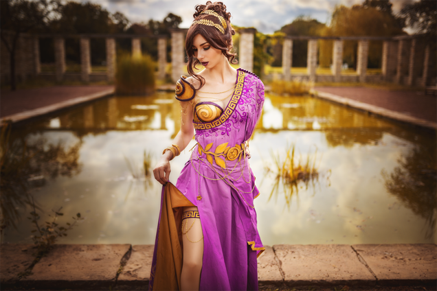
There’s a lot of Disney cosplay going around, as you’d expect, but Hercules doesn’t get much love. Oh, except from CosplaySymphony here, with this amazing Megara.
• Make a fist with your thumb outside, not tucked inside. If it’s tucked inside your fist, when you punch someone, you might break your thumb. The thumb goes across your fingers, not on the side.
• Don’t be like in the movies—don’t aim for the face. Face punches don’t usually stop people, and you can miss when they duck their head or break your hand on their jaw. If you want to get away quickly, or end a fight, aim for the chest, or the ribs. If you really want to do some damage, e.g., you’re being attacked, aim for the throat, which will make it hard for your attacker to breathe for a hot minute.
• When you punch, you want to aim and hit with your first two knuckles. Not the flats of your fingers, and not your ring or pinky knuckles, which can break more easily. You can use your weight, if you’re on your feet, to add wallop, and spring into a punch with your feet and torso.
Useful information, esp. if you haven’t taken self defense.
I reblogged this once before to add this and I’ll do it again…
keep your wrist straight.
You can also risk breaking your wrist if you allow it to bend. I actually can’t believe this isn’t in there.
Other good pointers:
if your attacker is male, go for his junk - especially if he’s wearing loose pants. There’s no sportsmanship when it comes to assault so fuck them balls UP
punching pretty much ANYWHERE in the face is going to actually hurt you a LOT (just think - you’re punching your bones into their bones and ow). If you’re going for the face, my suggestion is to strick upwards with your palm.
see that meaty portion highlighted in red? There’s a lot of muscle and fat right there which makes it excellent for striking. Hold your hand as shown and aim for the nose or chin (though I’ve been told in extreme circumstances, doing this to the nose can be fatal but I’ve never really heard if this is true or not) and just aim upwards
other delicate areas:
the shin (hurts like a bitch if you kick it right - also, you can hit this spot if you’re being held in a choke-hold and if your attacker has to move in order to stop you from kicking him, he’ll have to angle his body so as to expose his stomach and crotch to the wild spastic jabbings of your elbows)
the solar plexus (either jab while holding your hand in a sort of spear position or use your elbows - unless you’re super strong, your punch probably won’t wind your attacker. Your elbow or a spear hand will, however)
Originally in (most) martial arts, you hit the solar plexus because it supposedly contained an important chakra. Now we know that it actually also contains like a bunch of necessary organs that are exposed just below your ribs and is also (roughly) where your diaphragm lives so getting punched there is not pleasant.
the clavicle (from experience, getting hit in your clavicle HURTS LIKE A MOTHERFUCKER. If you strike downwards with your knuckles, the person might just cry. Like I did.)
the ear (this is probably the best place to punch besides the throat. It’s all cartilage so it probably won’t hurt you all that much and most people will be like “DUDE YOU PUNCHED ME IN THE EAR WHAT THE HELL”)
the kidneys (this is harder to hit without training but if you somehow get your attacker’s back to face you, try to hit’em in the kidneys. Again, from experience, this FUCKING HURTS. You can’t really hit the kidneys from the front with any effect but from the back it is super painful)
if you’re held in a choke-hold, try turning your head so the forearm isn’t pressed into your throat. If you can position yourself right, you can sort of force your chin into the crook of the elbow, making you able to still receive (limited) oxygen and provide time for you to kick some shins or elbow some spleens and shit
-Also, remember that a guy’s junk is not an off-button. Don’t think that you can rely on a swift kick to the balls to immediately incapacitate him in an emergency. Adrenaline and anger can keep somebody going for a long time even through extreme pain, and if you expect to end a fight with a single groin-attack you might be caught off-guard when he doesn’t drop. Certainly go for it if you get the chance, but keep hitting him until the fight is over.
-Draw blood if you can, especially if you can draw it from the face or the eyes. Blood in the eyes is not just a good way to impair your attacker’s vision, it’s also a really good way to freak them out and let them know that they might be getting more than they bargained for by picking a fight with you.
-Elbows and knees are really powerful weapons. Elbows are very sharp and very strong and if you are in close-range they are often more effective than trying to throw a punch.
-Yelling and shouting makes you scary.
Nothing much to add to this, it’s pretty much all there. So. Reblog. Oh, also, it’s really easy to break a nose - go for the eyes too. All it takes to avoid a shot to the throat is tucking your chin.
Also, that part about the ear - don’t punch. An open hand over the ear hurts a lot.
Tumblr teaching me how to fuck a bitch up
Also if you fuck up their face it’ll be easier for police to identify the attacker.
If someone gets you from behind and you cant punch them, go for the underside of the upper-arm. A bad pinch there is legit so painful because that skin is super sensitive. Also this cant be stressed enough, if the attacker is a guy then fucking rip his junk off.
I agree, all men should learn about women’s sexuality by reading My Immortal.
Hi friend! Foz here. Just a couple of points:
- I’ve specified good fanfiction in literally the first tweet. While this is, obviously, a value judgement wherein YMMV, My Immortal is famous for being arguably the most terrible fanfic ever written, and is therefore demonstrably not what I’m talking about. Similarly, I’ve seen other responses to this post bring up 50 Shades, which, despite its popularity in mainstream circles, is pretty much universally regarded as being not just terrible fanfic, but an excruciatingly bad and dangerously inaccurate portrayal of BDSM that romanticises abuse. So no: these are not the droids you’re looking for.
- Here’s the thing, though: you already knew that. The decision to respond to this post with a flippant reference to a fic that’s notorious precisely because of its poor quality is exactly why I used up precious Twitter characters to specify good fanfic, even though I shouldn’t have had to. Every mode of artistic expression is composed of good, bad and mediocre works, but when it comes to genres that are traditionally viewed as less worthy or literary - like fanfiction, or romance - we have a reflexive tendency to conflate the bad with the whole, such that the good is implied to be either exceptional or nonexistant. I specified that I’m talking about good fanfiction, not because I think such fics are an exalted minority, but to pre-emptively combat the assertion that they are, and then you’ve gone and made it anyway. So, thanks for that.
- But while we’re on the subject of quality, let’s make a very important distinction. Though fanfic is a largely unmediated medium, it’s not bad; it’s amateur, in the very literal, dictionary-definition sense of engaging or engaged in without payment; non-professional. While there’s a stereotype that lots of ficwriters are teenage girls - which, why is that always wielded as an insult? oh right, misogyny, carry on - a lot of us are, in fact, grown-ass adults of varying genders, some of whom also happen to write professionally in other contexts; like me, for instance. I’ve read fanfics that are unquestionably as good as, if not better than, many professionally published works I’ve read, some I’ve simply enjoyed or felt meh about, and others where I’ve mounted up on my Nopetopus and ridden off into the sunset after the first paragraph. It’s a grab bag, is what I’m saying, but if you think that’s an inherently different spectrum of enjoyment over quality than applies to any other medium, then I’d politely invite you to reconsider the matter.
- In conclusion: fanfic might not be your bag, but it has its own culture of editing, collaboration, publication, criticism and dissemination, its own conventions and subversions of same, its own extensive history and trope awareness, and, yes, its near-unique status as a medium invested in female sexual desire. That doesn’t mean there aren’t other things straight dudes can do to learn the mystical ways of What Women Want like, oh, say, talking to them, always bearing in mind that women are not a goddamn hivemind, but given that there are a frightening number of guys out there whose first or primary exposure to any type of porn is whatever degrading mainstream het they can scrouge up for free without virusing the hell out of their PCs, then yeah: I’m gonna go out on a fucking limb and suggest they maybe balance it out with some fanfic.
This might be the best summary of the power of fan fiction and its inherent lessons about women’s sexuality that I’ve ever seen.
And if you look to your left you’ll see a well written, well thought out piece “In Defence of Fanfiction”.
An elegant exploration of movement, the NYC Dance Project photographically presents the beauty and grace of dance.
The stunning series began in 2014, when Ken Browar, an esteemed fashion photographer, and Deborah Ory, a lifelong dancer with a background in editorial photography, began shooting contemporary dancers for a personal project. Through word of mouth in the dance community and inspiring success on social media, their photography quickly proved popular, and the NYC Dance Project was born.
In 2015, we interviewed Ken and Deborah to find out more about their artistic endeavor. Touching on everything from their initial inspirations to their theatrical techniques, the conversation offered an in-depth look at their still-new series. When asked about the long-term goals they hoped to accomplish through their project, they excitedly shared that they were “working on putting together a coffee table book of the images and interviews.” Now, just over one year later, that dream has become a reality, as their new book, The Art of Movement, launches in October.
With over 300 pages of content, the glossy hardback features glamorous photographs and intriguing interviews of more than 70 dazzling dancers from around the world—the American Ballet Theatre, New York City Ballet, Martha Graham Dance Company, Alvin Ailey, Royal Danish Ballet, and the Royal Ballet are just some of the prestigious companies represented. Shot both in beaming colors and in brilliant black-and-white, the series spotlights the intrinsically artistic nature of dance. Expertly photographed and directed by Ken and Deborah, each subject appears to dance across the page, striking impossible poses with ease and showcasing the skill, strength, and poise that their passion demands. Beautifully portrayed and masterfully captured, the elegant spreads offer an intimate glimpse into the incredible lives of dancers.
The Art of Movement hits the shelves on October 25. Pre-order the beautiful book here.
Above image: Charlotte Landreau, Soloist, Martha Graham Dance Company
James Whiteside, Principal, American Ballet Theatre
Daniil Simkin, Principal, American Ballet Theatre
Tiler Peck, Principal, New York City Ballet
Michael Jackson Jr and Sean Aaron Carmon, Alvin Ailey American Dance Theater
Chase Finlay, Principal, New York City Ballet
Xin Ying, Principal, Martha Graham Dance Company
Artem Ovcharenko, Principal, Bolshoi Ballet
Xander Parish, Soloist, Mariinsky Ballet
Hee Seo, Principal, American Ballet Theatre
Addison Ector, Complexions Contemporary Ballet
Sebastian Vinet, Soloist, Ballet de Santiago
Marcelo Gomes, Principal, American Ballet Theatre
Marcelo Gomes, Principal, American Ballet Theatre
Zachary Catazaro, Soloist, New York City Ballet
Michael Jackson Jr, Alvin Ailey American Dance Theater
This mind-blowing piece of transparent graffiti by Milane Ramsi makes a cement pillar disappear, leaving only 3D letters spelling the artist's name backwards. Where some people may see a simple concrete pillar, Ramsi spied his next canvas, completing the work in Carlsbad, Czech Republic in just under a week.
Since the image was posted on Reddit, speculation about how the illusion was created has been running rampant, but process images shared by the artist demonstrate the build up of background color to create the special effect, which works best from a single perspective. Playing with optics and perspective has a long tradition in painting—think Hans Holbein—with graffiti and street artists being no exception. Charged with working in public space and engaging with the environments, these artists often use optical illusions to great effect.
I'd seen the adorable han solo & leia before but the ariel and king triton makes me happy.
When it comes to their daughters, dads are full of aww-worthy moments—but it’s hard to top the times that they dress up alongside their little girls. Redditor taratorial recently captured sight of this sweet gesture while at Disneyland. The young daughter is dressed as Princess Ariel while her father dons a similar merman tail and crown, emulating King Triton. They walk hand in hand in the park, making memories to last a lifetime.
The selfless act might seem like a sacrifice for a grown man, but as Redditor ididnotdoitever pointed out, wearing the outfit was probably a no-brainer. “Dads think all day and night about what will make their daughters happy, and then they try their best to make it happen, some how, some way, and they're devastated when they can't,” he wrote. “This guy got those outfits and came up with the idea of wearing it for one reason, and one reason only—he wanted to see his little girl's eyes light up.”
“Merman Dad” isn't the only one who dressed up with this daughter. Other awesome fathers have also rocked princess and lady superheroes costumes:Photo credit: statix138
It was pointed out to me that I never posted the final version of my Suko Dragon sketch… but that’s because I don’t have a final version yet. But better something than nothing!
In conversation I think it was casually mentioned that “Suko has a hoard of food” (or something like that) which then caused my mind to see the Suko Dragon, happily crouched over her hoard of food like other dragons crouch over gold. “I understand that it’s not shiny, but it’s so tasty!” Suko would make the best/worst dragon ever!
(sketch is from March I think- kicked off before her latest hair cut even! Those braids were so pretty….)
You ever think about how mermaids decorating themselves with shells n shit is them just swimming around covered in animal bones? Because I think about that a lot lol.
OMG this is both useful and hilarious. I know about the primary colors for light and light mixing because of my vision science/optometry background. But knew a little bit about the paint/pigment thing because reflective is different than absorbtive, so this is really neat.
this single post is more useful to me then four years of art school
We did it in color study class on my college and it’s incredible the difference between using red/blue/yellow than cyan/magenta/yellow.
The purple was colored like shit, so as the greens. Than we tried the actuall primary colors and it FELT SO GOOD!
I JUST TESTED IT IN MY ART PROGRAM AND HOLY SHIT
IT WORKED REALLY WELL
On the left we have dissapoinment; on the right, love.
Then why do they teach us that RBY are primary colours in Pre-KG????
To mess with our heads….
Or because they think that cyan and magenta are too difficult for kids to learn? Lame either way
Reshare to save lives
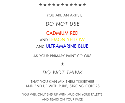
Okay, no. No no no no no no no no NO.
Listen up you fucks because I’m not wasting thousands of dollars on an art degree to watch y’all fuck up basic color theory.
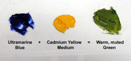
Red, yellow, and blue are the primary colors
If you’re using p i g m e n t.
Do you hear me? When you’re using traditional media, fucking actual goddamn paint, Bob Ross style, your primary colors are!
When you use paint, your primary colors are red yellow and blue and don’t forget it.
NOW THAT CHANGES COMPLETELY WHEN YOU GO FUCKING DIGITAL.
THE DIGITAL PRIMARY COLORS ARE RED BLUE AND GREEN IF AND ONLY IF YOUR WORK IS GOING TO STAY DIGITAL, ON THE SCREEN, AND NEVER LEAVE THE SCREEN, AND OF COURSE IF YOUR WORK IS GOING TO BE PRINTED. ON A PRINTER. WITH INK. THEN. AND O N L Y T H E N.
ARE YOUR PRIMARY COLORS.
CYAN.
MAGENTA.
AND YELLOW.
So say it with me folks!
Red yellow and blue, are the primary colors for traditional pigment that’s mostly used in paints and shit. You use red yellow and blue when you’re painting traditionally, Bob Ross style.
Red blue and green is light, which is what you’re painting with when you pick up your tablet and go digital.
CMYK is ink, and ink only. You could use cyan, magenta, and yellow as your primary colors in paint if you wanted to be a complete dick, but they’re not your primary colors unless your work is going to be printed using. i n k. The only time they could be considered the primary colors in a traditional medium is if you’re using ink.
Good day.
Also thatswhiskytoyou’s color mixing is bullshit because THIS:
Is my icon. I painted this using RED. GREEN. AND BLUE. AS MY PRIMARY COLORS and they turned out fine. Of course, I used the finger smudge tool first and then the color mixing tool and then the blur tool, but hey what do I know.
Clearly using the blur tool only doesn’t cut it.
“Oh but Leo!” You say. “You used cyan and magenta in that color wheel!”
Well bitch guess what.
this is the digital color wheel. I’d say I mimicked that pretty well, don’t you think?
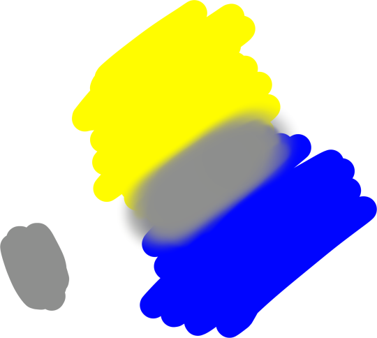
Oh and one other thing, notice how Blue and Yellow are directly opposite each other on this color wheel? That’s because we’re dealing with light, and with light, yellow and blue are complimentary colors.
Which is why when you mix them, it looks like this:
Which is a pretty neutral gray tone: They cancel each other out on the rgb color wheel when you mix them together.
BUT WITH PIGMENT THE PLACEMENT IS DIFFERENT
If you’ll notice, yellow and violet are now opposite each other, meaning they’re complimentary colors and if you mix them, they’ll make a neutral gray.
But if you mix yellow and blue, same colors as before, YOU GET THIS:
Now keep in mind that the person in the video uses a darker blue, so they get a darker green, but the point is that it doesn’t make that neutral gray.
Now what happens when we mix yellow and violet paint?
Ah yes, you get a bunch of muted colors the more evenly you mix them.
What happens when you mix yellow light and purple light?
I see, I see.
OH AND ONE MORE THING.
They didn’t teach you about red blue green and cmyk in pre-k because when most of us were in pre-k digital art was still in its early stages and what fucking seven year old knows how to use a printer.
GUESS WHO’S NOT FUCKING DONE YET:
The reason the primary colors for light are so dramatically different from the primary colors for paint and ink is because your eye only receives combinations of red light, blue light, and green light. Our eyes do not have a sensor (cone cell) for yellow light. So when we paint with light, red green and blue are our primary colors. Because of our eyes.
Furthermore, paint primary colors are colors that cannot be created by mixing other colors together. For paint, they are red yellow and blue, because you cannot mix orange and green to get yellow. Mixing orange and purple paint does not make red. And mixing green and purple paint does not make blue.
Mixing blue and green paints will make cyan. Mixing red and blue paints will make magenta.
That’s why cyan and magenta aren’t primary paint colors.
However, you can’t mix yellow and blue ink and get cyan. You can’t mix red and blue ink to get magenta.
And that’s why cyan and magenta are the primary ink colors.
Brighter and stronger paints are created through tints and shades, through a thorough understanding of color theory and a few quality paint recipes. Not by bullshit posts on tumblr designed to mislead you.
This fucking post is why we get newbie graphic designers who don’t know the difference between RGB and CMYK and how it affects the art and printing.
Another Art degree, BA in Painting here:
I wanted to point out that both are correct in a way. That is if you are talking about painting a color wheel with pigment.
I’m a painter, I work in traditional oil media, and while it’s true to paint a color wheel with pigment you use yellow, blue, and red, it’s a bit more complicated.
You cannot paint a color wheel with only blue, red, and yellow primaries, nor can you paint a color wheel with only cyan, magenta, and yellow. You need both.
To create a seamless color wheel that doesn’t neutralize (gray/muddy) any of the colors, you need to have a cool and a warm blue and a cool and warm red and a cool and a warm yellow to achieve the fully rendered vibrant colored color wheel.
This is because pigment of *true primaries* do NOT exist.
In an ideal world there would be a true blue, true red, and true yellow, meaning the color is neither warm nor cool, then you could use these pigments to mix a color wheel. However this is NOT the case.
To paint a 12 color, color wheel, an art professor would have you use the following paints:
Hansa Yellow, though it is a cool yellow, it will be okay to use only Hansa, but you may use a Cadmium* yellow if you wish to use a warm yellow too.
Quinacridone Rose(cool),and Naphthol (or Cadmium*) Red (warm)
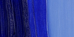
Phthalo Blue (cool) and Ultramarine Blue (warm)
Titanium white, (cool)
Before I get too much into the details of the colors, first its important to understand warm versus cool. You might think blue and green are cool, red and orange are warm. While yes true, it is again its more complex than that.
Compliments neutralize to a gray, BUT the compliments must be opposing warm and cool to create this effect. In the examples above a WARM BLUE was mixed with a COOL YELLOW, meaning it will neutralize. Now if you mix Phthalo and Hansa - both cools, you will get a lovely bright green. Phthalo is close to cyan, meaning both are cool hues of blue.
You can have a warm blue (ultramarine) and a cool blue (phthalo). A true primary, is a neither warm nor cool. Of course if its red, it will be “warm”, and if its blue its “cool.” Here is an example image:
Lets start with Color 1 Yellow, to paint this color simply use Hansa/Cadmium Yellow. You may mix a small amount of Cad yellow with the Hansa, but Hansa is already very close to a primary yellow.
Now lets move to 1 Blue. Now to get blue, as it is shown on the screen, you need to mix Phthalo blue withUltramarine, plus a little titanium white. Because the pigment is inherently dark, you need to tint it (add white) just a small amount to be able to see the color.
Red 1: this color is quite close to Naphthol/Cadmium, but it is a little too close to orange, so a small amount of Quin Rose is typically mixed with the Cad/Naphthol red to get a primary red.
Now for the secondary colors, this is where the warms and cools are very important.
Secondary Colors
2 Green: To mix green, you would use Phthalo Blue and Hansa Yellow. Its very important that when mixing a Color Wheel *this only applies when mixing colors to match the color wheel* That you do NOT use ultramarine, or else the green will be dulled and more neutralized. This green creates beautiful landscapes, but a muddied color wheel.
2 Violet: You will mix Quin Rose and Ultramarine, the warm blue with the warm red, otherwise you will get a hazy purple. A lovely color, but not accurate to a color wheel. And often a small touch of white can be added to make the color visible if it is too dark. **note, white is a cool neutral color and will tone down the vibrancy/saturation of a color, and shift it towards cool**
2 Orange: Mix Cad/Hansa Yellow with a small amount of Naphthol/Cad Red.
Now for the tertiary colors:
3 Yellow Orange: Mix 2 Orange with Cadmium/Hansa yellow
3 Yellow Green: Mix 2 Green with Hansa yellow
3 Blue Green: Mix 2 Green with Phthalo Blue
3 Blue Violet: Mix 2 Violet with Ultramarine
3 Red Violet: Mix 2 Violet with Quin Rose
3 Red Orange: Mix 2 Orange with Naphthol/Cadmium Red
*Cadmium is a more toxic pigment so depending on the professor, you may or may not be taught to paint with cadmiums. There are now synthetic pigments that are very similar to the colors produced by cadmiums, without the health risks.
Tldr: When painting a color wheel with pigment, you need to be aware of warm and cool variations of a color as mixing a warm with a cool, will not result in a color wheel color.
yes that shes a wonderful and kind woman who will bring you pinecone and rock gifts
i have a great love of the idea of the keepers of the cryptids.
bigfoot, this beast of fur and fangs and wilderness. and a tall person with ginger hair and kind eyes who keeps her. who makes sure she eats alright. who stamps their foot and says, “spit it down,” when she brings home a stray hiker. “no we can’t keep him, stop looking at me like that.” has a house full of birds and rocks and when bigfoot is home, sleeps curled up next to her.
the girl with wide eyes and freckles who keeps the jackalope. who is terrifically allergic to fur. who only ever wanted a rabbit. “he’s hypoallergenic,” she says when she finally shows her sister, “squeeze him.”
the krakken’s tentacles reaching out to play chasing games with the dogs on tiny fishing boats. gently carrying any tired puppy safely back to his family. and sometimes, if you’re lucky, he’ll carry you, too. “i think it was dolphins?” your memory is foggy with salt and half-drowning, “i was just… lifted up.” when you were seven you nursed a squid back to health before returning him to the ocean, wishing him well. you don’t know why the memory surfaces now, but when you turn to the sea, you think you glimpse one long tentacle out there, lifting and waving.
the grisly old seamaster who has been searching for nessie, and his niece, who keeps her. who met her while swimming one day and says, “well, that’s absurd, you’re not real.” who asks her uncle every day where he’s searching next, takes nessie (who is, of course, the great-great-and so many greats-granddaughter of the first) in the opposite direction. nessie who snorts water through wide nostrils when she laughs, and the girl who makes her laugh so much. and one day, it’s nessie that the girl goes to for advice. because love is scary and loving a girl is even scarier. and nessie watches over her, now, makes sure her heart isn’t broken. when they both have children, they play in the shallows, and the girl and nessie laugh.
the jersey devil, the unwanted thirteenth son. when the burger boy goes out to flip the trash he finds the devil in the gutter, hungrily eating what was left of a #23. it is not the weirdest thing he’s ever seen, because he lives in jersey. so he picks out the parts that are kind of edible from his trash and throws them one by one to this monstrosity. and he watches the thing eat and says, “okay,” and tomorrow sets aside every edible thing just in case. the devil shows up late, eyes shifting in the darkness. and the kid throws him meat, pays attention to what it seems to like to eat. after a week, the boy begins to speak. tells the devil about his life. about how his boss isn’t bad but the guys at school are. about being mexican in this country trying to kill him. how there’s this one girl he kind of likes and this one boy he really kind of likes, and both are scary. four weeks later and the devil just follows him around at night, sits by him (never close enough to touch) and … listens. and the boy feeds him. the devil likes carne asada tacos the best. the boys at school have stopped sleeping, have become quieter, scared versions of themselves. one day the devil comes home. the thirteenth son who has never been wanted has a door opened for him. and the boy’smother - she just looks at him and makes a plate and says they’re having burgers tonight, make yourself a plate. in this loud house of many, the devil shifts in his seat and barely even growls.
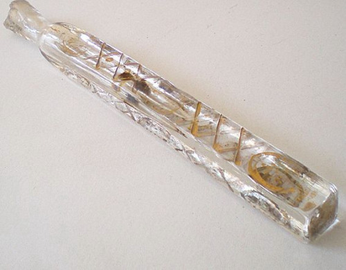
Collection of lachrymatorys (or lachrymosas), these tear catchers or tear vials - sometimes worn on a necklace, sometimes merely held - were used to gather the tears wept by mourners at funerals, to hold the tears of people mourning the passing of loved ones. One type of lachrymosa had a special top which allowed the tears to evaporate (signifying the time to stop mourning), others had a sealed top to allow the tears to last for a year, at which point they would be poured on the grave of the person whom the tears were wept for, Victorian era, 19th Century.
On one hand these are beautiful and this is a really interesting and unique form of death ritual. On the other hand Victorians are sooooo fucking extra. Like wow could you make things any more dramatic if you tried.
I can barely write legibly on a chalkboard. These are amazing. What talent!
Teacher Hirotaka Hamasaki captivates his young students by drawing sprawling masterpieces on the blackboard. Rather than writing notes or homework assignments, he emulates artworks featuring historically-significant imagery as well as contemporary pieces. Using everyday chalk and a well-worn eraser, Hamasaki references iconic paintings like Leonardo da Vinci’s Last Supper as well as pop culture-inspired works like Disney’s The Little Mermaid.
Hamasaki’s ability to faithfully reproduce several types of artistic styles is awe-inspiring. In one instance, he’s drawn the cubist masterpiece Guernica by Pablo Picasso, but he’s comfortable switching gears to illustrate a colorful scene from the anime film Kimi no Na Wa. It seems his chalkboard subjects know no limit—the perfect way to engage a group who is constantly learning.
We'd love to sit in his class—for now, though, we’ll have to settle and enjoy his work through Instagram.
I loved Think Quick as a kid so I get this (though it was never _that_ exciting or surprising), but really I want to know about the kid passed out on the couch in the back with something near his face.
Sigh, I know in reality it's not as magical as this but someday I'll go to Venice.
Director Olivier Astrologo, along with brother Nils, shares the spirit and essence of Venice in his new short film Venezia. Awarded by the city of Rome last year for his film Roma, which boasts over 1 million views, Astrologo’s newest venture highlights the craftsmanship, architecture, and inhabitants that shape Venice. Sweeping across the lagoon, skipping across sun-drenched rooftops and moving through undiscovered artisan workshops, the short film is a journey beyond the city's stereotypes.
Produced in partnership with René Caovilla, a master Venetian shoemaker who has worked with the likes of Christian Dior and Chanel, Astrologo’s Venezia peers behind the hidden doors of Venice. Crafting wooden oars, weaving luxurious textiles, and gliding through gondola-laden canals paint an enchanting—and secret—picture of Venice.


 A two-way double fore-edge painting from The Book of The Thames (1859), slanted one way. Photo via
  The American capital painted on the edge of American Poems (1870). Photo via
  A two-way double fore-edge painting from The Book of The Thames (1859), slanted one way. Photo via of
  A ship painted in Lectures on Modern History (1843). Photo via of
  A circus scene from Essays, Poems, and Plays (1820). Photo via of
  Spider monkeys from a fore-edge painting on The Natural History of Monkeys (1838). Photo via of the
  Stonehenge painted on the side of The Royal Kalendar, and court and City Register for England, Scotland, Ireland, and The Colonies (Date unknown). Photo via of
  Adam and Eve in the Garden of Eden on side of The Bible (1795). Photo via of
  The Last Supper on the edge of The Holy Bible (1803). Photo via of
  George Washington and Ben Franklin from the side of The Speeches of The Right Honourable William Pitt (1808). Photo via of
  Autumn
 Winter
 Spring
 Summer


 Xin Ying, Principal, Martha Graham Dance Company


 Photo credit:
  Photo source:
  Photo source:
  Photo credit:
  Photo credit:
  Photo credit:


