Shared posts

24 May 15:19

The Decisive Moment is Dead. Long Live the Constant Moment

by Clayton Cubitt

The Decisive Moment is Dead. Long Live the Constant Moment decisvemoment

We photographers deal in things which are continually vanishing, and when they have vanished there is no contrivance on earth which can make them come back again. We cannot develop and print a memory.
Henri Cartier-Bresson

We exist on a treadmill of forgetting and anticipating. We labor to preserve what we treasure of our past, even while the present shotguns us with a thousand new options, one of which must become our future. One of which we must choose.

In this maelstrom of time it is hard to be calm; to understand what warrants attention, and what can be ignored. This state of tranquility and presence has been the essence of the modern photographic act, best characterized in the popular mind by Cartier-Bresson’s concept of the “Decisive Moment.”

Cartier-Bresson believed that the photographer is like a hunter, going forth into the wild, armed with quick reflexes and a finely-honed eye, in search of that one moment that most distills the time before him.

In this instant the photographer reacts, snatching truth from the timestream in the snare of his shutter. The Decisive Moment is Gestalt psychology married to reflexive performance art in the blink of a mechanical eye.

It is the creation of art through the curation of time.

The Decisive Moment is Dead. Long Live the Constant Moment ancientrome

In Ancient Rome, officials in charge of overseeing the assets of the Empire were called Curators. This meant, literally, “caretaker.” The fall of the Roman Empire left the Catholic Church to carry on the role of curator, and by the Middle Ages the role had become ecclesiastical, with parish priests caretaking the souls of their flock.

The Decisive Moment is Dead. Long Live the Constant Moment cardinal

Cardinal de Retz

In fact, Cartier-Bresson’s choice of the term “decisive moment” itself comes from a quote by a 17th century Cardinal de Retz: “There is nothing in this world that does not have a decisive moment.”

The Cardinal’s role as a political agitator lends a Machiavellian patina to the phrase when you read the rest of the quote, which continues, “and the masterpiece of good ruling is to know and seize this moment.”

The modern relationship of “curator” to “art” arose in the princely courts of the Renaissance, when aristocrats sought to outshine each other in their support for the arts, and began building wings on their palaces for the showcasing of these collections, along with expensive printed catalogs to extend the reach of the art (and the glory of the owner.)

As we transitioned from aristocratic feudalism to the democratic nation state this form evolved into the modern museum and its attendant curators.

Presently the act of curation, or the title of curator at least, is undergoing an elastic expansion. Companies employ celebrities to curate the lineups of cultural festivals, and stylists to curate capsule collections of fashion they can sell to untapped demographics.

Online, members of the Tumblr generation compliment each other on their “curation.” On Facebook each day we see a continuous scroll of content curated by friends, and companies that pay for the privilege of sneaking in with them.

Curation, curation everywhere. And what of photographers? The curation of moments. Of perspectives. Of angles. This has always been so, although the technical limitations of primitive photographic technology falsely imposed a performance art aspect on the medium, a “dance” if you will.

The notion that a large part of the creativity of the medium was the ability to recognize and capture moments in real-time was the central conceit of the Decisive Moment. But in fact, much of what Cartier-Bresson describes is not about the art, but mainly about the tools that he had access to: the portable rangefinder camera and increasingly fast films, which enabled him to roam and grab action from the air as it unfolded before him, in ways previous eras of artists could not:

Photography is not like painting. There is a creative fraction of a second when you are taking a picture. Your eye must see a composition or an expression that life itself offers you, and you must know with intuition when to click the camera. That is the moment the photographer is creative. Oop! The Moment! Once you miss it, it is gone forever.
Henri Cartier-Bresson

But he was wrong. Before these tools became widespread, photographers were indeed very much like painters, in both form and function. The camera itself evolved from the camera obscura, literally a “darkened room,” in which one or two people would stand, and record the scene before them, tracing it on wallpaper.

Later, film-based large format cameras required easel-like tripods and stationary perspectives. Insensitive emulsions required exposure times of many minutes. There was very little difference between a photographer in the field and a painter sketching in the field.

The Decisive Moment is Dead. Long Live the Constant Moment wetplate

As materials improved, and costs reduced, photographers quickly usurped painterly subjects and methods, from formal portraiture to landscapes to still-life, and, having thus freed the painters from the burden of commercial utility, cleared the path for the flowering of the 20th-century modern art movements, from Cubism to Abstract Expressionism to Performance Art.

So the Decisive Moment itself was merely a form of performance art that the limits of technology forced photographers to engage in. One photographer. One lens. One camera. One angle. One moment. Once you miss it, it is gone forever.

Future generations will lament all the decisive moments we lost to these limitations, just as we lament the absence of photographs from pre-photographic eras. But these limitations (the missed moments) were never central to what makes photography an art (the curation of time), and as the evolution of technology created them, so too is it on the verge of liberating us from them.

The Decisive Moment is Dead. Long Live the Constant Moment

Imagine an always-recording 360 degree HD wearable networked video camera. Google Glass is merely an ungainly first step towards this. With a constant feed of all that she might see, the photographer is freed from instant reaction to the Decisive Moment, and then only faced with the Decisive Area to be in, and perhaps the Decisive Angle with which to view it.

Already we’ve arrived at the Continuous Moment, but only an early, primitive version.

The Decisive Moment is Dead. Long Live the Constant Moment glass1

Evolve this further into a networked grid of such cameras, and the photographer is freed from these constraints as well, and is then truly a curator of reality after the fact.

“Live” input, if any at all, would consist of a “flag” button the photographer presses when she thinks a moment stands out, much like is already used in recording ultra-high-speed footage.

The Decisive Moment is Dead. Long Live the Constant Moment dronecam

A sketch of the four-lens ARGUS-IS digital camer

DARPA has already developed a camera drone that can stay aloft recording at 1.8 gigapixel resolution for weeks at a time, covering a field as large as 5 miles wide, down to as small as six inches across, and it can archive 70 hours of footage for review.

This feat wasn’t achieved with any new expensive sensor breakthroughs, but rather by networking hundreds of cheap off-the-shelf sensors, just like the one you’ve got in your smartphone.

With the iPhone 5 camera module currently estimated to cost about $10/unit, and dropping like a rock with the inexorability of Moore’s Law, we can see how even an individual photographer might deploy hundreds of these micro-networked cameras for less than it costs to buy one current professional DSLR.

What might a photographer do with a grid of networked cameras like this, with their phone as the “viewfinder?” A street photographer could deploy them all over a neighborhood of interest, catching weeks worth of decisive moments to choose from at leisure.

A photojournalist could embed them all across a war zone, on both sides of the battle, to achieve a level of reality and objectivity never seen before. A sports photographer could blanket the stadium and capture every angle, for the entire game, even from each player’s perspective.

Activists could choose to link their networked cameras and capture a live feed from every protestor in a march of hundreds of thousands, each one flaggable, perhaps to highlight any police abuses as they occur, from every perspective nearby, editable live from anywhere else on Earth.

The Decisive Moment is Dead. Long Live the Constant Moment skypeportrait

A remote-controlled Skype portrait session

All of this is closer to the now than to the future. We’ve already seen tagged photos streaming forth from a billion networked smartphones, broadcasting the Arab Spring to Twitter and police brutality at Occupy to YouTube.

What I’ve previously described is only new by a small question of degree, and therefore inevitable. Google Glass linked to Street View and Google+, scaled. None of this is science fiction. Artists are already commandeering Google Street View to hijack its eyes for their own expression. 3D scanners have been used for fashion work for over a decade.

he 2001 documentary “War Photographer” employed a fascinating cinematic technique: video recording James Nachtwey’s shutter finger as he photographed conflicts around the world. The New Aesthetic already explores the surface artifacts of this techno-artistic explosion.

I’ve used Skype to conduct remote portrait shoots, and photographed fashion shows via live web streams. For instance, this Rodarte livestream:

The Decisive Moment is Dead. Long Live the Constant Moment constantmoment1

Things really start to get interesting when we realize that the tools photographers will soon employ need not even be traditionally photographic, but rather more like a 3D LIDAR array. We’ll no longer need cameras or lenses, only a small network of emitters, able to render and record our subject from all angles at once.

A primitive test of this has already been used artistically in Radiohead’s 2008 video for “House of Cards,” and it’s not hard to imagine how revolutionary this might be when resolution and color accuracy improves to the point of photographic realism, at a low enough price point for ubiquitous deployment.

Product and car photographers are already being replaced by advanced rendering software like Keyshot, what if it rendered LIDAR data instead of CAD files?

What if every phone in every pocket had this technology, and you could consent to have your presence “photographed” from anywhere on Earth at any time, by sharing your own connection with another artist, and vice versa? Imagine Errol Morris’ “Interrotron” in hyper-realistic 3D, from all angles, at all times.

The Decisive Moment is Dead. Long Live the Constant Moment goldengateWhat if a future decentralized social networking platform allowed everyone to connect their capture node, for the use of any other artist, or just a chosen circle of friends? We already use Google Street View for location scouting. What if it enabled us to change to any angle and scrub back and forth in time as well, and from any “open” node near it, side to side, and from drones above, not just from a single Google car that passed by once?

This is the Constant Moment. This is as close to a time machine as we’re likely to get.

Great technological leaps will be required to fulfill the furthest reaches of the Constant Moment. Massive gains in the quality of search and organization, not to mention cost of storage, and resolution. Perhaps even some form of a neural interface.

But it’s clear to me this is a “when,” not an “if,” and artists need to begin anticipating this future, to inspire and guide the technologists, and to keep up with the military dreamers (it’s been said that in childhood development the destructive urge precedes the creative one by months, as blocks get knocked down long before they get stacked.)

The Decisive Moment is Dead. Long Live the Constant Moment leicaTo the photographer that still thinks photography mostly means being physically present, crouched behind their Leica, finger poised to capture the classic vision of the Decisive Moment, this coming Constant Moment might be terrifyingly sacrilegious, or perhaps just terrifying, like an insect eye dispassionately staring.

Just as we still (!) have partisans that argue film capture is more “genuine” than digital capture, we will certainly have those who will argue that a photographer must be in a place and time in order to genuinely photograph that place and time. There will be counter-movements, inevitable copyright battles, privacy concerns, and a reevaluation of authenticity and authorship.

Which is why I began this essay emphasizing the centrality of curation, not action, to the photographic act. Just like Cartier-Bresson, I began my artistic life as a painter. Like Cartier-Bresson I enjoyed the vitality of the 20th Century photographic hunt, the way it forced me into the world to seek out that which illuminated hidden places in my mind. And like Cartier-Bresson I’ve enjoyed the synaptic electrical pulse of discovery, as the forms in front of me seemed to arrange themselves out of chaos into an order that meant something about the way life felt there and then.

The Constant Moment doesn’t end any of that. All it does is capture the billion missed Decisive Moments that previously slipped through our fingers, by expanding the available window of temporal curation from “here and now” to “anywhere and anytime.”

The Constant Moment eliminates dumb luck from photography. It minimizes, as much as anything ever can, the Hawthorne Effect caused by a lifeless camera between our interactions. It continues the photographic tradition of artistic democratization by flattening limits of time, of geography, of access.

Every photographer recognizes their role as curator. It’s that gnawing pit in our stomach that says to us “Shoot this! Before it passes! Now!” Our every heartbeat a reminder of the time passing through our veins, and our need to arrest it, if just for those coming after us, our small hope of immortality.

As the Decisive Moment aspired to a form of immortality, so the Constant Moment will attain it through a form of omniscience. A path I think Cartier-Bresson would be just fine with. As I gave him the first word, so I’ll leave him the last:

Constant new discoveries in chemistry and optics are widening considerably our field of action. It is up to us to apply them to our technique, to improve ourselves, but there is a whole group of fetishes which have developed on the subject of technique. Technique is important only insofar as you must master it in order to communicate what you see… The camera for us is a tool, not a pretty mechanical toy. In the precise functioning of the mechanical object perhaps there is an unconscious compensation for the anxieties and uncertainties of daily endeavor. In any case, people think far too much about techniques and not enough about seeing.
Henri Cartier-Bresson


About the author: Clayton Cubitt is a professional photographer and filmmaker based in New York City. Visit his website here. This essay originally appeared here.


Image credits: Decisive moment header photos by Henri Cartier-Bresson, L1035794.jpg MoMA and I by Susan NYC

24 May 15:14

Dear Model: Posing Tips for How to Look Your Best in Photographs

by Jen Brook

Dear Model: Posing Tips for How to Look Your Best in Photographs dearmodel 9

Dear (new’ish) Model,

My name is Other Model. I have spent the last couple of years finding out a few things that I wish I’d known from the start. Please don’t think I’m patronising as I mean this only in goodwill, as there is absolutely no gain for me by sharing these cheats. Not all of my points will be valid for you as posing varies in each genre. Just take what you can and ignore the rest. If only one suggestion helps your future career then my time has been well spent…

Rule one, the mirror is your BFF. Stand there, perfect your poses and learn how your body shapes. The mirror is a perfect tool to show you what the camera can see – try to imagine it behind your photographers head when shooting and always consider what can be seen from that angle. For example, if your foot is closest to the lens, it is worth remembering that your foot is going to the largest thing in the picture….and nobody wants to be remembered as Bigfoot…

Dear Model: Posing Tips for How to Look Your Best in Photographs dearmodel 1

Create separation between your limbs from your body. Not only does it prevent the arm/leg from being squashed against you spreading out any fat, it is also an optical illusion for a slimmer appearance in terms of overall width. A basic cheat that makes a massive difference.

Dear Model: Posing Tips for How to Look Your Best in Photographs dearmodel 3

Fat arm to thin arm

Dear Model: Posing Tips for How to Look Your Best in Photographs dearmodel 7

Body width shrunk by optical illusion

Have a basic understanding of light. For example, if you raise an arm to the light, it could be a whole F-stop brighter in camera than your face (being the object closest to the source of light according to the inverse square law). It will also cast a shadow across you. You can counteract this by using your other arm (!)…or, move your arm a fraction backwards, away from the direct beam of light. Learning how lighting falls is invaluable. Ask which is your key light and then work towards it.

Dear Model: Posing Tips for How to Look Your Best in Photographs dearmodel 4

Be aware of ‘mothing’. If the light has been metered to an exact spot, try to stick to it, or at least notice when you’ve crept closer to the light so you can rectify it if required.

No harry, don’t fly into the light!”…”I can’t help it, it’s so beeeeautiful… (A Bug’s Life)

Recognise when your eyes are over-rotating. It is always advisable to follow the line of your nose to keep your sight central. This stops you from looking bog eyed from too much white of the eye showing.

Dear Model: Posing Tips for How to Look Your Best in Photographs dearmodel 5

Know how far you can turn your head before your nose ‘breaks your cheek’. Go back to the mirror to see what angle becomes too far. This is perhaps a dying rule, but one that many competition judges still take into account so worth being aware of.

Elongate your neck to simulate height and poise. Possibly one of the hardest things to remember because it genuinely feels unnatural. Stand in front of the mirror and look at yourself…stand normally, then roll your shoulders back allowing your face to come forward…notice the difference in the width of your neck? An instant slimming trick.

Go one step further by popping your jaw towards camera if you want a strong line created by the shadow.

Dear Model: Posing Tips for How to Look Your Best in Photographs dearmodel 6

If the photographer is at a 12 o’clock angle, then standing angled at 1:30 rather than 3 o’clock will lose inches to your overall width. When you do, make sure it is shadow you are turning into and not the light. Always one rule: hide what you don’t want seen in shadow. Forget Weight Watchers, it’s all about tactical posing!

If you want to appear slimmer you can create a ‘false waist’. You can do this by positioning yourself to camera, then creating the waist you want seen with the positioning of your hands on your ‘hips’. See…crafty huh :)

Dear Model: Posing Tips for How to Look Your Best in Photographs dearmodel 8

If you’re like me and you don’t have natural curves, then fake them! And I don’t mean plastic surgery. As shown above, learning how to pop your hip is not something everyone can do but can be a big advantage if you can for great shape. Allowing your knees to cross slightly will emphasise that ‘S’ figure with it.

Keep your hands loose and fluid. The term ‘ballet hands’ is often thrown around…but if you’re like me and the only dancing you do well is the truffle shuffle, then keep your middle finger lower than the others whilst relaxing them with a slight curve. Don’t clump your fingers together and avoid showing the back of your hand. Why? Because backs of hands are big and ugly…sides of hands are small and dainty. This was drilled into me from the start of my career by friend and photographer Gary Hill.

See how much longer and larger my hands look when left straight:

Dear Model: Posing Tips for How to Look Your Best in Photographs dearmodel 11

Play with what is available. If you are wearing a flowing dress, play with it by tossing it into the air or working the movement in the bottom. Remember if you are wearing trousers then your legs don’t need to be so clamped together.

Dear Model: Posing Tips for How to Look Your Best in Photographs dearmodel 9

Putting theory into practice in Paris, photograph by Andrew Appleton (MUA Donna Graham & assistant Vicki Head)

You should have knowledge of what you are wearing and why. If you have been hired to sell a specific product, make sure you are pulling poses that are commercially complimentary and not hiding the product.

Own a ‘modelling kit’ and take it on all shoots. These are the things you will need, but may not be directly mentioned in pre-shoot communications. They are; outdoor/studio shoes, nude/black underwear, face wipes, moisturiser/oil for your legs, a plain vest top, safety pins/clamps, a straw for drinks (as not to ruin your lipstick), your own water with a sugary snack to keep you going (your shoot location may be far away from shops), spare stockings for lingerie shoots….and also hairspray, a top up lipstick, hair grips, brush and eyelash glue (in case the MUA can’t stay). If you have been booked for a specific job such as bridal, it is also well received if you bring appropriate accessories i.e. a pretend wedding ring.

Please be honest about your size and measurements. Nobody minds how tall or small, big or slim you are…but they do need to know in advance for obvious reasons. You may be sent home unpaid if you have exaggerated the truth and wasted time by not fitting the casting criteria. Save yourself and others the embarrassment.

Talk to other models, check references and don’t ever assume anything. Despite many people thinking models are the bitchy ones, it’s actually very untrue most of the time. We look after each other and the best out there are very supportive. I was terrified to talk to the people I admired, but then I realised they’re only human, we are all the same…and they’re pretty damn awesome guys and girls when it comes to helping you out.

Most of all be fun, easy going and willing to go that extra mile! If you are genuinely a delight to be around, you are 100% more likely to be rebooked. You are part of a team so pull your weight, diva’s are so 2010.

Dear Model: Posing Tips for How to Look Your Best in Photographs dearmodel 10

Fun times to get the shot despite being in the cold rain, creating ‘I bleed colours’ from my personal Dreamcatcher Project with Richard Powazynski, Lauri Laukkanen and Donna Graham

I hope this letter has been of some use to you and that you can take something from it. As I said, not all of this will work for you, it’s just tricks I wish I’d known when I began modelling. But then again look at Kate Moss, she breaks all of the ‘rules’…and still looks amazing – that’s fashion darling.

The day you stop enjoying your job is the day you need a new one. Work hard and love your life!

Kindest regards,

Other Model.


P.S. All pose examples are unedited for a true representation – taken by Jon Brook


P.P.S. If you found this helpful I’d really appreciate it if you ‘like’ my Facebook page and follow me on Twitter. Thank you!


About the author: Jen Brook is a creative fine art, conceptual and fashion model from UK. You can find her on Facebook and on Twitter. She also blogs over on Tumblr. This article originally appeared here.

24 Mar 11:05

Rooftop Living in Japan

We have collected a selection of buildings – large to small – that creatively incorporate roofspace. Some of these projects use their roofs as extra floor space, while others produce heightened experience.


Osanbashi Yokohama International Passenger Terminal
by Farshid Moussavi + Alejandro Zaera Polo / FOA

JA+U : Rooftop Living in Japan © Shinkenchiku-sha

Forming a pier that juts out into the port of Yokohama, the international ferry terminal has a 430 meters-long (1,410 feet) boardwalk on its roof. The undulating surface – derived from accommodation, circulation flows, and legal requirements – creates a landscape in the middle of the ocean.

JA+U : Rooftop Living in Japan © Shinkenchiku-sha


Saitama Prefectural University
by Riken Yamamoto & Field Shop

JA+U : Rooftop Living in Japan © Shinkenchiku-sha

This 54,080 m2 (582,112 ft2) university is comprised of single-story clusters which contain laboratories and classrooms. The roof of these low-rise volumes is used as open-air boardwalk connecting the taller rectangular buildings that contain the lecture halls and student lounges. The square pattern on the roof – created by lawn, wooden decking, and openings – resembles the pattern of the rice fields in the area.

JA+U : Rooftop Living in Japan © Shinkenchiku-sha


Fuji Kindergarten
by Takaharu + Yui Tezuka / Tezuka Architects, Masahiro Ikeda Co., ltd

JA+U : Rooftop Living in Japan © Shinkenchiku-sha

Children at this donut-shaped kindergarten in Tokyo can endlessly run around on the decked roof. Some of the kids reportedly do 30 laps (about 5 km or 3.1 miles) every morning.

JA+U : Rooftop Living in Japan © Shinkenchiku-sha


Showa Kinen Park Hanamidori Cultural Center
by Hanamidori Cultural Center Design Team

JA+U : Rooftop Living in Japan © Shinkenchiku-sha

Grass and trees cover the 30 by 150 meters (98 by 492 feet) roof that extends over this garden-themed cultural facility. The green landscape is an extension of the surrounding park. In fact, it almost appears as if a section of the park is lifted up by the supporting cones that emerge below.

JA+U : Rooftop Living in Japan © Shinkenchiku-sha


Secondary Landscape
by Masahiro Harada + Mao Harada / Mount Fuji Architects Studio

JA+U : Rooftop Living in Japan © Shinkenchiku-sha

Finding open space is difficult in the densely packed neighborhoods of Tokyo. Here, on top of a Cosmetology School in Shibuya, Mount Fuji Architects built a sloped landscape covered with red cedar decking. The slope climbs over the existing storage structure and creates a cave-like space for the students to gather inside.

JA+U : Rooftop Living in Japan © Shinkenchiku-sha


Tsuru Gakuen Yachiyo Campus, Campanella
by Tory Murakami Architects & Associates

JA+U : Rooftop Living in Japan © Shinkenchiku-sha

Floating like a lily pad, a semicircular roof sits on the rectangular wooden classroom. The rooftop – surrounded by organically-shaped railing – is accessed by glazed staircase which, when lit at night, shines like a beacon in the forest.

JA+U : Rooftop Living in Japan © Shinkenchiku-sha


Izu House
by Atelier Bow-Wow

JA+U : Rooftop Living in Japan © Shinkenchiku-sha

Built along a steep slope the roof-top decks of this house provide the unobstructed view of the Suruga Bay and the sky. The building follows terraced landscape of the site – formerly used as tangerine farm – and offers multiple viewpoints.

JA+U : Rooftop Living in Japan © Shinkenchiku-sha


House in Yamasaki
by Yo Shimada

JA+U : Rooftop Living in Japan © Shinkenchiku-sha

The residents of this half-sunken house can enjoy the exterior open space among the greenhouse-inspired structures. The relatively-low level of the patio – 1.56 meters (5.1 feet) – creates a connection with the rest of the neighborhood at ground level.

JA+U : Rooftop Living in Japan © Shinkenchiku-sha


House before House
by Sou Fujimoto

JA+U : Rooftop Living in Japan © Shinkenchiku-sha

Nine white cubes are stacked together to form a cluster of rooms around a small courtyard. Some of the exterior staircases lead to the interior spaces of these boxes, while others lead to the terraces on top of the boxes.

JA+U : Rooftop Living in Japan © Shinkenchiku-sha


Earth-ing House
by Nobuhiro Tsukada Architects

JA+U : Rooftop Living in Japan © Shinkenchiku-sha

The center of this rectangular house is filled with earth up to 4.3 meters (14.1 feet) above the ground. Looking up through the skylights, the residents can see trees as well as the sky.

JA+U : Rooftop Living in Japan © Shinkenchiku-sha


Kumagai House
by Koji Hisano

JA+U : Rooftop Living in Japan © Shinkenchiku-sha

The main, single-story, volume of this house is sunken 1.4 meters (4.6 feet) into the ground. This low (1.87 meter or 6.1 feet) roof can be used as a playground. Coupled with the three-story tower, the house is a conspicuous landmark within an otherwise nondescript neighborhood.

JA+U : Rooftop Living in Japan © Shinkenchiku-sha

24 Mar 10:56

28th Shinkenchiku Award Winners: Double Helix House + Small House

Double Helix House
by onishimaki + hyakudayuki architects / o+h

JA+U : 28th Shinkenchiku Award Winners: Double Helix House + Small House © Shinkenchiku-sha

Double Helix House has a prominent long corridor/stairway spiralling up its exterior. The spiral was inspired by the site’s two narrow entryways leading from the surrounding streets. The jurors appreciated the project’s sensitivity to its context and architects Maki Onishi and Yuki Hyakuda’s dynamic representation of their clear concept.

JA+U : 28th Shinkenchiku Award Winners: Double Helix House + Small House © Shinkenchiku-sha


Small House
by Unemori Architects

JA+U : 28th Shinkenchiku Award Winners: Double Helix House + Small House © Shinkenchiku-sha

This small house has a footprint of a mere 4 by 4 meters (13.1 by 13.1 feet). Architect Hiroyuki Unemori’s execution of the wall and floor details to minimize their thickness was highly praised by the jurors.

JA+U : 28th Shinkenchiku Award Winners: Double Helix House + Small House © Shinkenchiku-sha

Overall, the jurors noticed that the current young generation of architects are more attentive in their design than when Mr. Yamamoto and Mr. Yasuda themselves were young. They discussed that one reason might be the lack of a shared sense of necessity – such that existed during the Japan’s modernization period. In recent times, young architects seek to distinguish themselves as individuals by forming their own thesis and style.

24 Mar 10:55

Remarkable Japanese Timber Structures

Center Pompidou-Metz
by Shigeru Ban Architects Europe

JA+U : Remarkable Japanese Timber Structures © Shinkenchiku-sha

The undulating roof covers the galleries of the Center Pompidou’s annex in Metz, France. The tent-like roof is comprised of a timber lattice, woven in a hexagonal pattern.

JA+U : Remarkable Japanese Timber Structures © Shinkenchiku-sha


Yusuhara Wooden Bridge Museum
by Kengo Kuma and Associates 

JA+U : Remarkable Japanese Timber Structures © Shinkenchiku-sha

This bridge and museum is supported by 180 mm by 300 mm (7 inches by 11.8 inches) laminated timbers. The interlocking horizontals are supported by a single column in the middle and become progressively longer across the 47 meter (154 feet) span.

JA+U : Remarkable Japanese Timber Structures © Shinkenchiku-sha


Kitazawa Kenchiku Factory
by Fumiko Misawa + Masahiro Inayama

JA+U : Remarkable Japanese Timber Structures © Shinkenchiku-sha

The 18 meter-wide (59 feet) span over this timber mill is necessary for moving 6 meter-long (19.7 feet) logs. The roof is supported by a unique system of trusses which interconnect, forming a dramatic three-dimensional effect.

JA+U : Remarkable Japanese Timber Structures © Shinkenchiku-sha


Sea-Folk Museum
by Naito Architect & Associates

JA+U : Remarkable Japanese Timber Structures © Shinkenchiku-sha

This museum for fishing-related crafts has an 18.5 meter-wide (60.7 feet) roof constructed of laminated timber trusses. Sunlight fills this generous space from a central skylight, illuminating the fishing boats and assorted exhibits below.

JA+U : Remarkable Japanese Timber Structures © Shinkenchiku-sha


Prostho Museum Research Center
by Kengo Kuma and Associates

JA+U : Remarkable Japanese Timber Structures © Shinkenchiku-sha

This building is comprised of a dense orthogonal timber lattice. The interior spaces are carved out from within the wooden matrix.

JA+U : Remarkable Japanese Timber Structures © Shinkenchiku-sha


Church Sun-pu
by Taira Nishizawa

JA+U : Remarkable Japanese Timber Structures © Shinkenchiku-sha

The cubic chapel is clad with rough-hewn red cedar strips. The irregular surface produces an interplay of light and shadow, changing the appearance of the building at every moment and angle. Inside, the walls and ceiling are covered with horizontal pine slats. Daylight from above seeps through slits lining the ceiling and sidewalls, producing, what the architects describes as a “gauzy quality” to this sacred space.

JA+U : Remarkable Japanese Timber Structures © Shinkenchiku-sha


Sumika Pavilion
by Toyo Ito & Associates, Architects

JA+U : Remarkable Japanese Timber Structures © Shinkenchiku-sha

The outer walls and roof of this 9 meters by 9 meters (29.5 feet by 29.5 feet) pavilion is supported by laminated timber frame arranged at 60 and 120 degree angles. Internally, four columns support the roof. The timber pattern appears random, imparting a fractured, forest-like ambience.

JA+U : Remarkable Japanese Timber Structures © Shinkenchiku-sha


House of Japanese Cedar
by Suga Shotaro / Suga Atelier

JA+U : Remarkable Japanese Timber Structures © Shinkenchiku-sha

The structure of this residence is composed of Japanese cedar columns, fashioned from from processed forest thinnings. The composite columns and beams eliminate the need for heavy load-bearing walls. The exposed, angled, structure creates a rich and varied interior, visible through the end of the building, which is fully glazed.

JA+U : Remarkable Japanese Timber Structures © Shinkenchiku-sha


Mokuzai Kaikan
by Tomohiko Yamanashi / Nikken Sekkei + Takeyuki Katsuya / NSD

JA+U : Remarkable Japanese Timber Structures © Shinkenchiku-sha

The headquarters of the Tokyo Lumber Wholesalers Association has a facade crafted from Japanese cypress, forming engawa porches outside each floor. In order to conform to Tokyo’s stringent fire code, the main structure is reinforced concrete. Robotic CNC cutters were used to join the timbers, adapting traditional joinery techniques.

JA+U : Remarkable Japanese Timber Structures © Shinkenchiku-sha


Final Wooden House
by Sou Fujimoto Architects

JA+U : Remarkable Japanese Timber Structures © Shinkenchiku-sha

Designed and built for Kumamoto Artpolis, this small structure is composed of 191, 350 mm (13.8 inches) square-cut Japanese cedar logs. The wooden building blocks are simply stack to form a cubic building. Inside, the visitors find nooks to sit on and between the logs.

JA+U : Remarkable Japanese Timber Structures © Shinkenchiku-sha


Woods Of Net
by Takaharu + Yui Tezuka / Tezuka Architects

JA+U : Remarkable Japanese Timber Structures © Shinkenchiku-sha

Interlocking timber logs are stacked to house this permanent installtion by colorful net artist Toshiko Horiuchi Macadam.

JA+U : Remarkable Japanese Timber Structures © Shinkenchiku-sha

24 Mar 10:35

Facebook Web Design and User Interface Concept by Fred Nerby

by dirkpetzold

Conceptional Web Design Approach for Facebook.

Fred Nerby, a Swedish interactive art director and web designer based in Brisbane, Australia created this nice web design and user interface concept for Facebook, the largest social networking platform in the world. The design concept shows Nerby’s ideas of improving the user experience and encouraging the user behaviour. He examined the platform from the perspective of a user and focused on targeted and personalized data with a visually appealing grid based user interface.

Facebook Web Design Concept by Fred Nerby - Splash Screen and Login

Facebook Web Design Concept by Fred Nerby – Splash Screen and Login

Facebook Web Design Concept by Fred Nerby

Facebook Web Design Concept by Fred Nerby

Facebook Web Design Concept by Fred Nerby

Facebook Web Design Concept by Fred Nerby

Facebook Web Design Concept by Fred Nerby

Facebook Web Design Concept by Fred Nerby

Facebook Web Design Concept by Fred Nerby

Facebook Web Design Concept by Fred Nerby

The post Facebook Web Design and User Interface Concept by Fred Nerby appeared first on WE AND THE COLOR.

24 Mar 09:19

Dear Photographer… Kindest Regards, Model

by Jen Brook

Dear Photographer... Kindest Regards, Model photogmodel

Dear (new-ish) Photographer,

My name is Model. I would love it if when you shoot me you take these things into consideration to achieve the greatest effect for us both.

- Male or female, give some playful banter. It makes me so happy when I am in the company of someone who knows how to laugh. If you can laugh at yourself then it’ll make me laugh too and we’ll both feel more relaxed.

Dear Photographer... Kindest Regards, Model laughing

- Don’t laugh at me. Don’t give me negative vibes by pulling funny faces, giggling at an awkward angle or allowing me to think I am anything other than the sensational creature my confidence needs to believe I am.

- If you have never shot a model before, perhaps consider paying an experienced one so you can relax and enjoy the day without the pressure of getting those shots for the team working TF. Get the shots for you, nobody else needs to see them. Let the model do the work.

- If you have a makeup artist present, she will be worth her weight in gold. Not only will she transform the ugly caterpillar into a beautiful butterfly (not only physically, but most of all mentally), but she will also provide friendly advice on things you might miss – a sneaky bra strap and stray hairs that you’ll have to edit out later. Plus she’ll give you more than the one look I was born with, because lets face it, I can’t do my makeup to a perfect standard, if I could, I’d be a makeup artist. I mean, dayum… it could be the difference between this:

Dear Photographer... Kindest Regards, Model difference

- Tell me what you like to shoot. Tell me what you like in styling and show me examples. I’ll try my very best to accommodate your needs this way. I’ll feel like a disappointment if I arrive and you ask me to put on a plain black dress when in fact, it’s still lying on my bedroom floor after a night on the cosmos at The Velvet Room the week before… doh.

- Talk to me during the shoot, it is nice to hear feedback and building a rapport is essential in getting the best from me. Learn a rhythm of buzz words (whether you mean them or not); “Fab” “Good” “Amazing” …after all, I am woman, I thrive off this.

- If I model for my job then do direct me, but let me do my own thing too. I know my body and I have spent hours in front of a mirror perfecting how to make it look its very best. But saying this, you can see what I can’t, so we have to work as a team to make it look right. Try directing after every third buzz word: “fab, great, brilliant, lift your chin a little, excellent, amazing…” It really works.

- Don’t break my flow. This is the main one for an experienced model. I am just as nervous about shooting with you as you are. I want you to get the shots too. Let me start with my basic ‘hand on hip’ whilst we test the lighting/make up and then when it is right, let me know so I can start modelling for you. If you break after every shot to check the back of your camera then I will go back to ‘pose one’ …you won’t get that movement and each shot will be rigid. Take 5-10 shots and then pause to review them. Some will work, others won’t. But you’re more likely to get some variety.

Dear Photographer... Kindest Regards, Model cameras

- Put some music on to suit the mood e.g. up beat fast paced fashion or soft floaty boudoir. It fills the silence so you don’t need to ‘buzz word me’ as much.

- If I model frequently consider asking me which way I naturally gravitate to the light before setting one up if it’s going to be important to your shot, especially if I have a side fringe to prevent it casting a shadow across my face. This may not be the case every time, I appreciate that, it depends on the look you wish to achieve.

- Don’t be a perv. Some girls thrive off it, but you have to be absolutely sure I am one of those if you’re going to do it. If you give the slightest hint of creepiness, then I will be uncomfortable for the rest of the day. Finding that balance in buzz words is difficult, perfect it in advance. High five to those who have mastered it!

- If I am a client and I don’t know how to pose, then show me. I won’t feel half as silly if you do the pose first and I can mirror you with ease.

- If I am a client, only show me a picture on the back of your camera if you are 100% sure I will love it. If I see something I might not like (e.g. a double chin, a chubby knee, a nipple awkwardly peeping) then it might not make me feel that hot. In fact in might just knock my confidence for the rest of the shoot — that confidence that you have spent so long building up.

Dear Photographer... Kindest Regards, Model reviewing

- For headshots, can we leave the 35mm lens in the bag? I don’t mean that in a patronising tone, it’s just my cheeks are chubby enough without distorting them into a ‘chubby bunnies’ tribute. A fat face makes for a sad face.

- For full length shots, shoot me low. Get down (like you’re sat on a chair) and aim the camera at my front. I will look so much taller and thinner and I will love you forever. I won’t even look out of proportion and no-one will ever know you were down there.

Dear Photographer... Kindest Regards, Model lyingdown

- Tell me when you are going for a 3/4 length shot, I can angle my feet to give me support and twist my body into an unusual shape leading into the frame.

- I like different lighting techniques. I really really do. In fact I do so much that I am very sad when I am lit with a giant octobox at the same level as my knees with the power turned up so high that I see purple octagons every time I blink. I want to look up and have carved cheekbones and stretch my neck out like a beautiful… giraffe(?!) If we raise it up a little and point it back down at a nice 45-degree angle, I’ll feel much more natural looking up like I would to the sun in a shower of light. I’m no expert, but it feels more ‘right’ to me.

- If I am receiving images as payment, please tell me when I will be given the pictures. If I have to wait longer than 8 weeks without warning then I might start to think you have forgotten all about me and our exciting day together and it all gets a little bit awkward.

Thank you for taking the time to listen to me Mr and Ms Photographer, I really appreciate you making that extra effort and thank you mostly, for not taking this in the patronising tone it may come across as, especially as some of the points will not always apply.

I just want what you want, the best possible shot. It costs you nothing to know this but could save you a lot in the future.

Kindest regards,

Model


About the author: Jen Brook is a creative fine art, conceptual and fashion model from UK. You can find her on Facebook and on Twitter. She also blogs over on Tumblr. This article originally appeared here.


Image credit: Fotógrafo y modelo / Photographer and Model by Zyan, Children Laughing by Tela Chhe, Photographers by schani, Miss Pomodoro & Flask by liquene, Greenwich in Autumn – Nov 2010 – Lying Down on the Job by gareth1953

24 Mar 06:53

The LifeEdited Apartment Turns Compact Space Into Living Large!

by jbartolacci

fda49662 copy

This project won the 2013 Architizer A+ Jury Award for the Living Small category. See the full list of winners here.

Living in Manhattan sometimes can be rough—especially when your apartment is only 420 square feet. Fortunately for TreeHugger Founder Graham Hill, the design team at LifeEdited submitted its LifeEdited Apartment to his competition to find the best “luxury for less” design for his compact New York studio. Hill had a grand vision for his small space: dinner seating for 10, comfortable sleeping quarters for two, a great home office, a home theater, and high energy efficiency. Talk about challenging!

To meet all of the client’s requirements, LifeEdited spent much time learning about micro living spaces.  The designers even researched the confined spaces of boat and caravan interiors, as well as train and airplane bathrooms. According to Chief Designer Catalin Sandu, the team turned the apartment into a single space with multiple functionalities by incorporating a movable wall along with double-duty furniture items, allowing for a second room when needed. The result is an elegant, fully livable, and compact space that has the feeling of a much larger apartment. Read more.

While the flexible items transform the apartment with ease, the designers met several challenges when coming up with their inspiring concept. Lead Architect Scott Glass cites that a particularly difficult task was constructing a high-performance, contemporary house within an old structure, and states, “It was tricky doing that efficiently as a retrofit.” From the outcome, however, we would never have known!

After announcing that Life Edited’s design won the Jury Selection for the Architecture + Living Small in the Architizer A+ Awards, we wanted to know what the team liked most about their project. Sandu selected the lightness and ease of the moving wall as his favorite component, while Glass appreciated the fact that the apartment opened up a larger dialogue about sustainability and the ways people live. We hope more New Yorkers find inspiration from Life Edited’s tiny abode!

a1b59b66

fda49662 e944272b 7487d5e3 f2aa8616 7824fc66 f7028962 32a97cf9 5a04443b b455e190

Photos: LifeEdited

23 Mar 11:37

Creative and Highly Functional 65 Sqm Office Space in Paris

by Lavinia

Hypernuit modern office Creative and Highly Functional 65 Sqm Office Space in Paris

Hypernuit Offices is a project located on the ground floor of a building of flats, behind a large window looking out onto the Clignancourt street in Paris, France. The 65 square meter space designed by h2o architectes is well-lit with a  simple geometry.  The commission consisted in fitting-out a working area including five identical desks, a common meeting room and shared facilities. Hypernuit is an agency employing different people as artistic directors, graphic designers and workers in public relations.

h2o architectes Hypernuit 5 Creative and Highly Functional 65 Sqm Office Space in Paris
The refurbishment project had to reflect the dynamic and innovative spirit of the agency in a serene and contemporary space. It also had to include a maximum of shelving for storage, the creation of exhibition walls for the display of photography shows. The schedule for the building works  was very tight. h2o architects created for these offices a sort of indoor landscape thanks to a play with blocks. These volumes of varied form and size constitute the living space for each person working there. Their  combination help compose the furniture, the desks, the separation and exhibition walls, the coffers etc.
architecture h2o architectes Hypernuit Creative and Highly Functional 65 Sqm Office Space in Paris

The different parts were made in a workshop to save time on the building-site. The unitary treatment of the floor and of the furniture responds to the demand of a serene atmosphere.  The space is enlivened by the white color of the thickness of the different blocks and of course by the books and objects brought by each user. Each desk benefits from both openness towards the shared space and a more private area which can be modeled by a play with void and volume. [ Information provided via e-mail by h2o architectes; Photo credits: Julien Attard]

h2o architectes Hypernuit design Creative and Highly Functional 65 Sqm Office Space in Paris

dsign h2o architectes Hypernuit Creative and Highly Functional 65 Sqm Office Space in Parish2o architectes Hypernuit 4 Creative and Highly Functional 65 Sqm Office Space in Paris  h2o architectes Hypernuit 6 Creative and Highly Functional 65 Sqm Office Space in Parish2o architectes Hypernuit 7 Creative and Highly Functional 65 Sqm Office Space in Parish2o architectes Hypernuit 8 Creative and Highly Functional 65 Sqm Office Space in Parish2o architectes Hypernuit 9 Creative and Highly Functional 65 Sqm Office Space in Parish2o architectes Hypernuit 10 Creative and Highly Functional 65 Sqm Office Space in Parish2o architectes Hypernuit 11 Creative and Highly Functional 65 Sqm Office Space in Parish2o architectes Hypernuit 12 Creative and Highly Functional 65 Sqm Office Space in Parish2o architectes Hypernuit 13 Creative and Highly Functional 65 Sqm Office Space in Parish2o architectes Hypernuit 14 Creative and Highly Functional 65 Sqm Office Space in Parish2o architectes Hypernuit 15 Creative and Highly Functional 65 Sqm Office Space in Parish2o architectes Hypernuit 16 Creative and Highly Functional 65 Sqm Office Space in Paris  h2o architectes Hypernuit 18 Creative and Highly Functional 65 Sqm Office Space in Parish2o architectes Hypernuit 19 Creative and Highly Functional 65 Sqm Office Space in Parish2o architectes Hypernuit 20 Creative and Highly Functional 65 Sqm Office Space in Parish2o architectes Hypernuit 21 Creative and Highly Functional 65 Sqm Office Space in Parish2o architectes Hypernuit 22 Creative and Highly Functional 65 Sqm Office Space in Paris

You're reading Creative and Highly Functional 65 Sqm Office Space in Paris originally posted on Freshome.

The post Creative and Highly Functional 65 Sqm Office Space in Paris appeared first on Freshome.com.

23 Mar 11:25

10 Extraordinary Japanese Houses

House NA by Sou Fujimoto (2010)

Extraordinary Japanese Houses

Sou Fujimoto designed this multi-level home to recreate the experience of clambering up the branches of a tree. The steel and glass lattice encapsulates twenty-one small spaces at varying levels.

Extraordinary Japanese Houses


Curtain Wall House by Shigeru Ban (1995)

Extraordinary Japanese Houses

Shigeru Ban has devoted his career to questioning the limits of architectural materials, as well as the conventional confines of the home. Perhaps his most iconic house, the Curtain Wall House built to recreate the openness of traditional Japanese homes within a modern urban context. The dramatic double-height curtain can conceal the interior when the sliding doors slid open to expose the home to the street.

Extraordinary Japanese Houses


Truss Wall House by Ushida Findlay (1993)

Extraordinary Japanese Houses

This home was built well before blobs were all the rage. The client owned Truss Wall, a construction system for building compound curves in concrete. The architects not only rose to the challenge of using this system to build his house, but took the system to heights even the owner couldn’t have imagined.

Extraordinary Japanese Houses


Cell Brick by Atelier Tekuto (2004)

Extraordinary Japanese Houses

The steel structural modules that comprise the walls of this small house not only create a checkered glazing pattern, they also serve as shelving inside the home too.

Extraordinary Japanese Houses


House in Kohoku by Torafu (2008)

Extraordinary Japanese Houses

Light is collected from skylights at the top of the four tubular protrusions that form the roof of this small concrete home. The roof’s unique geometry creates divisions within the home, separating the various living spaces.

Extraordinary Japanese Houses


Shell by ARTechnic (2009)

Extraordinary Japanese Houses

Built in the popular weekend getaway of Karuizawa, Shell House is a tubular holiday villa built to gracefully endure the natural environment encroaching all around it. A courtyard with a fir tree at its center is carved from the middle of the home.

Extraordinary Japanese Houses


Ring House by TNA (2007)

Extraordinary Japanese Houses

Deep in a forest in Nagano, this small tower blends by architects TNA into its leafy surroundings by alternating transparency with woody bands. Originally built for a developer, the buyer liked photos of the home so much, they purchased it without ever stepping foot inside.

Extraordinary Japanese Houses


House O by Hideyuki Nakamura

Extraordinary Japanese Houses

Facing the road, the tall double-height window at the end of this narrow home is artfully draped by a curtain. The central space is little wider than a hallway with wings that project from either side. 

Extraordinary Japanese Houses


Reflection of Mineral by Atelier Tekuto (2006)

Extraordinary Japanese Houses

Straddling a corner of a dense Tokyo neighborhood, Yasuhiro Yamashita solved multiple challenges by shaping the home with large jewel-like facets. A compact parking space is carved out below, while glazed planes bring in light and views of the surrounding street. 

Extraordinary Japanese Houses


House of Laminated Layers by Hiroaki Ohtani (2003)

Extraordinary Japanese Houses

The walls of this home appear to be made of concrete strips. The horizontal gaps form thin window slits and also support wooden shelves, furniture, and even the stairs.

Extraordinary Japanese Houses

See 100 examples of creative houses and other spectacular works of Japanese architecture, check out our recent ebook for iPad, iPhone, Android, Mac, and PC. This special edition contains drawings, over twenty essays, links to maps, videos, and more. 

100 Architectural Works from JA Yearbooks 1990-2011

Available via Zinio for only $9.99

23 Mar 11:23

28th Shinkenchiku Award Finalist 4: White Hut and Tilia Japonica

JA+U : White Hut and Tilia Japonica by Takahashi Maki + Shiokami Daisuke / Takahashi Maki and Associates © Shinkenchiku-sha

The house is located on a small lot adjacent to a park in a residential neighborhood in Saitama Prefecture. The building has two windows that extend all the way up the building to open the home to views between the street and park on either side.

JA+U : White Hut and Tilia Japonica by Takahashi Maki + Shiokami Daisuke / Takahashi Maki and Associates © Shinkenchiku-sha

JA+U : White Hut and Tilia Japonica by Takahashi Maki + Shiokami Daisuke / Takahashi Maki and Associates © Shinkenchiku-sha

Architects Takahashi Maki and Shiokami Daisuke explained to this year’s judges – Riken Yamamoto and Koichi Yasuda – how the side openings (one against the stairway and the other against an atrium) achieve a sense of spaciousness inside the small house. 

JA+U : White Hut and Tilia Japonica by Takahashi Maki + Shiokami Daisuke / Takahashi Maki and Associates © Shinkenchiku-sha

JA+U : White Hut and Tilia Japonica by Takahashi Maki + Shiokami Daisuke / Takahashi Maki and Associates © Takahashi Maki and Associates

Second floor plan courtesy of architect

The judges were convinced that these open spaces help the 2.2 meter-wide (7.2 feet) floors to feel wider than they really are. Mr. Yamamoto suggested that the building could have more interaction with the park, so that the field could be used more actively.

23 Mar 11:23

The Art of the Japanese Bath

House in Asamayama
by Kidosaki Architects Studio

The Art of the Japanese Bath

We recently featured this residence in Nagano Prefecture with an exceptional view of Mt. Asama from the living room. The client also wished to gaze at the mountain while bathing. The bathtub is positioned at an angle so that – when laying in the tub – the view is aligned with the peak of the mountain.


Kasahara House in Karuizawa
by Ken Yokogawa Architect Associates

The Art of the Japanese Bath

Situated in Nagano Prefecture across from Mt. Asama, this weekend house has a bathroom attached to the master bedroom. This private room is situated on the lower level along the hill. The wall on northwest is fully glazed and screened by the forest. There are two bathtubs in the room: one made of cypress while the other is dug in the black-granite-clad floor.

The Art of the Japanese Bath


Villa M in Fujizakura
by Ken Yokogawa Architect & Associates

The Art of the Japanese Bath

This weekend house in Yamanashi Prefecture has an outdoor bath connected to the main building by a bridge. The architect was inspired by the clients’ son’s love for baths – he was only an elementary school student at the time – to create this hexagonal bath made of black granite with a wooden canopy.


Cliff House
by Yoshifumi Nakamura

The Art of the Japanese Bath

Perched atop the cliff in Kanagawa Prefecture, this bathroom occupies southwest corner facing Mt. Fuji. The custom-order Japanese umbrella pine bathtub sits quaintly in the middle of the space.


Lemm Hut
by Yoshifumi Nakamura

The Art of the Japanese Bath

The architect designed this small hut in the rural area in Nagano as his weekend house. The self-sustaining hut has a bath house with goemon-style tub. The water in this cast-iron tub is directly heated by a fire below. Since the bottom of the tub is very hot, the bather would sit on a wooden deck, which hangs on the wall in the above photo.


White Hut and Tilia Japonica
by Takahashi Maki and Associates

The Art of the Japanese Bath

We recently featured this small house – nominated for the 28th annual Shinkenchiku Award– located by a park in a residential neighborhood in Saitama Prefecture. The top floor of the 58 m2 (624 ft2) house is dedicated to a bathroom. The bathtub is positioned in the middle of the floor, and the person taking a bath can gaze at the sky through the roof trusses or hear the activity in the adjacent park.


Sky Garden House
by Keiji Ashizawa Design

The Art of the Japanese Bath

This house for a young family and their parents is located in a residential neighborhood in Tokyo. The bathroom is located beneath the ground, along the sloping street. The enclosed space receives natural light from a top light, which gives the dark-grey-tile-clad room an austere atmosphere.


Dual House
by Kohmura Kenichi / Ken-Architects

The Art of the Japanese Bath

The two bathrooms of this house – located in a residential neighborhood in Tokyo – have distinct characters. One faces a park on the west and the other faces the adjacent bamboo grove to the east. The sloped ceiling of the east side bathroom is clad with bamboo reflecting its surroundings.

The Art of the Japanese Bath


Earth, Wind & Sunshine
by Akira Hikone / A. H. Architects

The Art of the Japanese Bath

The bathroom of this residence faces its inner courtyard. In the summer, cool breeze blows over the pond outside.


House in Yamasaki
by Yo Shimada

The Art of the Japanese Bath

Located in a valley in Hyogo Prefecture that has many cloudy days throughout the year, the bathroom of this residence is covered by a double layer of translucent polycarbonate sheets. The light-filled white space is enlivened by fluorescent orange shower curtain and a brightly colored acrylic step. The room below receives sunlight through the stairway.


Soft and Hairy House
by Ushida Findlay

The Art of the Japanese Bath

This bathroom is enclosed in a small round pod. Dotted by circular windows, the organic womb-like environment makes bathing inside an otherworldly experience.


House in Karuizawa
by Yasushi Horibe Architect & Associates

The Art of the Japanese Bath

Dark stone and light pine boards contrast to give this leafy outdoor bathroom a calming atmosphere for this weekend house in Karuizawa.


House in Shioya
by Mitsumasa Sadakata / uemachi laboratory

The Art of the Japanese Bath

Light is filtered through timber slats covering the ceiling and glazing offering privacy and texture. When the window is open, there’s an unobstructed view to the Seto Inland Sea.


House in Monzen
by Satoshi Okada architects

The Art of the Japanese Bath

A hidden skylight provides light to this bath with a private zen-like view of a solitary Japanese maple.


House in Ichihara
by Yasushi Horibe Architect & Associates

The Art of the Japanese Bath

This very compact bathroom is lined in thin tiles. The small, yet deep, wooden bath looks into a small courtyard.


Floating House between Sea and Forest
by Eiji Ueno / Oak Village

The Art of the Japanese Bath

Sliding glass doors slide open to reveal the corner of this home to the garden, and the bath can be used as rotenburo, traditional Japanese open-air bath.


Lakeside House
by Kidosaki Architects Studio

The Art of the Japanese Bath

Wood is a common feature in Japanese baths. The generous wet room is lined in hinoki wood which naturally resists rot and mold.

The Art of the Japanese Bath

An outdoor bath is called a rotenburo in Japanese. This one is enclosed in its own small precinct by a wooden fence. Bathers can stare up at the pine trees as they have a soak.


House in Machikaneyama
by Kita Chikara

The Art of the Japanese Bath

This bath and shower is located in a terrace. The double-layered glass skylight can be open, making it feel like an outdoor extension of the en suite bathroom.

23 Mar 11:09

28th Shinkenchiku Award Finalist 5: House Komazawa Park

JA+U : House Komazawa Park by Mizuki Imamura + Isao Shinohara / miCo. © Shinkenchiku-sha

This 72 m2 (775 ft2) house is located in a neighborhood densely occupied by small-scale timber-framed houses. Architects Mizuki Imamura and Isao Shinohara took the existing two-story house, split it into two volumes, and added an extension off one side.

JA+U : House Komazawa Park by Mizuki Imamura + Isao Shinohara / miCo. © Shinkenchiku-sha

The judges, Riken Yamamoto and Koichi Yasuda, appreciated Imamura and Shinohara’s attempt to dissect the existing house, introducing an even smaller scale to the residential neighborhood.

JA+U : House Komazawa Park by Mizuki Imamura + Isao Shinohara / miCo. © Shinkenchiku-sha

JA+U : House Komazawa Park by Mizuki Imamura + Isao Shinohara / miCo. © Shinkenchiku-sha

Inside, the home’s two-story wings are separated by an open double-height living space. The walls separating these spaces have been removed to create continuous views throughout the interior.

In our next post, we will reveal the winner of the 2011 Shinkenchiku Prize. Here’s a recap of the finalists:

Forest Bath by Kyoko Ikuta Architecture Laboratory + Ozeki Architects & Associates

Double Helix House by onishimaki + hyakudayuki architects / o+h

Small House by Unemori Architects

White Hut and Tilia Japonica by Takahashi Maki + Shiokami Daisuke / Takahashi Maki and Associates

23 Mar 10:56

Spa San Ángel / Ambrosi I Etchegaray

by Jonathan Alarcon

Architects: Ambrosi I Etchegaray
Location: San Ángel, Ciudad de México, México
Area: 345 sqm
Photographs: Luis Gordoa

The project for Jiva – bodywork center, is located inside an area of 9000 m2 located in Colonia San Angel, in Mexico City.

The location within the property and at the city level, responds to the choice of an ideal environment for the center and a legal factor of land uses, which directly determine the project.

Within the selected area in the property, a number of abandoned buildings are reused. Thus an old building located in one of the boundaries of the property is attached with two pavilions that are recycled from Casa Habitat (theme pavilion for a design fair) to form an ensemble integrated directly with nature.

The remodeling consists of reconstructing the existing building facades trying to renew the image through the use oflimestone as a coating material. Inside, the intervention consists in dividing walls that shape massage cabins and public and semipublic spaces.

Adapting Casa Habitatinto two pavilions consisted in splitting the two level volume into two volumes of one level. The modular design is what gave the versatility to this adaptation. The transformation of an indoor building into an outdoor one consisted, on the one hand, on the base (foundation) on which are mounted the wooden structures; and secondly, in the slab that is added to the construction. Also the polycarbonate facade was changed to glass.

Outside landscape work consisted of a homogeneous material covering for volumes to rest upon a sea of gravel and vegetation.

Spa San Ángel / AMBROSI I ETCHEGARAY © Luis Gordoa Spa San Ángel / AMBROSI I ETCHEGARAY © Luis Gordoa Spa San Ángel / AMBROSI I ETCHEGARAY © Luis Gordoa Spa San Ángel / AMBROSI I ETCHEGARAY © Luis Gordoa Spa San Ángel / AMBROSI I ETCHEGARAY © Luis Gordoa Spa San Ángel / AMBROSI I ETCHEGARAY © Luis Gordoa Spa San Ángel / AMBROSI I ETCHEGARAY © Luis Gordoa Spa San Ángel / AMBROSI I ETCHEGARAY © Luis Gordoa Spa San Ángel / AMBROSI I ETCHEGARAY © Luis Gordoa Spa San Ángel / AMBROSI I ETCHEGARAY © Luis Gordoa Spa San Ángel / AMBROSI I ETCHEGARAY Section Spa San Ángel / AMBROSI I ETCHEGARAY Section Spa San Ángel / AMBROSI I ETCHEGARAY Plan

Spa San Ángel / Ambrosi I Etchegaray originally appeared on ArchDaily, the most visited architecture website on 21 Mar 2013.

send to Twitter | Share on Facebook | What do you think about this?

23 Mar 10:55

Townhouse Oberwall / Apool Architects

by Fabian Cifuentes

Architects: Apool Architects
Location: Berlin, Germany
Architect In Charge: Dominik Franz, Jesper Reinholt
Area: 539 sqm
Year: 2012
Photographs: Courtesy of Apool Architects

The found structure of a semi-finished town house within the context of the urban development of central berlin, the district of >friedrichswerder< based on the guidelines >planwerk innenstadt<, was radical reconsidered and dismantled.the structure of the building, which was at the extended shell stage, was stripped down and revised. The new design intensifies the vertical principle of the townhouse model on a narrow plot to the extreme. The white building shell is made of high-gloss painted aluminium panels, it highlights the significance of the abstraction and the vertical aspect of the project. You don´t need any outdoor advertising to highlight the flagship store – the serene surface making the location recognisable and  replacing classic outdoor advertising.

The 6.5-metre, fully glazed sliding door that forms the entrance to the store is as tall as the building is wide. Within the tight restrictions of a deep and narrow plot, the house achieves generosity through ceiling height of the duplex issue. The two-story fixed glazing and exterior outward-opening doors on the courtyard side have the same dimensions. The qualities of natural light and space are more important than the optimisation  of surface area and flexibility. The panels can be opened like shutters when the studio apartment on the upper floor is in use. The house will be used as a flagship store for the owners fashion label and their second home, the radical simplicity connects the different aspects of  use and creates a clear unit in a diversified neighbourhood.

Townhouse Oberwall / Apool Architects Courtesy of Apool Architects Townhouse Oberwall / Apool Architects Courtesy of Apool Architects Townhouse Oberwall / Apool Architects Courtesy of Apool Architects Townhouse Oberwall / Apool Architects Courtesy of Apool Architects Townhouse Oberwall / Apool Architects Courtesy of Apool Architects Townhouse Oberwall / Apool Architects Courtesy of Apool Architects Townhouse Oberwall / Apool Architects Courtesy of Apool Architects Townhouse Oberwall / Apool Architects Elevation Townhouse Oberwall / Apool Architects Elevation Townhouse Oberwall / Apool Architects Site Plan Townhouse Oberwall / Apool Architects Section

Townhouse Oberwall / Apool Architects originally appeared on ArchDaily, the most visited architecture website on 21 Mar 2013.

send to Twitter | Share on Facebook | What do you think about this?

23 Mar 10:27

Ballyroan Library / Box Architecture

by Fabian Cifuentes

Architects: Box Architecture
Location: Dublin, Ireland
Architect In Charge: Gary Mongey
Lighting Design: Wink Lighting
Area: 1,510 sqm
Year: 2013
Photographs: Paul Tierney

The library was built in the 1980’s and served the community well over the past decades. However the library became outdated, in need of upgrading and became too small to deal with the collection of resources available to the community for reference or borrowing.  After much consideration the existing building was demolished and rebuilt, doubling the size of the original library. A complete rebuild was deemed quicker, less disruptive, economic and a better environmentally sustainable solution.

The new building is part single and part two storey, two new entrances are provided, one to the north, accessed from Orchardstown Avenue, and one to the south, accessed via Orchardstown Villas, giving access into a new double height internal street. This new internal street will be used for large exhibitions, book borrowing and returns, readings, gatherings and to allow unrestricted access to information in a range formats, sources. The lower section of the northern two storey element houses the main book and reading facilities for adults and children.

A timber lining denotes the public elements and snakes in and out of these areas clearly defining public and private areas. The timber elements, within the exhibition area in particular, can be opened and closed to adapt to the user’s needs. A staff office is provided at ground floor for ease of access and monitoring. Two seminar rooms can be divided into separate entities of varying sizes allowing for flexibility but also allows for internet access for either singular use or in a class arrangement to maximize computer usage. Toilet facilities and other associated services elements are located in this area.

On the other side of the internal street a large reading room is accessed through a series of concrete fins and a change in the ceiling heights denotes a quieter area. The layout of furniture can be arranged to suit the demographics of the users with loose furniture on casters positioned in varying layouts to suit varying needs. The reading room is open plan, lit from above by means of roof lights with more intimate reading areas off the main space in the form of oriel windows – some singular and others larger overlooking the adjoining  context,  these can be used as places to study, sit or read. A children’s area is located to the south of the ground floor with children’s furniture, books and computers as well as a storytelling area, this space can be closed off completely if required. The entire building is Wi-Fi enabled and study areas are spread throughout

The main reading room.

Access to the first floor is by a public staircase or by lift. Upstairs is a ‘Memory Room’ holding heritage and local studies resources, which will serve as a research space for all. The main staff facilities and book storage are located on this level. The car park to the south was remodeled to become a shared surface. This area with planted trees and benches, allows one to sit and read. The area between the road and the oriel windows is landscaped to provide a buffer zone between the building and road.  The new Library is provides a rich spatial experience to users from all parts of the local community, broadening the scope of the library beyond the provision of book lending to that of a community learning and information resource suitable for the 21st century citizen.

Ballyroan Library / Box Architecture © Paul Tierney Ballyroan Library / Box Architecture © Paul Tierney Ballyroan Library / Box Architecture © Paul Tierney Ballyroan Library / Box Architecture © Paul Tierney Ballyroan Library / Box Architecture © Paul Tierney Ballyroan Library / Box Architecture © Paul Tierney Ballyroan Library / Box Architecture © Paul Tierney Ballyroan Library / Box Architecture © Paul Tierney Ballyroan Library / Box Architecture © Paul Tierney Ballyroan Library / Box Architecture © Paul Tierney Ballyroan Library / Box Architecture © Paul Tierney Ballyroan Library / Box Architecture © Paul Tierney Ballyroan Library / Box Architecture © Paul Tierney Ballyroan Library / Box Architecture © Paul Tierney Ballyroan Library / Box Architecture © Paul Tierney Ballyroan Library / Box Architecture © Paul Tierney Ballyroan Library / Box Architecture © Paul Tierney Ballyroan Library / Box Architecture © Paul Tierney Ballyroan Library / Box Architecture © Paul Tierney Ballyroan Library / Box Architecture © Paul Tierney Ballyroan Library / Box Architecture © Paul Tierney Ballyroan Library / Box Architecture © Paul Tierney Ballyroan Library / Box Architecture © Paul Tierney Ballyroan Library / Box Architecture © Paul Tierney Ballyroan Library / Box Architecture © Paul Tierney Ballyroan Library / Box Architecture © Paul Tierney Ballyroan Library / Box Architecture © Paul Tierney Ballyroan Library / Box Architecture © Paul Tierney Ballyroan Library / Box Architecture © Paul Tierney Ballyroan Library / Box Architecture © Paul Tierney Ballyroan Library / Box Architecture © Paul Tierney Ballyroan Library / Box Architecture © Paul Tierney Ballyroan Library / Box Architecture © Paul Tierney Ballyroan Library / Box Architecture © Paul Tierney Ballyroan Library / Box Architecture © Paul Tierney Ballyroan Library / Box Architecture © Paul Tierney Ballyroan Library / Box Architecture © Paul Tierney Ballyroan Library / Box Architecture © Paul Tierney Ballyroan Library / Box Architecture © Paul Tierney Ballyroan Library / Box Architecture © Paul Tierney Ballyroan Library / Box Architecture © Paul Tierney Ballyroan Library / Box Architecture © Paul Tierney Ballyroan Library / Box Architecture © Paul Tierney Ballyroan Library / Box Architecture © Paul Tierney Ballyroan Library / Box Architecture © Paul Tierney Ballyroan Library / Box Architecture Floor Plan Ballyroan Library / Box Architecture Floor Plan Ballyroan Library / Box Architecture Elevation Ballyroan Library / Box Architecture Elevation Ballyroan Library / Box Architecture Elevation Ballyroan Library / Box Architecture Site Plan Ballyroan Library / Box Architecture Detail Ballyroan Library / Box Architecture Detail

Ballyroan Library / Box Architecture originally appeared on ArchDaily, the most visited architecture website on 21 Mar 2013.

send to Twitter | Share on Facebook | What do you think about this?

23 Mar 10:26

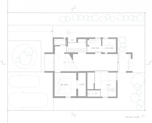
House in Hakusan / Fujiwarramuro Architects

by Javier Gaete

Architects: Fujiwarramuro Architects
Location: Ishikawa, Japan
Project Architects: Shintaro Fujiwara, Yoshio Muro
Area: 110.14 sqm
Photographs: Toshiyuki Yano

By going about their daily lives, humans become attuned to a sense of how much space feels familiar and right – the right size for an entrance, a children’s room, a bedroom, and so on. Although this optimal size may vary according to the individual, a sensible range of these dimensions typically already exists in our mind. A “standard” size for any given project is therefore already set. Forgetting about this sensation of the “right” size for a moment, however, offers us a way of making adjustments to this rigid, entrenched view.

For instance, gradually increasing what is commonly thought of as a standard size for an entrance will yield what is called a doma (Japanese earthen floor and threshold). New uses for this part of the house will proliferate, thanks to the links between the doma and the living room, or uses for the entrance that go beyond its original purpose. On the contrary, if the size of this entrance decreases, it may disappear altogether and give rise to different configurations. Our client for this project was interested in a split-level home, and wanted a house where the family would be able to circulate through the space in three dimensions, as it were.

The client had other requests regarding airflow throughout the site, and was concerned about excessive heat from sun exposure at the front of the site, which faces west. While thinking about various issues that had to be addressed, however, we came up with the idea of having a wide staircase situated at the center of the house. Why not have a wide, generous staircase without having any particular practical reason for it? What if we tried to think of a staircase as something that was not just a passageway for moving up and down?

This huge staircase would run through the entire height of the house from top to bottom, piercing through the building in the same direction as the airflow. When the windows are opened, a pleasant wind blows through the house. Even at the height of summer, the inhabitants can enjoy a comfortable environment by sitting on the staircase. At the top of the staircase is an inbuilt table that seems to be joined directly to the stairs, where the inhabitants can enjoy their meals while sitting on part of the staircase.

The rooms on the second floor are configured so that they enclose the area surrounding the staircase. These rooms mainly house the beds for the owner’s three children, and long desks for studying. The first floor includes a bedroom and tatami (straw-matted) room, which is used as a private space. There is also a doma that makes use of the area underneath the staircase where bicycles and a motorbike can be stored, and a bathroom that connects to the doma.

After having lived in this house for some time, the client remarked, “there are times when we just hang out on the staircase. Looking down from the staircase when the front windows are open gives us a nice view of the garden.” Although we restricted the size of the front windows in order to provide some respite from the western sun, opening these windows allows sunlight to reflect off the lower portion of the staircase, providing illumination from the bottom up. Although planning a building typically involves making decisions about various things, we felt that there are also important elements that can add variety to different lifestyles in places that are more or less unplanned, or places without a self-evident purpose or objective.

House in Hakusan / Fujiwarramuro Architects © Toshiyuki Yano House in Hakusan / Fujiwarramuro Architects © Toshiyuki Yano House in Hakusan / Fujiwarramuro Architects © Toshiyuki Yano House in Hakusan / Fujiwarramuro Architects © Toshiyuki Yano House in Hakusan / Fujiwarramuro Architects © Toshiyuki Yano House in Hakusan / Fujiwarramuro Architects © Toshiyuki Yano House in Hakusan / Fujiwarramuro Architects © Toshiyuki Yano House in Hakusan / Fujiwarramuro Architects © Toshiyuki Yano House in Hakusan / Fujiwarramuro Architects © Toshiyuki Yano House in Hakusan / Fujiwarramuro Architects © Toshiyuki Yano House in Hakusan / Fujiwarramuro Architects © Toshiyuki Yano House in Hakusan / Fujiwarramuro Architects First Floor Plan House in Hakusan / Fujiwarramuro Architects Second Floor Plan House in Hakusan / Fujiwarramuro Architects Floor Plan House in Hakusan / Fujiwarramuro Architects Section House in Hakusan / Fujiwarramuro Architects Section

House in Hakusan / Fujiwarramuro Architects originally appeared on ArchDaily, the most visited architecture website on 22 Mar 2013.

send to Twitter | Share on Facebook | What do you think about this?

23 Mar 09:17

World Water Day: 10 Projects that Exemplify Water Conservation

by Karissa Rosenfield

In celebration of World Water Day, we have complied a list of ten environmentally conscious designs that epitomize the importance of water conservation. See what they have to offer, after the break. 

California Academy of Sciences / Renzo Piano Building Workshop

Not only does the undulating, green roof of Renzo Piano’s California Academy of Sciences building prevent 3.6 million gallons of runoff from carrying pollutants into the ecosystem each year (about 98% of all storm water), but it significantly reduces potable water use by using reclaimed city water to flush toilets, installing low-flow fixtures, and recycling sea water to and from the Pacific Ocean for the aquarium systems.

Firma Casa Store / SuperLimão Studio + Campana Brothers

Firma Casa redefines the “gutter”, as it features a living facade of over six thousand seedlings hanging in origami shaped aluminum vases that efficiently filter and drain rainwater from the roof.

Great Barrier House / Crosson Clarke Carnachan Architects

This quaint timber home in the Great Barrier Island of New Zealand comfortably integrates a variety of basic, yet effective sustainable strategies into the design, including the collection and natural heating of rainwater in two large cisterns situated towards the back of the home.

NASA Sustainability Base / William McDonough + Partners and AECOM

This high-performance space station goes beyond LEED® Platinum in its pursuit of Cradle to Cradle® solutions that include the creation of a closed loop system that ensures water that falls on the site will leave at the same rate, volume and cleanliness of predevelopment conditions.

Eco Modern Flats / Modus Studio

This ecologically conscious renovation, known as Arkansas’s first LEED Platinum multifamily residence, proudly displays shared rainwater cisterns between each apartment building of the 96-unit complex.

VanDusen Botanical Garden Visitor Centre / Perkins+Will

Form follows function for this environmentally sensitive visitor center in Vancouver, as the lush undulating roof’s is shaped to maximize rainwater collection. All water is reused in the building, while greywater and blackwater are treated in an on-site facility.

Edgeland House / Bercy Chen Studio

Inspired by the vernacular of the ‘pit house’, this brownfield reclamation project returns the site back to nature with a varitety of sustainable measures including effective rainwater collection and a ‘smart pool’ that is used as an additional thermal mass that plays a role in home’s hydronic system.

Bilbao Arena / ACXT

This ArchDaily Building of the Year award winner sports an indoor cistern that effectively stores rainwater, which retrieves the plant substrate by capillary action and makes irrigation unnecessary.

1315 Peachtree / Perkins+Will

To address the region’s water issues, Perkins + Will’s Atlantic office not only replaced hardscaping with pervious materials but harvests rainwater within a 10,000 gallon cistern, which it is then filtered and treated onsite and used for 100% of their restroom flush fixtures and landscape irrigation. Overflow water is channeled under the plaza where it is filtered before naturally being allowed to recharge our aquifers.

Hotchkiss Biomass Power Plant / Centerbrook Architects and Planners

Almost disappearing into the landscape, this 16,500 square foot structure is topped with a vegetated roof that effectively absorbs and filters rainwater runoff.

Click on the images for more information about each project.

World Water Day: 10 Projects that Exemplify Water Conservation originally appeared on ArchDaily, the most visited architecture website on 22 Mar 2013.

send to Twitter | Share on Facebook | What do you think about this?

23 Mar 09:15

The Blue Planet / 3XN

by Fabian Cifuentes

Architects: 3XN
Location: Cheshire, England
Architect In Charge: 3XN
Area: 10,000 sqm
Year: 2013
Photographs: Adam Mõrk

Consulting Engineers: Moe & Brødsgaard
Landscape: HJ Landskab
Exhibition: Kvorning design & kommunikation

The Blue Planet is Europe’s largest and most significant aquarium with an outstanding location on the shores of Øresund, only eight kilometres from the Copenhagen City Hall Square. Moreover, the aquarium in Taarnby Municipality is ideally located with motorways, Copenhagen Airport, the Øresund Bridge, Metro and international trains within few hundred meters.

The Blue Planet will be one of Denmark’s five most prominent tourist attractions. At the tourism conference “A New Way to Grow” 2012, the Blue Planet was chosen as Denmark’s best lighthouse project within experience economy, because of its potential for growth, influence on regional development, innovation, realization as well as its uniqueness and ‘reason to go’.

The History behind Denmark’s Aquarium

Denmark’s Aquarium was founded by civil engineer and contractor Knud Højgaard. It opened for the public in 1939 just four months before the break out of World War II and seven months before the occupation of Denmark. The consequence was closed borders and considerable problems in getting hold of exotic animals to the aquarium. However, through an impressive effort with Danish and home reared fish the aquarium was kept open and active. After the war, the aquarium was in a bad shape, and Knud Højgaard initiated extensive renovations. During the next decades the building went through several modernizations and enlargements.

For more than 73 years the original building in Charlottenlund was the setting for enjoyment and education for all ages. For the last years, however, the establishment was run down and a continuous demand for expansions and high end technologies was the order of the day.

Preparations for The Blue Planet

Already in the mid-90s, Jesper Horsted, curator of Denmark’s Aquarium, outlined the first ideas on how a totally new and modern aquarium should be designed. The old building needed a total renovation which would be costly without even providing guests with a significant better experience. A much needed enlargement was neither possible at the site nor economically feasible with regard to the overall improvement of the attraction of the aquarium.

What was needed was a new location and new framings to give coming generations of visitors new and outstanding adventures. Inspired by visits to the world’s most exciting aquariums and spiced up with ideas of his own, Jesper Horsted formulated his wishes for the design of a totally new Danish Aquarium. Principles which were later to become the fundament for the international competition of The Blue Planet.

Now, Denmark’s Aquarium is again at the international forefront with world class architecture, thousands of animals from all over the world and advanced presentation technologies.

The Blue Planet / 3XN © Adam Mõrk The Blue Planet / 3XN © Adam Mõrk The Blue Planet / 3XN © Adam Mõrk The Blue Planet / 3XN © Adam Mõrk The Blue Planet / 3XN © Adam Mõrk The Blue Planet / 3XN © Adam Mõrk The Blue Planet / 3XN © Adam Mõrk The Blue Planet / 3XN © Adam Mõrk The Blue Planet / 3XN © Adam Mõrk The Blue Planet / 3XN © Adam Mõrk The Blue Planet / 3XN © Adam Mõrk The Blue Planet / 3XN © Adam Mõrk The Blue Planet / 3XN © Adam Mõrk The Blue Planet / 3XN © Adam Mõrk The Blue Planet / 3XN © Adam Mõrk The Blue Planet / 3XN © Adam Mõrk The Blue Planet / 3XN © Adam Mõrk The Blue Planet / 3XN © Adam Mõrk The Blue Planet / 3XN South Elevation The Blue Planet / 3XN West Elevation The Blue Planet / 3XN Site Plan The Blue Planet / 3XN Diagram The Blue Planet / 3XN Diagram The Blue Planet / 3XN Diagram The Blue Planet / 3XN Detail The Blue Planet / 3XN Diagram The Blue Planet / 3XN Diagram The Blue Planet / 3XN Diagram

The Blue Planet / 3XN originally appeared on ArchDaily, the most visited architecture website on 22 Mar 2013.

send to Twitter | Share on Facebook | What do you think about this?

23 Mar 09:10

Avoid Amputating People in Your Photos with This Cropping Cheat Sheet

by Melanie Pinola
Click here to read Avoid Amputating People in Your Photos with This Cropping Cheat Sheet Cropping photos of people can be tricky. There are so many places on the human body you can cut off! This photography cropping illustration from Digital Camera World shows you the best—and worst—areas to crop a subject so you can avoid creating awkward people photos. More »


23 Mar 09:09

moorbay: Lenticular clouds over Mount Fuji, Japan. These are...


moorbay:

Lenticular clouds over Mount Fuji, Japan. These are stationary lens-shaped clouds that form at high altitudes, usually perpendicular to the direction of the wind.

http://moorbay.tumblr.com

23 Mar 06:15

Comic for March 23, 2013

22 Mar 03:35

Japan Part 1 – Osaka, Kobe and Kyoto

by Editor
Arriving in Osaka was a very odd experience for me. I had never been to Japan before in my life, however for some strange reason I was hit with a strong and persistent sense of nostalgia. From the moment I stepped off the plane, for the next 24 hours or so I felt like I [...]
22 Mar 03:35

Japan Part 2 – Tokyo, Kanagawa and Hakone

by Editor
I arrived in Tokyo via bullet train, or Shinkansen, from Kyoto. I had toyed with the idea of taking a more budget-oriented approach towards getting here but I’m glad I didn’t. Seeing the countryside whizzing by me at 170 miles per hour inside my whisper-quiet cabin was an experience in itself, not to mention all [...]
22 Mar 03:34

More Tips on Learning Art-Theory Based Retouching

by noreply@blogger.com (Photoshop®)
I've been getting lot's of questions about my retouching "style" ever since I started contributing to Ronald Tan's really interesting "Let's talk Carving" thread on the model mayhem forums, and for some reason I really got into the zone when I was answering this one guys email and wrote a detailed response which I've since added pictures and additional content to. 
- - - 
Natalia's DVD is the best instruction to buy, so definitely do that. She'll teach you everything you need to know about using the actual program as well as generous helping of art theory (almost more important). 

The kind of retouching that I posted in the carving thread is heavy on art theory, so you really need to take up painting/drawing as well as studying composition and color theory quite heavily to be able to do it at that level. I now feel like a douche. When I'm talking about drawing/painting that's essentially inventing form from your imagination using your knowledge of form, the behavior of light, and the rules of perspective. You should be aiming to draw like this (not mine, and I should probably mention that none of the reference drawings in this post are mine):


Good luck, and if you do decide to start painting/drawing expect that your drawings will be really ugly for quite a while. So many people try drawing and then quit because they think they "just aren't talented." The truth is that the mental skills that drawing/painting require aren't really used by humans for anything other than drawing/painting/(photography a little bit) so it takes time to develop them. The people you think are naturally good at drawing either spent a long time practicing, probably because someone told them they're "talented" which made them enjoy it more, or they memorized how to draw arrangement of lines that fools people into thinking they know how to draw.


Here you can see the difference between someone who has memorized the arrangement of line vs the person who corrected them who has learned how to draw properly by starting with form/perspective, then adding detail

If I had to estimate based on people I've personally come across, 90% of all non-professionals who draw anime/cartoons/comic book figures aren't really drawing as much as they are memorizing other artists' figures (meaning the poses/anatomy/other "hard" stuff) and backgrounds then mixing and matching in their mental database of other memorized artists' work in a way that makes them really believe the work they're showing to their friends and family is their own. I know what you're probably thinking: let's talk statistics! Very well. I'd say 55% have no idea they're just memorizing and then regurgitating arrangements of lines, and then other 35% are blatant art thieves who either trace or copy then imply the work is their own to get money or attention. Is it possible the person reading this post is in that unaware 55% who don't realize they aren't learning to draw at a fraction of the speed they could if they learned what in my opinion (abbreviated to imo as I'll be using it quite a bit) is the right way? Here's a way to test yourself. Draw something you find comfortable drawing. A favorite face, character, cute animal, your house, whatever. Now try to lower the viewpoint by about five feet so you're now looking UP at whatever your subject was. Can you draw it from this new angle? If not, you're probably in the 55% who only memorizes symbolism. That's okay if you are. I once was.


The sooner you admit you're at square one the better. The imo true way to learn involves learning how to see the world in simple shapes, then learn how to apply the theories of perspective to these simple shapes in a way that allows the artist to create the illusion of depth on a 2D surface. From there you study and understand the way light behaves. Once you get that, then it's all about learning how to render different forms, textures, anatomy and all that detail stuff. This is all separate from learning composition and color theory which you should be studying along side the actual "drawing." The composition and color theory is more important to retouching, but this post deals with the part that's harder to master but also important.


To really draw in a sense that you can construct images from imagination without depending on reference takes a very long time and ANYONE unless they have a mental handicap can learn. Intelligent people learn more quickly. You'll need this true sense of drawing skill to retouch in that appealing to look at artistic way, but you can do it if you really want to. The imo best place to start is this guys videos which will teach you how to draw basic forms (cubes, spheres) in space using correct perspective, and how to start thinking with "depth" in mind. [url]http://www.youtube.com/user/moatddtutorials/videos[/url] Start at the beginning!

Check out my relevant post here when I share tons of good online resources for someone who wants to learn to retouch in this art theory heavy retouching style.

Also start drawing stuff you see and try to avoid "symbolizing" as much as possible, meaning drawing what you think it should look like (outlines and other shortcuts). Drawing what you actually see will feel really weird for a while. Concentrate on that actual shapes of the shadows and highlights. If you don't see any detail, don't draw any. Worry about details last. First block in the basic forms and try to get them as accurate as you can, but don't 
spend too long on each piece.


A really good exercise to help you avoid symbolism is to draw outlines around the shadow shapes (but no outlines to describe detail, ONLY places where there is shadow)


Examples of starting with the basic forms then worrying about details last.

See if you can sign up for drawing of life drawing classes/workshops at local community colleges or other private art schools. Browse other art forums and post your work for critique, then take in the constructive advice. Draw for a few hours every day and in a year you'll see a DRAMATIC improvement in both your drawing and retouching. Here are some common beginner mistakes to look out for: 


21 Mar 12:26

Colorful Turn of the Century Japanese Designs

by sprouticus

I know what you're probably wondering...turn of what century? Well these particular designs come from a magazine published in 1901 and 1902 called Shin-bijutsukai.

This magazine was a monthly publication featuring "various designs by the famous artists of to-day," and as you can see, the pages are filled with wonderful colors and trippy patterns. I don't know about you, but after looking at all of the nature elements in these designs, I feel like going for a jaunt in the park.


If you're interested in checking out the entire magazine, you can browse the pages below or visit Archive.org to browse the full size version.

And for good measure, here's a few Japan-inspired palettes from the community. Cheers!

Kami_no_ke  Samurai_Festival_APC

Sea_of_Japan  Japanese_Book_1944

相州七里浜  Lovers_in_Japan_II

Letters_from_Japan  Japanese_Language

Kitsune  Japanese_Bath

Japanese_Music  T_o_k_y_o_B_l_u_e_s

Bijin  Ume_Modern

Japanese_Tea  Z_e_n_W_o_r_l_d

japanese_candy_2  Summer_Turns_To_Fall

21 Mar 12:04

Kate Spade Reinvents Retail As A Lean Startup

by Mark Wilson

Control Group teamed up with Kate Spade to create a radical new store concept that uses iPads for retailing and RFID to track microtrends.

The Kate Spade flagship in Japan serves espresso to encourage customers to chat and linger. And every Saturday, it releases an article of clothing you won’t find anywhere else. The goal is to make the store a weekly excursion for millennials who may otherwise be hooked on Internet shopping.

There’s just one problem: Short-term analog experiences leave a long paper trail. Kate Spade was printing and shipping beautifully embossed signage every week. The expense was massive, and the efficiency was low. In short, it felt like a dated idea.

So the brand enlisted Control Group to bring a bit of digital deftness to their stores. The core of the makeover involves replacing most of the physical signage with iPads, but just adding iPads to a store could be a mess. Here’s how Control Group did it right:

Embracing A Lean Startup Mentality

What you see here--from the frontend graphics to the backend technologies--were created in just eight weeks. And to Control Group, that rapid-prototyping approach is absolutely perfect for Kate Spade’s use case.

“All businesses need to learn, starting with the minimum viable product, getting it into the hands of consumers, seeing how people react to it, and paying attention to what users want is the biggest success of this campaign,” Colin O’Donnell, a partner at Control Group, says. “[The signage is a] great, beautiful product. But for me, it’s amazing to see an organization embrace that lean startup technology."

With a lean startup mentality, Kate Spade doesn’t need to prognosticate the habits of their customer base. They can hypothesize, test that hypothesis, and refine over time.

“If we threw the kitchen sink at it right off the bat, it’d be a very cluttered experience,” O’Donnell adds. “As we add new features, we should look at features we can take away.”

Balancing The iPad’s Familiarity and Depth

The digital signs may be made of iPads, but a look around the store doesn’t actually reveal this branding. The touch screens could just as easily be Android tablets, or one-off monitors. Whereas some may expect Apple products to add a level of tech-savvy appeal to a store, Control Group had good reason for removing the branding--it changed the customer expectation.

“By abstracting the iPad a bit, it takes you out of the consumer experience when you’re going to jump on the web,” O’Donnell explains. “It’s a more focused experience.”

This focused experience means that users won’t expect to load the Kindle app or do those normal iPad activities, so Kate Spade can hone in on a few clear, quick messages--like sizing charts, style videos, and in-store offers. Because the worst thing all these touch screens could do is pull customers away from the clothing, and the experience of real shopping.

“A store can actually be a really hectic environment. We see digital signage to punctuate the noise of the environment, to bring some sanity in a focal point that’s calming, rather than having another point of noise,” O’Donnell says. “We definitely spent a lot of time thinking about how to make it simple, elegant, and deceptively basic, knowing full well if there was a lot of navigation or deep content, people would be distracted and not pay attention to the garments.”

Empowering Analog Analytics

But while saving all those paper signs is nice--and indeed, Kate Spade intends to make up their investment in just two months of avoided printing costs--the greatest advantage of digital isn’t that it saves paper, it’s that cloud-based content is just a more efficient way of tracking and disseminating information.

“This enables opportunities,” O’Donnell says. “Globally, if they want to promote a dress or garment, they can put it on an iPad across all their stores.”

Control Group built more than an iPad app. They constructed a whole, invisible backend CMS, with a workflow that would allow corporate to develop and launch campaigns. The particular brilliance of this setup is that these campaigns can be organized and customized at the store level by local managers. Because each iPad is modular, it can be moved with any display, and managers will have the opportunity to experiment locally while results feed into the greater network.

“They can see sales corresponding with a change. So you can do A/B testing seeing how you drive consumer behavior,” O’Donnell explains. “Using those web analytics in the real world is a super exciting place to be.”

The Digital, Analog Store

In the last cycle of Internet technology, we watched mega online retailers like Zappos disrupt through the web. Now, it seems that we’re in a technological reverberation, in which online consumer expectations are echoing into physical stores. But that’s not necessarily bad news for retailers. If they’re clever, they won’t be burdened with a bunch of new technology to invest in but empowered by a new wave of engagement and analytics formerly relegated to the online sector. That and a good espresso never hurts.


21 Mar 11:25

Menswear Dog Features Photos of Men’s Fashion, Modeled by a Shiba Inu

by Michael Zhang

Menswear Dog Features Photos of Mens Fashion, Modeled by a Shiba Inu dogmenswear 2

Clothing and cute pets are two subjects that have big followings online. Combine them, and you’ve got yourself something viral. Dave Fung and Yena Kim of New York City have brewed up a fun photo project that’s quickly gaining a lot of attention. It’s called Menswear Dog, and is what you might get if you combined The Sartorialist with a dog blog.

Each entry on the Tumblr page features a three-year-old Shiba Inu decked out in stylish outfits for men. Portraits of the dapper dog are always accompanied by photos of (and links) to the individual clothing items worn in the shot.

Menswear Dog Features Photos of Mens Fashion, Modeled by a Shiba Inu dogmenswear 1

Menswear Dog Features Photos of Mens Fashion, Modeled by a Shiba Inu dogmenswear 3

Menswear Dog Features Photos of Mens Fashion, Modeled by a Shiba Inu dogmenswear 4

Menswear Dog Features Photos of Mens Fashion, Modeled by a Shiba Inu dogmenswear 5

Menswear Dog Features Photos of Mens Fashion, Modeled by a Shiba Inu dogmenswear 6

Menswear Dog Features Photos of Mens Fashion, Modeled by a Shiba Inu dogmenswear 7

Menswear Dog Features Photos of Mens Fashion, Modeled by a Shiba Inu dogmenswear 8

Menswear Dog Features Photos of Mens Fashion, Modeled by a Shiba Inu dogmenswear 9

Menswear Dog Features Photos of Mens Fashion, Modeled by a Shiba Inu dogmenswear 10

Menswear Dog Features Photos of Mens Fashion, Modeled by a Shiba Inu dogmenswear 11

Menswear Dog Features Photos of Mens Fashion, Modeled by a Shiba Inu dogmenswear 12

Menswear Dog Features Photos of Mens Fashion, Modeled by a Shiba Inu dogmenswear 13

In addition to following along on the Tumblr site, you can stay up to date with Menswear Dog’s latest ensembles through Twitter and Instagram.

Menswear Dog (via Flavorwire)

Image credits: Photographs by Dave Fung/Yena Kim/Menswear Dog and used with permission

19 Mar 13:01

CMYK: Big idea

by ivan

CMYK is an advertising magazine in Israel.

Advertising Agency: Saatchi & Saatchi, Israel
Copywriter: Oren Meir
Art Director: Kamil Mekhty

19 Mar 12:59

Girls On Wheels