Shared posts

26 Oct 02:33

Photographer captures the beauty of Moscow's opulent Metro stations

by Katy Cowan

Beneath the cold and wintry streets of Moscow, lies an opulent underworld of the city's extravagant metro stations, and Canadian creative David Burdeny is believed to be the first photographer ever to be allowed to shoot them after-hours, when passengers have long gone home.

Dating back to 1935, The Moscow and St. Petersburg Metro was one of the USSR’s most extravagant architectural projects. Under Stalin's direction, the architects were directed to introduce the concept of "svet" – light – and "sveltloe budushchee" – a bright future. With their polished marble walls, high vaulted ceilings and ornate chandeliers, the Metro stations have been likened to an “artificial underground sun”. This underground paradise was to remind its riders that Stalin and his party had delivered something substantial to the people in return for their sacrifices.

Burdeny has themed the series around this notion showcasing his photographs of 20 of the metro stations along with various Russian museums, palaces and theatre interiors. Entitled Russia: A Bright Future, his photographs are on display at the Jennifer Kostuik gallery in Vancouver until 8th November 2015.

23 Oct 23:37

Brasiliana: Wood Tile That Explores Periods of Brazilian History

by Caroline Williamson

Brasiliana: Wood Tile That Explores Periods of Brazilian History

Surface designer Renata Rubim partnered with Oca Brasil on a series of wooden tiles that aim to revisit distinct periods of Brazilian design history: Tribal, Modernist, and Colonial. The Brasiliana collection tiles come in the traditional Portuguese tile size, measuring 20x20cm (7.87×7.87 inches), and are made of eucalipt or Valchromat in various color ways, each with their own personality.

Tribal

Tribal

The Tribal tiles, with their geometric, ethic feel, represent the time before Portuguese colonization when indigenous tribes where prevalent. Comes in three patterns.

Tribal

Tribal

Tribal

Tribal

Tribal

Tribal

Tribal

Tribal

Modernist

Modernist

The Modernist tiles boast abstract patterns that were inspired by the work of Burle Marx (Brazilian landscape architect), perfectly reflecting the Modernist movement.

Modernist

Modernist

Modernist

Modernist

Colonial

Colonial

The Colonial line looks at a time when the Portuguese influence set the tone for society. The collection is full of geometric and organic shapes made famous on traditional Portuguese tiles.

Colonial

Colonial

Colonial

Colonial

Colonial

Colonial

Colonial

Colonial


23 Oct 02:37

Alexandre Dubosc’s Newest Animated Zoetrope Cake, ‘Melting Pop’

by Christopher Jobson

French director and animator Alexandre Dubosc (previously) returns with his latest quirky confection, a towering animated zoetrope cake called Melting POP. This really defies any meaningful description, so just give it a watch and smile. And if you liked this, there’s quite a few more.

cake-1

cake-2

cake-3

cake-4

23 Oct 02:34

Knit Wool Meals and Edibles by Jessica Dance Look Good Enough to Eat

by Christopher Jobson

dance-1
Photo by David Sykes

Art director and prop stylist Jessica Dance (previously) has collaborated again with food photographer David Sykes to bring us another tasty spread of knit dishes and other edibles. Dance makes all of the objects at home using 100% lambswool on a domestic knitting machine. All of the shots here (except the cheese spread) were for the comfort food issue of the latest edition of Stylist.

dance-3
Photo by David Sykes

dance-2
Photo by David Sykes

dance-5
Photo by David Sykes

dance-6
Photo by David Sykes

dance-4
Photo by David Sykes

dance-7
Photo by David Sykes

23 Oct 02:09

An Unassuming Facade Hides a Large, Modern House in Mexico City

by Caroline Williamson
Jimena Azpeitia

me la compras?

An Unassuming Facade Hides a Large, Modern House in Mexico City

Hidden behind this unassuming facade is U House, designed by Materia Arquitectónica, a 590 square meter (6350 square feet) residence located in the suburbs of Mexico City on a steep lot. The challenge was to create a design that worked with the hills, which led to the simple front exterior that opens up to a much larger house behind the front door.

Casa_U_Materia_Arquitectonica_2

The entrance of the house begins on the top floor with the private and social areas built below. Once you enter, you’re led to a bridge that extends from the street through to the back of the house creating a balcony that overlooks the outdoor space below.

Casa_U_Materia_Arquitectonica_3

The concrete garage sits to the right of the bridge giving the residents easy access when coming or going.

Casa_U_Materia_Arquitectonica_4

Casa_U_Materia_Arquitectonica_5

The bridge carries visitors to the staircase that connects the levels of the home. The glass panels on two sides provide light for the interior.

Casa_U_Materia_Arquitectonica_6

Each landing showcases framed views of the outside world. The stair treads intentionally change in order to slow the person down to make them become more conscious as they move between floors.

Casa_U_Materia_Arquitectonica_7

The bedrooms reside on the level below the garage and entry, with the living and dining areas below that. On the partially underground floor, there’s a playroom and access to the yard.

Casa_U_Materia_Arquitectonica_8

Casa_U_Materia_Arquitectonica_9

Casa_U_Materia_Arquitectonica_10

Casa_U_Materia_Arquitectonica_11

Casa_U_Materia_Arquitectonica_12

Casa_U_Materia_Arquitectonica_13

Casa_U_Materia_Arquitectonica_14

Casa_U_Materia_Arquitectonica_15

Casa_U_Materia_Arquitectonica_16

Casa_U_Materia_Arquitectonica_17

Casa_U_Materia_Arquitectonica_18

Casa_U_Materia_Arquitectonica_19

Casa_U_Materia_Arquitectonica_20

Photos by Onnis Luque.


23 Oct 02:07

Yves Béhar Designs New Watch Collection for Movado

by Jaime Derringer

Yves Béhar Designs New Watch Collection for Movado

We pretty much all know the name Movado and can typically recognize a Movado watch by its iconic 12-o’clock circle with numberless dial, or the “Museum Dial”, which was designed by artist Nathan George Horwitt in 1947. We were very excited to hear that Yves Béhar of fuseproject is expanding this collection with the new Movado Edge.

Yves-Behar-Movado-Black-On-Black-Band

This new design plays with texture and space, featuring a more pronounced face and sculptural ridges that subtly mark the minutes. The collection includes men’s, women’s and chronograph models on stainless steel link bracelets and black leather or rubber straps.

Yves-Behar-Movado-Rose-Gold

Yves-Behar-Movado-Black-Chrono-Band

Yves-Behar-movado_process-shots


21 Oct 18:50

Furniture Inspired by the Memphis Movement

by Caroline Williamson

Furniture Inspired by the Memphis Movement

Benjamin Ashton designed a pair of functional furniture pieces and then took them for a Memphis spin. Bleached Memphis sees what might look like a console and a desk, but Ashton specifically leaves their use up to you. Playing up the Memphis movement and modernist architecture, the objects playfully display alluring colors and eye-catching cutouts in hopes of adding a bit of happiness to your day.

Bleached-Memphis-Benjamin-Ashton-2-cabinet

Bleached-Memphis-Benjamin-Ashton-3

Bleached-Memphis-Benjamin-Ashton-4

Bleached-Memphis-Benjamin-Ashton-5-desk

Bleached-Memphis-Benjamin-Ashton-6

Bleached-Memphis-Benjamin-Ashton-7


21 Oct 00:41

Anila Quayyum Agha’s ‘Intersections’ Sculpture Installed at Rice Gallery

by Christopher Jobson

Pakistani-American artist Anila Quayyum Agha has installed her impressive shadow sculpture Intersections at Rice Gallery. Inspired in part by her interpretation of patterns and images found in Islamic temples, the laser-cut 6.5′ square wood cube is illuminated from the inside by a blinding 600-watt light bulb that casts a dizzying shadow throughout the gallery. The piece becomes experiential as viewers who move through the space have the shadows cast on their bodies, incorporating themselves into the artwork. From Rice Gallery:

Intersections is inspired by Agha’s visit to the Alhambra, an Islamic palace originally built in 889 in Granada, Spain. Struck by the grandeur of the space, Agha reflected upon her childhood in Lahore, Pakistan where culture dictated that women were excluded from the mosque, a place of creativity and community, and instead prayed at home. As she explains, “To my amazement [I] discovered the complex expressions of both wonder and exclusion that have been my experience while growing up.” Agha translates these contradictory feelings into Intersections, a contemplative space of her own making that is open to all.

While we’ve shared photos of this piece before, Angela and Mark Walley of Walley Films were invited to do this insightful profile of Agha and her ArtPrize-winning installation, providing a deeper and immersive treatment than images alone. Intersections will be on view at Rice Gallery through December 6, 2015.

rice-1
Photo by Nash Baker

rice-2
Photo by Nash Baker

rice-3
Photo by Nash Baker

28 Sep 06:05

Lamps Made From Discarded Espresso Machine Boilers

by Caroline Williamson

Lamps Made From Discarded Espresso Machine Boilers

For a research project, Willem Heeffer explored possible uses of materials tossed by factories in Helsinki, Finland. The results led to a new project entitled, The City as a Mine, that aims to reuse local trash and turn it into interior objects. First up is the Boiler Lamp collection, which takes discarded boilers from espresso machines and turns them into lamps.

Willem-Heeffer-Boiler-Lamp-collection-2

Each of the copper boiler pieces were used for 10 years by the Paulig coffee factory before being disposed of and turned into lamps, which come tagged with the name and serial number of the machine they were in. Paulig loved them so much, they purchased the lamps back.

Willem-Heeffer-Boiler-Lamp-collection-2a

The exteriors feature a matte powder coated finish, while the interiors contrast with a shimmering beat bladed finish. The asymmetrical holes emit random rays of light.

Willem-Heeffer-Boiler-Lamp-collection-2b

Willem-Heeffer-Boiler-Lamp-collection-3

Willem-Heeffer-Boiler-Lamp-collection-4

Willem-Heeffer-Boiler-Lamp-collection-5

Willem-Heeffer-Boiler-Lamp-collection-5a

Willem-Heeffer-Boiler-Lamp-collection-6

Willem-Heeffer-Boiler-Lamp-collection-7

Willem-Heeffer-Boiler-Lamp-collection-8

Willem-Heeffer-Boiler-Lamp-collection-9

Willem-Heeffer-Boiler-Lamp-collection-10


28 Sep 06:03

Etsy Pick of the Day | El Granero Typewriters

by Jan Halvarson
http://www.awin1.com/cread.php?awinmid=6073&awinaffid=220879&clickref=https%3A%2F%2Fwww.etsy.com%2Flisting%2F203423639%2Fpink-olympia-monica-sm9-vintage-working%3Fref%3Dshop_home_active_6&p=
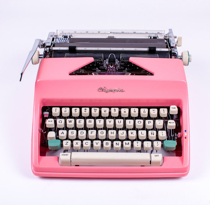
How can we resist?  A pink Olympia.  Refurbished (by an experienced former Olivetti technician we might add).  And those turquoise shift keys.  Sigh.  All from El Granero out of Spain.
Copyright 2005 - 2013 Poppytalk. All Rights Reserved poppytalk.blogspot.ca
28 Sep 05:30

Yo! Terrazzo!

by skinnylaminx

halleluja

A couple of times a week, I walk past the gorgeous exterior of Hallelujah Cafe on Kloof Nek Rd, and always glance admiringly at their colourful terrazzo exterior. Over the weekend, I also happened to stumble upon the ‘soft’ opening of brand new burger joint Junior , right across the road from Hallelujah and also, as it happens, kitted out in terrazzo. It’s so new I don’t even have pics! You’ll have to see for yourself.

All this terrazzo making an appearance in the epicentre of Cape Town’s trendsetting district has caused me detect the whiff of a trend in the air, and so off I went to sniff it out.


First stop: Wes Anderson’s Bar Luce in Milan, which opened earlier this year, with its pink terrazzo floor. So gorgeous!

Wes agrees: terrazzo is hot, hot, hot!

Bar-Luce-Framboisejam

Photo: @framboisejam on instagram

Max-Lamb-Marmoreal

Last year, British product designer Max Lamb launched his resin-cast terrazzo product Marmoreal, which uses four different kinds of marble, and can be used in architectural projects. Read more about it here, and look at some of the very varied uses to which Marmoreal has been put:

petitepassport

kitsune_spfdcu700-mup_1090214-max-lamb16

Marmoreal cheese board1. Maison Kitsuné store in Paris. Photo: @petitepassport on instagram. More pics here.

2.  As part of their store launch, Maison Kitsuné launched a Marmoreal capsule collection too.

3. Bathroom tiles, via Opening Ceremony 

4. Marmoreal cheese board at Makers & Brothers

Marmoreal has definitely been a hit, but does that mean its a trend? Here’s a little more evidence I dug up:

Bentu-terrazzo-lamps

LED hanging lights by BENTU

Valentino_Flagship_Store_by_David_Chipperfield_dezeen_784_13

Valentino flagship store in NYC by David Chipperfield from 2014. Via Dezeen.

TP-Milan-2014-06-500x600

The Terrazzo Project by Swiss product designers Stéphane Halmaï-Voisard and Philippe-Albert Lefebvre


So, the question is: does a high-end new architectural material, a couple of terrazzo-kitted Cape Town restaurants,  and a sweatshirt a trend make? The Wes Anderson bar design hits the Bingo bell for me, but let’s all keep an eye out for more evidence, and enjoy some terrazzo from the history books in the meantime.

Sunnyview-Wexler-house

Classic terrazzo floor in the Sunnyview Wexler House. Photo: @EvaGoicochea on Instagram 


Shiro Kuramata Memphis

Shiro Kuramata joined Ettore Sottsass’s Memphis collective in the ’80s, and this is his signature terrazzo surface, made into the Kyoto Table.

Nohostar-floor

The epic floor of the NoHo Star Cafe in NYC. Photos: Jayne Design Studios


28 Sep 05:26

Vertical Panoramic Photographs of New York Churches by Richard Silver

by Kate Sierzputowski

Church-of-St-Vincent-Ferrer
Church of St. Vincent Ferrer

Richard Silver (previously) has a unique way of looking at architecture, building composite photographs from several images that seamlessly reveal a structure’s interior. His new series captures the insides of New York churches, and are perfectly timed for the Pope’s impending arrival on U.S. soil. These images are composed of 6-10 shots, forming a vertical panorama so cohesive that it might give you vertigo.

Although Silver has been to hundreds of churches during his career and many years of travel, it’s only recently that he figured out how to capture the expansive inner beauty of their architecture. “Finding the perfect location in the center aisle then shooting vertically from the pew to the back of the church gives the perspective that only architecture of this style can portray,” says Silver.

church-2
Church of St. Stephen / Church of St. Paul the Apostle

Silver was born and raised in New York and has visited 75 countries in his life, including 13 last year alone. His previous careers involved computer science, real estate, and a stint on Wall Street, but he embraced photography full-time in 2011. You can see more of his vertical church series on his Flickr page here.

Calvary-Episcopal-Church
Calvary Episcopal Church

church-4
Serbian Orthodox Cathedral of St. Sava / Church of the Village

Church-of-St.-Francis-Xavier
Church of St. Francis Xavier

church-6
Vincent St. de Paul / Most Holy Redeemer Church

St-Monica's-Church
St. Monica’s Church

28 Sep 05:25

Artist hand-cuts paper to create hyperrealistic portraits of famous icons

by Katy Cowan

Korean artist Yoo Hyun has quite a simple tool kit to create her stunning hyperrealistic portraits of famous icons. Taking sheets of clean white paper, she uses an X-Acto knife and tweezers to hand-cut the material and deliver a range of stunning portraits of everyone from Audrey Hepburn and Michael Jackson to Frida Kahlo and Picasso – all on a painted black background, to allow the strips of paper to really pop. Up close, her artworks look abstract; step further and further away and the icon reveals itself in all its hand-cut glory.

As you can imagine, this practice requires skill, patience and dedication – along with a very steady hand – to be able to perfectly capture each character. If you want to discover more of her work, you can follow her on Instagram or like her on Facebook.

28 Sep 05:23

Designer creates series of geometric stamps inspired by the alphabet

by Katy Cowan

German graphic design student Fabian Fohrer certainly has a successful career ahead of him, after creating this appealing series of stamps inspired by letters, with each one based on geometric shapes.

Speaking of his process, he explained: "I separated these shapes, duplicated, scaled and cut them to create unique compositions. For instance, the first stamp consists of triangles and horizontal lines, taken from the letter A."

You can discover more of Fohrer's work over on Behance.

23 Sep 03:02

London Design Festival installation that skews a sense of perspective

by Becci Sharpe

This week the London Design Festival is taking place all over the capital, spreading creativity across the industry and bringing design to the masses. One of the best places to experience this festival of design innovation and inspiration is at the V&A.

There you will find Laetitia de Allegri and Matteo Fogale's stunning installation, 'mise-en-abyme', located on the bridge over the Medieval and Renaissance galleries. Launched at the weekend and running throughout the festival, their work is inspired by the V&A itself and ties together themes from the surrounding displays.

The piece was produced using bespoke floor tiling from Johnson Tiles, teamed with huge transparent acrylic shapes that visitors walk through. In a behind the scenes interview the designers, Laetitia explained:

"What we wanted from the start was to create an experiment. Something that was not just a piece of design to look at but also an experience. We hope walking through it will teach about the effects of perspective, and that it will represent a multi-coloured radical effect that people can really feel and hopefully enjoy.

“We were designing for this special area of the V&A so we wanted to take inspiration from the museum itself. We really like to go and visit for inspiration anyway and so we started looking around at the space that we had been allocated. In the Renaissance space below we have large-scale works displayed in the context of cityscapes, where the light comes through great tinted glass walls. These were our starting points. We decided to create something dreamy, surreal and with floating feelings that would work with the glass materials on display next to it. We’ve tried to match our work to what’s around the exhibition.”

Matteo added, "Obviously we had a lot of restrictions, working within the proportions of the bridge. You can’t block the way – there are health and safety issues and it must be wheelchair friendly. It’s such an old building – you’re aware of how you need to be very careful and can’t risk anything. You can’t hang or support anything to the bridge; you have weight issues to think about. So everything was taken into consideration from the starting point."

See 'mise-en-abyme' at the V&A as part of the London Design Festival (19 - 27th September).

18 Sep 01:49

3-Ingredient Mocha Milkshake

by Dana Shultz

3 Ingredient VEGAN MOCHA SHAKE! #vegan #glutenfree #recipe #coffee #coconut #chocolate #dessert #minimalistbaker #recipe

Remember that coconut ice cream we made?

Yeah, you’re gonna need that. It’s coffee chocolate milkshake time (as promised).

3 Ingredient VEGAN MOCHA SHAKE! Coconut ice cream, bold coffee, and cocoa powder make this creamy, dreamy shake! #coffee #coconut #dessert #icecream #vegan #glutenfree #recipe

This mocha milkshake is inspired by one of my favorite childhood desserts – Arby’s Jamocha milkshake.

I know – shame, shame. But I was a bit of a junk food addict growing up – true story.

3 Ingredient VEGAN MOCHA SHAKE! #vegan #glutenfree #recipe #coffee #coconut #chocolate #dessert #recipe #minimalistbaker

If you’ve never had a Jamocha shake, imagine vanilla ice cream blended with chocolate syrup and coffee. My version is a bit healthier than the original with no added sugar, thanks to cocoa powder, plus it’s vegan-friendly.

It also requires just 5 minutes and 3 basic ingredients once you’ve made (or bought) your coconut ice cream.

3 Ingredient VEGAN MOCHA SHAKE! #vegan #glutenfree #recipe #coffee #coconut #chocolate #recipe #dessert

This shake is beyond dreamy. It’s:

Creamy
Chocolate-y
Coffee-infused
Coconutty
& Perfectly sweet

This makes the perfect dessert when you’re wanting something creamy and cold, or when a serious coffee craving strikes (i.e. every minute of the day).

If you give this recipe a try, let us know what you think! Leave a comment and rate it, and tag a photo #minimalistbaker on Instagram! We love seeing what you come up with. Cheers!

3 Ingredient VEGAN MOCHA SHAKE! Coconut ice cream, bold coffee, and cocoa powder make this creamy, dreamy shake! #coffee #coconut #dessert #icecream #vegan #recipe

4.4 from 7 reviews
Vegan Chocolate Coffee Shake
 
Prep time
Total time
 
Amazing 3-ingredient coconut mocha shake! Made with vanilla bean coconut ice cream, cocoa powder and strong brewed coffee. Creamy, caffeinated and perfectly sweet.
Author: Minimalist Baker
Recipe type: Dessert, Beverage
Cuisine: Vegan
Serves: 2
Ingredients
Instructions
  1. Add ice cream, cocoa powder (starting with 1 Tbsp), and coffee (starting with 1/2 cup) to a blender and blend until creamy and smooth. Add more coffee or almond milk (optional) if it has trouble blending.
  2. Taste and adjust ingredients as needed, adding more cocoa powder for more chocolate flavor, coffee for more coffee flavor, or almond milk for creaminess (optional).
  3. Divide between 2 serving glasses and top with Coconut Whipped Cream (optional) or Vegan Magic Shell (optional).
Notes
*Recipe inspired by Arby's Jamocha Shake.
*Nutrition information is a rough estimate for one of two shakes without toppings.
Nutrition Information
Serving size: 1 shake (of 2) Calories: 307 Fat: 18.4 g Saturated fat: 16.2 g Carbohydrates: 41.5 g Sugar: 24.1 g Sodium: 12 mg Fiber: 12.8 g Protein: 2.6 g
3.3.3077

CREAMY 3 Ingredient VEGAN MOCHA SHAKE! #vegan #glutenfree #recipe #coffee #coconut #chocolate #dessert #recipe
16 Sep 22:37

Jagged Wood Fragments Find New Purpose When Fused with Resin by Jeweler Britta Boeckmann

by Christopher Jobson

resin-1

Melbourne-based designer and jeweler Britta Boeckmann has a way of seeing the perfect in the imperfect, a skill she uses to form a hugely diverse array of wearable objects from fused wood and resin. Each pendant, ring, or pair of earrings is made one at a time by hand without the aid of template, a process that allows the pieces to evolve organically as she works.

After graduating in 2013 with an industrial design degree, Boeckmann moved from Germany to Melbourne (by way of London) where she joined the Wangaratta Woodworkers studio. Working three times a week she quickly perfected her jewelry fabrication techniques and soon found a market for her wares. Boeckmann now has her own studio and sells her pieces online under the brand “BoldB” on Etsy. You can see an archive of her design on her website. (via So Super Awesome)

resin-9

resin-2

resin-8

resin-3

resin-4

resin-5

resin-7

resin-6

16 Sep 19:44

20 Free Editable CV/Resume Templates for PS & AI

by Chris Spooner

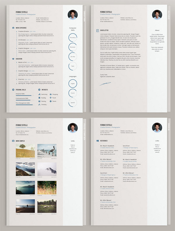
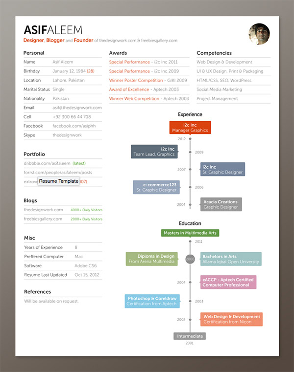
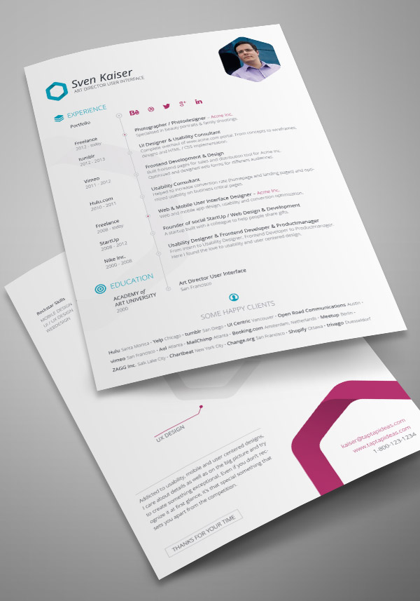
Do you need a CV/Resume for a job application fast? This roundup of ready made, editable templates for Photoshop and Illustrator will help you quickly create a stylish overview of your skills and background to send off to prospective employers as a print or digital PDF file. Alternatively, use these clean designs as inspiration for your own layout that’s uniquely branded to yourself. All these templates use standard A4 and/or Letter paper sizes with freely available fonts to ensure they’re completely usable in the real world.

Free Minimalistic & Clean Resume

Free Minimalistic & Clean Resume

Minimal CV Template by Theme Raid

Minimal CV Template by Theme Raid

Free Resume Template by Fay Zodiac

Free Resume Template by Fay Zodiac

Free Resume + Cover Letter by Demorfoza

Free Resume + Cover Letter by Demorfoza

Free Resume Template by Vivien Bocquelet

Free Resume Template by Vivien Bocquelet

Free PSD CV/Resume Template by PSDboom

Free PSD CV/Resume Template by PSDboom

Resume Template by Freebies Gallery

Resume Template by Freebies Gallery

Free Resume Template by Vivien Bocquelet

Free Resume Template by Vivien Bocquelet

Free Resume Template by Fernando Báez

Free Resume Template by Fernando Báez

Free Vita / Resume / CV InDesign Template by TapTapIdeas

Free Vita / Resume / CV InDesign Template by TapTapIdeas

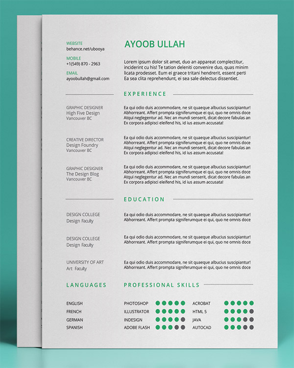
Free Resume Template by Ayoob Ullah

Free Resume Template by Ayoob Ullah

Resume Freebie by Mahmud Saeef

Resume Freebie by Mahmud Saeef

Freebie Multi-Page Resume by Unique Graph

Freebie Multi-Page Resume by Unique Graph

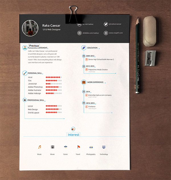
Resume / CV Template Free Download by Raka Caesar

Resume / CV Template Free Download by Raka Caesar

Free Simple Resume by Dean Harrison

Free Simple Resume by Dean Harrison

Free Resume Template by Jahangir Alam Jisan

Free Resume Template by Jahangir Alam Jisan

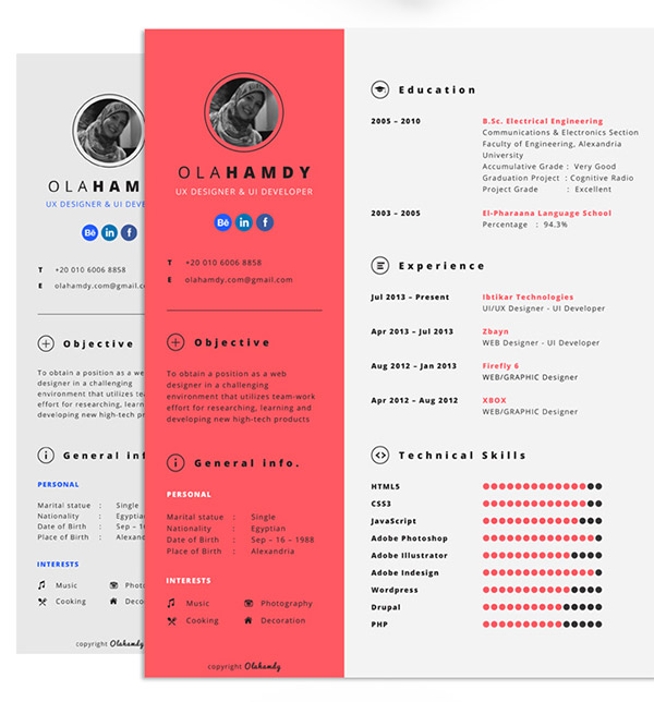
Free Clean Interactive Resume by Ola Hamdy

Free Clean Interactive Resume by Ola Hamdy

Ultra Minimal Resume by Saptarshi Nath

Ultra Minimal Resume by Saptarshi Nath

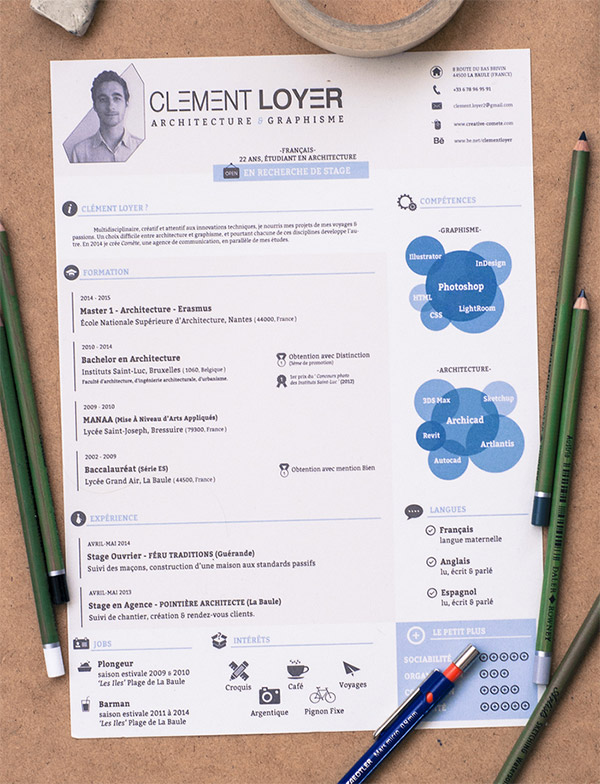
2015 Resume Template by Clément Loyer

2015 Resume Template by Clément Loyer

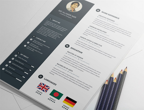
Free Resume Template by Alamin Mir

Free Resume Template by Alamin Mir

The post 20 Free Editable CV/Resume Templates for PS & AI appeared first on Blog.SpoonGraphics.

16 Sep 19:36

The Butler

by Katie

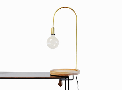
Say hello to the Butler, a curved brass lamp with a hand turned oak tray. Clamp it on to a tabletop or shelf for an ideal spot to keep necessities- perhaps your keys, wallet or phone? It always helps to have just one area for important things; set it down in the same place every time and it’ll be there when you go to get it (if you don’t live with anyone else).

Ack! Bad news, it can’t be shipped to the U.S., so best ask a jet setter friend to bring it back for you on their next trip.

A 2m cable and three prong plug.
Bulbs not included.

The Butler Light

15 Sep 17:48

Textile Art by Elizabeth Pawle

by Jaime Derringer

Textile Art by Elizabeth Pawle

I discovered UK-based Elizabeth Pawle’s creative stitchings on Instagram and was immediately hooked on her use of bright colors and unique textures. Using wool, cotton, silk and acrylic stitched in abstract patterns onto natural hessian, she creates a kind of anti-sampler. I love how every time you look at one of them, you discover something new.

elizabeth-pawle-stitching-1

elizabeth-pawle-stitching-1-detail

elizabeth-pawle-stitching-2-detail

elizabeth-pawle-stitching-3

elizabeth-pawle-stitching-4


14 Sep 00:18

A Clutch that’s Made Entirely by 3D Printing

by Caroline Williamson

A Clutch that’s Made Entirely by 3D Printing

Italian accessory company Maison 203 will present a small, 3D printed clutch, designed by Odo Fioravanti, at this year’s Maison et Objet. Armure is the first clutch for the brand and it’s entirely made by 3D printing. The design was inspired by the armor-like fruit that’s produced by a cypress tree.

Maison-203-Armure-clutch-Odo-Fioravanti-2

The organic shapes cover the entire exterior creating a uniform look. The clutch’s lock is hidden underneath the floating shapes that hover over an inner volume.

Maison-203-Armure-clutch-Odo-Fioravanti-3

Armure will be available in black, nude, bordeaux, and night blue.

Maison-203-Armure-clutch-Odo-Fioravanti-4

Maison-203-Armure-clutch-Odo-Fioravanti-5

Maison-203-Armure-clutch-Odo-Fioravanti-6

Maison-203-Armure-clutch-Odo-Fioravanti-7

Maison-203-Armure-clutch-Odo-Fioravanti-8

Maison-203-Armure-clutch-Odo-Fioravanti-9

Maison-203-Armure-clutch-Odo-Fioravanti-10

Maison-203-Armure-clutch-Odo-Fioravanti-11

Maison-203-Armure-clutch-Odo-Fioravanti-12


14 Sep 00:16

A Visit to Douglas and Bec

by Jaime Derringer

We’re virtually headed to New Zealand this month to talk with Bec Dowie of Douglas and Bec, a pair of stores full of beautiful wood furnishings and lighting that they’ve been designing and making for around 10 years. Using materials such as oak and American ash, they’ve also incorporated spun metals, copper, brass, linen, leather and blown glass into their collection, designed by them in addition to outside artisans and designers.

A Visit to Douglas and Bec

Why did you pick this city/neighborhood/storefront for your Auckland store?

We intended to be slightly off the beaten track, on the outskirts of Ponsonby in an suburb called St Marys Bay. This vibrant inner city area is known for its independent eateries, galleries and stores, so we felt it would be the perfect fit for us.

D&B-Store-Window-2

D&B-Store-window

Where did you get the name for the store?

Douglas is my father and I am Bec – our store mainly stocks the items that Douglas and I design and make, complimented by a curated range of smaller items by like-minded practitioners from all over the world.

Has it changed much since it opened? How?

In the first 2-3 years it did quite bit. We used to carry a lot more brands and the turn over fast and seasonal, but for the past 2-3 years we have whittled it down to the ones we love and it has become a lot more about our own products.

Futagami

D&B-Store-2

D&B-Store-4

D&B-Store-1

D&B-Office-at-Store

What’s one of the challenges you have with the business?

As I mentioned above we were not enjoying the fast pace of the super trending goods – its really nice to have found our niche.

What other stores have you worked in before opening this one?

Before we started Douglas and Bec I had always worked in restaurants.

D&B-store-kat-and-roger

Kat-and-Roger-Douglas-and-Bec-XL-low-triangle-pendant

What’s your favorite item in the store right now?

I adore Kat and Roger ceramicists. The pieces are hand thrown and hand painted by a lovely couple from Los Angeles.

Line-collection

D&B-Store-Line-Table-Lamp---XL-low-brass-triangle-pendant-

What is this season’s theme/inspiration/story?

We, Douglas and Bec, have just released a new collection – the ‘Line’ collection featuring hand blown glass, brass and beautiful painted timbers.

Are you carrying any new products and/or undiscovered gems you’re particularly excited about?

We are quite excited about Houston Design Co – a lovely local ceramicist which will be in stores later this month.

D&B-Store-3

What’s been a consistent best seller?

Our Douglas and Bec All Oak Mirror.

Any special events/exhibits/pop ups/collaborations coming up?

We are exclusively bringing in Dusen Dusen home goods to New Zealand (and our Melbourne showroom). We carry less brands now so it is really exciting when we get new things as we have really thought and considered them.

D&B-DS-hand-turned-lamp,-Sideboard-and-Jessica-Hans

Do you have anything from the store in your own home?

We are in the final stages of building our new home, and I plan to install many things from the range. I usually take home the prototypes and collect items that a little less than perfect – I love them if not more.

D&B-Office-at-store-2

What’s next for you and your store?

Douglas and Bec are seasonally putting out new work. We always have exciting projects going on, whether it be an addition to the collection, or bespoke work for our architectural clients – we like to keep busy! I’m hoping to extend our lounge furniture collection, and always more lamps – we are forever designing lamps.

Photos by Tony Brown-John.

Visit Douglas and Bec online or one of their two locations: Auckland and Melbourne.


14 Sep 00:06

This skull ashtray is the perfect gift to those who want to quit smoking

by Inigo del Castillo

This skull ashtray is the perfect gift to those who want to quit smoking

Stockholm-based designer Christian Sjostrom has come up with an ashtray that’s both beautiful and functional – and by ‘functional’ we mean getting chain smokers to quit.

Called the ‘Ash Tray Skully’, the product looks more like a foreboding skull than a typical ash tray. Its hollow eye sockets serve as receptacles for ashes, while its teeth function as cigarette holders.

The design is simple yet clever and effective. By making small changes in the item’s aesthetic, Sjostrom seamlessly integrates a health warning – and ultimately the fatal consequence of smoking – in something that smokers look forward to seeing daily.

You can purchase the Ash Tray Skully for your loved ones here.

This skull ashtray is the perfect gift to those who want to quit smoking This skull ashtray is the perfect gift to those who want to quit smoking This skull ashtray is the perfect gift to those who want to quit smoking This skull ashtray is the perfect gift to those who want to quit smoking

The post This skull ashtray is the perfect gift to those who want to quit smoking appeared first on Lost At E Minor: For creative people.

14 Sep 00:00

Scanning faces to make portraits is the weirdest thing ever

by Inigo del Castillo

Scanning faces to make portraits is the weirdest thing ever

Finding himself bored one Sunday afternoon, artist Xavi Sole decided to create a self-portrait not with a paint brush nor a camera, but with a scanner.

By pinning his face to a scanner, Sole was able to produce a self-portrait that’s both hilarious and disturbing. It shows scrunched up heads with ridiculous, cartoon-like expressions. Sometimes the photos even border on the horrific, with many depicting faces that look like they’re melting off.

Since that lazy Sunday, Sole has then included friends and family in his series. He even encourages strangers to get their self-portraits taken – or scanned, I should say. ‘Why don’t you scan your face too and send it to me here and I will add it to the gallery’, he said. ‘Let’s celebrate stupidity!’

Scanning faces to make portraits is the weirdest thing ever Scanning faces to make portraits is the weirdest thing ever Scanning faces to make portraits is the weirdest thing ever Scanning faces to make portraits is the weirdest thing ever

The post Scanning faces to make portraits is the weirdest thing ever appeared first on Lost At E Minor: For creative people.

13 Sep 17:38

Slow Cooker Marmalade & Vinegar Pork

by Anne-Marie Nichols
Jimena Azpeitia

dodiiiii, hacemos esta receta??? le echamos poquito couscous, o ya se, lo cambiamos por quinoa!

Slow Cooker Marmalade & Vinegar Pork. Get the recipe at This Mama Cooks! On a Diet

With back to school activities in full swing, it’s time for quick and easy slow cooker meals. This one for Slow Cooker Marmalade & Vinegar Pork comes from the September issue of Martha Stewart Living. What I love about this slow cooker dinner recipe is that it only takes 20 minutes to prepare. You can do this in the morning before you go to work.

If that’s too much time out of your morning routine, you can prepare the pork in the crock and the braising liquid in a bowl the night before. Put everything in the refrigerator overnight. In the morning, pour the braising liquid over the seasoned pork, put the slow cooker on low, and when you come back from work, your Slow Cooker Marmalade & Vinegar Pork will be ready!

To remind yourself to get everything going in the morning, leave your empty slow cooker on the kitchen table or next to the coffee pot. Yes, I’ve left the house totally forgetting to put the crock in the cooker and get my slow cooker dinner going. Doh!Looking for an easy slow cooker dinner recipe? Try this Slow Cooker Marmalade & Vinegar Pork recipe from Martha Stewart Living at This Mama Cooks! On a Diet

You can serve this over couscous and watercress, as shown. Or if you’re gluten free, quinoa, rice or polenta is a smart substitute. If you’re making quinoa, use some of the braising liquid from the slow cooker in your cooking liquid. You could also use orange juice, which would compliment the flavor of the marmalade used in the Slow Cooker Marmalade & Vinegar Pork recipe.

On the Martha Stewart Living website, there’s a video demonstration of this slow cooker dinner recipe. Pay close attention to how the Slow Cooker Marmalade & Vinegar Pork is plated. I love how he squeezes some fresh oranges wedges over the pork. Such a delicious idea!

More slow cooker and easy dinner recipe ideas from Martha Stewart Living

If you’re a fan of slow cooker meals like Slow Cooker Marmalade & Vinegar Pork, you should check out Martha Stewart’s cookbook, One Pot: 120+ Easy Meals from Your Skillet, Slow Cooker, Stockpot, and More. It features many wonderful slow cooker dinner recipes.

Get easy slow cooker dinner recipes from the September 2015 issue at This Mama Cooks! On a Diet

If you’re looking for more dinner time recipes, the September issue of Martha Stewart Living features 24 smart dinner time strategies. Slow Cooker Marmalade & Vinegar Pork is for the “hands-off cook.” There are also strategies for the “smart shopper,” the “freezer cook,” and the “early bird.”

I have to try their recipe for Cuban Skirt Steak and Vegetables for the Smart Shopper. You see I just bought several skirt steaks on the manager’s special to make carne asada, but the Cuban Steak recipe looks amazing, too!

So what’s your go to slow cooker dinner recipe?

Slow Cooker Marmalade & Vinegar Pork. Get the recipe at This Mama Cooks! On a Diet

Slow Cooker Marmalade & Vinegar Pork

Ingredients

  • 4 1/2 pounds pork shoulder, excess fat trimmed, cut into 2-inch pieces
  • Coarse salt
  • 1 teaspoon fennel seeds, toasted
  • 1/2 teaspoon red pepper flakes
  • 3/4 cup orange marmalade
  • 1/4 cup red wine vinegar
  • 1 sprig rosemary
  • 4 cloves garlic, peeled and smashed
  • 2 cups uncooked couscous
  • 2 teaspoons extra virgin olive oil
  • 2 cups boiling water
  • 1 bunch watercress, tough stems removed, 1/2 cup finely chopped, the rest left in whole sprigs, for serving
  • Flaky sea salt for serving
  • 1 small orange, cut into wedges, for serving

Directions

  1. Very generously season pork with coarse salt and place in a 5- to 6-quart slow cooker. In a small bowl, mix together fennel seeds, red-pepper flakes, marmalade, vinegar, rosemary, and garlic; pour over pork. Cover and cook on low until meat is pull-apart tender, about 8 hours.
  2. Meanwhile, combine couscous, 1/2 teaspoon coarse salt, and oil in a bowl; add boiling water. Stir, cover, and let stand 10 minutes. Fluff with a fork; stir in chopped watercress.
  3. Transfer pork to a large bowl with a slotted spoon. Strain sauce through a fine sieve, discarding solids. Skim fat from surface of sauce.
  4. Spoon pork and sauce over couscous in serving bowls. Sprinkle flaky salt over pork, and top with watercress sprigs. Squeeze orange wedges over dish and serve immediately.
Prep Time: 20 Minutes
Cook Time: 8 Hours
Total Time: 8 Hours 20 Minutes
Servings: Serves 8
  • Serving size: 1/8 of recipes

Photograph by Anna Williams. Recipe and photography used with permission.

13 Sep 17:37

Raspberry Kiwi Sangria Popsicles

by Sues

Raspberry and Kiwi Sangria Popsicles -- A summertime treat for adults only | wearenotmartha.com

If you’re like me, you have a summer bucket list filled with 43,595,924 things that you didn’t do this summer. Mine consists of things like spending a million hours on the beach, eating fried clams, toasting s’mores over a campfire, and sipping gallons of sangria on my deck. Ok, now that I’m officially bawling my eyes out, I need to come to terms with the fact that this is Labor Day weekend. Deep breaths.

The good news is, last year I let go of all my fashion judgement worries and wore white pants basically all year long. Well, aside from most of the winter when Boston was drowning in snow and it was a rare occasion for me to even put on pants since I couldn’t leave the house. I just really like white pants and think white is beautiful in winter and so I said “screw it” and gave a dirty look to anyone who looked at me judgy when I wore white pants after Labor Day. And I’ll likely do the same this year.

While sangria is typically a summery drink, it can also easily be incorporated into your weekend cocktailing plans. And I am definitely not letting this one go… Especially after my rather dismal summer performance in the sangria-making department. These popsicles totally kill two birds with one stone. Bird #1: They will cool you off and Bird #2: They are made with sangria. Do you even really need more of an introduction than that?

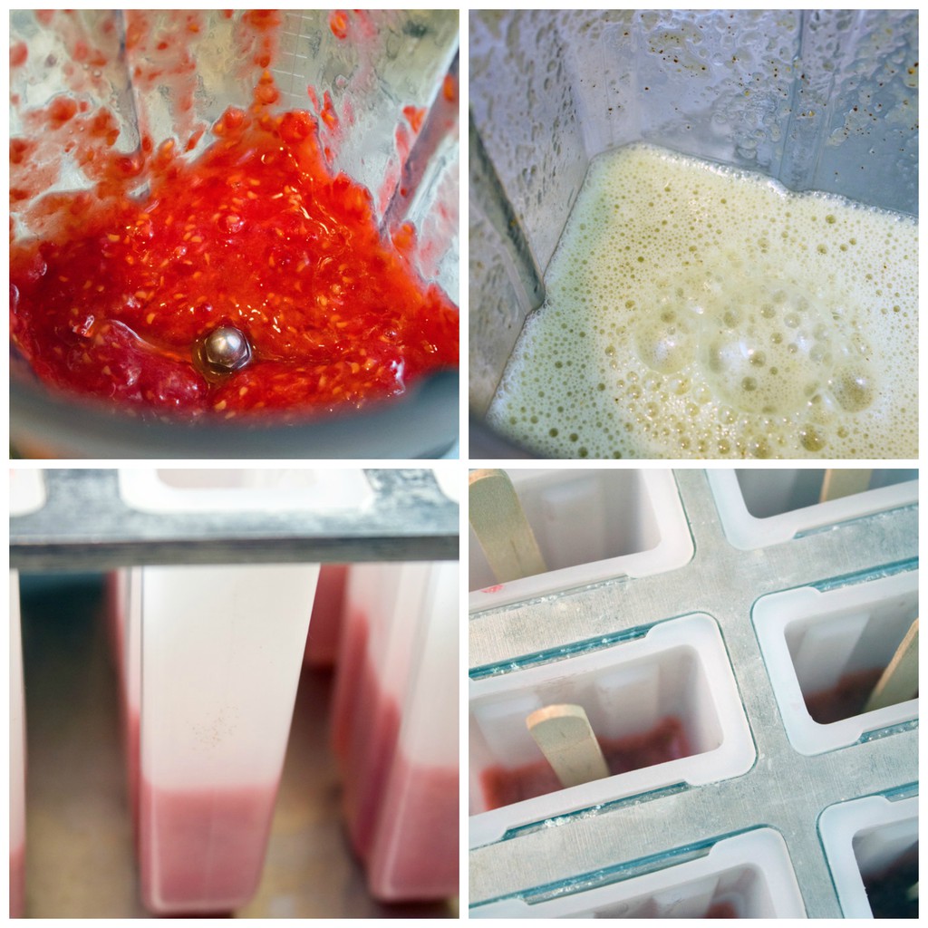
Also, they’re superbly easy. All you need to do is puree raspberries and kiwi and combine them with some wine and freeze them. Even I can do that after a long day at work and let them freeze while I doze off on the couch and dream of cocktails.

Sangria-Popsicle-Making-Collage

Who needs pitcher of sangria when you can have popsicles of sangria??

Raspberry and Kiwi Sangria Popsicles -- A summertime treat for adults only | wearenotmartha.com

I’m seriously ashamed to tell you that these were my only popsicles concoctions of the summer. Granted they were totally worth the wait.

Raspberry and Kiwi Sangria Popsicles -- A summertime treat for adults only | wearenotmartha.com

But if you’re only going to make one kind of popsicle, I think you should make them boozy popsicles and preferably with sangria involved. Fruit, too. Fruit cancels out the wine I think, so feel free to eat a couple of these.

Raspberry and Kiwi Sangria Popsicles -- A summertime treat for adults only | wearenotmartha.com

My neighbors totally think I’m having tame little gatherings in my backward with everyone eating popsicles. Little do they know it’s sangria on a stick.

Raspberry and Kiwi Sangria Popsicles -- A summertime treat for adults only | wearenotmartha.com

Of course you could make sangria popsicles with really any fruit of your choosing. I’ve bought a carton of raspberries every single time I’ve gone to the grocery store this year. And I don’t eat kiwi nearly enough even though they’re seriously delightful.

Raspberry and Kiwi Sangria Popsicles -- A summertime treat for adults only | wearenotmartha.com

Much like my penchant for white pants, I’m also choosing to go with theory that sangria popsicles never go out of style.  So, even though this is the last unofficially weekend of summer, don’t feel like you have to rush to the kitchen. But if you do, take comfort in the fact that these are ridiculous easy to whip up.

Raspberry and Kiwi Sangria Popsicles -- A summertime treat for adults only | wearenotmartha.com

I hope you have lots of fun plans this weekend and are planning to finish your entire summer bucket list over the next three days. And I wish you the very best of luck. I need to at least sneak some s’mores in there somewhere, right?

What is left on your summer bucket list?

Raspberry Kiwi Sangria Popsicles
 
What's better than sangria on a hot summer day? A sangria popsicle packed with raspberry and kiwi, perfect for cooling you have.
Author: We are not Martha
Recipe type: Dessert
Makes: 8 popsicles
Ingredients
  • 6 ounces fresh raspberries
  • 2 tablespoons water
  • 1½ cups white wine, divided
  • 2 tablespoons sugar, divided
  • 1 kiwi, peeled and roughly chopped
  • 2 tablespoons lime juice
Instructions
  1. Puree raspberries and water in a blender until smooth. Place mixture in a bowl and stir in 1 cup white wine and 1 tablespoon sugar.
  2. Fill popsicle molds about ⅓ of the way up. You will use about ½ of the raspberry puree mixture. Freeze molds until liquid is beginning to harden, 20-30 minutes. Remove from freezer and stick a popsicle stick into the center of each pop.
  3. Puree kiwi and lime juice in blender until smooth. Place mixture in a bowl and stir in ½ cup white wine and 1 tablespoon sugar.
  4. Pour mixture in popsicle molds over raspberry puree about ⅔ of the way up the mold.
  5. Freeze filled popsicle molds until beginning to harden, 20-30 minutes.
  6. Remove from freezer and pour remaining raspberry puree mixture over the top of the kiwi layer. Freeze for another 30 minutes, until popsicles are firm.
  7. Once frozen, remove popsicles from molds by running molds briefly under warm water.
3.2.2925

Raspberry-Kiwi-Sangria-Long-Pin

The post Raspberry Kiwi Sangria Popsicles appeared first on We are not Martha.

11 Sep 00:55

Moments of solitude in vast open spaces captured in beautiful minimalist photography

by Katy Cowan

For his series On His Own, Polish photographer and student Paweł Franik has captured solitary figures in vast open spaces, creating the most beautiful minimalist shots that really hit home the beauty of being alone.

Instead of evoking a sense of isolation, Franik's work celebrates precious moments that we enjoy away from others, when we have a chance to step back and reflect on life. He achieves this sentiment by placing all of his subjects in the centre of the frame, portraying each individual's need of 'alone time'.

Speaking of his work, he explained: "We live in a world of tremendous acceleration and where there is a constant quest for our purposes. In a world where there is no place for the proverbial 'minute for one's own self', the time when you can stop, talk to your own thoughts and feel the desirable harmony is important."

To discover more of his stunning work, visit Pawelfranikphoto.com.

11 Sep 00:54

Handcrafted paper installations that burst with colour and insanely intricate detail

by Katy Cowan

If you're mad about paper art, then you'll no doubt be familiar with the work of Zim&Zou – two French artists who are famous for creating stunning paper installations that burst with colour and enjoy insanely intricate attention to detail.

The duo is composed of Lucie Thomas, born in the Vosges in 1987, and Thibault Zimmermann, born in Paris in 1986. They met while studying graphic design together and after graduation decided to set up their own studio, focusing on installations of handcrafted objects made from tangible materials such as paper, wood and thread.

Anchored in craftsmanship, they create all the elements that make up their installations by hand, from drawing and cutting to assembling. Their favourite material is paper – cutting, folding and gluing it together to create intricate and colourful sculptures. Paper inspires them for its versatility, infinite range of hues and unique textures.

Opting for such traditional techniques and moving away from digital technologies, the pair have attracted the attention of some of the world's leading brands and publications. And you can discover why their work is proving so popular by visiting their colourful portfolio.

11 Sep 00:53

Beautiful aerial shots of Germany offer a different perspective to human life

by Katy Cowan

German photographer Klaus Leidorf loves to spend a lot of time riding a Cessna 172 aircraft above his home country, taking aerial shots of the world below. Referring to his work as 'Aerial Archeology', he loves to capture everything from farms, beaches and cities to industrial sites and countryside.

The ongoing series – which began in the late 1980s – is a fascinating study of landscapes, and looks closely at how humans have transformed the world around us, often with frightening consequences. Using image-stabilisation technology and his trusty Canon EOS Mark III, Leidorf is able to capture the teeniest, tiniest detail, even when he's soaring far above the earth. You can browse through over a decade of his work via www.leidorf.de.

11 Sep 00:52

Do-it-yourself paper toy and stationery kits from Mumbai that will make you smile

by Katy Cowan

Love beautiful things for your home or office but fancy being part of the creative process? Sky Goodies is for you. Founded in 2013 by Mumbai-based talented duo Amit Gudibanda and Misha Gudibanda, their range of Indian inspired products includes unique stationery items and do-it-yourself kits to make paper toys and articles for everyday use.

The gorgeous little kits come as printed, pre-cut, and pre-creased sheets with fold lines and instructions. No need for scissors or cutters. Even better, each kit has a specific use after they are assembled. So for example, you can purchase a typewriter calendar or a little retro TV that doubles as a photo frame. Or there are mini suitcases that can hold trinkets or candy.

The philosophy behind Sky Goodies is to make people happy, and everyone – no matter what age group – can find something to suit their needs. All products are handmade in India. Check them out on Etsy and also Facebook.