(via)

Established in 1991 and started at a basement like any well-respecting micro and craft brewery would, New Belgium, located in Fort Collins, CO, and a new brewery set to open in Asheville, NC, in 2015, is today the third largest craft brewer in the U.S. focusing on Belgian-inspired brews. It produces seven year-round beers and a host of seasonal options; its most popular — and my preferred mainstream beer on tap (before giving up delicious gluten) — being Fat Tire. In December, as it expanded distribution into Ohio (making it 32 states that carry the brand), New Belgium introduced a new packaging system designed by San Francisco, CA-based Hatch Design with illustrations by Boston, MA-based Leah Giberson.
The new design reimagines New Belgium's iconic and playful watercolor imagery from the past 22 years through a modern lens. The artwork will progress many of the themes celebrated in New Belgium's labels over the years, which have been hand-painted by founder Kim Jordan's neighbor, Ann Fitch, since the brewery's beginnings.
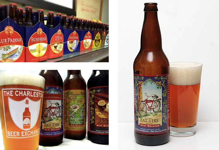
This colorful, handcrafted look has been with us since our inception and the new design brings the portfolio together in a fresh and contemporary way. We know that while the watercolors will always be part of the New Belgium story, we think the new designs will delight our long time fans while also inviting new folks into the fold. […] While the new look is a cleaner and more easily seen at a distance, the art is anything but cookie cutter in that every image starts as a photo and is repainted by hand. Much of the line — Fat Tire, Ranger — is simply a reimagining of our original themes.
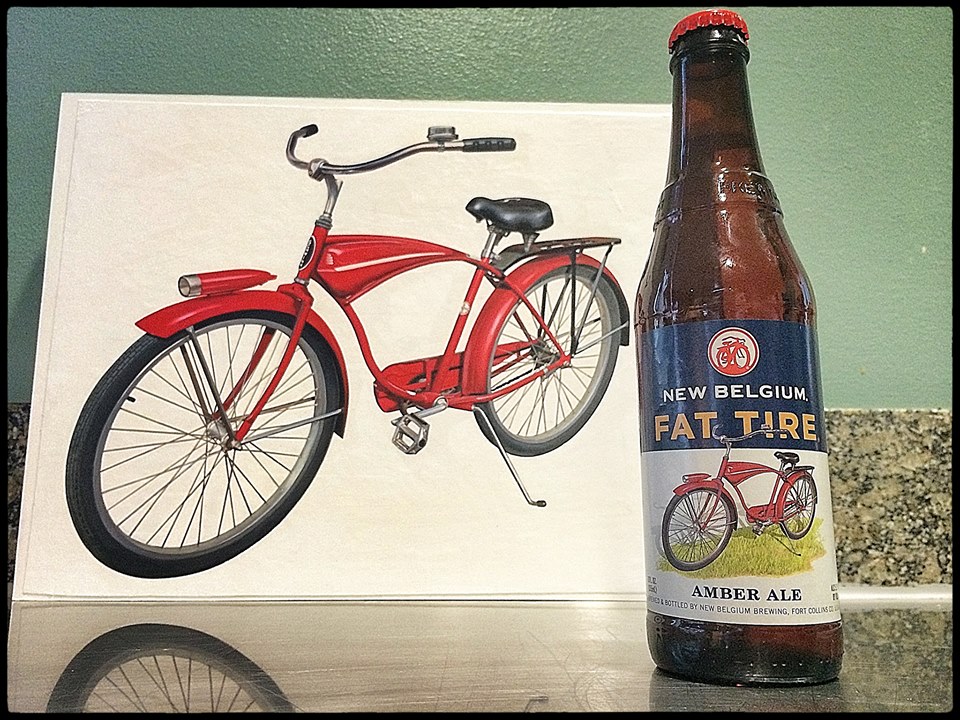
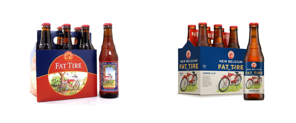
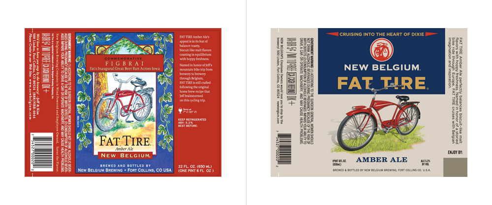
Despite it being one of my favorite beers, it took me a couple of years to realize that Fat Tire was made by New Belgium. The label, the 6-pack, and tap handles, never really showcased the New Belgium logo prominently, and the application changed among its other beers. Now, the brewery name is much larger and integrated with the name of each individual beer, perhaps in an attempt to have people refer to their beers as "New Belgium Fat Tire" or "New Belgium Ranger IPA" as opposed to just "Fat Tire" or "Ranger IPA". It doesn't need to happen, but establishing that link between the individual beers and the overall brand is not a bad goal. The logo (of which I don't have a clear shot of) has also changed, leaving the bike on its own in a circle, freed from the tight typesetting and poor color palette (red on yellow) from the previous version.
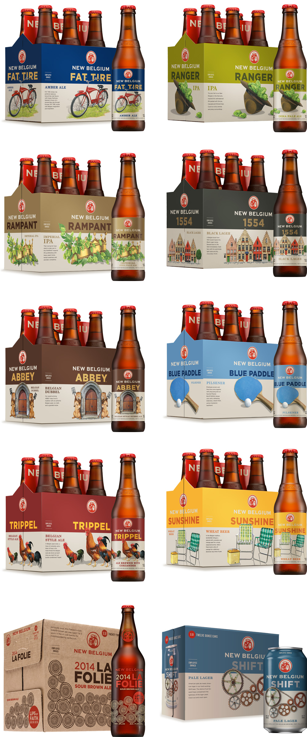
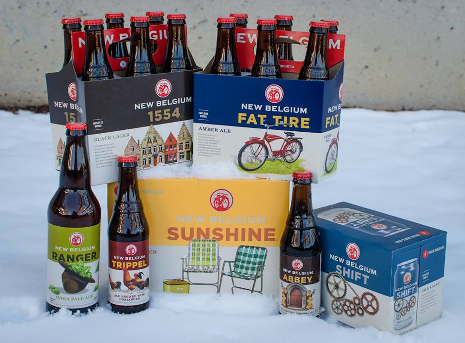
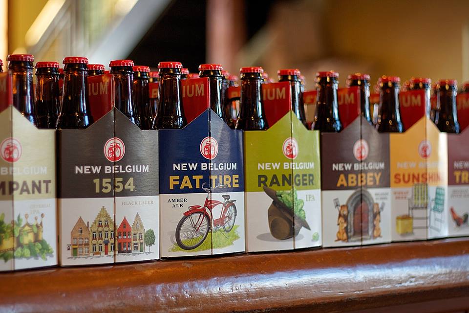
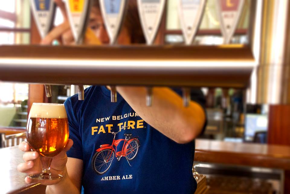
Through Hatch's crisp and unobtrusive design, the focus of the new packaging is on the new generation of illustrations by Leah Giberson that serve up quirky concepts in a deadpan, Americana style that help bring all the elements together: illustration, name, brewery. Overall, this is a great redesign that maintains the aesthetic and craft aspect of the brand while establishing a clear system to deliver a consistent brand with a growing audience.

Not that Iditarod stuff, though. So what if the hoomin wipes out? Just keep going! IN A JAUNTY RED COAT, TOO!
A video posted by Cute Win Fail, spotted on Dogheirs.com by Susan M.


En medio del banquete, sus guardias arrastraron fuera del salón a uno de los comensales. Estupefactos por la escena, los demás invitados tuvieron que presenciar cómo una jauría de perros feroces despedazó y devoró al príncipe Andrei Shiski. A continuación, el anfitrión llevó a sus invitados a degustar los postres y les dijo que habían presenciado lo que le ocurre “a quienes conspiran contra mí”.
Con solo trece años, el flamante zar del Gran Ducado de Moscovia, Iván Vasilievich III, más conocido como Iván el terrible, impuso con ese brutal mensaje la sumisión de los boyardos, la nobleza rusa del siglo XVI.
No fue el primero ni el último. Ese modo salvaje de advertir el alto precio de la conspiración, fue común en conquistadores mongoles como el Gengis Kan, guerreros tártaros y otros tiranos de la tierra. Pero el fundador del Estado ruso lo convirtió en un símbolo del más cruel lenguaje del poder. Lo increíble es que la escena se haya repetido en pleno siglo XXI.
El líder norcoreano hizo devorar a su tío por perros hambrientos. La versión inicial sobre la muerte de Jang Song-thaek ya era brutal. Al número dos del régimen lo arrancaron de su asiento en el Plenario del Comité Central del partido y, sin siquiera un juicio sumarísimo, lo acribillaron con una ráfaga de Kalashnikov. Pero después el mundo supo que esta era, en realidad, una versión edulcorada de la ejecución.
Todos los generales y la nomenclatura comunista fueron obligados a ver como 120 perros feroces, a los que tenían sin comer desde hacía cinco días, despedazaron a dentellones al jerarca caído en desgracia.
Se repitió en Norcorea una desventura que Platón vivió en Siracusa. El tirano Dinisio II castigó a su tío Dion por intentar, asesorado por el filósofo ateniense, que aquella colonia griega tuviera una “sofocracia”, el gobierno de los sabios.
Pero Kim Jong-Un fue más lejos que el tirano siracusano, quien se había limitado a expulsar al tío haciendo casar a la esposa con otro hombre. El líder norcoreano usó a su tío y mentor como Iván el Terrible al príncipe Shiski: para dar una lección espeluznante con el fin de aterrorizar a posibles conspiradores.
Lo reveló el diario chino Wen Wei Po y no hubo desmentidas. Lo extraño no es que en el régimen más hermético del mundo ocurran monstruosidades, sino que China no haya intentado ocultarla.
La estrafalaria dinastía comunista subsiste porque China necesita un Estado tapón para no tener frontera con la pro-norteamericana Corea de Sur, además de mantener a raya a otro aliado de Washington: Japón.
Pero el precio de la amistad china-norcoreana hace tiempo es demasiado cara. Los perros feroces de Kim Jong-Un desgarraron también la imagen política de China.