
the 800sqm building's functions are divided into large perpendicular volumes that balance on top of each-other.
The post planalto house by FC studio balances perpendicular volumes appeared first on designboom.
the 800sqm building's functions are divided into large perpendicular volumes that balance on top of each-other.
The post planalto house by FC studio balances perpendicular volumes appeared first on designboom.
james.cissyTell me about it.
 Thanks “guest” for the suggestion!
james.cissyAnybody interested in checking this out?

Wondering how AOL's RSS client will rank as a Google Reader replacement? Today's the day we find out, as the access doors to the AOL Reader beta have officially swung open. Feedly's been killing it for some weeks, and Digg's freemium setup is two days away -- but we couldn't resist getting an early taste of what our parent company (Disclaimer alert!) is cooking. Join us past the break where we've spilled all the details about this latest entrant in the field of feed readers.
james.cissyVery cool.


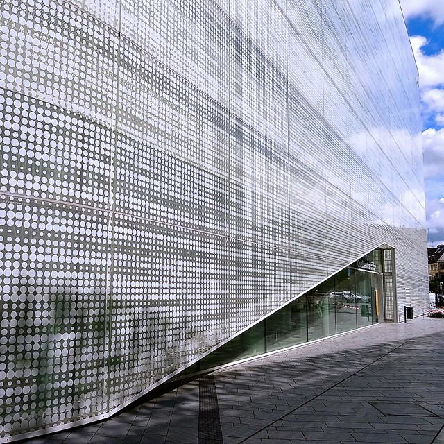
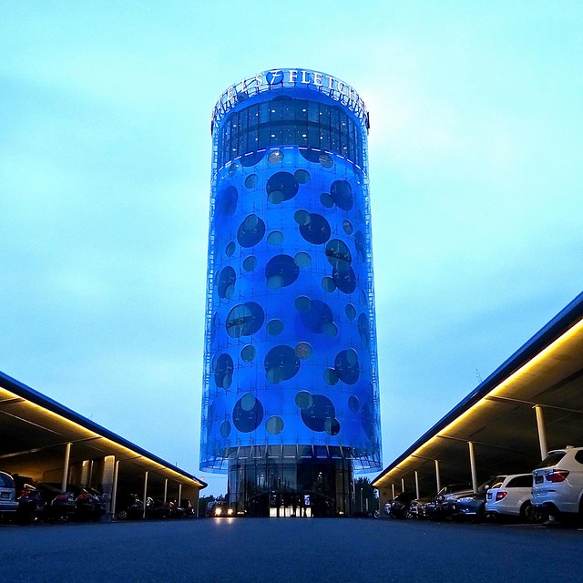
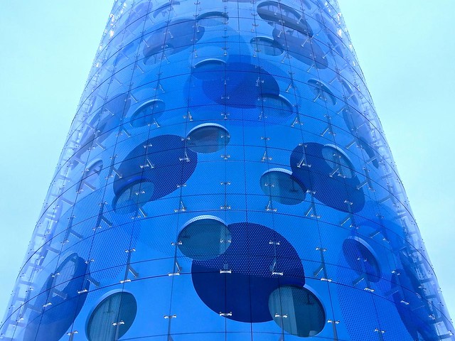
james.cissyThe Fletcher Hotel looks badass.


:: Join and add photos to the archidose pool, and/or
:: Tag your photos archidose
james.cissyhand drawings are still awesome

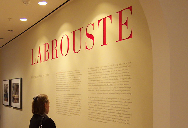
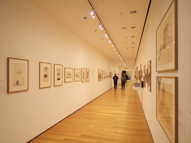
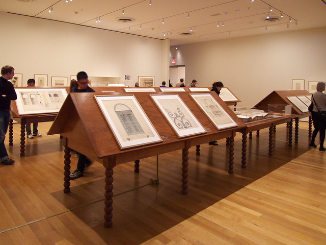
Inspired by a recent Alvaro Siza lecture, in which the architect traced the design process of one of his buildings through a myriad of ever-more-refined sketches, we've combed through the profiles on World-Architects to find sketches and other hand drawings—not an easy feat, considering the ubiquity of CAD drawings, computer renderings, and photographs for documenting projects. Nevertheless we've compiled a rich sampling of drawings to illustrate the value—even necessity—of hand drawings in the age of computers.
james.cissyNeed to look into this.

Burglars of the future beware: the age of the smart lock is coming. There's no shortage of entries into the space these days -- in fact, it was just under a week ago that we spotted the lovely Yves Behar-designed August lock. Goji's (whoever heard of a company named after a fruit?) got a pretty nice looking lock of its own, one it's hoping to bring to the market with help from a $120,000 Indiegogo goal. Like August, Goji's got a sleek disk design. In the place of the green and red dots, however, you'll find blue text that greets the user by name. The lock features bank-level encryption and will send pictures of people as they enter in through the door for added security. You can unlock it using your smartphone and can send people digital keys with your mobile device. Goji's expected to hit around December for $278 -- though you can get in a bit cheaper through the aforementioned crowdfunding campaign.
Via: GigaOm
james.cissyUniversal soldier, Jean-Claude Van Damme styles

The US military's dabbled with full-on robotic suits in the past, but it's now looking at a less convoluted, more energy-efficient approach. A project called Warrior Web from DARPA aims to enhance soldier carrying capacity and minimize injuries by distributing loads better, providing better joint support and "reapply(ing) energy to enhance motion." Such a suit would be equipped with sensors to detect forces, and be able to fit beneath existing uniforms while consuming only 100W of juice. The US Army has nearly completed five months of prototype testing using a multi-camera motion capture system (see the video after the break) to develop critical tech. The next step will be to design and fabricate a suit ready for real-world testing, which should happen in the fall -- assuming the program keeps its footing.
Filed under: Wearables, Science
Source: DARPA

Whatever value you see in game development schools, it's clear that few of them tout gaming industry veterans who can lead by example. The University of Texas' upcoming Denius-Sams Gaming Academy could solve this discrepancy by tapping two executives whose work many of us know by heart. Both legendary designer Warren Spector and Blizzard COO Paul Sams will guide (and sometimes teach) year-long post-baccalaureate certificate programs at the Academy that focus on creative leadership and game company management -- yes, that means instruction from gurus behind the Deus Ex and Warcraft franchises, among other classics. The programs will also emphasize that all-important ability to finish a game, rather than mastering skills in isolation. The first students join the Academy's ranks in fall 2014, although they'll need to be exceptional to stand a chance of getting in -- just 20 spots will be open in the first year.
[Image credits: Nightscream, Wikipedia; Rob Fahey, Flickr]
Filed under: Gaming, Software, Alt
Source: University of Texas at Austin
james.cissypretty awesome.


james.cissyAwesome.

It's not the first time that Kwikset's dabbled in wireless locks, but today the company's introducing Kēvo, a smartphone- (and tablet-) friendly lock powered by UniKey. The concept is pretty simple: pair a handset (running a special app) with Kēvo via Bluetooth, and simply touch the deadbolt to lock or unlock your door. A keychain fob is also available for those who have not yet joined the smartphone revolution. Kēvo only responds to touch when an authorized device or fob is detected nearby. A triple tap lets anyone lock your door, which is useful if a visitor leaves after you. The deadbolt is battery-powered using four AA cells that last more than a year with normal operation. It features a ring of RGB LEDs for feedback and a standard physical key for backup.
Most of the magic is made possible by tech developed by UniKey. The key (natch) to the entire system is the Kēvo app which lets you manage eKeys. Once logged into the app, you can send and delete eKeys, or transfer them to another device (this also deletes the eKeys associated with a lost handset, for example) -- you can even create eKeys that only work once. Currently, the app is only available for iOS, which is a major limitation, but it supports push, email and SMS notifications and keeps a detailed log of which eKeys have accessed Kēvo and when. Pricing and availability remain a mystery, but all in all the system looks pretty clever. Stay tuned for more details, and check out the link below.
Filed under: Cellphones, Household, Tablets, Wireless, Software, Mobile, Apple
Source: Kwikset
james.cissyOver the last few months, I have paid more and more attention to language and how things are articulated and expressed. It really is a powerful thing that can affect events as small as a drunken convo between @Danno and me, up to the scale of immigration reform. No real point to this rant; just thought it was interesting.
IN HIS 1991 book "Los Angeles: Capital of the Third World," David Rieff writes of the trembling racial sensibilities of the city's rich whites:
So sensitive were liberal Angelenos to the possibility of appearing xenophobic that they almost invariably used the term "undocumented worker" rather than "illegal alien," which made contravention of the immigration law sound like some trivial problem of paperwork rather than, for better or worse, a breach of the laws of the United States.
A couple of decades later the linguistic tastes of LA's Westside have conquered swathes of America's media. A big victory came this week when the Associated Press decided to ditch the term "illegal immigrant" from its stylebook. AP journalists should instead refer to people who are "living in a country illegally" or who "entered the country without permission". ("Undocumented" is also rejected, on the grounds of imprecision.) Thanks partly to the shrinking of American newsrooms, AP stories appear widely in newspapers, and many adopt AP's style guide for their own stories. "The dominoes will start falling" at other publications, said one campaigner. Expect "people who are living in the country illegally" to be coming to a newsstand near you soon.
The Economist's style guide contains no such directives. Over the years we have tended to stick with "illegal immigrant", although on occasion we have simply referred to "illegals", a word many find offensively reductive (my colleague explored the distinction in more detail a couple of years ago). The phrase "illegal immigrant" has the virtues of concision, clarity and familiarity, although not necessarily precision: it does not distinguish between someone who has crossed the border illegally, someone who has overstayed a visa, a worker violating the terms of his visa arrangements, etc.
But the real objection to "illegal immigrant" is not far off the objection to "illegals": that it reduces well-rounded human beings to avatars of lawlessness. The word "illegal," according to AP's executive editor, should be used to describe only actions, not people. This is more or less what the campaigners pushing for this change have argued all along, as this short Slate piece explains. Describing someone as "living in a country illegally" may use up more of a journalist's word count, but it leaves space for that person's humanity and character.
The discussion over what campaigners call the "I-word" comes, of course, as Congress begins a much larger debate: over how to construct path-to-citizenship (or at least path-to-legalisation) rules that mean for most illegal immigrants in America "illegal" will be rendered not only impolite but incorrect. The timing is not coincidental: it is an expression of the growing political clout of America's Latinos, at the ballot box, inside the academy and elsewhere. After AP's decision this week, a contributor to an e-mail discussion group for Latino political scientists referred to "a multi sector national, online and offline campaign to finish the job".
The biggest prize, however, awaits. As recently as last October Margaret Sullivan, the New York Times's public editor, said that banning the term "illegal immigrants" would not serve readers well. Now the newspaper appears to be softening its stance. "Undocumented", which the paper has previously considered euphemistic, may be allowed, and other terms will be "encouraged", says Ms Sullivan (who has no decision-making role on style matters). The style gurus are expected to issue a verdict shortly.
This line of thinking is not to everyone's taste. After AP's declaration William Gheen, the president of an anti-immigration pressure group, Americans for Legal Immigration, said the group would adopt the term "illegal invaders" in response to what he called "political correctness on steroids". But as with the debate on immigration reform, the debate seems to be moving away from the likes of Mr Gheen. This morning the Los Angeles Times, which in darker times once referred to local Mexican workers as "ignorant peons", said it too was reconsidering its policy on "illegal immigrant". The long march of Santa Monica liberals is nearly complete.
james.cissybiblio-phile post
organized by a four storey helical ramp and atrium, the library seeks to mediate the role of the central library as both a community promenade and intellectual archive for individual study.
The post preston scott cohen: datong library under construction in china appeared first on designboom.
the facade of a cultural centre has been transformed into a 3,000 sqm screen where users can play pac-man, tetris and space invaders using iPads.
The post world’s largest interactive arcade in sao paulo appeared first on designboom.
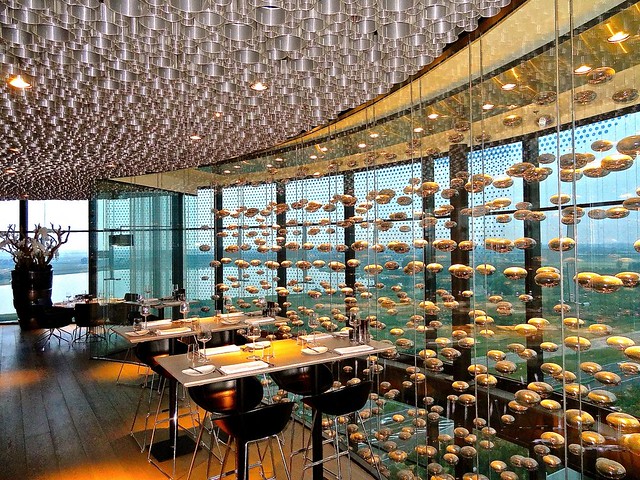
james.cissySo badass. Scroll down and watch the vid.
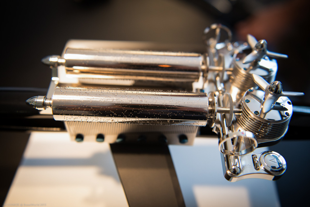
The latest creation from MB&F isn't something you wear on your wrist and it won't tell you the time either. Instead, Max Büsser has teamed up with Swiss music box maker Reuge to bring you the MusicMachine. This singing spaceship is a superlative table-top music box designed by MB&F and expertly crafted by Reuge. We have exclusive video of the MusicMachine in action and an in-depth explanation from Mr. Max Büsser himself.

Let's start with the basics. The MusicMachine is a music box that plays a total of six melodies, three on each barrel. One plays Star Wars, the Imperial March from Return of the Jedi, and the theme from Star Trek, while the other plays Smoke On The Water by Deep Purple, Another Brick In The Wall by Pink Floyd, and Imagine by John Lennon. The former piston represents classic sci-fi themes, while the latter features the three songs most important to Büsser during the first 20 years of his life.
Each melody lasts approximately 35 seconds, during which the barrel makes one full rotation, with the pins on the barrel plucking out the song on the tuned comb. To set up the next melody, the barrel then shifts slightly down its long axis, realigning the pins to pluck out a different melody. This is music made entirely mechanically and when the melodies play you can't help but smile.

Music boxes have a lot in common with watches, mechanically speaking, including power barrels, gear trains, and finishing, and you can really see MB&F in the details of these components on the MusicMachine. The barrels looks like pistons and are topped with propellor-shaped winders, the music cylinders are the ship's engines, and the lacquered wood body and aluminum landing gear optimize resonance so you can really hear the melodies. Reuge even had to devise a way to make the two independent mechanisms mirror images of one another so that the MusicMachine would be perfectly symmetrical instead of having both barrel units facing the same direction.

Also, just as with watches, there are all kinds of little touches and special components that both look good and ensure the MusicMachine functions at the highest level. For example, the spinning dishes you see on either side of the barrels are actually regulators that create the proper amount of resistance as the power barrels unwind to keep the cylinders turning at the proper pace.

And those brass cylinders themselves are far more complicated than they appear. Each of the 1400 or so pins is hand cut, shaped, and polished to play the proper note at the proper time, and eventually the entire cylinder is filled with a specially hardened resin to ensure stability and solidity over time.

Finally, the combs, on which the cylinders play out the melody, must be carefully tuned both by machine and by ear. The individual teeth are variously stripped of material and layered with lead to achieve the proper density and heft to produce the proper note - the deeper notes require more material and small, transparent dampening feathers behind them to keep them resonating properly. Each comb can produce 72 unique notes to suit whatever melody it is designed to play.
Just in case you're not already familiar with Reuge, the brand has been making music boxes of the very highest quality for almost a century and a half using the techniques described above. Based in Sainte-Croix, Switzerland, Reuge produces a range of mechanical music boxes ranging from the staunchly traditional to the decidedly avant-garde. We highly recommend you visit Reuge's website to see more of the brand's work.

Only 66 MusicMachines will be produced, 33 each in black lacquer and white lacquer. Both colors will be priced at 12,300 CHF and will be available through the same retailers as MB&F's watches. Check out MB&F for more details.


james.cissyWe gotta go check this out someday.
the images capture a unique aerial perspective of 'concurs de castells', the historical human tower competition.
The post concurs de castells – human tower competition photographs by david oliete appeared first on designboom.
james.cissy@kjigs, chiggity check this out.
Dr. Howard Torman lives an extraordinary life and enjoys extraordinary watches. A medical doctor, test pilot, and former CBS News national medical correspondent, Dr. Torman was involved in the development of the Omega X-33 watch, alongside NASA. In 1997, Dr. Torman, the Russian MiG jet he was test piloting, and the X-33 prototype on his wrist went crashing into the Nevada desert - only one of the three emerged almost entirely unscathed. This is their story.
james.cissyGreat data discussing the participation rate and employment.
 Click on graph for larger image.
 This graph shows the changes in the participation rates for men and women since 1960 (in the 25 to 54 age group - the prime working years).
 This graph shows that participation rates for several key age groups.
 This graph shows the participation rate for several over 55 age groups. The red line is the '55 and over' total seasonally adjusted. All of the other age groups are Not Seasonally Adjusted (NSA).
james.cissyAll I can think about is the Simpson's Halloween episode with the monkey paw that granted wishes. Wishes can be tricky business.

Scientists working together from Japanese and American universities may have made a pretty large leap in restoring neural function for those with non-paralyzing spinal cord injuries. The researchers applied a "novel artificial neuron connection" over lesions in the spinal cord of a partially paralyzed monkey, partially restoring its arm / brain circuit and allowing greater hand control purely by brainpower. The team also created a reverse circuit where muscle activity from the arm stimulated the spinal cord, reinforcing the signals and "boosting ongoing activity in the muscle." There's no word on whether it would help those with full paralysis, though for lesser "paretic" damage, "this might even have a better chance of becoming a real prosthetic treatment rather than the sort of robotic devices that have been developed recently," according to the team. See the source and More Coverage links for more.
Filed under: Science
james.cissyBadass.
Tori Kelly - P.Y.T. Cover - 2013 SXSW Spotify House
james.cissyIncredible.
james.cissyI definitely need to make a move and get a french fry maker.
 A soggy fry is a sad fry. In fact, it probably shouldn't even be called a "fry." Make sure the next time you cook a batch they're crispy—really crispy. The pros at Stack Exchange tell you how. More »
 james.cissyFirst oReader post. I'll observe a moment of silence for gReader. May it rest in peace.


. Imaginary reconstruction of an ancient city. Perspective view. Date unknown. Graphite, pen, ink and watercolor on paper. Académie d’Architecture, Paris")
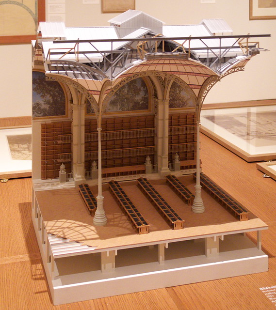
. Bibliothèque Sainte-Geneviève, Paris, 1838-1850. Southwest corner: elevation and section. Late 1850. Pen, ink, graphite, wash and watercolor on paper. Bibliothèque Sainte-Geneviève, Paris")

