
Shared posts
17 Jul 17:50
From Suri Cruise to Harper Beckham, there are some adorably stylish cuties in Hollywood! Here are 21 tiny and cuddly celeb kid styles to steal for your mini-me.
21 Celeb Kid Styles to Steal for Your Mini-Me
by Sonia Rao
Tatá likes this
17 Jul 14:10
The 5 Most Disastrous Marketing Failures of All Time
By Raoni Lacerda,Evan V. Symon,Carmen Burana Published: July 17th, 2014
In a world where it feels like we're all brainwashed by corporate marketing campaigns, it's nice to see them fall flat on their faces now and then. And trust us, when big promotional stunts go wrong, that shit can get ugly. We've covered many of thes


Tatá likes this
16 Jul 17:44
25 bebês chafurdando no bolo
by Janara Lopes

Para a nossa alegria.
Trilha sonora sugerida:


Tatá likes this
16 Jul 17:27
Filed under: Uncategorized Tagged: Big Kittens, Bunnies, Kittens

The Cute Overload Guide to Surviving a Comcast Telephone Cancellation Request
by Not That Mike The Other Mike
Start of call: The representative seems courteous and helpful, and merely has a few questions to assist with the cancellation process. Although the questions appear unduly personal, you may ease any stress of the experience by looking at this picture of a smiling tiger cub coded leopard.

Minute six: Although theoretically willing to assist with the cancellation, the representative is concerned that your desire to abandon such a caring, loving service may be due to latent feelings of resentment of one or both parents, and suggests weekly therapy along with a complimentary 20 Mbps upgrade. During this phase, you may need to gaze at this bunny for strength.

Minute eighteen: Now sobbing into his mouthpiece, the representative demands to know, to learn, to feel the reasons why you have chosen to break the heart of this fine service that exists only to serve you. Was it that one time the Game of Thrones season finale got all blocky? That wasn’t our fault, dammit! During this phase, hide all sharp objects and secure any firearms you may own. This kitten represents your last best chance to retain your sanity. Good luck.

The inspiration for this post, if you need it.
Filed under: Uncategorized Tagged: Big Kittens, Bunnies, Kittens
Tatá likes this
16 Jul 17:01


Where the Sky is Not Blue – 30 Beautiful Aurora Borealis Photographs
by Humza Mehbub

The title pretty much sums up the content of this post. We love Northern Lights as much as you do! What are the northern lights?
An aurora (plural: auroras or aurorae) is a natural light display in the sky particularly in the high latitude (Arctic and Antarctic) regions, caused by the collision of energetic charged particles with atoms in the high altitude atmosphere (thermosphere)
In the simplest words: a natural light display in the sky.
I have always searched for the Aurora Borealis and always found their images fascinating beyond words. That is exactly why I compiled this list to show you some of the most fascinating and breathtaking Aurora Borealis captured by photographers.
When silence is music by Russo Francesco

A Night To Remember by Arild Heitmann

Aurora´s Dance by Þorsteinn H Ingibergsson

Another planet by Joris Kiredjian

Stjerntind by Stian Klo

Jokulsarlon Lights II by Jesús M. García

The fishing boat by Frank Olsen

Secret River by Arild Heitmann

X-rays by RaymondHoffmann

Manta ray by RaymondHoffmann

Northern light after snow by Joris Kiredjian

Stars and Aurora by Sus Bogaerts

“Icy Night” by Isaak Schiller

Aurora borealis in iceland by Thierry Bornier

The Bend by Arild Heitmann

Waiting for 1967 by Stian Rekdal

Fading Aurora by Jacky CW

Aurora Borealis Lofoten by Felix Inden

Majestic Elements by Ole C. Salomonsen

Magic night by Tommy Eliassen

Northern light panorama by Joris Kiredjian

Mountain Lightshow by Arild Heitmann

Solar Reflection by D-P Photography

Winter Lights by Michael Liu

The Blue Lagoon by Sigurdur William Photography

“Dream Land” by Isaak Schiller

Green reflection by Thorir Bjorgvinsson

Aurora Borealis 9 December 2012 by KennethSolfjeld

Aurora Borealis from Iceland by porbital

Aurora on the rocks by Trichardsen

Tatá likes this


14 Jul 20:21

Brilliant Night Star Photography Examples
by Humza Mehbub

Who doesn’t love astrophotography? It is probably one of the most difficult choice of photography as you can only shoot the stars at night – duh – and it requires you being patient and then a lot of post-processing can be involved as well.
Here are some brilliant examples:
Mt Bromo Under The Stars by Elia Locardi

Engage by Lincoln Harrison

*** by Lincoln Harrison

Old Boat by Marius Kastečkas

Limitless by Scott Smorra

The Galaxy Guides Us Home by Michael Shainblum

Confine Your Dreams… by Stergos Skulukas

Meteor and Milky Way over Bonsai Rock, Lake Tahoe by Rick Parchen

Oregon Homestead under the Milky Way by Rick Parchen

Night in Donegal by Marius Kastečkas

A Sky Full of Stars by Marius Kastečkas

Fanad by Marius Kastečkas

Starry Night over Crater Lake by Rick Parchen

Dreamworld by Matt Payne

Tatá likes this
11 Jul 17:24


Handy Infographic is a Useful Social Media Image Size Cheat-Sheet
by Gannon Burgett

The folks over at Constant Contact recently put together a handy little infographic that will help you better manage and properly ‘dress up’ your the growing collection of social media accounts.
The graphic lists the dimensions of all of the photos these social media sites want you to upload. From you Facebook Cover photo (851 x 315), to your Pinterest profile pic (600 x 600), to your YouTube channel art (2560 x 1224), just about every major player is listed:

Be sure to toss the graphic into your archives. It’ll no-doubt come in handy the next time you’re revamping one of your social networks.
(via Constant Contact via Reddit)
Tatá likes this
11 Jul 16:27


Friday Fresh Free Fonts - Anders, FFAD Matro, Zona Pro
by paul0v2
Friday fresh free fonts is a series of free fonts posted every Friday, yes I know it's awesome. I will look forward to bring a lot of great fonts that will sure help you improve your typography work. Check out what I selected for you on this FFFF post and make sure to comeback for more next week.
View all FFFF posts
Anders
Download Anders

FFAD Matro
by SuperBruut
Download FFAD Matro

Zona Pro
Download Zona Pro

Tags:
Brought to you by:
Tatá likes this
10 Jul 17:49
17 assinaturas célebres
by Janara Lopes

Em 2014 a gente não sabe mais como é a letra de ninguém e a assinatura quem vê é só o colega do cartório. Sempre bom ver a letra e assinatura alheia.

Tatá likes this
10 Jul 17:46
Filed under: Uncategorized Tagged: The Big J, Thing One & Two

How Do U File ‘Em In The Dewey Decimal System??
by Brinke
 Thing One and Two from Guremike. (Wanted an excuse to write “Dewey Decimal System” in a header- first time ever on C.O.)
Filed under: Uncategorized Tagged: The Big J, Thing One & Two
Tatá and -1 others like this
09 Jul 16:58

Student Duo Illustrate Motivational Quotes with Stunning Chalkboard Art
by Humza Mehbub

Well, no one probably likes going to university so early in the morning. However, when you are greeted in the morning with such inspirational and motivating quotes chalked up on the chalkboard by two anonymous student duo, it’s hard to miss school the next day. You just can’t miss their new artwork. These two ‘secret’ duo students hail from Columbus College of Art and Design in Ohio.
Some of these chalkboard artwork take upto 11-hours to complete, so you have to admire their dedication and skill. Few people could rarely conjure such magic with mere regular chalks.
They’re like ‘Bansky’ of the university! ha!
Check it out:


Tatá likes this
08 Jul 18:02


Sugru divulga um ótimo uso para os minifigs da Lego: organizar cabos
by Jacqueline Lafloufa
A massinha de borracha Sugru, que promete grudar em quase qualquer coisa, está divulgando uma divertida ideia de uso útil para os minifigs da Lego, aqueles bonequinhos batutas que fizeram parte da infância de muita gente.
Além de serem chaveiros ou ímãs de geladeira (ao menos aqui em casa), os bonequinhos tem o encaixe perfeito para segurar os mais diversos tipos de cabos, em especial os cabos de energia da Apple.
A sugestão da Sugru é, portanto, usar a massinha de borracha adesiva na parte das costas dos minifigs e fixa-los nos lugares onde você precisa deixar alguns cabos, para colocar um pouco mais de ordem no ambiente e ainda manter o fácil acesso ao equipamento.
O autor da ideia, Andreas, também deixa uma outra ótima dica de organização – ao invés de fixar o minifig, ele fixou uma daquelas plaquinhas de Lego, bem fininhas, e prende o bonequinho ao encaixar as pernas dele na placa. Além disso, ao passar uma pecinha perfurada pelo elo da chave do carro, ele também pode encaixá-la no cantinho da mesa e mantê-la sempre à mão.
 Post originalmente publicado no Brainstorm #9
Twitter | Facebook | Contato | Anuncie
Tatá likes this

08 Jul 17:26
Filed under: Uncategorized Tagged: Fast-n-The Furry-ous, National Geographic, Otters

The Fast ‘n’ The Furry-ous 10: INCOMING!!!
by Brinke
 And will you check out the Most Excellent Ground Clearance! Photo by Mark Bridger, National Geographic Your Shot..sent in by Vajda B.
Filed under: Uncategorized Tagged: Fast-n-The Furry-ous, National Geographic, Otters
Tatá likes this
08 Jul 17:23

Nova Identidade Visual Nescafé
by Carolina Sangiovanni
A Nescafé, lançada em 1938 pela gigante suíça Nestlé, é uma das marcas de café solúvel mais distribuídas no mundo, vendida em mais de 180 países.
Infelizmente para a Nescafé, o produto café solúvel por si só não é muito empolgante. Em um mundo com uma Starbucks a cada esquina e tantas marcas de café gourmet surgindo no mercado, por que os consumidores se contentariam com café instantâneo? Eu não tomo café e nem conheço as nuances e sabores que podem ser perdidas ao se escolher uma versão instantânea. O fato é, com a “gourmetização” da vida, instantâneo não é um atributo de muito apelo.
Visando resolver este problema, a Nescafé lançou uma campanha global para instigar uma nova geração de apreciadores de café, aqueles jovens adultos que estão se iniciando no mundo da cafeína.
Os esforços do projeto foram divididos entre a Publicis, CBA e OgilvyOne (Frankfurt). A matriz da Nestlé será responsável por assegurar que a companha seja seguida globalmente, adaptando-se a particularidades locais.
Antes mesmo de entrarmos no case da nova identidade visual que acompanha o novo posicionamento me pergunto porque não houve mudanças no produto? Me parece que esta era a principal questão. Não que não seja inteligente buscar este novo público, mas também acho que a Nescafé poderia ganhar muito se tivesse algum apelo mais gourmet, para paladares mais exigentes.
Sendo parte de uma grande multinacional, com presença global, como a Nescafé consegue lidar com o café, um produto agrícola influenciado por tantos fatores externos (clima) difíceis de controlar? A única forma é manipulando-o para o paladar mais abrangente possível e desse modo, provavelmente pouco refinado. Deve ser por isso que a campanha que veremos a seguir foca pouco no produto sem si, dando espaço para a marca e lifestyle que a acompanha.
A unificação de embalagens, comunicação e estratégia digital da Nescafé, bebida a 5.500 xícaras por segundo, apresentará diversos elementos chave de design desenvolvidos com foco em um novo e mais jovem consumidor. – Wall Street Journal
De cara, já vemos novos elementos na identidade visual: o acento da palavra “café”, a icônica caneca Nescafé e um elemento que representa esta mesma caneca vista de cima.
Fica claro, em relação à caneca, que a Nestle está tentando dar uma de Coca-Cola, e conseguindo. O design particular dessa caneca já vira símbolo da marca e inspira os principais elementos da comunicação. O acento nada mais é do que a contra forma da “asa” da caneca, mas o “E” também pode ser interpretado como uma caneca, e o acento, a fumacinha do café quente.
![]()
![]()
![]()
Para o novo logo, uma pequena atualização que fez toda a diferença e deixou a imagem da marca um pouco mais jovem e acessível. A serifa superior foi mantida, afinal é um produto Nestlé, com o acento mais proeminente. O uso de formas da caneca para o desenho do logo é interessante e faz com que todos os elementos da comunicação estejam alinhados. Não é uma mudança ousada, mas no geral, traz uma nova “vibe” para a marca.

Vendo o projeto, é surpreendente que a Nescafé esteja conseguindo ser “cool”. Esta com certeza não é uma tarefa fácil quando se é parte de uma das maiores companhias globais do mundo.


Alguém aqui anda com uma caneca amarrada no cinto?
Outro ponto a se comentar são as embalagens. Parece que neste campo as mudanças foram poucas e apenas o logo foi trocado. Acho estranho ser tão sutil, mas talvez uma mudança mais drástica seja feita futuramente.

No geral, é um projeto muito interessante e alinhado com a estratégia que a marca decidiu seguir. Apesar de algumas aplicações serem um pouco estranhas (Capela Sistina de Nescafé e caneca amarrada no cinto?) o esforço da marca em ser “cool”
parece que será bem sucedido.
Interessante será ver como esta campanha se desenrolará pelo mundo.
Na França, por exemplo, a nova identidade visual já pode ser vista na ação criada pela Geometry Global Paris:
“Criamos uma maneira inesperada de duas compartilharem um momento juntas. Afinal, que melhor maneira de começar uma conversa do que tomando uma caneca de Nescafé?”
Enquanto isso, no Brasil, as mudanças ainda não embarcaram por aqui. Apesar de que mesmo com a identidade visual antiga, podemos perceber que a Nescafé já almejava há ser “cool”. Talvez agora ela consiga de verdade.


http://www.underconsideration.com
Confira o artigo original publicado pelo Choco La Design:
Nova Identidade Visual Nescafé
Tatá likes this
08 Jul 17:17

Somos todos iguais por dentro
by Diogo Travagin

Uma loja da rede de fast food Burger King, localizada em São Francisco, Estados Unidos, lançou uma novidade para seus clientes. No cardápio havia uma nova opção de lanche, o Proud Whopper, o que gerou curiosidade nas pessoas, ainda mais porque sua embalagem continha cores que faziam referencia à bandeira gay. Mas e o que de diferente havia no Proud Whopper? Nem os funcionários sabiam explicar. Praticamente uma degustação às cegas e o cliente poderia ou não gostar.
O lançamento do novo lanche foi durante a semana do orgulho gay em São Francisco e foi feito para reforçar o novo slogan do Burger King “Be Your Way”, “Seja do Seu Jeito” que a empresa adotou. Claro que a campanha não foi 100% aceita, mas vale aqui o respeito por essa ousadia e tentar conscientizar seus clientes a respeito da igualdade entre as pessoas, independente de suas escolhas pessoais. . Faço votos para que campanhas positivas como essa se tornem globais e possam atingir um número maior de pessoas.
O mais bacana dessa ação é ver a reação das pessoas ao descobrirem o que há (ou não) de diferente no lanche. Acompanhe no vídeo abaixo o desenrolar da ação e descubram a diferença.
The post Somos todos iguais por dentro appeared first on Blog Plugcitários.
Artigos Relacionados:
- Ação de marketing assusta a todos com um bebê demônio Imagine a seguinte situação: Você está tranquilamente andando pela calçada...
- Cabal Brasil faz homenagem no dia da Síndrome de Down Hoje é o dia internacional da Síndrome de Down. Para...
- A felicidade pertence a todos Navegando por sites de publicidade, especialmente no site do jornal...
Tatá likes this
08 Jul 17:09

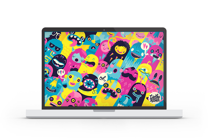
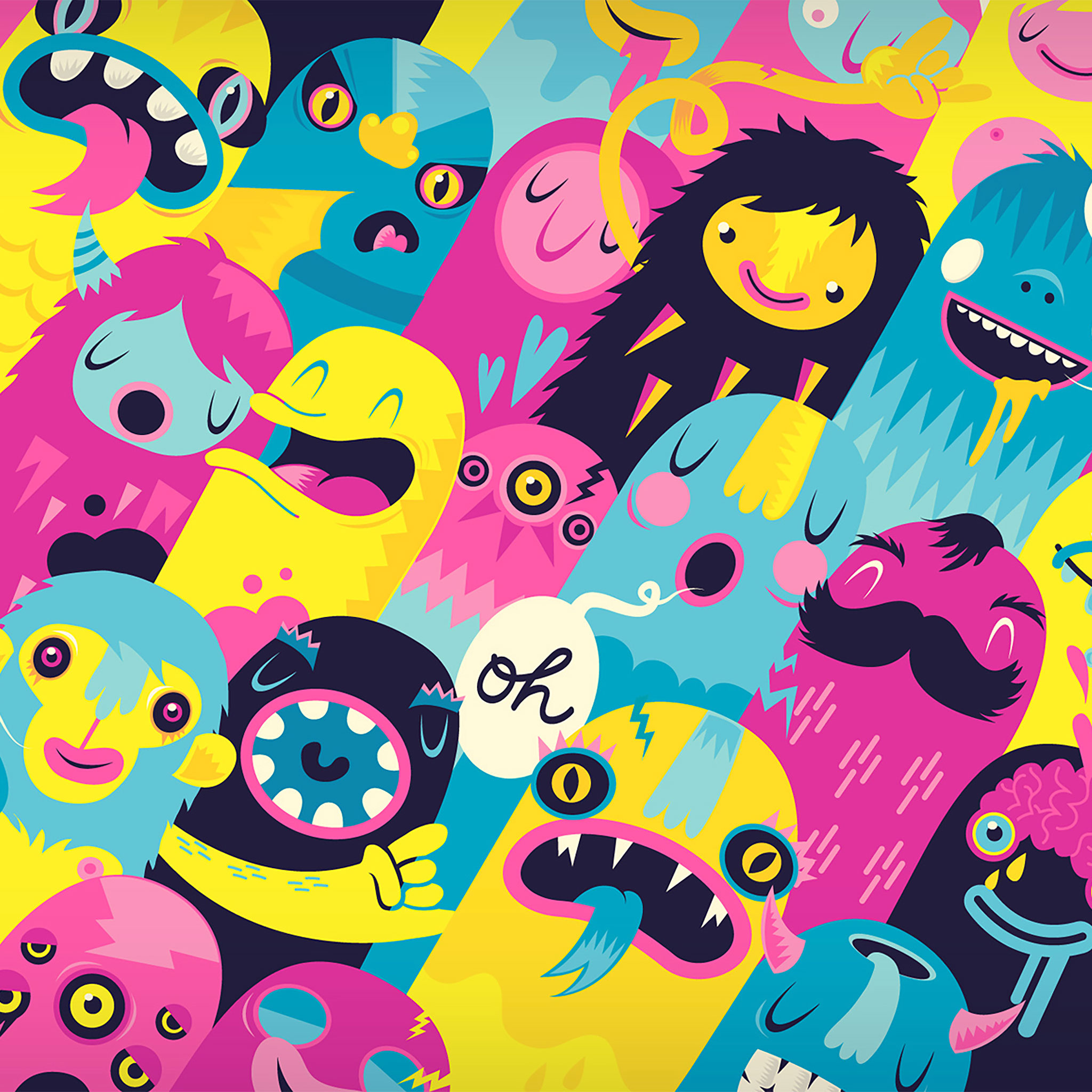
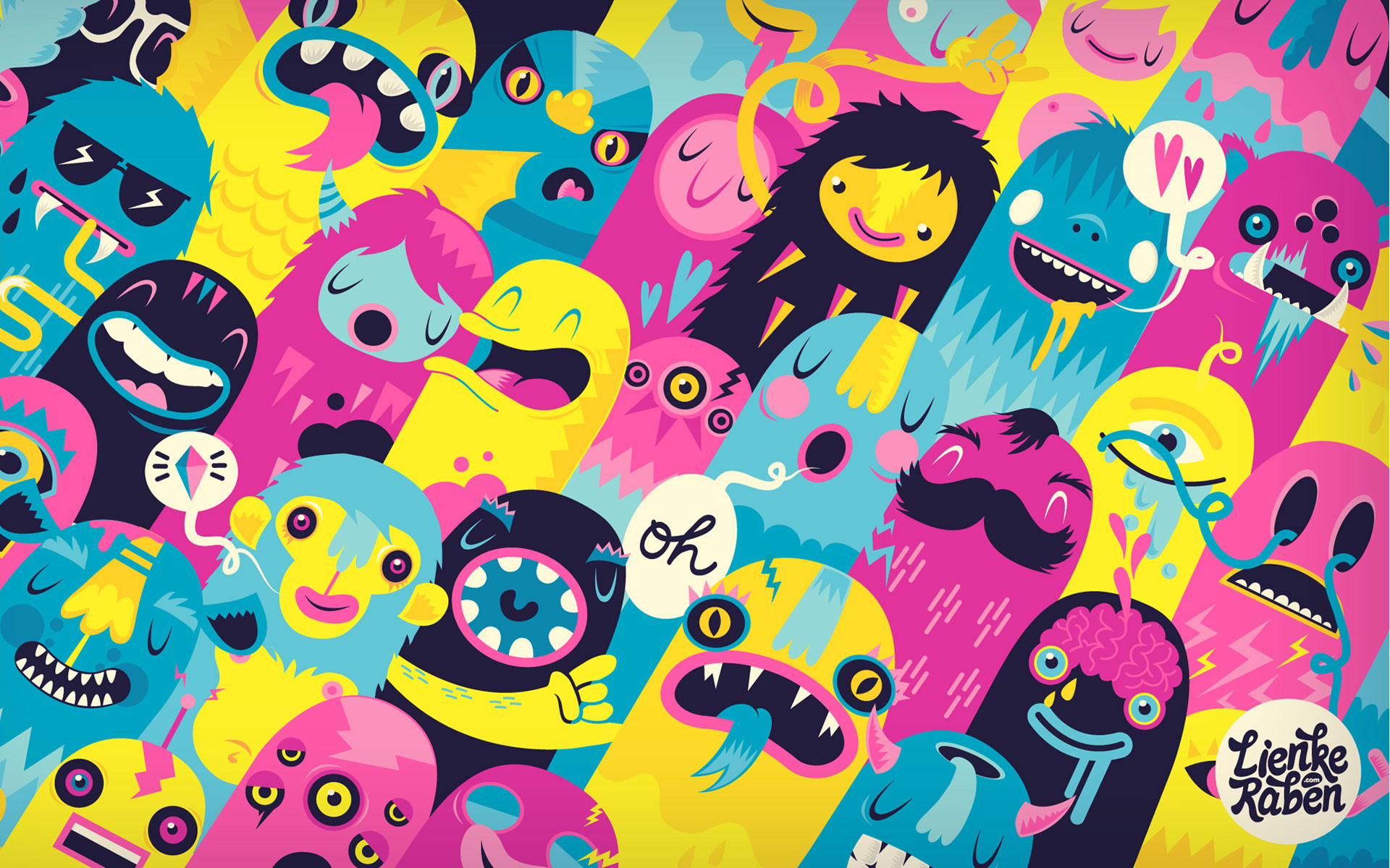
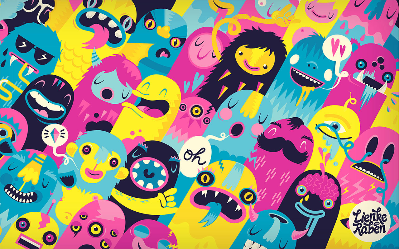
Wallpaper of the Week by Lienke Raben
by abduzeedo
The wallpaper of this week is an image created by Lienke Raben an Amsterdam based graphic/multimedia designer and illustrator. I always had an interest in many kinds of visual arts. The artwork is titled Monsters and it's available for wallpapers and print.
For more information visit http://www.lienkeraben.com/
Desktop Version
iPad Version

iPhone Version
Resolutions:
Brought to you by:
Tatá likes this
08 Jul 17:05

Wikipedia Redesign Concept
by paul0v2
This is a concept design by German designer George Kvasnikov. Wikipedia is one of the most visited websites in the world. It hasn’t been changed or redefined during the last 10 years. This is a try to make Wikipedia more modern, readable, useful and personal.
For more from George Kvasnikov visit gkvasnikov.com.
The Design
This is a try to make Wikipedia more modern, readable, useful and personal. After research steps were done, we started to create the look and feel of new Wikipedia and here is the result.
Welcome the Grid
We have completely redesigned the homepage of Wikipedia. We really wanted to bring order to Wikipedia to make it easier to operate with.


The New Reading Experience
We've chosen a more readable font to improve the user experience. We have created a universal grid for text, pictures, graphics, formulas, tables and more, thus focusing on the most important things.


Keep focused, nothing distract your attention from the essence anymore

New, clean layout and beautiful typography makes your read experience more enjoyable


Clear Structure, Rich Integrations
The menu is clearly structured and the features are easy to operate. Now the articles are displayed as pieces of paper, which you can easily organize, sort and navigate between them.

Interaction with the new wikipedia is like interaction with real paper

Click "Menu" button to see the new, clearer Wikipedia navigation

Wikipedia's own history page helps you to navigate between read and saved articles
Integrated Text Editor
Write your papers more efficiently right in your browser. It's possible to save your documents in the cloud, edit them wherever you are and publish them when they're done. And the best thing about it is, the bibliography is created fully automatically.

Select text and pictures to add them to your text editor


Activate focus mode to pay attention only on the essential
Mobile Capacity
it's very important to make Wikipedia available wherever the user are. Beautiful, readable typography and clear navigation are especially important on mobile devices. The new Wikipedia is platform for independent.

This is a concept design by German designer George Kvasnikov. For more from George Kvasnikov visit gkvasnikov.com.
Brought to you by:
Tatá likes this
08 Jul 16:43

New Lifelike Paper Birds by Diana Beltran Herrera
by Christopher Jobson


Year after year, artist and designer Diana Beltran Herrera (previously) continues to astound with her near perfectly accurate reproductions of birds using paper. The fragile sculptures shown here are a mix of private commissions and pieces for several luxury brands who use her work in displays and advertising. Originally from Columbia, Herrera studied in Bogota before spending time in Finland to study ceramic sculpture. She is now currently working on an M.A. in fine art at UWE Bristol and creates paper birds in her spare time. She most recently spoke at Pictoplasma in Berlin and had work at Centrespace in Bristol. You can see many more paper creations over on Flickr. (via Yatzer)
donotreply, Tomwalton and 5 others like this

05 Jul 16:33

Friday Fresh Free Fonts - Round-Grotesk, Axis, Watermelon
by paul0v2
Friday fresh free fonts is a series of free fonts posted every Friday, yes I know it's awesome. I will look forward to bring a lot of great fonts that will sure help you improve your typography work. Check out what I selected for you on this FFFF post and make sure to comeback for more next week.
View all FFFF posts
Round-Grotesk
Download Round-Grotesk

Axis
Download Axis

Watermelon
Download Watermelon

Tags:
Brought to you by:
Tatá likes this
01 Jul 19:24

An Abandoned Bangkok Shopping Mall Hides a Fishy Secret
by Christopher Jobson

Photo © Jesse Rockwell

Photo © Jesse Rockwell

Photo © Jesse Rockwell

Photo © Jesse Rockwell

Photo © Jesse Rockwell

Photo © Jesse Rockwell

Photo © Jesse Rockwell
In most post-apocalyptic films when the camera pans down the abandoned streets of New York or Tokyo, long after people have disappeared and the buildings have fallen into disrepair, we see nature again thriving. Trees and plants take hold in the sidewalks and wild animals like deer, bears, and lions stalk the ruins left behind by humans. But after descending the staircase at a vacant shopping mall in Bangkok, professional cook and photographer Jesse Rockwell discovered a wholly different take on beasts inheriting the Earth: fish. Specifically exotic koi and catfish, teeming by the thousands in a secret subterranean aquarium. Rockwell shares via his blog:
New World shopping mall, a four storey former shopping mall. Originally constructed as an eleven storey building. It was found to be in breach of old town Bangkok’s four storey limit on building heights. The top seven floors were demolished to adhere to building codes in 1997. In 1999 the mall burned due to suspected arson committed by a competitor in the area. The disaster resulted in several casualties, and the building has remained abandoned ever since. Not having a roof, the basement floor remains under several feet of water year round.
At some point in the early 2000s an unknown person began introducing a small population of exotic Koi and Catfish species. The small population of fish began to thrive and the result is now a self-sustained, and amazingly populated urban aquarium.
What an amazing discovery. It makes you wonder what else lurks in abandoned places around the world? You can see more of Rockwell’s photography over on 500px and on his website, Taste of the Road. (via James Theophane, The Verge)
Bunker.jordan, Cooper Griggs and 2 others like this
01 Jul 14:41
Filed under: Uncategorized Tagged: Maru, The Big J

NEW Maru- Now, THIS Is A Surprise
by Brinke
 Maru…in a box. Who woulda thunk it.
However.
There HAS to be a law of physics that says there is no way His Majestic Blorpness (FAVE FRAME™, above) can FIT inside a box of that size. And yet he does it, on cue and on camera, for the 16th time. No dust bunnies in sight, either.
Filed under: Uncategorized Tagged: Maru, The Big J
Tatá likes this
30 Jun 12:44
Filed under: Uncategorized Tagged: Kangaroos

Wondering If You’d Like 2 Order One Of Our Magazines?
by Brinke
 [Good evening, let me just hop inside and put my sample bag down, yes thanks. Hi, I am trying to raise money to put myself thru Kangaroo School, and wanted to know if you'd be interested?]
Filed under: Uncategorized Tagged: Kangaroos
Tatá likes this
27 Jun 18:08
Filed under: Uncategorized Tagged: The Big J, Thing One & Two

Guremike, Couldn’t U Buy Them A Bed Instead?
by Brinke
 Thing One and Thing Two love to sleep- what cat doesn’t- but instead of their bed, they chose a rather high-end piece of computing hardware. Reminder: Thing One (male gray,) and Thing Two (female calico.)


Filed under: Uncategorized Tagged: The Big J, Thing One & Two
Tatá and -1 others like this
25 Jun 15:39

Beauty Bites
by Norah

POST/PHOTOGRAPHY/GRAPHIC DESIGN BY NORAH CURLEE
Donuts are the new cupcake and cronuts are the new donut…but we think our croNOTS are the next big thing! (We’re calling it). You know after you core a ripe, juicy apple and slice it into rings? Looks kind of like a donut, huh? Well, with today’s Beauty Bite, we ran with it! With all the amazing beauty benefits apples bring, it really is true what they say about an apple a day…but we say bring on the toppings!

No wonder Snow White couldn’t resist…apples are such a gorgeous fruit! Not only are they easy on the eyes but these little pretties are a nutritional powerhouse. Among many various nutrients, apples have vitamins A and C, plus calcium, iron and fiber. You may already be familiar with the skin-supporting antioxidant benefits of vitamin C, as we’ve mentioned in previous posts, but one nutrient that shouldn’t be forgotten is fiber. An apple contains approximately 17% of your daily value of fiber, which is important for your body’s internal cleansing process. A beautiful body inside is a beautiful body outside! Apples also contain potassium, magnesium, and copper, all of which are beneficial to the hair by promoting growth, preventing loss and maintaining a healthy scalp. Score!

To make our pretty croNOTS, the first thing you’ll need to do is core all of your apples. You can use whatever type of apple is your favorite (so many to choose from!). Next you’ll want to slice your apple into rings…now do you see these donut-wannabees coming along?

Let’s talk toppings! To get the full donut effect you’ll need some “glaze” and some “sprinkles”. To keep things healthy, we used:
1. The “glaze”: We used flavored Greek yogurt and chose a few flavors that had especially pretty colors. For our chocolate fix, we made chocolate pudding out of an avocado…say what?! (Maybe that’s a post in and of itself!)
2. Fresh fruit. We sliced up some strawberries we had on hand, but you can use any fruit you like.
3. Almond butter. You could also use peanut butter or cashew butter.
4. “Sprinkles”: We used things like poppy seeds, almonds, cashews, peanuts, coconut, banana chips, dried apricots, dried cherries and pineapple…this is your chance to get creative with it!
Time to decorate! Make it fun…pretty food always tastes better.

We are dying to see your croNOT creations! Snap a pic and tag us! Instagram: @thebeautydept Twitter: @tbdofficial
Enjoy!
Aysecamalan, Tatá and -1 others like this
23 Jun 14:16

DIY Honeycomb Shelves are Major Wow Factors
by A Beautiful Mess
Totally wowed? Yeah, us too, especially since these statement shelves are totally DIY-able! Click through to A Beautiful Mess to see how you can get the look in your pad.
What You'll Need
- Miter saw
- wood screws or sheet rock screws
- drill
- Drill bits
- a level
- Pencil
- fencing planks ( 3 )
- tape measurer
- wood glue
- wall brackets
- rotary sander or sand paper
Tatá likes this