Shared posts

05 Jul 11:32

CSS: The Perfect Print Stylesheet

by Andreas Hecht

Even today, there are still many people that want to print out the entire internet. This can have many reasons. Maybe a team seeks to discuss an article’s content in a meeting. Or maybe somebody wants to read your article somewhere where they don’t have an internet connection. To satisfy these people, each website requires a CSS file for printing.
a4-print

Even today, many people print plenty of articles to read them offline. If you don’t want to lose readers, you should provide options for these visitors. However, there are two hazards on the way to printing.

First: today, there are barely any WordPress themes that come with a print stylesheet. The theme developers don’t put an effort in that, even though, for me, developing a print CSS is common courtesy. Second: as no print stylesheet is available, the ultimate consumer that uses the theme doesn’t have access to a print button.

Thus, in this article, I’ll show you how to create a print CSS, how it should be integrated into the theme, and how to create a print button.

Creating the Optimal Print Stylesheet

First, create an empty CSS file with a pure text or HTML editor. Name it print.css. Then copy and paste the following into the file:

/**
 * Print stylesheet for yourwebsite.com
* @version         1.0
* @lastmodified    16.06.2016
*/
 
@media print {
   Your notes
}

All CSS settings go between the opening and the closing bracket.

1 – Defining Side Borders and Font Sizes

First, we need to define the distances between the side edges, to receive an optimal result.

/* Setting content width, unsetting floats and margins */
/* Attention: the classes and IDs vary from theme to theme. Thus, set own classes here */
#content,#page {
width: 100%; 
margin: 0; 
float: none;
}
 
/** Setting margins */       
@page { margin: 2cm }
 
/* Or: */
@page :left {
margin: 1cm;
}
 
@page :right {
margin: 1cm;
}
 
/* The first page of a print can be manipulated as well */
@page :first {
  margin: 1cm 2cm;
}

I recommend using the above settings, and defining margins to 2 cm. After that’s done, the font size settings can be chosen. Here, you should keep in mind that the printer requires different units for the font size than the monitor. Thus, you need to convert pixels, em, and rem into points.

  • Pixels => Points
  • 6px => 5pt
  • 7px => 5pt
  • 8px => 6pt
  • 9px => 7pt
  • 10px => 8pt
  • 11px => 8pt
  • 12px => 9pt
  • 13px => 10pt
  • 14px => 11pt
  • 15px => 11pt
  • 16px => 12pt
  • 17px => 13pt
  • 18px => 14pt
  • 19px => 14pt
  • 20px => 15pt
  • 21px => 16pt
  • 22px => 17pt
  • 23px => 17pt
  • 24px => 18pt

A font size of 12pt has proven to be best. Now, you have the choice which font you would like to use for the print. On paper, fonts with serifs, like Georgia, are well readable.

/* Set font to 16px/13pt, set background to white and font to black.*/
/* This saves ink */
body {
font: 13pt Georgia, "Times New Roman", Times, serif;
line-height: 1.3;
background: #fff !important;
color: #000;
}
 
h1 {
font-size: 24pt;
}
 
h2, h3, h4 {
font-size: 14pt;
margin-top: 25px;
}

2 – Using Pagebreaks – Defining Pagebreaks

The three CSS attributes page-break-beforepage-break-after, and page-break-inside allow you to decide exactly where a print page will be broken. Among other things, this will prevent images from being broken into two pieces.

  • page-break-before determines if and how a pagebreak is set before this element.
  • page-break-after takes care of breaks behind an element.
  • page-break-inside can cause a break within an element, like images or graphics, for instance.
/* The following settings are possible: */
page-break-after  : auto | always | avoid | left | right
page-break-before : auto | always | avoid | left | right
page-break-inside : auto | avoid

Auto is the print element’s standard, always places a break every time, avoid prohibits the break, and left, and right are meant for continuation pages that are formatted left or right, accordingly. If applied properly, these rules would look as follows:

/* Defining all page breaks */
a {
    page-break-inside:avoid
}
blockquote {
    page-break-inside: avoid;
}
h1, h2, h3, h4, h5, h6 { page-break-after:avoid; 
     page-break-inside:avoid }
img { page-break-inside:avoid; 
     page-break-after:avoid; }
table, pre { page-break-inside:avoid }
ul, ol, dl  { page-break-before:avoid }

3 – The Handling of Links

Links should be highlighted so that they get noticed. As links can not be clicked on a piece of paper, we need to visualize the link targets. This is done with the following notes:

/* Displaying link color and link behaviour */
a:link, a:visited, a {
background: transparent;
color: #520;
font-weight: bold;
text-decoration: underline;
text-align: left;
}
 
a {
    page-break-inside:avoid
}
 
a[href^=http]:after {
      content:" < " attr(href) "> ";
}
 
$a:after > img {
   content: "";
}
 
article a[href^="#"]:after {
   content: "";
}
 
a:not(:local-link):after {
   content:" < " attr(href) "> ";
}

4 – Hiding Videos and Other iframes

Displaying videos on a printed piece of paper doesn’t make sense. However, when setting the iframes on display: none, ugly gaps remain. The following code allows you to remove the gaps and hide iframes, as well as videos entirely.

/**
 * Making intergated videos disappear, and removing the iframes' whitespace to zero. 
 */
.entry iframe, ins {
    display: none;
    width: 0 !important;
    height: 0 !important;
    overflow: hidden !important;
    line-height: 0pt !important;
    white-space: nowrap;
}
.embed-youtube, .embed-responsive {
  position: absolute;
  height: 0;
  overflow: hidden;
}

5 – Hiding Unnecessary Elements

Many areas of a website can’t be printed. For one, they don’t provide any relevant information, and for another, printing these areas is a waste of ink or toner. Thus, we will hide all areas that are not relevant.

For you, this means that you can dive into your website’s source code to find the areas that you don’t want to be printed. It makes sense to hide the following things:

The header, the navigations, the pagination, the sidebar, the tags, and the categories, the comments, the share buttons, and other elements. Here’s an excerpt from the print stylesheet of my website Techbrain.de:

/* Hiding unnecessary elements for the print */
 
#header-widgets, nav, aside.mashsb-container, 
.sidebar, .mashshare-top, .mashshare-bottom, 
.content-ads, .make-comment, .author-bio, 
.heading, .related-posts, #decomments-form-add-comment, 
#breadcrumbs, #footer, .post-byline, .meta-single, 
.site-title img, .post-tags, .readability 
{
display: none;
}

6 – Adding Messages Before and After Printing

Sometimes, it can be very useful to be able to add messages before and after the actual print content. This type of message allows you to thank your reader for printing your article. Or you can display a copyright message. Once again, it is important to find the proper CSS class of your content area.

/* Adding custom messages before and after the content */
.entry:after {
content: "\ All Rights Reserved. (c) 2014 - 2016 TechBrain - techbrain.de";
color: #999 !important;
font-size: 1em;
padding-top: 30px;
}
#header:before {
content: "\ Thank you for printing our article. We hope that some of our other articles can catch your eye as well.";
color: #777 !important;
font-size: 1em;
padding-top: 30px;
text-align: center !important;    
}

The Complete Print Stylesheet

View the code on Gist.

The Right Location: Where does the print.css belong?

The following functions belong into the theme’s functions.php or into a custom site plugin.

“Into the header” would be the correct answer. The following function is the right choice when a developed theme is to be added to the official theme index:

/* The proper function for the addition of the print.css */
 
function drweb_print_styles(){
    wp_enqueue_style(
        'drweb-print-style', 
        get_stylesheet_directory_uri() . '/css/print.css', 
        array(), 
        '20130821', 
        'print' // print styles only
    );
}
add_action( 'wp_enqueue_scripts', 'drweb_print_styles' );

If you don’t want to supply your theme with a print stylesheet, the method described above isn’t necessarily optimal. First, the CSS is loaded on all pages, and not on individual articles only, and second, it blocks the page display, while slowing down your website a bit. Thus:

Every CSS That Is Not Required For the Page Display Belongs Into the Footer!

On top of that, it should only be loaded when single.php is accessed with the individual articles. There should barely be anyone that wants to print your landing page.

That’s why we’ll let the stylesheet load in the website’s foot area.

/* The code's modified version only adds the print.css to the footer of single articles */
function drweb_print_styles(){
    if( is_single() ) {
    wp_enqueue_style(
        'drweb-print-style', 
        get_stylesheet_directory_uri() . '/css/print.css', 
        array(), 
        '20130821', 
        'print' // print styles only
        );
    }
}
add_action( 'wp_footer', 'drweb_print_styles' );

User-Friendliness: Creating a Print Button

When offering a well-done print stylesheet to your readers, it would be advantageous to also integrate a print button into your theme. The procedure is rather simple, as CSS allows you to design the button the way you want it to be. The code on my website looks like this:

<?php
function ah_print_button() {
?>    
<div class="printversion">
<header><span>Print Version</span></header>
 <a class="printit" href="javascript:window.print()"> <img src="//pathtoyourgraphic" width="146" height="20" alt="Print Page"> </a> 
</div>
<?php }

In the theme, this button can then be called up wherever you want it to appear with a simple <?php ah_print_button();?>

If you want a demo of the print stylesheet and the button, check out TechBrain.de. There you’ll find the button below the articles, and you can see what my print view looks like.

(dpe)
09 Feb 21:17

Amžiaus potvynis Londone

by Diana P.
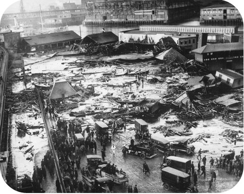
Anglijos sostinė dažnai kentėjo nuo įvairiausių stichinių nelaimių ir milžiniškų gaisrų. 1814 m. Londoną užklupo potvynis, kuris nusinešė aštuonių žmonių gyvybes. Tiesa, jie visi paskendo aluje.

Prieš 200 metų Londono centrą kirto St. Giles gatvė. Jos reputacija buvo prasta, kadangi tame rajone riogsojo patys baisiausi lūšnynai. Šiais laikais tai gana prabangus rajonas, netoli Britų muziejus ir žymiojo Covent Garden. 

Sunku net įsivaizduoti, kad XIX a. pradžioje čia stovėjo palaikiai namukai, kurių gyventojai turėjo nepaliaujamai dirbti, kad pelnytų duonos kąsnį. Viename kambaryje gyveno po kelias šeimas, rūsiai irgi nebuvo tušti. Didžiąją gyventojų dalį sudarė airių emigrantai.

Lūšnynų kaimynystėje buvo Tottenham Court Road, kur veikė įžymiosios Londono alaus daryklos. Jų buvo daug ir kiekviena aršiai kovojo dėl klientų. Daryklose virė galybę rūšių alaus, nuolat vykdavo eksperimentai, kai kurios rūšys brandintosmetų metus. Aludariai varžėsi ne tik dėl kokybės: kiekviena įmonė siekė turėti patį didžiausią rauginimo bosą. Vienos alaus gamintojų šventės proga net užfiksuotas rekordas, kai buvo pristatytas 200 žmonių talpinantis rauginimo bosas.

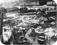
Dėl aludarių didybės manijos 1814 spalio 17 d. įvyko tragiška nelaimė. Darykloje Horse Shoe nutrūko vieno tokio gigantiško boso, kuriame jau 10 mėnesių brendo alus, veržiantysis žiedas. Boso talpa – 3550 barelių alaus, 1812 m. 1 barelis alaus buvo lygus 166.36 litro. Taip į laisvę ištrūko 590 000 litrų alaus!

Po to, kai žiedas nutrūko, katastrofa buvo neišvengiama. Darykloje dirbęs klerkas vėliau pasakojo, kad viskas priminė didžiulį sprogimą. Jūra alaus, medžio ir metalo skeveldros pramušė daryklos sienas ir užtvindė gatves. Pakeliui ši banga dar nušlavė mažuosius bosus, t. y. papildomus 1200 barelių alaus.

Nesunku paskaičiuoti, kiek alaus išplaukė į gatves. Kai kurių šaltinių teigimu, skysčio lygis siekė 4.5 metro. Potvynis užtvindė artimiausių namų rūsius ir pirmuosius aukštus iki pat lubų. Namą, kuris stovėjo arčiausiai daryklos, alaus banga tiesiog nušlavė, o pirmąja auka tapo 14-metė bufetininkė. Potvyniui nuslūgus, buvo rasti aštuonių žmonių kūnai. Liaudis netruko sukurti legendą, kad ligoninėje mirė devintoji auka, kuri išsigelbėjo nuo potvynio gerdama kylantį alų, o ją pribaigė apsinuodijimas alkoholiu.

Aukomis tapo tik vaikai ir jaunos mergaitės, nes visi kiti gyventojai buvo darbuose. Susirinkę stebėtojai nepraleido galimybės už dyką pasivaišinti – alų sėmė dubenimis, kibirais ar tiesiog mirkė jame drabužius.

Alaus daryklos savininkas buvo teisiamas, bet išvengė nuosprendžio. Teisėjo verdiktas: „Viskam Dievo valia“. Vėliau aludaris kreipėsi į parlamentą ir gavo leidimą visus ateinančius metus virti alų be akcizo, kad padengtų patirtus nuostolius.


23 Jan 10:27

DrawSVG for jQuery – Animated SVG Enlivens Your Website

by Denis Potschien
Tomas

draw svg js

Fortunately, the SVG format can do a lot more than just provide vector-based graphics. Animations are possible as well. With JavaScript, you can control and influence these animations in many different ways. The jQuery plugin DrawSVG allows you to draw the paths of an SVG graphic in an animation. This opens interesting ways of drawing the paths.

DrawSVG for jQuery - Animated Paths Enliven your Website

Requirements for DrawSVG

As a jQuery plugin, this well-known JavaScript all-rounder has to be integrated into the HTML head together with the plugin. After that, it is possible to animate the paths of an SVG graphic. These are the SVG shapes created via „<path>“ element. Line width and colour can be defined as usual, using attributes or CSS. A fill colour should not be assigned to the paths as it would not be animated and thus would always be visible.

DrawSVG uses „stroke-dasharray“ and „stroke-dashoffset“ to draw the paths. Because of that, these two attributes should not be used elsewhere.

DrawSVG: Animated Paths Enliven Your Website
Two States of the Animation

Since the plugin requires access to the DOM tree of the SVG graphic, the SVG source should be tied to the HTML element. A simple animation can be created by a single line of JavaScript.

$("svg").drawsvg("animate");

The example accesses all SVG elements that are labeled in the HTML document and shifts them to the animation function „drawsvg()“. To do so, the entire graphic is faded out at first. After that, the plugin draws the single paths of the graphic by itself. To create a realistic drawing effect, individual paths are animated with short breaks in between.

The more paths the graphic contains, the more animations are created.

Adjusting Animations via Settings

The duration of the break between the starting points of the separate paths can be set individually using the option „stagger“.

var $svg = $("svg").drawsvg({
  stagger: 5000
 }).drawsvg("animate");

The settings are transferred over as an object literal via the selection of „drawsvg()“. In the example, the break is set to five seconds. The duration of the animation, which is set to one second by default, can also be altered in the settings.

var $svg = $("svg").drawsvg({
  stagger: 5000,
  duration: 10000
 }).drawsvg("animate");

Additionally, there is the option of using a callback feature that pops up when the animation is finished, and the full graphic becomes visible.

var $svg = $("svg").drawsvg({
  callback: function() {
    alert("Animation is finished.");
  }
 }).drawsvg("animate");

In the example, we set up a simple alert when the animation is complete.

DrawSVG: Animated Paths Enliven Your Website

Drawing Graphics on Scroll

With a few additional lines of JavaScript, you can have the SVG graphic drawn on your visitor’s scrolling your website. To do so, the SVG element has to be fixed („position: fixed“) using CSS so that it is always visible. The page needs to be scrollable of course which you can achieve by defining a sufficient height with CSS. The following lines make sure that the graphic is drawn by scrolling down.

var $svg = $("svg").drawsvg();
 
$(window).on("scroll", function() {
  $svg.drawsvg("progress", $(window).scrollTop() / ($(document).height() - $(window).height()));
});

Defining the total duration of the animation is of course superfluous this way because the animation depends on the speed of scrolling. The faster you scroll, the faster it is drawn. The drawing disappears when scrolling in the opposite direction again.

Using DrawSVG with Paths and Masks

Another way to use the plugin is the combination of paths and masks. For example, a „<mask>“ element can also contain a path when this approach is used. When the path is drawn so that it covers the entire mask area due to its massive line strength, you can easily fade in nice images or other elements.

DrawSVG: Animated Paths Enliven Your Website
Two States of a Masked Animation

Conclusion

The usage options of DrawSVG are varied. Applying the plugin is easy. Beautiful effects are achieved despite the fact that there are only a few options. The documentation is very clear. A couple of demos show examples of what’s possible.

DrawSVG is being developed by Leonardo Santos from Porto Alegre and is provided on Github for use and participation. The plugin is free for commercial purposes also as Santos distributes it under the liberal MIT license.

(dpe)

23 Jan 10:27

mo.js: JavaScript Framework for Complex Animations

by Denis Potschien
Tomas

js animations

The basics for demanding animations within the browser are set thanks to CSS3 and JavaScript. But the CSS characteristics and JavaScript methods only allow general movement. The framework mo.js, however, allows much more complex animations using unique but quick to set up easing features.

mo.js: JavaScript Framework for Complex Animations

Easy Entry, but no Documentation Yet

As mo.js works without jQuery or other libraries, all you need to do is implement the framework’s JavaScript file. In the download package, there is a demo HTML document in which the JavaScript file as well as a „<div>“ element are set already. That means you can instantly start and take a look at all of mo.js’ options.

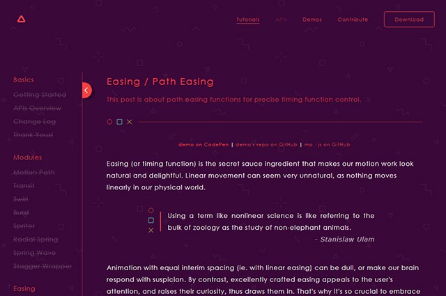
You can find several tutorials on the website, explaining what mo.js does and how to use it with the help of code examples and a demo. Unfortunately, there are only tutorials for the easing options so far. There are no tutorials available for the different modules and tweening features. A documentation is missing as well. But mo.js is already without that a fascinating animation tool for its unique way of creating complex easing features.

mojs_tutorials
Tutorial Page

Easy Syntax for Easy Animations

Using mo.js is very straightforward. You can create new animations and assign them to any desired element via „mojs.Tween()“. The amount of repeats and the duration of the animations will be set via parameters. An event handler allows you to control the actual animation.

new mojs.Tween({
  repeat: 2,
  duration: 3000,
  delay: 1000,
  onUpdate: function (progress) {
    document.getElementsByTagName("div")[0].style.transform = "translateY(" + 200 * progress + "px)";
 }
}).run();

In the example, a three-second animation that starts after one second and is repeated twice is created. Via „onUpdate()“, a feature that is responsible for the actual animation is accessed. The progress of the animation is handed over via „progress“. It’s a value that counts from 0 to 1 during the animation.

In the example, the value is used to calculate the animation. To do so, „progress“ is multiplied by the target value of the animation – 200 in the example. The „<div>“ element moves up by 200 pixels on the y-axis via „translateY()“.

Creating Easings with Paths

Several easing features for animations were entered using CSS3. In total, there are just five different, simple options available: „linear“, „ease“, „ease-in“, „ease-out“ and „ease-in-out“. „cubic-bezier()“ also allows you to create an individual easing with a bezier curve.

mojs_easing
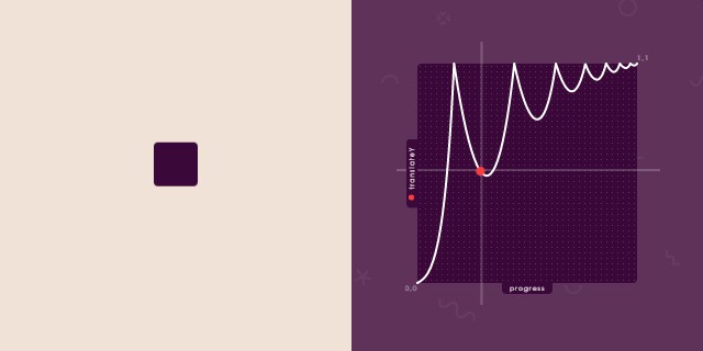
Paths Lay the Groundwork for Easings

You can develop an entirely custom easing with many accelerations and brakes using mo.js as well. These are defined by a path based on the SVG element „<path>“. For example, you draw a path in Illustrator and save it in the SVG format. The values of the paths marked in the „d“-attributes will be used as the base for your easing.

var bouncyEasing = mojs.easing.path("M0,100 C6.50461245,96.8525391 …");

In the example, an SVG path is handed over as an easing path using „mojs.easing.path()“; a feature that converts the easing of an element with the CSS attribute „transform“.

new mojs.Tween({
  onUpdate: function (progress) {
    var bounceProgress = bouncyEasing(progress);
    document.getElementsByTagName("div")[0].style.transform = "translateY(" + 200 * bounceProgress + "px)";
  }
}).run();

In this example, an „<div>“ element with a custom easing on the y-axis is animated thanks to „translateY()“. Instead of a linear movement, as seen in the first example, you can now integrate as many brakes and accelerations as you want. This way, you are also able to revert the movement’s direction with an accordingly drawn path. An animation made with classic CSS3 easing features only works in one direction.

With mo.js, you can not only move an element, but also change its shape. „scaleX()“ or „scaleY()“ can be used to make an element change its size while being animated.

Extensive Animation Options

Some examples on the mo.js website show the extensive animation options of mo.js. We can only hope that the documentation will be released soon and that more tutorials will be published. Currently, mo.js’ usability is restricted. If you want to, you can also get to know the framework on your own, using the examples.mojs_beispiel
Complex Animations Using mo.js

Although not all features are documented, mo.js is worth keeping an eye on. The framework is available for private and commercial use under the liberal MIT license.

(dpe)

23 Jan 10:26

Text Effects With SVG: Patterns, Masks and Clipping Paths

by Denis Potschien
Tomas

cool

You already know that the SVG format can do much more than displaying vector-based shapes. Today, I want to show you how text effects can be created with SVG. Patterns, masks and clipping paths allow you to implement a plethora of creative ideas. You can realize unusual and unique text effects that can’t even be done with the help of the many features of CSS3 or that at least don’t work in every popular browser.

Text Effects With SVG: Patterns, Masks and Clipping Paths

Patterns as Text Background

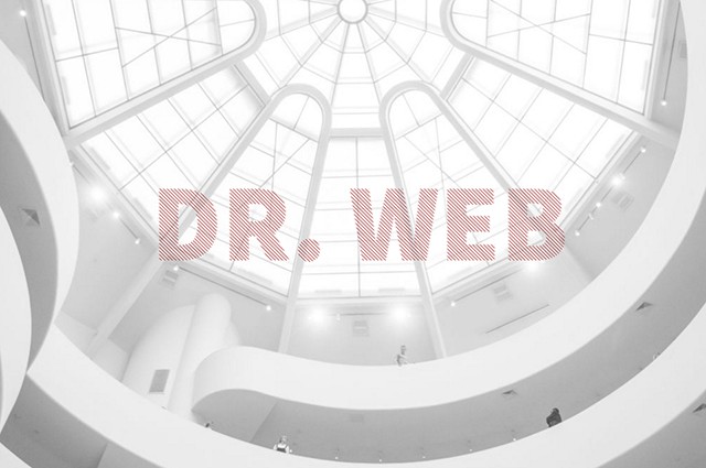
The „<pattern>“ element allows you to create any pattern you want via SVG and set it as the background for shapes, and also for texts. This can be repeating lines, circles or squares. Defining two squares with the length of one pixel each is enough to create a two by two-pixel chess board pattern. Even a simple line can become an interesting pattern for texts.

&lt;defs&gt;
  &lt;pattern id="muster" x="0" y="0" width="5" height="5" patternUnits="userSpaceOnUse"&gt;
    &lt;line x1="0" y1="0" x2="5" y2="5" stroke="#a62121" /&gt;
  &lt;/pattern&gt;
&lt;/defs&gt;

„<pattern>“ elements, as well as other elements, that are not directly displayed, but are referenced, should be placed withing the „<defs>“ container.

An ID has to be assigned to the pattern for it to fill an element. Afterwards, this ID is assigned to the pattern via „fill“ attribute or CSS characteristic. This doesn’t only work with classic shapes, but also with the font element „“.

text {
  fill: url(#muster);
}

svg-texteffekte1

In the example, a pattern is marked with the ID „pattern“ via „<pattern>“ and subsequently assigned to a „<text>“ element. In contrast to purely graphic solutions, the text can still be selected and thus, it can also be copied. CSS3 has a similar option with its attribute „background-clip“. The value „text“ makes sure that a background graphic that was assigned to an element will only be used on the text of this element. This creates the same effect as in the SVG example. However, Chrome is the only browser that supports the value „text“ for this attribute.

Cut Out Text

Using the „<mask>“ element allows you to achieve the opposite effect of the first example. Instead of adding a pattern to a text, you can cut out text from a pattern. To do so, you need to set a pattern, as well as a mask via the „<mask>“ element in the <defs>“ area. Masks work similar to how they work in Photoshop and other image editing applications. The tonal value determines what a mask should represent. The brighter the tonal value, the higher the transparency. White means 100 percent visibility and black equals no visibility at all. When you place a black, page-filling rectangle and put white text in front of it, you get a mask that does not cover the text.

&lt;defs&gt;
 &lt;pattern id="muster" width="5" height="5" patternUnits="userSpaceOnUse"&gt;
   &lt;line x1="0" y1="0" x2="5" y2="5" stroke="yellow" /&gt;
 &lt;/pattern&gt;
 &lt;mask id="maske"&gt;
   &lt;rect fill="white" /&gt;
   &lt;text x="50%" y="50%" fill="black"&gt;Dr. Web&lt;/text&gt;
  &lt;/mask&gt;
&lt;/defs&gt;

In contrast to the first example, the text is part of the mask and not an independently displayed element. In the last step, the mask needs to be assigned to an element via the „mask“ attribute. In this case, the element is another page-filling rectangle. This square is filled with the pattern via „fill“.

defs + rect {
  fill: url(#pattern);
  mask: url(#mask);
}
 
 <a href="http://codepen.io/denispotschien/pen/KVVGaM"><img class="alignnone size-medium wp-image-67713" src="http://www.noupe.com/wp-content/uploads/2016/01/svg-texteffekte2-640x425.jpg" alt="svg-texteffekte2" width="640" height="425" /></a>

In the example, the rectangle displayed on the drawing area receives the mask with the ID „mask“ via the „mask“ attribute, as well as the pattern with the ID „pattern“ via „fill“.

It is important, that the used rectangles and their parent elements all have 100 percent width and height so that the pattern can cover the entire page. As the text is part of the mask here, the text is not selectable in this case.

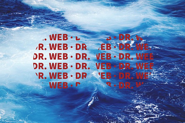
Clipping Text With Paths

Besides masks, SVG knows clipping paths. These also work similar to how they do in Photoshop. A clipping path defines a path that is used to clip an element, a text, for example, to match the shape of the path. To do that, a clipping path is defined in the „<defs>“ area via „<clip-path>“.

&lt;defs&gt;
  &lt;clipPath id="pfad"&gt;
    &lt;circle cx="33%" cy="50%" r="150" /&gt;
    &lt;circle cx="66%" cy="50%" r="150" /&gt;
  &lt;/clipPath&gt;
&lt;/defs&gt;

This can contain random paths that add up and thus result in the clipping path. Afterwards, the clipping path is assigned to an element by the attribute „clip-path“.

svg-texteffekte3

In this example, a multiline text is clipped to match the shape of two overlapping circles. The ID of the clipping path is assigned to the „<text>“ element by the CSS attribute „clip-path“.

text {
  clip-path: url(#pfad);
}

Of course, this clipping effect can also be achieved with a mask. However, masks always require a black and a white area. This means that you need several shapes, which all need to have a colour attached to them. All you need for a clipping path is a path.

Browser Support

The neat thing is, that all recent browsers support „<pattern>“ as well as „<mask>“ and „<clip-path>“ elements. Only for older browsers, a fallback, which can consist of a simple text or a graphic, might be needed.

Play With These Examples on Codepen

(dpe)

This article was originally written in German language for our sister magazine Dr. Web.

23 Jan 09:45

5 pažadai sau, naudingi karjerai ir jų norėsis laikytis ištisus metus

by Paskelbta
Tomas

new year resolution

Turiu gerų žinių: aš sunaikinsiu visą dramatiškumą, tvyrantį tavo naujųjų metų pasižadėjimuose. 2016 – aisiais skatinu padėti į šalį tokius tikslus kaip „nuvykti ten“, „padaryti tą“ – „numesti porą kilogramų“, „dažniau sportuoti“, „mažiau stresuoti“ – vietoj […]

The post 5 pažadai sau, naudingi karjerai ir jų norėsis laikytis ištisus metus appeared first on Psichika.

05 Jan 06:08

Kreivasis miškas Lenkijoje

by Vitalijus M.
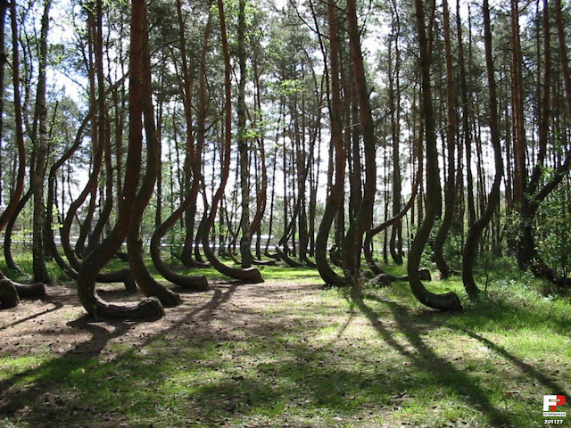
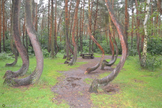
Dabartinėje šiaurės vakarų Lenkijoje, netoli Gryfino (vok. Greifenhagen) miesto, yra paslaptingas Kreivasis miškas. Medžiai čia sodinti 1930 – 1934 m., kuomet ši teritorija priklausė Vokietijai. Miškas ypatingas tuo, kad čia augantys medžiai visiškai nepanašūs į kitus, netoliese augančius medžius. 


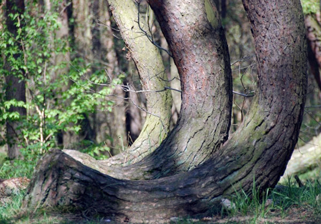
Apie 400 šio miško medžių kamienai išlenkti 90 laipsnių kampų prie pat žemės. Beje, visi jie išlinkę šiaurės kryptimi. Jų kirtimas draudžiamas. Kreivasis miškas, kurio plotas sudaro 1,8 ha, paskelbtas valstybės saugomu gamtos paminklu. Žinovai pastebi dar vieną keistenybę: dėl nežinomų priežasčių medžiai čia neišauga iki natūralaus aukščio. Išlenktos pušys siekia 12 - 15 metrų, o tai mažoka medžiams, kurių amžius – daugiau kaip 80 metų. Paaiškinti šio fenomeno kol kas niekas nesiryžta, tačiau egzistuoja daugybė versijų. 


Medžių anomalijos sukėlimu kaltintas stiprus vėjas, raganos, ateiviai, „ypatinga vietos energetika“ ir pan., tačiau visos šios nuomonės mokslininkams kelia šypsnį. 


Greičiausiai jaunos pušaitės išlenktos žmonių pastangomis, tyčia formuojant neįprasta jų augimą. Kam tai buvo padaryta – kitas klausimas. Galbūt kreivi medžiai buvo reikalingi išskirtinių baldų, rogių ar valčių gamybai? Dabar tai - pati pagrindinė versija.