Welcome to the summer American Astronomical Society (AAS) meeting in Austin, Texas! Astrobites is attending the conference as usual, and we will report highlights from each day here. If you’d like to see more timely updates during the day, we encourage you to search the #aas230 hashtag on twitter. We’ll be posting once a day during the meeting, so be sure the visit the site often to catch all the news!
Plenary Session: George Ellery Hale Prize, The Solar Magnetic Field: From Complexity to Simplicity (and Back) (by Benny Tsang)
The morning plenary session started with the George Ellery Hale Prize presentation of our speaker Manfred Schüssler (Max Planck Institute for Solar System Research) for his “outstanding contributions over an extended period of time to the field of solar astronomy”. Eugene Parker, who first discovered the magnetism and polarity of sunspots and who we named NASA’s new Sun-touching spacecraft after, was the first scientist to have received this honor. Today Schüssler led us on a journey to disentangle the Sun’s complex magnetic field with simple models — can this really be done?
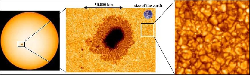
Zoomed-in images showing the complex structures within structures on the Sun’s surface. [NAOJ, JAXA, NASA]
To get a sense of the level of complexity in the magnetic structures of the Sun, let’s first take a look at some images. On the seemingly simple and boring surface, we see tiny features around sunspots (middle panel) and granules (hot, rising pockets of gas; right panel). In addition, all these are highly turbulent and dynamical, so we are faced with the challenge of explaining a hierarchy of time-varying complexities on a wide range of scales.
Numerical simulations have tried to reproduce the observed features by including physics at different scales — from the near-surface layer, to the deeper layer where the magnetic field is believed to be created, to the whole convection zone. Although simulations are not perfect in reproducing all features, Schüssler stressed that they offer an otherwise unavailable 3D view of the Sun, which allows new questions to be asked. Among all, the small-scale dynamo model shows the most promising prospects for explaining most of the observed small-scale structures. This dynamo process is so fundamental that it is believed to prevail even when the first generation of stars were born.
The Sun can be quite predictable in its own way. The highly regular, 11-year cycle of sunspot activity and the 22-year field direction reversal are two examples. Such regularities can be understood by the Babcock and Leighton (BL) model pretty well, which describes the activities as driven by the twisting of magnetic field lines in the Sun by its rotation. That said, the full picture of Solar magnetism is still far from being complete. As an example, Schüssler noted that the emergence of magnetic field deeper in the Sun (flux emergence) assumed in the BL model seems to be extremely complex in and of itself. Future scientists, I think we could really use some help here.
Press Conference: Bending & Blending (by Benny Tsang)
The last press conference of this AAS meeting featured two speakers and had a rather enigmatic title: Bending and Blending. To summarize in one sentence, it was about the bending of light by a white dwarf, and the blending of a suite of versatile tools for better data visualization.
Kailash Sahu (Space Telescope Science Institute) led the discussion of a truly exceptional microlensing event. One of the crucial tests of Einstein’s theory of general relativity is the bending of light around massive objects. Unlike typical gravitational lensing by clusters of galaxies, microlensing events are caused by objects with stellar or planetary masses. Sahu’s team observed a foreground white dwarf (Stein 2051 B) deflecting light of a background star. By analysing the images formed by this “white dwarf lens”, they estimated its mass to be 0.675 times the mass of the Sun (with ~7% error). Until this discovery, all mass estimates of white dwarfs have relied on binary systems. Sahu’s discovery opened up a new way to measure white dwarfs’ masses, which could empower many new discoveries in astronomy. [Full press release]
Aside: If you wish to do your personal gravitational lensing observation, there’s a chance during the upcoming total Solar eclipse event on Aug 21. We can all be part of it!
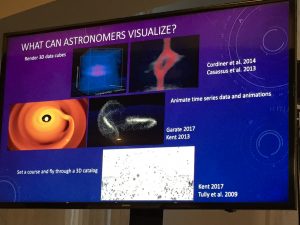
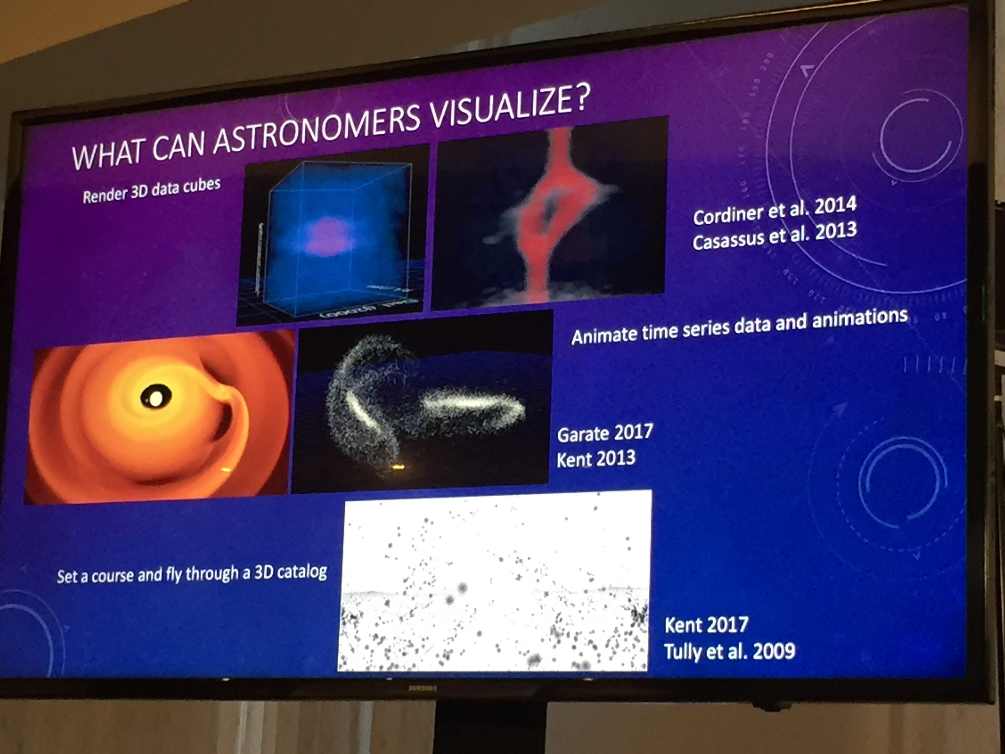
Kent showing examples of visualization projects by astronomers. This includes the making of protoplanetary disks, galaxy mergers, N-body simulations, and a fly-through of a 3D source catalog!
Next, Brian Kent (National Radio Astronomy Observatory) illustrated the multi-purpose, well-documented, scientific data visualization tool he built, known as Blender. Data from multi-wavelength observations and advanced supercomputer simulations have been growing in both size and complexity. Not only is visualization required to help communicate new discoveries to the general public, but scientists themselves rely heavily on efficient visualization tools to make discoveries in the first place. Recently Kent has even combined Blender with Google Spatial Media to “put data in the hands of the audience” — data visualization on users’ mobile devices. We can start making our own scientific art pieces now by following the tutorials and reading the new Blender book! [Full press release]
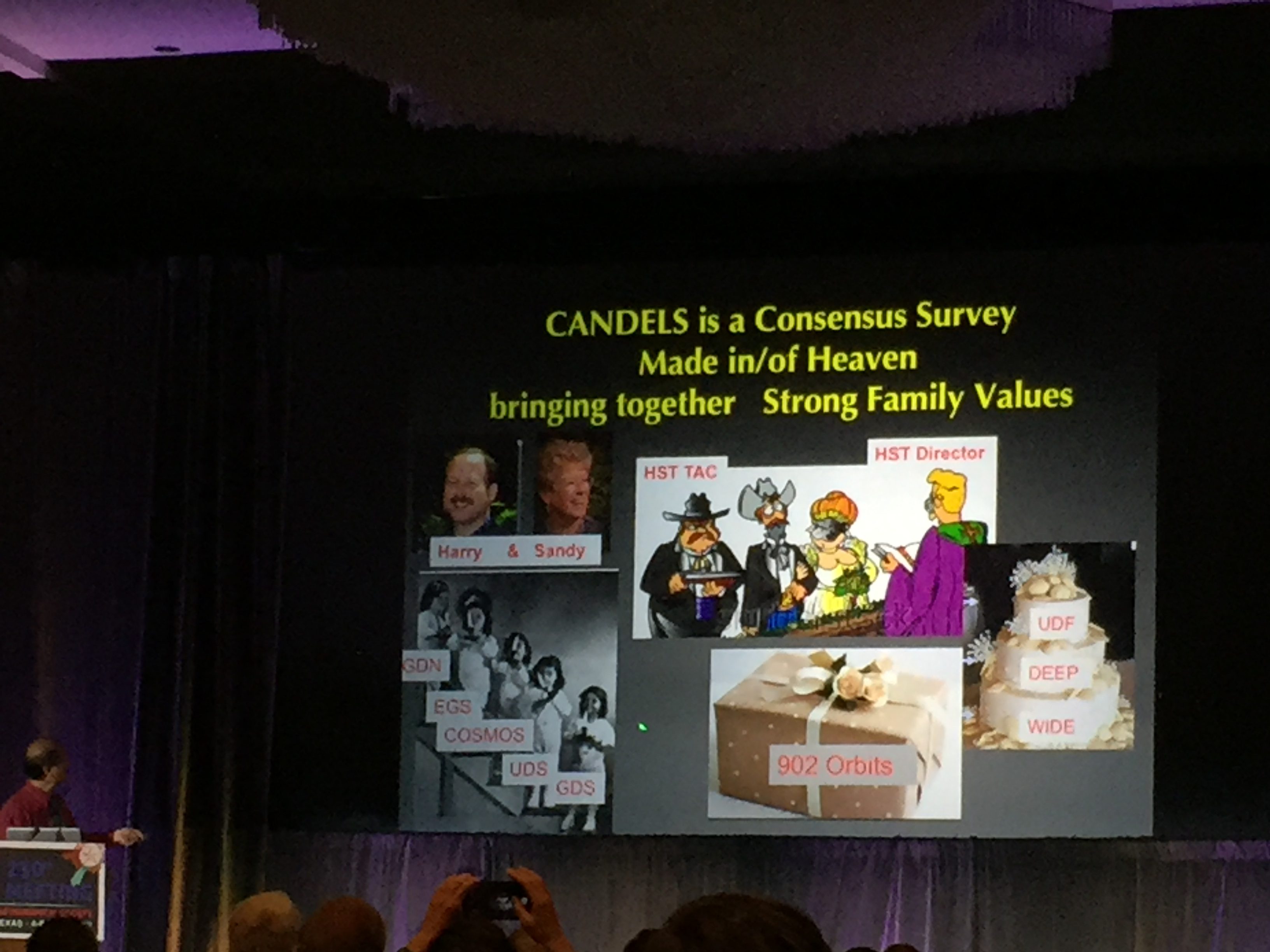
Plenary Session: CANDELS: A Cosmic Quest for Distant Galaxies Offering Live Views of Galaxy Evolution (by Benny Tsang)
Inventor of photometric redshift measurement David Koo (University of California, Santa Cruz) told the story of the cosmic quest to understand galaxy formation. Having recently retired to “finally do research full-time”, Koo started by clarifying a common question about the CANDELS program — the name ‘CANDELS’ is indeed an intentional misspelling to avoid generic results on search engines. CANDELS is a Hubble Space Telescope legacy survey with an unprecedented amount of data, providing both wide and deep coverage of galaxies. The entire image database consists of 250,000 galaxies from redshift of 1.5 to 8.

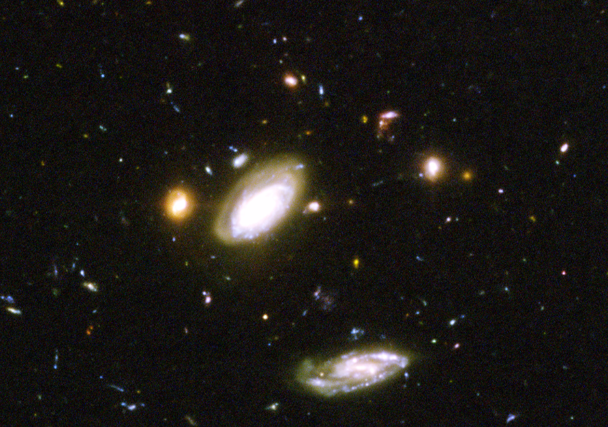
A small patch of the Hubble Ultra Deep Field image showing variations of environments and galaxy types within just a single image. [Image credit: HUDF/HST]
Why do we want to get yet more data on distant galaxies? It is obvious from a quick glance at the Hubble Deep Field that cosmic environments vary a lot — we see galaxies of different shapes and colors! Moreover, galaxies cannot be neatly divided into discrete types; they interact with each other and evolve. A large amount of data is therefore needed to cover a representative volume of the Universe in order for a galaxy evolution study to make sense.
With complementary coverage by Herschel and Spitzer (infrared), Chandra (X-ray), and GALEX (ultraviolet), we earn the bread and butter for galaxy evolution, e.g. stellar mass, size, star formation rate, and morphology. In particular, the addition of the X-ray band provides important hints about galaxies’ central supermassive black holes. An important component of the CANDELS program is the inclusion of theorists working with N-body and hydrodynamical simulations. By reproducing observed galaxies from first principles, simulations allow us to track them back in time (like rewinding a movie) to see the processes of their evolution.
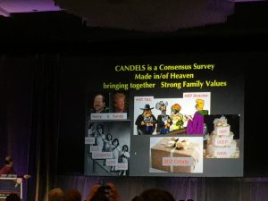
Koo attributed the success of the CANDELS collaboration to their strong “family values.”
Throughout the talk Koo filled the entire hall with his warmth, and he didn’t hesitate to give thanks to his team. Besides the principal investigators Sandra Faber (who has won the Bruce Gold Medal, the “cosmology Nobel prize”) and Henry Ferguson, he also thanked astronaut Andrew Feustel for installing the camera that made CANDELS possible! With the prospects of new telescopes such as JWST, ALMA, SKA, and those of decades to come, Koo echoed Casey on Day 1, envisioning that detailed mapping of gas and dust is the future of astronomical observations.

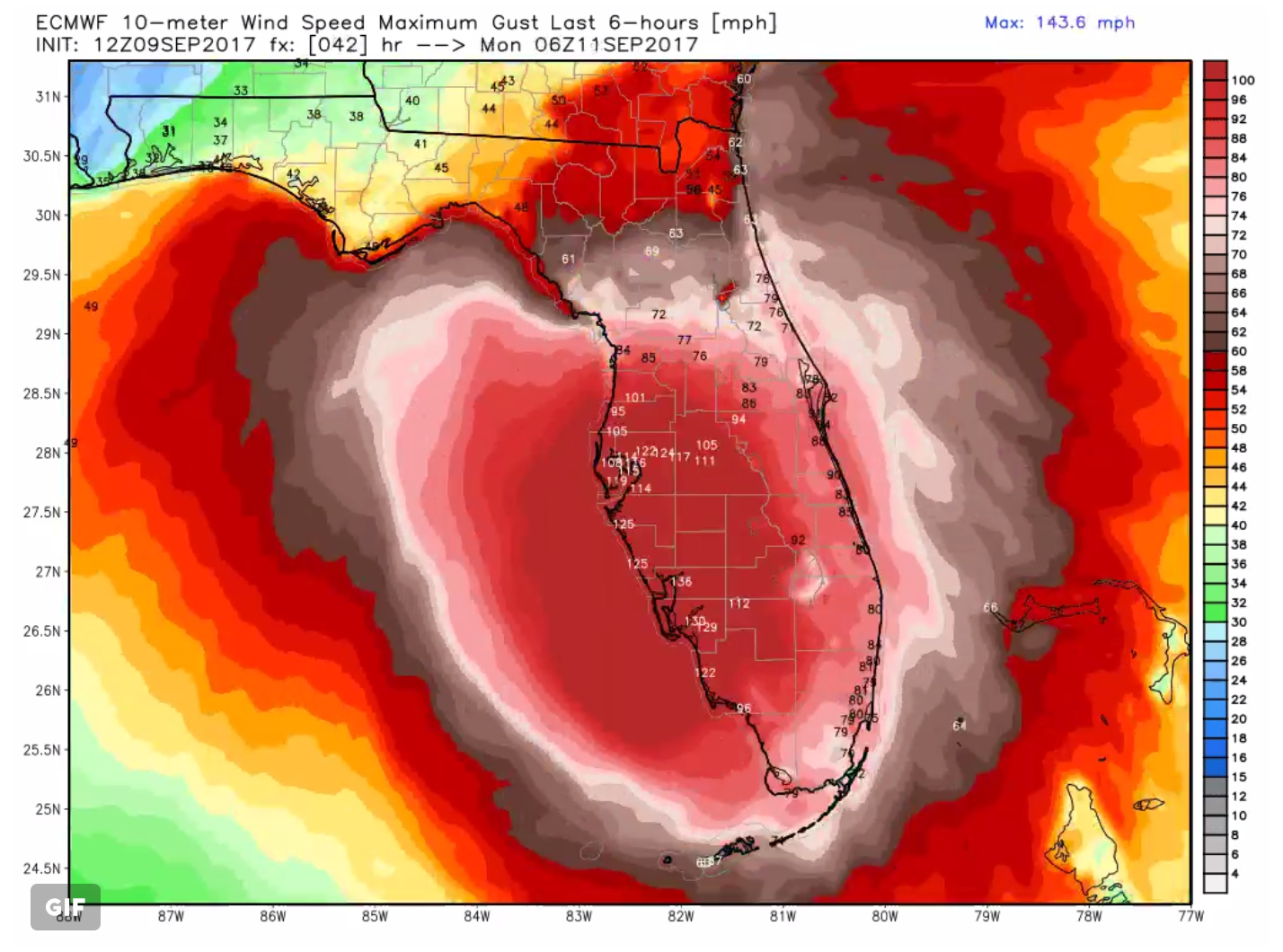


![Radar of Hurricane Irma Passing Through the FL Keys [oc]](https://b.thumbs.redditmedia.com/PGqtfS1fmFpRsPAxods3yOLayqhEaqTG-sYWEB6Q32c.jpg "Radar of Hurricane Irma Passing Through the FL Keys [oc]")
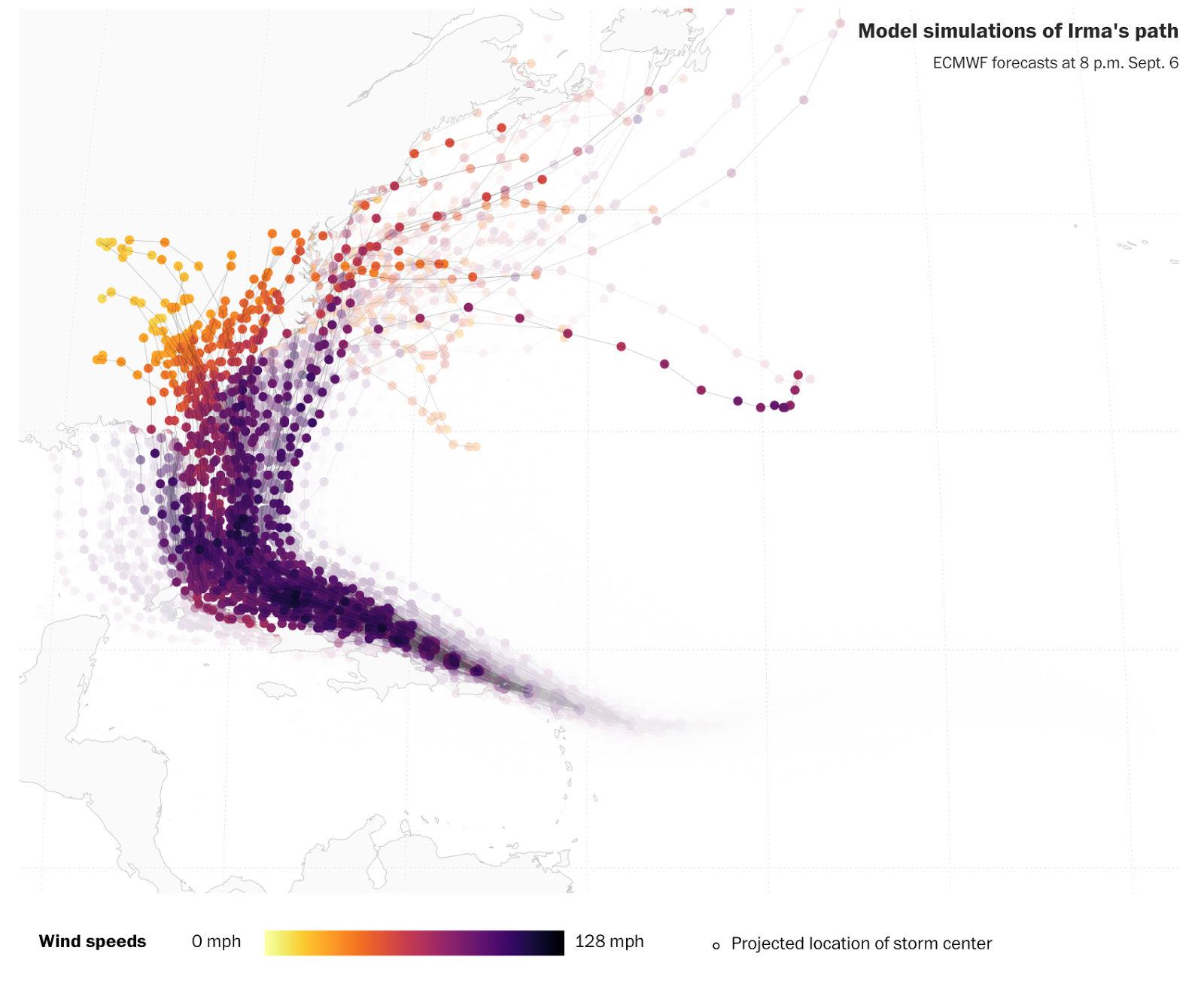
![Timelapse of predictions vs actual paths for Irma, Jose, and Harvey, updated with help from reddit [OC]](https://b.thumbs.redditmedia.com/STOyyRs47V092hEbvfWu9vTqdeB-tkoa7gkD90V_-bk.jpg "Timelapse of predictions vs actual paths for Irma, Jose, and Harvey, updated with help from reddit [OC]")
![My Car’s Fuel Economy [OC]](https://b.thumbs.redditmedia.com/Gy2KjLktO7heccjHG6vBMec4WK_OVhhQjuMPrv1EhGk.jpg "My Car’s Fuel Economy [OC]")
![Map of the population density in the Arab Republic of Egypt as of 2010 [2952x2716] [OC]](https://b.thumbs.redditmedia.com/futlV63HW4sx73pURR9eFz70TR0NuO_1mNk1d9PWeQA.jpg "Map of the population density in the Arab Republic of Egypt as of 2010 [2952x2716] [OC]")
![Months 3 to 17 of my baby's sleep and breastfeeding schedule [OC] (data collected manually and visualized in Excel)](https://b.thumbs.redditmedia.com/q0kEDBSgn9oCHnMNq_SN86cX5iBdRZSAj0Hcl1lLr3U.jpg "Months 3 to 17 of my baby's sleep and breastfeeding schedule [OC] (data collected manually and visualized in Excel)")


")


![[link]](https://i.redd.it/jc9x00zeh5lz.gif)
![[link]](http://i.imgur.com/XJbXZNL.png)
![[link]](https://i.redd.it/xk8e5bov36ez.jpg)