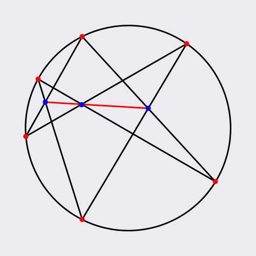
Pascal’s theorem.
No matter how you choose the red points, the three blue point will lie on a straight line.
The red line is known as the Pascal line of the hexagon.
JdinotoI really enjoy these elegantly animated geometry theorems.
Pascal’s theorem.
No matter how you choose the red points, the three blue point will lie on a straight line.
The red line is known as the Pascal line of the hexagon.
JdinotoThis is terrifying. If you are scientifically literate, this is terrifying.
JdinotoIt sounds like modern minimal music. Very pretty stuff.
JdinotoInteresting observations about declining attention span possibly being correlated with increasing use of mobile devices.
![A Decline in Attention Span with the Rise of Mobile: A look at 60 million visits to my site 2010-7 [OC]](https://b.thumbs.redditmedia.com/4szf-bChEaVxDFEJ9YPAOdFp9fdRClqXNoR74mTD2cs.jpg "A Decline in Attention Span with the Rise of Mobile: A look at 60 million visits to my site 2010-7 [OC]") |
submitted by /u/flexpex [link] [comments] |
JdinotoThis is terrifying. If you are scientifically literate, this is more frightening than anything David Cronenberg ever imagined.
JdinotoThis is a fascinating article about differing views on what it means to be "genius".
“Scenius” is a term coined by musician and producer Brian Eno to counter “The Lone Genius Myth,” or the idea that innovation in art and culture comes from a few Great Chosen Ones. When Eno draws what the traditional model of genius looks like, he uses the example of the symphony orchestra, with God or the Muse at the very top of the triangle, and on descending levels, the composer, the conductor, the musicians, and, finally, the audience listening:

He then draws other organizations in our society that traditionally have hierarchical models:
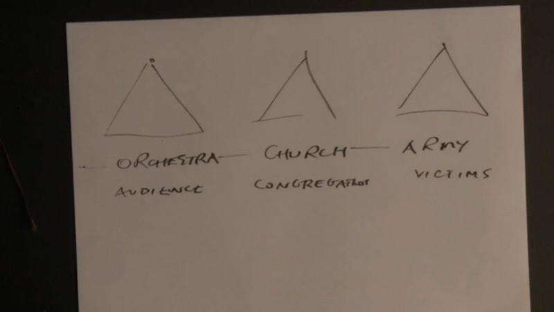
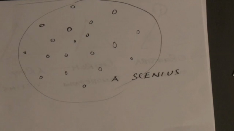
When he gets to “scenius,” or what he calls the communal form of genius, he draws this:
Here’s what I wrote about it in my book, Show Your Work!:
There’s a healthier way of thinking about creativity that the musician Brian Eno refers to as “scenius.” Under this model, great ideas are often birthed by a group of creative individuals—artists, curators, thinkers, theorists, and other tastemakers—who make up an “ecology of talent.” If you look back closely at history, many of the people who we think of as lone geniuses were actually part of “a whole scene of people who were supporting each other, looking at each other’s work, copying from each other, stealing ideas, and contributing ideas.” Scenius doesn’t take away from the achievements of those great individuals: it just acknowledges that good work isn’t created in a vacuum, and that creativity is always, in some sense, a collaboration, the result of a mind connected to other minds.
What I love about the idea of scenius is that it makes room in the story of creativity for the rest of us: the people who don’t consider ourselves geniuses. Being a valuable part of a scenius is not necessarily about how smart or talented you are, but about what you have to contribute—the ideas you share, the quality of the connections you make, and the conversations you start. If we forget about genius and think more about how we can nurture and contribute to a scenius, we can adjust our own expectations and the expectations of the worlds we want to accept us. We can stop asking what others can do for us, and start asking what we can do for others.
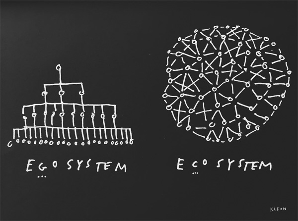
To put it even more simply: Genius is an egosystem, scenius is an ecosystem.
Our world is an ecosystem in which our only real chance at survival as a species is cooperation, community, and care, but it’s being lead by people who believe in an egosystem, run on competition, power, and self-interest.
This was the message of the great feminist and pacifist Ursula Franklin, who said:
The dream of a peaceful society to me is still the dream of a potluck supper. The society in which all can contribute, and all can find friendship. Those who bring things, bring things that they do well. [We must] create conditions under which a potluck is possible.
When you think about your family, your friends, your neighborhood, your office, your city, your country, your world… are you operating as an ecosystem or an egosystem?
Which model we choose to operate under will determine the quality of our lives, and, arguably, our survival.
JdinotoThis is an amazingly detailed write-up about the subtle differences in two popular map systems. Well worth the read!

Google collects much of their own data to construct their maps, whereas Apple sources most of their data externally. This difference, coupled with varying cartography that changes over time, means an interesting contrast between the two map services. Justin O’Beirne took monthly screenshots for a year to look at the differences more closely.
Tags: Apple, cartography, Google
JdinotoA simple and elegant example of effective data visualization. (bar charts were ineffective, bump charts were much more effective)
Take a look at the following chart, and guess what message the designer wants to convey:
This chart accompanied an article in the Wall Street Journal about Wells Fargo losing brokers due to the fake account scandal, and using bonuses to lure them back. Like you, my first response to the chart was that little has changed from 2015 to 2017.
It is a bit mysterious the intention of the whitespace inserted to split the four columns into two pairs. It's not obvious that UBS and Merrill are different from Wells Fargo and Morgan Stanley. This device might have been used to overcome the difficulty of reading four columns side by side.
The additional challenge of this dataset is the outlier values for UBS, which elongates the range of the vertical axis, squeezing together the values of the other three banks.
In this first alternative version, I play around with irregular gridlines.
Grouped column charts are not great at conveying changes over time, as they cause our eyes to literally jump over hoops. In the second version, I use a bumps chart to compactly highlight the trends. I also zoom in on the quarterly growth rates.
The rounded interpolation removes the sharp angles from the typical bumps chart (aka slopegraph) but it does add patterns that might not be there. This type of interpolation however respects the values at the "knots" (here, the quarterly values) while a smoother may move those points. On balance, I like this treatment.
PS. [6/2/2017] Given the commentary below, I am including the straight version of the chart, so you can compare. The straight-line version is more precise. One aspect of this chart form I dislike is the sharp angles. When there are more lines, it gets very entangled.
JdinotoReally nice dataviz and interpretation.
 |
submitted by /u/dr_isk_16 [link] [comments] |
JdinotoInteresting tool for exploring educational attainment vs. congressional district.
![A look at educational attainment in congressional districts [OC]](https://b.thumbs.redditmedia.com/FH8zH9EBe5VPRqSSlYOS7FZnhDR_CRHP-iTNg51KvQc.jpg "A look at educational attainment in congressional districts [OC]") |
submitted by /u/OverflowDs [link] [comments] |
JdinotoNice visualization of something that can be very hard to grasp since we're just not accustomed to thinking on this scale.
![Saturn's Moons to Scale [article]](https://b.thumbs.redditmedia.com/sW4BQNaWQtt3HKoTF4YYyJyVG_q46ZPgHa3mYT9WS1Q.jpg "Saturn's Moons to Scale [article]") |
submitted by /u/ab-absurdum [link] [comments] |
JdinotoThis is a really nice video breakdown of how the state budget works and how it has changed over time.
 |
submitted by /u/Whatisprogress [link] [comments] |
JdinotoThis is a really nifty insight into how people draw pictures of common items. :)
 |
submitted by /u/qartas [link] [comments] |
JdinotoA clever distortion field visualization of a subway map.
 |
submitted by /u/redkulat [link] [comments] |
JdinotoBeautiful example of how this open-source project has grown!
JdinotoIf you're not following this gif artist, do so immediately. He always posts elegant and creative geometry-based looping animations.

four rectangles
In October of 2012, Bill and Melinda Gates visited a school in the Eagle County, Colorado, school district called Eagle Valley High School. This school implemented many Gates funded experiments, including merit pay, and Gates praised the school in his 2013 annual letter. I analyzed their test scores a few years ago and wrote about them.
Colorado is a state that rates schools based on ‘growth’ measures. These are the metrics that supposedly enable us to compare schools where students have different proficiency rates by focusing instead (as Al Franken famously grilled DeVos about) on ‘growth.’ And while I agree that a school that is getting actual growth in student learning is a good thing, I don’t think that the measures right now, whether they are for teachers or for schools, are very accurate. Still, since that never stops reformers like Bill Gates from arguing that schools or teachers that don’t perform well on these measures need to be closed or fired, I do like to point out when some of the schools they praise do poorly on these metrics.
I checked the most recent ‘growth’ numbers from Colorado. A ‘growth’ score of 50% means that a school is getting average ‘growth’ compared to the other schools in Colorado. Something in the 40s is not so good while something in the 30s is really bad. So it is ironic that the school that Gates visited and wrote about, Eagle Valley High School has the lowest ‘growth’ score in their district with a 36.5% in ELA and a 34% in Math. The whole district has below average ‘growth’ with the exception of the middle schools which have average ‘growth.’
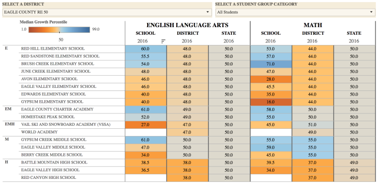
I know that Gates hasn’t addressed education in his most recent annual letter. Reformers love to tout their invented metrics when they support the policies they just know must work, but I would really love to see, one day, a reformer look at numbers like we see here in Eagle County and say either that the district is underperforming or that the metrics are flawed.

JdinotoI had to watch this one for a few loops before I figured it out. How does he think of these things? :)

cube buddies
Jdinotol love this sort of clever optical illusion! A very clever and beautiful use of geometry. :)

Dark Waves.
Stare at the middle. It looks like it is turning, but is it?
JdinotoKaiser's blog constantly has illustrative examples of data visualizations from reputable sources that he improves for sake of clarity.
Via Twitter, @Stoltzmaniac sent me this chart, from the Economist (link to article):
There is simply too much going on on the right side of the chart. The designer seems not to be able to decide which metric is more important, the cumulative growth rate of vehicles in use from 2005 to 2014, or the vehicles per 1,000 people in 2014. So both set of numbers are placed on the chart, regrettably in close proximity.
In the meantime, the other components of the chart, such as the gridlines and the red line indicating 2005 = 100 are only relevant to the cumulative vehicle growth metric. Perhaps noticing the imbalance, the designer then paints the other data series in rainbow-colored boxes, and prints the label for this data series in a big white box. This decision tilts the chart towards the vehicle per capita metric, as our eyes now cannot help but stare at the white box.
***
There are really three trends: the growth in population, the growth in vehicles, and the resultant growth in vehicle per capita. They are all be accommodated in a small-multiples setting, as follows:
There are some curious angular trends revealed here. The German population somehow dipped into negative territory around 2007-8 but since then has turned around. Nigeria's vehicle growth declined sharply after 2006 so that the density of vehicles has stabilized.
JdinotoThese are delightful!
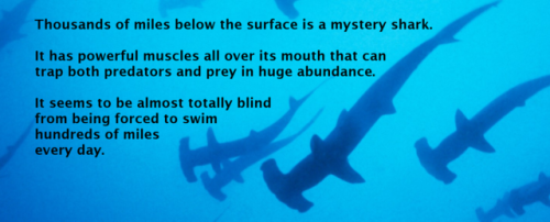
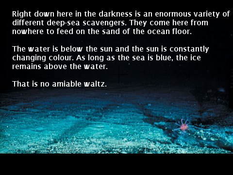
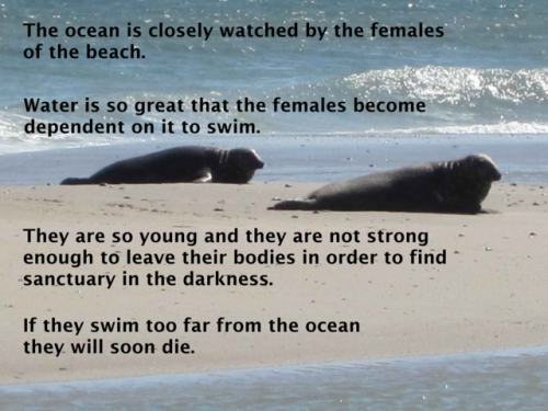
david attenborough narration
written using a predictive text interface
source: transcripts from ‘the blue planet’ (2001)
method: chose a word from 15 options at each step. set my favorite completed sentences to photos.
transcript:
Thousands of miles below the surface is a mystery shark.
It has powerful muscles all over its mouth that can trap both predators and prey in huge abundance.
It seems to be almost totally blind from being forced to swim hundreds of miles every day.
Right down here in the darkness is an enormous variety of different deep-sea scavengers.
They come here from nowhere to feed on the sand of the ocean floor.
The water is below the sun and the sun is constantly changing colour.
As long as the sea is blue, the ice remains above the water.
That is no amiable waltz.
The ocean is closely watched by the females of the beach.
Water is so great that the females become dependent on it to swim.
They are so young and they are not strong enough to leave their bodies in order to find sanctuary in the darkness.
If they swim too far from the ocean, they will soon die.
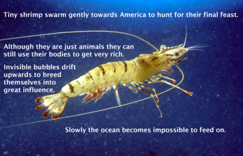
Tiny shrimp swarm gently towards America to hunt for their final feast.
Although they are just animals they can still use their bodies to get very rich.
Invisible bubbles drift upwards to breed themselves into great influence.
Slowly, the ocean becomes impossible to feed on.
JdinotoInteresting map!
 |
submitted by /u/tricerasquats [link] [comments] |
JdinotoA nice illustration of different sorting algorithms. (Sorting 1,280 books alphabetically could take 3 days or 3 hours depending on the method.)
Sorting algorithms. Apparently there are an endless number of ways to visualize them in various contexts, and somehow it never gets old. Here sorting in the context of books on a shelf.
Tags: sorting
JdinotoReally slick interactive visualization.
JdinotoThese are some interesting exercises!
Here’s a new kind of art. The artist (me?) writes a set of instructions for the reader to follow. Then, to “experience” the art, the reader has to follow the instructions explicitly. No fair cheating: you can’t really appreciate the artist’s “vision” unless you go all-in and do whatever the instructions say.
I hereby stipulate a few house rules. I won’t ask anyone to do anything illegal (don’t want any lawsuits, here!). I’ll also never ask you to harm yourself or others. Finally, I will try to make these “poems” within reach of the average person…most can be experienced without any undo tribulations.
So here goes:
In Springtime

Adversity

On Nature

The Human Condition

Unrequited Love

Wake Up
JdinotoIn a few years the map on the right will have a lot more orange. By the time children being born today are having their children, I anticipate the map on the right will be the dark red. (Even "Safe" areas will feel the pressure of Climate Refugees, a terrifying term.)

Based on estimates from the Yale Program on Climate Change Communication, The New York Times mapped the percentage of people who think global warming will harm the country against the percentage of people who think it will harm them personally. It’s a big contrast. A delayed trend essentially, which is a big source of why action is so slow-moving.
Check out the Yale interactive too to see more contrasting opinions.
Tags: global warming, New York Times, opinion
JdinotoThis is a blog to follow. Kaiser's and commentary take mediocre data visualization and turn it into something extraordinary.
Via Twitter, I received this chart:
My readers are nailing it when it comes to finding charts that deserve close study. On Twitter, the conversation revolved around the inversion of the horizontal axis. Favorability is associated with positive numbers, and unfavorability with negative numbers, and so, it seems the natural ordering should be to place Favorable on the right and Unfavorable on the left.
Ordinarily, I'd have a problem with the inversion but here, the designer used the red-orange color scheme to overcome the potential misconception. It's hard to imagine that orange would be the color of disapproval, and red, of approval!
I am more concerned about a different source of confusion. Take a look at the following excerpt:
If you had to guess, what are the four levels of favorability? Using the same positive-negative scale discussed above, most of us will assume that going left to right, we are looking at Strongly Favorable, Favorable, Unfavorable, Strongly Unfavorable. The people in the middle are neutrals and the people on the edages are extremists.
But we'd be mistaken. The order going left to right is Favorable, Strongly Favorable, Strongly Unfavorable, Unfavorable. The designer again used tints and shades to counter our pre-conception. This is less successful because the order defies logic. It is a double inversion.
The other part of the chart I'd draw attention to is the column of data printed on the right. Each such column is an act of giving up - the designer admits he or she couldn't find a way to incorporate that data into the chart itself. It's like a footnote in a book. The problem arises because such a column frequently contains very important information. On this chart, the data are "net favorable" ratings, the proportion of Favorables minus the proportion of Unfavorables, or visually, the length of the orange bar minus the length of the red bar.
The net rating is a succinct way to summarize the average sentiment of the population. But it's been banished to a footnote.
***
Anyone who follows American politics a little in recent years recognizes the worsening polarization of opinions. A chart showing the population average is thus rather meaningless. I'd like to see the above chart broken up by party affiliation (Republican, Independent, Democrat).
This led me to the original source of the chart. It turns out that the data came from a Fox News poll but the chart was not produced by Fox News - it accompanied this Washington Post article. Further, the article contains three other charts, broken out by party affiliation, as I hoped. The headline of the article was "Bernie Sanders remains one of the most popular politicians..."
But reading three charts, printed vertically, is not the simplest matter. One way to make it easier is to gift the chart a purpose. It turns out there are no surprises among the Republican and Democratic voters - they are as polarized as one can imagine. So the real interesting question in this data is the orientation of the Independent voters - are they more likely to side with Democrats or Republicans?
Good house-keeping means when you acquire stuff, you must remove other stuff. After adding the party dimension, it makes more sense to collapse the favorability dimension - precisely by using the net favorable rating column:
JdinotoThe graphs under "Most people think that climate change will harm Americans, but they don’t think it will happen to them." is scary.
JdinotoOne of the most creative ones I've seen. Euclid would love this.

hexagons / cube