Shared posts

10 Apr 08:19

Eve Valkyrie and how CCP became the frontrunner in the race to define virtual reality gaming

by Neil Long

Publisher/developer: CCP Format: Oculus Rift, Project Morpheus Release: TBC

If Sony and Oculus are leading the virtual reality hardware arms race, then CCP is running away with the dash to define this new medium’s software. We’ve seen and played our fair share of impressive tech demos on Oculus and Morpheus, but Eve Valkyrie is different: a built-for-VR game which will layer MMO and social features on top of its intense space dogfights. It’ll be VR’s first ‘proper’ videogame, in other words, giving players a reason to come back once the initial thrill of sitting inside a virtual reality cockpit has worn off.

If indeed that thrill wears off at all. In the Oculus Rift build I played at GDC, just looking about the place as the demo began was enough to elicit an unconsciously dropped jaw. Staring at the black dot at the end of the long tunnel stretched out before me, a short countdown allows the player to acclimatise to their sci-fi surroundings before the ship’s engines engage and it gathers momentum quickly, speeding through the tight corridor and out into open space. Already, my heart rate has quickened a little.

First encounters with virtual reality follow a strange pattern – it’s easy to forget there’s a videogame to be played when you’re busy feeling out the limits and limitations of the experience. Shoving the stick of the gamepad in my hands forward, I dive suddenly ‘downwards’ – though it’s difficult to tell exactly which way that is after a few minutes’ play – and, catching sight of an enemy ship at the top of my peripheral vision at the same time, I jerk my head upwards. The result is a dizzying sensation that’s gentler than, but still similar to, looking the wrong way when you’re slammed around a sharp bend on a rollercoaster. It’s the same when I take aim at an enemy ship, while, in the finest videogame tradition, I do a barrel roll. The effect is very nearly stomach-churning, and it becomes necessary to pull the ship out of its spin before this assault on the senses overwhelms.

Just speeding out of the mothership at the start of the demo is enough to quicken the pulse.

These aren’t complaints, but testament to the fidelity of the experience CCP has put together and its remarkable physical effect on the player, even at this early stage. It works because you’re in a cockpit, replicating your real-world pose; there are also a few design decisions which show Valkyrie is a made-for-VR game. Your ship isn’t nearly as agile as you might expect, as VR negates the need for developers to ‘sell’ the sense of speed and movement so hard. The ability to aim missiles with your head, with shots released by letting go a held trigger, was another VR-specific flourish, though the tracking feels a little woolly at this stage.

It’s a fairly basic dogfighter right now, but played through a VR headset, it’s still dazzling. The controls are simple, there are a couple of weapons, a simple lock-on and play unfolds out in a relatively sparse arena. As development continues, the dogfighting will get tighter, more complex and MMO elements will build on top of this already spectacular three-minute VR experience, says CCP CMO David Reid. “Keep in mind that what you’re seeing here is the seed of a fully fleshed out game,” he tells me afterwards. “You’ll go into battle, earn currency, earn skill points and you use those assets and resources to improve your character and you grow, you unlock new ships, you acquire new modules to fit new ships, as you do in Eve Online and in Dust 514.”

CCP is still working out how exactly that metagame takes shape, though there will be a detailed character sheet to build out, an in-game marketplace and myriad ways to spend the currency you earn. “You won’t be dogfighting every second,” Reid continues. “You’ll be progressing through some social experiences and collaborating with teammates and deciding how to take on the next match. I wouldn’t want to do what this demo does for hours at a time, but I believe that as we get more and more of the full foundation of the game then that’ll be less and less a percentage of the experience.”

CCP’s early backing of VR, and indeed Eve Valkyrie’s presence on both Oculus and Morpheus hardware at GDC, can be attributed to the neat confluence of existing business relationships and development resource at CCP. Though the studio was talking to Oculus long before it discussed Morpheus with Sony, its ties with PlayStation run back to the lengthy development and implementation of Dust 514, its free-to-play PS3 shooter that feeds into its trademark title, Eve Online.

Valkyrie’s sci-fi dogfighting is pretty basic right now, but added MMO and social layers aim to give the game longevity.

CCP was among the very first thirdparties Sony contacted about Project Morpheus, and it means that the studio is one of very few to have publicly confirmed it is developing a game for both VR devices. It might seem like a handy comparison, but the development processes here shouldn’t be compared to what we know about existing cross-platform game development, says Reid. ”The hardware is so new, there aren’t libraries of code or big white paper documents or APIs yet, it is a much tighter collaboration with both partners on the engineering side,” he tells us. “We’re just making sure we’re building a game that will work well on their hardware and with their SDKs, which continue to evolve.”

What helped CCP get a VR prototype up and running so quickly was its vast library of historical assets from Eve Online, and the timing of VR’s re-emergence. Once a group of around 20 engineers at CCP’s Newcastle studio had established the link between Dust 514 and Eve Online, ongoing maintenance of that infrastructure was moved out to the developer’s Shanghai office. With virtual reality on the horizon, an experienced team of engineers at the ready and a bank of assets at its disposal, the natural next step was for that group to start building out a VR prototype. Valkyrie was demoed at E3 last year in its previous form, EVR, and CCP has been working on the game in earnest ever since. So even with those close ties to both Sony and Oculus, is it harder to make a VR game than it is a ‘traditional’ game? “At a high level, yes,” says Reid. “But there are a very different set of details involved here because we are all together pioneering VR gaming. It’s very different to saying ‘let me take a first person shooter and bring it to consoles and PCs’. That’s a very well established thing. In this space, those norms haven’t been established – we’re doing that now with Oculus and Morpheus.”

That process means that the final game will stand apart from the kind of videogame we’re used to on traditional formats, and it’ll also reflect CCP’s player-powered approach to game design. “As a moment to moment experience it’s very different to a lot of high-end console games,” he adds. “Part of it comes back to our core philosophy – we don’t believe in designing huge amounts of narrative, NPCs, dungeons, quests and the kind of content a designer writes to send you through a story. We believe in just providing tools and ways for players to interact with each other and allowing the stories to emerge from there.

Death in Eve Valkyrie comes when your shields are defeated and your window on the world is shattered, sucking you out into space.

“I’m a huge fan of Bethesda – I love Fallout, Oblivion and Skyrim – but I can’t imagine what it’d be like to write a VR game like that. [Eve Valkyrie] is a very different proposition, development spend and a faster time to market than it would be if we were trying to create GTA 6 in a fully-realised VR world.”

It’s clear virtual reality gaming won’t be defined by simple ports of existing gametypes, though they may well emerge and might even work well; built-for-VR games like Eve Valkyrie will be the best advertisement for the medium, and right now, CCP’s space dogfighter is VR gaming’s leading proponent.

Yes, virtual reality in millions of homes remains a rather distant prospect, but with Sony and now Facebook’s backing, VR has edged closer to actual reality in the last few weeks alone. The smart use of existing assets and deployment of a tight, experienced team means that CCP isn’t betting its entire business on VR and Eve Valkyrie; nonetheless, it has been smart enough to quietly become the frontrunner in the race to define virtual reality videogames. Now it’s time for other developers to follow the Eve Online creator’s lead and help shape this thrilling new medium.

The post Eve Valkyrie and how CCP became the frontrunner in the race to define virtual reality gaming appeared first on Edge Online.

07 Apr 18:20

Against beautiful journalism

by Felix Salmon

Have you seen that site’s gorgeous new redesign? Every article has a nice big headline, huge photos, loads of white space, intuitive and immersive scrolling, super-wide column widths — everything you need to make the copy truly sing.

I’m over it.

Part of this is because I have a long-standing soft spot for ugly. It’s easy, of course, for a web page to become too messy, too noisy — especially when the mess and the noise is mostly ad-related. On the other hand, I grew up in a culture where today’s journalism is tomorrow’s fish-and-chips wrapper, and where in general journalism isn’t taken nearly as seriously as it is in the US. That’s healthy, in many ways, and it encourages a lightness of touch, as well as a gleeful let’s-try-everything approach, and a general feeling that the publisher won’t be offended if you stop reading this and start reading that instead.

The stripped-down, minimal approach to page design has its place — but most of that time, that place isn’t for news stories, which by their nature are mostly snack-sized things written on deadline and designed to be consumed quickly and easily, rather than long meals designed to be slowly savored.

More to the point, news websites have always struggled with any one-size-fits-all approach to stories. A format which works for a 6,000-word feature is not going to work well for a 150-word brief. Web designers have known this for years, but still news sites tend to put all of their stories into exactly the same template — and increasingly that template is designed for ambitious longform storytelling. Which, of course, generally accounts for only a tiny fraction of the material on the site.

For a prime recent example of the disconnect, check out NYT public editor Margaret Sullivan’s recent post on trend stories in general, and that monocle trend story in particular:

Media watchers received the story like a Christmas present, tearing off the wrapping to get at the goods. The fun began on Twitter, after the story went online but well before its print publication. Dustin Gillard tweeted: “NYTimes does a trend piece on monocles. It is about as good/bad as it sounds.” (No one ever said the Internet was good at nuance; the wags ignored that the short piece was tucked inside the Styles section in its “Noted” column, treating it instead as if it were front-page screaming-headline news.)

But here’s the thing: on the internet (which, Sullivan admits, was for a long time the only place where you could read the story), the story wasn’t “tucked” anywhere. Instead, it looks like this:

mono2.tiff

Everything about the way that this story is presented online screams This Is Important. In the physical paper, I’m sure there were lots of design cues telling the reader not to take the story too seriously; online, they all got stripped away.

I like to flick through the NYT in the morning, and recently I’ve been playing with the replica edition on the iPad, rather than the native iPad app. (All print subscribers get free access to the replica edition, seven days a week, although the NYT doesn’t make it easy to find.) The replica edition is just the newspaper as it is laid out on paper — with different-sized headlines, classifieds, display ads, everything. It has no hyperlinks (although every headline is clickable, to be read more easily) — but instead it provides something the online and iPad editions lack: the large amount of information presented by the fine page designers of the NYT. You can see what’s important, and you can revert to old-fashioned serendipity when it comes to things like stumbling across a wonderful obituary, even when you would never deliberately decide to read the obituary section in the iPad app.

The replica edition is not a replacement for the native app, so much as it’s a complement to it — and something which shows just how good the NYT is at its native medium of print. And the NYT isn’t even close to being the best-designed newspaper out there: I might be biased, but I think it’s generally accepted that most English newspapers are better designed than nearly all US papers. When it comes to the visual display of news, newspapers daily convey vast amounts of information which is simply lost in the translation to digital. At the top of the list: any indication of the importance of any given story.

Today, when you read a story at the New Republic, or Medium, or any of a thousand other sites, it looks great; every story looks great. Even something as simple as a competition announcement comes with a full-page header and whiz-bang scrollkit graphics. The result is a cognitive disconnect: why is the website design telling me that this short blog post is incredibly important, when in reality it’s just a blockquote and a single line of snark? All too often, when I visit a site like Slate or Quartz, I feel let down when I read something short and snappy — something which I might well have enjoyed, if it just took up a small amount of space in an old-fashioned reverse-chronological blog. The design raises my expectations, even as the writers are still expected to throw out a large number of quick takes on various subjects.

This is a problem for user-generated content, too. Look at Medium, for example. It wants to be a self-expression platform, much like Twitter or Facebook — but its design is daunting: for all that it’s easy to use, people intuitively understand that the way that their story looks implies a certain level of quality and importance. That can be a good thing: it encourages contributors to up their game. But equally, it can simply result in people giving up, on the grounds that they don’t particularly want such a grand-feeling venue for their relatively small idea.

It’s time for websites to put a lot more effort into de-emphasizing less important stories, reserving the grand presentation formats only for the pieces which deserve it. In theory, most content management systems these days support various different story templates; in practice, however, there’s a kind of grade inflation going on, and everything ends up getting the A-list treatment.

One of the many small pleasures of reading the New Yorker is the way that it presents its poems: they’re clearly distinguished from the right-justified body text, but mainly just by giving them more white space, more room to breathe. While poems look great that way, however, no one has ever suggested that the magazine would be improved if everything were given so much space. I hope that the web learns that lesson soon, and starts to bring back a little bit of noise and clutter. Which is, after all, the natural state of nearly all journalism.

12 Mar 19:57

The Translation of the Firetext App

by Joshua Smith

The History

Firetext is an open-source word processor. The project was started in early 2013 by @HRanDEV, @logan-r, and me (@Joshua-S). The goal of the project was to provide a user-friendly editing experience, and to fill a major gap in functionality on Firefox OS.

Firetext 0.3Firetext 0.3

In the year since its initiation, Firetext became one of the top ten most popular productivity apps in the Firefox Marketplace. We made a myriad of new additions, and Firetext gained Dropbox integration, enabling users to store documents in the cloud. We also added Night Mode, a feature that automatically adjusts the interface to the surrounding light levels. There was a new interface design, better performance, and web activity support.

Even with all of these features, Firetext’s audience was rather small. We had only supported the English language, and according to Exploredia, only 17.65% of the world’s population speak English fluently. So, we decided to localize Firetext.

The Approach

After reading a Hacks post about Localizing Firefox Apps, we determined to use a combination of webL10n and Google Translate as our localization tools. We decided to localize in the languages known by our contributors (Spanish and German), and then use Google Translate to do the others. Eventually, we planned to grow a community that could contribute translations, instead of just relying on the often erratic machine translations.

The Discovery

A few months passed, and still no progress. The task was extremely daunting, and we did not know how to proceed. This stagnation continued until I stumbled upon a second Hacks post, Localizing the Firefox OS Boilerplate App.

It was like a dream come true. Mozilla had started a program to help smaller app developers with the localization process. We could benefit from their larger contributor pool, while helping them provide a greater number of apps to foreign communities.

I immediately contacted Mozilla about the program, and was invited to set up a project on Transifex. The game was on!

The Code

I started by creating a locales directory that would contain our translation files. I created a locales.ini file in that directory to show webL10n where to find the translations. Finally, I added a folder for each locale.

locales.ini - Firetext

I then tagged each translatable element in the html files with a data-l10n-id attribute, and localized alert()s and our other scripted notifications by using webL10n’s document.webL10n.get() or _() function.

It was time to add the translations. I created a app.properties file in the locales/en_US directory, and referenced it from locales.ini. After doing that, I added all of the strings that were supposed to be translated.

app.properties - Firetext

webL10n automatically detects the user’s default locale, but we also needed to be able to change locales manually. To allow this, I added a select in the Firetext settings panel that contained all of the prospective languages.Settings - Firetext

Even after all of this, Firetext was not really localized; we only had an English translation. This is where Transifex comes into the picture.

The Translation

I created a project for Firetext on Transifex, and then added a team for each language on our GitHub issue. I then uploaded the app.properties file as a resource.

I also uploaded the app description from our manifest.webapp for translation as a separate resource.

Firetext on Transifex

Within hours, translations came pouring in. Within the first week, Hebrew, French, and Spanish were completely translated! I added them to our GitHub repository by downloading the translation properties file, and placing it in the appropriate locale directory. I then enabled that language in the settings panel. The entire process was extremely simple and speedy.

The Submission

Now that Firetext had been localized, I needed to submit it back to the Mozilla Marketplace.  This was a fairly straight forward process; just download the zip, extract git files, and add in the API key for our error reporting system.

In less than one day, Firetext was approved, and made available for our global user base.  Firetext is now available in eight different languages, and I can’t wait to see the feedback going forward!

The Final Thoughts

In retrospect, probably the most difficult part of localizing Firetext was supporting RTL (Right To Left) languages.  This was a bit of a daunting task, but the results have totally been worth the effort!  All in all, localization was one of the easiest features that we have implemented.

As Swiss app developer Gerard Tyedmers, creator of grrd’s 4 in a Row and grrd’s Puzzle, said:

“…I can say that localizing apps is definitely worth the work. It really helps finding new users.

The l10n.js solution was a very useful tool that was easy to implement. And I am very happy about the fact that I can add more languages with a very small impact on my code…”

I couldn’t agree more!

Firetext Editor - Spanish

Editor’s Note: The Invitation

Have a great app like Firetext?  You’re invited too!  We encourage you to join Mozilla’s app localization project on Transifex. With a localized app, you can extend your reach to include users from all over the world, and by so doing, help to support a global base of open web app users.

For translators, mobile app localization presents some interesting translation and interface design challenges. You’ll need to think of the strings you’re working with in mobile scale, as interaction elements on a small screen. The localizer plays an important role in creating an interface that people in different countries can easily use and understand.  Please, get involved with Firetext or one of our other projects.

This project is just getting started, and we’re learning as we go. If you have questions or issues not addressed by existing resources such the Hacks blog series on app localization, Transifex help pages, and other articles and repos referenced above, you can contact us. We’ll do our best to point you in the right direction. Thanks!

12 Mar 19:57

The Making of the Time Out Firefox OS app

by Andreas Oesterhelt

A rash start into adventure

So we told our client that yes, of course, we would do their Firefox OS app. We didn’t know much about FFOS at the time. But, hey, we had just completed refactoring their native iOS and Android apps. Web applications were our core business all along. So what was to be feared?

More than we thought, it turned out. Some of the dragons along the way we fought and defeated ourselves. At times we feared that we wouldn’t be able to rescue the princess in time (i.e. before MWC 2013). But whenever we got really lost in detail forest, the brave knights from Mozilla came to our rescue. In the end, it all turned out well and the team lived happily ever after.

But here’s the full story:

Mission & challenge

Just like their iOS and Android apps, Time Out‘s new Firefox OS app was supposed to allow browsing their rich content on bars, restaurants, things to do and more by category, area, proximity or keyword search, patient zero being Barcelona. We would need to show results as illustrated lists as well as visually on a map and have a decent detail view, complete with ratings, access details, phone button and social tools.

But most importantly, and in addition to what the native apps did, this app was supposed to do all of that even when offline.

Oh, and there needed to be a presentable, working prototype in four weeks time.

Cross-platform reusability of the code as a mobile website or as the base of HTML5 apps on other mobile platforms was clearly prio 2 but still to be kept in mind.

The princess was clearly in danger. So we arrested everyone on the floor that could possibly be of help and locked them into a room to get the basics sorted out. It quickly emerged that the main architectural challenges were that

  • we had a lot of things to store on the phone, including the app itself, a full street-level map of Barcelona, and Time Out’s information on every venue in town (text, images, position & meta info),
  • at least some of this would need to be loaded from within the app; once initially and synchronizable later,
  • the app would need to remain interactively usable during these potentially lengthy downloads, so they’d need to be asynchronous,
  • whenever the browser location changed, this would be interrupted

In effect, all the different functionalities would have to live within one single HTML document.

One document plus hash tags

For dynamically rendering, changing and moving content around as required in a one-page-does-all scenario, JavaScript alone didn’t seem like a wise choice. We’d been warned that Firefox OS was going to roll out on a mix of devices including the very low cost class, so it was clear that fancy transitions of entire full-screen contents couldn’t be orchestrated through JS loops if they were to happen smoothly.

On the plus side, there was no need for JS-based presentation mechanics. With Firefox OS not bringing any graveyard of half-dead legacy versions to cater to, we could (finally!) rely on HTML5 and CSS3 alone and without fallbacks. Even beyond FFOS, the quick update cycles in the mobile environment didn’t seem to block the path for taking a pure CSS3 approach further to more platforms later.

That much being clear, which better place to look for best practice examples than Mozilla Hacks? After some digging, Thomas found Hacking Firefox OS in which Luca Greco describes the use of fragment identifiers (aka hashtags) appended to the URL to switch and transition content via CSS alone, which we happily adopted.

Another valuable source of ideas was a list of GAIA building blocks on Mozilla’s website, which has since been replaced by the even more useful Building Firefox OS site.

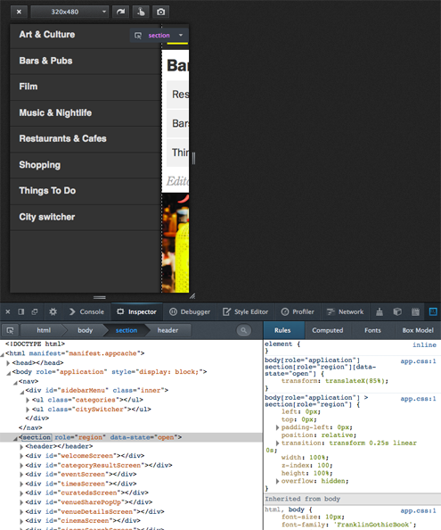
In effect, we ended up thinking in terms of screens. Each physically a <div>, whose visibility and transitions are governed by :target CSS selectors that draw on the browser location’s hashtag. Luckily, there’s also the onHashChange event that we could additionally listen to in order to handle the app-level aspects of such screen changes in JavaScript.

Our main HTML and CSS structure hence looked like this:
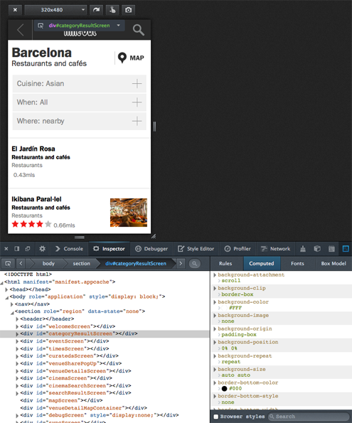
And a menu

We modeled the drawer menu very similarily, just that it sits in a <nav> element on the same level as the <section> container holding all the screens. Its activation and deactivation works by catching the menu icon clicks, then actively changing the screen container’s data-state attribute from JS, which triggers the corresponding CSS3 slide-in / slide-out transition (of the screen container, revealing the menu beneath).

This served as our “Hello, World!” test for CSS3-based UI performance on low-end devices, plus as a test case for combining presentation-level CSS3 automation with app-level explicit status handling. We took down a “yes” for both.

UI

By the time we had put together a dummy around these concepts, the first design mockups from Time Out came in so that we could start to implement the front end and think about connecting it to the data sources.

For presentation, we tried hard to keep the HTML and CSS to the absolute minimum. Mozilla’s GAIA examples being a very valuable source of ideas once more.

Again, targeting Firefox OS alone allowed us to break free of the backwards compatibility hell that we were still living in, desktop-wise. No one would ask us Will it display well in IE8? or worse things. We could finally use real <section>, <nav>, <header>, and <menu> tags instead of an army of different classes of <div>. What a relief!

The clear, rectangular, flat and minimalistic design we got from Time Out also did its part to keep the UI HTML simple and clean. After we were done with creating and styling the UI for 15 screens, our HTML had only ~250 lines. We later improved that to 150 while extending the functionality, but that’s a different story.

Speaking of styling, not everything that had looked good on desktop Firefox even in its responsive design view displayed equally well on actual mobile devices. Some things that we fought with and won:

Scale: The app looked quite different when viewed on the reference device (a TurkCell branded ZTE device that Mozilla had sent us for testing) and on our brand new Nexus 4s:

After a lot of experimenting, tearing some hair and looking around how others had addressed graceful, proportional scaling for a consistent look & feel across resolutions, we stumbled upon this magic incantation:

<meta name="viewport" content="user-scalable=no, initial-scale=1,
maximum-scale=1, width=device-width" />

What it does, to quote an article at Opera, is to tell the browser that there is “No scaling needed, thank you very much. Just make the viewport as many pixels wide as the device screen width”. It also prevents accidental scaling while the map is zoomed. There is more information on the topic at MDN.

Then there are things that necessarily get pixelated when scaled up to high resolutions, such as the API based venue images. Not a lot we could do about that. But we could at least make the icons and logo in the app’s chrome look nice in any resolution by transforming them to SVG.

Another issue on mobile devices was that users have to touch the content in order to scroll it, so we wanted to prevent the automatic highlighting that comes with that:

li, a, span, button, div
{
    outline:none;
    -moz-tap-highlight-color: transparent;
    -moz-user-select: none;
    -moz-user-focus:ignore
}

We’ve since been warned that suppressing the default highlighting can be an issue in terms of accessibility, so you might wanted to consider this carefully.

Connecting to the live data sources

So now we had the app’s presentational base structure and the UI HTML / CSS in place. It all looked nice with dummy data, but it was still dead.

Trouble with bringing it to life was that Time Out was in the middle of a big project to replace its legacy API with a modern Graffiti based service and thus had little bandwidth for catering to our project’s specific needs. The new scheme was still prototypical and quickly evolving, so we couldn’t build against it.

The legacy construct already comprised a proxy that wrapped the raw API into something more suitable for consumption by their iOS and Android apps, but after close examination we found that we better re-re-wrap that on the fly in PHP for a couple of purposes:

  • Adding CORS support to avoid XSS issues, with the API and the app living in different subdomains of timeout.com,
  • stripping API output down to what the FFOS app really needed, which we could see would reduce bandwidth and increase speed by magnitude,
  • laying the foundation for harvesting of API based data for offline use, which we already knew we’d need to do later

As an alternative to server-side CORS support, one could also think of using the SystemXHR API. It is a mighty and potentially dangerous tool however. We also wanted to avoid any needless dependency on FFOS-only APIs.

So while the approach wasn’t exactly future proof, it helped us a lot to get to results quickly, because the endpoints that the app was calling were entirely of our own choice and making, so that we could adapt them as needed without time loss in communication.

Populating content elements

For all things dynamic and API-driven, we used the same approach at making it visible in the app:

  • Have a simple, minimalistic, empty, hidden, singleton HTML template,
  • clone that template (N-fold for repeated elements),
  • ID and fill the clone(s) with API based content.
  • For super simple elements, such as <li>s, save the cloning and whip up the HTML on the fly while filling.

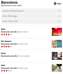
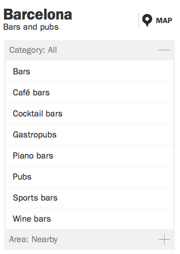
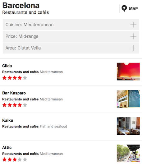
As an example, let’s consider the filters for finding venues. Cuisine is a suitable filter for restaurants, but certainly not for museums. Same is true for filter values. There are vegetarian restaurants in Barcelona, but certainly no vegetarian bars. So the filter names and lists of possible values need to be asked of the API after the venue type is selected.

In the UI, the collapsible category filter for bars & pubs looks like this:

The template for one filter is a direct child of the one and only

<div id="templateContainer">

which serves as our central template repository for everything cloned and filled at runtime and whose only interesting property is being invisible. Inside it, the template for search filters is:

<div id="filterBoxTemplate">
  <span></span>
  <ul></ul>
</div>

So for each filter that we get for any given category, all we had to do was to clone, label, and then fill this template:

$('#filterBoxTemplate').clone().attr('id', filterItem.id).appendTo(
'#categoryResultScreen .filter-container');
...
$("#" + filterItem.id).children('.filter-button').html(
filterItem.name);

As you certainly guessed, we then had to to call the API once again for each filter in order to learn about its possible values, which were then rendered into <li> elements within the filter‘s <ul> on the fly:

$("#" + filterId).children('.filter_options').html(
'<li><span>Loading ...</span></li>');

apiClient.call(filterItem.api_method, function (filterOptions)
{
  ...
  $.each(filterOptions, function(key, option)
  {
    var entry = $('<li filterId="' + option.id + '"><span>'
      + option.name + '</span></li>');

    if (selectedOptionId && selectedOptionId == filterOptionId)
    {
      entry.addClass('filter-selected');
    }

    $("#" + filterId).children('.filter_options').append(entry);
  });
...
});

DOM based caching

To save bandwidth and increase responsiveness in on-line use, we took this simple approach a little further and consciously stored more application level information in the DOM than needed for the current display if that information was likely needed in the next step. This way, we’d have easy and quick local access to it without calling – and waiting for – the API again.

The technical way we did so was a funny hack. Let’s look at the transition from the search result list to the venue detail view to illustrate:

As for the filters above, the screen class for the detailView has an init() method that populates the DOM structure based on API input as encapsulated on the application level. The trick now is, while rendering the search result list, to register anonymous click handlers for each of its rows, which – JavaScript passing magic – contain a copy of, rather than a reference to, the venue objects used to render the rows themselves:

renderItems: function (itemArray)
{
  ...

  $.each(itemArray, function(key, itemData)
  {        
    var item = screen.dom.resultRowTemplate.clone().attr('id', 
      itemData.uid).addClass('venueinfo').click(function()
    {
      $('#mapScreen').hide();
      screen.showDetails(itemData);
    });

    $('.result-name', item).text(itemData.name);
    $('.result-type-label', item).text(itemData.section);
    $('.result-type', item).text(itemData.subSection);

    ...

    listContainer.append(item);
  });
},

...

showDetails: function (venue)
{
  require(['screen/detailView'], function (detailView)
  {
    detailView.init(venue);
  });
},

In effect, there’s a copy of the data for rendering each venue’s detail view stored in the DOM. But neither in hidden elements nor in custom attributes of the node object, but rather conveniently in each of the anonymous pass-by-value-based click event handlers for the result list rows, with the added benefit that they don’t need to be explicitly read again but actively feed themselves into the venue details screen as soon a row receives a touch event.

And dummy feeds

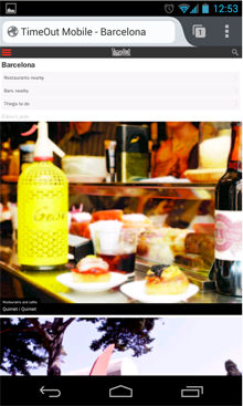
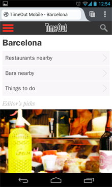
Finishing the app before MWC 2013 was pretty much a race against time, both for us and for Time Out’s API folks, who had an entirely different and equally – if not more so – sportive thing to do. Therefore they had very limited time for adding to the (legacy) API that we were building against. For one data feed, this meant that we had to resort to including static JSON files into the app’s manifest and distribution; then use relative, self-referencing URLs as fake API endpoints. The illustrated list of top venues on the app’s main screen was driven this way.

Not exactly nice, but much better than throwing static content into the HTML! Also, it kept the display code already fit for switching to the dynamic data source that eventually materialized later, and compatible with our offline data caching strategy.

As the lack of live data on top venues then extended right to their teaser images, we made the latter physically part of the JSON dummy feed. In Base64 :) But even the low-end reference device did a graceful job of handling this huge load of ASCII garbage.

State preservation

We had a whopping 5M of local storage to spam, and different plans already (as well as much higher needs) for storing the map and application data for offline use. So what to do with this liberal and easily accessed storage location? We thought we could at least preserve the current application state here, so you’d find the app exactly as you left it when you returned to it.
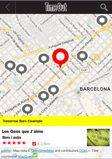
Map

A city guide is the very showcase of an app that’s not only geo aware but geo centric. Maps fit for quick rendering and interaction in both online and offline use were naturally a paramount requirement.

After looking around what was available, we decided to go with Leaflet, a free, easy to integrate, mobile friendly JavaScript library. It proved to be really flexible with respect to both behaviour and map sources.

With its support for pinching, panning and graceful touch handling plus a clean and easy API, Leaflet made us arrive at a well-usable, decent-looking map with moderate effort and little pain:

For a different project, we later rendered the OSM vector data for most of Europe into terabytes of PNG tiles in cloud storage using on-demand cloud power. Which we’d recommend as an approach if there’s a good reason not to rely on 3rd party hosted apps, as long as you don’t try this at home; Moving the tiles may well be slower and more costly than their generation.

But as time was tight before the initial release of this app, we just – legally and cautiously(!) – scraped ready-to use OSM tiles off MapQuest.com.

The packaging of the tiles for offline use was rather easy for Barcelona because about 1000 map tiles are sufficient to cover the whole city area up to street level (zoom level 16). So we could add each tile as a single line into the manifest.appache file. The resulting, fully automatic, browser-based download on first use was only 10M.

This left us with a lot of lines like

/mobile/maps/barcelona/15/16575/12234.png
/mobile/maps/barcelona/15/16575/12235.png
...

in the manifest and wishing for a $GENERATE clause as for DNS zone files.

As convenient as it may seem to throw all your offline dependencies’ locations into a single file and just expect them to be available as a consequence, there are significant drawbacks to this approach. The article Application Cache is a Douchebag by Jake Archibald summarizes them and some help is given at Html5Rocks by Eric Bidleman.

We found at the time that the degree of control over the current download state, and the process of resuming the app cache load in case that the initial time users spent in our app didn’t suffice for that to complete was rather tiresome.

For Barcelona, we resorted to marking the cache state as dirty in Local Storage and clearing that flag only after we received the updateready event of the window.applicationCache object but in the later generalization to more cities, we moved the map away from the app cache altogether.

Offline storage

The first step towards offline-readiness was obviously to know if the device was online or offline, so we’d be able to switch the data source between live and local.

This sounds easier than it was. Even with cross-platform considerations aside, neither the online state property (window.navigator.onLine), the events fired on the <body> element for state changes (“online” and “offline”, again on the <body>), nor the navigator.connection object that was supposed to have the on/offline state plus bandwidth and more, really turned out reliable enough.

Standardization is still ongoing around all of the above, and some implementations are labeled as experimental for a good reason :)

We ultimately ended up writing a NetworkStateService class that uses all of the above as hints, but ultimately and very pragmatically convinces itself with regular HEAD requests to a known live URL that no event went missing and the state is correct.

That settled, we still needed to make the app work in offline mode. In terms of storage opportunities, we were looking at:

Storage Capacity Updates Access Typical use
App / app cache, i.e. everything listed in the file that the value of appcache_path in the app‘s webapp.manifest points to, and which is and therefore downloaded onto the device when the app is installed. <= 50M. On other platforms (e.g. iOS/Safari), user interaction required from 10M+. Recommendation from Moziila was to stay <2M. Hard. Requires user interaction / consent, and only wholesale update of entire app possible. By (relative) path HTML, JS, CSS, static assets such as UI icons
LocalStorage 5M on UTF8-platforms such as FFOS, 2.5M in UTF16, e.g. on Chrome. Details here Anytime from app By name Key-value storage of app status, user input, or entire data of modest apps
Device Storage (often SD card) Limited only by hardware Anytime from app (unless mounted as UDB drive when cionnected to desktop computer) By path, through Device Storage API Big things
FileSystem API Bad idea
Database Unlimited on FFOS. Mileage on other platforms varies Anytime from app Quick and by arbitrary properties Databases :)

Some aspects of where to store the data for offline operation were decided upon easily, others not so much:

  • the app, i.e. the HTML, JS, CSS, and UI images would go into the app cache
  • state would be maintained in Local Storage
  • map tiles again in the app cache. Which was a rather dumb decision, as we learned later. Barcelona up to zoom level 16 was 10M, but later cities were different. London was >200M and even reduced to max. zoom 15 still worth 61M. So we moved that to Device Storage and added an actively managed download process for later releases.
  • The venue information, i.e. all the names, locations, images, reviews, details, showtimes etc. of the places that Time Out shows in Barcelona. Seeing that we needed lots of space, efficient and arbitrary access plus dynamic updates, this had to to go into the Database. But how?

The state of affairs across the different mobile HTML5 platforms was confusing at best, with Firefox OS already supporting IndexedDB, but Safari and Chrome (considering earlier versions up to Android 2.x) still relying on a swamp of similar but different sqlite / WebSQL variations.

So we cried for help and received it, as always when we had reached out to the Mozilla team. This time in the form of a pointer to pouchDB, a JS-based DB layer that at the same time wraps away the different native DB storage engines behind a CouchDB-like interface and adds super easy on-demand synchronization to a remote CouchDB-hosted master DB out there.

Back last year it still was in pre-alpha state but very usable already. There were some drawbacks, such as the need for adding a shim for WebSql based platforms. Which in turn meant we couldn’t rely on storage being 8 bit clean, so that we had to base64 our binaries, most of all the venue images. Not exactly pouchDB’s fault, but still blowing up the size.

Harvesting

The DB platform being chosen, we next had to think how we’d harvest all the venue data from Time Out’s API into the DB. There were a couple of endpoints at our disposal. The most promising for this task was proximity search with no category or other restrictions applied, as we thought it would let us harvest a given city square by square.

Trouble with distance metrics however being that they produce circles rather than squares. So step 1 of our thinking would miss venues in the corners of our theoretical grid

while extending the radius to (half the) the grid’s diagonal, would produce redundant hits and necessitate deduplication.

In the end, we simply searched by proximity to a city center location, paginating through the result indefinitely, so that we could be sure to to encounter every venue, and only once:

Technically, we built the harvester in PHP as an extension to the CORS-enabled, result-reducing API proxy for live operation that was already in place. It fed the venue information in to the master CouchDB co-hosted there.

Time left before MWC 2013 getting tight, we didn’t spend much time on a sophisticated data organization and just pushed the venue information into the DB as one table per category, one row per venue, indexed by location.

This allowed us to support category based and area / proximity based (map and list) browsing. We developed an idea how offline keyword search might be made possible, but it never came to that. So the app simply removes the search icon when it goes offline, and puts it back when it has live connectivity again.

Overall, the app now

  • supported live operation out of box,
  • checked its synchronization state to the remote master DB on startup,
  • asked, if needed, permission to make the big (initial or update) download,
  • supported all use cases but keyword search when offline.

The involved components and their interactions are summarized in this diagram:

Organizing vs. Optimizing the code

For the development of the app, we maintained the code in a well-structured and extensive source tree, with e.g. each JavaScript class residing in a file of its own. Part of the source tree is shown below:

This was, however, not ideal for deployment of the app, especially as a hosted Firefox OS app or mobile web site, where download would be the faster, the fewer and smaller files we had.

Here, Require.js came to our rescue.

It provides a very elegant way of smart and asynchronous requirement handling (AMD), but more importantly for our purpose, comes with an optimizer that minifies and combines the JS and CSS source into one file each:

To enable asynchronous dependency management, modules and their requirements must be made known to the AMD API through declarations, essentially of a function that returns the constructor for the class you’re defining.

Applied to the search result screen of our application, this looks like this:

define
(
  // new class being definied
  'screensSearchResultScreen',

  // its dependencies
  ['screens/abstractResultScreen', 'app/applicationController'],

  // its anonymous constructor
  function (AbstractResultScreen, ApplicationController)
  {
    var SearchResultScreen = $.extend(true, {}, AbstractResultScreen,
    {
      // properties and methods
      dom:
      {
        resultRowTemplate: $('#searchResultRowTemplate'),
        list: $('#search-result-screen-inner-list'),
        ...
      }
      ...
    }
    ...

    return SearchResultScreen;
  }
);

For executing the optimization step in the build & deployment process, we used Rhino, Mozilla’s Java-based JavaScript engine:

java -classpath ./lib/js.jar:./lib/compiler.jar   
  org.mozilla.javascript.tools.shell.Main ./lib/r.js -o /tmp/timeout-webapp/
  $1_config.js

CSS bundling and minification is supported, too, and requires just another call with a different config.

Outcome

Four weeks had been a very tight timeline to start with, and we had completely underestimated the intricacies of taking HTML5 to a mobile and offline-enabled context, and wrapping up the result as a Marketplace-ready Firefox OS app.

Debugging capabilities in Firefox OS, especially on the devices themselves, were still at an early stage (compared to clicking about:app-manager today). So the lights in our Cologne office remained lit until pretty late then.

Having built the app with a clear separation between functionality and presentation also turned out a wise choice when a week before T0 new mock-ups for most of the front end came in :)

But it was great and exciting fun, we learned a lot in the process, and ended up with some very useful shiny new tools in our box. Often based on pointers from the super helpful team at Mozilla.

Truth be told, we had started into the project with mixed expectations as to how close to the native app experience we could get. We came back fully convinced and eager for more.

In the end, we made the deadline and as a fellow hacker you can probably imagine our relief. The app finally even received its 70 seconds of fame, when Jay Sullivan shortly demoed it at Mozilla’s MWC 2013 press conference as a showcase for HTML5′s and Firefox OS’s offline readiness (Time Out piece at 7:50). We were so proud!

If you want to play with it, you can find the app in the marketplace or go ahead try it online (no offline mode then).

Since then, the Time Out Firefox OS app has continued to evolve, and we as a team have used the chance to continue to play with and build apps for FFOS. To some degree, the reusable part of this has become a framework in the meantime, but that’s a story for another day..

We’d like to thank everyone who helped us along the way, especially Taylor Wescoatt, Sophie Lewis and Dave Cook from Time Out, Desigan Chinniah and Harald Kirschner from Mozilla, who were always there when we needed help, and of course Robert Nyman, who patiently coached us through writing this up.

06 Mar 04:13

Now

This image stays roughly in sync with the day (assuming the Earth continues spinning). Shortcut: xkcd.com/now
24 Feb 07:39

Dominique Pamplemousse In “It’s All Over Once The Fat Lady Sings!” review

by Edge Staff

Publisher/Developer: Deirdra Kiai Productions Format: PC (tested), iPad Download: here.

Dominique Pamplemousse is a 90-minute point-and-click adventure game musical, the result of a wide-ranging creative effort by a single person. Creator Deirdra Kiai is responsible for the game’s script, instrumentation, vocal performances and environments. The phrase ‘hand-crafted’ is – for once – entirely apt, given that every character and backdrop in the game is built from cardboard and clay, photographed and animated to create an effect like interactive stop-motion.

The player controls the titular Pamplemousse, a private detective living on the breadline. The CEO of a major record label hires Dominique to investigate the disappearance of a famous singer, leading to a mystery that touches on – variously – issues of parenthood, poverty, gender, acceptance and the use of autotune in pop music.

Yet the game doesn’t linger on any of these points to the extent that you could identify a single dominant subject that it is ‘about’. Political indie games are not uncommon, but Pamplemousse’s unflinching naivety and joie de vivre make it unusual even among its peers. It shares some ideas with games like Cart Life and Gone Home, but doesn’t mirror their rhetorical directness or focus on human experience: it is cartoonish, bordering on grotesque, openly asking to do little more than entertain.

As a game, it doesn’t ask much of you. You drill down through dialogue trees, unlock new topics of conversation, and begin the process over. There are three puzzles of the traditional sort, none of them challenging, and only at the end are you asked to make a decision that informs the plot. The fact that it is interactive forces you to pay closer attention to everything else it is doing, but ultimately its mechanics aren’t where its quality lies.

Each character responds differently to Dominique’s ambiguous gender.

As a musical, every area is underscored with a looping ad-hoc cabaret soundtrack on top of which certain sections of each character’s dialogue are sung rather than spoken. Performances are highly exaggerated and the singing is frequently off-key, though projected with confidence. The result is a game that can be uncomfortable to listen to, but this roughness is consistent with its visual style. Its script is, likewise, rough: it is a comedy without jokes, a drama without characters that develop much beyond their fixed clay grimaces. The reason that it works at all is because it coheres internally, and that coherence gives it the sense of being a personal performance – which of course is what it is.

The cabaret connection goes deeper than the soundtrack: this is an intimate, socially aware stage show, the kind of thing that 90 years ago you’d have encountered in a Weimar nightclub. It’s a rare example of a Brechtian videogame, shoving the player away and asking you to engage critically with it from a position of alienation.

Alienation is key, actually. Pamplemousse is genderqueer, and although this is not the focus of the story the attitudes of other characters to this aspect of the protagonist’s identity is as close as it comes to having a message. Pamplemousse wonders aloud why people rush to conclusions instead of asking questions – and this, likewise, is the notion at the heart of the game as a whole.

There’ll be people for whom Dominique Pamplemousse does nothing, who cannot truck with its visual design, plot, music, mechanics or ideas. We don’t really have a precedent for games this defiantly off-beat, this subtle, this resistant to the rhetorical brinkmanship usually associated with political games.

Puzzles occur infrequently – the majority of the game is spent collecting information by talking to people in the right order.

That it is the work of a lone creator is important. When you work to appreciate Dominique Pamplemousse you are engaging directly with the person on the other side of the executable. That’s not the kind of relationship we traditionally have with artistry in games. The studio-centric process places value on symmetry, impact, conventional notions of quality, and that means that we’re more used to interacting with principles than personalities. Hold Dominique Pamplemousse to account on traditional grounds and it doesn’t stand up; it is too rough and raw for that. The challenge it presents is philosophical – can you put your expectations aside in order to appreciate someone else’s creativity on its own terms?  Should you?

It raises questions about how much of a parallel there is between the enforcement of norms for creative work and the enforcement of norms for people, and this isn’t the kind of political territory that we’re used to confronting in games. It’s an intimation of the kinds of change that the medium will undergo as it travels further down roads already navigated by other forms of art.

Should you buy it? If you’re interested in games as art and predisposed to generous interpretation, then it’s worth a look.  You will get an hour and a half of play and several subsequent hours of thought out of your small investment. If that’s not who you are then Dominique Pamplemousse is unlikely to change that. This is about as far into the hinterland of indie as commercial games go. Historically, though, that tends to be where the most exciting changes begin.

The post Dominique Pamplemousse In “It’s All Over Once The Fat Lady Sings!” review appeared first on Edge Online.

21 Jan 23:06

About Variables in CSS and Abstractions in Web Languages

by Chris Coyier

Variables are coming to CSS. They already have implementations, so there is no stopping it now. Firefox has them in version 29 and Chrome has them unprefixed in 29+ if you have the "Enable experimental Web Platform features" flag turned on.

To be clear, no amount of arguing on whether this is good or bad is going to change things at this point. But I still think it's interesting, so let's talk about it anyway.

The Abstraction Backstory

I've been giving a talk recently about abstraction in computing. Looking back at the history of programming, there are several clear points where we stepped up abstraction to a new level. From the "1's and 0's" of machine code, to assembler languages, to compilers, and the abstractions of those giving us languages like C++.

Browsers are comprised of parts, like a rendering engine and a JavaScript engine. Those parts are written in C++. So when we write things like HTML, CSS, and JavaScript, we're yet another step up the abstraction ladder. HTML, CSS, and JavaScript don't replace the languages below them, they sit on top of them. They depend on the layers below to do the things they do best. HTML, CSS, and JavaScript are languages we invented in order to build the kind of things we wanted to build on the web: interactive documents.

As time goes on, we want/expect/need the web platform to do more. Capabilities are only ever added to browsers, never removed. We gobble up those new capabilities and use them to their limits. That makes building for the web more complex. We don't like complexity. It makes work harder and less efficient.

This has been going on long enough that we're taking that next step up the abstraction ladder. Abstraction is the natural combatant to complexity, so we employ abstraction to lower the complexity of the code we write.

The abstraction we most needed on the web was for HTML. It would be ridiculous to work on a website where every page was stored as a complete HTML document, from <!DOCTYPE html> to </html> that you edited directly. No one works that way anymore. Complete HTML documents are pieced together through templates and chunks of content.

Abstraction in JavaScript is inherent. The tools of abstraction are already there. Variables, loops, functions, etc.

The last web language to get the abstraction treatment is CSS, and that has come in the form of preprocessors. CSS is enormously repetitive and offers almost no abstraction tools. Preprocessors offer those things that we need so desperately and save the day.

Popularity

Another thing at work here is the popularity of the web platform. It is the most successful platform ever in computers. More people build for it and use the things built from it than any other. In other words, HTML, CSS, and JavaScript are pretty damn successful. Largely due to the work of the efforts of web standards advocates, but that's a story for another day.

Why is a language like CSS so damn successful? Because it is so easy. Selectors and key/value pairs. That's it. Yes, there are lots of little gotchas as nuances. Yes, it takes a long time to really master. But the root language is very simple. In ten seconds you can show someone a block of code and explain how it works in such a way they completly get it.

h1 {
  color: red;
}

I'm convinced CSS is as successful as it is because of how easy the syntax is to understand, learn, and teach. There is plenty to bitch about in CSS, but I think correct language choices were made early on.

Complicating the Core Language

As languages do, CSS has evolved over time. Like everything in the web platform, it added new capabilities. Jeremey Keith pointed out that @keyframes represent a significant shift in CSS. For the first time, you could write CSS that had no meaning and wouldn't work at all if not for another block of CSS elsewhere in the code.

/* This means nothing... */
.animate {
  animation: my-animation 0.2s;
}

/* ...if not for this, which could be anywhere or nowhere */
@keyframes my-animation {
  to { color: red; }
}

As Jeremy says:

So CSS variables (or custom properties) aren't the first crack in the wall of the design principles behind CSS. To mix my metaphors, the slippery slope began with @keyframes (and maybe @font-face too).

A given chunk of CSS is no longer guaranteed to have meaning.

CSS (the core language) is heading down the path of being fully programmatic. If variables are useful, surely loops are as well, right? We can start to imagine a version of CSS that has so many powerful programming capabilities that it no longer feels like that simple, easy, understandable language it came from. That simplicity that made it successful to begin with.

The Abstraction Layer

I'm absolutely not anti-variables or anti-any-programming-concept. I love these things. They empower me as an author, making my job easier and enabling me to do more. That's what all (good) abstraction layers do. So why not leave these concepts in the abstraction layer rather than alter the core principles of the language?

Again as Jeremy says:

Thanks to preprocessors like Sass, we can have our cake and eat it too.

Not All Abstractions Are Great

In the spirit of back-and-forth blogging, allow me to respond to Jeremy again.

...not all abstractions are good abstractions.

He goes on to compare Sass and Haml, declaring Sass good and Haml bad. I'm largely in agreement there. I've worked with Haml a little and have never extracted much value from it, while I extract loads of value every day from Sass. I have two points to make here.

Chris made the case for abstractions being inherently A Good Thing.

The context here needs to be "over time". When these points in history come along where we step up the abstraction ladder, there are always languages that compete for that place in history. Developers duke it out (as we're seeing now with the CSS preprocessor market) and as the years go by a "winner" emerges with the vast majority of "market share" if such a term applies here.

The winners are A Good Thing as they have proven themselves. The losers were (probably) the less-good abstractions.

My second point is that I believe there is a such thing as a primary abstraction and secondary abstractions. Perhaps those aren't excellent terms, but what I mean is that there is an abstraction that provides the most important and valuable things authors need (the primary abstraction) then there are abstractions that provide little niceties (secondary abstractions).

As mentioned above, the primary abstraction of HTML is templates and content stored in data-stores. Haml is a secondary abstraction providing a more comfortable syntax for developers of certain flavors. CoffeeScript is also a secondary abstraction to JavaScript's inherent tools of abstraction.

Sass (or whatever the winner turns out to be over time) is the primary abstraction for CSS.


About Variables in CSS and Abstractions in Web Languages is a post from CSS-Tricks

21 Jan 21:45

Can The Xbox One’s Kinect Read Your Mind?

by Jamie Madigan

Well, no. Of course not. That’s a silly question. Why would you even ask it?

That said, the updated supercamera on the Kinect 2.0 is capable of some pretty amazing things. Microsoft demonstrated how it can tell where you’re looking, estimate your heart rate from the color of your skin, and even infer your mood from your facial expressions. Finally, it has a sophisticated voice recognition system and the ability to see in the dark, which will come in handy when it wants to sneak into your bedroom at night and listen to your breathe for hours on end.

And though it hasn’t been discussed, I wonder if the Kinect ‘s high definition camera could be programmed to measure one other important biometric: pupil dilation. This would be both awesome and worrisome, because while not exactly a mirror into our souls, the eyes can reveal a lot about what goes on in our minds.

How Kinect sees you: a pulsing sack of meat and emotions. (Image from Wired's Kinect demonstration.)

How Kinect sees you: a pulsing sack of meat and emotions. (Image from Wired’s Kinect demonstration.)

Daniel Kahneman, famed psychologist and voice of Domino’s pizza’s The Noid,1 wrote in his book Thinking Fast and Slow2 about how pupil dilation is a good proxy for mental effort. In a series of experiments he asked people to take a large numer, then increment each digit in the number by one to form a new number. So 348 would become 459. They would then do the same to a new number, using a metronome to do one new number/sum every two seconds.

Try it yourself and you’ll see that the task gets very difficult pretty quickly.3 And if you had someone eyeball your eyeballs he or she would clearly notice your pupils growing larger and larger as the mental machinery behind them started to work harder and harder –right up until the point where you gave up, when they would snap back to normal size.

In what sounds less like science and more like an exhibit at the museum of contemporary art, Kahneman and his colleagues would train a camera on subjects during these experiments and broadcast an enormous image of their eye onto a television in the hallway. The pupils were about a foot wide and thus dilation was easy to measure. The results were pretty consistent: the more mentally taxed we are, the bigger our pupils get.

If the Kinect (or any camera) could detect pupil size, it would open up a whole new level of scaling game difficulty. A puzzle game could be made more and more difficult until you’re taxed just the right amount to get you in the zone –something psychologists call “psychological flow.” And in fact, we may not actually need the camera to be able to detect pupil sizes. One study that looked at psychological flow in piano players found that heart rate variability, respiration, and the movement of certain facial muscles were highly indicative of the state.4

Imagine playing a rhythm game like Guitar Hero and having the game adjust the speed of the note highway until you’re pushed just to the brink of your abilities based on how hard you’re concentrating on the task.

"I see that you're like super pissed off right now, Dave. Would you like me to order a case of Doritos?"

“I see that you’re like super pissed off right now, Dave. Would you like me to order a case of Doritos?”

Or what about knowing when to offer you a helping hand? If the Kinect can tell the point at which you’ve given up on a puzzle or sequence because your pupils shrink back to normal, it might offer you a hint. Possibly in a condescending tone.

Another, more unsettling implication would be that if the Kinect could tell when you are stressed and mentally taxed, it could use that opportunity to sell you stuff. Willpower is like a muscle that can be exhausted by any mental activity, and when it’s depleted we’re more likely to do dumb stuff like make impulse purchases or, one might imagine, place an impromptu Skype call to an ex-boyfrined when we really should know better.

Either way, I look forward to seeing all the biometric applications of the new Kinect. Should be terrifying.

Follow me on Twitter, Facebook, or RSS.

21 Jan 21:38

The Psychology of Video Game Avatars

by Jamie Madigan

When each of us gets up in the morning, we start messing with what might as well be avatar customization tools to change our appearance. We decide what clothes and jewelry to wear. We decide which hairs to shave and which hairs to style. Some of us occasionally make more radical alterations, such as getting tattoos, piercing various dangly bits with metal, or even going in for cosmetic surgery. In real life, though, we’re often limited in the changes we can make to appear taller or more prosperous. Videogames and virtual realities, on the other hand, are more flexible.

buncha-sims

Researchers have been studying the effects our appearance has on how other people react to us for a long time, but they’ve also started to seriously study the psychology of our video game avatars. At first they used models of human behaviour relevant to appearances in real space, but they have gradually built up new concepts to understand how people behave when they adopt different types of in-game form. Why do we choose the avatars that we do? How do different avatars change our behavior in games? And how does the experience affect us when we select ‘quit game’ and re-enter the real world?

Sure, explaining why we adopt the avatars we do is sometimes easy: we decide to look like an elf because elves get +5 Intelligence and we want to max out our mage build. Put that one in your thesis and smoke it. But what about virtual playgrounds where we have options that aren’t constrained by the game’s mechanics? An emerging line of research says that when the choice is ours, it’s often about building a better version of ourselves.

“Studies have shown that, in general, people create slightly idealized avatars based on their actual selves,” says Nick Yee, who used to work as a research scientist at the Palo Alto Research Center but who now works at Ubisoft. He should know: before joining Ubisoft Yee has spent years studying the effects of avatars on human behavior in settings such as Second Life and World Of Warcraft. “But a compensation effect has been observed. People with a higher body mass index – likely overweight or obese – create more physically idealized avatars, [which are] taller or thinner. And people who are depressed or have low self-esteem create avatars with more idealized traits, [such as being] more gregarious and conscientious.”

Other researchers have found that the ability to create idealized versions of ourselves is strongly connected to how much we enjoy the game, how immersed we become, and how much we identify with the avatar. Assistant professor Seung-A ‘Annie’ Jin, who works at Emerson College’s Marketing Communication Department, did a series of experiments with Nintendo Miis and Wii Fit.1 She found that players who were able to create a Mii that was approximately their ideal body shape generally felt more connected to that avatar and also felt more capable of changing their virtual self’s behavior – a fancy way of saying that the game felt more interactive and immersive. This link was strongest, in fact, when there was a big discrepancy between participants’ perceptions of their ideal and actual selves.

“I would definitely recommend that developers allow players to design and don whatever kinds of avatars they like,” states Jim Blascovich, a professor of psychology at the University Of California in Santa Barbara, and co-author of the book Infinite Reality: Avatars, Eternal Life, New Worlds, And The Dawn Of The Virtual Revolution.2 Doing so tends to make the game more appealing and lets us connect more with our avatar and the world he or she inhabits. But what then? Once we’ve adopted an avatar, how does its appearance affect how we play games and interact with other players?

This research has its roots in what’s called self-perception theory, a watershed concept in social psychology pioneered by physicist-turned-psychologist Daryl Bem in the 1960s. Essentially, the theory says that we observe ourselves and use that information to make inferences about our attitudes or moods, as opposed to assuming our attitudes affect our behaviors. For example, someone who hurls themselves out of an airplane with a parachute might think, “I’m skydiving, so I’m the kind of person who seeks out thrills.”

In one clever study of this theory by Fritz Strack and his colleagues3, subjects were given a ballpoint pen and told to hold it in their mouth in one of two ways. Some were asked to use pursed lips and others were told to hold it between their front teeth, with their lips drawn up and back. The former approach tricked the subjects into frowning, while the latter got them to smile. When asked to rate the amusement value of a cartoon, those who were being made to smile thought it was far funnier than those who were forced to frown. Their appearance was affecting their mood.

My own avatar on Xbox Live

My own avatar on Xbox Live

This kind of “first behavior, then attitude” effect has been widely replicated in other studies. In one, researchers hooked male participants up to a monitor that beeped in time with their heart rates while they perused centerfolds from Playboy magazine.4 When the researchers used their control over the machine to fake an accelerated heartbeat, subjects decided that they must have a thing for the particular model they were viewing. The effect was even still there two months later when subjects were invited back.

So first we perceive what we look like or what we’re doing, and then we draw conclusions about our attitudes and identity. And it turns out that we may continue to act in line with that presumed identity. In fact, Yee started his career by taking the precepts of social identity theory and using them to understand how people behave depending on the virtual avatars they assume. In one of his earliest experiments,5 Yee had subjects don a head-mounted display that let them perceive and move around in a simple virtual environment. There was just a virtual room, another person controlled by someone else, and a virtual mirror. The mirror was important, because it obviously wasn’t a real mirror and the researcher could use it to show whatever ‘reflection’ of the subjects’ avatars he wanted. In fact, Yee randomly showed subjects one of three types of avatar reflection: ugly, normal, and attractive.

What the researchers were interested in was how this would affect how subjects interacted with the other person in the virtual room. After following directions to inspect their avatars in the mirror, subjects were asked to approach the room’s other occupant and chat with him or her. This other person was controlled by a research assistant and followed a simple script to get the conversation going, saying something like: “Tell me a bit about yourself.”

The study revealed that an avatar’s attractiveness affected how its owner behaved. Relative to those with ugly avatars, people assigned attractive looks both stood closer to the other person and disclosed more personal details about themselves to this stranger. Then, in a follow-up study using the same setup, Yee found that people using taller avatars were more assertive and confident when they engaged in a simple negotiation exercise. So, generally speaking, people with prettier and taller avatars were more confident and outgoing than those with ugly and stumpy virtual representations. Like in the real world, we first make an observation about our avatar, infer something about our character, and then continue to act according to our perceived expectations. We needn’t make a conscious decision to do it.

Video game avatar. See what I did there? Eh? Eh?

Video game Avatar. See what I did there? Eh? Eh?

“Studies have shown that people unconsciously conform to the expectations of their avatar’s appearances,” said Yee when I contacted him to talk about this study. “We’ve termed this phenomenon the Proteus effect, after the Greek god who could change his physical form at will. These studies in virtual environments parallel older studies in psychology showing that people conform to uniforms given to them.”

The Proteus effect, then, describes the phenomenon where people will change their in-game behavior based on how they think others expect them to behave. “In our studies at Stanford, we have demonstrated that avatars shape their owners,” agrees Jeremy Bailenson, an associate professor at Stanford University and Infinite Reality’s other author. “Avatars are not just ornaments – they alter the identity of the people who use them.” Subsequent research by Yee, Bailenson and others has even revealed that there doesn’t even have to be an audience for us to feel the need to conform to our avatar’s appearance – an assumed one is sufficient.

But what about after we quit? Well, our avatars’ power extends beyond the game, and perhaps unsurprisingly, there’s an angle to this that involves selling you stuff. Imagine, for example, that you’re in the Xbox dashboard and you notice that your avatar is holding up a branded soft drink and grinning like some kind of moron. Do you think you’d be more likely to remember that brand and pick some up the next time you’re at the shops? Research by Bailenson and his colleague Sun Joo Ahn suggests you would.6 In their study, the team altered photos of people to show them holding up fictitious brands of fizzy drinks like “Cassina” or “Nanaco.” Even though the participants knew the photo was doctored, they tended to express a preference for the fake brand, simply because they’d seen a representation of themselves holding it.

Drink Ternio brand soda, you witless consumer lemming.

Drink Ternio brand soda, you witless consumer lemming. Taken from Ahn & Bailenson (2011).

Other researchers have found similar results when they showed people pictures of themselves in a certain brand of clothing, and one study by Rachel Bailey, Kevin Wise and Paul Bolls at the University Of Missouri in Columbia looked at how kids reacted to advertisements for sweets and junk food that were thinly disguised as Web games. If the ‘advergames’ allowed players to customize their avatars, the kids remembered the snacks better and said that they enjoyed the game more.7

It’s not all scary news, though. For example, psychiatrists use mental visualization as a technique for treating phobias and social disorders. Someone deathly afraid of swimming, for instance, might be coaxed into imagining themselves at a pool. Through this kind of repeated imaginary exposure, the person might eventually seize control of their phobia.

And along those same lines, a body of work around social learning theory has shown that we can be encouraged to adopt new and beneficial behaviours by watching others perform them. The more similar the other person is to us, the more likely it is to work. Today, the technology exists to take our likeness and show it exercising and eating vegetables instead of chugging soft drinks. In fact, some researchers are experimenting with such approaches. Jesse Fox and Bailenson at Stanford University recently published a paper in which they examined this exact possibility.8

In the study, the researchers outfitted participants with a head-mounted display and set of controls that let them experience and navigate a simple virtual environment. Some people saw avatars with photo-realistic images of their faces attached, while others saw no avatar, or an avatar with an unfamiliar face. Everyone was then told about the importance of physical activity, asked to practise some simple exercises, and invited to keep exercising for as long as they wanted. Through a series of experiments based on this setup, Fox and Bailenson found that when people saw avatars that looked like them mirroring the exercises they tended to work out for longer. The effect was even greater when they saw the avatar slim down in the process. When asked later, people who saw their face on happy avatars also reported hitting the gym after being dismissed.

So while you needn’t have a panic attack the next time you see a character-creation screen full of choices, keep in mind that whatever you pick not only says something about you, but it can unconsciously affect how you behave on both sides of the screen as well.

A version of this article first ran in Edge Magazine.

Follow me on Twitter, Facebook, or RSS.

01 May 16:24

The Uncanny Valley and Character Design

by Jamie Madigan

Attention, Internet: I have a new article on the psychology of the uncanny valley up on gamesindustry.biz. You know what the uncanny valley is, right? It’s that theory originally from the field of robotics that says if you stick a couple arms and googly eyes on a trash can it looks cute, but if you don’t get facial animations or movement right on an otherwise realistic looking android it looks creepy as hell.

Nathan Drake and the traveler from Journey represent the two high points on either side of the uncanny valley.

Nathan Drake and the traveler from Journey represent the two high points on either side of the uncanny valley.

This has implications for the design of characters in video games, and the uncanny valley is sometimes cited as the reason why opting for more stylized character designs is a better choice –especially if you don’t have the budget and expertise to do tons of motion capturing and super high resolution textures. In the last few years some psychologists have done research on the underlying causes of the uncanny valley, and in my article I look at some of them and see what implications they have to say about character design in games.

I gave our friend Bobo the Quote Monkey a map of the uncanny valley and sent him off for a quote from the article. He came back looking a little freaked out and clutching this:

It shouldn’t be surprising that faces are one of the most important things determining whether or not a video game character will live in the uncanny valley.

One study by Karl MacDorman, Robert Green, Chin-Chang Ho, and Clinton Koch published in the journal of Computers in Human Behavior suggests this is true and provides some specific guidelines for those character creation tools we love to see in RPGs. In one of their studies, the researchers took a realistic 3D image of a human face based on an actual person. They then created eighteen versions of that face by adjusting texture photorealism (ranging from “photorealistic” to “line drawing”) and level of detail (think number of polygons). Study participants were then shown the 18 faces and asked to adjust sliders for eye separation and face height until the face looked “the best.”

The result? For more realistic faces with photorealistic textures and more polygons, participants pursued the “best” face by tweaking the eye separation and face height until they were pretty darn close to the actual, real face the images were based on. But for less realistic faces with lower polygons and less detailed textures, the ranges of acceptable eye separations and face heights were much larger. In a follow-up experiment the researchers did the same thing, except they asked the participants to adjust the sliders to produce “the most eerie” face instead of the best one. Again, when faces were more realistic looking, it didn’t take much tweaking to make them look creepy, but when the faces were more stylized and less detailed, a wider amount of facial distortion was acceptable before things looked eerie.

Read the whole article here. If you like it, please comment or share it on your social media outlet of choice.