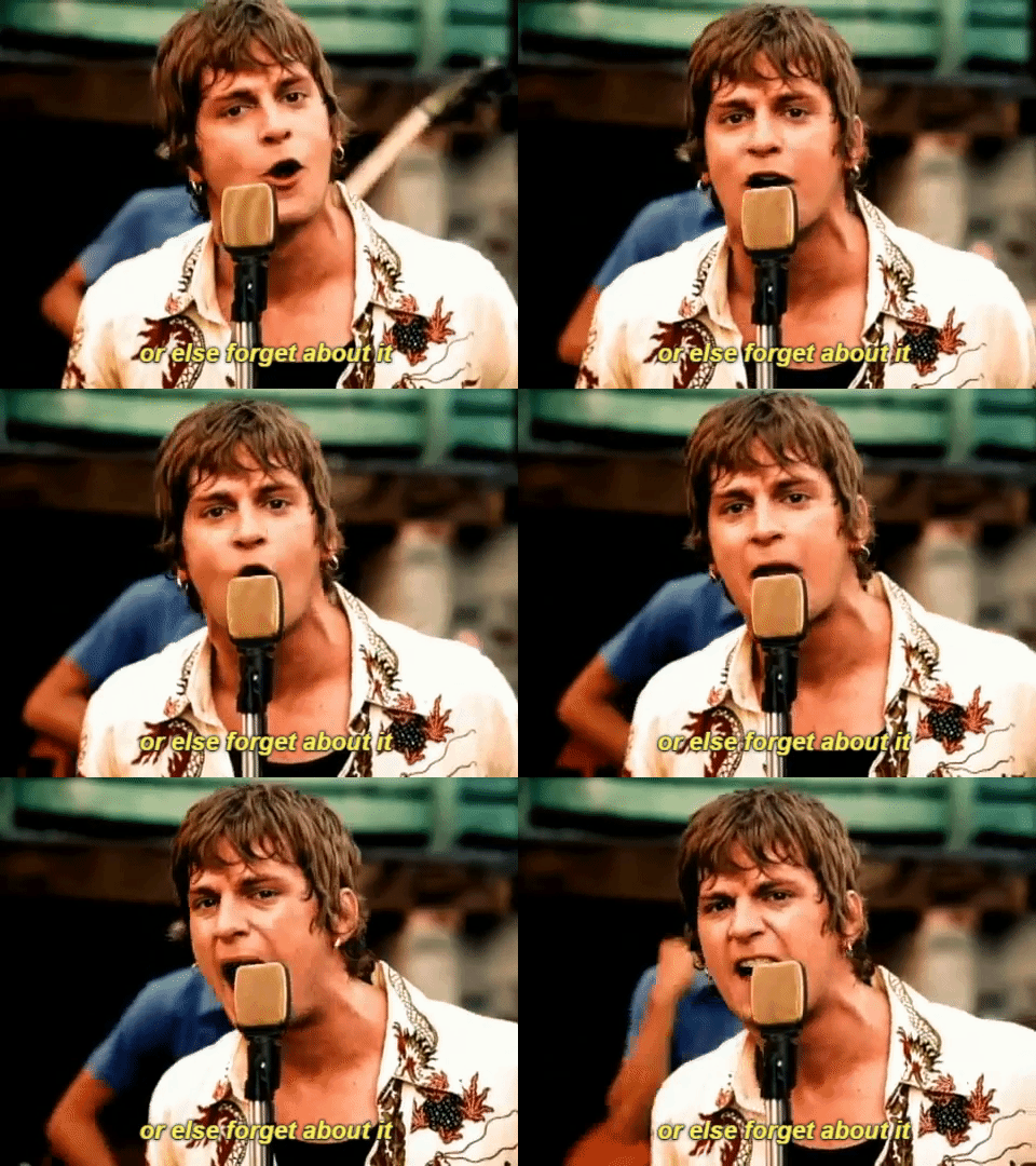
when it’s cold outside
NO
Shared posts
rasec-wizzlbang: dutchster: when it’s cold outside NO
bestrooftalkever: party-wok: julierthanyou: clambistro: Ahh,...
Steve DyerThis that good shit.
Ahh, it’s back
i have disproportionately strong feelings about this.
every time i say “nah i’m not gonna watch it again.” BUT I STILL DO EVERY TIME.
YEAUGH
gif87a-com:Burning some steel wool [x]
Steve DyerThis is beautiful and WHO KNEW STEEL WOOL WOULD BURN??
Gamboge, A Sunny Yellow with a Deadly Past
Steve DyerThere are lots in twists and turns in this installment of Weird Colors!
.
.
.
.
.
.
.
.
.
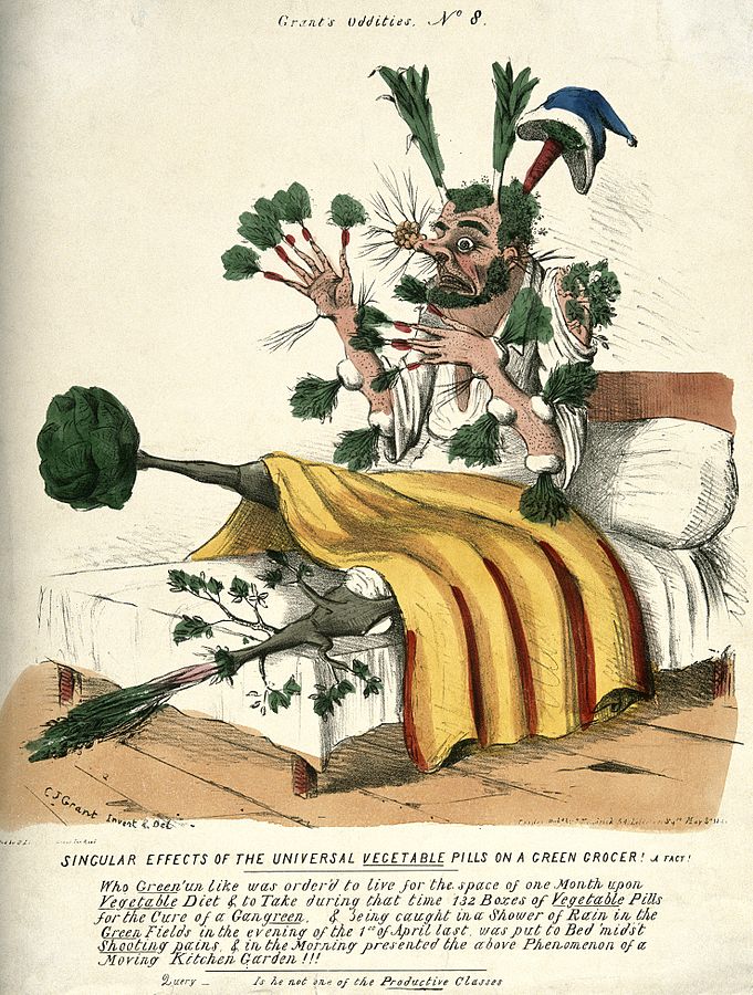
In the early spring of 1836, a British “hygeist,” as some practitioners of pill-based medicine were called, was found guilty of manslaughter after he advised the deceased, a formerly “stout, healthy man” identified as Captain Mackenzie, to ingest 35 pills of questionable origin. The pills were Morison’s pills—also known as Morison’s Vegetable Pills—and were touted as a miraculous cure-all, good for treating everything from a bum knee (like in Mackenzie’s case) to soreness around the eyes. These deadly capsules were created by one of the most famous charlatans in European history, James Morison. The chief ingredient was gamboge, a powerful laxative and diuretic derived from the sap of deciduous trees found primarily in Cambodia.
Morison’s story is nastily familiar. Like today’s snake oil salesmen (and saleswomen, lest we forget GOOP and Amanda Chantal Bacon), Morison “appealed to the general public because of the missionary-like zeal in which he opposed ‘orthodox’ medicine; in particular, he attacked physicians’ excessive fees and toxic medicine.” He claimed that his vegetable pills, which he began peddling in 1825 at the age of 51, cured 35 years of his own “inexpressible suffering.” But it wasn’t long before these crap laxatives—made from gamboge, aloe, colocynth, cream of tartar, myrrh, and rhubarb—got the good doctor (and his salesmen) in hot water.
According to an article titled “Quacks and Quack Medicines” from The Penny Magazine of the Society for the Diffusion of Useful Knowledge published in 1838, Mackenzie’s death was one of many. In the mid-1800s, nearly a dozen people in Great Britain died after taking large doses of Morison’s pills, and several of these cases wound up in court. Yet, the author notes, “even in the extraordinary annals of quackery it would be difficult to find an instance in which the boldness of ignorance was carried further than in this case.” The poor fellow just wanted to cure his knee, but instead he wound up shitting himself to death.
Gamboge is more than just another example of pharmacological greed gone mad; it’s a sunny yellow, a translucent hue as light and golden as early fall aspen leaves—or the undiluted urine of a fairly healthy person. In her excellent book Colors: A Natural History of the Palette, Victoria Finlay explains that gamboge is “one of the most efficient diuretics that nature knows—put it accidentally in your mouth and you’ll be in the bathroom all day.” Then, somewhat oddly, she points out that many yellow dyes cause bodily purging: “In fact, it is quite a characteristic of things that are vibrating at the yellow resonance, Gourds, unripe pineapple, yellow dock root and yellow flag irises all have the same violently purgative effect. Perhaps it is not a coincidence that Indian Vedic tradition places yellow at the second chakra—the navel, just above the colon.” Although she doesn’t explicitly reference the Doctrine of Signatures—an old school pseudo-religious theory that supposes plants meant to heal certain organs are designed to look like them, walnuts for brains, eyebright for eyes, lungwort for lungs, etc.—but there are shades of that superstition here, too.
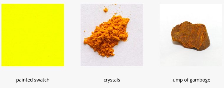
Screenshot: colourlex.com
Gamboge first came to Europe in the early 1600s, brought to the western world by the East India Company. The pigment takes its name from Camboja, an old form of the name Cambodia (or, as Cambodians call their country, Kampuchea). According to the British paint manufacturer Winsor & Newton, gamboge has gone by several other names, including rattan, wisteria yellow, gummi gatti, and drop gum. Collecting the pigment is a painfully slow process, similar to maple syrup collection, only far slower and with less comestible results. The sap flows slowly through bamboo shoots inserted into the middle layer of the tree bark, and it drip, drip, drips into a mold. After the sap hardens, you can either pulverize it into a fine yellow dust, or you can apply water directly to the dark brown nuggets (which have the “brittleness of hard toffee” and the “color of dry ear wax,” according to Finlay). The resulting paint is pretty and slightly golden, but it does not last long (it is “not very lightfast”), which makes it hard for art historians to locate examples of gamboge usage. We do know it was used in traditional Chinese painting, and though the hue has long since faded from most pieces, it was a favorite of Flemish painters and can be seen in some Rembrandts.
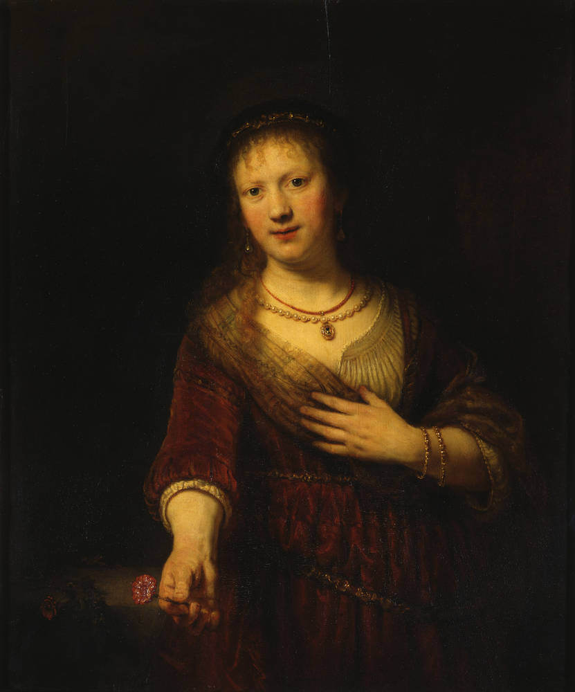
Rembrandt van Rijn, Saskia van Uylenburgh as Flora, 1641
While in China and much of Asia, yellow is an esteemed and respected hue, the color of both heroism and mourning, European and American cultures tend to view yellow in a darker light. Yellow is a color associated with cowardice (consider the phrase “yellow bellied,” which may refer to either a yellow-feathered bird or the yellow jerseys of an Irish hurling team, depending on who you ask), illness (yellow fever), and dishonesty (yellow press). Someone with a yellow tinge to their skin and a yellow cast to their eyes may be jaundiced—or they could just be a particularly rabid fan of famed serial killer Jeffrey Dahmer, who reportedly adored the color and even wore yellow contacts to trial. In Russian, the phrase “yellow house” is a euphemism for a psychiatric institution (inspired by the yellow-painted Obukhovskaya Hospital in St. Petersburg) and fans of feminist literature will remember the “shouldering unclean yellow” and “sickly sulphur tint” of Charlotte Perkins Gilman’s classic short story The Yellow Wallpaper. Even the word lurid, which goes hand-in-hand with the writings of the yellow press, takes its roots for the Latin luridus, meaning “pale yellow, ghastly, the color of bruises.”

By GAlexandrova – Own work, CC BY-SA 4.0, Link
And unfortunately for the legacy of gamboge, its foul history didn’t end with the death of Morison’s medicinal empire. Art supply shops continued selling gamboge into the 1980s, until it was discovered that this particular batch of pigments had been harvested from a Khmer Rouge killing ground. A 2012 episode of Radiolab (titled “The Perfect Yellow”) relays the story of a Winsor & Newton employee who found bullets lodged in a piece of hardened gamboge while he was breaking up chunks of the material to sell. It was determined that sometime during the slow drip of sap, a bullet had sped through the grove of trees, sticking in the gummy substance. Soon, they had found dozens of bullets in the gamboge.
Reporter Jad Abumrad concludes that something terrible must have happened in that seemingly peaceful forest, and asks Ian Garrett, former technical director of Winsor & Newton whether he feels it is morally acceptable to be selling a substance so obviously polluted by death. “It wasn’t Winsor & Newton that discovered these things,” Garrett replies. “These things were demanded by customers.” After a little bit of hemming and hawing about painters and their role in the world, eventually Abumrad concludes, “Colors are sometimes soaked in blood. That’s just how it is.” Slaughter, manslaughter, and perilous pills—gamboge may be gorgeous to some, but to me it will always be the most deadly yellow.
Katy Kelleher is a writer who lives in Maine with her two dogs and one husband.
Celadon, The Unseen Green
Steve DyerThe Awl has been doing a series on weird colors and I enjoy them. The first one was on puce. I did not know what puce was. Similary, I only now can describe what "celadon" is.
.
.
.
.
.
.
.
.
.
There was once a color so beautiful that only royalty were allowed to see it. The common folk didn’t know it, but this green was (rather fittingly) one of those “ish” colors with no clear descriptive word. It was an imprecise color, a murky color, found only on special ceramics and created by a thinly applied glaze that transformed iron oxide from ferric to ferrous iron as it fired in the kiln. The green-ish, gray-ish pottery emerged from the fire with a hint of brown and a fine crackle that supposedly reminded those early worshipers of imprecise beauty of jade. Later, this green would go by the name “celadon” (named, supposedly, for a fictional French lothario who wore pale green ribbons) but for centuries in China it was known only as mi se meaning “mysterious color.”
From the ninth century to the late twentieth century, people could only speculate about the true hue of mi se porcelain. They knew it was green, but whether it was an emerald or a sage, they had no idea. Then, in 1987, archeologists discovered a secret chamber of treasures in the ruins of a collapsed temple outside Xi’an. Inside, they found true mi se ceramics. (A brief but important distinction: The word “celadon” is used to describe both the ceramics, which vary in tone, ranging from yellow greens to more gray-greens, and celadon the color, which, thanks to web designers and their exacting taxonomy of colors, is precise, defined, and does not vary. In digital design, it has the hex code #ace1af and is composed of 67.5% red, 88.2% green, and 68.6% blue—or in the CMYK color space, it uses 23.6% cyan, 0% magenta, 22.2% yellow, and 11.8% black. According to the Pantone naming convention, celadon is filed under 13-6108 TPX.)
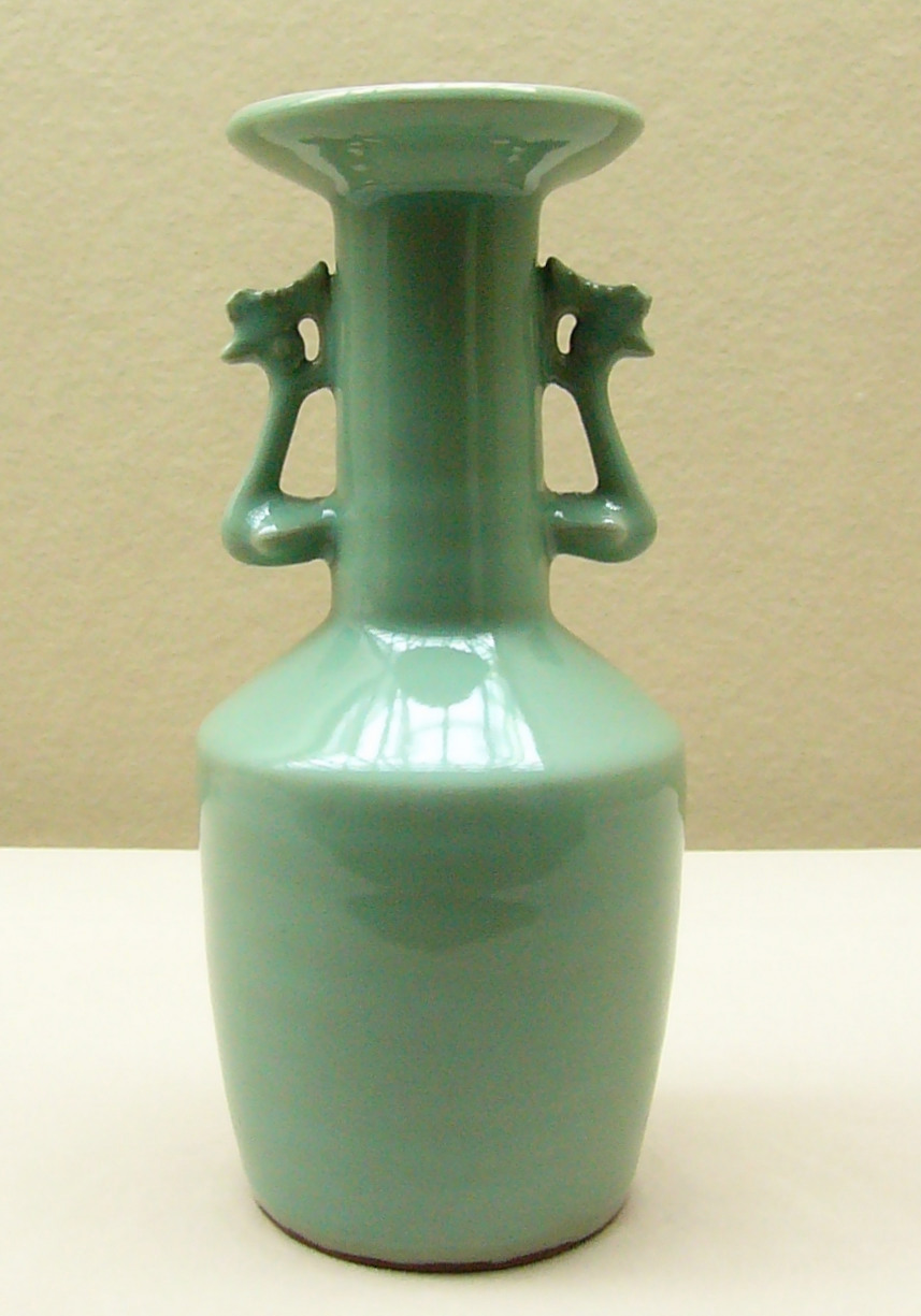
Image: Wikimedia Commons
So, mi se had been unveiled and a myth had been pinned down. It’s hard not to imagine that in that process, something was lost. (Few could argue that #ACE1AF is as a beguiling a hue as the “mysterious color,” even though they are the same damn thing.) In her book Color: A Natural History of the Palate, journalist Victoria Finlay records a profound disappointment upon seeing the color. “It looked dirty, olive brown, nothing special at all,” she wrote. Later, after visiting the birthplace of the color, she adds, “What did I know about celadon? I knew when I first arrived in Hong Kong and seen it—in museums and antiques shops and people’s homes—I hadn’t really understood it at all. It had seemed to be about the colors I hadn’t been attracted to: the non-colors, which can best be described conceptually or meteorically, with words like misty, dreamy, ghostly, pale, foggy.” She claims she comes to love mi se and celadon both—she comes to see how delicate and rarified it is, how poetic, representing “a state of exquisite elemental tension”—but I don’t quite believe her. I think her first response was the truest: nothing special at all.
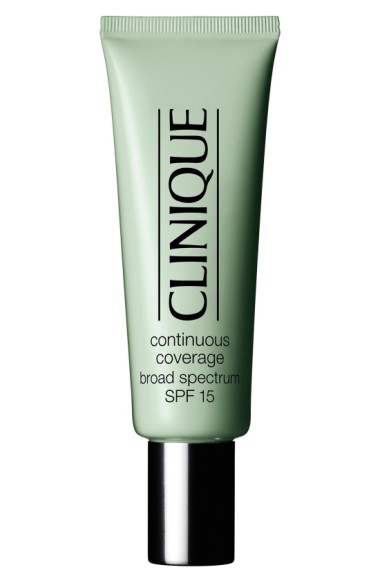
Or maybe I’m projecting, because I don’t know whether or not I find celadon all that appealing myself, though I, like Finlay, am predictably seduced by the mysticism and secrecy of this unseen green. I want to like it, but I wouldn’t wear it, nor would I paint my bedroom with that turbid Clinique green. Sometimes, when I try to describe celadon, I compare it to the silvery gray underside of spring maple leaves, turned belly-up before a storm. Then, it is beautiful. But sometimes I recognize it as the color of a sinus infection—not so pretty now.
That’s the thing about greens. They’re polarizing, like yellows (the least popular favorite color of all). This is particularly true in Western culture. Over the centuries, we’ve associated green with ill health, good health, demons, God, nature, envy, and luck. In his book Green: the History of a Color, Michel Pastoureau charts how green went from being unnamable and thus supposedly invisible for the Greeks (an idea espoused by first Nietzsche and later the Nazis) to becoming one of the most popular hues of the 20th century. In between, Europeans viewed green as a rather tricky color. In Christianity, there was a common distinction between honest and “dishonest” colors, with green nearly always been ranked with the negative colors, the “false, unstable group unworthy of good citizens.” In the middle ages, green was believed to be the color of ghosts and devils, dragons and other monsters. Witches had green eyes and green teeth, got decked out in green dresses, and spent their time mixing green poisons. Later, Shakespeare would describe envy as “the green sickness” in Anthony and Cleopatra, further cementing the connection between green and covetousness, green and greed. Off-greens were even more dangerous than true greens; these green-ish colors were associated closely with illness and decay. For much of history, “ish” colors were considered undesirable, since it was generally more costly and difficult to produce true jewel tones or highly saturated hues.
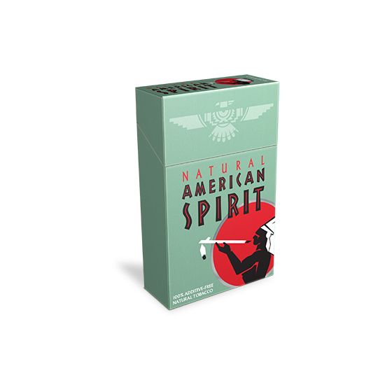
Not so today. Like hand-carved rustic furniture or Maine-caught crustaceans, “ish” colors have gone from being a symbol of poverty to one of wealth. In a New Yorker profile of color consultant Leslie Harrington (who has worked with companies like Crayola, Pottery Barn, and Avon to guide their color choices), Harrington tells writer Eric Konigsberg over lunch that house paints that are difficult to describe tend to be more pricey (or as she puts it, “upscale” or “sophisticated”). “The more high-end the color, the more colors have gone into it and the more words you use to describe it,” she said. As an example, if you hear “it’s kind of a taupey beige with a bit of green in it,” that color probably costs a pretty penny. But “when it’s a lower-end neutral, people just say ‘tan’.”
So the next time you see a pack of American Spirits (“Balanced”) or a Clinique bottle (founder Carol Phillips reportedly chose that color for its “soothing appeal”) you can now proudly point to it and tell your friends, “That is celadon!” And not only will everyone know that you’re a high-end individual, they’ll also know whom to avoid at the cheese table.
Katy Kelleher is a writer who lives in Maine with her two dogs and one husband.
People matching artworks
Photographer Stefan Draschan spent hours hanging around museums waiting for people who matched in some way the artwork around them.


Draschan has done several other similar-ish projects, including People Touching Artworks. If I ever get really into Buddhism and mindfulness, I think my biggest obstacle in achieving enlightenment will be observing people in museums touching the art and remaining calm about it.
Tags: art photography Stefan DraschanThe Sexy-Gross Story of Puce
Steve Dyerpuce and fleas and fucking and "oh it's dark millennial pink"
.
.
.
.
.
.
.
.
.
Puce is a color that’s been around for as long as we’ve been spilling blood and watching it dry, but it didn’t get a name until the summer of 1775 when French dressmaker Rose Bertin made Marie-Antoinette a gown in a color that blurred the lines between brown and maroon with only a hint of pinkish-gray. According to a biography of Bertin, the Louis XVI strode into a room where his wife was hanging out, wearing her brand new silk dress, and exclaimed, “That is puce!” He had observed, and rightfully so, that her dress was the same color as a flea (or, in French, “une puce”).
Considering what happens next, I imagine he meant this as praise. While that’s bug-colored doesn’t sound like a fantastic compliment to receive from a significant other, the French court went wild for this King-approved and Queen-endorsed red. “As the new colour did not soil easily, and was therefore less expensive than lighter tints, the fashion of puce gowns was adopted by the bourgeoisie, and dyers were unable to meet the pressing requirements of their customers,” explains The History of Fashion in France. Soon, both men and women were wearing trendy puce-colored taffetas and satins (or sending their old rags out to be dyed anew). “But the color was not always exactly the same shade, so they made a difference between old and young flea, and then made subdivisions, and you could see clothes the color of the flea’s ‘back’, ‘head,’ or ‘thigh’,” adds historian Augustin Challamel. But the muddy, bloody red went out of fashion as quickly as it blew in. Legend has it that, on another occasion just months following his puce ejaculation, Louis XVI saw his wife in a fab new gray gown and said something along the lines of, “That dress is the color of your hair!”
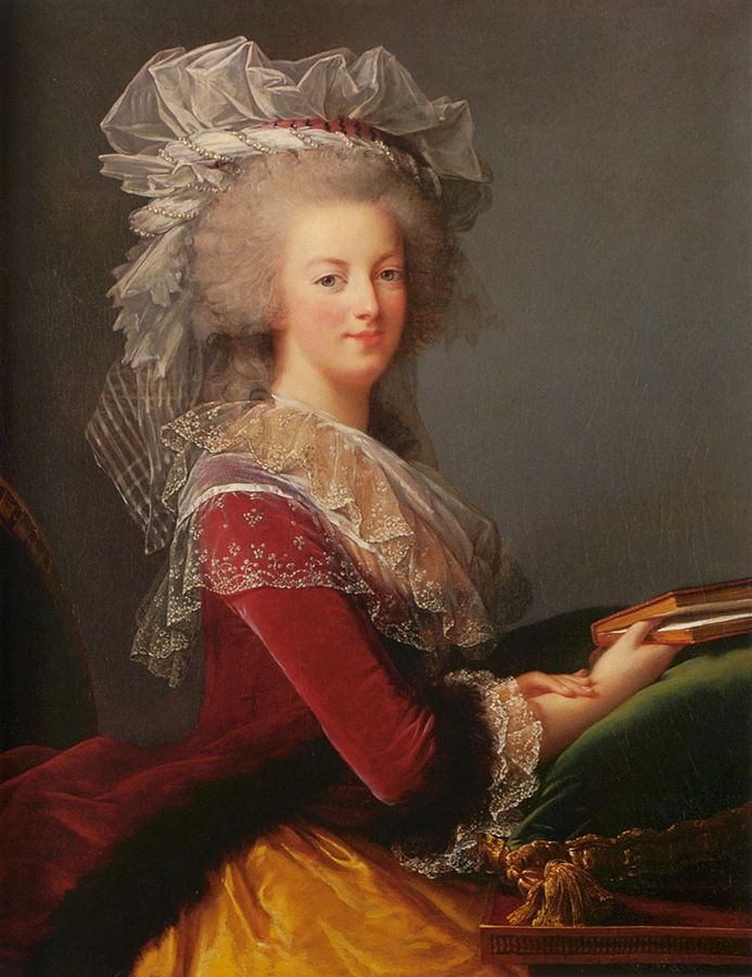
Portrait of Marie Antoinette painted in 1785 for the Ministry of Foreign Affairs, by Louise Élisabeth Vigée Le Brun – Private collection, Public Domain, via Wikimedia Commons.
(According to a collection of anonymous letters from the time period—exhaustingly titled Mémoires secrets pour servir à l’histoire de la République des Lettres en France depuis 1762 jusqu’à nos jours or “Secret Memoirs Serving as a History of the Republic of Letters in France from 1762 until Our Days”—“queen’s hair” replaced puce immediately as the It color: “From that moment, puce was out of fashion, and valets were despatched from Fontainebleau to Paris to procure velvet, ratteen, and cloth, of that colour…”)
Puce may have faded from prominence, but even the most abstract of things, once publicly named and identified, continues to exist in some way or another. While it may seem odd that the rather crudely named insect-inspired color became so quickly coveted, there was already a conceptual link between fleas and desire. In John Donne’s “The Flea” (published in 1633), the poet uses parasitic insects as a metaphor for fucking, and as a way to pressure his beloved into doing so. “It sucked me first, and now sucks thee, / And in this flea our two bloods mingled be; / Though know’st that this cannot be said / A sin, nor shame, nor loss of maidenhead,” he writes, and that’s just the first stanza. Donne goes on to get chastise this poor girl for killing the flea after arguing that she should just “yield” to him.
In a 2009 article on puce in Cabinet magazine, Barry Sanders makes a strong argument that fleas have a murderous side, as well as an “outlandishly sexual” one:
The flea took on its sexual identiy from a string of suggestive cognates with puce, like pucelle, ‘maiden’ (and in certain contexts, ‘slut’); pucelage, ‘maidenhead’; and depuceler, ‘to deflower.’ In addition, the French eroticize the fla in a popular phrase since the fourteenth century, ‘avoir la puce a l’oreille’ (‘to have a flea in one’s ear,’ meaning that one harbors a libidinous urge, ‘a sexual itch.’ Say the word puce today and a Frenchman will either titter or offer a knowing wink.
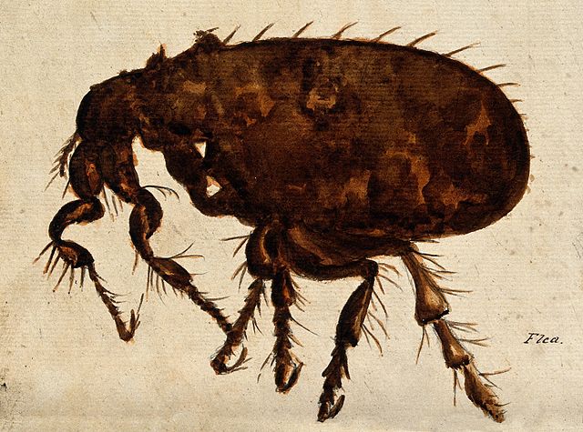
Image: Wellcome via Wikimedia Commons
I do not know whether Frenchmen still react this way, but there are others who desire puce. According to numerous antiquing bloggers, “bottle-diggers” lust after puce-toned glass relics, which can fetch a high price on eBay or at antique fairs, with the “puce eagle” bottle being particularly popular. (Question: Would you watch a Detectorist-style television series about bottle-diggers set in the American Midwest? I would.) In the past few decades, puce has become one of those cocktail party tidbits of knowledge that gets passed around, showing up randomly in movie dialogue for no other purpose than to showcase the writer’s encyclopedic intelligence/justify their art history minor. Puce gets shout-outs in Monsters Inc., Santa Claus: The Movie, and Fright Night. It’s also mentioned in Ulysses, but I think perhaps James Joyce was thinking of the other puce—the wrong puce—since Buck Mulligan says they want “puce gloves” to match his “green boots”. (The wrong puce is pea soup green and it seems to be a visual malapropism of British origins, and frankly, I think this green-puce is bullshit and should be ignored like the Johnny-come-lately it is.)
Unfortunately for those of us who desire exactitude while hypocritically chaffing under its rigors, puce is still somewhat of an unsettled color. You can find many different puces in the paint color and hex code worlds. Sometimes puce veers closer to mauve, while others it appears downright brown (and occasionally it appears as a pale boy belly-flop pink). Pantone’s puce is a particular disappointment. It lacks the gutsiness of some of the other tones; it’s a matte brown that is neither earthy and warm nor layered and intriguing. Personally, I think we should bring back the original French naming system for these varieties of puce. Flea-thigh, flea-belly, flea-back, new-flea, old-flea, dead-flea, live-flea—each one with its own tint and tone. There is a squalidness to this naming system that appeals to my messier tendencies, and an intuitive precision to it that is reminiscent of Werner’s Nomenclature of Colours. It would fit well next to his more corporeal colors—Veinous Blood Red, Gallstone Yellow, and Liver Brown. The slim volume is mainly filled with lovingly named colors (inspired by nature and his paint box in equal measures), yet every now and then, a bodily function sneaks in. Peach blossom red, rose red, and then: arterial blood red. And that is the story of puce—amidst such beauty, such repulsion.
Katy Kelleher is a writer who lives in Maine with her two dogs and one husband.
On safari in Trump’s America
Steve Dyeropened in tab and shared from excerpt
I very much enjoyed this Molly Ball piece.
…three days into their safari in flyover country, the researchers were hearing some things that disturbed them greatly—sentiments that threatened their beliefs to the very core…
“You’ve got all these parasites making a living off the bureaucracy,” the farmer declared, “like leeches pulling you down, bleeding you dry.” We had been in the state for just a few hours, and already the researchers’ quest for mutual understanding seemed to be hitting a snag.
Others in the group, a bunch of proudly curmudgeonly older white men, identified other culprits. There were plenty of jobs, a local elected official and business owner said. But today’s young people were too lazy or drug-addled to do them.
As we proceeded to meetings with diverse groups of community representatives, this sort of blame-casting was a common refrain. Disdain for the young, in particular, was a constant, across demographic, socio-economic, and generational lines: Even young people complained about young people. “They don’t want to do the work, and they always feel like they’re being picked on,” a recent graduate of a technical school in Chippewa Falls said of his fellow Millennials.
Some of the people we met expressed the conservative-leaning view that changes in society and the family were to blame. One, a technical-skills instructor at the Chippewa Falls school, questioned whether women belonged in the workplace at all. “That idea of both family members working, it’s a social experiment that I don’t know if it quite works,” he said. “If everyone’s working, who is making sure the children are raised right?”
There is much more at the link, but no final meeting of the minds.
The post On safari in Trump’s America appeared first on Marginal REVOLUTION.
An Excerpt from ‘Paul Ryan Magazine’: Proust Questionnaire, by Anna Heyward
Steve DyerHEY JAMES FOLTAAAAAAA and company
AND THEN THE LADY WENT AND SAT WITH THE BULLIED BOY AND FUCK YOU SHUT UP YOU’RE CRYING
Steve Dyersobbed at bk, ordering uber eats from them to celebrate
Burger King just released one of the best anti-bullying PSAs I've ever seen pic.twitter.com/0RV1JUvBd2
— Josh Goodman (@JustJOSH_ingYa) October 19, 2017
This might be one of the best anti-bullying ads we’ve seen. It’s a simple premise: A group of actors pretend to be a bunch of bullies and their victim in a real Los Angeles Burger King, and hidden cameras keep track of whether anyone intervenes. At the same time, on the cooking line, a Burger King employee “bullies” a Whopper Jr. then wraps it up to be served to whomever ordered it.
The bystander effect and social squeamishness about getting involved result in a depressing outcome: 92% of customers complained about getting a mooshed burger, and only about 12% intervened with the “bullied” teen, who earned his pay for acting. You’ll laugh and maybe cry some when the nice lady stands up and goes over to talk to the bullied kid. We’re not sure what we learn here, except that maybe we should get more people to pay two bucks for a teenager so they’ll care if he or she is bullied.
Also, we need a PSA showing Burger King executives how their employees could live much better lives on $15 an hour, but we don’t know if a comparison to a burger getting paid a living wage would work.
Just watch the ad, guys. We know you don’t watch the videos, but WATCH THE DAMN VIDEO OR WE’LL SMUSH YOUR BURGER.
We’d never do that. Really. We love you. It’s your open thread.
[Fortune/ Josh Marshall on Twitter]
The movement of David Fincher’s camera is a surrogate for your eyes
Steve DyerI'm very interested in increasing my visual vocabulary and I love these types of videos!!!!
This is a really keen observation by Evan Puschak about the camera movement in David Fincher’s films: it mimics your eyes in paying attention to the behavior in a scene. The effect is sometimes subtle. When a character shifts even slightly, the camera keeps that person’s eyes and face in the same place in the frame, just as you would if you were in the room with them.
Tags: David Fincher Evan Puschak film school movies videocykelops: sugarshai: marvelstudiosmovies: New clip from ‘Thor:...
Steve Dyer98% on rotten tomatoes
New clip from ‘Thor: Ragnarok’
Oh my gosh what the fhck
IM CRYING WHAT IS THIS
Robots in disguise
Steve DyerHOT ROD YOU FUCKIN NOOB
Some faves are problematic; others are merely embarrassing. 1986’s Transformers: The Movie may be both, but leans towards the latter.
You have to fit into a very narrow generational window to love this movie. It was really for late Gen X/early millennial cuspers, with a little bit of a hangover into millennials proper because of home video. But for the most part, if you’re a little bit older or younger, you’re either completely baffled by this cartoon or mildly surprised that it isn’t total crap.
I saw this film in the theater with my two brothers, one older and one younger. My mom and older sister saw Ferris Bueller’s Day Off down the hall. None of us had any idea what we were in for. I would contend that of the two films, Transformers should have PG-13. Mild scatological humor is no match for beloved toys cursing and slaughtering each other.
As kids who loved the TV cartoon, we were literally invested in these characters. To the extent that a child can have net worth, a huge percentage of it was tied up in these toys, and the characters they represented. Here they are getting killed off right and left — ominous smoke pouring forth from their mouths, my god — and all Megatron can say is “that was almost too easy.”
The best analogy I can think of is this: suppose you’ve read the first three or four Harry Potter books. Those are all that’s available. You hear that there’s going to be a Harry Potter movie. But instead of a film version of the books you love, the movie busts right into the story from books 5, 6, and 7. You jump forward in time to a creeping totalitarian state, beloved characters are getting killed off right and left by Voldemort and his Death Eaters, and BAM! A half hour into the movie, Dumbledore is disarmed and blasted out of the tower.
You’re six years old, and you watch your Dumbledore die with Reese’s Pieces in your hand. Only instead of a wizard you read about in a book, he’s a robot that turns into a truck, and you have to go over your friend Davey’s house to play with him because he’s too expensive.
Then instead of a big funeral, you blast into outer space for another hour of heavy-metal soundtrack movie. More deaths. More metamorphoses. Planet-devouring robots. Cars who say “shit” and “god damn it.” “Dare To Be Stupid.”
On top of that, unlike Dumbledore’s underwhelming death in the film version of The Half-Blood Prince, the scene where Optimus Prime is killed is totally amazing.
I mean, that is almost Luke vs. Vader and the Emperor in Jedi good.
The problem with Transformers: The Movie (besides all of the problems with the movie and all the movies and TV shows that came after it) is really the toys. The whole show is designed to sell the toys. All the character deaths, the new generation introduced in the movie, and the magnificent decision to send the Autobots and Decepticons into exile in uncharted space, are all decisions made to create a market for more goddamned toys.
The toys, our physical proximity to them, the ability to shape and change them, and the ways we use them to play out narratives, are the mechanism for our affection. But they’re also intentionally disposable. It’s as far from respectable art in the traditional sense as it gets.
MovieBob’s Bob Chipman has a terrific video about this problem, specifically as it relates to Transformers: The Movie.
TL:DR — the decision to kill off most of the established characters actually forces the movie to make some compelling artistic choices. It’s a war movie where the generals and top lieutenants are killed off immediately, forcing a raw younger generation to make their own choices and mistakes. This in turn resonates with aging kids who’ve parents die and split up, who have either already faced or will soon face their own traumas.
The movie’s message — terrible things will happen, not everyone will make it intact, but you can find a way to go on — becomes a resource kids draw on as they grow up. Again, very similar to Harry Potter: just for us folks who were a little too old to catch the book before our childhoods ended.
Robin Sloan is a novelist, blogger, and media inventor. He’s also like three weeks younger than I am and grew up about three miles away. Unsurprisingly, he and I had very similar reactions to Transformers: The Movie.
I mean maybe it’s cliched to say this, or impossible with any credibility, but I’m pretty sure that movie was the most emotional experience of my life inside a movie theater? I can’t remember the whole experience with total clarity, but I do remember which friend I saw it with; I also remember my initial confusion — it didn’t announce its time-shift, so any young fan of the TV cartoon was initially like, “Wait… what?” — and, of course, THE DEATH OF OPTIMUS PRIME. What do you even say? Biblical, Shakespearean, and totally sci-fi, all at once. Megaton-scale. I wonder if the people who made the movie even understood what they were doing, what impact it would have.
Looking at it as an adult today. I think the movie is astonishing. Even for all its flaws, all the rough edges in its animation, sound, script, it just does *so much more than it had to*, particularly for a movie of that kind, of that time. The scale of it… I mean have there even BEEN any other movies with planet-sized robots? Has anyone else even DARED?
Maybe that’s what makes a movie — or any piece of media? — seem special: the sense that it isn’t merely “made to spec” but rather the special product of a confluence of people who cared, for one reason or another — and with a big dollop of weird luck thrown in, always — who made something sui generis. If Transformers: The Movie belongs in any category, it’s that one: Fully Its Own Thing.
Finally: the voice acting, including Orson freaking Welles, is outstanding.
Tags: Love letters Robin Sloan toys TransformersPhoto
Steve Dyerokay if the other one was panoramic, is this what happens when portrait mode misfires

sridevi: WONDER WOMAN // The Feminum Mystique: Part 2 (1976)
Steve Dyerdamn
https://www.reddit.com/r/relationships/comments/74xnvf/i_27f_am_on_vacation_with_my_friend_29f_and_i/?st=j8i161ls&sh=0985f2ff
Steve DyerGuys, let's shit on some vegans, it's been awhile
docloudscomeinpurple: babyanimalgifs: Please stop what you are...
Steve DyerWOWWOWOW
Please stop what you are doing for 13 seconds and watch this:
performance art

