Shared posts

14 Mar 02:38

3 Fresh Ideas To Fight Air Pollution

by Aridan Mecava

Air pollution is a huge problem in cities across the entire world. New solutions are popping up that tackle the effects of dirty air. Do they really help? Here are some of them.

More Trees

Trees are commonly seen as the natural enemy of air pollution. Increasing the number of trees within cities is thus commonly seen as the ultimate solution to urban air pollution. However, this urban air purification method is not as useful as many people think. As, among others, this article has pointed out, it is relevant to take into account the city’s air flow. Planting trees along a narrow street can lead to the formation of a ‘green roof’ that prevents pollutants from escaping the street. Single trees can break wind flow, diverting pollutants towards pedestrians.

While carbon dioxide is often seen as the major threat, nitrogen oxides and particulate matter present greater a greater risk for humans, especially children and elderly. These gases and particles are released by fuel combustion. However, the effect of trees on these gases and particles is yet unknown. Simply planting more trees is not the ultimate solution for urban air pollution and a multitude of complexities needs to be taken into account as scientists point out.

CityTree

Green City Solutions, the German company responsible for four of Amsterdam’s new CityTrees, acknowledge that “many cities are finding it hard to breathe”. The company found that 90% of all city dwellers breathe in polluted air every day, 7 million annual deaths are caused by air pollution, and 1.48 trillion euros is lost annually in Europe due to air pollution. The CityTree claims it can help relieve these serious problems. The concept applies moss cultures that have the ability to filter pollutants, such as particulate matter, out of the air. They bind the particles to the leaf surfaces and integrate them into their biomass, hereby purifying the air around them.

However, urban environments are not ideal for moss. Hence, CityTree combines shade-giving plants, automated water supply and nutrients with Internet of Things technology (IoT) in order for moss to thrive in cities. At the same time, the filter performance and the moss’ needs are monitored. Integrated solar panels generate the energy that is needed for operating the CityTree.

Amsterdam is installing four CityTrees within one of its notoriously polluted streets, Valkenburgerstraat. The street forms a vital part of the city’s road network, connecting a major north-south traffic axis to the central railway station and one of three major tunnels that connect the main city to its northern suburbs. Residents have been complaining about poor air quality for years and the local government hopes that the four trees will help.

Smog Free Project

Dutch social design lab Studio Rosegaarde offers yet another set of solutions that help ease urban air pollution. Their Smoke Free Project “is a series of urban innovations led by Daan Roosegaarde to reduce pollution and provide an inspirational experience of a clean future”. One of these innovations is the Smog Free Tower. Rosegaarde calls it “the world’s largest smog vacuum cleaner”. The 7 meter tall uses ‘positive ionization technology’ that cleans 30.000 m3 per hour, using “no more electricity than an water boiler”. Rosegaarde says it is primarily a local solution that provides clean air in spaces such as parks. In 2015, the Smog Free Tower was planted in the Dutch city of Rotterdam and has found its way across the world into China, where it has now been implemented.

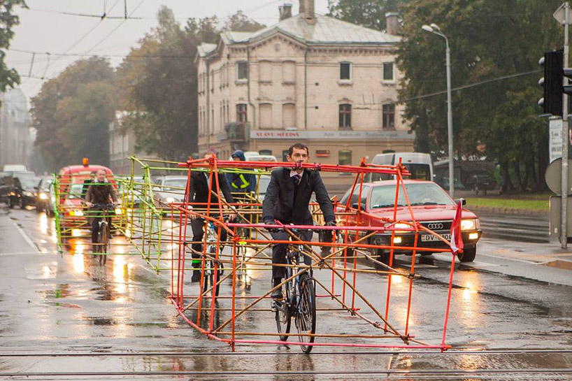
Along with the Smog Free Tower, Studio Roosegaarde has rolled out the Smog Free Bicycle. “The innovative bicycle inhales polluted air, cleans it, and gives clean air to the cyclist”. The Smog Free Bicycle looks like it is designed for the single cyclists healthy, but this is not true. The system is intended to become a way of achieving smog free cities by installing the system on thousands of bicycles within cities, impacting the urban area as a whole, not only the one driving the bicycle.

As simply adding more trees is not the solution, more complex innovations like the CityTree and the Smog Free Project might contribute to actual reduction of air pollution in cities. Simply adding more trees reduces nature to a functional solution to man-made problems. Trees are not appreciated for ‘just being there’ but they are used to serve mankind. On the other side, innovations like CityTree and the Smog Free Project tackle the outcomes of polluting activities in more effective ways. By only mitigating the negative effects of pollution caused by combustion engines, the need for these kind of solutions will remain and increase. Despite the fact that CityTree and the Smog Free Project are not aimed at changing our behavior, we should keep in mind that we need to change our day-to-day routines in order to make our cities healthy.

Read more →
05 Nov 00:10

Town Squares: Apple’s Contested New Product

by Aridan Mecava

Apple Stores in ‘top cities’ around the world are now called Apple Town Squares. Is the tech giant shifting its focus to urban space?

During Apple’s September 2017 keynote, we learned that Apple Stores in “top cities around the world” will not be called Apple Stores any more. Instead, Apple will call these stores ‘Town Squares’. In the short retail section of the keynote, Apple’s retail head Angela Ahrendts announced that these new Apple Town Squares will be “gathering places”. According to Ahrendts, Apple Town Squares should become “places where everyone is welcome, and where all of Apple comes together”. The Apple Town Square in Milan will feature a public plaza and Chicago’s Apple Town Square should “revitalize Chicago’s waterfront”. Ahrendts announced that Apple Town Squares should function as places where one can “relax, meet up with friends, or just listen to a local artist on the weekends”. The renderings of Apple Town Squares show the incorporation of the surrounding area of the city streets and squares into the Town Square design, but the concept mostly focuses on activities, such as Today at Apple, and retail experience innovation in the interior. The main idea is that the new, open design will enable a ‘connection’ to the community. All in all, Ahrendts’ announcement of Apple Town Squares suggests that the Apple Town Squares will function not only as retail spaces but also as public spaces that connect to communities, both physically and socially.

The introduction of Apple Town Squares as such raised many questions, also within the technology industry. Critics argue that Apple Town Squares are imagined as public spaces by Apple, yet many see them as retail spaces that are only promoted as being public. In so, Apple is said to have gone ‘too far’ with their marketing of their retail stores. Furthermore, according to skeptics, Apple Town Squares lack amenities that true public spaces posit. Gideon Fink Shapiro, an architecture and urban studies graduate and architecture historian, tells The Washington Post that a vibrant public space involves an element of surprise; “people walking, talking, kissing, arguing, protesting, making art”. According to him, town squares have been the backdrops of historic events, like protests and riots. Apple retail stores will not, according to Fink Shapiro. He thinks that Apple will likely succeed in attracting many people to their new squares. However, Apple Town Squares will not be true public spaces, which are more messy and organic, while Apple is not messy, says Fink Shapiro.

James Vincent of The Verge, an online technology platform, argues that calling Apple Stores Apple Town Squares is “a pretentious farce”. Vincent says that the Apple “has always been defined in part by onanism and self-congratulation, but has managed a certain degree of self-awareness”. He continues by saying that by introducing Apple Town Squares, Apple “jumped the shark”. Alex Madrigal of The Atlantic calls Apple Town Squares “truly explicitly not a public space. They are the opposite of a public space”. Madrigal says that Apple adopted a “faux democratic language of Facebook and Twitter” in order to “expect fundamentally commercial entities to build community or to serve liberal democracy or to make your voice heard or to act as an agora or whatever else”.

Despite his critique, Fink Shapiro has recognized that “maybe Apple is onto something in the sense that there aren’t enough appealing, vibrant public spaces in our cities”. For an American company that is attempting to be more involved in local communities, it might make sense to invest in public space, which are arguably lacking in American cities. In European cities, like Milan, public spaces are likely more readily available and lively, and Apple Town Squares might be an uncalled for solution for a non-existing problem. Finally, it remains unclear in what ways Apple Town Squares will contribute to local communities, and to what local communities exactly. Whether Apple Town Squares will serve those other than people with shattered iPhone screens and faulty MacBooks remains to be seen.

Read more →
02 Dec 21:06

Pop-Up City Is Looking For Interns

by Joop de Boer

Pop-Up City and Golfstromen are looking for editorial and project interns to join our team in the fourth quarter of 2018 and in 2019!

We are Golfstromen, a creative agency from Amsterdam. Founded in 2007, we do communication, urban development, events, and publishing. We develop innovative concepts for cities as well as new strategies and ideas for campaigns and events. Our clients include BPD, smart, Utrecht University and International Social Housing Festival. Furthermore, we have been working on a large scale research project on The Future Of Urban Living. We curate and organize the PechaKucha series in Amsterdam, we created Pop-Up City, and in 2014 we published our first book. We’re currently looking for interns to join our team in Amsterdam in the coming year.

1. Editorial intern (3-6 months)
As an editorial intern you’ll be an active member of Pop-Up City’s team. You’ll research topics, write articles and interviews for Pop-Up City and our clients, and learn the ins and outs of social media marketing and community management. You’re required to have decent English editorial, writing and sociale media skills and a passion for urbanism, design, marketing and new technologies, and a good eye for new trends. Basic knowledge of WordPress and HTML is not required but would be nice.

2. Project and editorial intern (3-6 months)
You’ll write articles for Pop-Up City and our clients, and also work on a variety of commissioned and self-initiated projects and events, ranging from urban development and communication and branding to public events (like PechaKucha Amsterdam). For this position you’re required to have decent Dutch and English speaking and writing skills, as well as a passion for urbanism, design, marketing and new technologies.

What do we offer?

We offer a great learning experience in a very creative and diverse environment, with big responsibilities. This is also your chance to be part of Pop-Up City and have 1,000s of people around the world read your articles. Furthermore, we’ll introduce you to Amsterdam’s vibrant creative and cultural scene. We are located in a creative environment in the city’s coolest district, Amsterdam-Noord. And yes, there’s a remuneration.

Interested?

In case you’re interested, please send an email to aridan@popupcity.net, together with your resume and what else you find important (favorite website, biggest source of inspiration, you name it). Applications in both Dutch and English are welcome. We’re looking forward to hearing from you!

02 Mar 23:23

Tropical - Dan Shake posters by Warriors Studio "Posters for...


Tropical - Dan Shake posters by Warriors Studio

"Posters for Glasgow club promoter, Tropical’s 4th party. 3-layer risograph prints on a selection of 120gsm uncoated stocks by Risotto Studio. Guests include London-based Dan Shake of Moodymann’s prestigious, Detroit record-label, Mahogani Music and resident Ally Tropical.”

Warriors Studio is a graphic design and creative agency based in Glasgow, founded by James Gilchrist and Beth Wilson. Strong concept, simplicity and clarity are at the heart of their work and they place high importance on honest, clear and efficient communication. They believe that continual learning and collaboration are essential for the development of strong ideas and the production of effective design, and that working closely and openly with their clients is the only way to reach a successful and mutually beneficial resolution.

The Design Blog:  facebook   |   twitter   |   pinterest   |   subscribe

28 Feb 13:18

Reviewed: New Logo and Identity for UIC by its Design Students and Staff

by Armin

Sideways

New Logo and Identity for UIC by its Design Students and Staff

Established in 1982 (although with roots as far back as 1858), the University of Illinois at Chicago (most commonly known as UIC) is the largest university in the Chicago area with over 27,000 students — approximately 61 percent undergraduate and 39 percent graduate and professional — across 15 colleges granting a combined 241 Bachelor's, Master's, and Doctoral degrees. Additionally, UIC operates the state's major public medical center and serves as the principal educator of Illinois' physicians, dentists, pharmacists, nurses and other health-care professionals. This past Fall the university approved a new logo and identity to be implemented this year designed by… wait for it… students from UIC's School of Design in their Design 440 senior capstone course headed by Cheryl Towler Weese of Studio Blue.

The current UIC brand is the result of a yearlong project undertaken by students and faculty in UIC's School of Design during the 2013/14 academic year. Students spent two semesters gathering insights into UIC and developing a visual verbal identity system for the university. In all, nearly 200 stakeholders were interviewed during the process to ensure that the new brand accurately represents UIC and its future direction. Once the students completed their designs in May 2014, the Chicago design firm Studio Blue went to work professionalizing the concepts so that campus units have the resources they need to execute the modernized brand.

UIC Office of Marketing and Brand Management

Inside look at the development of the new identity by UIC students.
Chicago is as much a part of UIC as UIC is part of Chicago. In the university's new logotype and mark, a strong typographic representation emphasizes the fact that UIC is, indeed, Chicago's public research university. The vertically oriented logotype reflects the city's dynamism, skyline and diverse population; emphasizing the transformative quality of a first-rate university education for students and of a top-tier research institution for scholars. The UIC mark references the historical Circle Campus and is closely tied to the university's previous mark, forming a bridge between old and new. The identity system is designed to be stable, yet flexible and versatile.

Identity guidelines (PDF)

New Logo and Identity for UIC by its Design Students and Staff
Identity elements.
New Logo and Identity for UIC by its Design Students and Staff
Primary lock-up.
New Logo and Identity for UIC by its Design Students and Staff
Secondary lock-up.

The previous UIC logo wasn't much but in its simplicity and ubiquity throughout the city of Chicago and all its publications and ads it was highly recognizable. The new circle mark keeps the same vibe as the old one but, hey, it's in a circle and it's a change that almost goes unnoticed. The biggest change is the new sideways wordmark, typeset in Theinhardt by Optimo. It's quite disconcerting at first. University wordmarks are not set sideways. Ever. Especially not ones with really long names. But it's the length of the name and that of the words themselves that make this work in a surpassingly compelling way. The first thought is of a skyline and since Chicago has one of the most amazing skylines in the history of skylines, it's an apt appropriation. Using the UIC circle as the punctuating mark anchors the wordmark with unexpected tension. In less words: this is really good.

New Logo and Identity for UIC by its Design Students and Staff
Various configurations for individual colleges or groups within the university.

The always challenging structuring of colleges and groups and institutions within the university works rather nicely in the sideways system, although the tinted solution is a little weak. The image above reminds me of these responsive logos.

New Logo and Identity for UIC by its Design Students and Staff
Typography: Theinhardt by Optimo.
New Logo and Identity for UIC by its Design Students and Staff
Mini billboards of some kind.
New Logo and Identity for UIC by its Design Students and Staff
T-shirts.
New Logo and Identity for UIC by its Design Students and Staff
Banners.

In application things get slightly tame which may not be the most terrible of approaches, letting the sideways typography command all the necessary attention. But even then, there is still some focus missing from the color palette and gradients. Perhaps it will settle with time and use.

So there you have it folks. The age-old question of "Why wasn't the logo designed by the university's design students?" finally answered in a positive light. This isn't the most outstanding university identity… actually, it's pretty outstanding… the logo is sideways! I guess my point is that it's not as polished as it could be and the applications are a little undercooked but from research to concept to proposal this is a darn good evolution carried by the students and faculty. I am the first to argue that students and staff should not be designing their school's identity but this makes me 1% less skeptic about it.

Many thanks to our ADVx3 Partners
17 Feb 15:51

Reviewed: New Logo and Identity for Panda Security by Saffron

by Armin

Virus Worth Getting

New Logo and Identity for Panda Security by Saffron

Established in 1990 in Bilbao, Spain, Panda Security is a provider of cloud-based and on-premise security solutions and antivirus software for millions of users across 195 countries. The company is not named after the cute bear but after the short version of pandilla, the Spanish word for "gang" (as in friend-gang, not shooting-everybody-over-a-corner-gang). Back in 2005, Panda was the fourth largest seller in the antivirus software market, behind giants like Symantec and McAfee (and Trend Micro) but growing competition has left Panda a bit behind in terms of recognition. This January, Panda introduced a new identity designed by Saffron.

As online security has become one of the biggest fronts to fight, Panda has had the flexibility to offer simple and effective solutions to the most complex internet issues. This essence was captured in the brand idea of 'Simplexity', put plainly; taking complex problems and making them easy through constant innovation. Panda aims to meet its customers through carefree security services.

Going against the usual visual codes rather similar to washing powder, rat poison or super heroes to convey anti-virus solutions, Saffron created a visual identity to express the idea of transforming complexity into simplicity focusing on the solution instead of the problem. The design concept is pure, honest and direct. Playing on an imaginative perception of viruses, it gives an abstract but real threat a face, using an iconic and optimistic language that works across all touch points.

Saffron project page

New Logo and Identity for Panda Security by Saffron
Logo detail.

The previous logo was fine and forgettable. Might as well have been called Cardboard because that was the least panda-esque logo to go with that name. The new logo finally brings in a panda in the form of an abstract panda face that is both robotic and cuddly. It plays off the name and the product offering quite well, hinting at both things without falling into either extreme, potentially feeling too cute and playful or too cold and mechanic. The wordmark… Ay dios mio. (OMG). I really don't know what happened there. Well, actually, I think I do: They stuck with circles and sticks, based on the circular icon. It's really uncomfortable to look at, making the characters weird and bulgy. It sort of works when rendered small but up close and personal? I'll take the virus.

New Logo and Identity for Panda Security by Saffron
Identity elements.
New Logo and Identity for Panda Security by Saffron
Icons.
New Logo and Identity for Panda Security by Saffron
Viruses.

Speaking of viruses… this is where the project won me back. I really dig these angry, menacing, evil little red things. They would make for killer 3D toys and giveaways. The "good" icons are also really well done, with a subtle dimensional effect and the same construction as the panda icon.

New Logo and Identity for Panda Security by SaffronNew Logo and Identity for Panda Security by Saffron
Icons animated.
New Logo and Identity for Panda Security by Saffron
Ads.
Brand video.

I left this video towards the end because it's the best thing about the project. The opening seconds with the viruses taking over the tablet is pretty cool and then the panda taking over is swift and convincing. Nice way of bringing the brand to life. In application, the icon set is used generously with plenty of white space and a thin typeface that contrasts well against the chunky icon and wordmark. Overall, a good deviation from the typical shield-and-lock metaphors and graphics of most security and antivirus products.

Many thanks to our ADVx3 Partners
17 Feb 15:41

Reviewed: New Logo and Identity for Prospect Park Alliance by OCD

by Armin

Two Peas in a Pond

New Logo and Identity for Prospect Park Alliance by OCD

Established in 1987, the Prospect Park Alliance is a non-profit organization that partners with the City of New York, under the jurisdiction of the Department of Parks & Recreation, to preserve and maintain Prospect Park — literally and figuratively Brooklyn's Central Park. Designed by the same duo, Frederick Law Olmsted and Calvert Vaux, Prospect Park is a magnificent 585-acre park with a lake, a zoo, baseball fields, playground, concert venue, an Audubon center, and miles of bike and running paths. Having lived three blocks from it, it's one of the things I miss the most about Brooklyn. After helping bring the park back to life through restoration in the 1980s, the Prospect Park Alliance employs a third of the staff and oversees the day-to-day operation of Prospect Park. This past November the Alliance introduced a new logo and identity designed by New York, NY-based OCD | The Original Champions of Design.

The Park logo designed by Chermayeff & Geismar in 2002, and later updated with the typeface Gotham by the internal design team, had accumulated valuable brand equity that would be lost by a total redesign.

A simple refresh allowed the Park to leverage existing cues while updating color and proportion to make usage across multiple platforms more practical.

OCD project page

New Logo and Identity for Prospect Park Alliance by OCD
Logo detail.
New Logo and Identity for Prospect Park Alliance by OCD
From the guidelines: Logo.

This isn't a dramatic redesign when it comes to the logo. The basic premise for the icon is still there: a leaf (or could also be interpreted as a tree) made out of two "P"s (for Prospect Park). Both iterations are equally acceptable. I don't think one is better or worse than the other, although the readability of the new one at small sizes is definitely an improvement. Where the new logo really wins is in the typography, going from a flat use of Gotham to a more unique choice of Klim Type Foudry's Founders Grotesk that gives the logo a much more contemporary look. The type isn't just an improvement for the logo but pretty much the backbone of the whole identity, as you will see later in the post.

New Logo and Identity for Prospect Park Alliance by OCD
Icon pattern.
New Logo and Identity for Prospect Park Alliance by OCD
Tote.
New Logo and Identity for Prospect Park Alliance by OCD
Umbrella.

The sturdier tree icon and large typography look great on application and the pattern lends itself to some playful applications.

New Logo and Identity for Prospect Park Alliance by OCD
Icons.
New Logo and Identity for Prospect Park Alliance by OCD
From the guidelines: Secondary colors.
New Logo and Identity for Prospect Park Alliance by OCD
From the guidelines: Brand typeface.
New Logo and Identity for Prospect Park Alliance by OCD
Header system.
New Logo and Identity for Prospect Park Alliance by OCD
System template.
New Logo and Identity for Prospect Park Alliance by OCD
From the guidelines: Signage.

Back to the typography. As you can see above, it's everywhere and it looks really fantastic in its simplicity and straightforward approach. I also like the parallel of how Manhattan is drenched in Helvetica and here, Brooklyn, uses a cooler and more distinct version of the same kind of sans serif, continuing the battle for which borough is cooler.

New Logo and Identity for Prospect Park Alliance by OCD
Map.

The map is hot. It's so well done; crisp and clean.

New Logo and Identity for Prospect Park Alliance by OCD
Kids mascot.
New Logo and Identity for Prospect Park Alliance by OCD
Kids brochure.

To seal the deal, the tree turns into a cute, slightly amorphous bird that is used as a kids' and family-friendly identifier. Overall, this isn't a visual fireworks kind of system but a solid set of basic design principles that has been well conceived to allow the Alliance to produce endless materials in a single, unified voice.

Many thanks to our ADVx3 Partners
17 Feb 15:39

Sanrun Mining Co.

by David Airey

Contributed by Michał Lewanowicz of Wrocław-based Necon.

Sanrun business card

We were hired by Sanrun Mining Co., a manganese mine, to design a distinctive identity that would stand out in what is often portrayed as a strongly conservative industry. Surrounded by conventional, often grim imaging that takes the viewer back to the times of the Industrial Revolution, we decided to take advantage of a brief open for creativity, and developed an identity to both stand out visually and to reflect the future-oriented image of the company.

Sanrun Mining Co. identity design

Context

Bearing in mind the geological nature of our client’s industry and the fact that China holds one of the most spectacular land and rock formations in the world, we decided to explore two areas in search of inspiration. The rainbow coloured Zhangye Danxia landforms and the manganese ore mine itself both display varying bands of colours when exposed to different lengths of light. Both become fruitful subjects from which to base further creative work, perfectly coinciding with the colourful Chinese culture.

Sanrun Mining Co. identity design

Sanrun Mining Co. identity design

Sanrun Mining Co. identity design

Visual identity

After exploring three separate design concepts we decided to focus on the manganese ore, excavation of which is the core of Sanrun’s enterprise. In similar way it has become the base for Sanrun’s visual identity. Focusing on the element’s complex features offered a wide range of creativity and allowed unique incorporation into the company’s identity. Colours and shape became more refined as the design process continued and eventually relating to both the distinctive shape of an opencast mine, and the manganese alloy’s colour-shine, visible in a cross section of a split ore block. One element, one theme. Varying essence depending on the source, focus and the direction of light.

Sanrun Mining Co. identity design

Typeface and logo

The logo designed for Sanrun remained true to the rest of the visual identity — its focus on a single element. Here, however, the focus is shifted onto a more uniformed and descriptive level, and becomes “SR” — a symbol reminiscent of the periodic table of elements commonly recognisable across all continents in the geological and mining industry.

Sanrun Mining Co. identity design

Choosing a coherent Chinese typeface was a task of equal bear as the colour composition. Designing a Mandarin typeface is not a common design practice. This has a great impact on font availability and price. We felt strongly that a typeface redesign was necessary to ensure coherence in an already clean and contemporary design. This stage required working closely with our friends from Beijing, eventually resulting in a business partnership in that region.

Sanrun Mining Co. identity design

Sanrun Mining Co. identity design

Print

One of the biggest challenges was transferring the colours contained in the design onto print while maintaining their vibrance. For business cards, we were looking for a way to combine the unique holographic effect of the manganese ore with the corporate feel the business card ought to represent. To achieve the best result we had to laminate three layers of paper which then had to be cut and manually sanded before edge-foiling. It demanded cooperating with two of our trusted printers and at some stages drove both of them mad. However, the end result only proved it was a good choice to stick to the decisions undertaken in the design process.

Sanrun business card

Sanrun business card animation

The result

The project is unique in many ways. A focus on clear vision, and incorporating it in various stages of identity design, is its strongest feature. But it also shows that a well designed, creative approach to visual identity for a business to business service company from a very conservative industry can result in cohesive communication.

Sanrun Mining Co. identity design

Sanrun Mining Co. identity design

Sanrun Mining Co. identity design

Sanrun Mining Co. identity design

Sanrun Mining Co. identity design

Sanrun Mining Co. identity design

Sanrun Mining Co. identity design

Sanrun Mining Co. identity design

More identity work on the Necon website. Follow Necon on Twitter.

02 Feb 23:45

Reviewed: New Name, Logo, and On-air Look for Pop by loyalkaspar

by Armin
Giulio Ceste

vario

For Those About to Pop

New Name, Logo, and On-air Look for Pop by loyalkaspar

Launched in 1999 — although its origins, previous owners, names, and iterations go back to 1981 — the TV Guide Network (TVGN) was a cable channel that you could pop into at any time and see a rolling listing, hour by hour, of what was programmed for each channel for the next handful of hours. (One step above in excitement from watching paint dry). It was the real-time counterpart to the bi-weekly TV Guide publication. The channel's screen was split into two, one area for the rolling guide and the other for ads, eventually custom shows. Since on-demand program guides on cable boxes are now a basic right of every owner, the raison d'être of TVGN was moot. In 2009, TVGN was acquired by Lionsgate and CBS Corporation who announced last September the channel would rebrand as Pop this January and forget all about that program-listing thing. Pop, as its name implies, is all about pop culture, with a programming that includes everything from re-runs of popular shows like 90210 to entertainment news shows to original scripted shows like the upcoming Schitt's Creek (which looks as awesome as Eugene Levy's eyebrows — that would make it really awesome in case I wasn't clear). The new identity and on-air look has been designed in close collaboration with Pop's network team by New York, NY- and Venice, CA-based loyalkaspar.

New Name, Logo, and On-air Look for Pop by loyalkaspar
Logo detail.
New Name, Logo, and On-air Look for Pop by loyalkaspar
Logo cut-out.

There is no point in talking about the old logo, since these are completely different channels now — I'll just say the old one was pointy. The new logo is very much in your face, with the word "Pop" bursting out of its holding shape and, with its extra tight tracking, looking like its about to explode like an over-inflated balloon. I really like the tension created in the wordmark and, oddly enough, the smooshed letters look really good together. It would have been easy to design a symmetrical "pop" or "POP" logo — I know it wouldn't be "symmetrical" but you know what I mean… palindromic — so the choice to go with an italic "Pop" configuration is somewhat unexpected. The logo works better as cut-out (as seen above) than a two-tone (as seen above above) or when it's encased as in the footer of their website.

New Name, Logo, and On-air Look for Pop by loyalkaspar
Overall brand voice.
New Name, Logo, and On-air Look for Pop by loyalkaspar
Banner/flag identity system.
New Name, Logo, and On-air Look for Pop by loyalkaspar
Sample language style.

The Pop brand is built around flags, banners, and nonchalant language. The latter has probably reached its tipping point, where all channels want to talk to you like you talk with your buddies or gal pals or as if you were constantly on Twitter. It started with IFC and Comedy Central it seems, then IFC again, and now it's all over the place. It's enjoyable, but maybe it's time to move on?

New Name, Logo, and On-air Look for Pop by loyalkaspar
Summary.
On-air look montage.

The on-air look is really fun and very well done. There is a great combination of typography that goes from a condensed italic to a chunky serif, providing some interesting contrasts. The banners and flags have cool and smooth animation behaviors that frame the content really well. The color palette is a restrained range of vibrant colors that don't make your eyes bleed. Overall, it's just very well done and appropriate for the name and content of the channel.

Many thanks to our ADVx3 Partners
09 Dec 23:37

Reviewed: New Logo and Identity for DeviantArt by Moving Brands

by Armin

Deviously Deviant Deviousness

New Logo and Identity for DeviantArt by Moving Brands

Launched in 2000, DeviantArt is the largest online social network for artists and art enthusiasts where artists ("deviants") of any kind — illustration, photography, film, anime, cartoons, and more — can exhibit, promote, and share their work ("deviations"). DeviantArt counts with 32 million registered members that attract and generate over 65 million unique visitors per month and upload over 160,000 original art works every day. (Those are some pretty crazy numbers). Last week, DeviantArt introduced a new logo and identity designed by Moving Brands.

New Logo and Identity for DeviantArt by Moving Brands
DeviantArt's new core story, "Bleed and Breed Art".
There's no other place like DeviantArt. We are an unapologetically addictive experience. Our world is a prolific orgy of originality where creatives enjoy freedom of artistic expression. We are the deviation of creativity that shatters the confines of expectation.

Deviantart CEO Angelo (spyed)

I had no idea DeviantArt was so big. I've never really paid much attention to it and part of it is because its brand, from logo to web design, looked and felt cheap, like a remnant from the early web days. For non-members, who appear to be quite passionate (like any other community built by the community), this outer layer hasn't been the best first line of promotion but the opposite. For me, it was always "How quickly can I get out of here while I get what I came to see?". I thought this site was going to look as it does now forever and is the last place that I would have imagined to go for a comprehensive rebranding job with a large agency. Yet, here we are.

DeviantArt's strength comes from it's phenomenally large and loyal user base. They consider themselves a community, not a business, united in love and support of art and artists. In partnering with DeviantArt to redefine their core beliefs to enable growth, we were ever-mindful of their relationship to their community and the impact of changes to the brand and experience.

To guide these changes we defined and articulated their core story — "Bleed and Breed Art." This is a bold promise and challenge from the world's largest collective of digital art and artists to nurture creativity and spread art throughout the world.

Moving Brands case study

Logo evolution.
The logo is a careful evolution of their existing mark and a literal representation of their desire to turn the art world upside down. This is further articulated with a unique brand pattern made from the symbol that reveals the both the right side up and upside down "A."

Moving Brands case study

New Logo and Identity for DeviantArt by Moving Brands
Logo detail.
New Logo and Identity for DeviantArt by Moving Brands
Various lock-up options.

My previous paragraph was as diplomatic as I get about the old look. The previous logo was terrible. The "da" monogram was absolutely unpleasant, from its basic construction to its unfortunate angle to its color palette. The typography was passable, only because it evolved from other graphic catastrophes. The new logo evolves the "da" monogram in a rather obscure way — watch for the key frame at the 0:08 mark in the video a few images above — by making a ligature of a lowercase "d" and an uppercase "A" and then slicing off the sides, leaving behind an alien-like mark.

Paired with the way DeviantArt is describing itself now, and clearly presenting a more rebellious attitude and voice, the bold and angled logo comes across with an anarchic tone that works much better than the completely voice-less logo of before. I don't love the new mark but I think it's really good and it has some of the same qualities of what I liked about the Airbnb logo which are (1) the simplicity and reduction of the mark into a stand-alone unit and (2) the ability for the mark to be uniquely identifiable to its service. Because of its huge audience, all tied to the online product, the new logo can be instantly deployed and embedded in the daily machinations of its members; a few months from now I bet no one will remember the old logo.

Angles within the system are derived from the 62° angle of the symbol, including brand typography and a fully customized iconography set for the website and the mobile app.

Moving Brands case study

New Logo and Identity for DeviantArt by Moving Brands
Typography.

The wordmark and identity, set in Klim Type Foundry's Calibre, aren't revolutionary. In the logo, it serves as a sturdy complement to the mark and in general use it serves as a workhorse font that can withstand the cut angles, which is a relatively interesting maneuver to establish a recognizable visual language for DeviantArt. Coupled with the right artwork from members, the type looks pretty convincing. I do have a conflicting feeling about the solution for the "A" which is the only one that has been italicized to solve the left-handed cut; I totally get why they had to do it graphically, and it works great in the logo, but it's the only letter where it happens as an alphabet and that's kind of odd.

The brand's color palette was evolved to present art in its best light. The hero DeviantArt Green was made more vibrant but used sparingly for effect and highlighting, while carefully selected dark neutral grays are used pervasively to showcase art.

Moving Brands case study

New Logo and Identity for DeviantArt by Moving Brands
Color palette.

All I can say is Hallelujah! for the new green and gray hues that replace the mix of puke greens and booger greens that currently adorn the website. Sure, it's trendy, but I'll take that over the current palette any day.

Another great thing about our symbol is that it can tessellate to form a beautiful pattern. It is particularly powerful because, when the symbol tessellates, it allows the two "A"s to become more clear.

Deviantart CEO Angelo (spyed)

New Logo and Identity for DeviantArt by Moving Brands
The logo, mirrored, makes an "A".
New Logo and Identity for DeviantArt by Moving Brands
Pattern.

Turning the logo into a pattern clearly turns the mark into an "A" for Art but as a pattern it isn't particularly successful. It feels clunky and forced when small. The effect seems to work better when it's the giant marks creating a single "A".

New Logo and Identity for DeviantArt by Moving Brands
Business cards.
New Logo and Identity for DeviantArt by Moving Brands
Poster prototypes.
DeviantArt is yet to enter into the app world; with more of its users accessing the site from mobile devices and eager for a suitable platform, the stage is set and the audience primed for a revolutionary new mobile experience.

Moving Brands case study

New Logo and Identity for DeviantArt by Moving Brands
Mobile app screenshots. Launches December 10.

The mobile app looks promising. You can see some motion captures in the video below.

New Logo and Identity for DeviantArt by Moving Brands
Stuff that might happen.
"Journey" film. An animated version of all the pictures above (and then some).

Overall, this redesign feels very well thought-out and positioned by Moving Brands and I think there is finally a great visual payoff to the "deviant"-ness of the name and the community that was missing all this time. The more "commercial" look of it I think will also benefit the members who have to compete against rising visual art communities like Behance and Dribbble whose much more polished look gives more legitimacy to the portfolios and galleries they host. In other words: Nice deviation.

Many thanks to our ADVx3 Partners
02 Dec 15:48

Noted: New Logo and Identity for Hippodrome Theater by 160over90

by Armin

This Horse Packs Extra Gallop

New Logo and Identity for Hippodrome Theater by 160over90

"The Hippodrome has grown from a tiny theatre group to the only professional theatre in the region. We moved from our 7-Eleven performance space on the outskirts of town to the historic Federal Building located in the cultural heart of the city, historic downtown Gainesville. We have created an adventurous combination of works, including World, U.S. and East coast premieres. From Tennessee Williams to Paula Vogel, the theatre unites our audiences with the nation's most prominent playwrights on our Mainstage. Our Cinema Program presents first-run artistic films, independent films, film festivals and introduces film lovers to the world's best filmmakers. Our educational initiatives take theatre into the classroom and bring students into the theatre. Student matinees, talkbacks, observerships, teacher workshops and playgoers guides connect our audiences with the powerful stories on the stage. Our classes and camps inspire creative thinking, teamwork, self expression and personal and academic growth. Our Visual Art Gallery features Florida artists in twelve exhibitions annually and is featured monthly in Art Walk. […]The theatre, which is open for public performances 340 days a year, attracts as many as 1,000 people to the downtown area each day. The Hipp provides the most extensive cultural programming in the region with 8 plays, 300 film screenings, 10 festivals, 16 Guest Artists Talkbacks, 12 visual arts exhibitions and hundreds of other programs annually."

Design by: 160over90 (Philadelphia, PA)

Opinion/Notes: When I first saw this logo pop up in my inbox I thought "Big deal, it's a horse behind a word about horses". I didn't notice there were six legs until I read the description. Just like your brain fills in visual information when the expected and known pieces are missing (aka Gestalt) it also omits pieces that are extraneous. I know a horse has only four legs so when I see a horse my brain, by default, only sees four legs even when there are six. Long way of saying: I enjoyed the punchline and deadpan delivery of this logo while it also seems to fit the organization quite well. I really like how they have integrated the banner of the logo in the posters below. Fun job.

Related Links: Hippodrome brand page
160over90 blog post
Gainesville Sun story

Select Quote: The Hippodrome identity is meant to be a catalyst of imagination by provoking questions such as: What's with the horse? Hippodrome is a Greek work meaning "horse" "race." In ancient times, people gathered in hippodromes to watch chariot races, a heritage that is represented with a classic, almost iconic, silhouetted image of a gracefully trotting horse.

This six-legged horse, which usually takes a second glance to notice, represents the Hippodrome's mission to alter the norm and incite questions and discussion. It also refers to the six founders of the theatre, the six pillars on the Hippodrome's historic building, and the Hippodrome's six operational service lines (mainstage theatre, cinema, education, art gallery, special events, and rentals).

The Hippodrome name is purposely obscuring the main body of the horse. It's a thought-provoking moment, prompting our viewer to use their imagination and complete the picture.

New Logo and Identity for Hippodrome Theater by 160over90
Logo detail.
New Logo and Identity for Hippodrome Theater by 160over90
Sub-logos.
New Logo and Identity for Hippodrome Theater by 160over90
Posters.
Many thanks to our ADVx3 Partners
25 Nov 15:19

Reviewed: New Logo and Identity for Liverpool Guild of Students by Smiling Wolf

by Armin

Unwavering Flag

New Logo and Identity for Liverpool Guild of Students by Smiling Wolf

Established in 1889, the Liverpool Guild of Students is the student union of the University of Liverpool, one of the six original "red brick" civic universities in the UK. The Guild (as it is commonly shortened) serves the 17,000 students of the university and has its own building that houses restaurants and bars, administrative offices, meeting rooms, and a music hall. The Guild also organizes the over 170 societies for different communities of interest. This past September, after and 18-month renovation and £13.8-million-investment, the Guild reopened its building designed by Nomad RDC and featuring a new identity by Liverpool-based Smiling Wolf.

Returning the name of the organisation from the acronym LGoS to Liverpool Guild of Students (or simply The Guild) was an important part of the transformation. Once opaque and difficult to comprehend, the new name is clear and succinct, and understood by everyone from the mature student from Colwyn Bay to the undergraduate from Kolkata.

Smiling Wolf press release

New Logo and Identity for Liverpool Guild of Students by Smiling Wolf
Logo detail.
Channelling pride, passion and heritage, Smiling Wolf's Flag symbol runs throughout all branding as the everyday marque of The Guild; a way to reiterate that Liverpool Guild of Students is a united and pioneering one, set in a university of firsts. The first student union in the UK and the first to be student-led, the University of Liverpool was also the first 'red brick' university.

Smiling Wolf press release

Logo animation.
New Logo and Identity for Liverpool Guild of Students by Smiling Wolf
One approach to society logos.
New Logo and Identity for Liverpool Guild of Students by Smiling Wolf
Another approach to society logos.
New Logo and Identity for Liverpool Guild of Students by Smiling Wolf
Society logo banners on the building.

The previous logo featured a sphinx, which was the name of the union's original printed publication but of little relevance in recent years. Represented quite literally, the sphinx wasn't particularly engaging and the LGoS acronym appeared heavy and overly institutional. The new logo brings back the full name which, despite being many more letters than the acronym, rolls off the tongue more smoothly. The flag approach is nothing very novel and I wager it's an idea we all have toyed with at some point or another but it feels like such a simple solution that we abandon it easily. It's no surprise though that it works. It's not the most differentiating of logos nor is it the most original but, like when conquering galactic bodies, if you stick the flag in the ground convincingly you can claim it as your own.

Typeset in Klim Type Foundry's Calibre the logo is as straightforward as it gets with the type neatly set in rectangles with even spacing between the stripes that matches the thickness of the mast. Nothing more, nothing less. To me it's a simple and clean solution, to others it might be the equivalent of a boring lecture. The extensions of the logo for the societies display good flexibility in the system.

Continuing their flag-raising inspiration, Smiling Wolf's main visual language for The Guild is led by a fun and youthful interpretation of mountain vistas, mossy green (Pantone 362) colour palette, and geometrical, escalating landscapes. Employing a strict isometric grid allows university designers to play with scale, colour and density; creating distinct illustrations to add detail and dynamism throughout Liverpool Guild's brand.

Smiling Wolf press release

New Logo and Identity for Liverpool Guild of Students by Smiling Wolf
Isometric illustration.
New Logo and Identity for Liverpool Guild of Students by Smiling Wolf
Posters.
New Logo and Identity for Liverpool Guild of Students by Smiling Wolf
Envelope.

The isometric and grid visual language feels like it's a whole other project and slightly disconnected from the logo. It's fun and rave-y looking to attract young students but that's the one part of this redesign that I'm not that fully sold on.

New Logo and Identity for Liverpool Guild of Students by Smiling Wolf
The new logo outside the Guild's refurbished space on campus.
New Logo and Identity for Liverpool Guild of Students by Smiling Wolf
"The Street".
New Logo and Identity for Liverpool Guild of Students by Smiling Wolf
The stairs (no quotes).
New Logo and Identity for Liverpool Guild of Students by Smiling Wolf
Refectory (dining room).

The abstract diagonals and triangles work a little better in the context of the new building and the interiors look like a cool place to hang out. Overall, accentuated by a well-funded renovation of the building, the identity presents a vibrant approach for what appears to be a rather active student union and hub of activity.

Many thanks to our ADVx3 Partners
21 Nov 23:52

Noted: New Logo and Identity for DIN by Kleiner und Bold

by Armin

A Standard for the Standards

New Logo and Identity for DIN by Kleiner und Bold

(Est. 1917) "Deutsches Institut für Normung e.V. (DIN; in English, the German Institute for Standardization) is the German national organization for standardization and is the German ISO member body. DIN is a Registered German Association (e.V.) headquartered in Berlin. There are currently around thirty thousand DIN Standards, covering nearly every field of technology." (Wikipedia)

(For example, DIN 25449 sets the standards for design and construction of concrete components in nuclear facilities, and DIN 1451 is the standard for typography used in transportation and administrative documents of the German Government, as established in 1936.)

Design by: Kleiner und Bold GmbH (Berlin)

Opinion/Notes: While the logo remains nearly the same — the "D" has been condensed a little (making a surprisingly big difference) and the lines have been thickened — the story here is about the identity around, literally, the logo. Hinting at the ISO A paper standards and the Fibonacci sequence the identity introduces an adaptable grid that always makes sure you notice the logo and establishes a recognizable visual system for all of DIN's corporate materials. Perhaps it straddles the fine line between simple and boring but the notion of a highly standardized grid seems perfect for the organization and I really like adaptability and rigor it balances.

Related Links: Kleiner und Bold project page

Select Quote: "Almost everyone is familiar with the German Institute for Standardization. On the job or at home, we encounter standardized products and services every day. However, the world is more than DIN A4. Based on newly developed positioning, the CD of DIN was updated. A strong key visual was created that brings together the full spectrum of dynamic market needs under one umbrella. It was developed based on the principle of surface division and inspired by the rules of the Fibonacci sequence.“

New Logo and Identity for DIN by Kleiner und Bold
The Fibonacci sequence and the international paper size diagram as sources of structure.
New Logo and Identity for DIN by Kleiner und Bold
The grid's usage and possible orientations.
New Logo and Identity for DIN by Kleiner und Bold
The grid applied to brochures.
New Logo and Identity for DIN by Kleiner und Bold
The grid on multiple items.
New Logo and Identity for DIN by Kleiner und Bold
The grid, many times, on a picture.
Many thanks to our ADVx3 Partners
19 Nov 16:23

Lo Siento

by Antonio Carusone

Lo Siento

Lo Siento

Lo Siento

Lo Siento is a Barcelona based design studio producing print, web, motion and exhibition work. A lot of great stuff in their portfolio. My favorite is this leaflet for the new Design Museum of Barcelona. It’s printed in 3 colors and languages.

19 Nov 09:49

Bleed    |    http://bleed.com "Moniers visual identity is based...


Bleed    |    http://bleed.com

"Moniers visual identity is based on the building’s architecture which is cubistic and solid. The idea for the logo is derived from the building´s three different window shapes, which is an important characteristic of the Monier building. As for the logotype, we created a custom typeface inspired by the original signage on the construction site. The alphabet is redrawn in three different widths to fit within Moniers three shaped window concept."

Bleed is a multi-disciplinary design consultancy based in Oslo and Vienna. They create identity and experience through concept development, art direction, graphic design and service design. Representing a mix of cultures and disciplines to challenge today’s conventions around art, visual language, interaction, media and identity. 

The Design Blog:  facebook   |   twitter   |   pinterest   |   subscribe

19 Nov 09:48

Tung    |    http://madebytung.com "Ben Weeks is an illustrator...


Tung    |    http://madebytung.com

"Ben Weeks is an illustrator whose work includes editorial, advertising and environmental illustration. Drawing from Ben’s personable nature and whimsical work, the brand reflects these sensibilities through playful typography and a broad colour palette."

Tung is a Toronto-based studio specializing in graphic design and art direction within the fields of art, culture and commerce. Founded in 2014 by Emily Tu and Edmond Ng, their practice developed out of a shared desire to create honest, intelligent and beautifully crafted work. They take a grounded and considered approach to design. Their process is decidedly personal – they collaborate with their clients to create thoughtful and compelling responses that reflect their needs and values.

The Design Blog:  facebook   |   twitter   |   pinterest   |   subscribe

17 Oct 09:09

Reviewed: New Logo and Identity for Porto by White Studio

by Armin

Tile by Tile

New Logo and Identity for Porto by White Studio

Continuing my string of awkward introductions for destinations… Porto: it's in Portugal, it's the country's second largest city with a population of about 1.4 million, it's pretty as hell, a river runs through it, and has plenty of history. You can Wikipedia-it or Google-image-it, both options far more helpful than the preceding sentence. Earlier this month, the Câmara Municipal do Porto (Porto City Hall) introduced a new identity designed by local firm White Studio.

New Logo and Identity for Porto by White Studio
Before and after of the logo for Porto City Hall, the organization behind the new design.

Just to get it out of the way and put it officially on the record: old logo, yikes; new logo, yay.

For each citizen Porto represents a different thing. If you ask someone "What is your Porto?" the number of answers is endless. We felt like we needed to give each citizen their own Porto. We needed to show all the cities that exist in this one territory.

Thus it became clear to us that Porto needed to be much more than a single icon, much more than a single logo. It needed complexity. It needed life. It needed stories. It needed personality.

Behance project page

New Logo and Identity for Porto by White Studio
Logo detail.
New Logo and Identity for Porto by White Studio
Various logos stemming from the new system.
Looking at Porto from an aesthetic point of view we found the inspiration we were looking for in the blue tiles spread all across the city. […] Inspired by the stories in the tiles we developed more than seventy geometric icons that represented the city and its people. The icons were designed based on a grid that could connect them with each other, creating a continuous network that evokes a tile panel. These icons became a visual code to represent the city. A code that can live by itself, viewing each symbol individually, or as a network of symbols that show the never-ending complexity of our city. The icons could also be more illustrative, telling stories, showing the landscape, translating our passions.

Behance project page

New Logo and Identity for Porto by White Studio
Logo with pattern and various patterns.
New Logo and Identity for Porto by White Studio
The icons that make up the patterns.
Logo and pattern introduction video.

Even I am starting to get tired of hearing myself say this but damn if I don't like a good, smart pattern system. Inspired by the city's vast inventory of blue tile, the new identity is built around a cadre of Porto-specific graphic references that can be combined in endless ways both in terms of icon combination and pattern structure. The resulting patterns are highly attractive and generate beautiful textures in signs around the city. Anchoring the patterns is a simple, geometric sans serif wordmark that fits today's, well, geometric sans serif wordmark trend. It's not the most adventurous or innovative approach but it works and, in particular, it works well with the complexity of the patterns.

New Logo and Identity for Porto by White Studio
Tile wall unveiled during launch.
New Logo and Identity for Porto by White Studio
Signage aplenty.
New Logo and Identity for Porto by White Studio
Window display.
New Logo and Identity for Porto by White Studio
Wrap for Metro do Porto.

It could be argued that this multi icon, flexible approach is the easy way out, giving everyone something they associate with the city as opposed to trying to rally them around a single icon or a more standardized solution. I don't think it is, btw, but it's worth being my own devil's advocate every now and then. In this case the blue tile concept and its ties to the city make this a perfectly reasoned approach and it's been ambitiously crafted and deployed throughout the city.

Many thanks to our ADVx3 Partners
14 Oct 20:52

Circus Zonder Handen

by David Airey

Contributed by Gwenn Nevelsteen of Anderlecht-based Bowling.

Circus Zonder Handen identity

The Brussels circus school “Circus Zonder Handen” has beyond its sporting challenge also a social challenge. It’s an urban meeting place where children from different backgrounds help each other to push (overstep) their physical boundaries. We created a new visual identity for the organisation, and using the motto “Amaze yourself” we produced a poster campaign to further encourage young people in an urban context to dare to fly, drop, throw, jump and to rely on each other — thanks to the circus school. The new identity uses old techniques to animate the illustrations.

The illustrations were created by Tim Colmant.

Circus Zonder Handen identity

Circus Zonder Handen identity

Circus Zonder Handen identity

Circus Zonder Handen identity

Circus Zonder Handen identity

Circus Zonder Handen identity

Circus Zonder Handen identity

Circus Zonder Handen identity

Circus Zonder Handen identity

Circus Zonder Handen identity

Circus Zonder Handen identity

Circus Zonder Handen identity

View more work on the Bowling website.

12 Oct 22:42

cyclists craft car skeletons to critique vehicle size on roads

by nina azzarello I designboom

a branch of latvian cyclists part of the let's bike it community staged a creative protest, which effectively -- and cleverly -- showed that cars with single occupants take up way too much space.

The post cyclists craft car skeletons to critique vehicle size on roads appeared first on designboom | architecture & design magazine.

12 Oct 09:15

Vol. 94 | No. 25

by arminvit

Typewritten Portraits by Álvaro Franca of six of his favorite authors. Shown: Jack Kerouac. Finished images at the link.

---

Link

---

(If you can not see a video above view this post on Quipsologies) Many thanks to our ADVx3 Partners
12 Oct 09:06

Charming Handmade Lettering and Type by Mark van Leeuwen

by Carli Krueger

vanLeeuwen2

I’ll admit I write about hand-lettered type often, it is a love of mine, but it’s also been continually trendy over the last few years. It’s a beautiful, difficult craft that I continue to be delighted by as I scroll through my various feeds. In particular Marco van Luijin, better known as Mark van Leeuwen, has one of the most consistent styles I’ve come across, possessing some great ability to produce familiarity over and over again. He also has a great eye for spacing and flow that can be difficult to achieve by hand.

Van Leeuwen, a Dutch freelance designer out of Northern Italy, specializes in typography, lettering and branding design, and he’s only sixteen-years-old! While he does some client work with logos, most of van Leeuwen’s work is made for fun and personal practice when he isn’t in school. He’s been teaching himself the craft by examining Instagram accounts of other letterers’ and incorporating techniques the techniques he notices. Before long, his style emerged. I especially notice his consistency when he uses sans serifs for supporting words.

vanLeeuwen5

vanLeeuwen6

“I naturally began to develop a style that is slightly different than others’, but it is not a very intentional process,” van Leeuwen said. “Each time I work on something I want to experiment with new styles and techniques, but at the same time I do not want to make my work too much different from my previous creations. Like this I try to keep my style as consistent as possible, but interesting at the same time.”

vanLeeuwen4

A lot of van Leeuwen’s early work involved layering type over photographs, as tends to be a common practice on Instagram, but he has since ceased to do that, instead trying to make type-work that could stand on it’s own. And he’s been quite successful. Van Leeuwen’s very good at getting his type to contain itself in very pleasing, inferred shapes, occasionally using some small illustrations to bring the whole piece together.

MotionShot_vanLeeuwen1

Van Leeuwen recently released the typeface Timber, a thick, hand-lettered slab serif with a very outdoorsy feel that will be perfect for autumn. As van Leeuwen’s first typeface, he really want to create something versatile but that paid homage to his own vintage, handmade style. He intends to make more in the future.

vanLeeuwen3

10 Oct 07:14

Linked: Norway's New Banknotes

by Armin

Norway's New Banknotes
Link
Norway's new banknotes are, as expected, awesome. The result of a contest, one side (pixelated) is by Snohetta and the other (photographic) is by The Metric System, both in Oslo. Many thanks to our ADVx3 Partners
08 Oct 09:02

Reviewed: Friday Likes 101: From Stockholm Design Lab, OCD, and RoAndCo

by Armin

From Stockholm Design Lab, OCD, and RoAndCo

Friday Likes 101

Still reeling from last week's Brand New Conference, this edition of Friday Likes is devoted to three recent projects from some of our speakers with work from Stockholm, New York, and New York.

Spritmuseum by Stockholm Design Lab

Spritmuseum by Stockholm Design Lab

Formerly known as Vin & sprithistoriska museet ("Wine and Spirit Museum"), this Stockholm organization recently relocated to a pair of eighteenth-century naval sheds and changed its name to the much shorter and friendlier Spritmuseum. The new logo, designed by Stockholm Design Lab, takes advantage of the serendipitous shape found on the facade of the two buildings: a martini glass. Brilliant, humorous, and Swedish as hell, the minimalist logo and Absolut-esque wordmark — the museum houses Absolut's art collection — make for a great cocktail as the basis of the identity, which is then infused with a bunch of other eccentric visual approaches like chemical formulas, floating bubbles, giant plants, and more — perhaps even going too far in different directions. Nonetheless: they had me at incandescent-lit martini glass. See full project / A few more images

Harlem EatUp! by OCD | Original Champions of Design

Harlem EatUp! by OCD | Original Champions of Design

Set to take place for the first time in May of 2015, Harlem EatUp! will be a "four-day festival in Harlem, New York, celebrating the food, culture, and spirit of East, Central, and West Harlem." The logo, literally cobbled together by New York-based OCD | Original Champions of Design, features modular typography and iconography that builds up, down, and sideways to create a joyous pattern that can accommodate diverse messaging and communication needs. It's all kinds of blocky, colorful, and flexible, capturing the denseness and energy of Harlem. Not a lot of applications yet but I'm sure as the event nears we'll see more of it built out and served up. See full project here.

Seilenna by RoAndCo

Seilenna by RoAndCo

A new line of swimwear by designer Annelies De Rouck, Seilenna presents itself with a cabana chic identity designed by New York-based RoAndCo through a rugged setting sun graphic in a beautiful coral-like color, paired with a no nonsense sans-serif for the wordmark, and a serif spelling out "swimwear" tightly cropped and split on the top and bottom of business cards and hang tags. The expected level of print ideas and print production from RoAndCo make these seemingly disparate identity elements work together like fish in water. See full project.

Many thanks to our ADVx3 Partners
02 Oct 15:27

Shawn & Andi Wedding Materials

by kelly
Giulio Ceste

great

Lead Image

Designed by Kyle DeGroff

Printed by Grand Rapids Printing Company
Robin Dana

Shawn and Andi's refreshing summer cocktail of letterpress and love invites guests to celebrate their union by toasting with the couple's very own custom citrus concoction. Shawn & Andi Wedding Materials
Shawn & Andi Wedding Materials

Production Details

Client
Shawn Blonk & Andi VanderWoude

Quantity Produced
120

Production Cost
$1,162

Production Time
1 week

Dimensions (Width × Height × Depth)

Page Count

Paper Stock
220 DTC

Number of Colors
3 Color Impressions / 1 Blank Impression

Varnishes

Binding

Typography
West Italiano
Eames
Neutraface

Many thanks to our ADVx3 Partners
02 Oct 14:57

Novum, black and white, graphic design, typography

30 Sep 21:54

Facades Art Prints

by jessica
Lead Image

Designed by Transfer Studio

Printed by Tuckshop

Thanks to patient registration, these hand-silkscreened posters of architectural patterns create limitless playgrounds for imagining new structures. Facades Art Prints
Facades Art Prints
Facades Art Prints
Facades Art Prints
Facades Art Prints
Facades Art Prints

Production Details

Client
Self-promotion

Quantity Produced
3 × 30 (90)

Production Cost
$2,000

Production Time
1 week

Dimensions (Width × Height × Depth)
50 × 70 cm (20 × 28 in)

Page Count

Paper Stock

Number of Colors
3

Varnishes

Binding

Typography
Akkurat

This piece is available for purchase for $103

Many thanks to our ADVx3 Partners
25 Sep 16:08

culturedisco: Full indetity for a Festival dedicated to...

Giulio Ceste

Costruizione decostruzione


culturedisco:

Full indetity for a Festival dedicated to promoting innovative cross-disciplinary improvised artistic projects and research in improvised practice.

25 Sep 16:08

Endre Berentzen

by Dave
Giulio Ceste

moduli ripetuti

Endre Berentzen on grainedit.com

Bergen International Festival (Festspillene i Bergen) presents art in all its guises from music to theatre, dance, opera and visual art. Established in 1953, the festival is one of the oldest and the largest of its kind in the Nordic countries, with more than 220 events during the 15 days it lasts. Working alongside his team, Endre Berentzen devised a visual identity for the event that is well-polished and visually stunning. Using a square as the starting point for a rhythmic pattern, they developed a solution that embodies the diversity of the audience and the music at the festival.


Endre Berentzen on grainedit.com


Endre Berentzen on grainedit.com


Endre Berentzen on grainedit.com


Endre Berentzen on grainedit.com


——————–

Also worth viewing:

Duane Dalton: Album Anatomy
Socio Design
Ben Roth

Follow us on RSSInstagramPinterestWaneloLuvocracy

——————–


Share on FacebookShare on Facebook

Thanks to this week's Sponsor // ThemeIsle: WordPress themes


25 Sep 16:07

Les produits de l'épicerie

Giulio Ceste

visita il loro sito

Les produits de l'épicerie

Posted in

Graphic
Friday, 11 July 2014
25 Sep 16:06

Harvard University Press Ditches Veritas

by Armin
Giulio Ceste

Interessante la acca ricavata da 6 rettangoli

Harvard University Press Logo, Before and After

Established in 1913, Harvard University Press is a "leading publisher of convergent works in the sciences, humanities, and social sciences" and, as its name implies, it is the imprint of Harvard University. Facing challenges with making the transition to apps, digital reading devices, and web browsers using its previous identity — an honorable and traditional shield — Harvard University Press has introduced a new logo designed by New York, NY-based Chermayeff & Geismar.

Harvard University Press Logo

Partner Sagi Haviv's solution — six equal crimson rectangles that form an abstract H that can also be seen as books on a shelf, windows, or a modern tablet — is simple enough that it will be effective both in traditional applications, such as book spines and title pages, and also in digital media such as app icons, browser icons, and ebooks. […] "The new identity also puts the emphasis on the Harvard name (previously obscured within the seal), underscoring the Press's historic and ongoing relationship with the University."
— Press materials provided by Chermayeff & Geismar

Harvard University Press Logo

Harvard University Press Logo

Harvard University Press Logo

Hey, pssst… Don't tell anyone but the old logo was a shield with the usual vines and stuff and awkward typography in a circle (except that this was an oval so it's even weirder) which in turn had the Harvard Veritas shield in it, making it a doubley-super-powered traditional shield that gave gravitas and higher meaning to each and every author's published words and without it the whole imprint might be considered a sham. Worse, with a very corporate logo, Harvard University Press could look as if it had sold out. I am, of course, poking fun at the University of California situation and, while this is not the exact same thing, the "Before/After" image is almost the exact kind of change that so infuriates people associated with a university. Nevertheless, change is here. And this change is excellent.

The new logo is a wonderful abstraction of the letter "H" — it's the first thing I saw — as well as books on a shelf. Even before I read the press release or explanation it was obvious what it was. And to do it with six chubby sticks is magnificently simple. It puts it right up there with other iconic university press logos like MIT Press and the old Yale University Press. The typography is a simple serif that doesn't do much, which is really all it needs to do: spell out the name and move on. A great redesign that brings us one step closer to a world without centuries-old shield logos.

Vote
Don't forget to cast your vote about this post online

Many thanks to our ADVx3 Partners