We’ve been talking a lot recently about the gradual shift of the internet: websites becoming more advanced, successful blogs being abandoned left right and centre, artists adopting new ways of uploading and sharing music. What I’ve been curious about is the gradual change we’re going to witness in music videos. Gone are the hi-octane, fleshy, music videos that were rife a few years back, and it seems that increasingly bands are not as keen to peacock themselves around and taking a back seat is the cool thing to do. Maybe it’s also to do with the attention span thing that everyone goes on about, why would you want to watch a four-minute music video with a narrative that you won’t understand until you see the end when you can just watch a beautiful piece of ambient animation?
Giulio Ceste
Shared posts
City Sense Platform Branding


I really love the color palette and the overlaying of elements in this branding design by Irene Shkarovska.
Nourished Journal | http://nourishedjournal.com Nourished...


Nourished Journal | http://nourishedjournal.com
Nourished Journal is a bi-annual lifestyle publication. The aim of Nourished Journal is not only to create an inspiring publication, but also to be a platform for readers and contributors alike to share, learn and connect. The journal features interviews with inspiring individuals, uplifting and informative editorial, recipes, travel stories and practical information on health and wellbeing. We believe in taking a holistic view on life, which you will see reflected throughout the journal.Nourished Journal is wholly owned and produced by Made Publishers.
Nourished’s editorial direction is built on a foundation of knowledge and insight. With a wide range of contributors across multiple disciplines, Nourished’s content is as comprehensive as it is diverse. Featuring profiles, interviews, guides, recipes and editorial content, Nourished has been created for individuals with a strong interest in health and well being, it also appeals greatly to those seeking inspiration in the areas of beauty, food, travel & lifestyle.
The Design Blog: facebook | twitter | pinterest | subscribe
A2 & New North Press’ 3D-printed letterpress font

Image courtesy Adrian Harrison
Type studio A2-Type and London print shop New North Press have created a 3D-printed letterpress font. With a film about the project premiering at London Design Festival next weekend, we spoke to graphic designer Richard Ardagh and A2's Henrik Kubel about the process...
The word 'letterpress' usually conjures images of vintage prints and wood type, but A2 and New North Press's letterpress font looks almost futuristic – made out of pristine white 'chemiwood', the wire-frame font was 3D-printed by an architectural model maker.
A23D will be available for use at New North Press's letterpress workshops and the studio is selling specimen posters on its website from Wednesday. Filmmaker Adrian Harrison has also made a film about the project, which is premiering at a free screening at the V&A next weekend (September 13), as part of the London Design Festival (details here).

Image courtesy Adrian Harrison
Richard Ardagh, a graphic designer and partner of New North Press (with Graham Bignell and Beatrice Bless), says the project was initially inspired by an exhibition the studio held in 2010 and a conversation with a commercial litho printer about 3D packaging.
"In 2010, we held Reverting to Type, a letterpress exhibition of all of the presses we'd heard of from around the world, and were amazed by some of the work on show, which got us thinking about the future of letterpress," he explains.


Image courtesy Adrian Harrison
"I'd also been speaking with a commercial litho printer whose partner used 3D printing to make customisable dolls, and we discussed the possibility of creating packaging with raised type," says Ardagh. "The conversation planted the seed of the idea in my mind: could we 3D-print a letterpress font, and connect the oldest and newest forms of print technology?
"There's been some talk among printers about using 3D printing to fill in gaps in type collections and replace damaged letters, which I think is a great idea, but it was still looking backwards, and I wanted to do something looking forwards," he adds.
Ardagh sought Arts Council funding for the idea and, with the grant, was able to commission type studio A2 to design it.

A2 partner Henrik Kubel says A23D is his first experience of 3D printing. "It's one of the elements of the project that initially piqued our interest," he says.
In researching the font's design, Kubel and partner Scott Williams studied décor active wood type, including eighteenth-century examples of shaded, chiseled and chromatic fonts, as well as early attempts at rendering depth and three dimensions, before working on a more contemporary design.

"Another inspirational touchstone, one we returned to again and again, is the publication Architectural Alphabet by Johann David Steingruber, published in 1773," he adds. "Many of our draft designs could easily have been produced fifty or 100 years ago, and by other technological means – [but this was] something we were striving to avoid with the A23D alphabet.
"It was important for us to acknowledge the 3D printing aspect in an appropriate and meaningful way, to see how far we could push the limits of this production process – and also to utilise the technology in a way that has not been done with wood type before," he adds.


Williams and Kubel presented several design options to Ardagh, who opted for the wireframe aesthetic for its 3D look.
"When Scott and Henrik presented their solution of the characters as wireframes I knew this was new territory that felt contemporary and exciting. This was a design that worked large as a display font, but was also something you wanted to get close up to, to examine the precision of the detail," adds Ardagh.
The design, however, posed some constraints: Ardagh says the main challenge was working out the minimum line stroke (around 0.3 millimetres). Finding a manufacturer was another challenge, with a confusing array of techniques and materials available.

"For this project, it needed to be able to withstand pressure and print in fine detail," he says. "[We tried a lot of methods] – the first was 'selective laser sintering' [a technique which uses lasers to sinter powders such as metal to create a solid 3D object], which achieved great detail, but was very brittle and porous."
He also tried 'fused deposition modelling', which lays plastic down like a coil, but its sensitivity to changes in temperature made it unsuitable. If there was a draft, it would just crumple, so achieving a flat surface was impossible. It also created a kind of grain, which I thought could be incorporated into the design like wood grain, but the detail just wasn't good enough.
The final font was printed using 'polyjet' printing, which is similar to inkjet, but instead uses a liquid photopolymer. The machine drops a layer [of the photopolymer], then the bed drops, then another layer is laid on top, and so on, while a UV light cures it at each stage.
"In the film, we've done a time-lapse so it looks really fast, but there's about 400 layers in a 3mm plate, and it was mesmerising to sit there and watch," adds Ardagh. "A bed of eight characters took roughly two hours and 15 minutes to 3D print," he adds.

It's a far cry from Chalk's usual work – the studio specialises in making architectural models. "I knew they were the right people as soon as we met them, as they're real problem solvers – they wanted to know how much pressure the presses would put on, and the minimum weight we could get away with," he explains.
"The backing is made of chemiwood, which can come in any percentage density, and Chalk were really keen for it to be equal to wood – everyone who's picked it up so far says it feels just like wood type."

The finished design is a complete font with four A's, six E's, an ampersand, and two of every number, and is 18 line (216 pt). "It's a really good size for us, as we do a lot of poster printing, and this is bold enough to attract you, but detailed enough that you want to get up close to it," says Ardagh.
Ardagh says it will be treated "like all of the other fonts at New North Press". The studio houses thousands of type sets in wood and metal, and will be available for people to use at the studio's monthly letterpress workshops. "It had to be a working font; otherwise, it becomes something else, sort of art for art's sake, which just wasn't the aim of this project," he adds.

To celebrate its release, A2 designed specimen posters, which Ardagh has letterpress printed 200 copies of in fluoro ink – the posters will be available to buy at New North Press' online shop from Wednesday, September 10.
Kubel says the idea behind the poster was to combine "both digital and analogue processes". The design features one character up close, imposed on a full A to Z. "The large wireframe letters that appear as background are digital artwork, printed offset (reminiscent of an architects plotter print), and the alphabet specimen is overprinted in letterpress using the 3D printed letters produced by Chalk," he adds.


While the project is, for now, New North Press' only 3D type, Ardagh says he would consider working on another in future.
"There's so much you can achieve with it now and it's developing so fast. I'd be fascinated to find out what's possible in five or ten years time.
"Before this, I was interested in 3D printing, but the majority of uses (apart from some fantastic medical ones) just seemed unnecessary, like desk toys and novelty items for your shelf. The world doesn't really need any more of that, so it was nice to make something with a real purpose."
More of A2-Type's work at a2-type.co.uk. The film, A2/3D: A 3D Printed Letter Font, will be screen on September 13 at the V&A Museum as part of the London Design Festival – more details at vam.ac.uk.

Sarp Sozdinler
Sarp Sozdinler is an artist and designer living and working in Turkey. After stints at various design studios around Europe he returned to his native country to establish a practice with Mehmet Ali Turkmen.In addition to his studio work he maintains the type foundry 383c.
——————–
Also worth viewing:
Helmo
Timothy Hunt
Tom haugomat
Follow us on RSS, Instagram, Pinterest, Wanelo,
——————–
Thanks to this week's Sponsor // CodeinWP: A PSD to WordPress development agency that provides quality themes to clients across the globe.
2014 Brand New Conference
Contributed by Armin Vit of UnderConsideration.

First stage of the logo and identity for the 2014 Brand New Conference in Chicago, IL on September 25 – 26.
Moving the conference away from New York is a big deal so we wanted to make sure to acknowledge this year’s host city, Chicago, in the conference’s identity. At first we thought of some of the obvious things we could derive visual elements from: theCTA and its iconic “L” subway map, or the “Ghost Signs” on brick buildings, or the logo on all of Chicago’s album covers, or even (and gasp) the Chicago Cows on Parade.
Needless to say, we were coming up short.
Because we are always obsessing about 1984 — the year, not the dystopian novel — one day our thoughts led us to the origins of the Mac, the venerable tool that allows most of us to make a living. This led to thinking about Susan Kare and her original family of fonts for the deliciously low resolution interface of the original Mac Operating System. Short of a dozen bitmap fonts, all were named after the world’s greatest cities: New York, Athens, San Francisco, Monaco, among others. And, yes, Chicago.
A delightful bitmap font with a heavily accentuated contrast between its thicks and thins, Chicago was the main interface font in Mac’s OS and decades later it was also the UI font of the original iPod. However, as the OS evolved and the resolution increased, Apple moved away from bitmap fonts and began introducing smooth-edged fonts in the interface; not ready to leave Chicago behind Apple commissioned Bigelow & Holmes to literally smooth out the original version, keeping the same structure but curving all the corners. The result could be considered one of the least appealing typefaces today and Apple slowly swept it under the rug; first decommissioning it from its UI use and later leaving it out completely of the OS.

This Dr. Jekyll and Mr. Hyde — or, well, more like Mr. Hyde and Mr. Hyde — double personality and the legacy of Chicago as a font in the Apple brand was very appealing and seemed like a good place to start exploring.
As usual, we are also thinking about trends — both the interesting and the ludicrous. One of the latter is the use of “Wiggles.” That’s right. Wiggles. They don’t serve much of a purpose but they are festive. They also start to look like weather or forecast icons of some kind, particularly wind… hey, Chicago is windy!

Samples of the “Wiggles” visual device.
Giving ourselves the liberty to go wiggle-crazy, a few other loose associations happened and more points of reference emerged.
The Midwest is cold, some people in the Midwest don’t always have the best fashion sense and they willingly dress themselves in crazy cat-christmas-sweaters — this gave us the idea of doing some kind of heavy pixelated-slash-cross-stitch pattern.

Crazy holiday sweaters.
What else is in Chicago? A stock exchange! Not every city has one of those and the image in our heads of all that data moving heavily across their boards also gave us some ideas — i.e., look at the top of our website.

Trading floor at the Chicago Board of Trade.
So: Chicago bitmap, Chicago smooth, wiggles, patterns, strips of data…
…this is where we ended up:

The build of the logo and a few possible combinations.

Patterns of the various combinations on a light background.

Patterns of the various combinations on a dark background.
Animation 01: Scrolling.
Animation 02: Dissolve.

Nine possible logos in the 4:3 ratio and in different color variations.

Ditto but with the looooong:1 ratio version.

Starting to explore possible speaker name and portrait treatmens for program and stage slides.
And that’s as far as we have gotten. Plus the website.

The supporting typeface is the new Burlingame by Carl Crossgrove for Monotype (and served online through fonts.com). It has a hard-working, blue-collar feel to it that we feel goes well with the city and oddly enough pairs well (or really wrong) with Chicago, the font.
—
View more work from the Texas-based duo on the UnderConsideration website.
Follow @UCLLC on Twitter.
Branch Creative
Contributed by Michal Sycz of Warsaw-based Noeeko.

Branch Creative is an executive production and advertising house that represents a pool of photographers, illustrators, and commercial directors from around the world. We created a sophisticated identity system with a playful typography treatment.

The typeface used for B—C is Brandon Grotesque with small adjustments to the letter B. The wordmark uses the Brioni font to distinguish it from the B—C monogram.


The embossing stamp was bought in a local craft store, and the project took a total of approximately one month to complete.


—
View more identity work on the Noeeko website.
Quim Marin Design
Quim Marin is a Barcelona-based art director with work that is consistently solid and well-polished.
——————–
Also worth viewing:
Michela Picchi
Timothy Hunt
Tom haugomat
Follow us on RSS, Instagram, Pinterest, Wanelo,
——————–
Thanks to this week's Sponsor // EasyBanners: your number one source for all your large print advertising.Blok Design
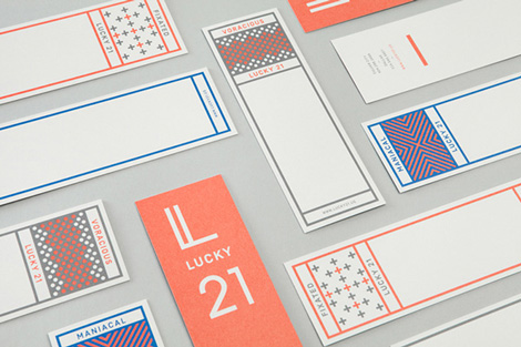
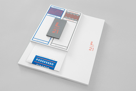
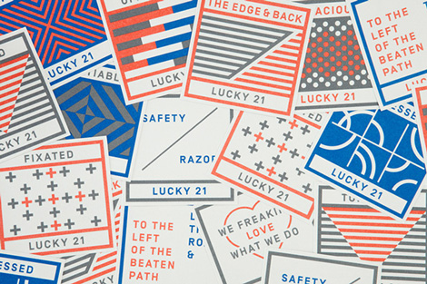
Blok Design created this spirited campaign for Lucky 21, a film production company based in Dallas and LA. . Tapping into the company’s humor and passion, Blok crafted an identity system that is bold, yet still allows the brand’s playful voice to shine.
——————–
Also worth viewing:
Chad Michael Studio
Sarp Sozdinler
Tom haugomat
Follow us on RSS, Instagram, Pinterest, Wanelo,
——————–
Thanks to this week's Sponsor // CodeinWP: A PSD to WordPress development agency that provides quality themes to clients across the globe.Wats Bar
Contributed by Macedonia-based Miki Stefanoski, in collaboration with Anastazija Manasievska.

Wats is a small, but warm, lounge bar and nightclub located at the top of a shopping centre in Belgrade. It’s a 150 square metre space where you can relax and enjoy the beautiful panorama of Belgrade’s bridges and riverbanks, or chill with magical sunsets and drink cocktails in the intimacy of good people and music.
Using only black and mint, we developed the full brand identity, logo, promo materials, templates and merchandise that would establish a catchy but strong and flexible look that is easy to build upon at every future event.


Year: 2014
Country: Serbia
—
View more identity work on mikistefanoski.com. Follow Miki on Twitter.
Cambridge Design Partnership
Contributed by Georgina Milne of Moving Brands.

Cambridge Design Partnership (CDP) creates ‘first of a kind’ product innovation to fuel its clients’ success in consumer, healthcare, energy and industrial markets. Passionate, human and open, CDP has a powerful offer and well-aligned culture.
However, as it targeted larger, more global clients, and opened its first US office in Palo Alto, it became clear that the existing ten-year-old brand no longer reflected its ambition or ability.
We partnered with CDP to distil its internal culture, articulate its unique story, and communicate its offer through a visual identity and touchpoints that would cultivate trust from global players and support growth in new markets.
Story
We identified immediately that Moving Brands and CDP are kindred spirits: both companies operate simultaneously in the worlds of design and technology. It was from this empathy that a particularly creative partnership emerged. We recognised that CDP’s ability to stretch across design and science spectrums was unique, powerful, and would differentiate it as it grew.


System
Workshops with people across the whole business proved they knew their own strengths, and client interviews supported these findings: CDP was valued as an innovation partner that could combine technology with design, ensuring products and services were created with real human needs at their core.
However, the existing business story ‘Think differently’ – although genuine – was almost a replica of Apple’s ‘Think Different,’ an irony that worked directly against communicating its truly innovative approach. We redefined the brand story as ‘Potential realised,’ precisely encapsulating the company’s purpose and its ability, through innovation, to realise potential for its clients.
The name and visual identity should capitalise on links to Cambridge as a world-leading technology centre, while ensuring it was not perceived as provincial. We retained the name Cambridge Design Partnership as it anchored the business to positive perceptions, but we knew its length would present challenges across applications. We created a symbol to work alongside the wordmark, which in time could be used exclusively to represent the business in all markets.
This symbol and accompanying visual identity system flowed from tensions inherent in the business: between design + science, curiosity + focus, technical + human. A combination of straight and curved components form an ownable mark that feels both engineered yet human.
Graphic textures are created by rotating and cropping this symbol, to create a range of expressions, from measured and precise to vibrant and expressive. Pressura Mono is used to deliver prominent information, supported by Kefa II pro, a more human typeface, when delivering long passages of text or quotes. The photography style focuses on the team, highlighting their expertise, showcases innovation in an ownable environment and demonstrates the human benefit of the product.


Experience
The rebrand coincided with the opening of state of the art facilities, where the identity has been boldly employed: from feature walls in conference rooms to charming way-finding iconography. The new brand has been embraced enthusiastically by all levels of the business. It successfully crystallises CDP’s powerful offer and vision to support its on-going growth.
“Our customers were small businesses looking for local companies. Now our clients are international companies, and first impressions are very important. When they meet us, how they perceive the services and quality is crucial. The new brand conveys this, and, as the first element that explains what we do and the quality we can provide, it’s going to be vital to our development in the US.”
MIKE CANE, FOUNDER, CDP


—
Moving Brands elsewhere on Identity Designed: CX, Arcadia, Blackjet.
More work on the Moving Brands website. Follow the team on Twitter.
Demanding More
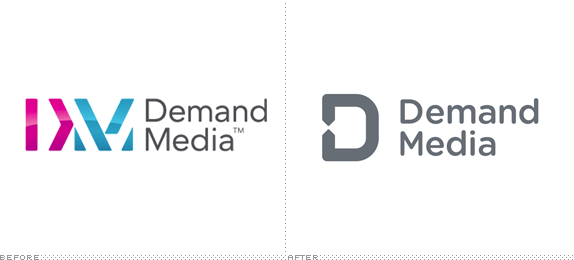
Established in 2006, Demand Media is a "leading digital media company that informs and entertains one of the Internet's largest audiences, helps advertisers find innovative ways to engage with their customers and enables publishers to expand their online presence." They manage the immensely popular sites eHow and Cracked as well as livestrong.com and indieclick.com, among other smaller sites and services. This month Demand Media introduced a new identity designed by San Francisco, CA-based Manual.
Our new brand identity is all about demonstrating how Demand Media is a touchpoint in people's real lives.
We connect people to content that's relevant to them.
We connect businesses to the web.
We connect brands with people and people with brands.
This is what our branding is all about--connecting, serving as a touchpoint, and meeting people where they are.
— Brand Guidelines


The old logo was interesting, despite its poor shading and Flickr-esque color palette, communicating connections and intersections. The new logo is a simplified version of that idea with a simple "D" monogram that has a more evident graphic device for connection. Not the most exciting thing in the world but a solid premise executed without fuss. The wordmark is set in Gotham Round and pairs well with the icon, softening the otherwise imposing "D". Where the identity becomes more interesting is in application, when the connection part of the monogram gets blown up and serves as a framing device for copy.
An important part of our graphic look and feel are the use of arrowheads. The arrows are derived from our logo, and signify connection and action.
Used alongside our bold color palette and angled headline typography, the arrows provide a bold and engaging graphic look and feel to all our communications.
— Brand Guidelines


The images above are taken from their brand guidelines (PDF) so there is a lot of Lorem Ipsum — don't let that distract you. The approach is simple and effective, providing a colorful system to deliver content. It might grow repetitive after a while but for now it gives them a fresh toolset. Lastly, there is a bunch of icons, shown below. Overall, a very appropriate internet-y identity that doesn't feel too cute or too friendly or, well, too internet-y.
![]()


Thanks to Brian Dillon for the tip.

Don't forget to cast your vote about this post online


