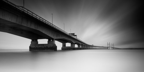
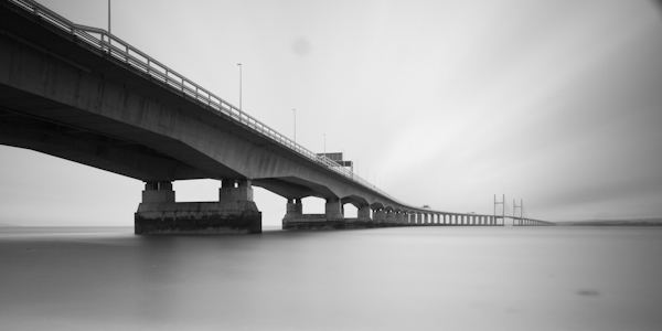
The image above is a long exposure taken of the Second Severn Crossing, a motorway bridge that crosses the River Severn, just outside Bristol, England. I have been asked a number of times how this image was processed, what software/plug-ins were used, so I thought it would be a useful exercise to explain it here.
Shooting the image
I had been thinking about this shot for a while and I knew that there were a couple of important elements that I needed to consider when trying to capture the image:
- I was really keen to get low, relative to the bridge, and shoot a wide-aspect image across the river. Fortunately, there is a footpath that runs along the river bank, under the bridge, that is easily accessible by car (Google maps link).
- I wanted to capture a long exposure so I could contrast the movement of the clouds against the static structure of the bridge. Therefore, there was no special planning in terms of weather or time of day, as I was happy with a cloudy sky in the middle of the day, as long as there was a strong wind – fortunately, over the 2012 Christmas period, the UK offered those conditions in abundance.
- I wanted to fill the frame with silky-smooth water, so as the River Severn is a tidal river with one of the largest tidal ranges in the world, I ensured that I would arrive at the location around high tide.
The image, as captured straight out of the camera, is shown below:
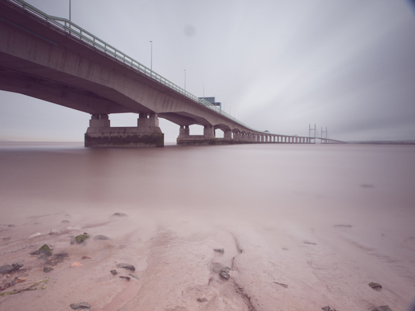
The image was taken at ISO100, 12 mm, f/10, with a 5 minute exposure (299 seconds to be precise). I used a 2-stop graduated neutral density filter to evenly match the exposure of the sky with the river, and used a 10-stop neutral density filter to produce the long exposure. As the highlights of the scene were easily contained, I over-exposed the image to ensure that I captured the maximum amount of movement in the clouds, knowing I would be able to correct the exposure/contrast during post processing.
Processing the image
The processing of this image was performed in Adobe Lightroom 4.
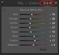
The first step was to convert the image to black and white using the B&W selector in the colour panel (on the development pane).
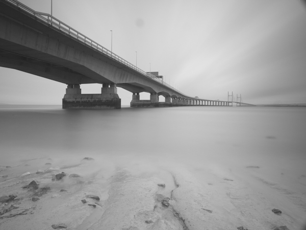
The initial image after a straight B&W conversion, lacking in contrast
Given the significant amount of foreground, I decided to crop the image at this point, using a 2:1 aspect ratio, to give the wide-aspect image I was after and to stop the foreground being a distraction during the rest of the processing.
Cropped to a 2:1 aspect ratio
I then needed to address the lack of contrast and over-exposure of the initial image. Therefore, I set the white (+33) and black (-40) points and adjusted the contrast (+40) to set the overall exposure for the image.
Initial exposure adjustments made
I then applied a graduated filter to the sky (shown below) to adjust the exposure (-1.74), contrast (+100), clarity (+100) and highlights (+12). I wouldn’t usually increase either the contrast or the clarity to +100, let alone both, but in this instance doing so acts to bring out a full range of tones within they sky and so emphasise the movement captured in the clouds (the increase in contrast/clarity is also a very good way of highlighting any dust spots present in an image!).
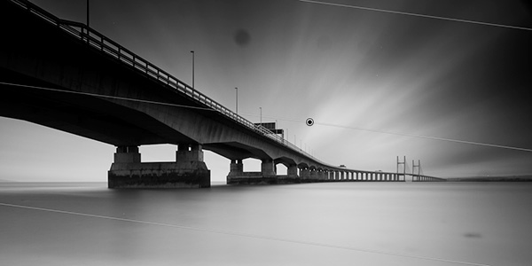
Showing the graduated filter being applied to give impact to the cloud movement in the sky
Next, I applied a graduated filter, from the bottom of the frame, to the water (shown below). I used it to increase the exposure (+0.80) and reduce clarity (-100) in order to brighten the water and reduce the local contrast to give that bright, smooth water effect that can be key to an image such as this.
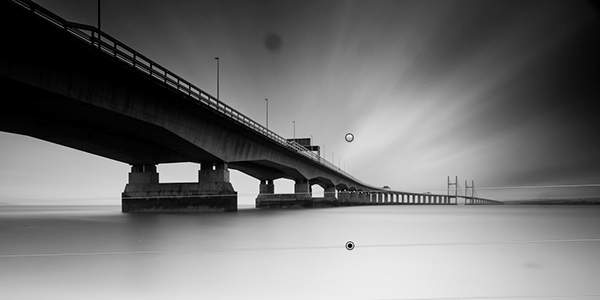
Showing the graduated filter being applied to the lower section of the image to smooth out the water
When applying the graduated filter to the sky, it also acted on the bridge in the top left corner of the frame, making it overly dark, losing detail. Therefore, I used the adjustment brush to paint a mask over the affected portion of the bridge, using a low flow, in order to be able to build up the desired effect gradually.
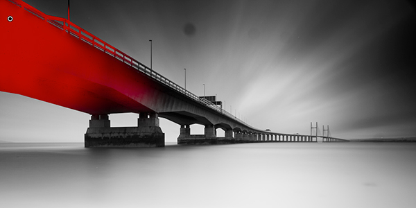
The mask drawn with the adjustment brush is shown in red
To the adjustment mask, I applied an increase in the exposure (+1.08) and shadows (+18) to bring out some of the detail in the bridge that was lost after applying the graduated filter over the sky.

Nitce the extra detail now visible in the upper left portion of the bridge after application of the adjustment mask
I then applied a graduated filter to each corner on the right hand side of the image, shown below. The top graduated filter was required to subtly blend a vignette caused by me stacking the 10-stop filter and the ND filter holder. The bottom graduated filter was required to tone down the water at the edge of the frame. The exposure was reduced in both instances.

The two final graduated filters shown merged into the same image here)
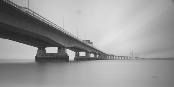
The final edit that needed to be made to the image was to remove all of the dust spots (you’ll be glad to know I’ve since had my sensor cleaned) and hot pixels (the bright white pixels that result from the extreme exposure time) to give the final image:

The final image (click to enlarge)
So there you go, using a few relatively simple edits, it was possible to produce this high-contrast black and white long exposure without the need for any additional plug-ins or software packages outside of Lightroom 4. The initial image may have lacked impact and that can often be the case with long exposure shots, however by shooting in raw, you can exploit the captured detail to create the image you had envisioned.
If you would like some tips to help you take long exposure images, such as the one above, please check out this earlier post.
Post originally from: Digital Photography Tips.
Check out our more Photography Tips at Photography Tips for Beginners, Portrait Photography Tips and Wedding Photography Tips.
How I shot and edited it: The Second Severn Crossing


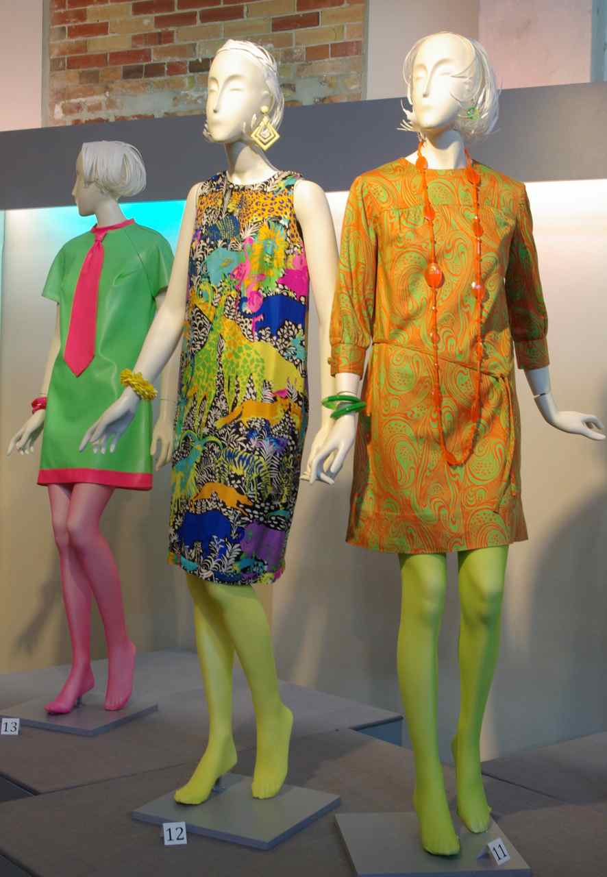
 There is still a bit of tweaking to be done, but our new show at the Fashion History Museum is now open. MODe looks at the phenomenal changes in fashion that occurred between 1960 and 1970.