Shared posts
DESIGN VINTAGE : Charles et Ray Eames
Designers : Charles et Ray Eames pour Herman Miller
TRES BEAU FAUTEUIL EAMES VINTAGE COULEUR COQUILLE D'OEUF
Fauteuil EAMES VINTAGE sur base "ROCKER" en bois de noyer et fils d'acier CHROME de fabrication américaine récente mais identique aux modèles d'origine. État parfait, soudures solides et robustes, qualité irréprochable.
La coque couleur "COQUILLE D'OEUF" est en bon état, la fibre de verre est très présente, à noter tout de même quelques petites rayures à peine perceptibles due à l'age. Les "shockmounts" sont sains et en très bon état.
Véritable icône du design du 20 ème à mixer dans un intérieur de type 1950, une ambiance scandinave ou plus seventies et pop...
La collezione Celio uomo per l'autunno inverno 2013 2014
La versatilità della collezione Celio per il nuovo autunno inverno trova nel brioso Christopher Michaut, modello in forza alla celebre agenzia Bananas, il proprio interprete ideale.
Onnicomprensiva la collezione Celio per il prossimo autunno inverno 2013 2014 conquista le luci della ribalta grazie ad un’aria particolarmente briosa, a quei suoi toni mossi che sanno passare, senza mai scomporsi, da un outfit casual ad un severo abito a giacca. Da una semplice ma allegra maglia rigata ad un ensemble formalissimo.
Perfetto trait d’union, Christopher Michaut che passa con innata disinvoltura da un capo all’altro. Ogni stile del resto sembra appartenergli. Essere da sempre il suo. Eccolo dunque in posa con il bomber, infilarsi un elegantissimo abito intero, sfoggiare sia scarponcini super casual che elegantissime scarpe nere. Nulla su di lui stona o sembra essere fuori posto.
Il celebre marchio francese d’altronde conosce ed intende benissimo i tanti bisogni dell’uomo di oggi. Quanto una collezione aperta e versatile sia, in questi tempi sfaccettati, dalle mille nuance, una vera manna dal cielo. Una benedizione, chiamiamola pure così, che l’aitante Christopher Michaut sa incarnare alla perfezione.
Celio uomo autunno inverno 2013 2014
Via | Celio
La collezione Celio uomo per l'autunno inverno 2013 2014 é stato pubblicato su Fashionblog.it alle 12:30 di giovedì 05 settembre 2013. Leggete le condizioni di utilizzo del feed.
Ideia boa e fácil para você mesmo fazer a cabeceira da sua cama
Quem tem cama do tipo box sabe bem o vazio que é olhar para a parede, e não encontrar uma cabeceira ali. Já passei pela experiência e preciso dizer que preencher esse vazio está cada dia mais fácil. =)
Você pode comprar uma cabeceira pronta, pode fazer uma com compensado, com tecido… mas pra quê tanta complexidade se o que incomoda mesmo é aquela parede vazia? É por isso que a boa de hoje é fazer da própria parede uma cabeceira. Aproveita o fim de semana, e se joga na tarefa.
Encontrei cabeceiras em adesivo bem interessantes, que por terem formas simples, você pode reproduzir em adesivo vinílico, tomando o cuidado de usar um nível, pra ficar retinho, claro. Mas como não sou de inibir o dom artístico de ninguém, pintar neste caso também é super válido. Além de exclusivo, claro. ;-) Ou seja: adesivo vinílico ou tinta, o que importa é que sua cabeceira não vai ficar vazia.
Monday's quick start: Maartje van den Noort
We just spend our last weekend in the Netherlands after a beautiful summer and extreme nice weather... this week it is time to fly back to our 'normal' life in Asia. Always a bit sad to leave our family and friends again and knowing you will be going back to a life where you always feel a bit like a stranger but that is also the interesting and exciting part... and I am convinced that living in Singapore is best for me and my family at this point in our lives. I have said it so many times before but I do believe that SG has so much to offer and I just love the climate and sunshine ...
But let's start this week with some beautiful work by Maartje van den Noort from the Ntehrlands whom I finally met in person .... very briefly though but nice enough to get an impression of this talented lady ...
A while ago her home was featured here on Bloesem.
Monday's quick start: SevenGauge
Hello lovelies!
I hope you have had a great weekend? We adjusted well and are ready for the almost final quarter of this year. Many exciting things to happen for me and for Bloesem. Will keep you posted of course :)
During our vacation in the Netherlands I decided that I have to go back to some of things that I really enjoy doing .. one of them is knitting and while searching for knitted home accessories I ran into these pillows and throws by seven gauge studios.
I love their vibrant colors and of course the styling in a contemporary setting. I learnt on their about page that the items are made with a knitting machine, which I want to learn too ... so if anyone knows where I can buy one PLEASE let me know!
Seven Gauge studios was founded by Joy Bates and several retailers are selling the gorgeous collection online.
Alexander Girard, “the color-fool”
Pour continuer notre série d’articles sur les grands noms du design graphique, nous vous parlions il y a quelques semaines d’Alexander Girard (1907-1993) découvert au musée Vitra. Si son nom semble inconnu à la plupart d’entre nous, il s’agit pourtant d’un des designers les plus influents de l’après-guerre. Son travail a profondément marqué les années soixante. Il est quasiment intervenu dans tous les champs du design: design textile, design graphique, design de caractères, design d’espace et design d’objets et de mobilier !
Alexander Girard, le fou de la couleur
Né à New York en 1907, d’une mère américaine et d’un père Franco-Italien, il a grandi à Florence en Italie. Diplômé de l’école d’architecture de Rome, il revient à New York en 1932, après avoir voyagé aux quatre coins de l’Europe. C’est durant ces années européennes qu’il nourrit sa créativité de l’influence moderniste alors naissante.
Il aurait pu devenir un brillant architecte, mais Girard n’aime pas les lignes droites et les destins tracés. De 1948 à 1956, il sera consultant en couleur pour General Motor. En 1952, il est embauché par Herman Miller, l’un des plus grands fabricants de mobilier de l’époque. Il prend la direction de la division textile. Il travaille alors avec la crème des designers: George Nelson, Eero Saarinen, ou encore Charles et Ray Eames.
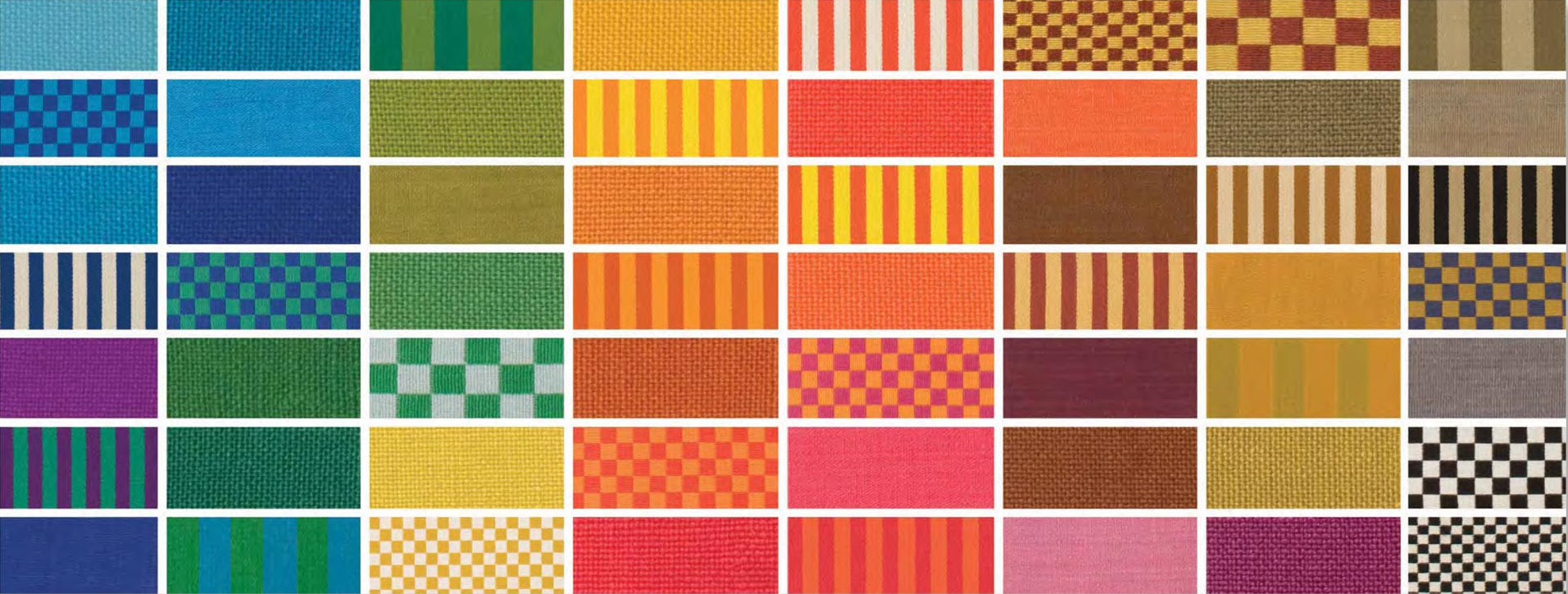
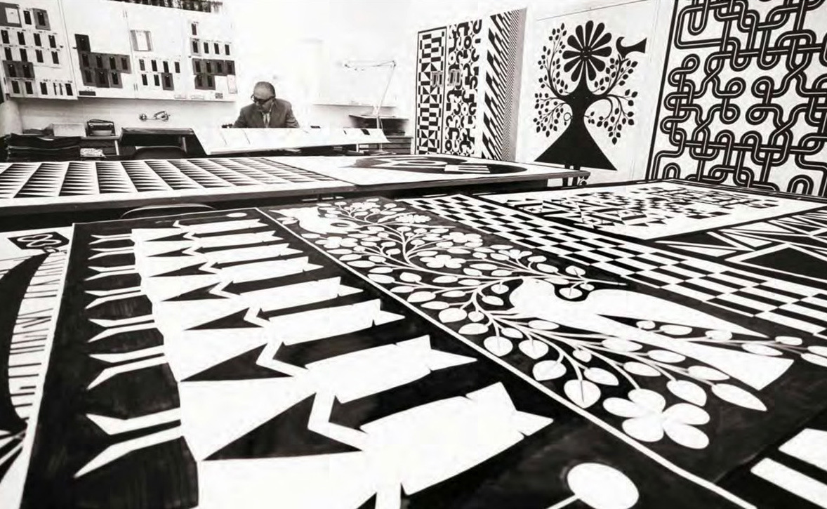
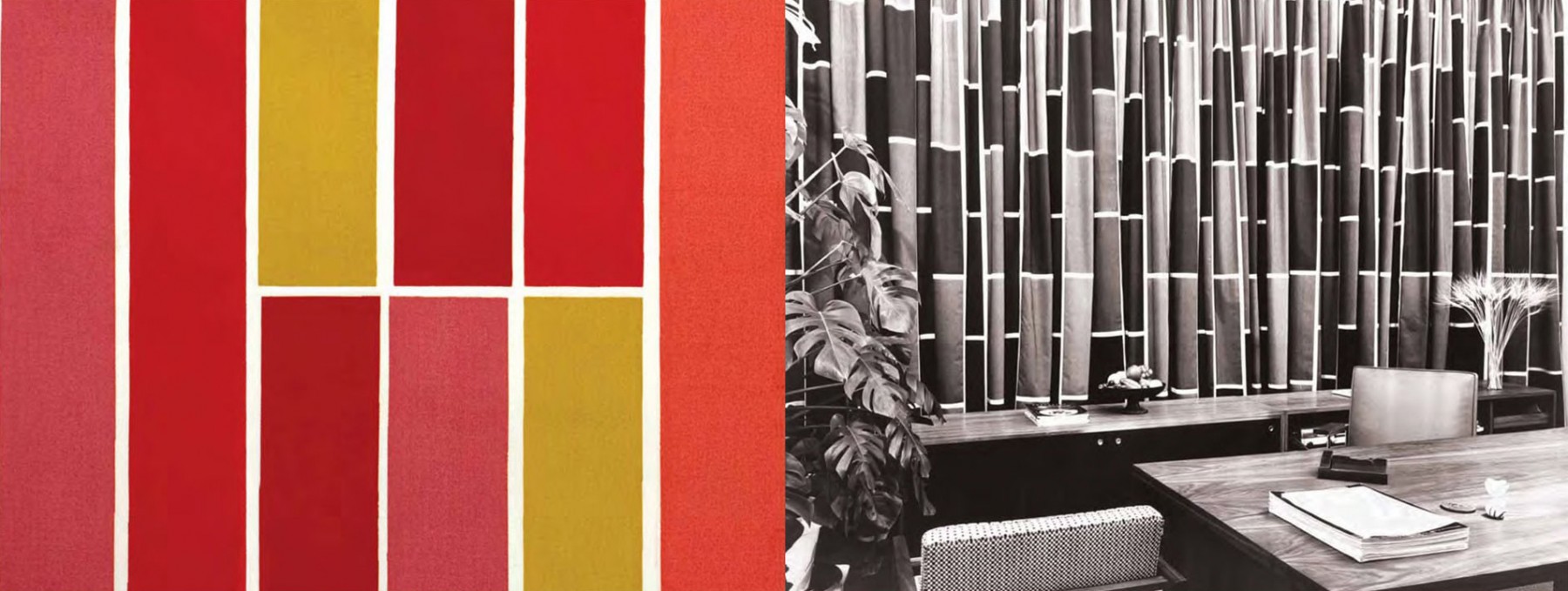
Durant cette période, son talent pouvoir va s’exprimer, et c’est là qu’il va créer d’innombrables motifs textiles.
Son travail est stratégique. Il emploie la couleur pour humaniser le fonctionnalisme des meubles de Hermann Miller. Et si la fabrication industrielle de ces derniers permet de multiplier facilement les variantes de couleurs et de matières, il s’agit avant tout de faire oublier qu’il s’agit de meubles en série ! Ainsi, chaque consommateur peut se targuer d’avoir une combinaison de couleurs unique ! En concevant des collections saisonnières, il fait rentrer la mode à l’intérieur de la maison.
Alexander va donc déployer sa palette de couleur et illuminer les intérieurs des classes moyennes de l’après-guerre.
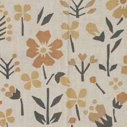
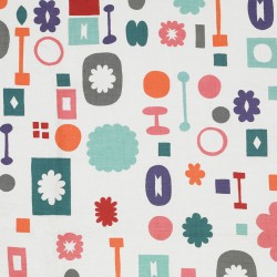
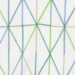
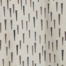
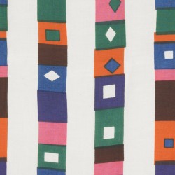
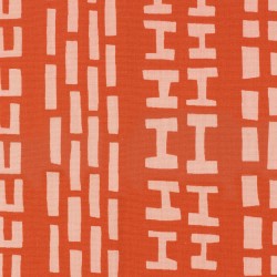
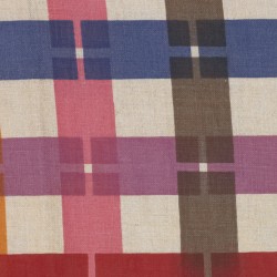
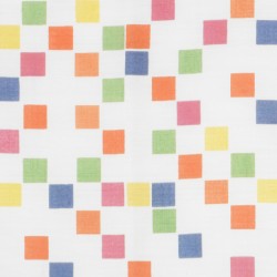
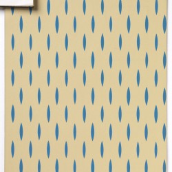
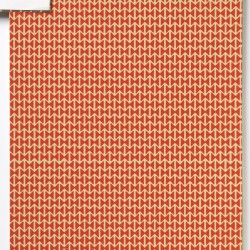
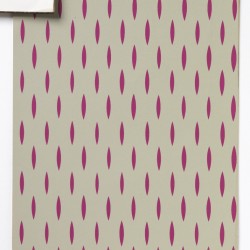
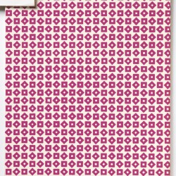
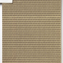
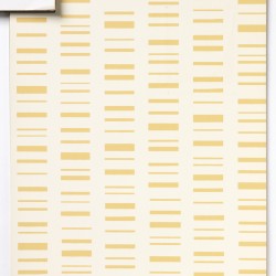
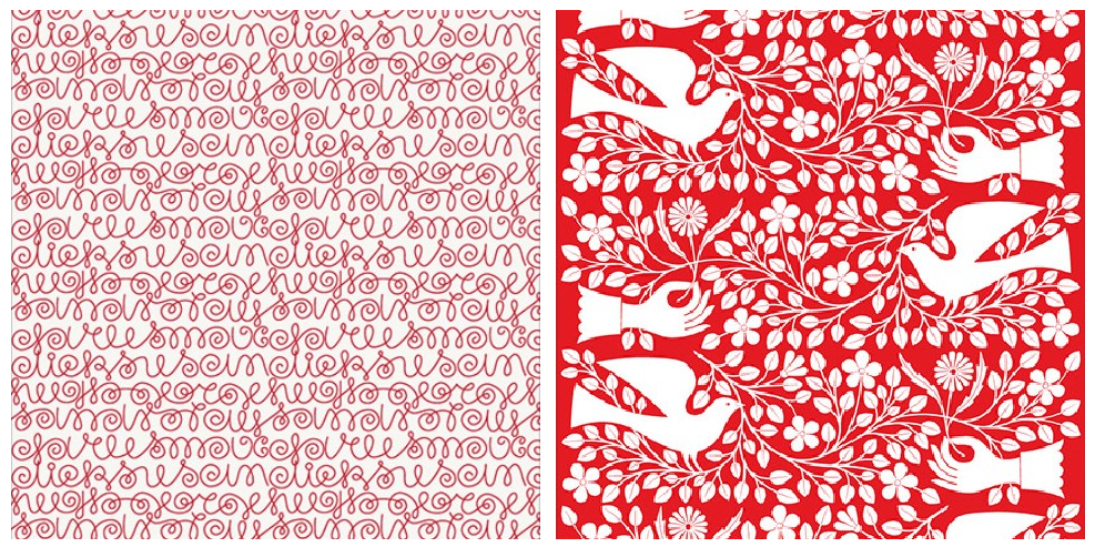
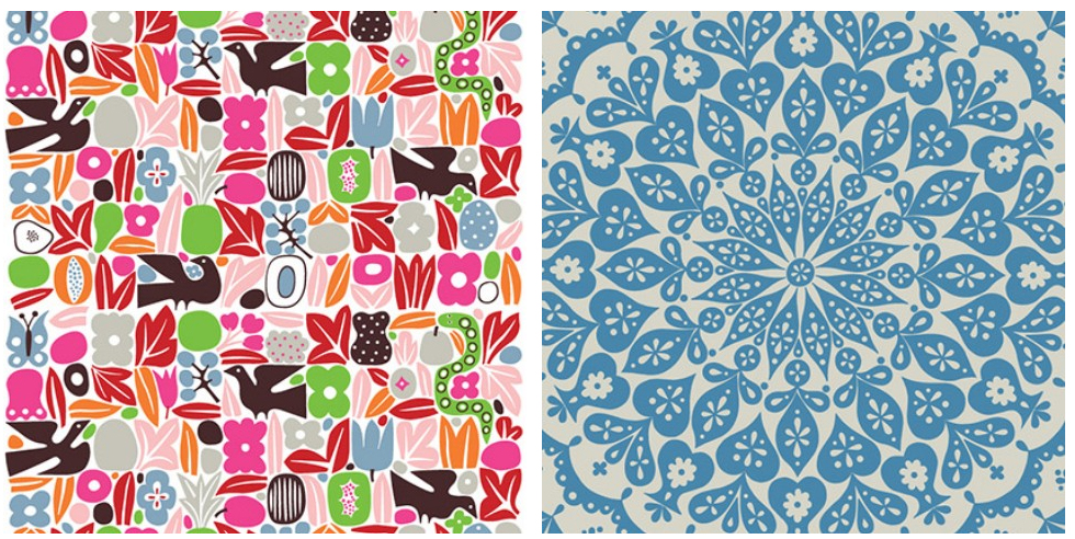
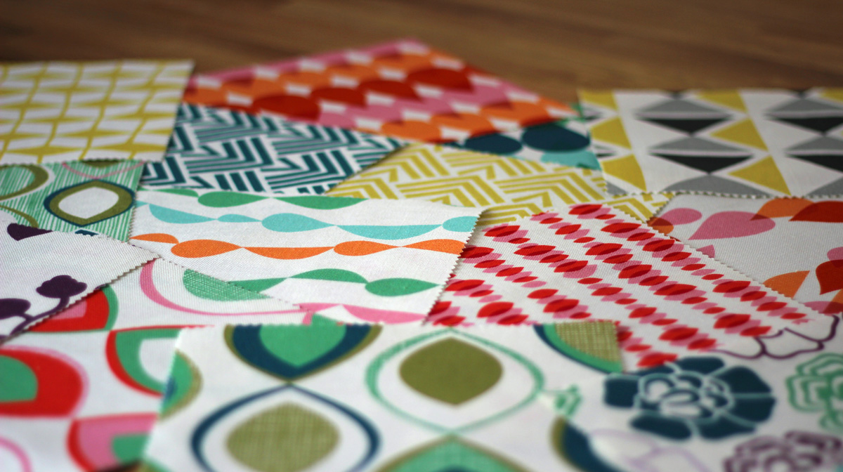
Ci-dessous quelques-un de ses imprimés textiles :
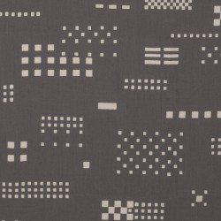
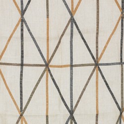
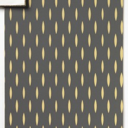
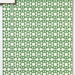
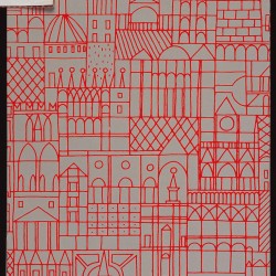
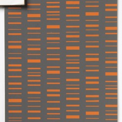
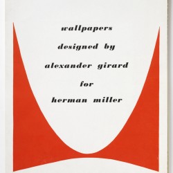
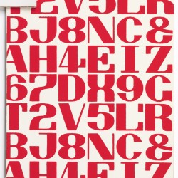
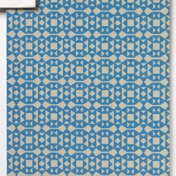
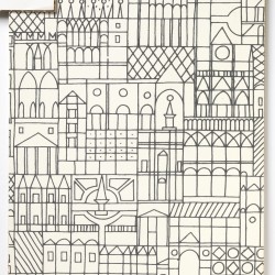
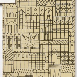
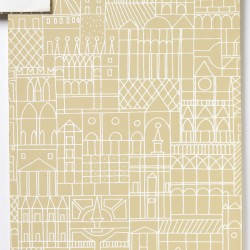
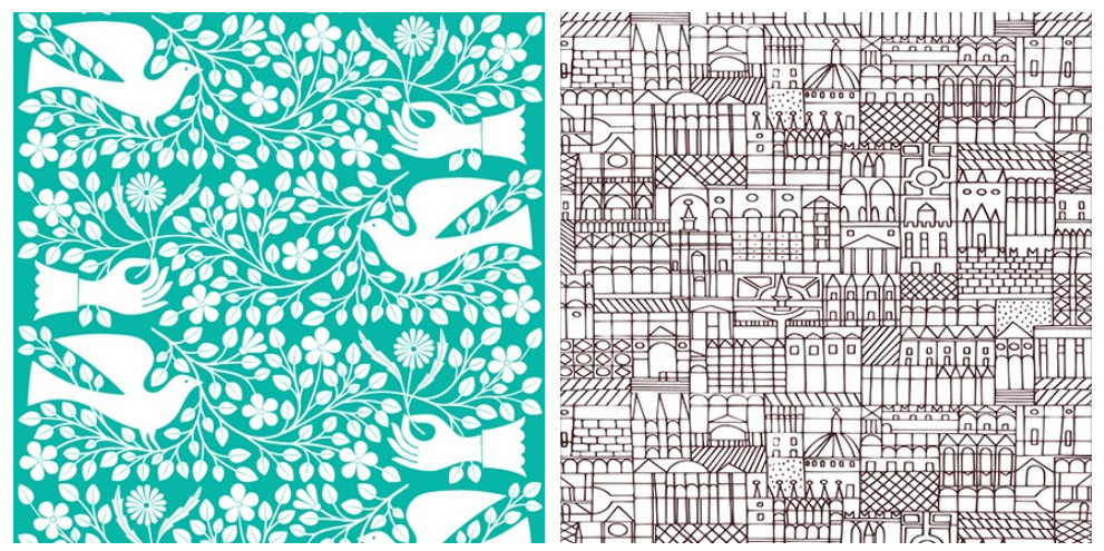
Ci-dessous ses collections de papiers peint :
La couleur du folklore !
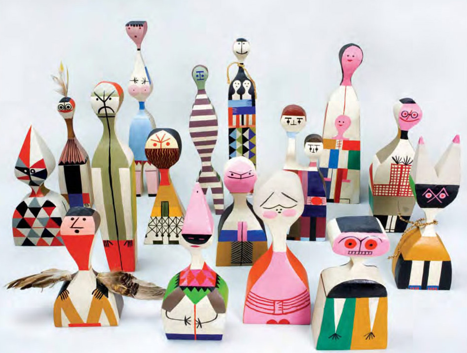
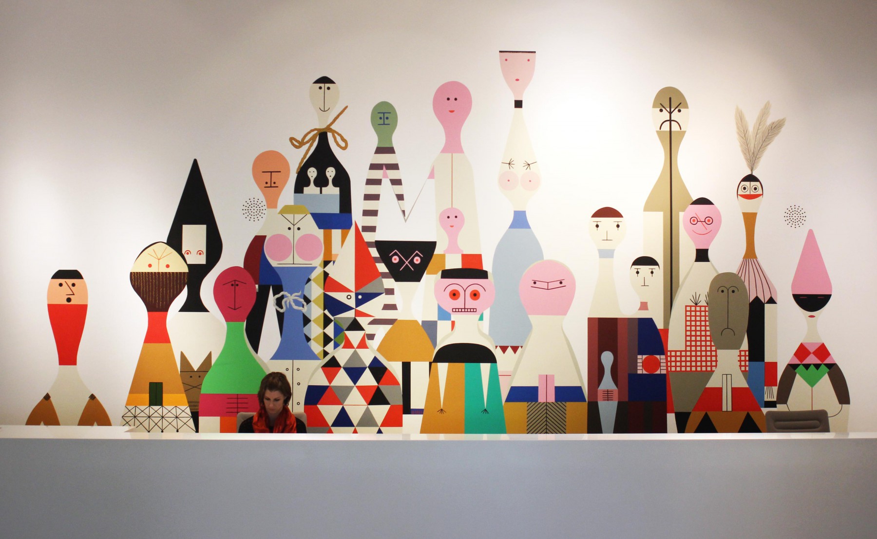
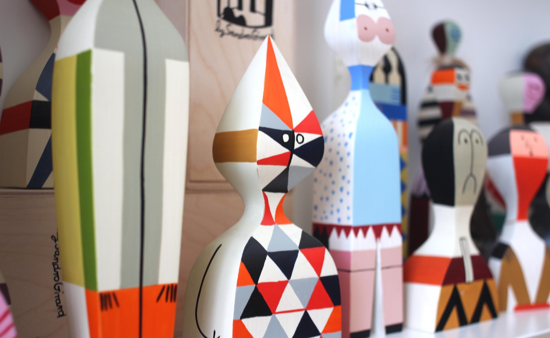
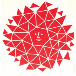
Si il ne théorise pas spécialement sa démarche, Alexander Girard fonde son travail sur une parfaite maitrise du cercle chromatique et une passion pour l’art populaire. Cette dernière passion aura une grande influence sur son travail. D’ailleurs, il voyagera toute sa vie, récoltant des dizaines de milliers d’objets qui ont terminé au Musée International d’Art folklorique de Santa Fe.
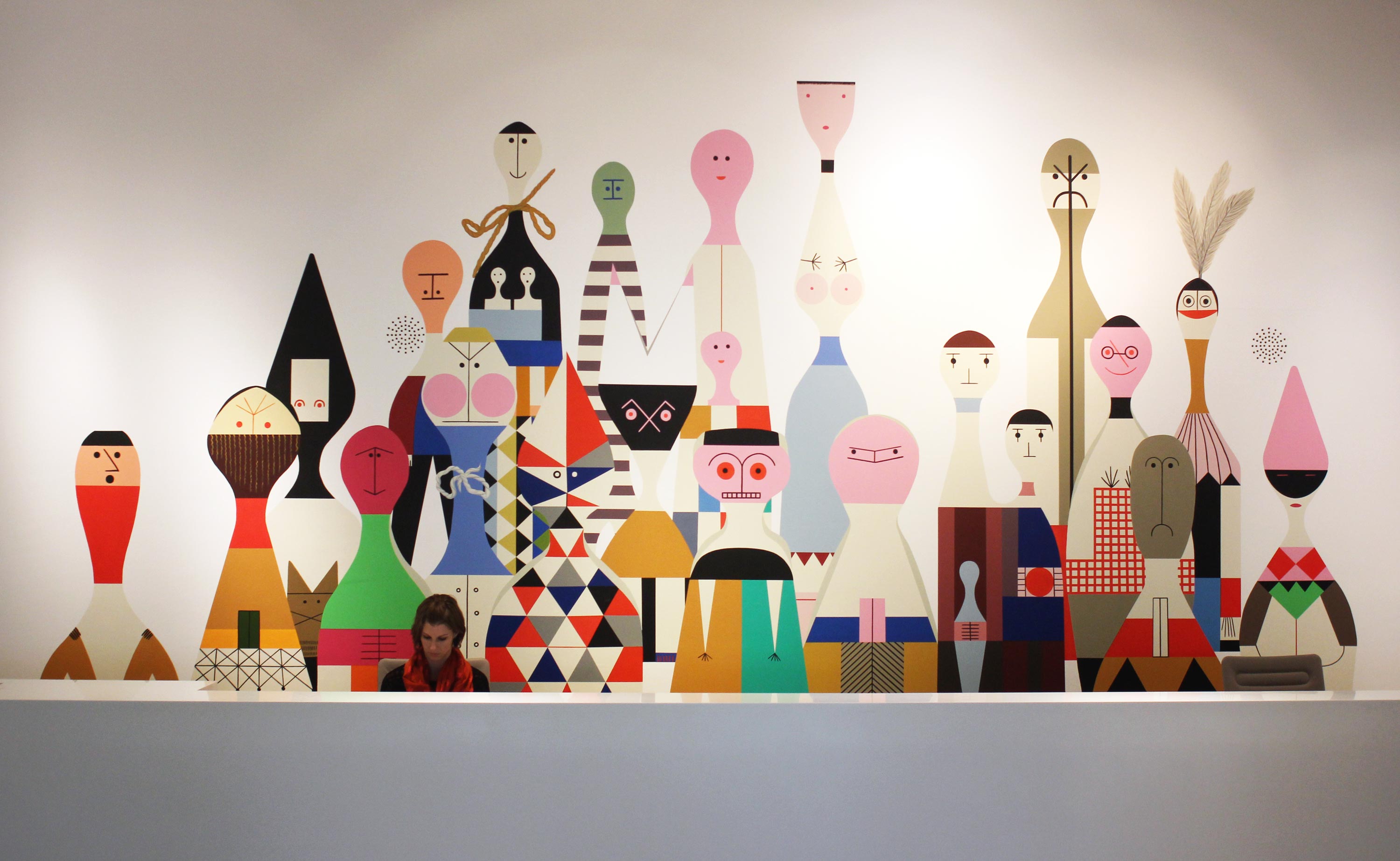
De ce goût pour les objets folkloriques sont nées les « Wooden Dolls », que Girard fabriqua lui même pour sa maison. Initialement créées pour s’amuser, elles sont à la fois des éléments décoratifs et des jouets. Elles sont actuellement éditée par Vitra.
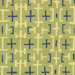
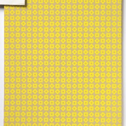
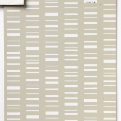
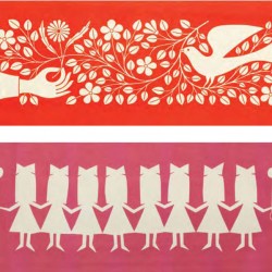
L’influence de l’art populaire se fera sentir tout au long de sa carrière. Cela se retrouve dans le caractère « fait à la main » de ses œuvres, par exemple, ci-dessous, pour cette collection de papier peint.
La Fonda del Sol
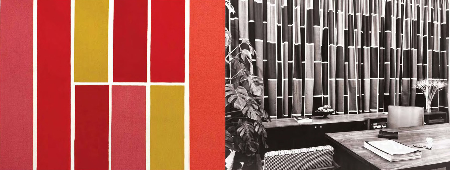
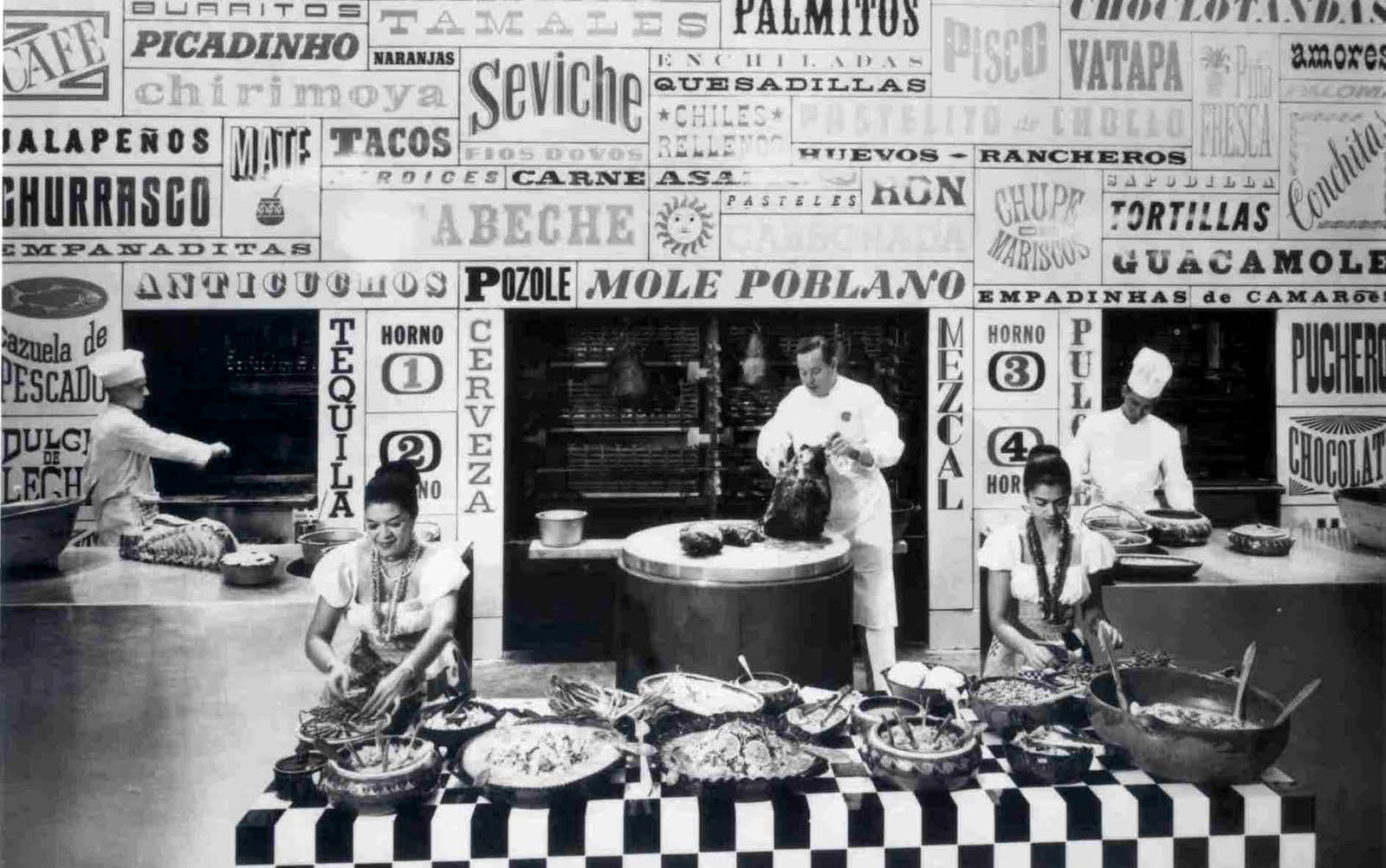
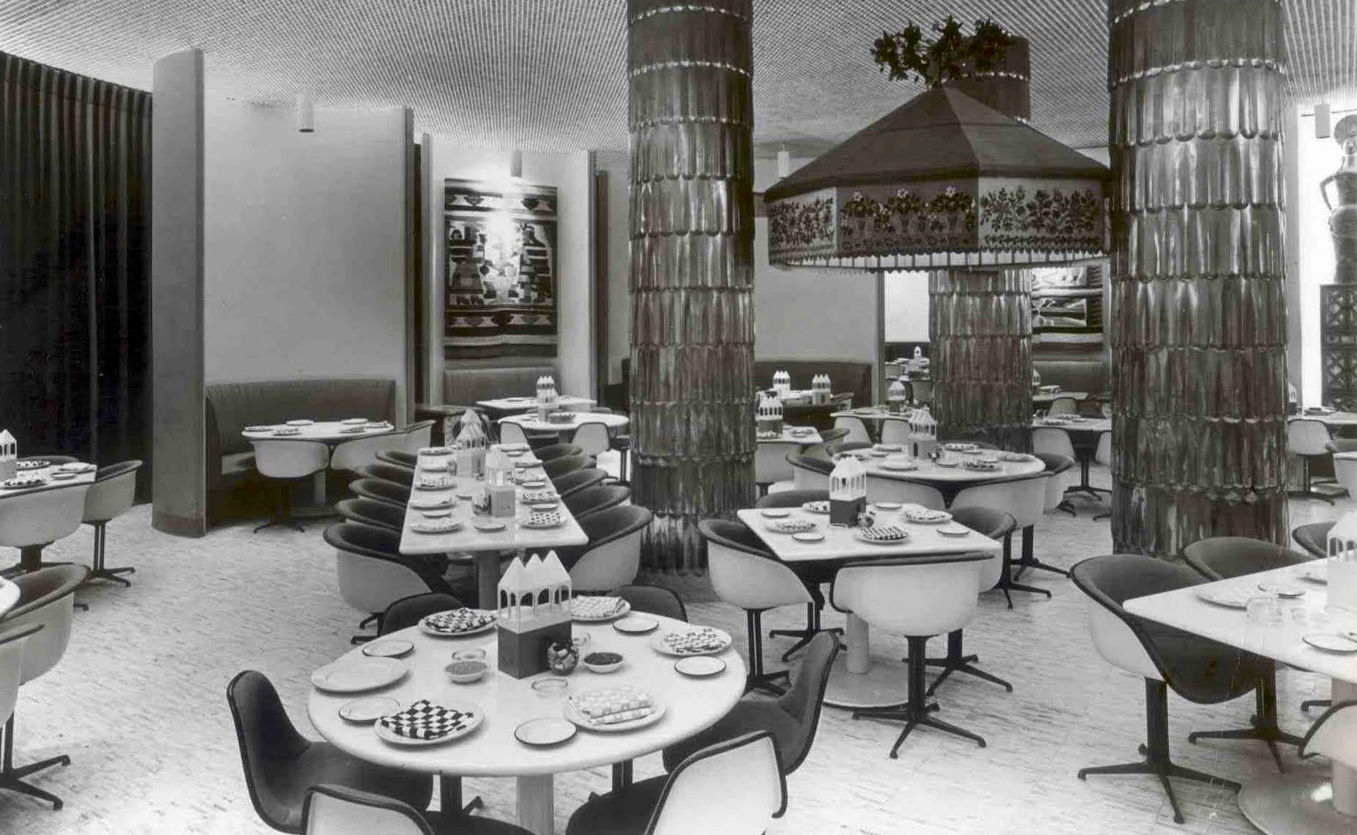
En 1960, Girard se voit confier le « design global » d’un restaurant de Manhattan. Le sang chaud et l’esprit latin de Girard vont parfaitement coller à l’esprit du projet. Il doit tout concevoir, du menu aux nappes, en passant par les vases et les tapisseries.
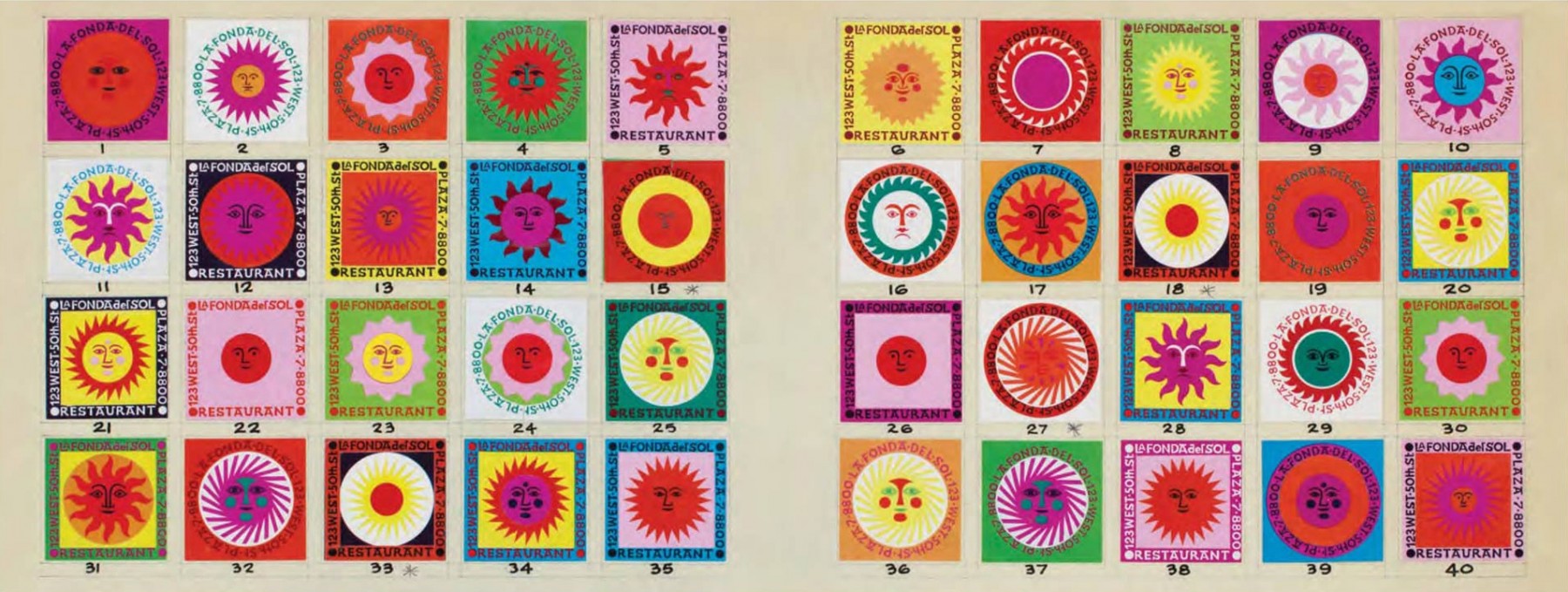
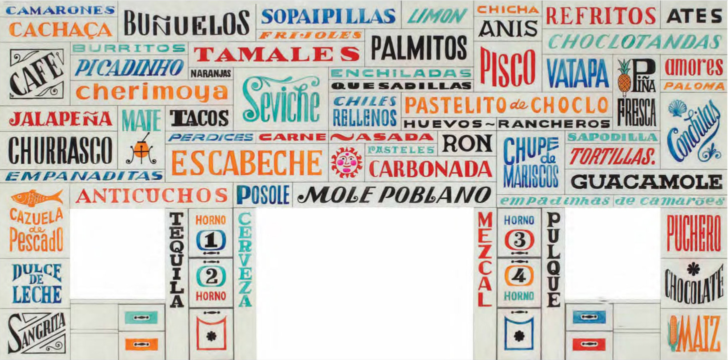
Une grande fresque typographique murale sera réalisée pour le décor du restaurant.
Durant cette période, Girard va concevoir de nombreux projet de restaurants. On peut citer le restaurant « l’Étoile » (1966) et « The compound Restaurant » (1967).
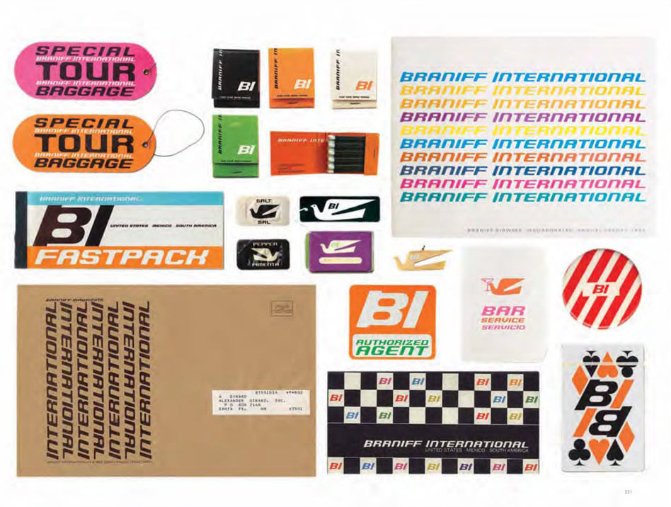
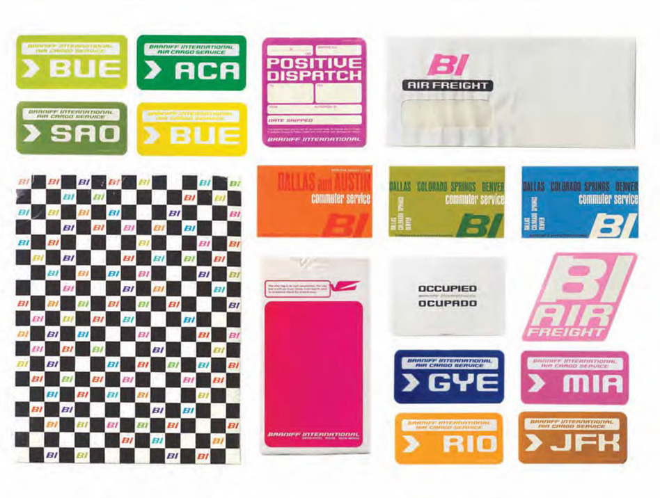
Braniff Airways re-Branding
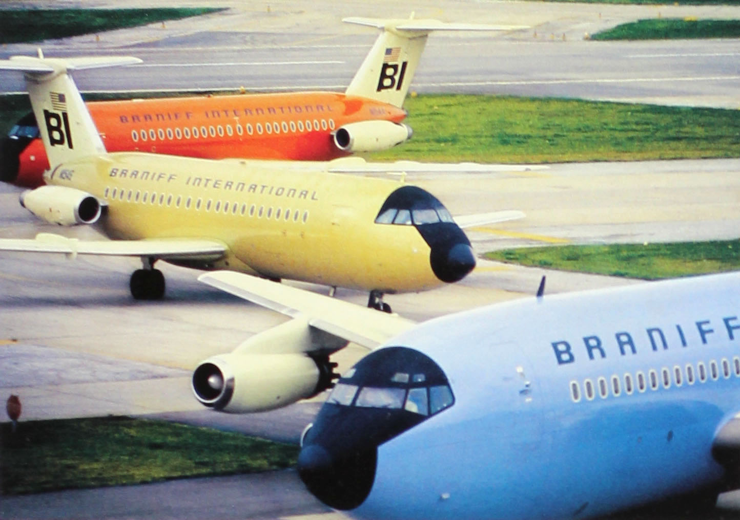
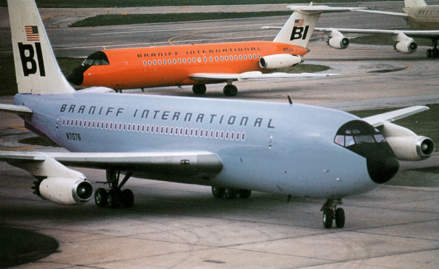
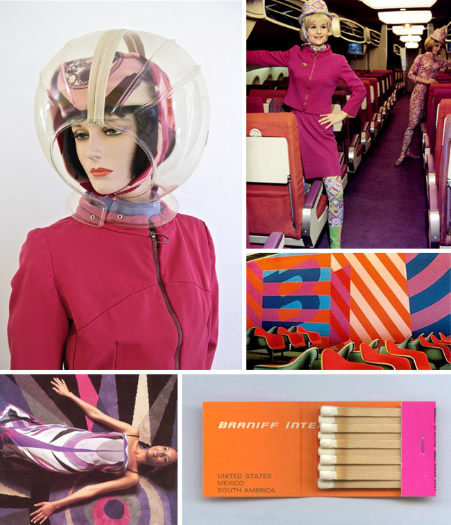
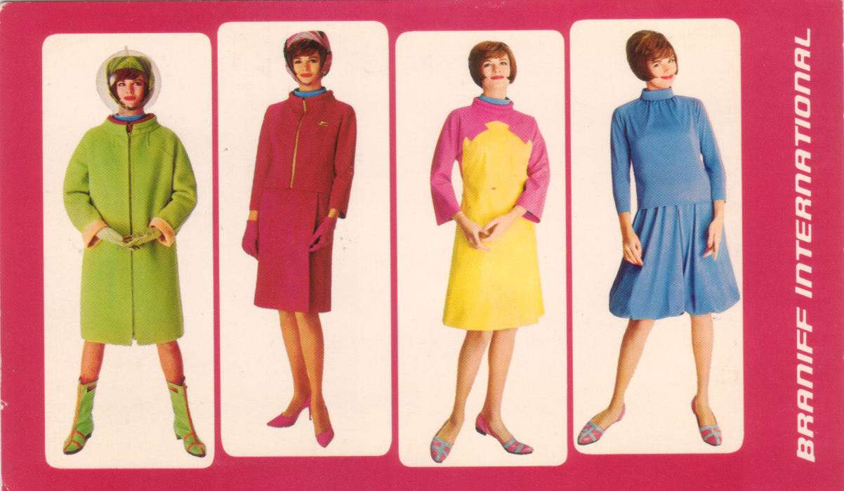
Au milieu des années 60, il est invité à travailler sur le design global de la compagnie aérienne Braniff International Airways. Ce sera l’occasion pour Girard de travailler à grande échelle. Le moindre détail passe par son crible: du billet d’avion aux sachets de sucre. Les avions sont tous peints de couleur différente allant du gris foncé au vermillon.
« Vous pouvez utiliser notre compagnie chaque jour de la semaine, sans jamais voler deux fois dans un avion de la même couleur ! » se ventait le dirigeant de Braniff à l’époque.
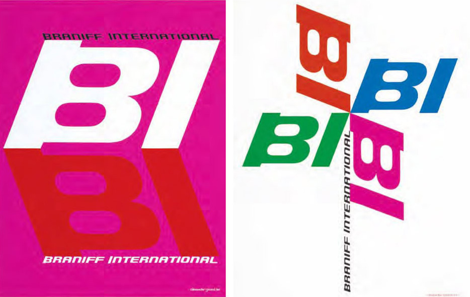
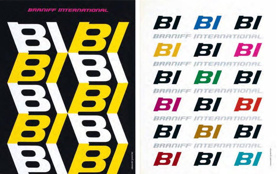
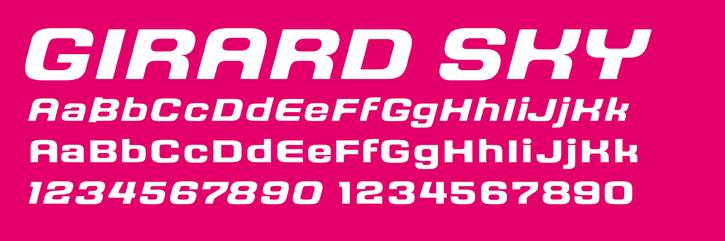
Une typographie corporate sera même dessinée par Girard pour la compagnie Braniff International !
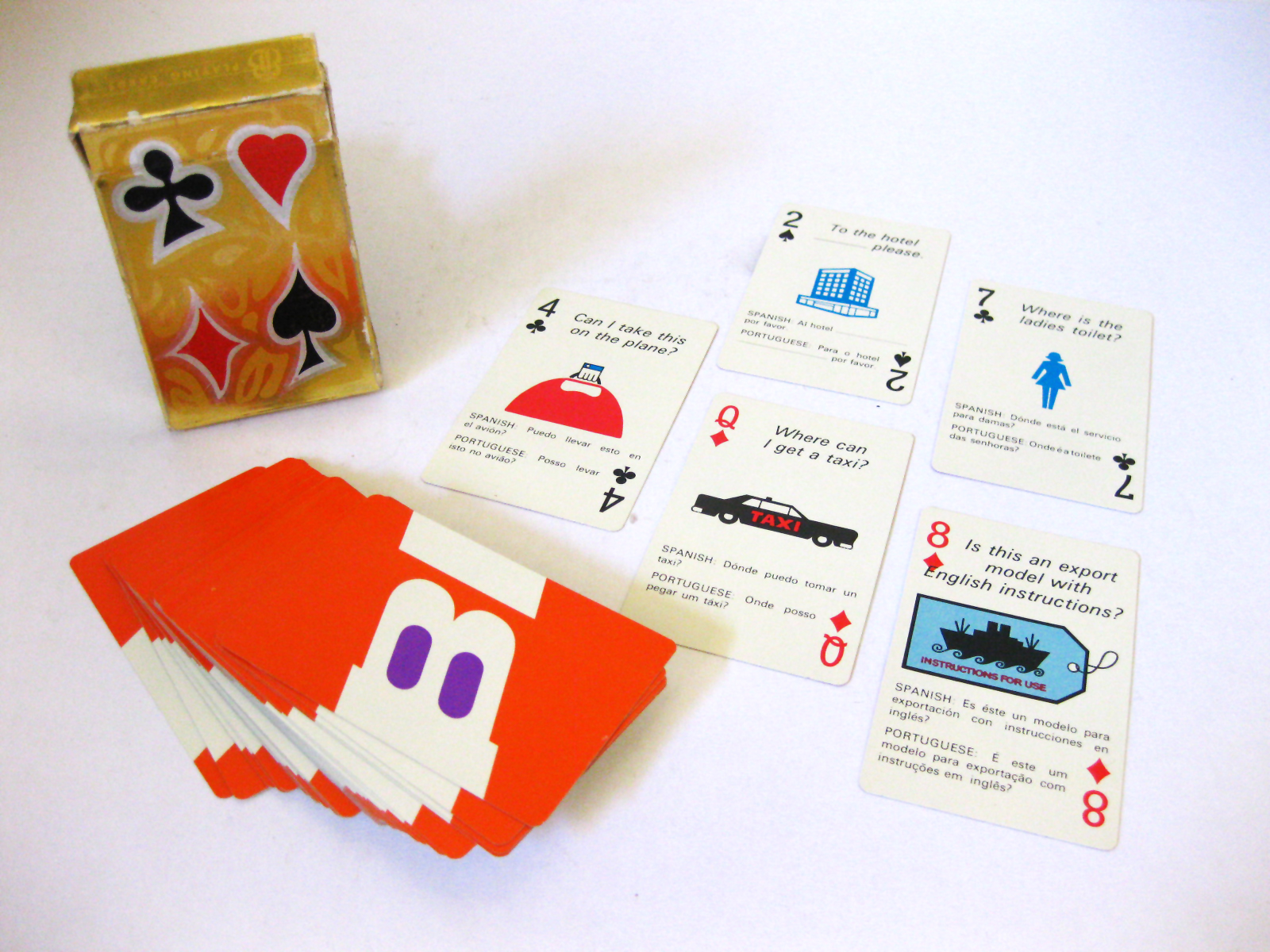
Les affaires de Braniff devenue florissante, il avait acquis une confiance totale de la part des dirigeants. Il alla même jusqu’à designer un jeu de cartes destiné à la clientèle internationale, avec une série de phrases de survie traduites en 3 langues… un petit luxe personnel !
Braniff, the end of the plain plane
« The end of the plain plane« , derrière ce slogan amusant, se cache une véritable volonté de révolutionner la conception de ce que peut être une compagnie aérienne. Les salles d’attente, les banques d’accueils, les uniformes des hôtesses, tout est designé avec soin !
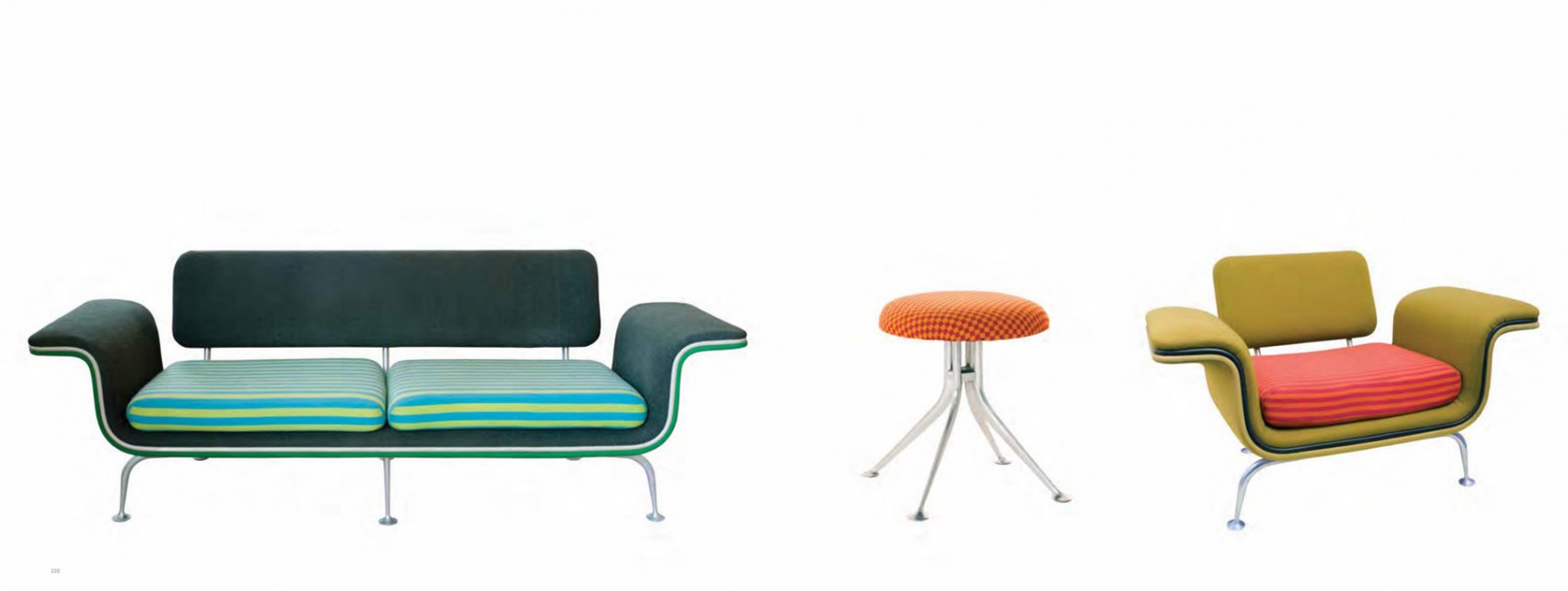
En 1967, Girard a conçoit une collection de mobilier pour les salons de Braniff. Le coût exorbitant pour produire ces chaises, ces canapés et ces tables forcera Hermann Miller à arrêter leur production deux ans après leur création. Ce sont aujourd’hui de véritables pièces de collection !
Braniff et Emilio Pucci
À la même époque, la compagnie Braniff invite le styliste italien Emilio Pucci à travailler sur les uniformes de la compagnie. Le résultat est surprenant ! Il conçoit une ligne de vêtements qui habille aussi bien les équipes au sol que les hôtesses de l’air. Ces vêtements sont même conçus pour évoluer au grès du vol : de la combinaison de cosmonaute à l’extérieur… à la robe de soirée ! Voici un aperçu en vidéo de ces tenues :
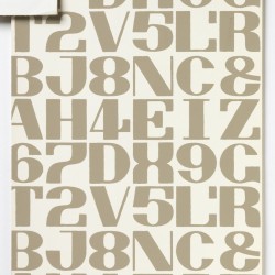
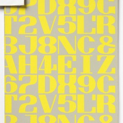
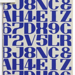
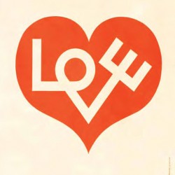
Dessinateur de caractères
Girard a énormément utilisé la typographie dans son travail. Ses créations sont aujourd’hui éditées par House Industrie
Un petit film présentant son travail typographique à travers les jeux édités par Houses Industries :
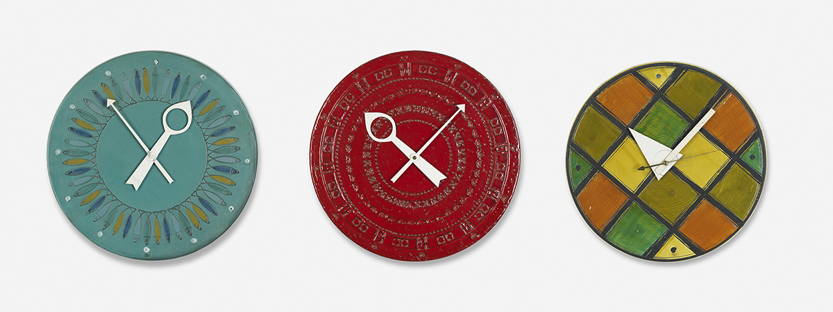
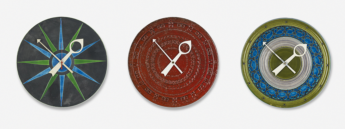
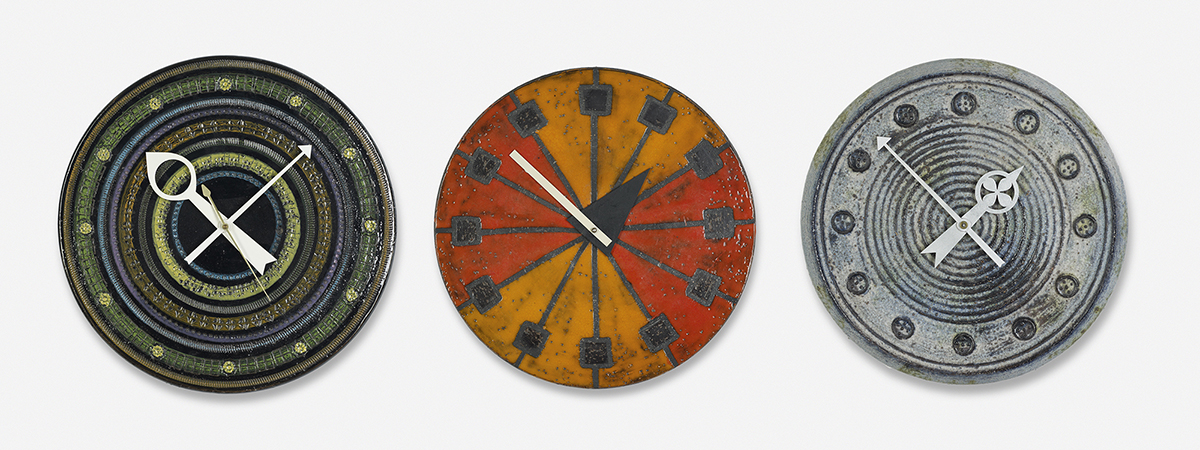
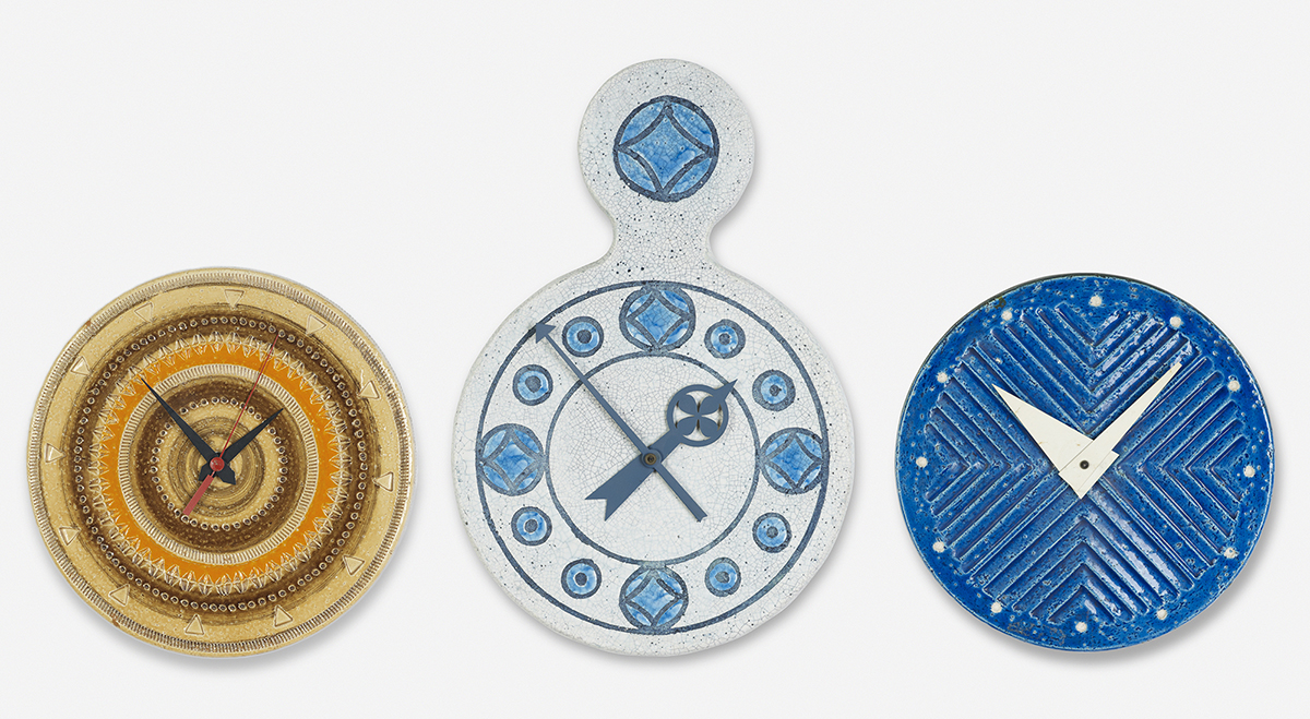
A l’heure des années soixante
Voici quelques horloges qu’il a réalisées :
Son travail influence encore de nos jours !
Le travail d’Alexander Girard aura influencé des générations entières de designers. Parmi les héritiers de son travail, on peut citer les créations textiles de Mademoiselle Dimanche, dont vous pouvez lire le portrait que nous faisions d’elle il y a peu ce blog.
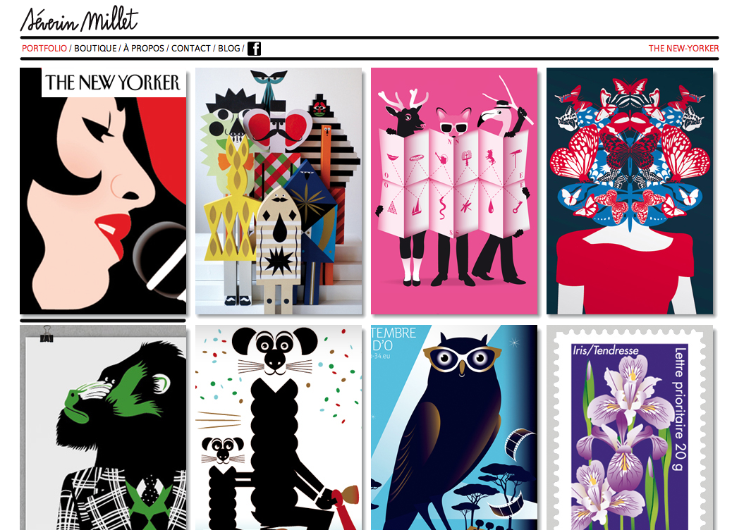
On peut également citer le travail de Severin Millet dont les illustrations multicolores et poétiques font de lui le digne successeur d’Alexander Girard. A quand des meubles ou des avions Severin Millet ?
Pour aller plus loin
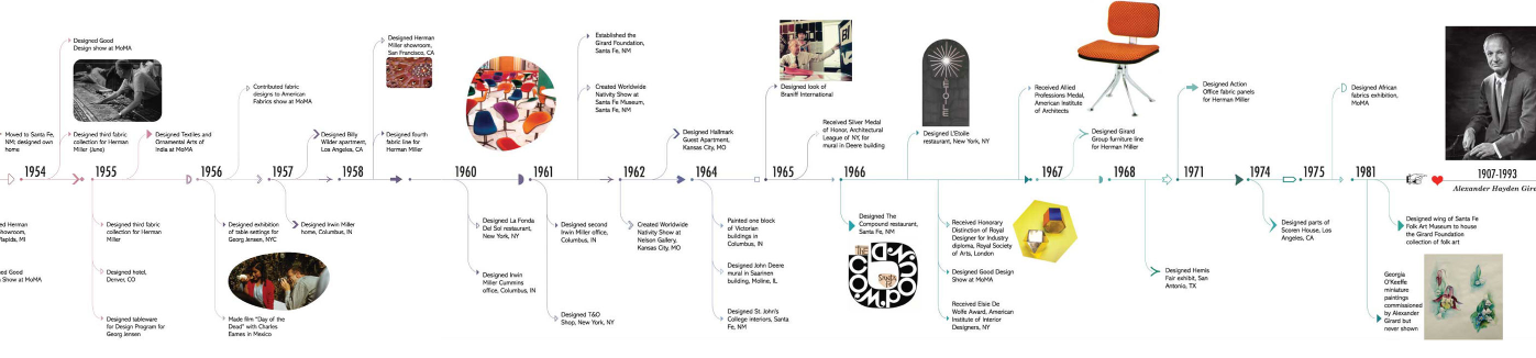
- Pour faire perdurer sa mémoire, sa famille a mis en place une site. On y retrouve entre autres une frise chronologique détaillée.
- Houses Industries distribue les typographies, les puzzles, les jeux de memory et certaines des poupées en tissus d’Alexander Girard.
- Un superbe livre de plus de 600 pages ( il fait 7kg !) est édité par Ammo Books
- Pour acheter ses créations textiles c’est chez Maharam
Sources : Les images et les textes de cet article sont présentés à but pédagogique.
D’autres grands noms du design graphique :
- JOSEF MÜLLER-BROCKMANN, « SWISS STYLE », 1914/1996
- FRANCO GRIGNANI, « GRAFICA CINETICA »,1914/1996
- ROLF RAPPAZ, « C’EST DE LA BÂLE », 1914/1996
- ROGER EXCOFFON, «COUP DE MISTRAL», 1910/1983
- ALEXANDER GIRARD, «THE COLOR-FOOL», 1907/1993
- EDWARD BAWDEN, «GREAT ILLUSTRATION FROM GREAT BRITAIN» 1903/1989
Cet article Alexander Girard, “the color-fool” est apparu en premier sur Agence de Communication Paris Lyon.
Candy Land
Luisellabench caramelle e sweetie
Comunicazione & Politica
In questi giorni stiamo facendo una lunga ricerca iconografica sulla comunicazione politica, che mano a mano stiamo mettendo qui su facebook, costruendo album appositi nella pagina di FF3300.
Qui trovate tutti gli album con le ricerche iconografiche divise per partiti:
http://www.facebook.com/album.php?profile=1&id=37824747211#!/photos.php?id=37824747211
Veniamo al dunque…
Facevo uno serie di considerazioni:
- L’effetto costruito sul testo, è un effetto di senso, un qualcosa che ci permette di cogliere informazioni prima di leggere la parola. Questo può avvenire perché quando leggiamo attiviamo due processi ontologici: uno iconografico e uno iconologico.
Quindi per ogni informazione, possiamo “interpretare la forma” e “leggerene” il contenuto.
- L’asciuttezza, il coraggio ci usare i colori che meglio descrivono ciò che si vuole dire, sono virtù che sempre mi hanno colpito.
- Al di là del messaggio politico, e della sua forma, solleverei una questione di carattere metodologico: La morte delle ideologie, l’introduzione del sistema quasi bipartitico, e l’abitudine a rivolgersi alle agenzie di comunicazione, è un mix letale.
Dico questo perché la maggior parte delle campagne “pubblicitarie” di queste agenzie è ignobile.
Sono queste agenzie che hanno portato la comunicazione politica sui bassissimi livelli a cui è oggi, con i loro format
FOTO + TESTO (come se immagine e testo fossero due cose diverse, tsè! ignoranti! C’è gente che dagli anni ’10 del secolo scorso và ripetendo che il testo è immagine, e le immagini si leggono come se fossero testi).
- Questo è il motivo per cui ribadisco che chi non sà fare le cose è bene che non le faccia. Ma come si fà a spendere centinaia di migliaia di euro, caro PD, per le campagne che ti sei fatto fare fin’ora?
Solo per citarne alcune.
Meditiamo gente, meditiamo.
Il ministero dei colori
Luisellabenchmark politici - FF3300
Stavamo studiando il modo in cui comunicano i “democratici” nel mondo, e abbiamo raccolto un po’ di materiale che condividiamo con piacere con voi.
Buona visione.
Sitografia:
USA
http://www.democrats.org/splash/every-GOP-senator
http://www.barackobama.com/
GERMANIA
http://it.wikipedia.org/wiki/Partito_Socialdemocratico_Tedesco
http://www.spd.de/aktuelles/
http://en.wikipedia.org/wiki/Free_Democratic_Party_%28Germany%29 (liberale)
FRANCIA
http://fr.wikipedia.org/wiki/Union_d%C3%A9mocratique_et_socialiste_de_la_R%C3%A9sistance
http://en.wikipedia.org/wiki/Union_for_a_Popular_Movement
http://www.u-m-p.org/
http://www.lagauchemoderne.com/
http://fr.wikipedia.org/wiki/La_Gauche_moderne
ITALIA
SPAGNA
http://www.upyd.es/
http://en.wikipedia.org/wiki/Union,_Progress_and_Democracy
http://it.wikipedia.org/wiki/Partito_Socialista_Operaio_Spagnolo
http://democracianacional.org/dn/
http://it.wikipedia.org/wiki/Democrazia_Nazionale_%28Spagna%29
INGHILTERRA
http://it.wikipedia.org/wiki/Partito_Laburista_%28Regno_Unito%29
http://it.wikipedia.org/wiki/File:Top_ht6.jpg
POLONIA
http://www.demokraci.pl/
GRECIA
http://www.dikki.org/
http://www.dimokratikiaristera.gr/
http://www.dea.org.gr/
CANADA
http://www.ndp.ca/#enter
BRASILE
http://www.psd.org.br/
http://www.pdt.org.br/
http://www.dem.org.br/
PORTOGALLO
http://www.cds.pt/
http://www.psd.pt/
http://www.cdu.pt/2011/
VENEZUELA
http://acciondemocratica.org.ve/ad/portada/portada.php
SVEZIA
https://sverigedemokraterna.se/
http://www.kristdemokraterna.se/
http://www.socialdemokraterna.se/
OLANDA
http://www.d66.nl/
BELGIO
http://www.lecdh.be/
http://www.vld.be/
http://www.ldd.be/nl/ldd-libertair-direct-democratisch-2521.htm
La guerra delle webfont di Adobe e Hoefler
Font. Per molti una passione, un modo di comunicare, un differente approccio al proprio lavoro grafico, che sia esso legato al mondo cartaceo o a quello online. Font. Una volta, quando ancora i caratteri erano “mobili” quello che bisognava sapere erano le diverse tipologie di famiglie, lapidario, veneziano, barocco, moderno, gotico ecc. Poi con il tempo abbiamo imparato a conoscere le varie “fonderie” più famose e successivamente, quando siamo passati dal reale al digitale abbiamo conosciuto i vari formati, dai Postscript agli Opentype, passando per i Truetype. Una selva di formati che per anni ha incasinato non poco il mondo tipografico, creando veri e propri mostri in fase di stampa. Formati diversi, device diversi, stampanti diverse. Ad esempio, per chi non lo sapesse, va ricordato che i font OpenType sono gli unici che usano un unico file di font sia per i computer Win che per i computer Mac, cosicché i file possono essere trasferiti da una piattaforma all’altra senza problemi di sostituzione e impaginazione del testo.
Oggi siamo alle webfont. Chiunque lavori quotidianamente nel webmondo sa perfettamente che le font ( e gli stili CSS) lavorano a pachetti (Helvetica, Arial, ecc.), questo per fare in modo che ovunque ci si colleghi, si possa leggere il proprio sito in maniera chiara e semplice. Era impossibile quindi fino a poco fa utilizzare font strane o alternative per il proprio sito/blog. Ma oggi che siamo in piena rivoluzione social, dove si ha sempre più il bisogno (o la percezione di esso) di avere ed utilizzare la stessa font o lo stesso carattere per tutti le nostre varie incarnazioni e sopratutto sia ha l’esigenza di distinguersi dagli altri e dal sovraffolamente web. Venendo incontro a questa pressante richiesta globale, Adobe ha lanciato per prima il suo Typekit, ma è di queste ore la notizia che la Hoefler e Frere Jones ha deciso di non stare con le mani in mano, lanciando il suo Cloud.typography e offrendo per la prima volta un servizio molto similea quello di Adobe. In sostanza parliamo di una specie di iTunes della tipografia, con l’idea portante che con un abbonamento si possano avere un numero (quasi) illimitato di font da gestire in modo autonomo per il proprio web lavoro.
Entrambi i servizi offrono un discreto pacchetto di font su cui lavorare per personalizzare in lungo e largo il proprio stile, ovviamente sfruttano entrambi gli stili CSS (con cui dovrete sempre fare i conti) e si presentano come il nuovo modo di fare tipografia oggi. Ma vediamo prevemente il dettaglio:
Sicuramente, data la potenza di fuoco e gli accordi presi in tempi non sospetti con le migliore typefoundry mondiali, la Adobe ha lanciato (già da qualche tempo) un servizio a pagamento davvero notevole. Il suo Typekit prevede una libreria di caratteri davvero enorme (la trovate tutta qui), con prezzi tutto sommato contenuti (anche se un po’ restrittivi) che vanno dai 29$ all’anno per un servizio che prevede 50,000 pageviews al mese per 2 soli siti (5 font per sito) fino ad un abbonamento “big” di 99$ annui per avere di tutto in cambio (un milione di pageview per siti e fonti infiniti). La potenza di Adobe è sempre più impressionante
Hoefler e Frere Jones Cloud.typography
Il portale, lanciato nei giorni scorsi parte dalla stessa idea di Adobe, fornire un servizio in abbonamento capace di dare una serie di font diverse per il proprio sito. Purtroppo però il tutto è legato ovviamente alle font prodotte e realizzate della stessa fonderia Hoefler e Frere Jones e quindi arriviamo ad una quarantina in totale (che non troverete da Adobe). I costi sono oltretutto molto più alti anche se con maggiore potenzialità, si passa dai 99$ annui per 250.000 pageviews mensili fino al costosissimo 299$ annui per chi viaggia intorno ai 2.000.000 di pageviews al mese.
E’ ovvio che questo non è che l’inizio di una guerra tra fonderie di font che non conoscerà rivali nel prossimi anni, siamo solo all’inizio (anche se cominciano anche a comparire altri servizi), una guerra che probabilmente darà finalmente al web un’impronta molto più tipografica e creativa, non limitando il lavoro del webdesigner a poche semplici font.
Buon lavoro.
Free Font (5)
Sta diventando ormai un appuntamento fisso quello con i free font. Anche stavolta, con questa quinta gallery, siamo andati alla ricerca di qualcosa di diverso, dieci caratteri per stimolare la creatività e la fantasia nei vostri lavori (e non solo). Per scaricare i font non vi servirà altro che cliccare sul nome della font ed andare nell’apposita pagina. Buon download!
>> Bloggokin spot <<
Articolo Sponsorizzato per Coca-Cola
A Wide Range of Media in Daniel David Kent's Collection of Art Pieces and Visual Experiments
It would be impossible to choose only a few images that do the quality of range in Daniel David Kent’s collection of art pieces and visual experiments any justice. Trying to anticipate the next step in his chain of thought wouldn’t be easy with all the original twists and turns.
Daniel uses the process of creating these images as a time to discover ideas that he can later on take into his commercial design practice. It makes sense that the further he explores new territory, the more flexible and informed his designs can be.
Most of all, we enjoy the sudden switches from one media to the next and changes of pace. Rough and hand-made can quickly change to digital and precisely placed, while paint, prints and fine drawings sit in contrast next to one another with both spontaneous and considered marks made.
“I am currently doing a mixture of analog and digital. I normally work with oil sticks, sum ink, and found items to create a piece which I then manipulate digitally. I make rough drawings, patterns, textures and scan them in. Sometimes I print pieces out, duplicate them and re-scan them in for added effect. Most of my personal work are practice and experiments that inform decisions in my professional design work.”
© Daniel David Kent, 2013
Bright and Joyful Characters in Work by Ben Javens
Ben Javen’s work would have to fall into the category of ‘spreading joy’. With so many brightly smiling faces in his characters, it’s almost impossible not to smile, too. Often with simple, pared down shapes and compositions, Ben illustrations focus on the textures and developing unique and eye-catching colour palettes.
Although the attractive colours and warm characters in Ben’s work are obviously a perfect fit for children’s illustration, he has been involved in projects across the board.
His work can be seen in editorial spots like in The New York Times Sunday Review and the Guardian as well as of various advertising and packaging.
My work is a mixture of hand-drawn and digital elements.
The digital side involves tweaking a line here or there, adding colour, texture and most importantly composition but each illustration will start with an idea and sometimes a pencil scribble (so as not to forget the idea if I get the urge to wander away from my desk).
I then deconstruct the illustration into its individual parts and using my trusty Brush pen, I draw these in my sketchbook (the kind anyone growing up in the UK will be familiar with).
Once I have all the elements that make up the image, I scan them, convert them to paths in Adobe Illustrator and then go about putting the pieces together until they match what I have in my head. It’s a pretty backwards way to work and one that shows the lack of confidence I have with drawing but ultimately it works for me.
© Ben Javens, 2013
This Week in Fonts
Calligraphic flair by DSType, a geometric stencil from Talbot Type, a tempered sans by MVB Fonts, a warm slab courtesy of Dada Studio, a fluid script from Sudtipos, some hand-drawn lettering by Mike Rohde, an art deco inspired face from Tilo Pentzin, a vintage sans by Hold Fast Foundry, geometric forms from HVD Fonts, and a tribute to Ladislav Sutnar by Suitcase Type Foundry.
DSType: Aparo
Designed by Dino dos Santos
Aparo appears to be a very simple bold italic roman typeface, but it has plenty of calligraphic flair, including swashes, collision detectors, alternate characters and a very extended character set.
Talbot Type: Kroppen Round
Designed by Adrian Talbot
Not strictly a stencil font given that several characters are not stencilled. The design has more to do with achieving each character from a single stroke, or series of single strokes.
MVB Fonts: MVB Solitaire
Designed by Mark van Bronkhorst
A tempered sans-serif somewhere between a humanist and a gothic, MVB Solitaire captures a 21st-century neutrality.
Dada Studio: Clavo
Designed by Michał Jarociński
Its warmth comes from subtle details, classical proportions and traditional forms, while its harmonious structure prevents distraction while reading.
Sudtipos: Rolling Pen
Designed by Alejandro Paul
Rolling Pen runneth over with alternates, swashes, ligatures, and other techy perks.
Delve Fonts: Sketchnote
Designed by Mike Rohde
Designed to be practical, to convey the human character and quirks of Mike Rohde’s normal handwriting and unique hand-drawn lettering with the benefits inherent in digital fonts.
Gestalten: High Times
Designed by Tilo Pentzin
High Times takes its inspiration from the eras of Art Deco and Art Nouveau but with a radically contemporary approach.
Hold Fast Foundry: Prohibition
Designed by Mattox Shuler
This vintage sans takes queues from classic war and workforce posters.
HVD Fonts: Niveau Grotesk
Designed by Hannes von Döhren
Based on geometric forms and influenced by classical 19th-century faces.
Suitcase Type Foundry: Ladislav
Designed by Tomáš Brousil
A tribute to the typography of Ladislav Sutnar.
Sponsored by H&FJ.
This Week in Fonts
i’m still jealous of jay dart
Ah, nothin’ says “Happy Canada Day, eh” like a bunch of colorful beards, some magical mystery branches, and a Mounty holding a bird. Ok, maybe it’s just the Mounty that really says it… the beards sort of say Portland. Anywho, what better way to kick off Canada Day, than with an amazing Canadian artist, and a few bearded guys with fishing rods. I wrote about Ontario based artist Jay Dart years ago, but my love for his work has just continued to grow… much like the long, colorful beards that he clearly loves to draw.
HAPPY CANADA DAY, CANADIANS! Enjoy the fireworks, go get a beaver tail, and while you’re at it…
A Tale for the Time Being - cover design process
Luisellacover design process
Minimal designs like this is always a hard sell in cover meetings, and it was immediately rejected as too quiet and precious-looking. Loud, colorful, and commercial are popular adjectives in modern book marketing, but it's always fun to start off negotiations with something a little more obscure.
i’m jealous of project B
Do you love old photos? Do you wish you could get one as a giant print to hang on your wall? Perfect… listen to this:
“PROJECT B specializes in a fascinating world: vernacular and anonymous photographs culled from the lively margins of history. We discover and preserve exceptional vintage photographs from unknown photographers and make them available in limited edition prints…. Our work is a culmination of more than 30 years’ experience in the fields of fine art, photography, folk art and material culture. By bringing together the best practices of collecting, curating and publishing, PROJECT B pays homage to the mysterious power of the anonymous photograph to transcend time and enhance the spaces we live in today.”
So cool! I want a 36″x36″ sea monster (very Scooby-Doo-esque) in my house!
Borja Bonaque's Clean Forms with a Little Edge in Abstract Compositions and Cityscapes
LuisellaWOW
The planes, corners and edges in Borja Bonaque’s work sit on clean lines with a little grit to them. The forms fit comfortably into his type work and editorial illustrations as well as his more abstract compositions and cityscapes.
Borja has done large advertising campaigns for companies such as Starbucks and was named Graduate of the Year by Wallpaper magazine in 2009.
© Borja Bonaque, 2013
Spray-Painted Business Cards
Random and unique spray-painted business cards designed by graphic design firm Cocolia.
Expressed on a series of plates printed with serigraphy and spray paint over a thick 380Gr cardboard.
Only a limited number of cards were produced and each front side is different than the rest. Fresh and colorful looking design!
By Cocolia
For Cocolia