

When you fall on love that time you feel fly. Here I will post 50 different ideas for love PICTURESCOLLECTIONS
DYT friends! Win Fantastic & Beautiful The Bricks UI Pack by Designmodo!


When you fall on love that time you feel fly. Here I will post 50 different ideas for love PICTURESCOLLECTIONS

Established in 2010 and hundreds of millions of photographs ago, Instagram is a "fun and quirky way to share your life with friends through a series of pictures". Obviously, that's an understatement. For its 100 million users, Instagram is as much part of life as texting and e-mailing and Facebook (who we all know paid a cool billion dollars to acquire Instagram in April of 2012 — who's laughing now?) and its filters have established a new lingua franca for documenting food, clouds, and POV of places you are not in. Point being: Instagram is big. And important. Small changes are big changes. And its latest update, version 3.5, brought along with it a redesigned wordmark crafted by Denver, CO-based Mackey Saturday.

It was always essential that the design maintained everything that we've all grown to know and love about Instagram while creating a logotype that was more refined, durable, and that positioned the brand for expansion. Looking to the past to inspire the future, the script connects with the nostalgia that Instagram was built from, maintains the important character of the original typeface, and places the brand in a unique and prominent position both in the current and future landscape.
— Dribbble shot
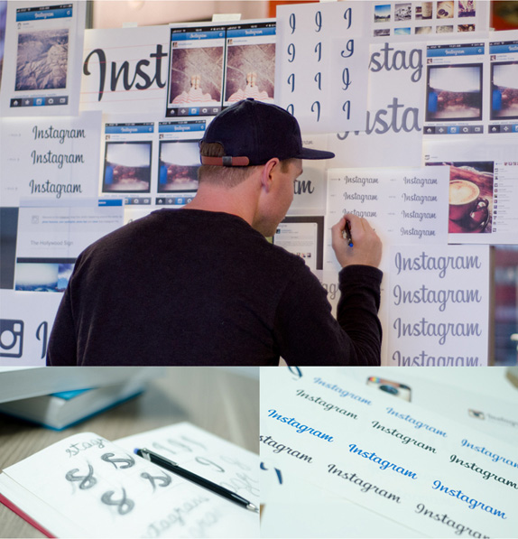
Mackey Saturday at work.
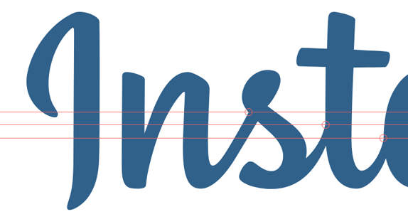
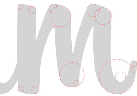
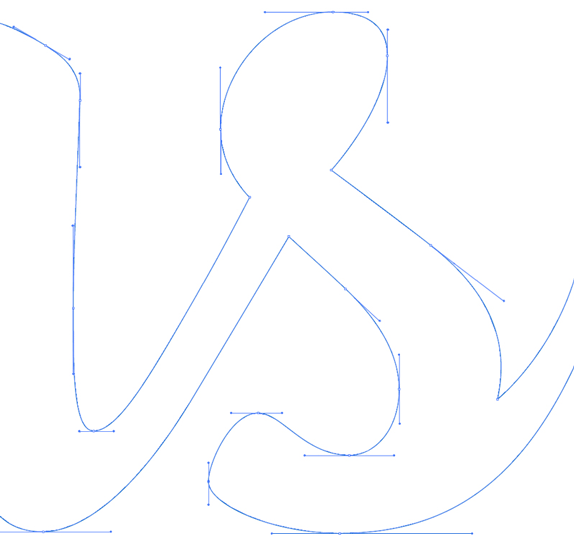
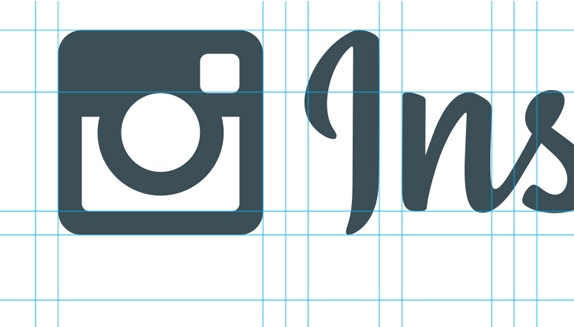
Vector-y details.
The previous wordmark was typeset out of the box using Billabong. Not the most horrible of 1950s script typefaces but also not necessarily the best one, especially that capital "I". I always appreciate a company dropping a stock font in exchange for a custom-drawn one. Even more so when it's well done. The change here is a wonderful evolution that transforms the well-known wordmark into something that feels similar but definitely looks (and reads) better, even keeping the quirkiness of the "I". The new upright script flows perfectly from character to character and then has enough for one last little kick in the flourish of the "m". This might seem like a small, meaningless change but it lifts Instagram from one-hit-wonder app to what it actually is, a lifestyle brand.

Testing the new wordmark with its own filters.
Thanks to Bradford Barron for first tip.


Absolutely fantastic press & OOH campaign for Schusev State Museum of Architecture Moscow.
Plus:
- high resolution images on click
- how-to’s sketches
Agency:
Saatchi&Saatchi Russia
Creative Director: Stuart Robinson
Account team: Khichtchenko Elena
Creative team: Polonski Yuri, Demakov Anton
Typography team: Sergey Sidorov, Anastasia Vedernikova
Designers team: Mark Ignatiev
PR team: Kristina Vorobieva, Yana Brekotkina
Agency producer: Ekaterina Pastukh
Production:
Carioca Studio
Brand team:
Schusev State Museum of Architecture Moscow
Brand manager: Anastasia Grigoryan, Alisa Bagdonayte
L’année dernière Google nous avait offert une version 8-bits de Google Maps, cette année nous avons droit à une carte aux trésors ! Pour y accéder, rendez-vous ici afin de découvrir si un trésor se cache en bas de chez vous.
Keen-eyed observers noticed something odd about this propaganda photo released by North Korean officials on Tuesday. It seems they tried to make a recent military training drill look a bit more impressive with a little help from our friend, the clone tool.
(Original photograph courtesy of KCNA via KNS/AFP/Getty Images)
This certainly isn’t the first time a government agency has used Photoshop to pump up their photos, and it definitely won’t be the last, but it does make you wonder how they think they’ll get away with something like this in today’s day and age. Don’t they know we at PS Disasters live for this stuff?
Many thanks to Laurent for the tip, and to The Guardian for the enhanced images.
The post North Korea: Hovercraft Clone Wars appeared first on PSD : Photoshop Disasters .
 We're all familiar with vintage-style camera effects thanks to popular apps like Instagram, but applying those modifications after you take the image doesn't look as authentic and can hurt the image quality. Instead, you can create true light leaks and special effect color with a plastic sandwich bag and a colored marker. DIY Photography explains: More »

How do you advertise a life drawing course? You could photocopy posters from the last session for the umpteenth time and hang them on a wall, or maybe take out a tiny ad in the local paper and hope some people show up. Except that’s what we’ve been doing for decades. Creative duo Wriggles & Robbins decided to take a new approach in this brief clip advertising drawing courses at The Book Club in London. Using photographed stills of the students’ work-in-progress the team created this lovely stop motion video the that does an extraordinary job of capturing the energy, perspective and fun of a life-drawing class. Really cool, I wish it went on for another minute or so. (via it’s nice that)