Shared posts

09 Jan 13:59

Wayne Reuben: rotulista de supermercado

by elbarbon

20090329HonestEds1 20090329HonestEds2 20090329HonestEds3

Les compartimos la historia de Wayne Reuben, un rotulista canadiense que desde 1967 se dedica a realizar rótulos para supermercados siendo su principal cliente una tienda Honest Ed’s para los cuales ha trabajando mas de 30 años en total y son de las pocas tiendas que actualmente siguen utilizando anuncios a mano en vez de impresiones digitales, pantallas o tableros intercambiables.

En el video podemos la maestría de este señor con un pincel en la mano y como en una cartulina con simplemente 3 colores  (azul para la descripción del producto, rojo para el precio y amarillo para los bordes) logra hacer mas de 70 anuncios semanalmente.


07 Jan 19:46

43 Beautiful Typography Packaging Designs Inspiration

by Henry

In packaging design, typography is the primary medium for the communication of the product’s name, function, and facts to a broad consumer audience. The typographic section, layout and treatment of the words and letterforms effect how the type is read. Ultimately the typography on packaging design becomes one of the most significant elements of the visual expression of the product.

Typography has become an important sales tool and some kind of a trend in package design. The visual personality of type and its association to certain emotions, is important when it comes to selling the product and attracting the right audience. Having this in mind, we collected a number of packages which are just inspiring if not beautiful.

Awesome sausage packaging

Awesome sausage packaging

Buck O’Hairen’s Sunshine

Buck O'Hairen's Sunshine www.WeAreDevice.com

Buba

//Buba//

Lovely typographic

Lovely typographic

Today’s good day

Todays good day by Adine Marie-Amélie

Literary Lites II

Literary Lites II - when the air thickens so should the plot

Oat biscuits. Illustration

Oat biscuits. Illustration by Julian Roberts.

Yo-ho-ho Juice

Yo-ho-ho Juice - Elena Kaimanova

Le Bleu Lait

Le Bleu Lait by Isabela Rodrigues

Bunches et Bunches

Bunches et Bunches

Bookjigs Initial Branding

Bookjigs Initial Branding

Hot Cup Cold Spoon is another top

Hot Cup Cold Spoon is another top

3D Typography

3D printed slipcover

Bag topper Garden Sushi Packaging

Look like this is one of the team's top

packaging design

beer, bottle, box, cap, design

linfuseur

boite_produit_linfuseur_6_detox_ok

Ice cream

Ice cream, via Behance

In Progress Logo

In Progress Logo

No-Li Brewhouse By Riley Cran

No-Li Brewhouse By Riley Cran

No-Li Wrecking Ball

No-Li Wrecking Ball

Packaging Mockup

Packaging Mockup By Scott Hill

SODA

SODA By Alex Westgate

Im Nu Packaging

Im Nu Packaging By Julian Hrankov

Migrant Whiskey

Migrant Whiskey by Chad Michael

Packaging

Packaging

Veuve Cliquot Clicq Up

Veuve Cliquot Clicq Up champagne cooler

Tokyo Chocorice

Tokyo Chocorice

Grub Pies

Grub Pies

Sugar Moon Maple Syrup Packaging

Sugar Moon Maple Syrup Packaging by Andrea Romero

Sassafras Baking Kits

Sassafras Baking Kits

Sticks and Bones.

Sticks and Bones.

Typography packaging design

typography packaging designs

Packaging

Packaging

YUMMY MILK

YUMMY MILK by simon spring, via Behance

PIzza Crust Mix

PIzza Crust Mix

Water by the numbers

Water by the numbers

Typography packaging

lovely packaging

Chocolate packaging

Chocolate packaging

Typographic Gift Wrap

Typographic Gift Wrap

Headphone packaging

Headphone packaging

fruit packaging

fruit packaging

Standard Dress Shirt

Standard Dress Shirt

Amoria

amoria

Related posts:

  1. 11 Rad Typography Designs For Inspiration Here goes another fresh part of typography design inspiration. In...
  2. 40 Beautiful Ribbon Designs Inspiration In this post, you’ll see beautiful, inspiring, stylish, decorative and...
  3. 60 Creative & Beautiful Packaging Designs 2013 Whenever you visit the supermarkets, malls, stores and any other...
27 May 20:12

Invenções fatais

by Eloise Martins

flying tailor1

O ser humano é impulsionado pelo seu desejo de conhecimento. Mas, às vezes, essa motivação acaba causando muitos infortúnios. Conheça alguns inventores azarados que tiveram em suas criações um destino sombrio.

O Alfaiate Voador:

flying tailor2

Franz Reichelt  (1879-1912) era um alfaiate austríaco que morava na França, onde inventou uma espécie de roupa paraquedas para pilotos escaparem de acidentes aéreos. No entanto, Franz é lembrado por ter morrido enquanto testava sua invenção pulando da Torre Eiffel.

flying tailor3

flying tailor4

O inventor decidiu fazer esse teste arriscado pois as primeiras tentativas com bonecos foram bem sucedidas. Mesmo assim, isso não foi o suficiente: a queda de 57 metros se provou fatal para o ousado alfaiate, sendo que ele morreu instantaneamente quando atingiu o chão congelado.


O Submarino Humano:

horace

Horace Lawson Hunley (1823-1863) foi um engenheiro da marinha que inventou um submarino sem motores, movido apenas pela força humana. Em Outubro de 1863, Hunley comandou um grupo em um exercício de rotina, do qual nenhum dos oito tripulantes saiu vivo, pois o submarino afundou.

horace2

No ano de 2000, uma expedição liderada por Clive Cussler resgatou o submarino do fundo do mar, entregando a sua carcaça para a base naval de Charleston.


A Impressora Assassina:

bullock1

O famoso inventor da primeira impressora rotativa, William Bullock (1813-1867), morreu em um acidente bizarro envolvendo sua criação revolucionária. O inventor tentou chutar uma correia de transmissão em uma polia, mas teve sua perna presa na engrenagem e esmagada. Nove dias depois, Bullock faleceu durante a operação que amputaria o seu membro já infectado com gangrena.

O Rei do Planador:

glider king1

Otto Lilienthal (1848-1896), conhecido como o Glider King, sofreu uma queda de 15 metros quando fazia um voo em seu planador, fraturando sua cervical e morrendo no hospital 36 horas depois do acidente.

glider king2


A Primeira Motocicleta: 

roper1

Sylvester H. Roper (1823-1896) foi o inventor da primeira bicicleta motorizada, o velocípede à vapor Roper, e também de um dos primeiros automóveis, a carroça à vapor. Em Junho de 1896, Roper foi visto perdendo o controle de um de seus velocípedes e caindo no chão. Não se sabe ao certo se o inventor morreu de falência cardíaca ou se o acidente provocou um ataque do coração.

roper2

O Avião de Metal:

aurel

O inventor do primeiro avião metálico do mundo, Aurel Vlaicu (1882-1913), morreu enquanto tentava cruzar as montanhas Carpathian pela primeira vez em um modelo Vlaicu II, em Setembro de 1913.

O Aerovagão:

valerian

O inventor da Letônia, Valerian Abakovsky (1895-1921), criou um vagão de alta velocidade com uma engrenagem e hélices de avião chamado Aerovagão. Valerian e mais cinco passageiros morreram durante o percurso para Moscou, no qual o vagão descarrilhou.

O Sangue da Juventude:

bogdanov

Esperando desvendar o mistério do rejuvenescimento, Alexander Bogdanov (1873-1928) começou experimentos de transfusão de sangue em 1924. Após 11 transfusões, sua visão melhorou, mas uma última transfusão seria fatal: em 1928 ele absorveu sangue de um estudante infectado com malaria e tuberculose.

O Brilho Fatal:

sabin

Sabin Arnold von Sochocky (1883-1928) inventou a primeira tinta luminescente à base do elemento químico rádio, que era um material muito popular no começo do Século XX. Não se sabia na época que o manuseio desse elemento causava envenenamento, resultando na morte de muitas pessoas no período, inclusive Sochocky, que faleceu de anemia aplástica em decorrência do contato com o rádio.

O Combustível Explosivo:

max1

Na década de 20, Max Valier (1895-1930) e Fritz von Opel foram pioneiros no desenvolvimento de carros e aeronaves com propulsão de combustíveis líquidos.

4.0.1

No entanto, em Maio de 1930, ocorreu uma explosão do combustível álcool durante um dos testes de automóvel, resultando na morte de Valier.

O Criador de Azar:

midgely

Thomas Midgely, Jr. (1889-1944) foi o inventor da gasolina com chumbo e do CFC, e em 1940, já aos 50 anos de idade contraiu poliomielite, que o deixou em uma cadeira de rodas. Engenhoso, Midgely desenvolveu um sistema de polias que auxiliava-o ao levantar de sua cama. Ironicamente, esse mesmo sistema foi responsável por sua morte, uma vez que ficou preso nas cordas da engrenagem de sua própria invenção.

O Carro Voador:

smolinski1

smolinski2

Henry Smolinski (1933-1973)e Hal Blake fundaram o Advanced Vehicle Engineers em 1971 para projetar e construir um carro voador. O primeiro e único protótipo era uma combinação de um Ford Pinto com a traseira de uma aeronave Cessna. Infelizmente, as asas da invenção caíram durante um voo de teste, matando os dois engenheiros.

smolinski3


A Queda do Dublê: 

soucek

Karel Soucek (1947-1985) foi um dublê que desenvolveu uma estrutura customizada absorvente de impacto e colocou sua invenção à prova nas Cataratas do Niágara. Confira abaixo o vídeo que mostra a ação ousada e impressionante de Soucek:

Infelizmente, um ano após o sucesso nas Cataratas, Soucek faleceu em uma queda de aproximadamente 54 metros, do topo do estádio Astrodome em Houston até um tanque de água. A cápsula atingiu a borda do tanque e o dublê morreu horas depois no hospital.

| via

21 May 16:11

Morreu Ray Manzarek

by Janara Lopes

tumblr_lhm10goZRs1qejrqso1_1280 (1)

Um dos únicos tecladistas de uma banda de quem as pessoas sabiam o nome – e isso não é pouco. Independente do quão hippie você ache o Doors, tem que reconhecer que esse cara mudou a visão sobre o instrumento no rock ´n´roll.

Ray se foi nessa segunda, aos 74 anos, vítima de um câncer na visícula biliar.

19 May 16:03

How To Stay Creative?

by Ken Myers

Some of us have no problem staying creative in an ever changing world. These people seem to be able to come up with new ideas on a regular basis that work out in wondrous ways. However, there is a portion of people who may feel they are in a rut and have troubles keeping as fresh as they possibly can. If you are one of these people, there are a few methods you could employ that may help you keep that competitive edge and marketable style.

Trends

trendsIf you’re a designer, then obviously you need to study current trends and monitor what is popular. The general public responds to popularity based on what magazines, celebrities, and television tells them. It’s a glib view of the world, but it’s what makes something trendy. Depending on your creative talents, this could come in the form of imagery, musical instruments, style of writing, and more. Follow the trends of your creative path to help increase your own knowledge.

Process

processAs a designer, you undoubtedly have your own methods as to how to complete any given project. Have you ever decided to try the same project using different tools, themes, or methods? By expanding your knowledge of how specific effects can be accomplished, you can develop other interesting ideas you may have never thought of before. Many electronic amateurs will walk down the isle of a Radio Shack in order to develop inspiration to help them create something new or a project they would like to accomplish. Graphic design is no different in that aspect. By examining available tools and other works from people, you too can be inspired to create something unique.

Physical

stay creativeInspiration to be creative is one thing, but there is also a physical aspect to helping your mind develop enticing designs. An imagination is only as healthy as the mind it’s coming out of. Not adhering to your physical needs could be detrimental to your creativity as it will split your attention and hinder your project’s development.

Sleep Deprivation: Being creative while fighting your own fatigue could make the end result anything but appealing. Your mind needs rest and a fresh eye on the project after a full night of sleep could give you that fresh outlook.

Poor Diet: Your brain needs to be properly nourished in order to function at optimal efficiency. A poor diet of junk foods or those that are not a significant source of vitamins and minerals your brain needs can decrease your productivity and focus.

Mental Stresses: A mind divided is unable to focus on a single task as well as it could. Eliminating elements that cause you stress such as a cluttered work area, screaming children, or physically uncomfortable working conditions could improve the way your mind processes information and can provide increased focus.

You should always endeavor to improve yourself regardless of your career or desires. Life is a constantly evolving mesh of idea and beliefs from all walks of life. Each culture has contributed some aspect of itself into the real world and millions have capitalized on this collaboration. The best you can do is keep your talents and skills as honed as you possibly can in order to make your own impact within the world.

The post How To Stay Creative? appeared first on Designbeep | Design Inspiration Free Resources.

19 May 15:57

El libro de Logorama: Logobook

by elbarbon

cover_va_logobook_1301181004_id_627045 page_va_logobook_01_1210251604_id_627061 page_va_logobook_02_1210251604_id_627076 page_va_logobook_3d_01_1212031713_id_641184 page_va_logobook_04_1210251604_id_627106 page_va_logobook_05_1210251605_id_627121 teaser_va_logobook_top_1207031601_id_536005 page_va_logobook_06_1210251605_id_627136 page_va_logobook_12_1210251606_id_627227

La editorial alemana Taschen en colaboración con Ludovic Houplain (el creador del cortometraje de Logorama) el próximo 15 de mayo publicarán un libro que se ve realmente interesante; se trata de “Logobook” donde a lo largo y ancho de mas de 750 páginas exploran algunos de los logotipos mas importantes de la historia.

El libro lo pueden pre-ordenar a partir de hoy en Amazon por $34 dólares.

El cortometraje de animación premiado en los oscars de 2009, Logorama, basado en el uso de logotipos y marcas, se convirtió en un punto de referencia para la cultura corporativa. Concebida por el estudio de diseño parisiense H5, la película narra la historia contemporánea a través de los productos y servicios que nos rodean en la vida cotidiana. Ludovic Houplain, director del estudio y codirector de la película, acometió un exhaustivo proyecto de investigación de un año de duración que le llevó a coleccionar más de 40.000 símbolos y marcas comerciales que representan el mundo actual.

El monumental archivo reunido por Houplain sirve de fundamento para este manual de referencia, lo último sobre logotipos, donde se incluyen en torno a 7.000 ejemplos organizados alfabéticamente, con información sobre sus diseñadores, año de creación, país, marca y empresa. Además, el libro presenta un exhaustivo ensayo crítico acerca de la cultura de las marcas realizado por el filósofo francés Gilles Lipovetsky y una introducción de Ludovic Houplain en la que explica el proceso de creación del filme Logorama, desde su concepción hasta su finalización.

Logobook

09 May 17:12

30 Great Examples of Web Design Sketches

by Designbeep Staff

website sketch

Although sketching is an old school method for web design,it is still the first for website creation.There are times you get stuck and frustrated in design process of a website so a piece of paper and a pencil will be a great helper for you.Sketching will help you stay focused on designing websites or blogs. In today's post we bring together a showcase website sketches for your inspiration.The below website sketches are great examples of how web designers plan their own website designs before going live. You may also take a look at past inspirational colections;  

Sketches For Personal Website

website sketchSource  

Sketching for Web

2.website sketchSource  

Colorframes

3.website sketchSource  

Initial Wireframe Sketches

4.website sketchSource  

Marker Comps

5.website sketchSource  

World Care Connections

6.website sketchSource  

Colophon Page

7.website sketchSource  

Website Sketch Wireframe

8.website sketchSource  

Wireframe Sketches for Website

9.website sketchSource  

Wireframe

10.website sketchSource  

Sketch For a New Website

11.website sketchSource  

Wibo Web Sketch

12.website sketchSource  

Website Sketch

13.website sketchSource  

Portfolio Sketch

14.website sketchSource  

Sketching a Website

15.website sketchSource  

Grid Website Sketch

16.website sketchSource  

Website Sketch

17.website sketchSource  

Personal Website Sketch

18.website sketchSource  

Portfolio Website Redesign Sketch

19.website sketchSource  

Mindstorm Sketch

20.website sketchSource  

Librespeak Interface Sketch

21.website sketchSource  

Early SAMHSA.gov Concept

22.website sketchSource  

BPG - UI Sketch

23.website sketchSource  

OnlyJames Wireframe Sketch of Article Detail

24.website sketchSource  

Web Sketch

25.website sketchSource  

Nomads In Stratford-Upon-Avon

26.website sketchSource  

Moving Menu Options

27.website sketchSource  

5 Year Campaign Site

28.website sketchSource  

Sketched Wireframe

29.website sketchSource  

Design Utilities - Wireframing Template

30.website sketchSource
24 Apr 14:19

Um vídeo didático e bem humorado sobre protótipos de papel

by Fabricio Teixeira

Protótipos de papel

Bom, o próprio Jakob Nielsen que disse:

“Very nice video — certainly more fast-paced than our video on the same topic. Well done guys.” – Jakob Nielsen

O vídeo traz um tutorial simples sobre como desenvolver protótipos de papel para uma interface que você está desenhando.

Como já falamos algumas vezes por aqui, o sistema de prototipagem em papel acaba sendo uma das formas mais baratas e rápidas de colocar algo em frente ao usuário e validar se a solução desenhada funciona bem ou não.

O vídeo foi criado pelo grupo AIR do Ltia – Laboratório de Tecnologia da Informação Aplicada da Unesp, para a oficina “Há mais papel entre um homem e sua interface que possa imaginar vossa vã filosofia!”.

Créditos abaixo:

Filmado por Juliano Ferreira, Fernanda Rodrigues e Henrique Perticarati.
Encenado por Fernanda Rodrigues, Henrique Perticarati, Diego Coutinho e Alexandre Nacari, com participação mais que especial de Pedro Cavalca.
Editado por Henrique Perticarati.
Trilha sonora editada por Paulo Cattai.


12 Apr 16:35

All City Canvas tailored by Tony Delfino

by elbarbon

Logo ACC x TDDetalle playera ACC x TC (Smithe)Playera foliada ACC x TD Edicion Limitada PREMIUM (Smithe)Print numerado ACC x TD Edicion Limitada PREMIUM (Smithe)Etiqueta-foliada-ACC-x-TD-Edicion-Limitada-PREMIUM-(Smithe)-

Por primera vez, All City Canvas y la marca de ropa Tony Delfino se unen para confeccionar una serie de diez camisetas con diseños únicos que trabajarán en conjunto con artistas, ilustradores y diseñadores mexicanos y extranjeros. Durante lo que resta de este 2013, estas dos marcas lanzarán 10 diseños diferentes compuesto por 2 ediciones; la normal y un paquete de lujo limitado a sólo 65 piezas que además de tener una playera seriada incluirá un cartel del mismo artista.

Por el momento solo sabemos que el primer participante de esta nueva iniciativa es nuestro buen amigo Smithe que como siempre nos presenta una gran ilustración. En cuanto tengamos mas detalles de este proyecto como el precio de las playeras y como comprarlas se los haremos saber.

11 Apr 18:02

This Week in Fonts

by Sean Mitchell

A bright slab serif by Typofonderie, a massive system from Typonine, a text face with flavour and a hardworking family from Rosseta Type, a casual face by HVD Fonts, an expansive family from Lost Type Co-op, a type designer’s typeface by Emigre, a warm and rugged face from Fountain, a geometric slab serif by The Northern Block, and a humanist grotesque from Atlas.

Typofonderie: Mislab

Designed by Xavier Dupré

With Mislab, Xavier Dupré has designed a brighter and more legible slab serif than most. Mislab aptly combines the strength of a slab serif with the lightness of a sans serif.

Typonine: Audree

Designed by Nikola Djurek with Marko Hrastovec

A type system with several hundred styles. Choosing between fifteen different serif shapes, two construction models, high or low contrast, and adding stencil or inline effects results in unique, expressive variations of Audree’s letterforms.

Rosetta Type: Huronia

Designed by Ross Mills

A text face with flavour, suitable for recording oral literature and for extended reading in books and academic texts.

Rosetta Type: Eskorte

Designed by Elena Schneider

A hardworking Latin-Arabic type family with an uncomplicated, regular appearance that conveys a crisp, businesslike tone.

HVD Fonts: Mikado

Designed by Hannes von Döhren

A friendly, casual type family intended to be used where a pleasant feeling should be conveyed. Mikado has a positive “out-of-the-box-appearance” in big sizes, but because of its straight architecture the fonts are also very legible in smaller sizes and longer texts in print or on screen.

Lost Type Co-op: Mission Gothic

Designed by James T. Edmondson and Trevor Baum

A relic; a ghost from an era where letters were hand-painted on wood and glass. Made up of five weights and two styles, Mission Gothic is one of the most expansive type families available from Lost Type Co-op.

Emigre: Program

Designed by Zuzana Licko

A type designer’s typeface. It’s about the craft of typeface design and the particular details and effects that type designers fret over.

Fountain: Taca

Designed by Rúben Dias

A typeface built around a shape that Portuguese designer Rúben Dias calls a “squircle” — neither square nor circle. Taca is warm and rugged, as if it was molded from clay or carved from stone.

The Northern Block: Hapna

Designed by Mariya V. Pigoulevskaya

A geometric slab serif designed as an alternative to other slab style fonts available on the market. Hapna was inspired by the baseball culture and the graphic language of the early 1950s.

Atlas: Novel Sans Office Pro

Designed by Christoph Dunst

The humanist grotesque typeface family optimized for office environments within the largely extended award winning Novel Collection.


Sponsored by H&FJ.

This Week in Fonts

11 Apr 17:24

Campaña Want it de Saks Saks Fifth Avenue

by elbarbon

saks1 saks7 saks6 saks5 saks4 saks3 saks2

Les comparto una campaña para la tienda Saks Saks Fifth Avenue que aunque ya pasó un buen rato desde que fue lanzada me parece bastante buena; todo el diseño e idea creativa corrió a cargo del despacho Studio Number One comandado por Shepard Fairey.

La campaña se titulo “Want it” y se tomó como principal inspiración la gráfica del constructivismo ruso de principios del siglo pasado y fue aplicado a diferentes piezas de comunicación que van desde anuncios impresos y espectaculares hasta bolsas de compra o a los mismos aparadores de las tiendas.

Como tip, les recomiendo que si quieren comprar productos de esta tienda departamental se den una vuelta por la página de Dscuento México donde encontrarán  Saks Saks Fifth Avenue en Dscuento.

11 Apr 17:20

Mochila esqueleto com capuz

by Monike Heredia

Quem adora caveira curtirá essa mochila com capuz.

Quando a pessoa usa o capuz, um esqueleto se forma na parte traseira da mochila.

Você pode encontrar esses ossinhos no Amazon por USD 49,99.

Você usaria?

mochila-caveira-com-capuz+Chá_com_cupcakes


mochila-caveira-com-capuz 5+Chá_com_cupcakes


mochila-caveira-com-capuz 3+Chá_com_cupcakes


mochila-caveira-com-capuz 2+Chá_com_cupcakes

11 Apr 13:38

15+ food and restaurant web designs

by Kendra Gaines

Thumb

How do we live without food? It’s our sustenance. It’s the reason why we live and can be the reason for the opposite. Many events, conferences and groups surround themselves around the idea of being a ‘foodie’ and submerge themselves in the culture of cooking.

While food is good, it’s a well known fact that going into business in the food industry is often the hardest. Those who start up a restaurant must have tons of front money and funds for daily expenses. Emergencies happen often and things can get hectic while food undergoes preparation. Restaurant owners have to almost be geniuses in their own right to create a spot that serves food liked by the masses, but also creates a strategy of longevity.

Strategizing with the impact of a restaurant can include a web presence. I don’t think this is something that’s caught on for lots of small business restaurants, mainly because when your customers are strictly local, word of mouth promotion is probably the best.

So, what happens when restaurants want to go online? Who says how a restaurant website should look? What are those standards? Well, there’s really no set idea — we have schemes for business sites and app sites, etc — but those designs for food and restaurants have a bit more leeway. Let’s take a look at some good, creative restaurant sites.


Bel 50

Bel 50 immediately starts us off with a very unique and creative idea. Waffles are fairly popular food items, but this time around we’re introduced to the waffle holding a different role other than just breakfast entree. Bel 50 features curiously crafted waffle sandwiches. Yes, waffle sandwiches and they’re presented in a way to make your mouth water, even if you don’t know what all the ingredients are.


Brown’s Court Bakery

I like this web design because if you aren’t paying attention, you’d think it was a creative agency’s website. The vintage feel and really balanced flow almost take you out the mindset that this is a bakery. Nevertheless, Brown’s is well known in the Charleston area and seems to have an extremely rich history.


Charley’s

In my experience, the actual sites of the Charley’s pales in comparison to the online image, but that’s neither here nor there. This Charley’s website does exactly what it’s supposed to do by evoking a little bit of excitement about these (excellent) sandwiches. 


Desert Chill Ice Cream

Two entrepreneurial brothers decided to take the idea of the ice cream truck and flip it right on it’s head, and I absolutely love it! You can basically schedule their ice cream van to make a visit or you can make sure you’re around when they pass through a certain location. This is a wonderful idea that’s paired with a very cute and uplifting site. Would love to see who’s going to bring it to the States!


Dilly Deli

This web design has a really kitchy, family type of feel going on. There’s lots of colors and graphics paired with some great images that definitely get you interested in what they have to offer. They mainly focus on just their food, which isn’t necessarily a bad thing. This is another creative, unorthodox look at a restaurant’s web design.


Emporium Pies

If there was ever a way to make pies look regal and immaculate, Emporium Pies has figured out a way to do it. Here, they bake up some speciality pies that look absolutely delicious and fit for a king, with a price tag to match! Of important note here, is the order form and its ease of use. That’s very important to get right when dealing with food!


Grk

Grk puts a fresh, new and modern spin on Greek eatery. Now, I put Greek food right next to Italian food in terms of the ingredients needing to be absolutely be fresh. There’s lots of salads, breads and more. What’s important about this particular site, however, is that it’s responsive! It’s one thing to throw up a site for your business, but it’s another thing to make sure it’s right in line with the trends and needs of the moment. Job well done.


Joe’s Crab Shack

Many times when you think of a seafood restaurant, you think of a pretty stuffy, fancy, regal atmosphere that’s quiet and dimly lit. Not at Joe’s. There’s way too much fun to be had and it’s almost like a constant party. They do a great job of mending high quality seafood with Grade-A fun, on site and online. 


Mellow Mushroom

Pizza is probably one of the most universally liked foods amongst people ever. I’ve never met a person who didn’t like pizza — just certain ingredients and toppings. Mellow Mushroom is contrary to their ‘mellow’ moniker, as they seem to be an exciting and interesting bunch who’ve gathered to make some dope pies.


Italio Kitchen

Italio claims to be a modern Italian kitchen with freshness in mind. I like this site because of it’s bold imagery and movement that captures your attention. The menu items look fabulous and you just have to assume they absolutely know what they’re doing. If you have time, check out their Facebook and see their entire branded identity. Great stuff! 


Jungsik

Jungsik puts a very modern and contemporary spin on Korean food. This web design is definitely another one of those extremely creative and adventurous looks into what a restaurant website should be.  Jumbo imagery of the food and a convincing menu make this a must-see if you’re in the New York area.


Niedlov’s Breadworks

There’s so many puns in the name of this company and that’s hard to overlook. It’s cute to go with a very cute and vintage themed site design. This simple parallax site is driven by big images and simple navigation. This is a great go-to if you need a quick, yet effective design for your food. 


Panda Express

If you have gone to your local mall, chances are you’ve probably come across a Panda Express. Whether you’ve liked it or not, what I like about Panda Express is the consistency of their image. They’re a bit gimmicky, but you also know right off the bat that they’re servicing Asian inspired food.


Boar’s Head

Boar’s Head is home to premium deli cuts and cheeses. Most of these brick and mortar spots have meats as well as sandwiches and stuff. If you’re unfortunate enough to live nowhere near a Boar’s Head, most times they sell this in your local market’s deli or pre-packaged in your grocery store. They are well-known for their high quality and freshness, something that can be seen and understood through their online strategy.


Sullivan & Bleeker

This is a single page website like I’ve never seen it before. Not only that, but it makes a ton of sense and isn’t bogged down with a bunch of nonsense. It’s straight and to the point with some great imagery and easy navigation. It’s great for a baker but could easily be used for many other things. This is just a great layout. 


The Soup Peddler

The Soup Peddler is another where food is brought to your neighborhood, you order it, and pick it up. It’s not often that you see people making a living off a good soup, but this model is helping the Soup Peddler do exactly that. Besides offering delivery of his soup, he has a nice blog integration where he discusses things such as soup! 


Whitmans

Whitmans seems to be your home for modern and fresh instances of American cuisine. Their spin, however, is that they use their ingredients from local farmers and such. They have a pretty easy to understand single page site design that works for their simplistic approach to their food. 


The food business is no joke. Web designers could kind of understand the pain, but we get to pick and choose who we ‘cook’ for. However, we know what it’s like to do damage control with unhappy customers. And we know we have to pick up on trends quickly before they ‘spoil’ or go rotten. You could try to parallel many different industries, but you can always argue how one is more intense than the other. Regardless, it goes without saying that creativity and skill are almost equally important for both.


What’s your favorite restaurant? Do they have a website? Let us know in the comments below.


CoffeeCup Mac Web Editor – only $10!


Source
11 Apr 13:25

Folksaga Liquor Packaging – Student Work by Caleb Heisey

by dirkpetzold

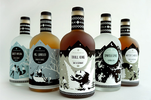
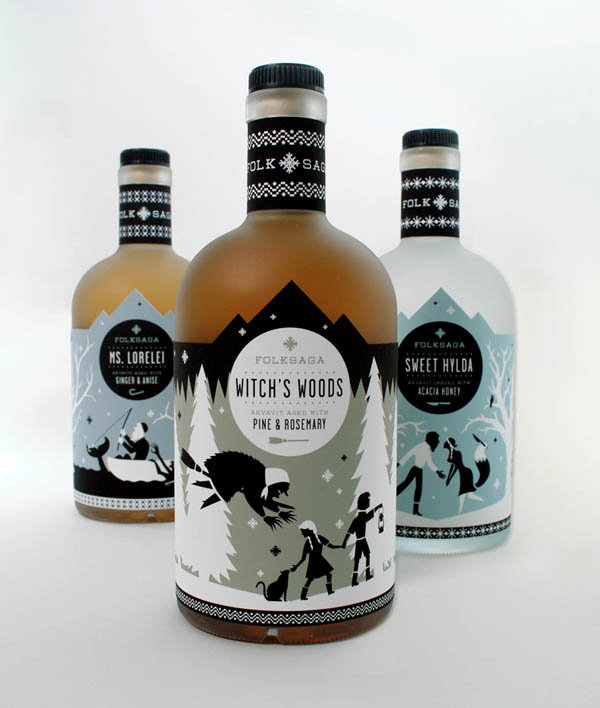
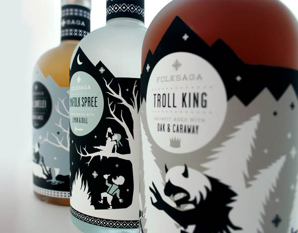
Liquor Package Design Concept.

A packaging concept by Caleb Heisey for Folksaga, a Swedish dis­tillery of akvavit (tra­di­tional scan­di­na­vian liquor). The illustrated bot­tles fea­turing pop­u­lar Swedish folk tales. The illustrations show mytho­log­i­cal char­ac­ters such as mer­maids, trolls, or witches.

Folksaga Liquor Packaging - Student Work by Caleb Heisey

Folksaga Liquor Packaging – Student Work by Caleb Heisey

Folksaga Liquor Packaging - Student Work by Caleb Heisey

Folksaga Liquor Packaging – Student Work by Caleb Heisey

Folksaga Liquor Packaging - Student Work by Caleb Heisey

Folksaga Liquor Packaging – Student Work by Caleb Heisey

The post Folksaga Liquor Packaging – Student Work by Caleb Heisey appeared first on WE AND THE COLOR.

25 Mar 13:27

Hora de massagear seu cérebro #5

by Janara

Como dito pelo pessoal do It´s Nice That: “Tecnicamente isso não é arte nem design, é ciência pura e simples”. Essa seção foi criada para celebrar a buena onda dos .GIF´s, mas esse tal Akiyoshi Kitaoka faz tudo se mexer sem movimento, e merece estar aqui.

Kitaoka é professor de psicologia na Universidade Ritsumaikan, em Kyoto, no Japão. Ele é especialista em percepção visual e suas criações têm o objetivo de revelar peculiaridades dos sistemas mecânicos e cognitivos que contribuem para nossas percepções pessoais do mundo.


.

Tweet Tags: ilusão de ótica, psicologia
22 Mar 13:57

60 Flat Web UI Design Inspiration

by Henry

Flat design existed long before it became a buzz word. It’s just finally been packaged. Flat design is beautiful and refreshing. It’s also generally faster to design and easier to make responsive. If it was a graphic design trend, it’d be well received.

2013 will be the year for flat UI Design. Apart from using Gradients, Shadows, Glossy effects, Flat design is using simple flat pastel or pantone color to UI or Web Design. So in this method, the website will be very clean and minimalistic. Typography has a main role in flat design because as we are not using effects & gradients. Here are 60 great examples of flat ui designs for your inspiration. Enjoy !

by Ben Garratt

Ben Garratt

by Riki Tanone

Riki Tanone

by Daryl Ginn

Daryl Ginn

by Jakub Antalík

Jakub Antalík

by Jackie Tran

Jackie Tran

by Mike Busby

Mike Busby

by Tomas Jerabek

Tomas Jerabek

by Cuberto

Cuberto

by Ines Gamler

Ines Gamler

by Marcel Henkhaus

Marcel Henkhaus

by Alex Vanderzon

Alex Vanderzon

by Rovane Durso

Rovane Durso

by Emre Durmus

Emre Durmus

by Per Lindgren

Per Lindgren

by Adam Debreczeni

Adam Debreczeni

by Balraj Chana

Balraj Chana

by Gil

Gil

by Abhimanyu Rana

Abhimanyu Rana

by Courtney Kim

Courtney Kim

by Jens Windolf

Jens Windolf

by Designmodo

Designmodo (Adrian)

by Jamie Syke

Jamie Syke

by Joris Rigerl

Joris Rigerl

by Josh Holloran

Josh Holloran

by Blaze Pollard

Blaze Pollard

by Nuruzzaman Sheikh

Nuruzzaman Sheikh

by Ivo Mynttinen

Ivo Mynttinen

by George Leonardo

George Leonardo

by Mike Cummings

Mike Cummings

by Dennis Covent

Dennis Covent

by Chloe Park

Chloe Park

by Gary Murray

Gary Murray

by RepixDesign

RepixDesign

by Kirill Zakharov

Kirill Zakharov

by Eric Ressler

Eric Ressler

by Aaron Sananes

Aaron Sananes

by Dylan Opet

Dylan Opet

by Patrick Wong

Patrick Wong

by Cat Smith

Cat Smith

by Pieter van Est

Pieter van Est

by Dart 117

Dart 117

by urbanjahvier

urbanjahvier

by Benoît Boucart

Benoît Boucart

by Cathryn Briggs

Cathryn Briggs

by Kaupo Kõrv

Kaupo Kõrv

by Morgana D'Almeida

Morgana D'Almeida

by Sam Joonas Nissinen

Sam Joonas Nissinen

by Murat Mutlu

Murat Mutlu

by Brian Delaney

Brian Delaney

by Nathan Butler

Nathan Butler

by Roberto Nickson

Roberto Nickson

by Alexandre Naud

Alexandre Naud

by Supersteil

Supersteil

by Robbert Esser

Robbert Esser

by Emil Manolea

Emil Manolea

by Stanislav Kirilov | CocaineHearts

Stanislav Kirilov | CocaineHearts

by Craig Stubblefield

Craig Stubblefield

by Johan Rundberg

Johan Rundberg

by Cole Townsend

Cole Townsend

by Tim Quirino

Tim Quirino

by Jayson Lane

Jayson Lane

22 Mar 13:53

8 jQuery Scrolling Effect Plugins

by Henry

In this post we have collected 8 jQuery Scrolling Effect Plugins that will help you create awesome scroll effect to your site. Enjoy !

stroll.js

A collection of CSS list scroll effects. Works in browsers with support for CSS 3D transforms including a special touch-enabled mode for iOS & Android 4.x.

jqsceft-1

Lateral On-Scroll Sliding with jQuery

You’ve probably seen this cool effect on some websites, like on Nizo or in the portfolio section of brilliantly designed La Moulade. The main idea is to laterally slide in elements depending on the scroll position of the document.

jqsceft-3

scrollorama

The jQuery plugin for supercool scroll animation.

jqsceft-4

jQuery Scroll Path

jQuery Scroll Path is a plugin that lets you define your own custom scroll path. The plugin uses canvas flavored syntax for drawing paths, using the methods moveTo, lineTo and arc. To help with getting the path right, a canvas overlay with the path can be enabled when initializing the plugin.

jqsceft-5

Stellar.js

Stellar.js is a jQuery plugin that provides parallax scrolling effects to any scrolling element.

jqsceft-2

skrollr

Actually, skrollr is much more than “just” parallax scrolling. It’s a full-fledged scrolling animation library. In fact, you can use it and still have no parallax scrolling at all. But I wanted to sound hip and use some buzz-words. By the way, skrollr leverages HTML5 and CSS3.

jqsceft-6

scrolldeck

A jQuery plugin for making scrolling presentation decks.

jqsceft-7

Layers 3D

Layers 3D is a powerful jQuery plugin which you can use for creating ‘Parallax’ or ‘Out of the Image’ effects on your site. With ‘fullsize’ mode you can create even a whole parallax effect website!

jqsceft-8

22 Mar 12:53

3 Musts of Good Packaging Design

by Jeff Giedt

In the retail world today, half the battle is getting the consumer to notice your product on the shelf. With so much competition, it’s more important than ever to have eye-catching packaging that grabs a shopper’s attention. So what are the three musts of good packaging, features that set your products far apart from the competition?

1. Form or Design

The first and most obvious requirement for great packaging is looks. If your packaging is well designed and eye-catching, then it will stand out on the shelf. People shop with their eyes first, so if you can win the battle of appearance, that’s half the war won.

Good looks aren’t just about using the most colorful design. Good-looking packaging matches the appearance of the packaging to the product and to the market you’re attempting to capture.

Consider a product designed for kids. Bright colors, cartoon characters, and a sense of fun are the ideal appearance. Something that’s organic and aimed at the health-conscious consumer, on the other hand, might benefit from brown paper and minimal printing.

Appearance plays a big role in telling people what they are buying, so design your packaging to appeal visually to your target market. Packaging also builds a brand, so be sure it says what you want to be heard about your product and your business.

Good design is also as much about what you take out as what you put in. It should be clear and easy to read. If you try to cram too much into the design, you might defeat the purpose.

2. Function or Usability

Yes, great design ensures that your product gets taken off the shelf, but great functionality ensures that consumers keep buying it.

Functionality in packaging design is simple: Consider how to incorporate usability into design so that the user experiences the product and design accordingly. Design the package to be easy to open. Can it also be resealed? Is it easy to get the product out of the package? Is it easy to pour?

Other key packaging issues include:

  • Keep packaging as simple and minimal as possible. Not only are people happy to open something that’s simple, but they also feel good about buying a product that does not contribute to a landfill.
  • Design packaging to be reused after the product is finished. Think of spreads or jellies that are packaged in juice glasses that can be washed and used again.
  • Consider size and shape. If your product is stored in the fridge, for example, does it fit?

3. Information

We live in the age of information, and people want to know what they’re buying. They want to know where the product is made and what the ingredients are. They may want to know nutritional information on food products, side effects and warnings on medication or cleaning products, and whether the product is organic or sourced from ethical sources.

Consider what distinguishes your product from the competition and add that information in a prominent place on the packaging. Become knowledgeable about legislation about product information too. Different countries have different requirements, so do some research about what is required for your packaging.

Great Examples of Awesome Packaging

Pro Bar

With complimentary colors, clean fonts and a great overall look and feel, Pro Bar has raised the “bar” for other food product packaging. Its design not only makes you want to grab the product, but also makes gathering information easy – just by looking at it, you can find out its ingredients (even whether it’s gluten-free or not) and know what functions the bars will play like replacing meals, giving you energy, or providing you with protein.

pro bar packaging design 3 Musts of Good Packaging Design

Level Ground Trading

Although it’s just coffee, they make it seem like so much more with this stylish, organic and “less is more” type of packaging. Just by looking at the package, consumers can already assume that the company cares about the environment as well as fair trading. With easy to find information and easy to store and reusable packaging, Level Ground Trading has the type of product packaging that is simple yet powerful.

level ground trading packaging design 3 Musts of Good Packaging Design

Apple

They’ve received accolades for just about everything else, so why not design? Seriously, Apple spends a lot of money and time getting the packaging of their products just right. Clean, functional and very white, but it works every time.

ipod mini apple packaging designi 3 Musts of Good Packaging Design

More Examples of Package Designs:

Generous

generous family packaging design 3 Musts of Good Packaging Design

Flaminio

flaminio packaging design 3 Musts of Good Packaging Design

Teekane Concept

teekane package design 3 Musts of Good Packaging Design

Ivolia LED bulbs

ivolia packaging design 3 Musts of Good Packaging Design

Vintage Taiwan Old Oolong Tea

retro oolong tea package design 3 Musts of Good Packaging Design

Packaging Design Is an Art

As shown above, designing good packaging must consider many factors. Since great packaging can make your brand and bad packaging can break it, if you’re not entirely sure what you’re doing, hire a professional. However, whatever you do, remember that packaging design does matter — a lot. Spend time on it, keep it as simple as possible, and make great packaging work for you.

The post 3 Musts of Good Packaging Design appeared first on Ourtuts.

22 Mar 11:35

A Great UI is Invisible

by Patrick Cox

A Great UI is Invisible

A really well designed user interface is one that goes unnoticed by the user, whereas a poorly designed user interface forces the user to pay attention to it instead of the content. Users come to websites in order to achieve a goal: buy a new book, learn about jQuery, share an article with friends, find new music, write a novel or just find the nearest Target. Users don’t come to play with your interface design. In fact, users don’t care about your interface. For years the desktop paradigm and the lack of interactive tools have made people think about user interfaces, how they work and what makes some designs better or worse; but do we really want our users caring about all this stuff?

Users have become too familiar with user interface patterns and user interface components — a user really doesn’t even want to know or even care to know what these things are. Over the years web designers have spent hundreds if not thousands of hours playing with button colors, drop shadows, borders and gradients in order to make the UI more usable and pretty. But really, the end goal of a great user interface design should not be usable, but invisible.

opencoach_carosel_nav

If you haven’t heard, mobile devices are kind of a big deal these days. The multi-touch device has cracked open the idea that user interfaces are a series of clicks and sequences that allow manipulation of content — mobile devices allow more natural user interaction between the human and the content embedded on the device. These Natural User Interfaces (NUI) are more “natural” for a variety of reasons, but, direct manipulation of content and the lack of antiquated metaphors (the desktop) allow these devices to be super easy to use because their interfaces are almost invisible.

But we still work on desktop and laptop computers, we still view web sites and use web applications that can’t always take advantage of this new, more natural interface design with all the wonderful multi-touchy stuff that makes these devices so much fun to use. So, because we aren’t quite there yet, do we continue to create old, “get in the way” interface components? We shouldn’t. The goal of an invisible interface should be the goal of every UI designer and developer.

UIs, not Hurdles

http://dribbble.com/shots/560911-IMG0007

The user interface shouldn’t be a hurdle to content or the user’s end goal. The user shouldn’t have to jump over UI traps and poorly organized navigations in order to achieve their goals. Over the years we’ve used and invented some real UI hurdles that, on the surface, feel as though they are solving a problem when they are just adding more user burden. The breadcrumb is a great example of this. Often we think a bread crumb is a great way to let the user know where they have been in the app, but that is mostly just an added UI component that is not always necessary in a properly designed user experience.

While the breadcrumb doesn’t directly burden the user, it takes up screen real estate that in most cases should be used to further the user goals and display content. Instead of adding a breadcrumb to overcome a navigation problem, address the navigational problem. Some UI problems are all too often “fixed” by adding a new component, but too many of these unnecessary components start to add up and eventually you have a UI that is riddled with hurdles. How can a UI become invisible when you just keep adding more UI components to it?

Fix the Problem

http://dribbble.com/shots/890759-Ui-Kit-Metro

This really ties into what we just talked about, but building an invisible UI means that you’ll need to solve the deeper problems, you’ll need to actually fix what is broken. I have a little bit of a back problem and sure, popping my back and taking Ibuprofen helps treat the pain, but it doesn’t fix the actual problem; I don’t exercise enough, I tend to slouch and I’m about as flexible as a rock. We do the same thing with UI problems. As we design and build web sites and apps we discover weird things in our sites and interfaces. A lot of the time we just react and throw something superficial on them to fix the problem when most of the time the problem lies somewhere deep down in the interface. We just stop the bleeding.

Generally, ‘stopping the bleeding’ has become the best practice for most of us because we’ve learned to pick our battles with project managers, site owners, stakeholders, time constraints or just plain laziness. We tend to right that off as a way to do some user or AB testing “Well, I know it’s got some issues but we’ll see if they are real problems when we user test.” That might not be the best approach if we are trying to design for invisibility. Having a completely transparent interface means solving those deeper design and user issues so that they don’t rear their ugly heads and become hurdles for users to trip over.

Design for Forgiveness

http://dribbble.com/shots/731563-Music-player

An attribute of an invisible interface is that it’s generally very forgiving. Natural user interfaces are more open to exploration by the nature of touch, they are also less prone to throw errors when the user finds a dead end and more prone to give a user another direction.

Forgiving the user means that we don’t punish them when they make mistakes. User mistakes are more often the result of the user not knowing what to expect. We tend to blame the user for making mistakes and we punish them with big warnings and errors. A more invisible UI refrains from punishing the user when they fall into a trap. Rather than displaying an error, a well designed UI predicts where there is a higher chance of user error in the app and provides a way for the mistake to be resolved or even deflected.

Forgiveness also means that the site or app allows the user to break it. It’s a cheesy thing, but the most valuable lesson is the one learned after you broke your Mothers antique vase, glued it back together and then got caught because you glued your fingers together doing so. The user learns more about the app when they are allowed to fix their mistakes if they make them — hopefully without a big red error icon and some poorly written, non-readable text.

Goals First

http://dribbble.com/shots/825856-Bobo-Profile-Page

This is pretty much just interaction design 101, it’s a Cooper building block, but since it still doesn’t seem to happen much I think it warrants a little mention — goal-oriented design. Your user interface should be designed around the goals of the users. Not what the user wants or what the user prefers, hell, it’s not even about what you want or what you would prefer, it’s about discovering the user needs to accomplish and meet the expectations by getting them there. It’s funny, users have a great idea on what they want to use, but they really don’t have any idea of what they need. It’s your job to figure out the need not the want. The ‘want’ just creates bloated, hurdle ridden interfaces that just annoy the user.

Find out the goals and allow your user to get there as quickly as possible, they don’t really care about anything else so if you can get them to their destination as quickly as possible that is reward enough. You don’t need to design some pretty interface if the user can quickly achieve their goal. Avoid over designing the UI to compensate for poor goal oriented design.

Real Consistency

http://dribbble.com/shots/510911-Inside-Photo-album-iPad-UI-UX-iOS

Okay, so in the UX world, we talk about consistency a lot and rightfully so. Consistency is a big deal when it comes to interface designs. If your UI components are all in the same place, have the same color and function the say way then your interface will disappear slowly over time… kind of like Marty McFly. But just simply putting all your call-to-action buttons in the same place on every page or calling a particular action the same thing through the app might not solve the consistency problem.

Another thing we tend to do in UX design is use constant and familiar things from other apps or sites in our own apps. I’ve written about this in the past about how familiar surroundings can make an interface more comfortable. But when we are trying to accomplish an invisible interface design than instead of being consistent for consistency’s sake might still not be good enough. An invisible interface has “real consistency“, meaning that not only are components, values, links, and other data presented consistently throughout the app, they are also consistent in context and meaning.

For example, you may notice that a lot of other apps put the login button or link in the top right corner of the app and so you just figure since other more popular apps use it, it can’t be bad. But maybe in your app it doesn’t make sense to have it there. Instead of continuing to build a flawed interface, put your components where they belong in your app and then continue the consistency of that throughout the app.

Conclusion: Inspire the User

The last thing any really well designed and completely invisible interface should do is inspire the user. When the user interface gets out of the user’s way and simply directs them to what they need, the user can focus on the their goals for using the application.

Interfaces should provide seamless interactions with the data and content and inspire the user to build a better relationship with it. Users do enjoy navigating a clever UI and in some cases have fun using them, but most often a user is inspired by an interface that isn’t there at all.

22 Mar 11:28

25 diverse patterns in site design

by Aquil Akhter

ThumbnailPatterns can make a website design more interesting and appealing. Often mildly skeuomorphic in nature, they bring an element of real-world texture to a site. The variation in tone that they create mimics the multi-tonal nature of real surfaces.

What’s more, patterns that tessellate are particularly suited to responsive design, as they can be repeated infinitely across any number of screen sizes.

In this collection, we’ll share with you some beautiful websites with patterns that you can take inspiration from.

Pop The Box

This website features a bold and confident pattern. Modern and unique, it wouldn’t work everywhere, but works well here.


Cake Sweet Cake

Cake Sweet Cake uses a delicate and visually pleasing pattern that match its niche perfectly. The way the designer uses patterns makes this website even tastier.


Cultural Solutions

Big bold circles, laid over a textured background, have been used as a pattern on this website. The innovative use of patterns gives this website a tactile look.


Moo’s

This cupcake website features a beautiful small circle pattern that looks very pleasing. The pattern is perfect for the design and looks great.


The Crazy Love Campaign

Two different sets of patterns are used here: one for the header to set it apart from rest of the website, and a second pattern for the rest of the page. Both look excellent.


Raise the Roof Productions

Different patterns merge so beautifully here, creating a perfect scene. The intelligent use of patterns makes this design very appealing to look at.


Gelateria Savoia

A fine and delicate pattern grabs attention and gives this website a pleasing look. The designer does not overdo it.


Typo Popote

The delicate geometric pattern here grabs attention and gives the website a charm.


Havana Mojito

Red bricks make a strong and solid impression. The overall look is dramatic.


Visual Republic

A minimal and clean design is paired with a geometric pattern. It shows you do not need to overdo a pattern.


Mind Epic

Different patterns set off different parts of the website. A rather complex use of patterns but very effective when done well.


WakWAW

This star pattern looks quite appealing. You can see how one can apply a pattern to make a design look stunning.


Bzzy App

The vibrant yellow bars are eye candy. The designer has done an excellent job.


Taro Horiuchi

Different patterns here are associated with hover effects. Rollover different links to see different patterns.


Johan Reinhold – Heart in a Jar

This pleasing colored pattern has a soothing look. The design could be used as a reference point for applying patterns.


Tme Solutions

Taking a unique approach, the designer has kept it simple yet eye-catching.


Kite Experience

This website sets itself apart with an innovative use of patterns. Kite Experience gives the website a pleasant fresh look.


Madabout Make Up

The soothing pattern might not get noticed at first glance, but it sure makes an impression, subconsciously engaging the user.


Made by Craft

Here, one can see the creative use of patterns and its impact on the overall design. For a delicate look, use subtle patterns; for a bold look, use dark and more visible patterns.


Coca-Cola

The dotted and lined pattern looks great. The designer has kept it simple and appealing, while making the whole design look stunning.


GS 3 Internet

This vibrant and lively pattern brings this design to life. While usually going unnoticed, a pattern can be appealing if used properly.


Tenthmil

Exceptional and attractive, this pattern mimics the contours found on maps.


IconSweets 2

This pink geometric pattern is used intelligently and not overdone.


Ungarbage

This design is lively and energetic, as is the pattern. The simple and brilliant geometric pattern makes this website a treat for the eye.


Shannon Moeller

This simple yet attractive pattern makes this website an attention-grabber.


Which of these patterns is your favourite? Have we missed any that you’d like to add? Let us know in the comments. 


Type & Grids: Responsive HTML5 Template – only $27!


Source