Shared posts
几个有用的Vim招术
2. 在vimrc中加入以下两行,可以用Ctrl+N/P来滚动Buffer:
nnoremap :bnext
nnoremap :bprev
3. 在vimrc中加入这一行,可以在命令行上用tab列出现有的buffer菜单:
set wildchar= wildmenu wildmode=full
4. 把vim的行间距拉大些,看起来舒服,gui环境下:
set linespace=4
5. 设置vim的窗口启动时就大一些,或者设到999可以变成最大化:
set lines=42 columns=120
6. 可以用Vim作为纯净无干扰的写作窗口,用插件goyo:
Plug 'junegunn/goyo.vim'
用Plug.vim来管理了,安装后直接在命令行启用:
:Goyo
:Goyo! 即可退出此状态
https://github.com/junegunn/goyo.vim
7. Sarasa Term字体兼顾中文英文,很不错:
https://github.com/be5invis/Sarasa-Gothic
8. 几个Buffer命令。Buffer还是比Tab更适合Vim的逻辑。
:ls 列出所有buffer
:bnext bprev or b[n]切换buffer
:b 加名字不全也可切换到相应文件,也可tab补全
Ctrl+I 和 Ctrl+O也可以切换
:bd bd!来关闭当前buffer
:buffer! 2可以不管现有buffer的改变,直接切到buffer 2,因为加了!号,Set hidden后就无所谓了,也可以Set
confirm,或者set autowrite,autowirteall
9. 有Buffer最好配合合作窗口切分:
:split :vsp直接切分当前窗口,内容是当前Buffer,这样可以看同一文件的不同部分
:sp :vsp 后面可以加文件名,这样新切出的窗口就是新文件
:vertical sb 2 可以竖直切分窗口,然后buffer 2文件显示
:rightbelow sfind file.txt 竖直切分,然后读取file到右窗口
用Ctrl-W之后配合hjkl可以在窗口间移动
Ctrl-W close 或 c 关闭窗口, o 关闭其他窗口
10. Vim 8之后应该可以直接在窗口内运行Shell:
:terminal/term 即可
:!cmd
:r !cmd 可以读取命令结果到当前位置
11. 状态栏,显示当前路径和时间
" Always show the status line
set laststatus=2
set statusline=\ %{HasPaste()}%F%m%r%h\ %w\ \ CWD:\ %r%{getcwd()}%h\ \ \ TIME:\ %{strftime('%c')}\ \ Line:\ %l\ \ Column:\ %c
Explore the Flavors in Your Coffee with This Tasting Wheel
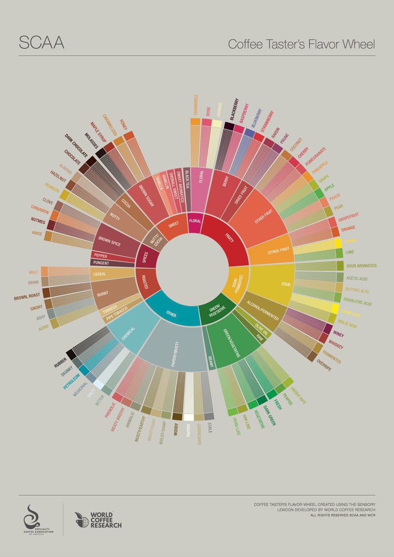
Sweet. Floral. Nutty. Baristas and coffee enthusiasts often use these words—and many more—to describe the flavor nuances of different coffees. The flavor wheel below from the Specialty Coffee Association of America groups different flavor descriptions into tiers on a wheel.
The wheel is based on three years of scientific research and collaboration among those in the specialty coffee community. Although the graphic doesn’t describe each flavor, but rather identifies them in a hierarchy, you can use it to narrow down the flavor notes you taste in a cup of coffee (or, perhaps, other beverages and dishes). For example, does it taste more roasted or sour? If roasted, is it a cereal-like flavor or more burnt? If it’s a burnt roasted flavor, is it smoky or ashy? Might be fun to use the wheel while taste-testing coffee as it’s described by the roaster.
The wheel will be available for purchase as a poster in February, but you can print out the version below.
Reinventing the (Flavor) Wheel: Industry Collaborates to Identify Coffee Flavor Attributes | The Specialty Coffee Chronicle via Mark@CoffeeGeek
This Graphic Helps You Pick Your First Programming Language
When you’re first getting started learning to code, one of the hardest choices can be picking which programming language to start with. This graphic can help you choose by comparing options based on application, potential salary, geography, and more.
Not all programming languages are created equal. While it’s a good idea to first find a problem to solve and work from there, if you’re considering a career and need some more long-term ideas before you commit, this graphic from online education service Udacity can help. It breaks down which language is good for different types of applications (like web development, mobile app development, etc.), average salaries, number of job openings in the five states with the most opportunities for programmers, and popularity of each language. You may not get an obvious, direct answer for your specific needs, but it can give you plenty of data to point you in the right direction.
4 Ways to Pick Your First Programming Language | Udacity

日杂铺G-01
1、不要相信什么互联网思维,O2O,众包众筹,UGG,移动端改变世界之类的听着很来劲很时尚的话,人类没有突变,基本的文明要素也不会突变。信息时代并不天生牛逼。
不管脸书、推特、YouTube、微博、微信一天要上传多少兆字节的数据,创造人类文明核心内容的最多只有1%的人,其他的人只是看客和享受者,或者不相关者。
发给所有人一部钢琴不会一下产生70亿音乐家,发给每个人一台电脑,最好的软件不会天生出现满地的作家和设计师,每个人都可以随时随地随意拍照片不代表一定会出现更多的摄影佳作。优越的工具和值得称道的成果中间,始终隔着卓越的天分、刻苦的训练以及投入的诚意。所谓大众创造时代已经来临,不过是个巨大的错觉。
阅读的质量不因为从媒介从龟壳、竹简、纸张、电脑到手机、KINDLE自然提升,个人的选择仍是第一位的。
生活的质量同样是这个道理,旅程更快速便捷,每年出若干次国不必然导致眼界的丰富,心灵的冶炼和见闻的广博。下载10个星空软件不见得就理解天文学的皮毛,下载100个菜谱APP不见得就能做美食,一切可以百度不会增长你的学识,反而会因为过于方便懒惰了学习与真正懂得的过程。
即时能得到全世界的资讯只是个幻象,你能理解,并能为之有一点触动和行动的,永远只是身边的极少部分。
发生的事情能第一时间被传播是件好事,但因此而造成深入报道和深邃观点的匮乏不是好事,真正的记者,真正的编辑,真正的媒体会在挑战中涅槃。
文明柔韧不断,工业革命,能源革命,信息革命不过是其中一个个节点,可能会给生活方式带来种种改变,但人作为人存在的基础不会轻易动摇,这是我们今天仍然能与柏拉图、苏格拉底、西塞罗精神对话,能从耶稣、穆罕默德、释迦牟尼那里得到教诲和慰藉,能从莎士比亚、雨果、莫扎特、巴赫、提香、米开朗琪罗、梵高的作品里体会美的同感心的最重要原因。
别自我洗脑,认为拿着个高端手机电脑,会说点术语,懂得点小操作技巧,上若干个最时髦的社交网站,熟练使用淘宝,翻个墙,谈论点高大上的纳斯达克上市科技企业就是达人,就走在了文明前沿。
没那么容易。
2、由之而带来的现象是,内容创造者普遍面临着危机,在知识产权保护相对完备,个人多元化发展基础较为深厚的西方,这个危机正在被努力应对,而在本来就处在文革后文明荒原的中国,匆忙的市场化并没有给内容作者提供更稳定体面的地位,未成熟的市场依赖于免费和山寨,不可避免地带来大量掺了水,甚至掺了毒药的伪内容。
我们的音乐产业已经沦落到什么样子,看看崩溃的唱片业,流行的神曲,看看广场舞,竭泽而渔的选秀节目。
我们的当代艺术泡沫到了什么程度,看看真正被认可的艺术家的数量,以及打击贪腐后拍卖行萎缩的价格。
我们的文学、电影,一方面被意识形态部门管制阉割,一方面被西方的成熟作品冲击,从事者要么肤浅得令人发指,要么地下得根本看不见,要么主流得令人恶心。
十几亿人,连几份像样的杂志报纸都没有,每次路过报刊亭,都觉得十分沮丧,南方系的全面沦落固然因为强权的无耻,现在确实没什么拿得出手的内容也是关键因素,只能捎几本《科学世界》、《环球科学》之类的回家。
3、这又带来一个另外的问题,随着十八十九世纪博物学退出舞台,自然科学和人文科学的壁垒越来越深,几乎到了很难沟通的地步。
自然科学的细分和日益专业使科学家不太可能跨界是一个原因,人文学者的科学素养日益低下是另一个原因。
理科生和文科生彼此占有的知识交叉领域越来越少,专精领域越隔越远,这是双方的悲剧。人文需要理性的光芒与逻辑,科学需要人类的趣味与情怀。
碎片化的时代,我们仍然需要完整的人。
4、如果自我定义为独立知识人,那就要做到起码的两点。
永远反对政府,反对权力,不要得到他们的褒奖,很容易被他们劫持。
永远反对大众,反对民粹,不要得到他们的拥戴,很容易被他们挟持。
当然,这两点只是基础,更高的要求是反对所谓的同路人,不能因价值观,友谊,怜悯等因素停止批判的愿望和火力。
批判是唯一的真实。
5、问题是如果这样,很容易变得冷硬,不会说人话,过于刻薄,像一只活着的鲁迅。
在反对的基底,是对人类的悲悯心,同理心,同情心。在家人朋友面前做到温和亲善,就像鲁迅当年曾经对妻儿、对日本友人,对左联的青年做到的那样。
缺乏一点基本的对人世的爱意,反对只会变成极端而无方向的愤怒,走向虚无的不归路。
6、要把敌人当做朋友,是他们不断促醒你改变进步,提升自己的等级。
要把朋友当做敌人,是他们耗损你的时间,消磨你的斗志,减少你的独立性。
7、至于爱,不要局限于男女之间那点事儿,体现荷尔蒙之外的什么真情。个体迷惑,虚弱,还要一头扎进另一个个体的生命使劲搅和,这样的成功爱情我一个都没见过。
克服那点嫉妒心,虚荣心,占有欲,克服那点虚伪的同情,懦弱的得过且过,梦想的不劳而获。
别拿唯美的,说了跟没说一样的爱情箴言和鸡汤文字骗自己,该上床上床,该结婚结婚,该离婚离婚,该通奸通奸,该出柜出柜。一个在卧室都不真诚的民族,怎么指望他们有美好的公德,在私领域都伪善的民族,怎么指望他们在公域追求的自由不是赝品。
一辈子能把自己做完整了就不容易了,更别说在别人面前伪装一辈子另一个自己。另一个自己都不喜欢的自己。
8、和别人的相处之道,包括爱人,我的个人意见是不要拿自己不具备的德行要求别人,或者说不要从别人身上苛求自己没有的品质。吝啬者别期望对方慷慨,不耐烦的人别寄望对方细心,索取过度的人别认为别人理应付出。
这世界,愿打的人太多,愿挨的人太少。
确认自己是个S之后,也得确认对方是M才行。
9、年底了,告诫自己,没人应该欠你什么,该付出的要付出,该还的帐要还。
然后就可以轻松,回家做饭,看老父亲,和兄弟伙聚会了。
抑郁和一切疾病都没关系,接受它,和它学会共存,力争在重压下继续工作,生活,写字,唱歌,做墙前面有力量的鸡蛋,铁丝网上盛开的花。
Ten Clever Uses for Plain Text Files That Can Increase Your Productivity

When it comes to keeping track of all your text and to-do lists, there's no shortage of apps to choose from, but sometimes the ease and simplicity of working with plain text files can actually be more productive. Here are ten clever plain text files that you might want to keep on hand.
This post originally appeared on the Zapier blog.
If you've read an earlier post on the Zapier blog about staying productive without using to-do apps, you will have already seen a glimpse of the productive potential of plain text files. Keeping things simple can be quicker than loading a bloated app, in some cases. I came across some other clever uses of plain text files recently, so I wanted to pull them all together so you can pick and choose which ones will be most useful to you. Here are ten plain text files that you might want to keep on your desktop.
A "Write Every Day" File
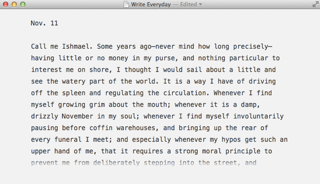
I came across a comment somewhere in my wanderings around the internet that suggested this clever use of plain text files. The commenter had a single text file saved to their desktop in which they wrote something every day. The idea was to cultivate a daily writing habit, which many people do—often using separate text files per day, a journalling app, or a purpose-made app like 750 Words.
Using a single text file instead means all of your writing is together in one place, and it's not stored online—it's private and local. Plus, it's easy to get started with: just open up the file each morning, type out the date and get writing. Later you can go back over your file to see what you wrote and how much you wrote per day. What really makes this a good use is the ease of entry—there's no reason not to write when the text file is just a click away.
Manage Your To-Do List in Plain Text

Todo.txt's syntax rules include setting priorities (A, B, C), contexts (@phone, @car, @store), and projects (+Work, +GarageSale).
Plain text to-do lists are one of the most useful and simplest ways of managing what you need to get done. Of course, you could create a plain text to do list any way you like, but if you want some extra bells and whistles, try Todo.txt by Gina Trapani, founder of Lifehacker and co-founder of ThinkUp. You can use Todo.txt's syntax in the Android and iOS apps, from the command line, or in any text editor. For some text editors, you can get plugins to add things like syntax highlighting.
Keep Track of What You've Accomplished with A "Done" List
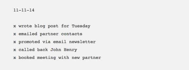
There's something to be said for seeing how much you've gotten done at the end of the day. You know how satisfying it is to cross out items on your to do list, and then look back at the list to see everything you completed? A "done" list, or "anti-to-do list" as Marc Andreessen calls it, works in a similar fashion: you simply take note of each thing you get done during the day.
Start out with the date and just list your "done" items underneath. Not only will this help you review your productivity at the end of each day and make you feel better about what you got done, but it can be really useful to keep around as a work log. You might want to look back in weeks or months to come to see what you were working on or how long a project took to complete.
Create an Action Plan for the Week
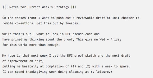
Computer scientist Cal Newport uses a text file to plan his week (example above) so he can get more done. Even if you use a complicated task management app, you might still benefit from doing a simple weekly plan like this. I do both, as I need a robust system to keep track of everything, but a simple to do list for the week keeps me from getting overwhelmed.
Cal doesn't have any rules for his plan:
Once a week, usually on Mondays, I open a small text file named plan.txt and jot down my action plan for the week.
There are no hard rules for this plan. Some weeks it's a few sentences. Usually, it's a few paragraphs. Sometimes it spans multiple pages.
The great thing about using a text file for your weekly plan is that you have the flexibility to experiment. You don't need to fit in with any particular feature set—just try out different ways of planning your week and stick with what works.
Keep a Plain Text Journal
There are some great apps for journalling, but if you don't want to pay for yet another app just to hold your journal, a text file can work just as well. You won't get the extra features of an app made for journalling, such as automatic weather data, tags, or adding images, but if your aim is to build the simple habit of penning some thoughts every day, plain text will more than suit your needs.
A related idea is writing letters for your children to read when they grow up. I came across this idea on Hacker News, where a parent mentioned writing emails to their son every day. If you'd rather store all that data yourself and not have it filling up an email account, you could use a text file to keep a running list of short letters to your children about their progress.
Collect Your Ideas in a Brainstorming File

I recently wrote about how to come up with better ideas. If you're thinking up new ideas all the time, you're going to want somewhere to put them. A simple text file can be a flexible way of storing your ideas—you can add a date if you want to, and you can come back to the list and add notes later to expand on it.
Track Your Own Data in a Self-Tracking File
With all the technology available now to help us track pretty much every aspect of our lives, you might wonder why anyone would opt for a text file instead. The answer is the same as it would be for any of the other ideas listed here—text files are flexible, simple, and future-proof. If you note down your exercise, measurements, habit progress, or other metrics in a text file, you won't need to worry about whether your favorite service will keep your data safe, or how they want to structure it.
Of course, you also give up the option of connecting your data to other services via integrations and APIs, but if that's not important for you, plain text will work.
Organize Your Feature Requests
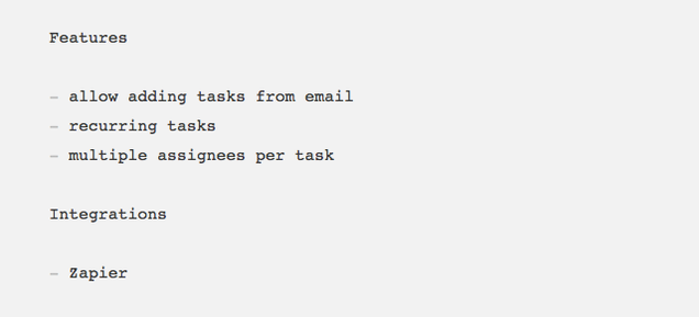
This use is a little more niche, but if you work in product development, keeping your feature requests organized can be it's own task. When you're in the early stages of building a new product, a really simple way to keep track of feature requests is to just make a list in a plain text file. Save it to your desktop, and each time a user mentions a feature they want, add it to the list.
To keep track of which features are more popular, add a number beside each feature and increment it as you get more requests. It's so simple, quick, and easy, and in the early stages of building something new, that's often all you need.
Collect Tasks as Folders on Desktop

If you want to keep your to-do list simple by using plain text, but you want a little more organization than keeping dozens of files spread across your desktop, you can use different folders to separate your tasks. Maybe you have different work projects that need different task lists, or you want to separate your tasks into contexts like work and home.
Another option is to use one folder per task. If you have a short list but you want to be able to see each and every task with just a glance at your desktop, create a new folder each time you add a task to your list. Developer Zac Holman of GitHub uses a simple script to do this from his command line, but you could just as easily do it manually. In fact, creating a folder manually for each task might even help you prioritize your task list, by making you rethink whether it deserves a spot on your desktop in the first place.
Decide on One Thing To Do Today
If you really need help getting more done, you might need to go for this extreme productivity method: create a very simple text file to save on your desktop that includes just one task to get done today.
The idea comes from John Henry Müller, who created this daily text file:

Müller keeps this file on his desktop so he's always being reminded of what he should be working on.
There are some great tools available to make working with text easy, whether you want a fully-featured text editor or something designed for a specific kind of writing. Of course, you can use any old text editor for the tips we discussed and keep it simple—that's the beauty of plain text.
10 Plain Text Files You Should Have on Your Desktop for Higher Productivity | Zapier
Belle is a co-founder of Exist, a personal analytics platform to help you track and understand your life. She is a writer at Crew and was previously Buffer's first Content Crafter and Head of Content at Attendly.
Image adapted from Max Griboedov (Shutterstock).
Want to see your work on Lifehacker? Email Andy.
Evernote for Windows Gets Image Annotation and Faster Sync
Evernote for Windows gets two significant enhancements today. First, you can now annotate images inside of your notes. Second, you’ll notice that sync is way faster. Let’s take a look at both.
Get Evernote for Windows Desktop »
Image Annotation
If you’re like many Evernote users, then you have lots of images in your account including web pages you clipped and photos snapped using Evernote on your phone. Now, you can make these images more useful.

Mouse over an image, and you’ll see an Annotation button appear in the top right corner. Click it to open the Annotation Tool. From there, point something out using arrows and stamps, add text and shapes, or crop and resize. Close the window and your note updates with the annotated image.
We love this feature for identifying key parts of a data visualization or calling out important information on maps and seating charts. Give it a shot.

Fast Sync
Evernote Business users and those with sizable Evernote accounts will notice a major improvement in sync performance. In fact, in some cases, sync is so fast that you won’t notice it at all.
And more
In addition to these improvements, we’ve improved stability, made Evernote better for new users and much more. Let us know what you think.
Calculations Using Dates Stored in Planning
Planning allows users to enter date values in Planning. For example, a start date can be entered as 11/01/2013 if the format is MM/DD/YYYY. Although the values are entered in date format, it is possible to calculate values based on dates entered.
Essbase stores values having a date format as numeric values. In the example above the “Start Date” 11/01/2013 is stored in Essbase as the value 20131101. If the “End Date” is 06/30/2014, you can calculate the number of months between the dates using Essbase functions. The following shows how to calculate the number of months between the “Start Date” and “End Date” using the @ROUND function:
1. Start with (@ROUND (“End Date”,-4) - @ROUND (“Start Date”,-4))/10000*12 – This step will calculate the number of months between the “End Date” year and the “Start Date” year. The result of this step will be (20140000 – 20130000)/10000 *12 or 12.
2. Add (@ROUND (“End Date”,-2) - @ROUND (“End Date”,-4))/100 – This step will calculate the number months between the start of the “End Date” year and the “End Date”. The result of the step will be (20140600 – 20140000)/100 or 6.
3. Subtract (@ROUND (“Start Date”,-2) - @ROUND (“Start Date”,-4))/100 – This step will calculate the number months between the start of the “Start Date” year and the “Start Date”. The result of this step will be (20131100 – 20130000)/100 or 11.
Combining the three steps into a single formula results in 12 + 6 – 11 or 7 months. A similar formula can also be written using the @INT or @TRUNCATE Essbase functions.
Inside the New Skitch Brand
yyq123还是喜欢那个心型的logo,也还是喜欢老版的界面。
We recently unveiled Skitch’s new brand as part of our iOS 7 update, and we’re really pleased that it’s received such a warm welcome from our global community of users. For years, we’ve been working to make Skitch the ultimate communication tool; the fastest, easiest way to get your point across. Our brand now clearly reflects this vision and purpose.
Crafting the New Brand
The app and its brand have evolved a lot over the years, both in the time before Skitch joined the Evernote family of apps and after. Reworking a brand steeped in all this history was not a task we took on lightly, and several months and multiple creative minds contributed to this endeavor.
We sat down with the folks who spearheaded the rebrand effort — lead designer Keith Lang, senior interaction designer Cris Pearson, and designer Chris Ploeg — to give you a peek inside Skitch’s new brand:
What was the process of creating the brand like?
Keith: We had tried a number of times to re-think the Skitch brand. The heart was something dear to all of us, especially Cris and I. Cris had drawn the original heart idea, and we’d both worked to refine its look and feel. So there was a lot of pressure in our heads to do something that was going to be good enough to replace it.
In a word, the process was daunting. Many people had expressed their love for the logo and we needed to create something that was more honest to the application, more modern and also a great logo.
How did you decide on fletching (the feathers on an arrow) to represent Skitch?
Cris: The feathers of an arrow — the fletching — are what guide an arrow to its point. And that’s fundamentally what Skitch was built to do: to help you get your point across, fast.

Keith: We had a couple of other logo ideas which had been getting a lot of polish and we were getting near the deadline for the rebrand project. The idea of fletching was a late-entry into the race, and wasn’t the clear winner. But in the end, the decision was made to go with the fletching and, after living with the logo for a while, it feels like the right decision.
Chris: I see the Skitch arrow as being emblematic of what our product does at its core. Finding a way to carry that metaphor into the brand, in a broader way, was definitely on my mind as I worked through various explorations.
What are some of the design techniques you used to create the new brand?
Keith: We used a number of techniques, the most important of which were:
- Keeping the negative space of the shaft the same height as the slab serif
- Rule of thirds on where the feathers split
- A symmetry of the general form
- Treatment of colors to reference to the red-pink of the original heart
- Keeping inner ‘shaft’ negative space edge and outside top and bottom edge exact
- Re-use of the curves to keep the logo strong and somewhat geometric
- Subtle use of transparency and gradient to imply soft featheriness
Chris: We spent time talking about negative space in different ways throughout the rebrand explorations. In going with the “bow and arrow” direction, we didn’t want to imply something aggressive. Focusing on the fletching entirely and allowing the empty space between to still read as a shaft seemed to be a simple and elegant solution.
Cris: I also showed many versions of the logo to people around the office to get initial impressions. Sometimes this was natural selection by asking, “Do you like logo A or B?” Based on people’s reactions, ideas we tried from A or B lived on or died. When filtered through our design process, this information helped guide what tweaks to make.
How did the brand evolve throughout the process?
Keith: I think we explored a lot of design spaces — from highly geometric to very organic. We also explored a lot of color options. We tried 3d, 2d, animals and objects.
What does the new brand mean for the future of Skitch?
Keith: It means we want to make the future of Skitch as bright as it can be. That everything is to be questioned — what’s working, what’s not. Sometimes that may mean going back to the past to re-capture what worked well and sometimes that will mean creating something new.
Chris: To me, Skitch is all about workflow. What that workflow is could be completely different depending on what device or platform you’re on — we are making an experience that feels indigenous to wherever you’re using it. We have lots of work to do to get there, but I couldn’t be more excited about that challenge.
A special thanks to everyone who helped with dreaming up, doodling, and designing the new brand: Gabe Campodonico, Carlos Rocafort, and the rest of our incredible design team in Austin and Redwood City.
The post Inside the New Skitch Brand appeared first on Evernote Blog.
Standalone Log Analysis Utility
I just had a comment from Development on one of our older posts.
Good news:
The Log file Analysis Tool that was introduced in EPM 11.1.2.3.000 (  read post here ) has now been made stand-alone.
Why would that be important?
Because: "You can use this standalone log analysis utility to analyze logs from any 11.1.1.x or 11.1.2.x deployments. It will run on EPM servers or non-EPM servers."
That's why!
It is available as a patch via MOS under the number  17425397
As of the readme, the prerequisites are fairly lightweight and not surprising:
|
Prerequisites |
The download is just over 2 MB and it includes the readme file. This will not only tells you how to install and use the utility, it also contains the list of available commands.
Sidenote:
The comment on the blog requesting a backport was posted early in September 2013 (our first mention in May).
The answer from Development came in on September 25th 2013. Less than a month to get this done!
Thanks to Fuad and Maurice for making this happen so quickly.
How Not to Structure Your Essbase Fix Statements
Fix statements... The most essential concept to understand when writing calc scripts in Essbase. I am going to be talking a little bit about best practices around fix statements and what not to do with them. I will be referencing the Sample.Basic database that we all love so much just to keep the code simple.
Below is a high level screenshot of the Sample.Basic outline that we will reference for this discussion:
fix(jan,feb,mar);
     fix(actual);
          fix("100-10");
               fix("new york");
                    fix(sales,cogs);
                         clearblock all;
                    endfix;
               endfix;
          endfix;
     endfix;
endfix;
#1: "The Zipper" or "Pyramid"
I am sure the first thing you notice about this example is that Jimmy has nested all of his FIX statements separately, calling out a member from each dimension in order to clear a select set of blocks.This method may look nice to some, but to an experienced Essbase developer, this is not nice. In fact, this is actually a less efficient way of clearing these blocks. By opening a new fix statement for every dimension he is actually slowing down the calculation unnecessarily. You can simply put all of the members in one statement to make this much more efficient.
#2: "Manic Semicolons"
Jimmy has added more sloppiness to his calc script. The Manic Semicolon happens more often than you would think. Some developers, like Jimmy, do not realize that a FIX statement does not need a semicolon. This really doesn't hurt performance, but it sure does make Jimmy look like he does not understand what he is doing.#3: "Unrestrained Members"
The last thing you ever want to do is leave any member unrestrained like Jimmy has done here. Members should always be contained within quotes. This may just sound like a pet peeve, but it can save headaches down the road. You will notice that "New York" and "100-10" are contained in quotes. This is not by accident. These members would cause the calc script to fail validation if they did not have these protective quotes around them. The reason for this is because New York has a space in the member name and the system will try to resolve it as two separate members, "New" and "York". The product 100-10 also would fail validation because the system assumes this is the number 100 minus 10 or 90. No good...#4: "Underutilized Functions"
Jimmy is what I would qualify as a caveman coder, similar to the "guy" that unplugs a lamp to turn it off when he could have just flipped the switch on the wall. You will notice in his first FIX Statement, he is trying to include the months in the first quarter of the year in his script. Lucky for him, there is an easy to use function called "@CHILDREN" that he can use instead of hard coding the first 3 months. I realize that this is not an extreme case, but it is a good idea to get in the habit of thinking about your calc scripts in this dynamic way. The syntax that should be used in this case is @CHILDREN("Qtr1") which will automatically grab Jan, Feb, and Mar.#5: No Respect for Next Person
Clearly Jimmy has no respect for the next developer that will be modifying this script in the future. You can tell this from 2 key facts, proper capitalization not used and the lack of comments.Proper capitalization may not seem very important, but it really improves the overall readability of the script syntax. It really lets the developer after you know that you took your time with the script. Some guidelines for properly capitalizing items within year script are as follows. Member names should always match the case of how they are stored in your outline. Functions, like FIX and @CHILDREN should be in a caps to make them easier to read.
Comments, need I say more? Commenting code is something that every programmer should have ingrained in their coding techniques. This not only helps the developer after you figure out what the script is doing, but helps you debug as you are developing. Another thing to add to the script is a header comment that describes which script you are looking at, what is is suppose to do, when it was written, who wrote it, and what the high level process is of the calc script. This will save many headaches down the road.
#6: Overruled Outline Order
Looks like Jimmy has done it again... His nested FIX statements are not in outline order. This order does not affect the script from a technical standpoint, but it sure does make it easier to figure out which members are from each dimension (see #5 above). What Jimmy should have done is put all of his members in one FIX statement and group them by dimension. You will notice in the best practice example below, this has been organized properly.How Should It Really Look?
After coaching Jimmy through my best practices, he re-wrote his script and gave it back to me. Much better! What do you think?/************************************************
Script Name: CLR_EX.csc
Script Purpose: This script will clear Actual Sales and COGS for New York for the "100-10" product
Date Created: 2012-06-21
Created By: Jimmy Smith (ACME Consulting)
Process:
1. Clear data
************************************************/
FIX(
@CHILDREN("Qtr1"), /* Year */
"Sales", "COGS", /* Measure */
"100-10", /* Product */
"New York", /* Market */
"Actual" /* Scenario */
)
CLEARBLOCK ALL;
ENDFIX /* Year, Measure, Product, Market, Scenario */
Please note that the best practices discussed here are the ones that I have collected over the years that that I personally believe are the best ones. There is no law of the land in this space, but these are the best practices that I drive on all of my projects.
Lady Gaga Covers V Magazine Fall 2013
第85期V杂志,2013秋季号,主题“偶像与天真少女”(Icons & Ingenues),送出4款 Lady Gaga 封面,还有无数内页裸照,照片由摄影大师组合 Inez van Lamsweerde & Vinoodh Matadin 拍摄,还邀来行为艺术家 Marina Abramovic 与其对谈。此次大动作,Gaga是为了自己即将推出的新专辑 ARTPOP 造势。ARTPOP于8月19日开始接受预订,11月11日正式发行。

Magazine: V Magazine Fall 2013
Photography: Inez van Lamsweerde & Vinoodh Matadin
Styling: Brandon Maxwell
Hair: Shay Ashual
Makeup: Yadim
Manicuring: Jin Soon Choi
Choreography: Stephen Galloway
Guest Model: Lady Gaga


The post Lady Gaga Covers V Magazine Fall 2013 appeared first on 空白杂志 NONZEN.com.
Announcing the Devcup 2013 Category Winners
There are a million things you can do with Evernote, but Evernote is just one app. It can’t do it all. Fortunately, an active community of developers and designers is constantly coming up with new ideas, apps, and services that extend Evernote’s capabilities for users.
The creativity of these developers peaks every year when we run our annual developer competition, the Devcup. This year, teams submitted over 180 apps and services to answer the challenge. Some are beautiful, some are incredibly creative, some are technically amazing. A few are all of the above.
To reward the best Devcup entries, we are awarding prizes in categories for popular Evernote use cases, plus a few for special technical or design achievements. These apps getting awards provide tremendous benefit to Evernote’s users, and they showcase what the Evernote platform can really do.
Each of the teams behind these winners will receive passes to attend EC3, the third annual Evernote Conference. At EC3, teams will have the opportunity to connect with Evernote engineers and designers, and to present their projects to attending investors and media. In addition, each category team will receive a $1000 credit for Amazon Web Services to continue hosting their growing apps.
We are proud to present the following projects as the winners of the
Devcup 2013 Category Prizes:
Best Evernote Business Integration: SmartTM
 SmartTM, Poland – Watch the video
SmartTM is a task organizer built around the “Getting Things Done” methodology. SmartTM sports a tight integration with Evernote, including hooking into the Reminders API and into Business notebooks. SmartTM is a powerful, multi-featured tool designed specifically for business users.
Design Achievement Award: Bubble Browser
 Bubble Browser, Poland – Watch the video
Bubble Browser is a visualization app for your Evernote notebook. It is a beautiful visual search tool for your Evernote account: Its sleek and intuitive user experience will encourage you to play with your Evernote data and discover content and connections that you might not find otherwise.
Best Technical Integration: Hop.in
 Hop.in, Chile – Watch the video
Hop.in is a mobile browser and web clipper designed to grab specific content on the web to sync with an Evernote account. Hop.in allows users to specify the amount of content they clip, and is built to isolate multimedia items for clipping. Hop.in’s smart clipping technology is a clear technical achievement for this year’s Devcup.
Best for Education & Research: biscuit
 biscuit, South Korea – Watch the video
Biscuit is a simple translation app that allows users to clip words from their mobile devices. It quickly translates words into multiple languages, and can sync to Evernote in a study-friendly format. Biscuit is the perfect education tool for Evernote users looking for a quick language reference.
Best for Family & Parenting: BabyWaa
 BabyWaa, South Korea – Watch the video
BabyWaa is a multiplatform app that allows parents to record moments of their newborns’ lives. Its social network functions let parents share photos and content, and then sync their favorite moments to Evernote for permanent safekeeping.
Best for Food & Cooking: Grocerytrip
 Grocerytrip, United States – Watch the video
Grocerytrip is a smart, mobile organizer for your grocery lists. Clip recipes or items from the web and Grocerytrip automatically figures out the items you need to buy. Grocerytrip creates shopping lists that sync with Evernote, simplifying your next trip to the market.
Paperless Achievement Award: Lightly
 Lightly, Hong Kong – Watch the video
Lightly is a mobile web clipper and highlighter app that allows users to sync online content to their Evernote accounts. Lightly’s smooth clipping and highlighting features give users both the content and the context, replacing the need to use paper articles as physical memory devices.
Best for Photography: Cooliris
 Cooliris, United States – Watch the video
Cooliris is a photo browser for your mobile devices and the Web. It syncs with Evernote and other cloud platforms, and allows users to easily share photos from the app’s chat feature. Cooliris is a clean and useful photo integration for Evernote users.
Best for Productivity: Context Booster
 Context Booster, Germany – Watch the video
Context Booster is an intelligent knowledge assistant for Evernote. This app scours the web for content related to your Evernote notes. It can populate your notebooks with additional information that it links to the notes that you write, making it a great productivity tool for research and writing.
Best for Publishing: Postach.io
 Postach.io, Canada – Watch the video
Postach.io is a powerful blogging tool that posts content directly from your Evernote account. Simply tag a finished blog post with “published” and your content will appear on your blog. Postach.io sports an easy, personal publishing experience, and has several attractive blog layouts.
Best Travel App: Xing
![]() Xing, Taiwan – Watch the video
Xing, Taiwan – Watch the video
Xing is a location-based travel app with a stunning design and interface. It integrates with your Evernote account, syncing with notebooks for your various trips. Xing also reminds you of travel items when you have reached a location. It’s a great traveling companion.
Best for Collaboration: Mural.ly
![]() Mural.ly, Argentina – Watch the video
Mural.ly, Argentina – Watch the video
Mural.ly is multi-featured collaboration tool that allows for virtual whiteboarding and the online development of ideas. Users can grab content from their Evernote account and work with ease in teams. Mural.ly is a creative business tool, making collaborative brainstorming easy.
There’s More to Come
There are more Devcup prizes right around the corner. On Friday, August 16th, our three major partners for the year of developer activities — Docomo Innovation Ventures, Honda Silicon Valley Lab, and Wayra Accelerator — will each announce which teams they are sponsoring to receive EC3 passes in recognition for their excellent work.
Also on August 16th we will announce which category winners will be the six Devcup finalists. These teams will be flown out to join us at EC3, and will be able to pitch their apps to all the conference attendees.
Congratulations again to all of this year’s category winners. We look forward to seeing all the teams at the Evernote Conference in September. Join us at EC3 this year, where we will announce the final gold, silver and bronze winners of the Devcup, as well as the names of all the teams that will be joining us at the Evernote Accelerator in October.
– The Evernote Platform Team: Seth, Rafe, Chris, Billy, Shinji, Mustafa, Julien, Gervis, Kentaro, Brett, Ty, and Karolyn
The post Announcing the Devcup 2013 Category Winners appeared first on Evernote Blog.
超模爱米奇
超模 Cara Delevingne、Edie Campbell、Georgia May Jagger、Rosie Huntington Whiteley、Chiharu Okunugi 打扮成米奇的造型,穿着2013年秋冬季最新时装系列,与米老鼠的金牌女友米妮(Minnie Mouse)一起,为英国 LOVE 杂志2013秋冬号拍摄封面及内页大片,照片由摄影师组合 Mert Alas 和 Marcus Piggott 掌镜拍摄,造型出自杂志主编及造型师 Katie Grand。

这组照片效果十分有趣,性感的超模装扮成 Minnie Mouse 的模样,每位头顶的米奇圆耳朵和蝴蝶结,都出自大牌手笔,比如 Cara 那一对就是 Gucci,而米妮身上所穿服饰也出自大牌,比如她在这一期杂志的预览版封面上的造型,全部由 Miuccia Prada 女士打造。


The post 超模爱米奇 appeared first on 空白杂志 NONZEN.com.
Evernote Reminders Are Here on Mac, iOS and Web
For the millions and millions of people around the world that use Evernote everyday to achieve their goals, we’re excited to announce a new part of Evernote that will keep you on track every step of the way. Reminders are here. Our three most requested features rolled into one small package:
- In-app and email Alarms
- Quick note based to-do lists
- Pinning notes to the top of your note list
The Reminders feature is currently available on Evernote for Mac, iOS and Evernote Web.
How Reminders Work
Reminders are incredibly easy to use. You can add a Reminder to a note by simply tapping on the alarm clock icon located at the top of the note on Mac and Web, and at the bottom of the note on iPhone and iPad. If you like, set a date and time for when this note must be completed.

You’ll get an in-app alarm and, optionally, an email the day that a Reminder is due. Once set, you’ll see the note title appear in the new Reminder section at the top of the note list. You can change the order of Reminders simply by dragging them around. When you complete your task, tap on the check or, on iOS, swipe to remove the Reminder from the list.
Like most things in Evernote, Reminders sync across all versions of the app that support the new feature.

Reminders and Notebooks
To keep your Reminders nicely organized, we’ve made them notebook-based. Whenever you add a Reminder to a note, it will appear in the Reminder section within that notebook. This is a perfect way to keep various projects separated. Of course, if you want to see them all in one place, simply go to the All Notes view.

Shared Reminders
By associating Reminders with notebooks, we’re able to do some really cool stuff. First, since Reminders show up at the top of a given notebook, they can be used as a handy way to highlight the most important notes in that notebook—it’s like creating a quick table of contents for your visitors. In addition, anyone who has access to your notebook is able to subscribe to be notified when notes come due. This way the entire team will stay informed about group projects and tasks.
Great for Business
All of these features are also available to our Evernote Business users, so that you’re not just sharing your team’s knowledge, but also moving your projects forward.

4 Ways to Use Reminders Right Now
We’ve been testing Reminders for a few weeks now. Here are some of the great things to try.
Birthday gifts
Evernote has always been a great way to clip gift ideas. Create a notebook called Gift ideas, and add notes containing gifts for your friends and family. Add a Reminder to each note set to a week before the person’s birthday. Now you’ll know what to get and when to get it.
Project planning
At Evernote, we use Reminders to plan all of our video projects. We’ve set up a shared notebook with the team called Video Projects. In it, we have a running list of all ongoing projects and their completion dates. If something needs to be reprioritized, we drag it to the top of the list. Once a project is completed, it’s marked as done and we’re on to the next one.

Packing right
You’ll never forget your toothbrush again. Create your packing list note and set a Reminder to go off a few hours before the trip. Because Reminders are associated with notes, you’ll not only be notified to check your packing list, but you’ll also see the entire thing. If you have everything you need, mark the note as done.
Doctors orders
Before heading off to the doctor’s office for a checkup, create a note with questions that you want to be sure to cover. Set a Reminder for the time of the appointment and you won’t miss a thing. Repeat this the next time you have an appointment so that you have a running history of past questions and answers.
Only The Beginning
It’s not often that we get to unveil such a highly-requested, powerful feature, which is why we’re so excited to hear your reaction. We’re far from finished. We have big plans to expand the functionality, and to bring it to more platforms in the very (very) near future. Go on, create some reminders and let us know what you think.
Cool Tools: pdf2html
The Older Reader
这个夏天,就要和Google Reader说再见了。虽然有很多不舍得,但生活还得继续,RSS还要继续看。THE OLDER READER就是一个有着和Google Reader类似的界面和操作的在线RSS阅读器。
登陆THE OLDER READER后,首先会显示一个包含订阅列表和统计信息的主页,主要有以下几部分组成:
- 搜索框,可以对所订阅内容进行全文搜索;
- 订阅按钮,输入网址或RSS地址进行订阅;
- 订阅列表,以文件夹形式列示所订阅的RSS;
- 未读项目,显示最近更新的未读日志;
- 朋友共享,显示朋友分享的日志;
- 最新动态,显示THE OLDER READER的新闻和更新;
- 最近更新,显示最近有更新的订阅;
- 僵尸订阅,显示很长时间都没有更新的订阅;
- 其它资源,显示系统的使用技巧和相关的网络资源等。
点击某一订阅后,可以用列表或全文模式进行阅读。在全文模式下,提供以下功能:
- 社交,可以查看自己分享的日志,关注你感兴趣的人;
- 文件夹,用于分类管理你的订阅,直接双击可以更改名称;
- 订阅,左侧竖条标识正在阅读的订阅,并在订阅的名称后显示未读条目的数字;
- 阅读状态,左侧竖条用于标识尚未阅读的日志,阅读日志后,此竖条将自动消失;
- 订阅信息,显示网站和Feed信息,并可以点击“Unsubscibe”按钮进行退订;
- 操作按钮,刷新和将日志置为已读;
- 导航按钮,移动至上一日志、下一日志,在全文和列表模式间切换,排序,显示未读或全部日志;
- 日志按钮,在每条日志的结尾,将显示一组按钮,用于保存至getpocket.com,分享日志,将日志置为已读,收藏日志。
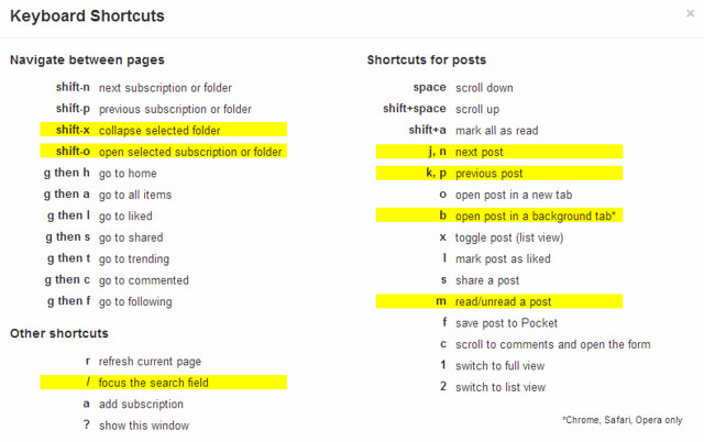
点击?键,可以显示系统的快捷键。THE OLDER READER与Google Reader的快捷键基本一致:比如用j键移动到下一日志,用k键移动到上一日志,用m键将日志置为已读或未读状态。而用b键在后台页面打开日志,则是很贴心的设计。当发现有兴趣详细阅读或需要保存(到Evernote)的信息时,就可以在后台打开页面并在稍后继续研读;而仍然停留在THE OLDER READER页面,则可以保证顺畅地浏览大量日志。
现在的THE OLDER READER还没有Google Reader那样完善:比如还没有针对移动设备的应用程序,比如还没有将日志发送到邮件的功能。但是THE OLDER READER简洁的界面和丰富的快捷键,都与Google Reader非常类似,再加上可以导入Google Reader订阅,可以使用Google Account登录。THE OLDER READER,也许能让你重温Google Reader旧梦。
Essbase Studio Installation Order
- Hyperion Financial Reporting
- Smart View
- Spreadsheet Add-in
- Essbase Studio
- EAS
Turns out that the HFR standalone installer requires a preceding Foundation installation. BUT, if you run the Essbase Studio installer after you run Foundation and HFR, Studio fails to start.
When this happened to me, I had two options:
- Delve into the innards of installation documentation and OTN lore; or,
- Just try installing Essbase Studio first (the quick and the dirty).
If you're on the clock, 2 is always preferable. Luckily, it worked. So this is the installation order I went with:
- Essbase Studio
- EAS
- Foundation
- HFR
- Smart View
- Spreadsheet Add-in
It was quick and painless and resulted in a working client machine in under an hour once I knew how and when to run everything.
EPM Release 11.1.2.3 Is Out!
When I find some free time I will install the release and post my findings about the installation and configuration process.
Hyperion FDM - POV Toolbar
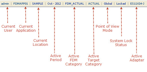
- Point of View Mode
- Global-change the period and category for all users
- Local-only changing for the power user
- System Lock Status
- Open-all users can log in
- Locked-locks the system for maintenance, only power users can log in
- Active Adapter
- Adapters are location specific. We assign an adapter to the application as a default. We call this to the system code


