
My most salient piece of advice on how to network while avoiding social burnout is: Do it online! inc.com/video/powerful…
Many of us in a certain subgenre of edtech have been working for a long time to try and use RSS to syndicate and aggregate posts from individual blogs into community sites. These sites are sometimes referred to as planet sites, mother blogs, aggregator sites, syndication hubs, etc. A good example of this is ds106, where posts are not only syndicated into the Blog Flow, but also the assignment bank—making for a richer, more targeted contextualization of student posts. Over the last seven years ds106 has syndicated more the 75,000 posts, providing a point of creative contact—if you will.

The syndication and aggregation for ds106 is all handled by FeedWordPress, which can grab the RSS feed of just about any publishing platform that exposes one. In order to simplify things, we’re using a Gravity Form to help automate the sign-up process. It’s far from a perfect setup, but it has been working fairly well for almost seven years now. In fact, it has been a template for other site aggregators, including the first Community directory site that Martha Burtis and Tim Owens built around UMW Domains in 2014 (which is no longer in use).

This community site for UMW Domains did a number of things: it aggregated recent posts, enabled a filtered view of posts by instructor, department, course, semester, software, etc., as well as providing a calendar view of posts. It was actually very awesome, and you can read about it in more detail here. That said, much of the ability to filter posts and add metadata was hacked together with FeedWordPress, Installatron, Google Spreadsheets, and a fair amount of duct tape. And while it worked—it was not easy to share. In fact, we tried as much with Emory University and University of Oklahoma, but it was not something easily supported given its idiosyncrasies. What’s more, as staff changed at UMW’s DTLT it was increasingly less sustainable (and eventually retired) with Martha running the Digital Knowledge Center and Tim going full time at Reclaim. But in the end it was a solid proof-of-concept, and one we were keen on returning to in earnest when time and energy allowed.

Martha built a feature that provided a calendar view of all the posts on UMW Domains -so cool.
Since then we’ve had a number of schools running Domain of One’s Own express interest in some version of UMW’s prototype. A few schools were willing to fund the work, but we just didn’t have the time. I think one of our strengths these last couple of years has been knowing when to pass on work. As much as we wanted to focus on building Community Directories given their potential to showcase work happening at various institutions, we knew it was too much. I think the fact we did turn the work down made our hosting that much better, but the community sites remained a stream deferred.

A Stream Deferred
We did try working with a developer to build aggregation hubs for Davidson and BYU using Known, but those did not pan out. After that BYU went ahead and started developing its own community directory. The site reproduces much of what Martha and Tim did in 2014, as well as integrating with BYU’s homegrown students information system to automatically de-provision inactive student sites It promises to be an excellent tool for showing off all the great domains work at BYU, as well as illustrating the folks at BYU are doing some deeper integrations to get associated metadata like user status (student, staff, faculty), graduation date, major, etc. I’ll definitely be blogging the work they are doing in more detail once it goes live.
But this brings me to the original point of this post—that took some time now didn’t it? I do apologize for rambling, but a little context helps when writing these posts given aggregation hubs are a topic I’ve been going on about for near on a decade. Anyway, this Spring Reclaim was finally in a position to return to the Community Directories, and we reached out to Marie Selvanadin and Yianna Vovides at Georgetown (who were keen on exploring this work back in 2015) about trying to build a Community Directory site from scratch. We also reached out to Tom Woodward to lead the development given his work with APIs of all kinds, The idea was that rather than doing this using FeedWordPress, we would try and build this using WordPress’s API. This was new territory for community aggregation hubs, and luckily Marie and Yianna were more than willing to approach this as an iterative experiment.

Georgetown Community Site Mockups
So, the development starts in earnest during the Spring and the initial work was presented at Domains 17. You can get a good sense of how Georgetown was approaching this site from the post “Envisioning a community site for GU Domains” Marie published back in June:
The presentation itself was a culmination of a few weeks of ideation, designing and prototyping with the team for this phase. Prior to this, we have always been intrigued by the idea of a true community space where people can create, collaborate and discover each other …. We conceived this community model in 3 layers – the macro layer which in this case at the campus level, the next layer is geared towards micro/sub communities which could be program level websites and the third layer is the individual layer.
I really like this vision of the community site as multi-level reflecting several visions of the university. From the macro to the individual:

Soon after Marie posted how Georgetown was imagining their community site, Tom posted more details on how he was building the site in his post “Community- Technically Speaking.” In this post he not only discusses the various reasons community sites may or may not work, but gives a look into how he is building the community site. By using the WordPress API he can grab recent posts (and pages) from a list of WordPress sites* as well as filtering out Hello World posts, and then store them in a Google Spreadsheet. He also details how he uses phantomjs ( or “a web browser without a graphical user interface“) to capture screenshots of all aggregated sites and then uses Vue (a framework for building the GUI phantomjs doesn’t provide) to combine the spreadsheet data with a screenshot and then represent it as a directory listing on a web page. It would look something like this:
In the above example we have Tom’s first iteration on Georgetown’s vision, which has screenshots of all the WordPress sites as well as a link to individual posts as a list and/or a timeline. The different categories can be associated with a program, course, theme, etc. Associating tags can be added at the point of installation through our script installer (Installatron), or through a plugin in WordPress that’s automatically added and activated at the point of setup. What’s interesting is none of what you see above is happening through WordPress, Tom is accessing public content from a large list of WordPress sites through the API and pulling it into a Google Spreadsheet. He is also using Phantomjs to grab screenshots and then mashes that up with the data in a webpage using VUE. I think I finally understand what Kin Lane might mean when he refers to a “headless CMS” using Google Apps, Github, etc. That said, this whole directory still assumes folks are using WordPress—which probably defeats the point.
What’s more, Tom re-did much of this same functionality from within WordPress. Watch the above minute and a half screencast which takes you through the latest iteration of how you can essentially add a URL of any site and it will quickly capture a snapshot, including a list of available posts and pages, as well as data around number of posts, pages, last updates, etc. And this is just one way to add them, you can have folks use categories on their sites, a form, provide options for opting in (or out) at sign-up, etc. This is exciting work, and by doing it through WordPress like this it can be packaged into a plugin that folks can use on their Domains sites—or even for WordPress Multisite installs. Think about the innumerable use cases there. You can get a look at what this might look like at the macro level here.

Keep in mind all this is yet to be styled, but the screenshots Georgetown shared would be one way the directories could look. We are still somewhat at the raw data aggregation and exposition stage here. The in-process status also includes questions around what data to collect and why. Everything collected here is already on the open web, but in the various discussions we have had the ability to opt-out of any centralized directory must be front and center. What’s more, the ability for the data to go away must also be an option, so resisting the inclination to archive posts as been painfully counter-intuitive for me—this was often the default for how we aggregated ds106 posts.
There is still much to be discussed on the data collection front, and it is important to note none of this would have been possible without Georgetown’s willingness to support the exploration of what’s possible. Additionally, Davidson College saw the cool work Marie, Yianna, and Tom were doing at Domains17 and are now working with Tom to revisit their earlier attempts at trying to create a community hub (more on their work in another post). Having willing partners in the process is crucial, and it is one of the many reasons we did not rush it and started from scratch. It’s important to remember that without folks like Marie and Yianna on-the-ground at these institutions who have specific vision for various use cases concomitant with myriad concerns this whole thing becomes just another generically packaged edtech portal/portfolio product entirely removed from what makes sense. This might be the best reason to wait until we have the time, energy, and willing partners and developers to make something so many of us have been approximating for well over a decade.
*For example, this list can be provided from Installatron for a school that is using a Domain of One’s Own server.
This weekend the New York Times published an article about a foot solider in the white nationalist movement. Critics say the article normalizes Nazis. My reaction was the opposite: I found the descriptions of a “normal” midwesterner with these beliefs terrifying. “A Voice of Hate in America’s Heartland,” by Richard Fausset, is a profile of Tony … Continued
The post Nazis in the New York Times: too normal, or scary as hell? appeared first on without bullshit.
Earlier this year, I made a package that riffed off of ProPublica’s really neat voting cartograms (maps) for the U.S. House and Senate. You can see one for disaster relief spending in the House and one for the ACA “Skinny Repeal” in the Senate.
We can replicate both here with the voteogram package (minus the interactivity, for now):
library(voteogram)
library(ggplot2)

hr_566 <- roll_call(critter="house", number=115, session=1, rcall=566)

house_carto(hr_566) +
  coord_equal() +
  theme_voteogram()
sen_179 <- roll_call(critter="senate", number=115, session=1, rcall=179)

senate_carto(sen_179) +
  coord_equal() +
  theme_voteogram()
I think folks might have more fun with the roll_call() objects though:
str(hr_566)
## List of 29
##  $ vote_id              : chr "H_115_1_566"
##  $ chamber              : chr "House"
##  $ year                 : int 2017
##  $ congress             : chr "115"
##  $ session              : chr "1"
##  $ roll_call            : int 566
##  $ needed_to_pass       : int 282
##  $ date_of_vote         : chr "October 12, 2017"
##  $ time_of_vote         : chr "03:23 PM"
##  $ result               : chr "Passed"
##  $ vote_type            : chr "2/3 YEA-AND-NAY"
##  $ question             : chr "On Motion to Suspend the Rules and Agree"
##  $ description          : chr "Providing for the concurrence by the House in the Senate amendment to H.R. ## 2266, with an amendment"
##  $ nyt_title            : chr "On Motion to Suspend the Rules and Agree"
##  $ total_yes            : int 353
##  $ total_no             : int 69
##  $ total_not_voting     : int 11
##  $ gop_yes              : int 164
##  $ gop_no               : int 69
##  $ gop_not_voting       : int 7
##  $ dem_yes              : int 189
##  $ dem_no               : int 0
##  $ dem_not_voting       : int 5
##  $ ind_yes              : int 0
##  $ ind_no               : int 0
##  $ ind_not_voting       : int 0
##  $ dem_majority_position: chr "Yes"
##  $ gop_majority_position: chr "Yes"
##  $ votes                :Classes ‘tbl_df’, ‘tbl’ and 'data.frame':  435 obs. of  11 variables:
##   ..$ bioguide_id         : chr [1:435] "A000374" "A000370" "A000055" "A000371" ...
##   ..$ role_id             : int [1:435] 274 294 224 427 268 131 388 320 590 206 ...
##   ..$ member_name         : chr [1:435] "Ralph Abraham" "Alma Adams" "Robert B. Aderholt" "Pete Aguilar" ...
##   ..$ sort_name           : chr [1:435] "Abraham" "Adams" "Aderholt" "Aguilar" ...
##   ..$ party               : chr [1:435] "R" "D" "R" "D" ...
##   ..$ state_abbrev        : chr [1:435] "LA" "NC" "AL" "CA" ...
##   ..$ display_state_abbrev: chr [1:435] "La." "N.C." "Ala." "Calif." ...
##   ..$ district            : int [1:435] 5 12 4 31 12 3 2 19 36 2 ...
##   ..$ position            : chr [1:435] "Yes" "Yes" "Yes" "Yes" ...
##   ..$ dw_nominate         : num [1:435] 0.493 -0.462 0.36 -0.273 0.614 0.684 0.388 NA 0.716 NA ...
##   ..$ pp_id               : chr [1:435] "LA_5" "NC_12" "AL_4" "CA_31" ...
##  - attr(*, "class")= chr [1:2] "pprc" "list"
as they hold tons of info on the votes.
I need to explore the following a bit more but there are some definite “patterns” in the way the 115th Senate has voted this year:
library(hrbrthemes)

# I made a mistake in how I exposed these that I'll correct next month
# but we need to munge it a bit anyway for this view
fills <- voteogram:::vote_carto_fill
names(fills) <- tolower(names(fills))

rcalls <- map(1:280, ~voteogram::roll_call(critter="senate", session=1, number=115, rcall=.x))
# save it off so you don't have to waste those calls again
write_rds(rcalls, "2017-115-1-sen-280-roll-calls.rds")

# do a bit of wrangling
map_df(rcalls, ~{
  mutate(.x$votes, vote_id = .x$vote_id) %>%
    arrange(party, position) %>%
    mutate(fill = tolower(sprintf("%s-%s", party, position))) %>%
    mutate(ques = .x$question) %>%
    mutate(x = 1:n())
}) -> votes_df

# plot it
ggplot(votes_df, aes(x=x, y=vote_id, fill=fill)) +
  geom_tile() +
  scale_x_discrete(expand=c(0,0)) +
  scale_y_discrete(expand=c(0,0)) +
  scale_fill_manual(name=NULL, values=fills) +
  labs(x=NULL, y=NULL, title="Senate Roll Call Votes",
       subtitle="2017 / 115th, Session 1, Votes 1-280",
       caption="Note free-Y scales") +
  facet_wrap(~ques, scales="free_y", ncol=3) +
  theme_ipsum_rc(grid="") +
  theme(axis.text = element_blank()) +
  theme(legend.position="right")
Hopefully I’ll get some time to dig into the differences and report on anything interesting. If you get to it before me definitely link to your blog post in a comment!
I still want to make an htmlwidgets version of the plots and also add the ability to get the index of roll call votes by Congress number and session to make it easier to iterate.
I’m also seriously considering creating different palettes. I used the ones from the source interactive site but am not 100% happy with them. Suggestions/PRs welcome.
Hopefully this package will make it easier for U.S. folks to track what’s going on in Congress and keep their representatives more accountable to the truth.
Everything’s on GitHub so please file issues, questions or PRs there.
Catching up on posting some stories here, so that this blog can continue to be a useful archive.
As we all know, the development-permit board made a historic decision on Nov. 6, with a 2-1 vote by the city’s top officials to reject the proposal.
Although I and many other reporters had written that there was a previous rejection of a project in 2005, that project in fact ended up going ahead. As former city staffer Phil Mondor discovered, it even proceeded with the same identifier number. So, in fact, there had never been a project turned down by the DP board since it was created in the 1970s.
I have three stories here: one noting in advance that it was going to be a historic decision either way according to former DP board members and city planning directors, one about the decision itself, and one follow-up a few days later, with more from city planning manager Gil Kelley and the site owners. (Headline was a little off because it says the developer will be revising the project but, in fact, Beedie people hadn’t decided yet.)
I’ve run into more than one former city planner since then who says that there is no way the city is not going to get sued over this. (Some people think that that won’t happen, not because the developer doesn’t have some grounds, but because he won’t want to alienate the city.) This story is not over yet.
There are plenty of ways to make people jump through a hoop, but that doesn’t make a difference if they’ve stopped dancing a few minutes later.
This is the problem with using split tests within a community.
You can increase your conversion rates by amplifying the web copy or offering bonuses to people that register or participate.
But it’s only what happens over the long-term that really matters.
Consider this graph from a client below:
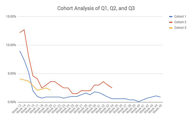
Cohort 1 (in blue), for example, begins with almost double the conversion rate of cohort 3 (in yellow).
But by week 18 this has fallen to a THIRD of cohort 3.
The big win here isn’t stopping the big drop-off at the beginning. You can do that with an array of one-off novelty ideas. Big drop-offs happen in every online community.
The big win is stopping the drop-off after around week 16 (from the beginning of the 12-week cohort). You can’t make a single tweak. Instead, you need to look holistically at the experience and make sure it’s a very fun or very relevant place to visit.
Looking at the first registration or first participation metrics might seem like a smart move, but I’d focus on the post-participation experience. Turning a 0.7% to a 2.3% here (like we see above) has a HUGE payoff over the long-term.
I saw a quote today somewhere that I didn’t save an don’t properly recall along the lines of most people don’t know what it’s like to be in the privileged position of a programmer who is able to code your own custom apps.
Slightly earlier, I’d idly wondered about the rhetoric of “everyone must learn to programme”, and how many people I know found it useful in their work to “do some programming” yesterday, or last week or over the last month.
I also wonder about how many of the folk preaching “everyone should learn to programme”:
a) actually know how to write code (and if they don’t, do they intend to learn? When?);
b) ever use code to do anything (i.e. why should folk learn to code? What’s it useful for?)
Whatever…
Going back to the privilege thing, what I think folk don’t realise is how little you need to do to get things done, if you know what to do – or look for.
One of the reasons I like the RStudio and Jupyter notebook environments, particularly for visualising data, is that if you have the data looking right, (i.e. when you display it as a table, it has things arranged in the right way in a table made up of rows and columns) you can create all manner of wonderful, interactive graphical outputs with a single line of code. Other folk have written templates from creating embeddable interactive HTML widgets, and transforming the data in my data table into the data the widget needs to display the chart.
In itself, code can often be just a written version of a menu option you might select or a set a values you have selected in an interactive form. Nothing new, just turning point-and-click choices into word equivalents and then writing them down, so the machine can do whatever it is rather than you.

Things are also – arguably – getting easier.
For example, over the last week Simon Willison has been tinkering with a really useful set of components for querying data. This started with a tool to put CSV files into a simple database without the user having to do anything other than say – put these files into a database. And then a tool that let you publish the database as a service, either on your own computer or the cloud (again with a single line) so you could query it through a browser. Now there’s a UI, and a simple tutorial for building a simple app to search for trees in San Francisco. (Writing the HTML might be tricky, but that page could be based on a template? Or the app could perhaps be accessed via Jupyter notebook using dynamically created ipywidgets and published using appmode.)
Taken together, with a few lines of code, you can create and publish your own interactive data explorer , along with an API you can access from elsewhere.
Perhaps that is a privilege only “coders” can avail themselves of. But why?
With knowledge of a few small tools, the sorts of thing they do (rather than how they do it), and how to wire them together, you can start to create powerful, and useful, applications.
Which makes me wonder again about whether it is really so much harder to teach programming stuff to adult novices using real tools to solve real problems compared to teaching them how to use Scratch to make an animated owl blink its eyes or make a turtle draw a square?
Pedagogy is an oft used word in the OU, which in derivation means “lead a child”. (The adult equivalent, andragogy, is rarely used, self-directed heutagogy even less so.) Can we really do no better at teaching adults programming and what it might be used for than starting them off with months of programming using tools developed for teaching primary school children, some of which was invented getting on for fifty years ago? Are we really that stuck for coming up with teaching ideas that not only teach principles of “computational thinking” and core programming ideas, but also help learners see how they might be able to use the ideas in practice and perhaps even set them up with a chance of using them for real outside of their studies? (SMEs employing three people probably don’t need a full time developer, but if one of them can hack a solution to problem that solves a need, or makes a particular task slightly easier, it doesn’t really matter?)
Or perhaps the practical uses get in the way of teaching the “pure*, abstract coding principles?
I JUST DON’T UNDERSTAND WHAT WE’RE TRYING TO DO?!


It's great to have reliable tests in your pipeline to avoid escaped defects and to shorten the feedback loop for your programmers.
Sometimes the build-and-test processes becomes a productivity-limiting problem. What do you do when your test suite takes too long to run?
I once worked on a team that had about 10,000 microtests running in 45 seconds.
It comes out to be about five-thousandths of a second (.005 seconds) per test. Those tests are pretty "micro."
But why does it matter? Why should people care about automated testing speed?
Consider the three crucial events in the life of a defect:

Defects are injected (accidentally) at some point by a programmer.
Later a person or an automated facility will detect that the error exists.
Sometime after detection, someone will endeavor to correct the defect.
Notice two intervals labeled a and b.
While some defects remain shallow and easy to correct, the time interval a on average seems to govern the time b on average.
Consider that the error is detected while the programmer is writing the code. The programmer backspaces and retypes the code and all is well.
Three things are working in the programmer's favor:
The code is still clear in the programmer's head
The changes that contain the defect are not mixed with other changes
There are no other defects that mask or confuse the error's true nature
If you wait a few weeks then many things are working against the programmer
The change that includes the defect will be mixed with other changes
The defect may occur in a way that makes it appear that other code is at fault
Other defects or exception-handling code may mask the defect
The programmer's memory of the code change has faded
The programmer making the correction may not be the original author

This is why the length of interval a tends to govern the length of interval b. It is important that defects are detected as soon as possible so that they may be more easily corrected.
Many programmers have worked hard in statically-typed languages to ensure defects are caught by the compiler. Turning runtime defects into compile-time defects is a powerful technique that creates rapid, undeniable feedback.
Some languages even adopt a Design By Contract approach, such that code errors are detected by specific runtime assertions so that errors are uncovered more quickly.
Most of us have adopted some form of Test-Driven Development using microtests, and may have automated story tests (frequently called Behavior-Driven Development).
In addition to these low-level tests, we often have module-level ("contract") tests, component acceptance ("intake") testing, and automated acceptance testing.
We don't stop there. Many organizations also have UI-level testing, along with penetration testing and performance testing.
That's a lot of tests; therein lies our problem.

Programmers are busy people and often are operating in pressurized circumstances.
We want to run the tests constantly as a habit, not a decision.
But what if running the tests takes a few minutes? Now programmers have to decide if they've done enough to merit running the tests.
If tests take several minutes, then programmers might run them once or twice in an hour instead of running them constantly.
If tests take long enough, programmers might run them less than once a day.
If tests take "too long", programmers will not run them at all.
The period of 'a' increases, driving up the period of 'b'.
Slow tests raise the cost of fixing defects.
Slow tests increase the likeliness that tests will be discovered late in the process when you don't have enough recovery time to fix them all.
If programmers aren't running the tests, they are less likely to write tests. After all, the test suite already takes too long to run, why make it worse? This increases the chance of bugs escaping into the wild.
There are a number of strategies to use when addressing slow tests:
Isolate build time from test time
Get test timings
Get timings for test setup
Isolating Build Time helps to determine where to spend the time optimizing. If the build consumes 80% of the time, don't bother fixing the tests. Instead, look at some of the parallel, distributed build servers or look at re-architecting the system.
If the tests consume 80% of the time, the time consumed by the build doesn't much matter.
Get test timings because sometimes there are a handful of tests that take the lion's share of time. There might be some integration tests hiding in among all your microtests. If you can get the list sorted by time, descending, you'll have a good sense of where the time goes.
Perhaps you can replace slow tests with much faster tests. Quite often tests are slow because they're written at a UI or API level but the code being tested is a simple function that can be covered through microtests instead.
If you can't replace slow tests with faster tests (always worth a shot) then try segregating the slow tests from the fast tests.
If you segregate slow tests, have the build server run the microtests first, then the slower tests, then the slowest tests of all (usually integration and UI tests).
Measuring test setup time helps see the time-wasters that the test runner doesn't capture. Generally, the test runner only captures the time from when the individual test begins until it ends.
If there is setup that happens before the test starts, that setup might take many times longer than the tests themselves and may run many times. Slow setup is a very common testing problem.
UI tests typically require a full instance of the app to be stood up, complete with all the supporting functions (DB, messaging, logging, etc). This pre-testing setup time isn't counted by the test runner. I've seen some test suites spend 1/2 their time just creating a database and populating it with data. Check these things, and segregate out the tests that require a complete infrastructure (then see #2, above).
I hope this blog helps you to understand the importance of keeping test suites small and fast, and that the suggestions help you to drive down the cost of defects.
If you take a different approach to speeding up a slow test suite, I would love to hear your approach as well! Please drop a link to your write-up in the comments, below.
The post Make Your Testing Affordable appeared first on Industrial Logic.
Fair and balanced take on the iPhone’s Portrait mode by Khoi Vinh, who generally prefers a DSLR to capture special moments:
More to the point, quibbling over the finer points of photographic effects is somewhat (though not entirely) pointless. What really matters here is that there will be tens if not hundreds of millions of these cameras in the hands of countless people everywhere before too long, and those people will take billions of pictures with them. Only a vanishingly small number of these people will ever object to the details I’ve listed here; most will be incredibly pleased with how portrait mode performs and will share the fruits of their labors avidly.
Just on the merits of sheer volume alone, portrait mode will become a part of our collective visual vocabulary.
→ Source: subtraction.com

It may have taken a month, but Google has finally made ‘gouda’ on its promise to update its burger emoji. For those who missed it, an intense debate was kicked off when a tweet centred on the placement of the cheese in the burger went viral.
I think we need to have a discussion about how Google's burger emoji is placing the cheese underneath the burger, while Apple puts it on top pic.twitter.com/PgXmCkY3Yc
— Thomas Baekdal (@baekdal) October 28, 2017
As writer Thomas Baekdal pointed out, Google and Apple evidently had very different ideas on if cheese should belong above or below the patty of a burger.
The discussion became so widespread that none other than Google’s big cheese himself, CEO Sundar Pichai, had to take to Twitter to assure customers that the company will look into the pressing issue.
Will drop everything else we are doing and address on Monday:) if folks can agree on the correct way to do this! https://t.co/dXRuZnX1Ag
— Sundar Pichai (@sundarpichai) October 29, 2017
While Monday, October 30th passed with nary a comment or retweet from Pichai, the internet remained cheesed off over what Google had done with the burger emoji.
Now, however, Google has finally cut the cheese, so to speak. Emojipedia notes, Google’s Android 8.1 release now shows the cheese clearly placed above the burger.
 Google has not yet commented on the change.
More information on Android 8.1 can be found here.
Via: TechCrunch
The post Google has finally fixed the burger emoji in Android 8.1 appeared first on MobileSyrup.
 Like with any other Samsung device, the Galaxy Note 8 comes with so many features that first-time owners of the handset are likely going to feel overwhelmed. On the positive side, Samsung allows one to customise and tweak almost any part of the interface according to one’s liking which is usually appreciated by power users.
Continue reading →
Like with any other Samsung device, the Galaxy Note 8 comes with so many features that first-time owners of the handset are likely going to feel overwhelmed. On the positive side, Samsung allows one to customise and tweak almost any part of the interface according to one’s liking which is usually appreciated by power users.
Continue reading →

Last week ten of the twelve Dutch Provinces met at the South-Holland Provincial government to discuss open data, and exchange experiences, seeking to inspire each other to do more on open government data. I participated as part of my roles as open data project lead for both the Province of Overijssel, and the Province Fryslân.
There were several topics of discussion.
I want to briefly show those examples (and might blog about the other two later).
Make it usable, connect to what is really of significance to people
Basically the three examples that were presented during the session present two lessons:
1) Make data usable, by presenting them better and allow for more interaction. That way you more or less take up position half-way between what is/was common (presenting only abstracted information), and open data (the raw detailed data): presenting data in a much more detailed way, and making it possible for others to interact with the data and explore.
2) Connect to what people really care about. It is easy to assume what others would want to know or would need in terms of data, it is less easy to actually go outside and listen to people and entrepreneurs first what type of data they need around specific topics. However, it does provide lots of vital clues as to what data will actually find usage, and what type of questions people want to be able to solve for themselves.
That second point is something we always stress in our work with governments, so I was glad to hear it presented at the session.
There were three examples presented.
South-Holland put subsidies on a map
The Province of South-Holland made a map that shows where subsidies are provided and for what. It was made to better present to the public the data that exists about subsidies, als in order to stimulate people to dive deeper into the data. The map links to where the actual underlying data should be found (but as far as I can tell, the data isn’t actually provided there). A key part of the presentation was about the steps they took to make the data presentable in the first place, and how they created a path for doing that which can be re-used for other types of data they are seeking to house in their newly created data warehouse. This way presenting other data sources in similar ways will be less work.

The subsidy map
Gelderland provides insight into their audit-work
Provinces have a task in auditing municipal finances. The Province of Gelderland has used an existing tool (normally used for presenting statistical data) to provide more detail about the municipal finances they audited. Key point here again was to show how to present data better to the public, how that plays a role in communicating with municipalities as well, and how it provides stepping stones to entice people to dive deeper. The tool they use provides download links for the underlying data (although the way that is done can still be significantly improved, as it currently only allows downloads of selections you made, so you’d have to sticht them back together to reconstruct the full data set)


Screenshot of the Gelderland audit data tool
Flevoland listens first, then publishes data
The last example presented was much less about the data, and much more about the ability to really engage with citizens, civil society and businesses and to stimulate the usage of open data that way. The Province Flevoland is planning major renovation work on bridges and water locks in the coming years, and their aim is to reduce hindrance. Therefore they already now, before work is starting, are having conversations with various people that live near or regularly pass by the objects that will be renovated. To hear what type of data might help them to less disrupt their normal routines. Resulting insights are that where currently plans are published in a generic way, much more specific localized data is needed, as well as much more detailed data about what is going to happen in a few days time. This allows people to be flexible, such as a farmer deciding to harvest a day later, or to move the harvest aways over water and not the road. Detailed data also means communicating small changes and delays in the plans. Choosing the right channels is important too. Currently e.g. the Province announces construction works on Twitter, but no local farmer goes there for information. They do use a specific platform for farmers where they also get detailed data about weather, water etc, and distributing localized data on construction works there would be much more useful. So now they will collaborate with that platform to reach farmers better. (My company The Green Land is supporting the Province, 2 municipalities and the water board in the province, in this project)

Overview of the 16 bridges and waterlocks that will be renovated in the coming years


Various stakeholders around each bridge or waterlock are being approached

Sony’s Xperia XZ1 was the first smartphone to come out-of-the box with Android Oreo — even beating the Pixel 2 — and now the company is bringing Oreo to its older devices as well.
The Sony Xperia X Performance is getting Android Oreo, which reportedly measures in at 1.2GB and includes November’s Security Patch. The Sony Xperia XZ and XZS are also getting updated to Android Oreo, even though the two devices are a little older than the X Performance.
While Android 8.0 overhaul Google’s mobile operating system, it does add notification dots and picture-in-picture.
Source Xperia Blog
The post Sony is rolling out Android Oreo to the Xperia X Performance appeared first on MobileSyrup.

The HDMI forum, the organization that standardizes HDMI cables, has officially revealed the next version of the popular video format: HDMI 2.1.
The standard was first announced at CES 2017, but the technology has now been finalized and manufacturers are beginning to integrate it into their devices, according to the HDMI Forum.
This new standard supports video output up to 10K resolution, which essentially doesn’t exist right now, along with 4K video at 120Hz (which is becoming increasingly common) and 8K video at 60Hz. In total, the cable supports data transfer of 48GB/s.
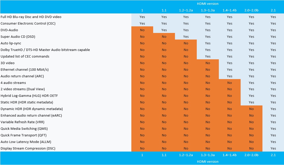
Other upgrades include an enhanced refresh rate called Variable Refresh Rate (VRR), which reduces and eliminates lag for smoother gameplay, while Quick Frame Transport (QFT) reduces latency. Another new feature called Quick Media Switching (QMS) reduces the amount of black-screen wait time while switching media. The final new feature is Auto Low Latency Mode (ALLM), which automatically sets the optimal latency.
This technology update embodies the definition of future-facing and likely won’t affect many current devices, especially considering 4K still isn’t even a common video resolution yet.
It’s worth pointing out that the new standard is backwards compatible with current HDMI devices, too. It will also likely be many years until we even begin to see the first devices that support 10K resolution content.
The HDMI Forum’s two most recent updates to the port format include HDMI 2.0a and HDMI 2.0b, specifications that enable the transmission of high dynamic range (HDR) content that utilizes HDR10 and Dolby Vision.
As a side note, I ran into HDMIa related issues when trying to get the 4K compatible Xbox One X to run through my relatively recent surround sound receiver.
Source: HDMI Forum
The post HDMI 2.1 supports up to 10K resolution video and variable refresh rates appeared first on MobileSyrup.

Apple is facing yet another autocorrect issue.
Not long after Apple resolved an issue in which iOS 11.1 users saw the single letter ‘i’ autocorrecting to ‘A[?],’ MacRumours reports that at least a few hundred iPhone users have complained about the word ‘it’ autocorrecting to ‘I.T’ on iOS 11 or later.
Affected users say ‘I.T’ pops up after writing ‘it,’ unless they select ‘it’ as a QuickType suggestion or backspace to retype. Additionally, some users are reporting the same issue is occurring with ‘is’ transforming into ‘I.S.’ The reports have reportedly trickled in since late September, shortly after iOS 11 was released.
Many users are claiming the issue remains even after rebooting and other basic troubleshooting, including — in some instances — text replacement. According to some users, Apple is recommending users reset the keyboard dictionary. Users can do this through the following path: Settings > General >Reset and then ‘Reset Keyboard Dictionary.’
For some, this workaround has been successful, but still others are reporting it didn’t fix the glitch. Of course, turning off autocorrect also works to fix the issue — but obviously isn’t ideal.
Apple will likely roll-out a fix for the issue in an upcoming update, as it did with the ‘[A?]’ issue.
Source: MacRumours, Apple Insider
The post Apple recommends workarounds for new ‘I.T.’ autocorrect bug appeared first on MobileSyrup.
When you are asked as a manager “What do I need to get to the next level?” I suggest the quality and completeness of your answer is directly correlated to your effectiveness as a leader. Let’s start with the worst answer, “We’re a meritocracy where the best idea wins.”
This is a bullshit cop-out answer. First off, being a meritocracy is a philosophy, it’s not a strategy. Using this as an answer to the growth question is akin to saying, “We give out gold medals when you win, so when you start getting gold medals, we’ll all know you’re winning.”
A meritocracy, if achievable, would be a trailing indicator. It would be a sign that long ago, your leadership team successfully created a culture where the humans were recognized because of their ability. It reads like a noble dream worth striving for, but it is poor career growth advice.
Here’s a better answer.
Two Paths
There are two career paths1 in your organization. One which describes the growth of the individuals and one that illustrates the growth of the managers. These paths are readily visible public artifacts written by those who do the work. This means engineers write the paths for engineers, marketing writes marketing’s, and so on.
The contents of these artifacts need to reflect your values, culture, and language, but I humbly suggest they contain the following information:
This suggested list is not definitive. You could easily add sphere of influence, ideal years of experience, or comparable levels outside of your company to this artifact. And then do the whole thing over again for your manager career path.
If you are feeling overwhelmed by the enormity of this task, you are in good company. There are existing career paths on the internet that can serve as good starting points, but I strongly encourage your team to write their own because your culture is unique. The competencies you need are a function of the values of your particular collection of builders.
Two Equal Paths
As a human who has screwed up the design and landing of career paths in every possible way, I have hard-earned advice on common pitfalls of landing these artifacts. My first piece of advice is making it clear with your actions that these two paths – management and individual – are equal. I’ll explain this concept by describing how to not land your career paths.
The need for a career path begins when there are enough engineers to require a rubric for career growth. A well-intentioned group of individuals defines this path. Great! You have a career path. Who decides who goes where on this newly defined path? Who is Senior? Who is Senior staff? Usually some form of a manager. It is at this moment when individual contributors not familiar with the ways of managers realize that these folks have a heretofore unknown influence on their careers. They probably already suspected something was up because these people were sitting in meetings… all the time.
When it becomes apparent these managers have special powers, a subset of individual contributors quickly become interested in management. The problem is this is often a career path that doesn’t often exist yet usually because everyone one was too busy working to define the individual contributor career path.
Here’s the screw-up. You just finished defining the individual contributor career path, and suddenly everyone is interested in a career path that has yet to be written. What’s up? The answer is: your individual career path has not made it clear that individuals have equal opportunities to lead.
There are many good reasons for an engineer to want to move into management, but if their only reason is the perception that management is the best place to grow as a leader, then you’ve started down a path where the perception is leadership is not the job of individuals. This is disaster.
The Growth Tax
Artifacts like a career path show up to document the culture, to define rubrics, and to help inform a process to allow informed decisions to be made to help the team scale. They exist to provide accessible definition, but how they are applied is what the team is truly watching. In the example above where managers are choosing levels for a newly defined career path, the team cares equally about their level and who is choosing it.
During a period of rapid growth with only organic role definition, everyone is wondering where they stand because everything is changing all the time. Suddenly, these managers appear who have the power to determine role and individuals ask themselves, “What other powers are they going to grant themselves? And how do I get in on that situation?”
Yes, you already wrote a career path for individuals. You defined a clear set of competencies of what makes a successful growing individual, but you forgot to make it clear that leadership comes from everywhere. If an individual doesn’t believe that they have an equal chance to lead as a manager, then those who desire to lead will attempt to get on the manager path.
This isn’t a horrible outcome because you do need to build and hire capable managers, but it’s a disaster because you are signaling to your team that it’s the managers who are calling the shots.
The growth tax is a perceived productivity penalty that you incur as a function of the size of your team. How long does it take to make a hard decision? How does a person find out a critical piece of information? Who owns what? The cost to answer each of these (and far more) questions slightly increases as each new human arrives.
These small communication taxes pale in comparison to the taxes levied by defining cultural norms. In a company where it is believed that the managers are the only leaders, you create hierarchy. We must go a higher power to ask for permission. Hierarchy creates silos. We own this, and they own that. Silos often create politics. Our mission is the only mission. Their mission is lesser.
Again, a disaster.
Leadership Comes From Everywhere
A meritocracy is a philosophy that states that power should be vested in individuals almost exclusively based on ability and talent. Advancing in this system is based on performance measured through examination and/or demonstrated achievement. As a leader and as an engineer, the concept of a meritocracy is appealing3. I want my teams as flat as possible and full of empowered individuals and any action that re-enforces the perspective that “managers have all the power” is sub-optimal.
Are managers required to scale a large group of humans? My vote is yes. You might disagree, but I think a set of humans responsible for the people, process, and the product are an essential scaling function. One reason you might disagree is that you’ve seen managers who’ve done the job poorly. That sucks. There are good managers out there, and they are the ones that understand their job is their team because without their team they have exactly no job.
The definition of individual contributor leadership starts with defining a leadership competency in your career path, but you need to spend an equal amount of time defining clear places for individuals to lead. Here are two places you can invest:
Technical Lead What does technical lead mean for your company? Is it a throwaway title that managers use to placate cranky engineers? That’s a missed opportunity to define credible contributor leadership. Here’s a starting definition: “You are the owner of this code/project/technology and this means you are the final decision maker when it comes to this area.”
With this definition in hand, you make a list of the all the technical areas that need technical leadership and make it publicly available. These are the areas we are responsible for and these are the technical leads. Ask them first.
Details about defining this role are both numerous and potentially politically hazardous. For example, how long can someone be a technical lead? What happens when they leave? And, finally, the contentious, “Who chooses technical leads?” Good luck.
Technical Lead Manager Another leadership variant. This role is a hybrid designed to give aspiring managers a transparent and fair view of people management.
The details: Technical Lead Managers continue to code a minimum of 50% of their time, but they also have direct reports. What’s the catch? Cap their direct reports at three. This constraint is intended to give new managers exposure to all the aspects of people leadership (Reviews, promotions, 1:1s, there’s a book) while giving them reasonable time to be hands-on engineers. Why three directs? Why 50%? Your ratios may vary, but what we’re optimizing for is a higher probability that they can do both jobs well instead of both poorly.
Like Technical Leads, the devil is in the operational details, but one cultural aspect I like to reenforce is the removal of any stigma when a Technical Leader Managers chooses to leave the role. After four months in the role when they approach me and suggest, “I don’t think I am built for the people thing.” I ask clarifying questions, we discuss, and once we’re both satisfied with the answers, we celebrate because it is likely we just avoided inflicting another crap manager on the world.
A Trailing Indicator
My final piece of advice is the most complex and incomplete. As I wrote above, the manner that you define leadership is as important as how it is perceived you are applying it. A thoughtfully constructed promotion process provides a means of consistently and fairly demonstrating to the entire team how you value leadership.
The topic of building a promotion process deserves an entire article. I’ll write it. I’m sorry to leave you hanging, but if you intend to follow the advice in this piece, you’re on the right track. You have career growth paths for both individuals contributors and managers. You’ve also perhaps defined additional non-managerial roles that give individuals opportunities to lead.
Your future promotion process benefits from work above because it gives both managers and individuals a standard frame of reference to have career and promotion discussions not just at promotion time, but all the time. Your future promotion process also needs to answer the question, “Are you consistently and fairly promoting both individual contributors and managers who are demonstrating leadership?”
There is more work you need to do. You need to train your managers to have career conversations all year long, you need to build an employee-friendly internal transfer policy that allows individuals to freely move about your company, you need to invest in teaching the entire company to give feedback, and there’s much much more because building a growth-mind company isn’t defined by a word, it’s defined by hard work.
Two ways to launch a new project.
The problem is only 1% of people tend to help create a project compared with 10% that tend to edit. Almost every successful collective effort requires an individual (or a few individuals) to make a huge number of contributions to get started.
If you want a wiki, a huge database, a successful fundraising effort, a big collaboration on an eBook or whatever, you need to have something huge to show to begin with. Then let people add and edit as they like.
Anyone can set a big goal and tell people what you want. The harder part is showing what you already have and asking people to help.


Anna Vital, in collaboration with the Google News Lab, shows the search popularity of chart types, books about charts, and tools for charting. The project is called The Visualization Universe. It surprises me to see some chart types so high on the list, such as the Gantt chart and Ishikawa diagram, but maybe that’s more of an indicator of where I am in the visualization spectrum.
Tags: chart types, Google
We’ve just released another awesome new film about Pixelmator Pro — this one’s all about the color adjustments.
Enjoy!

After being vilified for doing the right work for the right reason, urban planner and Duke of Data Andy Yan is now being recognized for his 2015 research in reviewing the ownership of new houses on Vancouver’s west side. What he found was that two-thirds of house buyers had “non-Anglicized Chinese names”. Without any other reliable way to collect the data, Andy Yan provided the first true research into the pouring of foreign dollars into the Vancouver real estate market. This study was important as it showed that Vancouver housing was being held as an appreciating asset instead of its original purpose of actually housing Vancouverites.
As Dan Fumano in the Vancouver Sun writes “key figures in B.C.’s real estate industry criticized Andy Yan’s work and Vancouver Mayor Gregor Robertson responded publicly, saying: “This is a public policy issue, not a race issue — and any confusion to the contrary only risks dividing our city. In a public post on his Facebook page, widely reported in the media at the time, Robertson wrote: “We don’t need … the blaming of any one group of people — or any one kind of last name — for the challenge of housing affordability.”
Well two years have passed, real estate prices have continued a rocketing ride skywards, making accessibility to financing and affordability for local residents real issues. There are also now studies indicating that the majority of jobs in Vancouver will be left unfilled in the near future due to the high cost of housing. Simply put, you can’t make enough money to afford to live here. And the idea that foreign investment could have a negative impact on housing prices is now being discussed at all three levels of government with the City of Vancouver wanting to ” collaborate with the provincial and federal governments to explore the viability of “restricting property ownership by non-permanent residents.”
That is part of the housing strategy that the City will be considering for approval on Tuesday, and is a marked policy change in how foreign ownership of Vancouver housing stock is being viewed. “The idea to investigate foreign ownership restrictions is one of a number of “tax and financial regulations to limit the commodification of housing and land for speculative investment” proposed in the city’s report, along with ideas like introducing a speculation and flipping tax, reforming federal and provincial tax regulations and seeking to “close loopholes.”
No one from the City of Vancouver has apologized to Andy Yan for the mayor’s unfortunate comments on his 2015 groundbreaking study. The dividing of the city that the Mayor referred to has happened not because of Andy Yan’s research, but by the hollowing out of affordable, attainable housing in Vancouver. That is not a “risk dividing the city” but the sad reality of having no municipal policy supporting housing for local people. Hopefully Vancouver’s 10 Year Housing Strategy will mark a new conciliatory approach and respond to emerging data and alarming trends.


 It’s been a few weeks since Google released the first developer preview for Android 8.1 Oreo, and now there’s new software to developers to try out.
Continue reading →
It’s been a few weeks since Google released the first developer preview for Android 8.1 Oreo, and now there’s new software to developers to try out.
Continue reading →


Rolandtjjj
Tim Ferriss’s new book Tribe of Mentors is out. I have finished it already, and can say it’s really excellent and I even liked it more than Tools of Titans even though I’m not in this one.  As I said in a message to Tim:
Curious how Tribe of Mentors is different from Tools of Titans? Here's a text to me from Matt Mullenweg (@photomatt, CEO Automattic)… pic.twitter.com/D9kvA2rFFC
— Tim Ferriss (@tferriss) October 16, 2017
I learned a lot from it, took a ton of notes to follow up on, and wrote down about twenty more books I have to read.

