Shared posts

28 Mar 17:36

What to consider when creating choropleth maps

Maps are not objective, but a version of reality. When creating them, lots of choices are made: What to map, how to map and whether or not to use a map in the first place. Here we’ll try to find guidelines to all of these questions, for a specific subset of maps: Choropleth maps (the ones in which each region is filled with a color that represents a value).

When to use choropleth maps

Choropleth maps are great to show clear regional pattern in the data, or for local data. Regional patterns could be an unusually high unemployment rate in neighboring counties, or the contrast between cities and rural areas. If your data doesn’t show a clear regional pattern, consider another chart type for your data. However, readers love to find themselves on a map. If you’re mapping an area in which your readers live, do consider a map even if they are no regional patterns.

choropleth map advice

Choropleth maps work best when showing just one variable. This variable could be the difference between two variables (e.g. the change of the unemployment rate from last year to this year). But if you want to show the correlation between values, choropleth maps might be not your best choice. Consider a dotplot or scatterplot instead.

choropleth map advice

Choropleth maps are great to see the big picture, but not for subtle differences. Readers will have a hard time perceiving the small differences between colors on your map. In addition, the intervals between the colors are not necessarily the same intervals between the values in your data. That makes it easier to recognize patterns in the map, but makes it harder to compare the exact values of regions with each other. If you want to point out the numeric differences between regions, consider another chart type, a table or text instead. That also applies if your most important regions are too small to be shown on a map:

choropleth map advice

Choropleth maps work best for relative data. It would not be useful to map the absolute number of unemployed people in each county, since we can’t compare that data without knowing the counties’ population. The unemployment rate (the number of unemployed people per 100 citizens) is more comparable. If you want to map absolute data, consider a symbol map instead. Be aware though, that this will often just answer the question “Where do most people live?”.

choropleth map advice

How to create better choropleth maps

Consider cartograms if it’s important how many people are affected. Choropleth maps show us how much geographic area is affected. On some maps this means that large regions where only a few people live take up a lot of space on the screen. Population cartograms, on the other hand, drive more attention to populated areas. In countries with a very different population density in each state, cartograms can offer a more honest view of the data. However, be aware that cartograms make it harder for readers to recognize regions, so they work best if readers are familiar with the geography.

choropleth map advice

Consider choosing the smallest units possible. If you can use counties instead of states or NUTS2 regions instead of European countries, consider doing so. It will give readers a more refined image of the data and will let them spot more regional pattern. There are exceptions: For example, a state map is more informative in the winner-takes-it-all-system in the US presidential elections.

choropleth map advice

Make sure to use the right color scheme for your data. There are three different kinds of color schemes for maps: Sequential (e.g. from bright blue to dark blue), diverging (e.g. from red via white to blue) and qualitative/categorical (e.g. one green color, one blue color). Consider a sequential color scheme if you want to drive the attention to the high values, e.g. for unemployment rates. Consider a diverging scheme if you want to drive the attention to both extremes of the scale, e.g. too show the difference in votes between two competing parties. With any color scheme, do use colorblind-friendly colors.

choropleth map advice

Make sure there is a lightness difference in your sequential/diverging color schemes. A gradient from a light color to a dark color enables your readers to quickly spot the regions with low and high values. Using different colors can increase the contrast, but shouldn’t be overdone. In the case of a diverging color scheme, the color in the middle should be the lightest one and the extremes should be the darkest ones. If you’re unsure, use the Datawrapper defaults or use the ColorBrewer palettes.

choropleth map advice

Consider using as few as possible colors in your qualitative color schemes. The more colors you use in your map, the harder it becomes for your readers to remember what they mean. Using only three colors means that your reader won’t need to check your color key too often. The colors shouldn’t give the idea of a sequential or diverging color scheme, if your data isn’t ordered in any way. You can use more than three colors if the reader already knows your color encoding, e.g. with colors of political parties.

choropleth map advice

Make sure that readers see all the differences in the data. Regions with different underlying data values should have different colors. Reserve your brightest and darkest colors for the extremes. Also, take your time when choosing the number of “stops”. They decide how dramatic the contrast between your low and high values appear. Make sure to use stops to make regional patterns visible, but not to overly blow up the difference between regions.

choropleth map advice

Consider using a continuous color scale instead of discrete color steps. A map with “discrete steps” assigns all your values to one of e.g. five distinctively different color shades. If you want readers to immediately see the range of values a region falls in, discrete steps are a good choice. However, discrete steps sacrifice nuance for that quick readability. A continuous color scale lets readers compare neighboring regions, even if they would fall in one color shade on a map with discrete steps. And if you enable tooltips on your map, readers can access the exact values anyway.

choropleth map advice

Spend time thinking about your color key. Color keys are crucial for readers to understand your map. Make sure that they are quickly decipherable: Keys for sequential color schemes should show the colors for the lowest and highest values; plus two to four colors in between. To be not overly confusing, the key should show the colors for values with the same interval (e.g. 0, 25, 50 instead of 0, 15, 50). In the case of a diverging color scheme, the key should also display the center value.

choropleth map advice

Consider using tooltips and labels. Tooltips are a great option to communicate the name and the underlying value of each region, since they will be hard to read otherwise. Tooltips also work well to communicate extra information about regions and remind reader’s what they’re seeing. Labels get more important the less your readers will know about the area you’re mapping.

choropleth map advice

Examples of good choropleth maps

The Guardian: EU referendum: full results and analysis. Shows the use of a cartogram (a big yellow London) and scatterplots for geographical data:

choropleth map advice

Berliner Morgenpost: Where the population of Europe is growing – and where it’s declining. Shows the importance of small units to see regional patterns:

choropleth map advice

Berliner Morgenpost: Alle Stimmen der 1779 Wahllokale. A election results map. Shows that it can be ok to have more than three color hues if readers know the color encoding:

choropleth map advice

Want to know more?

21 Mar 17:36

A Performance Question

by rands

At some point in your leadership career, you’ll need to care about performance management. My first bit of advice is the hardest: don’t ever let yourself think or say the words “performance management.” This is impossible, but aspirational. I will explain.

My hard earned definition of performance management: a well-defined workflow that either leads to an employee’s improved performance or their departure.

The moment you say or think “performance management,” you leave regular management and the rules of engagement change. The natural way you interact and communicate with this individual become structured and unnatural. Easy going conversations become stilted oddly… timed. and strangely punctuated. Smart, charismatic humans will tell you, “This is part of being a manager.” These humans are right, and while there are leadership merit badges to be acquired during performance management, the ultimate badge is awarded when you don’t end up in performance management.

The situations resulting in performance management are as varied as the individuals involved in them, but I am steadfast in my advice. Do all you can to avoid the consequential mindset of performance management because once you’re there, reality changes.

The Checklist Sentence

In our 1:1, you start the conversation, “Nelson has been here six months, and I do not see the sustained productivity. I am thinking about…”

I interrupt you, which is rude, but you were about to say performance management, and I can’t have that. I hold up one finger, and I ask the only question that matters:

“Have you had multiple face-to-face conversations over multiple months with the employee where you have clearly explained and agreed there is a gap in performance?”

It’s a big question so while you construct your answer; I am going to break down the question idea by idea and word by word because there are significant words and concept in that big sentence that humans like forget or ignore.

Multiple conversations. “Rushing it” – the classic bad entry path into performance management. For the reason that feels completely valid at the time, an eager manager decides to get real with an employee. They have one hard conversation that goes poorly, so they decide it’s time for performance management.

No. Also, no. Three substantive conversations – minimum. You need to give yourself time to explain the situation clearly, and you need to give them ample time to think about what you said and ask clarifying questions. Chances are, especially for new managers, that what they think they’re saying is not what is being said especially when the message is critical feedback. The second and third conversations are essential opportunities for communication error correction.

Face-to-face conversations. I gave them the feedback in an email. No, you just sent them an email with no opportunity to debate and discuss. Feedback is two-way communication, and when you are uncomfortably sitting there delivering complex constructive feedback, you can see with your eyeballs how they hear it. Email, Slack, and any other non-face-to-face medium is a hard situation escape route.

Many months. I used to be scared of flying. Takeoffs were the worst. I had a process of counting backward by seven by an arbitrarily large number I randomly picked to keep my mind off of my imminent death. It distracted me, but you know what helped my fear? Flying. A lot. For years.

Substantive changes to deep-rooted human behavior are often necessary to correct issues with humans that lead to performance management, and that means talking about those issues. Repeatedly. In different contexts. For months. I’ve handily tucked the most useful piece of advice in the middle of this article: give yourself months and months to discuss a gap in performance. Analyze it from different angles and make it about learning rather than a step on the road to performance management. This requires that your feedback is…

Clearly explained. If whatever the emerging performance issue had an obvious fix, you would just say to the individual, Hey, I asked for XYZ and got ABC. Let’s debug this together and figure out what happened. You are currently not in a situation where the path forward is obvious which is why you take the time to clearly explain the situation. You write it down before you say it. You ask a trusted someone to listen to your explanation and see if it resonates. Then, you clearly explain the situation to your employee.

Did it work? Maybe. There’s an easy way to find out.

And agreed there is a gap in performance The final clause in our sentence is the most important because if they don’t agree with your description of the situation, they aren’t going to act. How are you going to tell if they agree? You ask.

Is it clear what I’m describing? Did that make sense? Do you agree with my assessment?

The questions above asked within an aura of performance management sound entirely different than they are asked as a regular course of being a leader. The structure and formality of how I’m breaking down the performance question sentence might give you the impression I expect your conversation to be structured and formal. Nope nope nope. While there is pre-work in having these conversations, your attitude, your demeanor is that of a coach. If you’ve flipped the switch on performance management, your demeanor is that of the Grim Reaper, and that’s the difference between them thinking, “Oh, I get it. I know what I need to do” versus “Oh, I get it. I should be looking for a new job.”

What if they don’t agree? Great. What wasn’t clear? What did you hear me say? What data do I not have? You’ve begun a healthy and clarifying conversation where the stakes are not fire, or do not fire, but how can we figure out how to communicate and work better.

What if they still don’t agree? No problem, let’s agree to table this now. Give ourselves a week to both percolate on the conversation and pick it up next week in our 1:1.

What if they still don’t agree? I have to follow this path because you, as a leader, are going to find yourself two months into a conversation where either you’re not clearly explaining or perhaps they just don’t want to hear what you have to say. Performance management time, right? Wrong.

Try one more perspective. Write your feedback down1. This might feel like a formal step towards performance management; we’re still not there. We’re removing the interpersonal dynamics from the situation and focusing on the words transformed into sentences delivering a critical thought. Yes, there is a smidge of formality that comes with the written word, but in my experience, it comes with a higher chance of clarity.

Reality Changes

The reality is that you’re always managing performance. Your very existence as a leader sets one performance bar. How you act, what you say, how you treat others, how you work, all of your attributes influence how your team performs because you demonstrate what you value as a leader.

The performance management attitude I want you to avoid is the flip-a-switch “Well, now it’s time to get serious” approach with your team because in my experience it’s manager shorthand for “How do I let this human go?” rather than “How do I make this human better?”

There are very clear, obvious, and immediate situations where you let a human go. If they are stealing from you, you let them go. There are others, but the vast majority of the situations surrounding performance are fixable. The work is complex, uncomfortable, time-consuming, and often hard to measure, but it is during these hard conversations that you become a better communicator, you learn the value of different perspective, you build empathy, you become a better coach, and you become a better leader.


  1. Yeah, I know I said don’t deliver feedback digitally. In the case you write feedback down, you deliver it face-to-face. 
21 Mar 17:36

Black boys dropping income levels as adults

by Nathan Yau

Research by Raj Chetty, Nathaniel Hendren, Maggie Jones, and Sonya Porter from the Equality of Opportunity Project suggests that black boys who grow up in rich families are still much more likely to fall into lower income levels than white boys who grow up in equally rich families. The shift from low income to higher levels also appears to be a greater challenge, which makes closing the gap that much harder.

Emily Badger, Claire Cain Miller, Adam Pearce, and Kevin Quealy for The Upshot cover the data extensively with a series of charts, driven visually with a particle-based Sankey diagram (above). The individual points provide a vehicle to show variation over aggregates.

Take your time with this one.

You can grab the aggregated data from the Equality of Opportunity Project. Here’s the research paper in full (pdf) if you’re interested. And if you’re interested in the Sankey implementation.

Tags: income, race, Upshot

21 Mar 17:35

“Whatever you came into government to do […] you have to commit to serve the public.”

by Andrea

The Washington Post: Trump’s view of public service: Officials serve him, not the public. “Trump’s use of nondisclosure agreements in the White House is the latest violation of the public trust.” By Ian Bassin. “Ian Bassin is the executive director of Protect Democracy and formerly served as an Associate White House Counsel to President Barack Obama.”

“That’s why it has been disturbing to have witnessed for the past year a complete upending of this concept by the current holder of that office. This week’s revelation by Ruth Marcus that President Trump had White House staff sign a nondisclosure agreement compelling their silence long after their government service is over, ostensibly to be enforceable by Trump personally, is the latest example. It’s not just a matter of law (though government does restrict disclosure of some confidential or classified information, these NDAs go far beyond those rules); it’s about principle, and what these NDAs signify about the president’s view of government work. At root, it has become clear that Trump doesn’t view public office as a public trust, but rather as a personal fiefdom, to be controlled by whomever is declared the winner of an election.”

21 Mar 17:35

Silicon Valley Libertarianism - An Obituary

by Joe Gregorio

Facebook’s Role in Data Misuse Sets Off Storms on Two Continents

On March 18th, 2018 Libertarianism, aka the #Just-Trust-In-The-Giant-Corporations movement, died of a self-inflicted gun wound to the head. In lieu of flowers, please send regulators to look after your citizens privacy.

21 Mar 17:35

Sidewalk Labs’ Rohit Aggarwala on building Toronto’s first smart neighbourhood

by Rose Behar

After kicking off work in New York City, Sidewalk Labs — Alphabet’s smart city enterprise — turned its attention to Toronto for its next major project.

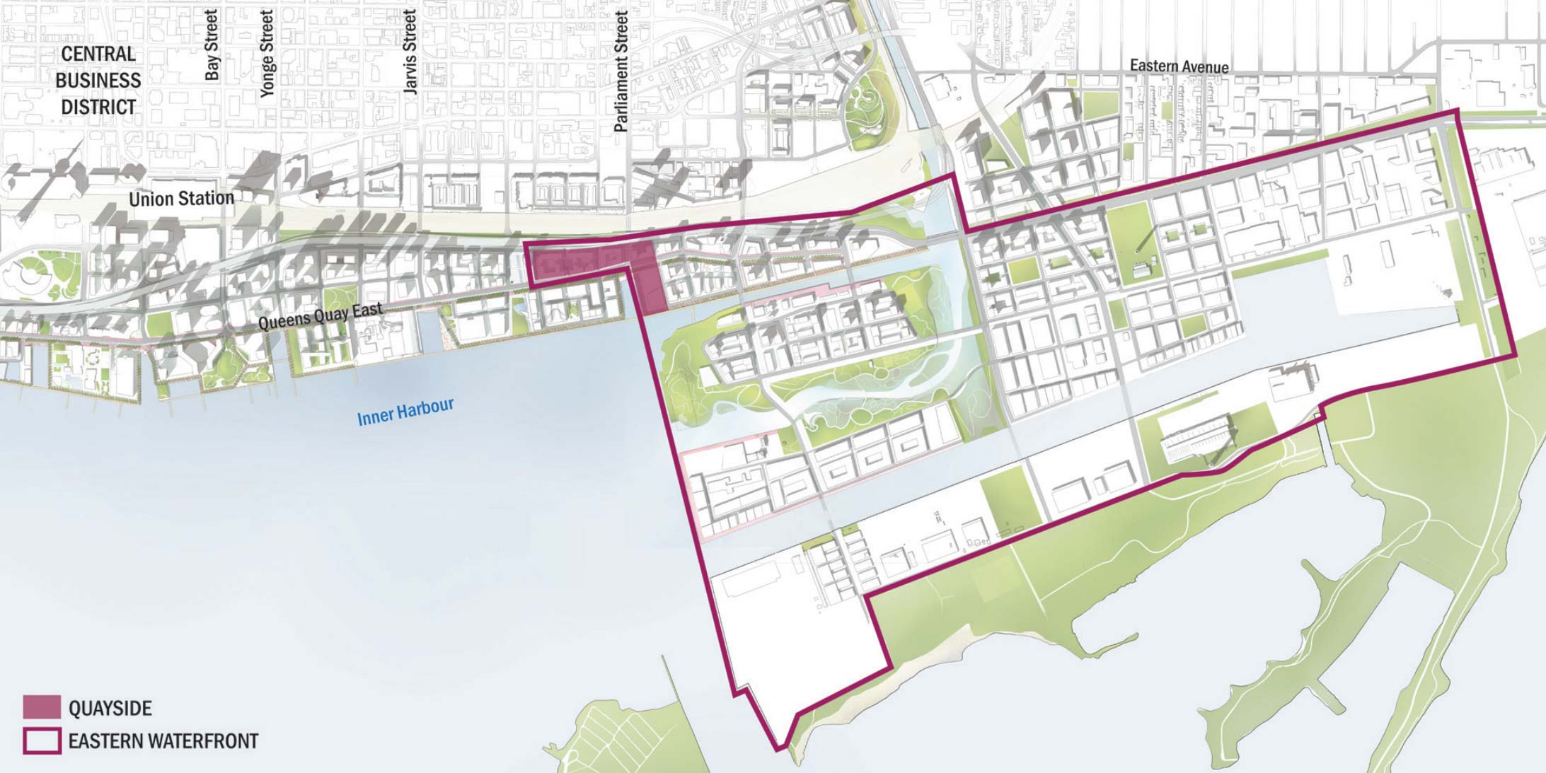
In October 2017, Sidewalk Labs announced it would develop ‘Quayside,’ a 12-acre site on Toronto’s eastern waterfront, working alongside government partner Waterfront Toronto.

The rather desolate site gives Sidewalk Labs the opportunity to build the ideal urban neighbourhood from the ground up, with new technology, yes, but also applying certain technological ideas to urban design.

Rohit Aggarwala, head of urban systems at Sidewalk Labs, told me he thinks of the Quayside as a platform, and wants to make it future-proof through modularity and smart design that anticipates and makes space for the next big innovation.

He spoke with me over the phone from his office in New York City last week, ahead of today’s town hall listening session in Toronto. Below, find the highlights of our conversation.

Why Toronto is the perfect spot

“We genuinely looked all across North America and could not find a location and a city that we were more excited about than this one.

The site has the ability to plug directly into the vibrancy of the city and not be a sterile campus and be on the outskirts, which so many large developments have to do.

Toronto’s eastern waterfront. Photograph by Mark Wickens via Sidewalk Labs informational material.

What Sidewalks Lab started working on two-and-a-half years ago was the question of: what would you do if you were going to develop a neighbourhood and you had the flexibility to rethink the way the streets are, rethink the way the buildings are shaped, rethink how services are provided.

Knowing what we know and expect from technology over the next, say, ten or 20 years, what would you do differently? And that was really the starting point for our work at Sidewalk Labs.”

How autonomous cars allow for smart streets

“There’s an opportunity, particularly with self-driving vehicles, to completely redefine the the way streets work. An urban street today is primarily designed to facilitate vehicle travel and secondly to protect everything else from the damage that bad drivers are likely to cause.

We don’t need to design streets the same way if we can rely on cars that will always obey the speed limit, will always be paying attention, will be willing to slow down and yield in a reliable way, in ways that human drivers maybe do often and are supposed to do, but you can’t rely on that with your life. So that’s one example of something that could radically change. If you think about what you could do, relying on those cars.

For example, you’d narrow the travel lane. Cars are generally speaking 8-feet wide, we have travel lanes that devote 12 feet to vehicles, because people aren’t good at staying in the middle of the lane and so we actually devote a lot of extra space to cars. If you shrink the lanes, that gives you more space for pedestrians.

You don’t need to provide parking, because either the car parks itself or what we hope is the car is a shared taxi-like experience.

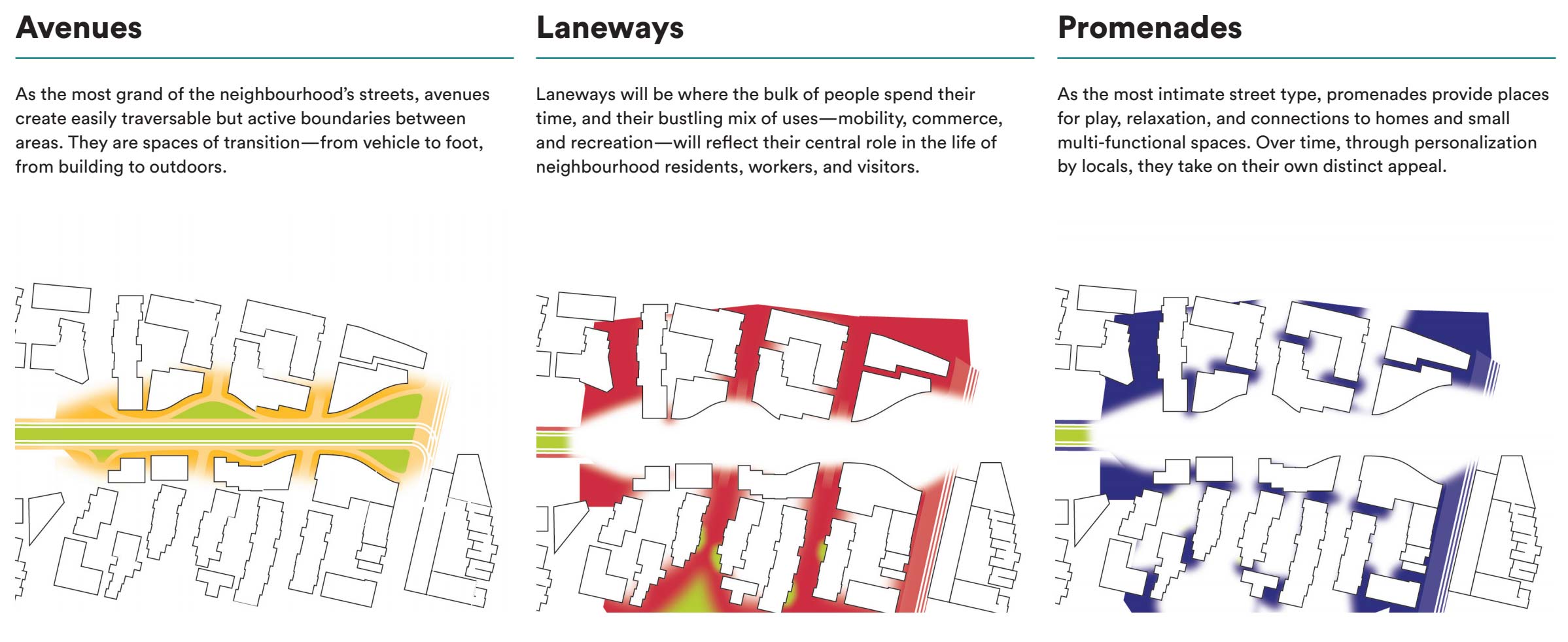
All of a sudden, you have a much bigger expanse of space for pedestrians, for cyclists and the buildings can be spaced closer together which, everybody who studies cities understands that while you want some broad avenues and plazas, you also don’t want all your buildings to be far apart, because those expanses tend to be dead space more often than not.”

A self-driven waterfront

“We have proposed that the streets in Quayside, even across the eastern waterfront, be restricted to autonomous vehicles only.

“We […] could not find a location and a city that we were more excited about than this one.”

Inevitably there will be exceptions for emergency vehicles and if someone shows up with a traditional taxi cab who has a disability or something like that. But if you restrict almost all traditional vehicles from the streets it does allow you to do these kinds of redesigns and reap the benefits.”

Porting popular tech ideas over to building planning

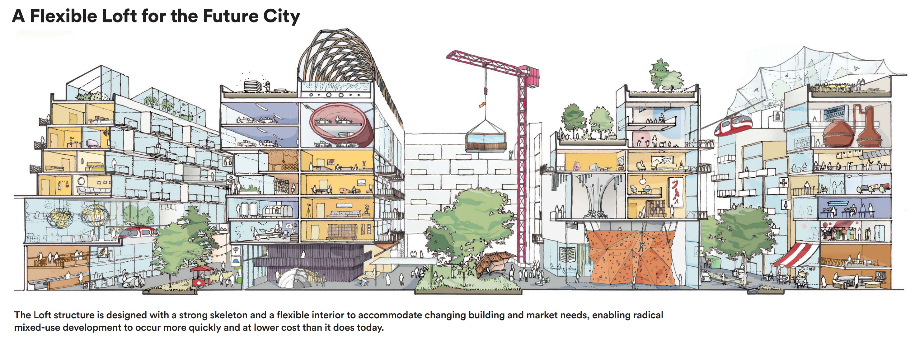
“Buildings are designed with one purpose in mind and yet, the most exciting neighbourhoods in most cities are actually the places where the buildings have gone through two or three or four generations and where they started out as a warehouse and are now housing, or started out as housing and now it’s a work space. And yet, that’s rare because most of the time it makes more sense just to tear a building down rather than try to re-purpose it.

So one of the ideas that we’ve been working on is how could you design buildings at a reasonable cost — of course you could just overbuild it, but that’s not economically feasible — if you used thoughtful design and lightweight advanced materials and you think about all of your systems in a modular way, that’s one of the ideas we very much port over from technology.

It’s not just the use of data, but also designing things that are platforms and modular and intended to evolve over time. You have the potential to make buildings that retain their value, that users can customize on an ongoing basis so it’s not a massive ordeal to decide you want to renovate your apartment or need to reconfigure your office space.

And in part that will also reduce the environmental footprint, because think about construction — every time you do a renovation of an interior space there’s a ton of stuff that you can’t reuse so that, at best becomes clean fill but more likely just landfill.”

Feedback from Torontonians

“Affordability was the top question that people [who attended the November 1st meeting] were concerned about. How is this going to create housing that normal people can access, not just super wealthy people? How is it not just an enclave for people who work for Google or Twitter or Amazon or whatever? It can’t be a tech enclave either. That was one big theme, another big theme was a concern around what happens to data. How are you going to address privacy needs.

A third concern was: how do you make sure it’s an inclusive, diverse community? Not just that it not be for the wealthy, but how do make sure that it reflects the vibrancy that really is one of the distinguishing features of Toronto, being such a multi-cultural city.”

Inclusion, diversity and affordability

“When Sidewalk Labs first started out one of the first things we put down was an objective was that, wherever we did this, whatever we wanted to build, it had to be inclusive. It’s gotta reflect the demographics of the metro area.

There are two things that we are particularly focused on as a way to make sure that that really happens.

One is a real commitment to making sure that the housing we build includes a large component that’s not only affordable to median and lower income people, but also has a diverse set of housing types and ownerships or rental opportunities that make housing accessible to lots of people.

“How do we make sure there are employment opportunities that are not just for people that know coding?”

You have some people that are priced out of the housing market just because it’s too expensive, you have others who are priced out because they might be able to afford a reasonable rent, but they don’t have the down-payment to buy.

The second aspect is how we think about everything else. How do we make sure there are employment opportunities that are not just for people that know coding? Or, it shouldn’t just be people who can do coding and people who can pour coffee. We need a good mix of jobs.

We need a place that feels comfortable to a wide variety of people, that means taking very seriously the idea that we want to redesign streets that are easy for people to use if they are senior citizens, places that are welcoming to children, places that are easy to navigate for the visually impaired. That goes to how we design the street-scapes for the public realm.”

Wireless connectivity

“The fundamental belief is that anything we do, not only would we want a level of ubiquitous connectivity, but one of the big ideas that I’m keen on is making sure we design an infrastructure that is easily upgradeable as technology changes.

Think about when 50 years ago we finally got most neighbourhoods in North America wired for electricity and telephone service, and then along comes cable television and all of these cities had to go through an effort to get cable television put everywhere. By the time we finished that, we realized, now we need fibre everywhere. So learning from that and thinking about this concept from so many electronics products — how do you make components swappable, how do you make it easy to upgrade.

Part of what we’re thinking about is how do you develop a utility system that when the next thing comes […] it can be put in at low-cost and without much construction because that’s the way we make it so a neighbourhood doesn’t start out smart and then get dumb as the rest of the world gets smarter, but it actually stays at the cutting edge.”

Correction: Rohit Aggarwala’s title was corrected to head of urban systems from co-head of Sidewalk Labs.

This interview has been edited for length and clarity.

All images courtesy of Sidewalk Labs.

The post Sidewalk Labs’ Rohit Aggarwala on building Toronto’s first smart neighbourhood appeared first on MobileSyrup.

21 Mar 17:35

Vancouver-based CryptoKitties secures $12 million in funding

by Jessica Galang
Cryptokitties

CryptoKitties, which was founded by Vancouver-based Axiom Zen, has raised $12 million USD, according to a report from Bloomberg.

The round was led by Andreessen Horowitz and Union Square Ventures, while other investors included Coinbase founder Fred Ehrsam, AngelList CEO Naval Ravikant, and Zynga founder Mark Pincus.

CryptoKitties is also being spun off from Axiom Zen. The platform aims to make blockchain technology more accessible to the average person; the game, built on bitcoin, is centred around breedable and collectible cats. You can buy, sell, or trade Cryptokitties, while blockchain will track ownership securely.

In early December, CryptoKitties accounted for 11 percent of all transactions on the Ethereum network, according to ETH Gas Station.

Source: Bloomberg

This article was originally published on BetaKit

The post Vancouver-based CryptoKitties secures $12 million in funding appeared first on MobileSyrup.

21 Mar 17:35

Philips is experimenting with Li-Fi technology

by Brad Bennett
Philips Hue

Philips is testing new technology that transmits internet data through lightwaves with some of its smart home products.

This tech provides interesting benefits over regular Wi-Fi, such as added security and the possibility for more robust coverage.

Li-Fi stands for Light Fidelity and it operates by building a modem into the light that’s capable of transferring internet signals through light waves.

It works by sending data from its built-in modem via light waves that are then received by a USB dongle attached to a computer. The USB adapter sends data back to the modem using an infrared link.

Philips is betting that in the future this technology will be built into modern computers and devices, but for now a dongle is needed.

Another benefit is that Li-Fi doesn’t disrupt equipment in the same way that radio frequencies do, making it ideal for use in locations like hospitals. Li-Fi also adds another layer of security to a network because it’s unable to pass through walls and it needs a dedicated dongle to connect. Ideally Li-Fi can expand coverage in a building that’s fully equipped with the technology, though something like this might still be years away.

Li-Fi can provide internet speeds of up to 30Mbps for downloading along with providing users with energy efficient LED lighting and up to 10,000 times more bandwidth than traditional Wi-Fi.

Source: Phillips

The post Philips is experimenting with Li-Fi technology appeared first on MobileSyrup.

21 Mar 17:34

Every day I'm Drupalin'

by Dries

It's a few years old, but I don't think I've seen this Drupal rap video yet:

21 Mar 17:34

Responsive accessible HTML tables

by Dries

A very thorough explanation of how to build responsive accessible HTML tables. I'd love to compare this with Drupal's out-of-the-box approach to evaluate how we are doing.

21 Mar 17:34

Use Case – Real Estate and the ParcelMap BC Parcel Fabric Dataset

by Elaine Dawson

The BC Data Catalogue is the place to find B.C. Government data, applications and web services.  It is a system specifically designed to encourage sharing, exploration and use of B.C.’s data assets.  Currently there are 3,043 datasets, and 1,578 of those are made available under an Open Government license. Over the past year DataBC has been connecting with businesses that have been using B.C.’s open data to build applications to improve B.C. and beyond.  We want to share their use case stories.

Our first use case story is about how real estate agent Gary Little created an interactive real estate map using one of the more popular open datasets, the ParcelMap BC Fabric, which is a geospatial dataset of land parcel boundaries, both private land and land owned by the province.  This dataset enables home buyers to see the shape of the property on a map.


Gary explained that until recently he had to seek out property boundary data from each municipality or regional district with mixed results. Some didn’t have the data or could not share it for Gary’s use. Even in the cases where he was able to obtain the data, it was in a variety of formats that took a huge amount of work to interpret and make useful for his purposes. The situation improved dramatically with the release of the ParcelMap BC Parcel Fabric dataset.

“The data is in a consistent format province-wide, so I now have complete coverage for the area of my map and I can use a single technique for analyzing all the data,” said Gary.

 The public availability of this dataset will no doubt lead to other surprising solutions for B.C. businesses and other users.

Stay tuned for future use case stories.

The post Use Case – Real Estate and the ParcelMap BC Parcel Fabric Dataset first appeared on DataBC Blog.

21 Mar 17:33

Mini mini pumps review

by jnyyz

Seeing that the  (non commuting) cycling season is about to start, I wanted to replace an old Serfas mini pump with something a bit more compact. As it turns out, I ended up buying two new pumps, with the main criterion that they had to be as short as possible to make them easy to stow. Left to right we have the Lezyne Sport Drive HP, my older Serfas, and the Topeak Micro Rocket AL.  Why did I buy two new pumps?  Well I got the Micro Rocket first, but I did not realize when ordering it that it was presta only.IMG_7986

The Lezyne pump is going to accompany my regular commuter (which is Schrader).

IMG_7976

It comes with a hose that accommodates both types of valves.

IMG_7979

I was concerned that it would be a pain to use since you have to screw the hose onto the pump, and then to rotate both pump and hose to screw it onto the valve. However in practice this didn’t seem to be too much of a pain.

IMG_7990

Weight stats with and without mounting clip

What is more important to me is that it is short (a bit under 7.5″) so that it fits into a seat bag. This way I don’t have to store it in the bottom of my commuting pannier like the Serfas.

IMG_7977

IMG_7988

Next up: the Topeak mini pump. This thing is both short and light.

It has a pretty sturdy almost all metal construction and seems to work pretty well. I can tell that it is going to take a bajillion pumps to inflate a tire from flat, but I’m not a believer in CO2 cartridge inflators.

IMG_7985

Here it is mounted on the Tamarack.

IMG_8041

Just for reference: my old Serfas. Nothing really wrong with it. It has a flip release chuck and it does work on both types of valves. However, it was forever getting lost in the bottom of my pannier, so now it is a spare that I’ll carry around on one of the other bikes.

IMG_7987

21 Mar 17:33

6 key takeaways from SXSW 2018

by Jessica English

Photo of live mural in progress at SXSW 2018

Over the past week at the South by Southwest Conference & Festivals, we’ve had the chance to hear experts weigh in on topics ranging from brand innovation to the future of work to evolving business models and next generation customers. We also got to watch creative energy and collaboration in action, as teams of artists co-created live murals, each one spotlighting a different cause. Here are a few highlights and takeaways from our week in Austin.

1. Mind-blowing murals can be created in only 9 hours

For three straight days, we witnessed these gifted duos join forces to showcase their activism through art. They began and finished their co-creations in nine-hour painting marathons, each in service of a different cause-driven theme. Shawna X and Rachell Sumpter reimagined the future. Ben Sanders and Maxwell McMaster explored environmentalism. And Stacey Rozich and Matt Leines took inspiration from the fight for human rights. Check out this video to see how it all came together.


2. Dropbox Paper helped make those collaborations faster and easier

In her Brand Innovators interview, Shane Steele, our Head of Global Brand Marketing at Dropbox, explained how we’re using the live mural activation as an opportunity to tell the story of creative energy.

“We’re here at SXSW because you all in this room are the superusers of Dropbox. It’s the people who are the creators, the inventors, the collaborators that work cross functionally,” said Shane. “We want to tell that story of creative energy at SXSW. One component of that story is this idea of co-creation, bringing together unexpected collaborators to create something.”

“Everything that’s coming to life on these murals actually started in Dropbox Paper,” said Shane. “These artists were doing early sketches, collaborating back and forth. There was a conversation happening in Paper leading up to what’s happening right now.”

Create and share early ideas with your team in Dropbox Paper

3. There’s growing interest in collaboration tools that reduce “work about work.”

When asked about the rationale for our recent rebranding campaign, Shane said, “The company has gone through a massive evolution over the past 10 years. It used to be this idea of your files in sync. Now it’s all about this idea of teams in sync. In addition to the new look and feel of the brand, we also had a new story to tell. We wanted to provoke a conversation and plant a seed around this new idea of creative energy.”

“So much about work these days sort of drains us. Our mission is to unleash more creative energy by facilitating work, so it’s easier, so we can stay in flow.”—Shane Steele, Head of Global Brand Marketing at Dropbox

4. Visible representation matters

Taking part in the panel on Supporting Women in the Entrepreneurial Ecosystem Through Public Policy, Angela Roseboro, Head of Diversity, Equity and Inclusion at Dropbox, spoke about the need for emerging companies to create opportunities and develop a culture of diversity that candidates can see.

“As you’re building your company, you have an opportunity to make diversity and inclusion a part of your DNA. It becomes the way you do business and not a separate initiative,” said Angela. “If I’m going to go to a company, seeing someone like me says, ‘Okay, I can be here.’ ”

“As you’re hiring leaders, visible representation matters.”—Angela Roseboro, Head of Diversity, Equity and Inclusion at Dropbox

5. The buying power of Gen Z is expected to quickly outpace Millennials

Liz Armistead, Head of Brand and Influencer Partnerships at Dropbox, joined the panel on Evolving Business Models: Finding Next Gen Customers to discuss how brands are evolving their digital strategies to earn and keep the loyalty of Gen Z customers. Commenting on the way Dropbox plans to inspire a market of future customers, Liz said, “We’re lucky because we have a ton of amazing non-profit customers that are saving lives and changing the world with the help of our products. We make it a priority to share those stories and bring awareness to their missions.”

“One of the things I really admire about Gen Z (and millennials) is their demand for brands to be socially responsible. 79% said they would engage with a brand that could help them make a difference.”—Liz Armistead, Head of Brand and Influencer Partnerships at Dropbox

6. All new ideas evolve out of the old

You may have heard the old adage that “there’s no such thing as an original idea.” At the session titled Runaway Species: How Creativity Remakes the World, our Head of Brand Marketing, Jessica English learned why. Author and neuroscientist David Eagleman and composer Anthony Brandt noted that ideas evolve by bending (e.g. variations on original creations), breaking (e.g. digital pixelation), and blending (e.g. music mash-ups).

“I thought it was interesting that the science and technology innovation or evolution examples used were all defined as ‘creativity.’ This reinforces our larger application of ‘creative energy,’ ” said Jessica.

“Creative energy is not just for creatives. It’s innate in all of us, given this insatiable need to evolve the original. The human instinct is to ‘tune-out’ sameness and repetition.”—Jessica English, Head of Brand Marketing at Dropbox

Being surrounded by cause-driven artists, entrepreneurs, musicians, and creative problem solvers makes us feel re-energized and re-committed to the causes brought to life in the murals. And we plan to keep it flowing in the weeks and months to come. To see where we’re headed next, follow us on Instagram, Twitter, and Facebook.

The easiest way to create and share early ideas, together | Check out Dropbox Paper

21 Mar 17:33

The Irresponsibilty Of The Ad Industry

by noreply@blogger.com (BOB HOFFMAN)

I posted this on LinkedIn yesterday and got some nice reaction to it. Being the lazy-ass bastard I am, I thought I'd re-post it here today and go out and have a beer.

Thus far the ad industry has been lucky. We have escaped the outrage and scorn that have been heaped on Facebook.

Lucky for us, the media and the public still don't get it. They don't understand at who's behest all the unconscionable collection, trading, and selling of personal, private information is being done. They haven't put two-and-two together yet and realized who is really at fault for the Cambridge Analytica and Russian election tampering scandals.

Our industry "leadership" have been uniquely incompetent and shamefully irresponsible in dealing with the dangers that ad tech has created.

Being the concerned, responsible, and annoying citizen that I am, in September of last year I wrote to a leader of one of our most influential trade organizations.
"You are now in a unique position to do something amazingly worthwhile about a very dangerous situation the agency industry has gotten itself into. I’m talking about surveillance marketing, tracking, and ad tech. These are very unhealthy for us as individuals and as members of a free society... can we have a brief talk about this subject? I would like to try to convince you... that this is an issue you guys should put on your agenda. It will not make you many friends among the holding companies, but you can do our industry and our country a great service."
In October, I personally wrote to another of our "leaders." Here's what I wrote:
"The ad industry has been irresponsibly negligent in its recognition of the implications of online tracking and surveillance. It is a very serious issue for free societies. I believe it is destined to explode in our face if we don’t start to do something about it...You are in a position to take a leadership role in giving mature consideration to this issue and bring some responsibility to our industry...You will be doing a service to the industry and to society...If you choose to do this I will help you in any way I can."
In neither case did I even get a reply.

There is now no doubt in my mind that the ad industry is in some deep shit. This problem is not going to go away. Pretty soon even the dimwits in Washington are going to see our fingerprints all over these debacles.

Any sense of responsibility that the ad industry once had has been drowned in the loose ethics and corrupt practices of the online ad industry and repulsive holding company creeps.

Meanwhile we waste our time at the "Programmatic Activation Worldwide Insider Summit" or some other idiotic conference when we should be discussing what to do about the shit storm we have created.
21 Mar 17:33

Scraping Texts

by Tony Hirst

One of the things I learned early on about scraping web pages (often referred to as “screen scraping”) is that it often amounts to trying to recreate databases that have been re-presented as web pages using HTML templates. For example:

  • display a database table as an HTML table in a web page;
  • display each row of a database as a templated HTML page.

The aim of the scrape in these cases might be as simple as pulling the table from the page and representing it as a dataframe, or trying to reverse engineer the HTML template that converts data to HTML into something that can extract the data from the HTML back as a row in a corresponding data table.

In the latter case, the scrape may proceed in a couple of ways. For example:

  • by trying to identify structural HTML tag elements that contain recognisable data items, retrieving the HTML tag element, then extracting the data value;
  • parsing the recognisable literal text displayed on the web page and trying to extract data items based on that (i.e. ignore the HTML structural eelements and go straight for the extracted text). For an example of this sort of parsing, see the r1chardj0n3s/parse Python package as applied to text pulled from a page using something like the kennethreitz/requests-html package.

When scraping from PDFs, it is often necessary to make use of positional information (the co-ordinates that identify where on the page a particular piece of text can be found) as well as literal text / pattern matching to try to identify different structured items on the page.

In more general cases, however, such as when trying to abstract meaningful information from arbitrary, natural language, texts, we need to up our game and start to analyse the texts as natural language texts.

At the basic level, we may be able to do this by recognising structural patterns with the text. For example:

Name: Joe Blogs
Address: 17, Withnail Street, Lesser Codswallop

We can then do some simple pattern matching to extract the identified elements.

Within the text, there may also be things that we might recognise as company names, dates, or addresses. Entity recognition refers to a natural language processing technique that attempts to extract words that describe “things”, that is, entities, as well as identifying what sorts of “thing”, or entity, they are.

One powerful Python natural language processing package, spacy, has an entity recognition capability that lets us identify entities within a text in couple of ways. The spacy package includes models for a variety of languages that can identify thinks like people’s names (PEOPLE), company names (ORG), MONEY and DATE strings.

However, we can also extend spacy by developing our own models, or building on top of spacy‘s pre-existing models.

In the first case, we can build an enumerated model that explicitly identifies terms we want to match against a particular entity type. For example, we might have a list of MP names that we want to use to tag a text to identify wherever an MP is mentioned.

In the second case, we may want to build a more general sort of model. Again, spacy can help us here. One way of matching text items is to look at the “shape” of tokens (words) in a text. For example, we might extract the shape of the word “Hello” as “Xxxxx” to identify upper and lower case alphabetic characters. We might use the “d” symbol to denote a numerical character. A common UK postcode form may then be identified from its shape, such as XXd dXX or Xd dXX.

Another way of matching elements is to look at “parts of speech” (POS) tags and the patterns they make. If you remember your grammar, things like nouns, proper nouns or adjectives, or conjunctions and prepositions.

Looking at a sentence in terms of its POS tags provides another level of structure across which we might look for patterns.
The following shows how even a crude model can start to identify useful features in a text, albeit with some false matches:

For examples of scraping texts, see this notebook: psychemedia/parlihacks/notebooks/Text%20Scraping%20-%20Notes

PS related, in policy  / ethical best practice terms: ONS web-scraping policy

20 Mar 19:44

Google brings Instant App technology to Android gaming

by Brad Bennett

The Google Play Store has added a new way for users to test out games instantly before they buy them.

The Mountain View-based search giant has released a new ‘Play Instant’ feature that runs off the Android Instant Apps technology that Google launched in 2017.

In practice ‘Play Instant’ works by enabling users to download and play a small portion of a game without having to download the whole thing. The developers get to choose what portion of their game is available through the service so each game offers something different.

Games like Words With Friends 2 offer a short tutorial-type demo while titles like Final Fantasy XV: A New Empire offer a weird 10-second slice of gameplay that might not be a part of the full game at all.

The Play Store now also has a section called ‘Instant Gameplay’ that so far has six games, but there are games that are not grouped into this section that still have the ‘Try now” option — like NYTimes – Crossword. This feature is still in beta but, according to a March 19th, 2018 Google press release, it will be more widely available later this year.

Source: Google Via: Android Central

The post Google brings Instant App technology to Android gaming appeared first on MobileSyrup.

20 Mar 19:44

Mozilla Statement, Petition: Facebook and Cambridge Analytica

by Ashley Boyd
Update, Thursday, March 22:

Facebook reached out to us to discuss how we characterized their settings and to tell us that our original blog post overstated the scope of data sharing with app developers. What we described is an accurate characterization of what appears in Facebook’s settings.

What Facebook told us is that what we have written below is only true generally for third-party apps prior to 2015. Again, this isn’t clear in the user-facing tools and we think this needs to be fixed.

If what Facebook told us is accurate, Facebook users are sharing less data with app developers today. We understand that Facebook is trying to clarify these settings for the user. We appreciate that Facebook is engaging with stakeholders, and we want to see further commitment on bringing greater transparency to this issue.


The headlines speak for themselves: Up to 50 million Facebook users had their information used by Cambridge Analytica, a private company, without their knowledge or consent. That’s not okay.

Facebook is facing a lot of questions right now, but one thing is clear: Facebook needs to act to make sure this doesn’t happen again.

Mozilla is asking Facebook to change its app permissions and ensure users’ privacy is protected by default. And we’re asking users to stand with us by signing our petition.

Facebook’s current app permissions leave billions of its users vulnerable without knowing it. If you play games, read news or take quizzes on Facebook, chances are you are doing those activities through third-party apps and not through Facebook itself. The default permissions that Facebook gives to those third parties currently include data from your education and work, current city and posts on your timeline.

We’re asking Facebook to change its policies to ensure third parties can’t access the information of the friends of people who use an app.

At Mozilla, our approach to data is simple: no surprises, and user choice is critical. We believe in that not just because it makes for good products, but because trust is a key factor in keeping the internet healthy.

The internet is transformative because it’s a place to explore, transact, connect, and create. Trust is key to that. We’re pushing Facebook to improve its privacy practices not just because of its 2 billion users, but also for the health of the internet broadly.


Ashley Boyd is Mozilla’s VP, Advocacy

The post Mozilla Statement, Petition: Facebook and Cambridge Analytica appeared first on The Mozilla Blog.

20 Mar 19:44

The Best Website Builder for Small Businesses

by Kevin Purdy
The Best Website Builder for Small Businesses

After researching 17 of the top website-building services and hosts, building 20 websites with seven of the most promising ones, and changing hundreds of little things on each page, we believe Wix is the best way for a small business to put up a professional-looking website. Its templates, setup interview, and editing tools create modern, clean-looking sites that you can easily customize, and adding crucial tools like contact forms or restaurant menus is easier than with other website-building tools. Wix’s customer support is reliable, its free trial is generous, and its pricing is clear and fair for small businesses.

20 Mar 18:39

Jobs Jar — Bike Host Program Coordinator

by Ken Ohrn

If you’d like to help plug newcomers to Canada into Vancouver’s world of cycling — here’s your chance.  HUB is looking for a coordinator for their lovely Bike Host program.

HUB.ISS.Bike Host Program

Click to enlarge


About the Newcomer Bike Host Program

The Newcomer Bike Host Program is a collaborative program between HUB Cycling and the Immigrant Services Society of BC (ISSofBC), modeled off of Toronto’s CultureLink program. The first of its kind in Vancouver, the program matches recent immigrants and refugees with local “host” volunteers for companionship and cultural orientation to Vancouver’s active cycling transportation lifestyle. HUB Cycling and the ISSofBC piloted the service model for 58 Vancouver immigrant and refugee newcomers in 2017 and are excited to continue this program in 2018.

Newcomers will receive city cycling orientation and instruction, then have the opportunity to spend time with their host volunteers cycling around the City becoming oriented to Vancouver’s cycling routes, rules, and culture, while having fun exploring urban spaces by bike together. For 2018, the program aims to have one intake of newcomers that will participate from May to August.

To Apply: Please send a cover letter and resume (in one PDF document) to jobs@bikehub.ca with “Bike Host Program Coordinator Application” as the subject line. Please ensure the file name follows the convention: “BHPC18_Firstname_Lastname.pdf”. Application deadline is Monday, April 2, 2018.

20 Mar 18:38

Our 2017 Annual Review

by Oliver Quinlan

Each year we take stock at the Raspberry Pi Foundation, looking back at what we’ve achieved over the previous twelve months. We’ve just published our Annual Review for 2017, reflecting on the progress we’ve made as a foundation and a community towards putting the power of digital making in the hands of people all over the world.

In the review, you can find out about all the different education programmes we run. Moreover, you can hear from people who have taken part, learned through making, and discovered they can do things with technology that they never thought they could.

Growing our reach

Our reach grew hugely in 2017, and the numbers tell this story.

By the end of 2017, we’d sold over 17 million Raspberry Pi computers, bringing tools for learning programming and physical computing to people all over the world.

Vibrant learning and making communities

Code Club grew by 2964 clubs in 2017, to over 10000 clubs across the world reaching over 150000 9- to 13-year-olds.

“The best moment is seeing a child discover something for the first time. It is amazing.”
– Code Club volunteer

In 2017 CoderDojo became part of the Raspberry Pi family. Over the year, it grew by 41% to 1556 active Dojos, involving nearly 40000 7- to 17-year-olds in creating with code and collaborating to learn about technology.

Raspberry Jams continued to grow, with 18700 people attending events organised by our amazing community members.

Supporting teaching and learning

We reached 208 projects in our online resources in 2017, and 8.5 million people visited these to get making.

“I like coding because it’s like a whole other language that you have to learn, and it creates something very interesting in the end.”
– Betty, Year 10 student

2017 was also the year we began offering online training courses. 19000 people joined us to learn about programming, physical computing, and running a Code Club.

Over 6800 young people entered Mission Zero and Mission Space Lab, 2017’s two Astro Pi challenges. They created code that ran on board the International Space Station or will run soon.

More than 600 educators joined our face-to-face Picademy training last year. Our community of Raspberry Pi Certified Educators grew to 1500, all leading digital making across schools, libraries, and other settings where young people learn.

Being social

Well over a million people follow us on social media, and in 2017 we’ve seen big increases in our YouTube and Instagram followings. We have been creating much more video content to share what we do with audiences on these and other social networks.

The future

It’s been a big year, as we continue to reach even more people. This wouldn’t be possible without the amazing work of volunteers and community members who do so much to create opportunities for others to get involved. Behind each of these numbers is a person discovering digital making for the first time, learning new skills, or succeeding with a project that makes a difference to something they care about.

You can read our 2017 Annual Review in full over on our About Us page.

The post Our 2017 Annual Review appeared first on Raspberry Pi.

20 Mar 18:38

The last people who don't do presentations

by russell davies

IMG_3365

I went to a talk at the Almeida last night (I know!). The event description (as captured in the Google search cache) was "Have politicians lost the art of persuasion? in association with the New Statesman...A speech can inspire crowds, set out a vision – and change hearts and minds. But in the era of Trump's tweets and social media soundbites, is there a place for great oratory? "

It was interesting. Lots of good thoughts about good speeches. But the question I've been burning to understand for years didn't get discussed.

Why are politicians the last people on earth to do speeches?

(Apart from, I guess, actors)

Everyone else in the world does presentations. They combine a powerful thing (spoken words) with other powerful things (written words and images). Politicians don't. I've never understood it.

Interestingly, there was a screen on stage to play an introductory video. It wasn't used for anything else but the powerful effect of a screen was evident. I'm not saying it's always a good thing, but it's undoubtedly a powerful communicative tool and I don't understand why politicians never use it.


20 Mar 18:37

Die Tübinger Straße heute im Bezirksbeirat Süd

by noreply@blogger.com (Christine Lehmann)
mkalus shared this story from Radfahren in Stuttgart.

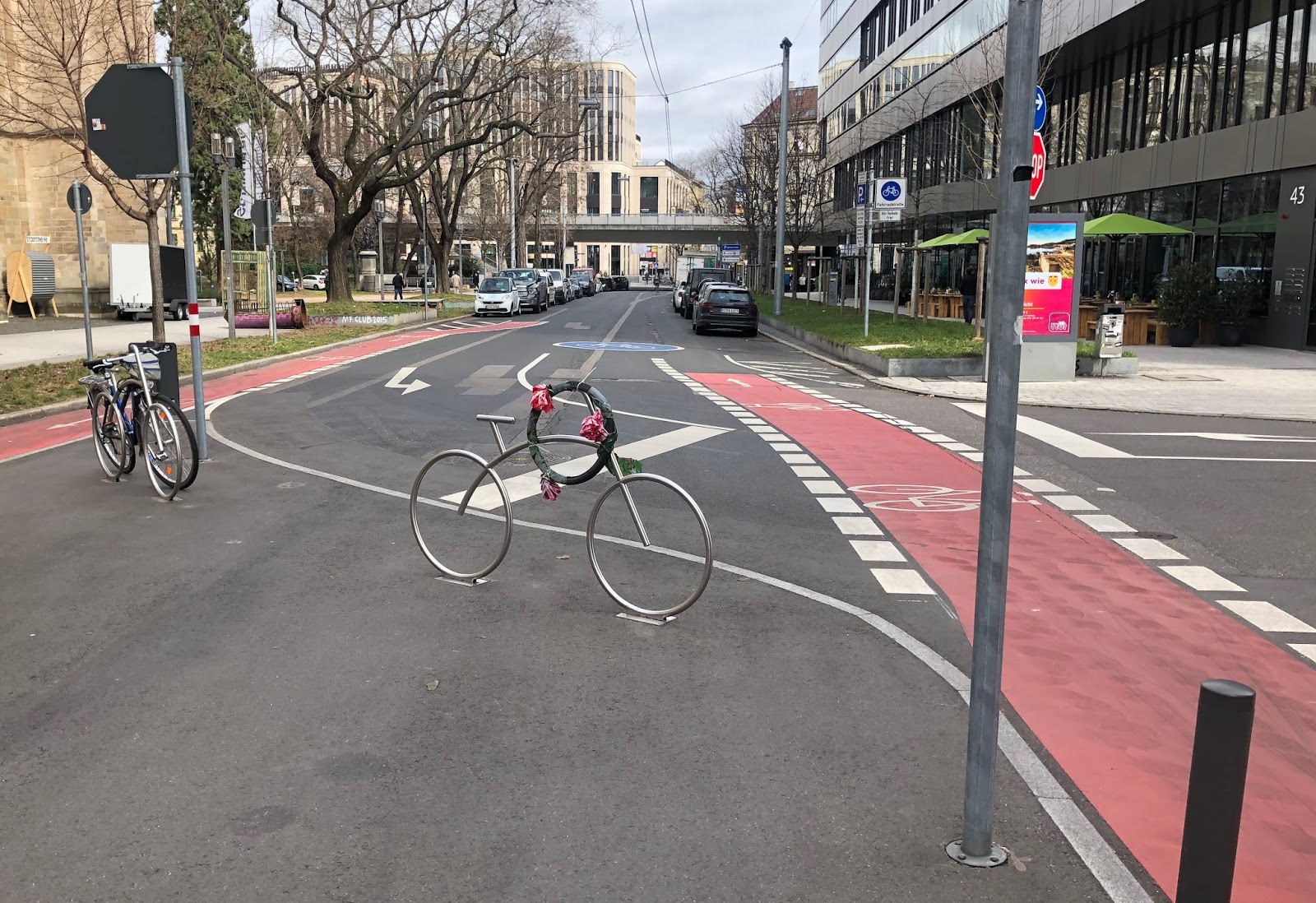
Der Österreichische Platz muss saniert werden. Drei Mal in diesem und den kommenden beiden Jahren soll für eine gewisse Zeit der Autoverkehr über die Fahrradstraße umgeleitet werden. Außerdem soll die Autosperre an der Feinstraße in dieser Zeit wieder aufgemacht werden. 

Ich finde: Die Fahrradstraße ist uns zu kostbar, um dem Autoverkehr geopfert zu werden, just im Sommer, wenn viele Menschen draußen sind und Fahrrad fahren, das Radfahren in Stuttgart womöglich sogar für sich entdecken wollen. Gerade dann sind verkehrsberuhigte Bereiche wichtig für alle, für die Gastronomie, für den Handel, für die Lebensqualität, für das Klima und für Fußgänger/innen und Radfahrende. Das gilt vor allem für die jetzige Sackgasse für Autos an der Kirche St. Maria.

Das Thema wurde in den letzten Wochen  heiß diskutiert, und es gab auch eine Radlerdemo. Nun werden heute Abend 18:30 Uhr im Gebrüder-Schmid-Zentrum zum zweiten Mal Vertreter des Tiefbauamts und der des Amts für Öffentliche Ordnung iim Bezirksbeirat Süd die Pläne vorstellen.

Tübinger Str. Richtung Cottastraße
Diesen Sommer wird die Öffnung der Fahrradstraße für den Durchgangs-Autoverkehr Richtung Cottastraße und Richtung Gerber nur sechs Wochen dauern und während der Sommerferien stattfinden. Aber die beiden anderen Bauabschnitte im kommenden und im übernächsten Jahr werden drei und sechs Monate dauern. Damit wird auch die Fahrradstraße in den kommenden Sommern deutlich länger dem Autoverkehr überlassen werden.

Der ADFC und andere haben Alternativen vorgeschlagen und gefordert, auch per Antrag im Gemeinderat (Grüne und LÖSLi-Plus). Auch im UTA (Ausschuss für Umwelt und Technik des Gemeinderats) wird die Sache noch thematisiert werden. Einen Termin dafür habe ich noch nicht.

Die Sitzungen des Bezirksbeirats sind immer öffentlich. Auch Bürgerinnen und Bürger können sich im Süden zu Tagesordnungspunkten zu Wort melden, nachdem die Bezirksbeiräte gesprochen haben. Etwas Geduld und Sitzfleisch ist allerdings nötig, denn der Österreichische Platz ist Punkt 3 auf der Tagesordnung.

Termin: heute 18:30 Uhr
Gebrüder-Schmid-Zentrum, 2. Stock
Gebrüder-Schmid-Weg 13


20 Mar 18:37

Bei dieser ganzen Cambridge-Analytica-Geschichte muss ...

mkalus shared this story from Fefes Blog.

Bei dieser ganzen Cambridge-Analytica-Geschichte muss ich mich ja schon fragen, was die Leute eigentlich glaubten, was Facebooks Geschäftsmodell ist.

Facebook sammelt eure Daten und verkauft sie an Leute, die damit Dinge tun wollen!

Die 50 Mio Datensätze für Wahlwerbung und Bevölkerungsmanipulation, das ist kein Datenmissbrauch und keine böse Datenextraktion, das ist Facebooks Geschäftsmodell. Nicht Kern-Geschäftsmodell. Geschäftsmodell. Andere Dinge tun die gar nicht.

Wo kommt jetzt also diese Verwunderung her?

20 Mar 18:37

Techcrunch :: #deletefacebook

by Volker Weber

Sketch

Facebook is using us. It is actively giving away our information. It is creating an echo chamber in the name of connection. It surfaces the divisive and destroys the real reason we began using social media in the first place – human connection.

It is a cancer.

All my Facebook entries are gone, as are all my Instagrams. I am keeping less than a hundred of my tweets at all times.

You have to start getting rid of your liabilities. ASAP. It is going to take a while.

More >

20 Mar 18:36

1080 Mainland Street

by ChangingCity

In 1911, the year before this building was developed, Clarence Tingley was Secretary & Treasurer of the Vancouver Transfer Co Ltd, living on Howe Street. Fred Tingley was Manager of the same company, and in 1911 lived in Kitsilano. Both brothers were born in British Columbia; Clarence Harper Tingley in 1869 and Frederick Chipman Tingley in 1873. Their mother died the year after Fred’s birth.

Their father, Stephen, was born in New Brunswick, and came to BC in 1861 to prospect in the Cariboo Gold Rush. After years of no luck (despite walking from Yale to Williams Creek, a distance of 370 miles, carrying a 100 pound pack), he was hired as a stage driver for the Barnard’s Express in 1864. Known as the “Whip of the Cariboo”, he incorporated as a partner with the British Columbia Express Company in 1871 and drove stagecoaches in the Cariboo region over what was then one of the most hazardous roads in North America. In 1886, Tingley became sole owner of the express company which he ran for before selling out in 1894. He had bought a ranch at 108 Mile House, still standing today, where he built the BX Barn Service, stabling stagecoach horses. He sold out for $11,000 in 1903, and increased his fortune as the “Discoverer of the Nicola Coal & Coke Mine”.

Fred came to Vancouver before Clarence, and managed the Vancouver Transfer Co, originally established by Francis Stillman Barnard of Barnard’s Express, while Clarence was still ranching. By the early 1900s they were both involved in the Transfer Co, and in 1912 Tingley Bros hired ‘Snider, Geo. & Brethune’ (according to the building permit) to design and build a 3-storey warehouse in the CPR Reserve on Helmcken Street – which we’re almost certain has to be this building (as we’ve accounted for all the other Helmcken Street buildings built around this time). In fact, the builders were George Snider and Edgar and John Brethour, who ran their business from offices in the Dominion Building. In 1911 Clarence was living with his wife Blanch, born in Nova Scotia, and their three children, Elizabeth, Stephen and Hall, all aged under seven. Fred was living with his Scottish wife Sarah and their three daughters, Jean, Henrieta and Myrtle, all aged five and under.

The new building served double duty; it was the stables for the Transfer Co, and also home to the Elevator Supply & Equipment Co Ltd, managed by Arthur Gamwell. In 1920 the Transfer Co still had their stables here, but shared the building with the Chevrolet Car Company. By 1930 there were multiple tenants, including the Orange Crush Bottling Co and the Van Loo Cigar Co. In 1940 when this Vancouver Public Library image was taken, Tingley Brothers still operated here, although now they were listed as ‘property owners’. Clarence died in 1942 and Fred in 1947. In 1940 the building was used by T Eaton and Co, and United Milling and Grain. By 1950 the entire warehouse was occupied by T Eaton and Co, and by 1970 Dogwood Wholesale Stationery were in the building.

Over the years the Yaletown warehouse district became under utilized and run down. In 1988 Simon and Associates designed a radical change of use for the vacant building, designing a boutique hotel conversion. The use never took off, although the additional floor, balconies and curious ‘bay’ windows are a legacy from that idea – and instead a 64,000 sq. ft., multi-tenancy design centre (showroom/office) project was created. Yaletown Galleria still operates today, with a mix of retail and office tenants.

Image source: City of Vancouver Archives CVA 779-E18.21

20 Mar 18:36

Uber ‘likely’ not at fault in fatal self-driving car accident, says police chief

by Bradly Shankar
Uber logo on wall

Uber is “likely” not to be blamed for an accident involving one of its self-driving cars that led to the death of a woman in Arizona, Tempe police chief Sylvia Moir told The San Francisco Chronicle. 

“I suspect preliminarily it appears that the Uber would likely not be at fault in this accident,” Moir said. The incident is believed to be the first known fatality involving a self-driving car on a public road. “The driver said it was like a flash, the person walked out in front of them,” Moir said of the accident. “His first alert to the collision was the sound of the collision.”

While Moir refers to the driver as a male, it was later revealed that the operator is actually a female, 44-year-old Rafaela Vasquez. Vasquez has since come under scrutiny following a report from Arizona Central that revealed she is a convicted felon.

In the early 2000s, Vasquez served almost four years in an Arizona prison for an attempted armed robbery conviction. Moir said police “won’t rule out the potential to file charges against the [backup driver] in the Uber vehicle.”

That said, police are saying that the accident may have been the fault of the victim, 49-year-old Elaine Herzberg, who appeared to be homeless. Using footage obtained from two video cameras outfitted to the self-driving Uber Volvo SUV — one facing forward toward the street, the other focused on the driver — police say that it appears that car didn’t have enough time to stop before hitting Herzberg.

According to police, the Uber vehicle was driving at 38 miles-per-hour (approximately 61 kilometres-per-hour) in a 35 mph zone (roughly 56 kph) on the night of Sunday, March 18th.

Moir said the car made no attempt to brake, adding “it’s very clear it would have been difficult to avoid this collision in any kind of mode (autonomous or human-driven) based on how she came from the shadows right into the roadway.”

Moir said Herzberg was “perhaps within 100 yards” of a crosswalk, noting “it is dangerous to cross roadways in the evening hour when well-illuminated, managed crosswalks are available.”

While the incident raises safety concerns associated with self-driving cars, Moir said she’s only aware of one other accident, which occurred a year ago. In that incident, authorities determined the other car involved failed to yield and cited its driver for a moving violation. Moir said it’s difficult to determine to fault in self-driving car accidents because “this is really new ground we’re venturing into.”

Uber has confirmed it will temporarily halt its self-driving car tests in San Francisco, Pittsburgh, Phoenix and Toronto as the investigation continues.

Source: San Francisco Chronicle Via: The Verge 

The post Uber ‘likely’ not at fault in fatal self-driving car accident, says police chief appeared first on MobileSyrup.

20 Mar 18:35

HTC’s Desire 12 and Desire 12+ are not coming to Canada

by Dean Daley
HTC Desire 12 and 12+

HTC has announced two new midrange phones, the HTC Desire 12 and the HTC Desire 12+.

The HTC Desire 12 features a 5.5-inch 720 x 1440 pixel display with an 18:9 aspect ratio. It also includes a 13-megapixel rear facing shooter and 2GB/3GB of RAM or 16GB/32GB of storage variants.

Meanwhile, the HTC Desire 12+sports a 6-inch 720 x 1440 pixel display and an 18:9 aspect ratio. Further, the phone includes a dual rear camera setup with 13-megapixel and 2-megapixel sensors. The phone also has a front LED flash with an 8-megapixel shooter.

The Desire 12+ runs on a Snapdragon 450 processor, while the Desire 12 uses a Mediatek MT6739 chipset. The smaller model also features 2,730mAh battery and a 2965mAh battery powers the larger model.

HTC has confirmed to MobileSyrup that today’s announcement is not geared towards Canadian or U.S. consumers.

Source: HTC

The post HTC’s Desire 12 and Desire 12+ are not coming to Canada appeared first on MobileSyrup.

20 Mar 14:38

Linea Sketch 2.0: Elegant, Approachable Sketching for the iPad

by John Voorhees

Today, The Iconfactory released a major update to its iPad sketching app, Linea. Version 2.0, which has been renamed Linea Sketch, takes what was already one of my favorite Apple Pencil-enabled drawing apps and has extended it with new features that make it more powerful than ever before. Most importantly though, the new features don’t come at the expense of the app’s usability.

When I reviewed Linea 1.0 last year, I was struck by how approachable yet capable the app was. That’s still the case, but The Iconfactory has added several new features that should make it appeal to an even broader audience.

I’m not going to cover the same ground as my original review, which you can read here, or iCloud sync and backup, which Ryan covered here. Instead, I’m going to concentrate on what’s new in Linea Sketch.

Sketches are organized into projects.

Sketches are organized into projects.

Not everyone considers themselves an artist. I certainly don’t. With the introduction of Linea Sketch though, it’s easy to start learning to draw or find other uses for the app.

Now, photos and other images can be imported into Linea Sketch from your photo library, the clipboard, the iOS system file picker, or by taking a picture with your iPad’s camera. I love that this feature isn’t limited to images in your photo library. Once an image is added to a sketch, you can mark it up, use it as a reference to help you draw something, or put it in another layer and trace the image. For example, I used a photo from the opening of Chicago’s Michigan Avenue Apple store to trace the logo in the sketch at the beginning of this review.

Linea Sketch has also added new grid, storyboarding, app design, and notebook paper templates. Whether you’re brainstorming ideas for a project, sketching out an app layout, or taking notes in a class, the new templates facilitate the process. I especially like the narrow-ruled note paper that can now be used in portrait mode for taking notes. Linea Sketch isn’t going to replace an app like GoodNotes, but it’s a good alternative if your needs are simple or for jotting down ideas you want to store alongside your drawings.

Perhaps my favorite new feature though is the transform tool, which is the sole new icon in the Linea Sketch toolbar. Tap the scissors icon, and you can trace a path around parts of your drawing to select them. You can edit the selection by using the selection add or subtract buttons that appear at the top of the screen and modify the extent of the selection by toggling included layers on and off.

Selections can be modified with the modal buttons that appear at the top of Linea Sketch or by picking the layers to which the selection applies.

Selections can be modified with the modal buttons that appear at the top of Linea Sketch or by picking the layers to which the selection applies.

Tapping on the selection opens a pop-up menu of options to resize, rotate, flip, move, duplicate, cut, copy, or clear the selection. As you manipulate a selection, a HUD at the top of the screen appears and provides information about the selection’s coordinates, angle, and relative size. That’s a lot of functionality behind a single, new button and tap.

Linea Sketch also supports Split View mode and drag and drop. I especially like the drag and drop support, which makes it dead simple to select a portion of a sketch and drag it into another app. The feature is a terrific way to share a portion of a sketch with someone else. Dragging images into Linea Sketch is supported too.

Sometimes you want a line that’s straighter than you can draw by hand, like when you’re working on a flow chart or creating a floor plan of your home. Linea Sketch has a clever new feature called ZipLine for making perfectly straight lines. Just draw a line and hold the endpoint for a moment. The line will automatically straighten out. The gesture feels completely natural and like magic at the same time.

Before you lift the Apple Pencil, you can drag the endpoint of the line to change its angle. As you do so, the HUD at the top of the screen indicates the line’s angle so you can get it just the way you want. After you create a straight line, you can connect its endpoint with another straight line by simply tapping and holding on another spot on the canvas, which is a quick way to create neat and tidy geometric shapes.

Linea Sketch is a fantastic way to plan your week.

Linea Sketch is a fantastic way to plan your week.

When I first opened Linea Sketch 2.0, I wondered what had changed. The UI is nearly identical to the first version I reviewed last January. It’s a testament to The Iconfactory’s design skills that this much functionality can be added without cluttering up the app’s interface.

Linea Sketch delivers powerful drawing tools in an elegant package that makes it approachable to a wide variety of users. The new selection tool adds flexibility to Linea Sketch, which is a fantastic addition for existing users. At the same time, portrait mode, new templates for taking notes, storyboarding, and prototyping, the ability to import images, and support for drag and drop, open Linea Sketch up to a wider base of customers who will find ways to use it for more than traditional sketching. I highly recommend trying the app if you haven’t already.

Linea Sketch is a free update for existing users. For a limited time, the app is available on the App Store for $4.99, which is 50% off its usual price.


Support MacStories Directly

Club MacStories offers exclusive access to extra MacStories content, delivered every week; it's also a way to support us directly.

Club MacStories will help you discover the best apps for your devices and get the most out of your iPhone, iPad, and Mac. Plus, it's made in Italy.

Join Now
20 Mar 14:37

Sleep++ 3.0 Brings Automatic Sleep Detection on Apple Watch

by Federico Viticci

Sleep++, developed by _David Smith, was one of the first apps to experiment with the idea of using the Apple Watch as a sleep tracker. Using physical movement data collected by the Watch overnight, Sleep++ allowed you to keep track of time spent sleeping without having to buy a separate device (funnily enough, exactly what Apple itself acquired).

While I used Sleep++ for over a year and loved the app's simplicity, its functionality was eclipsed by a newcomer – AutoSleep, developed by David Walsh. AutoSleep took sleep tracking via the Apple Watch to the next level: instead of forcing you to manually activate sleep mode in a Watch app before sleeping, AutoSleep figured everything out automatically. AutoSleep assumed that the Watch was continuously saving data in HealthKit anyway; instead of asking users to remember to track their sleep, AutoSleep “only” needed to monitor data saved in HealthKit and understand when the user was going to sleep and waking up a few hours later.

I switched to AutoSleep as soon as it came out in late 2016. The app has helped me get a better overview of my sleep for over a year: thanks to its HealthKit integration and input-free sleep detection, I've been able to build a historical log of my sleep times that has allowed me to change my habits and wake up earlier each day. As I noted in my original review of AutoSleep and coverage of subsequent updates, however, the app has always featured a complex UI full of controls, buttons, and sub-menus that made visualizing and adjusting sleep data harder than it should have been. AutoSleep's core proposition is also its downside for many: it's an app that throws a lot of numbers and graphs at you, with a learning curve and vast amount of information that can be overwhelming. If you're serious about sleep tracking and the intersection of sleep and your heart rate, I highly recommend AutoSleep; if you want a sleep tracker that "just works" with minimal interaction, I would consider looking elsewhere.

This is where Sleep++ 3.0, available today on the App Store, comes in. Launching two years after version 2.0, Sleep++ 3.0 is a major update that brings automatic sleep detection through the Apple Watch. Like AutoSleep, all you need to do is install Sleep++ on your iPhone and give it permissions to access your Health data for automatic sleep tracking; as long as you wear your Apple Watch at night, Sleep++ will use its sensors’ data to build an estimate of your night's sleep. There's no need to install an app on the Watch or manually activate a sleep tracking mode: just wear the Watch at night and you'll get a notification with a summary of your sleep within a few minutes of unlocking your iPhone in the morning.

What sets Sleep++ apart from AutoSleep is, of course, the drastic simplicity of Smith's app compared to the rich data display of AutoSleep. Smith has kept Sleep++ extremely simple and intuitive: you can view individual nights as cards in the main page of the app, and tap on one to open a barebones screen with details about sleep times and quality. There are two levels of navigation in Sleep++ and nights are visualized as blue bars containing blocks of restful and restless sleep, as well as awake times. There are no historical trends, no heart rate data points, no weekly goals: Sleep++ is as basic as an automatic sleep tracker can be.

That’s not to say that Sleep++ is a simplistic take on sleep tracking. With its intuitive approach and basic visualization of essential data points, Smith’s app can be the ideal utility for those who are new to sleep tracking or perhaps don’t need the advanced reports of AutoSleep. There are thoughtful details in the app too: individual nights are subtly colored in red or green to indicate whether you’ve hit your desired nightly sleep goal or not; if you want, you can enable a bedtime notification that will gently remind you to get ready for bed. I haven’t enabled it because no app is going to tell me when I need to turn my Nintendo Switch off, but you get the idea.

Behind the scenes, Sleep++ uses a combination of heart rate, active calories, and steps to analyze and categorize your night in restful and restless moments. In my tests over the past month, data captured by Sleep++ was just as accurate as numbers returned by AutoSleep. The algorithms used by Walsh and Smith are clearly similar, showing differences of a few minutes that are negligible from a big picture perspective. The biggest benefit of Sleep++ is that it doesn't ask you to go through a multi-step onboarding process upon starting the app for the first time, nor does it require you to learn what different colors or icons mean; for better or worse, it just works, almost magically, and it's free to download with an In-App Purchase to remove ads.

Sleep data captured by the app is saved in HealthKit.

Sleep data captured by the app is saved in HealthKit.

Ultimately, it's difficult, if not downright impossible, to recommend just one automatic sleep tracker for Apple Watch. Sleep++ lowers the barrier to entry considerably, both from a pricing and usability perspective; AutoSleep can be more useful in the long term if you commit to the app and want to understand as much as possible about your sleep patterns. Until Apple enters this space with their own automatic sleep tracking feature for watchOS, we have two fantastic options on the platform that solve the problem from two different angles.

Personally, despite its perplexing UI, I'm sticking with AutoSleep because I appreciate its data-heavy approach that lets me visualize goals, heart rate, and trends alongside my sleep data. However, thanks to its simple approach, no-frills interface, and rock-solid performance, Sleep++ 3.0 is my new recommendation for anyone who wants to get started with sleep tracking via the Apple Watch or doesn’t need the advanced features of AutoSleep.

Sleep++ 3.0 is available on the App Store as a free update for existing users. The app is free to download with a $1.99 In-App Purchase to remove ads.


Support MacStories Directly

Club MacStories offers exclusive access to extra MacStories content, delivered every week; it's also a way to support us directly.

Club MacStories will help you discover the best apps for your devices and get the most out of your iPhone, iPad, and Mac. Plus, it's made in Italy.

Join Now
20 Mar 14:37

Safe enough in Open Space

by Chris Corrigan

I’ve been deeply influenced over the years by Christina Baldwin’s principle that “no one person can be responsible for the safety of the group, but a group can learn to take responsibility for it’s own safety.” I too think that the principles of Open Space allow for the right balance for individuals to take responsibility for co-creating group safety.  What is remarkable is that safety is an emergent phenomenon in Open Space, a true artifact of a self-organizing system. Of course I have seen some real conflicts happen in Open Space, but what seems to mitigate them is the double wall of the container.

What I mean by that is that meetings in Open Space happen within break out groups within the larger container. If a break out group breaks down, participants are still held in the larger space. I have seen very few instances where people in conflict left the bigger container, even if the exercised the law of two feet and left their breakout space.  Most often a kind of “neutral ground” emerges in Open Space: near the agenda wall, around the coffee table, sometimes outside on a nice day. These emergent neutral spaces provide participants with a chance to discharge, relax, calm down and get their wits about them.  The facilitator never has to do anything, in my experience, but just keep holding the space.

I don’t like the idea of safe space though, I prefer the term “safe enough” space, or even “brave space.” For many marginalized people the idea of safe space is always a myth, and there is no way that we can guarantee it will emerge in Open Space.  So instead I encourage people to take a bit of a risk and enter into “safe enough” space, so that they can learn something new and let go of whatever it is they are holding on to.

I remember an event I did once on Hawaii with indigenous Hawaiians and well heeled Americans looking together at the values of reverence and sustainability. At one point, one of the Americans, a person with a net worth in the millions of dollars, asked the group that we commit to safety in the space.  This raised the ire of the senior Elder in the room who snapped (and I paraphrase) “You have no right to safe space! Your desire for safety has imperilled the entire world. We do not live safe lives as a result. Our lands are colonized, our food supplies are depleted and our oceans are in danger of no longer providing for us. There is no safe space here. You must learn to live with risk and take responsibility for your role in creating it.”

When we are invited into risk together, everyone giving up safety according to their means, the possibility for real relationship exists in the shared challenge to our well held worldviews.