Shared posts

22 Jul 16:21

iFixit Tests MacBook Pro’s Keyboard Membrane

by John Voorhees

iFixit ran more tests and took a closer look at the keyboard membrane that was added to the 2018 MacBook Pro released last week. It turns out, the membrane is one sheet of die-cut silicone with tiny cutouts to allow keycaps to connect to the butterfly switches beneath.

To test how well the new design holds up against dust, iFixit sprayed a new MacBook Pro with a dusting of paint additive. They then tore apart the notebook and found:

Lo and behold, the dust is safely sequestered at the edges of the membrane, leaving the mechanism fairly sheltered. The holes in the membrane allow the keycap clips to pass through, but are covered by the cap itself, blocking dust ingress. The previous-gen butterfly keys are far less protected, and are almost immediately flooded with our glowing granules. On the 2018 keyboard, with the addition of more particulate and some aggressive typing, the dust eventually penetrates under the sheltered clips, and gets on top of the switch—so the ingress-proofing isn’t foolproof just yet. Time will tell how long the barrier will hold up.

iFixit followed up by testing with grittier sand, which managed to cause keys to stick.

It’s good to see that the MacBook Pro’s keyboard withstands fine particles better than earlier models in testing. The real test, of course, is long-term human testing. Only time will tell whether the 2018 MacBook Pros can hold up when faced with a crumbly muffin in your local café or the pollen blowing across your keyboard as you browse the web in your backyard.

→ Source: ifixit.org

22 Jul 16:21

A&W Beyond Meat Burger

by peter@rukavina.net (Peter Rukavina)

I’m no great fan of the fast food industry, but A&W deserves a hat-tip for its Beyond Meat Burger and the way they’ve presented it.

I remember, many years ago, going through the drivethru at the Burger King in Charlottetown and ordering a “veggie burger.” What I received was a bun with a tomato slice and lettuce. Technically qualified, but hardly satisfying.

22 Jul 16:20

The story of the bicycle and its impact on Toronto at Bike City exhibit

by dandy

Images courtesy of the City of Toronto.

Bike City: How industry, advocacy and infrastructure shaped Toronto's cycling culture

Today, the bicycle is a mainstream mode of transportation for a million riders in Toronto, yet sharing the road has been a challenge for city builders and city users for well over a century.

Showcasing 13 bicycles, archival photographs, early advertisements and artifacts from private and public collections, the new exhibit, Bike City, tells the story of the bicycle and its impact on Toronto, past, present and future.

The exhibit is on display until November 17, 2018, at the Market Gallery on the second floor of the St. Lawrence Market at 95 Front St. E and features cycling clothing, including this reproduction of a women's cycling garment from the late 1800s seen below, along with some really cool bikes. 

Admission to Bike City is $8 for adults, $7 for seniors and $5 for children. 

This CCM Cleveland Ladies Roadster was made in 1918 at the CCM Factory in Weston, Ontario.

This fabulous high wheel - or penny farthing - bicycle is called "The Comet" and was made by T. Fane & Co.

And the Bike City exhibit even includes dandyhorse magazine! An image of the cover of issue one - which has art by Janet "Bike Girl" Attard, photo by Bouke Salverda, and design by Warren Wheeler - was featured on the cycling history timeline. How awesome is that?!


Related on dandyhorsemagazine.com:

Summer newsletter (coming soon!)

The Danforth's Big Bike Count

Toronto VS Everybody Bike Month Edition


22 Jul 16:20

Foundation

by peter@rukavina.net (Peter Rukavina)

Our house at 100 Prince Street has a sandstone foundation that has kept it standing for 191 years. It is not a museum piece, but it is mighty.

On top of the sandstone along the driveway, supporting the sill, is a layer of bricks; I’d always assumed, for no other reason than ignorance, that the bricks were a later addition, but learned this week that they’re original equipment.

I know this by way of work on the bricks that we’re having done this week by Jake the mason and his crew. The need for the work was brought on by a driveway reconstruction project spearheaded by our indefatigable neighbour Angus. Removing the driveway asphalt revealed more clearly issues with the brick that were seen evidence of for some years, and if there was ever a time to do something, it is now.

The bricks, Jake tells us with his experienced eye, have been there from the beginning of the house in 1827. The work he’s doing for us this week will allow them to continue to be there for another generation; it’s not a total system reboot, but rather a careful and deliberate surgery. It is a joy to watch.

Such a joy, at it happens, that yesterday, looking at brickwork and not where I was going, I twisted my ankle on the driveway. It’s been sore ever since, but seems to be slowly on the mend (rest, ice, compress, elevate).

With luck, me and the foundation should be fully supportive by early next week.

22 Jul 16:20

Week 178 of chemo complete: Everything’s blurry

by tyfn

Chemo treatment is a journey into the unknown. You’ll wake up on morning and something will be different with your body. It may not necessarily be painful or require immediate medical attention, but rather present an inconvenience that you didn’t expect.

Last week I woke up and noticed that I couldn’t see clearly out of my left eye, everything was blurry. Fortunately my right eye seemed fine, so I was able to read, walk around, and get things done without significant difficulties. Sometime during the afternoon, it cleared up, without me even noticing. Why did this happen? I don’t know. It may be a side effect of chemo treatment or a symptom of my cancer.

I took this self-portrait a couple days later. Yes, my right eye looks a little red. My eyes became red a couple times that day, before returning to normal. I didn’t experience any pain and I have no idea why this happened. Perhaps it was chronic fatigue from multiple myeloma or caused by my chemo.

I always keep my specialists fully informed regarding any changes to my health. I don’t want small issues to become big problems.

Week 178 of chemo complete: Everything's blurry

To recap: On Sunday, July 8th, I completed Cycle 45 Week 2. I have multiple myeloma and anemia, a rare cancer of the immune system. Multiple myeloma affects the plasma cells, a type of immune cell that produces antibodies to fight infection. These plasma cells are found in the bone marrow. As a blood cancer, it is incurable, but treatable. Since February 9th 2015, I have been on Pomalyst and Dexamethasone chemo treatment (Pom/Dex). On July 16th 2017, my Dexamethasone treatment ended, due to right eye damage, reported by my Glaucoma Specialist, from long-term use. On January 9th I began Ninlaro chemo to combat steadily rising cancer levels.

Weekly chemo-inspired self-portraits can be viewed in my flickr album.

Steveston May 2014: Steveston, BC

The post Week 178 of chemo complete: Everything’s blurry appeared first on Fade to Play.

22 Jul 16:20

How much does Edward Tufte travel?

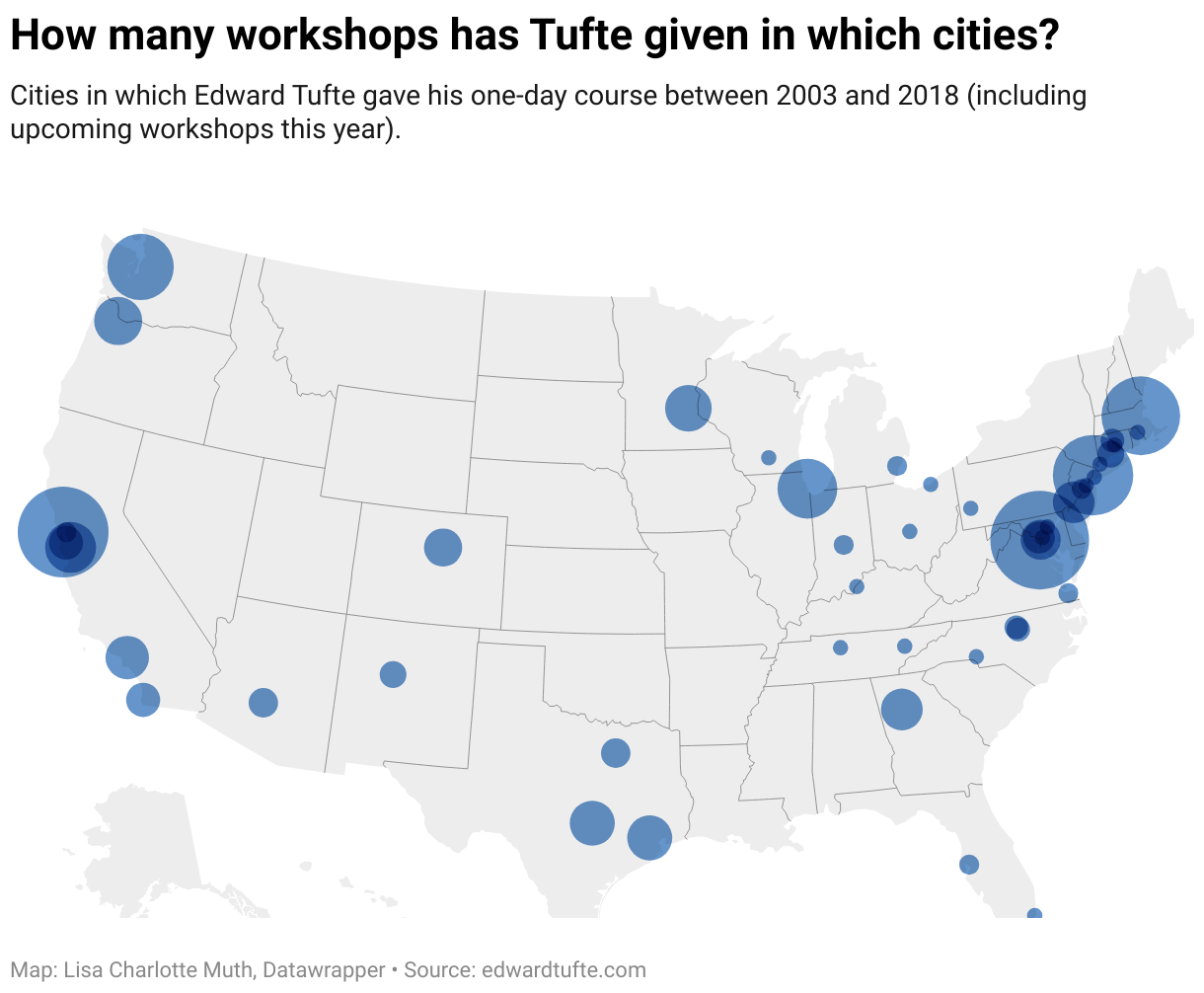
If you like data visualization, you might know Edward Tufte. You might have read a book by him. Or…you might have visited his one-day course. Tufte has given almost 500 of them in the last 15 years, in many US cities: New York City (45 workshops), San Francisco (60 workshops), Arlington (70), Boston (40), and more. We can read on his website that next Tuesday and Wednesday, he will teach in Seattle. Two days later, in Portland. Four days after that, in Denver. (In my humble opinion, giving that many workshops is crazy.)

On Tuesday, we announced the Data Vis Book Club, in which we’ll read Tufte’s book “The Visual Display of Quantitative Information”. (You’re welcome to join!) So I thought, why not spend a little bit more time with Tufte? If you’ve been to his workshop, you’ll very likely find yourself on this map:

You can find the almost 500 individual dates in this Google Spreadsheet. Feel free to re-use the data!

Chart Data Choices

The chart is a simple symbol map, so not much to talk about here. But you might wonder where I got the data from. Tufte’s website just shows the future dates of his course. So how did I get the past dates?

That’s the perfect use case for the Wayback Machine by the Internet Archive. The Internet Archive saves whole websites periodically, since 1996. And the Wayback Machine is the interface to this archive: You can see how a website looked like a month ago, or five years ago, or ten years ago. For the course site on Tufte’s website, you can find the previous versions here. You can click on a date to time-travel back to it and see how the website looked like for visitors on that date.

I did that and copy & pasted the upcoming course dates in a spreadsheet. Unfortunately, I can’t promise that this data is complete – maybe courses got canceled, or spontaneously added. Maybe Tufte gives private courses that he doesn’t put on his website. But I think it gives us a good estimate of the general scope of Tufte’s traveling. (Have I mentioned that I think it’s crazy?)


If you want to learn why Tufte is so important in the data vis scene, join the Data Vis Book Club! You can see who else will read him in these notes. Or follow @datavisclub for a massive number of retweets. I’ll see you next week!

22 Jul 16:20

Chinese tech companies climb up fast on the Fortune Global 500 list

by Runhua Zhao
One hundred and twenty Chinese companies have made it onto the 2018 Fortune Global 500 list, including a number of the country’s big tech companies. The three countries with the most companies on the list are the US (126), China (120), and […]
22 Jul 16:20

What walls are for

by leisa.reichelt@gmail.com (Leisa Reichelt)

Earlier this week I did a talk at the Mind the Product conference in San Francisco. I was talking about research, but now that i work at Atlassian, the examples I gave included some from the Jira team’s work.

I also showed a slide that was a photo of a team, gathered in a meeting around a wall covered with index cards. No one in the meeting had their laptops out.

This is what people seemed to want to talk about over coffee later in the day. Could it be true that I, spokesperson (one of many) for Jira, would possibly want to see stuff on the wall?  Surely it should all just be in Jira right?

People told me they messaged photos of the slide back to their teams to show them – ‘look, the Atlassian person says it is ok to put things on the walls!’

omg yes. I love walls with post its and index cards stuck on it and sketches on whiteboards. I like walls for planning, for thinking, for communicating and for analysing. And then you capture it all in a tool, like Jira.

This is why.

Walls make it easier to iterate

Digital things look ‘finished’ too soon. when something is a work in progress on a wall, it looks unfinished, so you keep working on it. moving things around, reshaping things, connecting things, erasing things, and making them again. Walls make it easier to iterate. Iteration, in my opinion, is massively correlated with quality.

This is why walls are good for sketching out design ideas and processes. This is why they are amazing for research analysis (don’t care what anyone says, post it notes are still the best tool for research analysis for exactly this reason – no one ever does three (or more) rounds of synthesis using a digital tool).

Walls make it easier to collaborate (in a single location)

There is something about a group of people standing in front of a wall full of sketches, or index cards or post it notes. Its a different kind of collaboration than you get around a table, or in a digital tool. You’re usually standing up, so you’re paying attention, you’re focussed. People physically pick up the card that they are talking about and something about that seems to pull focus even more. Doing a stand up at a physical wall and moving the cards across to done has always felt a lot like the physical act of crossing something off the to do list – so much more satisfying than updating a status on an issue. The messiness of a room full of post it notes when you’re doing analysis almost compels you to finish making that sweep through the data… finding the best place, for now, for every sticky note of data. There is something about the physicality and the embodiment of the work that I have always felt binds teams together more, drives us to do better and more complete thinking about the work we’re doing. There is no science to this just many years of experience. Walls just work better for me, when I’m lucky enough to work in the same location as my team. Walls do suck at remote and distributed teams.

Walls make it easier to communicate

Sometimes the walls are not for you but for other people. Sometimes walls are to send a message. They can say – ‘look how many things people want us to do, this is insane and someone needs to prioritise this’, they can say ‘look how much we’ve done this sprint, yay!’ or ‘look how much we have left to do, uh oh!’, they can say ‘these things are really important to our team, this is what we believe it’, or they can say ‘here is what we’re working on at the moment’.

I’ve been in, and observed many teams who use walls to communicate either the most important messages to the team in a kind of omnipresent way – this is what we believe it, or this is what we are focussing on right now, or these are our values, or here is our goal.

Or sometimes they are designed to communicate to bosses and stakeholders – those walls might say ‘we’d get the things we’ve promised done if you didn’t always sneak in all this unplanned work’ (I’ve seen a few of those).

Some people I’ve know have had jobs that include keeping the digital tool up to date with the wall. Or the other way around. Its not inefficiency. The wall is doing different things for the team.

And that’s another great thing about walls, it doesn’t need to be a zero sum game.

If you’re using Jira, using a wall makes perfect sense to me. I don’t know why you’d do without.

related reading: Alan Cooper – Know whiteboards, know design

22 Jul 16:19

The Seven Myths Keeping Teachers from Designing Makerspaces

John Spencer, Aug 01, 2018


This is a listicle, yes, but it's worth keeping the idea of makerspaces in mind as it reinforces the idea that learning technology isn't simply about what we display on computer screens for students to read. The idea is that students should be finding, making and sharing with each other. As John Spencer says, "There’s power in problem-solving and experimenting and taking things from questions to ideas to authentic products that you launch to the world. Something happens in students when they define themselves as makers and inventors and creators."

Web: [Direct Link] [This Post]
22 Jul 16:19

“Let’s See How The Community Reacts”

by Richard Millington

…is something you and your team should never have to say.

Our clients don’t see how the community reacts to anything. They already know. They’ve run the idea passed a decent-size group of members, they’ve refined it, they’ve gotten the buy-in from the top members (if they don’t, they don’t launch).

Usually, they’ve persuaded a small group of members (5 to 7) to share it and promote it positively within the community.

Dropping a new concept (platform, project, or anything else) might work well for record artists, but I wouldn’t recommend it for the rest of us. Most people don’t know whether something new is good or bad. They use the first reactions of other members to form their own opinions. Once that opinion has taken hold, it can spread rapidly.

So either don’t surprise members with something new (big changes should always be anticipated) or ensure you have respected community members engaged in the process and lined up to promote it (even better, do both).

It’s tempting to rush the launch of something new, but slow down a little. Get feedback, run the idea past people, and adjust your plans accordingly. Otherwise, the very project you’ve spent countless hours working on can hurt the very community you’re trying to help.

22 Jul 16:18

Introducing the ASan Nightly Project

by decoder

Every day, countless Mozillians spend numerous hours testing Firefox to ensure that Firefox users get a stable and secure product. However, no product is bug free and, despite all of our testing efforts, browsers still crash sometimes. When we investigate our crash reports, some of them even look like lingering security issues (e.g. use-after-free or other memory corruptions) but the data we have in these reports is often not sufficient for them to be actionable on their own (i.e. they do not provide enough information for a developer to be able to find and fix the problem). This is particularly true for use-after-free problems and some other types of memory corruptions where the actual crash happens a lot later than the memory violation itself.

In our automated integration and fuzz testing, we have been using AddressSanitizer (ASan), a compile-time instrumentation, very successfully for over 5 years. The information it provides about use-after-free is much more actionable than a simple crash stack: It not only tells you immediately when the violation happens, but also includes the location where the memory was free’d previously.

In order to leverage the combined power of Nightly testing and ASan we have joined them together to form the ASan Nightly Project. For this purpose we made a custom ASan Nightly build that is equipped with a special ASan reporter addon. This addon is capable of collecting and reporting ASan errors back to Mozilla, once they are detected. We launched this project to find errors in the wild and then leverage the ASan error report to identify and fix the problem, even though it might not be reproducible. So far, we made these builds for Linux only, but we are actively working on Windows and Mac builds.

Of course this approach comes with a drawback: While ASan’s performance can almost compete with the performance of a regular build, its already higher memory usage grows the longer you run the browser as ASan needs to retain freed memory for a while in order to detect use-after-free on it. Hence, running such a build requires you to have enough RAM (at least 16 GB is recommended) and to restart the browser once or twice a day to free memory.

However, if you are willing to browse the web using this new Firefox environment, you might be eligible to earn a bug bounty: We will treat the automated reporter submissions as if they were filed in Bugzilla (with no test case) which means that if the issue is 1) an eligible security problem and 2) can be fixed by our developers, you will receive a bug bounty for it. All rules of the Mozilla Bug Bounty Program apply. If you would like to participate, ensure that you read the Bug Bounty section carefully and set the right preference, so your report can be attributed to you.

This project can only succeed if enough people are using it. So if you meet the current requirements, we would be very happy if you joined the project.

The post Introducing the ASan Nightly Project appeared first on Mozilla Security Blog.

22 Jul 16:18

Warranty Expiration

by Nathan Yau

With almost absolute certainty, every product dies a quick death once its warranty runs out. I mean it makes sense, but I never really thought about it until I had to replace all of the chirping smoke detectors at once. And the toilet pumps. And the tires on my car.

Tags: warranty

22 Jul 16:18

Be My Eyes :: What a wonderful idea

by Volker Weber

Sketch

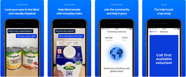
Be My Eyes is a free app that connects blind and low vision people with sighted volunteers and company representatives for visual assistance through a live video call.

More >
22 Jul 16:18

Newspapers on Wikipedia Project: A Quick and Current Project Summary and Some Heartfelt Thank Yous

by mikecaulfield

The Newspapers on Wikipedia Project is moving forward. If you don’t know what the project is about, read the brief summary on the WikiProject page, and then maybe this short Poynter story which I think explains the project more concisely than I typically have.

If you’re not into clicking links, the best summary I can provide is this:

The Data Void Problem

Wikipedia and the array of information services that rely on it have a problem.

  • Wikipedia ends up providing important credibility signals in evaluating news sources, and in particular in telling if something is from a traditional news source or an imposter.
  • These signals are part of multiple algorithmic and media literacy solutions.
  • Wikipedia provides fairly good coverage of national news sources.
  • Wikipedia provides very poor coverage of local news sources, where less than half (and possibly *much* less than half) of local newspapers have a Wikipedia page.
  • This particular “data void” has been exploited before (remember the “Denver Guardian”?) and we expect it to be increasingly exploited until we fill it in.
  • There are signs that exploiting this gap is on the menu in the near future. See, most recently, Russians Created Twitter Accounts for Fake Local News Sources.

(for an explanation of a data void issue in medicine, read this Wired article)

The Student-Driven Solution

  • We’re having students and faculty fill the gap by writing small articles on local newspapers. We’re going to try to get 1,000 written.
  • In the process, the students will learn deep information literacy skills and understandings around search, sourcing, point of view, and Wikipedia processes.
  • They also learn about the importance of local news — the ways in which it has served communities in the past, for both better and for worse.

And we think that’s an amazing trifecta: improving the information environment, developing online research literacies, and understanding the importance of local news ecosystems.

Partners, Funders, and Advisers

We are benefiting from the help of lots of people.

Eni Mustafaraj and Emma Laurie at Wellesley wrote the research article on the impact of the local news data void on students’ ability to evaluate sources, and inspired the project. And they are putting together code and people at Wellesley to help track the progress of this project in closing that void, and organizing some fall editathons to get it done.

Paul Haahr and Susan Karp literally jumped in to personally support this project on day one. Besides funding some project tracking through Wellesley, they have made a matching donation “challenge” that we will be using to further motivate students. For each newspaper article created to some minimal specifications, they will donate $25 to Room to Read, a charity that teaches young girls in developing countries to read, up to $25,000.

I’m also just indebted to them for their immediate interest and faith in this project. Paul is actually Google’s top-ranked search engineer: the fact that he grokked this idea immediately helped inspire me to add yet another project onto my rather full dance card. (I don’t regret it).

Pete Forsyth is a well-known Wikipedian who makes a living showing clients how to navigate Wikipedia ethically, explaining sometimes byzantine rules and conflicting concerns to newbies. He’s advising this project for free, helping not just me, but the  students who have already started working on this.

Amy Collier, the “first follower” that any project leader would die to have in their camp, contacted me about twenty minutes after I proposed this and said she wanted in. Her team of students at Middlebury is already kicking ass and helping us to work out the kinks in our processes before our fall semester rollout.

Wiki Education, which has agreed as of this week to coordinate with us to support students  and faculty on this project. From here forward, if you want to get started on this you can email contact@wikiedu.org, let them know that you want to work on the Newspapers on Wikipedia project. They will get you set up to teach Wikipedia in your classroom, integrating some of the materials and tasks that we’re pursuing, and pass you back to us for help where appropriate. They’ve been supporting people using Wikipedia in the classroom for years, so we are extremely grateful for their participation and investment in our success.

If I missed you here, I’m sorry — but I wanted to say thanks to these folks sooner rather than later. This project is starting to pick up a head of steam, and I’m thankful for all the support.


22 Jul 16:09

Twitter Favorites: [Sean_YYZ] Most fans were respectful when Thom Yorke made a statement about the injustice of Scott Johnson’s death and a moment of silence. Most.

Sean Marshall @Sean_YYZ
Most fans were respectful when Thom Yorke made a statement about the injustice of Scott Johnson’s death and a moment of silence. Most.
22 Jul 16:04

Android Messages app tear-down reveals upcoming dark mode for Messages

by Jonathan Lamont
Android Messages app icon

Android Messages version 3.4 brings hints of a dark theme and Chrome pairing.

Messages is Google’s default SMS and RCS messaging client that ships with the majority of Android smartphones.

XDA Developers recently did a tear-down of Android Messages version 3.4. Tear-downs often predict upcoming functionality, but they are in no way a guarantee a feature will make its way to an app. Developers root through the code in an app and find pieces of unreleased features.

In this tear-down, XDA’s Kieron Quinn ‘Quinny899,’ a student and Android developer behind Mighty Quinn Apps, discovered the dark mode.

Dark mode is an extension of the new Material Design look Google is working on for Android Messages.

Neither the Material Design nor the dark theme are currently available unless you root your device. The dark theme doesn’t change much even if you do enable it. The background becomes a dark grey and text transforms to white.

However, the dark mode isn’t complete. Certain features, like the menu, retain their original colouring. In other areas the text remains black, making it hard to read with a grey background.

The other feature isn’t currently accessible at all. XDA found a string in the app file that indicates Messages can pair with a Chromebook. The strong appears to be part of the ‘Better Together’ initiative.

This isn’t the first time internal app pieces have hinted at connectivity features with Chromebooks.

In June, code was discovered in Chrome OS that hinted at upcoming connectivity. Also in June, a Nova Launcher shortcut enabled users to launch the Better Together setup screen.

While it isn’t entirely clear what Better Together actually is, it does include an SMS connection. It’s likely a more feature-rich version of the current Messages for Web client. The client allows Android users to respond to text messages on their device from any browser.

While both features aren’t ready yet, seeing code in the Messages app indicates they’re coming soon. Personally, I can’t wait to get the Material Design and dark theme for Messages.

Source: XDA

The post Android Messages app tear-down reveals upcoming dark mode for Messages appeared first on MobileSyrup.

19 Jul 21:53

Twitter Favorites: [DenimAndSteel] Todd won’t shut up about completing his 365 day bike ride streak today. Thanks @RideReportApp for keeping track. https://t.co/8s4qbqMnex

Denim & Steel @DenimAndSteel
Todd won’t shut up about completing his 365 day bike ride streak today. Thanks @RideReportApp for keeping track. pic.twitter.com/8s4qbqMnex
19 Jul 21:53

Join the Data Vis Book Club & read Tufte with us

Do you keep getting recommendations for data vis books, maybe even buy them, but don’t make it a priority to read them? How about we read these books together? How about we discuss the books we read, for the joy of it, and to get more out of it? That’s the idea behind the Data Vis Book Club.

Our first book is a data vis classic and can be found unread on many shelves: “The Visual Display of Quantitative Information” by Edward Tufte, in the second edition from 2001. On August 14th, we’ll meet at 5 pm UTC to discuss the book here: notes.datawrapper.de/p/bookclub-tufte.

How does the book club work?

1. You get the book. Ask your local library to order it for you, buy it (used) or use the offer on Tufte’s website to buy all four of his books for 100 USD.

2. We all read the same book. That’s where the fun begins! If you want get your Twitter followers involved, please use the hashtag #datavisclub, so that we have a good overview. If you don’t want to spam your Twitter followers, we also have a document set up where we can all collectively write down notes & surprising bits that you found: notes.datawrapper.de/p/bookclub-tufte

3. We get together on August 14th to talk about the book. On Tuesday, 14th of August, we meet at 5 pm UTC to talk about the book here: notes.datawrapper.de/p/bookclub-tufte.That’s 10 am on the US west coast, lunchtime (1 pm) on the US east coast, 6 pm for readers in the UK & Portugal and 7 pm for most other Europeans.

Our conversation will be structured with the help of three questions:

  • What was the most surprising thing you’ve learned? Choose a text passage, and explain how it challenged something you assumed.
  • Select one of your favorite data visualizations. Is it working well because of a principle that Tufte explained? Or do you appreciate something about it although it goes against Tufte’s principles?
  • Having read the book, what will you do differently the next time you design a chart?

During the conversation, I’ll ask one question after another. For each one, you can prepare an answer in 1-2 sentences and paste it into the notes once I ask the question during the conversation. If you won’t find the time, don’t prepare anything at all and just come by and chat.


That’s it! Here’s a little FAQ for you, in case you have more questions:

I can’t make it on the 14th of August.

Do you live in New Zealand and it’s the middle of the night (sorry 😢)? Do you have a lunch date? Summer vacation? Need to bring the kids to bed? No problem! The conversation will be archived in the notes and can still be extended over the next day. After approximately one day, I will write a blog post summing up the discussion.

Why will we read this book?

I hope that this book will inspire, teach & provoke you.

Inspire, because it’s a work of beauty. It shows you what can be achieved in data vis with big images, and it does so on marvelous paper with wonderful book design. I don’t know a better-designed data vis book. I hope you will be in awe.

Teach: Tufte will teach you about principles for creating well-designed charts, the data density and data-ink ratio, the Duck of data vis & chartjunk. He will explain to you the genius of some important historical data visualizations and redesign charts for you. Afterwards, you’ll see charts with a sharpened eye.

Provoke, because Tufte has strong opinions. You might find yourself nodding your head firmly or you might find yourself disagreeing with his assessments. I hope you do both, and I hope you will build your own opinion on the way. In the best case, it will lead to interesting conversations during the book club meeting.

Also, it’s a short read. Lots of pictures that fill the pages!

Who’s Tufte?

Tufte is one of the first names you hear dropped aaaall the time at data vis conferences and meetups. He was in the scene before most of us, and wrote four books every seven or so years, starting at the beginning of the 80s:

  • 1983: The Visual Display of Quantitative Information
  • 1990: Envisioning Information
  • 1997: Visual Explanations
  • 2006: Beautiful Evidence

Nowadays, he mostly gives the same one-day-course all over the world, creates sculptures and blocks other data vis experts on Twitter. We will read Tufte’s first book, “The Visual Display of Quantitative Information”, in the second edition from 2001.

So why are we starting with this Tufte book, and not any of the other ones?

I recommend to read all four book by Tufte – but if you can only read one and want to learn about visualizing data, it should be “The Visual Display”. All other books focus on both information design and data vis, while “The Visual Display” talks exclusively about data vis. In case you’re interested, that’s what you will get out of the other books:

  • “Envisioning Information” (1990, new edition in 2001): The next book you should read after “A Visual Display”. Looks at color theory, small multiples & how to reduce noise.

  • “Beautiful Evidence” (2006): Learn why Tufte hates Powerpoint and get deep into sparklines. In this book, he also dissects Minard’s famous map in far greater detail than he does in “The Visual Display”.

  • “Visual Explanations: Images and Quantities, Evidence and Narrative” (1997): This book brings many examples of how to explain things visually. Magic tricks, for example. On the data side, Tufte explains the John Snow map of Cholera outbreaks, the Challenger catastrophe and the power of multiples.

What this book won’t achieve:

“The Visual Display” is not a practical book. You won’t

  • learn to code
  • learn any data vis tool, for that matter
  • learn to choose a chart for your data
  • learn anything about the data vis process
  • have a better sense for data, how to analyze it or how to obtain and prepare it

If these things are more important to you than general inspiration & awe, more important than finally knowing what everyone is talking about when they mention “Tufte-like” and more important than chart design: No big deal! This book club will get to more practical books over the next months.

If you’re still not sure if this book is for you, have a look at these 15 sample pages that Tufte posted here.


I’m very, very much looking forward to reading this book with all of you. If you have any more questions, write in the comments, write to lisa@datawrapper.de or write a message to Lisa or the Datawrapper account on Twitter. You can also place your questions (also to other book readers!) in the notes, which I’ll check daily.

19 Jul 21:51

July security patch now available on unlocked BlackBerry KEY2 devices

by Igor Bonifacic
BlackBerry Key2

BlackBerry has started rolling out an over-the-air software update for the KEY2 that includes Android’s July 1st security patch.

At the moment, it appears the patch is only available on unlocked devices; neither Telus nor Rogers have the update listed on their software update schedule webpages (Bell does not maintain a publicly viewable update schedule webpage).

The KEY2 launched in Canada on July 6th via all three of the country’s national telecoms, as well as Saskatchewan regional carrier Sasktel. It’s currently priced at about $100 on two-year term at all four carriers.

In his review of the KEY2 for MobileSyrup, staff reporter Sameer Chhabra said he liked the phone a lot, though he questioned its premium price tag.

Via: Android Central

The post July security patch now available on unlocked BlackBerry KEY2 devices appeared first on MobileSyrup.

19 Jul 21:51

The last Siri co-founder has left Apple

by Patrick O'Rourke
siri

Tom Gruber, the leader of Siri’s Advanced Development group and one of the voice-activated assistant’s original co-founders and creators, has retired from Apple, according to a report stemming from The Information

The Information corroborated its initial report with a statement from an Apple spokesperson who said, “personal interests in photography and ocean conservation” is what Gruber will be pursuing in the future following his departure from the company.

Gruber developed Siri along with Dag Kittlaus and Adam Cheyer, with the voice-activated assistant first showing up in the iOS App Store as an individual app back in 2010. Apple then acquired the app two months later and eventually integrated it into its iOS operating system, with all of the platform’s co-founders joining the company.

Kittlaus parted ways with Apple in 2011 and Cheyer left the company in 2012, though the pair worked together on a new project called Viv just a few years later. Viv was acquired by Samsung in 2016 and the platform’s technology was used to improve the South Korean manufacturer’s AI assistant, Bixby.

With Gruber’s departure from Apple, all of Siri’s co-founders have now left the company.

While Siri was once the most capable voice-activated assistant out there, Google Assistant and Alexa have since surpassed Apple’s platform by a significant margin in terms of functionality.

With the release of iOS 12, Apple is bringing a new IFTTT-like feature called Siri Shortcuts to its voice activated assistant.

Source: The Information 

The post The last Siri co-founder has left Apple appeared first on MobileSyrup.

19 Jul 21:51

MacBook Pro 2018 keyboard reliability fix reportedly confirmed in internal Apple document

by Patrick O'Rourke
MacBook Pro 2018 keyboard

While many have speculated that the silicon surrounding the MacBook Pro 2018’s new third-generation Butterfly keyboard mechanism is there for more than just making the keyboard quieter, we now have what is likely as close to an official confirmation as we’ll ever get.

According to documents distributed to Apple Authorized Service Providers that have been obtained by MacRumors, the membrane under the keyboard is designed to “prevent debris from entering the Butterly mechanism.” If this document is accurate, this is the first time Apple has acknowledged that the latest version of its Butterfly keyboard technology is designed to fix keyboard reliability issues.

“The keyboard has a membrane under the keycaps to prevent debris from entering the butterfly mechanism. The procedure for the space bar replacement has also changed from the previous model,” reads the internal document.

Publicly, Apple has been stating that the MacBook Pro 2018 keyboard revamp is focused on quieter typing, though a recent iFixit teardown of the computer uncovered that Apple actually added a thin silicon cover under each key and over the Butterfly mechanism. It’s likely Apple doesn’t want to add further fuel to the lawsuit fire currently surrounding MacBook Pro issues.

The first-generation and second-generation MacBook Pro keyboard experiences issues related to reliability, with keys getting stuck or becoming unresponsive due to debris finding its way under the keys.

It’s still too early to know for sure if the new MacBook Pro is actually more reliable than its predecessor, but it looks like it definitely could be, as long as Apple’s new silicon membrane works how the company intends it to.

Source: MacRumors, iFixit

The post MacBook Pro 2018 keyboard reliability fix reportedly confirmed in internal Apple document appeared first on MobileSyrup.

19 Jul 21:51

24 percent of Tesla Model 3 orders have been cancelled: analyst

by Brad Bennett

An analyst is claiming that there are more cancellations for the Model 3 than new orders.

Rajvindra Gill, a market analyst with Needham and Co, an investment bank, says long wait times, the end of a $7,500 federal electric vehicle rebate in the U.S. and the absence of the company’s long-promised $35,000 USD model as reasons for sales slowdown.

According to Gill, currently approximately one in four Tesla customers are cancelling their Model 3 pre-orders, which is double the rate from this same time last year and it’s more cancellations than new orders.

In a statement to CNN, a spokesperson for Tesla denied that cancellations were outpacing orders, and added that some of Gill’s information is outdated.

Gill is doubtful that the company will hit its year-end goal of delivering 100,000 Model 3s. To hit that goal by the end of 2018, Tesla will have to ship 27 percent more cars in the second half of the year than it did in the first half. Tesla only recently managed to hit its target of 5,000 cars in a week goal.

Source: CNN

The post 24 percent of Tesla Model 3 orders have been cancelled: analyst appeared first on MobileSyrup.

19 Jul 21:51

Google’s Fuchsia OS may not be coming in five years after all: report

by Dean Daley
Google HQ

Google has been working quietly on a new card-based operating system called Fuchsia.

While Bloomberg’s Mark Bergen and Mark Gurman received information indicating that Fuchsia will take over Android in the next five years, Google told CNET that there’s actually no such plan.

The two Bloomberg reporters received the information from people familiar with the conversations surrounding Fuchsia.

According to Bloomberg, we won’t have to wait too long before seeing Fuchsia in action. Those familiar with the plans believe that Fuchsia will be available on home devices, such as voice-controlled speakers, before landing on smartphones — though the operating system’s launch is still a few years away.

Fuchsia now has more than 100 people working on it, including Matias Duarte, the vice president of Google’s Material Design — though he is working part-time on the project, according to Bloomberg. 

Sundar Pichai, the CEO of Google, and Hiroshi Lockheimer — who runs Android and Chrome — have yet to sign off on Fuchsia. This is possibly the reason why Google is denying Bloomberg’s reported time frame.

You can take a look at the card-based operating system, here.

Source: CNET, Bloomberg

The post Google’s Fuchsia OS may not be coming in five years after all: report appeared first on MobileSyrup.

19 Jul 21:51

Freedom Mobile revamps roaming services and adds new international pricing add-on

by Dean Daley

Freedom Mobile has removed its $20 per month U.S. roaming add-on and now offers $5 per day roaming.

Freedom’s ‘Big Gig Roam Extra, U.S.’ lets users pay $5 per day with extra data, unlimited texts, unlimited local calls and calls back to Canada through three packages.

The least expensive Big Gig Roam Extra, U.S. package offers five days with 1GB of data for $25, while there’s also a 10-day package with 3GB of data for $50 and a 20 day package with 10GB of data for $100.

Note: Freedom doesn’t give the customer access to their home data bucket while roaming, only allowing them to use the additional data included in the add-on.

Previously, Freedom offered $20 per month U.S. roaming add-on that featured 1GB of data, 2400 minutes and unlimited text. However, when you’re done with the 1GB of LTE data, Freedom would throttle speeds, however, still give users unlimited data. Now if the user goes over 1GB of data they’d get charge pay-per-use prices.

The Big Gig Roam Extra, South plan is available as well. With this add-on Freedom is offering its roaming services $6 per day with two packages. Eight days with 1GB of data for $48 or 16 days with 2GB of data for $96.

The destinations now include: Anguilla, Antigua & Barbuda, Aruba, Barbados, Bermuda, Bonaire, British Virgin Islands, Cayman Islands, Curacao, Dominica, El Salvador, Grenada, Guyana, Haiti, Jamaica, Mexico, Montserrat, Panama, St Kitts & Nevis, St Vincent & Grenadines, St. Lucia, Suriname, Trinidad and Tobago and Turks & Caicos

The telecom is now offering the ‘Big Gig Roam Extra, International’ add-on. This add-on gives you more options in Asian, European and Oceania-based countries. The plan features eight days with 1GB of for $80 and 16 days with 2GB data for $160 packages.

As for Freedom’s standard roaming rates and the $8 ‘World Traveller’ add-on, the company seems to be revamping the pricing for individual countries.

One of the most notable is its change to the U.S. pricing.

The current standard rates: $0.15 per minute, $0.05 per text and $0.05 per MB. The standard rates will change to $0.50 per minute, $o.20 per text and $0.20 per MB.

As for the World Traveller pricing, currently its: $0.05 per minute, $0.03 per text and $0.03 per MB. That’ll change to $0.25 per minute, $0.10 per text and $0.10 per MB.

These changes will go into effect on August 30th. To view the complete roaming rates per country, click here.

Freedom Mobile has also added two new low budgeted data + talk plans, as well as, increasing the prices of each of their plans, unless you subscribe to the telecom’s Auto Pay. 

Comparing to the other telecoms, Bell, Telus and Rogers offer roaming plans that give users access to their complete data bucket, while away from home.

The post Freedom Mobile revamps roaming services and adds new international pricing add-on appeared first on MobileSyrup.

19 Jul 21:50

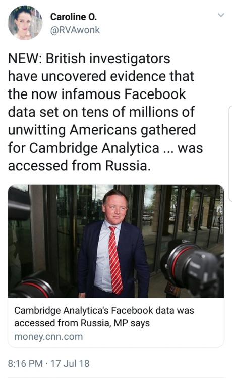
liberalsarecool: Cambridge Analytica is Kushner and Bannon,...


liberalsarecool:

Cambridge Analytica is Kushner and Bannon, funded by the Mercers.

They all coordinated with Russia. The info was shared, by design.

18 Jul 20:23

Mozilla Responds to European Commission’s Google Android Decision

by Denelle Dixon

The decision by the European Commission today to sanction Google for practices regarding the Android mobile operating system drives home the importance of true openness in the mobile ecosystem. These are complex issues, and we expect that we will be evaluating the remedies and their repercussions for some time. We are hopeful the result will help level the playing field for mobile browsers like Firefox, and to foster openness that creates and sustains competition and innovation.

For Mozilla, these issues of innovation, openness, and competition speak to our history. Twenty years ago, we made Firefox to combat the vertical integration of Microsoft Windows and Internet Explorer. Today, we are again witnessing vertical integration concerns on a larger scale, with powerful players at all parts of the internet ecosystem. Mozilla’s 2018 Internet Health Report identified decentralization as a major goal to promote a healthy internet.

Targeted, effective interventions can strengthen technology markets and are necessary to advance consumer welfare. Mozilla will continue to build competitive products and to advocate for effective policies and approaches to build a competitive and open technology ecosystem.

The post Mozilla Responds to European Commission’s Google Android Decision appeared first on The Mozilla Blog.

18 Jul 20:20

Prescriptive Analytics – Let Me See You Work, Work, Work

by MikeW

After a deep dive into the inner workings of one class of prescriptive analytics—recommender system (personalization engines), it’s time to step back and explore how we can leverage prescriptive analytics in general. Today, I am going to outline 3 relevant use cases:

  1. In business, prescriptive analytics can help you optimize business processes and operation
  2. In social business, it can help your social media team focus on what drives the biggest business impact
  3. In social media, it can even help you optimize your engagement time

These are very distinctive use cases, where the objectives being optimized are drastically different. I hope these examples will not only demonstrate the power and versatility of prescriptive analytics, but also give you a better understanding of how they work. (If they don’t please feel free to let me know!)


Optimization of Business Process and Operation

process optimization 360px.png

I’ve discussed before that the simplest example of prescriptive analytics is a GPS, which operates in the geospatial domain. In general, prescriptive analytics are not limited to geospatial optimization. We can optimize processes and other parts of business operations. One of the most common use cases of prescriptive analytics is business optimization. Since the underlying computation of prescriptive analytics is already an optimization of some objective, this application is very natural. In this case, the objective we optimize is typically the efficiency or throughput of the process.


Whether you are optimizing a business process in marketing, sales, or customer service, you must tell the prescriptive analytics system what you are trying to achieve. This is like telling the GPS where you are going. For example, increase conversion by 10%, increase sales by 20%, or increase your net promoter score (NPS) by 5 points. These are the goals, or “destinations” you are trying to reach in a non-geospatial domain.


Subsequently, the prescriptive analytics system would prescribe a sequence of actions that lead to the corresponding business outcomes you want (i.e. increase conversion by 10%, sales by 20%, or NPS by 5 points). For example, to achieve 10% conversion lift, the system may prescribe reducing the frequency of your email marketing by 35%; simultaneously increase your real-time social media engagement by 30%; and when your real-time engagement reaches 15%, start directing people to your customer community for peer-to-peer engagement and recommendation. These are like the turns that your GPS system advises you during the journey, except these directions are not in the geospatial domain.


Optimizing Business Impact of Your Social Media Engagement

Now you know what prescriptive analytics can do for your business, let’s dive deeper on how it prescribes actions. The key lies in the objective that’s being optimized. Let’s examine a couple of examples from social media.


These days, social media is not new to business, but many enterprises still struggle to figure out how best to leverage it. Because there are so many different things you can do on social media, it’s hard to determine where to best allocate your limited resources (e.g. time, money, energy, etc.). Should you create more YouTube videos or should you use Snapchat? Should you publish more blogs, or participate more in the Q&A section of your community? The social media landscape is complex with thousands of social channels. Even within a single social channels, there are probably a handful of actions you can take. Take Twitter for example. It’s probably one of the simplest social channels out there, but you can already engage in many different ways: tweet a message, reply to one, retweet it, favorite it, follow someone, or simply read the tweets coming out of the firehose. This gives rise to many different social metrics that quantify how you engaged on social media.


social impact optimization 360px.png

Prescriptive analytics can help you focus on what you should do to achieve the biggest impact, but you must tell it what kind of impact you are looking for. Whether it’s increasing marketing conversion, sales, or customer satisfaction (CSAT), you should be able to measure the impact you want to drive. This is typically a key performance indicator (KPI) for your business. Once you have the KPI that you are trying to drive, and the social media metrics that describe how you engage, it’s relatively trivial to perform a time-lagged cross correlation analysis to see which social metrics have the strongest correlation with your KPI. Although correlation is better than flying blind, it would be better if we could establish causation as well. But this would require less trivial methods in statistics or econometrics (e.g. instrumental variables). If you are comfortable with these advanced techniques, you can even establish causal relationship and identify the strongest causal predictors for your KPI.


The correlation strength (causal or not) between the social metrics and KPI is the objective. Upon maximizing this objective, the prescriptive analytics system would be able to prescribe the actions that are most effective at driving your KPI. This helps you focus your effort on a few actions that will give you greatest impact (as measured by the KPI). And if you choose a different KPI, the system will prescribe a different set of predictors that maximize this objective.


When to Post on Social Media—Engagement Time Optimization

Because social media engagement is voluntary, people can participate anytime they want. But when is the best time to participate? The answer really depends on what you are trying to achieve. The goal of most social media participation is usually to reach the widest audience (whether that’s for a brand or for us personally). Even when you are posting a question and want the fastest answer or the most accurate answer, these goals can often be achieved indirectly by maximizing your reach. By reaching the widest audience, you increase your odds of reaching someone who can respond immediately; and by reaching the widest audience, you also increase your odds of finding someone who has the expertise to address your question accurately.


There have been numerous studies on when is the optimal time to post on social media, and many infographics provide general guidance on when to post on various social channels. In general, these studies are rather limited because the data is highly aggregated, the sample size small, and the methodology not rigorous enough. We recognized that there really isn’t a universal best time to post on social media, because the best time to post is ultimately specific and unique to the individual.


Our brilliant data science team (humble brag!) have analyzed over a billion posted messages and observed reactions and found that the best time to post depends strongly on your specific audience’s engagement profile. Meaning when your specific audience is most actively participating on a particular social channel. Keep in mind that it is your audience’s behavior (i.e. how they choose to use social media) that determines the optimal time to post for you. Since we all have different audience on social media (e.g. different followers, friends, connections, etc.), the best-time-to-post for you may be totally different from the best-time-to-post for me. This is precisely how Lithium Reach is able to recommend the best-time-to-post that is hyper-personalized to a person or a brand.


engagement time optimization 360px.pngNow, I could certainly tell you more about the product, but that’s not my style. However, if you have specific product related questions, I’d be happy to discuss, or invite more qualified product management staff to chime in.


We further validated the optimality of our hyper-personalized recommendation on a sample of half million active users and more than 25 million messages observed over a 56-days period. We found that our individually optimized post-time leads to an average of +17% engagement lift on Facebook and +4% on Twitter. This is a VERY conservative average. In practice, we have seen more than +50% engagement lift at times from brands using Lithium Reach’s recommended time-to-post feature.


Conclusion

We discussed 3 business use cases of prescriptive analytics. In each case some objectives are optimized, so the system can prescribe a few actions (or sequence of actions) out of infinite number of possible action you can take.

  1. By maximizing the efficiency or throughput of some business processes under appropriate resource constraint, we get a prescribed sequence of steps to help us optimize the process.
  2. By maximizing the causal correlation strength between social metrics and your desired KPI, we get a prescribed set of social metrics we should focus on driving. Although there are hundreds and possibly thousands of social metrics, this set of metrics is most effective at moving the needles for your KPI.
  3. By maximizes the engagement profile of your specific audience (e.g. follower, friends, connections, etc.), we get a set of personalized recommendations on when to post on social media. Although you can post social media content at any time you like, posting at the recommended times will maximize the reach of your messages.


While optimization is something that computers can do very efficiently, doing this at the individual level is still a challenging big data problem. Because people’s social interactions change continuously, we must constantly re-optimize as the new data arrive from the respective social streams. Fortunately, our data scientists have done all the heavy lifting and built this hyper-personalized post time recommendation algorithm into Lithium Reach. Now, you can get the benefit of personalized recommendation on when to post without needing to routinely analyze billions of message and their reactions.


As you can see, prescriptive analytics is versatile and powerful. It has just as many applications in science and engineering as in business and social media. Next time I’ll share a somewhat esoteric use case of prescriptive analytics in data science. Yes, data scientists like me also use prescriptive analytics. Come back next time to find out more!


Image Credit: geralt, geralt, and valentinsimon0.


Michael Wu, Ph.D.mwu_whiteKangolHat_blog.jpg is CRM2010MKTAWRD_influentials.pngLithium's Chief Scientist. His research includes: deriving insights from big data, understanding the behavioral economics of gamification, engaging + finding true social media influencers, developing predictive + actionable social analytics algorithms, social CRM, and using cyber anthropology + social network analysis to unravel the collective dynamics of communities + social networks.


Michael was voted a 2010 Influential Leader by CRM Magazine for his work on predictive social analytics + its application to Social CRM. He's a blogger on Lithosphere, and you can follow him @mich8elwu or Google+.

18 Jul 20:20

Tariffs in a Nutshell

by bunnie

I was asked to distill a previous post about tariffs into something more accessible to the general public. The resulting article ended up being run on CNN Digital as an opinion piece:

In retaliation for unfair trade practices and the theft of American innovations and ideas, the US Trade Representative’s office is imposing a 25% tariff on a broad range of goods imported from China.

But these tariffs won’t help American workers. Instead, they will encourage American companies to push ideas and production overseas by raising the cost of raw materials without penalizing the import of finished goods.
[…]
Imagine a bakery located in the US. It uses imported flour, sugar and cacao to make delectable cakes based on a closely-guarded secret family recipe handed down for generations, and it employs dozens of bakers to do this. Now suppose a bakery in China has tried to copy the recipe…

The article uses a bakery as an analogy to explain the trade war situation, as well as thinking through why trade deficits are OK through the notion that buying a T-shirt at a store creates a “trade deficit” between you and the store, but in the end that trade deficit is actually quite helpful to you. You can read the full article on CNN Digital.

I had also prepared a short infographic to accompany the article, which wasn’t picked up by CNN, but you can enjoy it here.

18 Jul 20:20

Data-centric view of birth control

by Nathan Yau

Birth control is one of those topics often saved for private conversations, so people’s views are often anecdotal. Someone knows what their friend, family member, etc used, but not much else. Amber Thomas for The Pudding provides a wider view of birth control using data from the CDC’s ongoing National Survey of Family Growth.

You see what other people use, how the method changes with age, and side effects. There’s a Clippy-like character for added information on the different methods. So there’s a good amount of information there to make the choice that’s right for you.

Sidenote on the NSFG data: I looked at the data a few times. It’s a good, messy dataset to explore if you want some practice.

Tags: birth control, The Pudding

18 Jul 20:17

Corning says Gorilla Glass 6 is capable of surviving 15 drops

by Patrick O'Rourke
Gorilla Glass 6

Glass manufacturer Corning says that its new Gorilla Glass 6 is significantly more durable when compared to previous versions of its glass technology, stating that its new glass is capable of surviving 15 drops from approximately one metre in height.

Further, the manufacturer claims that overall Gorilla Glass 6 is overall “up to two times better” than Gorilla Glass 5 in terms of drop and scratch resistance.

“Corning Gorilla Glass 6 improves upon Gorilla Glass 5 by surviving drops from higher heights, but, more importantly, has been engineered to survive multiple drops,” said Corning Gorilla Glass vice president and general manager John Bayne in a recent statement sent to MobileSyrup.

The glass manufacturer goes on to say that its new glass technology features “chemically strengthened” glass technology that results in “significantly higher levels of compression” when compared to Gorilla Glass 5.

Corning also explains that there’s typically a compromise between drop resistance and scratch resistance, but states that with Gorilla Glass 6, these concessions are no longer necessary regardless of how thin a smartphone or tablet is.

The company also claims that near bezel-less, edge-to-edge smartphone screens have actually resulted in stronger displays, contrary to what some might assume, stating that in the past bezels often crack first resulting in the phone’s glass weakening.

It’s possibly that Gorilla Glass 6 could be featured in future iPhone models, including the company’s 2018 lineup of devices given that Corning has been an Apple iPhone component supplier for a number of years.

The post Corning says Gorilla Glass 6 is capable of surviving 15 drops appeared first on MobileSyrup.