Shared posts

15 Oct 03:00

"Take the number of years you’ve been in the group..."

by peter@rukavina.net (Peter Rukavina)

From Olle, a tip about making events that include everyone, especially newcomers:

There were at least two new faces at the meetup, and I had been given a hint by Morgan about the article Breaking Cliques at Events. In it, a method for reminding people that the longer they’ve been in a group, the more responsibility they have to welcome newcomers to it: “Take the number of years you’ve been in the group. That number is how many new people you say hello to at a meetup.”

Most groups I’ve been a member of give little thought to this, adopting a “it was hard for me to become a part of the group, so don’t expect a free pass, newbie” attitude. That’s not a good way to run a railroad.

15 Oct 03:00

Designing E-Learning 3.0 in gRSShopper - 4

by Stephen Downes


E-Learning 3.0 - Part 1 - Part 2 - Part 3 - Part 4 - Part 5 - Part 6 - Part 7 - Part 8 - Part 9 - Part 10 - Part 11 - Part 12 - Part 13


Activities

Each week of the course will feature some events. These are mostly live video conferences with guests. I also want to be able to show slides and to include the activity feed. I've been creating these using xSplit and then broadcasting the entire screen, but it's a bit unreliable. It's how I have been creating my presentations on my main website, and I'm not happy with it. Plus, using the backchannel with the rest actually crashed my web server recently, so I need to fix that if I want to use it for the course.

Also, I want to avoid the problem of it being difficult to find the right page. I just want the event to show up in an activities page at the right time, so people don't have to do anything but go there. Then I'll handle all the logistics behind the scenes.

So, basically, I want an activities page. I want to keep it really simple; I also want it to be (reasonably) responsive, so people can attend events on their mobile phones. Here's the basic structure I have in mind:

Figure 40 - Activity Page
Now I know there are applications that probably do this for me. The problem is that they're proprietary. For example, the Google website will show chat comments, but only those entered into YouTube. And if I'm using one system for video it's hard to change half way through the course to support something different. But if I can define my own activity page, then I can do this.

The basic Activity Page is just some CSS without a header or footer, using the grid CSS definition used previously.

Figure 41 - Activity Page Grid
Then I added a mini-header to the Chatter pane:

Figure 42 - Activity Centre mini-header
I could have made that a box to make the layout cleaner, but I don't know if I'll ever reuse it, so there's no real point.

Next, I created three pages, one for each iframe in the ActivityCentre:
   - course_activity_video.htm
   - course-activity_slides.htm
   - course_activity_chatter.htm

These are just plain pages, but I'm free to define them however I want, and to reload them and publish them whenever I want. So there's only one URL for activities:

   https://el30.mooc.ca/course_activity_centre.htm

For the video page, I'll embed a YouTube live video (or archive video, if nothing is currently happening) using the standard YouTibe embed command (which is in fact an iFrame).

For the slides page I thought about using Slideshare, but I'd like to be able to advance slides automatically. So What I'll do is have this page auto-reload every few seconds, and use an iFrame to display a slide. So when I want to change a slide, I republish the page with the new slide, and then everybody will see the new slide when it reloads.

I'll do the same for the chatter page, except I'll reload an updated version of the most recent comments submitted to the course. More on that in a bit.

Figure 43 - Course Activity Slide page in the Page Editor

The meta http-equiv="Refresh" is what reloads the page each ten seconds.

For the chatter page I define the page in exactly the same way, except I load the latest chat contents into the page. Like this:

Figure 44 - Course Activity Chatter page in Page Editor

Each time the chatter page is published, it generates the most recent list of chat contributions. Viewers access the course_activity_chatter.htm page in their Activity Centre, and when this refreshes it shows the most recently published version of the page (but again, does not generate it from scratch, because that's too hard on the CPU).

So the people viewing the event through the viewer are always viewing cached versions of the activities; only the event administrator (that's me!) actually regenerates the pages (of course, I need to ensure that these pages block attempts by other people to regenerate them, because that will crash the server, which is what happened to me in Mississauga the other day).

Now there is, however, a problem. When I went to run the chatter page it displayed nothing because this is a brand new course and no chats have been created yet. But when I turned on the chatter in the gRSShopper PLE, it generated an error:

Figure 45 - Software Error?
That's not good. What happened?

When I created this version of a gRSShopper website I didn't create a 'channel' table. Chats are organized into channels; these channels can be used to create multiple events or chat streams using chat. When I went to create a new chat channel for the course, I got this error.

Just to verify, when I look at the list of forms, and the list of tables in the database manager in the Admin function, there is indeed no channel table.

Figure 46 - Channel table doesn't exist

I could rebuild it from scratch, but I'm lazy. So lazy...

I go to my gRSShopper PLE at www.downes.ca where I do have a channel table defined, and export it as a JSON file:

Figure 47 - Export Channel table as JSON
I save the exported file as channel.json on my computer in a location I can find again. Then I return to the course PLE and this time I'll import the data:

First, I add a new table clalled 'channel' so the can have some place to go. (After adding the table I need to reload gRSShopper because the new table doesn't automatically get added to the dropdowns - this is something I need to fix).

Figure 48 - Cteate channel table

Now I import the JSON file I just created:

Figure 49 - Import Channel Data

Now I cross my fingers and hope this works as intended, because I haven't used this in a while...

OK, that didn't work. Obviously something I need to fix (it was close - but it didn't actually save the fields and data properly).

So I try again using Tad-Delimited files (which for no particular reason I call .tsv (or Tab-Separated Values, I guess). Export and import work exactly the same, except the file is channel.tsv and the format is TSV.

And it still doesn't work. What should happen is that gRSShopper should create new fields as defined by the imput data, and then fill those fields with the data from the other site. But instead it's creating a bunch of numbered fields. So I have a small change I need to make in the code to fix this error.

But you can see what I want here, right? I want different instances of gRSShopper to be able to shared data with each other directly. Instead of downloading and saving the file, you should be able to save it directly from a JSON feed generated by the gRSShopper API. You might say - but this is dangerous! Sure - if you're doing it with strangers, and it's just random data. But you do it with friends, and the data is cleaned before it goes into the database. If if you think it's too dangerous, you don't need to use it.

Anyhow, I need channels to work for the Activity Centre to work, so I'll have to define the form and the table elements manually. *sigh* I will attend to the data exchange protocols in the future.

(time passes)

OK, I've crated the table manually and Chatter is now working. However I hit this error (it shows up in Chatter in my PLE):

Figure 50 - gRSShopper Channel Twitter Error
What's happening is that the channel wants to input data from both Twitter and Mastodon. I could turn that off (though I'm not sure how just now - I should really add a simple command right at the error message; something else to fix). But I don't want to. So how do we set this up?

In the right hand pane, in the Users-Options tab, you can set the account values for all your social networks (Facebook is legacy - the code stills supports Facebook, but it has been more than two years since I used it, and things may have changed).

Figure 51 - Social Network Accounts
As you can see, we need several values from Twitter: an Account Consumer Key, Consumer Secret,   
Token, and a Token Secret.

This takes us to one of my pet peeves. Twitter's tokens are defined to work with an app, as compared to Mastodon's (and most APIs), which are defined to work with a person (Google's API also works with an app, which makes it as cumbersome as Twitter).

I'm going to just try to use the values I previously generated for www.downes.ca - I don't expect this to work, because it's coming from a different website, el30.mooc.ca. But I'll try.

And it doesn't work. This is the new error it generates:

Figure 52 - Second Twitter Error

OK *sigh* it seems clear that Twitter is not sending back an access token when I make my connection request. So I'll have to do this from scratch.

Step One - Apply for a a Developer accopunt. Sign in to Twitter and go here:
https://developer.twitter.com/en/apply-for-access

So this is me filling in the forms: I'll associate this with my @Downes profile (my www.downes.ca website is associated with @OLDaily). I'm requesting for my own personal use (I don't have the authority to request on behalf of an organization). I'll give it the name 'gRSShopper'.

Now they want to know about my application. I'm interested in academic reserach and publishing and curating tweets.Here's what I said I'm building (it's a text area):

    I’m using Twitter’s APIs to connect my personal learning environment to twitter in order to make a Massive Open Online Course.
    I don't plan to analyze, except to search for a specific hashtag (I expect the API will do this for me).
    Yes, I will be Tweeting content when I'm responding to one of those tweets.
    Tweets will be displayed on my personal learning environment and in my MOOC during live events.
It asks, "Will your product, service, or analysis make Twitter content or derived information available to a government entity?" Well - nothing that isn't already available to those entities. So I'm going to answer "no" to this.

This all really bothers me. I just want to use my Twitter account in another application. Why is data locked down like Fort Knox?

I scroll through the developer agreement and click the box to signify I have read it. I submit my application.

Finally, "To complete your application, please check your inbox to confirm your email address."

And that's where I have to stop for the day. @OLDaily uses stephen@downes.ca and @Downes uses my work email address. So I have to wait until I'm in the office to read the email (this never used to be a problem, but NRC locked down it's email, making it inaccessible to me).

(time passes)

(next day)

I clicked on the link in the confirmation email and was taken to the getting started page. So on to Step Two.

Step Two: Create an App. Fill out the form.
- Name of Application: E-Learning 3.0 MOOC
- Application Description: gRSShopper PLE support for E-Learning 3.0 course.
- Application URL: https://el30.mooc.ca
- Allow Twitter Sign-In: Yes
- Call-back URL: https://el30.mooc.ca/cgi-bin/admin.cgi
- Terms of Service: https://el30.mooc.ca/terms_of_service.htm
- Privacy Policy: https://el30.mooc.ca/privacy.htm
- Organization Name: downes.ca
- Organization URL: https://www.downes.ca
- Tell us how this app will be used (required) This field is only visible to Twitter employees:
Hiya Twitter people. This application hosts a massive open online course (MOOC). The MOOC sends tweets and looks for tweets using the course tag. This is used to facilitate backchannel communication in the course. For more please see http://grsshopper.downes.ca for a detailed description of the application. 

I had to stop while filling this form to copy the privacy policy page from downes.ca, making sure I used , and to fill in the website name and publisher (tehse are defined in the Admin-General tab).

I click create and Twitter comes back with a terms of service message. I actually think it's pretty good (though I don't think it's really being enforced, which is too bad):

Figure 53: Twitter Developer Terms

Step 3 - Create Keys and tokens.

I'm now in the main application section. I click on the 'Keys and Tokens' tab. I can see the API key and API secret key. And I can generate an access token and access token secret. I now have the new version of the four things I need to post into my account form, so I go back to the Users-Options tab, and can set the account value.

And.... I'm still getting the same error. I don't know why.

Is it the Twitter API or is it the cchat.cgi script? I don't know, so I create a test post and try to publish it to Twitter. I get a response: Twitter result: Twitter turned off. I go back to the potions and turn 'Post to Twitter' On. Then I try a test post again. It still says Twitter turned off. So there must be something wrong with the way I created the new tables. I'm going to have to dive into PHPmyAdmin on Reclaim to figure this out.

Social network information is kept in the config table. The 'use account' option is a row where 'config_noun' = 'tw_post' and 'config_value' is 'yes'  (it's all a bit awkward but it's worked well up to now). I think what's happening is that my standard yes-no buttons in the form editor don't work for this type of data storage.

Hm. Trying to edit the item directly in PHPmyAdmin I see that the config table has no unique element defined, so I can't edit it. I fix that. Then I go back to the Users-Options tab and turn 'Post to Twitter' on. I try to publish to Twitter again and voila! That fixed it.

Back to the Chatter page and - bleah. Same error.

OK, here's the full txt of the error (it's also in Figure 52 above, but it's truncated in the image):

Must not be empty (in $args->{"access_token"}) at (eval 499) line 63
"NonEmptyStr" is a subtype of "Str"
"Str" is a subtype of "Value"
"Value" is a subtype of "Defined"
Undef did not pass type constraint "Defined" (in $args->{"access_token"})
"Defined" is defined as: (defined($_))
For help, please send mail to the webmaster (webmaster@el30.mooc.ca), giving this error message and the time and date of the error.

This is pretty vague. It doesn't even tell me which script is complaining. But I know that Chatter is run by cchat.cgi, and this in turn calls the Net::Twitter::Lite::WithAPIv1_1 module. And it looks like $args->{"access_token"} doesn't have a value. I test and it does have a value. So I need to spend time doing some debugging. Back in a bit...

(time passes)

So I ran a couple of tests and it seems that everything in Twitter is working fine. Then I realize: it might be a problem with Mastodon. (I really need a way to turn Twitter and Mastodon on and off for the Chatter searches.) Well OK then. Mastodon is easy to fix.

OK, so back to the  right hand pane, in the Users-Options tab (Figure 51, above). Scroll down to the Mastodon config settings. Mastodon has a really easy API for getting your values, so easy I'll just build it right into the software at some point. It's all done in Javascript. But for now I provide a link in gRSShopper. Here it is:

Figure 54 - Mastodon API access token generator

Login to Mastodon before generating this form; it will request permission from you later. My Mastodon URL is https://mastodon.cocial, my client name is E-Learning 3.0 (or gRSShopper, or whatever), my web site is https://el30.mooc.ca and my scopes are 'read' and 'write'. I fill in the form, publish access-token, and paste the three values into the config settings and submit. That's Mastodon set up (there Twitter, that's how you do it).

OK, that eliminated the error. I made a test tweet and toot to see if it was working. It isn't posting them. I checked on downes.ca, changing the tag to el30 in an existing channel, and it worked just fine. So there's probably something wrong with the way it's trying to save the data. I checked the database and the chats are coming in. So the chat view must not be there. But they all seem to be there. Maybe the chats aren't associating with the channel properly.

Yup. That's what's happening. Each chat row has a chat_channel field, which should be the ID number of the channel. But this isn't being captured. So the chats aren't being displayed. I'm going to try deleting the channel and recreating it; maybe it will load properly now that everything is set up. I'll also deleted all the harvest chats (there were only 10 or so).

Nope. Didn't work. Why does it work on downes.ca but not on el30.mooc.ca ??

Found it. Tables were slightly different; elso was using an older version of the table. I had renamed chat_thread to chat_channel.

That did it. It's harvesting properly. Yay!

OK, now to make it update in the activity centre. My course activity chatter (Figure 44, above) should be set to go as it. But I'll test it just in case.... yes, it displays the chat posts beautifully, and it updates every ten seconds.

It's just updating a plain HTML page (that way hundreds of people can watch it without killing the server). But I need to republish that HTML page whenever a new chat comes in. This will take a minor edit to the Perl cote in cchat.cgi (actual elapsed time to write and test the code below: 15 minutes or less).

First, a shot function to republish the page:

Figure 55 - Publish Activity Chat Function

Now you will never have to do this, since it's not a part of gRSShopper. I'm just showing you in case you're curious.

Note that the page 'activity_page.htm' is hard coded in there. That's bad practice. What I'll do to fix it in the future is create an option in the Activity Centre Control Panel so you can set any page as your chat page.

Now I need to call the function. I only want to call it when I get a new comment added. So I'll put it here:

Figure 56 - Trigger Publish Function with new Chat

OK, that's it. Quick test and - yes. Works perfectly.

So, I also spent some time getting ready to do Google Live Hangouts. I was using xSplit but it was bogging my computer down. So I think I just want to use Hangouts. I looked it up online and got the following instructions:

Figure 57 - Google Live Hangout Instructions
This took me a half hour to work out so it shows nicely in the Activity Centre. The URL in the instructions is https://www.youtube.com/my_live_events and everything can be done from there. Note that the URL Google gives you for the embed link is 'http' but you must use 'https' because otherwise it won't play (mixed secure and non-secure content types).

That leaves just the slides. I could just throw a SlideShare embed in there, and that's my short-term fix. But I want to set it up so viewers don't need to advance their own slides, which is a bit trickier.

Well that's it for now; time to publish this article and call it a day.


15 Oct 03:00

Why open admission systems don’t always lead to greater equity in higher education

Marie-Helene Doumet, Education & Skills Today, Oct 25, 2018


Icon

People writing about open access to learning need to review their knowledge of necessary and sufficient conditions. It is misleading and trite to say "x by itself won't solve the problem of equity". This is true for pretty much any value of x because solving the problem of equity requires that a number of factors be present.PProviding one, but not the other, doesn't improve. Providing only the other doesn't improve access. What is interesting and useful is to show whether or not some factor is necessary, not that it's not sufficient. Sadly, this article doesn't do that.

Web: [Direct Link] [This Post]
15 Oct 02:59

Failure and Reform: BC’s Local Elections Campaign Financing Act – 5

by Gordon Price

This is the fifth and final posting about how the BC Local Elections Campaign Financing Act (LECFA) will impact the upcoming elections – from John Whistler, the Financial Agent for the Green Party of Vancouver.

This posting describes key provisions that are missing in the LECFA and the support provided by Elections BC.


The most significant omission of the LECFA is that there are no audit provisions for candidates, electoral organizations or third-party sponsors. In comparison, Elections Canada requires an audit for a federal campaign that exceeds $5,000 and Elections BC requires an audit for a provincial campaign that exceeds $10,000.

Candidates, electoral organizations and third-party sponsors can complete their public disclosure statements as they see fit, without a standardized framework and without concern for an audit. Elections BC is put in the impossible position of overseeing public disclosures without the accountability that an audit provision would provide. All credibility is lost without an audit provision. Local elections are no less important to the democratic process than federal or provincial elections.

The expectation for campaign audits should be central to the LECFA. The regulations and disclosure reports should be designed to facilitate an audit process and to minimize audit costs. Requirements for multiple bank accounts, multiple reporting periods, multiple jurisdictions and complex reports instead makes audits more complicated and costly.

Elections BC does not have any tools for candidates, electoral organizations or third party sponsors to use to assist in the completion of their disclosure statements. By comparison, Elections Canada has a compulsory software package that financial agents must use to create their contribution receipts and disclosure statements. This software file then becomes the framework for an audit. In the absence of a specific software package, Elections BC could provide a spreadsheet template as a framework to manage transactions for financial agents. Without this framework there is no standardized direction for financial agents and auditing becomes more difficult for either Elections BC or a third party auditor.

There are no public subsidies for local elections, with an audit allowance being the bare minimum.  Elections Canada provides up to $1,500 when a campaign reaches the audit threshold, which is typically adequate their prescribed framework is followed.

Public subsidies are a core part of best practices election financing regulations as they level the playing field between incumbents, well financed and established electoral organizations and new candidates or emerging electoral organizations. Unfortunately, election campaign public subsidies have been demonized by self-serving politicians who are protecting their incumbency. This includes Stephen Harper who removed the federal electoral organization per vote subsidy and Christy Clark who justified unlimited contributions in the 2014 LECFA in order not to have public subsidies.

Elections BC does not have the capacity to adequately review financial disclosure reports to ensure compliance. This is not a case of an unhelpful bureaucracy; indeed staff at Elections BC are very helpful to financial agents who need considerable support to understand the confusing requirements. This is also not a case of a lack of Elections BC auditors, whose job is made more difficult because of no audit provision or standardized reporting tools. Instead, this is a political and structural problem because of the complexities and flaws of the LECFA. Elections BC could be more efficient and effective if the LECFA was to be amended to adopt better practices.

It is hard to understand the motivations of the Christy Clark Liberal government when they first passed the LECFA in 2014.  However, adopting best-practices election financing regulations was obviously not a priority. The cynic might say their motivations were simply to benefit themselves and their financial supporters. The NDP government now has an opportunity to improve the LECFA and the democratic process for local elections.


15 Oct 02:59

Culture Change — 2018 Vancouver Civic Election

by Ken Ohrn
New politics, new people, new message

Further evidence as to the political ascendancy of a different part of our cultural mix. A younger demographic, neither left nor right.  People with media skills, energy, focus.

Oh yeah, and facing a nasty civic crisis with determination and intensity and clear political will.

Plus a message that not too long ago was the third rail, kiss of death, immediate disqualifier and prima facie proof of irrevocable electoral idiocy.

“Every ‘hood for everyone, every day.”

New politics, new people, new message [click to play terrific video with EXCELLENT sound]

A.K.A. lifting exclusionary rezoning to allow construction of denser housing on 70+ % of Vancouver’s land.

See how my summary is boring and clunky.  Now watch the video again.

With thanks to the folks at OneCity and Charlie Smith at the Georgia Straight, and Kevin Eastwood (@Kevin_Eastwood).

BTW — that faint wheezing sound you hear is from old-line parties, wondering why the hell they’re losing control of the city, but still bravely dog-whistling “veto” at every opportunity.

15 Oct 02:59

Yaletown Park Revisited

by Gordon Price

Price Tags has never had much nice to say about Yaletown Park –  found here.

Not when it opened in 2007: 

It’s a stretch to call it a park.  There’s hardly a living plant in the place.  The surface is either concrete or granite block, right up to the slender trunks of a handful of trees.  And just in case you miss the point, they’ve added blocks of stone that aren’t too far removed from Jersey barriers.

Not again in 2009:

On the whole, not what I would consider a successful public space, not for the cost.

There was a qualification: “perhaps the park will seem more inviting as the trees mature.”

And it’s true that hard-edged environments always benefit of some maturing landscape.  But the change in Yaletown Park wasn’t what I expected: it wasn’t the trees that greened up so much as the granite pavers beneath.


There’s enough of a grass carpet so that even the desire lines are apparent – those pathways created by people walking where they want across the landscape, regardless of where the designers intended.


Maybe this outcome is what the designers intended – a different kind of park for the urban environment, but still welcoming enough to attract children.

It takes patience for a place to mature, something landscape architects know better than their clients and the public.


15 Oct 02:59

Flipping the Learning

Read Write Collect, Oct 25, 2018


Icon

Some of the best posts are those providing clear step-by-step instructions on how to do things, in this case, how to flip the classroom. The post describes how to start a blog, how to embed third party content or insert a URL, podcasting, making a class blog, creating a YouTube channel, adding media and plugins, and resource tables. There's also an extensive list of resources. Sure, many will find this basic - but many will not, and this is for them.

Web: [Direct Link] [This Post]
15 Oct 02:59

Walmart planning 'net-connected trolley'

BBC News, Oct 25, 2018


Icon

Not e-learning directly, but this story about a shopping cart that spies on you points to the sort of world we're creating. "The patent, submitted in February, would see trolleys fitted with sensors which in turn send data over the internet to Walmart's servers." Walmart says it wouldn't collect any personally identifiable information, but why would we believe that?

Web: [Direct Link] [This Post]
12 Oct 21:33

Connected learning

Steve Wheeler, Learning with 'e's, Oct 25, 2018


Icon

It's nice to see people recognize the importance of connected reading, but this post recasts it as some sort of constructivism and feels like it should have been written in the 2000s. I don't want to be critical, because Steve Wheeler is normally on target, but as preparation for a talk in 2019 this outline is solely lacking. The first sentence of the last paragraph has by itself been the subject of a wealth of study over the last decade: "Learners with digital technology can discover for themselves, and drive their own learning, but it will be less structured than formal educational processes." Connected learning isn't constructivism. It's blogging and commenting, social networking, MOOCs, communities of practice, and so much more.

Web: [Direct Link] [This Post]
12 Oct 21:33

The Return of Peter Nicholson

Alex Usher, Higher Education Strategy Associates, Oct 25, 2018


Icon

Inside public service circles this argument on innovation is pretty familiar territory. Canada enjoys economic growth because we're a resource-based economy, but this is slowing, innovation is lagging, and as a reult productivity is dropping. So, as Alex Usher summarizes, "What is needed now are demand-side strategies: procurement policies that promote innovation, more export facilitation, competition policy, intellectual property policy and smarter regulation... The problem is not the supply of innovative ideas: it is the demand for them." Here's the problem. We've been trying to stimulate this demand for years (especially during the Harper years, but still in the Trudeau years) but mostly it amounts to pouring money down a sink. Companies take the money and just keep doing what they were doing. We're not large enough to create markets; we can only create products and market them, but corporate spending on R&D in Canada is low and getting lower (see diagram). And that is why productivity is dropping.

Web: [Direct Link] [This Post]
12 Oct 21:33

Animating CSS Gradients, One Frame at a Time

by Neale Van Fleet

While working on the recent launch of Airfoil 5.8 (with Sonos support!), I wanted to visually convey the idea of wireless broadcasting by using the tried-and-true pattern of concentric circles. To really sell the effect, I wanted these circles to animate when the mouse cursor was hovering over them. This took some doing, but a bit of inspiration from my childhood got us where we wanted to be.

Getting Started with Gradients

The easiest way to display concentric rings is a simple radial gradient, done in CSS. CSS gradients are a lightweight way to add all sorts of visual patterns to the web. This means not just the smooth gradual changes between colours generally associated with the word “gradient”, but also lots of other repeating patterns.


This is the desired look, but I really wanted these radial circles to move.

Gradients are super useful, but they’re usually about as animated as a Moai. Unlike many other web elements, you can’t just set the start and end states, then have the browser interpolate out a smooth animation. I expect this will one day work in the major browsers, but for the moment it’s not supported.1

Stop Motion Inspiration

To get the animation I was after, I reached back into my childhood. Long ago, in the days of VHS, I made stop-motion animations with my family’s clunky camcorder. I would painstakingly build a tiny set and characters out of clay, then move it all very slightly, to animate a scene one fraction of a second at a time. It was arduous, but much like CSS now, I had to work with what I had.


A still frame of an unlucky Play-Doh guy getting hit in the head with a snowball, circa 1992 or so. Sorry Pixar, I went into software design instead of animation.

I realized we could put a new twist on that old stop-motion technique, by writing out CSS to create one frame at a time, then using the animate function to cycle through them. It would work a lot like those old animations I used to make, but with the “frames” created from code instead of images.

Animating with CSS

Doing this in CSS requires two steps. We first defined our frames using the @keyframes function. After that, we applied the animation to our banner with the Animate function, which defines how the frames will play.

Step 1: Defining The Necessary Frames

The good thing is that the CSS needed to generate each frame of our animation was relatively straightforward, though quite repetitive. We simply incremented the progress count by 2%, and the radius of the ring portion of the gradient by 1px each frame. My co-worker Lee made a quick script to brute-force generate the 51 frames in our loop, which we then placed in the related CSS file.2

I won’t show all the frames here, as there are too many, but here are the first two frames as an example. One thing worth noting is that we actually built the animation with the rings radiating outward, because the math was slightly easier. In the second step, that animation is reversed, to get the desired effect.

Here’s the first (0%) frame of an animation I’m naming waves:

@-webkit-keyframes waves {
0% {
background: repeating-radial-gradient( 15% 50%, circle, #E5F8FF, #E5F8FF 0px, #B8DDED 0px, #B8DDED 2px, #E5F8FF 0px, #E5F8FF 52px);
}

This code may be a little complicated to the uninitiated. It sets the repeating background gradient we want, with the size of the inner ring at 0px, and a total width of 52px. We need to increment the radius of the inner ring by 1px for each frame, to make the rings move a single pixel outward (remember, we’ll reverse it later). So, the second frame looked like this:

2% {
background: repeating-radial-gradient( 15% 50%, circle, #E5F8FF, #E5F8FF 1px, #B8DDED 1px, #B8DDED 3px, #E5F8FF 0px, #E5F8FF 52px);
}

There are another 49 frames, omitted here in the name of brevity, which increment the ring size by one pixel per frame until we hit 100%.

Step 2: Making Those Frames Move

The above code creates the individual frames which will result in our desired animation. However, we still have to define how they will animate. HTML and CSS keeps the animation and the definition of how it plays separate in the name of reusability. Making this animation apply to our banner was then as simple as adding the following bit of CSS of our banner element:

.banner:hover {
animation-name: waves;
animation-iteration-count: infinite;
animation-duration: 1s;
animation-direction: reverse;
}

This last bit of code is equivalent to the playback controls, and defines aspects such as speed, iteration count, and direction. By separating the actual animation elements (the frames and instructions), from the playback controls, you could very easily apply the same animation to different elements, but with different playback parameters.

A good example of how this separation is useful is that our animation frames are built in the opposite direction of how we wanted them to run, so we’ve specified in the playback controls for them to run in reverse. If I wanted it to run the other way, or even ping-pong back and forth, I wouldn’t have to define a whole new animation, I’d just edit these playback controls.

Our End Result

Here’s a slightly modified version of the banner which appeared on our front page. To better show the effect, this version doesn’t require hover to animate:

Stream to Sonos

Airfoil now sends to Sonos’s
AirPlay-compatible speakers

As you can see, our CSS animation got us what we wanted. The concentric rings draw via CSS, and are then animated inward, representing audio streaming to these devices. CSS gradients and animation allowed me to achieve the effect I wanted, while remaining very lightweight. The frames are only about 15KB in total, a pittance for an animation in today’s world of overweight web pages.

I’m very happy with this result. This was an effect I’ve wanted before, but I hadn’t previously figured out the right approach. There’s a good chance you’ll see this technique used again before too long on our site. Perhaps you can make use of it yourself as well!


Footnotes:

  1. Surprise kudos to Microsoft, because the current version of Edge does support this type of animation. ↩︎

  2. 60 frames would have been ideal, to fit into the 60 frames per second most computers display. However, CSS keyframes are defined as percentages, which makes it difficult to define keyframes that don’t fit easily into 100. A bit more math may have made it possible to get the animation to take exactly 60 frames, but 51 frames wound up working quite well, with less work. ↩︎

12 Oct 15:15

NewsBlur Blurblog: How to Build a Low-tech Website?

sillygwailo shared this story from LOW←TECH MAGAZINE:
"A battery meter provides crucial information because it may tell the visitor that the blog is about to go down — or that it’s 'safe' to read it." You have to visit the page to see the battery meter in action. When I visited, there was 15% battery left on the server that hosts the website.

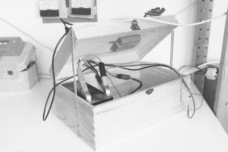
a detail of the solar powered server

First prototype of the solar powered server that runs the new website. The solar charge controller (on the right) is powering the server (on the left) through a USB-cable. 

Low-tech Magazine was born in 2007 and has seen minimal changes ever since. Because a website redesign was long overdue — and because we try to practice what we preach — we decided to build a low-tech, self-hosted, and solar-powered version of Low-tech Magazine. The new blog is designed to radically reduce the energy use associated with accessing our content. 

Why a Low-tech Website?

We were told that the Internet would “dematerialise” society and decrease energy use. Contrary to this projection, it has become a large and rapidly growing consumer of energy itself.

In order to offset the negative consequences associated with high energy consumption, renewable energy has been proposed as a means to lower emissions from powering data centers. For example, Greenpeace’s yearly ClickClean report ranks major Internet companies based on their use of renewable power sources.

However, running data centers on renewable power sources is not enough to address the growing energy use of the Internet. To start with, the Internet already uses three times more energy than all wind and solar power sources worldwide can provide. Furthermore, manufacturing, and regularly replacing, renewable power plants also requires energy, meaning that if data traffic keeps growing, so will the use of fossil fuels.

Running data centers on renewable power sources is not enough to address the growing energy use of the Internet.

Finally, solar and wind power are not always available, which means that an Internet running on renewable power sources would require infrastructure for energy storage and/or transmission that is also dependent on fossil fuels for its manufacture and replacement. Powering websites with renewable energy is not a bad idea, however the trend towards growing energy use must also be addressed.

To start with, content is becoming increasingly resource-intensive. This has a lot to do with the growing importance of video, but a similar trend can be observed among websites. The size of the average web page (defined as the average page size of the 500,000 most popular domains) increased from 0.45 megabytes (MB) in 2010 to 1.7 megabytes in June 2018. For mobile websites, the average “page weight” rose tenfold from 0.15 MB in 2011 to 1.6 MB in 2018. Using different measurement methods, other sources report average page sizes of up to 2.9 MB in 2018.

The growth in data traffic surpasses the advances in energy efficiency (the energy required to transfer 1 megabyte of data over the Internet), resulting in more and more energy use. “Heavier” or “larger” websites not only increase energy use in the network infrastructure, but they also shorten the lifetime of computers — larger websites require more powerful computers to access them. This means that more computers need to be manufactured, which is a very energy-intensive process.

Being always online doesn’t combine well with renewable energy sources such as wind and solar power, which are not always available.

A second reason for growing Internet energy consumption is that we spend more and more time on-line. Before the arrival of portable computing devices and wireless network access, we were only connected to the network when we had access to a desktop computer in the office, at home, or in the library. We now live in a world in which no matter where we are, we are always on-line, including, at times, via more than one device simultaneously.

“Always-on” Internet access is accompanied by a cloud computing model – allowing more energy efficient user devices at the expense of increased energy use in data centers. Increasingly, activities that could perfectly happen off-line – such as writing a document, filling in a spreadsheet, or storing data – are now requiring continuous network access. This does not combine well with renewable energy sources such as wind and solar power, which are not always available.

Low-tech Web Design

Our new web design addresses both these issues. Thanks to a low-tech web design, we managed to decrease the average page size of the blog by a factor of five compared to the old design – all while making the website visually more attractive (and mobile-friendly). Secondly, our new website runs 100% on solar power, not just in words, but in reality: it has its own energy storage and will go off-line during longer periods of cloudy weather.

The Internet is not an autonomous being. Its growing energy use is the consequence of actual decisions made by software developers, web designers, marketing departments, publishers and internet users. With a lightweight, off-the-grid solar-powered website, we want to show that other decisions can be made.

With 36 of roughly 100 articles now online, the average page weight on the solar powered website is roughly five times below that of the previous design.

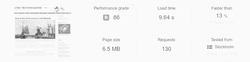
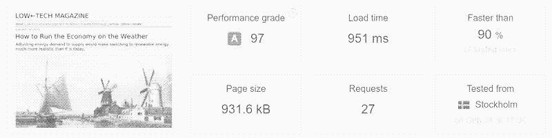
To start with, the new website design reverses the trend towards increasingly larger page sizes. With 36 of roughly 100 articles now online, the average page weight on the solar powered website is 0.77 MB — roughly five times below that of the previous design, and less than half the average page size of the 500,000 most popular blogs in June 2018. 

image

image

A web page speed test from the old and the new Low-tech Magazine. Page size has decreased more than sixfold, number of requests has decreased fivefold, and download speed has increased tenfold. Note that we did not design the website for speed, but for low energy use. It would be faster still if the server would be placed in a data center and/or in a more central location in the Internet infrastructure. Source: Pingdom.

Below are some of the design decisions we made to reduce energy use. More technical information can be found on a separate page. We have also released the source code for our website design.

Static Site

One of the fundamental choices we made was to build a static website. Most of today’s websites use server side programming languages that generate the website on the fly by querying a database. This means that every time someone visits a web page, it is generated on demand.

On the other hand, a static website is generated once and exists as a simple set of documents on the server’s hard disk. It’s always there — not just when someone visits the page. Static websites are thus based on file storage whereas dynamic websites depend on recurrent computation. Static websites consequently require less processing power and thus less energy.

The choice for a static site enables the possibility of serving the site in an economic manner from our home office in Barcelona. Doing the same with a database-driven website would be nearly impossible, because it would require too much energy. It would also be a big security risk. Although a web server with a static site can be hacked, there are significantly less attack routes and the damage is more easily repaired.

Dithered Images

The main challenge was to reduce page size without making the website less attractive. Because images take up most of the bandwidth, it would be easy to obtain very small page sizes and lower energy use by eliminating images, reducing their number, or making them much smaller. However, visuals are an important part of Low-tech Magazine’s appeal, and the website would not be the same without them.

By dithering, we can make images ten times less resource-intensive, even though they are displayed much larger than on the old website.

Instead, we chose to apply an obsolete image compression technique called “dithering”. The number of colours in an image, combined with its file format and resolution, contributes to the size of an image. Thus, instead of using full-colour high-resolution images, we chose to convert all images to black and white, with four levels of grey in-between.

image

A dithered image of our server.

These black-and-white images are then coloured according to the pertaining content category via the browser’s native image manipulation capacities. Compressed through this dithering plugin, images featured in the articles add much less load to the content: compared to the old website, the images are roughly ten times less resource-intensive.

Default typeface / No logo

All resources loaded, including typefaces and logos, are an additional request to the server, requiring storage space and energy use. Therefore, our new website does not load a custom typeface and removes the font-family declaration, meaning that visitors will see the default typeface of their browser. 

We use a similar approach for the logo. In fact, Low-tech Magazine never had a real logo, just a banner image of a spear held as a low-tech weapon against prevailing high-tech claims.

Instead of a designed logotype, which would require the production and distribution of custom typefaces and imagery, Low-tech Magazine’s new identity consists of a single typographic move: to use the left-facing arrow in place of the hypen in the blog’s name: LOW←TECH MAGAZINE.

No Third-Party Tracking, No Advertising Services, No Cookies

Web analysis software such as Google Analytics records what happens on a website — which pages are most viewed, where visitors come from, and so on. These services are popular because few people host their own website. However, exchanging these data between the server and the computer of the webmaster generates extra data traffic and thus energy use.

With a self-hosted server, we can make and view these measurements on the same machine: every web server generates logs of what happens on the computer. These (anonymous) logs are only viewed by us and are not used to profile visitors.

With a self-hosted server, there’s no need for third-party tracking and cookies.

Low-tech Magazine has been running Google Adsense advertisements since the beginning in 2007. Although these are an important financial resource to maintain the blog, they have two important downsides. The first is energy use: advertising services raise data traffic and thus energy use.

Secondly, Google collects information from the blog’s visitors, which forces us to craft extensive privacy statements and cookie warnings — which also consume data, and annoy visitors. Therefore, we replace Adsense by other financing options (read more below). We use no cookies at all.

How often will the website be off-line?

Quite a few web hosting companies claim that their servers are running on renewable energy. However, even when they actually generate solar power on-site, and do not merely “offset” fossil fuel power use by planting trees or the like, their websites are always on-line.

This means that either they have a giant battery storage system on-site (which makes their power system unsustainable), or that they are relying on grid power when there is a shortage of solar power (which means that they do not really run on 100% solar power).

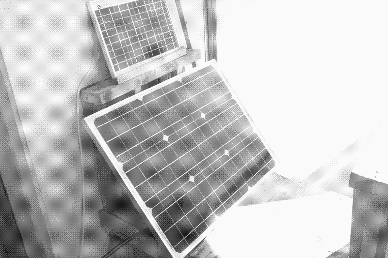
The 50W panel, on top of it is a 10W panel of a previously built off-grid lighting system.

The 50W solar PV panel. On top of it is a 10W panel powering a lighting system.

In contrast, this website runs on an off-the-grid solar power system with its own energy storage, and will go off-line during longer periods of cloudy weather. Less than 100% reliability is essential for the sustainability of an off-the-grid solar system, because above a certain threshold the fossil fuel energy used for producing and replacing the batteries is higher than the fossil fuel energy saved by the solar panels.

How often the website will be off-line remains to be seen. The web server is now powered by a new 50 Wp solar panel and a two year old 12V 7Ah lead-acid battery. Because the solar panel is shaded during the morning, it receives direct sunlight for only 4 to 6 hours per day. Under optimal conditions, the solar panel thus generates 6 hours x 50 watt = 300 Wh of electricity.

The web server uses between 1 and 2.5 watts of power (depending on the number of visitors), meaning that it requires between 24 Wh and 60 Wh of electricity per day. Under optimal conditions, we should thus have sufficient energy to keep the web server running for 24 hours per day. Excess energy production can be used for household applications.

We expect to keep the website on-line during one or two days of bad weather, after which it will go off-line.

However, during cloudy days, especially in winter, daily energy production could be as low as 4 hours x 10 watts = 40 watt-hours per day, while the server requires beteen 24 and 60 Wh per day. The battery storage is roughly 40 Wh, taking into account 30% of charging and 33% depth-or-discharge (the solar charge controller shuts the system down when battery voltage drops to 12V).

Consequently, the solar powered server will remain on-line during one or two days of bad weather, but not for longer. However, these are estimations, and we may add a second 7 Ah battery in autumn if this is necessary. We aim for an “uptime” of 90%, meaning that the website will be off-line for an average of 35 days per year. 

The 35Wh lead-acid battery and 30Wh Li-Po batteries that power the server.

First prototype with lead-acid battery (12V 7Ah) on the left, and Li-Po UPS battery (3,7V 6600mA) on the right. The lead-acid battery provides the bulk of the energy storage, while the Li-Po battery allows the server to shut down without damaging the hardware (it will be replaced by a much smaller Li-Po battery).

When is the best time to visit?

The accessibility of this website depends on the weather in Barcelona, Spain, where the solar-powered web server is located. To help visitors “plan” their visits to Low-tech Magazine, we provide them with several clues.

To help visitors “plan” their visits to Low-tech Magazine, we provide them with several clues.

A battery meter provides crucial information because it may tell the visitor that the blog is about to go down — or that it’s “safe” to read it. The design features a background colour that indicates the capacity of the solar-charged battery that powers the website server. A decreasing height indicates that night has fallen or that the weather is bad.

In addition to the battery level, other information about the website server is visible with a statistics dashboard. This includes contextual information of the server’s location: time, current sky conditions, upcoming forecast, and the duration since the server last shut down due to insufficient power.

Hardware and Software

We wrote an article with more in-depth technical information: How to build a low-tech website: software and hardware.

SERVER: This website runs on an Olimex A20 computer. It has 2 Ghz of processing power, 1 GB of RAM, and 16 GB of storage. The server draws 1 - 2.5 watts of power.

SERVER SOFTWARE: The webserver runs Armbian Stretch, a Debian based operating system built around the SUNXI kernel. We wrote technical documentation for configuring the webserver.

DESIGN SOFTWARE: The website is built with Pelican, a static site generator. We have released the source code for ‘solar’, the Pelican theme we developed here.

INTERNET CONNECTION. The server is connected to a 100 MBps fibre internet connection. Here’s how we configured the router. For now, the router is powered by grid electricity and requires 10 watts of power. We are investigating how to replace the energy-hungry router with a more efficient one that can be solar-powered, too.

SOLAR PV SYSTEM. The server runs on a 50 Wp solar panel and one 12V 7Ah lead-acid battery. However, are still downsizing the system and are experimenting with different setups. The PV installation is managed by a 20A solar charge controller.

What happens to the old website?

The solar powered Low-tech Magazine is a work in progress. For now, the grid-powered Low-tech Magazine remains on-line. Readers will be encouraged to visit the solar powered website if it is available. What happens later, is not yet clear. There are several possibilities, but much will depend on the experience with the solar powered server.

Until we decide how to integrate the old and the new website, making and reading comments will only be possible on the grid-powered Low-tech Magazine, which is still hosted at TypePad. If you want to send a comment related to the solar powered web server itself, you can do so by sending an e-mail to solar (at) lowtechmagazine (dot) com. Your comment will be published at the bottom of this page.

Can I help?

Yes, you can.

On the one hand, we’re looking for ideas and feedback to further improve the website and reduce its energy use. We will document the project extensively so that others can build low-tech websites too. To make a comment, please send an e-mail to solar (at) lowtechmagazine (dot) com.

On the other hand, we’re hoping for people to support this project with a financial contribution. Advertising services, which have maintained Low-tech Magazine since its start in 2007, are not compatible with our lightweight web design. Therefore, we are searching for other ways to finance the website:

We will soon offer print-on-demand copies of the blog. These publications will allow you to read Low-tech Magazine on paper, on the beach, in the sun, or whenever and where ever you want.

You can support us through through PayPal, Patreon and LiberaPay.

The solar powered server is built by Kris De Decker, Roel Roscam Abbing, and Marie Otsuka.

Comments

To make a comment, please send an e-mail to solar (at) lowtechmagazine (dot) com.

Seppe

Very interesting project! It’ll be interesting to see how well it holds up during the winter.

What software are you running on the server to keep the energy usage so low? (I’m mainly interested in the OS and HTTP server.)

I have a few ideas/suggestions:

I think it should be possible to reach much higher uptime by creating a network of nodes that all host the same set of websites. It wouldn’t be a very simple project, and you might argue that it’s not as lowtech anymore. But hear me out:

Say you have 5 “lowtech websites” each running on its own server (node), and each located in a different place on earth. You could then duplicate the content of each server to the 4 other servers. This only costs you extra storage. The servers only need to communicate with each other when the content changes. The energy/bandwidth cost of this communication should be negligible for static websites that are updated for example once a day.

The main challenge is the DNS. There needs to be some kind of load balancing between these 5 clients. A rudimentary solution would be to use round-robin DNS. Say you have and A record for solar.lowtechmagazine.com that contains all 5 of the nodes’ IP addresses and a lifetime of 5 minutes. Every time a node detects it is going to go down in less than 5 minutes, it updates this DNS record: it removes it’s own IP address. Every time a node boots back up, it re-adds it’s own IP address to the DNS record. I’m not an expert on DNS, so I’m not 100% sure that this would work. But I think it’s worth investigating if you’re thinking about improving uptime. Obviously more complex schemes would be necessary to handle unexpected node downtime. Depending on the type of website this may be overkill.

About the images. I think you may have gone a bit too far in the image compressing. I see that most (all?) of the images on the grid-powered website or stored in the lossless PNG format. In general this is not a good choice for photos (as opposed to icons or other graphics with few colors): the file size will be much larger than when you’re using the lossy JPEG format.

For example: the main picture for this article is 739 KB in PNG

The dithered version in PNG is 43 KB, which is indeed a huge improvement, but comes at a big cost in image quality

The B&W JPEG version of the main picture (70% compression) is only 35 KB, and I’d say the image quality is much higher than that of the dithered image. (The image resolutions don’t match entirely. For the same resolution the image size of the JPEG would probably be more or less the same as the dithered image, but with increased image quality.) You could even lower the JPEG quality further than 70%, but this quickly becomes rather unpleasant to look at, so you may not want to do this.

Jiehong

Very interesting experiment!

But what about CDN caching and all other kind of caching between your server and each of the browsers?

It might very be the case that CDN will cache the content of this website for some time according to default cache policies, and also that the client’s browsers might also cache part of the website directly.

I’d say that having big caching time for the browser is a big plus, as it would still allow users to access previously accessed pages when they are down at no energy cost.

On the other hand, estimating network caching energy usage might be complicated.

Sofie

“The design features a background colour that indicates the capacity of the solar-charged battery that powers the website server. A decreasing height indicates that night has fallen or that the weather is bad.”

So that’s what it is! It looks more like a glitch. I think it would be better to just add it to the header: This is a solar-powered website, which means it sometimes goes offline. Battery: xx%

Some other minor issues (in Firefox): The area you can click on links is some places longer than the text. When the window is wide the images become too big and lines denoting cut-out text go much further out than the text, which looks odd.

QWxleA

Quite enjoyed the article, and am interested how you did the image dithering and coloring. Do you have a link that explains more?

Thanks, Alex

PS you could add a logo if you convert /create it in svg and embed it in the page.

Case D

I think it’s a really cool project. I’m a hobbyist website tinkerer with a blog, and I’ve been experimenting with CMSes (I just installed WordPress, but I think it might be too much for what I want to do — really I’d like a flat-file, static site that I can push to from anywhere (i.e., with a webform), which is what I can’t figure out).

I’m writing you because I was curious if you’d share how your publishing workflow works — do you have a CMS that you use? If so, how do you get from a web form to a published post? Is that how you do it?

tx

Some thoughts:

RSS feed is missing!

jquery-3.3.1.min.js is the biggest file on your page, from the limited amount of JS I saw, it could be easily removed. you could cache the your in a separate js file, this would also prevent uselessly sending your script to browser that won’t support/accept it.

would you mind sharing the dithering script you apply to images?

I discovered LOW TECH MAGAZINE through this article and I’m really happy with the look and feel of the website! Keeping the default typeface is so rare nowadays and it works very well without JS.

kris de decker

RSS feed lives here https://solar.lowtechmagazine.com/feeds/all.atom.xml

George Dorn

@ Case D (#5)

Look into various static site generators, like Pelican, Jekyll and dozens of others - https://www.staticgen.com/

They require a little bit of effort to set up, design the template, etc, but then whenever you want to publish, you run a command and it (re)generates all of the html. You can run the generator on the server itself, or on any other machine and just send the results to the server (somewhat automatically, via rsync, ftp, scp, etc).

I publish a blog this way via Pelican. I edit a file in reST (other languages also supported) and when I’m ready I run ‘make html’ and ‘make publish’ to send it to the server.

Perry

very cool. have you considered p2p/distributed web technologies like beaker browser? https://github.com/beakerbrowser/beaker

Dan

Your site doesn’t load in Naked Browser on Android.

Ben S

It’s a cute idea, but please don’t dither your images.

One problem which you haven’t addressed is the increasing attitude towards web-pages as being “disposable”.

A good page, living on a sensible URL, could be available for decades if not centuries - but then, surely, there must also be a compromise made to maintain sources at the highest basic quality possible? What is worse that researching an interesting topic, only to run into photocopies of photocopies of a now lost technical drawing, which has become indecipherable over time. Dithering is basically this. You are an important source. Please don’t be a source providing photocopies of photocopies. I often find myself just grabbing screenshots and putting them into presentations or other documents. Ironically, this leads to a continual bit-rot as others do the same and screenshot my content. It’s surprising how many images in searches are clearly screenshots of poorly rescaled original images. Dithering will make this even worse.

I understand you’re trying to make a point - and there is a perverse value in stubbornly pissing into the wind, otherwise I wouldn’t enjoy low-tech so much and try to put it into practice myself - but please don’t let a low-energy perspective compromise on the real core of what you do, which is communicating excellent alternatives.

Edwan Summers

Thanks for this excellent post about a very important experiment. The adjustment around a website always being on seems like an important part of this work.

I’ve recently been experimenting with dat 1 which can often involve adjusting expectations about when content is going to be online or not. They have some nice instructions for publishing your static site using dat 2, which would mean that someone could potentially get your website from a peer who is sharing the cost of keeping your content online.

I honestly don’t know of what the energy costs associated with this are, but presumably the peers would only start to contribute traffic when content was requested. I imagine this is something the dat folks would be interesting in helping answer.

PS. I love the idea of doing web comments over email. It also makes me wonder if there could be static site plugins for supporting this process. Like running a Pelican/Jeckle/Hugo/etc conmand every day to examine an mailbox and look for comments on webpages. I guess there would be a necessary step of reviewing them too.

Damon Hart-Davis

My off-grid solar server:http://www.earth.org.uk/note-on-Raspberry-Pi-2-setup.html

You may also be interested in some of my tools to reduce page and image weight. (No ditherin:; zopfli(png) and similar in my case…)

Jeremy Keith

Hi Kris,

That’s an absolutely fascinating article! I really like what you’re doing.

You mentioned that you were looking for ideas. There’s a technology you could use that would allow people to see something from your website, even when the server is down: service workers.

As long as someone has visited your site at least once, you could show them something when they try to visit the site when the server is powered down. That could just be a simple message, or it could be articles that you previously put in the visitor’s cache (for example, every time someone visits an article, you could store a copy of that article in a cache to show them later when the server’s offline).

Usually service workers come into play when the user’s device isn’t connecting to the network, but they also apply in your situation, where the server isn’t connecting to the network.

I’d be happy to help you write the service worker script if you like.

Jacob Hall

Hello there,

I absolutely love this concept, and I hope this is where the world is headed; it simply doesn’t make sense to bloat the internet with so much needless data.

My first thought, which commenter Alex also mentioned, is that you may be able to preserve the “modern” look of your site by using .svg graphics for logos and some images (such as graphs). As cool as dithered images look, I suspect a .svg would have an even smaller footprint, and could greatly improve the readability of content such as graphs used in “How Much Energy Do We Need?”

Secondly, I’ve heard a lot of people say recently that the future of the internet is decentralization, with users “seeding” visited websites to future users to create a more efficient and secure internet experience. I believe that this concept would lend itself well to the ideals of low energy consumption, potentially providing backup should your server ever go down due to weather. I know it isn’t practical to implement right now, but I hope that is where the world is headed.

Thank you for the well-written and thought-provoking article.

Jeff Jahr

I like the old-timey dithered look of your images, and the way you are using the multiply blend to sepia tone them, that is very cool! However, if you want to have even lower page weight, then you might consider converting the images to grayscale jpg with a reduced quality instead of converting to dithered png.

Here’s a quick comparison using your original image, the dithered image that appears in the article, and a conversion to gray jpg using an ImageMagick ‘convert’ command.

zeppelin:/tmp> convert -grayscale RMS -quality 50 -geometry 800x600 6a00e0099229e88833022ad3b23825200b-750wi.png test.jpg zeppelin:/tmp> du -bh 6a00e0099229e88833022ad3b23825200b-750wi.png sps_close.png test.jpg 739K 6a00e0099229e88833022ad3b23825200b-750wi.png 43K sps_close.png 28K test.jpg

The image (test.jpg) is 15KB smaller than your dithered one, and still looks good with your color blending method.

If you like the rough look that your dither gives the images, you could ramp the -quality parmeter down to 10 or so, and your jpgs will start to look rough and mottled too- AND the image size will be reduced into the 9KB range for even more weight reduction.

zeppelin:/tmp> convert -grayscale RMS -quality 10 -geometry 800x600 6a00e0099229e88833022ad3b23825200b-750wi.png test10.jpg zeppelin:/tmp> du -bh test10.jpg 9.1K test10.jpg

Cool stuff, good luck with your web server!

Bill Daniel

I’m such a fan. I love your work, I only wish you published more frequently.

The low tech website is brilliant.

I would happily pay to get print versions of your articles. I’d likely print the whole archive! I’m a paper freak. Film and paper-based photographer, book collector, and collector and archivist of a wide variety of paper-based artifacts.

As a media archivist I’m constantly railing against digital storage, on the cloud or on drives. The future is going to have a dim understanding of what happened in our century, since most of the evidence will be non-existent/un-recoverable.

Keep up the good work! I hope I get the opportunity to purchase some print on demand articles.

Drew Gulino

It might go against the spirit of what you’re trying to do with your solar web site, but users could go to the web archive of solar.lowtechmagazine.com when it’s down (once it is archived; www. is already archived)

On the other hand, you’re not using ads, so you’re not out any money if users go to the archived site instead.

Francesco

Like others have said:

Instead of dithering you can use JPEG. I can achieve 52.4 KB with the image of this post, keeping the colors (compressing with gimp, quality 70, artifacts visible, but if you ask me only to somebody looking for them). Sure it’s slightly more, but the image looks almost the same.

Also, since your homepage has a lot of images and might get lots of visits, why not thumbnail the images to a lower resolution? This might cut in half or more the size of the homepage.

Also embedded svg for the logo or other non-photographic graphics it the way to go (if embedded you avoid http requests).

Additionally, like already said, eliminate jQuery (or at least use the slim build, that eliminates some features, see here https://cdnjs.com/libraries/jquery).

Putting the computer outside in winter might help a bit with energy efficiency and cooling.

I am convinced this is a low-power website and I like the project, but it remains to be seen wether more energy could be saved in a data center where the computational resources are shared and they have proper cooling solutions.

Evan V

Just so you know, if you “snap to web colors” when exporting your dithered PNG you can get a similar aesthetic at an additional 50% size savings.

Mengyang Li

Yep, the JPEG format is much better in storing pictures than PNG, You can even use bpg to reduce size while maintain pretty acceptable quality.

Visual comparison

I think this is over engineered with a huge trade off on the image quality.

Leo Tindall

One potential way to reduce energy consumption while still retaining content accessibility might be to publish the site on IPFS, as I’ve done with my blog 1. That way, people accessing the site help serve the site. 1:https://leotindall.com/post/putting_this_blog_on_ipfs/

Job van der Zwan

So I checked the solar powered website images to the regular website images.

To my shock and dismay, TypeKit for some reason uses PNGs for photos. This is extremely inefficient: PNG really is only good at compressing smooth surfaces and gradients. Photos are a terrible choice for PNGs.

I made a test gallery to compare alternative options: https://blindedcyclops.neocities.org/low-tech-image-tests/gallery.html

In my experience, and as shown in the above gallery, cleaning up the image first makes an enormous difference in compression size, and results in better maintained quality at extreme compression values. I suggest Darktable and GIMP: http://www.darktable.org/ https://www.gimp.org/

Another conclusion that I would draw is that JPGs aren’t that bad.

However, if we insist on using dithered PNGs, here are some suggestions.

PNGquant is a lossy PNG encoder, which can be found here: https://pngquant.org/

The downside is that it only supports Floyt-Steinberg dithering.

PNGs can also be losslessly optimized with optipng: http://optipng.sourceforge.net/

It is often even worth putting the output of GIMP and/or PNGquant through optipng for a few extra percentages.

Ivan Vandot

Love the idea, great job. For the even more low-tech site definitely remove jQuery and rewrite in plain JS part for the icon and weather.

A Baldo

Wow, this is good news! As one of your readers who lives in a passive solar off-grid home in northeastern North America, your new lower-bandwidth site loads wonderfully fast over my slow cell signal. I tend to browse in “text mode” anyway, for speed and readability on my little phone screen.

Because of my slow connection I have become painfully sensitive to the growing bandwidth requirements you describe, even to read the news. I rely heavily on the text-only NPR page and the text-only National Weather Service forecast page; in cloudy weather they are sometimes the only pages that DO load!

Glad to be able to add the solar version of your site to the list. It is an informative, entertaining, and practical resource (I am now a thermal cooker aficionado, thanks to you!)

anja

PS I agree with Sofie that a simple text battery percentage in the header would probably be sufficient and more readable (when Safari isn’t already in text mode) than having the web page display battery status via background color.

Garve Scott-Lodge

Love the idea. Here are a couple of ideas which might improve the site further

There’s an easy way to shave a few bytes. The type=”text/JavaScript” attribute to the script tag is not needed on html5 pages like yours.

But there may be a more complex way of doing away with jQuery entirely.

All you seem to be using jQuery for is to pull in a JSON file with the current weather and battery stats. Your server is obviously creating the JSON file on the fly. If instead you created a small CSS file with the data you could pull it in instead, setting the attributes of the battery div and using the content declaration of :before and :after pseudo elements to insert words like “snowy” into your content. You’d need to ensure the CSS file wasn’t cached, either server side or using a little JavaScript.

Cheers

kris de decker

Here is a quick note from Low-tech Magazine. We are a bit overwhelmed by all the feedback, especially because we were still working on the website when word got out.

We managed to fix the most obvious errors, took away the scaffolding, and launched a partly untested website, only to be flooded with traffic. Between 16:00 and 23:30 yesterday, the solar powered server registered 35,000 unique visitors, all while working flawlessly and using only between 1 and 2 watts of power. That’s comparable to a very small LED reading light.

In the comments, many people focus on the battery meter and the dithered images, and they come up with very clever ideas to do it differently. For our project, low energy use was not the only goal. We also wanted it to be obvious to visitors that the server is solar powered and that the website is built in a very different way. If it would look and feel just like any other website, almost nobody would realize it is special.

Of course other ideas for image compression are very worthwhile and we look forward to try out some of the ideas and discuss them further.

We are still writing technical information (to be published soon), refining the software, and experimenting with various set-ups of the battery system, so expect more updates in the next days and weeks.

PS: There’s a lot of interesting comments on the project over at Hackernews

PPS: And there is a nice article on Treehugger

Jeff Gnatek

hi there, curious if you have considered doing an inverted color scheme, so dark background with light text.(/blackle.com/ claims to have saved lots of watt hours for not being on a white background.

i love the magazine and look forward to reading more in the future

Sava Chankov

Great re-design, completely in line with the site’s topic! Reminds me in a way of Fidonet, a lowtech computer network that was popular in early 1990s, before the Internet takeoff. It was ran by volunteers, who ran bulletin board systems that dialed automatically each other in the early morning hours to exchange emails, which took quite long to travel on it compared to the modern email.

Jan Steinman

YAY! You guys are my heroes! I’ve been wanting to do such a thing for some time.

One of the fundamental choices we made was to build a static website. Most of today’s websites use server side programming languages that generate the website on the fly by querying a database. This means that every time someone visits a web page, it is generated on demand. But wouldn’t caching deal with that?

We run a MediaWiki server on a Mac Mini, and are running memcached. About 90% of page requests end up being served by memcached, as far as I can tell. And with an SSD behind that, there isn’t too much energy penalty for a cache miss, anyway.

Nicolas Huillard

Re. the 10W+ router: since you’re on fibre internet, you may probably directly link the server to the fibre ONT, and get a DHCP address from the operator. You would still have the ability to connect from your laptop using a switch and 2 VLANs (the operator DHCP stuff probably already use a VLAN). You would have to check the details for your country/operator.

Re. CDN, IPFS, etc.: since this server is 2W max, adding more infrastructure will kill the energy efficiency (I doubt the typical-low-powered IPFS server around is less than 20W). The page lightness makes all that useless. The RSS feed makes the CDN perfectly redundant too. 500k page views in a few hours for this little thing is impressive!

Re. multi-site web-serving: I use “booth”, a software package that distribute tickets to 2 or more locations. The location that have the ticket updates the DNS record to bring the traffic to itself, using a simple home-made script. The DNS stuff relies on setting the TTL very low (~5 minutes). This works great for my pro-hosting needs (semi-solar-powered highly-available hosting at 200W). Using this on very distant locations would make the website highly available at very low cost, and only twice the power (probably 2W active/loaded server + 1W standby server). Since there is no database, dual-active hosting is also very easy, using DNS round-robin. You just need to distribute the content (rsync) and aggregate the logs (mergelog) when there is plenty of sun.

STPo

You did a really great job here. Improvements are always possible (and welcome) but hey guys, that’s what I call a redesign!

Glad to see some folks showing us the path.

Laplace Victor

First, I’m a huge fan of your solar project !

I’m a front-end developer and I see some improvements :

  • as mentioned in other comments you can easily remove jquery (or at least use the CDN version it will be less ressource intensive for your server) and as I like your project, I rewrite your code in vanilla javascript (let me know if you have any issue)
  • images have width 100%, this is ok for mobile but not really on desktop, as your images max size is 800px, so I think you can add this style : .entry-content p.img{ max-width: 800px } it will be less pixel to render, so less energy consumption for visitors.
  • also mentioned in other comments, PNG is not the lightest image format, you can have almost the same weight and preserve colors with jpg (or even webp)
  • you can “minify” images. All images comes with metadatas, those datas are not necessary for displaying image on the web (ex for sps_close.png 40.172 bytes vs 43.415 bytes for original). Have a look at https://github.com/imagemin/imagemin
  • you can lazyload images. Don’t use the technique using ‘scroll’ event as it’s really ressource intensive for visitors, prefer the Intersection Observer API
  • you can also improve browser caching to limit reload of assets https://varvy.com/pagespeed/leverage-browser-caching.html
  • you can also replace images cloud, sun in footer by unicode characters, https://unicode-search.net/unicode-namesearch.pl?term=cloud https://unicode-search.net/unicode-namesearch.pl?term=sun

That’s it :)

Paul Ito

First of all: I love your website and wish I had come across it much earlier.

The article on how to build a lowtech website was super inspirational and sparked (re-sparked?) my interest in building a website with easy and low-impact tools.

My comments on the project:

1) I would love if you would give direct IBAN bank account information if in any way possible. As much as I respect the mission of donation tools like patreon and librepay, they do take their cut from the donations. The most direct way to support your product and your mission is monthly payments directly to you. I understand that this is only free of charge if your supporters happen to have an EU bank account with IBAN/BIC, but it would be worth at least giving readers the option to support you in that way.

2) I am not a big fan of the yellow battery indicator that is (as of right now) splitting the screen in half. This feels gimmicky to me and is distracting my attention from your great articles. (Very much personal preference of course)

3) In addition to other people commenting on the use of dithered images, you might consider hosting more hi-res (jgp?) versions on the server and linking the dithered images to them. That way people who want the better picture quality can have it, without everyone having to load articles with heavy images in them.

Keep up the great work, I will definitely come back more often!

Cheers,

Paul

Frederik Van Der Veken

Excellent project!

I love the idea of a static, non-always on website. You’re making a fair point, and I agree we need to make a mental shift in what we expect from the on-time of a website.

However, I have some issues with the images. As some people already mentioned, the dithering really lowers the quality a lot, while a lossy compression could achieve the same file size but with better quality. Another issue is the black-and-white. This is indeed a smart thing to do as it saves a lot in file size, however, you have to make sure that your article does not depend on the color in the image..

E.g. in your article on the high-speed trains the original low-speed train route and the newer high-speed train route between Paris and Amsterdam are shown on a map in different colours. Of course both look the same in black and white and the distinction is lost. Maybe you could solve such issues by make one of the lines dashed?

Abelardo

Kris, I am cuban reader that become crazy with the cool low tech website

Could Low Tech design and host low tech websites for a fee, that contributes with the magazine?

Skye

Just wanted to say absolutely fantastic project - I will be watching this develop and plan to use your example as a template to follow in a website I will be building in the next year or so. The work you are doing is so important - thank you!

Geoffrey Tolle

I haven’t had a chance to read all the way through your latest article (and won’t understand most of it when I do) but I did catch one point that I thought worthy of consideration in the design of your energy storage system.

I see that you chose to use lead / sulfuric acid batteries as your battery back-up. May I suggest that you consider switching to iron-nickel batteries. It may be that I’m preaching to the choir but, in case you haven’t heard of them, iron-nickel batteries are a proven if bulky rechargeable technology. They use alternating iron and nickel plates (relatively cheap) in a basic electrolyte to store energy.

They are rechargeable hundreds of times, have less toxic waste products, and are very durable. They have a slow charge and discharge rate but should present few problems for powering low-tech websites. While the units can be quite expensive, they are also amenable to home-production (something that anyone who can assemble a low-tech website should be able to handle).

Well, even if I don’t understand the exact nature of this technology, I feel that the possibilities and the look into energy cycling will be helpful to me.

Roel RA

Dear low-tech readers,

Quick introduction: I’m Roel one of the collaborators of the project that worked on the web design, back-end and hardware.

As Kris already mentioned, we got caught off guard by the unplanned early launch and all the attention. We are still smoothing out most of the design. Having said that though, solar.lowtechmagazine.com was intended from the start as a public learning moment. The site we’ve made should thus be understood both a proposition but also as a question and we really appreciate your insights and feedback. These insights and feedback we will use to further improve the website over time and document how and why so they can be points of departure for others.

@Seppe: We are aware that we could make multiple servers around the world to always have the sun shining and use clever routing to always have the machine on-line. However this was besides the point for us and contra-productive to our message. If weather-based renewable energy is to ever become our main source of energy, that only works if we massively decrease our energy use and adapt our patterns to availability.

In the case of our server it is fairly simple to have a 90% uptime with a cheap and energy efficient computer and a small solar panel. However. to go above that 90% we would need to double or triple the machines used, the solar panels necessary and our storage capacity available. That is not even mentioning the resources necessary to maintain all of this in different parts of the world. If this is to work in a sustainable way, we have to change our attitude and the best way to do that in terms of web is to challenge the holy grail of ‘uptime’.

For me the articles ‘How (Not) to Run a Modern Society on Solar and Wind Power Alone’ and ‘How to Run the Economy on the Weather’ where very informative in this respect.

As others like @Daniel have pointed out, there is an energy advantage also in economies of scale, running multiple websites on a single machine.

I was very surprised for example during our peak traffic of yesterday. While on the front page of the popular website HackerNews we got 500,000 requests in a few hours, yet the 15 minute average load of the server never reached above 30% of total capacity. So yes multiple popular websites built around the same principles and technologies could have fit comfortably on the same machine.

Something that isn’t addressed that much in the comments, but which was very important for the design process and the future archive-ability of low tech magazine is how we converted all of the articles into markdown plain text files, and have made archives of all the original images. This means the ‘sources’ of the site are in a format which is legible across time and distinct computing environments. Another benefit is that the articles can be written off-line and generated into the website or its RSS feed when necessary. This means the process of dithering the images is part of the generation of the website, so the originals are not lost.

This brings us to the point of the dithered images, which seem to be the most divisive element of the web site :)

@Francesco, @Evan V, @Menyang Li and others

I’ve looked extensively into image compression and have learned a lot in the process. The choice for the dithering the images was not only one to reduce the size of the file. It was also a design decision to make the web page more calm, legible and outspoken at the same time. I agree that similar space savings can be achieved with colored jpegs with very lossy compression but in my opinion they look a lot worse and need to be displayed small. We also made a decision to stretch the images to full width of the browser to create pauses in the text, whilst creating a sort of visual rithm.

I am also aware that in theory PNG is not the optimum image format, however it is a format that lets me limit the color palette to save space and still create great crisp dithered images. In my post-processing pipelines I’ve run tools like ‘optipng’ over the resulting output but they could only shave off another 5% of the image size at the cost of having two full extra hours of processing.

However, @Job van Der Zwan, I really appreciate your side-by-side comparison and it reminds me a lot of what I have been doing the past months. I am very impressed with your results and would like to find a way to see how we can create this style of crisp dithered jpegs in an automated pipeline. So please lets continue this conversation!

We plan to publish the pelican theme and all the code in the beginning of next week so those of you interested could have a look at it.

Another issue with the images is that of course not all images lend themselves to the technique, which has been pointed out a few times by some of you. This is something which we will address as well.

The jquery dependency, has also been pointed out a lot and we will remove it sooner rather than later. @Laplace Victor thank you so much for making a pure js implementation. This really helps. We’ll be trying it out asap. Again once we’ve published our sources we are really open to pull requests.

This weekend I will publish an addendum to this article on the technical details for the server configuration.

As Kris already mentioned in this article and on the ‘donate’ page of the solar site, advertising trackers are incompatible with the new website design and we really want to make Low-Tech Magazine tracker free and sustainable so if you enjoy our work or find our public research useful please donating.

Many thanks for the comments!

Tomasz Jadowski

Yes, grid-powered router is the weakest part of this project.

Have you ever heard about mesh networks and Hyperboria project?

When you setup a hyperboria node you could backup your internet connection with Wi-Fi, GSM or another link and powered them by solar.

The cost is access only via hyperboria network when a grid is off, you could run both versions (for “normal” IPv4 and for Hyperboria mesh) simultaneously.

I don’t know how “expensive” in CPU and power is to run a Hyperboria node.

Good luck! I love this idea!

ijk_ijk

Your new solar site is fully accessible from not so powerfull client like old pcs and old tablets with poor hardware and obsolete OS. The regular site makes the browser of my 6 years old tablet to crash but the solar one is perfect ..and faster. Static sites are increasing the life of all clients.

J Campbell

Hi,

This is so cool.

I have always thought static websites are the best when your content is just pictures and words. Even the old image rollovers can be fun and generate a little interactivity. But I especially like the dithering idea. I use dithering as an artistic tool for some of my works because I find the dot pattern generated rather pleasing to look at. I also play around with the number of colors and swap colors used in the images. Photoshop’s “Save for Web(Legacy)” tool is where I play with images and dithering. I find the diffuse style of dot pattern the most aesthetically pleasing.

Another energy saving concept is that of a black background. When displayed on users devices it required less energy. But it’s a significant change to the site appearance.

I just wanted to let you know that this is a fantastic idea you have and it gives your website a palpable quality that does not exist on any dynamic webpage.

Joel Mikulyak

I’m a front-end developer, and just wanted to state that I completely love your decision to go low-tech and energy-efficient with your site. If you have any other great resources on the topic, I’d love to read more.

Marie Otsuka

Hi all,

I’m Marie, and I’m one of the designers / developers of the website. Thanks so much for your feedback! As Kris and Roel have mentioned, it somehow got out before we were quite ready, but it’s been amazing to hear all of the responses so far. We’d planned for this platform to provoke discussion, so we’re excited to get this jumpstarted.

A large part of the challenge of this project was balancing functional decisions with the design concept. Often, we opted for the more radical option so that this design questions our current aesthetic expectations. To chime in:

Images

Dithering

Certain images are better suited for other forms of compression. But our goal was to not only compress images, but also to call to attention this act of compression.

We found that dithered images can be stretched beyond their actual image size while providing a distinct aesthetic, and that the artifacts of compression can become an integral part of the design.

(Along those lines… many sites produce multiple images for different sizes appropriate for various display sizes. We opted to use the same image file for both thumbnail and featured images to prioritize the caching, even if it means that the listing pages may be a bit heavier.)

SVG

Inline SVG definitely makes sense as a lightweight graphic form! (They’re actually used for the social media icons already.)

I also agree that the legibility of graphs can be improved with SVGs. But we’d need to convert the given raster images we have of these graphs into a vector format — which, if done automatically, would end up producing a super heavy SVG file. What would be ideal is for any informational graphics to be readable and text-based, with svg/css-based shapes, which we unfortunately currently don’t have the capacity for within our workflow. But definitely a problem to address!

Using an SVG for the logo is a good practice too, which I’ve actually seen done well on many sites. But once defined, that logo would have to be preserved on any platform, not just on this website — whether publishing in print or web form. That file would need to be sent around as an asset for any marketing needs. Again, we wanted to question what it means to create a “brand” identity.

We also played with Unicode for the weather icons, but found that the way they displayed (especially more non-default characters such as “windy” or “clear night”) were too unreliable. We’ll work on better sizing/compressing these though! Also, more improvements are coming to the battery indicator / dashboard / weather page!

JS

jQuery As Roel mentioned, removing jQuery is in the plans. Thanks to all those with the tips! We thought about doing some more research on potential browser compatibility issues the library helps take care of, but looks like it won’t be an issue.

Offline Service workers for offline reading is something I’ve also been doing some research on! We’re looking forward to further develop how caching might fit into improvements for the site.

Thanks again for all of the comments! And we appreciate your patience as we work through some kinks. More soon!

QB

I’m a longtime reader and fan; I just wanted to let you know that on Firefox 61.0.2 on Mac OS 10.13, the website has a huge semi-transparent yellow box over the lower half. I think it’s a sun-meter or a battery-meter.

I’m not sure whether it’s deliberate or if it’s a bug that is causing it to cover all the text on the page. If it’s deliberate, I just wanted to let you know that it makes it almost impossible for me to read the page, it’s super distracting. I’d love for it to be just a thin sidebar or something in a top scrolling navbar sort of thing. Having something overlaid on the text like that basically renders the website unusable for me.

Thanks for all the work that you do, and the new server sounds really cool!

TC

First off thanks for introducing the world to your website, absolutely love it. I’m new to reading your site, but I assume low-tech is not at the exclusion of clever solutions (which IMHO is where the fun starts). The capability of low cost hardware means that there is a huge amount of potential in even the most basic setups.

It is a very neat idea and I think it could be a very useful concept which could also be applied to many situations where internet access is difficult or limited. In some cases a link to the internet may not be possible, so localised hotspots could also be used. This could be in developing countries, areas of natural disasters or even war zones. Allowing vital information to be broadcast, from medical information/advice to emergency assistance, lost/found persons to providing educational resources. Potential website-in-a-box?

This could also provide an excellent project for schools for teaching.

With regards to the site as a technology news site, I have several observations (none is intended as criticism):

Images:

I agree the dithered styled images are a nice design feature and adds a real charm to the site, particularly the colour categories flowing through to the article. However, you are right to concede that certain images don’t lend themselves well to this treatment - ie. your web page speed test image. For diagrams/tables etc SVGs or similar would allow technical details to be read clearly, even if you apply the same grayscale colour mapping (if feasible).

Power bar:

Although I don’t think I have any particular sensitivity to colours, I do find the colour hue across the article very distracting when trying to read and absorb the content (people who are particularly sensitive to this - often a characteristic of neurodiversity - will find it even harder). Perhaps consider limiting the overlay to the home page only, or (if feasible) to the article header bar only. A nice feature would be to have a day/night theme so people can select a contrast which is best for them - ensuring the site is accessible to a wider audience (and as someone else commented an added bonus OLED devices will use less power).

Uptime:

I do agree with the principle of 90% uptime, and it underlines the whole concept - adding additional panels and battery/storage, like you say, isn’t the point. However it would be interesting if you can determine if the downtime is likely to be off-peak or not. Clearly for yourselves and your readers within +/-2-3 hours GMT their peak times will be very similar and may well be a good fit to the site availability. A study of loading before a downtime could provide an indication of if a certain group of readers are inadvertently being excluded (due to geographical or demographical reasons). Longer term it may be possible to characterise the charging and the loading to allow the site to predict the best times to go offline in order to meet peak times (and provide forecasted downtimes during off-peak periods). I’m sure that would make an interesting project for some students looking at machine learning.

Multisite:

The multiple site location concept does introduce some excellent possibilities, since even one similar site elsewhere in the world could provide complete coverage with additional redundancy, while reducing overall power needs by sharing the serving of multiple sites. This does complicate the setup a little but it does provide the opportunity to grow the idea further. This could perhaps provide the opportunity to scale down the setup with smaller panels and battery. As mentioned before this could have very useful applications for the website-in-box concept where multiple setups could be meshed to cover an area.

Energy storage:

I wonder how feasible alternative energy storage systems would be. It would be interesting if eventually you could replace the need for the batteries completely by using kinetic storage or similar (I claim no knowledge on how practical this is and probably is not suitable for your setup).

John

Great site, but what software did you use to generate the site?

You’ve given hardware details but no software.

peter garner

I’m truly inspired!

I’ve already been running my web site on a Raspberry Pi for a couple of years now and it’s proved very economical. This morning I’ve managed to get my home page size down from 225Kb to 7.5Kb just by getting rid of “decorative” images and reducing the size of others. I found that some page loading speed can be recovered by using sprites, assembled using glue-sprite.

If you didn’t want to serve images on-the-fly a potential low(er) energy option is to use a Gopher server. I also run one of these on a low-power Raspberry Pi and it’s very effective for serving documents of all types. I know it’s an old protocol but according to a recent survey there are 333 active gopherholes (servers).

I plan to start setting up a solar-powered web/gopher server soon, but as I live in Yorkshire, UK, my sunlight hours are not quite as good as Barcelona!

Thanks once again for a brilliant idea - it’s the future!

Craig Balfour

My name is Craig. I’m a big fan of what you’re doing with the Low Tech Magazine, and I love the idea of a solar powered website! The newsletter asked for feedback and suggestions, so I had a look if I could come up with any. This is all pretty rough, so I’m sure I’ve missed stuff, probably with responsiveness etc.

Anyway, this is my feedback:

Make battery meter a lot less in your face Love the idea of the battery indicator, but it’s so distracting when reading! When it’s low it also visually breaks the content and makes anything in the battery indicator look like a footer. Here’s how I’d change it:

Align it right, not left. Make its width something like 64px so it’s just a bar at the side (in the new whitespace) Move the top border from the content to the battery div so it covers the top nicely. Lessen the “intensity” of the black on the readout. I found something around #333 to be quite nice, but just play around and see what looks nice. Also, when at smaller screen sizes, reduce it further and don’t bother with the icon, and maybe even the number.

Centre content Wrap your page in a div with margin: 0 auto; max-width 960px; or something like this to keep it in a nice tidy column on the screen. Otherwise it looks a bit like a newspaper and is hard to follow.

Font family Really not a fan of the serif font. Nothing wrong with Arial and co, or maybe even a mono font to get that typewriter feel? Idk. I think just the normal sans. This won’t increase network traffic, since it’s not sending fonts.

Spacing I have changed the page layout from using lists to using divs with display:flex. It’s pretty powerful and a lot more flexible than ul. I think it will make life easier, and it’s much easier to get decent spacing around things like the nav.

Logo I do think you need a logo. A simple SVG is pretty tiny, and it makes the site look heaps more professional. I made a quick one, but use whatever (use that one if you want, or make your own, but I think it needs something!)

Sky background I stuck a simply CSS gradient as a background to resemble the sky (since it’s solar, it seemed nice). Not sure I like the gradient, but whatever. I did wonder about changing the background gradient by time of day. So at night where it’s hosted, it would have a black background, then moving into yellow then blue as the day goes on. Only on the body background, not the content background or it would just be annoying. But it shouldn’t be too hard. I think a gradient of black through yellow to blue scaled to something like 5000vh then offset based on the time. Shouldn’t be much Javascript. Might look super ugly or distracting though, so not sure it’s worth it.

Image sizes There’s one image I found called sunnyday.png which is displayed at width 20px, but the image itself is 800px wide! This is not good. It’s a simple BW png so it’s small, but a simple SVG is still less than 10% of the size. Further, if you’re displaying images small on some pages and big on others, save two copies and only send the small one if you can. Storage is cheap, bandwidth (for you server) is not.

Minify agressively! Ok, so I know how much we hate inlining, but it has its place. Not at the element level, but on the document level. The size of the files being sent is important, smaller files use less energy. However, the number of files is worth thinking about too. Sending a bunch of small files results in a server call per file, which can add up. Having a working copy of the site with all its separate files is a very good idea for building it, it’s SO much easier! But for the published one, I would think about minifying everything and putting your stylesheet contents in a style tag, using inline SVG for icons (this is a tradeoff, since they are duplicated when you use them again. And doing the “use” trick is not a whole lot better because it sticks them in an iframe-which means you’ve got another request anyway. But for small, one-hit images you could base64 encode them. For icons, make a stylesheet for just these and base64 encode the SVG itself, which is very small and doesn’t require hitting the server again.

I minified my version of your homepage to be one file which includes your original css, my overrides, the html itself, and the logo image as a base64 encoded svg. The whole thing is 41kb and loads instantly. It would only be one request to the server (the images on the page would all be their own, but there’s not much you can do about this. Base64 encoding them would make them larger, so best to leave as is)

Also, you’re using jQuery. I would avoid that tbh. It’s a pretty big library, and all you’re doing is reading some JSON data, which you could do in a similar amount of code without needing to import jQuery at all. Until you rewrite that function, why not hotlink jQuery from a CDN? It will save your poor little solar server from transferring it each reques.

Don’t hold open connections Your script for showing battery percentage etc holds an open connection the server. I get why you did, but I think until you’ve got your power problems sorted, just query it on page load, then close the connection. Just fire and forget. Otherwise your server is maintaining a heap more connections than it needs, wasting power.

With something like this, you want your server to be doing as little as possible while still working. So anything the browser can do for you is fantastic. The use of image filters etc you’re doing is really great! Keep that up! Same goes for Javascript. So many effects can be done by the browser with some clever CSS. Try to avoid animating etc with Javascript when CSS will do fine. When you do need Javascript, try and avoid jQuery and other large libraries.

Also, when you are querying things like the weather JSON data, where are you getting that from? Can you hit that directly rather than storing it on your server then hitting your own server?

I know this seems like a lot, I hope it doesn’t come across as arrogant or like I don’t like what you’ve done. I am so impressed! I wish I could build something like this tbh. Just trying to throw some ideas around, and they hopefully some help. You’re more than welcome to use any of my suggestions or code, or simply throw it all away.

I tried attaching my modifications etc but google doesn’t allow sending zip files, so here’s a drive link.

If that link doesn’t work I could try sending loose files.

I’ve also attached some screenshots just because it’s easier to glance at them quickly. http://krisdedecker.typepad.com/.a/6a00e0099229e88833022ad3b4657e200b-pi http://krisdedecker.typepad.com/.a/6a00e0099229e88833022ad394c691200d-pi http://krisdedecker.typepad.com/.a/6a00e0099229e88833022ad394c69e200d-pi http://krisdedecker.typepad.com/.a/6a00e0099229e88833022ad36e9bd0200c-pi

All the best, and hope some of this helps.

[Craig, thanks a lot, I hosted your screenshots on Typepad otherwise the colours won’t show, KDD]

Posted by: Craig Balfour | September 28, 2018 at 04:29 PM

Premkumar Masilamani

Hi Team - I am impressed with the solar powered website running from the home. Congratulations. I disabled comments on my blog and used a contact form to let the visitors send a message to me. That was one portion of my blog which is hosted elsewhere. Your idea of asking the users to send email to get the comments is really well thought of. I am going to implement that in my blog.

  1. How feasible is it to put the email address on the webpage?. Are you net yet spammed?. Are you doing something on this front?.
  2. How are the emails converted as blog comments?. Is it a manual conversion or automated? If automated, could you tell us how?. I would like to implement that in my blog as well.
Hans Fast

Many congratulations on taking this step: making the statement, showing that it’s possible and even extremely attractive to build a website without all the weight we’ve come to accept. Loading this website is like a breath of fresh air. And your server performance under peak load speaks for itself!

It’s clear that you’re doing more than publishing a website, it’s a demonstrator of the energy usage involved in serving a site. Respect for that.

I would like to mention dat and Beaker browser again (mentioned at least once above). While making a point of letting the website go offline when the battery is empty is a powerful educational move, the various peer-to-peer protocols all overcome this limitation of the http model (I’m only familiar with dat). Publishing over both http and dat simultaneously is fairly straightforward and maintenance-free, so it adds little overhead. Then everyone who views your site rehosts it: if your server is offline, others can still access it via those peers. No need for the solar panels and battery or even the server, you can publish from your laptop. Even more (embodied) energy savings :)

Of course, this is only practically true once all browsers speak peer-to-peer protocols .. and I believe a server is still needed for DNS resolution (so people can find the dat archive that belongs with solar.lowtechmaganize.com). In the meantime, fantastic work of public education going on here.

iří Maha

Hey guys, love your project of low energy consumption website.

I have a two questions: Any use of versioning system for development? If not, how would xou scale such a project? How do you deploy? Simply copy files manually?

Thanks and cheers from Czech republic, Jiří

Nikolaus Bartke

Wow, fantastic project, I‘m in love! I really like the literally spoken „background information“ about energy and weather. This makes a big difference in perception and creates awarenes in several respects!

Pertaining the comment section, perhaps you can publish a timestamp, like when the mail was sent…

Kris De Decker

@Nikolaus Bartke, @Premkumar Masilamani

For now, the comments are added manually to the page. However, this approach doesn’t combine well with the amount of comments we are receiving at the moment. We’re looking into ways of automating this process. A timestamp could be an idea indeed.

@TC, @Geoffrey Tolle

We chose a lead-acid battery as an energy storage medium because it was available from an earlier solar PV setup. The LiPo battery came with the server.

These batteries will need to be replaced within 1-2 years, but the ultimate goal is to replace them by a compressed air energy storage system. See: Ditch the Batteries: Off-grid Compressed Air Energy Storage

It is one of our goals on Patreon

The solar and battery system are still in an experimental phase. For now, it looks like we have overbuilt the system. This is mainly due to the fact that the router is not yet solar powered, but also because we overestimated the energy use of the server, and because we underestimated the energy production of the solar panel.

We already switched to a battery that is three times smaller: we are now running the sever on the 24Wh UPS LiPo battery and use the lead-acid battery only as a regulator. The next experiment is to run the setup with a smaller solar panel. The aim is to downsize the system as much as we can.

@peter garner

It would be great to see how a similar set-up works in a less sunny country like the UK. Keep us informed!

Greg Melton

Many thanks to all the work that has gone into this site. On a personal level, it has inspired me to take up something along the same lines.

I’m not a technical guy, but I did notice that solar.lowtechmagazine.com loaded quite quickly even over a dialup connection. Image dithering may have played a role in the fast load time and perhaps it also requires less cpu power to present the image in the browser. Power savings at the server and the browser.

Although it is most likely not compatible with the goals of Lowtechmagazine, the Gopher protocol, I understand is also much less energy intensive. Perhaps a gopher server on the same machine could serve up a Gopher version of Lowtechmagazine.

Adam

Hi there,

I love your solar powered project. Fantastic post about it too. One thing I noticed is that your dithered images can be even smaller file sizes if you run them through the tool at tinypng.com - I tried out a couple and it shaved 3-5kb off each image.

I’m a designer/dev and even though there are lots of ways to squish images in gulp, photoshop and many other tools, I’ve found that the tinypng tool works brilliantly, there’s even a CLI you can use.

Just to clarify, I have no links to tinypng, I just really rate their tool.

In my job, I make a lot of static sites with lots of javascript scrolling effects and images so I’m always squishing and minimising to optimise performance but I’m still dealing with quite large page sizes so it’s great to see optimisation really pushed to the limit.

I think it’s a really interesting project. I work in the news industry so taking pages down to the bare minimum is a really interesting idea, especially when you’re disseminating essential news in countries or situations where internet is sporadic at best.

Fascinating stuff and I can’t wait to read how the experiment progresses.

Thanks, Adam

Kris De Decker

Reader Qwerty translated the article to French

Merci beaucoup !

Brando

Hi, I saw yesterday your solar website (via Hacker Newsletter), amazing experiment: probably if half the web would save on bandwidth the world could be a better place.

Just a note, the dithered images are a nice hack but on my full HD screen are streched to the border and I think they would look better if you put a maximum width at 1080 px, also because the text doesn’t reach the borders (good) and the images are 800 px wide.

I subscribed the RSS feed, you have some nice articles there but I’m really curious how your experiment will evolve. And also you let me think about the option to migrate my personal site from WordPress to a static generator like HUGO.

All the best, Brando.

N Bennett

Hi,

I just read your article on your new web-server approach. Besides your technical implementation, I really liked the way you reduced the web sites data footprint. It is so refreshing to see a website that concentrates on content, and is not overloaded with cookies, banners and whatsoever content I had to ignore otherwise. Websites nowadays are so overloaded with functionality and advertisement, which distracts from the actual content of interest. Thanks! I think, others should follow your approach as well. Clean, nice, and slick.

Roel RA

Hello everyone,

For those that have been wondering about the technical details of solar.lowtechmagazine.com I’ve written a guide on software and hardware over at https://homebrewserver.club/low-tech-website-howto.html

It should answer most of your questions but it has a few questions itself!

Please have a look at it and feel free to get in touch.

greetings,

Roel

Leon Stafford

I’ve been a happy subscriber to Low Tech Mag’s newsletters for many years now and so glad to see web hosting addressed here, as it’s also my nice product at the moment. It allows WordPress sites to be published as static websites, perfect for then serving on a raspberryPi, as some users have reported doing. Depending on the size/load of the site, you can also generate it on the Pi, but I’d keep that stripped down as much as possible and just do static file serving from it. Almost every Pi owner has another computer that can run their WP site for the development part.

Tom

Could you add a print-friendly layout of articles for easy printing them and read them offline? I am an English learner and I use your content as a learning personal materials, because when we read something interesting us, we spend more time with them and learning is more fun :-)

Nicolas Huillard

@Kris “due to the fact that the router is not yet solar powered”

Yes, make sure that everything needed to connect the server to the Internet (on your side) is solar-powered. Not powering the router, ONT or anything else from the sun is cheating ;-)

You should be able to switch off the grid in the house and still see the lights blink…

Having a nice RRD dataset of the information provided in /api/stats.json, and generating graphs from it would be very educational: we could see how the battery drains in the night, probably faster in the evening when lots of people browse the site, then less so in the middle of the night. We could notice when solar production starts in the morning, offsetting the drain from the server, then starting to charge the battery, and produce a lot of surplus at solar-noon. We should also see seasonal variations and how they’re strong. I use 5 minutes resolution RRD for a few days, then ~1h resolution for a full year, then store nearly daily data for a few years. The problem with RRD is that you must predefine everything at the beginning. The positive side is that it’s very light, and suitable for the hardware you have (just take care of Flash wear, probably with tmpfs synchronized with Flash at intervals, or a kind of in-memory RRD server which will store the RRD file at intervals).

(I post on the heavy-website, in the hope that it may reduce your hand-work. You may decide to redirect from the old site to the solar one ASAP, not until you have solved the differences in URIs : old /2018/09/how-to-build-a-lowtech-website.html vs. new /2018/09/how-to-build-a-lowtech-website/ ; we should be able to replace www. with solar. in the addresse bar and get the same article, not a 404 - nothing a tiny rewrite in nginx couldn’t solve)

Tomas

Hi

I saw your post about the soler powered webserver. I think it’s quite neat, but using grayscale PNGs makes a lot of graphics on your site kinda useless, especially any colored graphs like in this article

JPEG at a low setting will produce much better images, without loss of color.

For graphics, where PNG is more suited, using a palette makes more sense than grayscale. It’s not always better to use a smaller palette either. smol-16.png uses only 16 colors, but takes up more space than smol.png!

Finally, you can use zopflipng to get the most out of the PNGs you’ve already encoded (if you have the CPU cycles to spare). I generated the attached images with these commands:

convert 6a00e0099229e88833022ad3b23825200b-750wi.png -quality 50% smol.jpg convert 6a00e0099229e88833022ad3b23825200b-750wi.png -colors 256 -ordered-dither o8x8,4,4,2 smol.png zopflipng smol.png -y smol.png

Oh, also a lot of links on the solar version of the site are broken :)

Kris De Decker

@Tomas, @Nicolas

Thanks for pointing out the problem with broken links. As you have noticed, it’s caused by a different URl structure on the old and new websites. We’re fixing it ASAP.

Rod

I agree the “battery meter” is not clear. The battery is around 90% now and I kept wondering why the “white header bar” didn’t scroll off with the top of the page. I read near the top of page and I hate the visual distraction (on all websites). If the battery was 50%-80% I think I’d close the page. :/

Why don’t you make it 5-10em wide on the left or right so that it will (most likely) fall outside of the text column?

Or better yet make it a thin horizontal meter at the top or bottom?

Nick

Hello!

I applaud your recent effort to reduce the energy usage of your website. However, while reading this article I have had trouble reading and interpreting the graphs that are displayed. It seems the dithering effect you implemented may have been too severe for these information rich graphs - in particular various different colored labels are hard to discipher and the text in one chart is illegible.

It is up to you to weigh the trade-off in legibility vs. size for these images, but I thought I would let you know I had trouble reading them.

Thanks for providing this information, Nick

Rick Canfield

Hello Kris,

Really love the design and mentality behind the website, I think it’s the start of a new trend for all potential eco-friendly sites in the future. I can picture a coalition of energy saving sites existing with their own badge of honor.

One thing I’d like to suggest or ask about, and maybe it’s something you guys have looked into, but whether inverting the site (dark background and light colored text) might not save more energy? I recall Google having an energy saving day many moons ago and they inverted the Google homepage to black for a day, saving a significant amount of power.

I use a plugin Google Chrome plugin called Dark Reader, which helps invert the color of pages in a readable manner, more for the sake of reducing fatigue on my eyesight.

It doesn’t make much of a difference with LCD screens, but would with CRT and OLED screens, (which OLED may be the way of the future). It may be good practice to start with. https://www.quora.com/How-much-energy-would-be-saved-if-Google-used-a-black-screen-instead-of-white

I’m just wondering if this something you all have considered. I commend the extensive endeavor, creating rare and unique online experiences I believe enhances authenticity.

Abraham Palmer

You might have heard this from others but there are many peer-to-peer and synchronization type of technologies that align completely with your goals. It allows people to share the hosting. The technologies haven’t crossed over to critical mass, but do appear close. I follow things like Holochain, DAT project and Beaker Browser, IPFS, and Scuttlebutt. You have already done all the hard work and so any mostly available can be replicated now globally with very low total energy usage. I need to get my own website and cloud hosted application converted over to one or more of these. I’m sure the extended community will be happy to help further if you need it.

Kris De Decker

@ Nick & others

We know that some images do not work well with the dithering plug-in and we will solve that issue. It’s a good opportunity to try out some of the other compression techniques.

@ All

We have released the source code for the website theme.

And we have published a hardware/software guide.

Ander Gomez

I’ve seen that you used Armbian, that’s a good choice. Did you consider Alpine with the lbu mode? (r/o image with commits made from the user with “lbu commit -a”, will all the new stuff is written back to the sd image, which is the rootfs.

optipng can optimize PNG images without losing too much quality.

Finally, thanks for your low-power site inspiration :D

Kris De Decker

Very interesting discussion at Metafilter https://www.metafilter.com/176879/always-online where some commenters are arguing that we are “giving solar energy a bad name”.

Fred

Your website is really excellent, bravo! An...

10 Oct 21:58

For Some Scholars, a Full Professorship Calls for ‘a Lot of Paperwork’ That ‘Doesn’t Mean Anything’

Audrey Williams June, Chronicle of Higher Education, Oct 23, 2018


Icon

A lot has been said about the fact that Canadian Nobel prize winner Donna Strickland was only an associate professor - not a full professor - at Waterloo. It's just a lot of paperwork for a limited benefit. As someone comments, "The raise is v v small & I could write a whole article in the time it would take to put together the promotion materials." I sympathize - I haven't put in for a promotion at NRC for, I don't know, a decade? and so never advanced to 'Principal Researcher'. It's backward, in m view; promotions should be given, not sought for. I think it's more telling, actually, that her Wikipedia page was deleted despite her obvious qualifications, even well before the Nobel prize. It's a sad commentary not only on how society regards women, but also on how it regards scientists.

Web: [Direct Link] [This Post]
10 Oct 21:52

From a world wide web to a personal web

by Dries
Rolandt

sj

Solid concept inrupt

Last week, I had a chance to meet with Inrupt, a startup founded by Sir Tim Berners-Lee, who is best known as the inventor of the World Wide Web. Inrupt is based in Boston, so their team stopped by the Acquia office to talk about the new company.

To learn more about Inrupt's founding, I recommend reading Tim Berners-Lee's blog or Inrupt's CEO John Bruce's announcement.

Inrupt is on an important mission

Inrupt's mission is to give individuals control over their own data. Today, a handful of large platform companies (such as Facebook) control the media and flow of information for a majority of internet users. These companies have profited from centralizing the Open Web and lack transparent data privacy policies on top of that. Inrupt's goal is not only to improve privacy and data ownership, but to take back power from these large platform companies.

Inrupt will leverage Solid, an open source, decentralized web platform that Tim and others have been developing at MIT. Solid gives users a choice of where their personal data is stored, how specific people and groups can access select elements, and which applications can use it. Inrupt is building a commercial ecosystem around Solid to fuel its success. If Solid and/or Inrupt are widely adopted, it could radically change the way web sites and web applications work today.

As an advocate for the Open Web, I'm excited to see how Inrupt's mission continues to evolve. I've been writing about the importance of the Open Web for many years and even proposed a solution that mirrors Solid, which I called a Personal Information Broker. For me, this is an especially exciting and important mission, and I'll be rooting for Inrupt's success.

My unsolicited advice: disrupt the digital marketing world

It was really interesting to have the Inrupt team visit the Acquia office, because we had the opportunity to discuss how their technology could be applied. I shared a suggestion to develop a killer application that surround "user-controlled personalization".

Understanding visitors' interests and preferences to deliver personalized experiences is a big business. Companies spend a lot of time and effort trying to scrape together information about its website's visitors. However, behavior-based personalization can be slow and inaccurate. Marketers have to guess a visitor's intentions by observing their behavior; it can take a long time to build an accurate profile.

By integrating with a "Personal Information Broker" (PIB), marketers could get instant user profiles that would be accurate. When a user visits a site, they could chose to programmatically share some personal information (using a standard protocol and standard data schema). After a simple confirmation screen, the PIB could programmatically share that information and the site would instantly be optimized for the user. Instead of getting "cold leads" and trying to learn what each visitor is after, marketers could effectively get more "qualified leads".

It's a win not only for marketers, but a win for the site visitor too. To understand how this could benefit site visitors, let's explore an example. I'm 6'5" tall, and using a commerce site to find a pair of pants that fit can be a cumbersome process. I wouldn't mind sharing some of my personal data (e.g. inseam, waist size, etc) with a commerce site if that meant I would instantly be recommended pants that fit based on my preferences. Or if the store has no pants that would fit, it could just tell me; Sorry, we currently have no pants long enough for you!. It would provide me a much better shopping experience, making it much more likely for me to come back and become a long-time customer.

It's a simple idea that provides a compelling win-win for both the consumer and retailer, and has the opportunity to disrupt the digital sales and marketing world. I've been thinking a lot about user-controlled personalization over the past few years. It's where I'd like to take Acquia Lift, Acquia's own personalization product.

Inrupt's success will depend on good execution

I love what Solid and Inrupt are building because I see a lot of potential in it. Disrupting the digital marketing world is just one way the technology could be applied. Whatever they decide to focus on, I believe they are onto something important that could be a foundational component of the future web.

However, it takes a lot more than a good idea to build a successful company. For startups, it's all about good execution, and Inrupt has a lot of work to do. Right now, Inrupt has prototype technology that needs to be turned into real solutions. The main challenge is not building the technology, but to have it widely adopted.

For an idea this big, Inrupt will have to develop a protocol (something Tim Berners-Lee obviously has a lot of experience with), build out a leading Open Source reference implementation, and foster a thriving community of developers that can help build integrations with Drupal, WordPress and hundreds of other web applications. Last but not least, Inrupt needs to look for a sustainable business model by means of value-added services.

The good news is that by launching their company now, Inrupt has put themselves on the map. With Tim Berners-Lee's involvement, Inrupt should be able to attract top talent and funding for years to come.

Long story short, I like what Inrupt is doing and believe it has a lot of potential. I'm not sure what specific problem and market they'll go after, but I think they should consider going after "user-controlled personalization" and disrupt the digital marketing world. Regardless, I'll be paying close attention, will be cheering for their success and hopefully find a way to integrate it in Acquia Lift!

10 Oct 21:48

Netflix Isn't Invincible

by Neil Cybart

Netflix has been on a roll. The company is adding approximately two million paying subscribers per month while its original content portfolio grows by leaps and bounds. However, calls suggesting Netflix has won the paid video streaming war are grossly premature. In fact, the battle hasn’t even begun. We are still in the early stages of what will likely become a brutal stretch for many players as competition for paying subscribers and our time intensifies. New players, including Disney and Apple, are about to enter the scene as different direct-to-consumer business models are put to the test. Many prevailing assumptions about the paid video streaming industry will end up being proven wrong.

Netflix Growth

It’s easy to see why Netflix has been a Wall Street darling. The company has seen years of sustained paid subscriber growth in an intriguing new market. While a few disappointing earnings reports, including 2Q18 results, have led to sporadic bouts of investor jitters, Wall Street has rewarded Netflix’s paid subscriber growth with a market cap roughly equal to that of Disney. Instead of judging Netflix on profitability or sales, Wall Street has only cared about one metric: the number of paid subscribers.

Exhibit 1 highlights both Netflix’s steady increase in the total number of paid subscribers and robust growth in the international segment offsetting slowing U.S. subscriber growth.

Exhibit 1: Netflix Paid Subscribers

Screen Shot 2018-10-07 at 10.35.59 AM.png

As depicted in Exhibit 2, year-over-year growth in the number of paid Netflix subscribers on an absolute basis stands at an all-time high. In 2Q18, Netflix saw a 25M year-over-year increase in paid subscribers. This is roughly equal to the number of Hulu subscribers. Netflix now has close to 125 million paying subscribers, and the company’s momentum seems unbeatable.

Exhibit 2: Netflix Paid Subscriber Growth

Screen Shot 2018-10-07 at 10.46.03 AM.png

Netflix Keys to Success

A few factors explain Netflix’s strong momentum over the years:

  1. Original video content. Netflix’s decision to bet on original content has been a game changer, helping to maintain paid subscriber momentum from the early 2010s. Shows like House of Cards and Stranger Things have single-handily helped boost Netflix’s paid subscriber tally.

  2. Low pricing. Compared to the price of a large cable bundle, Netflix’s low monthly subscription pricing is viewed as attractive by consumers. Netflix is also running with low pricing options in international markets.

  3. Superior user experience. Consumers want to decide when to watch their favorite shows instead of being told when to tune in.

Netflix’s business model is ultimately dependent on the number of hours subscribers spend watching Netflix content. As long as subscribers are watching an increasing amount of content, the Netflix model works marvelously. Strong paid subscriber and engagement trends give management the green light to spend an increasing amount on original content, which then contributes to additional user and engagement momentum. This produces a positive feedback loop, as shown in Exhibit 3.

Exhibit 3: Netflix Feedback Loop

  Screen Shot 2018-10-10 at 1.53.51 PM.png  

Netflix Competition

Competition has been a recurring theme on Netflix’s quarterly earnings calls. Management’s response has included a carefully-crafted, cautious tone, although the takeaway has been consistent: Instead of spending time worrying about the competition, Netflix remains focused on coming up with a better user experience. The aim isn’t to deny that Netflix faces competition, but rather to claim that Netflix doesn't look at the competition to figure out what to do next.

Up to now, Netflix has faced two primary competitors: legacy cable and our time. Netflix is a media company selling a video bundle to consumers. The company has seen much success in going up against the traditional cable bundle given innovation surrounding distribution. The way we consume video is undergoing a sea change, and Netflix has been able to ride the wave while legacy video struggles to stay afloat.

As shown in Exhibit 4, ESPN’s subscriber count, which serves as a proxy for the health of the large cable bundle, has declined by about 11% from the peak. Given how a growing number of slimmed-down cable bundles include ESPN, the large cable bundle has likely experienced even steeper subscriber declines.

Exhibit 4: ESPN Subscribers

Screen Shot 2018-10-07 at 10.53.09 AM.png

Netflix’s fight against our time has been the more intriguing competitive battle. Netflix’s success is directly related to the amount of time users spend on the platform. Accordingly, the more Netflix video is consumed, the brighter Netflix’s prospects look. Given the finite amount of time available each day, Netflix ends up competing against everyday tasks for our time and attention. This battle has placed Netflix up against work, chores, errands, and even sleep. The battle for our time, not Amazon or even YouTube, has proven to be Netflix’s most formidable competitor to date.

New Battles

While it may seem like Netflix already has quite the nuanced battle on its hands going up against the clock, competition will only intensify. Up to now, Netflix has been running away with the ball with little to no competitive response from other paid video streaming players. When it comes to paid services other than Netflix, the list isn’t long with Amazon, HBO, and Hulu possessing the most mindshare. Things are about to change in a big way. In fact, we haven’t even seen a genuine battle yet in the paid video streaming space.

Three notable competitors are about to enter the paid video streaming scene:

  1. Disney. The company’s existing intellectual property portfolio, combined with assets acquired from 21st Century Fox, position Disney as a formidable force in the direct-to-consumer paid video streaming space. The company plans to have three video bundles: a Disney-branded bundle with family-friendly content, a Hulu bundle with content that isn’t as family friendly, and ESPN+. It is not a question of if Disney will succeed over the long run, but rather how aggressive Disney will be out of the gate in terms of grabbing paying subscribers.

  2. Apple. The new kid on the block. We are seeing what it looks like for Apple to go all-in on developing its own video streaming service. There are still questions surrounding Apple’s video strategy. However, the stream of reports regarding new shows and movies points to Apple building a decent-sized (at least a dozen shows) portfolio out of the gate.

  3. AT&T / Time Warner (HBO). After buying Time Warner for $85 billion, AT&T has a strong incentive to leverage its crown jewel, HBO, to gain a stronger footing in the direct-to-consumer paid video streaming landscape. AT&T seems interested in tinkering with HBO’s strategy of valuing quality over quantity. Such a content strategy is being questioned when compared to Netflix chasing both quality and quantity at the same time.

The three preceding companies will likely unleash a brutal paid video streaming war over the next five years. There will be intense bidding wars for the best ideas and shows. Talent will become even more scarce. Consumers will have more in the way of choice when it comes to watching high-quality shows. This battle will be so intense, free video streaming players, like YouTube, will likely be pulled into the mix. The significant momentum found with the paid video space is a direct threat to ad-based video models. Google may feel pressure to wade even further into the paid video streaming space.

Netflix’s Problems

Netflix’s grip on the paid video streaming market is not as strong as it may appear. The company’s competitive advantages in the marketplace are being oversold.

  1. Netflix’s video catalog is underwhelming. Aside from its one to two dozen original hit shows, Netflix’s broader content portfolio isn’t compelling. Much of the legacy content is stale while a surprising number of original movies feel off - as if they are low-budget despite having household stars. While Netflix’s growing efforts with original shows may be enough to keep viewers as monthly subscribers, more is needed on the content front if Netflix wants to grow viewer engagement.

  2. Switching between video subscription services is easy. The idea that consumers will stick with one video streaming platform has not been fully thought out. While companies like Netflix are incentivized to keep viewers on their own platforms, attention is easily transferrable to other video streaming services. Apple’s TV app breaks down the barriers between video streaming services to the point of there not being any barriers at all. It is not surprising that companies like Netflix have little desire to fully participate in such a service.

  3. Netflix’s technology advantage is misrepresented. As Ted Sarandos, Netflix’s chief content officer, discussed in a recent interview, gut represents around 70 percent of the equation when it comes to Netflix determining what makes great content. The narrative that Netflix is actually a technology company masquerading as a media company ends up being a stretch. Instead, Netflix is a media company that must continue to come up with popular hit shows.

  4. Subsidized subscription pricing helps the competition. Netflix continues to subsidize paid memberships in order to grab as many users as possible. An unintended consequence of this practice is that Netflix ends up leveling the playing field for competitors by devaluing paid video content. By keeping pricing artificially low, Netflix makes it that much easier for new competitors to enter the market with pricing that isn’t too far off from that of Netflix. Disney has telegraphed that it will likely price its family-oriented video bundle at around $5 per month, which isn’t too much lower than Netflix’s pricing, despite Disney having a content portfolio that will be a fraction of the size of Netflix’s.

Business Models

Paid video streaming does not have the characteristics of a winner-take-all industry. No one company will have a monopoly on good, compelling video content. Netflix is not going to become “the new cable bundle.” Instead, it’s very likely that consumers will subscribe to multiple paid video streaming services. We may very well see a handful of video streaming services have more than 100M paying subscribers around the world. This reality is made that much more likely given the significant financial resources found with industry players including Disney, Apple, Amazon, AT&T, and Google.

There have been two primary business models in the paid video streaming space:

  1. Direct subscription fees (Netflix, Hulu)

  2. Larger entertainment bundle fees (Amazon)

The two business models haven’t been put to the test. Direct subscription fees continue to be subsidized in order for companies to grab users. It is very obvious that Netflix will have to raise its subscription pricing in a big way, especially if engagement hours plateau.

Meanwhile, companies that position video as merely one of a handful of services for subscribers don’t need to turn a profit with video streaming. By bundling video into Prime, Amazon doesn’t have to worry about video streaming pricing. Ultimately, this dynamic will pressure companies dependent on direct subscription fees. We haven’t seen what the video streaming industry looks like with another major player bundling video as part of a larger entertainment package. Apple is expected to offer a comprehensive entertainment package containing music, video, news, and even cloud storage.

Mindshare

Paid music streaming provides a sneak peak of what may unfold in the paid video streaming industry. In some ways, the music streaming industry is a few years ahead of the video streaming when it comes to having genuine competition.

There are key differences between the music and video streaming industries. With music, the same content is available on multiple paid streaming platforms. This has resulted in streaming companies positioning music discovery and the listening experience as the primary forms of differentiation. In what is a new development, hardware is also now being positioned as a differentiator with stand-alone stationary speakers, in addition to wearables, increasingly paying a role in how consumers pick between music streaming services.

Meanwhile, differentiation for video streaming comes in the form of original content. For example, Stranger Things is available only on Netflix and will likely remain so for the foreseeable future. Based on Netflix subscriber trends, original programming plays a major role in driving subscriber growth. This has led to a type of arms race when it comes to content budgets. Netflix is reportedly spending close to $10 billion per year on original content. Amazon is spending near $5 billion per year.

There are similarities between the two industries as well. Both music and video streaming began with a clear first-mover. Spotify was the undisputed leader in paid music streaming, similar to how Netflix now holds the same title in the paid video streaming space. This title gave each company significant mindshare, which corresponded to strong early momentum in terms of grabbing new users.

However, with a genuine competitor in the music streaming market, Spotify’s mindshare has suffered. Exhibit 5 compares the growth in paid subscribers for Apple Music and Spotify. While each company continues to benefit from the music streaming pie getting larger, Spotify now has to share the stage with Apple for mindshare.

Based on company disclosures, Apple Music’s new user growth is indeed accelerating as time goes on. In what is likely a worrying development for Spotify, Apple Music is now said to have more paid users than Spotify in the U.S. Similar trends are unfolding in other developed markets.

Exhibit 5: Apple Music vs. Spotify

Screen Shot 2018-10-10 at 2.19.03 PM.png

Meanwhile, Spotify’s stronghold appears to be in Brazil and emerging markets, locations in which Apple’s market penetration is low. This dynamic doesn’t give one confidence in Spotify’s long-term opportunity. Instead, Apple will continue to chip away at Spotify’s mindshare.

While Netflix is able to use original content as a way to set itself apart from the competition, the company hasn’t needed to share the paid video streaming stage with such household names as Disney and Apple.

The Key Variable

The number of paid subscribers is not the key variable to monitor with Netflix. Since the paid video streaming market faces a number of tailwinds, it is certainly possible that Netflix will continue to grow its subscriber count over time. The overall streaming pie will continue to grow. Instead, the Netflix item to watch is subscriber engagement.

Netflix’s business model is ultimately dependent on the number of hours subscribers spend watching Netflix content. As discussed up above with Netflix’s feedback loop, as long as subscribers consume an increasing amount of content, the Netflix model works marvelously.

Based on Netflix’s 2Q18 earnings commentary, viewing/engagement hours are still up year-over-year. What will happen to Netflix engagement once Disney and Apple launch their own video bundles? Questions surrounding future competition are legitimate for Netflix. While consumers may very well end up subscribing to multiple video bundles, there is only so much time that can be split among each bundle. Time spent watching Disney or Apple content will be time not spent watching Netflix content.

As shown in Exhibit 6, the hole in Netflix’s armor will likely be found with the item circled in red: engagement. Any sign of plateauing engagement could lead to a domino effect as Netflix loses pricing power and the ability to run with higher content budgets. Any slowdown in new original content could then begin to impact new user trends, especially in international markets. Less content could then lead to even lower engagement.

Exhibit 6: Netflix Feedback Loop (Potential Problem Circled in Red)

  Screen Shot 2018-10-10 at 1.55.51 PM.png  

The Big Picture

Given how Netflix is viewed by many as unstoppable, it probably shouldn’t come as a surprise that consensus expectations remain muted for Disney and Apple in the paid video streaming space. This will likely end up being a mistake. Various publications have been solely focused on casting doubt on Apple’s video efforts instead of highlighting how the paid video streaming market remains attractive for a company like Apple. The cynicism surrounding Apple Video brings back memories of the doubt facing Apple Music in the early years.

Tim Cook and Eddy Cue are reportedly taking a very hands-on approach with Apple’s video initiative, highlighting the service’s importance to Apple. Video will end up being a key ingredient of an Apple entertainment bundle containing various services. The company ends up building not just a video streaming service, but a Hollywood arm. Meanwhile, Disney has the strongest intellectual property out of any video player. The company’s problem up to now has been found with distribution. Those problems are now being addressed.

As for Netflix’s future, management appears to be well-aware of the risks found with being just a paid video streaming company. Netflix management will likely focus on two items in particular:

  1. Acquire or build a strong portfolio of intellectual property. It would not be surprising to see Netflix embrace M&A (the company has only acquired one company - Millarworld) in an effort to beef up its intellectual property.

  2. Expand beyond video content. Netflix reportedly considered buying a chain of movie theaters. Recent reports have Netflix moving into radio as well. These efforts are designed to move Netflix beyond being just a paid video streaming company.

Disney and Apple don’t have to go toe-to-toe with Netflix to do well in the video streaming space. Instead, each company is ultimately focused on grabbing viewer attention with compelling content. The ingredients are in place for both Disney and Apple to do very well.

Receive my analysis and perspective on Apple throughout the week via exclusive daily updates (2-3 stories per day, 10-12 stories per week). Available to Above Avalon members. To sign up and for more information on memberships, visit the membership page.

10 Oct 21:47

Looking for a task management tool

by admin

I am looking for a task management tool to organise work across people and contexts. So far we are with Trello, but I’m not happy with it.

What do I need?

  • a pool of tasks, some of which are shared with the others and belong to projects
  • being able to assign a task to multiple contexts (projects/views/boards/tags)
  • an overview on those tasks that I can easily tweak
  • personalised views and organisation of the tasks (including shared) for the other team members

RTM+iGoogle combo

I actually had something that worked very well when during my PhD time. It was a combination of Remember The Milk for task management and iGoogle (discontinued) that I used to create an overview on the work to be done. It was a really handy combination and I really regret of not posting a blogpost about it then (it still somewhere in drafts, but doesn’t make much sense without the screenshots).

My tasks in RTM were organised into smart lists, which essentially allow showing one task in a many different contexts. For example, something like “write an introduction to chapter 3” could be shown in “PhD: discuss with profs”, “PhD: Chapter 3” and “Next week”.

I had a couple of iGoogle overview pages, each of which included a bunch of customisable gadgets used to show tasks from RTM smart lists. As far as I remember I used two views the most. One included an overview of everything related to my PhD, another – all the tasks, including non-work ones sliced by urgent/important, locations and types of activities (e.g. “all writing” or “all shopping”).

The only real problem I had with that combo was lack of intergration of non-work tasks between me and Robert, since he used Trello at work. I could send him tasks by email, but this is how far it got. But for my own tasks it worked perfectly, allowing me to add tasks easily, to snow them in various combinations and to switch contexts easily.

iGoogle was discontinued around the time when I stopped working. I continued to use RTM on and off. At slow periods it was too much hassle: I operate pretty well with a paper lists that I update as soon as needed. At more busy times I missed the dashboard of iGoogle to manage the complexity and reverted to a combination of paper lists for urgent tasks and various reminders/events for long-term and repeating tasks.

Trello and what doesn’t work

Now, since we work together with Robert, I decided to give a try to Trello. We also added kids to the mix, with the oldest two having their own Trello accounts and learning how use them. We have tried various paper lists with the kids – they work for a short term projects, but do not help much with repeating tasks, so an online option is something I wanted to explore (another one is a paper version of Scrum :).

I created a couple of boards and started to fill them in, share and do things. I quickly run into the problem of getting a good overview across the boards. Trello home page and a personal overview both have a very limited way of showing what’s up. Yes, I can filter and orders the tasks, but what I miss being able to organise them in space manually and switch on/off specific contexts.

I schould have been warned about lack of proper overviews in Trello when Robert told me that he uses one board to manage work and private tasks. Since higher level overviews do not work for me I ended up doing the same – adding everything into one board. Of course after that I quickly lost overview within that board as well as the flexibility of choosing contexts (e.g. focusing on homeschooling tasks only).

I also miss the flexibility of RTH smart lists: I’d love to be able to have a task in a “project” and “today” lists simultaneousely and allowing the kids to add it in some other list of their own.

By now I’m pretty frustrated with it, but not giving up before digging dipper in what are the options within Trello. May be what I need can be done with add ons or saved searches feature of the paid verstions. Of course, any advice, experiences or ideas for alternatives are welcome.

The post Looking for a task management tool appeared first on Mathemagenic.

10 Oct 21:47

Delaying Further Symantec TLS Certificate Distrust

by Wayne Thayer

Due to a long list of documented issues, Mozilla previously announced our intent to distrust TLS certificates issued by the Symantec Certification Authority, which is now a part of DigiCert. On August 13th, the next phase of distrust was enabled in Firefox Nightly. In this phase, all TLS certificates issued by Symantec (including their GeoTrust, RapidSSL, and Thawte brands) are no longer trusted by Firefox (with a few small exceptions).

In my previous update, I pointed out that many popular sites are still using these certificates. They are apparently unaware of the planned distrust despite DigiCert’s outreach, or are waiting until the release date that was communicated in the consensus plan to finally replace their Symantec certificates. While the situation has been improving steadily, our latest data shows well over 1% of the top 1-million websites are still using a Symantec certificate that will be distrusted.

Unfortunately, because so many sites have not yet taken action, moving this change from Firefox 63 Nightly into Beta would impact a significant number of our users. It is unfortunate that so many website operators have waited to update their certificates, especially given that DigiCert is providing replacements for free.

We prioritize the safety of our users and recognize the additional risk caused by a delay in the implementation of the distrust plan. However, given the current situation, we believe that delaying the release of this change until later this year when more sites have replaced their Symantec TLS certificates is in the overall best interest of our users. This change will remain enabled in Nightly, and we plan to enable it in Firefox 64 Beta when it ships in mid-October.

We continue to strongly encourage website operators to replace Symantec TLS certificates immediately. Doing so improves the security of their websites and allows the 10’s of thousands of Firefox Nightly users to access them.

The post Delaying Further Symantec TLS Certificate Distrust appeared first on Mozilla Security Blog.

10 Oct 21:46

More details here of how the EU has been holding Global Britain back bloomberg.com/news/articles/… pic.twitter.com/UTlKTzOCvB

by IanDunt
mkalus shared this story from iandunt on Twitter.

More details here of how the EU has been holding Global Britain back bloomberg.com/news/articles/… pic.twitter.com/UTlKTzOCvB


Posted by IanDunt on Wednesday, October 10th, 2018 3:11pm


88 likes, 63 retweets
10 Oct 21:44

So much Fred in this picture

by jnyyz

IMG_9756

Due to unseasonably warm weather, I decided to ride into work with shorts, and to commemorate the event, I took this selfie. Upon reflection, I’m posting it here since there is so much Fred in the picture.

… in other words, pretty much everything you see in the picture.

Some might argue that riding a folding bike to begin with is the epitome of Fred as well, but I won’t do that as it might get me in trouble with Brompton fans.

Update: I see that I posted more or less the same thing five years ago.


10 Oct 21:42

2018 French Fender Day and the Future of Vintage

by noreply@blogger.com (VeloOrange)
by Igor

Another French Fender Day is in the books! This year, I think, was the best one yet. Lots of new people, fantastic bikes from several generations, terrific weather, and great riding through the gorgeous New England countryside. This year was particularly of interest to me as we had our little guy, Theodore, with us. In addition to having him with us as well as seeing a really good turn out of young people, I thought a lot about the future of vintage and how to continue the knowledge and traditions we've developed - you can find my notes about this at the bottom of the post after jumping in to all the cool stuff.

This Jack Taylor mixte and the blue diamond framed one next to it are sequentially numbered units!


Simon of Transport Cycles in Philly measuring up a skirt guard

Bonus Jan of Compass/BQ and Matt of Crust. Great to see them both out here for the event.
Dulled Zeppelin Fenders with paint matched striping on the above 650b'd Raleigh

Gorgeous striping, box lining, and logos on this Weigle


This picture is actually one from last year's event as context for the next.

And this one is from when Mark pulled me aside and showed me how the bag mounts. Quite clever and exceptionally secure!


Postino Bars

Peter's new-to-him support Volvo

Daniel's rig was properly weird and I love it.


Left shifter controls the internal crankset gearing, right one is for the rear derailleur

Segmented fork

Volvo and the VO Bus. The show was not relegated just to bikes.

Anodized stem


Surprising amount of Rustines Grips on the drops!

VO abounds at this gathering.


Super neat and clean internal wiring channel.

Flat topped fenders with two simple leather straps for newspaper retention


Color matched fenders


Jay with his VO'd Raleigh. Be sure to check out the DC Tweed Ride he organizes!

Woody from Trophy Bikes and her Lilac Polyvalent! We actually saw the crew riding through Cape Henlopen last weekend. 

Dave from Waxwing Bags
Corey Thompson's personal tourer. Gorgeous black and red lug and box lining. A beauty with many, many miles!


I noticed something this year that either I was not yet, perhaps, acutely aware of in years past: fresh faces. And that doesn't just mean people we haven't seen before, but rather that of younger folk. Even though I am technically part of the millennial generation, I have been into vintage bikes and cars for most of my life, and can speak fairly fluently about details, history, and technical aspects. But it is different if that isn't how you were brought up.


Throughout my life, I've gone to car events focused on both new and old, worked on my own vehicles (and sometimes others'), worked in a bicycle shop that did high-end customs and restorations, and currently attend/exhibit at shows that cater to our niche of the bicycle world. In the world of vintage, you cannot fully learn things simply by reading them in a book or even seeing them online. You need to ride a bike with downtube friction shifters, learn how adjust a loose-ball bearing bottom bracket, ride a 10-speed bike that has ten speeds total to really grasp how far we have come as well as the context as to why these things even existed. And often, learning by osmosis is paramount. Once the context lines up with the technical aspects, then you have knowledge. With the basis of knowledge and accessibility to resources, hopefully an interest will blossom and, with it, an appreciation of vintage cycling - and that is future of vintage.

Seeing an old bike, to some, may be a novelty or on the other side of the spectrum worse, garbage. We need to keep the younger audience in mind when we have these super neat events such as French Fender Day, Philly Bike Expo, Builders' Ball, NAHBS, and smaller regional shows. It may be easy to misread a lack of knowledge as disinterest, when in reality, it is simply hard to enter into a conversation when you are unable to articulate a question or interject with additional information. I've been a part of this industry for long enough that I can tell when someone I talk to has that spark of interest, but doesn't yet know some of the terminology or why a certain accessory even exists. It's exciting to see that ah-ha moment when they can understand the desire for frame/fender/rack/lighting integration and can see why Rebour identified and illustrated particular items on a Constructeur's frame.

Owning and using a vintage bike is a labor of love. They aren't as light and don't shift as crisply, but they exude a style and flair that is often lost on modern, wunder-bikes. There is a story behind the bike, even if you don't know it. The scratches tell how the bike was used, the stickers tell you where it lived, and the design tells you what the fashion was. There is something unique about riding an old bike (even with new VO components) that shows your personality and your desire to keep perfectly good old things in use rather than in the landfill or recycling plant.

We need to ensure we are open to all types of cyclists and expose those who may have never ridden toe-clips to these simple and wonderful machines. And that means being open, honest, and also accessible. Perhaps it's something I've learned though reading parenting stuff online, if you don't know something, rather than saying, "Because" or "I don't know", say "hmm, let's find out together". There are various forums and internet resources that house an amazing wealth of information from frame identification, part compatibility, and period-correct selections. Use it. And make sure others know about it as well.

And with that, I would like to implore our readers to comment with at least one resource, forum, show, or event that you find extremely useful in your daily vintage bike life. I'll start with two sites I use every day. Whether it is to answer questions from our readers or to satisfy my own curiosity, they are jewels of resources.
  • www.velobase.com
  • www.sheldonbrown.com
10 Oct 21:39

GeoJSON Version of CBC Quebec Ridings Hex Cartograms with Example Usage in R

by hrbrmstr

The CBC covered the recent (as of the original post-time on this blog entry) Quebec elections and used a well-crafted hex grid map to display results:

They have a great ‘splainer on why they use this type of map.

Thinking that it may be useful for others, I used a browser Developer Tools inspector to yank out the javascript-created SVG and wrangled out the hexes using svg2geojson🔗 and put them into a GeoJSON file along with some metadata that I extracted from the minified javascript from the CBC’s site and turned into a data frame using the V8🔗 package. Since most of the aforementioned work was mouse clicking and ~8 (disjointed) lines of accompanying super-basic R code, there’s not really much to show wrangling-wise1, but I can show an example of using the new GeoJSON file in R and the sf🔗 package:

library(sf)
library(ggplot2)

# get the GeoJSON file from: https://gitlab.com/hrbrmstr/quebec-hex-ridings or https://github.com/hrbrmstr/quebec-hex-ridings
sf::st_read("quebec-ridings.geojson", quiet = TRUE, stringsAsFactors = FALSE) %>% 
  ggplot() +
  geom_sf(aes(fill = regionname)) +
  coord_sf(datum = NA) +
  ggthemes::scale_fill_tableau(name = NULL, "Tableau 20") +
  ggthemes::theme_map() +
  theme(legend.position = "bottom")

And, with a little more ggplot2-tweaking and some magick, we can even put it in the CBC-styled border:

library(sf)
library(magick)
library(ggplot2)

plt <- image_graph(1488, 1191, bg = "white")
sf::st_read("quebec-ridings.geojson", quiet=TRUE, stringsAsFactors=FALSE) %>% 
  ggplot() +
  geom_sf(aes(fill=regionname)) +
  coord_sf(datum=NA) +
  scale_x_continuous(expand=c(0,2)) +
  scale_y_continuous(expand=c(0,0)) +
  ggthemes::theme_map() +
  theme(plot.margin = margin(t=150)) +
  theme(legend.position = "none")
dev.off()

# get this bkgrnd img from the repo
image_composite(plt, image_read("imgs/background.png")) %>% 
  image_write("imgs/composite-map.png")

You can tweak the border color with magick🔗 as needed and there’s a background2.png in the imgs directory in the repo that has the white inset that you can further composite as needed.

With a teensy bit of work you should be able adjust the stroke color via aes() to separate things as the CBC did.

FIN

It’s important to re-state that the CBC made the original polygons for the hexes (well, they made a set of grid points and open source software turned it into a set of SVG paths) and the background images. All I did was some extra bit of wrangling and conversionating2.

1 I can toss a screencast if there’s sufficient interest.
2 Totally not a word.

10 Oct 21:38

#VanElxn2018: Price Tags Editor Slate — Ken

by Ken Ohrn

The 2018 civic election in Vancouver will ask voters to pick from a daunting list of candidates — 1 Mayor (from 21 candidates), 10 Councillors (from 71), 7 Park Board Commissioners (from 33), and 9 School Board Trustees (from 33), a grand total of 158 candidates.

Price Tags editors Ken Ohrn and Colin Stein have decided to share their personal slates and selection rationales; look for Gordon Price as he plays objective pundit on a screen near you on election night.

I did the first rough cut based on simple criteria. Several parties seem to stand for the wrong things, so all their candidates are out.

In particular, the NPA’s major disqualifier is their insistence on a quasi-veto for neighbourhoods when it comes to new affordable housing, more density and renters as new neighbours. Coalition Vancouver’s Trump-lite mayoral candidate just seems ridiculous, what with the facts-optional approach to policy decisions, and the blinkered view of issues’ importance.

The second cut was to eliminate no-hopers and the frivolous. This is a small group.

For those remaining, I chose weighted criteria and scored the candidates on each one. The criteria and scores are mine alone, and yours may differ considerably.

I think the incoming council will not be party dominated, unlike most of recent past councils, so major decisions and directions will not come from a single partisan back room.  These will arise from the thinking of individual councillors, the informal coalitions they may form, and their circles of advisors and confidantes.

Mayor: Leadership, trust, transportation (bike lanes, UBC subway).  A mayor, as figurehead, should be non-partisan, and willing and able to pull together a disparate group and get it moving in a useful direction. Without a strong leader, we face the distinct possibility of a council of chaos and dysfunction.

Councillor: History of service, partisan or cooperative nature, focus on housing, transportation (bike lanes, UBC subway). Given the turnover, I want a few councillors with experience of what is involved.  Council experience is preferred, but there are so few incumbents in the race.  Otherwise, I looked for evidence of a history of working with disparate groups, boards, councils and so on. Those in parties with a possibility of partisan leanings lost points on cooperativeness — as did those with apparent single-issue focus. I’d prefer council members that can learn to work together.

Park and School: Experience, focus on the business of parks or education, potential as a future councillor or leader.

As things evolve, I may evolve my thinking too (it’s been known to happen).  I reserve the right to change any or all of my slate.

MAYOR
5 – Shauna Sylvester

Honourable mentions: Kennedy Stewart

COUNCIL
6 – Crook, Adrian
7 – Fry, Pete – Green
16 – Roberts, Anne – COPE
20 – Evans, Catherine – Vision
36 – Paz, Tanya – Vision
43 – Grant, Wade
45 – Swanson, Jean – COPE
66 – Carr, Adriane – Green
68 – Weibe, Michael – Green
71 – Deal, Heather – Vision

Honourable mentions: Brandon Yan, Sarah Blyth, Diego Cardona, Derrick O’Keefe

PARK BOARD
5 – Rossetti, Massimo – Vancouver First
7 – Fuoco, Chris – Vancouver First
19 – Goldenchild, Ray – Vancouver First
25 – Zubco, Cameron – Vision
26 – Giesbrecht, Gwen – COPE
27 – Irwin, John – COPE
31 – MacKinnon, Stuart – GREEN

Honourable mentions: Camil Dumont, Jennifer Yeung, Shamim Shivji.

SCHOOL BOARD
2 – Reddy, Jennifer – OneCity
6 – Fraser, Janet – Green
7 – Carrie Bercic – OneCity
11 – Gill, Pratpal Kaur – Vancouver First
12 – Gonzalez, Estrellita – Green
15 – Jaaf, Erica – OneCity
26 – Wong, Allan – Vision
31 – Arnold, Erin – Vision
32 – Oger, Morgane

Honourable mentions: Aaron Leung, Diana Day, Stephanie Descoteaux

TOTALS

Independents – 4
COPE – 4
Green – 6
OneCity – 3
Vision – 6
Vancouver First – 4

10 Oct 21:38

These Weeks in Firefox: Issue 47

by mconley

Highlights

Friends of the Firefox team

Resolved bugs (excluding employees)

Project Updates

Add-ons / Web Extensions

  • Search engines are being converted to WebExtension style packaging (tracker bug)
  • about:addons is getting some visual tweaks.
  • Content scripts can now read from a <canvas> that they have modified.
  • Small fixes/improvements to the identity and menus APIs.

Browser Architecture

Developer Tools

Fission

Lint

Mobile

  • Firefox for iOS 14 is on it’s way to the App Store. The second release candidate will go out to QA in the week of the 8th for final verification.
  • Android Components 0.25 shipped. Highlights of this release:
    • Improvements
      • We have a new component feature-intent that provides intent processing functionality.
      • Added WorkManager implementation for updating experiment configurations in the background.
    • Fixes
      • Fullscreen mode would only take up part of the screen.
      • A crash that could happen when loading invalid URLs
      • A bug in FlatFileExperimentStorage that caused updated experiment configurations not being   saved to disk.
    • More here at the changelog

Performance

Policy Engine

  • New Policy for Security Devices (PKCS #11) landed
  • New Policy for DNS Over HTTPS being reviewed
  • Up Next:
    • Installing certificates
    • Browser Startup Page
    • Changing Locale
  • Plan is for all policy changes to be in by the end of the week

Search and Navigation

Address Bar & Search

Places

Web Payments

10 Oct 21:37

The next career step for Senior Software Engineers (that isn't management)

You’ve been working as a programmer for a few years, you’ve been promoted once or twice, and now you’re wondering what’s next. The path until this point was straightforward: you learned how to work on your own, and then you get promoted to Senior Software Engineer or some equivalent job title.

But now there’s no clear path ahead.

Do you become a manager and stop coding?

Do you just learn new technologies, or is that not enough?

What should you be aiming for?

In this post I’d like to present an alternative career progression, an alternative that will give you more autonomy, and more bargaining power. And unlike becoming a manager, it will still allow you to write code.

From coding to solving problems

In the end, your job as a programmer is solving problems, not writing code. Solving problems requires:

  1. Finding and identifying the problem.
  2. Coming up with a solution.
  3. Implementing the solution.

Each of these can be thought of a skill-tree: a set of related skills that can be developed separately and in parallel. In practice, however, you’ll often start in reverse order with the third skill tree, and add the others on one by one as you become more experienced.

Randall Koutnik describes these as job titles of a sort, a career progression: Implementers, Solvers, and Finders.

As an Implementer, you’re an inexperienced programmer, and your tasks are defined by someone else: you just implement small, well-specified chunks of code.

Let’s imagine you work for a company building a website for animal owners. You go to work and get handed a task: “Add a drop-down menu over here listing all iguana diseases, which you can get from the IGUANA_DISEASE table. Selecting a menu item should redirect you the appropriate page.”

You don’t know why a user is going to be listing iguana diseases, and you don’t have to spend too much time figuring out how to implement it. You just do what you’re told.

As you become more experienced, you become a Solver: are able to come up with solutions to less well-defined problems.

You get handed a problem: “We need to add a section to the website where pet owners can figure out if their pet is sick.” You figure out what data you have and which APIs you can use, you come up with a UI together with the designer, and then you create an implementation plan. Then you start coding.

Eventually you become a Finder: you begin identifying problems on your own and figuring out their underlying causes.

You go talk to your manager about the iguanas: almost no one owns iguanas, why are they being given equal space on the screen as cats and dogs? Not to mention that writing iguana-specific code seems like a waste of time, shouldn’t you be writing generic code that will work for all animals?

After some discussion you figure out that the website architecture, business logic, and design are going to have to be redone so that you don’t have to write new code every time a new animal is added. If you come up with the right architecture, adding a new animal will take just an hour’s work, so the company can serve many niche animal markets at low cost. Designing and implementing the solution will likely be enough work that you’re going to have to work with the whole team to do it.

The benefits of being a Finder

Many programmers end up as Solvers and don’t quite know what to do next. If management isn’t your thing, becoming a Finder is a great next step, for two reasons: autonomy and productivity.

Koutnik’s main point is that each of these three stages gives you more autonomy. As an Implementer you have very little autonomy, as a Solver you have more, and as a Finder you have lots: you’re given a pile of vague goals and constraints and it’s up to you to figure out what to do. And this can be a lot of fun.

But there’s another benefit: as you move from Implementer to Solver to Finder you become more productive, because you’re doing less unnecessary work.

  • If you’re just implementing a solution someone else specified, then you might be stuck with an inefficient solution.
  • If you’re just coming up with a solution and taking the problem statement at face value, then you might end up solving the wrong problem, when there’s another more fundamental problem that’s causing all the trouble.

The better you are at diagnosing and identifying underlying problems, coming up with solutions, and working with others, the less unnecessary work you’ll do, and the more productive you’ll be.

Leveraging your productivity

If you’re a Finder you’re vastly more productive, which makes you a far more valuable employee. You’re the person who finds the expensive problems, who identifies the roadblocks no one knew where there, who discovers what your customers really wanted.

And that means you have far more negotiating leverage:

So if you want to keep coding, and you still want to progress in your career, start looking for problems. If you pay attention, you’ll find them everywhere.


There’s always too much work to do: too many features to implement, too many bugs to fix—and working evenings and weekends won’t help.

The real solution is working fewer hours. Learn how you can get a 3-day weekend.

10 Oct 21:37

Spending Those CAC Dollars — 2018 Vancouver Civic Election

by Ken Ohrn
CAC-like money for everyone!

Hot on the heels of Price Tags’ post on the basics of what CAC actually is, here’s a Vancouver civic election party promising to enable, collect and spend CAC-like proceeds in a voter-friendly way.

Yes Vancouver“Public policy changes to build the new housing we need will also create new wealth… We are going to capture part of that value for the direct benefit of the public so no one is left behind.”

Yes Vancouver is the Bremner party, who talk of a “Vancouver Housing Dividend“. The party foresees a large building boom upcoming from “legalizing middle class housing”, a.k.a. city-wide rezoning of a lot of land.  YV sees new housing starts rising to 20,000 per year from the current 6,000, which YV calls one of the biggest building booms in the history of Vancouver.

That any ambitious politician would propose such massive changes to the sacred single-family ‘hoods that occupy some 70-odd % of the land in Vancouver is astonishing in itself.  But to so clearly identify with the needs and to court the votes of renters is, to me, unprecedented.  It may be a set of ideas that, once released, are impossible to cram back into the basement corner. It’s a spotlight on political interest in a rising class segment in Vancouver, and a major skirmish in our city’s clash of cultures.

So Mr. Bremner, you may not win the Mayor’s seat, or council, but maybe we’ll all be winners in the long run.

Perhaps now we begin to understand why the NPA vetoed Mr. Bremner’s mayoral candidacy.  (They do seem to love the veto). His ideas are too much of a threat to the comfortable landowners in single family neighbourhoods, who are the base of NPA support, and have been for decades.  And focusing on renters at all — oh, the horror. Talk about afflicting the comfortable, while comforting the afflicted. 

But back to election promises.

As land zoning is changed, YV evidently plans to encourage builders and house-rich homeowners to contribute voluntarily to a CAC-ish fund based on the new value created.  They calculate the yearly bonanza to be in the $ 200M range. At-risk renters will get 50%, once approved, and the wider community will get the other 50% (co-ops, transit, childcare, affordable housing, city administration, etc).

Says Yes Vancouver:

Builders contributing to the fund will benefit from front-of-the-line access to building permits as well as density and square footage bonuses that will enable them to afford their contributions when units are sold.  The programs will see new housing starts more than double while drastically cutting rezoning times.  The Vancouver Housing Dividend will participate financially in the new value that is created through new zoning policies, and redistribute proceeds for the benefit of our community.

Detached homeowners could potentially see permitted density more than double on their lots offering projected incremental profits of $350K to $500K+ per additional [infill] home under proposed new zoning.   Program rules would assist detached homeowners who are ‘house rich’ but ‘cash poor’ enabling them to tap equity to build infill homes, pay off mortgages and debt, contribute to retirement planning / aging-in-place, create homes for family members (elderly, and adult children) etc.  Property taxes would also be reduced proportionally by dividing taxes between resulting strata lots.

10 Oct 21:37

Perspective: Europe over Australia

by Gordon Price

Wasn’t the map of Algeria placed over Europe an interesting exercise in perspective (and the distortion of the Mercator Projection)?

Here’s another: Europe atop of Australia.  It’s said that Aus is either the world’s largest island or its smallest continent.  Maybe it’s actually the second smallest.

10 Oct 21:36

Getting that Separated Bike Lane Done on San Francisco’s Embarcadero

by Sandy James Planner

It’s one thing to say that you are going to build a world-class separated bikeway facility on San Francisco’s Embarcadero, which has a scenic three-mile stretch along the waterfront. It’s another thing to get it implemented as development continues along this stretch, which of course attracts more vehicles, pedestrians and cyclists.

That has led to conflicts between users on this popular stretch of street, with the Embarcadero “now on the City’s High Injury Network”.  That ominous terminology refers to 6 per cent of the network of streets where 60 per cent of severe and fatal pedestrian injuries occur.

While the community waits for protected bike lanes and while bikes are legally permitted on the Embarcadero’s Promenade they are a source of conflict as the area becomes busier with pedestrians. And one cycling advocate took to twitter to point out that basic protected bike lane infrastructure does not need to be expensive and could be sourced and crowd funded.  Twitter bike advocate  @Brezina has taken a look at the elements that would be required to “finish” a separated bike lane and suggested simply crowd funding an interim solution~until the permanent separated bike lane is finally installed. Those parking curbs are $150.00 for an eight foot section, and those round concrete planters are $515.00 a pop.  No word yet how effective his campaign has been in stimulating the funding for a fully separated bike lane in this crucial location.

10 Oct 21:36

The Battle for the Home

by Ben Thompson

If the first stage of competition in consumer technology was the race to be the computer users went to (won by Microsoft and the PC), and the second was to be the computer users carried with them (won by Apple in terms of profits, and Google in terms of marketshare), the outlines of the current battle came sharply into focus over the last month: what company will win the race to be the computer within which users live?

The Announcements

The first announcement came from Amazon three weeks ago: a new high-end Echo Plus, Echo Dots, several Echo devices for use with 3rd party stereos and speakers (or other Echoes), and an updated Echo Show (i.e. an Echo with a screen). All standard fare, and then things got wacky: the company also announced a microwave, a wall clock, smart plugs, a device for the car, and a TV Tuner/DVR, all with Alexa built-in.

Next up was Facebook: earlier this week the company launched the Portal, a video chat device that can track faces, has Alexa integration, and a smattering of 3rd-party apps likes Spotify. The device was reportedly delayed last spring as the company grappled with the fallout of the Cambridge Analytica scandal, and was instead launched in the midst of a data exposure scandal.

Third was Google: yesterday the company announced the Google Home Hub — a Google Home with a screen attached, a la the Echo Show — as well as the Pixel 3 phone and the Pixel Slate tablet, along with far deeper integration between Nest home automation products and the Google Home ecosystem.

And, of course, there is Apple, which launched the HomePod earlier this year, and added a few new capabilities with a software update last month.

Each of these companies brings different strengths, weaknesses, go-to-market strategies, and business models to the fight for the home; a question that is just as important of who will win, though, is to what degree it matters.

Strengths

Each of these companies’ strengths in the home is closely connected to their success elsewhere.

Amazon: Amazon deserves to go first, in large part because they were first: while Google acquired Nest in 2014, Nest itself was predicated on the smartphone being the center of the connected home. Amazon, though, thanks to its phone failure, had the freedom to imagine what a connected home might look like as its own independent entity, leading the company to launch the Echo speaker and Alexa assistant in late 2014.

I was immediately optimistic, in part because the Echo was everything the failed Fire phone was not: its success depended not on the integration of hardware and software, the refinement of which a service company like Amazon is fundamentally unsuited for, but rather the integration of hardware and service. It also helped that Amazon had a business model that made sense: on one hand, the investments in Alexa would pay off with services for AWS, and on the other, Amazon’s goal of taking a slice of all economic activity was by definition centered around capturing an ever-increasing share of purchases made for and consumed in the home, and Alexa could make that easier.

That led to an early lead in the development of the Alexa ecosystem, both in terms of “Skills” and also in devices that incorporated Alexa. As I noted in 2016, this made Alexa Amazon’s operating system for the home, and today Alexa has over 30,000 skills and is built into 20,000 devices.

That, though, makes Amazon’s recent announcements that much more interesting: Amazon isn’t simply content with being the voice assistant for 3rd-party devices, it also is making those devices directly. This, by extension, perhaps points to Amazon’s biggest strength: because Amazon.com is so dominant, the company can have its cake and eat it too. That is, just as Amazon.com is both a marketplace and a channel for Amazon to sell its own products, Alexa is both a necessary component of 3rd-party devices and also a driver of Amazon’s own devices; the company faces no strategy taxes in its drive to win.

Google: Google was very late to respond to Alexa; the original Google Home wasn’t announced until May 2016, and didn’t ship until November 2016, a full two years after the Echo. The company was, as I noted above — and as you would expect for a market leader — locked into the smartphone paradigm; an app plus Nest was its answer, until Alexa made it clear this was wrong.

Google, though, has started to catch up, and the reason is obvious: if a home device is about the integration of hardware and services, it follows that the company that is best at services — consumer services, anyways — would be very well-placed to succeed. The company still trails Alexa by a lot in actions/skills (around 2,000) and 3rd-party devices (over 5,000), but Google’s core functionality is plenty strong enough to sell devices on its own. There are still more Echoes being sold, but Google Home is catching up.

To that end, one of the more interesting takeaways from yesterday’s Google event was the extent to which Google is leaning on its own services to sell its devices: not only did the company tout the helpfulness of Google Assistant, it also prominently featured YouTube, particularly in the context of the Google Home Hub. This is particularly noteworthy because Google handicapped the YouTube functionality of the Echo Show, clearly with this product in mind. Google is also including six months of YouTube Premium with a Google Home Hub; indeed, every Google product included some sort of YouTube subscription product.

Apple: The HomePod is exactly what you would expect from Apple: the best hardware at the highest price. The sound is excellent and, naturally, even better if you buy two. The HomePod is also — again, as you would expect from Apple — locked into the Apple ecosystem;1 this is from one perspective a weakness, but this is the Strength section, and the reality is that people are more committed to their iPhones — and thus Apple’s ecosystem — than they are to home speakers, meaning that for many customers this limitation is a strength.

Along those lines, Apple is clearly the most attractive option from a privacy perspective: the company doesn’t sell highly-targeted ads, has made privacy a public priority, and is thus the only choice for those nervous about having an Internet-connected microphone in their house.

Facebook: Perhaps the most compelling case for Portal is historical. In the introduction I framed the battle for the home as following the battle for the desk and the battle for the pocket. There were, though, intervening battles that were enabled by those fights for physical spaces. Specifically, the PC created the conditions for the Internet, which in turn made smartphones that could access the Internet so compelling. Smartphones, then, created the conditions for social networking (including messaging) to infiltrate all aspects of life.

Might it be the case, then, that just as the Internet was the key to unlocking the potential of mobile, so might social networking be the key to unlocking the potential of the home? That appears to be Facebook’s bet: sure, the device has some neat hardware features, particularly the ability to follow you around the room or zoom out during a call, but neat hardware features can and will be copied. If Portal is to be a successful venture for Facebook, it will be because the tie-in to Facebook’s social network makes this device compelling.

Weaknesses

As is so often the case, each companies’ weakness is the inverse of their strength:

Amazon: Amazon simply isn’t that good at making consumer products. In my experience its devices are worse than the competition2 both aesthetically and in terms of hardware capabilities like sound quality. In addition, Amazon’s brute force skills approach — it is on the user to speak correctly, not on the service to figure it out — lends itself to more skills initially but a potentially more frustrating user experience.

Amazon also has less of a view into an individual user’s life; sure, it knows what kind of toothpaste you prefer, but it doesn’t know when your first meeting is, or what appointments you have. That is the province of Google in particular, and also Apple. What is more valuable: being able to buy things by voice, or being told that you best be leaving for that early meeting STAT?

Google: As a product Google’s offering is remarkably strong (there are other weaknesses, which I will get into below). The company is the best at the core functionality of a home device, and it knows enough about you to genuinely add usefulness. Its products are also more attractive and better-performing than Amazon’s (in my estimation).

Google does face questions about privacy: the company collects data obsessively — right up to the creepy line, as former CEO Eric Schmidt has said — and that could be a hindrance to the company’s ability to penetrate the home. That said, Google has so far escaped Facebook-level scrutiny, and wisely excluded a camera from the Google Home Hub. Google knows its advantage is in providing information; it has sufficient other avenues to collect it, without putting a camera in your bedroom.

Apple: Apple, even more than Google, seemed blinded by its smartphone success. This isn’t a surprise: the ultimate point of Android was to be a conduit to Google’s services; it follows, then, that if home devices are about services, that Google would be more attuned to the opportunity (and the threat). Apple, on the other hand, is and always will be a product company; the company offers services to help sell its hardware, not the other way around, and it follows that the company is heavily incentivized to insist that the iPhone and Apple Watch, which both offer attractive hardware margins and are differentiated by the integration of hardware and software, are better home devices.

That, furthermore, explains Apple’s biggest weakness: the relative performance of Siri as compared to Alexa or Google Assistant. The problem isn’t a matter of trivia, but rather speed and reliability. Siri is consistently slower and more likely to make mistakes in transcription than either Alexa or Google Assistant (and, for the record, more likely to fail trivia questions as well). As always, Apple is the most potent example of how strengths equal weaknesses: just as it was inevitable that a services company like Amazon would be poor at product, a truly extraordinary product company like Apple will face fundamental challenges in services.

Facebook: If the strengths of Facebook Portal were largely theoretical, the weaknesses are extremely real: it is, frankly, mind-boggling that the company would launch Portal given the current public mood around the company. And, to be clear, that mood is largely deserved; I wrote last week about the company as a Data Factory, and one of the telling examples was how Facebook lets advertisers use numbers provided for two-factor authentication for targeting. This strongly suggests that, from Facebook’s perspective, data is data: everything is an input, and while the company may promise that Portal is private, one wonders why anyone would believe them.

That noted, I actually suspect Portal data is private; this seems like more of an attempt to enhance the value of the Facebook graph, and thus the app’s stickiness, than to collect more data. The problem, though, is that Facebook is not in the position to expect nuance, and that this product was launched anyways supports the argument that the company’s executives are indeed out of touch.

Go-to-Market

The various go-to-market possibilities for these four companies could very well have been folded into strengths-and-weaknesses, but they’re worth highlighting on their own, given how important an effective go-to-market strategy is in consumer products.

Amazon: This is arguably Amazon’s biggest strength: not only does the company have direct access to the top e-commerce site in the world and one of the largest retailers period — and, because it is them, can skip a retailer mark-up — it also gets access to prime real estate:

Amazon's front page featuring an Echo Dot

There is not only no question in a consumer’s mind about where to buy an Echo, it is also nearly impossible that they not know about it. Moreover, Amazon has a second trick up its sleeve: it doesn’t stock any of its competitors’ Google or Apple’s home products, making acquiring them that much more of a hassle.

Google: I highlighted this as a major Google weakness when it launched its #MadeByGoogle line two years ago, but to the company’s credit, it has worked hard to build out its channel. Today Google products are available on most non-Amazon e-commerce sites and in retailers like Best Buy, Target, and Walmart. The company has also invested in advertising to build awareness; there is still a long ways to go, to be sure, and go-to-market remains a Google weakness, but the company has impressed me with its work in this area.

Apple: This is a huge area of strength for Apple as well. The company obviously has a very strong channel, both online and through its retail stores. Both reflect Apple’s biggest strength, which is its brand: there is no company that has more loyal customers, and those customers are tremendously biased to buy an Apple product over a competitor’s; they are also more likely to be receptive to Apple’s privacy message, perhaps because they care, or perhaps because that is the message that plays to Apple’s strengths.

Facebook: It appears the company learned nothing from the Facebook First flop. The Facebook First, if you don’t recall, was Facebook’s ill-fated phone; it was manufactured by HTC and was discontinued within weeks of launch. There simply was no evidence that customers wanted to pay for a product that was predicated on Facebook integration, and there was certainly no effective go-to-market strategy.

It is hard to see how the Portal will be different: again, the defining feature is that the camera follows you around, a feature that is cool in theory but bizarrely out-of-touch with Facebook’s current perception in the market. Is the company really going to spend the millions necessary to market this thing? And if so, where is it going to be available to purchase? I can see why this product was designed; I see little understanding of how it might be sold.

Business Models

This too ties into strengths-and-weaknesses, but like the go-to-market strategies, is worth calling out in its own right:

Amazon: I explained the company’s business model above: Amazon wants to own the home, because it sells a huge number of items that are used in the home. This is why the company is willing to press its advantage as both a platform and retailer when it comes to Alexa devices: winning has a very direct connection to the company’s ultimate upside.

Google: The business model is a bit fuzzier here: Google makes money through ads sold in an auction where the winner is chosen by the user. That is a model that doesn’t work for voice in particular; affiliate fees are less profitable given that they foreclose the possibility of an advertiser forming a direct relationship with the end user. That noted, the introduction of a visual interface does also offer the possibility of ads.

More noteworthy is the incorporation of YouTube: YouTube has seen the addition of more and more subscription services, including YouTube Premium, YouTube TV, and YouTube Music. All of these work in conjunction with Google’s designs on to the home.

The most compelling business case for Google, though, is the same as it ever was: maintaining a dominant presence in all aspects of a user’s life, not just on the go (in the case of Android) but also in the home provides the data for more effective advertising in the places where it makes sense. No, Google may not sell that many voice ads, but voice interaction will affect what ads are shown in Search, and that is worth an awful lot.

Apple: Apple’s business model is the most straightforward: HomePod is clearly sold at a profit, part of Apple’s strategy of increasing its monetization of its current userbase. This is also a limitation: as noted above, the HomePod is significantly more expensive than any of its competitors.

Facebook: The social network company has the weakest business model story of all: there are no add-on services to sell, and the company has promised not to use the Portal for advertising, for now anyway. The best argument is similar to Google: more data and more engagement mean more opportunities to show better-targeted ads on the company’s other products.

Winners and Losers

There are compelling cases to be made for at least three of the four companies:

Amazon: Amazon’s head start is meaningful, and its widespread integration with other products mean it is likely that more people have a device with Alexa integration than not. The company is also highly motivated to win and has the business model to justify it.

Google: I find Google’s case the most compelling. Product is not the only thing that matters, but it is awfully important, and Google is the best placed to deliver the best product. Its services are superior, its knowledge of users the most comprehensive, and its overall product chops have improved considerably. Yes, its go-to-market is worse than Amazon’s and it has a late start, but it is still early.

Apple: The loyalty of Apple’s userbase cannot be overstated, particularly when you remember that the company’s userbase is the most affluent customers of all. This makes it difficult to ever count Apple out, even if their product is late and tied to the worst services.

Facebook: It is hard to envision how Portal won’t be a loser: the company has no natural userbase, has a terrible reputation for privacy, and has no obvious business model or go-to-market strategy.

Does It Matter?

There is one final question that overshadows all-of-this: while the home may be the current battleground in consumer technology, is it actually a distinct product area — a new epoch, if you will? When it came to mobile, it didn’t matter who had won in PCs; Microsoft ended up being an also-ran.

The fortunes of Apple, in particular, depend on whether or not this is the case. If it is a truly new paradigm, then it is hard to see Apple succeeding. It has a very nice speaker, but everything else about its product is worse. On the other hand, the HomePod’s close connection to the iPhone and Apple’s overall ecosystem may be its saving grace: perhaps the smartphone is still what matters.

More broadly, it may be the case that we are entering an era where there are new battles, the scale of which are closer to skirmishes than all-out wars a la smartphones. What made the smartphone more important than the PC was the fact they were with you all the time. Sure, we spend a lot of time at home, but we also spend time outside (AR?), entertaining ourselves (TV and VR), or on the go (self-driving cars); the one constant is the smartphone, and we may never see anything the scale of the smartphone wars again.

  1. You can use the HomePod as an AirPlay speaker for services like Spotify, but then you are just overpaying for a dumb speaker
  2. I haven’t tried Facebook’s Portal
10 Oct 21:02

Best Buy Canada lists Pixel Slate release date as December 3rd [Update – date pulled]

by Patrick O'Rourke
Pixel Slate

Though we don’t have an official word yet from Google beyond the company stating that the Pixel Slate will launch later this year, a new Best Buy listing indicates the laptop-tablet hybrid device could make its way to Canada on December 3rd.

Further, Best Buy lists the 128GB Pixel Slate with an 8th Gen Intel i5 processor at $1,299 CAD, with the 256GB version that includes an 8th Gen Intel Core i7 Processor coming in at $1,999. Finally, 64GB Slate with an 8th-generation Intel Core m3 processor is priced at $1,049.

Google Pixel BestBuy listing

Google’s recently revealed Pixel slate is a 12.3-inch 2-in-1 Chrome-powered tablet-laptop. The hybrid device features an 8-megapixel front-facing camera with a wide-angle lens and an 8-megapixel rear-facing camera. The device’s power button also doubles as a fingerprint sensor.

It seems like Best Buy doesn’t plan to carry the $849 entry-level Slate configuration, which features 4GB of RAM/32GB of storage and an Intel Celeron processor. There’s also set to be an 8GB of RAM/64GB of Storage version of the Slate available through the Google Store.

Further, it’s unclear if Best Buy plans to sell the Slate’s keyboard and Stylus as neither accessory is currently listed on the retailer’s website, though that could change in the coming weeks.

It’s important to keep in mind that December 3rd could just be a placeholder, though given how specific the date is that seems unlikely.

For more information on the Pixel Slate, check out our hands-on with the device from Google’s fall hardware event.

Update: According to Best Buy Canada’s site, the date now simply says the Pixel Slate is ‘Coming Soon.”

The post Best Buy Canada lists Pixel Slate release date as December 3rd [Update – date pulled] appeared first on MobileSyrup.

10 Oct 15:21

Samsung could ditch the 3.5mm headphone jack in upcoming devices: report

by Patrick O'Rourke
Note 9 3.5mm headphone jack

Despite poking fun at Apple during nearly every recent keynote since the Cupertino, California-based company removed the standard 3.5mm headphone jack from the iPhone, it looks like Samsung could soon make the same move with its upcoming Galaxy devices.

A new report from South Korean publication ETNews indicates that the still-unannounced Galaxy S10 will be safe from this shift in design ideology, but that all subsequent phones, including the Note 10 and Galaxy S11, will ditch the once standard port. As expected, Samsung will rely on included USB-C headphones and a 3.5mm headphone dongle, similar to other smartphone manufacturers that have also made this shift.

ETNews doesn’t specify why Samsung will remove the headphone jack, though it’s likely the company is making the move to free up space inside its devices for other parts.

This is the same justification smartphone manufacturers like Apple, Google and even HTC have cited in the past as the primary reason for ditching the headphone jack.

What’s set to be most interesting if this shift ends up being true is how Samsung positions the move during its keynote presentations, especially given how often the company has made jokes in the past about other smartphone manufacturers removing the 3.5mm headphone jack from their devices.

Source: ETNews Via: Android Authority 

The post Samsung could ditch the 3.5mm headphone jack in upcoming devices: report appeared first on MobileSyrup.