Shared posts

10 Oct 21:51

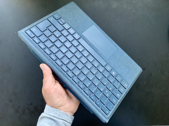
Surface Signature Keyboard :: Verschmutzt das Alcantara?

by Volker Weber

IMG 4992

Ich benutze diese Puscheltastatur nun seit fast einem Jahr und sie ist nicht dreckiger als jedes andere Keyboard. Auch wenn meine Handballen jeden Tag stundenlang auf dem Alcantara liegen, hat es sich nicht abgenutzt und es lässt sich problemlos reinigen. Ob Surface Laptop oder Surface Pro, man muss keine Angst vor diesem luxuriösen Material haben! Die matten Tasten werden langsam blank, aber die Tasten-Aufschrift verblasst noch nicht. Das ist ein Qualitätsprodukt. Ein Vorteil der abnehmbaren Tastatur des Surface Pro: Man kann sie regelmäßig ausklopfen, um sie vom Staub hinter den Tasten zu befreien. Und sollte mal ein Getränk reinkippen, tauscht man nur die Tastatur, nicht aber den Rechner. Good stuff.

10 Oct 21:51

Briefing: Huawei to invest heavily in AI manpower

by Christopher Udemans
The company has already managed to reduce manpower through autonomation and AI.
10 Oct 21:51

Wenn alles passt

by Volker Weber

20181010 115533

Jeder kommt irgendwann mal an. Der eine liebt sein Galaxy Note, das auf seine Art konkurrenzlos ist. Der andere schwört auf sein Thinkpad Carbon, weil das die beste Kombination von Gewicht, Robustheit und Tastatur ist. Die Mutter der Scheffin ist untrennbar mit ihrem alten iPad verbunden, weil es ihr Tor zur Welt ist - und das mit mehr als 80 Jahren.

Bei mir ist es das Surface Pro. Ich habe mir das Gerät heute noch mal in Ruhe angeschaut. Mit allen kleinen Kratzern, die es sich verdient hat. Was würde ich ändern? Was muss verbessert werden? Mir ist nichts eingefallen. Surface ist ein Computer, mit dem ich alles mache. Ich lese damit Zeitschriften, ich verfasse damit Texte, ich schaue Videos und ich lümmele im Internet rum. Wenn ich am Tisch sitze, ist eine Tastatur dran. Wenn ich etwas notiere oder skizziere, dann benutze ich den Stift. Wenn ich Videos schaue, dann klappe ich den Kickstand ganz nach hinten, um den Bildschirm leicht zu erhöhen. Zum Lesen lege ich die Füße hoch und lege das Surface in meinen Schoß. Der Bildschirm hat die richtige Größe und Auflösung, dass ich ohne zu Zoomen lesen kann. Die beiden Stereo-Lautsprecher sorgen für den rechten Ton. Wenn es lauter sein soll, dann stöpsel ich ein Headset ein. Die Tastatur verbindet sich mechanisch und mit Federkontakten - kein fummeliges Bluetooth. Die Stromversorgung hat ebenfalls einen magnetischen Kontakt, so wie die MacBooks früher mal. Wenn ich einen Vortag halten will, stecke ich ein HDMI-Kabel an den Displayport. Aller andere Klimbim passt in den USB-A. Der Akku hat für mich die richtige Größe. Mehr geht immer, aber dann wird das auch dicker und schwerer. So habe ich eines der leichtesten Notebooks überhaupt, weil leichter als ein MacBook Air. Ja, das Display hat einen schwarzen Rand. Na und? Ja, es gibt mittlerweile ein neueres Surface 6 mit neuem Intel-Prozessor. Na und? Dieses Surface ist schon derart schnell, dass ich noch schneller wohl kaum bemerken würde. Mein Surface hat einen Lüfter, aber den höre ich alle Jubeljahre mal, wenn der Search Indexer Panik schiebt.

Surface Pro macht das, was ich will. Und zwar alles. Dennoch probiere ich immer wieder gerne andere Sachen aus. Neugierig bin ich auf Surface Go. Das wird vielen gefallen, weil man es so leicht mitnehmen kann. Es ist meinem Surface Pro in vieler Hinsicht unterlegen, aber das zählt nicht. Ich will wissen, für wen es taugt.

Mit welchem Stück Technik seid Ihr so richtig rundum zufrieden?

10 Oct 21:51

Hey Siri

by Volker Weber

IMG 4993

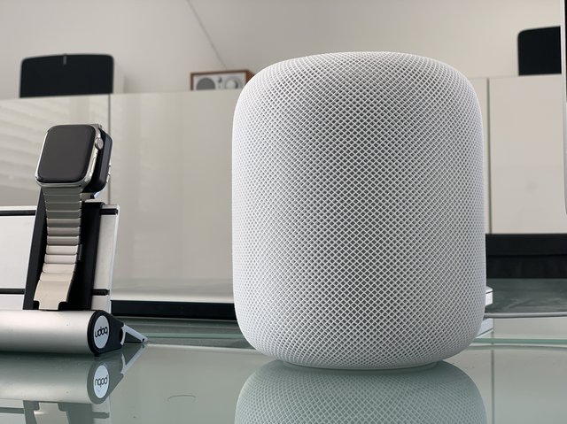
This is just an observation, not a statement of direction. But I find myself speaking more with Siri than with Alexa. And it's because of HomePod and Watch. I did not use it much on iPhone, but I do it all the time on the Watch, and often via HomePod. Once you get used to saying "Hey Siri", you don't have much reason to say "Alexa". If only Siri wasn't so chatty. I don't always need a long answer.

10 Oct 21:49

Twitter Favorites: [rcousine] On the left, the Presidents’ Trophy winners. On the right, the claimers of some kind of post-season exhibition tour… https://t.co/wIVLBTB8rr

Ryan Cousineau @rcousine
On the left, the Presidents’ Trophy winners. On the right, the claimers of some kind of post-season exhibition tour… twitter.com/i/web/status/1…
10 Oct 21:49

Announcing a Competition for Ethics in Computer Science, with up to $3.5 Million in Prizes

by Mozilla

The Responsible Computer Science Challenge — by Omidyar Network, Mozilla, Schmidt Futures, and Craig Newmark Philanthropies — calls on professors to integrate ethics into undergraduate computer science courses


With great code comes great responsibility.

Today, computer scientists wield tremendous power. The code they write can be used by billions of people, and influence everything from what news stories we read, to what personal data companies collect, to who gets parole, insurance or housing loans

Software can empower democracy, heighten opportunity, and connect people continents away. But when it isn’t coupled with responsibility, the results can be drastic. In recent years, we’ve watched biased algorithms and broken recommendation engines radicalize users, promote racism, and spread misinformation.

That’s why Omidyar Network, Mozilla, Schmidt Futures, and Craig Newmark Philanthropies are launching the Responsible Computer Science Challenge: an ambitious initiative to integrate ethics and accountability into undergraduate computer science curricula and pedagogy at U.S. colleges and universities, with up to $3.5 million in prizes.

Says Kathy Pham, computer scientist and Mozilla Fellow co-leading the challenge:

“In a world where software is entwined with much of our lives, it is not enough to simply know what software can do. We must also know what software should and shouldn’t do, and train ourselves to think critically about how our code can be used. Students of computer science go on to be the next leaders and creators in the world, and must understand how code intersects with human behavior, privacy, safety, vulnerability, equality, and many other factors.”

Pham adds: “Just like how algorithms, data structures, and networking are core computer science classes, we are excited to help empower faculty to also teach ethics and responsibility as an integrated core tenet of the curriculum.”

Pham is currently a Senior Fellow and Adjunct Lecturer at Harvard University, and an alum of Google, IBM, and the United States Digital Service at the White House. She will work closely with Responsible Computer Science applicants and winners.

Says Paula Goldman, Global Lead of the Tech and Society Solutions Lab at Omidyar Network: “To ensure technology fulfills its potential as a positive force in the world, we are supporting the growth of a tech movement that is guided by the emerging mantra to move purposefully and fix things. Treating ethical reflection and discernment as an opt-in sends the wrong message to computer science students: that ethical thinking can be an ancillary exploration or an afterthought, that it’s not part and parcel of making code in the first place. Our hope is that this effort helps ensure that the next generation of tech leaders is deeply connected to the societal implications of the products they build.”

Says Craig Newmark, founder of craigslist and Craig Newmark Philanthropies: “As an engineer, when you build something, you can’t predict all of the consequences of what you’ve made; there’s always something. Nowadays, we engineers have to understand the importance and impact of new technologies. We should aspire to create products that are fair to and respectful of people of all backgrounds, products that make life better and do no harm.”

Says Thomas Kalil, Chief Innovation Officer at Schmidt Futures: “Information and communication technologies are transforming our economy, society, politics, and culture. It is critical that we equip the next generation of computer scientists with the tools to advance the responsible development of these powerful technologies – both to maximize the upside and understand and manage the risks.”

Says Mary L. Gray, a Responsible Computer Science Challenge judge: “Computer science and engineering have deep domain expertise in securing and protecting data. But when it comes to drawing on theories and methods that attend to people’s ethical rights and social needs, CS and engineering programs are just getting started. This challenge will help the disciplines of CS and engineering identify the best ways to teach the next generation of technologists what they need to know to build more socially responsible and equitable technologies for the future.”

(Gray is senior researcher at Microsoft Research; fellow at Harvard University’s Berkman Klein Center for Internet & Society; and associate professor in the School of Informatics, Computing, and Engineering with affiliations in Anthropology and Gender Studies at Indiana University.)

The Responsible Computer Science Challenge is launching alongside an open letter signed by 35 industry leaders, calling for more responsibility in computer science curricula.

Responsible Computer Science Challenge details

Through the Responsible Computer Science Challenge, Omidyar Network, Mozilla, Schmidt Futures, and Craig Newmark Philanthropies are supporting the conceptualization, development, and piloting of curricula that integrate ethics with computer science. Our hope is that this coursework will not only be implemented, but also scaled to colleges and universities across the country — and beyond.

Between December 2018 and July 2020, we will award up to $3.5 million in prizes to promising proposals. The challenge is open to both individual professors or collaborative teams consisting of professors, graduate students, and teaching assistants. We’re seeking educators who are passionate about teaching not only computer science, but how it can be deployed in a responsible, positive way.

The challenge consists of two stages:

In Stage 1, we will seek concepts for deeply integrating ethics into existing undergraduate computer science courses, either through syllabi changes (e.g. including a reading or exercise on ethics in each class meeting) or teaching methodology adjustments (e.g. pulling teaching assistants from ethics departments). Stage 1 winners will receive up to $150,000 each to develop and pilot their ideas. Winners will be announced in April 2019.

In Stage 2, we will support the spread and scale of the most promising approaches developed in Stage 1. Stage 2 winners will receive up to $200,000 each and will be announced in summer 2020.

Projects will be judged by an external review committee of academics, tech industry leaders, and others, who will use evaluation criteria developed jointly by Omidyar Network and Mozilla.

Judges include Bobby Schnabel, professor of computer science at the University of Colorado Boulder and former president of ACM; Maria Klawe, president of Harvey Mudd College; Joshua Cohen, Marta Sutton Weeks Professor of Ethics in Society at Stanford University; Brenda Darden Wilkerson, president and CEO of the Anita Borg Institute; and others.

We are accepting Initial Funding Concepts for Stage 1 now through December 13, 2018. Apply.

~

Pham concludes: “In the short term, we can create a new wave of engineers. In the long term, we can create a culture change in Silicon Valley and beyond — and as a result, a healthier internet.”

The Responsible Computer Science Challenge is part of Mozilla’s mission to empower the people and projects on the front lines of internet health work. Other recent awards include our WINS Challenges — which connect unconnected Americans — and the Mozilla Gigabit Community Fund.

Omidyar Network’s Tech and Society Solutions Lab draws on Omidyar Network’s long-standing belief in the promise of technology to create opportunity and social good, as well as the concern about unintended consequences that can result from technological innovation. The team aims to help technologists prevent, mitigate, and correct societal downsides of technology — and maximize positive impact.


ABOUT OMIDYAR NETWORK

Omidyar Network is a philanthropic investment firm dedicated to harnessing the power of markets to create opportunity for people to improve their lives. Established in 2004 by eBay founder Pierre Omidyar and his wife Pam, the organization invests in and helps scale innovative organizations to catalyze economic and social change. Omidyar Network has committed more than $1 billion to for- profit companies and nonprofit organizations that foster economic advancement and encourage individual participation across multiple initiatives, including Digital Identity, Education, Emerging Tech, Financial Inclusion, Governance & Citizen Engagement, and Property Rights. You can learn more here: www.omidyar.com.


ABOUT SCHMIDT FUTURES

Schmidt Futures is a philanthropic initiative, founded by Eric and Wendy Schmidt, that seeks to improve societal outcomes through the thoughtful development of emerging science and technologies that can benefit humanity. As a venture facility for public benefit, they invest risk capital in the most promising ideas and exceptional people across disciplines. Learn more at schmidtfutures.com


ABOUT CRAIG NEWMARK PHILANTHROPIES

Craig Newmark Philanthropies was created by craigslist founder Craig Newmark to support and connect people and drive broad civic engagement. The organization works to advance people and grassroots organizations that are getting stuff done in areas that include trustworthy journalism, voter protection, gender diversity in technology, and veterans and military families. For more information, please visit: CraigNewmarkPhilanthropies.org

The post Announcing a Competition for Ethics in Computer Science, with up to $3.5 Million in Prizes appeared first on The Mozilla Blog.

10 Oct 21:49

News homepage design overview

by Nathan Yau

As you click through the news, you can probably almost always figure out what source is loading without the URL or title. Just judge based on the layout. Noah Veltman made this overview to show how news orgs prioritize editorial content, ads, and sponsored content.

Tags: homepage, news, Noah Veltman

10 Oct 21:49

Amazon And The Bridge Too Far

by John Battelle

Yesterday, I lost it over a hangnail and a two-dollar bottle of hydrogen peroxide.

You know when a hangnail gets angry, and a tiny red ball of pain settles in for a party on the side of your finger? Well, yeah. That was me last night. My usual solution is to stick said finger into a bottle of peroxide for a good long soak. But we were out of the stuff, so, as has become my habit, I turned to Amazon. And that’s when things not only got weird, they got manipulative. Sure, I’ve been ambiently aware of Amazon’s algorithmic pricing and merchandising practices, but last night, the raw power of the company’s control over my routine purchases was on full display.

There’s literally no company in the world with better data about online purchasing than Amazon. So studying how and where it lures a shopper through a purchase process is a worthy exercise. This particular one left a terrible taste in my mouth – one I don’t think I’ll ever shake.

First the detail. Take a look at my search results for “Hydrogen Peroxide” on Amazon. I’ve annotated them with red text and arrows:

As you can see, the most eye catching suggestions – the four featured panels with large images – are all Amazon brands. Big red flag. But Amazon knows sophisticated shoppers like me are suspicious of those in house suggestions, so it’s included a similar product in the space below its own brands (we’ll get to that in a minute).

Above the featured items are ads: sponsored listings that are not Amazon brands, which means the advertiser (a small player named “Blubonic Industries”) is paying Amazon to get ahead of the company’s own promotional power. Either way, Amazon makes money. Second red flag.

By now, I’ve decided I’m not interested in either the sponsored brands at the top, or Amazon’s four featured brands, because, well, I don’t like to be so baldly steered into buying Amazon’s stuff. Then again, before I move down to the results below, I do notice something rather amazing – Amazon’s familiar brown bottle of peroxide is really, really cheap – as in, $1.29 cheap. There’s even a helpful per oz. calculation next to the price, screaming: this shit is eight pennies an ounce cheap!

Well, I’m almost sold, but because I hate to be directed into purchases, I’m still going to consider that similar brown bottle below, the one with the red label. Amazon knows this, of course. It’s merchandising 101 – make sure you give the consumer choices, but also, make sure the most profitable choice is presented in such a way as to win the day.

So my eye moves down the page to check out the second bottle. It’s from Swan, a brand I’ve vaguely heard of. Then I check its price.

Nine dollars and sixty nine cents.

Which would you buy? After all, this is a staple, a basic, a chemical compound. And you trust Amazon to get shit right, don’t you? I mean, a buck and change – nearly nine times cheaper? What a deal!

So…my eyes revert to  Amazon’s blue labeled bottle. It wouldn’t have a four-star plus review if it burned your skin, right? And that’s when I notice the tiny icon next to it, which looks like this:

What’s this? Is this yet another annoying subscription service? Ever since we moved to New York, my wife and I have tried to figure out Amazon’s subscription services (Fresh? Pantry? Prime Now? Whole Foods Delivery? Who knows?!). I’m already deeply suspicious of any attempt by Amazon to lure me into paying them monthly for a service that I don’t understand.

But…a buck twenty nine! So I click on the bottle, and the landing page is super clean, and there’s no obvious Prime Pantry mention. Plus, it turns out, that bottle from Amazon is the Whole Foods generic brand, which for whatever reason seems a bit better than a generic Amazon brand. Did I just get lucky? Maybe I can just get some super cheap chemicals delivered in a day to my door, and my annoying hangnail will be a thing of the past soon enough….Right?

Here’s the landing page:

Looks great, the price is amazing, but…Uh oh. I can’t get this bottle of peroxide until Sunday. By then, I’ve likely lost my finger to a flesh eating bacteria. As I feared, this bottle is nothing more than a baited fish hook for one of Amazon’s subscription offers – which I find out, will cost somewhere between five and thirteen bucks a month. I’ve signed up for Prime Pantry by mistake in the past, and it wasn’t a smooth or enjoyable experience. No thanks. I click back to the original search results. Seems to me Amazon is gaming the shipping deals.

Well of course it is.  I’m no longer a happy Amazon customer at this point. Now I’m annoyed.

But what’s this? If I scroll down below the $9.69 bottle, there’s another choice, also from Swan, and, it seems, exactly the same, if one is to judge just by the image (and we do judge just from the images, let’s just admit it). This one costs almost half as much as the one above it. What’s going on?! Here’s an annotated screen shot:

As you can see, there’s a lot going on. I’ve narrowed my choice down to two non-Amazon brands. They look nearly identical. The most significant difference, at least in terms of the information provided to me by Amazon, is the price – the top bottle is nearly twice as expensive as the bottom one. But the top bottle has a major benefit: I can get it nearly immediately! The bottom one makes me wait a day. Is the wait worth four or five bucks? Hmm.

Also confounding: The bottom bottle has its price broken out on a per ounce basis – 32 cents, exactly four times more than the 8 cents-an-ounce bottle I just looked at from Amazon’s Prime Pantry. Ouch! Now I’m really annoyed, and confused. My eyes dart back up to the $9.69 bottle. As I’ve shown with the empty red circle, there’s….no per-ounce breakdown shown by Amazon. It does tell me that this particular bottle is 32 ounces, whereas the bottom one is 16 ounces.

But why not do the math for me? A quick calculation shows that the top bottle comes out to about 30 cents an ounce – two cents less than the bottom bottle. Why not show that fact?

This, folks, this is algorithmic merchandising at its finest.

Amazon knows exactly how many clicks it’s going to take for me to reach shopping fatigue. Not “on average for all shoppers,” or even “on average for each shopper who’s ever considered a bottle of hydrogen peroxide.” Amazon knows all of that, of course, but it also  knows exactly how long it takes ME to get fatigued, to enter what I like to call “fuck it” mode. As in, “fuck it, I’m tired of this bullshit, I want to get back to the rest of my life. I’m going to buy one of these bottles.”

And because there’s no per-ounce breakdown of the 32-ounce bottle, and because that makes me suspicious of it, and because hell, who ever needs 32 ounces of hydrogen peroxide anyway, well, I’m just going to buy the $5 one.

Ca-ching! Amazon just made a nearly seven percent markup on my purchase. It took five clicks, 15 seconds, and a vast architecture of data and algorithmic mastery to make that profit. Each and every time we purchase something on Amazon, that machinery is engaged in the background, guiding us through choices which insure the company remains the trillion dollar behemoth we know and…

Love?

***

Do you love Amazon anymore? For that matter, do you love Facebook, Google, or Twitter? Interactions like the one I’ve detailed above are starting to chip away at that presumption. Personally, I’ve gone from cheerleader to skeptic over the past few years, and I’m broken out into full-blown critic over the last twelve months. I no longer trust Amazon to have my best interests at heart. I’ve lost any trust that Facebook or Twitter can deliver me a public square representative of my democracy. I’ve given up on Google delivering me search results that are truly “organic.” And YouTube? Point solution, at best. I can’t possibly trust the autoplay feature to do much more than waste my time.

What’s happened to our beloved tech icons, and what are the implications of this lost trust? In future posts, I plan on thinking out loud on that topic. I hope you’ll join me. In the meantime, I think I’ll stroll down to CVS and buy myself another bottle of hydrogen peroxide. By the time Amazon’s comes, I’m sure my hangnail will be a distant memory. But that taste in my mouth? That’s going to remain.

***

Update: Many readers have pointed out that I missed the fact that the top package of peroxide was, in fact, a two-pack. True that, and it would have changed my on-the-fly calculation around which to buy, given the per ounce comparison. However, it would not change the fact that the act of not adding the per ounce calculation directly on the page somehow discolored that choice. 

Also, a rather rich post note: The bottle I did buy never came. It was “lost” – and Amazon offered me a refund. Sometimes it pays to just hit CVS. 


10 Oct 14:28

The Long Search for Duke

by Reverend

Back in November of 2010 a much younger bava family visited a dog breeder in Bumpass, Virginia when we were seriously considering getting a Spinone. When we finally did get one eight years later Antonella reminded me of the videos we took years earlier. She asked if we all could wach them and as I often do these days when it comes to archiving my past, I froze worrying these videos were part of the Great YouTube Deletion of 2012. And, as it turns out, they were on my Youtube that was deleted in 2012. “No worries, I have backups, right?” One would hope, but the two backup drives I had and the backup folders on AWS delivered nothing. [At this point I usually curse myself for not backing up a version to this blog apart from Youtube and their ilk.]  I was searching across all video formats, though I was pretty sure I shot them with a flipcam which would be mp4. File names were going to be standard flipcam fare, but everything I found was not showing me any Italian hunting dogs from 2010. Damn, and then sets in that depression which follows the idea these recorded memories were lost. Sad bava…

But, but, but, I had a third backup drive I had forgotten about in the bookshelf that has just about all the videos I lost on Youtube in one fashion or another (except “Embedded!,” the lost EdTech Survivalist episode featuring a First Blood parody -but that was a casualty of the Blip.tv famine of 2013 🙁 ). Finding this stash of videos led to a good hour or two of all of us watching our younger selves playing with 10 or more Spinones and even a Bracco. It was good to find the videos, it was wild to see what time does, and it was a small victory in my unorganized attempt to hold onto memories I might have otherwise lost.

A five year old Miles, a three year old Tess, and Tommy not even a year. A small time capsule of video that captures a strangely long sense of our personal history. It’s weird when you start measuring time by intervals of twenty years. I’m not always sure why I wanna capture what I capture, but it seems to take on a life of its own that I was only initially part of. The archiving continues, and the Spinone thrive! It’s been a long search for Duke.


*The desire to get a Spinone has been with us even earlier than that, I saw my first Spinone on the streets of Brooklyn in 2001 and was smitten from then on. 

10 Oct 14:24

Trusting the delivery of Firefox Updates

by Julien Vehent

Providing a web browser that you can depend on year after year is one of the core tenet of the Firefox security strategy. We put a lot of time and energy into making sure that the software you run has not been tampered with while being delivered to you.

In an effort to increase trust in Firefox, we regularly partner with external firms to verify the security of our products. Earlier this year, we hired X41 D-SEC Gmbh to audit the mechanism by which Firefox ships updates, known internally as AUS for Application Update Service. Today, we are releasing their report.

Four researchers spent a total of 27 days running a technical security review of both the backend service that manages updates (Balrog) and the client code that updates your browser. The scope of the audit included a cryptographic review of the update signing protocol, fuzzing of the client code, pentesting of the backend and manual code review of all components.

Mozilla Security continuously reviews and tests the security of Firefox, but external verification is a critical part of our operations security strategy. We are glad to say that X41 did not find any critical flaw in AUS, but they did find various issues ranking from low to high, as well as 21 side findings.

X41 D-Sec GmbH found the security level of AUS to be good. No critical vulnerabilities have been identified in any of the components. The most serious vulnerabilities that were discovered are a Cross-Site Request Forgery (CSRF) vulnerability in the administration web application interface that might allow attackers to trigger unintended administrative actions under certain conditions. Other vulnerabilities identified were memory corruption issues, insecure handling of untrusted data, and stability issues (Denial of Service (DoS)). Most of these issues were constrained by requiring to bypass cryptographic signatures.

Three vulnerabilities ranked as high, and all of them were located in the administration console of Balrog, the backend service of Firefox AUS, which is protected behind multiple factors of authentication inside our internal network. The extra layers of security effectively lower the risk of the vulnerabilities found by X41, but we fixed the issues they found regardless.

X41 found a handful of bugs in the C code that handles update files. Thankfully, the cryptographic signatures prevent a bad actor from crafting an update file that could impact Firefox. Here again, designing our systems with multiple layers of security has proven useful.

Today, we are making the full report accessible to everyone in an effort to keep Firefox open and transparent. We are also opening up our bug tracker so you can follow our progress in mitigating the issues and side findings identified in the report.

Finally, we’d like to thank X41 for their high quality work on conducting this security audit. And,  as always, we invite you to help us keep Firefox secure by reporting issues through our bug bounty program.

The post Trusting the delivery of Firefox Updates appeared first on Mozilla Security Blog.

10 Oct 14:23

Fantastical’s New Shortcuts, Complications, and Notification Actions

by Federico Viticci

Fantastical was updated last week to version 2.10, which brought support for some of the key features of iOS 12 and watchOS 5 – namely Siri shortcuts and complications for the Infograph watch faces. I want to highlight some of the changes in this release and how they fit my usage of Reminders as my main task management system.

While Fantastical 2.10 doesn't offer shortcuts to create new events or reminders in the background based on text from the clipboard1, it features a good selection of shortcuts to view lists of items from the app as well as launch specific screens. My most used one so far is the 'Schedule for Today' shortcut: when invoked via a Siri phrase, it loads a Fantastical snippet that aggregates calendar events and reminders due on the current day; each item features a date and custom color to indicate the list it belongs to. The same shortcut also exists in a 'Tomorrow' flavor that I've found quite handy to get an instant preview of what's coming up in my calendar app and task manager.

Fantastical's native shortcuts in iOS 12.

Fantastical's native shortcuts in iOS 12.

In addition to shortcuts that aggregate items from multiple lists, Fantastical now features shortcuts to view events or reminders from individual calendars or Reminders lists too. These suggested shortcuts are automatically created for each calendar or list you have on your iOS device, and they can be found in Settings ⇾ Fantastical ⇾ Siri & Search ⇾ Shortcuts. I've added a couple of these to check on calendars and lists that I frequently use, and I like how events and reminders are grouped by day in the visual intent that is loaded in Siri or the Shortcuts app. I've also assigned a "type event" Siri phrase to a shortcut that launches Fantastical in the reminder/event creation screen, which is useful when I want to quickly add an appointment via natural language.

As was the case with Things' update for iOS 12, even though I like what Flexibits has done with shortcuts in Fantastical, the fact that the app isn't Universal diminishes their impact for someone who works on both an iPad and iPhone every day. A Siri phrase assigned to an app shortcut can work on every iOS device only if the app it's associated with is Universal and installed on multiple devices at once. In their current version, Fantastical shortcuts you've set up on the iPhone won't work on the iPad and vice versa; you'll have to assign a Siri phrase to the same shortcut on each device, and of course your phrases will have to be slightly different otherwise iOS 12 won't let you save them.

You can build custom shortcuts to work around the issue of separate app shortcuts for non-Universal iOS apps.

You can build custom shortcuts to work around the issue of separate app shortcuts for non-Universal iOS apps.

This hasn't turned out to be an issue for me because I tend to use Fantastical more on the iPhone anyway, but it's worth noting for those who may want to use Siri phrases for Fantastical everywhere. A possible workaround, which you can download below, is to create a custom shortcut that loads a Fantastical shortcut in either its iPhone or iPad version depending on the device you're using. Doing this will add a step to execution within Siri, but it's a possible solution (which you can reuse for apps that still offer separate iPhone and iPad versions).

Fantastical Schedule (Multi-Platform)

View Fantastical's schedule for today using native app shortcuts for the iPhone and iPad versions of the app. The shortcut doesn't require any user interaction to choose platforms.

Get the shortcut here.

Fantastical 2.10 has also brought buttons to snooze events and reminders directly from notifications. These buttons can snooze alert times (they won't change the due date itself) for 5, 15, or 60 minutes, and they're available by expanding a Fantastical notification both on iOS and watchOS. When a reminder is snoozed, it keeps its overdue status, but an alert for it will re-appear when the snoozed time expires.

Snoozing alerts with Fantastical for iPhone.

Snoozing alerts with Fantastical for iPhone.

Snoozing alerts with Fantastical for watchOS.

Snoozing alerts with Fantastical for watchOS.

I've been using Fantastical's snoozed alerts so much, I've tweaked the way I receive notifications from Reminders and Fantastical on my iPhone and Apple Watch. For several months, despite using GoodTask as a client for Reminders, I only kept notifications from the Reminders app because I liked how they could be pinned to the top of the lock screen; I also thought they were more reliable than GoodTask's notifications given the background sync privileges of Apple's Reminders app. However, the convenience of Fantastical's snoozed alerts has made me rethink my Reminders notifications setup. After changing a few options in the iPhone's Settings and Watch apps, here's what I ended up with:

  • iPhone while in use (unlocked): Fantastical banners, expand for snoozed alerts;
  • iPhone lock screen: Reminders notifications, grouped;
  • iPhone Notification Center: Fantastical, grouped;
  • Apple Watch: Fantastical notifications, expand for snoozed alerts;
  • Apple Watch Notification Center: Reminders, grouped.
My notification settings for Fantastical (left) and Reminders.

My notification settings for Fantastical (left) and Reminders.

My reasoning is simple: when I'm not using my iPhone, the easiest way to snooze a reminder is to expand the notification on the Watch, which means I can send Reminders' own alerts to Notification Center. If I'm using my iPhone, I want Fantastical's notifications to be the only ones I see when I'm in an app; and because I still want to have Reminders' notifications on the lock screen, I chose to send Fantastical's directly to iOS' Notification Center. This dual setup allows me to use Fantastical almost like some people use Due; I would love to have per-list custom notification settings (so that only certain reminders fire off notifications that contain custom snooze times), but I'm probably asking too much.

Finally, I want to mention Fantastical's integration with the new Infograph faces on the Apple Watch Series 4. By opening Fantastical's own Settings and navigating to Apple Watch ⇾ Complications, you'll be able to configure Fantastical's complications for both small and large layouts. These include the new Graphic Circular, Corner, Bezel, and Rectangular complications that can be added to the Infograph and Infograph Modular faces on the Apple Watch Series 4.

Fantastical's complications for the Infograph and Siri watch faces.

Fantastical's complications for the Infograph and Siri watch faces.

In customizing the Infograph watch face to my needs, I realized that I wanted to display the digital clock at the top and see the current date in the bottom left corner. Surprisingly, Apple still offers an inconsistent set of complications for system features on watchOS, and I couldn't find a basic Date complication that I could put in the lower left corner of the Infograph face. Some folks on Twitter recommended Better Day, which is an excellent utility to create a variety of date-based complications for every watch face and customize every aspect of them. I used Better Day for a while, and it worked well. However, the latest version of Fantastical can also display the current date and day of the week with a Graphic Corner complication, which allowed me to delete Better Day and just use Fantastical. In future updates to watchOS 5, I'd like Apple to bring more consistency to their complication offerings; every built-in app or system feature should offer at least one complication for every available type. Even though I'm a fan of Fantastical, I shouldn't have to use a third-party complication to see the current date in a specific corner of the watch face I prefer.


One of the most compelling aspects of using Reminders as a task manager is having the freedom to mix and match clients for different features and integrations. Just like I can connect the same email account to different email clients, with Reminders I can use a combination of GoodTask, Apple's Reminders app, Shortcuts, Drafts, Siri, and Fantastical to create and manage tasks in the same system. Fantastical's adoption of iOS 12 and watchOS 5 made me appreciate the quality of its overall experience again; if you haven't played with Fantastical in a while, or if you still haven't checked out its shortcuts, complications, and snoozed alerts, now's a great time to take it for another spin.

Fantastical 2.10 is available on the App Store for iPhone and iPad.


  1. Which is something that I hope GoodTask, my Reminders client of choice, will adopt in the near future. ↩︎

Support MacStories Directly

Club MacStories offers exclusive access to extra MacStories content, delivered every week; it's also a way to support us directly.

Club MacStories will help you discover the best apps for your devices and get the most out of your iPhone, iPad, and Mac. Plus, it's made in Italy.

Join Now
10 Oct 14:22

Apple Watch Face Legibility

by John Voorhees

In a post on Marco.org, Overcast developer Marco Arment critiques the design of many of the current Apple Watch faces. Using a variety of analog watches as references, Arment highlights the design elements that make them legible, few of which are followed by Apple’s faces:

Across a wide variety of brands, styles, and price points, a few key design principles are clear:

  • The hour markers for 12 (and often 3/6/9) are more prominent.
  • The hour indices are much larger than the minute markings.
  • The hour hands nearly touch the hour indices.

These all improve legibility by making it as fast and easy as possible to know which hour is being indicated (and minimize the chance of an off-by-one error), first by orienting your eyes to the current rotation with the 12 marker, then by minimizing the distance between the hour hand and the indices it’s between.

Arment is especially critical of the Infograph face, which is so hard to read that many people have resorted to using a digital time complication with it. He concludes that it’s time for Apple to allow third parties to create watch faces.

We covered our Apple Watch faces on AppStories this week, and both Federico and I noted that we use a digital time complication with the Infograph watch face because the hands are so hard to read. As Arment’s piece points out, that isn’t uncommon, but it shouldn’t be necessary and is a pretty clear indication that the design is flawed. I’ve been happy with the Series 4 Watch’s support for more complications, but I also want more face options and flexibility across watch faces. It's time for Apple to re-evaluate its current watch faces and reconsider letting developers create faces of their own.

→ Source: marco.org

10 Oct 14:19

Nothing Squared is Still Nothing

by David Banks
OoOoOhHhH! Scary hoaxus pocus!!! (I just didn’t want to use that photo of the three authors like everyone else.) Source: Iconspng

Last week three self-described “concerned academics” perpetrated a hoax in the name of uncovering what they call the “political corruption that has taken hold of the university.” “I’m not going to lie to you.” James A Lindsay, one of the concerned academics says in a YouTube video, just after laughing at a reviewers’ comments on a bogus article. “We had a lot of fun with this project.” The video then cuts to images of mass protests and blurry phone-recorded lectures, presumably about topics that aren’t worthy of debate. The takeaway from the videos, press kit, and write-up in Areo Magazine is the following: fields that study race, gender, sexuality, body types, and identity are really no more than “Grievance Studies” (their neologism) and the desire to criticize whiteness and masculinity overrides any appreciation of data.

To prove this they spent over a year writing and submitting articles that they wrote in bad faith. Sometimes these articles would have fairly decent literature reviews which would then lend legitimacy to less-than-decent theses. But when you actually read the papers, and the reviews, the picture you get is far less interesting than the sensationalist write-ups or even the Areo piece makes them out to be. The picture you get by actually reading the work is mostly mid-level journals doing the hard, unpaid work of giving institutional authority to ideas that —hoax or not— will rarely see the light of day. This is the real hoax: that academic institutions waste so many good people’s time and energy on work that goes nowhere and influences nobody. I wish we lived in a world where it made any sort of sense to compare the influence of Fat Studies to the influence of oil companies on climate science. We don’t, but —and here’s something that astonishingly no one with a platform seems to want to argue— we should.

It is fair to say that the three co-conspirators in this project are insufferable edgelords. From their matching Twitter profile banners that reproduce the lede image of their article, to their collective body of previous work, everything about them is a screwed up face in the back of the room asking if any of this intersectionality stuff helps “normal people.” They are releasing work that is designed to produce more heat than light. It is all meant to grab headlines and rally the troops, not convince anyone of anything. They play into old, worn tropes about how the qualitative social sciences and humanities do not deserve institutional funding simply because they do not produce marketable, patentable ideas that are useful to industry. I take them at their word that they are “left leaning liberals” because only liberals would spend a year on a project that helped the reactionary right and neoliberal college administrators in equal measure.

This is not their first Culture War battle, just their most popular. Helen Pluckrose, an editor and contributor at Areo, has produced articles like “Skepticism is Necessary in our Post-Truth Age. Postmodernism is Not” and “Androphobia — and How to Address It.” James A. Lindsay fashions himself as a discount Dawkins. He has a PhD in mathematics but writes a lot about religion and how, as one of his books is titled, Everyone is Wrong About God. Peter Boghossian, an Assistant Professor of Philosophy at Portland State University and writer with bylines in everything from mainstream publications like Scientific American to Quillette, actually made an app that, “provides you with the skills you’ll need to spot flaws in weak statements and use reason to politely help people understand why they may not be correct.”

Pluckrose, Lindsay, and Boghossian are clearly talented carnival barkers. They have well-produced videos to go along with a just-long-enough article. Their press kit, saved to a Google drive folder, contains all of the articles they submitted along with the anonymized reviews of their work. They have since collectively written an article in New Statesman where they make the same sort of verifiably incorrect statements about French theorists that Jordan Peterson likes to make, calling them”post-modernists” who replace “rigorous evidence-based research and reasoned argument with appeals to lived experience and a neurotic focus on the power of language to create social reality.”

Unsurprisingly, The Atlantic ran a glowing review of the hoax written by Yascha Mounk, dubbing this project “Sokal Squared.” The Sokal Affair, as it is called in many theory-driven fields, refers to the time that Alan Sokal  a physicist of some repute, wrote an article filled with gibberish and got it published in Social Text, a journal that at the time was not practicing peer review. Sokal made a similar argument to what Pluckrose, Lindsay, and Boghossian made, though much more focused: that the social sciences, if they are to take the natural sciences as a subject of study, should get the science exactly right. It was an obnoxious, bombastic way to make what is ultimately a boring Neil Degrasse Tyson tweet. Sokal Squared does not rise to this low standard.

Pluckrose, Lindsay, and Boghossian having done an excellent job of branding their work as flashy and controversial. The work itself though is tame, boring stuff. Take for example the article that Fox News called “Feminist Mein Kampf’.” According to the authors’ press kit:

The last two thirds of this paper is based upon a rewriting of roughly 3600 words of Chapter 12 of Volume 1 of Mein Kampf, by Adolf Hitler, though it diverges significantly from the original. This chapter is the one in which Hitler lays out in a multi-point plan which we partially reproduced why the Nazi Party is needed and what it requires of its members. The first one third of the paper is our own theoretical framing to make this attempt possible.

I read through their article Our Struggle Is My Struggle: Solidarity Feminism as an Intersectional Reply to Neoliberal and Choice Feminism and then went through the chapter of Mein Kampf this article is supposed to be mimicking (Can’t wait to find out what Amazon and YouTube suggests to me after putting that in my browser history.) and couldn’t find a single phrase that matched. To be fair, I couldn’t bring myself to read an entire chapter of Mein Kampf (I did not have as much fun with this project as they did.) but when I searched in both texts for common words and phrases I couldn’t find a single match. Even if you told someone to identify the famous text that this article is cribbed from, I am not convinced anyone would figure it out. This isn’t an article demanding concentration camps for men, it’s just a pedantic argument about neoliberalism. There are dozens of these in just as many journals. That is a real problem. But has the SCUM Manifesto finally found a critical mass of adherents ready to Kill All Men? Maybe! And given the decades of terrorism on abortion providers there’s an argument to be made that such an act would be a defensive war. Does this particular project provide evidence of a nascent violent revolution? Absolutely not.

Pluckrose, Lindsay, and Boghossian’s biggest get was a publication in Gender, Place, & Culture a feminist geography journal that effused praise on their submission, nominating it for one of their “lead pieces” of the year. This article purported to demonstrate the rape culture latent in humans’ reactions to dogs humping each other (E.g. “When a male dog was raping/humping another male dog, humans attempted to intervene 97% of the time. When a male dog was raping/humping a female dog, humans only attempted to intervene 32% of the time.”) Of course all the data was as fake and the article has been retracted.

Their stated purpose for publishing this article was “To see if journals will accept arguments which should be clearly ludicrous and unethical if they provide (an unfalsifiable) way [sic] to perpetuate notions of toxic masculinity, heteronormativity, and implicit bias.” It is really difficult to parse this ungrammatical sentence. Are they saying this work is “ludicrous” because dogs humping each other should have nothing to say about human gender politics? Are they saying that dogs humping each other could say something about human gender politics but the methods employed in their article are not good enough? It doesn’t matter of course, because the point of this whole thing isn’t about data integrity any more than Gamergate was about ethics in games journalism. The point is to dismiss wholesale, the concepts they cite in their literature reviews. They have a political disagreement with Rebecca Tuvel, who they quote at length in their paper, when she says: “In cultural imperialism, what the dominant group says, thinks and does goes … Their values are what matter, and what will become infused as ‘universal’ values.”

I had the same reaction to all of this as Greg Afinogenov, who recently wrote in N+1,

My initial reaction, triggered by long-dormant Sokal Hoax antibodies, was to become outraged at the political motivations and damaging anti-academic effects of the project. But of course this only plays into the hands of the hoaxers, to whom indignation and charges of unethical conduct from the targets only reveal how effective the hoax actually was.

Afinogenov is also right to say that this entire project is “a remarkably poor model for nonpoliticized scholarship, even if it were true (as it clearly is not) that the hoaxers were any less driven by ideology than their targets.” Indeed, Pluckrose, Lindsay, and Boghossian lament that peer review should filter out bias but in Grievance Studies fields this doesn’t happen. “This isn’t so much a problem with peer review itself” they write, “as a recognition that peer review can only be as unbiased as the aggregate body of peers being called upon to participate.” Presumably, if Sandra Harding or Patricia Hill Collins said this about racial or gender-based biases in the sciences, this would be “Grievance Studies” but when our Extremely Concerned About Data authors say it, it’s just the reasonable truth.

In response to this hoax, some well-meaning authors have argued against Pluckrose, Lindsay, and Boghossian while ostensibly accepting their framing of the problem. Don’t worry, these critical theorists —Postmodernists, grievance studies scholars, social constructivism warlocks, whatever you want to call them— are staying in their lane and haven’t fundamentally compromised our shared norms and values that science can speak truths. Daniel Engber writing in Slate comes frustratingly close, concluding his essay before fully diving into an idea that itself doesn’t go quite far enough:

In spite of Derrida and Social Text, we somehow found a means of treating AIDS, and if we’re still at loggerheads about the need to deal with global warming, one can’t really blame the queer and gender theorists or imagine that the problem started with the Academic Left. (Hey, I wonder if those dang sociologists might have something interesting to say about climate change denial?)

Yes, sociologists have a bunch of very important things to say about climate change denial but even further, sociologists have a lot to say about the state of climate change science itself! All of these fields do — gender studies, fat studies, cultural studies, science and technology studies— they all have incisive criticisms of a wide array of disciplines that orbit the same idea that predicated their founding as fields of inquiry: that no one has a monopoly on truth. That science is, like all human endeavours, shot through with politics, prejudices, and cultural norms.

This essential idea, that all knowledge is the result of human history, geography, and culture is much more than a splash of cold water on burning passions of ambitious scientists, although it is sometimes that and for good reason. The Cultural Turn —the name given to the moment in the 70s where the social situatedness of knowledge really began to be transformative— says that we can make better scientific breakthroughs, not less. This isn’t a detour, it’s the only way through that assures no one is left behind.

AIDS research is actually a really good example of why Grievance Studies (I’m gonna own it) is actually really useful. In a 1995 article in Science Technology & Human Values Steven Epstein shows how ACT Up! activists became “genuine participants in the construction of scientific knowledge” and how they were able to “(within definite limits) effect changes both in the epistemic practices of biomedical research and in the therapeutic techniques of medical care.” How does Epstein make sense of the complex web of political relations and scientific controversies at the heart of this matter? He fucking cites Foucault:

The science of AIDS therefore cannot simply be analyzed “from the top down” it demands attention to what Foucault has called the “micro-physics of power” in contemporary Western societies-the dispersal of fluxes of power throughout all the cracks and crevices of the social system; the omnipresence of resistance as imminent to the exercise of power at each local site; and the propagation of knowledges, practices, subjects, and meanings out of the local deployment of power (Foucault 1979, 1983).

Could you have done the same kind of work with a Marxist materialist analysis? Yeah maybe. Does that matter? Again, a big maybe, but for Epstein the work of Foucault helped him make sense of a complicated scenario. We now know, thanks to the recently posthumously published fourth volume of History of Sexuality, that even Foucault himself was in the midst of rethinking a lot of his work in this field up until his death (from AIDS ) in 1984. There are lots of good critiques of Foucault that give me pause when it comes to using him in my own work. But the point is that these conceptual models, this way of thinking, is instrumental to good, useful work that makes for better science and exploration.

The Cultural Turn has lost some of that steam in the last few years, and the uncritical media attention around events like “Sokal Squared” certainly hasn’t helped. But this legacy isn’t being carried forward in the elite halls of academia; it’s in the streets, teachers lounges, and bars full of underemployed scholars that may or may not be pursuing a formal degree. With few exceptions, the academics who have made significant overtly political contributions to the discourse are either marginal or low-ranking. From Adolph Reed to Rochelle DuFord (a friend of mine whose work you really should read), authors that have consistently and voraciously condemned power structures are not the ones benefiting from lavish endowed chairs. People who make bank in academia are, to reiterate another one of Afinogenov’s observations, those that have enthusiastically shared Sokal Squared: Steven Pinker, Jordan Peterson, and Yascha Mounk.

Pluckrose, Lindsay, and Boghossian would have us believe that they have uncovered a massive, powerful strain of political corruption within the American academy on the level with and with the consequences of, say, Merck using ghost writers to get their deadly drug Vioxx to market, but this simply not true. While there are some promising changes —healthcare workers’ understanding of obesity’s relationship to health, and workers’ rights movements are on the rise again— but there is still so much more work to do. I wish the academy were as potent and persuasive as they say it is but it simply is not. These edgelords did not publish barn-burner manifestos about chaining white boys to the floor. They repeated milquetoast, bourgeois arguments that have kept academia from being a prime mover in the political issues of our time.

David is on Twitter: @da_banks

10 Oct 14:07

Cat dreams

by Liz

Last night I dreamed that I compiled the cat. There were quite a few error messages. As they scrolled past I was trying to remember important ones and note them, sometimes highlighting them in Terminal to stop the scrolling for a few seconds so I could read the errors more closely, then letting go again to watch the messages fly past. The only one I remember now said OUCH!!!! in a strange, different font, much bigger than the rest of the stream of output.

I was worried in the dream about having to debug the cat’s code in front of all the people who were watching.

The last time something like this happened was many years ago and very silly – I had been trying out emacs (for work, after many years of vi) and I configured the cats with something like this: set-cats:no-meow.

It is commonly said that you can’t read and write in dreams, but I’ve always been able to, sometimes reading whole stories or books, or writing poetry or stories that I remember parts of when I wake up. I used to write down the bits of text I composed or read in dreams. At times I get the “scrambled text” effect (like the numbers on the digital clock in the movie Waking Life) and then realize I’m in a dream. Maybe writing and reading in dreams is part of being able to lucid-dream, or just part of being a person who is very focused on textualities.

Unfortunately, the cats did not successfully set to no-meow years ago, and my current cat still woke me up with its real life error messages such as MEOW MEOW MEOW IT’S 6AM AND MY BREAKFAST IS MISSING MEOW I AM STARVING.

cat with flowers

10 Oct 14:07

New Made By Google hardware

by Rui Carmo

I like the slate most of all (it’s where Chromebooks should have been a couple of years back, I think) but keep wondering if Google will ever manage to figure out how to sell hardware worldwide.

Because until it does, Apple is going to keep steamrolling their branded hardware sales, and this generation feels like it might be up to par.

10 Oct 14:06

Civic Savvy: Misunderstanding CACs

by Gordon Price


I’ve revised this post on the consequences of negating the CAC mechanism – and why most candidates probably don’t understand the implications of their own platform.  Yeah, it gets into the weeds – as it should – and I’m open to criticisms of points I may have missed (or, gasp, failed to understand fully.) Comments encouraged.


Does any candidate really understand Community Amenity Contributions (CACs)?  Maybe one or two.   A lot seem happy to entertain the idea of gutting them in the name of transparency or fairness or expediency or something better.  Whatever.  But something valuable –  literally some of the value of land that CACs are meant to capture – may get lost.

To begin, here are some basics.

Community Amenity Contributions are not a tax.  It’s in the title: they’re “contributions”.  And while some developers may roll their eyes when they hear that word (yeah sure, contributions), it’s still true that there is no obligation to pay them if they don’t want to.  And that’s because …

They are only applicable to rezonings.  

Let’s be really clear: when developers own or buy land, their rights are within the maximums spelled out in the Zoning and Development Bylaw. If they want more density, they may apply for a rezoning – but they are not entitled to it.  

Normally, developers who aren’t rezoning will apply for permits to develop under the zoning bylaw, and at that point they will likely be charged a Development Cost Charge to cover some of the defined public expenses – often something that involves pipes.  That really is a tax; they don’t have a choice.  But they can include the DCC in their calculations beforehand because it is a knowable charge.

And this is where some candidates get it wrong: they say or imply that a CAC is like a DCC (or should be) – a tax to pay for public amenities.  And it therefore increases the cost of housing because it will be passed on to the consumer.  So let’s eliminate it if we want more affordable housing.

Guarantee: eliminating CACs will not reduce the cost of housing if the market prices it up anyway.  No developer will come up to City Hall, declaring that even though there was no CAC, the price didn’t go down.  So here’s a cheque for the difference.  The City also has studies which maintain that the cost of CACs comes out of the land being sold, not the end consumer price.

Some candidates, prodded by the development community, believe CACs should be standardized, set at a flat rate, knowable in advance by everyone. At least on the public sector side.  I doubt many developers want their financials publicly released along with the City’s.

CACs can’t easily be knowable in advance, especially before a rezoning is requested.   And it can’t be assured.  Neither City Hall nor the real-estate market knows what the rezoning may ask for in the way of density, much less whether it will be approved, or what the market conditions will be at the time of asking.

If the City is going to require 70 percent of the increased value on a site, then it has to determine what that value is.  And come to an agreement with the development making the rezoning request.  That requires some negotiation.

If incoming candidates are going to scrap that negotiated part and set a fixed value, it’s likely leaving something on the table – maybe a lot, especially over time.

The CAC is the additional value provided to the City for the additional value created by the City.  The amount is determined near the time the decision is made to add the value.  

To repeat: If developers don’t want to incur that cost or disagree with the amount, they don’t have to apply for the rezoning!

Several parties and candidates wish to do away with rezoning – especially what they consider ‘spot’ rezonings -altogether.  After a comprehensive plan is agreed on (good luck with that), then much of the city would be ‘pre-zoned’ to allow for new development under the traditional approval process (or an expedited one for more affordable housing).  That effectively means that the increase in value from the higher densities would either go to the landowners or be assessed through some other mechanism (often termed a land-value capture).  Even if an approximation of CACs are used, the idea seems to be that they should be lower. Does that mean foregoing amenities through this mechanism, or making up the amazing amounts that have been generated from the recent increase in land values.

Guarantee: the attempt to find a substitute for CACs will be complicated and, more than that, will be seen to be unfair if its essentially a flat tax across the city or a DCC added on to unrezoned land values.  There would be a call for some more fine-tuned mechanism, based on the particulars of the site and the conditions at the time.  Landowners and neighbourhoods would most likely want to … um, negotiate with the City to set the charge and then change it every time a significant development was proposed.

We have a name for that: CACs.

So candidates who would do away with CACs, are you potentially giving landowners and developers potential windfalls?  You won’t be able to know til after that fact, and then you’ll likely be ‘fine-tuning’ the process until you are pretty much back where you started.

But first of all, do you actually understand what it is you’re so determined to abolish or change?

10 Oct 14:05

The Design of NetNewsWire’s Timeline

I had some principles in mind for the timeline:

  • It should be appealing
  • It should include some graphics, to cut down on the wall of text
  • It should be easily scannable
  • It should scroll really, really fast

The last one of those — super-fast scrolling — is important. (High performance is a principle of the app in general.)

Luckily, I’ve written so many timelines over the years that I know how to make them fast. Even on my five-year-old MacBook Air — where I spend about 20% of my coding time — scrolling in the app is as fast as it could be.

So let’s set that aside.

The first one of these — “it should be appealing” — is also super-important. But, as a principle, it’s too general, and the answer is subjective.

So that leaves me with two things to think about: including graphics to cut down on the wall of text, and making it easily scannable. If I do a good job designing those two things, then hopefully the result is just naturally appealing — on the grounds that something well-designed for scannability and legibility tends to be appealing.

(Before I go any further: if you want to go get the app — it’s free and open source — you can.)

What Scannability Means

A timeline cell should have enough info that you can quickly figure out, when you glance at it, what it’s likely to be about, where it comes from, and how old it is.

It should be large enough to be able to include that much context, but not so large that you find you have to scroll constantly (even though scrolling is fast).

It should include the title — hopefully the entire title — and perhaps some of the text, for further context. It should include the feed name so you know where it comes from.

Each cell should be the same height as other cells, since this also helps scannability. (I tried a variable-height table early in the development process, and found that a regular height was better.)

Layout

After trying a bunch of different layouts — my design process often requires me to actually code a thing and try it (for better or worse) — I settled on the following layout:

Title
Title line 2 or first line of body
Date
Feed name

Examples:

The title is bold and dark, since it should stand out the most. The first line of body text, when displayed, is lighter in color and is regular text.

In the case of a title-less article, the layout is this:

Article text
Article text continued
Date
Feed name

Example:

For title-less articles, the article text weight is in between the title and body text. Not as bold as the title, not as light as article text. This tells you, at a glance, that you’re reading the first line of an article and not an actual title.

The date and feed name are set in smaller type. The date is bold, which sets it apart from the article title/text above it and the feed name below it.

All text is ellipsized when needed, which lets you know when you’re not seeing the whole thing.

I decided against horizontal grid lines in favor of vertical spacing. This means less visual noise in an area of the app that could easily be too noisy. And, well, it’s a news reader, not a spreadsheet, and using spacing instead of gridlines seemed more publication-like.

This all might seem obvious. I hope so! Of course it wasn’t obvious — but I like it if it seems that way.

Graphics

I knew I wanted graphics too, in part because they brighten up the UI and keep it from being too text-heavy (and thus hard to scan).

But graphics can serve another purpose: they can quickly tell you something about the article, which helps with scannability.

In NetNewsWire Lite 4.0 I added graphics to the timeline, so this wasn’t a new idea for me. For each article, it looked at the HTML text and found the first image, and assumed it was a featured image. It downloaded those images and made thumbnails to show in the timeline.

This looked pretty cool, brightened up the UI, and cut down on wall-of-text. But it had one major drawback: sometimes the results were a bit risible. Because it was making square thumbnails, it had to crop — which meant sometimes you’d get a nose but no eyes.

And sometimes in trying to find the featured image it would just be a social media sharing icon. Or an image of an emoji. Or a blank tracking image. There was no set of rules that was going to make this work correctly all the time.

And then of course there are plenty of feeds that rarely use images at all. This blog, for instance, or Daring Fireball.

In practice I found that those images — while attractive when they worked — didn’t add that much to scannability (except in the case of photo feeds, which are a minority of feeds, surely).

So, for NetNewsWire 5, I decided to go with feed icons. These are like big favicons, basically, and they serve the purpose of providing a super-fast visual indication of which feed an article comes from.

(Finding these is a bit of a chore. There’s a property for this in JSON Feed, but there are plenty of RSS and Atom feeds out there. So, for those, it downloads the HTML for the home page and attempts to find the feed icon by looking at various metadata properties: the apple touch icon, for instance. I’ll write more about the technical side another day.)

Initially I put them on the left side and moved the text to the right. I was thinking of Twitter and chat and similar apps, where the avatar goes on the left.

The problem there, though, was that not every feed has one of these. So I could either leave the left side blank for those feeds, or move the text all the way to the left — but that made it so sometimes the text was indented (when there’s a graphic) and sometimes not, which looked weird.

So I put them on the right — to my surprise, because I never pictured them there — and it works just fine.
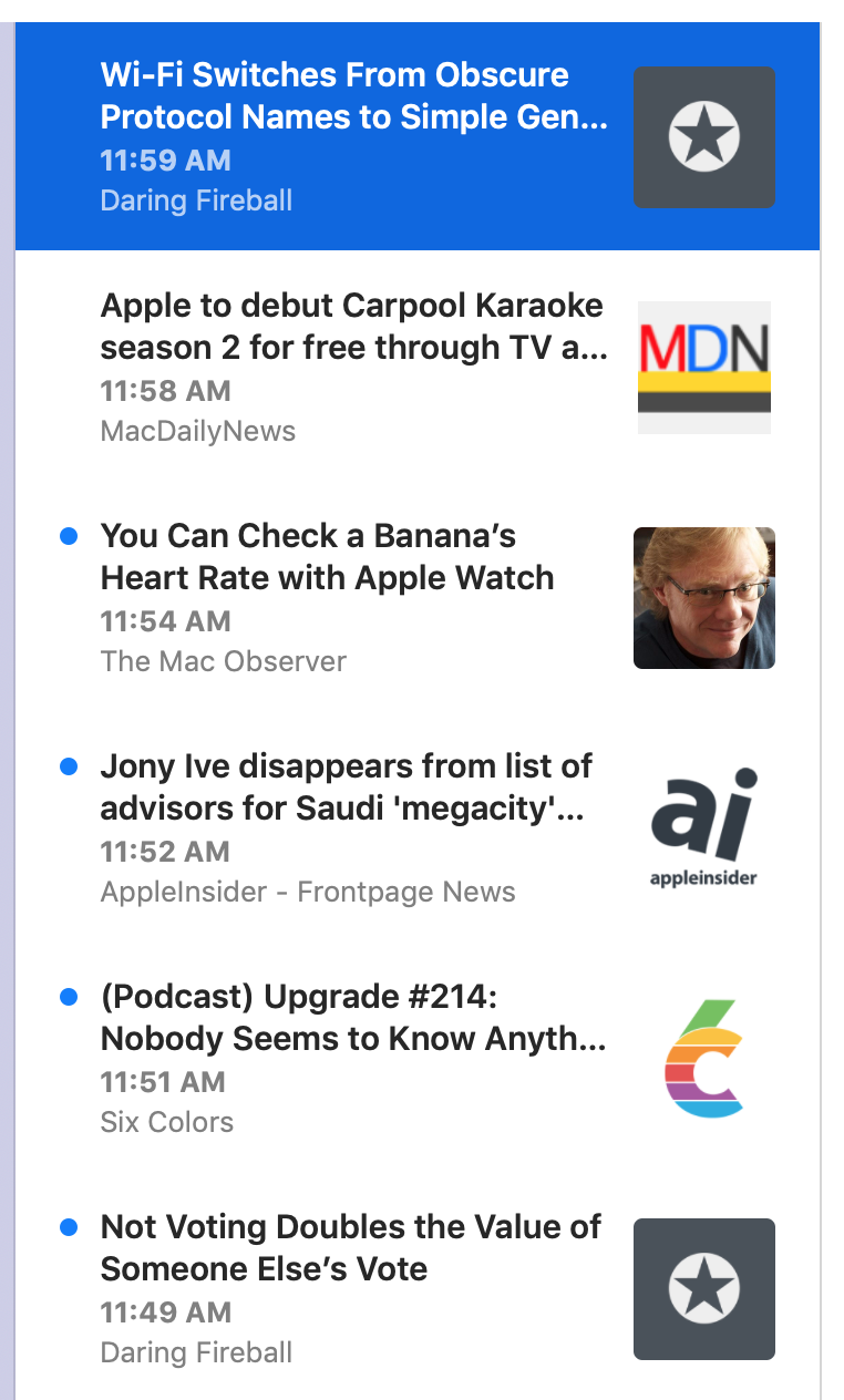
Single-feed selection

The above all works great for the Today, All Unread, and Starred pseudo-feeds. It works great when a folder is selected, or when multiple feeds are selected.

But when you have a single feed selected, it looked weird to have the feed name and the feed icon repeated a whole bunch of times.

So, in that case, the layout removes the feed icon and the feed name. The row height becomes correspondingly shorter.

It does mean the timeline is a bit more wall-of-text in this case — but it’s also a quick reminder that the selection is a single feed. I think it’s fine — though I could imagine revisiting this.

Future

I could also revisit the idea of using thumbnails of images from article text. There are problems to solve with that, of course.

One idea would be to put a larger, non-cropped version of the image below the rest of the cell — as you see in Twitter and various unfurls. This would bring back variable-height cells, but that’s not necessarily the worst thing. (People deal with variable heights just fine in social media apps.)

Another idea for the timeline — one I’m pretty keen on — is to render microblog posts in full in the timeline. (Microblog in the generic sense, not just posts from Micro.blog.) These would have to include clickable links and basic HTML formatting.

The thing is, I don’t want to just use a web view. To make this work well would mean writing a small HTML layout engine that handles the basics (bold, italics, links, blockquotes, images). While this sounds like a fun challenge, it’s also probably not a one-day project. It would take some time. And right now I’ve got enough other things — syncing, especially — to do, so I’ve put off thinking about this until after 5.0 ships.

Another thing put off until after 5.0 ships: an alternate high-density timeline. I’ve heard from a number of people that they really prefer one-line cells with multiple columns: title, date, feed name. For them this is the most scannable UI, and they liked this exact feature in years-ago versions of NetNewsWire. So it’s something to consider — but, again, I’m not thinking about it till after 5.0 ships.

Dark Mode

Though I don’t run in Dark Mode normally — even though it’s beautiful — sometimes I switch to it just to look at NetNewsWire. :)

10 Oct 14:03

A new study provides some dispiriting evidence for why people fall for stupid fake images online

Laura Hazard Owen, NiemanLab, Oct 24, 2018


Icon

The usual advice given to people about fake news (and fake images) usually has something to with: consider the source, consider the content, does it look professional, are other people linking to it? Etc. I'm thinking for example of Mike Caulfield, who often gives this advice, as in this interview. Not so, according to this report. "Instead, what matters are digital media literacy skills, experience or skill in photography, and prior attitudes about the issue." Not that any of this is easy, and the study also points to the risk of government and institutional overreaction.

Web: [Direct Link] [This Post]
10 Oct 14:03

Common Core Produces Massive Failure in Writing

Diane Ravic, National Education Policy Centrer, Oct 25, 2018


Icon

We've seen calls in Canada for 'education reform' that looks a lot like the American Common Core focus on instructivism, core content, and a lot of testing. The promise was that it would improve outcomes, but Diane Ravich reports on a study that shows it produced the opposite. "National NAEP scores flatlined, and scores for the poorest kids dropped. Here is the latest from New York, which embraced the Common Core wholeheartedly. Since the introduction of the Common Core, the proportion of students in New York who scored zero on the state writing tests has doubled. In addition, the achievement gap has grown."

Web: [Direct Link] [This Post]
10 Oct 14:02

Technology Was Supposed To Save Us. It Hasn’t

Dan Pontefract, Oct 25, 2018


Icon

I was born 12 years before Dan Pontefract. And while I would be the first to agree with him that technology isn't perfect, I think those 12 years make all the difference in understanding the impact of new technology. We had television from my early childhood, but depended more on radio, since we only had two channels (CBC and CTV). I worked with some of the earliest computers, before they were small enough to fit inside a house. My life is neatly divided between the paper era and the digital era - and believe me, the digital era is much better.

It's not, as Pontefract claims, that technology has made us more busy. We were always busy. I'd read three newspapers a day (and in my younger years, deliver two of them; I also sold greeting cards, sorked as a hot dog vendor, and mowed lawns - work invariably involved physical labour, even for kids). My nose was always in a book, morning, noon and night (except when I was involved with newspapers). In university, I had to write my papers by hand, or (later) type them on a typewriter. And there was waiting - so much waiting - at the bank, at the store, at government offices. All of this pain has been replaced by really simple computer applications.

Web: [Direct Link] [This Post]
10 Oct 07:08

Briefing: More evidence emerges on hacked Supermicro hardware

by Masha Borak
Compromised Supermicro hardware was discovered at an unnamed US telecommunications company.
10 Oct 07:08

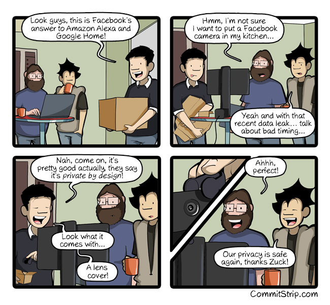
Private by design

by CommitStrip
mkalus shared this story from CommitStrip.

10 Oct 07:07

Briefing: Google’s China search engine is coming within nine months?

by Emma Lee
A leaked transcript of Google executives meeting shows a different picture from Google's official statements.
10 Oct 07:07

Ward 10 (Spadina-Fort York) All-Candidates' Meeting

by Richard

Spadina-Fort York is a federal riding, a provincial riding, and a Toronto ward, and the boundaries are identical. Being from British Columbia, and having spent most of my adulthood in Vancouver (which does not have a ward system), the riding boundaries do not match at all. The recent changes to the wards in Toronto (from 44 to a proposed 47 to an eventual 25) set the wards to match the provincial (and therefore federal) ridings. So we will have a situation where Toronto has a councillor, MPP (member of provincial parliament) and MP (federal member of parliament) represent the exact same people but with different responsibilities.

I live in the Garment District of Toronto, which is a postage stamp neighbourhood comprising the area bounded by Spadina to Bathurst and Queen to King. I tell people I live at Queen and Spadina, though King and Spadina would be just as accurate. (Queen St. seems more famous than King St. to me.) I've been a member of the Garment District Neighbourhood Association as soon as I heard about it in 2016, and have gained their trust such that help run their Twitter and Instagram accounts and, to a lesser extent, their Facebook account. I have no plans on running for a board position, but I do like staying involved with them, helping make the neighbourhood as good as it can be.

Tonight, along with 7 other neighbourhood associations, the GDNA presented and all-candidates meeting featuring men and women running for council.

The MPP Chris Glover addressed the crowd (he noted he was allotted 45 seconds and stayed within that time).

The candidates, seated randomly, would answer questions in that order, always starting with a the candidate next on the list for each question (so that people only went first once at most). Each got two minutes to speak. Everybody more or less stuck to time. I took notes on my iPhone, and there was no break for me for my fingers to regain their composure. (It would later emerge that the meeting was recorded.) The themes were housing affordability, community safety, population growth in the ward/riding, waterfront protection and revitalization (the riding includes the waterfront along Queens Quay, not to mention Toronto Islands and the Billy Bishop airport), and infrastructure (especially as it relates to flood protection). I barely heard mention of the King St. transit pilot, and not a peep from it from the candidate most opposed to it. To say I'm a supporter of the King St. transit pilot would be an understatement. Three or four candidates stood out for me as potentially getting my vote: the incumbent Joe Cressy, litigation lawyer April Engelberg, former banker and current officer in Her Majesty's Royal Canadian Navy Kevin Vuong (the only candidate on my list not to use Nation Builder for his website), and businessman Rick Myers.

Due to the uncertainty around the which ward system the election would run under, and due to my not being in town on election day, I've had to rush somewhat to judgment on who I will end up voting for. Of the four above, I have little doubt they will remain involved in their communities and in politics, whether or not they call themselves a politician. Advance voting starts tomorrow, so I have about 48 hours to come down on a decision. I was heartened by what I saw at the all-candidates' meeting. Some clearly were not put on this earth to serve in public office, and some had the earnest belief that they can make a difference in their communities that I admire, so I hope that the latter will continue with that attitude afterwards and stay politically even though their candidacy for council is a long shot.

10 Oct 07:07

Android Opens Links With GPS Coordinates in Osmand

by Martin

Open with OsmandSometimes it is just a lot more convenient to do a map search on the PC rather than on the phone. Nevertheless I still want to have the result in Osmand (OpenStreetMap for Android) on my smartphone for later use, e.g. for car navigation. So my approach so far was to first search the location on the PC and once I knew where it is I would manually locate and bookmark it on the smartphone again. Far from ideal… However, I just found out a much simpler way to do this by accident:

When I recently wanted to send location information to someone, I noticed that if I send a link from OpenStreetMap or Google Maps from the PC to my smartphone (e.g. via Conversations) and then click on the link in the smartphone, Android asks me if I want to open it in the browser or in Osmand!

I’m not quite sure how this is implemented but it seems Android detects the GPS coordinates in the URL and then offers to extract the coordinates and send it to a maps program. So it seems Osmand must have registered itself for a program that can receive GPS coordinates. Not sure if this is only a feature of the latest Android version (8.1) or if this feature has been in the OS for some time now. Anyway, this is a great feature!

10 Oct 07:07

Creating A Better Onboarding Journey For New Members [3 Examples]

by Richard Millington

A staggering number of online communities have terrible onboarding journeys. They usually waste time teaching people how to use the platform, sharing bland welcome messages, or asking members to do inane things (“update your profile photo!”).

Your audience is smart. If they’ve signed up to your community assume they know who you are, how a community works, and have a reasonable idea of what they want. Don’t waste extremely precious attention.

The purpose of an onboarding series is to change and enhance how people feel about the community.

You can do this by:

a) Telling them something they didn’t know or expect (and find remarkably interesting or useful).

b) Nudging them to take an immediate action – which makes them feel smarter or better connected.

c) Create unique opportunities they can join in.

A great onboarding series steadily helps members feel more competent, more connected, or more autonomous.

For example:

  • Email 1 – Just Getting Started? Sign Up For A Mentoring Group (+1 Days)
  • Email 2 – The Top 5 Resources for Beginners, Curated by Our Top Experts (+7 Day)
  • Email 3 – Share What’s Holding You Back (what can we solve?) (+14 Days)
  • Email 4 – 5 Members You Should Connect With (+21 Days)

Likewise, you can focus on a specific pathway (usually competence).

  • Email 1 – It’s Time To Set Your Goal (and our members will help you get there)
  • Email 2 – How Our Top Members Learned To [Key Skill]
  • Email 3 – The Top Questions You Probably Have About [Key Skill]
  • Email 4 – It’s Time For Your Newcomer Blog Post (share your progress!)
  • Email 5 – Getting Stuck? Our Top Members Share Their Tips

Each email can contain relevant links to discussions and content shared in your community.

You might focus on an autonomy journey.

  • Email 1 – What Can You Contribute To Our Community?
  • Email 2 – What’s The One Thing You Knew When You Started In This Field?
  • Email 3 – Who Would You Like Us To Interview?
  • Email 4 – Can You Share Your Best Tips About [X]
  • Email 5 – Want To Lead Your Own Group?
  • Email 6 – What Can We Do Better? Help Us To Help You!

You steadily make people feel more in control and able to feel a sense of ownership over the community.

If you haven’t looked at your community’s onboarding journey recently, I recommend you sign up for it and go through the entire process. Then decide what kind of journey you need for newcomers in your field and create the series.

10 Oct 07:07

Erste Fehlerbehebung für Windows 10 1809

by Volker Weber

Annotation (1)

Das erste Cumulative Update ist da und es behebt auch den Fehler, der Microsoft dazu veranlasste, das Rollout von 1809 zu unterbrechen. Was war da los? Das Windows-Update löschte bei einigen Anwendern — Microsoft spricht von etwa einem in Zehntausend — Dateien. Egal wie wenige das sind, das ist ein absoluter Albtraum. Sowas passiert nicht zufällig, sondern unter ganz definierten Bedingungen. Nachdem Microsoft die Ursachen erforscht hat, gibt es jetzt eine genaue Erklärung:

Windows kennt bestimmte Ordner für Benutzerdateien, etwa c:\user\vowe\Documents für Dokumente. Diese Ordner kann man verschieben, etwa auf d:\vowe\Documents, wenn man etwa eine zweite Platte mit mehr Platz hat. Wenn man diese Änderung vornimmt, dann verschiebt Windows automatisch alle Dokumente und Unterordner zum neuen Ort. Und bei diesem Upgrade hat Microsoft zu gut aufgeräumt und die alten Orte entfernt. Wer noch restliche (oder neue) Dateien in z.B. c:\user\vowe\Documents hatte, der verlor sie bei diesem Upgrade. Wenn man erst mal weiß, was da passiert ist, kann man das leicht abstellen.

An dieser Stelle kann man auch mal erklären, was eigentlich der Unterschied zwischen dem halbjährlichen Windows Upgrade und den monatlichen Windows Updates ist. Die kumulativen Updates installieren Dateien in der vorhandenen Windows-Installation, das Upgrade aber ist eine komplette Neu-Installation. Die alte Windows-Installation findet man dann in Windows.old. Geht das Upgrade schief, kann Windows zurück auf die alte Version wechseln. Nach der Neuinstallation übernimmt Windows die Einstellungen der alten Version in die neue und bei diesem Kopiervorgang werden nicht immer alle Einstellungen mitgenommen. Wer sein Windows gerne anders aufstellt als Microsoft das vorsieht, der muss dann entsprechende Änderungen nachpflegen. Das betrifft mich in der Regel nicht, weil ich so viel wie irgend möglich auf den Default-Einstellungen lasse. Die Ausnahme bei mir: Ich habe eine Gruppenrichtlinie, die Cortana abschaltet, und die nimmt Windows bei jedem Upgrade zuverlässig mit.

Annotation (2)

Windows hat übrigens eine sehr nützliche Funktion, alte Datein selbst zu löschen: Disk Cleanup entfernt auf Wunsch auch die alte Windows-Version. Ich benutze bevorzugt Disk Cleanup, damit ich mir bei manuellen Aufräumaktionen nicht selbst in den Fuß schieße. Beim 1809-Update aber hat Microsoft einigen Benutzern beim Zielen geholfen, damit sie den Fuß nicht verfehlen. Dieser Fehler ist nun behoben und der Rollout hat wieder begonnen.

10 Oct 07:04

Pixel Slate Hands-on: Pixel C spiritual successor

by Josh McConnell
Pixel Slate header

The Pixel Slate is Google’s latest take on the laptop-tablet hybrid category, as well as the spiritual successor to 2015’s Pixel C.

The tablet features a 12.3-inch touch-screen display with a 3000 x 2000 pixel resolution that comes in at 293ppi (pixels per inch). The first thing most will likely notice when they see the device in person is just how impressive the display really looks.

Google says the Slate feature the highest resolution available in this category of devices.

The Pixel Slate also comes with what Google is calling “low-temperature polycrystalline silicon technology” in the screen, which allows for 100 times faster movement of electrons versus a standard display.

Pixel Slate

The new colour for Pixel Slate is called Midnight Blue (don’t worry, there is a Pen to match). The device features rounded corners and a balanced centre of gravity, so when you hold it with one hand there is no awkward balancing. It’s surprisingly comfortable to hold the Slate with just one hand.

There are two front-facing speakers for dual-firing stereo sound. Google also created an audio algorithm with a custom profile for “crisp high and lows.” That said, it was hard to hear it clearly in the loud hands-on area of the event.

There’s also an 8-megapixel camera on both the front and back of the Pixel Slate, which features machine-learning algorithms similar to Google’s Pixel smartphones. Portrait Mode is available on the Pixel Slate because of this, as is a wide-angle lens on the front of the tablet-laptop hybrid device.

Pixel Slate keyboard

While the Pixel Slate doesn’t come with a keyboard like last year’s Pixelbook, you can purchase the new Pixel Slate Keyboard separately. It attaches to the tablet with a snap through built-in connectors, similar to Apple’s iPad Smart Keyboard, so you don’t need to pair or charge the accessory. The keyboard also features rounded “hush keys,” as Google calls them, which are backlit.

The Slate Keyboard is full sized and feels pretty solid to type on. It’s a little less sticky and has more travel than the Pixelbook, which was a great keyboard in itself, and the trackpad feels very comfortable to use. Concerning the experience of actually using the trackpad, I found it comparable to a MacBook trackpad versus the one featured in Microsoft’s Surface.

The folio of the Pixel Slate Keyboard can be adjusted infinitely due to its kickstand-like apparatus to hold up the screen. You can then also flip it around to act as a case — again, similar to Apple’s iPad Smart Case.

Pixel Slate

Google redid the UI and Chrome OS for Pixel Slate, optimizing it for a touch screen. You swipe up to close apps, like with Android P, and have both a desktop or tablet interface depending on whether the keyboard is attached.

Google Assistant is integrated more deeply, plus machine learning is used in the launcher to quickly recommend apps that you use frequently or may need next. There is a desktop experience that lets the user run developer tools as well as full-powered Linux apps.

Multi-tasking is available for split-screen view, plus there is Do Not Disturb and Night Light features as seen on Android Pie. Family Link is also built in to limit device usage times, content type, apps and more.

Pixel slate pen

Virus protection and background updates come standard in the Pixel Slate, plus Google’s Titan Security Chip is inside to store personal information, device passwords and more. The power button also acts as fingerprint sensor.

Though I only spent a short period with Google’s new Pixel Slate, the time I did spend with it left me impressed. The build quality felt solid to both hold and look at after first impressions, thanks to the screen’s impressive resolution and viewing angles. I definitely could see myself using this throughout the house and on the go for both work and fun, even though Chrome OS can sometimes be finicky to maneuver sometimes.

Google’s Pixel Slate also continues the company’s Pixel modus operandi of integrating software, hardware and AI for a complete experience.

Pixel Slate keyboard

My biggest concern as it stands so far is using the Slate on my lap. Now that the Pixel Slate uses an optional keyboard accessory, it likely won’t rest as comfortably on the lap while typing when compared to its predecessor.

That said, I have been using a Microsoft Surface Pro as my main computer for the last month and I’ve gotten used to optional keyboards, though I still feel like this is an issue that should be flagged.

Google’s Pixel Slate starts at $849 CAD Canadian and is available for pre-order now through the Google Store. The Pixel Slate Keyboard is priced $259 and the Pen, now available in Midnight Blue, is $129.

Mobilesyrup will have a full review of the Pixel Slate and Pixel Slate Keyboard in the coming weeks.

Image credit: Igor Bonifacic 

The post Pixel Slate Hands-on: Pixel C spiritual successor appeared first on MobileSyrup.

10 Oct 07:03

Pixel 3 and Pixel 3 XL Hands-on: It’s all about the software

by Igor Bonifacic
Pixel 3

Google has finally taken the wrapping off the worst kept secret in tech.

After months of leaks, the Pixel 3 and Pixel 3 XL are finally here, and as usual, it turns out that hardware is only a small part of the Pixel story.

Unfortunately, it’s those same features that are the hardest to judge in a short hands-on session like the one Google offered in New York City to members of the media.

Google Pixel 3 and Pixel 3 XL

Still, in the short time I had with the Pixel 3 and Pixel 3 XL, what I saw was impressive, though perhaps not as game-changing as we’ve come to expect from the search giant.

Let’s start with the Pixel 3 and Pixel 3 XL’s new camera features. Google announced a slew of new functionality that leverages the company’s expertise in machine learning to make the Pixel’s already top-in-class camera even better.

The one I imagine future Pixel 3 owners will learn to love is called ‘Top Shot.’ Building on the company’s ‘Motion Photos’ functionality, the Pixel 3 will take additional photos before and after the user presses the shutter to ensure they capture the money shot.

Pixel 3

In its current iteration, this feature is somewhat hidden. In situations in which you’ve clearly missed capturing a friend’s smile or the most critical frame in an action shot, the Pixel 3 will surface what it thinks were better frames automatically.

Otherwise, it’s up to you as the user to launch Google Photos and pull up the details tab to see what else it was able to capture.

Similarly, I can see Pixel fans loving the new Photobooth selfie mode. This is a dedicated mode users can trigger from the Pixel 3 camera app’s ‘More’ section. In this mode, the Pixel 3 will trigger the shutter when it sees that most of the individuals in the scene are either smiling, making a funny face or posing.

Pixel 3

The side of the screen will then flash white to signal to everyone that it’s about to take a photo. When I tried this feature with a Google spokesperson, we were quickly and easily able to do an entire photo shoot involving our silliest poses.

The Pixel 3’s new front-facing camera is also likely to be a crowd pleaser. In contrast to other phones we’ve seen recently, the new front-facing camera on the Pixel 3 isn’t used for authentication. Instead, it’s a wide-angle lens that allows you to capture more of the scene than you would otherwise be able to with the phone’s standard selfie camera. As with all wide-angle lenses, the Pixel 3’s wide-angle selfie camera adds the type of optical distortion that’s a signature of wide-angle lenses, resulting in human features looking more exaggerated.

Lastly, I wasn’t able to test the Pixel 3’s new Night Sight functionality. If this feature works as well as Google promises, where Pixel 3 users won’t ever have to fire the flash on their smartphone ever again, then Night Sight, more so than anything else Google showed off, has the potential to make the Pixel 3 a winner.

Pixel 3

Hardware wise, there’s not much to say about the Pixel 3 and Pixel 3 XL.

At first glance, they look nearly identical to their predecessor. On closer inspection, subtle differences become apparent. The two Pixel 3 phones feature more rounded edges that give them a modern and sophisticated look. Overall, the fit and finish of the devices is improved, though not substantially so.

There are positive changes to be found though. For example, the front-facing stereo speakers are 40 percent louder than the speakers located on the Pixel 2 and Pixel 2 XL. The two phones now both feature inductive charging, as well as flexible OLED displays.

As for the Pixel 3 XL’s already notorious display notch. In person, it looks more substantial than it does in photos, but after playing with the phone for a couple of short minutes, I found I didn’t mind it that much.

Pixel 3

During the company’s keynote presentation, Google senior vice president of hardware Rick Osterloh said the most significant advances in technology come not from just from new hardware, but from the combination of hardware and software that leverages advances in developing fields like artificial intelligence.

And yet in some ways, the Pixel 3 and Pixel 3 XL feel constrained by their restrained hardware.

For example, while it’s impressive what Google was able to achieve with Super Res Zoom, the zoom on the Pixel 3 still lags behind what I’ve seen from smartphones like the Huawei P20 Pro that feature an actual optical zoom.

Moreover, all of the camera features Google introduced work well, in some cases incredibly so, but none of them feel exactly revolutionary.

Pixel 3

Still, what’s perhaps most promising about these devices is what Osterloh said about the Pixel 2 and Pixel 2 XL.

Those two devices are significantly better devices now than they were when they first came out, and they were already incredibly devices when they launched.

What I saw on Tuesday is likely only the tip of the iceberg regarding what Google has planned for the Pixel 3 and Pixel 3 XL.

Mobilesyrup will have a full review of the Pixel 3 and Pixel 3 XL in the coming weeks.

The post Pixel 3 and Pixel 3 XL Hands-on: It’s all about the software appeared first on MobileSyrup.

10 Oct 07:01

Google Pixel 3 vs Pixel 3 XL: What’s the Difference

by Rajesh Pandey
Just like last year and the year before it, Google has unveiled two new Pixel handsets at its October event: the Pixel 3 and Pixel 3 XL. So, what separates the two devices? Is it just their size and battery capacity? Or just like Apple has Google also kept some features reserved for the bigger Pixel 3 XL? Find out in our comparison. Continue reading →