Shared posts

04 Jan 01:59

Macworld Profiles Mac Apps Developed for Over 25 Years

by John Voorhees

As we start a new year that could bring significant change to macOS, Glenn Fleishman, writing for Macworld, spoke to the creators of four Mac apps – BBEdit, PCalc, Fetch, and GraphicConverter – that have been around for at least 25 years and weathered a variety of past macOS and hardware transitions.

Rich Siegel of Bare Bones Software, which can trace BBEdit's lineage back to 1989 when the app was built for System 7, told Macworld that over the years:

We’ve extensively rewritten, upgraded, and optimized [BBEdit’s] internal architecture.… Even though it has evolved a great deal, BBEdit has stayed very close to its fundamental mission: empowering its users to accomplish tasks which would challenge or defeat other tools.

Not long after BBEdit came on the scene, James Thomson released the first version of PCalc on the Mac, which was also built for System 7. For Thomson, PCalc's evolving UI has kept working on the app fresh:

My passion since I first discovered the Mac nearly 30 years ago has always been making interesting and fun user interfaces. And look forward to keep doing it for a long time to come.

Fleishman also spoke to Jim Matthews, for whom FTP client Fetch has gone from full-time job to side project over the years, and Thorsten Lemke, whose GraphicConverter app has evolved from converting a handful of image formats to over 200.

Twenty-five or more years on one app is a remarkable accomplishment. The story of each app is different, but their developers share a common commitment to maintaining their apps for their customers notwithstanding the changes to the Mac and its OS over the years. Later this year, we should hear more about Apple's plans to help iOS developers bring their apps to the Mac App Store. Whatever impact those changes end up having on the Mac app ecosystem, I hope the sort of developer dedication that has kept BBEdit, PCalc, Fetch, and GraphicConverter around for over a quarter century perseveres.

→ Source: macworld.com

04 Jan 01:59

Writing Code that is Easy to Delete

by Eugene Wallingford

Last week someone tweeted a link to Write code that is easy to delete, not easy to extend. It contains a lot of great advice on how to create codebases that are easy to maintain and easy to change, the latter being an essential feature of almost any code that is the former. I liked this article so much that I wanted to share some of its advice here. What follows are a few of the many one- and two-liners that serve as useful slogans for building maintainable software, with light commentary.

... repeat yourself to avoid creating dependencies, but don't repeat yourself to manage them.

This line from the first page of the paper hooked me. I'm not sure I had ever had this thought, at least not so succinctly, but it captures a bit of understanding that I think I had. Reading this, I knew I wanted to read the rest of the article.

Make a util directory and keep different utilities in different files. A single util file will always grow until it is too big and yet too hard to split apart. Using a single util file is unhygienic.

This isn't the sort of witticism that I quote in the rest of this post, but its solid advice that I've come to live by over the years. I have this pattern.

Boiler plate is a lot like copy-pasting, but you change some of the code in a different place each time, rather than the same bit over and over.

I really like the author's distinction between boilerplate and copy-and-paste. Copy-and-paste has valuable uses (heresy, I know; more later), whereas boilerplate sucks the joy out of almost every programmer's life.

You are writing more lines of code, but you are writing those lines of code in the easy-to-delete parts.

Another neat distinction. Even when we understand that lines of code are an expense as much as (or instead of) an investment, we know that sometimes we have write more code. Just do it in units that are easy to delete.

A lesson in separating concerns, from Python libraries:

requests is about popular http adventures, urllib3 is about giving you the tools to choose your own adventure.

Layers! I have had users of both of these libraries suggest that the other should not exist, but they serve different audiences. They meet different needs in a way that that more than makes up for the cost of the supposed duplication.

Building a pleasant to use API and building an extensible API are often at odds with each other.

There's nothing earth-shattering in this observation, but I like to highlight different kinds of trade-off whenever I can. Every important decision we make writing programs is a trade-off.

Good APIs are designed with empathy for the programmers who will use it, and layering is realising we can't please everyone at once.

This advice elaborates on the quote earlier to repeat code in order not to create dependencies, but not to manage them. Creating a separate API is one way to avoid dependencies to code that are hard to delete.

Sometimes it's easier to delete one big mistake than try to delete 18 smaller interleaved mistakes.

Sometimes it really is best to write a big chunk of code precisely because it is easy to delete. An idea that is distributed throughout a bunch of functions or modules has to be disentangled before you can delete it.

Becoming a professional software developer is accumulating a back-catalogue of regrets and mistakes.

I'm going to use this line in my spring Programming Languages class. There are unforeseen advantages to all the practice we profs ask students to do. That's where experience comes from.

We are not building modules around being able to re-use them, but being able to change them.

This is another good bit of advice for my students, though I'll write this one more clearly. When students learn to program, textbooks often teach them that the main reason to write a function is that you can reuse it later, thus saving the effort of writing similar code again. That's certainly one benefit of writing a function, but experienced programmers know that there are other big wins in creating functions, classes, and modules, and that these wins are often even more valuable than reuse. In my courses, I try to help students appreciate the value of names in understanding and modifying code. Modularity also makes it easier to change and, yes, delete code. Unfortunately, students don't always get the right kind of experience in their courses to develop this deeper understanding.

Although the single responsibility principle suggests that "each module should only handle one hard problem", it is more important that "each hard problem is only handled by one module".

Lovely. The single module that handles a hard problem is a point of leverage. It can be deleted when the problem goes away. It can be rewritten from scratch when you understand the problem better or when the context around the problem changes.

This line is the heart of the article:

The strategies I've talked about -- layering, isolation, common interfaces, composition -- are not about writing good software, but how to build software that can change over time.

Good software is software that can you can change. One way to create software you can change is to write code that you can easily replace.

Good code isn't about getting it right the first time. Good code is just legacy code that doesn't get in the way.

A perfect aphorism to close to the article, and to perfect way to close this post: Good code is legacy code that doesn't get in the way.

04 Jan 01:58

Twitter Favorites: [counti8] Good thing I got my wallet tapping ya-ya’s out while in Toronto. Now I am back to tapping just my Compass card now.

Karen Quinn Fung | 馮皓珍 @counti8
Good thing I got my wallet tapping ya-ya’s out while in Toronto. Now I am back to tapping just my Compass card now.
04 Jan 01:58

Paper notes

by Tom MacWright

From 2006 to 2016, I wanted to be the kind of person who carried a paper notebook around. I bought nice notebooks and consistently got halfway through each one before abandoning it and giving up again.

In 2016, everything changed all at once. Every month since I’ve finished a paper journal. Here’s what I changed and the flaws that I discovered in my previous attempts.

Time not topics

Paper notes are append-only: treat them as such. The unlimited flexibility of computer note-taking gave me warped expectations of paper notes, and early in my journey I’d try to maintain notebooks about certain subjects. I tried to keep notes about a certain book in one contiguous section, add a table of contents at the beginning, and stay organized.

Organizing paper notes like digital notes is a fool’s errand. The only organization strategy that I’ve found that works is this one.

The only consistent structure is time. Notes go forward in time. You write the date span of notebooks on the cover, and the date of notes on the pages, and keep the notebooks in order. Try to keep all notes from a certain point in time in the same notebook.

Summarize topics when you finish notebooks, never when you start. Add a list of topics to the front cover (inside or outside), and then after a year, summarize the topics from all notebooks in another notebook.

Simplicity not heaviness

Durability, portability, and capacity are part of the same continuum. An 80-page notebook will probably need a rigid cover, like the kind on a Moleskine or Leuchtturm notebook. That’s the kind that I tried using for a long time – I was hesitant to sacrifice the fanciness of that for something that was pocketable. I was completely wrong about that: when I finally switched to Field Notes, I understood the other, personally better corner of the space. The small notebooks are delicate, and start breaking down after a month being carried around in a pocket or a backpack, but – at 48 pages long, by the end of that month, you’re about finished using it anyway.

Note box

Taking notes is useless without a place to put them when you’re done. Continuing on the theme of Field Notes fandom, I bought their ‘Archival Wooden Box’, a wildly overpriced but perfectly-sized… box… made to hold finished notes. Key to this strategy is that your notebooks are precisely the same size, so that they line up neatly and if you mark a corner of the notebook with its start & end date (as I do), that corner will fall in the same place for each notebook in the stack. This also gives you a place to add structure with dated & labeled dividers, so it’s easier to hunt down a specific notebook later on.


I also take digital notes: Day One as a digital journal, and The Archive for work-related or reference notes. Like with todo lists, I suspect those applications will change and be replaced over time, but thankfully as I’ve started to understand my own habits and preferences, that change has slowed.

04 Jan 01:57

Linking Directly To Impact

by Richard Millington

Joel identified the coherence problem.

Unless you’re selling memberships or advertising, maximizing engagement is useless.

Each additional engagement doesn’t yield an additional dollar (or cent).

Worse, it can decrease valuable activity as key contributions and members are lost in the clutter and overwhelm.

Forget commitment curves, engagement ladders, and the like. Only a tiny fraction of members will ever progress through them anyway. Instead, focus on a simple strategic plan.

The Mayo Clinic’s strategic plan, for example, is:

A plan directly connects your goal to the tactics. To clarify:

  • The goal is something the organization cares about (the impact you want to make)
  • The objectives are what you need (segments) of the audience to do.
  • The strategies are why they will do it.
  • The tactics are what you do to get them to do it.

We waste far too much of our community’s potential chasing engagement.

This would be a great year to stop chasing engagement.

04 Jan 01:57

Leadership is mostly about listening - the rest is about helping

by Chris Saad
04 Jan 01:57

Sleep Subjects

by Zach Kaiser

The worthiest human efforts are those intellectual pursuits that specifically seek the uninterrupted delimiting of infinity into convenient, easily digestible portions.
—D503, in Yevgeny Zamyatin’s We


Critics may worry about algorithmic surveillance, but my university students often complain to me that their computational companions — Spotify, Netflix, Google Maps, Amazon, FitBit, or Apple Watch — don’t know them as well as they should. My students are frustrated, they tell me, when they get a Spotify or Netflix recommendation they don’t like or a seemingly inaccurate number of steps from their fitness trackers.

Despite all the negative attention tech companies have received recently, this attitude may still be more pervasive than skepticism. Whether we admit it to ourselves or not, it is often taken for granted that computational products should be able to measure us accurately, not only in physiological but psychological terms. Hence the wearable thermometer Embr Wave is marketed as being able to control your moods by changing how hot or cool you feel. Medibio, a “mental health technology company,” claims to be “identifying the link between physiologic measures and mental health,” focusing primarily on information captured during sleep — which the new Apple Watch can gather — to purportedly determine a user’s overall levels of depression, anxiety, and stress, as well their likelihood of suffering from bipolar disorder and schizophrenia. And Fast Company is eager to report the promise that an algorithm “can tell if you’re depressed just from your Instagram posts.”

Whether we admit it to ourselves or not, it is often taken for granted that computational products should be able to measure us accurately

With sleep tracking this becomes particularly pronounced. Sleep tracking technologies can tell us how many hours we slept and the relative “depth” of that sleep based on, for example, heart rate and skin conductance as well as the frequency, duration, and intensity of our movement — but they aspire to tell us about our interior lives through data. Apparently, we are in the golden age of the “smart mattress,” with older firms like Sleep Number competing with startups like Eight and others to sell beds with embedded sensors that can connect with an app to help users optimize their sleep with data-driven insights about when to go to bed and when to wake up. One might come to expect a tracker to accurately assess how sleep felt to them the same way some expect spot-on recommendations from Netflix.

I know from my own experience in wearing a FitBit, which claims to track steps, exercise, heart rate, and sleep patterns to help users stay on track with fitness goals and lead healthier lives under the presumption that self-knowledge is only possible through self-quantification. “Know yourself to improve yourself,” its website proclaims. I had used a FitBit for about six months, until I broke a rib playing basketball and stopped wearing it. (I was exercising less and felt sheepish about my sudden lack of data.) But after not wearing it for a few days, I began to miss it. I’d wake up and think, I need to know how tired I am — which I know makes no sense. But FitBit’s measurements of my quantity and quality of sleep became a kind of empirical assurance, a metrical safety blanket that said, “Yes, you can feel this tired,” or “You should feel spry and alert.” Does it know better than I do how much sleep I got, or how tired I should feel? Does it matter if these measurements are actually accurate? What would “accurate” even mean when it came to how I felt? How did I come to implicitly trust it over my own consciousness?


But can sleep really be characterized by how long we’ve slept or whether it was “deep sleep” or “light sleep” according to, for example, your Sleep Number “SleepIQ score”? For many of us, sleep is defined by our dreams. And so far, tech companies have yet to figure out how to quantify them and, like everything else they measure, turn them into monetizable data.

That’s not to say no one is trying. Recent research has explored new ways of trying to manipulate and record dream states. A Fast Company article from April describes an MIT-designed device that extends the hypnogogic phase between sleeping and waking — a state that, as one the researchers claims, “holds applications for augmenting memory, learning, and creativity” — and prompts users to narrate their dreams before going into deep sleep.

More sophisticated is the clinical neuroimaging work being done in the U.S. and Japan. The Gallant Lab at the University of California has been working on this front for over a decade, declaring in 2011 that “quantitative modeling of human brain activity can provide crucial insights about cortical representations and can form the basis for brain decoding devices.” That is, fMRIs can be used to essentially transcribe what the brain is seeing. The researchers claim that different kinds of brain activity correlate with visual representations of different objects. If we know what the brain is doing when it sees a specific thing, like a bird, then we can infer that when similar brain activity is present, a subject is imagining, seeing, or dreaming of a bird. Operating on those assumptions, the lab developed machine-learning algorithms to re-create imagery on the basis of the brain patterns recorded while watching it, drawing from footage from YouTube. In 2017, using a similar process, researchers from Kyoto combined fMRI data with neural networks to produce images which they billed as having been “decoded from brain activity” and then posted on Twitter.

The products work on us rather than for us, selling us a fiction about subjectivity: that we are completely machine-readable, or at least aspire to be

Developing enough correlative data to “accurately” visualize the contents within our dreams seems pretty far off. However, as brain-scanning machines get smaller and startups begin to “innovate” with these new developments (with the requisite TED-talk-cum-business-pitches), it seemed plausible enough to CNN for them to ask “How close are we to video-recording our dreams?”

The efforts to record dreams suggests that companies and researchers will seek ways to turn even our most inner sanctum into data, on the idea that it can be “better” known externally than experientially. Even if it remains a dream itself, the project of supposedly objective dream capture still accomplishes another important goal: Reinforcing the idea that we need trackers and data companies like FitBit, Medibio, and Eight to tell us who we really are. How did we come to think that machines could know us better than we know ourselves, even in our dreams?


It is strange that we would rely on data and machines to reveal ourselves to us, given that even the most rudimentary measurement technologies are often flawed. For example, Gabi Schaffzin recently described his experience with a Zozosuit, a spiffy spandex body suit that is supposed to generate personalized clothes sizing but which resulted for him in jeans that were comically ill-fitting. When this kind of service fails, the difference between the potentially inaccurate “computed” version of ourselves and our physical body is obvious (though Zozo is eager for feedback to get better). But when it comes to sizing up our mental states, our sleep quality, our stress level, or the nature of our dreams, it can be harder to see how the computed self differs from our qualitative but amorphous sense of ourselves. If products like the Zozo suit will eventually work, who’s to say that Medibio doesn’t or that a dream-reading smart pillow won’t? In all these cases, the products work on us rather than for us, selling us a fiction about subjectivity: that we are completely machine-readable, or at least aspire to be.

Any kind of digital tracker, whether it is measuring our waist size or our dreamscape, sells users on this idea, that you should be able to be understood by computational products and services. This is part of what I call a computable subjectivity: an understanding of one’s entire mental and physical life as being completely legible to computational systems.

Tracking devices and other surveillance technologies emanate a perceptual field of sorts, made up of memos, R&D, beta testing, and marketing materials as new products move toward realization in the consumer space. The fantasy worlds in which these technologies were incubated — in the minds of VCs or founder-innovators — migrate into reality, pressing on the contours of our lived experience. The futurological discourses in which companies like FitBit, Medibio, and Zozo engage produce worlds that we then are encouraged to inhabit; they become, to borrow the title of a new story collection, “economic science fictions.”

That is not to say these product concepts are detached from reality but rather to suggest that the economic and social science fictions within which we live are not necessarily written down. They appear as networks of disparate artifacts and utterances: the TED talk, the patent filing, the industry-insider listicle, the ad campaign. This ideological haze, as Mark Fisher writes in the introduction to Economic Science Fictions, is “not necessarily falsehoods or deceptions — far from it. Economic and social fictions always elude empiricism, since they are never given in experience; they are what structures experience. But empiricism’s failure to grasp these fictions only indicates its own limitations.”

We can’t rely, in other words, on established methods of scientific observation to illuminate the connective tissue between technofetishist futurology and our everyday lived experience. Ideology can’t be tracked as data any more than our dreams. The Zozo suit and the dream-reading smart pillow are part of the “transpersonal fictional systems” that Fisher argues generates the individual subject as “something like a special effect,” positioning the computable subjectivity and machine-readability as aspirational ideals. They promise the possibility of optimizing every aspect of ourselves and implicitly making it more productive — our sleep patterns, our eating habits, our Netflix queues, our dreams.

Not only is the computable subject ideally suited to be the entrepreneurial self par excellence, but it is, as Fisher argues, an effect of the hegemonic fiction of capitalist realism, the feeling that there is no alternative to capitalism. When our imagination is dominated by these ideas, we seek what sociologist Ulrich Beck calls “biographical solutions to systemic contradictions.” In other words, instead of trying to change the system, we try to adapt ourselves and our lives to it. We accept that risk must be privatized, so that individual consumers can optimize their individual lives in their own self-interest, and no collective or collaborative alternatives are possible.

The subjectivities and lived experiences that emerge from these systems are not a result of some premeditated conspiracy. We may be becoming more susceptible to a certain kind of incisive biopolitical control, but not because of some specific evil genius has cooked up new wearables. In a sense, we are ourselves both the evil geniuses and an effect of them: Our subjectivities emerge from the economic science fictions we inhabit, reproducing and reinscribing their neoliberal ideologies and establishing the boundaries of our imaginations and experiences, perpetuating the cycle.

Our dreams might be the final frontier of capitalism’s march toward colonizing, quantifying, and capitalizing every aspect of everyday life. The dream may also then be the only ground left on which we can make a stand: Dreams are a space of unknowing, a space of confusion and non-reality outside the effective virtualities that render us machine-readable and wanting to be even more so. Dreams might be a space of autonomy from which we can draw inspiration to move beyond capitalist realism. But only if dreams themselves remain beyond the grasp of the computable subjectivity and its ideological machinery can they offer something other than the reductive vision of tracking, and of total availability to the technologies that intend to tell us who we really are.

04 Jan 01:56

After the Rhythm Nation

by Anil Dash
After the Rhythm Nation

With Janet Jackson's (woefully belated) acceptance into the Rock and Roll Hall of Fame, it's well past time for a broader reckoning with her place in popular culture, and especially the way she's challenged narratives in pop music. To me, her evolution, and unique place in culture, can be summed up with just one verse.


There's a brief, melancholy moment on Janet's 2015 album Unbreakable that shocked me when I first heard it, and has haunted me ever since for its accuracy and prescience. It comes in "Shoulda Known Better", a dance song that's a standout on Unbreakable, with fairly conventional pop production paired with a very unusual structure that alternates between a pulsing, even euphoric chorus and subdued, nearly heartbroken verses. It's not the loud-soft that every Pixies-referencing rock band trots out, but rather a striking grafting of two completely different moods into a single pop song. The overall sentiment of the song is conveyed by the jarring juxtaposition of cataloguing social ills (the kind that Janet has been discussing since Rhythm Nation) against an insistence that directly reckoning with such injustices can still help to fix them.

What Janet said made me rethink how pop music talks about narratives of race, and how it deploys hope and optimism or falls back to resignation or despair.

I had this great epiphany
And rhythm nation was the dream
I guess next time I'll know better

Janet's Unbreakable album has been unfairly overlooked, perhaps because she couldn't do a full-on promotional push at the time of its launch as she was going through a complicated pregnancy and a lot of change in her personal life. But as an album, it stands tall amongst the other formidable standouts in her catalog, and is perhaps her best complete album since 1998's Velvet Rope. "Shoulda Known Better" shows exactly why it's her strongest release in years.

A Vision of Blindness

The pop music tradition, especially the global superstar tier of pop music where Janet resides, has had a fairly consistent narrative for a few decades now. Just as the rhythms and arrangements of contemporary pop music can often find its roots in the funk and disco of the 70s, the lyrical grounding of most "issue oriented" pop music was defined in the simple, sometimes reductive, utopianism of the 60s.

Motown struggled famously with reacting to the political moment it found itself in toward the late 60s and early 70s, with Berry Gordy fighting against Marvin Gaye's cultural commentary in What's Going On, only begrudgingly agreeing to release the now-classic record. But despite the success of Gaye's efforts (and even more pointed songs like some of Stevie Wonder's work later in the 70s), the template for much of pop music was set: talking about racial problems in America was still supposed to finish with a call for color-blind idealism. And it's important to remember that Motown wasn't some abstract representation of excellence in black music to the Jackson family; Motown was the mentors who came around the house as the Jackson kids were growing up. Especially for Janet, as the youngest of the family and the one most rooted in California instead of Indiana or Detroit, the example set by someone like Diana Ross would have been omnipresent.

This expectation of pop music's conversation about race persisted for decades. By the end of the 80s, Janet was pushing forward the boundaries of pop music with Rhythm Nation 1814, with many of its songs explicitly articulating a vision of color-blindness. Even its title track, an all-time classic, opens with a spoken incantation:

We are a nation with no geographic boundaries
Bound together through our beliefs
We are like-minded individuals
Sharing a common vision
Pushing toward a world rid of color lines

Within two years after the release of Rhythm Nation, Michael Jackson would release his single "Black or White", whose chorus repeatedly insists that it doesn't matter if you're black or white. The same year, Prince would release his album Diamonds and Pearls, whose bridge enthusiastically promises, "u will be colorblind". The biggest stars of the MTV era had weighed in, and they had found consensus in their lyrics.

Telling the Truth

But lets's fast-forward to just over a decade after the peak of the MTV era. Janet had been sidelined by the predator Les Moonves for her Super Bowl performance. Prince had abandoned his name, written "slave" on his face, returned to his name, and re-emerged outside the conventional record label system. Michael Jackson had gone to war against his record label, calling his label head "the devil". None of their work would ever blindly champion ignorance of race again; all of them would reckon directly with the fact that even their extraordinary talent and success didn't shield them from the structural injustices of the industry they had mastered.

But it took Janet explicitly revisiting her past work to really drive this home. Unlike almost any other major pop artist, Janet revisited her signature song, in a world of #BlackLivesMatter and #MeToo, and declared her past vision obsolete. In its place was an updated, more complicated vision.

Janet's vision of a post-Rhythm nation isn't a pessimistic one, though. Instead, it's a hard-earned lesson, an unpopular but necessary truth that takes courage to share. We can't solve problems that we can't talk about, and Janet had the wisdom to tell the truth of the problem, even if it meant challenging one of her best-known narratives.

Still, the first time I heard those lyrics in "Shoulda Known Better", it hit me like a gut punch. Part of it was the difference between hearing an idealistic message as a teen and hearing a tough, painful lesson as an adult. But more fundamentally, it was about recognizing the shortcomings and dangers of the colorblindness that we'd all been taught when I was young. Great art is supposed to challenge us, but it takes a truly great artist to give us permission to let go of our past. And Janet pushed us there.

I stil love the song "Rhythm Nation"; I always will. But I believe in Janet today. And just as with her Hall of Fame induction, the music industry may always lag behind, but it can never deny Janet's vision.

04 Jan 01:51

Google’s Fuchsia OS confirmed to get Android app support

by Jonathan Lamont
Fuchsia logo

Recent work on Google’s in-development operating system Fuchsia has confirmed the OS will support Android apps.

While this isn’t much of a surprise, it’s good to see confirmation of support.

The confirmation came via a ‘README’ file added to the Android Open Source Project (AOSP) via a code change on the Android Gerrit.

Previously, we wrote about two Fuchsia repositories that Google had added to AOSP. The first, “platform/prebuilts/fuchsia_sdk” now contains a pre-built copy of the Fuchsia SDK. Developers can use the SDK to make Fuchsia apps.

The second, “device/google/fuchsia” contains the README file which explains what the repository is for.

According to the ‘README,’ Fuchsia will use a specially designed version of the Android Runtime (ART) to run Android apps. Further, this ART version can be installed on any Fuchsia device use a ‘.far’ file — Fuchsia’s version of the Android APK file.

Unfortunately, the README doesn’t explain how Fuchsia will use ART from there. It could run in a Linux virtual machine, or it could merely replace Linux kernel calls with equivalents from Fuchsia’s Zircon kernel.

Also of note, the README says the ART file on Fuchsia will support both x86 and ARM architectures. In other words, it should work with both mobile and desktop CPUs. This adds further credence to the idea that Fuchsia will run on multiple form factors.

Overall, this development means Fuchsia devices will run Android apps. It’s an excellent addition for Google, which allows the search giant to leverage the popularity of Android and the wealth of Android apps that already exist.

That should help ease new users into Fuchsia. Further, it means Fuchsia could potentially dodge one of the biggest obstacles for new operating systems — lack of app support.

Source: AOSP Gerrit Via: 9to5GoogleAndroid Authority

The post Google’s Fuchsia OS confirmed to get Android app support appeared first on MobileSyrup.

04 Jan 01:51

Apple’s Terrible No Good Very Bad Earnings Warning

by Rui Carmo

Market saturation, trade imbalances, extremely high prices, gigantic phones with underwhelming differentiation–whatever the cause, I’m leaning on the side of both market saturation and people putting off upgrades because the iPhone is now both extremely overpriced and (in the case of the XR) an ungainly lump of plastic that is not compelling enough of an upgrade at that price.

I have a faint hope this will lead to their cutting prices and going back to smaller SE-like form factors, but considering they are still making ludicrous amounts of money, systematically hiking up prices across the board and seem to be largely deaf to customer feedback, it’s a toss-up as to whether that will happen.


04 Jan 01:51

Emotions

by noreply@blogger.com (VeloOrange)
By Scott

I was listening to a podcast yesterday on the way home. It was an interview with Alton Brown, the Food Network host, author, and generally interesting fellow. The podcast/interview centered around watches and food - the watch website Hodinkee was the host - and one of the themes that came out was emotions.  In the context of the interview, it centered on why someone would obsess/fixate on a specific watch/model/style when they were buying or looking at watches. This got me thinking, as one can, about how emotion relates to bicycles.


I think for some, emotion and bicycles relates to the act of riding a bike. The joy, the feeling of flying, of moving around a city or place at a pace that is directly controlled by your efforts and that of the machine you are riding.

For others, the emotion of bicycles is the bike itself. The interest in the lugs or paint on a frame, the details of the derailleur mechanism or the other little features that only become evident when you examine the bike close up.

I mean, there is no logical reason for someone to spend time and money to restore an old Peugeot UO-8 or Schwinn Letour. One can go to a bike shop and buy something that is lighter, more reliable and compatible with modern parts for not much more then what some folks have dropped over time with new parts on a bike made in the late 60's/early 70's.

So why do we do it? Well that is where I think emotion comes in.

For me, it is a love of an all-rounder bicycle - an historically British style where the bike could be used for touring, both on and off road, and for commuting to work. For me, the Polyvalent is the modern progression of this style. Equipped with braze-on's for everything one might need and room for wide or narrow tires, it can be anything you want it to be. The feeling I get riding it over rough roads/tracks is fantastic. Knowing that I'm independent of anything or anyone else is very empowering as I explore the smaller paths and roads of Maryland.

I know of customers who obsess over certain brands. They collect and ride a variety of bikes from one maker and become very knowledgeable about the details and features of that brand/model.

So what emotion gets you when we talk of bikes? Is it the feeling of riding, an interest in a particular brand, model, or something else?
04 Jan 01:51

Tim Cook isn’t afraid to travel to China after Huawei CFO arrest

by Shruti Shekar

Apple CEO Tim Cook says he isn’t afraid to travel to China or that the country might detain him in retaliation for the arrest of Huawei CFO Meng Wanzhou.

Meng was arrested in Vancouver on December 1, 2018 on fraud-related charges. She was granted bail but faces extradition to the U.S. During the month-long scandal, a Chinese-state run newspaper made threats against U.S. companies that sold smartphones in China, according to the BBC.

But in an interview with CNBC, Cook said that he’s not afraid of travelling to China and doing business there.

“I was just there in October. I’m going back later this quarter. And so it’s not something I’m even thinking about is the truth,” Cook said. “I don’t know the circumstances of [the arrest], and I don’t need to know and shouldn’t know. But what I can tell you is I feel welcomed when I go there.”

Cook did caution that the U.S. should be careful about getting involved in a trade war with China, something he has opposed since U.S. President Donald Trump initiated it.

“I do believe that it’s in the best interest of both countries to have a very strong trade relationship. This thing is a big agreement between the countries, and it’s very complex and it clearly needs updating, there’s no doubt about all of that,” Cook said. “Business can play a very key role in bringing countries together.”

On January 3rd, 2018, CNBC reported that the U.S. State Department issued an increased travel warning about China. It urged U.S. citizens to “exercise increased caution” in the country “due to arbitrary enforcement of local laws as well as special restrictions on dual U.S.-Chinese nationals.”

The advisory said that Chinese authorities have “exit bans” in place to not allow U.S. citizens to travel back and that could last “for years.”

On December 27th, 2018, Reuters reported that Trump might declare a national emergency and sign an executive order to bar U.S. companies from using any equipment manufactured by Huawei and ZTE.

This could be his next step to cut the two Chinese smartphone companies from the U.S. In August, Trump announced a ban that prevented Huawei from supplying 5G telecommunications equipment to U.S. telecom providers. According to a draft of China’s national intelligence law that was recently released, all Chinese companies “shall support, cooperate with and collaborate in national intelligence work, and maintain the secrecy of national intelligence work they are aware of.”

This executive order has been in consideration for more than eight months and could be put in place as early as this month, but nothing has been announced by the White House yet.

Cook’s statements come the same day Apple announced it’s reducing its revenue forecast for the first quarter of 2019. In an uncharacteristic move, Apple issued investor earnings guidance as a result of fewer iPhone upgrades and weak sales in the Chinese market.

Apple now forecasts $84 billion USD ($114 billion CAD) in revenue for the first quarter of 2019, a number that already sits below estimates of $91.5 billion ($124 billion CAD) based on BES data from Refinitiv, according to Reuters. In total, this means that Apple dropped its Q1 2019 revenue forecast by $9 billion ($12 billion CAD).

At the same time, Cook also revealed that the iPhone experienced record activations on Christmas Day in Canada and the U.S.

Source: CNBC Via: 9To5Mac

The post Tim Cook isn’t afraid to travel to China after Huawei CFO arrest appeared first on MobileSyrup.

04 Jan 01:51

‘data:’ Scraping & Chart Reproduction : Arrows of Environmental Destruction

by hrbrmstr

Today’s RSS feeds picked up this article by Marianne Sullivan, Chris Sellers, Leif Fredrickson, and Sarah Lamdanon on the woeful state of enforcement actions by the U.S. Environmental Protection Agency (EPA). While there has definitely been overreach by the EPA in the past the vast majority of its regulatory corpus is quite sane and has made Americans safer and healthier as a result. What’s happened to an EPA left in the hands of evil (yep, “evil”) in the past two years is beyond lamentable and we likely have two more years of lamenting ahead of us (unless you actually like your water with a coal ash chaser).

The authors of the article made this chart to show the stark contrast between 2017 and 2018 when it comes to regulatory actions for eight acts:

  • Clean Air Act (CAA)
  • Clean Water Act (CWA)
  • Emergency Planning and Community Right to Know Act (EPCRA)
  • Federal Insecticide, Fungicide, and Rodenticide Act (FIFRA)
  • Resource Conservation and Recovery Act (RCRA)
  • Safe Drinking Water Act (SDWA)
  • Toxic Substances Control Act (TSCA)
  • Comprehensive Environmental Response, Compensation, and Liability Act (CERCLA)

They made this arrow chart (via Datawrapper):

For some reason, that chart sparked a “I really need to make that in R” moment, and thus begat this post.

I’ve got a geom for dumbbell charts but that’s not going to work for this arrow chart since I really wanted to (mostly) reproduce it the way it was. Here’s my go at it.

Data First

Datawrapper embeds have a handy “Get the data” link in them but it’s not a link to a file. It’s a javascript-generated data: href so you either need to click on the link and download it or be hard-headed like I am go the way of pain and scrape it (reproducibility FTW). Let’s get packages and data gathering code out of the way. I’ll exposit a bit more about said data gathering after the code block:

library(stringi)
library(rvest)
library(hrbrthemes) # git[la|hu]b / hrbrmstr / hrbrthemes
library(tidyverse)

article <- read_html("https://theconversation.com/the-epa-has-backed-off-enforcement-under-trump-here-are-the-numbers-108640")

html_node(article, "iframe#psm7n") %>% # find the iframe
  html_attr("src") %>% # get iframe URL
  read_html() %>%  # read it in
  html_node(xpath=".//script[contains(., 'data: ')]") %>% # find the javascript section with the data
  html_text() %>% # get that section
  stri_split_lines() %>% # split into lines so we can target the actual data element
  unlist() %>% 
  keep(stri_detect_fixed, 'data: "Fiscal') %>% # just get the data line
  stri_trim_both() %>% # prep it for extraction
  stri_replace_first_fixed('data: "', "") %>% 
  stri_replace_last_fixed('"', "") %>% 
  stri_replace_all_fixed("\\n", "\n") %>% # make lines lines
  stri_split_lines() %>% 
  unlist() %>%
  stri_split_fixed("\\t") %>% # we now have a list of vectors
  map_dfc(~set_names(list(.x[2:length(.x)]), .x[1])) %>%  # first element of each vector is colname
  type_convert(col_types = "cddn") %>% # get real types
  set_names(c("act", "y2018", "y2017", "pct")) -> psm

psm
## # A tibble: 8 x 4
##   act    y2018 y2017   pct
##   <chr>  <dbl> <dbl> <dbl>
## 1 CAA      199   405   -51
## 2 CERCLA   147   194   -24
## 3 CWA      320   565   -43
## 4 EPCRA     56   107   -48
## 5 FIFRA    363   910   -60
## 6 RCRA     149   275   -46
## 7 SDWA     121   178   -32
## 8 TSCA      80   152   -47

Inside the main article URL content there’s an iframe load:

<p><iframe id="psm7n" class="tc-infographic-datawrapper" src="https://datawrapper.dwcdn.net/psm7n/2/" height="400px" width="100%" style="border: none" frameborder="0"></iframe></p>

We grab the contents of that iframe link (https://datawrapper.dwcdn.net/psm7n/2/) which has a data: line way down towards the bottom of one of the last javascript blocks:

That ugly line gets transformed into a link that will download as a normal CSV file, but we have to do the above wrangling on it before we can get it into a format we can work with.

Now, we can make the chart.

Chart Time!

Let’s get the Y axis in the right order:

psm %>%
  arrange(desc(y2017)) %>%
  mutate(act = factor(act, levels = rev(act))) -> psm

Next, we setup X axis breaks and also get the max value for some positioning calculations (so we don’t hardcode values):

# setup x axis breaks and max value for label position computation
x_breaks <- pretty(c(psm$y2018, psm$y2017))
max_val <- max(x_breaks)

I have two minor nitpicks about the original chart (and changes to them as a result). First, I really don’t like the Y axis gridlines but I do believe we need something to help the eye move horizontally and associate each label to its respective geom. Instead of gridlines I opt for a diminutive dotted line from 0 to the first (min) value.

The second nitpick is that — while the chart has the act information in the caption area — the caption is in alpha order vs the order the act acronyms appear in the data. If it was an alpha bullet list I might not complain, but I chose to modify the order to fit the chart, which we build dynamically with the help of this vector:

# act info for caption
c(
  "CAA" = "Clean Air Act (CAA)",
  "CWA" = "Clean Water Act (CWA)",
  "EPCRA" = "Emergency Planning and Community Right to Know Act (EPCRA)",
  "FIFRA" = "Federal Insecticide, Fungicide, and Rodenticide Act (FIFRA)",
  "RCRA" = "Resource Conservation and Recovery Act (RCRA)",
  "SDWA" = "Safe Drinking Water Act (SDWA)",
  "TSCA" = "Toxic Substances Control Act (TSCA)",
  "CERCLA" = "Comprehensive Environmental Response, Compensation, and Liability Act (CERCLA)"
) -> acts

w125 <- scales::wrap_format(125) # help us word wrap at ~125 chars

# order the vector and turn it into wrapped lines
act_info <- w125(paste0(unname(acts[as.character(psm$act)]), collapse = "; "))

Now, we can generate the geoms. It looks like alot of code, but I like to use newlines to help structure ggplot2 calls. I still miss my old gg <- gg + idiom but RStudio makes it way too easy to execute the whole expression with just the use of + so I’ve succumbed to their behaviour modification. To break it down w/o code, we essentially need:

  • the arrows for each act
  • the 2017 and 2018 direct label values for each act
  • the 2017 and 2018 top “titles”
  • segments for ^^
  • title, subtitle and caption(s)

We use percent-maths to position labels and other objects so the code can be re-used for other arrow plots (hardcoding to the data values is likely fine, but you’ll end up tweaking the numbers more and wasting ~2-5m per new chart).

ggplot(psm) +

  # dots from 0 to minval
  geom_segment(
    aes(0, act, xend = y2018, yend = act),
    linetype = "dotted", color = "#b2b2b2", size = 0.33
  ) +

  # minval label
  geom_label(
    aes(y2018, act, label = y2018),
    label.size = 0, hjust = 1, size = 3.5, family = font_rc
  ) +

  # maxval label
  geom_label(
    aes(y2017 + (0.0015 * y2017), act, label = y2017),
    label.size = 0, hjust = 0, size = 3.5, family = font_rc
  ) +

  # the measure line+arrow
  geom_segment(
    aes(y2018, act, xend = y2017, yend = act),
    color = "#4a90e2", size = 0.75, # I pulled the color value from the original chart
    arrow = arrow(ends = "first", length = unit(5, "pt"))
  ) +

  # top of chart year (min)
  geom_label(
    data = head(psm, 1),
    aes(y2018, 9, label = "2018"),
    hjust = 0, vjust = 1, label.size = 0, size = 3.75, family = font_rc, color = ft_cols$slate
  ) +

  # top of chart year (max)
  geom_label(
    data = head(psm, 1),
    aes(y2017, 9, label = "2017"),
    hjust = 1, vjust = 1, label.size = 0, size = 3.75, family = font_rc, color = ft_cols$slate
  ) +

  # bar from top of chart year label to first minval measure
  geom_segment(
    data = head(psm, 1),
    aes(
      y2018 + (0.005 * max_val), 8.5, 
      xend = y2018 + (0.005 * max_val), yend = 8.25
    ), 
    size = 0.25
  ) +

  # bar from top of chart year label to first maxval measure
  geom_segment(
    data = head(psm, 1),
    aes(
      y2017 - (0.005 * max_val), 8.5, 
      xend = y2017 - (0.005 * max_val), yend = 8.25
    ), 
    size = 0.25
  ) +

  # fix x axis scale and place breaks
  scale_x_comma(limits = c(0, max_val), breaks = seq(0, max_val, 200)) +

  # make room for top "titles"
  scale_y_discrete(expand = c(0, 1)) +

  labs(
    y = NULL,
    title = "Decline by statute",
    subtitle = "The number of civil cases the EPA brought to conclusion has dropped across a number of federal statutes,\nincluding the Clean Air Act (CAA) and others.",
    x = act_info,
    caption = "Original Chart/Data: The Conversation, CC-BY-ND;<https://bit.ly/2VuJrOT>; Source: Environmental Data & Government Initiative <https://bit.ly/2VpcFyl>"
  ) +
  theme_ipsum_rc(grid = "X") +
  theme(axis.text.x = element_text(color = ft_cols$slate)) +
  theme(axis.title.x = element_text(
    hjust = 0, size = 10, face = "italic", color = ft_cols$gray, margin = margin(t = 10)
  )) +
  theme(plot.caption = element_text(hjust = 0))

Here’s the result:

(it even looks ok in “batman” mode):

FIN

With Microsoft owning GitHub I’m not using gists anymore and the GitLab “snippets” equivalent is just too dog-slow to use, so starting in 2019 I’m self-hosing contiguous R example code used in the blog posts. For the moment, that means links to plain R files but I may just setup gitea for them sometime before the end of Q1. You can find a contiguous, commented version of the above code in here.

If you do your own makeover don’t forget to drop a link to your creation(s) in the comments!

04 Jan 01:49

Sparkline Graphics in HMTL5

by Ton Zijlstra

Various people in my feedreader have nifty graphics of their stuff on their sites. Sparkline graphs of their posting frequency of various types of content. In the words of Edward Tufte, sparklines are ‘word like graphs’ that can be used inline. I never really tried to find out how you make those sparklines. “View source”, the most important feature of any web browser, reveals it’s simple HTML5 using a vector image (SVG).

The data for the graph is declared as numbers. Such as d=”M0,20 0,16 1,17 2,20 3,15 4,19 5,20 6,15 7,17 8,13 9,19 10,20 11,15 12,12″ (the start of that data string sets the lower and higher end of the y-axis, and then the data points are given numbered from 0. Data point 0 has a value of 16, 1 of 17 etc. Kevin Marks wrote it up a few years ago. That gives sparkline graphics like the one below:

sparkline

Now the next question is how to pull that data from somewhere and turn it into a HTML5 statement on the fly.

04 Jan 01:49

Futures thinking with Bruce Sterling

Bryan Alexander, Jan 03, 2019
Icon

Summary and link to a talk by Bruce Sterling. There are two propositions: first, to be a futurist is to pick an audience "that agrees to value a certain aspect of futuring." Second, these audiences can be defined along the lines of Stewart Brand’s Pace layers. Clearly Sterling's talk was tailored to this audience, the Long Now Foundation. Me, I would classify change along another axis as well: duration. Culture, commerce and infrastrcuture change rapidly and the changes have a short duration. Governance, culture and (aspects of) nature change slowly, and the changes endure. But my own focus is on a layer not even present - we can call it, perhaps, 'scientific and technological discovery', where the changes may be very rapid but have great duration, because these discoveries don't go away - planets, algorithms, materials: once we find them, they don't disappear, and the changes they create are more or less permanent.

Web: [Direct Link] [This Post]
04 Jan 01:49

Netflix releases behind-the-scenes looks at the making of ‘Black Mirror: Bandersnatch’

by Bradly Shankar
Black Mirror: Bandersnatch Stefan

A particularly large amount of work went into making Black Mirror: Bandersnatch.

The sci-fi choose-your-own-adventure film follows a young programmer named Stefan, who struggles to adapt a popular novel into a video game. As a result, the filmmakers say Bandersnatch has “millions” of story variations and hundreds of scenes had to be shot accordingly.

To illustrate these challenges, Netflix has released two three-minute behind-the-scenes looks at the making of Bandersnatch.

The first video dives into the conceptualization and production of the film, as told by the likes of Netflix vice president of products Todd Yellin, Black Mirror series creator and writer Charlie Brooker and Black Mirror producer Annabel Jones.

The second video focuses more on the consumer side of the experience and takes a look at some of the choices that viewers can make. Some of the cast members, including Fionn Whitehead (Stefan) and Asim Chaudry (game developer Tuckersoft boss Mohan Thakur), are also interviewed.

For more on Black Mirror: Bandersnatch, check out the latest episode of MobileSyrup‘s pop-culture podcast, Viewer Experience, which dives into some of the film’s branching narratives.

The post Netflix releases behind-the-scenes looks at the making of ‘Black Mirror: Bandersnatch’ appeared first on MobileSyrup.

04 Jan 01:49

The Incremental Ending of Single-family Zoning

by Gordon Price

As Vancouver and Seattle engage in discussion about new forms of housing in what were once single-family housing zones, other cities are already deep in the debate or have already taken action.  Like Minneapolis:

From Strong Towns:

Minneapolis just took a huge step toward becoming a stronger city by passing an ambitious new housing reform … allowing every neighborhood to evolve gradually to the next increment of development.

Duplexes and triplexes will now be allowed in every neighborhood citywide, most of which were formerly reserved for nothing but single-family houses.

Debate is happening at the legislative level in Oregon and California, as you might expect, but here’s a place where you wouldn’t: Grand Rapids:

Ten years ago, when Grand Rapids set out to rewrite its zoning ordinance, the common complaint from developers as well as residents was that it was unpredictable, Schulz says. The ordinance had been amended more than 300 times since it was adopted in 1969. The city had earlier created a master plan in 2000 based on “smart growth” principles, Schulz says, encouraging a mix of housing types at various price points.

To rewrite the ordinance a decade ago, Suzanne Schulz, managing director of design, development & community engagement, says staff met with neighborhood associations to hear what they wanted the code to promote. As a precursor to the rewrite, Schulz helped develop a “Neighborhood Pattern Work Book,” which identifies Grand Rapids neighborhoods by the era in which they were primarily developed: Turn of the century, early 20th century, post-World War II, and late 20th century.

“Preserving neighborhood character was important,” Schulz says. “But how do you quantify or codify neighborhood character?”

What they ended up with is a type of zoning that Schulz refers to as “form-based lite.” Residential districts are either low-density or mixed-density, and most housing types are permitted either by right or by a special exception, which requires a public hearing before the planning commission. But the special exception process takes just five weeks, and the planning commission approves 97 percent of applications, Schulz says.

However …

Still, while the zoning ordinance may have made building easier, it hasn’t saved Grand Rapids from the same affordable-housing challenges that other cities are facing. No matter how a city handles zoning, the cost of construction and availability of land and labor can be obstacles to expanding the supply of low-cost housing, Schulz says. And the city’s more administrative zoning approach hasn’t brought an end to controversies around housing and land use.

The wonks at The Weeds podcast from Vox are also predicting that this will be the Year of Zoning Reform.  (Doesn’t that just make your heart beat faster.)

04 Jan 01:48

A bumpy road to Firefox ScreenshotGo in a foreign market

by Morpheus Chen

Back in January 2018, we were assigned to lead a project called New Product Exploration to help Mozilla grow impact on shopping experience in Southeast Asia, and the first stop was Indonesia, a country I had not visited and barely knew!

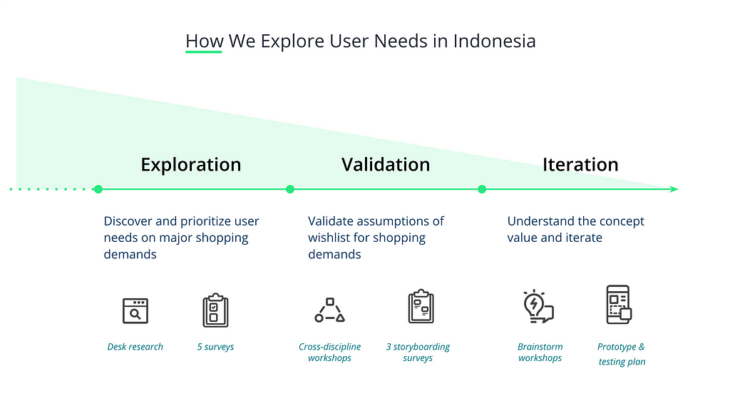
To quickly dive into the market and design a great product within six weeks, we adopted Lean UX thinking and continually fine-tuned the design process* that has proven to be successful in this journey. Furthermore, we also practiced the strategic approach, Playing to Win**, to fit the emerging markets aligning the business model/goal. In short, we pushed forward and discovered by the following design process:

1. Explore & learn: discover and prioritize user needs on shopping demands
2. Assumptions to validate: create and validate preliminary assumptions
3. Design & build prototype: develop the prototype by collaborative design
4. Test & iterate: field research with users by prototype to iterate

Fine-tuned structure according to Lean UX process

Explore & learn
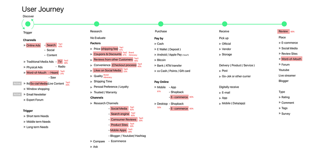
Though Indonesia is just 5 hours-flight from Taiwan, I had little knowledge about its language, culture, value, etc. Fortunately, Ruby Hsu, our user researcher who had done extensive research and interviews in Indonesia, brought us decent observation and research findings as our starting point. Next, the team did extensive desk research to understand their shopping behaviors. With the research findings, we depicted the shopping journey to explore the opportunities and pain points.

User journey is a sequence of events a user may take or interact with something to reach their goal

According to the shopping journey, we synthesized five general directions for further exploration:
- Price comparison
- Save to Wish list
- Save Money Helper
- Reviews
- Cash Flow Management

For each track, we validated assumptions by quantitative questionnaires via JakPat, a mobile survey service in Indonesia. Around 200 participants, online shoppers, were recruited for each survey. The surveys offered us fundamental knowledge covered from their daily life to specific shopping behaviors across genders, ages, and monthly spending, etc. Surprisingly, the most significant pattern was that

screenshot always served as a dominant tool to fulfill most needs, like keeping wish lists, promotions, shopping history, and cash flows, which was really out of our expectation.

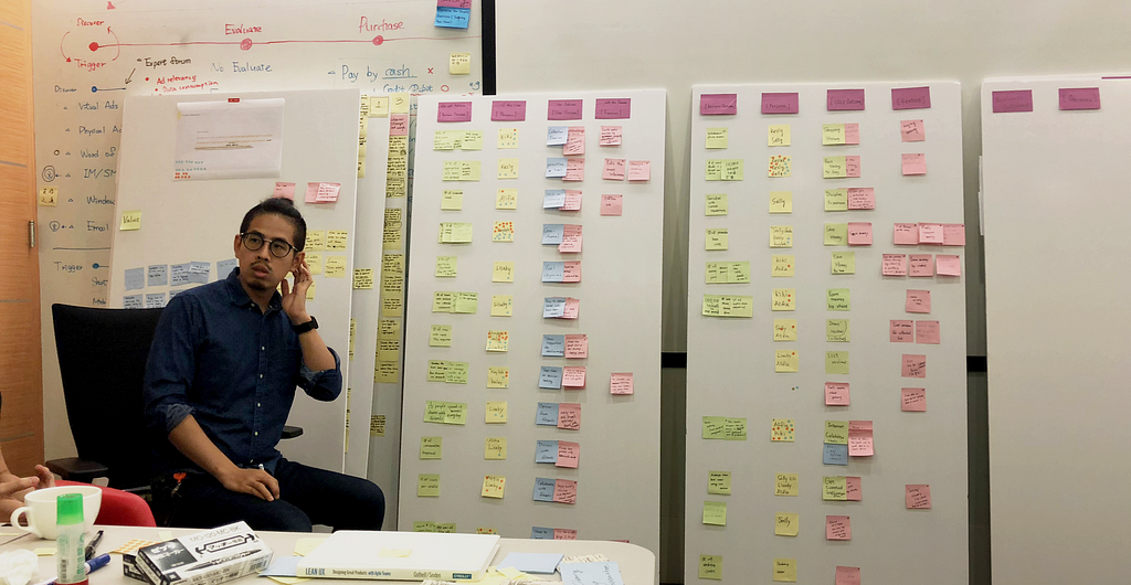
Too much to do, but too little time. With so many different things going on, knowing how to prioritize effectively can be a real challenge. To have each member from different disciplines become familiar with the knowledge, we held a workshop to develop the problem statement and persona to represent what we have learned from our research.

Persona is a representation of a type of target users

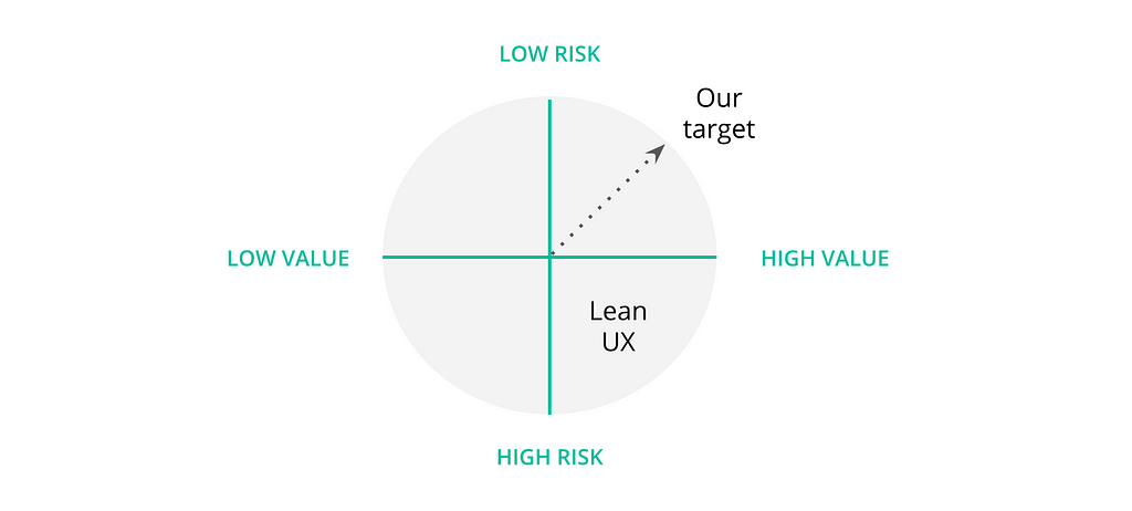
At the end of the workshop, the participants of the brainstorming session helped the team identify and assess risks and values as references to determine the exact location for each direction in the Risk/Value Matrix. “Save to wish list” was the one with the lowest risk but the highest value considering the limited time and resources, which was the different logic of Lean UX.

Risk/Value Matrix prioritizes the potential ideas, which Lean UX believes the higher the risk and the more the value, the higher the priority is to test first

The team believed that creating a cross-channel wish list tool for online shoppers could be valuable since it could track original product information and discover the relevant items tailored to their taste.

Assumptions to validate

We determined the direction. It is time to march forward. We invited representatives from all function teams to create hypothesis and assumptions. The workshop consisted of four parts, business outcomes, users, user outcomes and features. At last, we mapped all materials from those four aspects to create the feature hypotheses:

We believe this [business outcome] will be achieved if [these users] successfully achieve [this user outcome] with [this feature].
Cross-disciplinary workshop

Considering the persona, we prioritized and chose three hypotheses via risk prioritization matrix. To speed up the validation, we decided three most essential and developed surveys with storyboards accordingly to verify, which were “universal wish list,” “organized wish list” and “social wish list.”

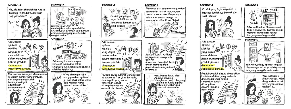
Left to right: Universal wish list, Organized wish list, and Social wish list

The result revealed that the high demands for the first two ideas but the last one required further validation for the potential needs. Out of our expectation again, how Indonesians used screenshots was still the highlight of the survey results.

The screenshot was the existing and dominant tool they got used to capturing everything beyond shopping needs.

Design & build prototype

With all the validated assumptions, we concluded to develop an app to help Indonesians make good use of screenshots as a quick, universal information manager across various online sources. Furthermore, they could get back to online sources through collected screenshots.

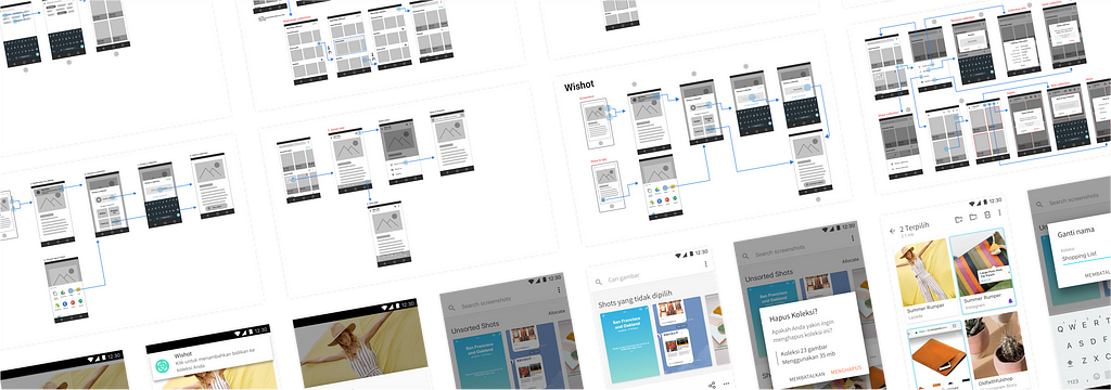
At that time, we have to make our ideas tangible for testing. After the collaborative workshop with engineers on the early design and continuous feasibility check, I used Figma, a collaborative design tool, to quickly develop fundamental information architecture and interaction details. By co-operating and referring to the evolving UX wireframe, everyone showed their capabilities simultaneously.

Collaborated UX spec via Figma

While Fang Shih, the UI designer, was busy with designing the look and feel into the visual spec, Mark Liang, our prototyper, was coding the infrastructure and high fidelity prototype with Frammer. Last but not least, Ricky Yu, the user researcher, took care of the research plan, recruiting and testing schedule in Indonesia.

Test & Iterate

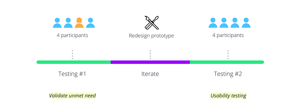
With everything prepared, we flew to Indonesia to meet the real users and listened to their inner thoughts. The research trip consisted of three sections. Among the eight recruited participants, the first four were interviewed for the validation of the unmet needs, which we put more focus on their screenshot behaviors, mental models. We took one day to iterate the design, then kept testing the rest participants for concept feedback, like the IA, usability.

Overview of testing

Each participant took various tasks for us to understand and learn their feelings, thoughts, and behaviors, such as demoing screenshots, prioritizing top features, etc. The entire research trip confirmed our observation about the screenshots to Indonesians:

“Almost everything I screenshot,” said one of our participants.

Shaping the product

As the answers from the interviews analyzed, their screenshot behavior and pain points gradually emerged in each step of the screenshot process, including triggering, storing, and retrieving.

Why did Indonesians like to screenshot?

Apps provided a better experience than websites, even better prices in some e-commerce apps. Screenshots was a quick and universal tool to grab information across apps. Besides, with the unstable, slow, and limited data plan, they were more inclined to capture online live through an offline screenshot instead of a hyperlink, which might cost forever loading.

What pain points did Indonesians have in storing and retrieving?

Handy screenshots led to countless images in Gallery, which caused users hard to locate the needed screenshot. Even though the screenshot was found, the static image did not provide any digital data for relevant actions in the smartphone — for instance; users had to memorize the info on the screenshot and search more relevant content again.

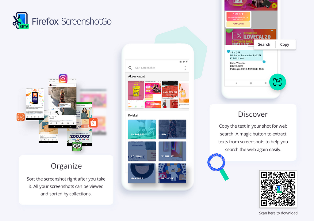
In conclusion, screenshots to Indonesians could be defined as a universal offline tool to capture information across various apps for further exploration online. However, they are looking for an app to find needed screenshots among numerous images readily and make good use of screenshots to explore related knowledge and content. The validated findings shaped the blueprint of Firefox ScreenshotGo — an Android app that helps Indonesians easily capture, manage screenshots and explore more relevant information.

As for how we measured the market size and launched the product, allow me to spend another post to cover the details.

Firefox ScreenshotGo is only available in Indonesia Google play store, but you can still install by following the instructions.

Why did Mozilla build Firefox ScreenshotGo?

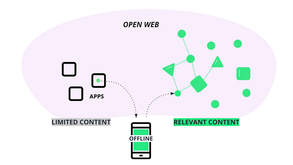
It is a great question! Here I would like to briefly talk about how we adopted Playing to Win to delve into the answer. The strategic narrative focused on fulfilling Mozilla mission. Users screenshotted their online life across app silos who offered limited or manipulated information. Mozilla targeted to encourage users to go back to the open web to search more linked content freely with those screenshots as bookmarks.

Strategic narrative

*Lean UX process is a cycle of four actions, starting with “Research & learning”, “Outcomes, assumptions, hypotheses”, “Design it” and “Create an MVP.”
**Playing to Win provides a step-by-step framework to develop a strategy.


A bumpy road to Firefox ScreenshotGo in a foreign market was originally published in Firefox User Experience on Medium, where people are continuing the conversation by highlighting and responding to this story.

04 Jan 01:48

Applying for a PhD program in visualization

by Nathan Yau

Niklas Elmqvist provides a detailed guide for finding and a visualization PhD program:

Unless you have a specific reason to choose a specific university (such as a geographic one; maybe you can’t relocate), don’t start from the university you want to go to, but start with the faculty member you want to work with. This is where all that idle web surfing experience can come in useful: you need to become an expert in finding faculty members that have research interests that match your own, and the only way to do so is to trawl their websites and read their papers.

And then applying:

Now, having identified some possible advisors (and don’t just pick one; you never know whether you will be admitted and whether they have funding to hire new students), you should reach out to them. In other words, don’t just apply, but send them an email with plenty of time to spare before the application deadline. Attach your CV, outline your background, and provide some of the above-mentioned commentary on their work and why you are interested in it (i.e., the “hook”). If you have a portfolio or website, link to it. Remember, no form letters!

Useful information here. You might also want to get a sense of flexibility in the department. I was two years into my PhD in statistics until I decided I wanted to go the visualization direction, which was a big switch from my original intentions of statistics education. Focus and interests tend to shift after you learn more.

Once you get into a program, see also my survival guide for avoiding burnout and finishing.

Tags: academic, PhD

04 Jan 01:44

✚ Avoiding D3, Using D3, and Why I Use D3

by Nathan Yau

D3.js can be used for a lot of things, and for some people it's too much to deal with. Read More

04 Jan 01:44

These tweets spark joy

by tychay

Marie has loved Marie Kondo since her book first hit the US four years ago, so of course last night we watched the first episode of her new show on Netflix.

This morning she’s been sharing with me these tweets.

“There is definitely something unique and fresh about Marie Kondo. That’s why she’s become so popular.” she said.

“I just hope that I continue to spark joy in your life,” I replied.

04 Jan 01:44

Why exercise alone won’t save us | News

mkalus shared this story from The Guardian.

This is the time of year when trainers are mined from under beds and gym kits are disinterred from the bottom drawer. Google searches relating to physical fitness peak in January. Many people even trawl the web to find out about “desk exercises” and “workouts on the go” in case they are too busy to use their new gym memberships.

Our relationship with exercise is complicated. Reports from the UK and the US show it is something we persistently struggle with. As the new year rolls around, we anticipate having the drive to behave differently and become regular exercisers, even in the knowledge that we will probably fail to do so. Why do we want to exercise? What do we expect it to do for us? We all know we are supposed to be exercising, but hundreds of millions of us can’t face actually doing it. It is just possible the problem lies at the heart of the idea of exercise itself.

Exercise is movement of the muscles and limbs for a specific outcome, usually to enhance physical fitness. As such, for most of us, it is an optional addition to the working day – yet another item on a long list of responsibilities alongside the fulfilment of parental duties or earning money to put food on the table. But because the principal beneficiary of exercise is ourselves, it is one of the easiest chores to shirk. At the end of the working day, millions of us prefer to indulge in sedentary leisure activities instead of what we all think is good for us: a workout.

Fitness crazes are like diets: if any of them worked, there wouldn’t be so many. CrossFit, the intensely physical, communal workout incorporating free weights, squats, pull-ups and so forth, is still less than 20 years old. Spin classes – vigorous group workouts on stationary bikes – have only been around for about 30. Aerobics was a craze about a decade before that, although many of its high-energy routines had already been around for a while. (The pastel horror of 1970s Jazzercise is probably best forgotten.) Before that, there was the jogging revolution, which began in the US in the early 1960s. The Joggers Manual, published in 1963 by the Oregon Heart Foundation, was a leaflet of about 200 words that sought to address the postwar panic about sedentary lifestyles by encouraging an accessible form of physical activity, explaining that “jogging is a bit more than a walk”. The jogging boom took a few years to get traction, hitting its stride in the mid- to late-80s, but it remains one of the most popular forms of exercise, now also in groups.

The exercise craze that dominated the 1950s was, oddly, not even an exercise. The vibrating exercise belt promised users could achieve effortless weight loss by having their midriffs violently jiggled. It didn’t work, but you can still find similar machines available for purchase today.

These fads even came with their own particular fashions – legwarmers, leotards, Lycra. So is our obsession with fitness doomed to be the stuff of embarrassing passing “phases”? Is exercise itself a fad?


It is not news that we are becoming more sedentary as a species. The problem has been creeping up on us for generations. As industry and technology solved the physical demands of manual labour, they created new challenges for the human body.

Evidence about bone strength and density gleaned from fossils of early humans suggests that, for hundreds of thousands of years, normal levels of movement were much higher than ours today. And the range of work required of the human body to subsist was sizeable: everything from foraging for food and finding water to hunting, constructing basic shelters, manufacturing tools and evading predators. The fossil record tells us that many prehistoric humans were stronger and fitter than today’s Olympians.

A hundred years ago, while life was easier than it had been for our hunter-gatherer forebears, it was still required that shopping was fetched, floors scrubbed, wood chopped and washing done by hand. Modern urban environments do not invite anything like the same kinds of work from the body. It is not easy to clock up those miles when cities are built to prioritise cars and treat pedestrians as secondary. We are not assisted by our environments to move like we used to, for reasons tied up with motivation, safety and accessibility.

Technological innovations have led to countless minor reductions of movement. To clean a rug in the 1940s, most people took it into their yard and whacked the bejeezus out of it for 20 minutes. Fast-forward a few decades and we can set robot vacuum cleaners to wander about our living rooms as we order up some shopping to be delivered, put on the dishwasher, cram a load into the washer-dryer, admire the self-cleaning oven, stack some machine-cut logs in the grate, pour a glass of milk from the frost-free fridge or thumb a capsule into the coffee maker. Each of these devices and behaviours is making it a bit more difficult for us to keep moving regularly throughout our day.

As we step through various innovations, we tend to think of the work that is no longer required as “saved”. Cleaning a rug once burned about 200 calories, while activating a robo-vac uses about 0.2 – an activity drop of a thousandfold, with nothing to replace it. Nobody, when they buy a labour-saving device, thinks: “How am I going to replace that movement I have saved?”

A great deal of energy is also saved in the kinds of work that we now do. Towards the end of the 19th century, the labour market began to change radically. Office clerks were the fastest-growing occupational group in the latter half of the period. The UK census of 1841 suggests that 0.1% of working people performed administrative or office work at that time. By 1891, the number had increased twentyfold, and only kept increasing. One recent US survey estimated that 86% of today’s workforce is in sedentary employment.

As a result of our leisurely lifestyles, our bones are thinner and our muscles weaker, and while these are not problems in themselves, they are part of the larger, fleshier story whereby the diminution of movement is shackling humans to the very biggest global killers. Heart disease and strokes are responsible for about 17 million deaths a year, according to the World Health Organization.

All-day activity trackers like the Apple Watch and the Fitbit (which is only a decade old this year) have attempted to make an intervention into this sandpit of sedentariness. Widespread use of wearables may be helping people to move more, but technology created this problem of sedentary work and leisure, and cannot solve it alone.

A 2015 report by the Academy of Medical Royal Colleges called Exercise – the Miracle Cure said that regular exercise can assist in the prevention of strokes, some cancers, depression, heart disease and dementia, reducing risk by at least 30%. With regular exercise, the risk of bowel cancer drops by 45%, and of osteoarthritis, high blood pressure and type 2 diabetes by a whopping 50%.

Exercise, in these terms, is not a fad, or an option, or an add-on to our busy lifestyles: it is keeping us alive. But before it can work for us, our whole approach needs to change.


As a result of the Miracle Cure report, doctors were urged to promote regular exercise among their patients. Humans obviously need regular activity, but the modern world strives to take exertion out of our lives. Modernity is characterised by imperatives to simplify, improve and maximise efficiency. In much the same way, medical bodies trying to motivate the population to exercise promise big results with the absolute minimum of disruption to our busy, seated lives.

Anyone researching exercise strategies this new year will find that the government recommends “at least 150 minutes of moderate aerobic activity such as cycling or brisk walking every week and strength exercises on 2 or more days a week that work all the major muscles (legs, hips, back, abdomen, chest, shoulders and arms)”.

If 150 minutes – or half an hour five times a week – is too much for you, and the data suggests that for most of us it is, another public health strategy promotes the efficacy of being active for just 10 minutes a day. Public Health England launched its Active10 campaign on the grounds that just 10 minutes’ brisk walking each day “counts as exercise” and “can reduce your risk of serious illnesses like heart disease, type 2 diabetes, dementia and some cancers”.

Even less time is required for high-intensity interval training (HIIT), which can involve bouts of just 20 seconds of intense effort a few times a week. It seems there is good evidence for the efficacy of very short bursts of strenuous anaerobic exercise, such as sprinting or cycling hard, followed by a brief recovery period. Interval training may improve insulin sensitivity and oxygen circulation, and increase muscle mass. But one of the early researchers into HIIT, kinesiologist Dr Martin Gibala, worried that despite its benefits, it required “an extremely high level of subject motivation”, because all-out exertion is unpleasant and can lead to dizziness, vomiting or injury. “Given the extreme nature of the exercise,” he wrote, “it is doubtful that the general population could safely or practically adopt the model.”

While all of these three modes of exercise are effective in different ways, and each has its proponents and committed followers, none is an all-round solution for a “fit” human body. But the problem is not really with the exercises themselves; it is what we tend to do in between those bursts of activity.

The health effects of being sedentary are as common and recognisable as they are serious. Anxiety, depression, heart disease, breast and colon cancer, type 2 diabetes, high blood pressure, obesity, osteoporosis, osteoarthritis and the leading cause of global disability, back pain, are all driven by sedentary behaviours.

For our bodies to function properly, they operate on the assumption that we will be burning calories throughout the day, and not in short bursts. It is clear that periods of sedentariness are bad for the human body, and some exercise is always going to be better than none; the issue is not really to do with the types of exercise, but with our approach to them and what we expect them to achieve. We know from the data that the human relationship with exercise is predominantly characterised as both optional and additional to an otherwise sedentary life, which itself causes a ton of problems. As long as physical activity is divorced from the real work of our lives, we will find reasons for not doing it.

No matter how low the institutional expectations for physical activity drop, more of us fail to meet them each year. A Public Health England survey last year found that people in England are becoming so inactive that 40% of those aged between 40 and 60 walk briskly for less than 10 minutes a month. The reasons are numerous, but they seem to be connected to our notion of exercise, and the difference between short bursts of running or cycling and low-level, sustained physical activity. If we go back to the beginnings of exercise, we can see why it is still so problematic for us today.


The rise of exercise is synonymous with the rise of leisure. We associate this with the start of the Industrial Revolution, but in fact it dates from much earlier. Once humans settled and began to build, several thousand years ago, hierarchies began to form, particularly in cities, as did the gap between master and servant. To be one of the elite meant others were doing the physical work for you. For the masters, there was time to fill, and into this space grew the idea of leisure. Exercise also emerges here, in the imbalance created in the spread of labour performed across a population. Ever since, we have seen a powerful link between exercise and inequality.

The wealthy men of ancient Greece, deprived of work by their slaves and with little else to do, invented a new place called the gymnasium, an open space in the city where they could strip off and gambol about naked, competing in made-up challenges to keep each other fit for war.

Later, the Romans also celebrated the value of exercise. Cicero, the Roman politician and lawyer, said: “It is exercise alone that supports the spirits and keeps the mind in vigour.” Pliny the Younger, a writer and also a lawyer, said: “It is remarkable how one’s wits are sharpened by physical exercise.” Like their Greek gym buddies, these men were privileged and wealthy. They understood that even though the slave class did their work for them, exercise and physical activity were essential for a long and sane life.

After the Greeks and Romans, exercise all but disappeared from western culture. It didn’t resurface properly until the 18th century, when inactivity became a problem for a certain class of gentleman. In 1797, the Monthly Magazine announced a new patent for Francis Lowndes’ Gymnasticon, the earliest of the static exercise machines – a frame in which the user sat, turning a spindle with his arms and operating a treadle with his feet. The article noted that “when peculiar or sedentary occupations enforce confinement to the house, it promises to be equally useful to the healthy as to the sick. The merchant, without withdrawing his attention from his accounts, and the student, while occupied in writing or reading, may have his lower limbs kept in constant motion by the slightest exertion, or, the assistance of a child.” The handle on the contraption’s lower spindle was arranged so that, if desired, a child could be employed to turn the wheel, to save the user valuable energy.

In the early 20th century, calisthenics became popular among people with limited means of expending physical energy. In the opening pages of EM Forster’s Howards End, from 1910, we are introduced to the Wilcox family as they come and go in their country-house garden. They are “new money”; they see the world instrumentally, and are mostly allergic to it, too. A visitor reports the scene in a letter: “Then Evie comes out, and does some calisthenic exercises on a machine that is tacked on to a greengage tree – they put everything to use – and then she says ‘a-tissue,’ and in she goes.” Like inactivity, hay fever only seemed to afflict those higher up the social scale.

In 1831 the Journal of Health defined calisthenics as “a reasonable, methodical, and regular employment of the exercises best calculated to develop the physical powers of young girls, without detriment to the perfecting of the moral faculties”. Its adoption was necessary because “young girls have not the same freedom as boys in their outdoor exercise, and their customary amusements and occupations, when not at school, are of a more sedentary nature”.

Since our modern way of life denies many of us the physical exertion that kept our ancestors healthy, one way to gain social capital is to add it back in.

Any kind of communal exercise gives us a sense of belonging, of shared values and endeavours, aside even from its more general physical and mental benefits. When people gather together in a gym or in an exercise class, at least one aspect of what they are doing is joining together in a civic activity that ensures their collective survival, just like the ancient Greeks before them.


If being fit promotes long life, you might expect being an elite athlete to help you reach a ripe old age. It doesn’t. Olympians buy themselves an extra 2.8 years on average, according to a 2012 study. Devoting your life to sport and exercise will buy you more time, but once you factor in the Olympians’ lifelong sustained attention to diet and healthy living, as well as tens of thousands of hours spent training, 2.8 years might not really seem sufficient recompense.

Instead, the fittest and healthiest people on the planet have never been to a gym. These people, who report high levels of wellbeing and live extraordinarily long lives, inhabit what have been called “blue zones” – areas where lifestyles lead to peculiar longevity. The term was coined by two demographers, Gianni Pes and Michel Poulain, who, while collecting data on clusters of centenarians on the island of Sardinia, identified places of especially high longevity on their map with a blue felt-tip pen. Because clusters of long-lived people are often found in geographically remote places (also including parts of Okinawa, Costa Rica and Greece), jackpot genes seem like a strong candidate to explain their longevity. But a famous study of Danish twins has concluded that a long life seems to be only “moderately heritable”. Over the years, many studies have looked at the lifestyles of people in “blue zones” and found that a number of their customs and habits contribute to a long life (everything from a sense of belonging and purpose to not smoking, or eating a predominantly plant-based diet). In the list of contributory factors, there is a noticeable absence of exercise.

I travelled to Sardinia to meet Pes and find out more about his work. He has a vested interest in longevity. His great uncle was a supercentenarian (living beyond 110). The years that Pes is interested in finding out more about are the good ones, not those spent with 24-hour care in a nursing home (there are also none of these in Sardinia’s blue zones). A trial by a group of gerontologists based at Boston University reported that 10% of supercentenarians made it to the final three months of their lives without being troubled by major age-related diseases.

In my conversation with Pes, he repeatedly stressed that while diet and environment are important components of longevity, being sedentary is the enemy, and sustained, low-level activity is the key that research by him and others has uncovered: not the intense kinds of activity we tend to associate with exercise, but energy expended throughout the day. The supercentenarians he has worked with all walked several miles each day throughout their working lives. They never spent much time, if any, seated at desks.

Pes has recently been studying workers in one of the island’s regions of longevity, Seulo (population around 1,000). He discovered one group of women who had spent their working lives seated, but nonetheless reached a great age. They had been working treadles (pedal-powered sewing machines), which meant they had regularly burned sufficient calories to derive the longevity benefits of remaining active. (Lowndes’ Gymnasticon, which works like a treadle, is starting to look a little less ridiculous as a solution for sedentary workers.)

For all the trillions invested in healthcare year on year, there are regions in high-income nations (such as the UK and the US) where life expectancy is still as low as it was in the mid-60s. In Tower Hamlets, one of the poorer parts of London, men can only expect an average of 61 years of good health – and women just 56.

So far, researchers agree that sustained periods of low-level activity seem to work well. Aiming for 10,000 steps a day is a good idea, but 15,000 better resembles the distances likely covered by our prehistoric ancestors, and indeed by those Sardinian centenarians.

For those of us who can’t move to Sardinia and become a shepherd, a review published in the Lancet in 2016 found that “high levels of moderate-intensity physical activity (ie, about 60-75 min per day) seem to eliminate the increased risk of death associated with high sitting time”.

So even if we go to the gym on a Saturday morning, our absolute inactivity at other times can still be damaging to the body. Low and moderate activity for longer or sustained periods seems to produce the best results. It looks like excessive high-intensity activity (the kind we see in elite athletes) drives metabolism and cell turnover, and may even, when all factors are taken into account, accelerate the ageing process.

As those all-day activity trackers continue to mature into their second decade, they will no doubt find better ways of encouraging us out of our chairs. At the moment, though, they can only count the things we have done, not the opportunities for movement we have missed. They make us more likely to be attentive to our activity than our inactivity.


After two centuries of trying, we should accept that exercise is not working as a global fitness strategy while it remains an addition to the working day. In the long view, it is starting to look a lot like a fad. Government guidelines in the UK and other countries that encourage sport and exercise are failing. These strategies struggle because we are trying to get people to give up what little leisure time they have to pursue activities that require substantial additional effort.

Perhaps instead we should encourage people to make the kinds of daily decisions that result in a healthier life. What is needed are the kinds of strategies that would make exercise unnecessary. Urban planning that better addresses the outdoor experience and encourages movement would be a key part of this change. But on an individual level, we can think about returning a little of the friction that technology has so subtly smoothed out for us, and make it easy to get things done. Exercise becomes physical activity when it is part of your daily life.

A year ago, my car lease came up for renewal. I had been a driver for nearly 30 years, but after all the alarming research I had read about the impact of modern lifestyles, I could not possibly keep it. I now walk miles more than I used to. Without a car, getting to the gym involved a 70-minute round trip. By the time I had walked there and back, the workouts seemed less necessary, so I cancelled my membership.

I tried other things, too. I experimented with a standing desk, but I knew from Pes’s research in Sardinia that it is not sitting itself that is bad, but the inactivity associated with it. Standing in one place for hours is only marginally better than sitting there. The Gymnasticon is also making a comeback. Its new incarnation is the treadmill desk, which seeks to keep office workers permanently on the move. From a health perspective it seems superb, but it is hardly practical. Getting a less comfortable office chair would probably be as effective a strategy, making it less easy to settle into for long periods of immobility.

You don’t have to join a gym this year. The numbers tell us that exercise is not the solution to the problems associated with physical inactivity, for the simple reason that these two things are not opposites. The antidote is activity: to find and recover some of the movement that modern life has been taking from us for centuries.

Vybarr Cregan-Reid is the author of Primate Change: How the World We Made Is Changing Us, which is available to buy at guardianbookshop.com

• Follow the Long Read on Twitter at @gdnlongread, or sign up to the long read weekly email here.

04 Jan 01:42

All Picks Go to Heaven: Why Do Picks Change? (And Are Old Picks Still Good?)

by Reader Services
All Picks Go to Heaven: Why Do Picks Change? (And Are Old Picks Still Good?)

Here at Wirecutter, we make an effort to read every note you send our way. Over the years, the questions we’ve seen most consistently are about how we do our work. This new series aims to address those enduring questions.

Whenever we announce that we’ve updated one of our guides, we hear from people who are anxious to know if the old pick they own is still good. Don’t despair: In the vast majority of situations, we stand by our older picks. Our reviews are living documents that evolve and change as we learn new things about the types of products we recommend, and choosing new picks is a part of that process. Any pick we’ve recommended remains a decent option down the line—barring discovery of some hidden fault, which we’d tell you about. And if you’re ever unsure, just check the update box at the top of every revised guide or ask us.

To clear up some recurring concerns about former picks, we passed these reader questions along to several colleagues on the editorial staff and asked them to explain Wirecutter’s approach to making picks, common reasons why those picks change, and how you can find out about upcoming changes.

Is the old pick still good?

As a general rule, you should feel secure that our old picks are still good. They may not include the very latest features or be superior to more recently released models in the same category, but whenever we choose picks, we do so with an eye to selecting products we expect will last and provide enduring value. We don’t change picks to induce our readers to chase the latest products, and we don’t expect our readers to replace a previous pick with a newer recommendation just because it’s new.

In rare cases we change our pick because of issues that didn’t emerge during our initial testing process: a recall, a decline in manufacturing quality, or usability or quality concerns that crop up during our long-term testing. In those cases, we’ll explain the issue in the update box that sits below the headline of the review.

Why do your picks change?

We change our picks for several reasons: We’re accounting for new models, brands, or technologies that alter our opinion of what’s best in a given category, we’ve incorporated improved testing criteria, we’ve received reader feedback giving us new insight into things we’ve already tested, or we’re making sure we recommend alternatives you can get if a pick runs into stock issues or is discontinued.

An illustration of a ribbon conveying newness

New products and brands

Our writers and editors stay up to date on new products and brands across all of our categories. We cover anything that looks like a promising contender as well as anything that our readers have told us they’d like to know more about. If our pick in a given category continues to test better than newer competition, it remains in place. But sometimes we find that new models or entirely new products from new manufacturers do a better job—and in those cases, our previous picks are no longer the best option for our readers.

For instance, when we first tested mattresses in 2016, senior editor Christine Cyr Clisset and senior staff writer Kevin Purdy found that the Casper Original was a great option. But in our most recent round of research, Christine said the Casper “didn’t compare well to some of the newer brands,” some of which weren’t around two years ago. The Casper Original is still as good as it was when we first tested it, and if it’s been working for you there’s absolutely no reason you should feel compelled to switch. Some of the newer mattresses have simply surpassed it in value and comfort.

An illustration conveying the high-tech feel circuitry

New technology

Sometimes new technology forces us to rethink the way we approach a product category, which is something senior staff writer Lauren Dragan (who has tested more than 1,000 pairs of headphones) has had to deal with while covering headphones for Wirecutter. “We used to recommend more wired headphones, but with fewer companies making phones with headphone jacks, that changes things,” Lauren said. Wired headphones still work great, and we continue to recommend them, but we do feature more wireless headphones in our reviews than we did a couple of years ago.

Other categories have more aggressive—and often unpredictable—product-release cycles. “In the case of TVs, it’s kind of a problem related to the timing of product releases,” explained senior editor Grant Clauser. “‘X’ TV is the best until Samsung gets around to releasing ‘Y’ TV.” In these categories, we continually revisit our reviews and update them to reflect the current models as they’re released.

But newer doesn’t always translate to better, and newer models don’t automatically replace a current pick. “The primary reason [we test new models] is to keep people informed,” said Michael Berk, executive editor. “Is the newer thing actually better? If not, we do keep older models as picks until they disappear.”

And even if we do change a pick to something newer and better, that doesn’t mean you need to replace your old model. As Lauren notes, “Sometimes, it might only be one aspect that’s improved, like sound, or connection, or microphone—and the reader might find they don’t care about that particular aspect.”

An illustration of a brian on the lest and circuitry on the right

We’ve reevaluated our thinking

Although we do a lot of research and testing before we publish a review, we continue to learn more about the product category, talk to new expert sources, and hear different perspectives from our readers well after we’ve published it. Our staffers also continue to test our picks in their homes, so we can see how they hold up over time in real-world use. We consider all of this information to better evaluate what’s truly important to most people in a category, be it price, materials, or aesthetics.

This process recently led Christine to reexamine her approach to evaluating mattress toppers: “We’ll be switching our mattress topper picks because we now think it’s worth spending more to get a more comfortable or long-lasting topper—whereas before, experts that were probably biased told us not to spend over $150. Now we think it’s worth spending up to $300 if your mattress is still supportive.”

An illustration of dialogue callouts signifying reader feedback

Reader feedback

Feedback from readers is also an important factor in our deciding if something should remain a pick. Grant leaned heavily on reader feedback for the most recent update to our smart-lock review. “We’ve been recommending the Kwikset Kevo for a long time, but it’s gotten a bad reputation [for usability] in user reviews and in our comments,” he said. After taking the usability feedback into consideration, we replaced the Kwikset with the much more foolproof Yale Assure as our new top pick.

Christine has used reader feedback to reevaluate picks as well. “If we see an uptick in bad user reviews for our pick, we’ll pull it as a pick,” she said. After multiple reader reports of poor service, Christine and her team stopped recommending Joybird in our online sofa review.

An illustration of up and down arrows to signify product stock issues

Stock issues and discontinuations

If retailers aren’t able to keep a product in stock and our affiliate team can’t find a reliable source, our editors look into replacing it with a more readily available alternative. We had this happen in our comforter review with the Snowe Down Comforter, which is no longer a pick. We liked the Snowe a lot, especially for the price, but it was frequently backordered, making it tough to recommend for most people. Sometimes products are temporarily out of stock because of hitches in distribution, but other times a continued lack of availability can mean something is about to be discontinued. We check into these situations and change picks if necessary.

Christine said that stock issues are especially common with home goods. “That’s happened a lot with towels and blankets for us,” she noted. “We do try to feature picks that come from retailers that we’re reasonably confident in keeping good stock—but we can’t control it. Even big retailers (hello, Target) can be very bad about this.” The Target Threshold Gauze Bed Blanket would still be a pick in our blankets review if Target hadn’t discontinued it. (If you’re reading this, Target, please bring it back.)

How can I find out if a pick is changing?

You have a few different ways to know if we’re expecting to make new picks in a review. You can look at the update box at the top, read the “What to look forward to” section at the bottom, or just send us a message and ask.

A screenshot of wirecutter's blue updates box in our Baby Monitors guide.
A screenshot of a red update box in wirecutter's Smart Thermostat guide.

Check the update box

At the top of every revised guide is an update box that we use to announce any recent or upcoming changes to the guide. These update boxes are maintained by our updates team, an arm of our editorial department that is dedicated to ensuring that the links and information in our reviews are up to date and relevant. The update box is color-coded to help bring attention to updates we think are especially relevant to our readers. Blue signifies the review has received a major update, which usually means we have new picks. Red signifies an issue with the review and serves to warn our readers of problems—product recalls, data breaches, and the like.

Read the “What to look forward to” section

The “What to look forward to” section is in the latter half of most of our guides. This is where we list new models that are on our radar for the next round of updates but that we have not had a chance to test yet. If you’re curious to hear our take on a recently released model, look there. We tell you everything we can confidently say about it without having tested it, and we also try to give you a sense of how soon we plan on testing it.

Reach out to us

Don’t see the answer to your question in the review? Just want to double-check that a former pick is still okay? Reach out to us on Twitter or Facebook, leave us a comment, or send us a message. We respond to as many messages as we can, but even if we’re not able to get back to you immediately, we’ll see that you’re looking for updated information and can let our updates team and editors know. If you have any questions or ideas on how we can better inform you of changes in the future, send us a message about that as well. We’d love to hear your thoughts.

04 Jan 01:42

Rogers Fido increase cost of $60/10GB BYOD promo plans by $5

by Sameer Chhabra

Toronto-based national carrier Rogers is increasing the cost of the Christmas 2017 $60/10GB bring-your-own-device (BYOD) promotion plan. As of January 3rd, 2019, the plans will now cost $65-per-month.

The price increase also affects Fido subscribers who signed up for the promotional offer.

Subscribers will still have access to a 10GB mobile data bucket, unlimited nationwide calling and global messaging, as well as features and services like Roam Like Home, Fido Roam, Fido XTRA and Five Extra Hours of Data.

“We regularly review and adjust our plans to reflect ongoing network and service investments so that we can continue to deliver the best possible customer experience,” said a Rogers spokesperson, in an email to MobileSyrup.

“This promotional plan remains one of our most competitive and continues to offer great value.”

Subscribers affected by the rate increase should begin receiving bill notifications today. Affected subscribers will also notice the price increase on their first bill on or after February 4th, 2019.

The $60/10GB promo plan is a month-to-month, non-fixed-term contract, which is subject to price changes.

The promotional offer is widely regarded as a response to Freedom Mobile’s ‘Big Gig’ rate plan overhaul in October 2017, when the Toronto-based regional service provider expanded its offering to include 10 rate plans.

In response, Canada’s three largest carriers — Rogers, Bell and Telus, respectively — as well as their flanker brands offered 10GB of monthly data for $60.

As a result of the $60/10GB promo plans, Freedom Mobile experienced “record disconnects,” with Bell ultimately winning the holiday promotional battle.

MobileSyrup has reached out to Bell and Telus for comment. This story will be updated with a response.

The post Rogers Fido increase cost of $60/10GB BYOD promo plans by $5 appeared first on MobileSyrup.

04 Jan 01:41

Apple hat überraschend eine Gewinnwarnung rausgehauen. ...

mkalus shared this story from Fefes Blog.

Apple hat überraschend eine Gewinnwarnung rausgehauen. Begründung:
the unforeseen “magnitude” of the economic slowdown in China
Der Markt reagierte wie üblich: Mit Panik.
Trading in the company’s shares was temporarily halted
Und zwar nicht nur bei Apple!
Apple’s shock downgrade has sent shares in European-listed companies with exposure to China – from Burberry and the Gucci owner, Kering, to chipmakers and miners – tumbling over fears the slowdown that has hit the Silicon Valley giant is set to spread.
Aber ist nicht alles negativ:
Hintergrund scheint der Angriff des chinesischen Konzerns Alibaba auf den globalen Onlinehandel zu sein.
Die Russen k… äh Die Chinesen kommen!!1! Und wollen Zalando kaufen (gerüchtet es)!1!!
04 Jan 01:41

Surface Studio 2 ab 7. Februar im Handel :: Vorbestellungen jetzt

by Volker Weber

Surface Studio 2 7

Auf meinem Schreibtisch steht ein 27" iMac von 2011, den ich 2015 auf SSD umgerüstet habe und den immer noch gerne benutze. Der hat immerhin schon zwei mal vier Jahre auf dem Buckel So ein Surface Studio täte sich an gleicher Stelle auch gut machen, aber das entspricht eigentlich nicht mehr meiner Art zu arbeiten. Lieber habe ich einen Bildschirm in etwa 40 cm Entfernung als in 80 cm. Da brauche ich keine Brille. Und dann diese (Listen-)Preise, immerhin mit MWSt:

  • 16 GB RAM | 1 TB SSD | Intel Core 7. Generation i7-7820HQ | NVIDIA GeForce GTX 1060 6 GB | Windows 10 Pro | Preis: 4.149 €
  • 32 GB RAM | 1 TB SSD | Intel Core 7. Generation i7-7820HQ | NVIDIA GeForce GTX 1070 8 GB | Windows 10 Pro | Preis: 4.999 €
  • 32 GB RAM | 2 TB SSD | Intel Core 7. Generation i7-7820HQ | NVIDIA GeForce GTX 1070 8 GB | Windows 10 Pro | Preis: 5.499 €

Microsoft fackelt gar nicht lange mit Entry-Level-Konfigurationen rum. Vorsicht: Nicht die alte Version kaufen, die sieht zwar cool aus, hatte aber keine angemessene Ausstattung.

04 Jan 01:40

Bell’s Crave app streams only in 720p on ‘most devices’

by Patrick O'Rourke
Crave

Although I’ve been impressed with Bell’s revamped Crave streaming video platform and its new ‘Crave + Movies + HBO’ tier, it seems the service suffers from resolution-related issues.

Bell has confirmed to MobileSyrup that with the 4th-generation Apple TV, including the 4K version of the set-top box, Crave content streams in full 1080p HD (1920 x 1080 pixel resolution).

That said, this isn’t the case with every platform the service is available on, according to Bell. The company states that 720p (1280 x 720 pixel resolution) is the best quality video resolution when it comes to “most devices.” This means that Crave is locked to 720p with iOS, Android and the Xbox One. Further, the platform lists this limitation in its ‘Frequently Asked Questions section.’

Bell says that Full HD playback is part of the platform’s future plans, but that there isn’t a specific timeline for when the resolution will be broadly available across every platform.

Additionally, the company says that 4K playback is also a part of its roadmap, a fact MobileSyrup reported a few weeks ago.

Locking content to 720p on most platforms is strange decision on Bell’s part given 1080p is now widely regarded as the standard resolution for modern video content. It’s even more strange given that competing services like Netflix offer some content in 4K for an additional fee.

The post Bell’s Crave app streams only in 720p on ‘most devices’ appeared first on MobileSyrup.

04 Jan 01:39

Bad Blood: Secrets and Lies in a Silicon Valley Startup

Bad Blood, in my opinion, should be the book of the year for 2018. Written by John Carreyrou, the book chronicles the fall of Theranos, a once beloved Silicon Valley darling, whose at its peak, commanded a valuation of about $9B, making its founder, Elizabeth Holmes, a Standford dropout, one of the self-made billionaires in Silicon Valley. Elizabeth, who owned more than 50% of the company, according to Forbes was worth approximately $4.5B.

In the book, John laid account of how Ms Holmes lied to her board, investors and the general public about a breakthrough in laboratory testing that her company, Theranos, had pioneered.

Theranos claim to fame was a small medical device that the company claimed could conduct more than 100 laboratory test from blood gotten from the prick of a finger. This is amazing and a feat in medical sciences, considering these kinds of test were always conducted from blood gotten from the vein. Theranos claimed it developed a medical device called “Edison,” later miniLab with codename “4S,” a node to Steve Job’s iPhone 4S, a man she had come to admire and idolize. The miniLab was an improvement to the first version, Edison.

The major problem here was that these devices didn’t work. Instead, Theranos used commercial analyzers from Seimens for the analysis. Nothing at Theranos worked. Everything was a big, fat scam. Her flagship products, Edison and miniLab, probably worked 2 out of every 10 attempts. This was in no way acceptable.

With a treasure chest, the size of the annual budget of some African countries and a ballooning valuation, the company employed some of the best legal hands to chase and intimidate anyone that was going to uncover its wrongdoing. With the company breaking medical ethics, its sharp practices did put some of her staff, whose conscience wasn’t seared at a crossroad. This led to a couple of people leaving and the overall employee turnover wasn’t encouraging. To put things more succinctly, anyone that challenged the practices of the company was shown the door. Not before they were made to sign an iron-clad non-disclosure agreement.

The most fascinating part of Theranos was the calibre of investors the company had managed to assemble. The firm counted Rupert Murdoch, the chairman of NewsCorp as one of its investors. The Australian-born American media mogul, famous for dabbling into tech investments and one-time owner of the now-defunct MySpace invested about $125m into the company. Mr Murdoch once turned a $150,000 investment in Uber into $50m so Theranos wouldn’t be his first, I suspect it wouldn’t be his last either. Aside from Murdoch, Theranos counted Carlos Slim, the Mexican telecoms tycoon and billionaire as one of her investors.

Theranos, to its credit, was able to get Walgreens and Safeway in bed. It was unsurprising for Ms Holmes to have pulled such an epic partnership. I mean, who will doubt a company that counted Richard Kovacevich, former Wells Fargo CEO and chairman, James Mattis, later US Secretary of Defense as some of its board members. Walgreens paid $100m in what it termed “innovation fee” and another $40m loan to Theranos. Safeway, on the other hand, spent about $350m, putting together what it called wellness centres; a mini physician centre that doubles as in-store laboratories that will run exclusively on Theranos devices. With ailing revenues, Safeway believed this was going to be a way to help the company bolster its fortunes. This assumption couldn’t be further from the truth.

It’s not surprising to see how Ms Holmes and her COO, Sunny Balwani, was able to fool everyone, including top government officials. She was touted as the next Steve Jobs. Her charismatic personality and an unusually deep voice only help in creating a larger than life aura around her. She has been called a once-in-a-generation genius and has been compared with Newton, Einstein, Mozart and Leonardo da Vinci.

I had mixed emotions reading Bad Blood. These emotions ranged from pure anger, disgust and a douse of excitement. Anger because of the heavy-handed tactics they used in running the company. Disgust at the bald-faced lies Elizabeth, in the company of Sunny, the firms COO told even in the face of overwhelming evidence. Excitement, when the former staff of Theranos came forward to corroborate stories that came from a tip John got.

As you leaf through the book, John made it super difficult if not impossible to put the book down. Every chapter has its own theme, somewhat close to watching a crime series. You want to know what happens next. What new revelation was made? Who is getting the axe next? I am not one to sit still so long on a particular book, but I read the first 9 chapters of this book in one sitting.

John is a master storyteller and Bad Blood is a scintillating read. It will keep you on the edge as you go from chapter to chapter. If there is one word to describe the account in this book, it will be chilling.

Thank you, Seyi Taylor, for pushing me to read this book. I now understand what you saw in it.

03 Jan 22:25

Capacity building and scaling a participatory approach

by Chris Corrigan

On the Art of Hosting email list last month, there was an inquiry posted by Monica Nissén asking about scaling the Art of Hosting as a leadership practice through levels of engagement. By “Art of Hosting” Monica means the four fold practice, which is the basic framework for leadership that gives our community a coherent centre of practice, around presence, participation, hosting others, and co-creation.  Monica asked whether hoping these practices would just go viral in a networked way is enough, and I replied with the following, tracing a couple of long term projects I have been involved in that have supported systems change in child and family services in British Columbia.

It’s definitely deliberate and networked. For me, it’s about building capacity. Our biggest work the last 9 years has been providing the Leadership 2020 program to social service workers in British Columbia working with children, youth and families in agencies, indigenous communities and government.

(You can read a summary of our five year evaluation of this program here)

We continue to developmentally evaluate as we go, and as a result, each cohort is different, each curriculum is slightly changed and we find new and more relevant ways to introduce people to this practice.

The basis of that program is a leadership approach that is very similar and deeply informed by what we in the Art of Hosting community know as the four-fold practice: that great leadership is personal, practice-based, participatory and perceptive. The program is structured in cohorts made up of people that have to apply. We mix “legacy” leaders with experienced and emerging leaders to show that learning never ends. Each cohort participates in two 5 day residencies – which are basically extended Art of Hosting workshops – and a nine month program of learning in between, featuring webinars and coaching and peer support for the application of tools and methods.

Over the past eight years we have brought about 450 people through the program. While it’s about learning in participatory ways, the program has a kind of hidden agenda. We are very clear that, about every 20 years or so, the child welfare system in our province goes through a massive restructuring, often provoked by a crisis, but not always. We have always invited our participants to both practice their leadership on the issues that are immediately in front of them, but to do it in a way that builds their capacity to respond when that later transformation happens. We want them to be the first to run to the centre when the old system is dying, eager to use their capacity, relationships, and practice to create the new.

In these days, the system is now beginning that deeper transformation, and fortunately it hasn’t been preceded by a crises. Instead, the woman who founded the Leadership 2020 program, Jennifer Charlesworth, was appointed to a five-year term as the Representative for Children and Youth in British Columbia, a very powerful position that is independent of the government and that can make powerful recommendations about systems change, usually as a result of different issues or events.  Jennifer is bringing a collaborative approach to her work and to be successful in that, she is partly relying on the 450 Leadership 2020 graduates that are spread all through the system. There is a built-in capacity that is being invited into its biggest calling, reaching across traditional divides of indigenous/non-indigenous and government/community. Jennifer’s appointment to the position was received with widespread enthusiasm and optimism. We are hoping to see that the system is able to evolve faster with this capacity embedded in a way that is less painful than a collapse and transformation. 

Participatory practices have been used for a long time in the field of social work and child and family services. In 2003 I started working with David Stevenson to use Open Space, Cafe, Circle, and the four fold practice to begin to build an indigenous governance systems for child and family services in BC. Our colleagues Kris Archie and Kyla Mason, Pawa Hayupis and many other indigenous Art of Hosting practitioners came into and out of that work. Toke Moeller and Monica Nissen and Patricia Galaczy joined us to teach Art of Hosting to families and community members who were participating in that work: http://www.turtleisland.org/healing/healing-cousins.htm. Between 2003 and 2009 we did something important on Vancouver Island. We started something and then had to abandon it for a different form, because not every idea works. But David later took that work with him into his work in executive positions in government. Kris has now become the CEO of the Circle on Philanthropy and Aboriginal Peoples in Canada and Kyra has become an extraordinary executive director of Usma, a Nuu-Chah-Nulth agency on Vancouver Island. Pawa is currently doing her Masters of Arts in indigenous governance and she and David continue to offer Art of Hosting trainings locally, as do Caitlin and I. In each of these new settings capacity building for participatory leadership has been used.

Meanwhile, Jennifer and a small group of us began Leadership 2020 in 2011. It has taken 15 years of developing leadership at the grass roots level and seeing that leadership grow into positions of power that has allowed us to work with the system this way. There is capacity in BC now, hopefully enough to take the system through the changes that are now coming, the ones we have prepared for, the ones we are waiting for, the ones we are making, and the ones that will surprise us.

It takes courage, patience, time, power, stewardship, relationship, and community to do this work. It takes a common language and shared perspectives and it takes massive diversity and difference to build resourcefulness and resilience. It is costly, politically, emotionally and materially, and it is not easy work. It requires a fierce commitment to relationship and a willingness to be at the edge of safety, with one foot out into the dangerous world. You get uplifted, hurt, angry, and joyful. But it’s a long game and you cannot sacrifice the depth of the work for ease and comfort. And no one person or team can do it alone.

It is not enough to do some trainings and walk away. The viral network does not just magically appear. Beautiful workshop experiences are only useful for systems change if they are connected to power. It requires staying in.

I just realized a few weeks ago that, although I never intended to work in the field of child and family services, that this may indeed be my life’s work. It has been nearly 20 years since I first walked into Vancouver Aboriginal Child and Family Services to take on a job organizing their negotiations to become a “delegated agency” able to make decisions for and with indigenous children and families instead of government doing it. I think in that time I’ve learned a bit about what it takes to create the capacity in a large system that gives us a chance. That’s all I can say we’ve done at the moment, but I’m an optimist, so I live with the hope and gratitude that the legacy of the work we have done will make the world better for the kids who suffer the most in it.

03 Jan 22:25

Parks Board on Cycling: A Priority of No Priorities

by Gordon Price
mkalus shared this story from Price Tags.

“The truth about a city’s aspirations isn’t found in its vision,” confirms Brent Toderian. “It’s found in its budget.”

“Budgets,” confirms Sam Sullivan, “are the sincerest form of rhetoric.”

So when it comes to the priority that the Parks Board places on cycling, don’t bother with its plans or the commissioners’ affirmations.  Look to its capital plan, where you will find … almost nothing.

Here’s the 2019-22 capital plan.  Check page 36 for the Parks Board, where you will find in the chart $2.4 million for “skate &bike facilities/tracks” – a pittance in the scheme of things.  By comparison, the City will spend $3 million just for the Bute greenway and Helmcken-Comox greenway extension.

The highest priority, of course, should be the upgrading of congested and unsafe routes, and the need to connect with the City’s bike network that funnels tens of thousands of cyclists into the conflicted spaces of existing parks, especially Kitsilano and Jericho.  Instead, on the priority list for improved routes, the Parks Board has only Park Lane (1 on the map below).  It isn’t even within the park, just on its eastern boundary but under PB jurisdiction. It is a route designed to skirt the park, rather than enter it.

When Park Board staff are asked why there isn’t any money specified in the new capital plan for the Stanley Park plan, they typically respond that funds have already been approved.  It just needs political will and clear directions from the board – and that hasn’t happened.

On the map above, you can see the results: ambitious plans and projects – everywhere but in the green parts, the parks. The bike network, the separated routes, the system safe for 8 to 80-year-olds, it basically ends where we want to encourage people to get to and through without driving.

How does the Parks Board get away with this?

City/Park Board interface at Jericho Park


So what should be the priority commitments?  Here’s a list:

1) Kits Beach park from the north end of Arbutus to Balsam – a civic embarrassment and a gap in the Seaside Greenway

2) Stanley Park, with a prioritized list from the items identified in the approved and budgeted plan

3) Jericho  Park from Point Grey Road west, along or near the beach


Within Stanley Park:

1) The Coal Harbor entrance hub, with signage and marked paths  (which are already paved but do not permit bikes) to Park Drive and the Causeway protected paths

2) The path above the seawall, from Beach Ave to Ceperley Park, with sufficient space, and separation for people walking and people on bikes

3) A protected bi-directional path on Pipeline Road from Burrard Inlet to the Coal Harbour entrance hub, providing a return route from the eastern section of the Seawall path, and relieving congestion on the Seawall path to the west