I just shipped a tiny but really useful new feature to Datasette master: you can now add ?_where=sql-fragment on to the URL of any table view to inject additional SQL directly into the underlying WHERE clause. This tiny feature actually has some really interesting applications: I created this because I wanted to be able to run more complex custom SQL queries without losing access to the conveniences of Datasette's table view, in particular the built-in faceting support. The feature actually fits in well with Datasette's philosophy of allowing arbitrary SQL to be executed against a read-only database: you can turn this ability off using the allow_sql config flag.
Lorena hat heute dieses wunderbare Bild in unserem Circus auf Kaizala gepostet und ich nehme das gerne mal auf, um ihr EDC aufzuzählen. Immer nur meine Gerätschaften zu zeigen, ist ja auf die Dauer auch langweilig.
Nokia DT 901 (Fatboy) Qi Lader (in rot für 10 Euro!)
Lorena sagt, die Powerbank ist nur im Bild, weil sie farblich gut passt. Das iPhone XR halte so lange durch, dass man keine Powerbank braucht. Das Fonee findet nicht meine Zustimmung. Das ist ein billiger Chinakracher, der seine Versprechen nicht einhält. Ich empfehle die MiPow Powerbank, die sowohl das iPhone als auch die Apple Watch lädt, ohne dass man den Schlingel benötigt. Die Lapàporter iPhone-Hülle findet bei vielen Frauen spontane Zustimmung. Sicher ein schönes Ostergeschenk!
Some things are superseded by other and better things and I find it quite interesting that when this happens, it pretty much goes unnoticed. Let’s take for example 3.5″ disks. If you are old enough to remember, do you remember when you last used one?
I actually don’t remember, and using disks as part of my retro-computing hobby doesn’t count, so I can just try to reconstruct when 3.5″ disks went out of fashion for me. One data point I have is that my last computer that had a 3.5″ drive was a Pentium 4 based desktop PC that came with Windows XP. Windows XP was sold between 2001 and 2007 and I bought this computer around 2004 so that sets the general timeframe. 3.5″ disks that could hold 1.4 MB of data were superseded as a means of exchanging data with other people by CDs that could hold around 600 MB, rewritable DVDs with a capacity of 2.8 GB and later by Flash memory cards and USB adapters. My computer with the 3.5″ disk drive did have DVD read/write drives and USB ports so it was the ideal device for that transition.
The first time I can still remember having used Flash cards to exchange data was with my first 3G phone, the Sony Ericsson V800. I remember that even at the time it was using a somewhat uncommon Flash card standard by Sony, so a special USB adapter was required. But it did a great job of exchanging pictures between the phone and the PC. That was around 2005. I also had an HP Jornada 560 PDA with a CompactFlash slot and I remember that I also used that for data transfer to and from the PC. That was also in the 2005 timeframe.
So it must have been around 2005 that I stopped using 3.5″ disks for exchanging data. That’s almost 15 years ago. How time flies…
Scariest words today: “Daddy, am I wearing diapers?”, while we’re in the car. The little one has been practicing going without diapers at home, and when she asked I realised we went shopping without wearing a diaper. Back home she ran to the bathroom. Made it!
Several months ago I took on a new role at Mozilla, product manager for Firefox browser accessibility. I couldn’t be more excited about this. It’s an area I’ve been interested in for nearly my entire career at Mozilla.
It was way back in 2000, after talking with Aaron Leventhal at a Netscape/Mozilla developer event, that I first started thinking about accessibility in Mozilla products and how well the idea of inclusivity fit with some my personal reasons for working on the Mozilla project. If I remember correctly, Aaron was working on a braille reader or similar assistive technologies and he was concerned that the new Mozilla browser, which used a custom UI framework, wasn’t accessible to that assistive technology. Aaron persisted and Mozilla browser technologies became some of the most accessible available.
Thanks in big part to Aaron’s advocacy, hacking, and other efforts over many years, accessibility became “table stakes” for Mozilla applications. The browsers we shipped over the years were always designed for everyone and “accessible to all” came to the Mozilla Mission.
Our mission is to ensure the Internet is a global public resource, open and accessible to all. An Internet that truly puts people first, where individuals can shape their own experience and are empowered, safe and independent.
I’m excited to be working on something so directly tied to Mozilla’s core values. I’m also super-excited to be working with so many great Firefox teams, and in particular the Firefox Accessibility Engineering team, who have been doing amazing work on Firefox’s accessibility features for many years.
I’m still just getting my feet wet, and I’ve got a lot more to learn. Stay tuned to this space for the occasional post around my new role with a focus on our efforts to ensure that Firefox is the best experience possible for people with disabilities. I expect to write at least monthly updates as we prioritize, fix, test and ship improvements to our core accessibility features like keyboard navigation, screen reader support, high contrast mode, narration, and the accessibility inspector and auditors, etc.
Summary: This series outlines the process to diagnose, treat, and manage enterprise content debt, using Firefox add-ons as a case study. In Part 1 , I framed the Firefox add-ons space in terms of an enterprise content debt problem. In this piece, I walk through the eight steps we took to develop solutions, culminating in a new content model. See Part 3 for the deliverables we created to support that new model.
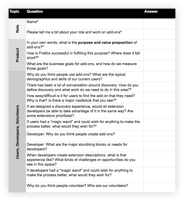
To determine a payment plan for our content debt, we needed to first get a better understanding of the product landscape. Over the course of a couple of weeks, the team’s UX researcher and I conducted stakeholder interviews:
Who: Subject matter experts, decision-makers, and collaborators. May include product, engineering, design, and other content folks.
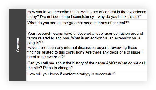
What: Schedule an hour with each participant. Develop a spreadsheet with questions that get at the heart of what you are trying to understand. Ask the same set of core questions to establish trends and patterns, as well as a smaller set specific to each interviewee’s domain expertise.
Sample question template, including content-specific inquiries below
After completing the interviews, we summarized the findings and walked the team through them. This helped build alignment with our stakeholders around the issues and prime them for the potential UX and content solutions ahead.
Stakeholder interviews also allowed us to clarify our goals. To focus our work and make ourselves accountable to it, we broke down our overarching goal — improve Firefox users’ ability to discover, trust, install, and enjoy extensions — into detailed objectives and measurements using an objectives and measurements template. Our main objectives fell into three buckets: improved user experience, improved developer experience, and improved content structure. Once the work was done, we could measure our progress against those objectives using the measurements we identified.
Step 2: Documenting content elements
Product environment surveyed, we dug into the content that shaped that landscape.
Extensions are recommended and accessed not only through AMO, but in a variety of places, including the Firefox browser itself, in contextual recommendations, and in external content. To improve content across this large ecosystem, we needed to start small…at the cellular content level. We needed to assess, evolve, and improve our core content elements.
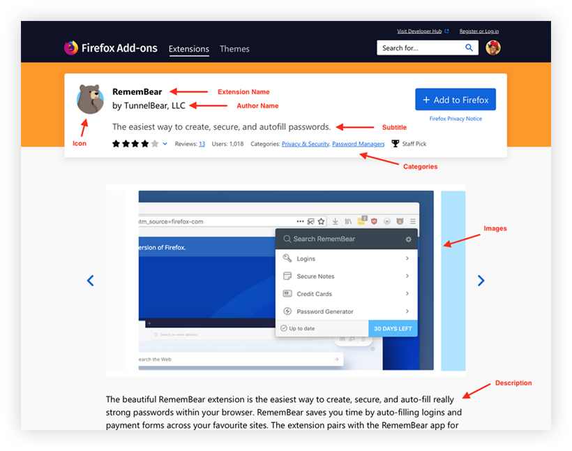
By “content elements,” I mean all of the types of content or data that are attached to an extension — either by developers in the extension submission process, by Mozilla on the back-end, or by users. So, very specifically, these are things like description, categories, tags, ratings, etc. For example, the following image contains three content elements: icon, extension name, summary:
Using Excel, I documented existing content elements. I also documented which elements showed up where in the ecosystem (i.e., “content touchpoints”):
Excerpt of content elements documentationExcerpt of content elements documentation: content touchpoints
The content documentation Excel served as the foundational document for all the work that followed. As the team continued to acquire information to shape future solutions, we documented those learnings in the Excel, evolving the recommendations as we went.
Step 3: Data analysis — content quality
Current content elements identified, we could now assess the state of said content. To complete this analysis, we used a database query (created by our product manager) that populated all of the content for each content element for every extension and theme. Phew.
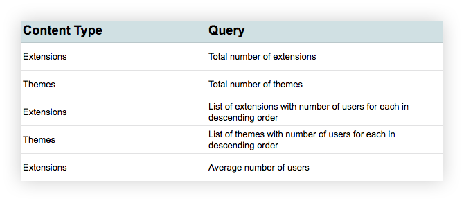
We developed a list of queries about the content…
Sample selection of data questions
…and then answered those queries for each content element field.
Sample data analysis for “Extension Name”
For quantitative questions (like minimum/maximum content length per element), we used Excel formulas.
For questions of content quality, we analyzed a sub-section of the data. For example, what’s the content quality state of extension names for the top 100 extensions? What patterns, good and bad, do we see?
Step 4: Domain expert review
I also needed input from domain experts on the content elements, including content reviewers, design, and localization. Through this process, we discovered pain points, areas of opportunity, and considerations for the new requirements.
For example, we had been contemplating a 10-character minimum for our long description field. Conversations with localization expert, Peiying Mo, revealed that this would not work well for non-English content authors…while 10 characters is a reasonable expectation in English, it’s asking for quite a bit of content when we are talking about 10 Chinese characters.
Because improving search engine optimization (SEO) for add-ons was a priority, review by SEO specialist, Raphael Raue, was especially important. Based on user research and analytics, we knew users often find extensions, and make their way to the add-ons site, through external search engines. Thus, their first impression of an add-on, and the basis upon which they may assess their interest to learn more, is an extension title and description in Google search results (also called a “search snippet”). So, our new content model needed to be optimized for these search listings.
Sample domain expert review comments for “Extension Name”
Step 5: Competitor compare
A picture of the internal content issues and needs was starting to take shape. Now we needed to look externally to understand how our content compared to competitors and other successful commercial sites.
Philip Walmsley, UX designer, identified those sites and audited their content elements, identifying surplus, gaps, and differences from Firefox. We discussed the findings and determined what to add, trim, or tweak in Firefox’s content element offerings depending on value to the user.
Excerpt of competitive analysis
Step 6: User research — what content matters?
A fair amount of user research about add-ons had already been done before we embarked on this journey, and Jennifer Davidson, our UX researcher, lead additional, targeted research over the course of the year. That research informed the content element issues and needs. In particular, a large site survey, add-ons team think-aloud sessions, and in-person user interviews identified how users discover and decide whether or not to get an extension.
Regarding extension product pages in particular, we asked:
Do participants understand and trust the content on the product pages?
What type of information is important when deciding whether or not to get an extension?
Is there content missing that would aid in their discovery and comprehension?
Through this work, we deepened our understanding of the relative importance of different content elements (for example: extension name, summary, long description were all important), what elements were critical to decision making (such as social proof via ratings), and where we had content gaps (for example, desire for learning-by-video).
Step 7: Creating a content model
“…content modeling gives you systemic knowledge; it allows you to see what types of content you have, which elements they include, and how they can operate in a standardized way — so you can work with architecture, rather than designing each one individually.” — Sara Wachter-Boettcher, Content Everywhere, 31
Learnings from steps 1–6 informed the next, very important content phase: identifying a new content model for an add-ons product page.
A content model defines all of the content elements in an experience. It details the requirements and restrictions for each element, as well as the connections between elements. Content models take diverse shapes and forms depending on project needs, but the basic steps often include documentation of the content elements you have (step 2 above), analysis of those elements (steps 3–6 above), and then charting new requirements based on what you’ve learned and what the organization and users need.
Creating a content model takes quite a bit of information and input upfront, but it pays dividends in the long-term, especially when it comes to addressing and preventing content debt. The add-ons ecosystem did not have a detailed, updated content model and because of that, developers didn’t have the guardrails they needed to create better content, the design team didn’t have the content types it needed to create scalable, user-focused content, and users were faced with varying content quality.
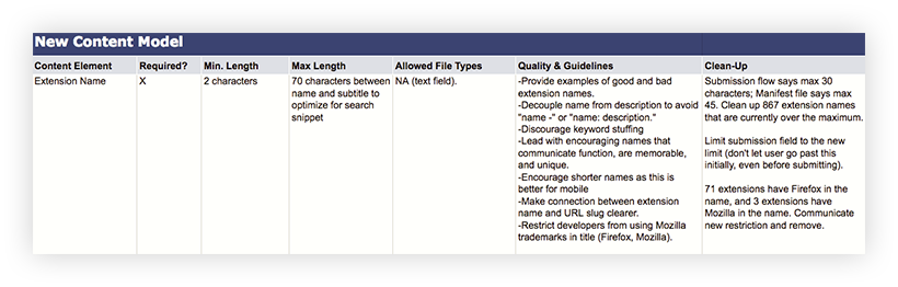
A content model can feel prescriptive and painfully detailed, but each content element within it should provide the flexibility and guidance for content creators to produce content that meets their goals and the goals of the system.
Sample content model for “Extension Name”
Step 8: Refine and align
Now that we had a draft content model — in other words, a list of recommended requirements for each content element — we needed review and input from our key stakeholders.
This included conversations with add-ons UX team members, as well as partners from the initial stakeholder interviews (like product, engineering, etc.). It was especially important to talk through the content model elements with designers Philip and Emanuela, and to pressure test whether each new element’s requirements and file type served design needs across the ecosystem. One of the ways we did this was by applying the new content elements to future designs, with both best and worst-case content scenarios.
Re-designed product page with new content elements (note — not a final design, just a study). Design lead: Philip WalmsleyDraft “universal extension card” with new content elements (note — not a final design, just a study). This card aims to increase user trust and learnability when user is presented with an extension offering anywhere in the ecosystem. Design lead: Emanuela Damiani
Based on this review period and usability testing on usertesting.com, we made adjustments to our content model.
Okay, content model done. What’s next?
Now that we had our new content model, we needed to make it a reality for the extension developers creating product pages.
In Part 3, I walk through the creation and testing of deliverables, including content guidelines and communication materials.
Thank you to Michelle Heubusch, Jennifer Davidson, Emanuela Damiani, Philip Walmsley, Kev Needham, Mike Conca, Amy Tsay, Jorge Villalobos, Stuart Colville, Caitlin Neiman, Andreas Wagner, Raphael Raue, and Peiying Mofor their partnership in this work.
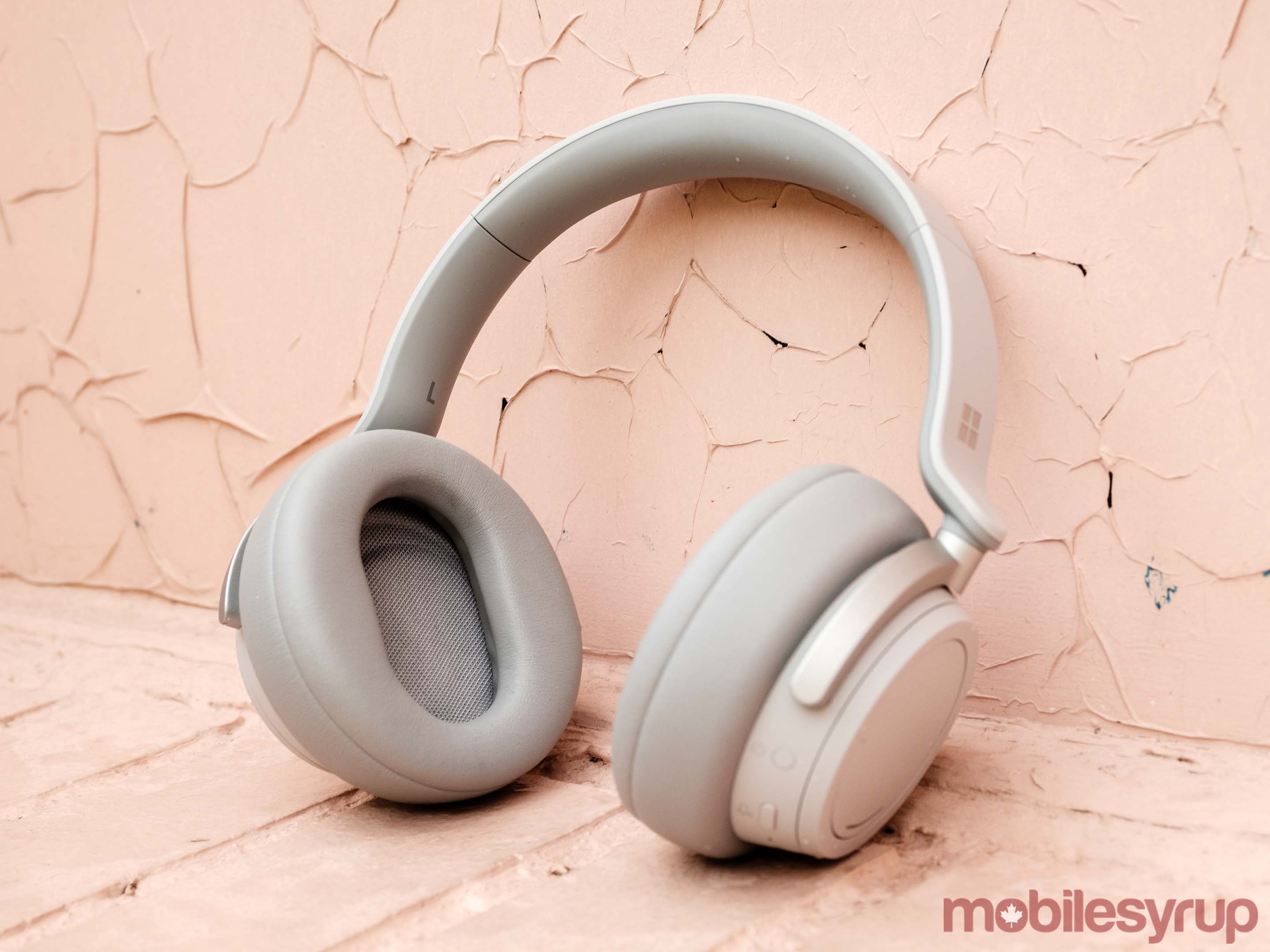
After an initial launch in the U.S., Microsoft’s first pair of noise-cancelling headphones, the Surface Headphones, are finally available to purchase in Canada. They join an incredibly competitive market dominated by old standbys like Bose and Sony.
Does the new kid on the block make a compelling case to pick its offering over the, frankly, excellent competition? The answer, as usual, is tricky.
For much of this review I compare the Surface Headphones to Sony’s WH1000XM3. I do this for two reasons.
First, of all the noise cancelling headphones on the market currently, I have the most experience with the WH1000XM3s. Second, by most accounts, the WH1000XM3s are among the best — if not the best — Bluetooth noise-cancelling headphones Canadian consumers can purchase currently.
With Microsoft pricing the Surface Headphones at $450 CAD, the same price as the WH1000XM3s, they need to be better than the best to be worth a recommendation.
Another classic design from the Surface team, with some annoyances
If you’ve seen any other Surface-branded devices recently, the Surface Headphones tread familiar ground.
At the moment, they’re only available in one colour, ‘light gray,’ (no handsome matte black colour just yet, alas). Like Microsoft’s Surface Pro and Surface Book 2-in-1s, the Surface Headphones feature solid construction throughout and generous use of premium materials. In particular, the headband, made from rubber, steel and high-quality plastic, stands out, as do the generous memory foam ear cups.
However, there are a couple of issues I found with the design of the Surface Headphones.
To start, at 290g, the Surface Headphones are heavier than both the Sony WH1000XM3s (255g) and Bose QC35 IIs (234g). They’re also more rigid than either of those two pairs of headphones. Taken together, I found these two factors made the Surface Headphones fussy to properly position on my head.
There was definitely a specific way I had to wear them on my head. If I wore them in any other way, they felt either unbalanced or uncomfortable. On the subject of comfort, I found the Surface Headphones less comfortable than other over-the-ear headphones I’ve used in the past. For example, where I can wear the WH1000XM3s for hours on end without issue, I find I have to take frequent breaks with the Surface Headphones. A lot of that has to do with the fact that they felt like they pressed down excessively on my ears.
Also noteworthy is that the Surface Headphones don’t collapse down into a more compact package. This makes them less finicky to take out and put away. Conversely, they take up more space when stowed in the included carrying case.
Despite the above design shortcomings of the Surface Headphones, I absolutely love one aspect of their design.
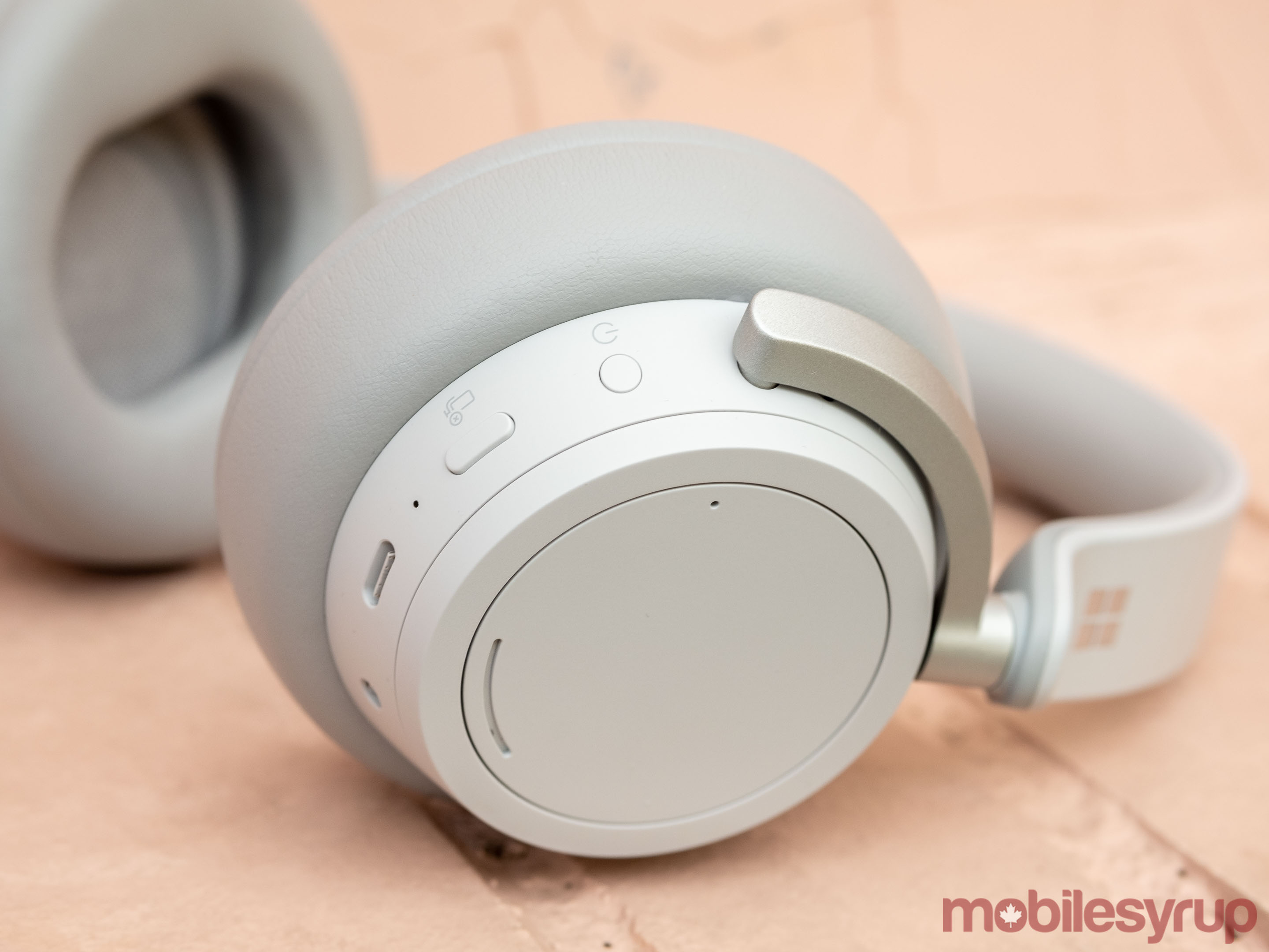
Each ear cup features its own dial. The left dial allows one to adjust the level noise cancellation (there are 13 levels to choose from), while the right dial allows one to adjust playback volume. The dials make it both fun and easy to precisely control just how much volume the Surface Headphones output and how much ambient sound they let through.
Best of all, they tie the two settings you’re most likely to access frequently to granular controls. I can’t stress enough how much better the experience of using a pair of noise-cancelling headphones is when you don’t have to rely on fussy touch controls — though the Surface Headphones have their share of those, too.
A single tap on the exterior of either the left or right ear cup pauses and resumes playback, while double and triple taps will skip forward or back to the next song. You can also tap and hold to decline an incoming call, as well as activate, depending on the device the Surface Headphones are paired with, Google Assistant or Siri. I found the touch controls on the Surface Headphones worked more reliably than they did on the WH1000XM3s — though they could still be temperamental at times.
Moreover, and this is a big positive, in the time I’ve been able to test them in cold outside weather, the Surface Headphones have worked consistently great. This is in major contrast to the WH1000XM3s, which in cold weather, start to function erratically.
Great, but not best-in-class performance
Microsoft promises 15 hours of battery life from the Surface Headphones. In some instances, this is significantly less than the competition; Sony says the WH1000XM3s can provide 30 hours of functionality on a single charge, while the Bose QC35IIs are rated to 25 hours on a single charge.
Practically, I found this meant I had to charge my Surface Headphones far more frequently than my WH1000XM3s. I haven’t had a chance to take them on a long-haul flight yet, but I imagine most people will want to have a backup power source on hand if a trip involves multiple flights and layovers. It’s by no means a deal breaker, but it does make them less convenient.
When it comes time to charge them, the Surface Headphones feature a USB-C port, which means you can easily charge them with any modern Android smartphone charger in a pinch. Moreover, in a nice touch, the charging cable Microsoft included with the Surface Headphones is a USB-C to USB-A cable, which makes it ideal for use on planes since it’s quite the ancient airplane that doesn’t have USB-A ports aplenty.
For the most part, the Surface Headphones do an excellent job of keeping ambient noise to a minimum. Using them daily in MobileSyrup‘s often rowdy office and on the subway, I was able to work and read in peace. In practice, however, I found their ability to cancel out noise a shade worse than the WH1000XM3s.
What’s more, the Surface Headphones have an Achilles heel when it comes to their noise-cancelling capabilities. Instead of cancelling out the noise of the wind, they amplify it, making whatever song or podcast you’re listening to currently sound like it was recorded without a dead cat over the microphone.
However, if there’s one major disappointment with the Surface Headphones, it’s that they don’t support advanced Bluetooth audio codecs like AAC, aptX or LDAC, nor does it appear as if Microsoft plans to update them to do so. Instead, all that’s here is SBC, which offers the most basic functionality and audio quality of all the currently available Bluetooth codecs.
In its defence, Microsoft says the SBC codec has improved significantly in recent years, and that unlike ACC, aptX and LDAC, which were developed by Apple, Qualcomm and Sony, respectively, it’s not a proprietary format.
All fair, but these are codecs competing noise-cancelling headphones like the WH1000XM3s support, and their inclusion would have made the Surface Headphones a better product.
It’s not that the Surface Headphones sound bad without these codecs, but I did find that they sound unimpressive at best and lifeless at worst. Ironically, this issue is compounded by the fact the Surface Headphones cancel out noise. With near silence to focus on a song, their audio shortcomings become all the more apparent.
As one example, listening to ‘Take The Power Back’ by Rage Against The Machine, the Surface Headphones display an impressive soundstage as Tom Morello’s guitar skitters distinctly between left and right channels.
However, once the rest of the band joins the assault, there’s a distinct lack of clarity to individual elements. In a word, everything sounds muddled. On songs that don’t feature immaculate production, the Surface Headphones perform worse, but they don’t do justice to even beautifully produced albums like Radiohead’s In Rainbows.
Elsewhere, the Surface Headphones perform significantly better. Watching movies and playing video games, I didn’t notice any latency issues. I have also yet to experience any cutout issues; in fact, if there’s something that’s especially impressive about the Surface Headphones, it’s that they’re absolutely tenacious when it comes maintaining a link to a source device.
In my 900 sq. ft condo, I’ve been able to leave my Pixel 3 in my bedroom, walk to the complete other side of the condo and continue listening to a song or podcast without issue.
Microphone quality was another highlight, with most people I spoke to over the phone noting that there was little echo when they listened to my voice.
If information outlined in a recently filed Apple patent actually makes its way to a commercial product in the near future, it looks like Face ID could be featured in future Mac devices. Further, the MacBook Pro’s not very useful Touch Bar could be coming to the tech giant’s Magic Keyboard.
Apple first ditched Touch ID and a physical fingerprint sensor with the iPhone X, forcing the company to come up with a different biometric authentication solution. The resulting system was Face ID.
According to 9to5Mac, the first patent for Touch ID was also filed back in 2017 for the Mac and not the iPhone. This particular patent describes a feature that allows a Mac in sleep mode to still look at the user’s face and automatically log them into the device. In a way, this sounds like an always-on version of Microsoft’s Windows 10 ‘Windows Hello’ authentication.
This new patent application, which was first reported by Patently Apple, describes a system that would utilize Retina scanning technology rather than a 3D map of the user’s face like with Face ID in the iPhone X, iPhone XS and iPhone XS Max and iPad Pro (2019). This could be an indication that Apple plans to change how Face ID operates with future versions of the iPhone.
Further, the patent application outlines the MacBook Pro’s Touch Bar being featured in a standalone keyboard. Apple also patented a similar keyboard design back in 2017. Given that the Touch bar hasn’t really evolved into a useful feature when it comes to the MacBook Pro, this is by far the least interesting tidbit of Apple’s recently filed patent.
Of course, as with all patents, there is a possibility that the technology outlined in these filings will never make its way into any of Apple’s products.
So I made a FOI request about James Dyson's farm and how his water reservoir was funded and guess who paid for it ladies and gentlemen? pic.twitter.com/qx5Ww9hIcf
Posted by
Otto_English
on Friday, April 12th, 2019 9:40am
Retweeted by
ottocrat
on Friday, April 12th, 2019 9:43am
Accidentally pulled out the wrong CD and put it on without looking. What I was expecting was Russian choral music; what I got was The Best of The Corrs, which brightened up lunch no end. Rachmaninov was good, but he was no Andrea Corr.
Posted by
redhistorian
on Friday, April 12th, 2019 1:00pm
I’ve seen at least at two studies which demonstrate that ‘gentrification’ does not necessarily lead to major displacement of poorer residents. But that goes against the dominant narrative, so is often not acknowledged – or it’s dismissed. Indeed, the meme that investment or development leads, ipso facto, to gentrification is spreading, most recently at the open house for the Kits Larch Street rental project:
Here’s another perspective from Jesse Van Tol, chief executive officer of the National Community Reinvestment Coalition:
In some communities, gentrification evokes instant distrust. It implies the arrival of selfish developers, investors and corporate chains replacing locally owned, independent businesses – and a flood of well-off white people who inevitably push out the poor black and brown people who were there before.
But for many neighborhoods, gentrification represents much-needed investment. Local residents welcome the resurrection and revival of neglected and disinvested areas. Community leaders desire capital investments, leading to better services, jobs, thriving businesses and other components of a healthy, vibrant neighborhood. As one resident of West Baltimore put it: “How can we get some gentrification in our community?”
It turns out both views are correct. Gentrification does not have to mean displacement – if the circumstances are aligned correctly.
…displacement of people of color in gentrified neighborhoods wasn’t uniform. For instance, Minneapolis had gentrification in 22 neighborhoods, but only one had indications of displacement. In Los Angeles, 73 neighborhoods gentrified, and there was displacement in 13 of them. The data showed displacement in just 22 percent of the neighborhoods that experienced an influx of new people and new money in the time period studied. The rest did not show displacement.
The notion that gentrification doesn’t always result in displacement may seem antithetical to some, because the term is often used as a synonym for displacement. In fact, if a neighborhood keeps the same number of housing units but has an influx of new residents, then displacement inevitably will occur. But in some places, it appears investment and economic revival are occurring without immediate displacement, suggesting some capacity for longtime residents to stay put and reap the benefits of increased property values – or the production of new housing or utilization of empty units.
The full column discusses many of the nuances and caveats involved, and comes from an American perspective. But it’s another indicator that ‘gentrification’ used as a NIMBY strategy often works against the interests of those who, with the right strategies, would benefit from development, amenity and growth.
For a tree-pollen allergy sufferer like me, spring is torture. Flowering trees are my kryptonite, and during peak bloom it feels like pollen stokes a six-week permasneeze from which there’s no reprieve until the end of June. (And since 2018’s Fourth National Climate Assessment suggests that increasing carbon dioxide means an earlier, longer pollen season and higher levels of airborne allergens, it might last even longer in the future.)
What to do if you’re suffering? Immunotherapy—getting shots that can help desensitize your immune system to an allergen—can help over time, but if you’re not ready for needle treatment, you can take a few other steps to minimize allergens’ effects inside the house. We talked to allergists to get their best tips for minimizing the effects of the most common outdoor and indoor allergens when you’re at home, from pet dander to dust mites.
Clear the air
For people who suffer from outdoor allergies to ragweed or grass, the best solution is to stay indoors, especially in the morning when pollen counts are highest, and to seal the clean air in. “Central air conditioning is best because they can keep windows closed and that prevents some of the pollen from coming in,” said Dr. Paul V. Williams, clinical professor of pediatrics at the University of Washington School of Medicine Division of Allergy and Infectious Diseases. “Monitor pollen counts and avoid extensive outdoor activity when the pollen counts are high.”
Making sure your furnace or HVAC system’s filter is clean, and replacing it regularly, can help too. Wirecutter recommends choosing filters with a MERV rating in the 8 to 13 range; these filters remove 90 percent or more of smaller particles like those of pollen and smoke.
A standalone air purifier can help with airborne allergens such as mold and dander, according to Dr. Purvi Parikh, allergist and immunologist, and spokesperson for the Allergy and Asthma Network. Williams also suggests using a HEPA (High Efficiency Particulate Air) filter in the bedroom. Wirecutter recommends an air purifier that can circulate air at least four times per hour for the room size it’s rated for and can run quietly while you sleep.
In damp regions, a dehumidifier can help reduce the moisture below 50 percent as what Williams called a “second-line measure” against the kind of humidity that mold and dust mites prefer (as one 2001 study found). If you are concerned about the possibility of mold, Dr. Neil Gershman, an allergist and immunologist and fellow of the American Academy of Allergy, Asthma & Immunology, recommends hiring a mold inspector to take air samples both inside and outside the house. “If you get 1,000 spores of Alternaria in the kitchen, but it’s 1,000 spores outside, it means the house is not the problem,” said Gershman, whose practice is located in South Florida.
If your scourge is year-round indoor allergens—say, pet dander or dust mites—do the opposite and open your windows to circulate clean air in.
Clean your bedroom
In a study published in the Journal of Allergy and Clinical Immunology of dust collected from the bedrooms of 7,000 households in 2005–2006, 74 percent had three to six of eight measured allergens present. It pays to be vigilant about cleaning the room you sleep in: “Think of the bedroom as the place you want to do the most aggressive environmental control because you’re in that room a third of your life,” said Gershman. Mattress protectors for both your mattress and box spring, as well as pillow protectors, are woven tightly enough to keep dust mites from taking up residence in your bedding. (Wirecutter recommends Protect-A-Bed AllerZip Smooth Mattress Encasement.) Although a 2008 meta-review of 54 studies did not find strong enough evidence to recommend physical encasements to reduce asthma, the allergists we spoke to all recommended their use.
Whether you suffer from year-round indoor allergies or seasonal outdoor allergies, it’s important to vacuum regularly to pick up allergens that are heavy enough to fall on the floor. Remove carpet and clutter so you have fewer surfaces to vacuum. Washing clothes and bedding weekly in hot water will help wash dander away and kill dust mites. (Wirecutter has several recommendations for vacuums for different living situations.)
If you’re allergic to the pollen outside, rinse yourself at the end of the day before you climb into bed. “We recommend showers at night before going to bed to get pollen off their hair so it doesn’t get deposited on the pillow and get breathed in all night,” said Williams.
Although the hygiene hypothesis posits that our oversanitized world is causing an increase in allergies, it’s not a good excuse to stop cleaning the house. “That’s only helpful before you develop allergies. Once you have allergies, it’s not a good idea because if you don’t keep your house clean, you’ll have a lot of problems, ” said Parikh.
If you have pet allergies
There is no such thing as a hypoallergenic cat or dog, according to the American Academy of Allergy, Asthma & Immunology, and short-haired pets are no less likely to cause a reaction than long-haired pets. The first piece of advice Gershman gives to a family with pet allergies is to remove the pet from the house, but many people don’t heed it. “People would rather get rid of their allergist than their animal,” he said.
If you can’t bear to live without your pet, the allergists we spoke to suggested keeping the pet out of the bedroom at minimum, washing the pet regularly, and using an air purifier with a HEPA filter or equivalent HVAC filter to remove airborne particles.
The American Lung Association says that two times as many people report cat allergies as they do dog allergies, even though a higher number of homes keep dogs as pets. “The allergen from cats is a smaller particle and it tends to be airborne for longer periods of time and can circulate around the house,” said Williams. He explained that allergens can be found in the saliva and oil glands of a cat, which means that even washing the cat (if you can manage to do it) doesn’t provide lasting results.
If you are taking over-the-counter medications and your allergies get worse or if you have any breathing difficulties, Parikh recommends seeing a physician. “People can get asthma from allergies and that can be very dangerous if it’s left untreated,” she said.
In what is an obvious effort to combat accidental in-app subscriptions in the iOS App Store, Apple has added a new ‘Confirm Subscription’ pop-up that appears before you finalize a subscription’s transaction details.
This news was first uncovered by app developer David Barnard (@drbarnard) and then reported by 9to5Mac. The additional step in the purchase process appears after you authenticate with either Touch ID or Face ID.
The pop-up reads as follows:
The subscription will continue unless cancelled in Settings at least one day before a subscription period ends.
While a relatively minor change, this is a great quality of life improvement on Apple’s part. Accidental in-store subscription purchases have been a significant issue in the App Store since Apple launched Touch ID. The issue has arguably gotten even worse with Face ID, which requires even less interaction on the user’s part.
Whoa! Apple added an additional confirmation step for subscriptions. This new alert comes after you confirm with Touch ID/Face ID. I hope they address this in a more elegant way in iOS 13, but I’m thrilled Apple took a definitive step to curb scam subscriptions. @pschillerpic.twitter.com/oktaEVdx0o
With Touch ID, it was also easy to make the mistake of accidentally subscribing to a platform. Once the subscription pop-up appeared, users would push the iPhone’s ‘Home Button’ to try to exit the app, accidentally authenticating the transaction with Touch ID in the process.
The secondary subscription step was reportedly rolled out at some point last week. It’s unclear if Apple also has plans to launch a similar pop-up for in-app purchases.
The world is full of problems—from poverty to climate change—and it seems like software ought to be able to help.
And yet your own programming job seems pointless, doing nothing to make things better.
Far too many jobs are just about making some rich people just a little bit richer.
So how can you do something meaningful with your life?
There are no easy answers, but here’s a starting point, at least.
Don’t make things worse
Even beyond your moral obligations, working on something you actively find wrong is bad for you:
Either you end up hating yourself for doing it.
Or, in self-defense you become cynical and embittered, assuming the worst of everyone.
This is not pleasant, nor is it an accurate view of the surprisingly varied threads of humanity.
If you find yourself in this situation, you have the opportunity to try to make things a little better, by pushing your organization to change.
But you can also just go look for another job elsewhere.
Some jobs are actually good
Of course, most software jobs aren’t evil, but neither are they particularly meaningful.
You can help an online store come up with a better recommendation engine, or optimize their marketing funnel, or build a web UI for support staff—but does it really matter that people buy at store A instead of store B?
So it’s worth thinking in detail about what exactly it is you would find meaningful, and seeing if there’s work that matches your criteria.
There may not be a huge number of jobs that qualify, but chances are some exist.
If you care about climate change, for example, there are companies building alternative energy systems, working on public transportation planning, and more broadly just making computing more efficient.
Your job needn’t be the center of your life
You may not be able to find such a job, or get such a job.
So there’s something to be said for not making your work the center of your life’s existence.
As a programmer you are likely get paid well, and you can even negotiate a shorter workweek.
Given enough free time and no worries about making a living, you have the ability to find meaning outside your work.
Make the world a better place, just a little: I’ve been volunteering with a local advocacy group, and the ability to see the direct impact of my work is extremely gratifying.
Religion: While it makes no sense to me (apparently even as a very young child), apparently many people find their religion deeply satisfying.
Creation for creation’s sake: Many of us become programmers because we want to create things, but having a job means turning to instrumental creation, work that isn’t for its own sake.
Try creating something not for its utility, but because you want to.
Find people who understand you: Being part of a social group that fundamentally doesn’t match who you are and how you view the world is exhausting and demoralizing.
I ended up moving to a whole new country because of this.
But if you live in a large city, quite possibly the people who will understand you can be found just down the block.
No easy answers
Unless you want to join a group that will tell you exactly what to think and precisely what to do—and there are certainly no lack of those—meaning is something you need to figure out for yourself.
It’s unlikely that you’ll solve it in one fell swoop, nor is it likely to be a fast process.
The best you can do is just get started: a meaningful life isn’t a destination, it’s a journey.
Tired of scrambling to get your job done?
If you were productive enough, you could take the afternoon off, confident you’d produced high value work. Not to mention having an easier time finding a new job when you need one.
A lot of people have come up with the idea of a
system that lets readers of a web site pay to avoid
the advertising. This is obviously bad, wrong and
dangerous, for several reasons.
The model assumes that advertising is unredeemably awful, and walks away from
future revenue that would be made possible from fixing advertising. (So far,
Online Ads Haven't Built Brands,
but what if they could?)
The model creates incentives to make advertising worse. Ever since we started
running the auto-playing video campaign for MIRACLE ASS FUNGUS CURE, our subscriptions
are through the roof! Bonuses for all!
(a)Because the ads on news sites will keep getting worse and worse, non-subscribers will get more
and more of their news from biased sources that re-report and spin it.
(The most common sound effect on Rush Limbaugh's radio show, last I heard it, was him
flipping the pages of the New York Times as he selectively quoted from
news stories.)
(b) Or, because the ads keep getting shittier
and shittier, because that's the best way to incentivize people to pay to
get out of them, ad blocking keeps going up.
As soon as site owners realize that number 3 is
growing, and won't go away, they'll start lobbying
for extensive copyright expansion laws that
limit fair use, or create new exclusive rights, or apply DRM to web pages to
limit ad blocking, and, as a side effect, restrict other software that gives users control over
their web experience. Probably all three.
Freedom-hostile companies will repurpose these
laws for censorship and break the Internet.
I know that "this stupid idea will break the Internet"
posts are everywhere, but I just wrote one more.
Keeping the ads just high enough in signal, and low
enough in resource suckage and privacy/security risk
that they mostly aren't worth blocking, is just one of
the many things that has to come out somewhere close
to right in order to prevent a bunch of bad stuff.
Michael Alexander came up with a great name (‘Granville Grind’) for the opportunity to include a stairway from the Granville Bridge deck to the Island below. It should be a necessary part of the Granville Connector – the City’s name for a centre walking and cycling path across the bridge.
There’s an online survey (here), open houses and workshops through the end of April.
Michael notes:
In the future, they say they will consider an elevator to Granville Island. If they also build a stairway, and call it the Granville Grind, it will become a destination and a challenge. But if you take the survey or visit an open house or workshop, you can push for it now.
Both the City and Granville Island should priorize an elevator and stairway now. It is, after all, part of the Granville 2040 redevelopment vision (detailed here) and makes sense from a transportation view, providing a link for all the transit that crosses the bridge.
But best of all, it would be an attraction all on its own – at a time when active tourism has proven its worth (hello, Grouse Grind) and seems to be the big new thing.
As Michael discovered at the Vessel in New York’s Hudson Yards:
Michael: “It’s not just New York City that can make stairways into destinations.”
UPDATE: Scot Hein adds this recollection.
I vaguely recall that Bruce Haden, the originator of the Granville Island elevator and stair proposal in August 2002 (hard for me to believe it has been 17 years), came up with that name (‘Granville Grind’). We started referring to the potential as a fitness asset by that name within city hall at that time.
On an individual and small collective basis, the IndieWeb already works. But does an IndieWeb approach scale to the general public? If it doesn’t scale yet, can we, who envision and design and build, create a new generation of tools that will help give birth to a flourishing, independent web? One that is as accessible to ordinary internet users as Twitter and Facebook and Instagram?
I think so. I hope so. My part is to write a free RSS reader — and make it open source so that other people can easily use RSS in their apps.
RSS isn’t the only part of the solution, but writing an RSS reader is in my wheelhouse. So this is what I choose.
Do I claim it’s as accessible to ordinary internet users as Twitter (for instance)? I do not. But it’s the step forward that I know how to take.
My point is: don’t give in to despair. Take a step, even if it’s not the step that will solve everything. Maybe your step is just to start a blog or open a Micro.blog account. Whatever it is — do it! :) #LetsFixThis
One thing I wish we had that we used to have: blog-only search engines.
You could go and search for a hash tag. Or for links to your blog or elsewhere. Or for keywords. Etc.
It should have an API that returns RSS, so RSS reader users could set up persistent, updated searches.
There used to be a bunch of these, and now there are none that I know of.
* * *
Sure, it’s easy to search on Twitter. But you only get things posted on Twitter, and it doesn’t search the content of linked-to articles. So you’ll miss all kinds of things.
I can’t do this work myself — partly because I’m too busy with work and with other apps, and partly because I’m no expert at web-based stuff like this. I wish I could.
Huawei unveiled its latest laptop, the MateBook 13, at Mobile World Congress back in February.
I had the chance to test the ‘Space Grey’ variant of the notebook over the past few weeks. While the laptop doesn’t include a pop-up camera, it does feature an elegant design and premium feel.
People often mistook the laptop for a MacBook, which is both a compliment and exactly what Huawei wants.
While the laptop, unfortunately, features issues that I’ll discuss later in this story, for the most part, I enjoyed my time with the MateBook 13. That said, there isn’t anything particularly mindblowing about the laptop, but altogether it’s a solid device.
Key Travel
At 14.9mm thick when folded, the MateBook 13 is a thin laptop. The MateBook 13 is thinner than the MacBook 2019 MacBook Air, which measures in at 15.6mm. However, its thinness is deceptive because once you pick it up, you’ll likely be shocked by the laptop’s weight.
Weighing in a 1.3kg, there’s a surprising amount of heft to the laptop considering its size and thinness. And if you’re wondering, yes, it is heavier than the 2018 MacBook. But that’s not to say the laptop felt too weighty though. For example, I was easily able to take pictures of it with a camera in one hand while holding it with the other. It just looks heavier than you’d expect for such a thin and compact notebook.
Dimensions wise, the MateBook 13 measures in at a width of 296mm and a height of 211mm.
Even though the MateBook 13 is made of plastic, it still feels sturdy and well-built. While a weighty laptop isn’t typically a good thing, I’d argue the additional heft gives the MateBook 13 a more premium feel.
The thin laptop also comes with a few downsides. Port-wise the MateBook 13 only sports two USB Type-C ports with a single 3.5mm headphone jack. This means that if you’re interested in purchasing this device, get ready to embrace the #donglelife.
The speakers face downwards, and though they are loud, I would have preferred it if Huawei placed them at the top of the laptop.
That said, the speakers do feature Dolby Atmos surround sound technology. And as I previously mentioned, the laptop doesn’t include a pop-up camera like the MateBook X Pro. Instead, the 1-megapixel camera is located on the top bezel like most other laptops.
Huawei placed the power button above the delete key, which also doubles as a fingerprint scanner.
The MateBook 13 features black keys with a full backlit keyboard. The keys felt great — they’re big and have good travel. The laptop sports a 1.2mm key distance. As a result, when typing the keys have the right amount bounce to them. I compared the keys to the MacBook 2017 and I thought the MacBook’s were far shallower.
The MateBook 13 is available in ‘Mystic Silver’ and ‘Space Grey.’
Keeps chugging, like Thomas
The MateBook 13 that I tested features an Intel Core i7 8565U Coffee Lake processor with 8GB of RAM and a NVIDIA GeForce MX150 graphics card. With that internal hardware in mind, the laptop runs smoothly without any lag, just as I expected.
Over a regular day, I used apps like Adobe Photoshop, Chrome, Spotify and Slack. While I didn’t experience any issues most of the time, I did have problems with Lightroom.
Sometimes loading up multiple images at once would cause the MateBook to chug and run hotter. In those instances, when the MateBook completed importing the RAW files from my camera, the experience went back to smooth sailing.
I also tried playing Fortnite for roughly 20 minutes. During this time the laptop got very hot with the game running at 24fps. While the MateBook 13 was able to handle Fortnite pretty well, I wouldn’t suggest running it under a heavy load for an extended period because it could overheat.
This means that graphical intensive games like Overwatch or The Witcher 3 are probably out of the question. If you’re interested in playing those types of games on a laptop, you’re likely better off picking up a gaming-specific laptop.
At times, the MateBook’s fans also got loud. This happened when I played Fortnite, and when I was writing part of this hands-on. In the latter case, all I had running at the time was Google Chrome (with two tabs open), Spotify (with no music playing) and Slack. This was a rare occurrence, but it’s important to note that the fans do occasionally seem to spin up for no reason.
Stealth fingerprint scanner
As I previously mentioned, the laptop’s fingerprint scanner doubles as the power button. I thought this was a clever move on Huawei’s part because it easily allows you to wake the computer from hibernation and log in simultaneously. This works the same as it does with the MacBook Pro and MacBook Air, so it isn’t exactly unique. Still, it’s a welcome addition.
Just like with a smartphone, the fingerprint scanner unlocks the computer instantly with the help of ‘Windows Hello.’ When you’re booting up the notebook and it’s powered off, you’ll still need to tap your finger against the fingerprint scanner to unlock the device.
I think this is a good implementation of a fingerprint sensor in a laptop because it saves a lot of time. It sort of reminds me of LG’s G6 smartphone, which featured a fingerprint scanner in its rear-facing power button.
As for the battery, the Huawei MateBook 13 features a 41.8 Wh power source. When I used the laptop, I often had Spotify, Slack, Photoshop and Chrome running in the background. Also, I set the display to half brightness and the computer to its best battery performance setting. With these settings, I got a little over six hours of battery life. When I adjusted the display to its maximum brightness performance settings, I got at most three hours of usage.
Downward facing Dolby Atmos
Even though the Dolby Atmos speakers are downward facing, they’re still quite loud and can easily fill a room. Even when placing the laptop flat against the table, the speakers don’t get muffled and nearly sound the same in comparison to when they’re not blocked by a table.
The laptop’s speakers aren’t the loudest for a notebook. I compared the MateBook 13’s speakers to Apple’s 2016 MacBook. The older MacBook offered a more full sound stage and more pronounced bass. In comparison, the MateBook 13’s speakers are a little tinnier hollow sounding, which is odd considering the Dolby Atmos branding.
However, when watching Guardians of the Galaxy Vol. 2, I thought the device was sufficiently loud and clear. While the MateBook 13 isn’t the perfect device for listening to music, it’s sufficient for ‘Netflix and chilling.’
A good keyboard a decent laptop
The MateBook 13 is a good laptop, and while its battery isn’t the best, it provides decent sound, can handle my day-to-day tasks and it features a sleek design. I also really like the placement of the power button because it doubles as a fingerprint scanner. The laptop’s key travel is also superb, and I appreciate the display’s quality even though it isn’t 4K.
This isn’t the most impressive laptop on the market from Huawei but it is the most affordable. The China-based company’s new MateBook X laptop is currently available in Canada and can be purchased through Amazon for $1,369.89 CAD.
Relevant categories include: Best Dance Club, Best Live Music Venue, Best Late Nite Bite, Best Pizza, and Best Live Theatre (which I guess is the only category this year that fit Hubba Hubba Revue or Mortified?)
It means nothing, but we like the validation. If you're the "thoughts and prayers" type, voting for us there is the least you could do. Literally the least. Oh hey, this month we had four new people sign for our Patreon -- count 'em, four -- so please nag your friends, ok?
As the DNA Lounge apocalypse rolls ever nearer, one of the ways that I fiddle while Rome burns is by repairing obsolete electronics.
To that end, welcome to the DNA Lounge Arcade. I fixed up and nightclub-hardened some old arcade games. These has been siting in my apartment for years, adding excellent ambience but mostly being powered off. But what good are they doing anyone if they aren't being played? That is their mission. So now they're at the club. So I re-built a few boards, put in beefier fans, moved the power switches, got the coin-mechs working, and generally made them more tolerant of the gentle embrace of customers. Please don't tag them.
Sadly, Tempest did not survive all the jostling in the truck and up the stairs. I have not had a chance to figure out which component died this time. Star Wars and Millipede are working great, though! Oh yeah, I also fixed Vectrex: the screen was all squished at the top, and I made the reset button go back to the menu, rather than just restarting the current game, which is something I often saw people being confused by. (Like Vectrex, Star Wars and Tempest use vector CRTs instead of raster CRTs, which makes them just inherently better. No emulation or LCD has ever done these games justice. Elegant games for a more civilized age.)
Oh, hey! We hired a new pizza manager! This guy beat the record for shortest duration ever: this one quit 4 hours before his first shift! He accepted the job, set a start date, and then said "I changed my mind" that very day.
Go team.
Let me leave you with one final thought. The other night I was considering going to see a band that I was barely familiar with (not at my club). But I was grumpy and almost talked myself into staying home. But I didn't, I went to see this random band, and by the time they began their second song, I remembered -- no matter how depressed I am, I have never, not once, ever said, "I should have just sat on my couch instead of going to see that show." Even if the band sucked. (They didn't.)
Support your local live entertainment. Or it won't be there.
Which brings us to the fairly eclectic mix we have coming up in the next couple of weeks. If one of these doesn't float your boat, please consider the possibility that you have already died.
As automated technologies are increasingly incorporated into car design, consumers need to educate themselves on these features for safety reasons. Shutterstock
You may remember the cute Google self-driving car. In 2014, the tech giant announced their brand-new prototype of what the future of transportation might one day look like. If you wish you could drive one today, you are out of luck. The design was unfortunately scrapped in 2017. But don’t worry, what happened didn’t make a dent in the plan of introducing the world to self-driving cars, I mean autonomous cars, driverless cars, automated vehicles or … robot cars?
Today’s cars offer a vast selection of driving aids available. Relatively few models, however, come with advanced features like self- or assisted-parking technology and systems capable of taking over steering and acceleration in different driving situations. A recent report shows that despite an optimistic surge in market penetration of these systems, the general public is still on the fence when it comes to fully relying on them.
Systems of classification
The Society of Automotive Engineers (SAE) — a large engineering professional association and standards-developing organization — released their classification of automated driving systems in 2014 with the sole objective of making things clear across the board. That didn’t go well, and critics pointed out limitations in the taxonomy. One of the taxonomy’s characteristics, however, is that it was designed for a technical audience. In turns out, then, that the general public was left with no other choices but to be led astray by whatever other information was made available to them.
In 2016, Mercedes-Benz released an ad for their new 2017 E-Class car. What the ad focused on instead was their futuristic self-driving F 015 concept car driving around with the front and back-row passengers facing each other and using futuristic Minority Report-like displays. The ad came under attack by road safety advocates because it overstated “the capability of automated-driving functions available” of the E-Class. You may even spot the fine print: “Vehicle cannot drive itself, but has automated driving features.”
The withdrawn Mercedes-Benz ad.
A similar controversy had Tesla at the centre of the debate in 2016, when it announced it would release self-driving capabilities over-the-air to their vehicles. Similar to what happened with Mercedes-Benz, the company was criticized for misleading advertising and “overstating the autonomy of its vehicles.”
You may be thinking: These are just names, ad campaigns do the same all the time , so what’s the harm? Earlier this year, the American Automobile Association — a major motor clubs’ federation and safety advocate in North America — released a timely report pointing out how the terminology used by manufacturers to describe their automated technology is in fact difficult for consumers to understand. While this appears to be just a problem of communication and branding, the issue can have in fact much deeper repercussions.
Labelling expectations
When I buy a dishwasher, what I want is a machine that automates the manual task of washing dishes. What I need to do is just push a button and the machine will do its thing with no additional command or intervention. Now, believe it or not, a similar logic applies to automated driving systems. If I am told — or shown or suggested or hinted — that the car might in fact drive itself, what do you expect I, as a human, will do?
Leaving aside related technical or ethical issues, from the perspective of someone who teaches and researches cognitive ergonomics and human factors, I can tell you that providing inaccurate, or even wrongful, information on how automation works has direct safety consequences. These include using machines in unintended ways, reducing the level of monitoring or attention paid to their functions and fully ignoring possible warnings. Some of these safety consequences were touched upon in the official investigation report following the first fatality involving a car with an automated driving system.
Informing consumers
What, you may wonder, are today’s drivers left to do?
A few things: First, before you drive a car equipped with autonomous or self-driving features, you might want to find more about the actual capabilities and limitations. You can ask your dealership or do some good old online research. A valuable resource for consumers is MyCarDoesWhat.org. This website, with helpful videos and links to manufacturers’ websites and user guides, is valuable in presenting the dos and don'ts of automated driving systems.
Finally, before using your car’s automated driving features in real traffic, you may want to familiarize yourself with how they work, how to engage them, etc. Do all of this while stationary, when parked in your driveway perhaps.
I know it may sound like a lot of work (and sometimes it may not even be sufficient), but as research and accident reconstruction already showed many times over, when you are at the wheel, the safest thing to do is to keep your mind and eyes on the road, instead of thinking about how a self-driving car might make your commute much simpler and much more enjoyable.
Francesco Biondi has received funding from AAA Foundation for Traffic Safety. He is a member of the Human Factors and Ergonomics Society.
You don’t need a huge mass of members to reach a critical mass, you need a relatively small group of super passionate members.
10 super-committed members trumps 1000 casual visitors.
This is implicit in our online community lifecycle too. You don’t grow by nurturing the masses, with big promotional pushes, or paid advertising.
At least not at the beginning.
You grow by identifying the most passionate members and engaging with each of them directly so they feel they can make useful contributions to creating something incredible.
This group may include your best customers, the members with the highest open-rates, those who are already talking about you on social media and other channels. Ideally, you begin with the group you already have great relationships with.
It’s a lot easier to get a community started with 50 super-enthusiastic members than 5000 who stumbled in from the mailing list. You can ask each of the 50 what they want from the community, what they can contribute to the community, and design specific, unique, ways they can contribute to the group.
If you’re struggling to reach critical mass, it’s unlikely because you don’t have enough relationships. It’s more likely you don’t have strong enough relationships with existing members. Get closer to a small group, narrow the focus of the community, and find unique ways they can contribute to the group.
Back in February LG announced its newest flagship, the G8 ThinQ. Now, the smartphone is finally available in Canada.
The LG G8 ThinQ is available at Bell, Eastlink, Fido, Freedom Mobile, Rogers, SaskTel, Virgin Mobile and Vidéotron. Best Buy, Tbooth Wireless, The Source, WOW!, Wireless Wave and Xplore Mobile are also selling the G8 ThinQ.
Bell
$149.99 — 2-year with Premium Ultra Plus plan
$349.99 — 2-year with Premium Plus plan
$549.99 — 2-year with Premium plan
$749 — 2-year with Smartphone plan
$1,099 — 2-year with Basic plan
$1,249.99 — outright
Virgin Mobile
$149.99 — 2-year Diamond Plus plan
$349.99 — 2-year Diamond plan
$549.99 — 2-year Platinum plan
$749.99 — 2-year Gold plan
$1099 — 2-year Silver plan
$1,249 — outright
SaskTel
$49.99 — 2 year +$25/mo. with Plus Pricing Voice and data
$349.99 — 2 year +$10/mo. with Plus Pricing Voice and data
$549.99 — 2 Year Voice and data
$749 — 2-year with Smartphone plan
$1,049 — Device only
Rogers
$150 — 2 year Ultra Tab
$350 — 2 year Premium+ Tab
$550 — 2 Year Premium Tab
$700 — 2-year Smart Tab
$1,100 — No Tab
Fido
$150 — 2 year XXL
$350 — 2 year XL
$550 — 2 Year Large
$700 — 2-year Medium
$820 — 2-year Small
$1,100 — BYOP
We’re still waiting for pricing information from the other carriers and will update this story when it becomes available.
If you purchase the G8 ThinQ between April 12th and May 31st, you’ll get a $200 pre-paid gift card that’s redeemable at this link.
LG is also offering a two-year warranty on the device that the company is calling its ‘LG Second Year Promise.’ Those who register their device can file, track and receive a replacement easier, says the company.
The LG G8 ThinQ features a 6.1-inch display with a 3,120 x 1,440-pixel resolution. It sports 6GB of RAM, 128GB of storage and a time of flight sensor that uses ‘Hand ID,’ a new way to unlock your handset with the veins in your hand.
If you’ve ever wondered how Netflix dubs your favourite show so they’re available to non-English speakers and vice versa, look no further.
On Monday, March 18th, the over-the-top streaming company took a group of journalists behind closed doors at its 2019 Press Labs event to explain how much work goes into getting a show ready for the global streaming platform’s audience.
Netflix translates shows and movies into 27 languages right now, but Debra Chinn, the director of international dubbing, thinks that the company is on track to expand beyond 30 in the future.
Debra Chinn, Netflix’s director of international dubbing.
The most popular languages Netflix’s media gets dubbed in are French, Italian, German, Turkish, Polish, Japanese, Spanish (Spain), Brazilian Portuguese and Latin America Spanish.
When you think of dubbing, you might imagine reciting lines in a sound booth while someone else slaps the recording over an international TV show or movie’s video.
In reality, Netflix has a whole team of people that work on ensuring the majority of users on its platform can watch all of its native content in their own language.
How does Netflix dub a show?
To dub a show the company uses prompting software that helps voice-over actors hit their lines at the perfect time. This is done so the disconnect between the on-screen actor’s lips moving and the voice over isn’t as noticeable.
When it can, the streaming giant uses the show or movie’s original actors to dub if they can speak more than one language, which is the case with The Rain, a Danish Netflix Original from 2018. While this can help the authenticity of a show, generally the company needs to find other actors.
One of the first steps to making a dub is translating the script while keeping it as close to the director’s original vision as possible. Once the translator finishes, the company puts the new script into the prompting software with specific timecodes to match the original actors’ lip movements.
This process moves through the script line by line, while at the same time making space for breathing room and other natural pauses that actors make in the show’s first-language.
Once the translator adds the script to the program, the team moves on to recording.
The actors record the lines in an automatic dialogue replacement (ADR) space. This makes it easier to edit the vocals in post-production, so they match the tone and spatial sounds of where the show’s setting. For example, a line recorded in this type of space is easier to edit, making it sounds like the actor recorded it on the show’s live set.
When the recording starts, the software places the voice-over actors’ lines over the portion of the show that it’s dubbing. This is so the voice-over specialist can try to match the pauses and tone of the original actor as accurately as possible.
Depending on a number of factors like the type of content and the availability of actors, this process could take about 10 to 20 weeks.
This system is a little tricky to explain, but I was able to record a demo of the process during the event that I’ve embed below.
The company says it generally translates its English language shows into seven languages. That said, you may not see this many in your audio settings because the Netflix apps only recommend specific languages the platform thinks you’ll use.
Changing your language preferences in ‘Settings’ offers different dubs of shows. It’s odd that the company has so many translated languages and it doesn’t provide all of them to all its subscribers easily.
Overall this is a cool process, and it’s a good step forward for the company in making its shows as accessible as possible.
In an odd change, Tesla has removed the option of buying its lowest cost Model 3 from its website in Canada.
Anyone looking to buy the ‘Standard Range’ Model 3 will now have to do so at a Tesla store. Yes, these are the same stores that the EV company announced it was scaling back when it first started selling the low-cost Model 3. People looking to buy the $58,400 CAD ‘Long Range Rear-Wheel Drive’ trim option will also now need to visit a physical store to order one.
In Canada Tesla only has nine stores. The company has dialled back its plans to close stores and told MobileSyrup that it recently closed 10 percent of its locations, but it’s “decided to keep significantly more stores open than previously announced.”
Tesla is now watching another 20 percent of its stores and “depending on their effectiveness over the next few months, some will be closed and some will remain open,” the company told MobileSyrup in an email.
Why did this happen?
Tesla is restructuring how it sells the Model 3 since the Standard Plus trim option has been selling on average six times more than the base model car. Notably, the Standard Plus’ price increased to $53,700.
Tesla increased the prices on all the Model 3’s because the cars all include Autopilot standard. For reference, buying a Standard Plus Model 3 with Autopilot used to cost a total of $54,300. With its price now sitting at $53,700, Tesla has effectively saved drivers $600 if they were planning to add the semi-self-driving feature to their vehicle.
It’s also worth noting that Tesla has scrapped building a separate version of the base trim Model 3. Going into a Tesla store and buying the Standard Range Model 3 now gets you a “software-limited version of the Standard Plus,” according to the company’s blog.
This means that the car’s hardware is exactly the same Standard Plus, but it’s missing features like “onboard music streaming service, navigation with live traffic visualization, and heated seats.” The company is also limiting the car’s range by 10 percent.
Anyone who buys this vehicle now has the option of paying an additional cost once they get their car to have these features unlocked. Moreover, anyone with a Standard Plus model can ask for a refund and have these features removed.
MobileSyrup has reached out to Tesla to learn about the current price of the Standard Range and Long-Range Rear-Wheel Drive Model 3s.
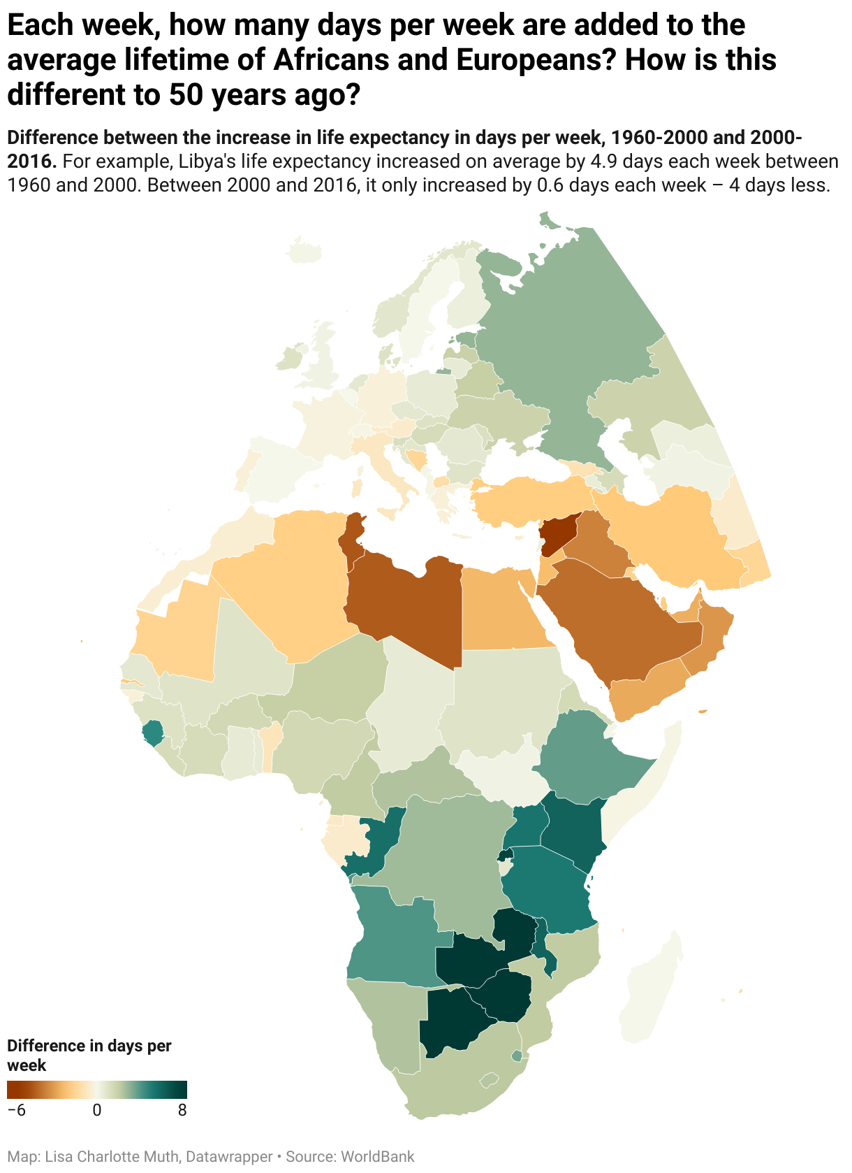
This week, I’m happy to bring you a really, really complicated chart. I’m also happy to admit that it might be too complicated:
This map encodes, for all countries, the difference between two increases, normalized as days per week: The life expectancy increase between 1960 & 2000 and the increase between 2000 & 2016.
Creating that monster started with a harmless sentence in De Correspondent journalist Rutger Bregman’s book “Utopia for Realists” (you might remember it from last week):
“Whereas wealthy countries have to content themselves with the weekly addition of another weekend to their average lifetime, Africa is gaining four days a week.”
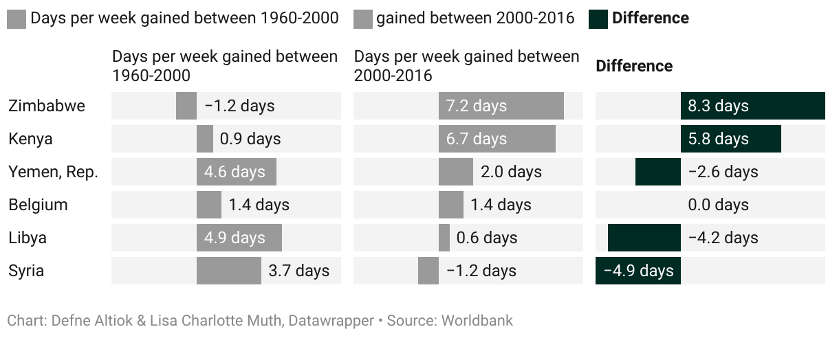
I was intrigued by the idea to bring the numbers down to a week timeframe. Our intern Defne Altiok and I decided to check the numbers ourselves. And yes, he’s right. And yes, Africa’s increase in life expectancy is the biggest compared with other continents. But we wanted to go one step further and understand how that “weekly addition” changed over time. So we calculated the life expectancy increase not just for the last fifteen years, but also for the time range 1960-2000. What you see in the map above is the “Difference” from the last column here:
Defne also made a bar chart with the top and bottom 10 countries worldwide. It’s astonishing that only a few of them are not in Africa or the Middle East. These two regions cover both extremes in our data set:
If you want to learn more about how and where life expectancy and other important indicators changed over the past decades, join us in reading “Factfulness” by Hans Rosling. It’s the next book we will read in the Data Vis Book Club; I just announced it on Monday. See you next week for a new Weekly Chart, this time by Defne!



 TORONTO STAR.














 ottocrat on Twitter.


 redhistorian on Twitter.


 Both the City and Granville Island should priorize an elevator and stairway now. It is, after all, part of the Granville 2040 redevelopment vision (detailed










 jwz.
jwz.


 Home – News – The Conversation.