You woke up with some strange marks on your pillow case. Or, you’ve noticed mysterious red welts on your arms. Maybe you’ve spotted them right there in your bed. Bugs!
What do you do now?
Bedbugs have spread rapidly over the past two decades, and the prospect of infestation can strike fear into the most cool-headed of people. We understand—at least five of our staff members have battled bedbugs in the past few years, including me. When we were researching our guide to the best mattress cover, we found a real lack of levelheaded, practical advice on what to do if you suspect a bedbug infestation at your home.
To find out the first steps you should take if you think you have bedbugs we talked to Molly Wilson, then the director of the Bed Bug and Urban Pest Information Center at Virginia Tech; Jeff White, technical director of Bed Bug Central, an educational resource on dealing with bedbugs; and Matt Kelly, owner of Philadelphia-based Prodigy Pest Solutions. We also have tips on how to avoid encountering or bringing home bedbugs when you travel.
Don’t panic
If you think you have bedbugs, don’t move furniture out of the room, don’t throw mattresses and other belongings away (we’ll explain why this is almost never necessary), don’t rip up carpet, and don’t use DIY pesticides on the bugs—all this can spread the bedbugs further throughout your home.
Our experts were unanimous: Even if you know beyond a reasonable doubt that you have bedbugs, remain calm and don’t do anything hasty.
Bedbugs spread rapidly, may leave itchy bite marks, stain and soil bedding and furniture, are difficult and expensive to eradicate, and carry social stigma—all causing real psychological distress. But they don’t pose any immediate threat to your family’s health, because they don’t transmit disease. “They are actually much less of a threat than other blood feeders like mosquitos or ticks,” Wilson explained in an email.
Study guides show the size and appearance of bedbugs throughout their life cycle. Bedbugs typically hide during the day and are active from nightfall until an hour or two before dawn, clustering near a food source (i.e., you).
Wilson said to grab a strong flashlight and look for bugs, eggs, and cast skins in “cracks, crevices, nail or screw holes, furniture joints, seams, and under any mattress tags,” as well as on the bed frame and baseboards near your bed.
There’s nothing distinctive about a bedbug bite, so neither bite marks nor red or light-brown blood stains on your bedding are proof you have them. Look for their characteristic brown-black, dot-like fecal stains (digested blood) on your bedding, mattresses, box springs, or baseboards.
If you have bedbugs, you will find some visible evidence, Wilson explained. “Bedbugs, from eggs to adults, are visible with the naked eye. They are not microscopic, they do not fly, and they do not spontaneously generate.”
Bring in (the right) help
Wilson said you shouldn’t try to fight bedbugs on your own. “We do not recommend any DIY treatments that would be safe and effective.”
Bedbugs have developed resistance to many DIY insecticides. Spraying bedbugs with insecticides you buy at a hardware store or online will likely only kill some bugs, and scatter the rest, making your problem significantly worse. Today, proven methods for killing bedbugs include using heat and steam (adult bedbugs, nymphs, and eggs die at temperatures above 113 degrees Fahrenheit), spraying growth-inhibiting chemicals, and dusting powders that physically injure the bugs. Recently, an insecticide that infects bedbugs with a deadly fungus has shown promising results. All these treatments require professional grade equipment and training.
You may want to hire the first pest control operator (PCO) who can schedule treatment, but waiting a few extra days to research, ask questions, and vet companies can make a big difference. “Don’t assume all PCOs are created equal,” Wilson cautioned. Be wary of one-size-fits-all treatment plans, and make sure your PCO offers follow-up inspections and treatments. Effective treatment requires a “multi-pronged approach,” Wilson explained, including “at least three inspections and subsequent treatments at two-week intervals.”
Kelly said to avoid an exterminator who schedules treatment without inspection or proof you actually have bedbugs. Also beware of a PCO who tells you to throw away your mattress or other belongings. The National Pest Management Association, a nonprofit organization that sets standards for pest control companies in the US, states that in almost all cases, it’s never necessary to discard these items because treating them is part of the PCO’s job.
Clean and kill
Even if you have to wait a while for professional treatment, you should clean infested areas and kill any bugs you find. The secret weapon?
“Squish them,” Wilson said. “Every bug that you find and remove is reducing the population.” You can also pick up bugs with tape or a sticky lint roller, or vacuum them up. Remove the vacuum bag immediately afterward, and seal it in a plastic bag for disposal, to prevent any bugs from escaping.
If you want to save expensive vacuum bags and you’re using a hose vacuum, Wilson has a trick: take a knee-high nylon stocking and pull the opening of the stocking over the hose attachment, with the stocking dangling over the end. Secure the stocking tightly with a rubber band, and turn on the vacuum. The suction will pull the stocking into the hose, and trap the bugs, cast skins, and eggs in the fabric (eggs are often sticky, and may require strong suction to remove). Turn off the vacuum and carefully remove the stocking, tie the end, and discard.
Heat treat bedding, clothing, and other textiles in your dryer to kill bugs and eggs. Carry the items in garbage bags and loosely pack them in your dryer. Run the hottest cycle for 30 minutes (there’s no need to wash beforehand). “The dryer becomes your best friend,” said Kelly.
Encase mattresses and box springs in close-fitting, impermeable bedbug-proof covers. As we outline in our guide to mattress and pillow protectors, mattress encasements should cover all six sides of the mattress and have a zipper that won’t easily open to let bugs in or out. If you think you have an infestation, leave the covers on mattresses and box springs for 12 months (or as long as your PCO advises). Bedbugs don’t generally live on pillows, because they prefer quieter, darker spots where they won’t be disturbed.
Wilson suggested placing ClimbUp Interceptors—small, rimmed saucers dusted with talcum powder—beneath the legs of your beds, chairs, or couches to trap bedbugs trying to climb up or down. Remove other pathways by moving your bed away from walls and curtains, and don’t let bedding drape onto the floor.
Where you should sleep
Pull Quote
“If you sleep in a different bed, different bedroom, or even on the couch, you could easily make the problem worse.” —Molly Wilson, entomologist, Virginia Tech
You might be grossed out by sleeping in the room where you found bedbugs, but if you can cope, it’s much better to stay put, even if it means a few more nights of anxiety. “If you sleep in a different bed, different bedroom, or even on the couch, you could easily make the problem worse, because hungry bedbugs will search throughout the home looking for a meal,” Wilson warned.
Jeff White concurred: “It’s easier to treat 500 bugs in one room, than 50 bugs in several rooms.” He said that it’s likely okay to sleep in another room for “one or two nights,” but eventually, the bugs will seek you out.
Communicate
We know from experience that you’ll probably want to hide your bedbug problem, but if you live in an apartment building or attached house, part of an effective treatment is coordinating inspections and treatments with your neighbors. Bedbugs can move easily between dwellings that share walls, so it’s crucial to inspect adjacent homes, treat any neighboring infestations, and put down barrier chemicals to prevent them from spreading. “It doesn’t matter if you’re the cleanest person in the world or the dirtiest or somewhere in between. If you have blood, they’re coming for you,” said Kelly.
How to keep from spreading bedbugs
To prevent sharing your bedbugs with co-workers, friends, family, and the public at large, Wilson said you should limit what you carry out of the house, and inspect those items carefully. Go minimalist (temporarily) and carry just a single bag in and out of your home. Before leaving, look over the bag’s exterior to make sure there are no insects on it. Wilson said it can be helpful to keep a clear, plastic bin with a lid near the front door and seal your belongings in it when you return home.
Control is the best measurement of both freedom and harm. If freedom can be summarized as not being under the control of another, harm can be summarized as being under the control of another.
The darker side of “control vs. freedom” or “control + harm” casts a shadow on every facet of technology—and it is a digital civil rights issue, where control over you by corporations is causing you harm, all the time, on all your devices.
The answer is rather simple: Don’t. Control. People.
Don’t track people
It would be simple to create the exact same technology companies that exist today, without the creepy crossing into personal privacy invasion. Social Media can absolutely exist (and even sell ads) without being invasive; search tools can return valid results (and still sell ads) without recording everything on you (forever); ride sharing services can drive you places without tracking your every location when you’re not using them; ordering history from stores certainly does not need all your personal data after you receive what you ordered.
Don’t retain useless data
There is no reason to retain everything a person has ever done digitally. A simple policy of “once data is no longer needed, it is deleted.” fits perfectly here. Does the police need to hold your GPS location, date and time permanently, after scanning your car’s license plate? Does a social media service need to backchannel your purchase receipts to match who you follow and interact with, against credit card receipts, forever? Not really.
Use free software
Use software where it passes the simple freedom test: Can you run that program as you wish? Can you study the source code? Can you share it alike? If you can, you have complete control over the program, and you can avoid harm.
Don’t Control People. If hardware, software, and services would follow this simple rule of not controlling people, the results would become quickly apparent.
Hardware should not have a corporate controlled lock, so people can own devices, not rent them. Software should be under the full control of the person using it, and source code released. Services should be decentralized, so no single entity can control them and their users. Once all three (hardware, software, services) are in the hands of the people, then they will truly be digitally free.
Big Tech strips Freedom and causes Harm
Let’s take a look at some of big-tech’s big issues below:
Apple
Looking at Apple (the censorship and personal control masters), we see they block applications from their platform, censor applications and content to their own liking, disallow them on their platform entirely, invade privacy with excruciating level of detail, are anti-competitive with an unlawful monopoly with its App Store, amongmanyotherexamplesoftheircontroloveryou. We quickly recognize that people are just renting a device from Apple, that Apple is in complete Orwellian control of it, that all our personal data is also under Apple’s control.
These and others all fall into the same Silicon Valley funding process: to write software, services, and applications designed around grabbing as many users and personal data as possible—oftentimes doing an end-run around regulation in the name of innovation (does anybody actually think Uber or Lyft aren’t just non-yellow taxis booked through a mobile app? So why shouldn’t they comply with the same rules and regulations that taxis do? Oh… right, because of ‘innovation‘). All these companies share the same bad habits of writing software that controls the person using it, of exploiting people for profit—be that through tracking your everylocation detail, your mood, profiling you, leaving you unable to verify the source code and inserting malware into it—continuing abuses of your digital civil rights.
The Solution
Is quite simple: support products and companies that protect your freedoms, put you in complete control, and work to eliminate harm. The interesting side effect is you will also be building a more tolerant, empowering, diverse, and inclusive society.
Yesterday we got the bikes tuned up by Velofix (they come to you, which makes things very convenient) and the old, sprung front fork was put back on to replace the solid one I needed to accomodate the electric wheel. I never heard back from the guy who bought the other one, so I do not know if he got it to work. I will be taking all the bits I have left now to the zero waste facility (as the recycling centre has been renamed). – Postscript: one of the annoyances with the wheel was how the battery got wedged into its slot and was difficult to remove. “Impossible” I have been saying but today the staff at the Zero Waste site insisted I separate wheel and battery to put them into different places. It came out easily!
Since there is only one way out of here that does not require a steep hill climb, we decided to put the bikes on the rack of the car. We had heard that there was quite a bit of activity at Iona Beach on Monday – herons and eagles aplenty. That was not to be the case today, unfortunately. And while there were aircraft landing as we rode out along the jetty beside the sewage pipe, by the time we got to the end there was a distinct lull.
Doing this in bright sunlight with a camera that uses a screen (as opposed to a view finder) is not as easy as you might think.
Since we were last at the airport, the extension to the Mall at the eastern end has popped up like a mushroom after rain and traffic over the bridge at 3pm is already heavy before that opens. It was also backing up from Marine Drive as a dump truck and trailer had stalled at the traffic lights in the left turn lane to Milton Street. Since this was not immediately apparent to approaching traffic, there were people still trying to queue jump into the turn lane even though it was blocked and cars were having a hard time regaining the left through lane to get around the truck. The signals were not producing any left turn green arrow phases either. I think we spent longer in the ensuing traffic jam than we did on the bike ride.
Next up will be a return to the Richmond Dike, and then probably a trip round Boundary Bay.
Here are some views from the end of the pipe, looking north towards UBC and Howe Sound. I have used the Mac’s photo editor to take out some of the hazy smoke.
So lange ich mich erinnern kann, hat Lewis stets MacBooks gehabt, bis ihn das Butterfly Keyboard so angepisst hat, dass er auf Lenovo ThinkPad X1 wechselte. Diese X1 Carbon sind wirklich ganz wunderbare Geräte und Lew erwähnt, die nächste Generation würde das Carbon sogar sichtbar machen.
Ich selbst benutze aktuell sehr viel das Yoga C930, das im Alu-Gehäuse eleganter, aber weniger tough als die ThinkPads ist. Im Vergleich zu vielen anderen Laptops gefällt mir vor allem der Klang der Lautsprecher. Das X1 Carbon taugt mir nicht, weil es kein Touch und kein Pen hat, das ich sehr gern benutze. Screens, die man nicht anfassen kann, unterbrechen immer wieder meine Workflows. Aus der X1-Linie wäre für mich wahrscheinlich das X1 Yoga das richtige Gerät. Es gibt übrigens auch eine Kopie des Surface Pro, aber das habe ich schon.
I’m honoured to be a guest speaker on Episode 1, Season 2 of Citizens of Craft podcast, between craft luminaries Leo Kowolik, editor of Studio Magazine, and Sage Paul, Indigenous fashion designer.
Between their interviews, I spoke with podcast host Maegen Black on my own craft history, my books, yarn bombing, and what we can learn about craft when we learn to use hand skills into our everyday lives.
Citizens of Craft brings together the voices of craft artists, curators, educators and collectors who speak off the cuff about craft practice and its role in their lives. Check out and become part of the movement by signing the Citizens of Craft Manifesto in solidarity.
Hopefully, PT readers are following my exploration of Tel Aviv’s White City on Instagram. As mentioned in the leading post above, this historic neighbourhood shares a lot of characteristics with others of its ilk:
Mid-century modernist beachfront neighbourhoods have an eclectic combo of dense housing, a mix of uses, unique businesses all kinds of restaurants, stirred together with social tolerance. There’s often a gay village embedded within.
They were often the first suburbs of rapidly expanding cities or linear developments strung along beaches, a few blocks deep, served initially by streetcars and transit with limited parking. Like Ipanema in Rio, like Miami Beach in Florida, like Venice in California.
They’ll have their beachfront attractions, of course, but usually a block in or leading perpendicularly from the waterfront will be a commercial street cluttered with restaurants and shops, still served by the transit that shaped them Think Denman and Davie.
They’ve had their up and downs, starting off as attractive middle- and upper-class developments, sometimes as beachfront escapes, sometimes as single-family speculative real estate, sometimes as apartment districts and then gone into decline in the early 20th century until after World War II. Like the West End, some were largely bulldozed and replaced with higher density rental apartments, some were simply passed by – until rediscovered in the late 20th century and then increasingly gentrified in the 21st.
What shall we call these districts?
Despite their variations, they share enough in common to have a generic name. MiCe,Hi-Di-on-the-beach. Okay, not that one. But help us out.
Scot and I have been developing a list. Here’s what we have so far:
White City – Tel Aviv
West End and Kitsilano – Vancouver
Santa Monica and Venice Beach – Los Angeles Ipanema and Cocacabana – Rio Miami Beach – Florida Sea Point – Cape Town St. Kilda – Melbourne Potts Point and Bondi – Sydney
I missed the anniversary: it's now week 61 of Job Garden. I write weeknotes on the Job Garden blog and they're invisible here, so to rectify that: here are links to all the posts to date. Expect a combination of feature releases and rambling tangents about the old days of the internet.
This is more for me than you, so I'll point out any particular post which I think is worth a read.
Until this point, Job Garden was personal: just a place for me to share jobs at companies I'm connected with in some way (i.e. that I've invested in either personally or more likely via R/GA Ventures, or ones I advise, or they're run by mates).
Now, as an experiment, since a few others had asked if they could also use Job Garden, I started opening it up a bit.
But still very much a hobby. That's one of the things I like about Job Garden: it's well within my comfort zone to build and design, so as a hobby it's perfect because it's about craft and doing things "properly"... and whether that means "100% working" or "opinionated" I'll leave open.
So it's been three months since launch (Week 14) -- it's worth reading this because (a) it has a small retrospective in which I decide to carry on building the thing; and, (b) it has some thoughts about scaling including Quantity has a quality all its own which is a quote you really shouldn't use because it's from Joseph Stalin
Closed this week (Week 15) - one of many references to the ancient internet, this one is about Newspaper Club's summer holidays
Here's a post in its own section because it still gets a bunch of traffic. So maybe you would like to read it too?
These next few months feel like their own chapter... adding a few more friends to garden their own job boards, and the general data and design improvements required in consequence:
It's amazing it's taken so long: pagination (Week 23) - huh, there's a line: A small improvement, but big improvements are made out of small improvements a thousand times. I'm pretty obsessed with this compound interest thing it turns out
Ah, and at this point Stella was born. So everything stopped until week 50.
That 17 week period - four and a bit months - was interesting (baby aside, which of course is interesting and joyful and awesome and all kinds of superlatives, but I'm talking about JG here) because it gave me room to think about Job Garden. And remember it's still a hobby at this point!
Coming into 2019, a handful of my users got in touch and asked for additional features. So I looked at what I'd built and I thought: it's rare that you make something that does a valuable thing and also people want to use it enough that they're requesting features. Then I thought: I should take this more seriously.
So the chapter that follows is the chapter of: work on Job Garden enough that I can tell whether or not to take it seriously.
I'm not on JG full time. I'm working on other things too. I get up at 6 and work on Job Garden then, and I work at night after the family have gone to bed. During the day I often work on JG but I also have other gigs, and I'm a parent too, and the parent bit gets priority.
Perhaps there's something commercial in Job Garden that doesn't compromise the value it provides to the startups I care about (that's one of our overriding principles. We've got 12.). Perhaps not, and if there's not then the worst thing that will happen is that we've built something good.
The goal for this year is to figure out whether there is something commercial and uncompromising there. If that's the case, I'll take JG seriously at that point.
So the rest of the weeknotes (till now, I guess) are in that chapter.
They are also less frequent, and seem to be more about feature releases although of course with regular tangents. Here:
Reading all these weeknotes back, just now, it also feels like the end of a chapter, or at least a subchapter: having shipped autotags and the new design, Job Garden basically represents what was in my head pre week 1. Sure there needs to be more data on which to pivot, and more ways to receive alerts about new jobs, etc, and there is a ton to do around that, but that's all just a matter of colouring between the lines.
I feel like now everything's on the table; the basic Lego bricks have been made; the frame has been created. So it's time to figure out what to do with those pieces, and the motivations for what to prioritise from the roadmap (which is big believe me) will be different from what they've been so far.
Which means year 2 will feel different. Exactly how I'll have to see in next year's retrospective.
Earlier this week I was delighted to give a keynote at the Academic and Research Librarians Group annual conference at the University of Teesside, Darlington.
Information literacy is a central theme in the work I have been doing with my co- researchers and writers, Bill Johnston and Keith Smyth. So in the talk I focused in on some of the information literacy based aspects of our recent book.
A critical understanding of the information structures that are building around every aspect of our daily lives is becoming more and more important. This recent DEMOS report, Warring Sounds; Information Operations in a Digital Age, is worth a look – particularly around some of the militaristic language it uses. Control of what they term “information operations” is not just the battle ground of the future, it’s the battleground of now. Ensuring our education systems (at every stage) are developing holistic and discipline specific approaches to information literacy is key to ensuring that we all can, what the report calls defend (I prefer critically understand and question) ourselves against those who exploit and control information operations is more vital than ever.
At the edTech19 conference last week I was struck in a couple of presentations about students using of video. A couple of studies I went to showed that despite staff diligently spending time curating videos within module spaces in VLEs, students were still going to youtube if they didn’t understand “stuff”. This was causing some concern as the students had also stated that they weren’t totally confident about the veracity of the videos. When I asked in one session if this study was going to lead to including some more information literacy based sessions on evaluating video resources in that discipline, I was told that (paraphrasing here) no, not really there is some study skills material available but we really just don’t have any room in curriculum for that. We need to make room for “that”. We need to ensure that our students understand where and how information/content comes from and how to assess it. It can, and is, being done (thank you wikimedia foundation) – but we need to collectively do more.
Apple’s truly transforming into a privacy-as-a-service company, which shows in the way that it’s implementing both the new single sign-on account service, as well as its camera and location services updates in iOS 13. The SSO play is especially clever, because it includes a mechanism that will allow developers to still have the relevant info they need to maintain a direct relationship with their users – provided users willingly sign-up to have that relationship, but opting in to either or both name and email sharing.
For years, a major point of debate in tech circles has been the friction between privacy and convenience, particularly as relates to web services offered by companies like Apple and Google. Apple’s privacy-sensitive approach has, in some people’s view, hamstrung it from offering the same level of convenience in its services that’s found in competing services from Google, Amazon, and others who rely on sending your data to the cloud for analyzing.
This year at WWDC, Apple’s new privacy-focused initiatives seem to be striking more of a balance between convenience and security. The company’s new Sign in with Apple feature is a great example: it provides developers a way to contact their users directly, while still protecting those users’ actual email addresses so they can’t be sold to third parties. In my view that’s a brilliant win-win, and the type of innovation I hope we see more of in future products.
Most of the content in the journal Open Learning is (ironically) closed, but once in a while a rare open article will pop out into my search results. Just so with this 2015 article, which I viewed today. This article describes the results of 3 intensive workshops, over the course of which a total of 20 design patterns were developed from shared narratives of successful practice. The patterns are described in detail in Table 1 (you'll have to click on the link to view them). Table 2 organizes them according to design domain.
This article compares how expert knowledge differs from novice knowledge, and describes methods of capturing that knowledge. This work informs how we subsequently teach people to become experts. In this article, the authors argue that experts apply both perceptual and conceptual information in judgements of similarity and difference, while novices apply perceptual data alone. It made me wonder how much of the expert's description is rationalization after the fact, and how much was actual application of conceptual information. There's a good review of expertise development literature, including an explanation of the key roles of similarity and difference recognition in expert knowledge.
“I wrote a whole bunch of meaty blog posts. Could I make a book out of them?” That’s the seductive reasoning I hear from many clients. So let’s talk about what it takes to turn a blog into a book. Here’s a comment that appeared on my author survey yesterday: I write a blog, to … Continued
This free webinar, titled "Digital Meets Cognitive: How IBM Is Leading the Learning Revolution" may be of interest to some here:
https://webinars.futureworkplace.com/webinar/3334
It takes place in just a couple of hours, but I believe that the same link will then lead to the recording.
FYI, I am not associated with any of the entities related to the webinar, I am just in Future Workplace's mailing list.
On last week’s episode of Adapt I shared that automation for running shortcuts was one of my top two feature requests for iOS 13. And despite the Shortcuts app not receiving much stage time during the WWDC keynote, Apple has officially granted my wish in a big way.
The Shortcuts app in iOS 13 has a new Automation tab, in which you can configure shortcuts that automatically run based on a wide variety of triggers. Currently, certain automation actions require sending a notification first when the trigger is activated, and that alert contains the option to run the shortcut; other actions, however, include a toggle that determines whether the automation runs automatically in the background, or if you’d prefer an alert instead.
Here is the full list of current automation triggers in iOS 13 beta 1:
Events
Time of Day: You can set up automation that runs at the exact time you choose, down to the minute. There’s also an option for sunrise or sunset. And in all these cases, automation can be configured to run only on the days you choose.
Alarm: Trigger automation when a particular alarm goes off, or when an alarm is snoozed, or stopped.
Apple Watch Workout: Configure the start or end of a certain workout type to trigger automation.
Travel
Arrive: Run automation when arriving at a particular location, either at any time or within a specific time range.
Leave: Run automation when leaving a particular location, either at any time or within a specific time range.
Before I Leave: Based on when Shortcuts predicts you will leave for either home or work, trigger automation either at the predicted time, or 5, 10, 15, 30, or 60 minutes beforehand.
CarPlay: Connecting to or disconnecting from CarPlay can activate automation.
Settings
Airplane Mode: When enabled or disabled.
Wi-Fi: When connecting to a specific network.
Bluetooth: When connecting to a specific device.
Do Not Disturb: When enabled or disabled.
Low Power Mode: When enabled or disabled.
NFC: Triggered when tapping a specific NFC tag you pre-configure.
Open App: Triggered when you open a particular app.
This isn’t a final list of automation triggers, as some could be added, removed, or tweaked leading up to the public release of iOS 13 in the fall. But if nothing changes before then, this is a very exciting list that opens up a world of new possibilities for the Shortcuts app. It’s going to be a fun fall.
Auf dieses Handy habe ich mich sehr gefreut. Vielleicht ein bisschen zu sehr. Robust, wasser- und staubdicht. Performance gute Mittelklasse und dann eine Action Cam dazu, das klang nach dem perfekten Handy für Outdoor-Spezis. Ich kenne solche Leute, die durch's Gebirge kraxeln, stundenlang auf dem Fahrrad unterwegs sind, über Stock und Stein. Die das Handy dreimal am Tag runterfallen lassen und einem iPhone trotz Case und Screen Protector immer wieder den Bildschirm zerbrechen.
Für solche Menschen ist der Trekker gemacht und ich war schon ganz hibbelig, das auch auszuprobieren. Harness angelegt, Trekker montiert, Frau Brandlinger an die Leine genommen und raus mit dem Fahrrad. Als Modus Ultra Wide ausgewählt, Landscape, Timelapse mit einem Bild pro Sekunde. Nach ca zehn Minuten angehalten und festgestellt, dass zwar der Splashscreen des Videos richtig ist, aber die eigentliche Aufnahme um 90 Grad verdreht ist. Naja, kann passieren, vielleicht verwechselt. Also einfach Portrait eingestellt und wieder los. Jetzt ist es Portrait, aber wieder um 90 Grad verdreht. Unbrauchbar. Wie kommt es dazu? Es liegt an der Software.
Der Trekker hat Stock Android 8.1, mit einem vier Monaten alten Sicherheitspatch. Okeeee. Dazu eine zweite Mail App, eine zweite Kamera-Software, eine zweite Fotogalerie und ein paar Gimmicks. Und jetzt wird es konfus. Der Trekker hat drei Kameras: vorne eine Selfie-Cam, auf der Rückseite ein Weitwinkel und die spezielle Action Cam mit Fisheye-Objektiv. Mit der Android-Kamera-App kann man unstabilisierte Videos und Fotos von allen drei Kameras schießen; die Action Cam zeigt dabei ein stark verzerrtes Bild des gesamten Sensors als Fisheye. Erst die X-Cam von Crosscall bietet die spannenderen Möglichkeiten: stabilisierte Extrawide- und Ultrawide-Videos, bei denen der Horizont stets horizontal bleibt. Das geht bis 4K und 120 FPS, aber nicht gleichzeitig. 120 FPS gibt es nur bei der Zeitlupe bis 1080p, alles andere ist stets nur 30 FPS, zu wenig für Action-Aufnahmen. Bei viel Licht geht das leidlich gut, aber sobald man drinnen ist, wird es rauschend. Und auch fehlerhaft, wie meine Versuche mit der Timelapse zeigen.
Die Videoschnipsel soll man dann mit der X-Gallery zu einer X-Story schneiden. Das ist schwierig zu bedienen, aber doch irgendwann zu meistern. Aber beim Rendern einer weniger als zwei Minuten langen X-Story hätte ich beinahe nach der zehnfachen Zeit aufgegeben. Die Software warnt, dass sowas Minuten bis Stunden dauern kann. Und in dieser Zeit ist die Kamera lahm gelegt.
Ich habe also meine vorhandenen Schnipsel auf einen USB-Stick mit der richtigen Benennung übertragen -- das geht sehr einfach mit Android -- und dann dem iPhone als Speicherkarte einer Kamera präsentiert. In Sekunden importiert, dann mittels einer App gedreht und mit Clips zusammengeschnitten. Das ist umständlich aber funktioniert. Und da Clips Videos im quadratischen Format erzeugt, konnte ich sogar verschiedene Formate zusammenführen, was X-Gallery verweigert hatte.
Die Systemsoftware des Trekker hatte ich zweimal aktualisiert, die Crosscalls Apps aber befanden sich nicht im Google Play Store, wo sie eigentlich hingehören. Vielleicht ist die Software ja schon besser geworden und ich komme einfach nicht dran.
Zwei Tage habe ich in den Trekker investiert und komme auf keinen grünen Zweig. Es ist so schade, denn die ganze Hardware macht einen soliden Eindruck, inklusive des durchdachten Zubehörs. Der Trekker hat sogar einen Kamera-Auslöser.
Zeit, das alles wieder einzupacken und zurückzuschicken. Die Software ist einfach unterirdisch. Hier noch mal die Theorie:
Update 6. Juni: Eine Nacht drüber geschlafen und beschlossen, erst einmal abzuwarten, ob sich der Nebel lichtet. Das kann ja eigentlich nicht sein, dass die ganze Software aus dem Play Store geflogen ist und das Pie-Update ist auch überfällig. Später mehr.
I mean, sure. “Boot speed” certainly isn’t the end-all, be-all of performance. In fact, it may not even be in a “Top 10 Important Performance Metrics.” But it gives a good indicator of what’s possible with the system — and what to expect. Add to it, the fact that this was done without any boot speed optimizations at all? Downright exciting.
The Librem 5 smartphone is schedule to begin shipping in Q3 of 2019. Stay tuned to this blog — or follow Purism on Librem One or Twitter — for updates and details.
Also worth noting: You can pre-order the Librem 5 now for $649. That price goes up at the end of July. So if you want the lower price, now’s the time.
Remember the olden times, Vancouver, when dinosaurs and Pokemon Go ruled the Earth?Cast your mind back to mid-2016.That was the last time that pretty much everybody agreed that housing unaffordability was a Very Bad Thing – in principle, at least.Over the preceding two years, there had been a mix of awe and confusion as the average price of a detached house in Greater Vancouver soared 40 to 50 per cent, thanks to the rocket fuel of Chinese capital outflows. Real estate prices across the board…
Those are links to videos of Curtis Driedger and Doug Cameron, performing as a stripped down acoustic version of the “post-punk/new wave power trio” the CeeDees. It was a great way to start an email, as I have been a fan of the CeeDees, and Doug and Curtis and their music foralmostever.
John continued:
This request might take a phone call.
There’s going to be an annual a prize for an undergraduate Trent student in my name, and I’m asking you to “help me” compose the description.
Here’s the background:
So, among many other things done and said, during the speeches on the glorious afternoon of Saturday August 9th this last summer (during the “Trent’s 50th Anniversary Reunion at Peter Robinson College”), Tom Miller announced that he was establishing a prize for an undergraduate Trent student in my name. (Do you remember Tom?)
No I had no idea, but that aside, now I need to draft some text to describe it. I like what you wrote about Trent Radio, and I will always savour what I can remember of the “fuck school” project.
Would you be up for this? Please say yes.
And if you decline, it’s okay, I will always love you.
But if you say Yes then read on.
Of course I said yes.
And read on.
Tom and his wife, Barb Chisholm, are going to give Trent University $25,000 which might yield about $500-750 annually.
They’ve asked me to write a description for it. All the scholarships, prizes, bursaries and awards are described in the calendar. I think we’re gunning for a prize rather than the other things (scholarships, bursaries and awards).
I like the tone of the Glassco, Hulcoop, McColl Turner & Gillian Stamp — Friends of Field Hockey Prize. I liked Lisa Howard’s idea of “exceptionality” rather than “excellence”. Would much prefer “a not very connected networks of exceptionality” vs “a centre for excellence.”
It could go to (a) someone who has done or attempted something interesting or humorous that involves Trent Radio, or (b) someone who somehow challenges the obstacles that a place like Trent University puts up in the way of peoples education in an interesting and/or joyful way.
I thought long and hard about this, looking for a way to reflect the spirit that John described; this is what I wrote back:
I am honoured that you would think of me, and I am open to the idea of writing something.
I’m not sure, from your request, how much latitude you have, and how much latitude you are looking for me to express.
That all said, here are my initial bullet-point-thoughts:
1. $500 isn’t very much. Looked at from a purely financial angle, relative to the cost of a university education, it’s not going to be transformative – it’s not likely to be the $500 that gets someone over the hump and into Trent, and it’s just as likely to melt into the background in the forest of complexity of financing an education. I know, for example, that I got the Blah Blah Blah Bursary my first year at Trent but I can’t recall at this distance – and likely didn’t even know at the time – who Blah Blah Blah was. It was simply $X that I didn’t have to devote from my Canadian Tire earnings the summer before Trent. I’m generalizing here, and it’s possible that $500 *could* be the difference between going to Trent and not going to Trent, but I’m not sure that’s the kind of hole that the John Muir Prize should be looking to fill.
2. The question for me, in that light, then becomes: how can one use $500 as a catalyst in a way that would be transformative. What CAN $500 do, or leverage, or start, that would be remembered 30 years later, that would have a positive impact on an individual and their community? One example from my own experience: as a Home and School president several years back I got together with the presidents of 4 other nearby elementary schools and obtained a $2000 grant to enable some sort of cooperative event, focusing on engaging parents, to be organized. $2000 wasn’t really enough to do anything substantial, but it turns out that the $2000 *was* useful as the shiny object that got the 5 of us in a room together: we held 5 meetings, each meeting in one of the cooperating schools; for many it was their first time darkening the door of another elementary school, and it was a tremendous aid in combating stereotypes that many of us carried around about the other schools. That, and the conversations that resulted, were far more important than the $2000 and what we spent it on, but it was the $2000 that catalyzed our discussions.
3. In *that* light, then, the question becomes: what kind of positive impact on an individual and their community do you, John Muir, want to have. My feeling is that tying the prize too tightly to Trent Radio, or to radio at all, misses the point. “Awarded annually to the person who commits their life to the pursuit of the campus-community radio dream” isn’t the play we’re trying to cast (I don’t think): rather, I think we’re trying to take the broader view, and look at what was and is special about you, and your deep and committed loving relationship with Trent Radio, and its relationship to Trent and to Peterborough, and abstract that out to encourage, catalyze, engender, spur others to pursue a similar (but likely entirely different, for all practical purposes) course.
4. Completely different tack: reading through the pages and pages and pages of prizes and awards and bursaries, I find them almost universally drop-dead uninspiring. So it seems like an area that could use some levity, some imagination, and some contrarianism.
I have no idea where this leads, but, again from my own experience, I can say that the greatest gift that you, and by abstraction Trent Radio, gave me while I was actually AT Trent was enough of a cataclysmic psychological shock required to propel me to re-conceiving of why I was at university in the first place. You demonstrated, by your words and your actions but even more so by your willingness to talk, that other things, other paths, other relationships to power, were possible. That was transformative for me and, I think, I am not unique in your acolytes in having gone through some variation of that experience.
“Men have become like gods. Isn’t it about time that we understood our divinity? Science offers us total mastery over our environment and over our destiny, yet instead of rejoicing we feel deeply afraid. Why should this be? How might these fears be resolved?”
and then, in Brand’s words:
“By participating in history instead of standing by to watch we shall at least be able to enjoy the present. The cult of scientific detachment and the orderly fragmented way of living that goes with it, serve only to isolate the human individual from his environment and from his neighbors they reduce him to a lonely, impotent and terrified observer of a runaway world. A more positive attitude to change will not mean that you will always feel secure; it will just give you a sense of purpose. You should read your Homer. Gods who manipulate the course of destiny are no more likely to achieve their private ambitions than are men who suffer the slings and arrows of outrageous fortune; but gods have much more fun!”
I don’t know if you would align your take with those words, but those words certainly align with my experience.
If this resonates at all, then I would see the challenge to craft a prize that:
1. Is not drop-dead uninspiring.
2. Catalyzes something rather than simply discounts tuition.
3. Inspires, through that catalyst, something that has a chance of achieving a perspective-shift in one or more people.
I don’t know how far you can push the bounds of what a “prize” is, but I’d like to hope that it can be targeted more directly at an event or an experience, and isn’t just a credit on a student’s account. If that is the case, then what I would suggest is something, in general, along these lines:
“Each year on the 2nd Friday of November, 5 students, one from each college, attend the John Muir Prize Supper. The students selected are those identified by their college head as being able to best benefit from a transformative experience – a kick in the intellectual head, so to speak – early in the first year at the university: students who are questioning their decision to attend Trent, their choice of academic emphasis, their position in the college community, or their larger role in the world. In addition to breaking bread together, those attending the supper are given the opportunity to develop, over the course of the evening, a designee of the John Muir Prize, a yearly cash award of $500. The choice of designee, made by consensus of the group, is open: the Prize may be awarded to an individual or group inside or outside the Trent community, based on whatever criteria those dining determine.”
I don’t know if the specifics are the right ones, but my point is this: the transformative power of the $500 lies not as much in the designee as in the designators, so position the heart of the matter in the deciding, not in the recipient. I don’t know what would happen at such a dinner – that is, partly, the point, of course – but at the very least you have 5 people who know each other at the end of the night, who’ve shared an experience together, who did something together. That seems like a pretty powerful proposition, and one very much aligned both with the Trent Radio philosophy and with the John Muir philosophy (at least as I interpret it).
John K Muir Prize
Established by Tom Miller ’82 and Barbara Chisholm to recognize their friend, John Muir ’75, General Manager of Trent Radio. With more than 40 years of experience as a broadcaster, administrator and technician, John has been a creative force for the community and culture in Peterborough. To be awarded by a student committee to Trent-affiliated organizations, student groups or students who have been most influential in their own development.
Could they have actually done it?!
I was just making that shit up.
Well, not really: it was heartfelt and honest. But very much written in the spirit of “if the world was true and just, this is what would happen” with the implication that the world is not true and just, and that the prize would end up being awarded to the “communications-stream investigator most leveraging contemporary modalities toward academic excellence.”
But it turns out that John successfully transformed my draft manifesto into a compelling case.
Muir’s two-pronged approach to education is as simple as it is inclusive: everyone has creative potential, and the best way to learn is by doing. When guiding Trent Radio novices, he believes in giving just enough technical training to get them onto air. And then turning them loose. He refers to it as “deep-ending.”
And while Muir is there to rescue anyone who flounders, more often than not his pupils succeed admirably. Creativity reigns.
“My job,” he says, “is, essentially, making sure that other people can do weird and wonderful things.”
According to benefactor Dr. Tom Miller, one of the reasons that Muir is so successful as an educator is because he has an absolute love of learning.
“John is the quintessential lifelong student,” he explains. “He cherishes learning for himself and for those who are fortunate enough to know him. His passion for Trent Radio and what it represents to the University and the community makes John the creative, intellectual and artistic nexus for creative life at Trent and in Peterborough.”
Miller also recognizes Muir as a person who fosters development at both the personal and community levels.
“John helped create and orchestrate the exciting and creative incubator of ideas and talent that embodied Peter Robinson College, and that embodies Trent Radio today.”
Which makes the particulars of the John K. Muir Prize so appropriate.
Established by Miller and Barbara Chisholm, the prize will gather together a group of promising but academically at-risk students for a focused discussion about their impact upon the university community. The idea is to engage these students and actualize untapped potential.
Guided by a faculty member, the students will meet to unanimously decide on one or more Trent-affiliated organizations, students, or student groups to receive funding. They will be asked to consider which Trent-affiliated organizations, student services, or students have been most influential in their own development.
I love that this happened, and I love that the reason I was able to draft a description of the John Muir Prize was because of things I learned from John Muir.
I love that part of the inspiration for an academic prize was John remembering that I published a manifesto titled “Fuck School” back in the late 1980s (after I dropped out of the selfsame institution awarding the prize).
And, most of all, I love imagining the conversations that the John Muir Prize will inspire over the years to come, the kinds of conversations that John would love and that I would love.
In 2016, Microsoft replaced its Yammer Office community with TechCommunity on the Lithium platform. This cannot have been easy. There are plenty of other platforms for different purposes. If Microsoft made a mistake, they will have thousands, perhaps millions, of angry members.
This week, we’re going to do a breakdown of the Microsoft Tech Community and dive slightly into Microsoft’s broader community structure.
This is our 6th community breakdown, you can find the others below:
Making this even more complicated is the incredible speed of growth in the community. Since launching in 2016, the community has grown at a staggering pace with 500+ new members every day, 600 new posts, and over a thousand new conversations.
One potential problem here is the number of conversations per day far exceeds the number of posts. This means either a huge number of conversations are being started which do not receive a response or there is a flaw in the data.
Based upon the community lifecycle, we would consider this community at the very peak of its speed of growth. However, given the overwhelming size of Microsoft, we would note the community in many aspects has already jumped ahead to the mitosis phase.
* Note: per day numbers are collected by comparing figures listed on the website today vs. several months ago (via Archive.org) and averaging the results. This will not account for any posts which have been removed.
The Microsoft Tech Community comprises of 99 distinct communities (70 distinct product and service categories, 16 ‘solution’ based communities and several hidden communities).
It’s important to distinguish between the TechCommunity – for IT professionals and the answers community for end-users here. The community is designed to help IT professionals get the most from Microsoft products.
However, despite the complexity of the community, the community uses a relatively basic set of features from Lithium (Khoros).
The lack of groups and knowledge base is interesting. This could be because either group is a relatively new feature from Lithium or because it’s outside of the community strategy.
The community essentially uses a small number of templates with minor variations for both the homepage and each sub-community/space/other areas. This ensures a consistent (if somewhat unexciting) experience. It also makes it a lot easier to review the community.
The community does well to clearly articulate its purpose, provide a place for newcomers, and show some of the latest activity above the fold. It could be improved by reducing the static boxes to half the height, adding in trending topics, and possibly removing the in-line answers which take up a lot of space, but make it harder for members to scroll through the page.
We would also like to see clearer calls to action in both the search and a registration box. Both are relatively well hidden but are pretty important.
The display of blog posts alongside the content is handy and something other communities could embrace.
The mobile experience is good but could also be significantly improved. Moving the search to the top of the page (and keeping it there when members scroll) is a really smart move on mobile. It would also be good to bring the rest of the activity up by removing the static banners and other content.
The image on the left would be an ideal mobile experience. It also makes sense to show the expanded content here. The community also has a great display of blog posts. It would even better if members could quickly swipe to the next blog post for simplicity.
Final Design Rating: B-
Using our benchmarks, the community design hovers somewhere around a B-. It has simple enough navigation, somewhat guides newcomers, and displays most activity fairly well. Its mobile site is ok, but calls to action could be a little improved. It’s not going to win any awards for being aesthetically pleasing but neither is Microsoft.
The community uses Lithium’s native search function which performs ok. This enables members to search for information from posts, ideas, blogs, and the tribal knowledge base (which is only used for older Yammer articles). The results appear to be prioritised by 1) Relevancy to key terms 2) Accepted solution 3) Date and 4) Likes. This is a good standard.
Like many communities, this could benefit from a unified search option which retrieved information from the rest of the site alongside search results. This ignores all existing documentation.
Onboarding
We can break onboarding down into three areas; pre-registration, registration, and post-registration.
Pre-Registration
At the time of writing, Microsoft is the most valuable company in the world with a huge array of products, services, and information to communicate to different target audiences. We’re less than surprised the community does not appear prominently on the company homepage. Most links to the Tech Community are buried down the pages for each product.
Like many brands which require extensive product documentation, the community must compete with documentation to appear higher in search results. There is likely scope to improve and prioritise how discussions appear in search results to attract more traffic and differentiate from product information. We suspect the community attracts the long-tail of search results which documentation can’t easily cover.
When members do visit, it’s difficult to see where to register. Members have to click on the ‘login’ section instead of a registration link. It might be better to show a registration call to action for visitors who haven’t logged in.
Registration
The Microsoft community uses SSO (single sign-on) but without Facebook/Twitter support. To join the Microsoft community you need to have a Microsoft (or Skype) account. To join you need to give the community access to your Microsoft account. This is a little clumsy, but probably understandable.
Like most, SSO-based communities, this is a little clunky. But it seems to work easily enough.
The process is simple and only takes a minute or two (even without an existing Microsoft account).
Post-Registration
Once a member has registered, they’re immediately asked to highlight the areas which most interest them. This ensures members aren’t overwhelmed with irrelevant information.
Below this, members are asked for some very basic profile information. This is a great example of understanding what members want and asking for as little information as possible. It might also be useful here to have a separate Code of Conduct tab.
Once complete, the homepage shows an activity feed filled with content members chose to follow. This is ideal for communities where members are likely to use multiple products.
However, there are no further onboarding or automation rules here to better engage newcomers within the community. An email campaign or a clear next step would be useful.
Final Rating: C+
A very mixed onboarding experience. We would probably give the community a C+ (ok) grade here. The pre-registration is ok, the registration is great, and the post-registration is somewhat non-existent.
The Microsoft engagement experience is spread across multiple areas. The core of the community is the Q&A discussions which take place within each space of each community. However, this is slightly augmented by a community section, an ideas area, blogs, and events.
There is a lot to like here and a little to dislike. At the core of engagement in Microsoft communities is a Facebook wall-like structure as opposed to a typical forum community. Members respond by entering their replies directly in the box provided beneath previous discussions. The benefit is it makes participating easier for casual browsers.
The downside is it takes up space and members might reply without reading the entire topic. It might also be simpler to adopt the open text box at the top of the page for members who want to ask a question.
The search bar clearly needs to be moved to the banner. It’s far too small here for the thousands of people who need to search for answers to their questions. All three boxes on the right, however, are pretty much ideal and relevant to the situation. We really like this page layout. It’s not aesthetically pleasing, but it functions perfectly for a primarily tech audience.
The interface for Spaces is clear and focused on function over form. This too would benefit from a clearer search box. We would also recommend replacing ‘like’ with ‘I have this question too’ which reveals more information about the visitor’s needs. Related conversations on the right is also a good touch.
Ideas
Ideas and feedback is where the structure of the community becomes strange and murky. At one level, there is a fairly good ideation page for community feedback hosted on the community below:
There is room for improvement, but generally, it’s a good way to see the latest ideas and the status of these ideas. However, this ideas section isn’t used for any of the product categories. These are still hosted on the external UserVoice site.
It’s odd to pay for ideation from Lithium and barely use it. The Uservoice community has a high level of engagement with thousands of items of feedback and new idea updates. While most links direct you back to the relevant community, it’s strange to have two places for the same function.
Blogs
The community generally does a great job of displaying blogs. Staff are highly engaged in creating a lot of topical content within their area of expertise. This suggests widespread support for the community across the business.
All the contributions to the blog currently come from Microsoft employees. It may be valuable to enable trusted members to share their best advice as well. This is motivating and helps scale the community. This may enable staff to filter for quality instead of creating all the contributions personally.
Events
The Microsoft Tech Community has an interesting approach to events. Any related social group can seemingly add an event to the calendar with their own page which takes members to a separate registration link on Meetup/Eventbrite or possibly other communities.
Another interesting innovation is to create a list of the top speakers searchable by category and field of expertise. This enables anyone hosting an event to find people to speak to and may attract top people to visit and maintain their profiles.
Final Rating: B
Microsoft delivers a fairly good engagement experience with high levels of activity across almost all areas of the community, unique innovations, and a friendly, if not overwhelming friendly, response to many questions. However, the response rate is a concern and may be the result of competing with similar Microsoft-owned properties for the same audience and attention.
The Microsoft community uses standard Lithium gamification with multiple levels based upon a combination of actions members have performed and badges reflecting individual achievements. There doesn’t appear to be any integrations with other areas of Microsoft (which is a huge missed opportunity) or any interesting innovations.
Levels
Community seems to have a relatively small number of levels with unimaginative names and confusing hierarchy. These include visitor, occasional visitor, frequent visitor, contributor, trusted contributor, respected contributor, MVP, ‘Microsoft’ etc…
But is trusted better than respected? Levels could be greatly improved (perhaps with numbers instead of names). Clearly, some members have become stuck on the top level and the community is less than 3 years old.
However, it’s good to see user levels appear high up on the member profile and reflected in a colour change on that member’s profile.
One major annoyance is the community sends notifications to members who haven’t made a contribution telling them they have increased a level as a result of their contribution. This devalues the effort required to reach new levels for everyone.
Another problem is these notifications almost always winding up in the spam folder through poor design.
Badges/Achievements
The community has fewer achievements members can earn than other communities. It also tends to mix important badges (member of the week) with unimportant badges (5 consecutive days visiting).
Microsoft isn’t alone in doing this. It seems to be a default Lithium option.
Leaderboards
Each of the 99 communities has a leaderboard of top contributors. However, these are buried too far below the fold on the homepage of each community to be meaningful to (or seen by) most members. It would be nice to bring them closer to the top and increase their visibility within the community.
Final Rating: C+
Microsoft doesn’t appear to have put much thought into its gamification system and instead used the defaults provided by Lithium which are less than ideal.
It’s almost impossible to evaluate an MVP program on the scale of Microsoft’s within a few relatively short paragraphs. In a sentence, it is the program other companies should aspire towards.
Microsoft has perhaps the most successful and best-supported MVP program of any company. Microsoft has over 3000 MVPs (although it’s unclear how many of these are active). The MVP program has its subdomain featured prominently on the Microsoft website.
Members can be nominated or apply to join the MVP program. There doesn’t appear to be a rigid standard, but more of a fluid criteria which evaluates the contributions of an applicant across multiple projects, communities, blogs, user groups, and more.
Perhaps the most remarkable aspect of the entire program is there is no outlined reward scheme. As shown in the copy, it’s simply a way of ‘showing thanks’ to members. This demonstrates that MVPs don’t need rewards, they need to feel they have an impact, have some asset of exclusive information, and a sprinkle of status.
Members do gain access to a five-day event for MVPs at company headquarters. Most MVP programs have a single-data event. It’s clearly a big deal.
Each MVP has a distinct bio. The bios are clear and simple enough which clearly list a member’s expertise. They are also searchable by their region and level of expertise. One area where the bios really shine is listing members contributions to the entire Microsoft ecosystem into a single stream. This shows exactly how each member has helped the community. This clearly shows speaking at conferences, forum participation, hosting user groups, blog posts etc…
Final Rating: A
Perhaps the best MVP program in the world right now.
The Microsoft community is one of the most complex and challenging communities to evaluate (let alone manage). It exists in a challenging environment, with veteran users, and long-established habits. This creates challenges which Microsoft has largely done well to overcome:
The community has a consistently high level of engagement, benefits from a terrific MVP program, and has a design that enables a community of this size and complexity to work. However, it also suffers from poor gamification and onboarding experiences – both of which should be improved.
In addition, the community is still competing against its own, more popular, legacy communities. This is less than ideal and needs to be resolved. Our recommendations would be:
1) Develop a communications plan to ensure all IT pros and developers are focused on a single platform beginning with TechNet and then the Microsoft Developer network. This will cause annoyance but yields benefits in the long-term.
2) Use the ideation functionality provided by Lithium to replace that used by Uservoice. Sending members away from the community to post feedback and ideas doesn’t make sense.
3) Improve the post-registration experience of community members to have a longer automation journey highlighting how they can become top community members.
4) Remove the worthless gamification badges and focus them on big achievements. Revamp levels to ensure there are more of them and they have a clear hierarchy of value to everyone. Make sure leaderboards are more prominently displayed.
5) Develop a system to flag unanswered conversations and ensure a large group of members in each community are dedicated and rewarded for tackling these.
We run our software for its effects, so effects are necessary. We can’t write 100% pure code. But I contend that some effecting code is better than others. In other words, there is a spectrum from bad effecting code to good effecting code. Even if you can’t turn an action completely into a calculation, you should still strive to minimize implicit inputs and outputs.
Transcript
Eric Normand: Why is side-effecting a spectrum and not a binary choice? By the end of this episode, you should learn how to improve your actions, even if you can’t turn them into calculations. My name is Eric Normand. I help people thrive with functional programming.
We all know that functional programmers prefer calculations. You might also hear them called pure functions. We prefer pure functions over a side-effect. We prefer calculations over actions. Those are my terms.
But it’s not always possible. You need actions. That’s why we run our software. If you need to send an email, because that’s the affect your software’s supposed to have, then you need to call an action. It just needs to happen. We need to examine that a little bit.
Let’s imagine we have this action. It’s a complex action. Let’s say, you didn’t write it. You just found this in the wild. Someone else has written it. It reads from a global variable. It writes to the database.
We don’t want to change the behavior of this app. We need to write to the database. That’s an important thing. Let’s just assume that. That database value needs to be written there because some other part of the app needs to read it in later. We can’t get rid of that call, but we can get rid of the global. That is not necessary. We all know that global variables are not necessary to the outside world, to the behavior that we’re trying to get our app to have.
Here’s the question. Seeing that this is already in action and there’s no way around it, should we get rid of the global variable? The global variable is not going to change this action from an action to a calculation, if you get rid of it. It’s already an action. It’s already writing to the database. Getting rid of the global is not going to change the category that this function is in. Should we get rid of it? Is there a point to getting rid of it?
I say yes. I say, if we do get rid of that global variable read — That read is a global variable, so that this is, let’s say, “More pure.” It’s not pure, but it’s more pure — that this action will be better. It will have fewer inputs. These would be, I guess, implicit inputs. The global variable’s value is an implicit input, as opposed to the explicit inputs which are the arguments. It still has the same number of outputs. We’re not changing that, but it has fewer implicit inputs. I’d say it’s better.
What this implies, if this is true, if what I say is true. I think a lot of people would agree with me, just to set aside. I think global variables are known to be problematic, even in a world that does not recognize the distinction between actions and calculations, but let’s just put it in a conditional way.
If you get rid of the global variable, the action will be better. If that’s true, if the action is better, that means that there are better and worse actions. That means that it’s a spectrum. That side-effecting is a spectrum. That you can have something that’s more side-effecting and less side-effecting.
The way I like to think of it is, this function that is outputting to the database, it’s writing to the database. That is an “implicit output.” I’m putting that in quotes, for those listening. It’s an implicit output because there’s only one explicit output to a function, which is the return value.
This writing to the database is data leaving the function and being used somewhere else, just like a return value is. You could look at it like, “I’m not going to have a regular return value. I’m just going to have this one return value that’s implicit, but it’s just one.” There is some constraint on it that is similar but different, but it’s similar to how you say, “I’m just going to have this one return value.”
This is similar to how I like to think of React. The whole React system is not pure because it is modifying the DOM. React lets you write a function that takes some input, then returns a representation of the DOM, and then it does some diffing between the DOM and the actual DOM.
It figures out what needs to change in the DOM, and it makes that change. It’s supposed to be pretty efficient at it but the end result is, it is outputting DOM changes. It is side-effecting, depends on when you run it, and it is a visible change to the world. It’s not just the return value.
However, it doesn’t even have a return value, not the whole system. That is its only purpose, is this output to the DOM. I’d like to look at it like, “They’re working within the language.” The language gives them only return values, and side-effects are all implicit outputs. That’s all they have given to them.
They’ve constrained it in such a way that it’s still easy to reason about, in the same way that functions that only return from the return value and don’t have any implicit outputs are also easy to reason about. This thing that only has one output, which is to the DOM, that is also easy to reason about.
This function that only writes to the database, it could, in a sense, have that same ease of reasoning about it. It’s not as easy as a pure function, that does not modify anything, that you could run it a million times, and it wouldn’t have any affect. It will have an effect if you run it twice.
It will change things if you run that same output twice. It’s still not unconstrained, as in its reading and writing the global variables left and right. It’s got just one output, which is to write to the database. I think there’s something to that. There’s a gradation of side effectiveness.
There’s better and worse actions. The worst actions have a lot of implicit inputs and a lot of implicit outputs. Then as you go to the better side, you reduce those numbers until you’re down to one implicit output or one implicit input.
It’s still an action. It has to be because you still need to do that thing that read from the database, write to the database, send the email, contact the server. Whatever it is, you still have to do that, but you can reduce it down to where it’s a unit of just doing that one thing. That’s better. It doesn’t cross the line into calculations, but it is close to that line, as close as you can get. There’s a lot of value in that.
That’s the moral. Side-effecting is a spectrum. The more we can move towards the line, even if we can’t cross over into calculations, the better. That seems reasonable to me, as a design principle, as a functional programming coding principle.
If you have enjoyed this, you can find other episodes and this episode on lispcast.com/podcast. There, you’ll find all the episodes with video, audio and text transcripts, if you like to read more than you like to watch or listen. You’ll also find links to subscribe, and to contact me on social media. If you like, please go there. I’m really into discussions, so if you have any comments, questions, disagreements, let me know and we’ll talk. Awesome. Rock on.
Each time I review a new iPad I come to the same conclusion, particularly with the iPad Pro.
Apple’s tablet is steadily becoming increasingly capable but is still held back by iOS’ limitations as an operating system.
With iPadOS launching this fall, Apple’s strategy of incremental, desktop-inspired improvements to the iPad seems set to continue. The now official offshoot of iOS is by far the most capable tablet operating system Apple has ever released.
iPadOS also does a great job, at least on paper, of solving many issues users have had with the iPad and iPad Pro for the last few years, especially last year’s 11.5-inch and 12.9-inch iPad Pro (2018).
While iPadOS in a sense is just a branding change, in a way Apple finally has the freedom to adapt its mobile operating system to the iPad’s larger display.
Multitasking finally makes more sense
Multiple apps can now be open at once in ‘Slide Over,’ giving users quick access to the apps they use the most through a new carousel interface.
When you drag and drop one of these apps from the carousel to the middle of the display, it instantly switches to full screen.
More importantly, Split View now supports multiple windows from the same app. For example, two Safari windows can now be open simultaneously, side-by-side. Apple has even added a new floating keyboard that supports QuickPath swipe typing, resulting in more screen real-estate for multitasking.
Apple says all iPadOS multitasking features are compatible with the iPad Air 2 and above, including even the iPad Mini 4.
Widgets on the home screen
The most obvious change with iPadOS is that Widgets are now expanded and located alongside app icons on the iPad’s main home screen. This means Widgets are no longer confined to the Notification Center like they are with iOS 13 and previous versions of Apple’s mobile operating system.
While this shift would crowd the iPhone’s home screen, it looks great on the iPad Pro’s larger display. Further, having easy access to Widgets breathes new life into the often ignored feature. Moreover, now possible to feature more apps on the iPad’s home screen given that icons are smaller.
macOS Catalina’s Sidecar
While Apple should have added this feature to the iPad years ago, official second-screen support for the iPad with macOS has finally arrived with iPadOS and macOS Catalina.
Along with mirroring and extending macOS, Sidecar also allows users to draw on the tablet with specific Mac apps via the Apple Pencil with an iPad. It’s also now possible to capture screenshots and mark them up on the iPad with Sidecar.
For more on macOS Catalina and iPadOS’ second-screen feature, check out this story.
Text editing is better now
Editing text with iOS has always been a finicky process. Thanks to changes to iPadOS and iOS 13, that is no longer the case.
You can now tap precisely where you want to edit text, with the cursor moving around smoothly. Selecting a more extensive section of text is accomplished just by dragging your finger.
A double tap highlights one word, while a triple tap selects an entire sentence, with four taps grabbing a full paragraph. Text can also be copied with a three-finger pinch and an un-pinch to paste.
With iPadOs, swiping to the left with three fingers now works as an undo gesture across all apps.
It’s important to note the new text editing functionality is included in iOS 13 as well iPadOS, according to Apple.
External storage finally works with all iPads
The most exciting iPadOS feature coming this fall is that the tablet is now capable of connecting to external hard drives and USB drives across both Lightning iPads and the USB-C iPad Pro.
As a result, third-party apps like Adobe Lightroom CC can finally import files directly to the app instead of from only Apple’s Photos app.
For someone like myself that does most of their photo editing with the 12.9-inch iPad Pro whenever possible, this makes the photo uploading process far more straightforward.
The Files app is finally useful
Apple’s Files app is getting a downloads folder with ipadOS. The app now supports shared folders with iCloud, allowing users to share specific Files folders with multiple users via the cloud.
Anything downloaded through Safari will also show up in the new Files downloads folder. Apple says that other browsers could potentially include this feature as well if developers opt to allow users to change the app’s downloads location.
Finally, the Files app now includes a new column view that makes it easier to view files.
Screenshots are different
Taking Screenshots with iPadOS is accomplished by swiping across the screen from the bottom left corner of the display, rather than awkwardly pressing the Sleep/Wake button on the top of the iPad Pro and the volume up on bottom simultaneously.
If you take a screenshot of a website in Safari, the app gives you a paginated PDF file of the entire page that you can then be marked up, extending beyond what is present on the iPad’s display when you snap the screenshot. Apple says this feature works in Safari, Mail, Maps and third-party apps if developers include support for it.
Allan W. Gregory@awg_allan
When the story of Ford gov is told an entire chapter needs to be devoted to what happened to powerful/prominent wom… twitter.com/i/web/status/1…
In the late 1960s, scientist Roger Payne popularized underwater recordings of humpback whales, with the goal of ending the extinction-level threat of commercial whaling.
“I felt that unless people got interested in whales there was no hope of saving them and I realized that I might be able to help change that. […] I spent two years recording whales and lecturing about them and going around playing whale songs for anyone who’d listen. My aim was to try to build whale songs into human culture.” — Roger Payne
In 1969 he released “Songs of the Humpback Whale” on a flexi-disc with Katy Payne and Frank Watlington, included in National Geographic and selling over ten million copies. For many people, this was the moment they learned that whales sing. A few years later the United Nations recommended an international moratorium on commercial whaling, adopted in 1982.
As an artist, I feel this represents one of the greatest cultural interventions in history: transporting ancient sound from the depths of the ocean, a team of researchers weaving alien music into the fabric of human culture. It’s akin to taking a photo of Earth from space. A radical new perspective that cannot be unseen, or unheard.
“Even wonderful films of marine life, often artificially illuminated, miss the fact that this is not a world of light and sight like ours but one of sound, where the primary sense of most denizens is hearing! In fact, to put it bluntly, we lack the capacity to listen and comprehend this world in anything like the way that the sophisticated sea creatures do.” — Mark Peter Simmonds, for Holoturian
I’ve recently been working with a decade of underwater recordings collected by NOAA to help Google Creative Lab visualize humpback whale songs for the Pattern Radio project. The scientists who regularly work with this data are intimately familiar with the nuances of animal vocalizations and the underwater soundscape. They use specialized software for processing and analyzing these recordings. But my ears are mostly trained for experimental music, and my tools come from machine learning or computer vision for interactive installations and other kinds of media art. My goal was not to answer a specific question or build a specific tool, but to explore new kinds of analysis that might help build deeper appreciation for what we are hearing when we listen to humpback whales. I’m writing to share my experience; not as a scientist writing a paper, or even a professional with a rigorous blog post, but as an amateur keeping a journal — having an encounter with an alien art form with only my ears, and code, and seven terabytes of data.
Introduction
For this project I had access to uncompressed audio recorded between 2005 and 2016. Just moving this data around is incredibly resource intensive, and a lot of pre-processing was done by Matt Harvey. The audio comes from a “High-frequency Acoustic Recording Package” or HARP. “High-frequency” because the audio is originally recorded at more than 100kHz and downsampled to 10–16kHz for analysis. HARPs are deployed at depths around 400–900 meters for months at a time.
Diagram of HARP showing the microphone attached to a cable suspended by floats, and photo of HARP with case removed, overall cylindrical structure with electronics, disk drive array, and battery array.
To save power a HARP will alternate between recording and sleeping. It might be recording for 75 seconds followed by sleeping for 15 minutes. To account for these gaps, audio is stored in a modified WAV format called XWAV that encodes the duration of those gaps (documented by the Triton acoustic analysis software). Each contiguous recording is called a “subchunk” (the file itself being one “chunk” of the deployment). XWAV also includes a small amount of additional metadata, including a timestamp, latitude/longitude, and the name of the deployment location.
Scatter plot with deployments on the vertical axis and time on the horizontal axis, showing some regular patterns in deployments at certain locations, irregular patterns elsewhere. Some filenames might be typos, or just idiosyncratic.
In spite of the gaps, and that deployments in any single location are not continuous, I estimate nearly 12 years of audio in total recorded over 15 years worth of deployments. This is far more than anyone could listen to, so researchers often view spectrograms, which can be quickly skimmed to guess whether a certain kind of sound is present.
Screenshot from Triton software with two diagrams: a wave representation below and spectrogram above.
For visualizing sound over longer periods of times, researchers create a long term spectral average (LTSA) which downsamples over time and can visualize anywhere from minutes to days instead of seconds.
Early LTSA example from “Marine Biological Sound West of San Clemente Island” (1965) by Thompson, showing two low frequency sounds around 20Hz happening regularly over a 4 minute period.Recent LTSA from “High-frequency Acoustic Recording Package…” (2007) by Wiggins and Hildebrand. Left most image shows LTSA over 2 hours, and three images to the right show excerpts: dolphin whistles, dolphin clicks, and a 50kHz echosounder.
There are also more subjective, interpretive kinds of analysis. Artist Ariel Guzik imagines a kind of calligraphic writing system for all kinds of whale vocalizations.
Tan paper with a sketch of a sperm whale in the corner. Calligraphy with lots of long tails and curly motifs, reminiscent of Mongolian calligraphy or Burmese script.
Roger Payne and Scott McVay identified a hierarchical structure to humpback whale songs, describing individual sounds as “units” that combine into a “phrase”, repeated with variations as a “theme”, and with themes combined into a “song” that lasts in total around 10–15 minutes.
Figure 1 from “Songs of Humpback Whales” (1971) by Payne and McVay showing graphical representation of humpback whale song hierarchy.
Series of bass and treble staves covering 7 minutes, showing abstract brightly colored blobs that represent individual units of humpback whale song. Around 6 unit types are represented. Some units repeat more than 20 times, others alternate after 2–8 repetitions.
A few dozen Markov states represented as circles, in five colors according to the phrase they belong to, with arrows indicating the transitions between states. Figure 2 from “Song hybridization events during revolutionary song change” (2017) by Garland et al.
Other work argues that this Payne’s “hierarchical” structure is better described as heterarchical: that it cannot be reduced to a fixed order or simple set of rules, and in the most extreme interpretation might be best understood as a solution to physiological constraints rather than an intentional semantic gesture. This gives me mixed feelings. Humans have a history of projecting our very narrow perspective onto everything (in this case, our ideas about linguistics, or music). But at the same time, we also have a history of reducing intelligence in other creatures to mere instinct.
So before we get too much into the data, a quick reminder of the creature itself.
Humpback whales have been roaming the oceans for at least 11 million years. They feed on krill and small fish in the summer, sometimes teaming up to trap fish with bubble nets. They are generally friendly and appear to protect other species like gray whales and humans. They can grow up to 16m (52 feet), and live up to 100 years.
Only male humpbacks produce songs. All humpbacks in one area sing variations on the same song on a yearly cycle, and those songs spread from one region to another as shown in the diagram above. The purpose of these songs is unknown. Because the songs are typically performed during mating season, and in breeding grounds, there is some suspicion that the songs are meant to indicate reproductive fitness (longer songs demonstrating the whale can hold its breath longer). Others have proposed the songs are just sonar, or for demonstrating dominance. All of this is very speculative, because singing males are either solitary or sometimes with other males, and they don’t appear competitive when singing. I like the theory that the songs aren’t designed to impress females, but mostly for males to altruistically bond with and support each other. Maybe they’re just consoling each other.
Spectrograms
Before doing any other kind of analysis, I wanted to build a good system for visualizing short snippets of what I was hearing. I did a quick survey of prepackaged software that uses spectrograms: Audition, Audacity, Sonic Visualizer, Triton, Raven, Sound Analysis Pro.
Example spectrogram from Audition showing eight repetitions of a three-unit phrase over 40 seconds.
I tried to recreate my favorite results with librosa and wrote a notebook showing some variations on how to create spectrograms. We needed to make some decisions about our frequency range, volume range, whether to use a linear or logarithmic frequency axis, etc. The biggest decision was between using CQT or FFT.
Two-frame animation alternating between CQT and FFT, showing three repetitions of a three-unit phrase.
We went with the CQT because it has the nice property of balancing time and frequency resolution at all frequencies, which avoids the usual “stretching” effect in lower frequencies.
Because we wanted to ensure that the volume levels were consistent across the entire visualization, we needed to pick the right min and max volume levels. To do this we sampled ten thousand random subchunks across the entire dataset and sorted them by how loud they were, looking at curves of different loudness percentiles.
Curves showing the 0%, 10%, 50%, 90%, 99%, and 100% percentile of loudness across a single subchunk for ten thousand subchunks
This allowed us to estimate a minimum and maximum loudness so we could encode all spectrograms as images in a portable format with minimal clipping.
One of the next challenges for clear visualization was removing mechanical noise artifacts from the spectrograms. While the HARP microphone is acoustically decoupled from the recorder, it still regularly picks up the sound of the hard drives spinning up at the beginning of each recording “subchunk” (after sleeping). Fortunately, this spin up has a consistent timing relative to the beginning of the subchunk. So if we take the median across hundreds of consecutive subchunks, we can extract the signature of the HARP spin-up noise.
HARP noise spectrogram: a rising tone, followed by a noise burst, a strong tone, noise burst, then finally a quiet tone for the remaining 70% of the recording.
Then we divide the original spectrogram by the HARP noise spectrogram to get an “equalized” version where every pixel is scaled by the expected noise level.
Two-frame animation showing spectrogram before and after HARP noise removal.
This has the added benefit of boosting the high frequencies and muting the lower frequencies to create an equal appearance of brightness across the entire spectrogram.
After creating clean spectrograms for 12 hours of audio, I created an LTSA. A typical LTSA would take the mean across each subchunk. But I noticed that it was possible to create an LTSA with more contrast for loud, narrow-band sounds like whale songs by instead taking the 99th percentile. Taking the 99th percentile is a more robust alternative of taking the max, telling us how loud the loudest sounds are over a given time period. The mean is large when there are quiet but persistent engine noises, but the 99th percentile is only large when there are very loud sounds (even if they are brief).
Two-frame animation showing 12-hour LTSA spectrogram calculated from the mean and from the 99th percentile for each subchunk frequency band.
I also explored the possibility of coloring the LTSA by the duration of repetition at that frequency.
In the image above, the red sounds are repeating slower and the green sounds are repeating faster. Because humpback whales seem to keep an even “tempo”, refining this visualization could make it a little easier to distinguish their songs from other repeating sounds (including other whales). In some cases I heard multiple whales singing at the same time, phasing in and out due to slightly different tempos, so a shorter-time version of this visualization might make it easier to visually distinguish multiple whales singing in the same recording.
In theory it should be possible to scale up the LTSA concept to average across days and see patterns in times of the year. I tried to visualize an entire year’s worth of audio, and without any alignment of day and night quickly hit the limits of information density.
278 days of audio, 128 rows of spectrograms, around 2 days per row, selected from multiple locations.
A Brief Soundscape
Come into my home Murder my family and leave me alone Ceaseless hunger ran Until the sea is silent and deadly quiet But for an engine — Björk + Dirty Projectors, “Sharing Orb”
The background of every HARP recording is the boat engine. This broad-spectrum noise masks nearly everything else and creates big problems for sea life. There’s an incredible audio gallery of recordings from the Discovery of Sound in the Sea website, cataloging everything from animal sounds like blue whales, natural sounds like lightning, and anthropogenic sounds. But I wanted to share a few weird sounds that stood out to me from my relatively brief time listening.
Minke whale call (also described as a “boing”). Wake Island, March 2012
I don’t have statistics on the presence of various sounds throughout the data, but from listening to a lot of recordings from different years and locations my intuition is: the audio is mostly quiet at night, or with engine noise during the day, and one in twenty recordings have some kind of humpback song or another interesting feature. There’s also a very common “pulse”, “thumping”, or “heartbeat” sound that is as yet unidentified. It sometimes sounds like this “heartbeat” recording, but not always.
Nonlinear embedding
In 2017 I visualized bird songs by organizing them based on similarity. I used a technique called t-SNE which is a kind of nonlinear dimensionality reduction. In this case that just means making a 2D plot where similar sounds are closer together and dissimilar sounds are farther apart. I wanted to see what would happen if we tried that with humpback whale songs. My first idea was to try the same thing: extract 10,000 random snippets and sort them using UMAP, a newer algorithm very similar to t-SNE. Then I arranged them in a grid and visualized each point as a small spectrogram, a “fingerprint”.
Grid of 100x100 grayscale spectra showing some very broad clustering with no discernible features.
What this showed me was less about the humpback sounds, and more about the kinds of noise across the dataset. At the bottom left there are a handful of almost completely silent recordings. Towards the bottom right there’s a cluster of what we’ve been calling “heartbeats”, unidentified regular low-frequency pulses that seems to show up very often but intermittently. The top center has some broad spectrum noise from engines.
I decided to try again on a shorter time scale. I used UMAP on each time frame from a single subchunk, and plotted the 3D embedding as RGB colors beneath the spectrogram.
Initially it didn’t work at all. I was expecting similar units to be color coded similarly, since they should all arrive in a similar 3D location in the UMAP embedding. This was based on intuition from trying something similar with text. I looked at the plot of the first two dimensions of the 3D embedding for hints.
First two dimensions of UMAP embedding for all frames, each point is one frame with time mapped to hue.
My interpretation here was that the consecutive frames were too similar to each other for UMAP to find longer range similarity. So I decided to break this up by using chunks of consecutive frames instead of single frames, and by spacing out the chunks with a small stride.
This worked much better: the quick rising units all have a green/yellow-to-brown gradient, the growls are more bright green, with some other pink and lavender units getting their own classification. If we look at a simpler example, we can see that UMAP turns simple repetition into a loop through the embedding space:
For a segment with two different repeating units, UMAP creates two separate loops through embedding space:
I’d like to imagine that with enough work in this direction, and a robust metric for comparing two moving windows, UMAP might be able to discover some of the same structures that Ellen Garland’s Markov chain captures.
I also tried creating UMAP embeddings from the consecutive UMAP embeddings, but I’m not convinced this is a practical method for finding higher level structure without some additional processing to account for time warping.
Similarity Matrices
One reason I find algorithms like t-SNE and UMAP so compelling is they have a “softness”: their output can’t be clearly judged as correct or incorrect, it’s more of a complex suggestion. Face detection is usually “hard”: when it draws a box around something that’s not a face, we say “that’s wrong”. But it’s not necessarily the algorithm itself that is “soft”. Showing a confidence score next to the box makes the output feel a little softer. Showing a heat map of “face-ness” across an image feels softest.
Most machine learning algorithms are designed for “hard” output. They’re designed to answer questions with decisive answers: are these two faces the same, what song is this, what route should I take? For this project we were more interested in soft answers that encouraged people to explore instead of hard answers that might mislead or distract.
One guiding question we asked from the beginning was: “where else can I find similar sounds to what I’m hearing now?” I was imagining something like Terrapattern: a tool for finding similar satellite images based on a location. To help understand what was needed I tried looking at intra-spectrogram distances on the scale of a few minutes.
My first idea was to take each frame from the spectrogram and compare its distance to the n other frames, in a big nxn image. I’ve been calling this a “distance matrix” or “similarity matrix”, but always have it presented so that brighter areas means “more similar”. I was expecting to see a bright line along the diagonal, with some bright spots when two frames were similar, and dark areas everywhere else.
Spectrogram on left going from top to bottom, nxn Euclidean similarity matrix to right.
My intuition was betrayed when I saw the above image that was bright almost everywhere. This is because two frames of silence are much more similar to each other than two matching sounds. I tried a few kinds of normalization to account for this.
Spectrogram on left going from top to bottom, nxn correlation and covariance similarity matrices to right.
Using correlation and then covariance as distance functions instead of Euclidean distance partially handled the issue with silence matching silence. But there were still a lot of false positives, so I used a moving window of consecutive frames instead a single frame.
Using a moving window with covariance helped, but I noticed the brightness didn’t match my intuition for the similarity of certain sounds. Applying a shaping function like a sigmoid or gamma curve wasn’t working across all recordings, so I tried something non-traditional: histogram equalization followed by a gamma curve. This is a way of preserving the relative ordering of similarity peaks while also compressing the bright values. Finally, instead of using covariance I switched to a custom distance function that seemed to work well: a per-sample standardized dot product. Like covariance, I subtract the mean from each sample, but I also divide by the standard deviation before taking the dot product. I also blur the spectrogram in the frequency axis a little before doing anything to create some leeway for whales that don’t sing the exact same pitch twice.
One piece of information is missing from this visualization: at what frequency is the match happening? If we compute a similarity matrix for multiple frequency ranges, then color the pixels by which range has the best match, we can see some features more clearly.
Similarity matrices colored by dominant frequency of repetition at time scales of 45 seconds, 3 minutes, and 12 minutes.
The 3 minute similarity matrix in the center is particularly neat because it seems to show a lower frequency red sound overlaid at a much slower rate compared to more complex patterns. It’s hard for me to identify this sound in the audio itself, but easy to see in the visualization.
Unit Detection
One way to extract units from recordings is to look for louder sounds over time. This is how I segmented bird sounds a few years ago. But due to background noise, the same approach doesn’t always work with humpback sounds. I experimented with a different approach based on the similarity matrices above.
First I find a threshold for the similarity matrix such that some percentage of the columns will have nonzero entries. Then I take the mean across the columns. This gives a kind of “repetitiveness” feature for every frame. Finally, I look for event boundaries by identifying local peaks in this “repetitiveness” feature.
Plot of “repetitiveness” on top of corresponding spectrogram, with colored bars in plot indicating separate peaks/events, also drawn as white bars below.
This technique seems to help with noisy recordings. It doesn’t pick up loud persistent background noises or one-off bursts of noise, only repetitive sounds.
I also tried a more traditional computer vision approach: blur the spectrogram then threshold at two different levels with some morphological filtering, using the higher-level thresholded regions as seeds to extract the connected lower-level thresholded region with contour detection and bounding box merging. In other words: find the loudest sounds, then find the region around them. This is vaguely similar to how the watershed algorithm is applied.
Threshold image and spectrogram with bounding boxes for units. Threshold image is red and blue against a black background, with red blobs from the higher threshold on top of blue blobs from the lower threshold. Spectrogram shows approximately 45 seconds of whale song with 26 separate units indicated.
I imagine either of these approaches to detection could serve as a decent heuristic to bootstrap a human-annotated corpus of humpback whale songs, which could then be fed to a supervised learning algorithm to build a detector or classifier.
Once we have some unit boundaries, we can run the units through UMAP to get a coloring that roughly groups the different sounds (I also tried some clustering algorithms like hdbscan, but UMAP gave “softer” results).
Approximately 90s spectrogram showing alternation between two units that continually morph over the course of the recording, with unit boundaries colored by a 3D UMAP embedding.
Another interesting side-effect: because we have contours for each unit we can do a kind of noise reduction on the spectrogram, highlighting the regions inside those contours.
Two-frame animation showing approximately 45 second spectrogram, then again with non-whale background noise blended towards black.
Triplet Loss Embedding
With a unit detection heuristic in place, we can take a huge sequence of units and train a neural network with triplet loss to find a high dimensional embedding. Triplet loss takes two samples that are known to be the same, and one sample known to be different, and tries to find an embedding that minimizes the distance between the similar and maximizes the distance between the dissimilar. We can guess which units are the same by looking in the neighborhood of each unit for the most similar units based on another metric like the standardized dot product described above. The most dissimilar units are almost certainly from another class and can be used as negative examples. Triplet loss should be able to learn an embedding that is more robust to the actual variation in the dataset.
Before training, I checked the ability of simple Euclidean distance based nearest neighbors to find similar sounds across the dataset. In some cases it worked, but in most cases it looked like this:
Small spectrogram of target unit and 16 “matching” results from the dataset. Results are mostly quiet.
Given the unit on the far left, it mostly found other chunks of noise. So I did a quick experiment with a three layer convolutional network processing 32x128 pixel spectrogram images of individual units. I started from a triplet loss example I wrote in 2017. Strangely enough, it worked the first time. This was encouraging, because Matt Harvey at Google got similar results with triplet loss on this dataset.
Small spectrogram of target unit and 16 “matching” results from the dataset. Results mostly appear correct.
Given the same unit, nearest neighbors in the embedding space appeared more similar. This technique seems to works well for finding long-distance matches, but it can’t be directly adapted for creating similarity images due to the translation invariance of the convolutional network making it harder to pinpoint the matches. I was hoping a UMAP of the triplet loss embeddings would create some clear clusters, but the result was much more interconnected than I expected.
Globular UMAP cloud with colors showing some local grouping but no clear clusters.
This general direction is ripe for more work, especially looking closer at what the triplet loss embedding actually learned, and using embedding sequences to look up similar phrase sequences across different days.
Generating New “Songs”
Another way of learning an embedding is to use the state of a an unsupervised sequence prediction algorithm like seq2seq or a recurrent neural network (RNN). I didn’t get very far with this one. From my previous experience working with RNNs, the network is more likely to learn an embedding that captures a shorter or longer duration depending on whether you provide a shorter or longer window for training.
To maximize my chances of getting something out of the RNN I simplified the data as much as possible to a small binarized representation with only 32 frequency bands (I‘ve previously shared a similar notebook that predicts sequential handwritten digits). Binarized because I rarely have any luck training regression tasks, and because models like PixelRNN or WaveNet seem to suggest that discretized representations can work better for sequential generation. This allowed me to train to completion in 5 minutes and quickly test a few different hyperparameters.
Five binarized outputs from a recurrent neural network.
In the above image the first 256 samples are a seed, then there is a vertical white line, and the rest is generated by the network. After struggling to get up to speed, the network falls into a regular phrase that appears frequently during the 12 hours of data that was provided.
The next things to try here might be:
Sonifying the results using concatenative synthesis from the original recordings.
Running a large amount of data through the neural network, saving the state of the network at each moment, and looking for other moments in the data with a similar state.
Increasing the amount of training data, the number of frequency bands, and the levels of quantization.
Using a mixture density network or discretized mixture of logistics for the output.
Switching to a seq2seq-like model, which is explicitly designed to encode state.
Phrase-level Similarity
While wrapping up work on this project, the big question tugging on me is one of the same questions that triggered the collaboration between NOAA and Google: what does it mean for two phrases to be similar to each other? It’s very tempting to just extend the window size of the chunks, but this mostly stretches the similarity matrix along the diagonal.
Another direction that seemed promising in theory but was incredibly slow and not super helpful in practice was dynamic time warping. DTW finds a time offset for each sample in a series such that it is best aligned with another series. Using DTW before comparing two spectrograms can help provide some temporal translation invariance when doing comparisons. I optimized some DTW code to produce whole similarity matrices (at a lower resolution than usual).
But each phrase section tends to bleed into the next. In retrospect it makes sense that DTW alone wouldn’t be able to tell when a phrase “begins” and “ends”.
Another difficulty with identifying repetition of phrases is that there are often multiple whale songs mixed together.
Approximately 45 second humpback whale song spectrogram, showing white and yellow boxes around units from two different songs.
For me, this makes it seem unlikely that pure heuristics or mostly-unsupervised techniques will be able to correctly annotate NOAA’s multiple decades of recordings. But I think some combination of a few techniques could potentially provide useful unit annotations: heuristics for bootstrapping a corpus of units, manual labels for a complete but relatively small number of unit classes (possibly using audio annotator), and semi-supervised learning to make use of the rest of the data. Then again, this might not be holistic enough: a repeated unit from a single phrase can vary wildly in pitch over the course of a song, often starting at a higher pitch and descending.
Approximately one hour spectrogram of humpback whale songs, showing at least seven distinct falling pitch trends, each over the duration of minutes.
This means that if some units are primarily identified by their pitch, any system operating on local context alone will fail often.
I imagine a “soft” way of showing phrasal similarity. Like the unit-level similarity matrices, but for entire sections. It might look something like this:
With the similarity matrix on the left, any row or column can be read to show similarity peaks at other moments in time. On the right, the current phrase would be highlighted as well as similar phrases at other times. It’s unclear to me how to create an image like this, especially when the kind of repetition in humpback songs isn’t generally as simple as the example above.
Conclusion
Screenshot of “Pattern Radio” website showing notes from Ann Allen and spectrogram of multiple whale songs.
This work was all in service of Pattern Radio. With the launch of the website my exploration has wrapped up, but I’m still really interested in this kind of work! It’s hard for me to shake this thought that these creatures sing a new song every year, and they’ve been doing this for 11 million years. If you want to chat, please find me on Twitter or send me an email.
This work wouldn’t have been possible without help from a bunch of people. In alphabetical order:
Alexander Chen (Google Creative Lab), Jonas Jongejan (Google Creative Lab), Lydia Holness (Google Creative Lab), Mohan Twine (Google Creative Lab), and Yotam Mann for holding the bigger project together, keeping me on track and sharing lots of helpful feedback, ideas, and questions 💪
Ann Allen (NOAA Fisheries PIFSC) for entertaining my questions about weird sounds I heard in the course of listening to lots of hydrophone recordings 🐋
Aren Jansen (Google Machine Hearing) for answering a bunch of my extremely poorly informed questions at the beginning of this project 🙏
Matt Harvey (Google AI Perception) for multiple discussions, answering a bunch of questions about his work with the same data, and especially for helping me understand the potential connection between the UMAP loops and Ellen Garland’s Markov chains, and that blurring the spectrogram before creating the distance matrix was equivalent to checking the max across multiple offsets 🤦♂️
Nikhil Thorat (Google PAIR) who did some early work on unit segmentation and classification from a large chunk of manually annotated data. I learned a bunch from talking to him about what did and didn’t work 👏
Parag Mital for reviewing this article, for a suggesting useful directions for analysis and making recommendations for other audio visualization tools to check for inspiration 👌
Flight Deck VLady@Lesley_NOPE
Important lessons from therapy: It is not my job to heal others. And it is unfair for others to act out their pain and damage on me.
Our home energy audit last fall told us that if we insulate our basement and our walls at 100 Prince Street (neither of which have any insulation at all), we can reduce our household energy use by 35 GJ/year.
The audit estimates that we use 188 GJ per year in oil to heat our house, producing 13.4 tonnes of CO2; lowering that to 153 GJ per year would lower our emissions to 10.9 tonnes, a savings of 2.5 tonnes per year.
We got an estimate from Greenfoot of $10,286 to insulate the walls (“drill and fill”) and basement (“2lb closed cell polyurethane foam insulation”); Efficiency PEI rebates would lower this to $8,036.
Put all this together, over a decade, and we’d save 25 tonnes of CO2, spending $321/tonne to do so.
Buy an Electric Car
Five months into 2019 we’ve spent $176 on gasoline for our 2000 VW Jetta, a total of about 160 litres; extrapolating over a year, assuming roughly the same consumption, 32 litres a month, we’ll use 384 litres of gasoline in 2019.
We could replace our Jetta with a 2014 Nissan Leaf electric car for about $18,000 all-in, and we could charge it only from renewal energy
If we did that, we’d spend about $18,000 and, over a decade, we’d save 9.3 tonnes of CO2, spending $1935/tonne to do so.
So, which one?
There are several assumptions and missing parts built into my calculations (including the assumption that our 2000 Jetta will live forever), but as a gross calculation it’s helpful for making decisions about where money is best spent.
Buying an electric car is sexy and exciting and Jetsonian but, at least for people who drive as little as we do, it makes more sense, dollar-for-tonne, to put our money into our walls.
Google has released the first security patch for the Pixel 3a and 3a XL. With the patch comes 11 fixes ranging from high to critical.
The most critical of the 11 fixes addresses a vulnerability that allows remote attackers to run harmful code disguised as a regular file. Other patches include a fix to Bluetooth security keys and Google’s Titan fob.
The Pixel 3 and Pixel 2 series both had other issues, including a fix that caused some Pixel 2 devices to freeze during the bootup sequence.
The security patch also rolled out to the Pixel 3 XL, Pixel 3, Pixel 2 XL, Pixel 3, Pixel, Pixel XL and Pixel C.
Those interested who haven’t receive the update can find the link to download it for the Pixel 3a here and Pixel 3a XL here.
Additionally, this security patch will also allow users to update their Pixel 3a or 3a XL to the developer beta of Android Q. Though Google has yet to officially update its site, the Pixel 3a and 3a XL now support the Q beta.
Over the past few iterations of its watchOS operating system, Apple has been slowly moving towards making the Apple Watch more independent from the Apple Watch.
First, the wearable gained cellular connectivity with the Series 3 back in 2017, and watchOS 4 and watchOS 5 took several steps towards allowing the Apple Watch to operate without the iPhone.
With the public release of watchOS 6 coming this fall, Apple is kicking this strategy up a notch thanks to a few new long, overdue features. The tech giant doesn’t yet offer a public beta for watchOS 5 like it does with macOS and iOS.
Here are some of the best new features coming to Apple’s wearable operating system.
The Apple Watch finally gets an App Store
I’ve argued for years, even back when the Apple Watch heavily relied on the iPhone, that the wearable should feature its own dedicated App Store. For one, it’s challenging to tell which iOS apps offer Apple Watch companion functionality.
With the release of watchOS 6, the Apple Watch is finally getting its own dedicated store. Further, developers can now finally create watch apps that are entirely independent from the iPhone.
Similar to Apple’s other digital storefronts, a team of editors will curate the Apple Watch App Store. The store can be navigated using Siri or via swipes. Apple says that users will also be able to pay for apps with Apple Pay directly on the Apple Watch.
What will be interesting is how independent Apple Watch apps will alter the wearable’s battery life. This also makes the inevitable cellular version of the Series 5 — which Apple will likely reveal later this fall — a far more attractive option.
It’s also worth noting that only apps that are entirely independent of the iPhone are included in the Apple Watch’s new App Store. Apple also says that Series 1 and above will even be able to run apps on their own, with only the original Apple Watch not being capable of this because watchOS 6 isn’t coming to the smartwatch.
More Watch Faces and Complications
Though I still think Apple needs to open up Watch Face development to third-party developers, it’s great to see more options coming to the Apple Watch with watchOS 6.
The new version of the wearable operating system adds a total of five new Watch Faces to Apple’s smartwatch.
First, there’s a gradient Watch Face that animates as the time changes.
There’s also a Watch Face that features numerals and displays the time in multiple languages, a digital face in a variety of colours, a California dial, and, finally, a new solar Face that follows the sun’s path over 24 hours.
Calculator, Voice Memos and Audiobooks
I remember reading rumours last month that Apple-developed Calculator, Voice Memos and Audiobook apps were coming to the Apple Watch, and being surprised that they didn’t already exist on the wearable.
While often less than stellar third-party apps have filled this void for years, Apple is finally releasing a dedicated, Native Calculator, Voice Memo and Audiobook app for the Apple Watch.
As someone who is not good at “quick maths,’ of all these apps I’ll find the Calculator’s built-in ability to calculate tips the most useful.
Health features
Since the Apple Watch’s pivot from a watch replacement to a fitness-focused wearable with the Series 3, Apple has emphasized the smartwatch’s fitness capabilities.
One of the most significant features to come to Apple Watch with watchOS 5 is built-in ‘Cycle Tracking,’ new functionality that allows women to log their menstrual cycles directly on the smartwatch.
Smartwatches from Fitbit have offered this functionality for a while now, so in a way, this is just Apple playing catch-up with its key competitor.
Other health features include the ability for users to compare their 90-day activity trend across various metrics. For example, if your fitness activity is trending downwards, watchOS 5 will now give you suggestions for how to improve this.
A noise app that can measure the decibel levels of the surrounding environment is coming to the Apple Watch with watchOS 5 as well. The idea behind this feature is that the Apple Watch will notify the wearer if the current sound around them has the potential to damage their hearing.
Apple says the watch only samples this audio and doesn’t record or save sound clips, sticking with the emphasis on privacy the company has been pushing lately.
Unfortunately, despite being approved by Health Canada a few weeks ago, it’s still unclear when the Apple Watch Series 4’s ECG and irregular heart rhythm notification features are coming to Canada.
It’s possible Apple could be saving ECG’s launch for the Series 5’s reveal this fall.
If you’re a fan of Ultimate Ears’ (UE) Bluetooth speakers, then you’ll likely be excited about the new UE WonderBoom 2.
The next-gen WonderBoom keeps the same look as the first model from 2017, but adds better waterproofing, three more hours of battery and stereo pairing.
That means the little device has a 13-hour battery life and is IP67 water and dust proof. This is the same rating as the excellent UE Boom 3 that MobileSyrup reviewed during November 2018.
UE’s press release mentions that the UE WonderBoom has a big 360-degree sound and extra bass when compared to the last generation WonderBoom.
It will be interesting to see if this holds true in real-world tests since the speaker is so tiny, coming in at 104mm tall with a diameter of 95.3mm. Altogether, it weighs 420g.
There’s a new feature in this year’s WonderBoom called ‘Outdoor Boost mode’ which tunes the speaker to sound louder and crisper outside.
There’s also a redesigned button on the top of the speaker. When the user presses it once, it acts as the play/pause button. Two taps will skip forward and three taps will skip backward.
The speaker comes in five colours — ‘Radical Red,’ ‘Deep Space Black,’ ‘Bermuda Blue,’ ‘Crushed Ice’ and ‘Just Peach.’
The speakers are going to cost $99 CAD and will be on Canadian shelves June 25th.
Similar to other features coming to Apple’s numerous operating systems this fall, the tech giant is now allowing the iPad to be utilized as a secondary display with its Mac devices.
That said, the functionality has finally arrived, and at least at the outset, it seems great, especially regarding how easy the new feature is to use.
While apps like Duet Display and Luna have offered third-party second-screen support for the Mac and iPad for years, both apps require users to take several steps before they actually work. Sidecar, on the other hand, is baked directly into macOS 10.15 Catalina and iOS 13, which makes it much easier to access for the average Apple user.
One of the first things to note is Sidecar connects through USB-C or wirelessly via Bluetooth. As a result, the feature will only run within roughly a few meters of the Mac the iPad is connected to. You’ll also need to be logged into iCloud for Sidecar to work, says Apple.
Sidecar doesn’t require a dedicated app. The iPad is instead connected to the Mac you’re using via macOS 10.15 Catalina’s ‘display settings,’ which is located in the menu bar.
This means Sidecar is controlled through macOS rather than the iPad and Apple’s new iPadOS. Whether you’re mirroring or extending the screen, the second Mac display will show up on the iPad like a standard app. This means you’ll be able to swipe up to multitask from the Mac display, and still use features like ‘Slide Over.’
When connected to a Mac, the iPad display acts as a standard secondary screen for the most part. However, with this in mind, there are a few cool new features included in Apple’s Sidecar.
First, Sidecar effectively adds a Touch Bar to your Mac device even if you aren’t using a Touch Bar-enabled MacBook Pro. If you’re running a Mac app that supports the Touch Bar then the functionality will appear on the iPad connected to it.
Sidecar also supports the Apple Pencil, but only with the iPad Pro (2018). This functionality allows users to markup screenshots snapped on their desktop with the Apple Pencil, which can then either be saved on the connected iPad or the Mac in whatever folder you select.
Additionally, you’ll be able to use the connected iPad’s touchscreen with many apps. Some of the already announced supported apps include Adobe Illustrator, Affinity Designer, Affinity Photo, Final Cut Pro, Sketch and more. It’s likely more drawing, sketching and note taking Mac apps will add Sidecar support in the future.
Finally, Apple says you’ll be able to connect both a monitor and an iPad as a secondary screen to a Mac simultaneously.
Interestingly, Apple isn’t yet saying what versions of the iPad will be compatible with ‘Sidecar,’ though given the second-screen experience can be wireless over Bluetooth, it’s likely it will at least make its way to the tech giant’s current lineup of tablets, including the 11-inch and 12.9-inch iPad Pro (2018), iPad Air (2018) and maybe even the 9.7-inch iPad and iPad mini (2019).
Sidecar is set to launch this fall alongside iOS 13 and macOS Catalina.






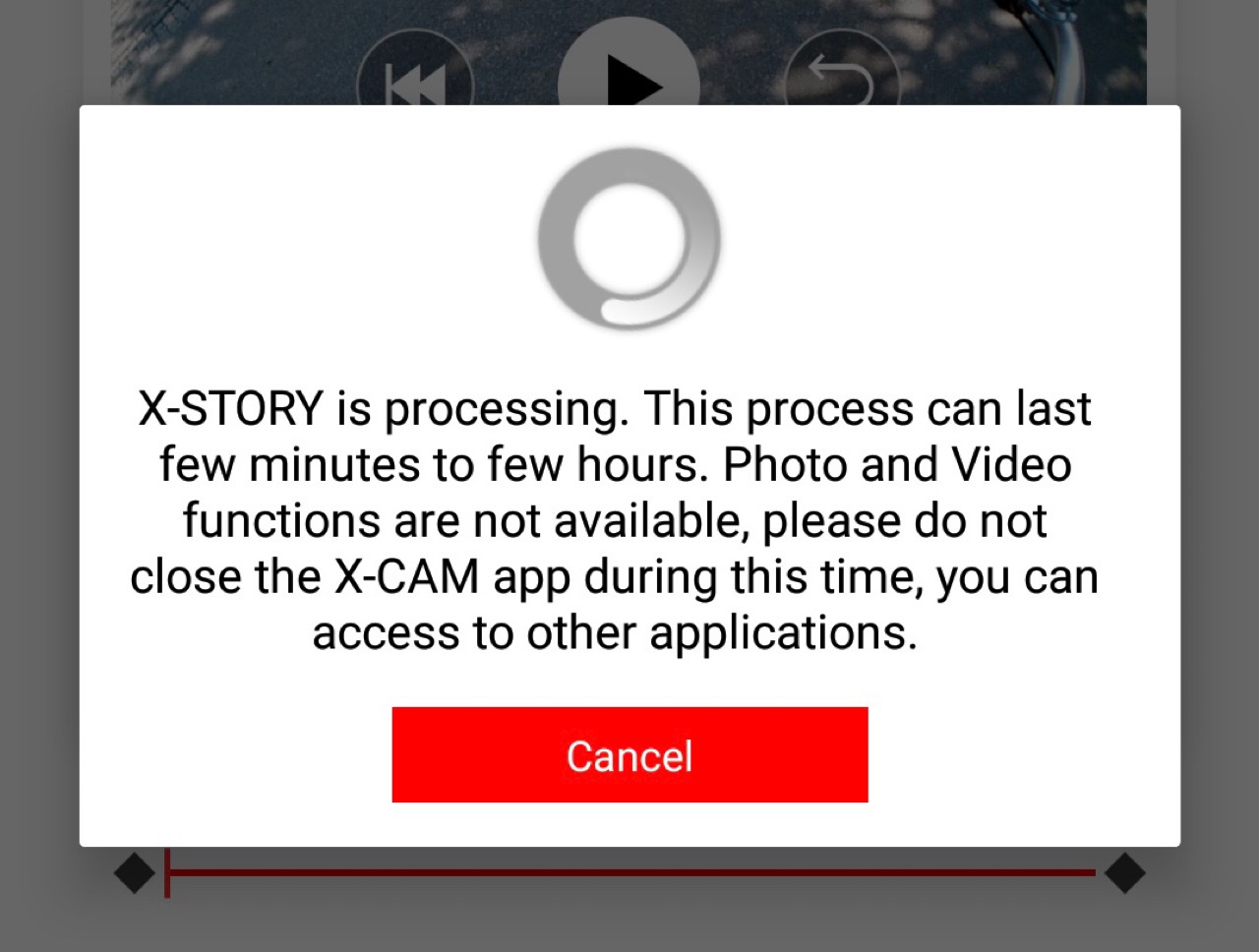


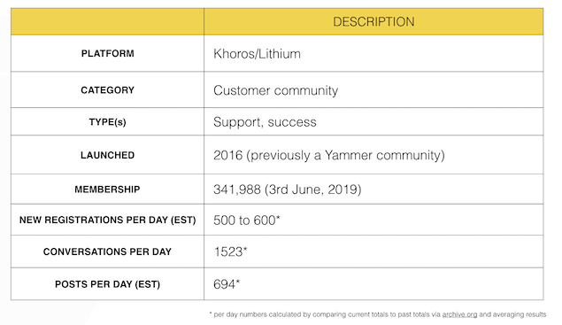

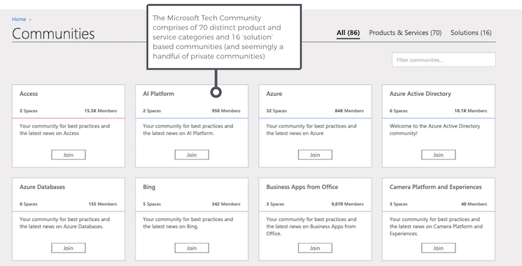


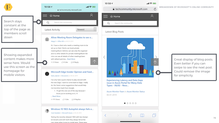
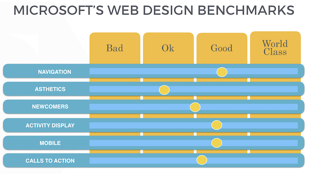



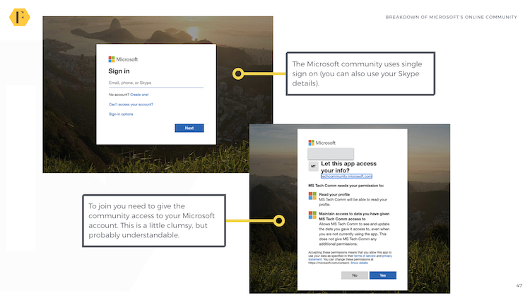
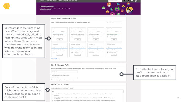
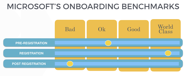
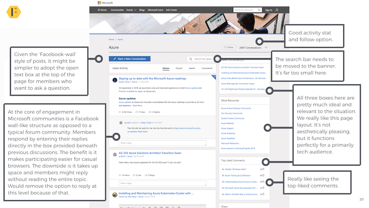
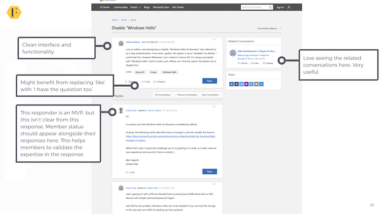

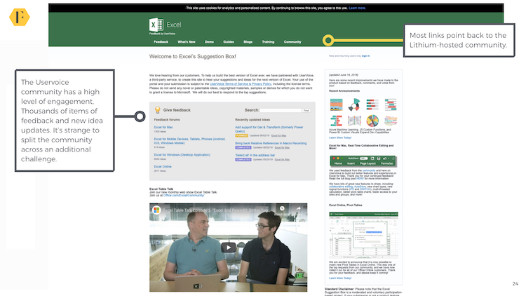


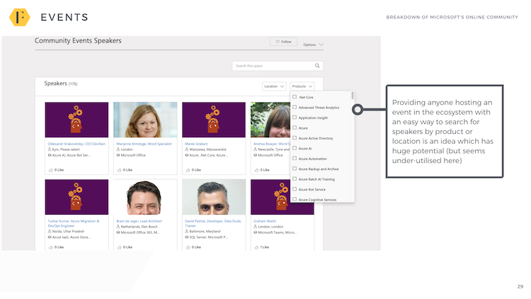


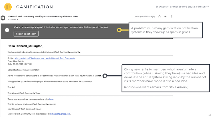

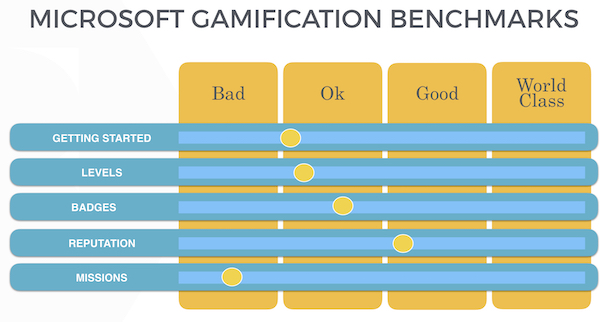
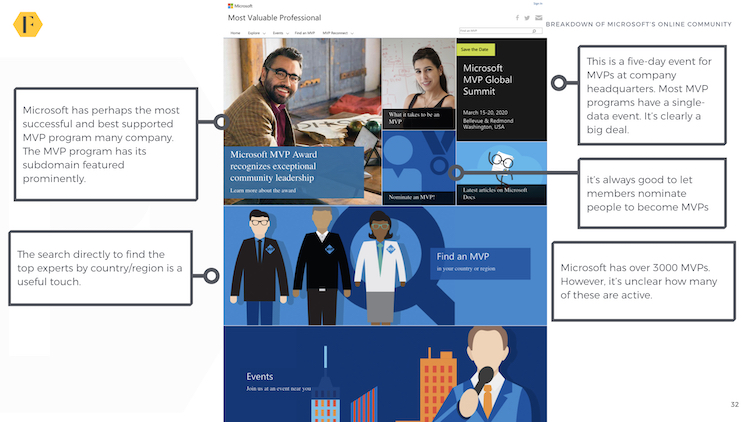
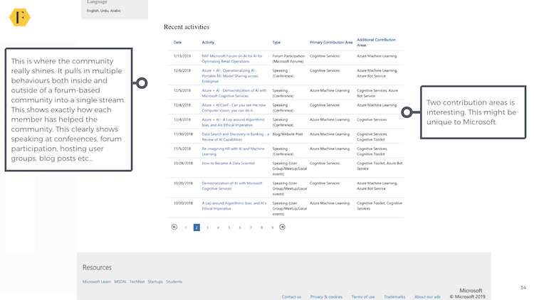
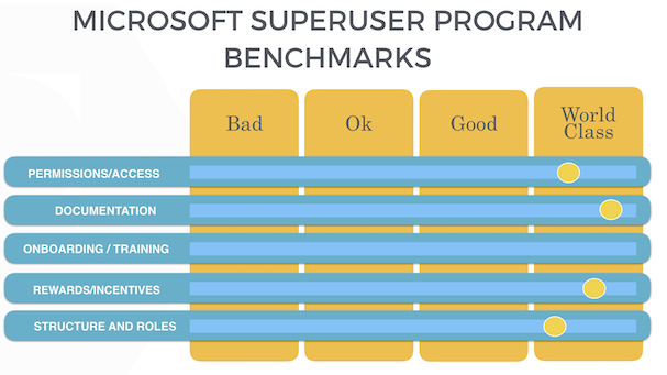


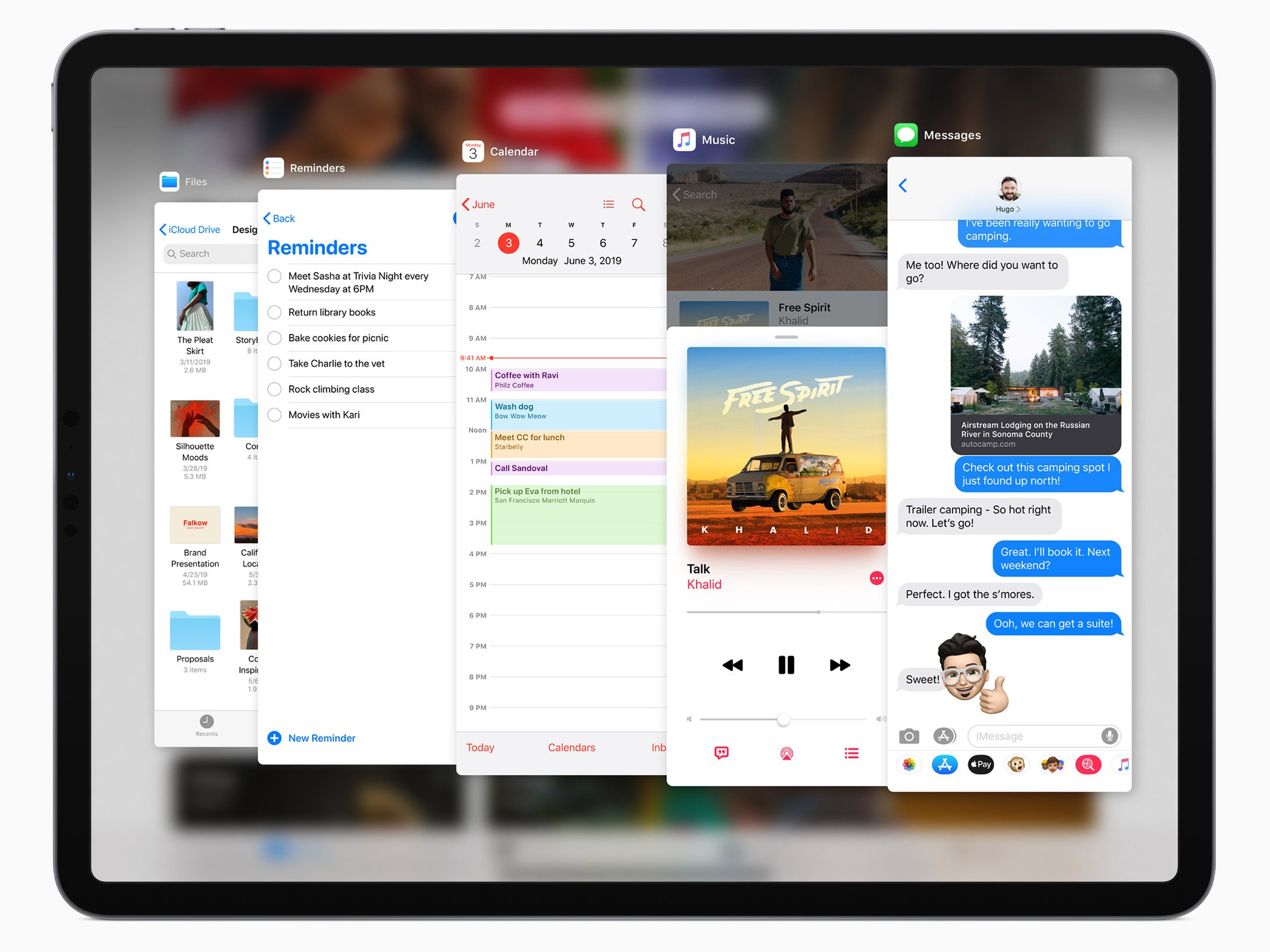

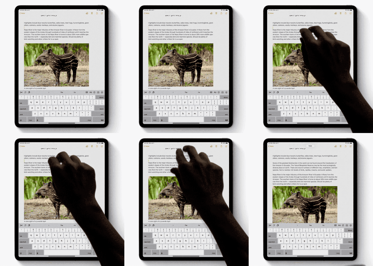




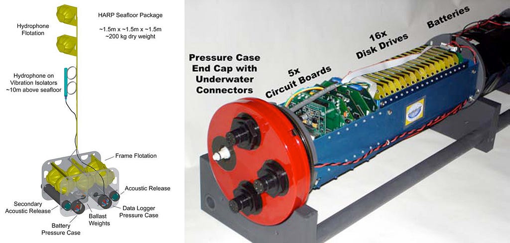
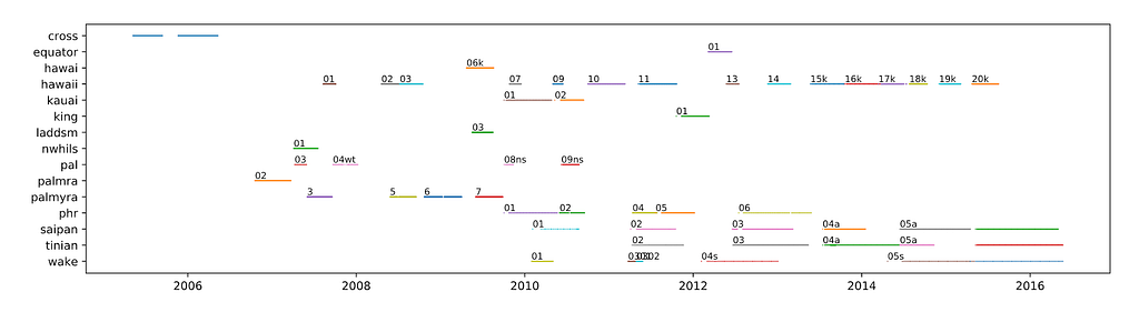
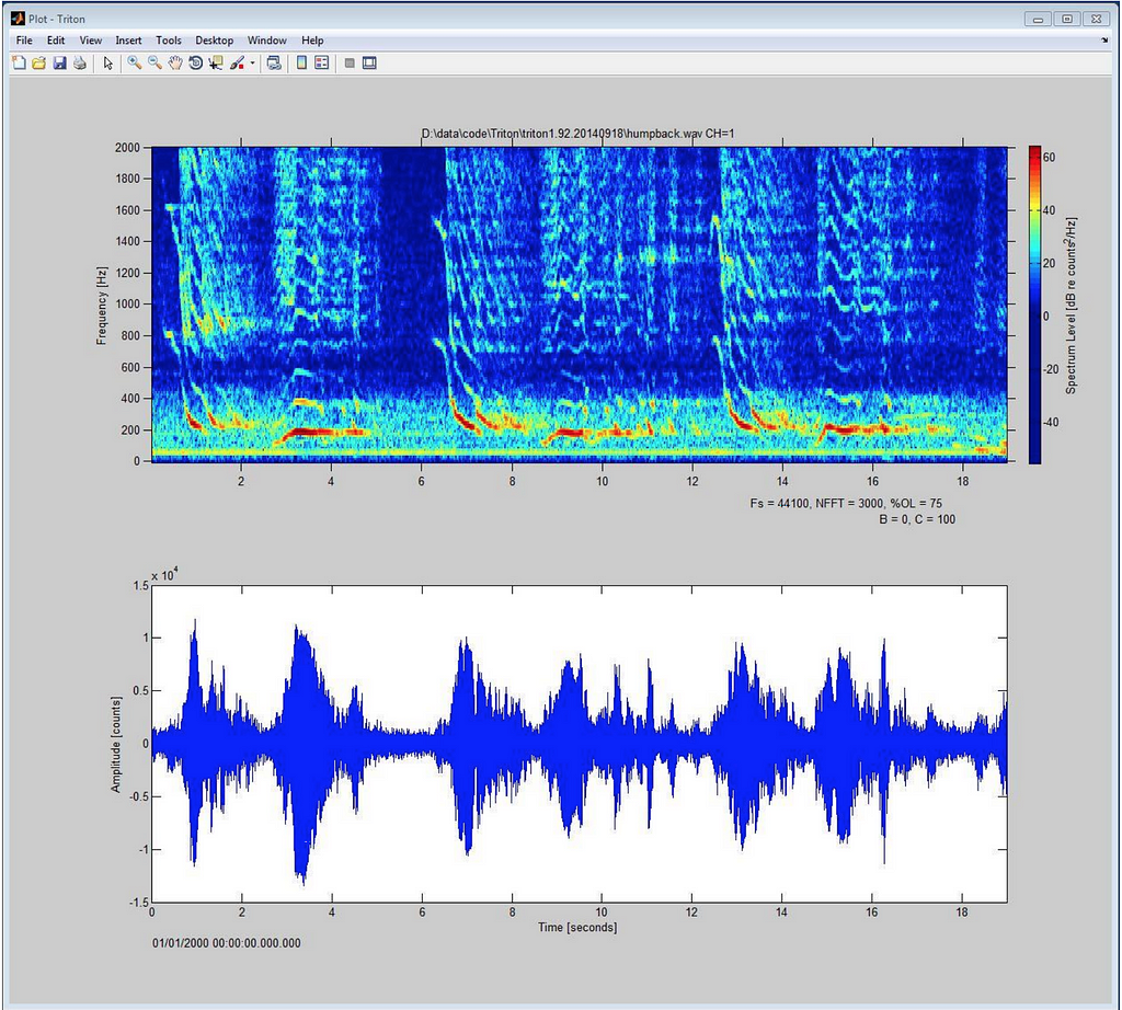
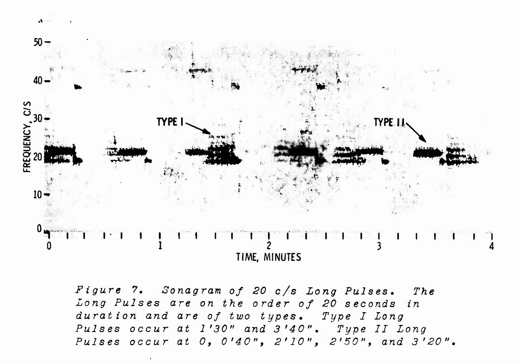
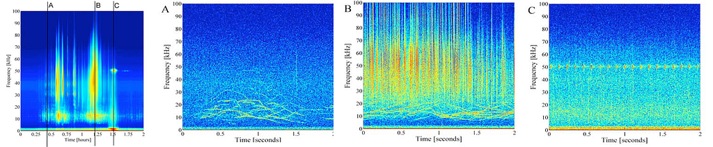
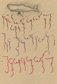
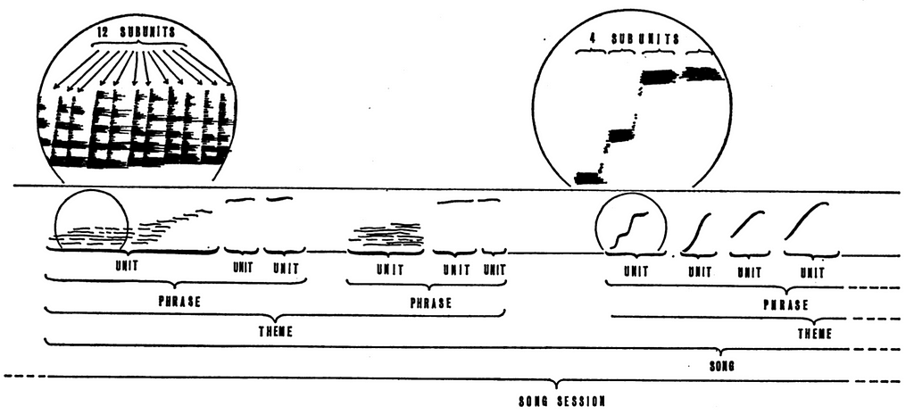
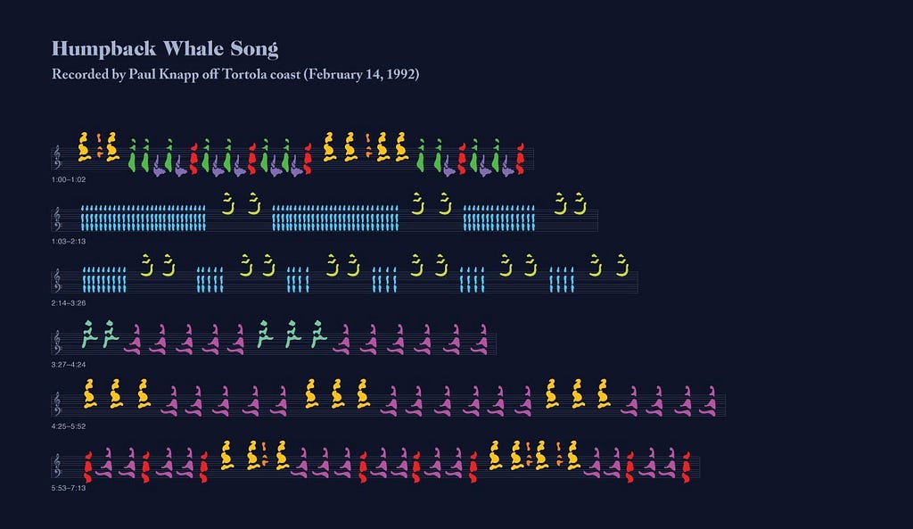
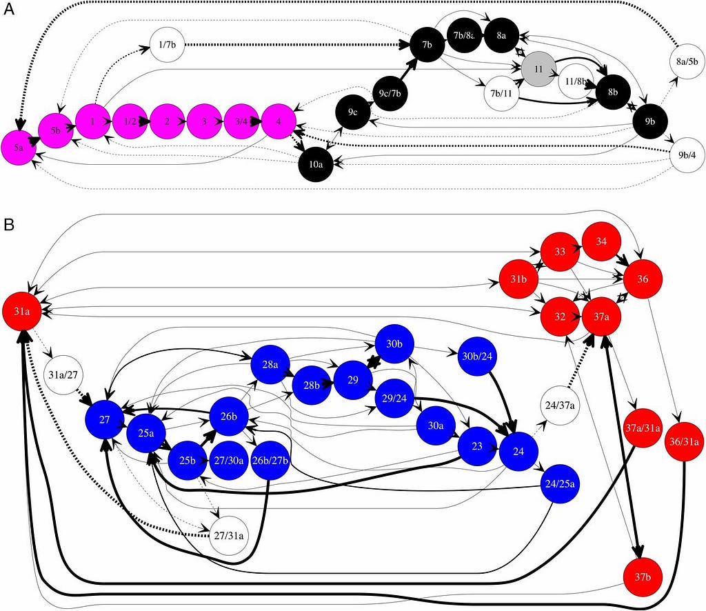

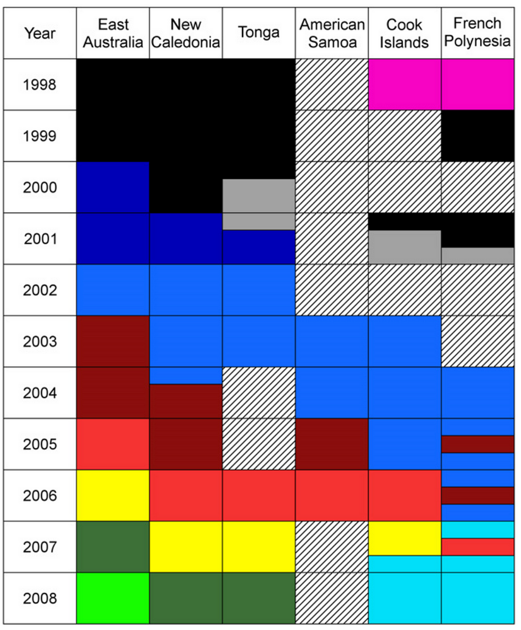
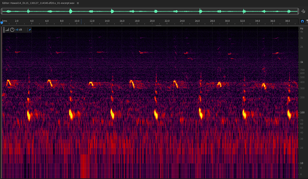
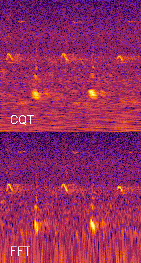
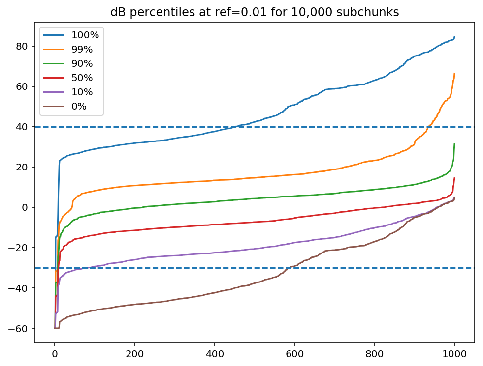

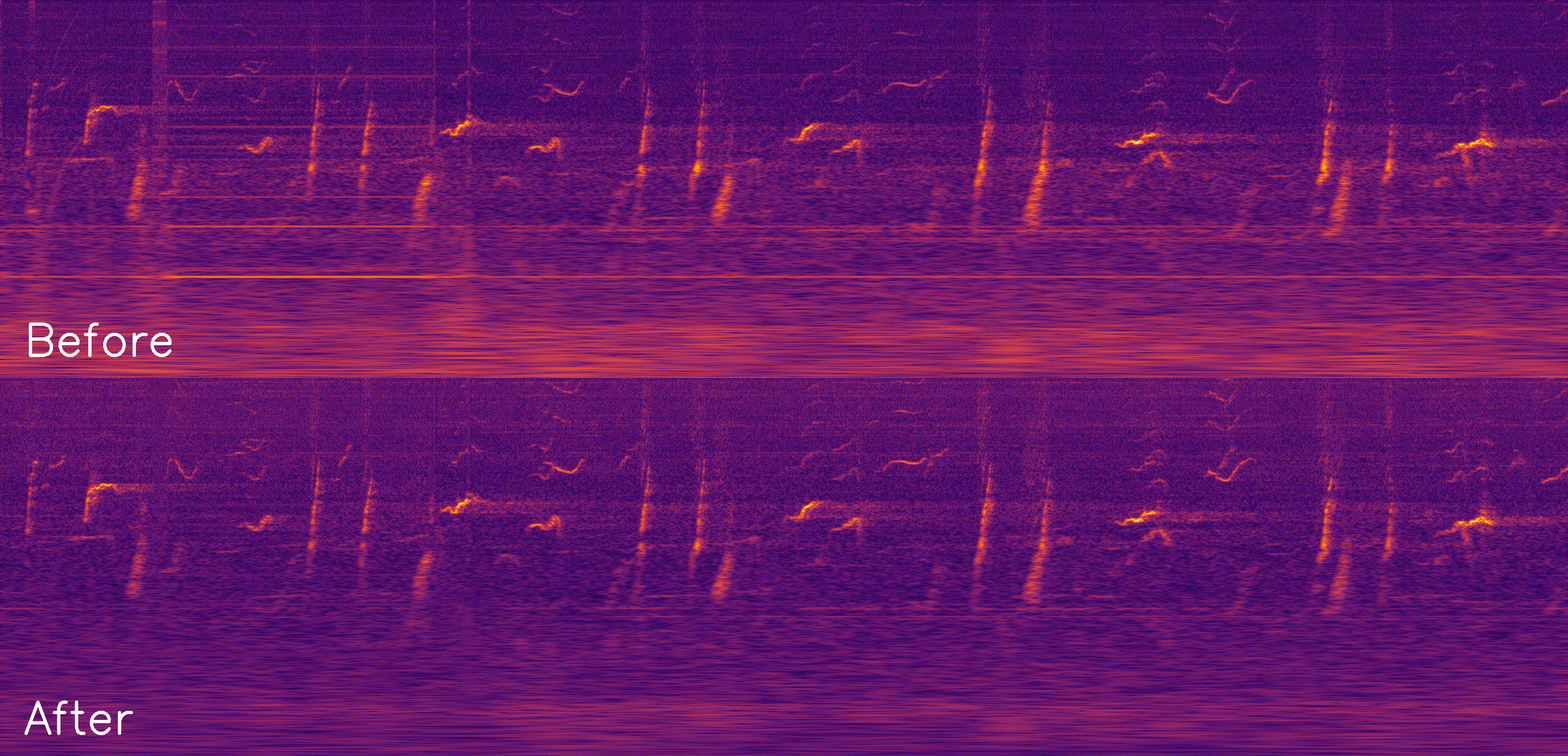
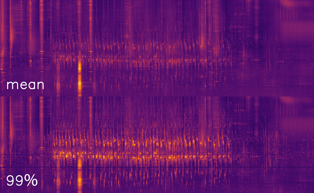
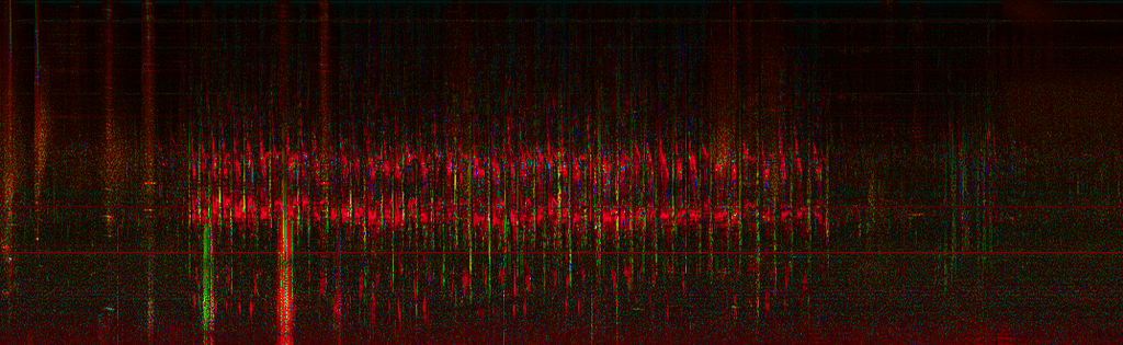

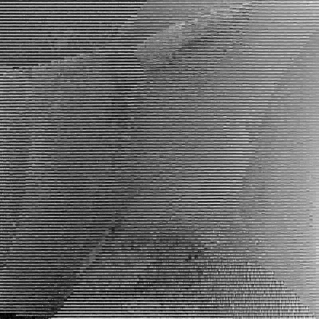
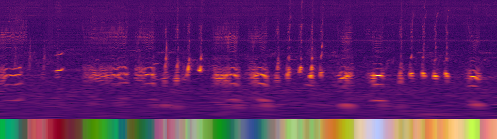
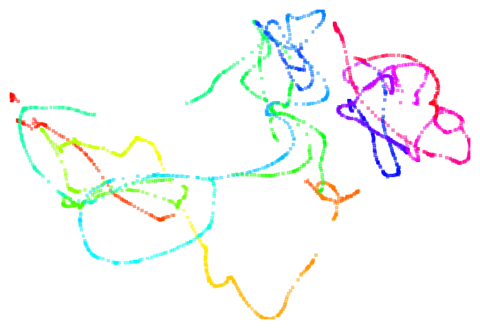
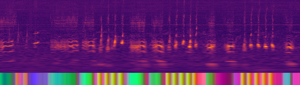

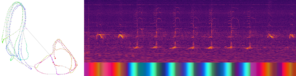

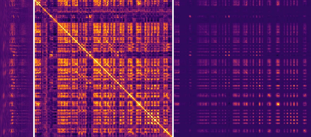
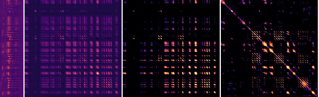
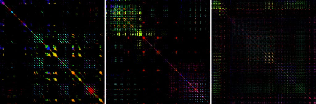
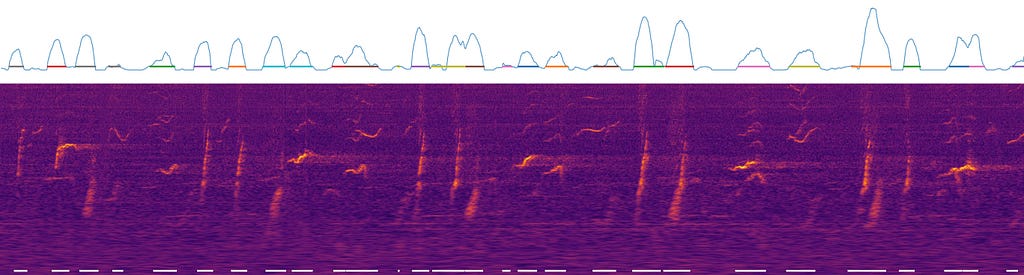
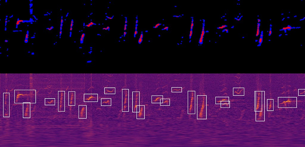

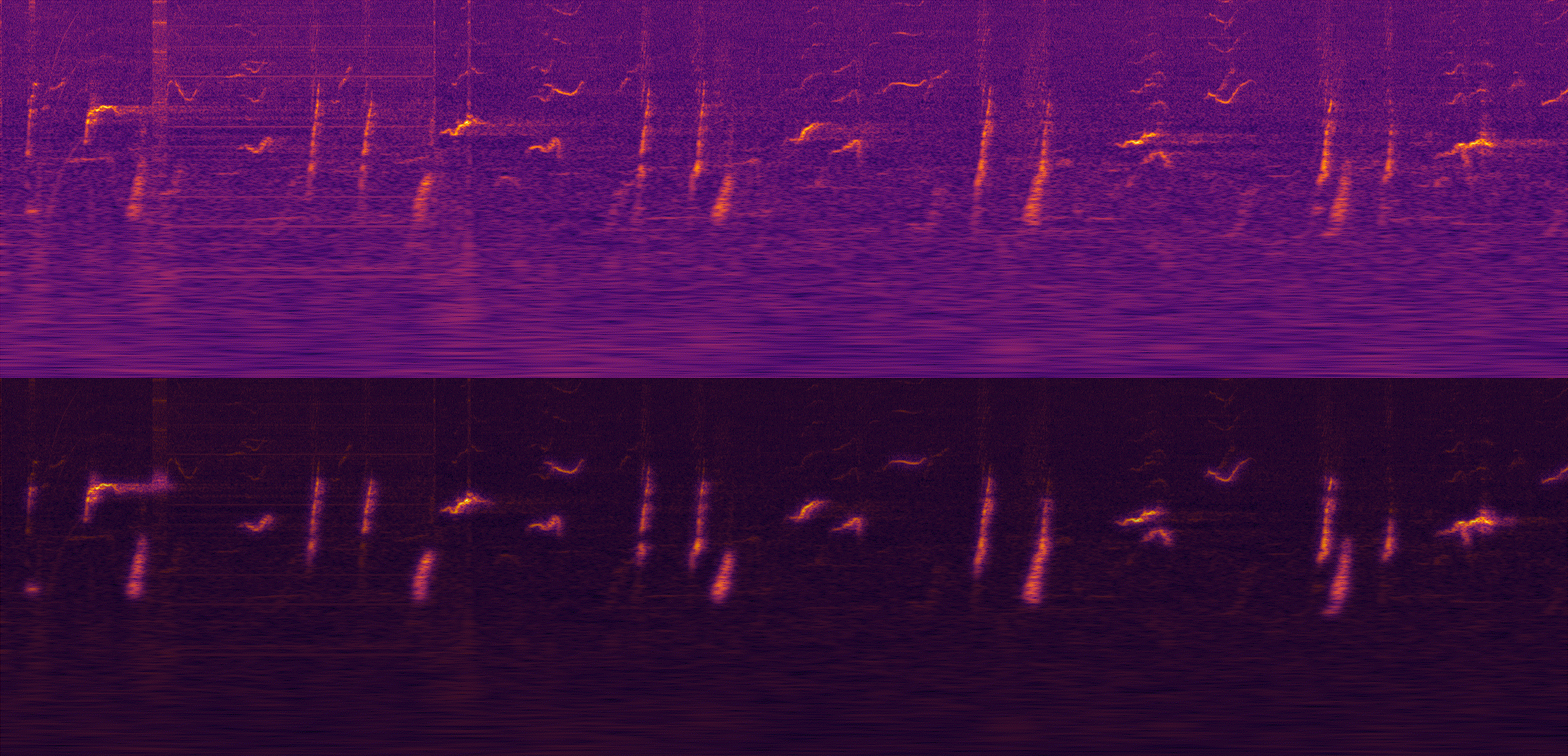
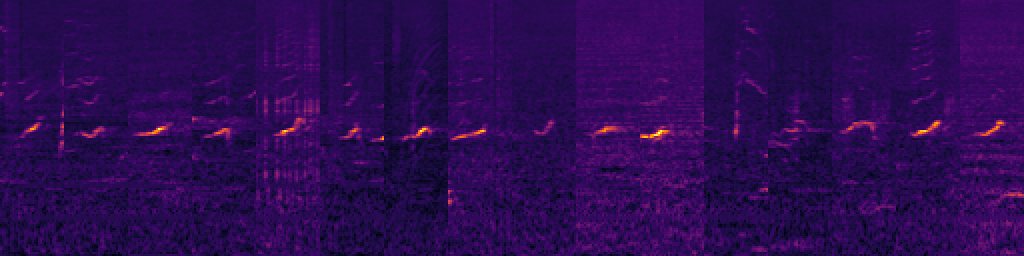
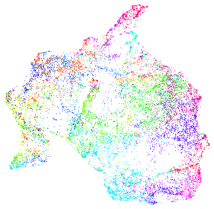




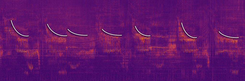
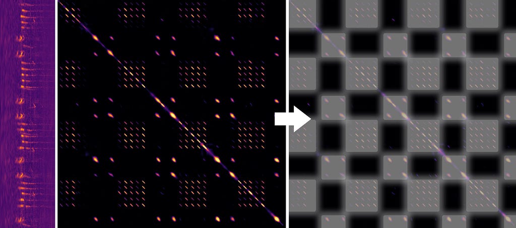
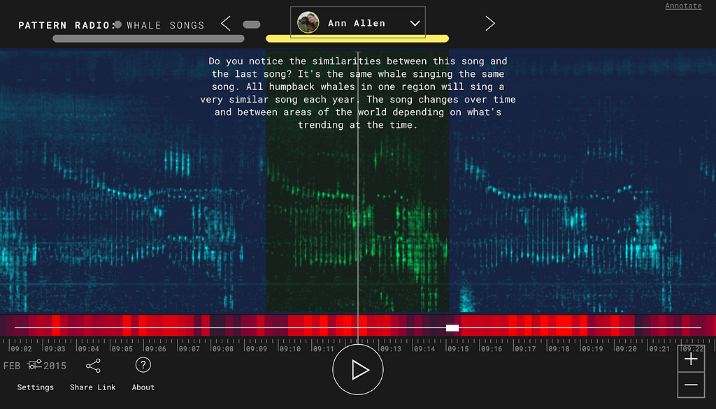


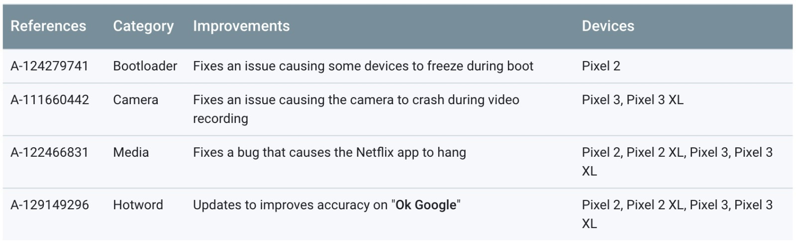

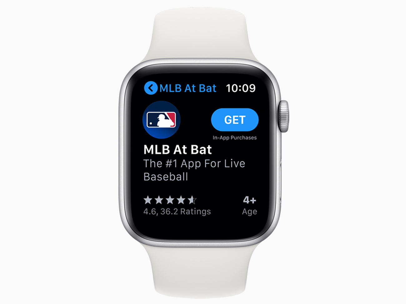

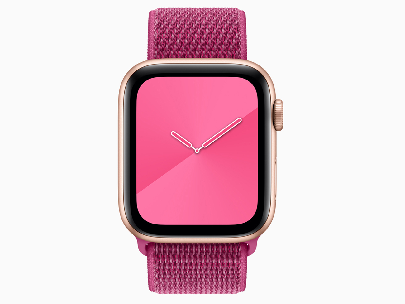

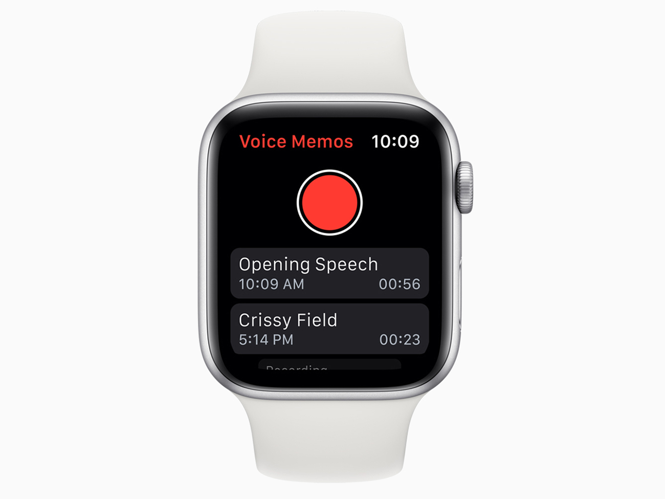

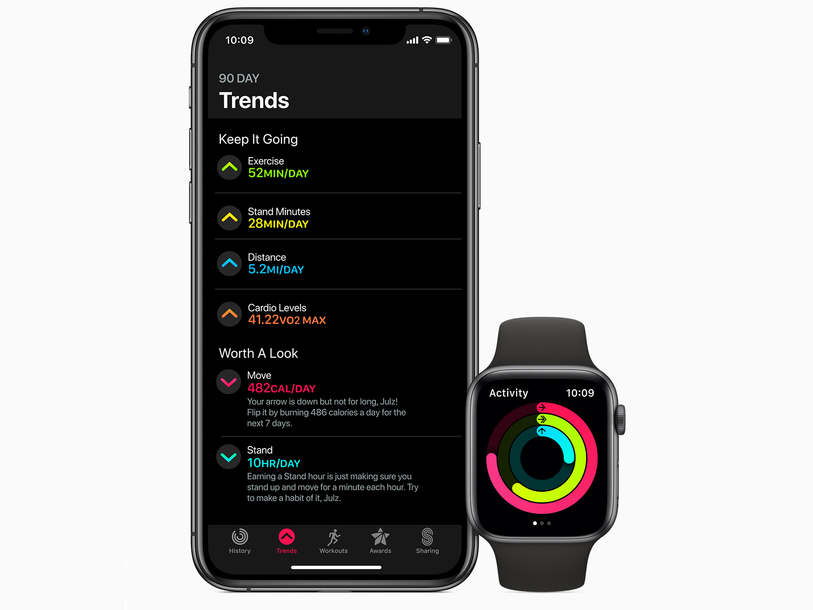
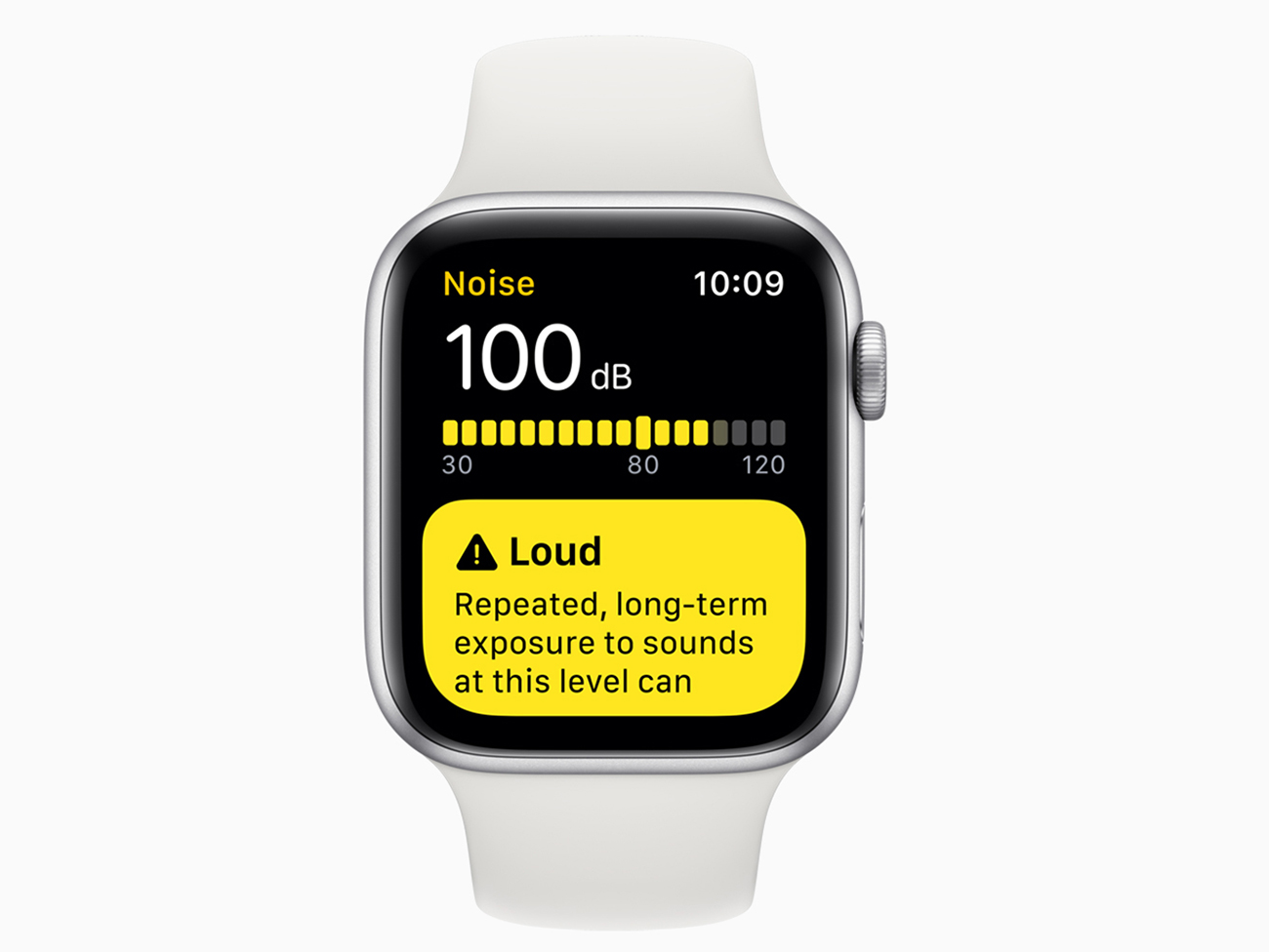
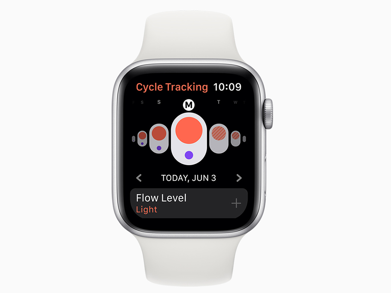




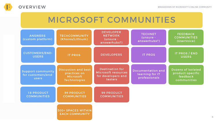
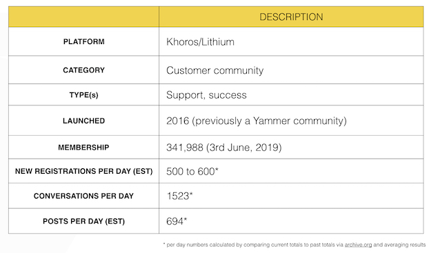
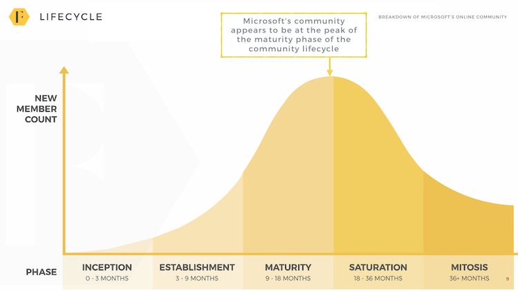
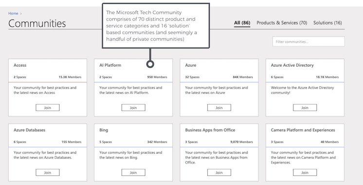
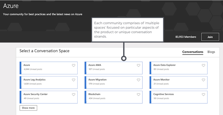

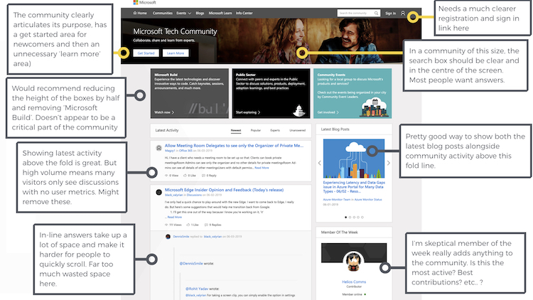
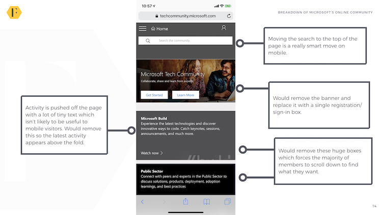

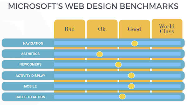
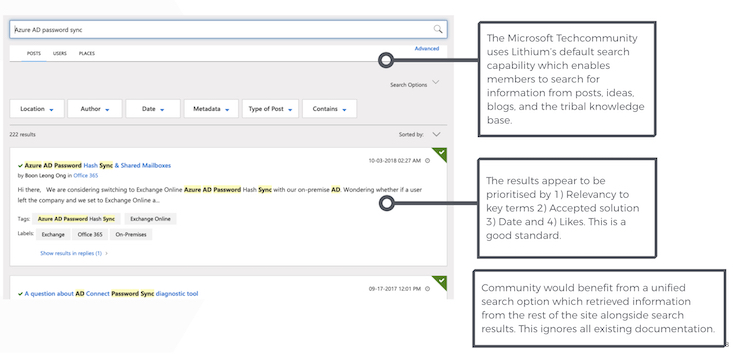


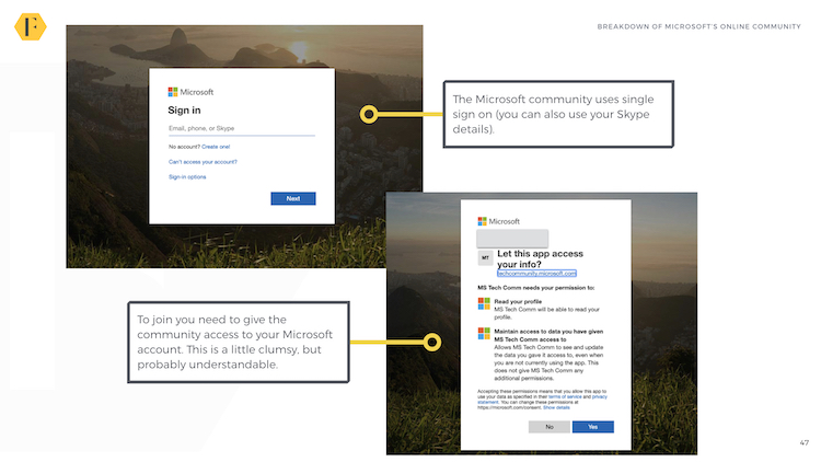
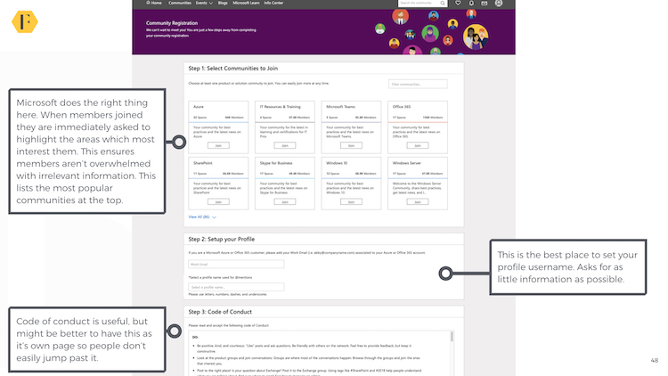
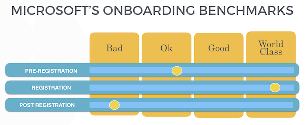
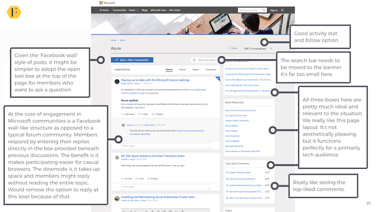
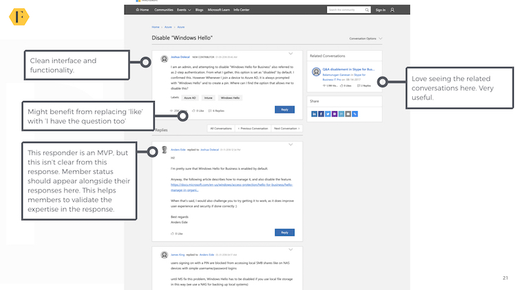
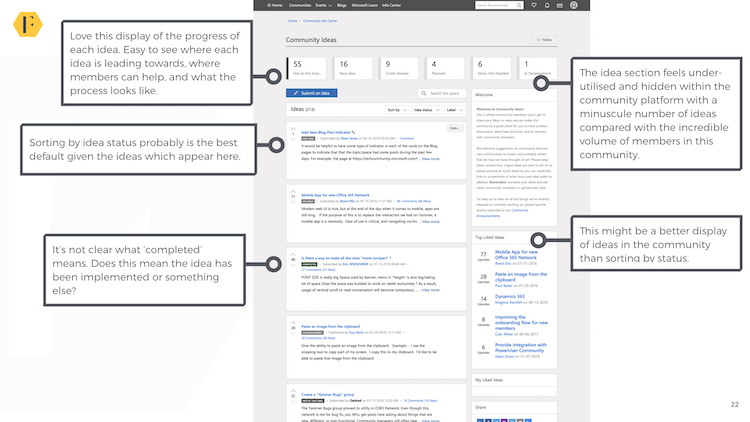
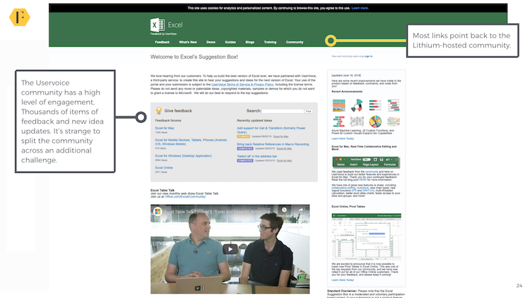
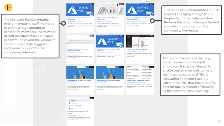
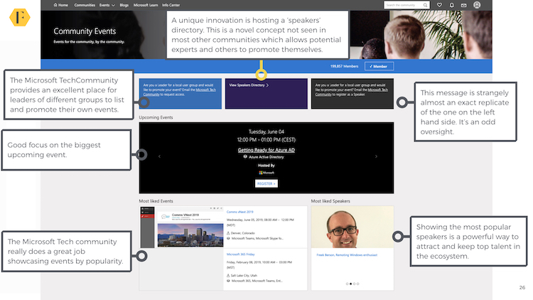
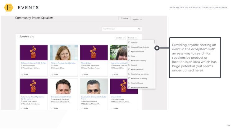
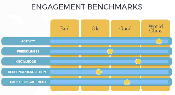
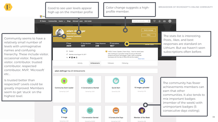
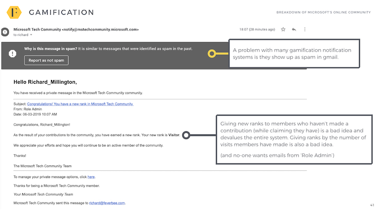

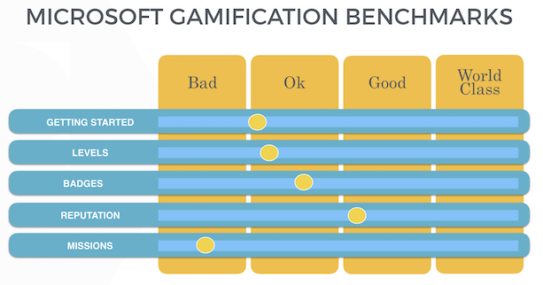
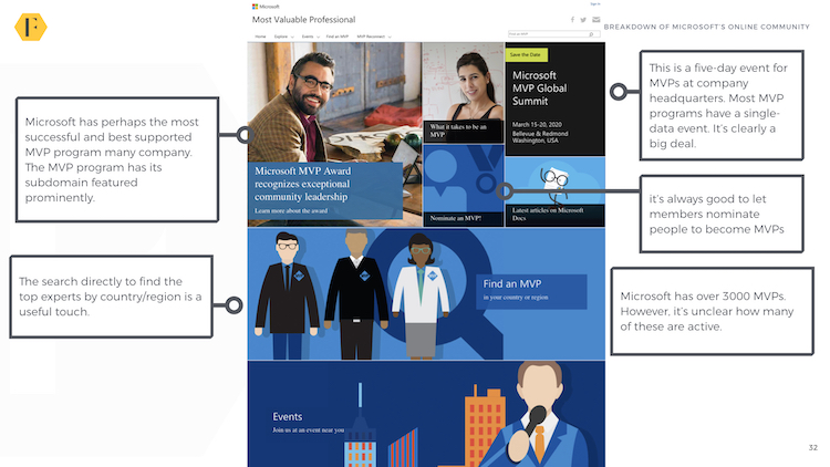
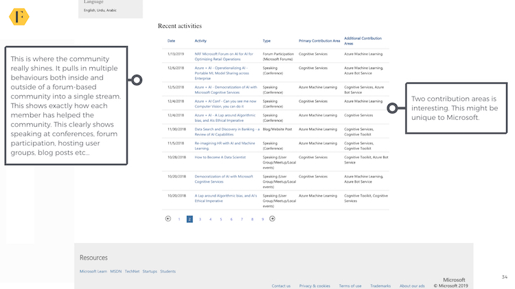
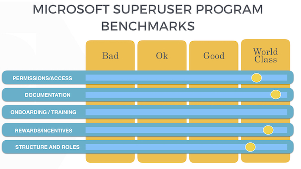
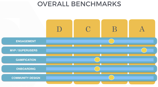
.jpg)
