
An iconic moment. pic.twitter.com/WXOejXUXBR

You can wash pillows. In the washing machine.
You can make a stir fry from kohlrabi, shallots, and tempeh.
Nobody’s coming to empty the upstairs wastebaskets; it’s on me.
If you enable it in your settings, Zoom meetings can have “breakout rooms,” created manually or automagically, where sub-hives can gather for smaller discussions.
Shopify has a retail point of sale system.
Mail from Belfast to Charlottetown takes two days. Mail from Charlottetown to Belfast takes a week.
For someone known to claim he has no friends, I sure have a lot of good friends.
We are back with one last major update before the 1.0 release of Windows Terminal! Releases between now and then will be revisions of this version. This is the v0.11 release and you can download the Terminal from the Microsoft Store or from the GitHub releases page. Let’s see what has changed with this update!
 Azure visualization – https://github.com/msleal/asciivmssdashboard
This is the first Windows Terminal version that has support for non-English UI languages. We are still working out the bugs with this, so please bear with us.  If you find any translation issues, please file them on our GitHub!
We have made some changes to our settings that we’d like to bring to your attention. We recommend you move your settings file out of the folder and have the Terminal automatically generate a new one. Then, you can copy your settings back over.
The profiles.json file has been renamed to settings.json. If you already have the Terminal installed, your file name will automatically update.
Cascadia Code has been set as the default font for all profiles automatically generated by the Terminal. If you want to change your font, you can add the fontFace property to any profile or to the defaults section.
Terminal now ships with the Tango Dark and Tango Light color schemes.
Copy and paste are bound to ctrl+c and ctrl+v, respectively, in the newly generated settings.json file. This means these key bindings will work alongside ctrl+shift+c and ctrl+shift+v and you can easily remove them. Ctrl+shift+c and ctrl+shift+v are still included in the defaults.json file, so you will still have a key combination you can use to copy and paste if you choose to remove ctrl+c and ctrl+v.
 Note: If you want to free up a default key combination, you can set it to
 unbound or null in your settings.json file.
{ "command": "unbound", "keys": "ctrl+shift+c" },
{ "command": null, "keys": "ctrl+shift+v" }
We have changed the default behavior of copying to copy plain text by default. A new global setting has been added to the newly generated settings.json file called copyFormatting. This is set to false by default, however you can change it to true to always copy the HTML and RTF formatting.
Note: In defaults.json, copyFormatting is set to true in order to not break existing users.
In preparation for v1.0, we have removed some previously deprecated settings. We know this will likely impact your workflows, but we are hoping this is a one-time event.
The Terminal no longer supports the globals property in the JSON file. If you have settings inside the globals object, they will be ignored. To fix this, remove the globals object and move your global settings into the root of the JSON file.
The global setting requestedTheme has been renamed to theme. This helps clean up the naming and provide flexibility for theming in the future.
"theme": "system"
The copyTextWithoutNewlines command and the argument trimWhitespace for copy have been removed in favor of the singleLine argument. This naming change helps better explain how the feature works. If you enable this as true for a copy key binding, the content copied from the Terminal will be on one line when pasted.
{ "command": { "action": "copy", "singleLine": true ), "keys": "ctrl+alt+c" }
The first iteration of creating a new tab of a specific profile had key binding commands from newTabProfile0 to newTabProfile8. We removed these commands in favor of a more flexible alternative.
Note: Indexing in the Terminal starts at 0.
{ "command": { "action": "newTab", "index": NUMBER }, "keys": "ctrl+shift+NUMBER" }
Tab navigation now has the same structure as new tab creation, where switchToTab0 through switchToTab8 have been removed in favor of the index property.
Note: Indexing in the Terminal starts at 0.
{ "command": { "action": "switchToTab", "index": NUMBER }, "keys": "ctrl+alt+NUMBER" }
To allow for more options when splitting panes, the splitHorizontal and splitVertical commands have been removed in favor of the new key binding format. Additionally, if you don’t provide a split direction, the Terminal will default to splitting using auto, which will split to provide the largest surface area.
{ "command": { "action": "splitPane", "split": "horizontal"}, "keys": "alt+shift+-" },
{ "command": { "action": "splitPane", "split": "vertical"}, "keys": "alt+shift+plus" }
Originally, you could use moveFocusDown, moveFocusUp, moveFocusLeft, moveFocusRight as key binding commands to navigate between panes. We have removed these and have added the following formats as replacements:
{ "command": { "action": "moveFocus", "direction": "down" }, "keys": "alt+down" },
{ "command": { "action": "moveFocus", "direction": "up" }, "keys": "alt+up" },
{ "command": { "action": "moveFocus", "direction": "left" }, "keys": "alt+left" },
{ "command": { "action": "moveFocus", "direction": "right" }, "keys": "alt+right" }
To follow the same key binding architecture, the pane resizing commands (resizePaneDown, resizePaneUp, resizePaneLeft, resizePaneRight) have been removed. Below is the new format for resizing panes.
{ "command": { "action": "resizePane", "direction": "down" }, "keys": "alt+shift+down" },
{ "command": { "action": "resizePane", "direction": "up" }, "keys": "alt+shift+up" },
{ "command": { "action": "resizePane", "direction": "left" }, "keys": "alt+shift+left" },
{ "command": { "action": "resizePane", "direction": "right" }, "keys": "alt+shift+right" }
The following key binding commands allowed you to change your font size, but they are now removed: decreaseFontSize, increaseFontSize.
You can modify your font size by using the below key bindings, which use a delta that defines the font size change in points.
{ "command": { "action": "adjustFontSize", "delta": -1 }, "keys": "ctrl+-" },
{ "command": { "action": "adjustFontSize", "delta": 1 }, "keys": "ctrl+=" }
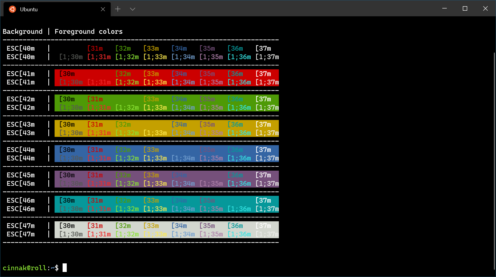
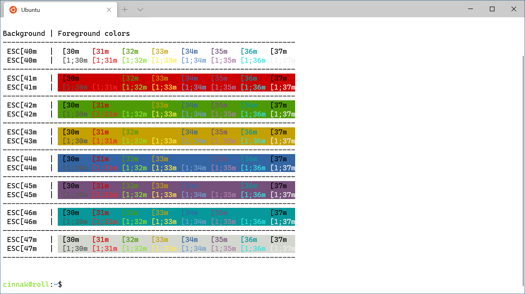
 The lines that appeared between solid blocks of background color are gone!
Command line arguments should trigger more reliably in the order you expect them to.
The input stack has been changed to address some issues with non-US-104 QWERTY keyboard layouts.
The window borders now respect your application theme.
We love working with the community on GitHub and we’d like to recognize some individual contributors who have made an impact on this release!
We hope you’ve been enjoying the Windows Terminal so far and we’re eager to release v1.0 very soon. If you have any questions or feedback, feel free to reach out to Kayla on Twitter (@cinnamon_msft). If you find any bugs or would like to file a feature request, you can create a new issue on our GitHub page. We’ll see you soon with our 1.0 release!

The post Windows Terminal Preview v0.11 Release appeared first on Windows Command Line.
A new release of Datasette, two new projects and progress towards a Dogsheep photos solution.
I released Datasette 0.40 last night. Full release notes are here, but the highlights of this key feature in this release is the ability to provide metadata in a metadata.yaml file as an alternative to metadata.json. This is particularly useful for embedded multi-line SQL queries: I've upgraded simonw/museums and simonw/til to take advantage of this, since they both use their metadata to define SQL queries that power their search pages and Atom feeds.
My JSK Fellowship at Stanford ends in a few months. JSK has extremely talented and influential alumni, and one of the benefits of the fellowship is becoming part of that network afterwards.
The @JSKStanford Twitter account maintains lists of fellows on Twitter - journalists love Twitter! - so I decided to use my twitter-to-sqlite tool to build a Datasette-powered search engine of them.
That search engine is now running at jsk-fellows.datasettes.com. It's updated daily by a GitHub Action to capture any bio changes or new list entrants.
It's a neat example of taking advantage of SQLite views to build faceted search across a subset of data. A script constructs the jsk_fellows view at build time, then metadata.json configures that view to run full-text search and facet by the derived fellowship column.
I shipped twitter-to-sqlite 0.21 with a new twitter-to-sqlite lists username command as part of this project.
I described my new TILs project on Monday. I've published 15 so far - the format is working really well for me.
Hacking on simonw/tils reminded me of a feature gap in my datasette-template-sql plugin: it didn't have a solution for safely escaping parameters in SQL queries, leading to nasty string concatenated SQL queries.
datasette-template-sql 1.0 fixes that issue, at the cost of backwards compatibility with previous releases. I'm using it for both til and museums now.
I released github-to-sqlite 2.0 with a small backwards incompatible change to the database schema (hence the major version increment). It builds on 1.1 from a few days ago which added a new github-to-sqlite contributors command for fetching statistics on contributors to repositories.
More importantly, I improved the live demo running at github-to-sqlite.dogsheep.net.
The demo now updates once a day using GitHub Actions and pulls in releases, commits, issues, issue comments and contributors for all of my Dogsheep projects plus datasette and sqlite-utils.
This means I can browse and execute SQL queries across 929 issues, 1,505 commits and 132 releases across 14 repositories!
Want to see which of my projects have had the most releases? Facet releases by repo.
I've also installed the datasette-search-all plugin there, so you can search across all commits, releases, issues etc for "zeit now" for example.
Bringing all of my different project data together in one place like this is really powerful.
I think it's a great illustration of the Datasette/Dogsheep philosophy of pulling down a complete SQLite-powered copy of data from external services so you can query and join across your data without being limited to the functionality that those services provide through their own interfaces or APIs.
Dogsheep is about bringing all of my interesting personal and social data into a single, private place.
The biggest thing missing at the moment is photos. I want to be able to query my photos with SQL, and eventually combine them with tweets, checkins etc in a unified timeline.
Last week I took a step towards this goal with heic-to-jpeg, a proxy to let me display my iPhone's HEIC photos online.
This week I started work on photos-to-sqlite - the set of tools which I'll use to turn my photos into something I can run queries again.
So far I've mainly been figuring out how to get them into an S3 bucket that I control. Once configured, running photos-to-sqlite upload photos.db ~/Pictures/Photos\ Library.photoslibrary/originals will start uploading every photo it can find in that directory to the S3 bucket.
The filename it uses is the sha256 hash of the photo file contents, which I'm hoping will let me de-dupe photos from multiple sources in the future. It also writes basic metadata on the photos to that photos.db SQLite database.
This is going to be a big project. I'm investigating osxphotos to liberate the metadata from Apple Photos, and various Python libraries for extracting EXIF data from the files themselves.
Once I've got that working, I can experiment with things like piping photos through Google Cloud Vision to label them based on their contents.
This is all a very, very early alpha at the moment, but I'm cautiously optimistic about progress so far.
Guess who has come out with a quick response on how to design for our changing street uses in the time of the virus. It’s from a place you might not expect: the provincial transportation ministry.
Here’s what they recommend to those who make the decisions about how we’re going to allocate road space.

Since the days of Jane Jacobs and Robert Moses, urbanists are typically sceptical of large state or provincial transportation departments (mostly about the care and feeding of highways) very much removed from local conditions.
But this is helpful. The people at the province basically get the idea. The headline alone – “Reallocation of Roadway Space” – is pretty provocative for a culture like MoTI.
However, some of it is already contested.
Sorry, guys, there’s this:

Beach flow way showed what could be done overnight. And it works – without meeting all the recommendations above.
We’re learning by doing, because we have to do this. Virus.
Trying things out safely and monitoring the results is a great and necessary way to proceed. But trying to do it with a set of prescribed regulations presumes you know what your’re trying to prescribe for.
Not yet, I’d bet.
This is what online learning looks like to me. "The 100 Day Writing Challenge is a free fiction writing course, by podcast. Each episode contains a 10 minute exercise, complete with timer, to help build your writing muscles, train you in different styles, and develop your confidence. There’s no homework, and you can complete the course at your own pace. The 100 Day Writing Challenge was made possible by the support of Arts Council England... you’ll find a list of episodes, with links to full audio transcripts, in case you prefer text." Author Tim Clare also developed the Couch to 80K Writing Boot Camp.
Web: [Direct Link] [This Post]Unsurprisingly, the challenges here are much greater than those in wealthier companies. Moreover, as Tony Bates makes clear, there's a lot of variation - some countries have good internet access in cities, less so in rural areas, in others access to technology may vary between rich and poor, and so on. So his advice is "use the media that make most sense in your situation." And as he notes, in many countries "online learning will be a non-starter for all but the wealthiest, urban students." So, what to do? "Start by asking: who are your students and what access to technology do they already have?" Also, "it is better to reach 90% of students with a slightly less than perfect medium than to reach 50% with a more powerful medium. You are more likely to meet most students with a combination of media. Also the more media the better."
Web: [Direct Link] [This Post]This Letter to the Editor ran in this morning’s Guardian (paywall):
As spring arrives and we all spend more time outside, those of us who live in downtown Charlottetown are awakening to a very changed urban landscape, where there are more pedestrians, wheelchairs and bicycles than there are vehicles.
We’re discovering that, suddenly, we have the wrong kind of streetscape for the times: vast swathes of pavement devoted to the absent automobiles, while we all crowd together on the sidewalks and sides of the streets.
And so I have a proposal: during the time of this pandemic, let’s declare the streets of Charlottetown, from Grafton Street to the water, as an “active transportation first” zone. Encourage vehicles, other than those of residents and those making deliveries, to stay out of the area. Lower the speed limit to 20 km/h. And allow wheelchairs, bicycles and pedestrians to freely and safely use the streets, to get the exercise and fresh air that we all need so much.
We have a once in a lifetime opportunity to experiment with what a car-free downtown might look like; let’s take this horrible pandemic and try and leverage the slivers of opportunity it offers us.
I’m hopeful that this will happen in the next week.
Update
I’ve added a GitHub repository containing the code needed to reproduce the graphs in this post, as what’s shown here isn’t self-contained.
Apple recently released a batch of mobility data in connection with the COVID-19 pandemic. The data is aggregated from requests for directions in Apple Maps and is provided at the level of whole countries and also for a selection of large cities around the world. I folded the dataset into the covdata package for R that I’ve been updating, as I plan to use it this Fall in a course I’ll be teaching. Here I’ll take a quick look at some of the data. Along the way—as it turns out—I end up reminding myself of a lesson I’ve learned before about making sure you understand your measure before you think you understand what it is showing.
Apple released time series data for countries and cities for each of three modes of getting around: driving, public transit, and walking. The series begins on January 13th and, at the time of writing, continues down to April 20th. The mobility measures for every country or city are indexed to 100 at the beginning of the series, so trends are relative to that baseline. We don’t know anything about the absolute volume of usage of the Maps service.
Here’s what the data look like:
|
|
The index is the measured outcome, tracking relative usage of directions for each mode of transportation. Let’s take a look at the data for New York.
|
|
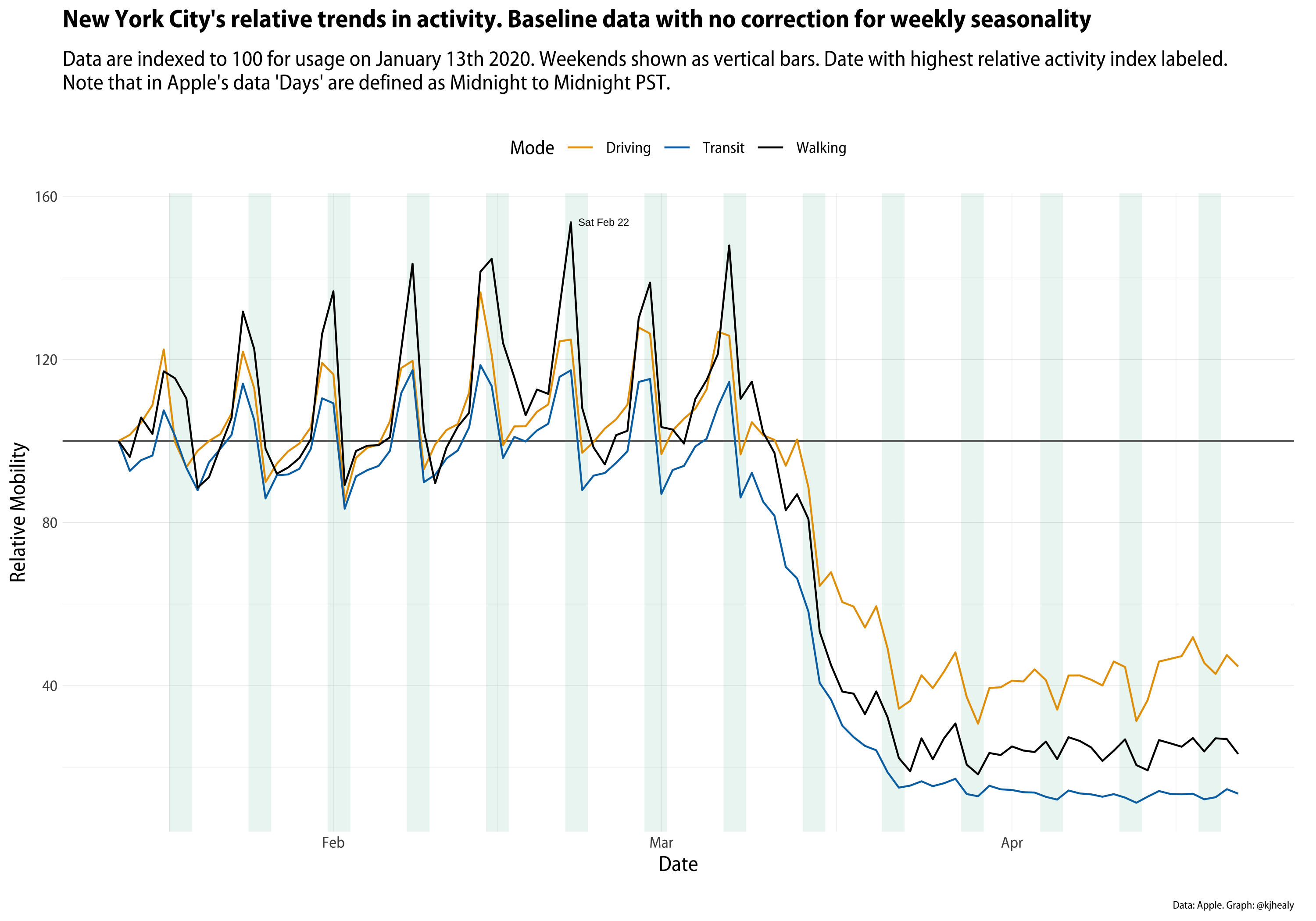
Relative Mobility in New York City. Touch or click to zoom.
As you can see, we have three series. The weekly pulse of activity is immediately visible as people do more or less walking, driving, and taking the subway depending on what day it is. Remember that the data is based on requests for directions. So on the one hand, taxis and Ubers might be making that sort of request every trip. But people living in New York do not require turn-by-turn or step-by-step directions in order to get to work. They already know how to get to work. Even if overall activity is down at the weekends, requests for directions go up as people figure out how to get to restaurants, social events, or other destinations. On the graph here I’ve marked the highest relative value of requests for directions, which is for foot-traffic on February 22nd. I’m not interested in that particular date for New York, but when we look at more than one city it might be useful to see how the maximum values vary.
The big COVID-related drop-off in mobility clearly comes in mid-March. We might want to see just that trend, removing the “noise” of daily variation. When looking at time series, we often want to decompose the series into components, in order to see some underlying trend. There are many ways to do this, and many decisions to be made if we’re going to be making any strong inferences from the data. Here I’ll just keep it straightforward and use some of the very handy tools provided by the tidyverts (sic) packages for time-series analysis. We’ll use an STL decomposition to decompose the series into trend, seasonal, and remainder components. In this case the “season” is a week rather than a month or a calendar quarter. The trend is a locally-weighted regression fitted to the data, net of seasonality. The remainder is the residual left over on any given day once the underlying trend and “normal” daily fluctuations have been accounted for. Here’s the trend for New York.
|
|
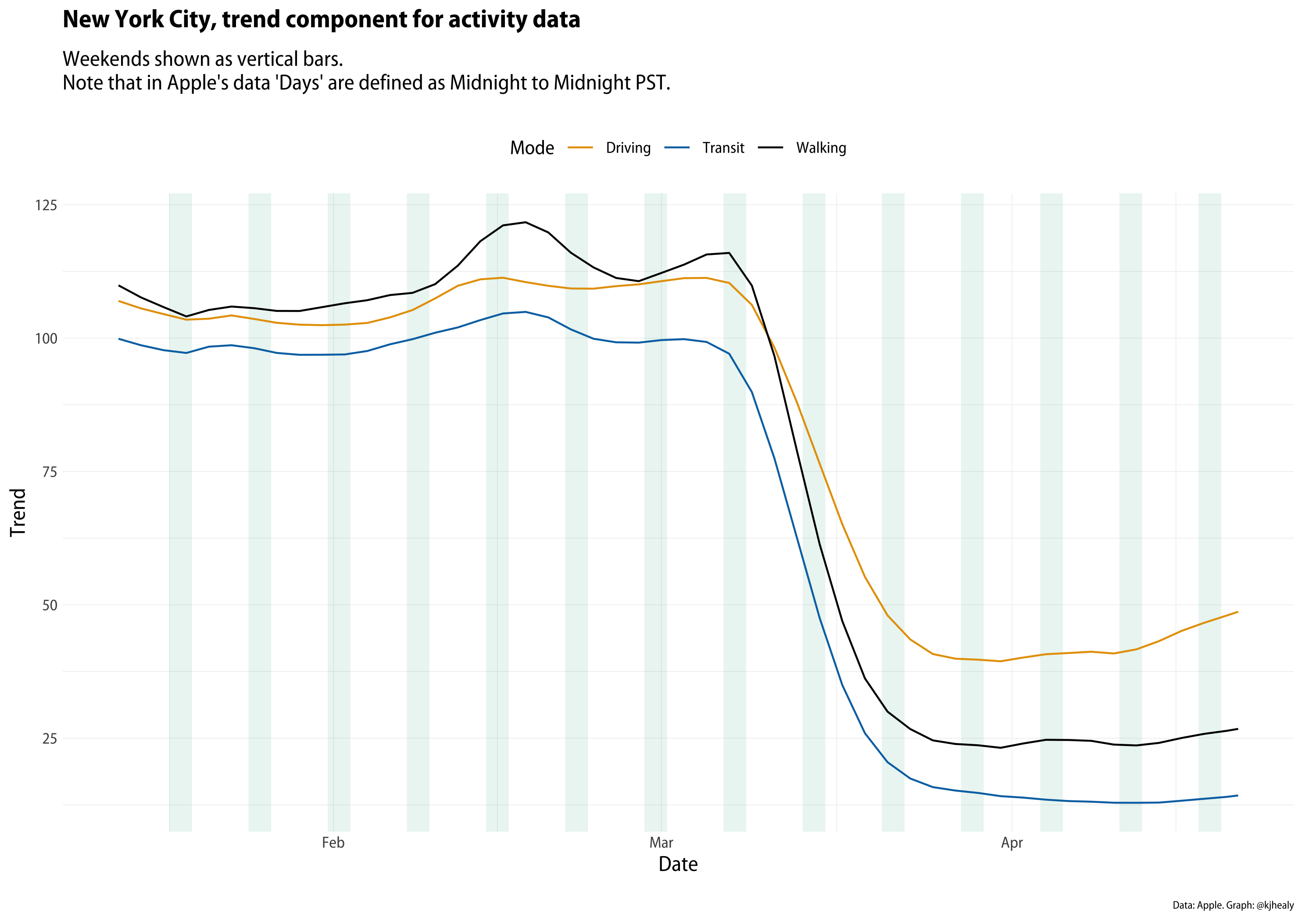
Trend component of the New York series. Touch or click to zoom.
We can make a small multiple graph showing the raw data (or the components, as we please) for all the cities in the dataset if we like:
|
|

Data for all cities. Touch or click to zoom.
This isn’t the sort of graph that’s going to look great on your phone, but it’s useful for getting some overall sense of the trends. Beyond the sharp declines everywhere—with slightly different timings, something that’d be worth looking at separately—a few other things pop out. There’s a fair amount of variation across cities by mode of transport and also by the intensity of the seasonal component. Some sharp spikes are evident, too, not always on the same day or by the same mode of transport. We can take a closer look at some of the cities of interest on this front.
|
|
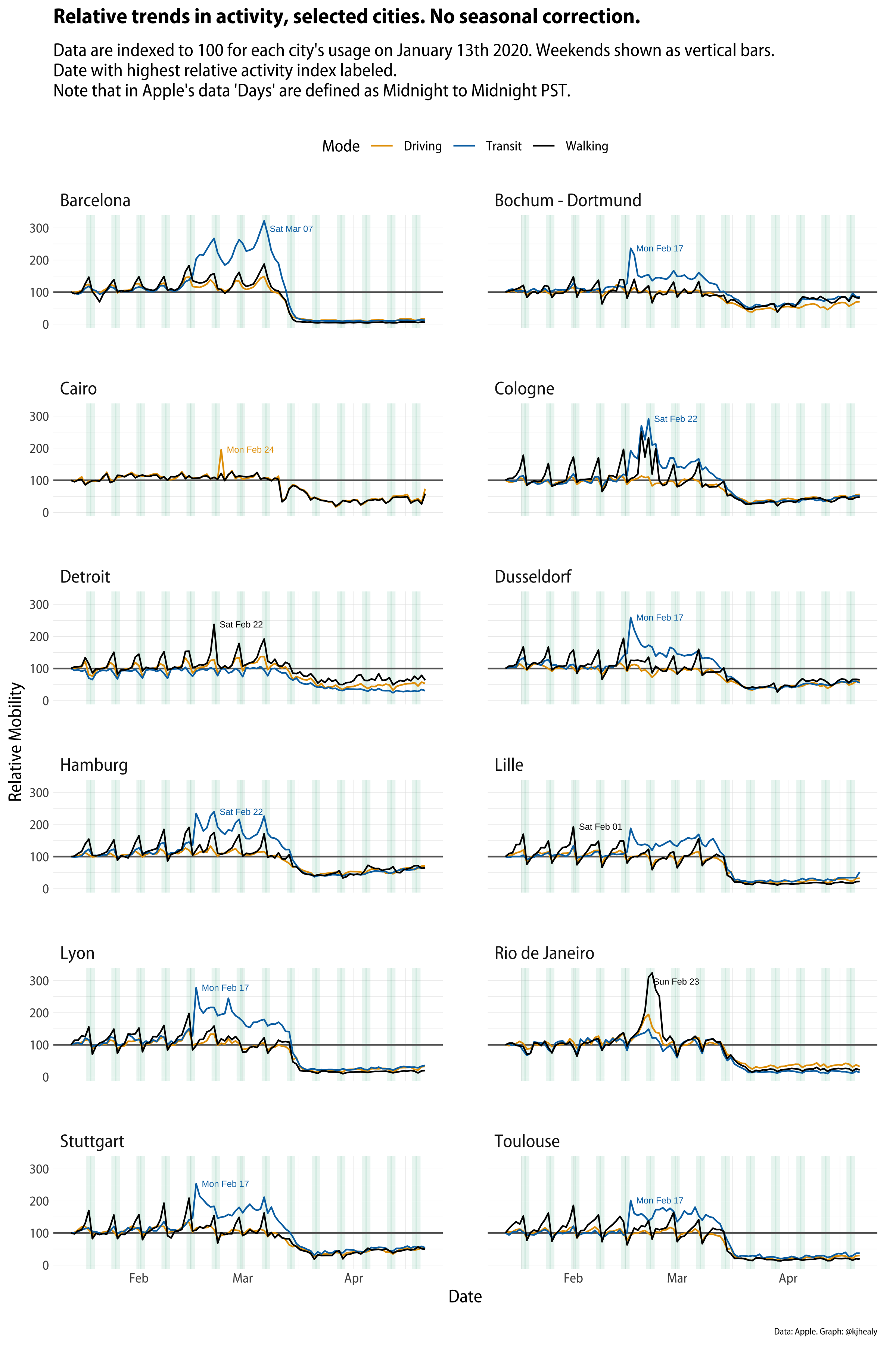
Selected cities only. Touch or click to zoom.
Look at all those transit peaks on February 17th. What’s going on here? At this point, we could take a look at the residual or remainder component of the series rather than looking at the raw data, so we can see if something interesting is happening.
|
|

Remainder components only. Touch or click to zoom.
We can see that there’s a fair amount of correspondence between the spikes in activity, but it’s not clear what the explanation is. For some cities things seem straightforward. Rio de Janiero’s huge spike in foot traffic corresponds to the Carnival parade around the week of Mardi Gras. As it turns out—thanks to some local informants for this—the same is true of Cologne, where Carnival season (Fasching) is also a big thing. But that doesn’t explain the spikes that repeatedly show up for February 17th in a number of German and French provincial cities. It’s a week too early. And why specifically in transit requests? What’s going on there? Initially I speculated that it might be connected to events like football matches or something like that, but that didn’t seem very convincing, because those happen week-in week-out, and if it were an unusual event (like a final) we wouldn’t see it across so many cities. A second possibility was some widely-shared calendar event that would cause a lot of people to start riding public transit. The beginning or end of school holidays, for example, seemed like a plausible candidate. But if that were the case why didn’t we see it in other, larger cities in these countries? And are France and Germany on the same school calendars? This isn’t around Easter, so it seems unlikely.
After wondering aloud about this on Twitter, the best candidate for an explanation came from Sebastian Geukes. He pointed out that the February 17th spikes coincide with Apple rolling out expanded coverage of many European cities in the Maps app. That Monday marks the beginning of public transit directions becoming available to iPhone users in these cities. And so, unsurprisingly, the result is a surge in people using Maps for that purpose, in comparison to when it wasn’t a feature. I say “unsurprisingly”, but of course it took a little while to figure this out! And I didn’t figure it out myself, either. It’s an excellent illustration of a rule of thumb I wrote about a while ago in a similar context.
As a rule, when you see a sharp change in a long-running time-series, you should always check to see if some aspect of the data-generating process changed—such as the measurement device or the criteria for inclusion in the dataset—before coming up with any substantive stories about what happened and why. This is especially the case for something susceptible to change over time, but not to extremely rapid fluctuations. … As Tom Smith, the director of the General Social Survey, likes to say, if you want to measure change, you can’t change the measure.
In this case, there’s a further wrinkle. I probably would have been quicker to twig what was going on had I looked a little harder at the raw data rather than moving to the remainder component of the time series decomposition. Having had my eye caught by Rio’s big Carnival spike I went to look at the remainder component for all these cities and so ended up focusing on that. But if you look again at the raw city trends you can see that the transit data series (the blue line) spikes up on February 17th but then sticks around afterwards, settling in to a regular presence, at quite a high relative level in comparison to its previous non-existence. And this of course is because people have begun to use this new feature regularly. If we’d had raw data on the absolute levels of usage in transit directions this would likely have been clear more quickly.
The tendency to launch right into what social scientists call the “Storytime!” phase of data analysis when looking at some graph or table of results is really strong. We already know from other COVID-related analysis how tricky and indeed dangerous it can be to mistakenly infer too much from what you think you see in the data. (Here’s a recent example.) Taking care to understand what your measurement instrument is doing really does matter. In this case, I think, it’s all the more important because with data of the sort that Apple (and also Google) have released, it’s fun to just jump into it and start speculating. That’s because we don’t often get to play with even highly aggregated data from sources like this. I wonder if, in the next year or so, someone doing an ecological, city-level analysis of social response to COVID-19 will inadvertently get caught out by the change in the measure lurking in this dataset.
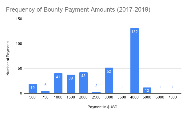
Firefox has one of the oldest security bug bounties on the internet, dating back to 2004. From 2017-2019, we paid out $965,750 to researchers across 348 bugs, making the average payout $2,775 – but as you can see in the graph below, our most common payout was actually $4,000!
After adding a new static analysis bounty late last year, we’re excited to further expand our bounty program in the coming year, as well as provide an on-ramp for more participants. We’re updating our bug bounty policy and payouts to make it more appealing to researchers and reflect the more hardened security stance we adopted after moving to a multi-process, sandboxed architecture. Additionally, we’ll be publishing more posts about how to get started testing Firefox – which is something we began by talking about the HTML Sanitization we rely on to prevent UXSS . By following the instructions there you can immediately start trying to bypass our sanitizer using your existing Firefox installation in less than a minute.
Firstly, we’re amending our current policy to be more friendly and allowing duplicate submissions. Presently, we have a ‘first reporter wins’ policy, which can be very frustrating if you are fuzzing our Nightly builds (which we encourage you to do!) and you find and report a bug mere hours after another reporter. From now on, we will split the bounty between all duplicates submitted within 72 hours of the first report; with prorated amounts for higher quality reports. We hope this will encourage more people to fuzz our Nightly ASAN builds.
Besides rewarding duplicate submissions, we’re clarifying our payout criteria and raising the payouts for higher impact bugs. Now, sandbox escapes and related bugs will be eligible for a baseline $8,000, with a high quality report up to $10,000. Additionally, proxy bypass bugs are eligible for a baseline of $3,000, with a high quality report up to $5,000. And most submissions are above baseline: previously the typical range for high impact bugs was $3,000 – $5,000 but as you can see in the graphic above, the most common payout for those bugs was actually $4,000! You can find full details of the criteria and amounts on our Client Bug Bounty page.
Again, we want to emphasize – if it wasn’t already – that a bounty amount is not determined based on your initial submission, but rather on the outcome of the discussion with developers. So improving test cases post-submission, figuring out if an engineer’s speculation is founded or not, or other assistance that helps resolve the issue will increase your bounty payout.
And if you’re inclined, you are able to donate your bounty to charity – if you wish to do so and have payment info on file, please indicate this in new bugs you file and we will contact you.
Lastly, we would like to let you know that we have cross-posted this to our new Attack & Defense blog. This new blog is a vehicle for tailored content specifically for engineers, security researchers, and Firefox bug bounty participants. We’ll be highlighting improvements to the bug bounty program (which will often be posted to this Security blog also) – but also posting guides on how to test different parts of Firefox. You can follow us via RSS or Twitter, where we’ll be boosting tweets relevant to browser security: exploitation walkthroughs, conference talks, and the like.
The post Firefox’s Bug Bounty in 2019 and into the Future appeared first on Mozilla Security Blog.

Darkroom is a terrific photo editor for the iPhone and iPad that leverages iCloud Photos with a robust set of editing tools and filters. With the release of version 4.6 today, Darkroom adds video to the mix. What’s impressive about the update is that it manages to apply the same set of tools and filters available for photos to video in real-time, which results in a fast, efficient editing workflow.
I last reviewed Darkroom when version 4.0 launched in late 2018 with iPad support for the first time. The app has come a long way since then, refining and improving the photo editing experience. What I concluded in that review is just as accurate today with one big difference:
There’s a lot more to this app than fun filters. With RAW support, a wide range of tools, and iPad support, Darkroom is a full-fledged photo editor. Darkroom also scales nicely from the smallest iPhone screen to the biggest iPad and takes advantage of the unique hardware each iOS device has to offer. Especially on an iPad, Darkroom does an excellent job of offering the tools you’ll want to edit your photos without getting in the way, allowing the photos room to breathe as you edit. I’m glad I have the ability to edit in Darkroom on my iPhone, but the iPad is where the experience is best, which is why it’s great to have that option with the release of Darkroom 4.0.
The difference is that now the app can handle video editing as gracefully as it does photo editing.

All of Darkroom’s editing tools and filters available for photos are available for videos too.
Darkroom is a fully-modern iOS and iPadOS app. It takes advantage of Split View, Slide Over, drag and drop, keyboard shortcuts, multiwindowing, and many of the other features and frameworks introduced by Apple in recent years. About the only iPad feature Darkroom doesn’t support that I wish it did is external displays.
Not long ago, Darkroom’s rendering engine was rebuilt from the ground up. It was the kind of update that didn’t come with shiny new features. Instead, the update focused on making the experience smoother for tasks like rendering huge RAW images and scrolling large photo libraries. The new engine also set the stage for the future.
Version 4.6 of Darkroom takes full advantage of its new image processing engine by adding video editing. If you’ve used Darkroom to edit photos before, the video editing process will come naturally because the workflows are essentially identical. Once you’ve given Darkroom access to your iCloud Photos, the app can access videos just like it does photos. You can also import videos using the system document browser if your videos are stored outside of iCloud Photos.
Once opened in Darkroom, the same tools available for photos can be used to edit videos. That means cropping, rotating, perspective shifts, the many excellent filter presets, including new cinematic filters designed for video, user-defined filters, and a wide array of discrete editing tools are all available for video. What’s more, that functionality is applied to videos in real-time just like it is with photos, while the video loops continuously onscreen. The result is a tight feedback loop that makes editing feel more immediate than other apps and speeds up the process.

Batch editing videos.
Also available as part of the update is batch editing and exporting. Copy a set of adjustments from one video or photo and apply them to multiple videos and images by returning to the library view, selecting the Batch button, and pasting the edits to the new videos. Batch deleting, hiding, marking videos as favorites, and exporting are available too. It’s worth emphasizing that you aren’t limited to processing just videos. Mixing and matching video and still images is also possible.
What Darkroom isn’t, however, is a full-featured video editor. You can edit videos the same way you do photos, but video-specific edits like trimming the ends of a clip, chopping them up into multiple clips, applying transitions, and separately editing audio aren’t possible, for example. For the most part, I’m okay with that. For quick sharing, the lack of those video-specific tools isn’t a big deal. Moreover, when you want to do something more, it’s simple enough to edit footage in Darkroom and then send it to another app for additional edits. Still, simple trimming, as is possible with the Photos app, would be a welcome addition.
I don’t shoot a lot of videos, but when I do, I usually want to share right away with someone. Darkroom makes it trivially easy to make some quick edits and apply an attractive filter. Although I do miss some video-specific editing features, there’s a lot to be said for keeping things simple by aligning the workflows for photos and videos. Still, Darkroom 4.6 is an excellent update worth checking out, especially if you enjoy sharing videos.
In February, Darkroom switched to a subscription business model. Darkroom 4.6 is free to download from the App Store with a limited feature set. Advanced features, including video editing, require a subscription that has been renamed Darkroom+. Although the name has changed, the details have not. Darkroom+ is $3.99/month, $19.99 annually, or a $49.99 one-time payment.
Club MacStories offers exclusive access to extra MacStories content, delivered every week; it’s also a way to support us directly.
Club MacStories will help you discover the best apps for your devices and get the most out of your iPhone, iPad, and Mac. Plus, it’s made in Italy.
Join NowRolandtj
On Wednesday afternoon, I had a fun and enjoyable conversation with John Irwin, the COPE member of the Park Board. I’ve known John since I was an NPA councillor and he was, sometimes, a sparring partner (though we agreed on cycling). The fun when debating with John is, between him and me, who gets to finish their thoughts before being overtaken by the other.
John is on the ever-well-meaning Left – a COPE guy of long standing. In elected office, his is the politics of conversation, consultation and collaboration – a strategy of re-action, always hoping for togetherness. Great when it works. Puts action off when it doesn’t.
Exhibit A: Providing for mobility in Kitsilano and Hadden Parks.
But this is the time of the virus – a moment when the previously un-doable gets done very quickly. Exhibit B: the Beach Avenue flow way.
The necessity for change in Kits and Hadden Parks is inarguable: It’s unsafe because different users don’t have space to share, and they can’t social distance without it. So each pisses the other off.

 What, John, I asked, can be done this month to provide enough space for all the different users to walk, run and cycle while respecting each other? While the Park Board has placed ‘champions for social distancing’ along the seawall and in parks, it hasn’t provided the space to do it properly.
Except along on Park Drive and Beach Avenue. The Park Board, I’m told, took the initiative to both close Stanley Park to most vehicles and to provide connected space on Beach. When I got a ‘process’ answer on the problem in Kitsilano (“We need to work with the City …” blah, blah), I pressed him on Beach: Will you turn it all back to the way it was before the virus? Will the Beach flow way disappear and cyclists return to the seawall, in some cases jammed together like they are in Kits Park?
Finally, John was unequivocal:
“I will oppose, I will fight to prevent the removal of the lanes on Beach Avenue.”
After a summer or more of use, I doubt John will be alone in a fight to retain the flow way in some form. My guess is that most Vancouverites, having accustomed themselves to a pleasant walking and cycling experience along Seaside (and hopefully other greenways in the city), will be supportive, even demanding, of this street-use reallocation. Even on Kits Point.
Mark Gurman writing for Bloomberg: Apple Aims to Sell Macs With Its Own Chips Starting in 2021.
Apple Inc. is planning to start selling Mac computers with its own main processors by next year, relying on designs that helped popularize the iPhone and iPad, according to people familiar with the matter.
The Cupertino, California-based technology giant is working on three of its own Mac processors, known as systems-on-a-chip, based on the A14 processor in the next iPhone. The first of these will be much faster than the processors in the iPhone and iPad, the people said.
While rumors of ARM Mac have been around for years, it really does feel like it should be happening sooner rather than later. I'm personally a big fan of the idea. When Macs switched from PPC to Intel Acorn and VoodooPad were there on day one. I actually had both up and running on the new processors in under an hour, and I expect to do the same again for both Acorn and Retrobatch.
This part of the reporting gave me pause though:
Apple is designing more of its own chips to gain greater control over the performance of its devices and differentiate them from rivals. Getting Macs, iPhones and iPads running the same underlying technology should make it easier for Apple to unify its apps ecosystem and update its computers more often.
(Emphasis mine).
I don't think unifying the chip architecture would make the app ecosystem any more unified. Apple could do this today if they really wanted to, fat binaries (where different cpu architectures are combined in the same application) have been around forever. Major frameworks are already on both architectures, which is the biggest hurdle. I think the problem is more philosophical, or maybe Apple just lacks the will or vision to actually get it done today, if ever.
|
mkalus
shared this story
from |
This photograph shows the food ration amounts of butter, milk, bacon, lard, sugar, cheese, tea and jam received by two people per week in Britain during World War II. pic.twitter.com/qiuW0MrSLo

Below the heron condos in Stanley Park, all is as quiet as the tennis courts. It’s egg time in the nests, presumably – before the post-hatch raucous begins.
See for yourself in the video here: Heronry

PT: As predicted, the rationale for more driving (and priorizing road space for it) is underway – this one from our own Bob on whether to keep the Beach flow way:
Bob: This Bloomberg article suggests that the last thing we should be doing is removing road space:
…..The auto industry is already seeing a couple of positive signs in this regard. In the first two weeks of April. Cars.com’s unique visitors bounced back from late-March doldrums. According to a recent survey by the vehicle-shopping website, 20% of people searching for a car said they don’t own one and had been using public transit or ride hailing. They might buy a set of wheels to be safer from a pandemic that could linger well into the year, Cars.com Chief Executive Officer Alex Vetter said.
“Covid has pushed more people who don’t own a car to consider purchasing one,” Vetter said by phone. “The primary reason given was to avoid public transit and because of a lack of trust in ride sharing.”…
PT: Maybe if we try we can beat our previous record for carbon emissions.

Canada is entering the early stages of assessing technological approaches for contract tracing, and experts are calling for safeguards to be implemented to protect people’s privacy.
Innovation Minister Navdeep Bains stated in a recent press conference that all options are on the table when it comes to reducing the spread of COVID-19. He said the government has engaged with some “early stage” technology projects designed to contain the virus.
Although the government has not made any final decisions on any projects or apps, Canada’s public chief health officer Dr. Theresa Tam says that that contract tracing is a key measure to contain the virus.
The office of the Privacy Commissioner of Canada says that it has had some communications with the Innovation, Science and Economic Development department and Health Canada on the topic of contract tracing apps.
In a statement sent to MobileSyrup, Commissioner Therrien stated that “during a crisis, laws can be applied flexibly and contextually, but they must still apply. Public health objectives and privacy protection can be achieved at the same time.”
The commissioner has released a framework for governments that outlines key privacy principles in addressing the pandemic in a way that respects privacy as a fundamental right.
It outlines that any technological approaches implemented must have a clear legal basis, be time-limited and science-based and considered necessary. The framework also notes that the government should be clear about the process, and that the data collected during this period should be destroyed once the crisis ends.
Several countries around the world have implemented different versions of contract tracing, some more extreme than others. Singapore has launched an opt-in ‘Trace Together’ app that uses Bluetooth proximity data to mitigate further spread of the virus.
Following the introduction of an emergency law, Israel has launched a program that uses mobile phone data to track people who have the virus, in order to identify and quarantine those who have come into contact with them.
Since there are several different methods of contact tracing, it’s unknown what type of model Canada would follow if it were to implement a similar system.
Dr. Richard Lachman, the head of Ryerson University’s Digital Media Zone, tells MobileSyrup that Canada needs to determine what its model would look like.
“We need to have a serious conversation about which version of contact tracing we’re going to implement, what rights we are going to have to temporarily suspend in terms of public health, and for how long,” he stated.
“Any decision we make should be limited in time and limited in scope to only deal with today,” Lachman noted, echoing the time-limited model described in the framework laid out by the privacy commissioner.
Further, if Canada does implement a technological approach, Lachman outlines that there should be safeguards set in place to ensure that the technology and data isn’t being used for any other purpose.
Additional safeguards should be put in place to ensure that vulnerable populations are protected, according to Lachman. For instance, someone who is a recent immigrant or an activist and needs to protect their identity, may not want to share their location data.
He notes that “privacy, and infringement on privacy, doesn’t affect everybody equally,” and that measures should be taken to protect each segment of the Canadian population.
Lachman also outlines that contact tracing through technology is not a magic bullet solution for containing the virus, and that there are some limitations. For instance, if the government launches a system that only a small percentage of people download, its effectiveness is limited.
Some people are more tech-savvy than others, which could impact adoption rates of technological measures. Lachman notes that a Canadian method likely wouldn’t be similar to Singapore’s model since the country’s population is more technologically sophisticated.
Further, Bianca Wylie, the co-founder of Digital Public and a senior fellow at the Centre for International Governance Innovation, tells MobileSyrup that releasing contract tracing apps without adequate testing capacity would lead to limited effectiveness.
Since testing is somewhat limited in Canada, there’s the question of how effective contract tracing would be if people are unable to get a test once they are notified that they have come into contact with an infected individual.
Wylie notes that Canadians also need to have a conversation about the type of future we want to have, and how much we want to “tie issues such as freedom and our right to movement to the technology we use.”
“The last few years suggest that we’ll see an increase in natural and health emergencies, not less of them, and we have to ask ourselves if this is the kind of power we want governments to have, not only now, but every time something like this happens,” she stated.
As the government continues to assess possible technological approaches, we may see some measures being implemented in the next few weeks. What exactly these measures may look like remains unknown for the time being.
The post As Canada enters early stages of using tech to track COVID-19, experts call for safeguards appeared first on MobileSyrup.
|
mkalus
shared this story
from |
Nice to hear Dominic Raab describe the NHS in such glowing terms. In 2011 he co-authored* a book that described it as a 'monolith' that 'should be broken up'.
*with Priti Patel


Der Versuch, die Apple Watch als Luxusobjekt zu positionieren, schlug fehl. Fünf Jahre später weiß Apple, was Nutzer wirklich brauchen - und verkauft mehr Uhren als die ganze Schweizer Uhrenindustrie.
Hatte zu lange nichts mehr für Spiegel Online geschrieben und gelobe Besserung. :-) Meinen Schlussparagraf hat Spiegel nicht veröffentlicht:
Ich trage die Apple Watch seit dem ersten Modell und sie hat mein Leben nachhaltig verändert. Angespornt durch die Aktivitäten-App habe ich eine aktivere Lebensweise durchgehalten und massiv Übergewicht abgebaut. Seit beinahe fünf Jahren schließe ich jeden Tag alle drei Ringe, die Ausnahmen lassen sich an zwei Händen abzählen. So wie im Herbst 2017, als ich im Aufschrieb der Uhr feststellte, dass mein Herz unter großem Stress war. Hausarzt, Internist und Chirurg empfahlen binnen zwei Stunden eine Intervention. Vier Tage später wurde ich geheilt aus dem Krankenhaus entlassen. Ich hatte eine schwere Sepsis überwunden.
Mir ist das aber sehr wichtig, deshalb trage ich es hier nach.

Motorola has been out of the flagship smartphone game for a few years. However, the company today announced its return to form with the new Motorola Edge+ and Edge smartphones.
While some may have apprehensions about Motorola’s return to flagships, looking at the phones’ spec lists should put those concerns to rest. The Edge+ is jam-packed with new technology and features that should help it go toe-to-toe with the likes of Samsung, OnePlus and Google. That said, specs alone don’t make a phone great and there’s a lot we don’t know about the phone. Since those things can only be revealed in a deep-dive review, for now, we’ll focus on the specs.
To start, Motorola says it built the Edge+ for speed and power. That means the Edge+ is powered by Qualcomm’s Snapdragon 865 system-on-a-chip (SoC). Further, Motorola coupled the 865 with 12GB of Micron DDR5 RAM, which should keep things blazing fast on the phone. As for storage, the Edge+ includes 256GB of internal UFS 3.0 storage with built-in ‘Turbo Write’ for even faster speed.
Considering Motorola’s ongoing work in bringing 5G to the masses through things like its 5G-capable Moto Mods, it’s no surprise that the Edge+ also supports 5G. Motorola says it equipped the phone with an antenna array suitable for both Sub-6 and mmWave frequencies. Not only does that ensure global compatibility, but Motorola says it will allow the phone to achieve future speeds of over 4Gbps on 5G connections. The Motorola Edge+ supports Wi-Fi 6 as well.
All this is powered by a 5,000mAh battery that can last for two days according to Motorola. The phone also supports 15W wireless charging and 5W wireless power-sharing.

The Motorola Edge+ sports a new ‘Endless Edge’ 6.7-inch OLED display featuring Full HD+ (FHD+), a 21:9 aspect ratio and a 90Hz refresh rate. Further, the display is HDR10+ certified and uses a 10-bit DCI-P3 colour space with over a billion colours.
Love it or hate it, Motorola is also hopping on the curved edge bandwagon with its display. The Edge+ sports an aggressive ‘bend’ that wraps the screen 90 degrees around the edge of the phone. Thankfully, the company also seems to recognize that curved edge displays aren’t for everyone, so Motorola says it included a software feature to turn off the screen on the edges. Additionally, Motorola says the Endless Edge screen will work with critical smartphone features.
Motorola also added several software features that take advantage of the edge. That includes ‘Edge Touch,’ which lets users customize interactions with the edge of the screen. For example, users can swipe up or down on the edge to switch apps or open the notification shade.
On top of that, the Edge+ includes ‘Edge Lights’ that illuminate the sides of the screen to let people know when they get notifications, show that the battery is charging and more.
There is an extra feature for gamers too. Motorola’s ‘Edge Gaming’ feature puts two ‘top buttons’ on the edge of the screen that act similar to shoulder buttons on a game controller. That could add new ways for players to interact with mobile games.

The Edge+ sports a 108-megapixel sensor for the main rear camera. Motorola says it’s a 1/1.33-inch sensor size, which is three times larger than the 12-megapixel sensor found in most flagships. The camera’s native shooting mode users Motorola’s Quad Pixel technology to output 27-megapixel images. On top of that, Motorola says the camera is four times more sensitive to light.
Along with the main camera, the Edge+ also sports an 8-megapixel telephoto lens with 3x optical zoom and OIS and a 16-megapixel ultra-wide angle lens with a ‘Macro Vision’ feature for getting close-up shots up to 2cm away from the subject. Finally, the camera set-up includes a time-of-flight sensor to improve low-light focus.
Motorola says the camera supports Night Vision photography with background processing, which means users can keep snapping picks while the phone processes images in the background. Night Vision is also available on the phone’s 25-megapixel selfie camera now. Motorola’s Portrait Mode supports HDR bokeh as well.
On the video side, the Edge+ camera features horizon correction, which aligns video based on the horizon. Additionally, it actively combines OIS and EIS for extra stability while recording. The phone supports HEVC as well and lets users capture high-res 20-megapixel images while shooting video.

Finally, Motorola says that it wanted to get as “close as possible” to near-stock Android 10 with the Edge+. Part of that means not duplicating apps. That should mean when you power up the Edge+ for the first time, you’ll have Google Calendar, Messages and other apps and not a bunch of Motorola-made apps that do the same thing.
Additionally, Edge+ users will have access to ‘My UX’ in the Motorola app. My UX lets you tweak the system theme, create your own theme and adjust other parts of the phone like Moto gestures, the Edge display software and more.
In terms of software support, Motorola says the Edge+ will get at least one major operating system upgrade, which should mean the Edge+ will get Android 11 in the future. Beyond that, the future will be “under evaluation.” Motorola will also provide quarterly security updates for at least two years along with other updates through the Play Store.
Additionally, Motorola partnered with Waves Audio to bring its processing software to the Edge+ for improved sound. The phone has two large stereo speakers and a built-in 3.5mm headphone jack.

For the most part, the Motorola Edge and Edge+ are the same phone but with a few critical differences. For one, the Edge runs on a Snapdragon 765 instead of the more powerful 865. It sports the same display but with HDR10 certification. Around back the Edge has a 64-megapixel main camera along with an 8-megapixel telephoto lens and a 16-megapixel ultra-wide shooter.
Further, the Edge sports a smaller 4,500mAh battery, 4GB of RAM in North America and 128GB of built-in storage along with expandable storage that supports up to 1TB microSD cards. Based on the spec list, it also looks like the Motorola Edge doesn’t support wireless charging.
Both phones will come to Canada, although at the time of writing Motorola said it did not have pricing details. The Edge+ will have a global digital launch on April 22nd and will have exclusivity with U.S. carrier Verizon.
The Motorola Edge+ will be available in both ‘Thunder Grey’ and ‘Smoky Sangria’ starting at $999.99 USD (about $1,418.39 CAD). In Canada, the Edge+ will be available at Bell, Rogers, Telus and Freedom Mobile.
The Motorola Edge will be available later this year in ‘Midnight Magenta’ and ‘Solar Black.’
The post Motorola returns to form with new Edge+ and Edge flagships appeared first on MobileSyrup.

People of the Pandemic is a game that lets you choose how many times you leave the house to get food or go for a walk. Using data for population and hospital beds in your ZIP code, the game then simulates infection, death, and recovery for a hypothetical virus, based on your choices and 19 others’ choices who played before you.
The infection rate felt aggressive no matter what choices I made in my ZIP code, so it’s probably worth emphasizing again that the game uses a simplified model. See the methodology here. But I like the effort to localize our individual decisions.
Tags: game, social distancing, virus

You’d think that an aspiring baker who ordered five 9-inch pie plates from five different manufacturers would be able to cook five pumpkin pies that were exactly the same size. Well, not necessarily.
We in Canada spend almost $30 billion annually on higher education, about half of which comes from government sources, and almost a third comes from student tuition. About 60% pays for salaries and benefits. I wonder what people would say is 'the higher ed we need now' as a return for this investment. Here's what Goldie Blumenstyk suggests (quoted):
Now I think that this is a pretty good starting point. This would go a long way toward making higher education the community resource it should be. My question is, is there a way to get from where we are to where we could be?
Web: [Direct Link] [This Post]I posted this essay in my own pre-blog, Reality 2.0, on December 1, 1995. I think maybe now, in this long moment after we’ve hit a pause button on our future, we can start working on making good the unfulfilled promises that first gleamed in our future a quarter century ago.

The import of the Internet is so obvious and extreme that it actually defies valuation: witness the stock market, which values Netscape so far above that company’s real assets and earnings that its P/E ratio verges on the infinite.
Whatever we’re driving toward, it is very different from anchoring certainties that have grounded us for generations, if not for the duration of our species. It seems we are on the cusp of a new and radically different reality. Let’s call it Reality 2.0.
The label has a millenial quality, and a technical one as well. If Reality 2.0 is Reality 2.000, this month we’re in Reality 1.995.12.
With only a few revisions left before Reality 2.0 arrives, we’re in a good position to start seeing what awaits. Here are just a few of the things this writer is starting to see…
The Web is the board for a new game Phil Salin called “Polyopoly.” As Phil described it, Polyopoly is the opposite of Monopoly. The idea is not to win a fight over scarce real estate, but to create a farmer’s market for the boundless fruits of the human mind.
It’s too bad Phil didn’t live to see the web become what he (before anyone, I believe) hoped to create with AMIX: “the first efficient marketplace for information.” The result of such a marketplace, Phil said, would be polyopoly.
In Monopoly, what mattered were the three Ls of real estate: “location, location and location.”
On the web, location means almost squat.
What matters on the web are the three Cs: content, connections and convenience. These are what make your home page a door the world beats a path to when it looks for the better mouse trap that only you sell. They give your webfront estate its real value.
If commercial interests have their way with the Web, we can also add a fourth C: cost. But how high can costs go in a polyopolistic economy? Not very. Because polyopoly creates…
The goods of Polyopoly and Monopoly are as different as love and lug nuts. Information is made by minds, not factories; and it tends to make itself abundant, not scarce. Moreover, scarce information tends to be worthless information.
Information may be bankable, but traditional banking, which secures and contains scarce commodities (or their numerical representations) does not respect the nature of information.
Because information abhors scarcity. It loves to reproduce, to travel, to multiply. Its natural habitats are wires and airwaves and disks and CDs and forums and books and magazines and web pages and hot links and chats over cappuccinos at Starbucks. This nature lends itself to polyopoly.
Polyopoly’s rules are hard to figure because the economy we are building with it is still new, and our vocabulary for describing it is sparse.
This is why we march into the Information Age hobbled by industrial metaphors. The “information highway” is one example. Here we use the language of freight forwarding to describe the movement of music, love, gossip, jokes, ideas and other communicable forms of knowledge that grow and change as they move from mind to mind.
We can at least say that knowledge, even in its communicable forms, is not reducible to data. Nor is the stuff we call “intellectual property.” A song and a bank account do not propagate the same ways. But we are inclined to say they do (and should), because we describe both with the same industrial terms.
All of which is why there is no more important work in this new economy than coining the new terms we use to describe it.
The best place to start looking for help is at the dawn of the Industrial Age. Because this was when the Age of Reason began. Nobody knew more about the polyopoly game — or played it — better than those champions of reason from whose thinking our modern republics are derived: Thomas Paine, Thomas Jefferson and Benjamin Franklin.
As Jon Katz says in “The Age of Paine” (Wired, May 1995 ), Thomas Paine was the the “moral father of the Internet.” Paine said “my country is the world,” and sought as little compensation as possible for his work, because he wanted it to be inexpensive and widely read. Paine’s thinking still shapes the politics of the U.S., England and France, all of which he called home.
 Thomas Jefferson wrote the first rule of Polyopoly: “He who receives an idea from me receives instruction himself without lessening mine; as he who lights his taper at mine, receives light without darkening me.”
He also left a live bomb for modern intellectual property law: “Inventions then cannot, in nature, be a subject of property.” The best look at the burning fuse is John Perry Barlow’s excellent essay “The Economy of Ideas,” in the March 1994 issue of Wired. (I see that Jon Katz repeats it in his paean to Paine. Hey, if someone puts it to song, who gets the rights?)
If Paine was the moral father of the Internet, Ben Franklin’s paternity is apparent in Silicon Valley. Today he’d fit right in, inventing hot products, surfing the Web and spreading his wit and wisdom like a Johnny Cyberseed. Hell, he even has the right haircut.
Franklin left school at 10 and was barely 15 when he ran his brother’s newspaper, writing most of its content and getting quoted all over Boston. He was a self-taught scientist and inventor while still working as a writer and publisher. He also found time to discover electricity, create the world’s first postal service, invent a heap of handy products and serve as a politician and diplomat.
Franklin’s biggest obsession was time. He scheduled and planned constantly. He even wrote his famous epitaph when he was 22, six decades before he died. “The work shall not be lost,” it reads, “for it will (as he believed) appear once more in a new and more elegant edition, revised and edited by the author.”
One feels the ghost of Franklin today, editing the web.
Combine Jefferson and Franklin and you get the two magnetic poles that tug at every polyopoly player: information that only gets more abundant, and time that only gets more scarce.
As Alain Couder of Groupe Bull puts it, “we treat time as a constant in all these formulas — revolutions per minute, instructions per second — yet we experience time as something that constantly decreases.”
After all, we’re born with an unknown sum of time, and we need to spend it all before we die. The notion of “saving” it is absurd. Time can only be spent.
So: to play Polyopoly well, we need to waste as little time as possible. This is not easy in a world where the sum of information verges on the infinite.
Which is why I think Esther Dyson might be our best polyopoly player.
“There’s too much noise out there anyway,” she says in ‘Esther Dyson on DaveNet‘ (12/1/94). “The new wave is not value added, it’s garbage-subtracted.”
Here’s a measure of how much garbage she subtracts from her own life: her apartment doesn’t even have a phone.
Can she play this game, or what?
I wouldn’t bother to ask Esther if she watches television, or listens to the radio. I wouldn’t ask my wife, either. To her, television is exactly what Fred Allen called it forty years ago: “chewing gum for the eyes.” Ours heats up only for natural disasters and San Jose Sharks games.
Dean Landsman, a sharp media observer from the broadcast industry, tells me that John Gresham books are cutting into time that readers would otherwise spend watching television. And that’s just the beginning of a tide that will swell as every medium’s clients weigh more carefully what they do with their time.
Which is why it won’t be long before those clients wad up their television time and stick it under their computer. “Media will eat media,” Dean says.
The computer is looking a lot hungrier than the rest of the devices out there. Next to connected computing, television is AM radio.
Fasten your seat belts.
Think of the Industrial world — the world of Big Business and Big Government — as a modern Roman Empire.
Now think of Bill Gates as Attilla the Hun.
Because that’s exactly how Bill looks to the Romans who still see the web, and everything else in the world, as a monopoly board. No wonder Bill doesn’t have a senator in his pocket (as Mark Stahlman told us in ‘Off to the Slaughter House,’ (DaveNet, 3/14/94).
Sadly for the the Romans, their empire is inhabited almost entirely by Huns, all working away on their PCs. Most of those Huns don’t have a problem with Bill. After all, Bill does a fine job of empowering his people, and they keep electing him with their checkbooks, credit cards and purchase orders.
Which is why, when they go forth to tame the web, these tough-talking Captains of Industry and Leaders of Government look like animated mannequins in Armani Suits: clothes with no emperor. Their content is emulation. They drone about serving customers and building architectures and setting standards and being open and competing on level playing fields. But their game is still control, no matter what else they call it.
Bill may be our emperor, but ruling Huns is not the same as ruling Romans. You have to be naked as a fetus and nearly as innocent. Because polyopoly does not reward the dark tricks that used to work for industry, government and organized crime. Those tricks worked in a world where darkness had leverage, where you could fool some of the people some of the time, and that was enough.
But polyopoly is a positive-sum game. Its goods are not produced by huge industries that control the world, but by smart industries that enable the world’s inhabitants. Like the PC business that thrives on it, information grows up from individuals, not down from institutions. Its economy thrives on abundance rather than scarcity. Success goes to enablers, not controllers. And you don’t enable people by fooling them. Or by manipulating them. Or by muscling them.
In fact, you don’t even play to win. As Craig Burton of The Burton Group puts it, “the goal isn’t win/win, it’s play/play.”
This is why Bill does not “control” his Huns the way IBM controlled its Romans. Microsoft plays by winning support, where IBM won by dominating the play. Just because Microsoft now holds a controlling position does not mean that a controlling mentality got them there. What I’ve seen from IBM and Apple looks far more Monopoly-minded and controlling than anything I’ve seen from Microsoft.
Does this mean that Bill’s manners aren’t a bit Roman at times? No. Just that the support Microsoft enjoys is a lot more voluntary on the part of its customers, users and partners. It also means that Microsoft has succeeded by playing Polyopoly extremely well. When it tries to play Monopoly instead, the Huns don’t like it. Bill doesn’t need the Feds to tell him when that happens. The Huns tell him soon enough.
No matter how Roman Bill’s fantasies might become, he knows his position is hardly more substantial than a conversation. In fact, it IS a conversation.
I would bet that Microsoft is engaged in more conversations, more of the time, with more customers and partners, than any other company in the world. Like or hate their work, the company connects. I submit that this, as much as anything else, accounts for its success.
In the Industrial Age, a market was a target population. Goods rolled down a “value chain” that worked like a conveyor belt. Raw materials rolled into one end and finished products rolled out the other. Customers bought the product or didn’t, and customer feedback was limited mostly to the money it spent.
To encourage customer spending, “messages” were “targeted” at populations, through advertising, PR and other activities. The main purpose of these one-way communications was to stimulate sales. That model is obsolete. What works best to day is what Normann & Ramirez (Harvard Business Review, June/July 1993) call a “value constellation” of relationships that include customers, partners, suppliers, resellers, consultants, contractors and all kinds of people.
The Web is the star field within which constellations of companies, products and markets gather themselves. And what binds them together, in each case, are conversations.
What we’re creating here is a new economy — an information economy.
Behind the marble columns of big business and big government, this new economy stands in the lobby like a big black slab. The primates who work behind those columns don’t know what this thing is, but they do know it’s important and good to own. The problem is, they can’t own it. Nobody can. Because it defies the core value in all economies based on physical goods: scarcity.
Scarcity ruled the stone hearts and metal souls of every zero-sum value system that ever worked — usually by producing equal quantities of gold and gore. And for dozens of millennia, we suffered with it. If Tribe A crushed Tribe B, it was too bad for Tribe B. Victors got the spoils.
This win/lose model has been in decline for some time. Victors who used to get spoils now just get responsibilities. Cooperation and partnership are now more productive than competition and domination. Why bomb your enemy when you can get him on the phone and do business with him? Why take sides when the members of “us” and “them” constantly change?
The hard evidence is starting to come in. A recent Wharton Impact report said, “Firms which specified their objectives as ‘beating our competitors’ or ‘gaining market share’ earned substantially lower profits over the period.” We’re reading stories about women-owned businesses doing better, on the whole, because women are better at communicating and less inclined to waste energy by playing sports and war games in their marketplaces.
From the customer’s perspective, what we call “competition” is really a form of cooperation that produces abundant choices. Markets are created by addition and multiplication, not just by subtraction and division.
In my old Mac IIci, I can see chips and components from at least 11 different companies and 8 different countries. Is this evidence of war among Apple’s suppliers? Do component vendors succeed by killing each other and limiting choices for their customers? Did Apple’s engineers say, “Gee, let’s help Hitachi kill Philips on this one?” Were they cheering for one “side” or another? The answer should be obvious.
But it isn’t, for two reasons. One is that the “Dominator Model,” as anthropologist (and holocaust survivor) Riane Eisler calls it, has been around for 20,000 years, and until recently has reliably produced spoils for victors. The other is that conflict always makes great copy. To see how seductive conflict-based thinking is, try to find a hot business story that isn’t filled with sports and war metaphors. It isn’t easy.
Bound by the language of conflict, most of us still believe that free enterprise runs on competition between “sides” driven by urges to dominate, and that the interests of those “sides” are naturally opposed.
To get to the truth here, just ask this: which has produced more — the U.S. vs. Japan, or the U.S. + Japan? One produced World War II and a lot of bad news. The other produced countless marvels — from cars to consumer electronics — on which the whole world depends.
Now ask this: which has produced more — Apple vs. Microsoft or Apple + Microsoft? One profited nobody but the lawyers, and the other gave us personal computing as we know it today.
What brings us to Reality 2.0 is the Plus Paradigm.
The Plus Paradigm says that our world is a positive construction, and that the best games produce positive sums for everybody. It recognizes the power of information and the value of abundance. (Think about it: the best information may have the highest power to abound, and its value may vary as the inverse of its scarcity.)
Over the last several years, mostly through discussions with client companies that are struggling with changes that invalidate long-held assumptions, I have built table of old (Reality 1.0) vs. new (Reality 2.0) paradigms. The difference between these two realities, one client remarked, is that the paradigm on the right is starting to work better than the paradigm on the left.
| Paradigm | Reality 1.0 | Reality 2.0 |
| Means to ends | Domination | Partnership |
| Cause of progress | Competition | Collaboration |
| Center of interest | Personal | Social |
| Concept of systems | Closed | Open |
| Dynamic | Win/Lose | Play/Play |
| Roles | Victor/Victim | Partner/Ally |
| Primary goods | Capital | Information |
| Source of leverage | Monopoly | Polyopoly |
| Organization | Hierarchy | Flexiarchy |
| Roles | Victor/Victim | Server/Client |
| Scope of self-interest | Self/Nation | Self/World |
| Source of power | Might | Right |
| Source of value | Scarcity | Abundance |
| Stage of growth | Child (selfish) | Adult (social) |
| Reference valuables | Metal, Money | Life, Time |
| Purpose of boundaries | Protection | Limitation |
Changes across the paradigms show up as positive “reality shifts.” The shift is from OR logic to AND logic, from Vs. to +:
| Reality 1.0 | Reality 2.0 |
| man vs nature | man + nature |
| Labor vs management | Labor + management |
| Public vs private | Public + private |
| Men vs women | Men + women |
| Us vs them | Us + them |
| Majority vs minority | Majority + minority |
| Party vs party | Party + party |
| Urban vs rural | Urban + rural |
| Black vs white | Black + white |
| Business vs govt. | Business + govt. |
The Plus Paradigm comprehends the world as a positive construction, and sees that the best games produce positive sums for everybody. It recognizes the power of information and the value of abundance. (Think about it: the best information may have the highest power to abound, and its value may vary as the inverse of its scarcity.)
For more about this whole way of thinking, see Bernie DeKoven’s ideas about “the ME/WE” at his “virtual playground.”]
This may sound sappy, but information works like love: when you give it away, you still get to keep it. And when you give it back, it grows.
Which has always been the case. But in Reality 2.0, it should become a lot more obvious.
Cllr Lisa Dominato was interviewed on ‘NW’s Simi Sara show this morning, touching all the points on why slow streets made sense – health, safety, open space for higher density neighbourhoods, social distancing.
Simi: “Needs to get done. Needs to get done fast.”
* * *
A second city councillor weighs in:

* * *
Jeff Leigh sends in a pic from a HUB Cycling member – “Parks Board responded to the concerns about the blocked entrance at Kits Beach Park. ”

* * *
Likewise in Stanley Park, Dianna reports in:
It’s a work in progress, and this is the Parks Department’s latest effort to clarify which direction to ride. It’s a good change. In two loops, I saw only three cyclists riding the wrong way, two were nervously creeping down from Prospect Point, and the other looked defiant so maybe he was out for the scenery. Also, intersected with one bus and two landscaping trucks. No expensive SUVs today.

This morning we lunged and squatted along to PE with Joe as we have for most days of the lockdown, and all together across three homes and two continents as we have for the past week or so.
We have a family iMessage group so there’s usually a bit of text chat just before 9 to see who’s up for it. Then somebody hits the FaceTime button (which is hidden at the top) to kick off a video call.
Then what we do, in our house, is precariously prop the iPad against the TV for the group video call. The workout is a YouTube Live thing at 9am every weekday, so that shows on the TV itself. We’re here in London. There’s another bit of the family doing the same elsewhere in the UK, and then another bit of the family in Queensland, Australia, where’s it’s 6pm, and we all do the workout together.
The noise is catastrophic so we tend to mute YouTube and listen the exercise instructions via Australia instead, which is out of sync and absurd when you think about it, but it works.
There’s a little bit of chat in rest periods, mainly with our toddler who gets thoroughly underfoot – I managed to sit on her and later take her out entirely with a backwards kick today. Then afterwards we wave bye or sometimes hang out.
I think this is magical.
A couple of ways this could be better:
I was chatting with designer + friend Joe Malia about this a couple days ago and he said I want something to keep in touch with folks more but don’t always have something new to say (and that’s not a bad thing)
– and I said, what a design brief that would be: how to keep in touch without anything new to say.
Perhaps there are a couple of clues in the daily workouts?
Video calls are becoming accepted as a place we can do stuff together rather than just have mere conversations. And you don’t need anything new to say if you’re doing a workout, or playing bridge, or singing in a choir together (all of which my mum is doing pretty regularly btw).
So one question is how video call software needs to change if it’s going to be used for domestic activities, instead of sharing PowerPoint slides.
Then thinking about togetherness which has a kind of “social attention” ladder. From the top…
(Some systems have a more developed “presence” system: green or red activity lights will show whether someone is online or not, that kind of thing.)
As a group, in whole or in part, we move up and down this ladder: there’s a push/pull from individual members that makes this happen. And it’s fascinating to look really closely at the exact push/pull mechanisms.
I wonder about the role of location as part of the push/pull on the ladder. There’s no way that I would let any of my family peep through my phone or my tablet to automatically turn a chat into a call…
but the TV in the front room?
You know, MAYBE?? The front room is already a kind of semi-permeable space…
The full text of The Naked Sun (1956) by Isaac Asimov, in which Elijah Baley visits Solaria, a planet of where everyone lives on vast estates managed by robots, and they never, ever meet in person.
When they want to talk, they step into a Viewing Room.
Daneel said, ‘It is necessary first to signal the individual one desires to view. A robot will, of course, receive the message. If the individual being signalled is available and wishes to receive the view, full contact is established.’
Baley’s glance fell to the floor. Where did his room end and the other begin? It was easy to tell. There was a line where the quality of the light changed and that must be it.
And there’s a discussion about the difference between seeing and viewing:
‘Same thing, isn’t it?’ said Baley.
‘Not at all the same thing. You’re viewing me right now. You can’t touch me, can you, or smell me, or anything like that. You could if you were seeing me. Right now, I’m two hundred miles away from you at least. So how can it be the same thing?’
Baley grew interested. ‘But I see you with my eyes.’
‘No, you don’t see me. You see my image. You’re viewing me.’
Anyway.
My point is that I don’t think I’d mind somebody from my family group chat peeping into my front room. Perhaps with a behaviour like this:
Because TV is a lean-back experience (that old phrase…) it should be possible to hang up the call by raising my hand in the air (to let the computer that I’m addressing it, none of this Hey Siri nonsense) then saying “hang up.”
That would let me go about my day, multitask, make a cup of tea, play with the little one, and do it all simultaneously to being on the video call. My phone should act as a portable mic when I step out of the room.
I’m not sure I’d want this kind of behaviour in any other room except the front room with the TV, but that shared space is so different from my phone, or the other rooms in the house, maybe we should design for it specifically?
Too much writing! Enough.
Oh no actually, one more thing!
That talk of Viewing Rooms reminds me of the Cisco video conferencing setup where they paint the room the same neutral grey at both ends, and the table looks like it continues through the screen, etc. Fancy.
Years back we were doing a bunch of work with Intel, and the team we were working with was in Portland, and it was morning there, and we had to travel to Swindon to do the calls in the evening, a bit of a way outside London, because they had the full Cisco kit set up there.
So it’s evening and it’s also a chilly day, so we’re all bundled up. But the meeting goes on like three hours and those big screens run HOT, so progressively the room is getting hotter and hotter. And by the end we’ve all pulled off our sweaters and rolled up our sleeves and unbuttoned our shirts, designers presenting the latest project deck from our meeting room sauna, all the while doing the world’s slowest, sweatiest striptease.
Definitely too much now. Enough enough.
Pundits are predicting the future of online learning in 2020 and beyond. Clive Shepherd invites us to think about how we watch music, drama or sport - if you wanted to do it all live face-to-face, "unless you're rich and with considerable discretionary time, it would be completely impractical." And the same too with learning, in the future. Others, meanwhile, disagree. Fordham's Robert Pondiscio argues "Kids will go back to brick-and-mortar schools... the act of sending our kids every morning to a place called a school is a cultural habit formed over many generations." Not to mention the fact that, in many home, both parents have to go to work just to makes ends meet.
Similarly, Alex Usher says predictions that all learning will go online are nonsense. "Education is social," he argues, and online learning isn't set up for that. Well, first, yes it is set up for that, but more importantly, second, as I've argued numerous times in the past, voters at some point will tire of paying for social clubs for rich people while doing nothing for people who can't afford it. Bryan Alexander, meanwhile, covers his bases and predicts three different outcomes.
But it doesn't matter. I think any genuine futurist in the field of online learning could and should have seen this coming. As I've repeated through the years, "educational providers will one day face an overnight crisis that was 20 years in the making." Now it's here.
Web: [Direct Link] [This Post]A great initiative from Autism Nova Scotia that’s open to autistic people in the four Atlantic provinces. Oliver’s signed up.


