Shared posts

05 May 17:31

Digitizing Your Photos – Just Released

by admin

We’re excited about the release of our new multimedia ebook, Digitizing Your Photos. It presents a comprehensive method for scanning photos with a digital camera, and managing the process with Lightroom.

The book is written for professional photographers, family historians, corporate collection managers, and cultural heritage institutions. We know that great collections of slides, prints and negatives are everywhere, and we want to help preserve and make use of them.

The book runs for 248 pages, and includes 90 workflow videos for a total of 9 hours of comprehensive instruction.


Here’s the first video from the book, which outlines the entire process.

And here’s the product page.

The post Digitizing Your Photos – Just Released appeared first on The DAM Book.

05 May 17:30

Folding Ti bicycles

by jnyyz

One of my holy grails is to have a light, high performance folding bike that is easily folded into a suitcase. The Brompton and Tikit each have their advantages and disadvantages, but they both weigh more than about 25 pounds. Last year during STP, I caught a brief glimpse of a 20″ Ti folder, and I was told that it was a prototype.

DSC09028

Last night I got a note that it was now available for purchase. It is called the Burke 20 folding bike, and this image from their website is very promising

hero-products-02.png

The claimed weight can be as low as 18 lbs without saddle. Unfortunately, the lowest price on the bike is $5500 US.

It is interesting to compare this bike to the Helix, a Toronto based bike which is promised for production this year, but thus far has not seen the light of day, AFAIK. The Helix has 24″ wheels, a claimed 22 lb weight, and it was advertised at less than half this price point.


05 May 17:29

Make Some Noise

by Reverend

A couple of weeks ago I wrote about a conversation I had with Bryan Mathers at OER17 regarding the new default splash page for new accounts on Reclaim Hosting. I got so taken away with Bryan’s Dali take on Reclaim that I forgot what we originally talked about: namely a turntable letting folks know their site works and they can login and “Make Some Noise.”

Awesome, right? And Bryan even animated the image, which we are working on integrating for all new shared hosting accounts on Reclaim. 

I’ve said it before, and I’ll say it again, imagining the whole Reclaim aesthetic (not to mention the Rockaway Hosting aesthetic) has been the most fun I have had in a long while. It just keeps on making me smile.

05 May 17:29

Will Science World look like this one day?

by jamesavbligh

Last year, during a Museum of Vancouver lecture held to honour the 30th anniversary of Expo ’86, Bruno Freschi briefly mentioned that Expo Centre’s geodesic sphere was intended to perform as a massive outdoor screen. Coordinating with the teams behind Jumbotron and OMNIMAX, a workable design was presented but unfortunately did not proceed in the period leading up to Expo.

Footage provided courtesy of the Province of British Columbia. Royal BC Museum item number V1990:09/41

I conducted an interview with Bruno to talk about the design on Vancouver is Awesome. Some excerpts from the article are provided below:

JB: If you could make any tweaks to the design of the Expo Centre today what would you make?

BF: I would add the skin back because here’s the other side of it – it’s social architecture. One of the elements of that sphere is that it is a lantern to East Vancouver. Now, Vancouver still today has this West and East Main Street divide.  The Sphere was a “signaletic icon trying to create a bridge to East Vancouver. This was that magic lantern, with public space around it for people to sit around and watch stuff. It would have been a hit during Expo and Post-Expo. It could have been a fun legacy in the public domain of the waterfront.

JB: You mention the Jumbotron acting as building dematerialization, what do you imagine playing on that screen?

BF: Anything you could do on a screen you could do there. You could run movies free to the world, or it could be commercials (which is dangerous). One can imagine live global events being broadcast to the public in open public space, I told you the little story about the projections on the sides of buildings; I was always struck by that kind of phenomenon because the building goes away and you are in the ennui of the movie, or whatever the projection is. All decoration in history tries to do that. If you study the Baroque world: Borromini, Bernini, all those guys – you discover that they are interested in that subject of dematerialization and illusion. Here we could have done it as intentional public media in the public domain.

Is it too late to resurrect a 30+ year old idea and clad the geodesic sphere in exterior screens today? Would the public be in favour of the various installations that could be programmed onto the sphere? Would commercial interests dominate its use or could the Signage By-Law limit advertisements?

Would there be outcry against light pollution? The lights from the GM pavilion had to be shut off due to their brightness, although today we have the lights from BC Place Stadium.

The full article is available here.


05 May 17:29

A day with AIY Voice Projects Kit – The MagPi 57 aftermath

by Rob Zwetsloot

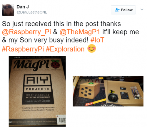
Hi folks, Rob here. It’s been a crazy day or so here over at The MagPi and Raspberry Pi as we try to answer all your questions and look at all the cool stuff you’re doing with the new AIY Voice Projects Kit that we bundled with issue 57. While it has been busy, it’s also been a lot of fun.

Got a question?

We know lots of you have got your hands on issue 57, but a lot more of you will have questions to ask. Here’s a quick FAQ before we go over the fun stuff you’ve been doing:

Which stores stock The MagPi in [insert country]?

The original edition of The MagPi is only currently stocked in bricks-and-mortar stores in the UK, Ireland, and the US:

  • In the UK, you can find copies at WHSmith, Asda, Tesco, and Sainsbury’s
  • In the US, you can find them at Barnes and Noble and at Micro Center
  • In Ireland, we’re in Tesco and Easons

Unfortunately, this means you will find very little (if any) stock of issue 57 in stores in other countries. Even Canada (we’ve been asked this a lot!)…

The map below shows the locations to which stock has been shipped (please note, though, that this doesn’t indicate live stock):

My Barnes and Noble still only has issue 55!

Issue 57 should have been in Barnes & Noble stores yesterday, but stock sometimes takes a few days to spread and get onto shelves. Keep trying over the next few days. We’re skipping issue 56 in the US so you can get 57 at the same time (you’ll be getting the issues at the same time from now on).

If I start a new subscription, will I get issue 57?

Yes. We have limited copies for new subscribers. It’s available on all new print subscriptions. You need to specify that you want issue 57 when you subscribe.

Will you be restocking online?

We’re looking into it. If we manage to, keep an eye on our social media channels and the blog for more details.

Is there any way to get the AIY Voice Projects Kit on its own?

Not yet, but you can sign up to Google’s mailing list to be notified when they become available.

Rob asked us to do no evil with our Raspberry Pi: how legally binding is that?

Highest galactic law. Here is a picture of me pointing at you to remind you of this.

Image of Rob with the free AIY kit

Please do not do evil with your Raspberry Pi

OK, with that out of the way, here’s the cool stuff!

AIY Voice Projects Kit builds

A lot of you built the kit very quickly, including Raspberry Pi Certified Educator Lorraine Underwood, who managed it before lunch.

Lorraine Underwood on Twitter

Ha, cool. I made it! Top notch instructions and pics @TheMagP1 Not going to finish the whole thing before youngest is out of nursery. Gah!!

We love Andy Grimley’s shot as the HAT seems to be floating. We had no idea it could levitate!

Andy Grimley on Twitter

This is awesome @TheMagP1 #AIYProjects

A few people reached out to tell us they were building it with children for their weekend project. These messages really are one of the best parts of our job.

Screenshot of Facebook comment on AIY kit

Screenshot of tweet about AIY kit

Screenshot of tweet about AIY kit

What have people been making with it? Domhnall O’Hanlon made the basic assistant setup, and photographed it in the stunning surroundings of the National Botanic Gardens of Ireland:

Domhnall O Hanlon on Twitter

Took my @Raspberry_Pi #AIYProjects on a field trip to the National Botanic Gardens. Thanks @TheMagP1! #edchatie #edtech https://t.co/f5dR9JBDEx

Friend of The MagPi David Pride has a cool idea:

David Pride on Twitter

@Raspberry_Pi @TheMagP1 Can feel a weekend mashup happening with the new #AIYProjects kit & my latest car boot find (the bird, not the cat!)

Check out Bastiaan Slee’s hack of an old IoT device:

Bastiaan Slee on Twitter

@TheMagP1 I’ve given my Nabaztag a second life with #AIYProjects https://t.co/udtWaAMz2x

Bastiaan Slee on Twitter

Hacking time with the Nabaztag and #AIYProjects ! https://t.co/udtWaAMz2x

Finally, Sandy Macdonald is doing a giveaway of the issue. Go and enter: a simple retweet could win you a great prize!

Sandy Macdonald on Twitter

I’m giving away this copy of @TheMagP1 with the @Raspberry_Pi #AIYProjects free, inc. p&p worldwide. RT to enter. Closes 9am BST tomorrow.

If you have got your hands on the AIY Voice Projects Kit, do show us what you’ve made with it! Remember to use the #AIYProjects hashtag on Twitter to show off your project as well.

There’s also a dedicated forum for discussing the AIY Voice Projects Kit which you can find on the main Raspberry Pi forum. Check it out if you have something to share or if you’re having any problems.

Yesterday I promised a double-dose of Picard gifs. So, what’s twice as good as a Picard gif? A Sisko gif, of course! See you next time…

No Title

No Description

The post A day with AIY Voice Projects Kit – The MagPi 57 aftermath appeared first on Raspberry Pi.

05 May 17:29

Weaving the annotated web

by Jon Udell

In 1997, at the first Perl Conference, which became OSCON the following year, my friend Andrew Schulman and I both gave talks on how the web was becoming a platform not only for publishing, but also for networked software.

http://wwwapps.ups.com/tracking/tracking.cgi?tracknum=1Z742E220310270799

Here’s the slide I remember fom Andrew’s talk:

The only thing on it was a UPS tracking URL. Andrew asked us to stare at it for a while and think about what it really meant. “This is amazing!” he kept saying, over and over. “Every UPS package now has its own home page on the world wide web!”

It wasn’t just that the package had a globally unique identifier. It named a particular instance of a business process. It made the context surrounding the movement of that package through the UPS system available to UPS employees and customers who accessed it in their browsers. And it made that same context available to the Perl programs that some of us were writing to scrape web pages, extract their data, and repurpose it.

As we all soon learned, URLs can point to many kinds of resources: documents, interactive forms, audio or video.

The set of URL-addressable resources has two key properties: it’s infinite, and it’s interconnected. Twenty years later we’re still figuring out all the things you can do on a web of hyperlinked resources that are accessible at well-known global addresses and manipulated by a few simple commands like GET, POST, and DELETE.

When you’re working in an infinitely large universe it can seem ungrateful to complain that it’s too small. But there’s an even larger universe of resources populated by segments of audio and video, regions of images, and most importantly, for many of us, text in web documents: paragraphs, sentences, words, table cells.

So let’s stare in amazement at another interesting URL:

https://hyp.is/LoaMFCSJEee3aAMJuXhO-w/www.ics.uci.edu/~fielding/pubs/dissertation/software_arch.htm

Here’s what it looks like to a human who follows the link: You land on a web page, in this case Roy Fielding’s dissertation on web architecture, it scrolls to the place where I’ve highlighted a phrase, and the Hypothesis sidebar displays my annotation which includes a comment and a tag.

And here’s what that resource looks like to a computer when it fetches a variant of that link:

{
    "body": [
        {
            "type": "TextualBody",
            "value": "components: web resources\n\nconnectors: links\n\ndata: data",
            "format": "text/markdown"
        },
        {
            "type": "TextualBody",
            "purpose": "tagging",
            "value": "IAnnotate2017"
        }
    ],
    "target": [
        {
            "source": "https://www.ics.uci.edu/~fielding/pubs/dissertation/software_arch.htm",
            "selector": [
                {
                    "type": "XPathSelector",
                    "value": "/table[2]/tbody[1]/tr[1]/td[1]",
                    "refinedBy": {
                        "start": 82,
                        "end": 114,
                        "type": "TextPositionSelector"
                    }
                },
                {
                    "type": "TextPositionSelector",
                    "end": 4055,
                    "start": 4023
                },
                {
                    "exact": "components, connectors, and data",
                    "prefix": "tion of architectural elements--",
                    "type": "TextQuoteSelector",
                    "suffix": "--constrained in their relations"
                }
            ]
        }
    ],
    "created": "2017-04-18T22:48:46.756821+00:00",
    "@context": "http://www.w3.org/ns/anno.jsonld",
    "creator": "acct:judell@hypothes.is",
    "type": "Annotation",
    "id": "https://hypothes.is/a/LoaMFCSJEee3aAMJuXhO-w",
    "modified": "2017-04-18T23:03:54.502857+00:00"
}

The URL, which we call a direct link, isn’t itself a standard way to address a selection of text, it’s just a link that points to a web resource. But the resource it points to, which describes the highlighted text and its coordinates within the document, is — since February of this year — a W3C standard. The way I like to think about it is that the highlighted phrase — and every possible highlighted phrase — has its own home page on the web, a place where humans and machines can jointly focus attention.

If we think of the web we’ve known as a kind of fabric woven together with links, the annotated web increases the thread count of that fabric. When we weave with pieces of URL-addressable documents, we can have conversations about those pieces, we can retrieve them, we can tag them, and we can interconnect them.

Working with our panelists and others, it’s been my privilege to build a series of annotation-powered apps that begin to show what’s possible when every piece of the web is addressable in this way.

I’ll show you some examples, then invite my collaborators — Beth Ruedi from AAAS, Mike Caulfield from Washington State University Vancouver, Anita Bandrowski from SciCrunch, and Maryann Martone from UCSD and Hypothesis — to talk about what these apps are doing for them now, and where we hope to take them next.

Science in the Classroom

First up is a AAAS project called Science in the Classroom, a collection of research papers from the Science family of journals that are annotated — by graduate students — so teachers can help younger students understand the methods and outcomes of scientific research.

Here’s one of those annotated papers:

A widget called the Learning Lens toggles layers of annotation and off.

Here I’ve selected the Glossary layer, and I’ve clicked on the word “distal” to reveal the annotation attached to it.

Now lets look behind the scenes:

Hypothesis was used to annotate the word “distal”. But Learning Lens predated the use of Hypothesis, and the Science in the Classroom team wanted to keep using Learning Lens to display annotations. What they didn’t want was the workflow behind it, which required manual insertion of annotations into HTML pages.

Here’s the solution we came up with. Use Hypothesis to create annotations, then use some JavaScript in Science in the Classroom pages to retrieve Hypothesis annotations and write them into the pages, using the same format that had been applied manually. The preexisting and unmodified Learning Lens JavaScript can then do what it does: pick up the annotations, assign color-coded highlights based on tags, and show the annotations when you click on the highlights.

What made this possible was a JavaScript library that helps with the heavy lifting required to attach an annotation to its intended target in the document.

That library is part of the Hypothesis client, but it’s also available as a standalone module that can be used for other purposes. It’s a nice example of how open source components can enable an ecosystem of interoperable annotation services.

DigiPo / EIC

Next up is a toolkit for student fact-checkers and investigative journalists. You’ve already heard from Mike Caulfield about the Digital Polarization Project, or DigiPo, and from Stefan Candea about the European Investigative Collaborations network. Let’s look at how we’ve woven annotation into their investigative workflows.
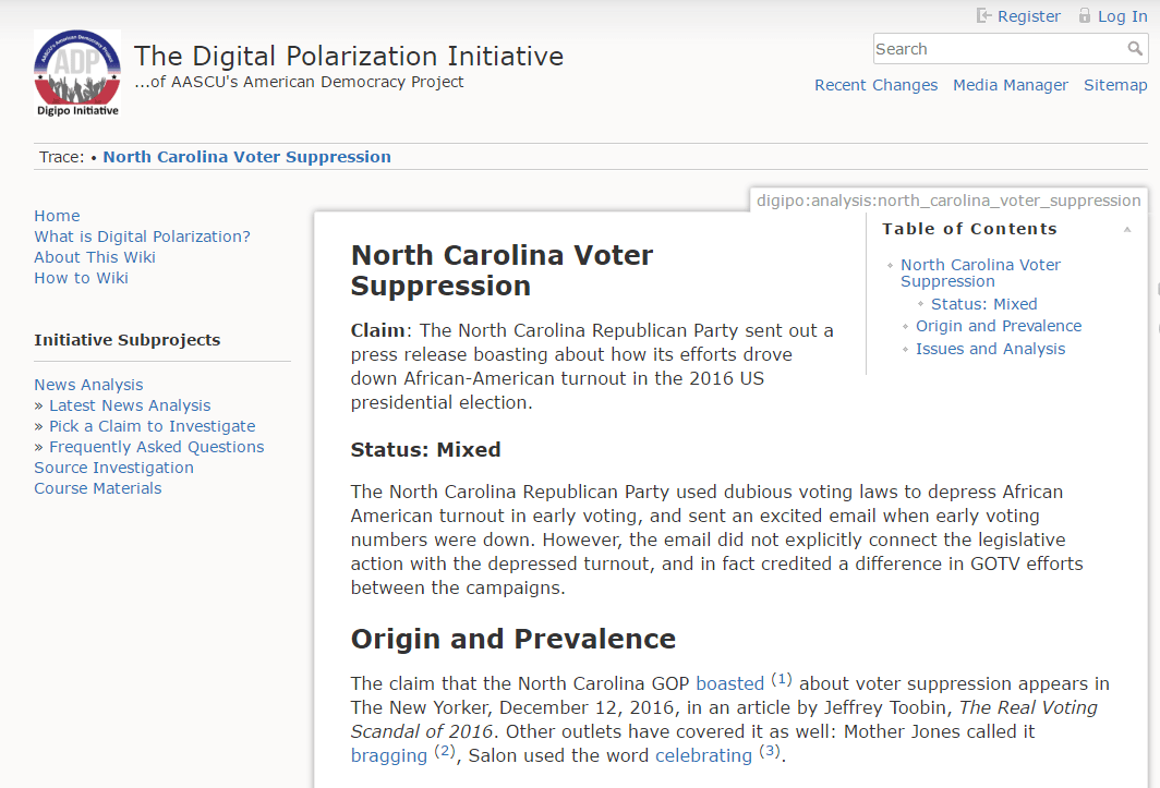
These investigations are both written and displayed in a wiki. This is a DigiPo example:

I did the investigation of this claim myself, to test out the process we were developing. It required me to gather a whole lot of supporting evidence before I could begin to analyze the claim. I used a Hypothesis tag to collect annotations related to the investigation, and you can see them in this Hypothesis view:
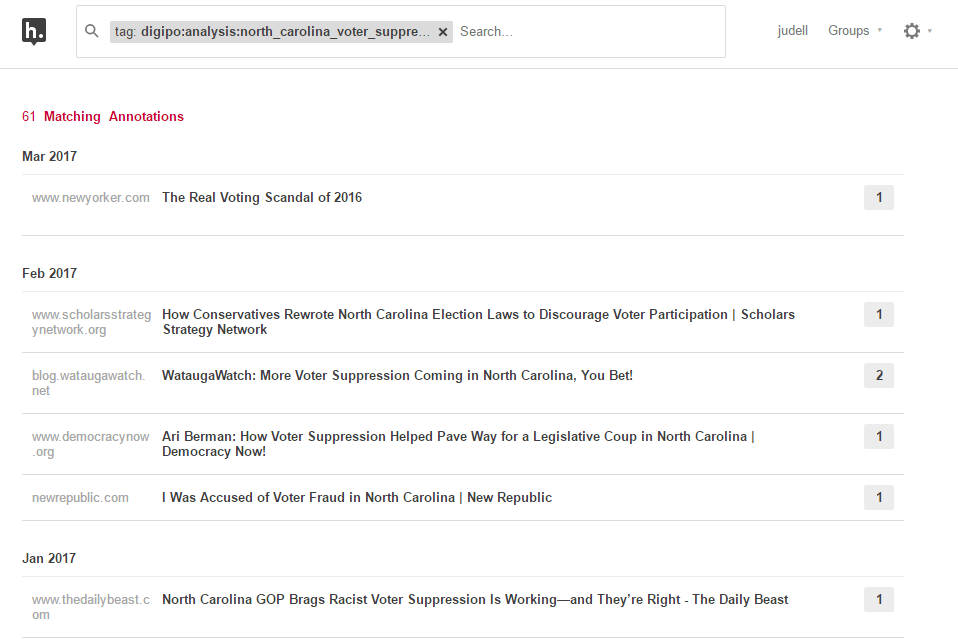
I can be very disciplined about using tags this way, but it’s a lot to ask of students, or really almost anyone. So we created a tool that knows about the set of investigations underway in the wiki, and offers the names of those pages as selectable tags.

Here I’ve selected a piece of evidence for that investigation. I’m going to annotate it, not by using Hypothesis directly, but instead by using a function in a separate DigiPo extension. That function uses the core anchoring libraries to create annotations in the same way the Hypothesis client does.

But it leads the user through an interstitial page that asks which investigation the annotation belongs to, and assigns a corresponding tag to the annotation it creates.

Back in the wiki, the page embeds the same Hypothesis view we’ve already seen, as a Related Annotations widget pinned to that particular tag:

I had so much raw material for this article that I needed some help organizing it. So I added a Timeline widget that gathers a subset of the source annotations that are tagged with dates.

To put something onto the timeline, you select a date on a page.

Then you create an annotation with a tag corresponding to the date.

Here’s what the annotation looks like in Hypothesis.

Over in the wiki, our JavaScript finds annotations that have these date tags and arranges them on the Timeline.

Publication dates aren’t always evident on web pages, sometimes you have to do some digging to find them. When you do find one, and annotate a page with it, you’ve done more than populate the Timeline in a DigiPo page. That date annotation is now attached to the source page for anyone to discover, using Hypothesis or any other annotation-aware viewer. And that’s true for all the annotations created by DigiPo investigators. They’re woven into DigiPo pages, but they’re also available for separate reuse and aggregation.

The last and most popular annotation-related feature we added to the toolkit is called Footnotes. Once you’ve gathered your raw material into the Related Annotations bucket, and maybe organized some of it onto the Timeline, you’ll want to weave the most pertinent references into the analysis you’re writing.

To do that, you find the annotation you gathered and use Copy to clipboard to capture the direct link.

Then you wrap that link around some text in the article:

When you refresh the page, here’s what you get.

The direct link does what a direct link does: it takes you to the page, scrolls you to the annotation in context. But it can take a while to review a bunch of sources that way.

So the page’s JavaScript also creates a link that points down into the Footnotes section. And there, as Ted Nelson would say, and as Nate Angell for some reason hates hearing me say, the footnote is “transcluded” into the page so all the supporting context is right there.
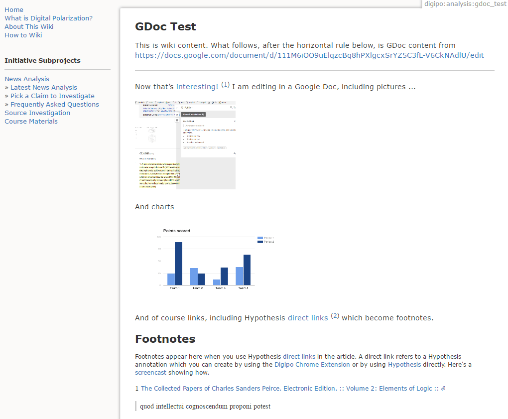
One final point about this toolkit. Students don’t like the writing tools available in wikis, and for good reason, they’re pretty rough around the edges. So we want to enable them to write in Google Docs. We also want them to footnote their articles using direct links because that’s the best way to do it. So here’s a solution we’re trying. From the wiki you’ll launch into Google Docs where you can do your writing in a much more robust editor that makes it really easy to include images and charts. And if you use direct links in that Google Doc, they’ll still show up as Footnotes.

We’re not yet sure this will pan out, but my colleague Maryann Martone, who uses Hypothesis to gather raw material for her scientific papers, and who writes them in Google Docs, would love to be able to flow annotations through her writing tool and into published footnotes.

SciBot

Maryann is the perfect segue to our next example. Along with Anita Bandrowski, she’s working to increase the thread count in the fabric of scientific literature. When neuroscientists write up the methods used in their experiments, the ingredients often include highly specific antibodies. These have colloquial names, and even vendor catalog numbers, but they still lacked unique identifiers. So the Neuroscience Information Framework, NIF for short, has defined a namespace called RRID (research resource identifier), built a registry for RRIDs, and convinced a growing number of authors to mention RRIDs in their papers.

Here’s an article with RRIDs in it. They’re written directly into the text because the text is the scientific record, it’s the only artifact that’s guaranteed to be preserved. So if you’re talking about a goat polyclonal antibody, you look it up in the registery, capture its ID, and write it directly into the text. And if it’s not in the registry, please add it, you’ll make Anita very happy if you do!

The first phase of a project we call SciBot was about validating those RRIDs. They’re just freetext, after all, typed in by authors. Were the identifiers spelled correctly? Did they point to actual registry entries? To find out we built a tool that automatically annotates occurrences of RRIDs.

In this example, Anita is about to click on the SciBot tool, which launches from a bookmarklet, and sends the text of the paper to a backend service. It scans the text for RRIDs, looks up each one in the registry, and uses the Hypothesis API to create an annotation — bound to the occurrence in the text — that reports the results of the registry lookup.
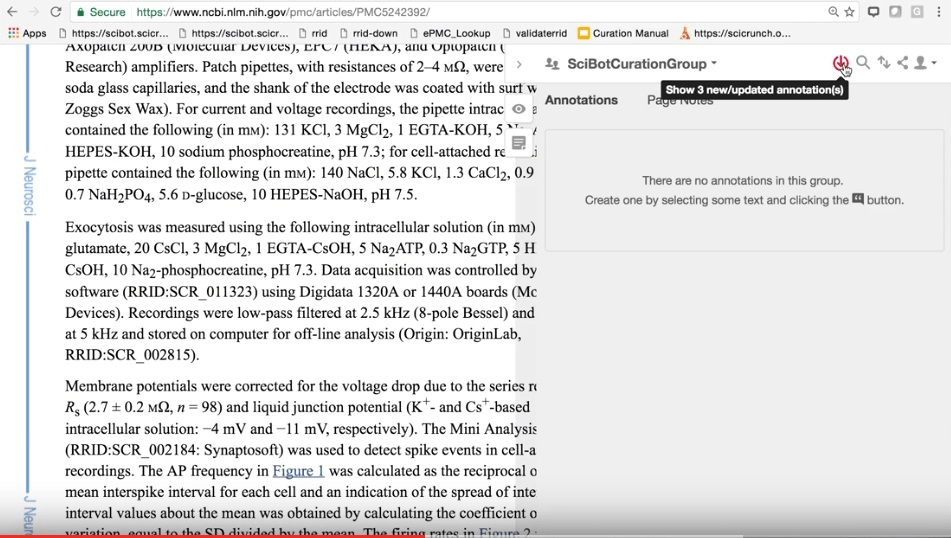
Here the Hypothesis realtime API is showing that SciBot has created three annotations on this page.

And here are those three annotations, anchored to their occurrences in the page, with registry entries displayed in the sidebar.

SciBot curators review these annotations and use tags to mark which are valid. When some aren’t, and need attention, the highlight focuses that attention on a specific occurrence.

This hybrid of automatic entity recognition and interactive human curation is really powerful. Here’s an example where an antibody doesn’t have an RRID but should.

Every automatic workflow needs human exception handling and error correction. Here the curator has marked an RRID that wasn’t written into the literature, but now is present in the annotation layer.

These corrections are now available to train a next-gen entity recognizer. Iterating through that kind of feedback loop will be a powerful way to mine the implicit data that’s woven into the scientific literature and make it explicit.

Here’s the Hypothesis dashboard for one of the SciBot curators. The tag cloud gives you a pretty good sense of how this process has been unfolding so far.
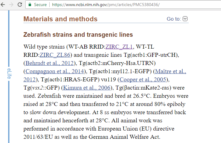
Publishers have begun to link RRIDs to the NIF registry. Here’s an example at PubMed.

If you follow the ZIRC_ZL1 link to the registry, you’ll find a list of other papers whose authors used the same experimental ingredient, which happens to be a particular strain of zebrafish.
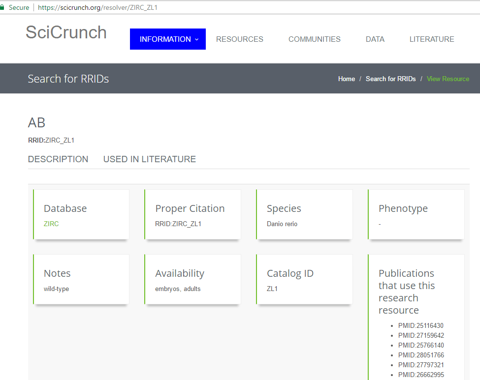
This is the main purpose of RRIDs. If that zebrafish is part of my experiment, I want to find who else has used it, and what their experiences have been — not just what they reported in their papers, but ideally also what’s been discussed in the annotation layer.

Of course I can visit those papers, and search within them for ZIRC_ZLI, but with annotations we can do better. In DigiPo we saw how footnoted quotes from source documents can transclude into an article. Publishers could do the same here.
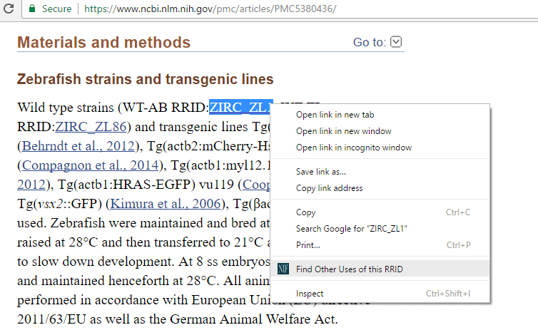
Or we could do this. It’s a little tool that offers to look up an RRID selected in text.

It just links to an instance of the Hypothesis dashboard that’s pinned to the tag for that RRID.

Those search results offer direct links that take you to each occurrence in context.

Claim Chart

Finally, and to bring us full circle, I recently reconnected with Andrew Schulman who works nowadays as a software patent attorney. There’s a tool of his trade called a claim chart. It’s a two-column table. In column one you list claims that a patent is making, which are selections of text from the claims section of the patent. And in column two you assemble bits of evidence, gathered from other sources, that bear on specific claims. Those bits of evidence are selections of text in other documents. It’s tedious to build a claim chart, it involves a lot of copying and pasting, and the evidence you gather is typically trapped in whatever document you create.

Andrew wondered if an annotation-powered app could help build claim charts, and also make the supporting evidence web-addressable for all the reasons we’ve discussed. If I’ve learned anything about annotation, it’s that when somebody asks “Can you do X with annotation?” the answer should always be: “I don’t know, should be possible, let’s find out.”
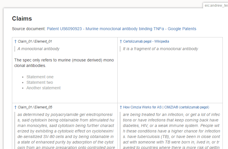
So, here’s an annotation-powered claim chart.

The daggers at top left in each cell are direct links. The ones in the first column go to patent claims in context.

The ones in the second column go to related statements in other documents.

And here’s how the columns are related. When you annotate a claim, you use a toolkit function called Add Selection as Claim.

Your selection here identifies the target document (that is, the patent), the claim chart you’re building (here, it’s a wiki page called andrew_test), and the claim itself (for example, claim 1).
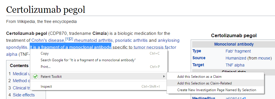
Once you’ve identified the claims in this way, they’re available as targets of annotations in other documents. From a selection in another document, you use Add Selection as Claim-Related.

Here you see all the claims you’ve marked up, so it’s easy to connect the two statements.

The last time I read Vannevar Bush’s famous essay As We May Think, this was the quote that stuck with me.

When statements in documents become addressable resources on the web, we can weave them together in the way Vannevar Bush imagined.


05 May 17:29

on Paul Krugman's 'What’s the Matter With Europe?'

on Paul Krugman's 'What’s the Matter With Europe?':

I think Krugman is too quick to dismiss France’s populism, which is at its core more about the consequences of globalism than white nationalism. He doesn’t mention Mélenchon in this piece, but his supporters are – in the conventional sense – far-left antiglobalist populists. When you consider the immigration issues of France – and Europe – as an outcomes of hypercapitalist globalism and former colonialism, sovereignty is an economic question, not just a cultural one. 

I am not suggesting that Le Pen would be a good outcome for France, but I equally abhor Macron and his metropolitan Eurocratic, hypercapitalist, globalist vision.

Here’s Krugman, stepping back and looking at what ails Europe:

it seems clear that votes for Le Pen will in part be votes of protest against what are perceived as the highhanded, out-of-touch officials running the European Union. And that perception unfortunately has an element of truth.

Those of us who watched European institutions deal with the debt crisis that began in Greece and spread across much of Europe were shocked at the combination of callousness and arrogance that prevailed throughout.

Even though Brussels and Berlin were wrong again and again about the economics — even though the austerity they imposed was every bit as economically disastrous as critics warned — they continued to act as if they knew all the answers, that any suffering along the way was, in effect, necessary punishment for past sins.

Politically, Eurocrats got away with this behavior because small nations were easy to bully, too terrified of being cut off from euro financing to stand up to unreasonable demands. But Europe’s elite will be making a terrible mistake if it believes it can behave the same way to bigger players.

Indeed, there are already intimations of disaster in the negotiations now taking place between the European Union and Britain.

I wish Britons hadn’t voted for Brexit, which will make Europe weaker and their own country poorer. But E.U. officials are sounding more and more like a jilted spouse determined to extract maximum damages in a divorce settlement. And this is just plain insane. Like it or not, Europe will have to live with post-Brexit Britain, and Greece-style bullying just isn’t going to work on a nation as big, rich and proud as the U.K.

Regarding EU’s plans to exact the maximum damage on the UK for Brexiting, I’ve noted that they seem to have left the spirit of Article 50 behind in their acrimonious and sanctimonious attacks on Theresa May. Is she supposed to kiss the hem of the EU’s robes? After all, article 50 is constructed around the premise that members of the EU might decide to leave, and spells out how it’s to be done. It does not state that EU officials should work to make such an exit a failure. And in fact – despite what Merkel says about not talking about the future relations until the divorce agreement is settled – Article 50 says the EU must take into account ‘the framework for its future relationship with the Union:

2. A Member State which decides to withdraw shall notify the European Council of its intention. In the light of the guidelines provided by the European Council, the Union shall negotiate and conclude an agreement with that State, setting out the arrangements for its withdrawal, taking account of the framework for its future relationship with the Union.

I think Krugman should read Chris Caldwell’s The French, Coming Apart (here’s my notes), which is about Christophe’s Guilluy’s views on what’s up in France. In particular,he should check out  Guilluy’s observations on the viewpoint of the Left Behinds, the average French living outside the metropole filled with the elite, out past the banlieues filled with immigrants, out in La France périphérique, which is 60% of the population.

If not this election, then in the next, Eurocrats’ hubris will clearly become their nemesis.

05 May 17:28

The Naming Of Things: Social Business

stoweboyd:

I guess the Dachis folks are getting some push back on the use of the ‘social business’ and ‘social business design’ handles to characterize the impacts of social tools on business.

[via Defining Social Business Design: Style vs. Substance by Peter Kim]

For the most part, people understand that we’re talking about what’s on the horizon for business. However, most detractors seem to take issue with the style of the idea’s communication rather than its substance. Some say they don’t understand. I’ll take that at face value and suggest they try harder. Others ask why simpler words weren’t used. Well, as a certain bald-headed guru told me, “words matter.”

Some new terms take a lot of persuading before they become lodged in the zeitgeist, like Web 2.0 and social tools, in the past ten years. But, now, on balance, we can see that these ideas have helped to characterize what is going on: to clarify, not to confuse.

Many people are naturally reluctant to adopt what might just be specious terms, especially after being subjected to 'knowledge management’ projects, or asked to 'think out of the box’ at company offsites, or being barraged with market speak by a word-happy advertising culture.

But I believe that words, and even more importantly, metaphors, matter. How we choose to name things makes a difference.

Unlike Peter Kim and his associates at Dachis, I might have been more metaphorical and less riveted down in my prose for a social business description than Peter was in his post today, and in the earlier group post (see Social Business Design). Of course, they are advancing a more complex picture – social business design, and its moving parts – while I am simply sketching out the anthropology of the thing.

Since I am doing a ten minute sprint presentation on social business at tomorrow’s 140 Character conference, here’s my handwave.

Social Business

'Social Business’ denotes businesses organized around social ties and the use of social technologies to support them.

This is intended to represent a break between companies (in general) organized prior to the rise of the social web.

Leaving aside any implied methods for designing, building, or even managing such organizations, I offer a few one-liners to try to capture the essential elements of these organizations. I don’t want to undercut my 10 minutes of glory, so here’s a few teasers:

  • the individual is the new group
  • business is a village, not an army
  • small talk is big again
  • meaning is the new search
  • time is the new space
  • flow is the new center

A golden oldie: about the early use of the term ‘social business’, from October 2009.

05 May 17:28

Weaving the annotated web

by Jon Udell

In 1997, at the first Perl Conference, which became OSCON the following year, my friend Andrew Schulman and I both gave talks on how the web was becoming a platform not only for publishing, but also for networked software.

Here’s the slide I remember from Andrew’s talk:

http://wwwapps.ups.com/tracking/tracking.cgi?tracknum=1Z742E220310270799

The only thing on it was a UPS tracking URL. Andrew asked us to stare at it for a while and think about what it really meant. “This is amazing!” he kept saying, over and over. “Every UPS package now has its own home page on the world wide web!”

It wasn’t just that the package had a globally unique identifier. It named a particular instance of a business process. It made the context surrounding the movement of that package through the UPS system available to UPS employees and customers who accessed it in their browsers. And it made that same context available to the Perl programs that some of us were writing to scrape web pages, extract their data, and repurpose it.

As we all soon learned, URLs can point to many kinds of resources: documents, interactive forms, audio or video.

The set of URL-addressable resources has two key properties: it’s infinite, and it’s interconnected. Twenty years later we’re still figuring out all the things you can do on a web of hyperlinked resources that are accessible at well-known global addresses and manipulated by a few simple commands like GET, POST, and DELETE.

When you’re working in an infinitely large universe it can seem ungrateful to complain that it’s too small. But there’s an even larger universe of resources populated by segments of audio and video, regions of images, and most importantly, for many of us, text in web documents: paragraphs, sentences, words, table cells.

So let’s stare in amazement at another interesting URL:

https://hyp.is/LoaMFCSJEee3aAMJuXhO-w/www.ics.uci.edu/~fielding/pubs/dissertation/software_arch.htm

Here’s what it looks like to a human who follows the link: You land on a web page, in this case Roy Fielding’s dissertation on web architecture, it scrolls to the place where I’ve highlighted a phrase, and the Hypothesis sidebar displays my annotation which includes a comment and a tag.

And here’s what that resource looks like to a computer when it fetches a variant of that link:

{
    "body": [
        {
            "type": "TextualBody",
            "value": "components: web resources\n\nconnectors: links\n\ndata: data",
            "format": "text/markdown"
        },
        {
            "type": "TextualBody",
            "purpose": "tagging",
            "value": "IAnnotate2017"
        }
    ],
    "target": [
        {
            "source": "https://www.ics.uci.edu/~fielding/pubs/dissertation/software_arch.htm",
            "selector": [
                {
                    "type": "XPathSelector",
                    "value": "/table[2]/tbody[1]/tr[1]/td[1]",
                    "refinedBy": {
                        "start": 82,
                        "end": 114,
                        "type": "TextPositionSelector"
                    }
                },
                {
                    "type": "TextPositionSelector",
                    "end": 4055,
                    "start": 4023
                },
                {
                    "exact": "components, connectors, and data",
                    "prefix": "tion of architectural elements--",
                    "type": "TextQuoteSelector",
                    "suffix": "--constrained in their relations"
                }
            ]
        }
    ],
    "created": "2017-04-18T22:48:46.756821+00:00",
    "@context": "http://www.w3.org/ns/anno.jsonld",
    "creator": "acct:judell@hypothes.is",
    "type": "Annotation",
    "id": "https://hypothes.is/a/LoaMFCSJEee3aAMJuXhO-w",
    "modified": "2017-04-18T23:03:54.502857+00:00"
}

The URL, which we call a direct link, isn’t itself a standard way to address a selection of text, it’s just a link that points to a web resource. But the resource it points to, which describes the highlighted text and its coordinates within the document, is — since February of this year — a W3C standard. The way I like to think about it is that the highlighted phrase — and every possible highlighted phrase — has its own home page on the web, a place where humans and machines can jointly focus attention.

If we think of the web we’ve known as a kind of fabric woven together with links, the annotated web increases the thread count of that fabric. When we weave with pieces of URL-addressable documents, we can have conversations about those pieces, we can retrieve them, we can tag them, and we can interconnect them.

Working with our panelists and others, it’s been my privilege to build a series of annotation-powered apps that begin to show what’s possible when every piece of the web is addressable in this way.

I’ll show you some examples, then invite my collaborators — Beth Ruedi from AAAS, Mike Caulfield from Washington State University Vancouver, Anita Bandrowski from SciCrunch, and Maryann Martone from UCSD and Hypothesis — to talk about what these apps are doing for them now, and where we hope to take them next.

Science in the Classroom

First up is a AAAS project called Science in the Classroom, a collection of research papers from the Science family of journals that are annotated — by graduate students — so teachers can help younger students understand the methods and outcomes of scientific research.

Here’s one of those annotated papers. A widget called the Learning Lens toggles layers of annotation and off.

Here I’ve selected the Glossary layer, and I’ve clicked on the word “distal” to reveal the annotation attached to it.

Now lets look behind the scenes:

Hypothesis was used to annotate the word “distal”. But Learning Lens predated the use of Hypothesis, and the Science in the Classroom team wanted to keep using Learning Lens to display annotations. What they didn’t want was the workflow behind it, which required manual insertion of annotations into HTML pages.

Here’s the solution we came up with. Use Hypothesis to create annotations, then use some JavaScript in Science in the Classroom pages to retrieve Hypothesis annotations and write them into the pages, using the same format that had been applied manually. The preexisting and unmodified Learning Lens JavaScript can then do what it does: pick up the annotations, assign color-coded highlights based on tags, and show the annotations when you click on the highlights.

What made this possible was a JavaScript library that helps with the heavy lifting required to attach an annotation to its intended target in the document.

That library is part of the Hypothesis client, but it’s also available as a standalone module that can be used for other purposes. It’s a nice example of how open source components can enable an ecosystem of interoperable annotation services.

DigiPo / EIC

Next up is a toolkit for student fact-checkers and investigative journalists. You’ve already heard from Mike Caulfield about the Digital Polarization Project, or DigiPo, and from Stefan Candea about the European Investigative Collaborations network. Let’s look at how we’ve woven annotation into their investigative workflows.

These investigations are both written and displayed in a wiki. This is a DigiPo example:

I did the investigation of this claim myself, to test out the process we were developing. It required me to gather a whole lot of supporting evidence before I could begin to analyze the claim. I used a Hypothesis tag to collect annotations related to the investigation, and you can see them in this Hypothesis view:

I can be very disciplined about using tags this way, but it’s a lot to ask of students, or really almost anyone. So we created a tool that knows about the set of investigations underway in the wiki, and offers the names of those pages as selectable tags.

Here I’ve selected a piece of evidence for that investigation. I’m going to annotate it, not by using Hypothesis directly, but instead by using a function in a separate DigiPo extension. That function uses the core anchoring libraries to create annotations in the same way the Hypothesis client does.

But it leads the user through an interstitial page that asks which investigation the annotation belongs to, and assigns a corresponding tag to the annotation it creates.

Back in the wiki, the page embeds the same Hypothesis view we’ve already seen, as a Related Annotations widget pinned to that particular tag:

I had so much raw material for this article that I needed some help organizing it. So I added a Timeline widget that gathers a subset of the source annotations that are tagged with dates.

To put something onto the timeline, you select a date on a page.

Then you create an annotation with a tag corresponding to the date.

Here’s what the annotation looks like in Hypothesis.

Over in the wiki, our JavaScript finds annotations that have these date tags and arranges them on the Timeline.

Publication dates aren’t always evident on web pages, sometimes you have to do some digging to find them. When you do find one, and annotate a page with it, you’ve done more than populate the Timeline in a DigiPo page. That date annotation is now attached to the source page for anyone to discover, using Hypothesis or any other annotation-aware viewer. And that’s true for all the annotations created by DigiPo investigators. They’re woven into DigiPo pages, but they’re also available for separate reuse and aggregation.

The last and most popular annotation-related feature we added to the toolkit is called Footnotes. Once you’ve gathered your raw material into the Related Annotations bucket, and maybe organized some of it onto the Timeline, you’ll want to weave the most pertinent references into the analysis you’re writing.

To do that, you find the annotation you gathered and use Copy to clipboard to capture the direct link.

Then you wrap that link around some text in the article:

When you refresh the page, here’s what you get. The direct link does what a direct link does: it takes you to the page, scrolls you to the annotation in context. But it can take a while to review a bunch of sources that way.

So the page’s JavaScript also creates a link that points down into the Footnotes section. And there, as Ted Nelson would say, and as Nate Angell for some reason hates hearing me say, the footnote is “transcluded” into the page so all the supporting context is right there.

One final point about this toolkit. Students don’t like the writing tools available in wikis, and for good reason, they’re pretty rough around the edges. So we want to enable them to write in Google Docs. We also want them to footnote their articles using direct links because that’s the best way to do it. So here’s a solution we’re trying. From the wiki you’ll launch into Google Docs where you can do your writing in a much more robust editor that makes it really easy to include images and charts. And if you use direct links in that Google Doc, they’ll still show up as Footnotes.

We’re not yet sure this will pan out, but my colleague Maryann Martone, who uses Hypothesis to gather raw material for her scientific papers, and who writes them in Google Docs, would love to be able to flow annotations through her writing tool and into published footnotes.

SciBot

Maryann is the perfect segue to our next example. Along with Anita Bandrowski, she’s working to increase the thread count in the fabric of scientific literature. When neuroscientists write up the methods used in their experiments, the ingredients often include highly specific antibodies. These have colloquial names, and even vendor catalog numbers, but they still lacked unique identifiers. So the Neuroscience Information Framework, NIF for short, has defined a namespace called RRID (research resource identifier), built a registry for RRIDs, and convinced a growing number of authors to mention RRIDs in their papers.

Here’s an article with RRIDs in it. They’re written directly into the text because the text is the scientific record, it’s the only artifact that’s guaranteed to be preserved. So if you’re talking about a goat polyclonal antibody, you look it up in the registery, capture its ID, and write it directly into the text. And if it’s not in the registry, please add it, you’ll make Anita very happy if you do!

The first phase of a project we call SciBot was about validating those RRIDs. They’re just freetext, after all, typed in by authors. Were the identifiers spelled correctly? Did they point to actual registry entries? To find out we built a tool that automatically annotates occurrences of RRIDs.

In this example, Anita is about to click on the SciBot tool, which launches from a bookmarklet, and sends the text of the paper to a backend service. It scans the text for RRIDs, looks up each one in the registry, and uses the Hypothesis API to create an annotation — bound to the occurrence in the text — that reports the results of the registry lookup.

Here the Hypothesis realtime API is showing that SciBot has created three annotations on this page.

And here are those three annotations, anchored to their occurrences in the page, with registry entries displayed in the sidebar.

SciBot curators review these annotations and use tags to mark which are valid. When some aren’t, and need attention, the highlight focuses that attention on a specific occurrence.

This hybrid of automatic entity recognition and interactive human curation is really powerful. Here’s an example where an antibody doesn’t have an RRID but should.

Every automatic workflow needs human exception handling and error correction. Here the curator has marked an RRID that wasn’t written into the literature, but now is present in the annotation layer.

These corrections are now available to train a next-gen entity recognizer. Iterating through that kind of feedback loop will be a powerful way to mine the implicit data that’s woven into the scientific literature and make it explicit.

Here’s the Hypothesis dashboard for one of the SciBot curators. The tag cloud gives you a pretty good sense of how this process has been unfolding so far.

Publishers have begun to link RRIDs to the NIF registry. Here’s an example at PubMed.

If you follow the ZIRC_ZL1 link to the registry, you’ll find a list of other papers whose authors used the same experimental ingredient, which happens to be a particular strain of zebrafish.

This is the main purpose of RRIDs. If that zebrafish is part of my experiment, I want to find who else has used it, and what their experiences have been — not just what they reported in their papers, but ideally also what’s been discussed in the annotation layer.

Of course I can visit those papers, and search within them for ZIRC_ZLI, but with annotations we can do better. In DigiPo we saw how footnoted quotes from source documents can transclude into an article. Publishers could do the same here.

Or we could do this. It’s a little tool that offers to look up an RRID selected in text.

It just links to an instance of the Hypothesis dashboard that’s pinned to the tag for that RRID.

Those search results offer direct links that take you to each occurrence in context.

Claim Chart

Finally, and to bring us full circle, I recently reconnected with Andrew Schulman who works nowadays as a software patent attorney. There’s a tool of his trade called a claim chart. It’s a two-column table. In column one you list claims that a patent is making, which are selections of text from the claims section of the patent. And in column two you assemble bits of evidence, gathered from other sources, that bear on specific claims. Those bits of evidence are selections of text in other documents. It’s tedious to build a claim chart, it involves a lot of copying and pasting, and the evidence you gather is typically trapped in whatever document you create.

Andrew wondered if an annotation-powered app could help build claim charts, and also make the supporting evidence web-addressable for all the reasons we’ve discussed. If I’ve learned anything about annotation, it’s that when somebody asks “Can you do X with annotation?” the answer should always be: “I don’t know, should be possible, let’s find out.”

So, here’s an annotation-powered claim chart.

The daggers at top left in each cell are direct links. The ones in the first column go to patent claims in context.

The ones in the second column go to related statements in other documents.

And here’s how the columns are related. When you annotate a claim, you use a toolkit function called Add Selection as Claim.

Your selection here identifies the target document (that is, the patent), the claim chart you’re building (here, it’s a wiki page called andrew_test), and the claim itself (for example, claim 1).

Once you’ve identified the claims in this way, they’re available as targets of annotations in other documents. From a selection in another document, you use Add Selection as Claim-Related.

Here you see all the claims you’ve marked up, so it’s easy to connect the two statements.

The last time I read Vannevar Bush’s famous essay As We May Think, this was the quote that stuck with me.

When statements in documents become addressable resources on the web, we can weave them together in the way Vannevar Bush imagined.

05 May 17:28

Google releases DIY open source Raspberry Pi 'Voice Kit' hardware -- here's how to get it

mkalus shared this story from BetaNews.

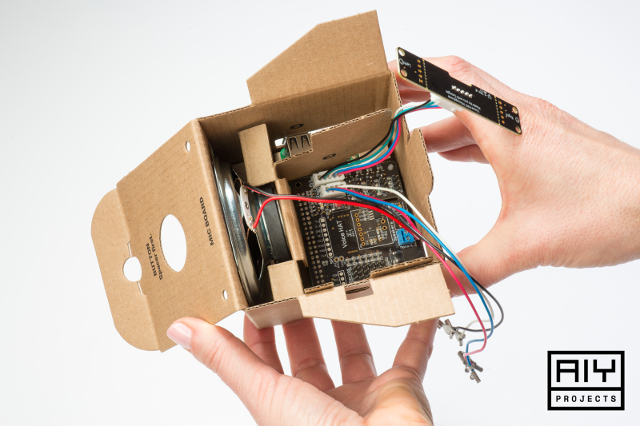
AIYlaunch_Google-VoiceSim-assemble-17

Google has long been focused on artificial intelligence. Its Google Now and voice assistance projects have used AI to better the lives of users. The Google Home voice-based hardware unit brings its assistant to life, making traditional inputs and displays unnecessary. With just the power of your voice, you can interact with the device -- nothing else is needed.

The search giant has decided to take artificial intelligence to the maker community with a new initiative called AIY. This initiative (found here) will introduce open source AI projects to the public that makers can leverage in a simple way. Today, Google announces the first-ever AIY project. Called "Voice Kit," it is designed to work with a Raspberry Pi to create a voice-based virtual assistant. Please keep in mind that the Pi itself is not included, so you must bring your own. For this project, you can use a Pi 3 Model B, Pi 2, or Pi Zero. Want a Voice Kit? Here's how to get it. Heck, you might be getting one for free and you don't even know it.

"The first open source reference project is the Voice Kit: instructions to build a Voice User Interface (VUI) that can use cloud services (like the new Google Assistant SDK or Cloud Speech API) or run completely on-device. This project extends the functionality of the most popular single board computer used for digital making -- the Raspberry Pi," says Billy Rutledge, Director of AIY Projects, Google.

Rutledge further explains, "The included Voice Hardware Accessory on Top (HAT) contains hardware for audio capture and playback: easy-to-use connectors for the dual mic daughter board and speaker, GPIO pins to connect low-voltage components like micro-servos and sensors, and an optional barrel connector for dedicated power supply. It was designed and tested with the Raspberry Pi 3 Model B."

Google shares some potential uses for this particular AIY project below.

  • Replace physical buttons and digital displays (those are so 90's) on household appliances and consumer electronics (imagine a coffee machine with no buttons or screen -- just talk to it)
  • Replace smartphone apps to control devices (those are so 2000's) on connected devices (imagine a connected light bulb or thermostat -- just talk to them)
  • Add voice recognition to assistive robotics (e.g. for accessibility) -- just talk to the robot as a simplified programming interface, e.g. "tell me what's in this room or "tell me when you see the mail-carrier come to the door"

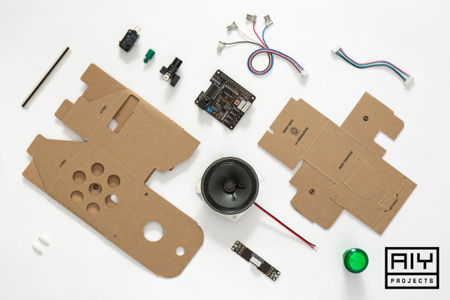
AIYlaunch_Google-VoiceSim-Deconstucted-white

If you want to score yourself one of these kits, you can actually get it free -- if you are an existing subscriber to MagPi Magazine, that is. It will come packaged with the latest issue. Not a subscriber? Don't panic. If you are in the USA, you can soon purchase it from a Barnes and Noble retail location. If you are across the pond in the UK, however, you have more places from which to choose -- Asda, Sainsburys, Tesco, and WH Smith. Pricing and availability is not yet known.

AIYlaunch_Google-VoiceHat-white

The contents of the kit are listed below.

  • Voice HAT accessory board (×1)
  • Voice HAT microphone board (×1)
  • Plastic standoffs (×2)
  • 3-inch speaker (wires attached) (×1)
  • Arcade-style push button (×1)
  • 4-wire button cable (×1)
  • 5-wire daughter board cable (×1)
  • External cardboard box (×1)
  • Internal cardboard frame (×1)
  • Lamp (×1)
  • Micro-switch (×1)
  • Lamp holder (x1)

Will you be getting the Google Voice Kit? What types of projects do you anticipate making? Tell me in the comments below.

05 May 07:03

Telus Samsung Galaxy S6 customers are getting their Nougat update on May 8

by Dean Daley
Telus Samsung Galaxy S6 rear

Telus Samsung Galaxy S6, S8 and S8+ users should expect an update to Nougat within the next four days.

The Samsung Galaxy S6 will get their long awaited Android 7.0 update on May 8th, catching them up with the other approximately 7 percent of Android powered devices running Nougat. Galaxy S6 owners can expect a minor battery update, Doze mode that works while the device is on the move, notification grouping and more.

The S6 update also comes with unspecified bug fixes and security update.

While the Galaxy S6 is getting the Nougat treatment, Telus Samsung Galaxy S8 and S8+ customers are going to receive red tint updates. Don’t worry if you don’t see a red tint on your S8 — you’ll still get the update, but it shouldn’t change anything.

During the MobileSyrup testing of the Galaxy S8 our reviewer Patrick O’Rouke never experienced the red tint issue. However, some Galaxy S8 and S8+ owners complained about a slight red tint to their devices. Although it could be resolved with changing the colour balance on the device, the Korean company decided to release an update to rectify the issue and increase the colour balance range on the device.

Source: Telus

The post Telus Samsung Galaxy S6 customers are getting their Nougat update on May 8 appeared first on MobileSyrup.

05 May 07:02

CIBC considers exclusive Apple product monthly subscription program for clients

by Rose Behar
Apple iOS

CIBC is asking members of its Advisory Panel to weigh in on a potential Apple product monthly subscription program in which clients would pay for the latest iPhones, iPads or MacBooks through the bank.

“In order to help its customers better manage their money, CIBC is considering introducing an Apple product monthly subscription program, exclusive for CIBC clients,” reads the description.

The Canadian bank says it would allow customers to pay $0 down for the newest Apple devices, spreading the cost out over 24 “low monthly payments” for iPhones and iPads, or 36 monthly payments for MacBooks.

Customers can also “unlock the residual value of [their] current Apple devices and receive the latest device for a new model ensuring that [they] always have the latest Apple technology.”

Additionally, since clients aren’t subsidizing their devices on a carrier contract, they can “earn big savings with your carrier plan (up to 25 percent)” — though, it should be noted, BYOD savings are much less through Telus, Rogers and Bell.

In another hard sell against the carriers, CIBC notes that clients can “enhance the flexibility of Apple devices” by not signing contracts with or paying activation fees to cellular providers.

“In order to help its customers better manage their money, CIBC is considering introducing an Apple product monthly subscription program.”

Lastly, it notes that Apple devices will be protected throughout the program by AppleCare+.

Giving the example of a 32GB iPhone 7, CIBC states that customers would pay $0 down and $41.58 CAD per month for 24 months, amounting to $997.86. In its description, CIBC notes the regular price as being $1,186.52 — which would represent a 16 percent savings — but that doesn’t line up with Apple Canada’s online pricing of $899. Presumably, this is just an oversight in the copy.

Continuing with the same example, at the end of the 24 months customers do not own the phone — they return it and keep their monthly subscription going with the latest iPhone.

At the tail end of its proposal, CIBC hints at a partnership with Telus, asking Advisory Panel members to “imagine that Telus also offered an additional exclusive discount on cellular services,” and questioning whether they would go with a different carrier or take the offer from Telus.

The potential offer is similar to Apple’s own yearly Upgrade Program, which isn’t available in Canada. It’s also unusual in the world of Canadian banking, as none of the other Big Five banks in Canada — BMO, Scotiabank, RBC or TD Canada Trust — offer similar programs.

It’s still unclear whether this potential program will actually see the light of day, but if it does, it will offer an interesting alternative to carrier offerings for Apple users.

The post CIBC considers exclusive Apple product monthly subscription program for clients appeared first on MobileSyrup.

05 May 07:02

Surmesur Quebecois menswear boutique uses AR to help customers design their own clothing

by Dean Daley
Surmesur AR technology

Surmesur, a Canadian menswear boutique, has implemented augmented reality (AR) technology that overlaps computer generated images into the real world to help customers design their own clothing.

The menswear company, established in 2010 in Quebec, uses its own software and Google’s Tango technology to help customers ‘see’ the clothing they’re designing.

Shirts, suits, overcoats and more can be designed in real time and be placed on a 3D avatar. According to the Pittsburgh Post-Gazette, customers can choose from 8,000 different fabrics to choose from and can design each specific component of their clothing such as their collars or cuffs, while also having the ability to rotate the avatar in 360-degrees to view from all angles and zoom in on the details of the clothing.

Shirts start at $75 CAD and can get quite costly from there. Before you can custom create your own clothing, associates at Surmesur have to take your measurements at one of its 12 stores in either Ontario or Quebec or one of the company’s two American stores in Pittsburgh or Chicago.

Technology is a big part of the company Francois Theriault, co-founder of Surmesur said in an interview with the Post-Gazette, “the DNA of our company is the technology.”

The Quebec company focuses on creating and making clothing your own, “it’s all about the customization,” said Vincent Theriault the other co-founder of Surmesur.

Surmesur was founded by two brothers, Francois and Vincent Theriault in their basement in Quebec more than seven years ago and now has 100 employees.

Source: Pittsburgh Post-Gazette 

The post Surmesur Quebecois menswear boutique uses AR to help customers design their own clothing appeared first on MobileSyrup.

05 May 07:02

Gallery of programming UIs

by Jonathan Edwards

I’ve assembled a gallery of notable/interesting user interfaces for programming, as inspiration for the next Subtext. [Google Slides]

05 May 07:01

P-Values and Random Fluctuations

by Richard Millington

In statistics, the p-value is the probability of seeing the same (or more extreme) outcome by chance.

For example, I might claim I have a lucky coin that always lands on heads. If I flip the coin twice and it lands on heads both times, does this prove my theory?

Nope. You simply witnessed the 1 in 4 occasions where that outcome was statistically likely to occur.

The lower the p-value, the more likely there is something going on. If my coin landed on heads for the 5th time in a row (p = 0.031), you might want to start inspecting the coin.

Our web traffic rose by 10% yesterday. Is this because yesterday’s blog post was great? Our Google search ranking increased? Or was it just the 1 in 30 days where our traffic fluctuates by 10%.

The danger begins when you attribute random fluctuations to specific events. This will lead you down the fruitless path of trying to replicate false results.

For example, a webinar guest might attract a 20% bigger audience. An activity might increase participation by 15% one month. Is this because of the guest or the interesting discussion topics? Or is it simply the outcome of random fluctuations?

The more you learn about statistics the more skeptical you should become of your observations.

05 May 07:01

Expo.io – Building Android and iOS Apps using React Native Made Easy

by Thejesh GN

I have used MIT’s AppInventor in class rooms. All non-professional programmers appreciate how easy it is to use AppInventor to create apps. I have also seen lot of professionals using it to create one time use apps including me. It’s a great tool except you can’t generate an iOS app.

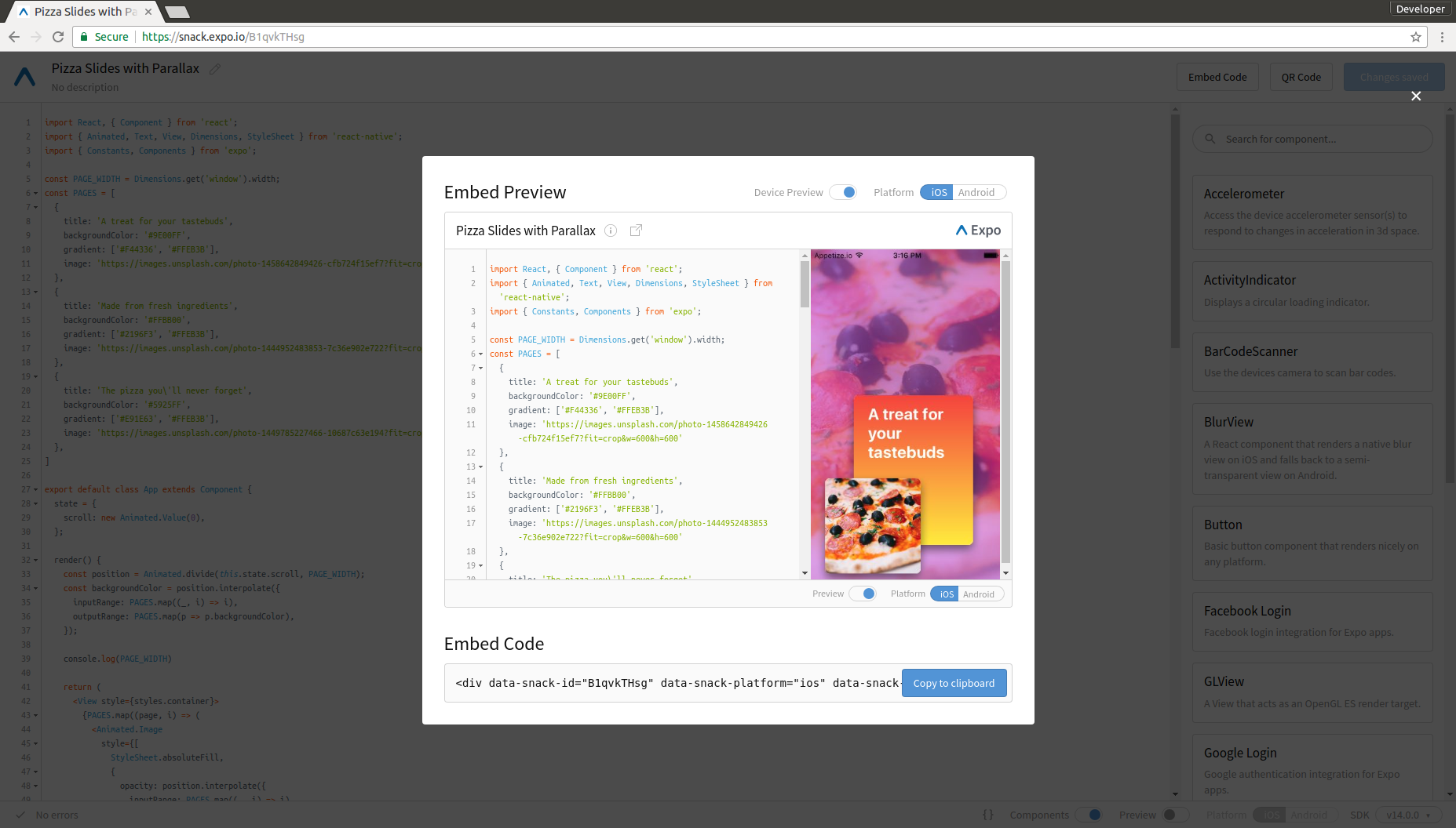
On the side I have looked for similar projects which has the potential to attract both professionals and non-professionals alike. Recently I started working with react native. React Native enables you build “Native” mobile apps using only JavaScript. Once the system is set up, it works like magic. Setup is still an issue for kids and many beginners. That’s where Expo.io is so useful. If you are a student or a beginner just go to Expo Snack and code your react project. Then scan the QR code on the snack page using Expo iOS app or Android App. Voila the app starts running on your phone. You can bookmark or create shortcuts. You can share the link with your friends to share the app. Here is the Simple QR code Scanner written completely in a browser to try.

Write and Scan to run

Write and Scan to run

If you don’t have a phone then you can try web embedded emulator. For most things it works. But the best experience would be with a phone and browser.

Expo Browser Preview

Expo Browser Preview

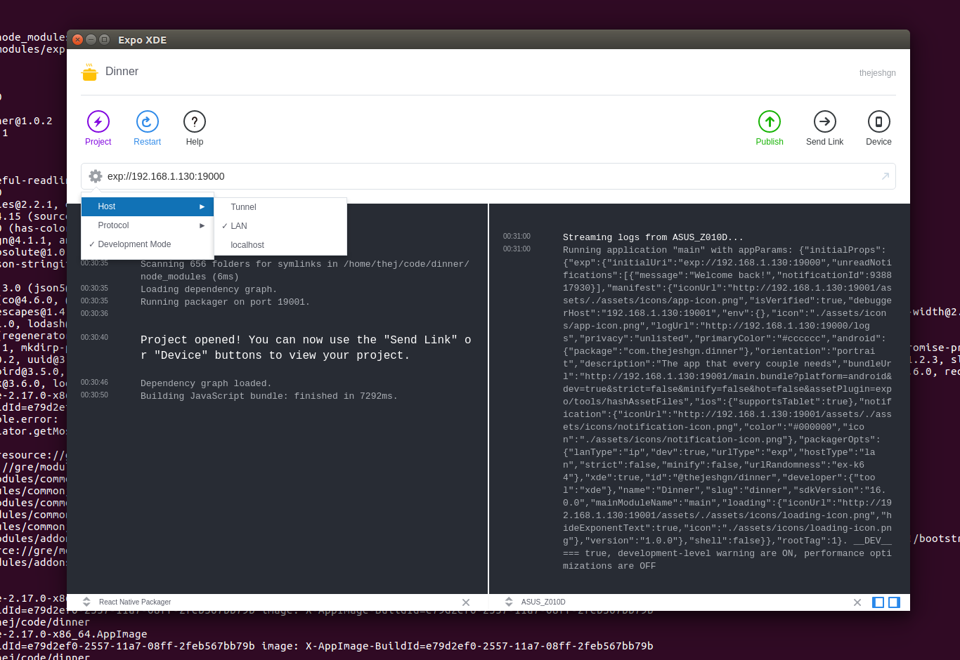
Let’s say you are an advanced developer and want to build apps to publish in markets. Then you need a desktop development environment. You will need to install Expo desktop development tool called XDE and Expo mobile app which you have already installed.

Create the project. It gives you a basic structure. You can edit using any editor that you love. Use the URL to open the project on Expo App. I prefer LAN because its fast. You can try tunnel if you want to share with a friend temporarily. You can also install Android and iOS emulators to test. But I use their Expo app for testing. It fast and works perfectly fine. Once you are done. To share it with the world you can click share. It gives you an URL that you can share it with friends with Expo app.

You can also build Android or iOS binaries for the markets. But for that you need to go one more step and install the node package exp. Once you install you can build the binaries. Everything that you can do with XDE – Expo desktop development can also be done with exp. If you like command line then you can skip XDE and install exp.

So in the next class. Its going to be React Native with Expo.

05 May 07:00

Twitter Favorites: [rcousine] 24-hour review of Apple AirPods: These will be the greatest portable audio system I have ever used, if my left ear stops hurting.

Ryan Cousineau @rcousine
24-hour review of Apple AirPods: These will be the greatest portable audio system I have ever used, if my left ear stops hurting.
05 May 07:00

Twitter Favorites: [beanjammin] Nancy Pearl Librarian action figure here to help me on my first day in the office at BC Libraries Co-Op. Very excit… https://t.co/5eIbBGlrEB

Ben Holt @beanjammin
Nancy Pearl Librarian action figure here to help me on my first day in the office at BC Libraries Co-Op. Very excit… twitter.com/i/web/status/8…
05 May 07:00

Twitter Favorites: [dlbno] If you don't delete tweets then you're too prideful.

db @dlbno
If you don't delete tweets then you're too prideful.
04 May 23:07

Tweak

by Eugene Wallingford

In an essay in The Guardian, writer George Saunders reflects on having written his first novel after many years writing shorter fiction. To a first approximation, he found the two experiences to be quite similar. In particular,

What does an artist do, mostly? She tweaks that which she's already done.

I read this on a day when I had just graded thirty-plus programming assignments from my junior/senior-level Programming Languages courses, and this made me think of student programmers. My first thought was snarky, and only partly tongue-in-cheek: Students write and then submit. Who has the time or interest to tweak?

My conscience quickly got the better of me, and I admitted that this was unfair. In a weak moment at the end of a long day, it's easy to be dismissive and not think about students as people who face all sorts of pressures both in and out of the classroom. Never forget Hanlon's Razor, my favorite formulation of which is:

Never attribute to malice or stupidity that which can be explained by moderately rational individuals following incentives in a complex system of interactions.

Even allowing the snark, my first thought was inaccurate. The code students submit is often the end result of laborious tweaking. The thing is, most students tweak only while the code gives incorrect answers. In the worst case, some students tweak and tweak, employing an age-old but highly inefficient software development methodology: Make another change and see if it works.

This realization brought to mind Kent Beck's Rules of Simple Design:

  1. passes the tests
  2. reveals intention
  3. has no duplication
  4. has the fewest elements possible

Most students are under time pressures that make artistry a luxury good; they are happy to find time to make their code work at all. If the code passes the tests, it's probably good enough for now.

But there is more to the student's willingness to stop tinkering so soon than just external pressures. It takes a lot of programming experience and a fair amount of time to come to even appreciate Rules 2 through 4. Why does it matter if code reveals the programmer's intention, in terms of either art or engineering? What's the big deal about a little duplication? The fewest elements? -- making that happen takes time that could be spent on something much more interesting.

I am coming to think of Kent's rules as a sort of Bloom's taxonomy for the development of programming expertise. Students start at Level 1, happy to write code that achieves its stated purpose. As they grow, programmers move through the rules, mastering deeper levels of understanding of design, simplicity, and, yes, artistry. They don't move through the stages in a purely linear fashion, but they do tend to master the rules in roughly the order listed above.

Today is a day of empathy for my novice programmers. As I write this, they are writing the final exam in my course. I hope that in a few weeks, after the blur of a busy semester settles in their minds, they reflect a bit and see that they have made progress as programmers -- and that they can now ask better questions about the programming languages they use than they could at the beginning of the course.

04 May 23:06

Trint: A new service that transcribes recordings instantly and cheaply

We, the modern people, are tickled with our phones’ voice-recognition powers. We can ask questions! We can open apps with our voice!

You know who’s not so tickled? Anyone who records other people talking. Our phones are terrible at transcribing voices—converting them to text that we can edit.

I realize that most people don’t care about transcribing audio. But if you’re a reporter, producer, editor, author, YouTuber, filmmaker, student, documentarian, researcher, government agency, doctor, lawyer, or police officer, for example, you might really care. Manual transcription of audio and video files is an excruciating, tedious, soul-sucking exercise, and we’ve doing it pretty much the same way for 50 years.

The world waits for a method that’s fast, cheap, and accurate. We want this:

image
The holy grail of transcription tools. Unattainable.

But you can’t have that.

Until now, there have been only a few ways to convert a recording into text:

  • Transcribe it manually. You do the typing yourself as you listen. Hit Play, Stop, Rewind, Play, Stop, Rewind, over and over. That’s accurate and cheap, but not fast. It’s a royal pain, especially if you have several long interviews to do.
  • Transcribe it manually, with web assistance. This Chrome extension combines an audio player and a text editor, so at least you’re spared some of the back-and-forth between two apps as you type it out yourself. Still tedious.
  • Let your phone transcribe it. Yeah, play the recording into your phone, as though you’re speaking to it. The results are terrible. There’s no punctuation, no paragraph breaks, and the result needs so much editing, you could have done the job yourself faster. Fast and cheap, but not accurate. (Same thing for the automatic transcription features of YouTube and Google Docs. The results are generally a mess.)
  • Hire a web-based service to do it. Services like Rev.com, Scribie.com, Transcribeme.com, and VoiceBase.com employ human transcriptionists to type out your audio. Usually, they charge between $1 and $3 per minute of recorded audio or video—more if you want same-day turnaround, and even more if you want the transcriber to add time codes, the names of who’s speaking, and the little “ums” and false starts. Bottom line, you’re looking at $60 to $150 per hour of audio. Accurate, but not fast or cheap.
  • Hire a professional service. Professional news channels hire professional transcription services like Transcript Associates, Audio Transcription Center, or Professional Transcriptions. You get incredible quality—flawless transcriptions; “ums” and “uhhs” and dashes representing pauses; time codes typed in; the speakers’ names identified. And you get it in a matter of hours. But we’re talking $220 per hour of audio, or more. Accurate and fairly fast, but not what you’d call cheap.
image
No method gives you everything.

This is a review of a new, fifth approach: Trint.com. (The name, we’re told, is a combo of “transcript” and “interview.”) It lands on a new point in that speed-cost-accuracy continuum by (a) automating the conversion instead of hiring humans, and (b) providing a slick, easy way for you to breeze through the results and correct the errors.

“The idea is to take the very best of automated speech recognition [ASR] and push it as far as it will go, then give the user a simple tool to get those last yards,” Trint founder Jeffrey Kofman told me. “By combining a text editor with an audio/video player, we let you quickly search, verify, and correct the output of our ASR.”

The cost is $15 per hour of video—about a quarter of the cost of even the cheapest human web-based services.

How it works

You sign up. You upload your audio or video file. You pay in advance: $15 for an hour of converted audio or video. (If you’re willing to commit to doing a lot of this, the cost comes down to $12 an hour.)

You wait maybe five minutes—an insanely short time—and then it’s done. You open the transcription right there in your browser, looking like this:

image
Now the fun begins: Cleaning up the Trint transcription.

Already, what you get is good enough that you can search for words or highlight the good parts.

But while the system correctly detects sentences and adds periods, it adds no other punctuation. It makes no attempt to add commas, for example. So you wind up with phrases like “I went to you know the store and bought peaches plums and pickles.” No question marks, either.

Now you read through it, correcting the errors, adding punctuation and paragraph breaks, and identifying speaker names using a pop-up menu. The video above shows what this process is like.

What’s kind of wonderful is how the audio or video playback is integrated with the editing: Wherever you click your mouse, that bit plays back automatically. There’s no Play, Pause, Rewind cycle here; the system always knows what to play when. (You can turn this playback on or off with a keystroke, and also control the playback speed.)

So how long does this cleanup process work? I tried Trint on seven interviews, and the editing generally wound up equaling the length of the interview. Thirty-minute interview, 30 minutes to clean it up.

That will never fly in the professional world. CBS News won’t be using Trint any time soon. But doing the job yourself would take five to ten times the length of the original recording. And if you hired a professional service, you’d pay four to eight times as much.

(For many people, of course, a full cleanup isn’t necessary; often, the point of transcribing an interview is just to skim it to find the good parts. That’s where Trint really shines. It’s simple to read or search for text in a transcript, highlight the juicy parts, and even play back only the highlighted portions. In that case, you can clean up only those few bits.)

How does it compare?

To compare the results, I submitted the same interview recording to Trint, to Rev.com ($1 a minute for 24-hour turnaround), and to a high-end pro service. Here’s what I got back:

image
Transcriptions compared.

It’s in beta

There are some bugs left to squash in Trint. For example, copy and paste don’t work in the text editor. (I was editing an interview that contained the word GISHWHES over and over again, a non-word that Trint never once transcribed correctly. I thought I could just paste it in over and over again, but no joy.) The company explains that if you went nuts, pasting in blobs of text, you’d throw off the software’s underlying links between the audio and the text.

Chrome extensions can trip up Trint, too. Every time I inserted a Return to break up a paragraph, some text would disappear. Turning off all my extensions fixed that.

You should also keep in mind that Trint requires clean, clear audio, in which your subject was miked. You can’t feed it the echoey recording of your kid’s school play, for example, and expect decent results. And, as you’d guess, thick accents dramatically impair the accuracy. (When you post the recording, you specify which accent the speaker has; that helps.)

The company acknowledges that it has some work to do, and says that it has big plans for Trint 2.0 this summer.

In the meantime, Trint is here now. It’s not this—

image

—but it’s this:

image

—and that’s a new spot on the time-cost-accuracy spectrum. It’s therefore a welcome new weapon in the fight against the costly, time-consuming, soul-sucking act of transcribing the human voice.

More from David Pogue:

Inside the World’s Greatest Scavenger Hunt: Part I

Inside the World’s Greatest Scavenger Hunt: Part 2

The David Pogue Review: Windows 10 Creators Update

Now I get it: Bitcoin

David Pogue tested 47 pill-reminder apps to find the best one

David Pogue’s search for the world’s best air-travel app

The little-known iPhone feature that lets blind people see with their fingers

David Pogue, tech columnist for Yahoo Finance, welcomes nontoxic comments in the comments section below. On the web, he’s davidpogue.com. On Twitter, he’s @pogue. On email, he’s poguester@yahoo.com. You can read all his articles here, or you can sign up to get his columns by email.

04 May 23:01

Some default and debt restructuring data

Yesterday the government of Puerto Rico asked for bankruptcy relief in federal court. Puerto Rico owes about $70 billion to bondholders and about $50 billion in pension obligations. Before asking for protection the government offered to pay back some of the debt (50% according to some news reports) but bondholders refused. Bondholders will now fight in court to recover as much of what is owed as possible while the government and a federal oversight board will try to lower this amount. What can we expect to happen?

A case like this is unprecedented, but there are plenty of data on restructurings. An op-ed by Juan Lara pointed me to this blog post describing data on 180 debt restructurings. I am not sure how informative these data are with regards to Puerto Rico, but the plot below sheds some light into the variability of previous restructurings. Colors represent regions of the world and the lines join points from the same country. I added data from US cases shown in this paper.

The cluster of points you see below the 30% mark appear to be cases involving particularly poor countries: Albania, Argentina, Bolivia, Ethiopia, Bosnia and Herzegovina, Guinea, Guyana, Honduras, Cameroon, Iraq, Congo, Rep., Costa Rica, Mauritania, Sao Tome and Principe, Mozambique, Senegal, Nicaragua, Niger, Serbia and Montenegro, Sierra Leone, Tanzania, Togo, Uganda, Yemen, and Republic of Zambia. Note also these restructurings happened after 1990.

04 May 23:01

"We’re going to have to end up with a Basic Income, or revolution."

“We’re going to have to end up with a Basic Income, or revolution.”

- Mike Warot, cited by Pew in The Future of Jobs
04 May 23:01

Levels of Techie Enlightenment

by Emin Gün Sirer

Having taught thousands of students and watched hundreds of graduate students, friends, and colleagues tackle advanced material, I have come to realize that there is a common path people follow when mastering a technology. There are three distinct stages, or levels of enlightenment, that individuals proceed through.

I want to chronicle this seemingly universal process, partly to seek feedback from those of you with deeper insights than mine, partly to provide reassurance to young graduate students, partly to help people who are entering my field, but mostly to serve as a framework for how to evaluate communities and improve discourse. For any community will consist of various individuals, scattered throughout this continuum between the various stages of enlightenment. And it's useful to be able to categorize and guide appropriately.

One caveat: I am not claiming to speak from a position of authority on this topic. All of this is "meta" and outside my area of expertise. I can claim to have reached Level 3 only in a limited number of narrow fields, and I'm constantly trying to explore new fields myself. So for all I know, maybe there are 16 stages of enlightenment and I've only seen 3! But I do think it's useful to discuss how people respond to intellectual challenges, what this means for those around them, and perhaps how we can all engage in better discussions.

Level 0: The Newcomer

Levels of enlightenment

Almost all newcomers to an area are greeted by a barrage of ideas developed by people who came before them. Even if an area seems "brand new," say, computing in the 40s, it buds off of existing fields, like electrical engineering or math, and entails the use of techniques drawn from both. Mastering these techniques is often a difficult process, for the road ahead seems windy and the end is not clear.

For one, learning a new area requires adopting the terminology and frameworks used within that area, some of which might be confusing and even off-putting. For instance, what we call "slow start" in networking refers to exponential growth, one of the fastest possible ramp up functions possible. Every new system to master comes with idiosyncratic complexities that reflect its history. The bigger the gap is between how a clever person would design something from scratch versus how it is right now due to its history, the more offputting and inaccessible it is.

And the ties between the disparate lines of work aren't crystal clear. There are few people, for instance, who can relate how the work on failure detectors, in distributed systems, is related to consensus protocols. The relationship between a new consensus protocol and others that came before it may not be clear, even to the authors of the work themselves.

And there is seemingly a ton of material to master. This is especially true when one is learning on their own and there isn't someone to guide them through the enormous data bank of published work. And it can be confusing, if not incredibly unproductive, because there is often a giant gap between what is said publicly and what is known among the experts. For instance, there are some well-publicized results that are known by experts to be misguided or misleading, such as the CAP Theorem. A simple reading path will often guide one into the underbush, where even the trees, let alone the forests, are not visible. Self-study in such areas will lead one into ratholes.

Level 0 Reaction: Overwhelmed

Levels of enlightenment

The standard reaction most people have at this stage is to feel overwhelmed. People universally feel like they have far too much reading to do.

There are some common pitfalls at this stage.

Lack of integration is probably the biggest problem that people encounter as they try to make sense of the various papers they are reading. Instead of fitting the new material into a cohesive whole, they learn and memorize results. Instead of applying uniform standards and criteria to different ideas, they evaluate each idea separately, within its own framework. For instance, it is quite common for people who have done some but not enough reading in databases to use the acronyms ACID and CAP, without realizing that the C in these acronyms is completely different. Or, for another instance, for people who hold day jobs building distributed systems to claim that Paxos is a Byzantine Fault Tolerance algorithm (yes, there are Byzantine Paxos variants, but no, Paxos does not handle Byzantine failures).

Lack of time is an issue that plagues the part-timers. In most areas of study, it is impossible to perform the necessary synthesis in one's mind except by reading a large number of papers in a relatively short span of time (say, 4-8 papers per week for 10 weeks). The mental cache needs to contain the material to be cross-connected, and that can't happen at a rate of 1 paper per week.

Finally, lack of breadth is a common problem. You might say "hey, wait a minute, in this age of ADHD, you're telling me that it's lack of breadth, and not lack of focus, that is a problem?" Indeed, in my experience, focus isn't critical in the early stages. There is so much to learn that it doesn't matter if you attack left or right or center -- as long as you do the reading voraciously, you will master it (and if you're not doing the reading, we go into the "lack of time" category above). The problem cases I've seen are invariably people who are so focused on one topic that they try to go deep and skip the foundation-building that comes from reading a broad base of papers.

Most people never proceed past Level 0. It is possible to always remain behind the reading, just with a slightly expanding vocabulary and a constantly foggy understanding. Being in a structured degree program helps yank one out of this zone, but is not a guarantee.

Level 1: The Half-Expert

Levels of enlightenment

As people gain more expertise in an area, the Level 0 feeling of "inferiority in front of the collective works of mankind," gives way to its opposite. They have now mastered a sub-piece of human knowledge. They speak the lingo. And most importantly, they have acquired the ability to critique it. They now possesses destructive powers.

Specifically, people at this level can read a paper and either figure out its critical weaknesses, or they have built a catalog of quick critiques they have memorized. For instance, every time someone says proof of stake, a half expert will cite the "nothing at stake" problem, to knowing nods from other Level 1s and 0s. Or someone will introduce a new database and a Level 1 will ask if a database is "CP or AP." These cringeworthy discussions are signaling mechanisms that Level 1s have adopted to distinguish themselves from Level 0s.

Most Level 1s are incredibly good at identifying problems with past work. In fact, they can't help but do this; they've been trained to become weakness-finding-machines. This skill is a critical enabler for what they need to do at the next level up. But leveling up is hard.

So they see it as their hard-earned privilege and, now, birthright to attack every idea that came before them, as well as every new idea that they encounter. Snark and negativity flows with copious abandon from half-experts.

Level 1 Reaction: Dismissal and Destruction

Levels of enlightenment

And as we know from the Lord of the Rings and the entire "power-corrupts" canon, it's hard not to wield destructive powers. This is where we begin to see damaging behaviors. No work is good enough. Everything that has ever come before is crap. The greats on whose shoulders they rise clearly didn't know anything about the demands of today's systems.

There are three behavioral patterns that are common among half-experts.

First is sheer laziness. When asked to critique an idea, Level 1s will simply google related words, parse what they see (for they can now do this properly, as they are not Level 0s), and deliver a non-original critique that, in essence, was provided to them by someone else. Some might hang out on IRC channels to pick up others' ideas and regurgitate them. Many Level 1s have their pet issues that they feel defines them. For instance, some might harbor a special love or special hatred for certain techniques (e.g. certain algorithms, approaches and so forth), ready to go into a canned rant every time these are mentioned.

Second, they exhibit an obsession with their own ideas. At this stage, ideas are rare and hard to come by for the Level 1. Typically, their solutions are complex, under-thought and under-justified. It is quite common to see solutions that are essentially kitchen sinks that "solve" multiple problems at the same time. Achieving novelty with a simple and elegant solution is hard: you really have to invent something new. Creating something novel by gluing together disparate components is almost trivial. For instance, in a world where the only rain protection consists of hats, inventing an umbrella would be the next best invention, but requires intellectual prowess that a Level 1 simply lacks. It's much easier to invent a novel hat, incorporating a propeller, a wide brim, and a feather on top. Because no one has done that before, it's automatically novel. Crucially, its weaknesses cannot be readily discovered by other lazy Level 1s by simple googling. Too wet? It has a wide brim. Too hot? Propeller fixes that. What's the weird feather for and why didn't you design something simpler? Ah, but you see, the wide brimmed hats for sale never anticipated the needs of my particular hat usage, and you're a dummy if you don't see why the feather is absolutely essential.

Finally, in my experience, Level 1s have few ideas, but what few ideas they have, they repeat over and over again. People say that when you have a hammer, everything looks like a nail. I don't know if that's universally true, but what I have seen is that, to a blacksmith's apprentice who worked so hard to forge that first hammer, everyone else's hammers look totally inferior.

Level 1 half-experts often develop narratives to justify their destructive behavior. One narrative is that whatever they are working on is too important, too exceptional, too precious. This is wrong, of course, unless they are working on nuclear launch systems, but then again, Level 1's are never allowed to work on nuclear launch systems. I've met people who worked on (non-nuclear) launch systems, as well as many people who worked on systems that actually serve about a billion people. None of these experts had 1/100th the hubris of a half-expert. Another narrative, commonly used by Level 1s in industry, is to justify destructive behavior by citing their business concerns. Somehow, especially in the US, bad businesspeople firmly believe that "all is fair in business" or "it's just business," as if those words could ever provide an adequate basis for destructive behavior.

Of course, any given community will have some Level 1 members in transition. In unhealthy or immature communities, where there are large groups of people at Level 0, these people might even be revered. After all, they have a better understanding of issues than Level 0 muggles who don't even have the right vocabulary. And they might seem to have an insightful comment or two every now and then. And if they can't produce an insightful comment themselves, they can always acquire and resell someone else's ideas.

Quite a few people get stuck at Level 1 and never proceed beyond. Interestingly, such people are quite rare in PhD programs: the number of people who dropped out of our PhD program because they were stuck in Level 1 is incredibly small. What is much more common is the self-taught techie who managed to reach Level 1 on his or her own, but is unable to make further progress. They often form or join a tribe of like-minded people, for much needed validation and for protection against criticism from people who know better. And they frequently make much of the noise. People at higher levels are actually busy with productive activities, while the Level 1 typically spends more time jockeying for social recognition instead of technical competence.

Level 2

There is no characterizable Level 2. Between Level 1 and the ultimate Level 3 lies some chaotic times, different for every individual, marked by much hard work.

Level 3: Nirvana

Levels of enlightenment

At some point in the process of trying to master, and then advance, a new area, something magical happens. The researcher realizes that, indeed, all past work has weaknesses, and that this is normal, for it is quite difficult to achieve perfection. Their destructiveness gives way to a positive attitude that can extract valuable contributions from other people's work. They realize that we are all in this together. They become able to function in a cohesive environment of like-minded peers. And their productivity skyrockets.

Those of you who are familiar with successful software houses (like Google on the large company end of the spectrum, and Chain on the startup side, and everything in between) will immediately recognize that these are the qualities that most happy science and tech communities encourage. Hacker News, for all its many faults, works very hard to avoid snark in an effort to keep out Level 1 discourse, and it succeeds somewhat. Academia, of course, is all about principled behavior, from design to critique.

I'm not going to say anything about the value of reaching Level 3, or whether it makes a community more healthy. The causality could run the other way -- instead of happy communities being a result of people who have reached Level 3, it could be that happy communities allow people reach the final stage of enlightenment.

And are there communities that are devoid of Level 3s, yet able to function? Undoubtedly so.

But in my experience, the most stable and productive environments tend to have a large number of people who have reached this final stage. Such people are able to provide and receive criticism without making it personal. They can see the value in half-baked ideas and foster them, instead of shooting them down on sight. New people fearlessly join such groups because they know that their ideas will get fair consideration.

I don't want to paint too rosy or idealistic a picture. We know that even academia, which tries very hard to foster a Level 3 environment, has personal rivalries and petty infighting. But the discourse, at least in the communities I have been a part of, is almost always civil, the problem cases are confined, and there exist common values to help steer the group out of ruts of negativity.

Overall, the bottom line is that this is the exact progression I have seen hundreds of times in graduate programs at several different schools. Those who reach Level 3 seem to be far more productive. Of course, it's certainly possible to be productive without fully going through the stages -- my own institution has awarded PhD degrees to people who never progressed beyond Level 1. But somehow, there seems to be a strong correlation between the Level 3 mindset and the ability to advance human knowledge.

Addendum

Perhaps it's worth talking about the nebulous Level 2, the all too critical transition between Level 1s and Level 3s. I'd like to hear from the readers on what they think enables people to cross over the chasm. Is it a hard challenge? Mentorship? Recognition? Something else? If so, how do we help more researchers achieve higher levels of enlightenment?

04 May 21:53

Film: No Fixed Address – May 19-Jun 8

by pricetags

From Vancouver International Film Festival:

Vancouver: No Fixed Address

.

In Haida Gwaii, Charles Wilkinson explored and celebrated the resourceful (and resource-conscious) alternative lifestyles that coexist and flourish in Northern British Columbia. In this follow up, he turns his eye on our own home town, to dissect the often difficult and perhaps untenable compromises that come with putting down roots in one of the “most liveable” cities in the world….

Among the speakers, you will likely recognize David Suzuki, Gregor Robertson, and Bob Rennie, but the film also lends an ear to First Nations voices, to immigrants from China, to our homeless, and the millennial generation who in many cases can’t afford to live in the city where they were born. Are developers being given too much license, or not enough? Are foreign speculators distorting the market? Is globalization to blame? Or just greed across the board?

Official Website

Buy tickets here


04 May 21:53

Resource Value Re-thought

by Ken Ohrn

The Economist argues (what else?) that the centuries-old dominance of oil as the most valuable resource commodity may be coming to an end.

Most of us use social media and other things on the Internet, and the Economist points out that the data collected by the big 5 (Google, Amazon, Apple, Facebook and Microsoft) has helped them become the most valuable listed corporations on earth. This territory was once the domain of big oil.

The Economist’s rallying cry:    Who ya gonna call?  Trustbusters!!

But there is cause for concern. Internet companies’ control of data gives them enormous power. Old ways of thinking about competition, devised in the era of oil, look outdated in what has come to be called the “data economy” Briefing). A new approach is needed. . . .

. . .  What has changed? Smartphones and the internet have made data abundant, ubiquitous and far more valuable. Whether you are going for a run, watching TV or even just sitting in traffic, virtually every activity creates a digital trace — more raw material for the data distilleries. As devices from watches to cars connect to the internet, the volume is increasing: some estimate that a self-driving car will generate 100 gigabytes per second. Meanwhile, artificial-intelligence (AI) techniques such as machine learning extract more value from data. Algorithms can predict when a customer is ready to buy, a jet-engine needs servicing or a person is at risk of a disease. Industrial giants such as GE and Siemens now sell themselves as data firms.

Here’s another look, from John Cheney-Lippold at Quartz.  It’s US-centric, but in the data age, this doesn’t matter much. The writer draws a distinction between your physical identity and your algorithmic identity. And discusses how various actors use your algorithmic one (NSA and Google are prominent).

Because algorithms draw from our data, not our lived experience, it largely doesn’t matter if we’re incorrectly identified. (And as much as it sometimes may seem, Google is not invested in explicitly maintaining the patriarchy.) Instead, Google wants to provide advertisers with a consumer base of users who are seen to be profitably man-ish. Similarly, the NSA really doesn’t care if a user is citizen or foreigner, as algorithmic citizenship itself is only a legal caveat that protects them from constitutional overstepping.

But it still raises the question: What would the real world look like if users were identified based only on their algorithmic self?

This is already happening to some extent. Google’s gender and age audience analytics determine which users are targeted with content and advertisements, as well as how websites interpret who is visiting their site. For example, if your data suggests you’re algorithmically wealthy, you might be shown higher prices for hotels or flights on a site like Orbitz.com, because your data suggests you can pay. Or, like the case of a Wisconsin man this week, you might be denied parole because you’ve been identified as an algorithmic reoffender.

Of course, the knowledge gathered from big data is not always used wisely.

Dilbert.Data


04 May 21:53

Google Street View can now extract address info to update Maps

by Bradly Shankar
Google Maps Street View

Google Street View can now read and extract information off of images to update Maps.

In a blog post, Google said that its algorithms can take information from street names, numbers, businesses and more. In theory, a Street View car equipped with a 360-degree camera can drive around a city and automatically fill in information on Google Maps from passing businesses.

To test its tech, Google looked at hard to read images from a variety of countries. French signs reading “Avenue des sapins,” for example, could be read roughly 84 percent of the time. The algorithms can even read signs with abbreviations, such as “av” for “avenue,”  and make it into full words.

However, different shots of the same objects had to be viewed multiple times to account for difficulties like blurring, lighting or angles.

Google says there are over 80 billion Street View images, with over one billion people using Maps.

Image credit: Wikimedia Commons 

Source: Google Blog Via: Engadget

The post Google Street View can now extract address info to update Maps appeared first on MobileSyrup.

04 May 21:53

Introducing Stagemaster

by Anselm Eickhoff

In order to take a small break from thinking about economics, while still doing something useful for it, I decided to work on engine code for creating user interfaces.

Although the prototypes thus far already contained a pretty flexible and nice system for complicated mouse interactions with objects in the 3D game world (creating, selecting, modifiying roads and lanes with drag and drop), keyboard interaction was pretty rough and 2D user interfaces (buttons, texts, info windows, menus, ...) were pretty much nonexistent.

Both Herbstein and kingoflolz, two of my most avid contributors, already went great lengths towards better keyboard interaction (such as rebindable key bindings) and their ideas were a direct inspiration to what I ended up implementing.

Regarding the 2D user interface part, I originally planned to write a UI library from the ground up, just like I did for interaction with the 3D world. But then, in the spirit of keeping things simple, I decided that I don't really need to revolutionize good ol' button-clicking and text-showing and instead opted to use an existing 2D user interface library.

I decided to use "dear imgui", a library that's really popular with game developers and already contains a huge catalogue of useful controls like sliders, scrollable windows, ... pretty much whatever you will ever need. People create all kinds of simple and complex UIs with it.

Even though using "dear imgui" would save me a lot of work, integrating it still brought some challenges:

  • marriage to the actor system (a difficult marriage, since "dear imgui" is the oldschool "everything is global & single threaded", and the actor system is the new and wild "everything is happening at once")
  • deciding when to give mouse & keyboard events to "dear imgui" and when to the 3D user interface (basically: "when are you clicking on a button and when are you clicking into the world?")
  • Making "dear imgur" use the Citybound text font and make that look nice on glorious retina displays
  • Choosing some nice colors for the UI

But the biggest challenge was probably:

  • All the existing code for 3D world interaction, handling keyboard events and displaying debug messages and telling the renderer what to draw was all over the place.
  • It became clear that this old responsibilities plus the new 2D user interface code really all belonged in one place.

So I unified all of that and called it Stagemaster, which is now the one and only part of the engine to:

  • handle mouse and keyboard input
  • convert that into 3D world or 2D interface interaction
  • draw the 2D UI
  • handle camera control
  • offer loading and saving of user preferences
  • offer rebindable key bindings for all different parts of the game and a quick way to create a settings UI

Here is the first screenshot of Stagemaster in action:

Stagemaster-powered UI

As you can see, it shows the debug info we all know and love, as well as a fully-functional control settings menu for camera control and plan editing!

The best thing is that with this set up, it is now really easy for me to add all kinds of UI.

This will not only mean that I will finally put a stronger focus on that in the upcoming prototypes, but also that I will be able to write some really nice inspection and debug UI to look at individual households and companies while developing the economy simulation.

What else I did in the past couple days:

  • Working on a unificaiton/redesign of the homepage & blog using Webflow, which will make it much more pleasant for me to write blog posts, update the homepage and make everything look much nicer in general
  • Already started a little bit with implementing the new economy simulation model - stay tuned for more

As always, let me know what you think!


04 May 21:53

Why you should work remotely, even if you're not remote

My last job was as a data scientist at Upworthy, which is a 100% remote company. Prior to starting the position I was worried about whether I could be happy and productive on a remote team. I wondered how project planning would work, whether it would be terribly lonely, and how communication would function when things got hectic. What I discovered is that the company was one of the more efficient and friendly places that I’ve worked, and I think the changes that they have made to accommodate remote work deserve much of the credit.

Most companies who hire remote employees do so to take advantage of cheaper labour markets. If you are a Silicon Valley tech company and are able to hire remotely you will be able to hire from areas which are not experiencing a labour shortage and as a result you will able to hire better people for less money. The thing which prevents companies from taking advantage of this opportunity is that they are afraid that remote work will disrupt the company’s workflow. How will they organize projects across multiple time zones? How will we come up with ideas if we have no watercoolers? I think that most of the changes required to accommodate remote employees are actually independent goods which every company should adopt. And since I learned all this at Upworthy, I’m going to present these benefits as a listical with cute animal pictures.


Four Ways that Remote Work Helps Your Company

1) Results orientation

Results oriented work environments are those which only care about employee output and do not care about their effort. In these environments it doesn’t matter if an employee leaves early or checks Facebook at work so long as their results are good. This makes a lot of sense because ultimately, the company, as a whole is judged on its results, and so an employee’s work should be judged relative to how it contributes to those results. The problem is that defining results for an employee is a hard job, and it’s much easier to judge people based on their effort. Most companies which say they are results focused still use this heuristic.

Remote work makes results-orientation mandatory. The simple fact that you can’t tell if or when your remote employees are at their desk means that managers have no choice but to evaluate employees based on their work product. As a result employees have incentives to make their work more efficient, for instance by taking short naps after lunch.

2) Intentional communication

When you work with a remote team you have to be intentional about your communication. If you are having a bad day or have run into a block of some kind, you have you proactively tell other people about it. Nobody is going to walk by your desk and notice why you are frustrated, and so you have to be intentional about asking for help, and connecting with your colleagues. My team at Upworthy did this, in part, by scheduling weekly one-on-one video calls between different engineers. These were a half-hour long, and the only requirement was that you not talk about work. We also did things like daily Slack check-ins and making sure to start meetings by spending a bit of time asking how everyone was doing. There’s an assumption that this kind of informal communication happens automatically at in-person offices, but I don’t think that’s actually true. It might be true that some employees are making some connections, but most employees don’t actually end up connecting with a wide slice of their colleagues. This kind of intentional communication is connection and emotional safety. People develop better relationships with one another, and so they are more likely to ask for help or raise a dissenting view. Because remote work brings the problem of disconnection into sharper focus, it provides an incentive to build structures which help people connect.

Here is an example of my dog Cadence engaging in intentional communication through a digital platform.


3) Continuous documentation

Remote work environments promote asynchronous communication. You spend more time communicating through email, Slack, or other written media than through conversation. Even video conferences involve a substantial amount of written communication. For instance at Upworthy we would frequently keep collaborative meetings notes in a Dropbox Paper document, or create Jira tickets as tasks were being assigned during the meeting. This is in contrast to in-person work environments where a lot of the work assignment takes place through verbal communication either at a meeting or through your boss dropping by your desk to ask you to do something. These synchronous bits of communication then need to be documented if anyone’s going to keep track of them.

The great thing about remote communication is that teams are constantly producing written artifacts which are easy to turn into documentation. For instance, you never forget what exactly your boss asked you to do because work assignments almost always include a written description. It’s also easy to move from a brainstorming document used at a meeting, to a working document discussing a system, to a polished bit of documentation about that system. Because everyone works in text all the time, there’s a lower cost to creating documentation.


4) Support for diversity

Almost every tech company has a major diversity problem. This is bad both from a basic ethical perspective but also because it causes teams to ignore perspectives other than their own. Structuring your company to promote remote work is, in my opinion, the single biggest action that you can take to promote diversity. There are two main ways that it does this:

Remote work accommodates diverse workplace requirements

Workplaces are path-dependent places. You start your company with a few employees, and then make decisions about how that workplace develops physically and socially based on those employees. These decisions in turn attract employees who like those work environments and the cycle continues. For instance, it’s very likely that your open-concept, start-up office with a climbing wall and beer in the fridge is tailored to support the work of able-bodied young men. Probably you won’t make the investments to support the work of, say, a blind engineer who needs to code by voice, and so you will never hire that engineer.

The same thing is true for geography. A small or midsized company tends to pick office locations based on where their current employees want to work, and so tend to hire people from particular neighborhoods, because that office location is convenient to those neighborhoods. This embeds a fair amount of socioeconomic and ethnic bias into your workplace because neighborhoods tend to be ethically and socio-economically segregated.

This is a kind of Catch-22 for workplace accommodation: you don’t know what to change if none of your employees need accommodation, but you won’t be able to hire employees who need accommodation if you haven’t made those changes.

A simple solution is to just let an employee determine their own work environment. If someone has a particular workplace need, it’s very likely that their home already meets that need. If they need a quiet environment to code by voice, they will be able to find or create that space when you let them work remotely. If they need to be close to their children or ailing parents, they will be able to do that. Similarly your company can hire from communities which are geographically removed from your current work neighborhoods which increases diversity.

Reducing bias

Before getting into this, I should say that I have almost no personal experience with bias in the workplace. That said, I’m lawyer with some experience in human rights litigation and can speak from that perspective. The thing you notice again and again with human rights disputes is that bias flourishes in areas with poor evidence. It’s hard to prove workplace discrimination, because this discrimination often happens informally and usually without witnesses. Claimants have a hard time reporting a discriminatory conduct, because they are justifiably worried that they won’t be believed without some kind of smoking gun bit of evidence. Since the assholes of the world are well aware of this fact, they tend to do their harassing in circumstances where it will be hard to prove the conduct. Because remote work funnels more communication through channels which leave a paper trail, it reduces the amount communication which is amendable to this kind of discriminatory conduct. If someone harasses their female coworker through Slack or email, it’s very easy for that coworker to forward that communication on to human resources or a labour lawyer. It’s also easier to correct people for inadvertantly saying or doing something discriminatory, because you have a record to look back on to identify what exactly was wrong with their behavior.

You can probably think of other ways that remote work helps with bias. For instance results-orientation might lead to more evidence-based promotion decisions, women might be better able to better integrate their professional life with gendered, non-professional work like child care, or text-based communication might ameliorate implicit bias. I have a suspicion that these factors are valid, but have neither data nor experience to support that suspicion so, will leave it at that.

Accommodating diversity extends beyond people who you typically think of as requiring accommodation. Almost everybody’s work-life could be improved if that work fit their life circumstances a bit better. For instance, I have a tiny dog who will only go to the vet if she’s carried in a satchel. Remote work accommodates that particular life circumstance:

Doesn't know she's going to the vet

A post shared by Gordon Shotwell (@shotwellgordon) on

04 May 20:26

Microsoft HoloLens chief inventor says smartphones are ‘already dead’

by Bradly Shankar
HoloLens wide shot

The chief inventor of Microsoft’s HoloLens mixed reality headset says he thinks smartphones are on the way out.

In an interview with Bloomberg, one of Microsoft’s top ‘technical fellows,’ Alex Kipman, said that “phones are already dead, people just haven’t realized.”

Instead, he thinks that advancements in mixed reality technology will ultimately replace traditional smartphones. He didn’t elaborate on when or how he thinks this might happen, however.

Microsoft so far has only released a developer build of the HoloLens, which sells for $4,000 CAD. Specific sales figures haven’t been released, although Microsoft said in February that “thousands”of units have been sold since the device’s release in August 2016.

As for the future, a February report from insider tech site Thurrot suggested that the next iteration of the HoloLens won’t be released until 2019. Microsoft isn’t currently facing significant competition in this market, which reportedly led the company to take more time to improve on the next version of the headset.

Earlier this week, however, Microsoft opened mixed reality up to a much larger audience with the announcement that it is bringing the technology to laptops via webcams.

Meanwhile, company CEO Satya Nadella told Marketplace that the company will likely make more Windows smartphones, but they would look different from other phones. It’s not yet clear if these supposed phones would adopt mixed reality technology as Kipman is suggesting, or if they would come in a different form altogether.

Source: Bloomberg 

The post Microsoft HoloLens chief inventor says smartphones are ‘already dead’ appeared first on MobileSyrup.