Shared posts

15 May 02:11

The Elixir Fold

by Radhika Seth

Elixir is a high-quality OLED desk lamp that can fold in three directions and be tucked down along the edge of a desk when not in use. A power outlet is conveniently positioned on its arm so that you can charge your phone or any other gadget using it. The design is space saving and effective. Moreover it is simplistic and maybe this is why I have a soft spot for it.

  • Elixir can be folded three ways (down, up, and over), it can be installed on any side of the desk using the clamp.
  • The arm can rotate up and down, right and left, and back and forth by 120 degrees.
  • The arm of the lamp features a touch-activated mood-light strip.

Designer: Nari Hwang

-
Yanko Design
Timeless Designs - Explore wonderful concepts from around the world!
Yanko Design Store - We are about more than just concepts. See what's hot at the YD Store!
(The Elixir Fold was originally posted on Yanko Design)

Related posts:

  1. Fold, Fold, Fold, Chair!
  2. Just Fold It
  3. Fold Your Lamp


15 May 01:46

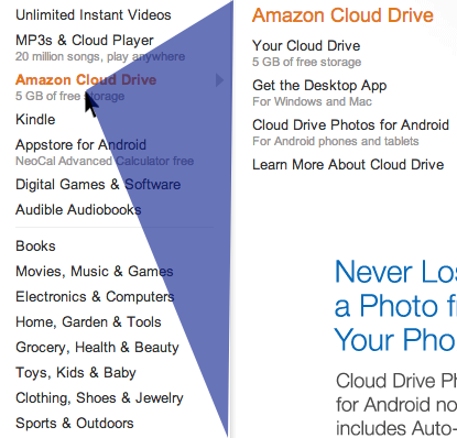
Amazon - Drop down submenus detect/calculate the direction of...


Amazon - Drop down submenus detect/calculate the direction of the cursor to determine whether to keep displaying a submenu or move on

More info

/via Chris

07 May 06:16

15+ innovative flat design websites

by Kendra Gaines

I first took notice of flat color web design when Google started to redesign their sites. This was during a time when gradients and drop shadows were all the rage. In using what was then Google Docs and my Google Calendar, I always realized there was something better and more user friendly about these sites but I never could put my finger on what it was. I just continued to enjoy and use the services as needed.

Eventually, I think I was just messing around with the apps when I finally noticed the buttons had no gradients and the icons didn’t either. There were no drop shadows and really nothing but flat colors and lines to separate the content. I loved it and I took to Twitter to share my findings.

Quickly, I was met with a few people who just didn’t like it. They didn’t understand it, said it was completely boring and said it would never catch on. Thank goodness they were wrong.

Of course Google isn’t the first brand to use flat color in their designs. But of major importance is how they used it, not just why they used it. It created a fresh user interface. There were little to no distractions and the aesthetics were still there. It felt like common sense when it was done, but beforehand, we loved our buttons and color schemes with gradients and shadows and textures and so much more.

This flat color web design is a trend right now not just because it looks good but because it makes sense. It promotes a clean user interface that’s easy to use and understand. Today, we’ll be looking at a couple of web sites that utilize this principle of flat color design. Let’s jump right in.


Microsoft Windows

Microsoft has always had their issues with being a bit behind the times, especially with a competitor like Apple. Windows 8 is the development many people attribute the success of flat design to. It seems as if Microsoft got hip to what people really wanted and how they really worked and came up with the user interface design they currently have. If they didn’t get anything else right, Microsoft definitely got the design right.

15+ innovative flat design websites


Wistia

Wistia is professional video hosting that specializes in hosting for businesses. It’s a nice for those of us who want a different look than a YouTube embedded player and also desire the ability to use Flash and/or HTML5 to view video. They’ve taken flat design to new heights by using it entirely in their web design alongside some really good illustrations.

15+ innovative flat design websites


David Hellman

David is an art director and web developer who has quite the portfolio. Many times we see white backgrounds that feature these flat colored elements in a variety of color schemes. Hellmann switched his up a bit by offering flat color in his backgrounds and not only his other graphical elements.

15+ innovative flat design websites


Standbuy

It’s always refreshing to see great web designs on sites and brands that stand for a great cause. Standbuy focuses on easing the financial burdens of dealing with cancer with this web site. They use flat design in a relatively regular way, but they pair it with great typography and images to really make their site pop.

15+ innovative flat design websites


Minimal Monkey

The name of this site, Minimal Monkey, is obviously spot on for the design here. By the naked eye, this is just another plain website that uses minimalist theories to create the site and look desired. The wonderful thing here is how you can interact with the site and how it transitions. This is an amazingly smooth iteration of flat web design.

15+ innovative flat design websites


Neue Yorke

Most of our favorite flat color sites have these extravagant color palettes that feature at least 4 or 5 different colors. Neue York took a different approach by creating a very simple color palette. Much like the Minimal Monkey website, the interaction with this site is to be spotlighted alongside the wonder flat color design.

15+ innovative flat design websites


Split Secnd

You’re probably wondering why this site is on this list. As you can see, the first couple of buttons actually have very subtle gradients. But as you move down, you’ll find that lots of flat color is used. This is a wonderful example of how you can get both flat color and other techniques to live together.

15+ innovative flat design websites


Symbolset

Flat web design paired with big typography is one of the greatest trends we have going today. Symbolset utilizes these two techniques to show off their set of icons that can be used in web design or whatever design. I really like this site because the header is flat color that transitions the spectrum of colors. It’s really neat!

15+ innovative flat design websites


Geckoboard

This service offers a way for business owners and entrepreneurs to check all their statistics in real time, in one place. They’ve decided to subtly use flat color design in their buttons and other elements. Of interest, is the way these designers have added a bit of tasteful design to flat color elements as well.

15+ innovative flat design websites


Portraits

Portraits is a cute little offering from AOL. They use flat color web design as a way to fill in their white space and create different sections of content. What I like about this site, again, is the interaction you have with the content and how it appears and transitions.

15+ innovative flat design websites


Palace

Palace has borrowed a great deal from the folks over at Microsoft. Not only do they use the flat color technique, but they also put in a grid much like all of Windows 8. It’s not your typical color scheme and that makes things a bit more interesting as well. 

15+ innovative flat design websites


Boat Studio

Sometimes all you need is a pop of color to make things interesting. Boat studio has built a website with images that are displayed mainly in grayscale. As you begin and end the scroll on each page, you’re introduced to a semi-transparent area that contains some text. It’s a wonderful iteration of flat color and making it creative for your brand.

15+ innovative flat design websites


Koken

Koken uses a variety of feels to create an extremely solid web site. We start off with a light colored header then transition to a dark body of the page. Eventually, we end up with a brightly, flat-colored footer. This goes to show that a whole site doesn’t have to be flat in color, but can use simple elements to create that technique.

15+ innovative flat design websites


Mud

This site does a good job of taking the flat color technique and making it theirs. They didn’t use a gradient or other elements to enhance, but they chose a color scheme and put two different colors side to side to create a nice background. In addition, they kept their scheme very consistent throughout the site–it wasn’t about lots of colors but perfecting the ones they had.

15+ innovative flat design websites


The Clocksmiths

Again, this is a site that uses a very simple color palette, one that’s not exceptionally bright and random but rather monotonous. It works for them, because they have so many other unorthodox elements that add to their design. This site helps show how the trend can still work while taking a backseat to other creative elements.

15+ innovative flat design websites


Hatch Inc.

Hatch uses white space and wonderful illustrations to help create and support the flat color trend. They’ve got a very simple site that they’ve added some character to with different techniques and elements.

15+ innovative flat design websites


EARS

What’s extremely popular in flat color web design and in design period is the use of straight lines, regular boxes and circles. It’s very rare to see different shapes introduced online. EARS is changing that rhetoric by involving a different type of line separator that’s very similar to an EKG line. And I love it. Notice how they used a muted color palette for their trendiness as well.

15+ innovative flat design websites


Conclusion

It’s tough to call flat color web design a trend because it’s just a common sense iteration of creating a cleaner user interface. However, as you can see, there are many different ways to do it. Again, it’s extremely important the flat color design isn’t just a nice new look for you, but a means for you to keep your design consistent and user friendly throughout your website.

What are some of your favorite websites that use flat color? Have you created a design that uses flat color? Share with us in the comments section.


Over 1,200 Pixel Perfect Hand Crafted High-Quality Icons – $27!
15+ innovative flat design websites


Source
03 May 02:13

15 really creative 404 pages

by Kendra Gaines

ThumbWe’ve talked about ‘Contact’ pages. We’ve talked about the ‘About’ page. You know what to put on these pages because, hopefully, you’ve thought long and hard about it. And you know exactly what to put on the inside pages, because you have your content for those as well. You think you’ve got it all covered, right?

Think again! You have the opportunity to design and make use of your 404 error page. And quite frankly, you’re not a cool kid if you don’t have a super cool 404 page. Why do we go above and beyond for these basic error pages? Well, because we can. It’s like a little hidden world that you often hope no one will see. But if they do get a chance to see it, you’ll want to make sure it’s a looker.

There are two options when talking about designing 404 pages. Since it is technically a page reached in error, you can make your 404 completely functional so it helps return your viewers to relevant content. The second option (which many seem to fancy), is to make your 404 page your own little creative space. It can be an awesome illustration or picture or it’s own page to which people will be desperate to return.

There are many ways to go about each and today, we are going to take a look at a few. Let’s jump right in.


Gig Masters

We will start off with a very practical 404 page. Here, when we stumble upon this error, we are quite aware that we’ve gotten here on accident. The page offers a link for you to return to the homepage or you could complete a search and get the results. It’s very straight-forward and fits into the visual branding of the site.


Qype

Qype have created another rather practical use of their 404 page by allowing you to return home or search all the categories the site has. They also offer answers to questions you may have as well. In addition to the practical use, they did add a bit of flair by creating a very beautiful, high quality illustration that refers to their brand’s use. 


Klapp

Klapp has created a very interesting use for their 404 page. They’ve created an entire game you can play while you determine what you want to do next. It’s a very fun game. It’s actually very addictive. But when the game is over, the game is over and you’re forced to get back on track. Or try to get lost again. 


Audiko

Again, this brand has decided they want to couple the most obvious use of returning the viewer to the correct page with creating an amazing illustration for you to view. The difference here is Audiko has created such a focus with this illustration that all you want to do is marvel at it and find your way back later. 


The Movie Nerd

The Movie Nerd has used a clever little iteration of their logo to characterize their 404 page. That’s extremely smart and consistent branding. Because of the very visible navigational bar up top, they didn’t see the need to make sure the viewer needed to be redirected.  


Inriality

Here’s another use of illustrations in 404 pages. While I’m unsure of what it says (due to the language barrier), I can assume it says something to the effect of ‘Click here to return to Inriality.’ Obviously, when you click the picture of the illustration, you’re redirected to the homepage. 


Davidwashere

What I like about this 404 page is it’s simplicity. Not only that, but while it’s straightforward, the brand has decided to let a bit of their personality come out with some of the instructions. It’s a very easy way to approach the 404 page.


Illucolor

This is another very clever graphic. It seems as if your Internet is broken and you need to get it fixed. Again, I’ll have to assume the graphic says to click somewhere to refer to the home page, but again it’s another attempt at a semi-practical, yet highly visual 404 page. 


I love Icons

This 404 page doesn’t have much to do with anything. In fact, if you stumbled upon this page you’d probably be extremely lost. However, that does not change the fact that in it’s simplicity, this is just a beautiful image. And the faint “404″ is a nice touch.  


Bellstrike

Another simply beautiful 404 page. The illustration is exceptionally consistent with the visual image throughout the web site. This 404 page lets you know you’ve stumbled upon the wrong page, but you’re still on the right site, which is extremely important.


Molome

Well, this 404 page is just plain cute. Molome obviously wanted a chance to show their graphic skills and weren’t too worried about directing the viewer back home. That’s fine though, because again, the navigation is very visible. The 404 page is an extension of the brand. 


The Many Faces Of…

 We sometimes like to crowd the Internet with parody sites and sites used to poke fun at (or honor) certain people. The Many Faces of Leonardo DiCaprio seems to do one of those, creating little meme faces from Leo himself. for the 404 page, why not keep it the same? This is a very fun approach to 404 pages.


Focus Lab

Focus Lab’s approach to the 404 page is pretty simple and straight-forward as well. I like this one because, again, you get to see the 404 copy in the brands voice. However, this time, instead of directing the viewer to the homepage, Focus Lab directs the viewer to some of the most important pages in the web site.


Mic Check 404

While this is just a concept, this is indeed a very clever concept. I mean, what else do you do when you’re trying to make sure something’s right? You test it! 


Kiss.com

Another concept, Kiss.com takes a completely different approach to the content on the 404 page. Instead of directing people to the homepage or other pages, we’re doing something different here. They ask you to submit a support ticket so they can fix the problem, which makes sense. Because after all, it is an error page, right?


Dribbble 404

This is another concept a designer on Dribbble created. They became so close to the brand, they developed a 404 page for them. Now, this is just extremely clever because of the branding of Dribbble as well as the copy on the page. Dribbble should see this and implement it. Immediately! 


Conclusion

404 pages don’t have to be these bland pages controlled by the web and different browsers. You can take control of yours today. You may want to go simple or you may decide to be completely extravagant in your approach. But remember the 404 page should always be a solid representation of you and your work. 

Have you worked on a 404 page design lately? Have any favorites? Let us know in the comments.


Vector Mania! 4400 vectors – only $49!


Source
28 Apr 02:11

25MB的官方插件:Chrome浏览器接管查看微软Office文档功能

by steven
Ming YIN

FUCK

大家都在Chrome浏览器中查看过PDF文件,这是通过Chrome内置的PDF查看器实现的,非常方便。可是我们还经常会在网页上遇到.doc、.xls、.ppt等微软Office文件,往往需要下载后用本地的Office软件查看,尤其是.ppt、.xls这样视觉效果比较复杂的文件。

如果你用过Chromebook的话,一定会倾心于该设备上的Chrome浏览器带来的流畅、高效的Office文件查看体验,跟PDF查看器是一样的效果。

这是通过Chrome Office Viewer插件实现的,然而这个插件起初是为Chromebook专门设计的。因为Chromebook执行各项任务主要是通过浏览器实现的,所以增强浏览器的诸如文件查看之类的功能非常有必要。

现在这个插件也登陆了Windows和Mac版的Chrome浏览器,尽管目前只能在Chrome Beta版本下安装。其查看效果如下:

Word文件:

chromedoc

Excel文件:

chromexls

PPt文件:

chromeppt

可以看到,Chrome Office Viewer的查看界面跟Chrome内置的PDF查看器是一样的,虽然无法编辑,但具备放大、缩小、保存以及打印等功能;而对于PPT文件,还具有特别的播放键。这对于在线直接查看Office文件十分有帮助,能为你省去一部分寻找“打开方式”的时间,也不必再为兼容性发愁。

在经过一番试用后,我发现这款插件的功能还是十分强大的。虽然不能编辑文件,但可以做很多除了查看以外的动作,比如:播放幻灯片、选定Exel表格的部分区域(可以进行冻结、升降序排列等),而且柱状图支持OnMouse事件,鼠标移动到某处能显示相应的数据。

此外,Chrome Office Viewer还具备反病毒功能,其内置了一个“沙盒”,能够拦截携带恶意软件的Office文件,防止个人信息和网络行为的泄露。

尽管Google未明确指明,但这款“重达”25MB的插件的技术很可能有来自Quickoffice的支持。Google去年6月份收购了这家移动生产应用开发商。Quickoffice能够允许用户在移动设备上创建和编辑微软Office文件。

目前该插件支持.doc,.docx,.xls,.xlsx,.ppt,.pptx格式的文件。

相关下载:Chrome Beta | Chrome Office Viewer (Beta)

在线演示文件:Word | Excel |PPt

19 Apr 03:05

留美热首次降温:中国学生留美读研申请数目下降5%,而过去两年的增幅分别是19%和21%

by Warald

CGS(Council of Graduate Studies,美国研究生院委员会)多年来一直跟踪美国研究生院申请数目,它们最近发布了2013年入学申请的调查,发现来自中国的申请数目减少5%,而过去的两年里,增幅分别是19%和21%。同时,来自印度的申请增长20%,来自巴西的申请增长7%。– 美国现在经济形势好,老印们果然加紧马力抢渡美国、到美国留学找工作。

Warald翻看了一下CGS的报告,发现跟往年一样,这个报告最大的问题还是没有单独计算每类学科,来自中国的申请数目增长幅度,比如一亩三分地论坛里申请人的主体,对应着engineering和physics & earth science这两个大类,但是CGS的报告只告诉了我们“来自中国的总申请数目减少了5%”和“在engineering学科上,国际学生申请数目增长2%”,并没有告诉我们“在engineering学科上,来自中国的申请数目是增加还是减少了”。– 大家都知道,各个学科的申请难度是不同的,混为一谈并不合理。

当然,CGS调查还有一个隐藏的假设:每个申请人平均申请的学校数目,今年和去年持平。这个假设不知道现实中是否成立。

无论如何,今年来自中国的申请数目在连续7年增长后首次降低,这是个新现象。CGS的报告分三个阶段,目前发布的是第一阶段,期待后面能有更多的分析。

很多中国学生赴美留学时,抱着在美国至少工作几年的想法,但是现实很无情,大部分专业在美国很难找工作,详情可以参考《[美国就业Warald指数]数据分析各专业在美国找工作难易程度和工资水平》,希望大家能更理性的看待留学。

信息来源:

http://www.cgsnet.org/sites/default/files/Intl_I_2013_final.pdf

http://www.cgsnet.org/ckfinder/userfiles/files/Intl_I_2013_report_final.pdf

– Warald (Email: iamxiaoning@gmail.com)
博客: http://www.1point3acres.com,微博:http://www.weibo.com/warald
欢迎转载,转载必须在标题注明转载,在文章正文开始之前而不是最后,用不小于正文的字体大小,肉眼可以清楚识别的颜色,一字不漏的附带以上三行内容。否则视为侵权!感谢合作。

10 Apr 05:55

21 Beautiful iPhone App Websites

by Gisele Muller
Ming YIN

good

Advertise here with BSA


I believe we can agree that a lot of iPhone app websites are really beautiful and well designed. It seems that designers embrace the “Apple” style and create websites that are clean, minimal and elegant. Instead of simply creating a random page to show their apps, designers create inspiring layouts, using beautiful images, lots of white space and nice typography. Today we will show you a list of iPhone apps websites that are certainly inspiring, check it out.

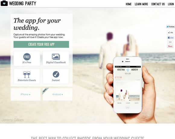
Wedding Party

Wedding Party is a simple & fun way to capture and share your wedding experience with your guests.

21 Beautiful iPhone App Websites

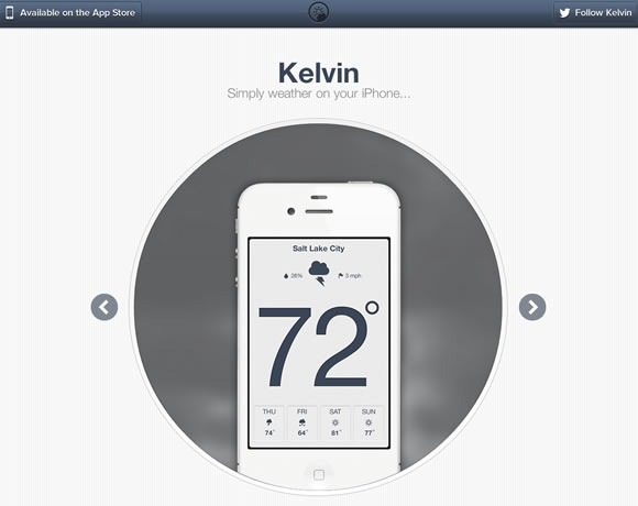
Kelvin

Seeing the weather on your iPhone has never been so easy and beautiful!

21 Beautiful iPhone App Websites

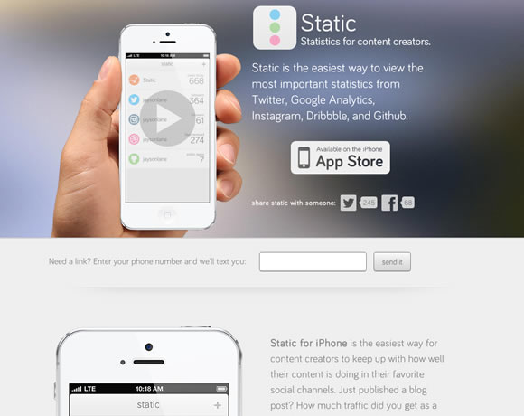
Static

Static allows you to track how well you are doing in your favorite social channels. Just added an Instagram photo? Just published a blog post? How much traffic did you get as a result? How many new followers did you gain on Twitter? Instead of hopping back and forth between apps you can see your most important social stats from one screen.

21 Beautiful iPhone App Websites

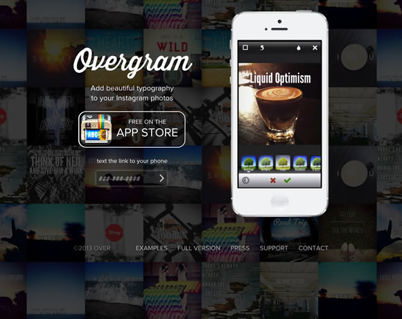
Overgram

Add beautiful text to your photos and share them on Instagram. Create inspirational, informational or even funny images to share quickly and easily.

21 Beautiful iPhone App Websites

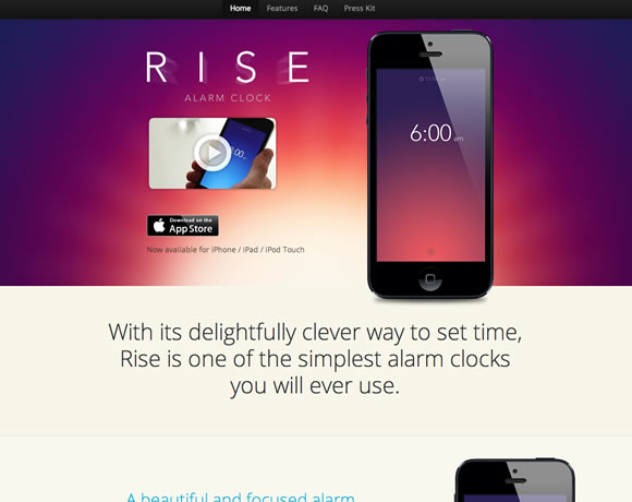
Rise

Rise is a delightfully simple and unique alarm clock, for your iPhone/iPad/iPod Touch. With its refreshing and clever way to set time, Rise is one of the simplest alarm clocks you’ll ever use.

21 Beautiful iPhone App Websites

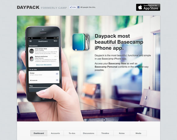
Daypack

Daypack is the most beautiful, functional and simple in use Basecamp iPhone app.

21 Beautiful iPhone App Websites

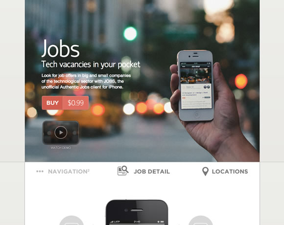
Jobs

Tech vacancies of the most important tech companies. Would you like to know what the most cutting-edge technology companies in San Francisco, Seattle, New York, Toronto or London demand? Refocus your career looking for jobs in the most important technology companies with Jobs, an iPhone unofficial client of Authentic Jobs, one of the referenced websites in job search in the technological sector in the U.S., Canada and UK.

21 Beautiful iPhone App Websites

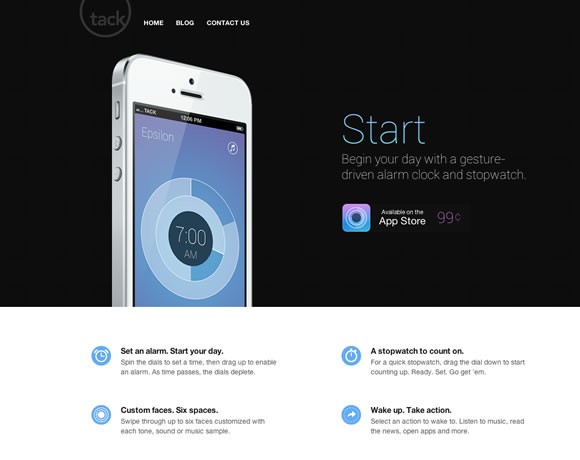
Start

Start is a simple, gesture-driven alarm and stopwatch. Tap the plus icon to create your alarm, spin the dials to set the exact time and customize your alarm with default tones or your personal music. Tap the arrow and direct Start to launch into your favorite app after you wake up.

21 Beautiful iPhone App Websites

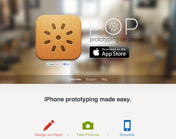
Pop

Pop helps you make interactive prototype with ease. If you can draw, you can design apps.

21 Beautiful iPhone App Websites

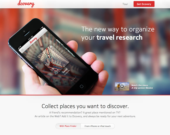
dcovery

Dcovery is the best way to organize your travel research and discover more when you reach your destination.

21 Beautiful iPhone App Websites

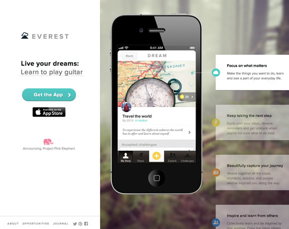
Everest

Everest helps you live your dreams and achieve personal goals. From traveling the world to getting in shape to learning Italian – Everest is a place to capture all your dreams, big and small, and focus on a few.

21 Beautiful iPhone App Websites

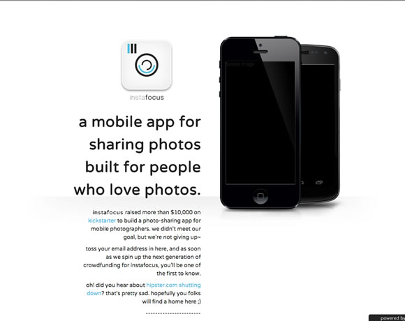
instafocus

A mobile app for sharing photos built for people who love photos.

21 Beautiful iPhone App Websites

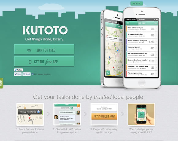
Kutoto

Get your tasks done by trusted local people.

21 Beautiful iPhone App Websites

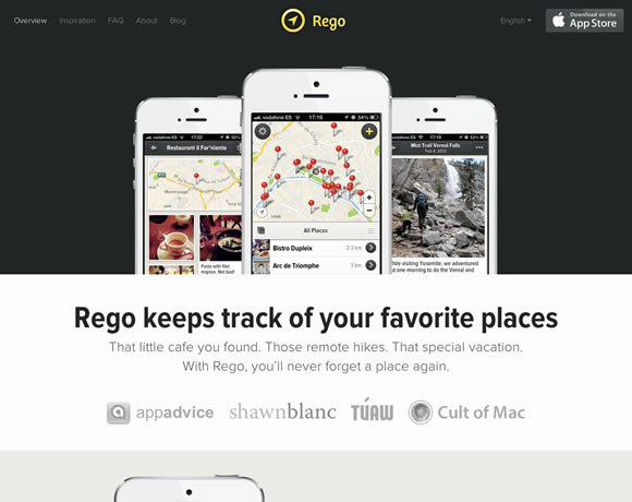
Rego

A new way to bookmark locations, with notes and beautiful photos. Free for 10 places. People use Rego to plan and journal their travels, keep track of their favorite restaurants, cafes and take-aways, and quickly remember that interesting place that was “around here somewhere”.

21 Beautiful iPhone App Websites

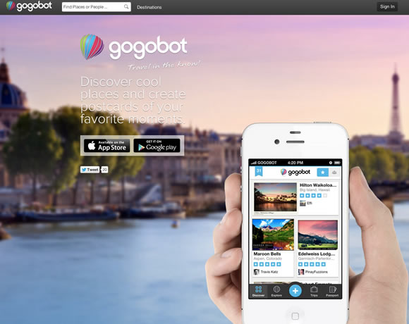
Gogobot

Gogobot is the best way to travel in the know! Whether you’re planning your next getaway or simply exploring your own city, Gogobot is the complete travel companion. Discover interesting places, explore destinations, plan and book your next trip, document your travels and share it all with your friends.

21 Beautiful iPhone App Websites

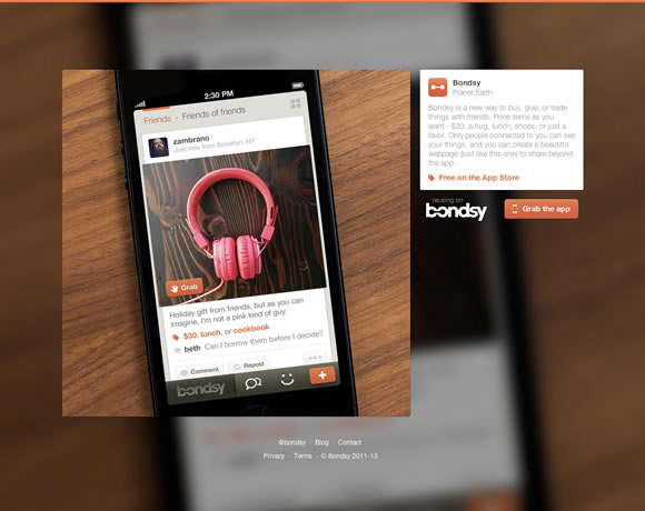
Bondsy

Bondsy is a new way to buy, give, or trade things with friends.

21 Beautiful iPhone App Websites

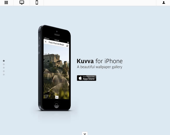
Kuvva

Kuvva for iPhone﹣the beautiful wallpaper gallery. Discover new images by exploring the Kuvva collection or by checking out our featured artists. If you like an image, preview it as your lock screen or homepage.

21 Beautiful iPhone App Websites

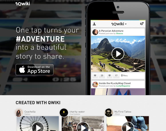
Qwiki

With one tap, Qwiki automatically creates beautiful movies from the events captured on your iPhone or iPod touch – providing a rich and elegant way to share your life.

21 Beautiful iPhone App Websites

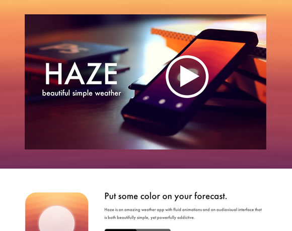
Haze

Put some color on your forecast with Haze, an amazing weather app with fluid animations and an audiovisual interface that is both beautifully simple, yet powerfully addictive.

21 Beautiful iPhone App Websites

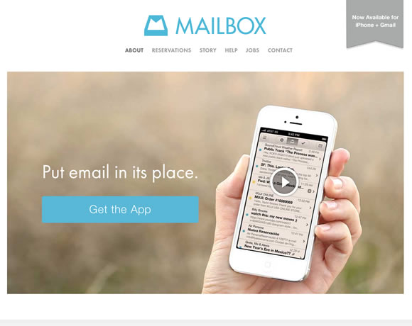
Mailbox

The fast, fun mobile inbox that puts email in its place. Mailbox is a completely redesigned inbox that makes email light, fast, and mobile-friendly.

21 Beautiful iPhone App Websites

Vine

Vine is the best way to see and share life in motion. Create short, beautiful, looping videos in a simple and fun way for your friends and family to see.

21 Beautiful iPhone App Websites

Note: Android users, I’m trying to put together a list of Android app websites, get in touch if you want to suggest a website.

02 Apr 09:45

Essential tools for every web designer

by Andy Leverenz

Every web designer requires the right tools to do their job. To create well crafted original designs you certainly need to be inspired to do so.

Getting to that point is sometimes the hardest challenge in the field of web design. Luckily enough for us and our fellow design community there are tools available to assist in completing the job quicker and more efficiently.

Below, I have outlined a list of tools I recommend for any web designer. Be sure to bookmark these pages so you can utilize them to your advantage like I have!

Color

Adobe Kuler (free)

A great tool offered by Adobe which allows members to upload, create, and edit color schemes of their choice.


Pictaculous (free)

From the creators of Mailchimp comes a color palette generator different to any other. Simply upload an image and colors within the image are sampled to create a custom color scheme.


Colorzilla (free)

ColorZilla for Google Chrome is an extension that assists web developers and graphic designers with color related tasks – both basic and advanced.ColorZilla includes a Color Picker, Eye Dropper, Gradient Generator and many additional advanced color tools.


Dribbble.com (free)

Many designers turn to dribbble.com for great inspiration. You can search common terms but even better you can search by color. Visit dribbble.com and click the explore link in the top navigation and then select colors to explore inspiration for your designs by color.


Hues ($2.99)

Interested in native apps rather than web apps? Hues from giant comet is a color scheming tool for you. At only $2.99 from the app store you can sample colors on any project you’re working on.


Typography

Google Webfonts (free)

Google has numerous web fonts for any web designer to make great use of. They are free and incredibly easy to implement into your projects.


Font Squirrel (free)

Font Squirrel is your best resource for free, hand-picked, high-quality, commercial-use fonts. Even if that means they send you elsewhere to get them.


Lost Type (from $1)

The Lost Type Co-Op is a Pay-What-You-Want Type foundry, the first of its kind. With a great selection of fonts any web designer could push their designs to the next level.


Typecast (from $29 per month)

Typecast is a very valuable tool which allows you to quickly style, check readability, and rendering as you work. Instead of downloading web fonts and constantly changing the way they read inside a Photoshop document this new technology will help any designer’s work flow.


Wireframing

Balsamiq (from $79)

Balasmiq is a rapid wireframing tool used to produce mockups of user experiences. Their sketched UI design embraces the fact that it’s a tool for brainstorming and critical thinking when it comes to designing with users in mind. Options to design for web, mobile, and tablets all exist and are easy to implement.


moqups (free)

moqups is a HTML5 app used to create wireframes, mockups or UI concepts. The style and features available are very similar to balsamiq. It all boils down to which tool you are more comfortable using.


Mockflow (from free)

Mockflow is an online wire framing tool like the couple I mentioned above. The feature I find neat is the collaboration tools. You can make notes to allow another user to see your changes or concerns as well as chat with each other in live time regarding important UI decisions or functionality.


Google Drawing (free)

A valuable tool that a lot of web designers pass up is Google Drawing. While it doesn’t feature any presets like those on balsalmiq or moqups, it is an entirely free service which you can store on your online google drive. You simply need a gmail address to get started.


Photoshop/Indesign/Fireworks (from $49.99 per month)

The easiest of solutions in my opinion is to create a wireframe from scratch. Going this route is only limited by your creativity and imagination instead of preset UI solutions like many wire framing tools offer. It may take longer but the end result is more personal and customized to fit each individual user experience be it a website, app, mobile website, or tablet app.


Layout and Boilerplates

960 Grid (free)

The 960 grid is the benchmark of the web. Every good web designer should already understand the importance using a foundational grid for their layout as it keeps web design much more usable for the end user. The accompanying photoshop actions in the download have saved me numerous hours of getting alignment issues in check.


1140 CSS Grid ($5 donation)

If you’re interested in a wider grid width then I recommend the 1140 CSS grid as a great starting point. The complete grid fits perfectly to a 1280 monitor and better yet for smaller monitors or devices the grid becomes fluid and adapts to any width of the browser.


Bootstrap (free)

If you’re looking for a pre-made user experience out of the box, then bootstrap will become your best friend. There are numerous features bundled with the framework which is completely adaptive and sexy looking to boot.


LessFramework 4 (free)

Less is a framework dedicated to making websites truly adaptive. It’s made to fit nearly any device on the market. It contains 4 layouts and 3 sets of typography presets, all based on a single grid.


Skeleton (free)

Skeleton is simply a great starting point for any website. Its simple, light weight structure benefits those who are looking to get started without studying up on how the framework really works.


Foundation by Zurb (free)

Foundation just released Foundation 4 which according to them is the most advanced responsive front-end framework in the world. With many new added features and awesome templates to start off with I can say that I am a true fan. Test drive it today.


Reset CSS (free)

Without a doubt this globally recognized browser CSS reset is an absolute must for any web designer to offer their designs across any platform or browser.


Content Management

WordPress (free)

WordPress takes the cake when it comes to Content Management Systems. Originally the most popular blog posting platform has turned into that and more in the CMS world.


Joomla (free)

Joomla is another popular CMS used by millions worldwide. Much like WordPress the default layout installed with the CMS is user friendly and mobile ready.


Expression Engine (from $299)

Developed by EllisLab, Expression Engine is a CMS built with the help from an open source PHP framework called Codeigniter. Many larger corporations like Apple, Ford, Nike, and Sony choose Expression Engine to fit their own demands. Expression Engine as a result is not a free CMS but it’s definitely worth reading up on and/or downloading a copy to become familiar with, for future work you may encounter.


Drupal (free)

Drupal is an open source content management platform for powering millions of websites and applications. It’s built, used, and supported by an active and diverse community of people around the world. Drupal can be used for everything from blogs to extensive web applications.


Radiant CMS (free)

Radiant is a no-fluff, open source content management system designed with small teams in mind. Their slogan says it all: content management simplified.


Useful Apps, Actions, and Resources

GuideGuide (free)

GuideGuide is an awesome photoshop extension which allows you to create perfect grids on the fly. By using GuideGuide you can create more accurate columns,rows, midpoints, and baselines with one click.


iOS Photoshop Actions & Workflows (free)

One of my favorite resources is on a website called bjango.com. The specific article features a detailed listed of actions and workflows created by Bjango. Actions to create new templates for iPhone, or iPad are made with a simple click or if you’re designing an app icon for an iPhone app there is a great action which resizes the app to each pixel width and height necessary. This find was the equivilent to finding gold for me.


By People (free)

By People is a great and simple website feature packed with resources which are all free and easy to use.


Temboo (from free)

Temboo lets developers focus on what makes their software unique. Temboo normalizes access to APIs, databases, and more to save you time and give you the creative space you need.


LittleIpsum (free)

Download this! If you’re a web designer on a mac, you’ll use this every day. I promise!!


awesome-fontstacks.com (free)

Awesome Fontstacks is a great online tool to help you mix and match web fonts on the fly. When you are satisfied with your fontstack you get greeted with ready-to go CSS code.


Code Editors

Coda 2 (from $99)

Ever since coda was introduced to me I have been a fan. I typically compare other code editors to coda and for me Coda always wins the fight. This may be different for you but I suggest giving coda a try if you haven’t yet. Coda2 is packed with features and easy to use UI which makes coding for the web a breeze.


SublimeText 2 ($70)

SublimeText 2 is right up there with Coda for me. There are a ton of features and the sleek UI of the app itself lets you concentrate on the coding process rather than messing with the app to get it in usable condition for your own projects.


TextMate (from $59)

TextMate brings Apple’s approach to operating systems into the world of text editors. It’s simple and easy to use and takes up less screen real estate than many other Code Editors.


Aptana Studio (free)

Aptana Studio is the industry’s leading web application IDE. Available for both Mac and PC this software harnesses amazing potential to code virtually any type of application you can think of.


BBEdit ($49.99)

BBEdit is a professional HTML and text editor for Mac.


FTP Clients

CyberDuck ($23.99)

By far my favorite FTP client is CyberDuck. There’s endless ways to connect to web servers, local servers, access devices via ssh, and more. A great tool available for both Mac and PC platforms.


FileZilla (free)

FileZilla is a free FTP solution. It’s also open source software.


Transmit ($34)

From the makers of Coda comes Transmit. A very fast and effective solution for FTP.


FireFTP (free)

Fire FTP is a client available for Firefox users. The application is built into the mozilla browser and offers a quick and easy way to transfer your files.


Have you tried out these resources? Have we missed any of your favorites? Let us know in the comments.


MaxButtons PRO: WordPress Button Generator – only $7.50!


Source
28 Mar 09:51

Best practices for creating app sites

by Kendra Gaines

ThumbnailIf you have a smartphone, a tablet or a regular computer, chances are you have used an app at some point. We can’t get enough of them. They make life easier and quicker. Apps help you remember things, help you find and see things and just all around help you be an awesome(r) person.

There’s so many to choose from, whether you want a mobile app or a web-based app. Maybe you want something for your Android phone, or perhaps something to boot up on your MacBook Pro. Either way, chances are the app is doing something amazing to help you or create some fun in your life. Apps are increasingly popular and it’s becoming easier for people to create them.

In making these apps, part of the marketing and promotional technique is to create a website that introduces viewers to the app. The intro to the app typically tells you what it is and why you need it, much like any product. However, there are some differences and tips available for making sure your app (or the site you’re designing for an app) is a complete success.

1. Don’t depend on product shots. Show us people using the app.

It’s extremely popular for app creators to want to show screengraps and pictures of their app on a smartphone. Of course, it makes sense because people will want to know what they’re getting into and essentially what it looks like; they want to get a good idea of how it works.

The problem with this is, it’s nothing more than a glamour shot. These types of pictures don’t do much and either leave too much, or not enough, to the imagination. Your best bet is not to rely solely on these types of shots, but to also incorporate shots of people using the app.

For example, chances are the app is used to solve real world problems. So instead of showing the phone in someones hand, show the results of using the app and how it really makes things easier or better. If you claim that your app will help find the best food place in walking distance, depict the beginning, middle and end of that type of story.


2. Use the idea of the landing page. Go above the fold with clear calls to action.

If you don’t know, landing pages can be extremely useful in conversions and informing. The way in which they are typically used is to tell a targeted group of people specific information about a product or service. A landing page not only wants to inform, but wants this group of people to react to the information on the page.

The same thing goes for an app site. The purpose is to inform people of the application and get people to use it. You want to make sure there’s good information at the top of the page, but not too much. Include some bulleted points and/or headlines for the most important features, a good image or two, and of course a call to action.

Keep in mind that the way the call to action, and even the way the content is worded makes all the difference. Landing pages are effective because people know their audience and how to talk to them. Take the same approach with your app website. If your app is built for doctors or professionals, talk to them as such and not like they’re best friends in a living room.


3. We’re past technical specifications. Tell a story.

Listing off the features and technical specifications of any product, let alone an app, is extremely detrimental and short sighted. We have way too many choices in this day and age. Chances are if you get into a tech spec battle with someone or something, there’s probably another offering that’s comparable to what you’re offerring. 

So, how does one set one’s offering apart? Well, it’s by telling a story and making a connection. By telling a story, I mean that you have to make your offering relatable to your target market. If I’m making an app for web designers who are looking for clients, I’m not going to just tell them the app helps them find x amount of clients. I’m going to relate it to the struggle of finding clients and how it can stress one out and things of that nature.

That allows people to make a connection and feel like a company understands them. If you can create a connection, that’s extremely hard to break with a person. Think about how the app makes life easier and depict that, rather than all its shiny features.


4. Keep it short and concise with bullet points.

You don’t have a ton of time to make your point when we’re talking about the Internet. There are many stats out there that will tell you you have 5 seconds or less, but really you have to capture attention and keep it, in the blink of an eye. Quickly explain what an application does using bullet points and short sentences.

There are a few reasons why we do this. One of which is because people don’t want to do a lot of reading. If they want to read long, crazy paragraphs, they can pick up a book. If they want an app, they go online. Secondly, bullet points make reading easier. People know exactly what to read and where to read it. 

Also, leave the fluff alone, especially in the bullet points. Just keep the most important information.


5. Make sure you’re using consistent design schemes online and in the app.

This one seems like a bit of a given, but it doesn’t hurt to reiterate. Make sure the aesthetics of your application and your website match. This helps from a branding standpoint and also helps people understand what your application is about and for. If you’ve got a clean design, we know your app is all about business and can help manage or organize or whatever it is you do.

If it’s a game, we expect it to be fun and funky and things of that nature. Keep that consistency because it can help change people’s minds about your offering.


Great examples of app sites

Drip

Drip is a desktop application that makes uploading files easier. Instead of uploading files individually or having to gather them to make a .zip, Drip does all the work for you and allows multiple uploads. This site is extremely clean and clear on what it does and presents a layout that leads you to download the app as soon as you’re done reading.


Duet

This idea is great for people who enjoy doing things and cherishing the memories. Duet is currently an iPhone app that allows you to propose events with others. Once they accept, Duet is like a hub for images and videos and all sorts of memories from the time spent together. This app site features a video that doesn’t just tell you what the app does, but it tells a story and connects.


Flow

Immediately, when you enter the Flow website, you have an idea of exactly what this web based app is for; it’s obviously about keeping a productive team. The Flow site gives three bulleted points of some important features and benefits but continues to paint a picture with some scenarios of how Flow can help. 


Infomatic

The Infomatic app site is unlike many app sites you see. However, this is a great representation of how to make an app site if you’re low on time or even low on content. The design is very modern with the screen shots and design elements and it’s very clear how to get the app, how much it costs and what it does. There’s absolutely no fluff here. 


Jobs

The creators of this app decided they wanted to make an iPhone app that makes it easier to search for jobs from Authentic Jobs. While the site is well designed and includes lots of the necessary elements, I do personally think there could have been more of a story being told. However, this is a great layout that clearly states the purposes, many of the benefits and keeps a consistent look.


Mosaic

Here we’ve got another iPhone app that thrives off people who love to take pictures and keep them around. Mosaic is an app that allows you to easily use pictures from your iPhone in a scrapbook. The above the fold portion is a quick shot of what the app does, and as you scroll down you’re given many of the different things the app is capable of doing. 


Nizo

Nizo is a great app site to study how people know and understand their target markets. If you open this page and have no clue what they’re talking about, that’s fine. Nizo uses a bunch of technical jargon and features to appeal to their audience. In this circumstance, it’s okay not to add a ‘storyline’ because they know their audience enough to know that this app is only going to appeal to those who are interested in specifications. 


Ballpark

The Ballpark app’s website is very similar to the Flow website we’ve previously seen — in design and in layout. Again, we have a good headline and subheadline that give you the purpose of the app, three bulleted items that interest more in the app, but a good difference here is the call to action is high above the fold.


Hipvite for TechCrunch

Well, here’s one way of getting your app noticed by others. In an attempt to position themselves far far away from the competition of those who email TechCrunch all the time, they’ve created a quick app site to get them interested in what they’re doing. With the typical product shots and some features, they’ve got a decent chance at getting their attention. 


Plover

Plover is another fluff free app site for a web based application that organizes and allows you to sell your photographs quickly and easily. Right above the fold, you know what the app is and how to get it. Then you’re given screengrabs and the ability to find out more about the app. 


Listing Scout

Listing Scout is an iPhone and desktop app that makes selling property easier for realtors. It creates a website for you to showcase your homes and share them with different areas of social media. What I like about this website is the call to action that’s prominent above the fold and the features aren’t just given as technical bullet points, but as practical comparisons to the real estate agent’s job. 


Strava

Strava is great for those of us who want to live a healthy lifestyle. It’s a website community that comes with an app that allows you to track your progress with maintaining a healthy lifestyle and weight loss. With every image in the slide, you’re given an opportunity to sign up for free as well as given a new look at what you can do with Strava. 


Creating a good app site is pretty straight forward. You want to essentially make sure it’s branded well and makes sense for your specified audience. Keep in mind that it isn’t only about how you design your website, but it’s also about how you promote, get people to see it and have them interact with it. The most successful apps don’t just have beautiful, wonderful websites, they have amazing content and offer to fulfill a real need.


What’s your favorite app to use? Does it have a website that works as well? Let us know in the comments.


SEO Special: Monitor 500 Backlinks for 6 Months – only $9.95!


Source
28 Mar 01:54

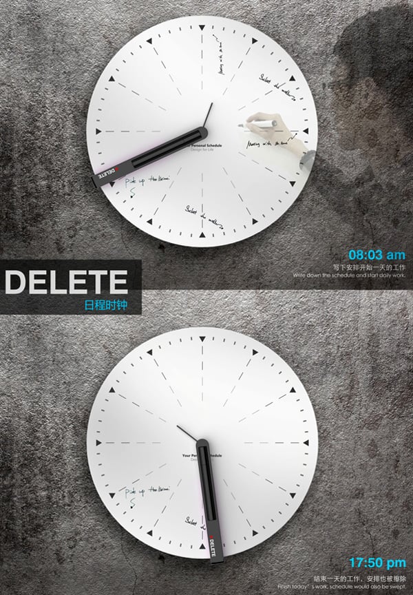
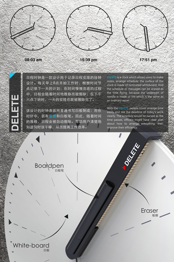
Delete My Schedule

by Radhika Seth

Really love this simple Delete Clock, offering us an innovative way of planning our day and keeping with schedules. The whiteboard surface is good for jotting down notes and tasks, plus the fact that the schedule gets erased when the clock hand sweeps the face, is very poetic indeed.

Designers: Li Ke, Pang Sheng Li & Chen Yi Lin

-
Yanko Design
Timeless Designs - Explore wonderful concepts from around the world!
Yanko Design Store - We are about more than just concepts. See what's hot at the YD Store!
(Delete My Schedule was originally posted on Yanko Design)

No related posts.


25 Mar 02:26

Ooo La La Lighting!

by Troy Turner

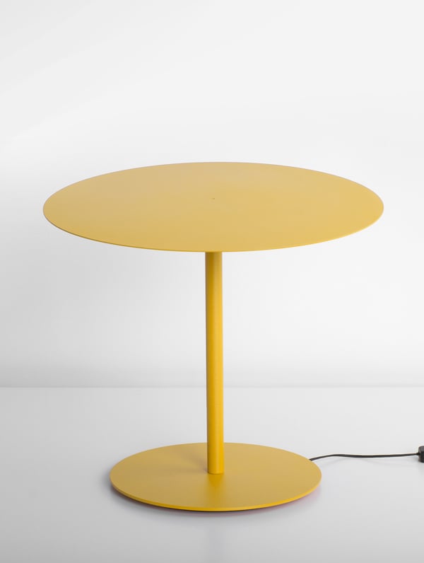
The OOO lamp derives its name from the ultra-thin, perfectly circular plate that composes its shade. The swiveling shade is made possible by using a rotary joint and dual magnets that connect the tubular arm to the top and bottom plates. The result is a a sculptural lighting object with fewer parts, straightforward assembly, and easy functionality! Simply give the shade a light press to focus the light in any direction, or position it upright to hide direct light and create an ambient glow.

Designer: Vasiliy Butenko

-
Yanko Design
Timeless Designs - Explore wonderful concepts from around the world!
Yanko Design Store - We are about more than just concepts. See what's hot at the YD Store!
(Ooo La La Lighting! was originally posted on Yanko Design)

Related posts:

  1. LED Bud Lighting Up
  2. Less is More Lighting
  3. Lighting Lab


22 Mar 02:58

将机器学习应用于英文书写辅助:1Checker立足国内为全球非英语母语用户提供服务

by L. Leung
Ming YIN

This looks awesome~

img 02

2007年,张以弛和孙琳两人都在剑桥大学计算机实验室攻读博士学位。但他们在写论文的时候常常会遇到一些语言上的问题,而当时微软的Office Word只能解决简单的单词和词组错误,而对非母语用户的语法问题没有多少帮助。于是两人便打算自己写一个适合第一语言不是英语的人进行英文写作的语法辅助软件。

这个项目名为Gamma,他们反其道而行之,走了和微软的Word相反的路线,通过机器学习来进行语法的纠错模型训练。经过两年时间,2009年终于在技术上有了很大的突破,其语法纠正的准确率上要高于微软Word、WhiteSmoke等同类产品。2010年,张以弛和孙琳创立的Greedy Intelligence公司(分别任CEO和CTO)凭借Gamma赢得了剑桥大学的相关奖项。

Evaluating Gamma’s Performance on Real Word Error

不过这到让张以弛和孙琳有信心把Gamma项目转化成真正的产品,七个月后,Gamma正式成为一款产品——易改原名1Correct,英文名为1Checker)。同时张已弛和孙琳也开始寻找真正的天使投资,后来他们接受了杭州滨江区 5050 计划,提供约 500万 50万人民币的创始资金以及三年近500平米的办公场所(后又拿到400万天使投资)。易改也于2011年7月1日正式上线公测。

现在,Greedy Intelligence公司不光有易改 这一款产品,旗下现在还包括1Course、1Test以及最近改名的1Checker(即 易改)。1Course是为教育培训机构度身定制的多元化在线教学管理系统(LMS),系统涵盖师生管理、网络课程、作业练习、学生跟进、统计报表等模块,并融入了全自动主观题(听力与写作)智能批改技术。1Test则基于人工智能技术,为教育机构提供考试题型与试卷形式、全自动的阅卷评分与答卷分析等便捷的在线测试解决方案。

而最近发布的1Checker,相当于易改的国际版,它同样是基于云计算的英语写作辅助软件,可以进行英语文本的纠错和润色,并有解释和词典等功能来快速改正错误以及提高成文质量。1Checker的直接竞争对手是WhiteSmoke、Grammarly这样的专业校对工具,供全球英语非母语用户使用,比如外企、科研、翻译、媒体等从业人员。

Greedy Intelligence-1Checker

GI CEO 张以弛告诉PingWest ,1Checker的作用主要是借助后台的机器学习机制,通过用户的动作(比如 接受/忽略 机器的建议)来进一步提高用户英语处理能力和精度。

在商业盈利方面,张以弛说,他们未来可能会推出Premium版本,但目前还没有压力。WhiteSmoke、Grammarly已经给了他们很好的商业先例,甚至单靠校对工具这一款产品上市都没太大问题。而且GI 的1Course从去年第四季度就已经开始盈利了,所以他们还没有这方面的打算。

对于旗下的这一系列英文书写服务的产品,Greedy Intelligence公司着眼于全球市场,而且1Checker在技术上已经属于一流的校准工具,其自然语言处理和机器学习能力也已是国际水平。目前GI 用户不到50万,WhiteSmoke和Grammarly两者加起来不到400万。

英国文化协会报告称,目前全世界有15亿英文学习者,未来10到15年内预测还会有20亿英文学习者,GI的英文校准工具有着异常广阔的市场。

18 Mar 01:37

从 Mailbox 看产品设计火花

by ICOjump

作者头像 作者:ICOjump / 产品观察家 简简单单做 好产品 [核心提示]还没排上队使用 Mailbox 的同学不要错过这篇介绍 Mailbox 设计优点的文章。

Mailbox 是个基于 Gmail 的任务管理类的应用,任务即邮件,可以让邮件完成,删除,设为稍后提醒,放入待办项目中,推行 Inbox Zero 理念,是个最近比较火的产品,不过坑爹的是 Mailbox下载后不能马上用,需要排队开通,本人在上周终于排到了队,经过了几天的试用,把 Mailbox 和热门邮件客户端 GmailSparrow 做对比,顺便记录一些感想。

iOS 上,Gmail 官方邮件应用,Sparrow 应用都是很优秀热门的邮件客户端,Mailbox 和他们有哪些不同的地方呢?简单对比下,主界面(收),写邮件(发),抽屉(管理)。

主界面

  • Gmail 和网页版本的 Gmail 的设计一脉相承,简洁+扁平化的设计,大大的标志性红色“写邮件”按钮,已读未读邮件通过正常和加粗区分开,搜索是默认就显示的。
  • Mailbox 也是简洁为主,大部分内容和 Gmail 类似,右上角也是"写邮件"按钮,不过在导航栏上有 3 个 Tab 对应 3 个功能(稍后,收件箱,已完成),这个设定非常符合 Mailbox 的 "Put email in its place." 的 slogan。
  • Sparrow 的主界面和 Gmail 类似,右上角换成了“编辑”而“写邮件”放到了右下角,导航栏的设计是亮点,可以快速切换不同的发件箱,方便了很多。

写邮件

3 个客户端比较接近,我以 Gmail 作为标准,说说不同的地方。

抄送方式不同

Gmail:点击抄送/密送输入框后会展开,同时显示“抄送”,"密送"。

Mailbox:没有默认显示“抄送/密送",当点击 “To:收件人”后的箭头后,展开画面。

Sparrow:分 2 步进行,点击“写邮件”按钮(见上图)先进行“收件人”,“抄送”,“密送”的选择,然后进入写邮件的界面。

增加附件的位置不同

  • Gmail/Sparrow:在主题处添加。
  • Mailbox:在邮件最后添加。

loading不同

  • Gmail/Sparrow:在菜单栏中的运营商名称后 loading。
  • Mailbox:菜单栏直接变换成 loading 条,会有 loading 时候的信息,状态,有无新邮件,等信息,感觉不错。

抽屉

抽屉的内容是 Mailbox 区别与邮件客户端 Gmail,Sparrow 最不同的地方,从截图里面就可以看出来,Gmail,Sparrow 虽然在信息布局显示上有所不同但是主要还是围绕基本的邮件的选项展开,而 Mailbox 是重新设计这部分内容,最直观的对比就是简化了信息,没有”星号“,”标签“之类的内容,新增了 “Later” 和 “lists”,这些 Mailbox 独有的内容。

通过对比,可以发现 Mailbox 是把 Gmail 的基础邮件功能保留,其他都剔除,然后改进产品往任务管理的形式上靠拢。我们看下 Mailbox 具体是怎么管理任务的。

看看 Mailbox 操作

完成任务(右滑)和删除任务(右长滑)

右滑会看到“打勾”的标记,表示完成任务了,继续往右滑动到 70% 的位置,会变成 "X" 标记,表示删除任务,这样的交互设计让滑动误删可能性降到了很低。

Mailbox 还有个贴心的“批量完成”的功能,列表最下面有一个小控制,移动他可以批量完成任务和删除。

左滑

这里的左滑会触发“稍后提醒”的功能,如果当前没空处理这个邮件/任务,可以设定一个未来处理时间,然后放空脑袋,先集中精力去做当前的事情,待下一个时间到来再去考虑。

左长滑

往左长滑也大约 70% 的位置时候,就会触发“项目/标签”的功能,默认已经设定好了 3 个项目+自定义(“To Watch”,“To Read”,“To Buy”,“Create New List…”),加入这个项目后,就可以在“抽屉”里面的 Lists 中找到邮件。

在 Mailbox 中设定的标签,对应到 Gmail 中其实是给邮件建立了一个新的 “To Watch” 的标签。

开机引导教程

因为左右的长短滑动是 Mailbox 的核心操作,所以 Mailbox 有一个非常强势的开机引导,必须跟着一步步学会各种操作后才能进入下一步直到正式出现界面。

另类的产品设计火花

“创造音乐很伟大,发明摄像机也很伟大,结合以后变成电影也是很伟大”。平时很多产品功能已经做的很棒了,但这些产品周而复始依然在扮演自己的角色,那是不是有人从另一个角度来看看这些产品?
Mailbox 把 2 件事情(“收发邮件”和“任务管理”) 2 个产品 (Gmail+GTD like App) 结合到了一起,变成了 Mailbox,虽然用的是 Gmail 的,管理也是参考GTD,Inbox Zero 的理念,但是一结合却擦出了一些火花。

我们的移动生活刚刚到来,这样的产品火花应该会更多。

极客观察均为极客公园原创报道,转载请注明原文链接。

原文地址:http://www.geekpark.net/read/view/174864

关注极客公园,即时获得最新内容:Twitter | 微信:极客公园 | 新浪微博 | 花瓣网 | 人人小站 | Google+ | 点点