Available on: Luaka Bop
William Onyeabor has put body and soul into preventing the release of Who is William Onyeabor?, a compilation of songs plucked from his infectious synthesizer-driven pop records released between 1977 and 1985, during the golden era of Nigerian funk. After four long years of painstaking persuasion, David Byrne’s world music label Luaka Bop has finally managed to release it, playing up to the mysterious theme of the record in their video trailer: “Synth Virtuoso, Russian Film Scholar, Oxford Law Student, sinner or saint?”
Nigerian ex-pat blogger Uchenna Ikonne made contact with the cult musician in 2009 and – in the “toughest ordeal I had ever endured in my life” – got a signature on a Luaka Bop contract. But after four years of painstaking attempts to follow up with the elusive septuagenarian, Luaka Bop boss Eric Welles-Nystrom had to fly to Nigeria to track him down himself. Welles-Nystrom eventually found his home – a palace of faded glory, a short drive from the hill-top town of Enugu – and after several days watching evangelising television, Onyeabor acquiesced to back the project.
It was Christianity that put an end to Onyeabor’s musical career, which produced eight extraordinary albums, each cover featuring the younger man donning debonair suits, surrounded by keyboards and chunky analogue equipment. Whether or not the Hitchensian adage “religion poisons everything” applies, it was certainly Onyeabor’s born-again faith that put his artistic days behind him.
“I was a sinner who repented and gave himself 100 percent to Christ,” Onyeabor told the New York Times this month, declining to discuss his music or his sketchy past. “I didn’t use [my music] strictly to praise God. That is why I have decided now that henceforth all my revealings will be to praise God and preach the word of God.”
The hard-won fruits of this album have been worth it. Who is William Onyeabor? opens with ‘Body and Soul’, a 10-minute build to nowhere with a hard funk beat and female backing vocals, punctuated with Onyeabor’s sweet voice and chattering keyboards. The psychedelic ‘Atom Bomb’, the title track to his most famous album, has made the cut but its song ‘Better Change Your Mind’, again touching on the subject of the Cold War and Mutually Assured Destruction, sadly didn’t.
Artists including Four Tet, Dam-Funk, Devendra Banhart and Oneohtrix Point Never have heaped praise on Onyeabor. Carl Craig called him “an African Shuggie Otis” and Dan Snaith sampled him for ‘Ye Ye’. But now his infamously hard-to-find records – even MP3s – are presented for a new generation to hear, whether Onyeabor likes it or not.

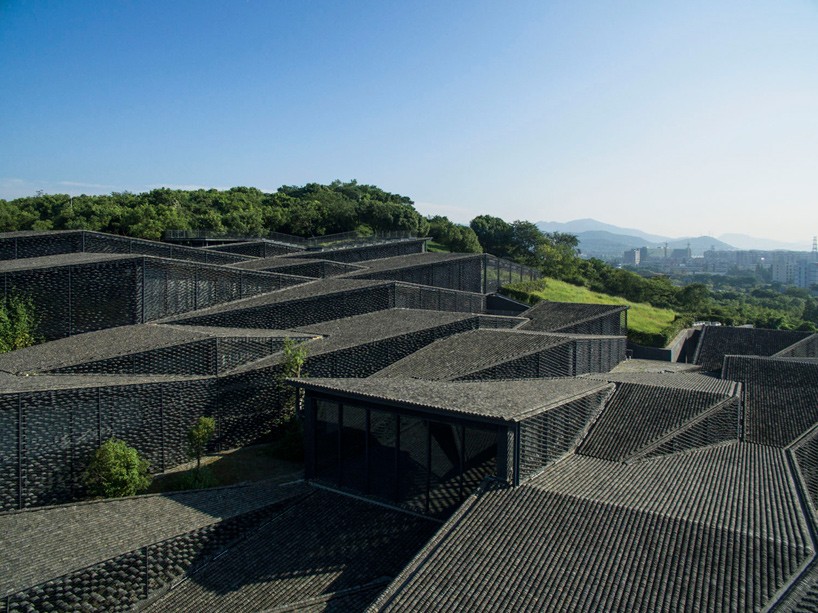



 Hamra by DinellJohansson
This beautifully simple summer house designed by Swedish architecture studio DinellJohansson is located in Hamra, Gotland, Sweden. Local tradition of stone houses resulted in using lightweight conctrete masonary blocks as the main material, but with focus on sustainability and minimalisation of waste. Unique furniture and clever use of space and dividers make this house one of a kind.
"The brief came out of the very limited budget: a house as simple as possible. Equally simple as the barn we wanted to convert to a summer dwelling, but which never showed up on the market: one open space with a large number of possible beds, cooking in the middle, washing facilities outside the house. Planing regulations ruled the placement of the house to the inner part of the plot which at the time of designing was still densly vegetated and scarcely accesible. Hence the house was designed with generic qualities, creating no front- or backside, treating all sides of the site equally. Four large openings 2,4x2m are placed according to rotational symmetry, one in each facade. Facing north is a fixed window, the other three are glazed doors. There is no hierarchy between the doors – anyone can be used as an entrance. Two roof windows add skylight to the interior. (...) The becoming of this house was made possible by compensating low budget with long construction time. Parts of the construction work was executed by friends and unskilled builders. Several sollutions had to be rethought on site out of this perspective. Last but not least it all was made possible by a uniquely skilled builder with a passion for architectural detailing."
Words: DinellJohansson, Thisispaper
Photography: Elisabeth Toll


 Nordic House by Anagrama
Anagrama is an international branding firm from Mexico, with clients from varied industries and countries from all around the world. Their exceptional designs are innovative and interesting, simple, yet sharp. Their visual identification of newly launched dry-cleaning company makes us wish more services looked as good.
"Nordic House is a yet-to-be-launched dry-cleaning shop in San Francisco, California. Our approach to Nordic House's branding was focused on Scandinavian design, combining simple geometric forms with a clean, sharp, well-distributed logotype and an icy, cold color palette. Snowy white, chilly grey, pine needle green and fresh salmon combine to create a cool nordic landscape complete with its pure, immaculate and undisguised scents. A few icons are present in the overall identity, designed with a stark and reductionist style that captures the brand's elemental emphasis on honesty, clarity and above all, quality. Apart from their premium dry-cleaning services, Nordic House will also sell exclusive, quality items such as scented soaps and undershirts."
Words: Anagrama, Thisispaper
Photography: courtesy of Anagrama


 Ermitage by Septembre
This inconspicuous black cabin situated in Swedish woods is a perfect place for summer getaway. As simple as could be, this small hut has all you need and nothing more - a place to sleep, storage and big window that lightens up this tiny interior. Another beautiful creation of Parisian architecture studio Septembre.
"A small wooden cabin with sauna and bedroom on the island of Trossö, Sweden. Two large windows frame the windswept and poetic landscape: the ocean on one side, pines on the other, with a large sliding door effectively doubling the living area when open. The brief was a room with a view of the sea. A minimal living space, containg only the essential. The exterior material is swedish spruce painted with a mat black paint (3 layers). The interior floor boards are swedish spruce, and the walls and ceiling are clad in plywood. All materials had to be transported by boat and carried by hand since there are no connection to the main land and no roads, nor cars on the island. The sloping roof was for the interior volume and also all local vernacular fishing cabins have pitched roof, the building is raised from the ground to do the least possible impact on nature. The sea is 50 meters from the house. The nearest town/fishing village is a 15 minutes boat ride away."
Words: Septembre, Thisispaper
Photography: courtesy of Septembre


 Library in Awashima by ETAT Architects
ETAT Architects is an architecture studio established in 2008 by head-designer Erik Törnkvist. In Stockholm-based office they work on projects for public and private sectors in Sweden and abroad. For this amazing project ETAT Architects has been commissioned by Art Setouchi to design a library located on Awashima island in the Seto Inland Sea, Japan. The detail-oriented approach and focus on materials resulted in this breathtaking yet clean, simple design.
"The new library is housed in an existing heritage-classified building from the 1920’s located on the port’s sea front. ETAT’s refurbishment is designed to highlight the material and spatial qualities of the existing wooden building and to enhance it’s relationship to the sea. For new additions the predominant material is brass, which is used as wall surface, for fittings and for the 3,6 x 3,6 meters reading table. The library is a regional development project in order to revitalise Awashima and the project is part of the art and architecture triennale Setouchi International Triennale 2013. The library was opened in early October 2013 and has since attracted more than 1 000 visitors."
Words: ETAT Architects AB, Thisispaper
Photography: courtesy of ETAT Architects AB


 Polderceramics by Atelier NL
"Artists have long explored the significance of ‘place’ – as a site of history and identity; as a dynamic process in constant flux; and as a politically charged way to both challenge and contextualise the world. For Atelier NL, the Eindhoven-based design studio of Lonny van Ryswyck and Nadine Sterk, the place in question was the Noordoostpolder region of central Netherlands.
At the invitation of Jurgen Bey and Rianne Makkink the designers took up residence in the area to better study the social and agricultural nuances of the region. As the Noordoostpolder had been integral to the Dutch land reclamation acts of the twentieth century, carried out in order to improve flood protection and create additional land for agriculture, the area is rich with both historical and geological disparity.Atelier NL’s Drawn From Clay series embodies all these local distinctions as each piece was made from a specific plod of soil taken from each of the different farms they accessed across the 460 square kilometre polder. As Sterk explains, ‘A bucket filled with earth is anonymous, but the stories of the farmer who works the earth lend it its identity.’
The overriding principal behind the series was to keep the symbiosis between object and origin as pure and integral as possible. ‘We wanted to make tableware so that the vegetables prepared for dinner could be served from vessels made from the same soil the vegetables came out of,’ explains Van Rijswijck. The designers simply refined then mixed each individual batch of soil with water to form malleable clays, before cast-moulding each piece at a consistent temperature in order to compare and contrast the resultant differences between colour and texture from the various soils. To further the correlation Atelier NL both devised a systematic ratio system for the size of each piece and stamped each vessel with a geo-code reference to match the plot from whence the soil came.
By rendering visible the close relationship between vegetation and clay and, hence, between origin and identity, the Drawn from Clay series emphasises Atelier NL’s sensitive, respectful and informed approach to design."
Words: Libby Sellers
Photography: Paul Scala


 Fashion Identity for HAY Design by Merel Korteweg
The marriage of design and fashion results in the unexpected! Merel Korteweg got inspired by Danish design and created a Fashion Identity for HAY Design, which is her graduation project for Fashion&Branding degree on Amsterdam Fashion Institute. Furniture and clothes compliment each other perfectly and tell the stories full of colours!
"I observed the trend that lots of fashion companies expanding with a interior line but did not see any good example for the opposite way. This inspired me to extend the danish interior design company Hay with a fashion identity. Hay works in product families and to maintain that approach I opted to stick to three style families and created elaborate mood boards. I directed a styled photoshoot to capture the essence of each. The natural style, the architect style and the explorer style."
Words: Merel Korteweg, Thisispaper
Photography: Anne Claire de Brije
Styling: Babette Tielrooij


