Stopthegears
Shared posts
Cockfighting ring put out of business in Butler Co.

What German Sounds Like In Comparison To Other Languages
The Copy Cat Channel demonstrates what German sounds like in comparison to other languages in this funny video.
Here’s Why Wireless Companies Are Going Gaga About Early Upgrade Programs

(SA_Steve)
OUT WITH THE OLD
As we mentioned when covering AT&T and Verizon’s decisions to do away with 20-month early upgrades for subscribers, wireless companies no longer need to sell consumers on the idea of the smartphone or of a data plan.
Six years ago, when the iPhone debuted, most of us had basic cellphones that maybe had a fuzzy camera and could download ringtones. Wireless companies wanted to get customers into more expensive smartphones with pricier monthly plans, so getting that upgrade at 20 months instead of 24 was an easy to encourage the switch.
Android phones offered competition to the iPhone and the ensuing race to be the best, fastest, sleekest, thinnest, etc., led to a high rate of turnover in smartphones as early adopters sought to trade up for the newer, more improved device.
But now, smartphones are around 70% of the U.S. wireless market, and while innovations continue, not as many people are rushing to switch. The Wall Street Journal cites UBS analysts’ numbers in reporting that while 68 million people upgraded their phones last year, that number is down a whopping 9% from the year before and expected to keep dropping this year.
While upgrading your smartphone at 20 months may lock you in to your contract for another two years, you’re not really paying anymore for your plan (you might even be paying less if you realized you don’t use much data and downgraded your allotment), and the wireless company has plunked down (possibly significant) cash to subsidize your new phone.
That’s why the wireless carriers are ditching the old early upgrade model. So what’s with the new?
PAY NOW, UPGRADE LATER
The AT&T plan can be viewed as one of two things — either a way for the user to spread out the cost of a new device over 20 months, or a way for upgrade-happy users to keep trading up every 12 months. Regardless, either way is a win for AT&T.
The 20 monthly installments paid by the subscriber are for the unsubsidized cost of the phone. So if you’re buying a device with a $500 price tag and don’t use your upgrade ability after 12 months, AT&T is getting back the full amount in the end, along with 20 months of service payments.
If the subscriber does upgrade that phone after 12 months, AT&T will have received $300 of the full $500 sticker price for that phone and will lock that customer in for another 20-month plan. The customer has repaid 60% of the device’s full retail cost, which is much better than AT&T would do with the standard subsidized phone. For instance, a new Samsung Galaxy S4 will run you around $650 without a contract, but AT&T only charges around $150-$200 for this device to contract customers, which means the company is subsidizing a larger portion of that device’s cost.
T-Mobile already had a plan like this when it switched to its “un-carrier” model, that doesn’t lock users into the standard contract, but does retain them as customers through installment plans on their wireless devices.
So its JUMP plan goes a bit further, shortening the upgrade window to only 6 months. How can it do that? By charging a $10 monthly fee and by requiring a down-payment on your phone (and that you turn in your old phone in good condition when you upgrade).
Using the Galaxy S4 as an example again, T-Mobile currently requires a $150 down payment on the phone then $20/month for 24 months. JUMP subscribers would be paying $30/month when you factor in the program’s fee. So after 6 months — the earliest point at which the user can upgrade — he will have spent around $330, more than half the full cost of the phone. When he upgrades, he pays another down payment and starts anew with the monthly payments. Meanwhile, T-Mobile gets his old phone back and can sell it as a refurbished device and make additional money from it.
SO IS IT WORTH IT?
Unless you are a devoted early adopter who is constantly switching to the latest device, AT&T and T-Mobile’s new programs probably aren’t worth the cost.
The customer needs to decide whether that ability to possibly upgrade at 12 months is worth paying significantly more for her phone than she would have paid if she was willing to wait to use her scheduled upgrade.
And you should really only even consider these programs if you have every intention of upgrading at the earliest possible point. If an AT&T Next customer waits until 15 months to use his upgrade, he will have paid off 75% of that phone’s total cost; at 17 months it’s 85%. If a T-Mobile JUMP subscriber waits a year before upgrading her Galaxy S4, she will have paid off nearly 80% of it’s sticker price. At 15 months without an upgrade, she will have paid off more than 90% of the cost.
Every day you wait beyond that upgrade date puts more equity in the wireless company’s pocket, making the program worth less to you.

Grill Up Your Burgers with a Side of Geometry

There's hardly a better day for grilling than the 4th of July, and what better way to celebrate a nation's independence than barbecuing with a charcoal grill that celebrates freedom from traditional geometry?
    
|
Justin Timberlake: Tunnel Vision (NSFW NSFW NSFW)
Not to be outdone by his less famous mirror image Robin Thicke, Justin Timberlake has released a new music video, 'Tunnel Vision', that skirts the NSFW YouTube line with boobies just like Robin Thicke's Blurred Lines video. Which is to say: THIS VIDEO IS SO NSFW PEOPLE. It's nearly as NSFW as Blurred Lines which wasn't even safe enough for YouTube.
|
|
OSHP report says pilot error led to Dayton Air Show crash

Study: General public prefers iOS 7 system icons

As users wait for the official debut of iOS 7, the new operating system's design is getting a wide range of responses from across the internet opinion machine. It's easy to look at a few blogs and think you've got an idea of what the general consensus about the redesign is, but that's a pretty small sample size. Thankfully Polar, a mobile polling tool from Input Factory, has launched a poll to gauge the response between the old and new icons by the general public.
Over 95,000 votes have been cast and the results are overwhelmingly positive towards the new icons. The new minimalist icons for Phone, Newsstand, Mail, Music, Photos, Video, FaceTime, Messages, Contacts, Notes, Compass, App Store, Weather, Calendar, Clock and iTunes all received high marks from voters by a wide margin.
There were a few exceptions for voters however. Voters were not impressed with the new takes on Camera, Game Center, Safari and Reminders. Still the margins by which the iOS 6 icons won over iOS 7 were nowhere near as large as those enjoyed by the more popular iOS 7 icons.
Considering this is the first major overhaul of iOS' design since its launch, there are sure to be some growing pains for some longtime fans. It's the nature of technology. Thankfully we live in a modern era where there is Twitter for sharing our annoyance in the most charming ways possible.
Study: General public prefers iOS 7 system icons originally appeared on TUAW - The Unofficial Apple Weblog on Mon, 24 Jun 2013 18:00:00 EST. Please see our terms for use of feeds.
Teen's body recovered after he was swept away in Hamilton canal

The Best Video Player for iPhone
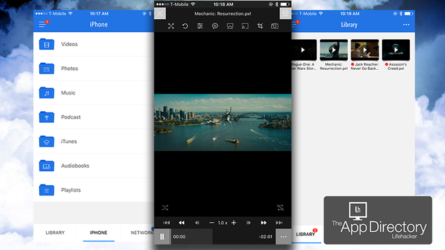
A long time ago, Apple made it difficult for third-party developers to make a good media player for the iPhone. Thankfully, over the years they’ve loosened their restrictions, and now you can get a really solid video player with PlayerXtreme.
Yahoo! Sports gets iOS app overhaul

Yahoo! has been on a tear lately revamping its mobile apps. The latest is Yahoo! Sports 4.0 for iOS (formerly known as "Sportacular"). The most noticeable improvement is that the app is now universal. The app has also been completely redesigned with a slick new look, and lets you sync your favorite teams across iOS devices. Finally, users can also see built-in Twitter feeds of local sports writers. Here's the full release notes:
Sportacular is now Yahoo! Sports - Faster, cleaner and more useful than ever before.
+ iPad is here! Enjoy the new universal iOS support.
+ Login to Yahoo! Sports to sync your favorite teams across mobile apps and the web.
+ Refreshed design - A clean new look for a new era makes scanning and navigation a breeze.
+ "Live Games" - Follow every in-progress game across all supported leagues from the "Live" tab on Trending scores.
+ Game tweets - Follow the action with live game tweets from local beat writers and team experts.
+ Pitch by pitch - Our baseball game experience is even better with pitch-by-pitch information for every at-bat.
**Note: Chat is no longer supported in v4.0.
Thank you for your continued support. We sincerely appreciate it.
Yahoo! Sports 4.0 is a free download.
Yahoo! Sports gets iOS app overhaul originally appeared on TUAW - The Unofficial Apple Weblog on Fri, 14 Jun 2013 11:00:00 EST. Please see our terms for use of feeds.
stophittingyourself: Have you ever thought, for a single...

Have you ever thought, for a single solitary moment about my responsibilities to my employers?
Welcome to the new Myspace app

A new Myspace app launched today, featuring a complete redesign and pushing forward with several new ways to interact with other users on the social network. Of course many of you are probably making jokes about Myspace right now, and perhaps you're referring to MySpace or my______, each legacies of a company which was bought in 2011 by Specific Media and Justin Timberlake for US$35 million.
Since then Myspace has been undergoing a major overhaul and a refocusing on its social roots. The new app reflects this, and makes discovery a huge part of the experience. When you first sign up via the app, you are required to "connect" to five people -- none of whom you are likely to know. I have to admit it was a little weird to connect with five people whom I'd never met or seen or heard of, but in the interest of science I did it anyway. You can also log in via Twitter or Facebook.
Note that these connections can be asymmetrical, so it's more like I'm subscribing to someone's stream on Facebook. Let's face it, if you're on a social network are you really concerning yourself too much with privacy to begin with?
Once in the app you'll see an interface that is part Flickr (gorgeous tile-based photo browsing), part Facebook (social subscriptions), part Tumblr (animated GIFs) and part Path (attractive design with excellent interaction models). Myspace has taken some of the better features from those mobile experiences and produced a light but effective solution for browsing photos and seeing connections.
Of course, at the very beginning there was music. I remember being a heavy MySpace user (note the camel case, indicating the olden times), and music was a huge part of the experience. OK the other part of the experience was glittery pages hacked together -- but thankfully that nonsense has been abandoned for a streamlined profile page featuring photos. Yes, you can also make animated GIFs right in the app as well, which some might see as the new sparkly unicorn dancing on your profile page, but it's really a lot more fun than it sounds. If you enjoyed Stilly, you'll love this feature.
If you're looking to find new music, the new Myspace app is very compelling. I can browse my connections, see the connections those people are making, then go to a profile and right up top there are two buttons: one to connect, and one to play their music playlist. That's actually quite awesome. I was very quickly able to see what cool photos a person had, how many connections, their website, location, etc.

As you can see in the photo above, the two circles indicating a connection are everywhere. Once you connect (to music or a person) the two circles merge. It's a nice touch with a huge impact, because Myspace, by constantly pushing these connections, is getting back to its roots of connecting artists with people and providing a powerful discovery mechanism in the process. Say what you will about the network, this is a powerful way to discover new music and people.
While it remains to be seen if this will revitalize Myspace, I can attest to the power of this connection process. Within moments of joining I discovered a person in Los Angeles through one of my connections, then discovered Die Antwoord, an artist I'd never heard of but now I'm seeking out more of their music! That's powerful stuff, but we'll see if it's the magnet of users Myspace hopes it will be.
The new Myspace app is free, and I encourage you to try it out. Animated GIFs aside, there's a real effort to connect people and artists, and I think this is one of the better apps I've seen that does exactly that.
"The magic of Myspace has always been at the intersection of creative expression, community, promotion, and discovery," said Myspace CEO Tim Vanderhook. "Myspace aims to power a new ecosystem catering directly to the creative community, enabling artists to manage their digital presence, build an audience, upload and distribute their content, and learn from data all on a single platform."
The entirely new platform was developed by a creative team of artists, designers, and developers, and refined by community feedback during the site's beta. One feature developed as a response to high demand by the community is a tool that allows people to create and share animated GIFs as simply and intuitively as taking and posting pictures.
The new Myspace also offers a persistent player, which anchors everything in music. Accessing 53 million songs from the world's largest digital music library, the player delivers faster streaming and intuitive drag-and-drop functionality for a superior music experience.
The mobile app's My Radio feature allows people to create and program their own radio stations, which can be streamed for free on an unlimited basis. Stations can be produced by anyone, giving each member the opportunity to play the role of DJ and promote the music they love to the broader community.
Myspace also delivers its community Insights, an analytics suite that offers a set of visualized data reports telling artists how big their audience is, which fans are most influential, and what's resonating with them.
Committed to promoting its community, the new Myspace dedicates a highly visible home page to highlighting members and their content. The site's Discover feature drives connection and collaboration by allowing members to filter searches by account type, such as musician, photographer, writer, or even developer.
Starting today, the new Myspace is officially available at www.myspace.com. Profiles from Classic Myspace have been upgraded to the new platform, so that members can log in using Classic Myspace, Facebook, or Twitter account credentials and access their content and connections easily.
The mobile app is available exclusively for iOS devices at www.AppStore.com/. A mobile-optimized version of the new Myspace is available for non-iOS consumers as well.
About Myspace
Myspace (myspace.com) is a place where people come to connect, discover, and share. Showcasing artists and their work, the site gives people access to 53 million tracks and videos-the world's largest digital music library. With roots in music and social, the platform is built to empower all artists-from musicians and designers to writers and photographers-helping them connect with audiences, collaborators, and partners to achieve their goals. Through an open design, compelling editorial features, and analytics-based recommendations, Myspace fosters a creative community of people who connect around mutual affinity and inspiration for the purpose of shaping, sharing, and discovering what's next.
Welcome to the new Myspace app originally appeared on TUAW - The Unofficial Apple Weblog on Wed, 12 Jun 2013 12:45:00 EST. Please see our terms for use of feeds.