Brian Johnson
Shared posts
Port Sudan Worries About Crystal Meth Use Among Youth
Thousands Take to the Streets in New Marches of the Millions
The TGC National Conference Livestream Schedule
Brian Johnsonmartinluther missions programme in side advet
Written by:Justin Taylor
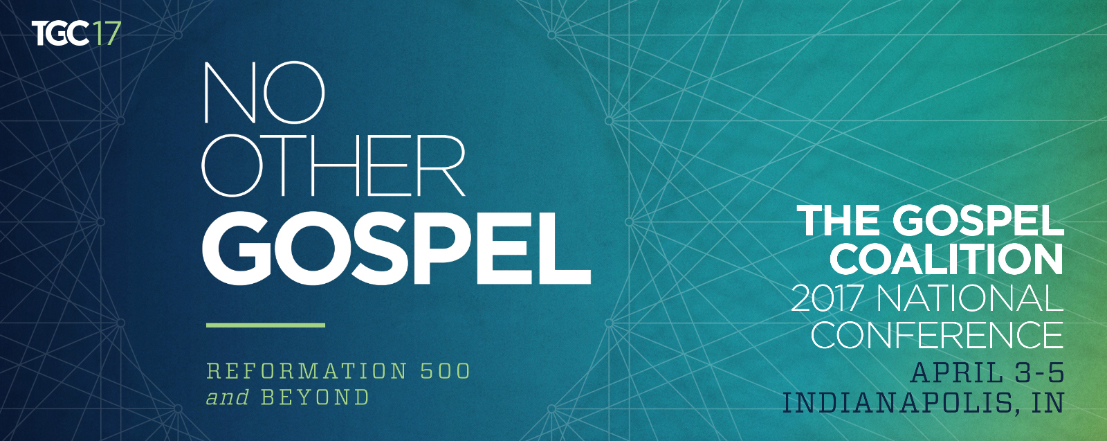
The livestream link is here.
All times Eastern Daylight.
Monday, April 3
1:00 pm John Piper | Paul’s Pilgrimage, Paul’s Plea | Galatians 1
3:00 pm Sandy Willson | Apostolic Confrontation: The Exclusive Sufficiency of Christ | Galatians 2
4:00 pm Stephen Nichols | On Martin Luther
7:30 pm Kevin DeYoung | On John Calvin
Tuesday, April 4
8:00 am Ben Sasse| What Does Washington Have to Do with Jerusalem?
9:00 am Peter Adam | The Gospel of Grace: How to Read the Bible, Part 1 | Galatians 3
11:00 am Don Carson | The Gospel of Grace: How to Read the Bible, Part 2 | Galatians 4
1:30 pm Workshop: Nancy Guthrie Interviews Tim Keller | Help Me Teach the Bible Live Recording
3:00 pm Workshop: Kevin DeYoung | Reexamining Perspicuity: If the Bible Is So Clear, Why Are There So Many Different Interpretations?
4:30 pm Workshop: Tim Keller | Calvin’s Company of Pastors Today
7:30 pm Ligon Duncan | The Reformed Tradition Beyond Calvin
Wednesday, April 5
9:00 am Thabiti Anyabwile | Gospel Freedom, Gospel Fruit | Galatians 5
11:00 am Tim Keller | Boasting in Nothing Except the Cross | Galatians 6
The “wheelchair” symbol gets an update
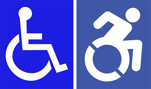
Dylan Stableford of Yahoo asked me a few questions on the New York update to the International Symbol of Access. Here’s Dylan’s piece. For full context my answers are below.
What do you think of the new logo?
Jeff Gentry of the Accessible Icon team said the purpose of the project wasn’t to replace the original design, but to create conversation about accessibility, inclusion, and the capability of people with disabilities to navigate their world. That’s a worthy aim, and despite the mostly negative online comments I’ve read it’s probably far too early to judge the project’s effectiveness.
Is it a better design? More positive than the previous iteration?
I rarely see anyone in a wheelchair who leans forward to such an extent unless they’re in a race. Perhaps there was an iteration between the new and old where the figure didn’t seem to be in such a hurry.
Some critics say the new logo appears to be inspired by a Paralympic athlete and is not representative of all handicapped disabled persons. Fair criticism?
The use of a chair will always mean the design isn’t representative of everyone with a disability. What’s important is that people understand the meaning of the symbol, whether there’s an element of motion to the design or not.
If you were charged with the redesign, how would you approach it?
I’d look for a different way to create a conversation.
—
The story elsewhere:
The handicap symbol gets an update, from The Washington Post
Governor Cuomo signs legislation updating New York’s accessibility signage and logos, on the Governor’s website
The icon graphic elements, on the Accessible Icon Project site
International Symbol of Access, in the archives