
Advertise here with BSA
We’ve finally hit the 500,000-user mark at Buffer, a product that helps you share on your social media networks more efficiently. About two years ago when we started on our path to building Buffer, we knew we’d be meeting obstacles and making mistakes along the way.
One of the main things we’ve kept in mind is that making mistakes is unavoidable and that if we choose to learn from them, they’ll be helpful in giving us good guidance on how to move forward more effectively.
And I believe that it’s partly because of these mistakes that we were able to get to where we are today.
The Experience That Shaped How We Build Our Product
Before I discuss the biggest lessons we learned from some of our UX and design mistakes, I want to talk about one of our primary product development principles:
"Validate first, code later"
Let me tell you how this came about.
When the idea of Buffer for building a smarter way to post to Twitter and other social networks came about, our founder Joel Gascoigne immediately started coding instead of first validating his idea (which is how he used to typically approach things).
A few minutes into his coding session, he realized that that wasn’t the way to go.
So he tried something else.
What he did was to put up a landing page as if his product already existed, even though he hadn’t finished everything yet.
He then went ahead and spread the link of his site across Twitter.
People whose interest got piqued would click on a button on the landing page to sign up for an account. They were then presented with another web page that said Buffer wasn’t finished yet and asked the interested user to leave his/her email address so that he/she can be get an email as soon as Buffer launched.
This strategy worked out quite well and we got our first paying customer within 7 weeks of coming up with the idea.
Three key product development principles were created from this experience:
- Keep the first version of a feature or product as minimal as possible.
- Be prepared for a long journey with lots of course-redirection.
- Turn any idea for a feature into a hypothesis that first needs validation from the user.
Now that you know a little bit about our product development principles, the following lessons that we learned will make a bit more sense.
Lesson 1: User Flows Should Focus on Retention, Not Revenue
A key user experience (UX) lesson that we discovered early on was that we needed to concentrate on keeping our customers rather than generating revenue.
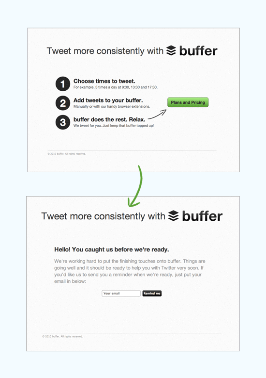
This is how we learned this lesson. Our initial landing page’s user flow was as follows:
- When you first see our landing page and click on the sign-up button, we would show you a "subscription plans and pricing" page.
- From there, you would be required to choose either the "Free" plan or one of our paid plans.
- After you’ve picked the right plan for you, you would be able to sign up by providing your details (e.g., your name, email address, and so forth).
With this user flow, the rate of people choosing one of the paid plans upon signing up is high, thus allowing us to generate revenue early on.
However, we quickly learned that users who picked to pay for the product before getting the chance to use it sent our churn rate through the roof.
Why did this happen?
We found out that people would pay, but then they wouldn’t even start to use Buffer, and eventually they’d cancel their subscription.
So we changed our sign-up user flow and philosophy of acquiring users. We decided to say to ourselves, "Let’s get the person to start using the product first so that they can experience first-hand the value of our product, which will hopefully encourage them to upgrade to one of the paid subscription plans."
That worked out a lot better for us.
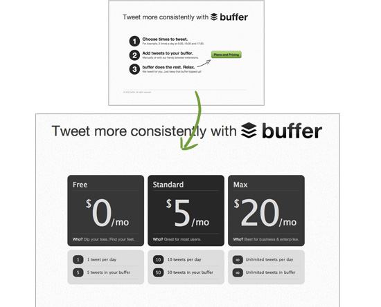
As a result, the user flow through our website is incredibly more seamless now:

As a result of this user flow redesign, two important things happened:
-
More people signed up because we didn’t dilute the funnel with a pricing page as an interstitial.
-
More people upgraded over time because they started to actually use the product, find value in it, and stick with us.
Since then, we’ve made many more product changes that give out more free features, and our core product features are still free. Only after we’re sure you’ve really seen lots of value from using Buffer that we would encourage you to upgrade to a paid plan.
Making user flows that focus on user-retention was an important discovery for us.
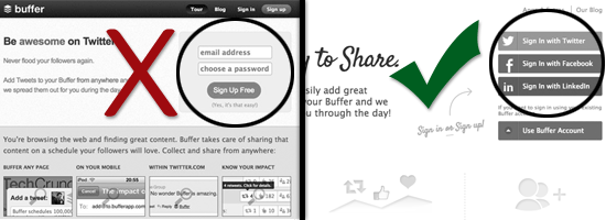
Lesson 2: Social Sign-in is Better Than Email Sign-in
After dozens of failed A/B tests to improve the conversion rates of our landing page, we came up with the idea to enable social sign-in (i.e., signing up for a Buffer account and logging in using your Twitter, Facebook or LinkedIn account).
After all, Buffer is for posting on Twitter, Facebook and LinkedIn so it only seemed logical that our potential users would be able to quickly and conveniently sign up using one of their existing accounts.
For comparative purposes, below is our initial landing page that would let you sign up with your email and a password:

Our change from the email sign-in to social sign-in is one of our biggest growth hacks, allowing us to eventually increase sign-ups by 50%. And around the time of this sign-in switch, we went from 500 daily sign-ups to 800 daily sign-ups practically overnight.
Lesson 3: Test All of Your Assumptions Early
Let me tell you a story about how we failed miserably with a new browser extension redesign idea.
One of the essential parts to Buffer is our browser extension for Chrome, Firefox and all other major browsers. We know that if you’re a user and use the extension, you’ll have the best experience with the product. Sharing from any web page and easily adding everything to your "buffer" to share on Twitter, Facebook and LinkedIn emerged as the most powerful use-case.
So it was only natural for us to focus on this element of the product and try our very best to improve it, as we clearly had some ideas on how we could make it better.
But when we got going with the production of a better browser extension, it seemed like we fell back into our old habits and made the same mistakes we knew we should be avoiding.
Here’s the sequence of how we (incorrectly) approached building our new extension:
- We identified some issues with our existing browser extension and then we brainstormed on what we wanted to change.
- We spent a lot of time and resources to design and develop a fully-functional first version.
- We tested the first version late in the process and realized people were getting extremely confused when using it.
- We canned the new idea and never launched it.
This was the new layout of the browser extension that we never pushed to production:

Getting into the habit of testing every single assumption you have as early as possible is something we now have seared deeply into our brains since that failure.
To make things right, this is now how we approach building new products and features:
- Identify issues with the existing product and brainstorm what you might want to change.
- Talk to users about whether they actually have the same issues.
- After validating it in a discussion with our users, quickly build wireframes or a simple prototype that doesn’t take longer than 1-2 days to produce.
- Talk to users again and see how they interact with your prototype.
- Iterate further to a somewhat usable feature/product that you can show to more users.
- Track engagement/growth/revenue metrics and talk to users again about their experience.
Lesson 4: Be Clear with User Interface Labels
The last lesson that I want to share with you is something that I’ve been thinking about for quite a while: It’s the issue of being clear with your labels, buttons, help text, etc. versus being clever with them.
Des Traynor from Intercom defined this problem incredibly well in an article:
Situation: You’ve built a great feature that solves a real problem that you know your users have. They’re not using it though. Usually, it’s because they haven’t seen it, or they saw it and didn’t know what it did.
That situation is something we continue to face.
The key example I wanted to describe here is the following: Inside Buffer, you can connect multiple social accounts together so you can post to them all from one location, e.g., you sign up or login with your Twitter account but you also want to connect your Facebook and LinkedIn account to Buffer to make posting from one place easier.
What it used to look like was this:

We thought to ourselves that having a clever "plus" (+) sign icon will indicate to people that that’s the way to add your other social network accounts.
And yet, we repeatedly received emails from our users asking us if there was a way to connect their Facebook or LinkedIn account in Buffer.
So what we did was to change various aspects of the "connect" button by making it a placeholder icon, using a bigger plus sign, and many other design tweaks.
What was the eventual design solution?
The solution was simple: Using the text "connect more accounts" in plain, written words, which is a lot clearer and more effective than having (what we thought was) a cleverly devised icon to represent this UI task.
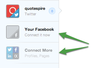
We learned that picking the clear solution over the clever solution — even though the former might not be as pretty or as unique or as cool — is always what’s better for the user.
Conclusion: Everything Is a Hypothesis That Needs to be Validated
We believe that our company and our app is still in its early stages, so a lot of the design processes and methods we have are still very experimental.
The concept of not being attached to a single idea and treating every design or feature iteration as a hypothesis that needs validation is the overall biggest thing we’ve learned.
We plan to build many more features that people will hopefully love. And we also expect to build many more that we’ll have to throw away.
We think this way of thinking will give us the biggest potential for building something our users truly want.
Related Content
About the Authors
 Leo Widrich is co-founder of Buffer, a better way to post to Twitter, Facebook and LinkedIn. He also blogs about insights on lifehacks, business and productivity on the Buffer blog. You can say "hello" to him on Twitter @leowid (he is a super nice guy).
 Tom Moor is co-founder at Buffer, a smarter way to share on Social Media. At Buffer Tom leads design and UX, constantly trying to make the interface easier to use, whilst focusing on the little details. Follow him @tommoor on Twitter for more great chats on startups and design.


 (image by


